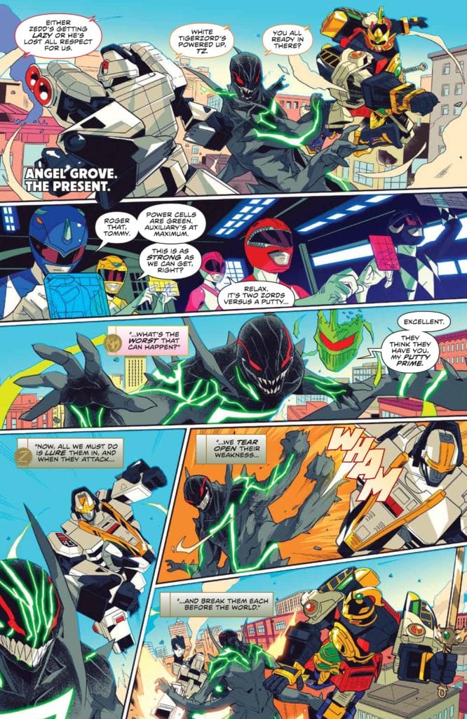
Boom Comics releases its fourth issue of the Mighty Morphin series on February 10, 2021. It’s another strong entry in Mighty Morphin Power Rangers line relaunch. The story is written by Ryan Rarrott. Marco Renna handles the illustrations. Colors are provided by Walter Baiamonte and the book is lettered by Ed Dukeshire.
Story
Ryan Parrott continues to spin tales that enhance fan nostalgia for Power Rangers. Issue four is like so much of his work. Characters are developed, the plot thickens, and complexity abounds on every page. However, it never comes at the cost of what fuels the nostalgia. Issue four feels like the end of a second act. Our heroes are on the verge of being conquered by Lord Zedd’s Chaos Putties. This alone testifies to how well Parrott understands the source material behind his work. This could be an episode of Power Rangers. But since the book is aimed for an older audience, we get some great moments of nuanced writing.
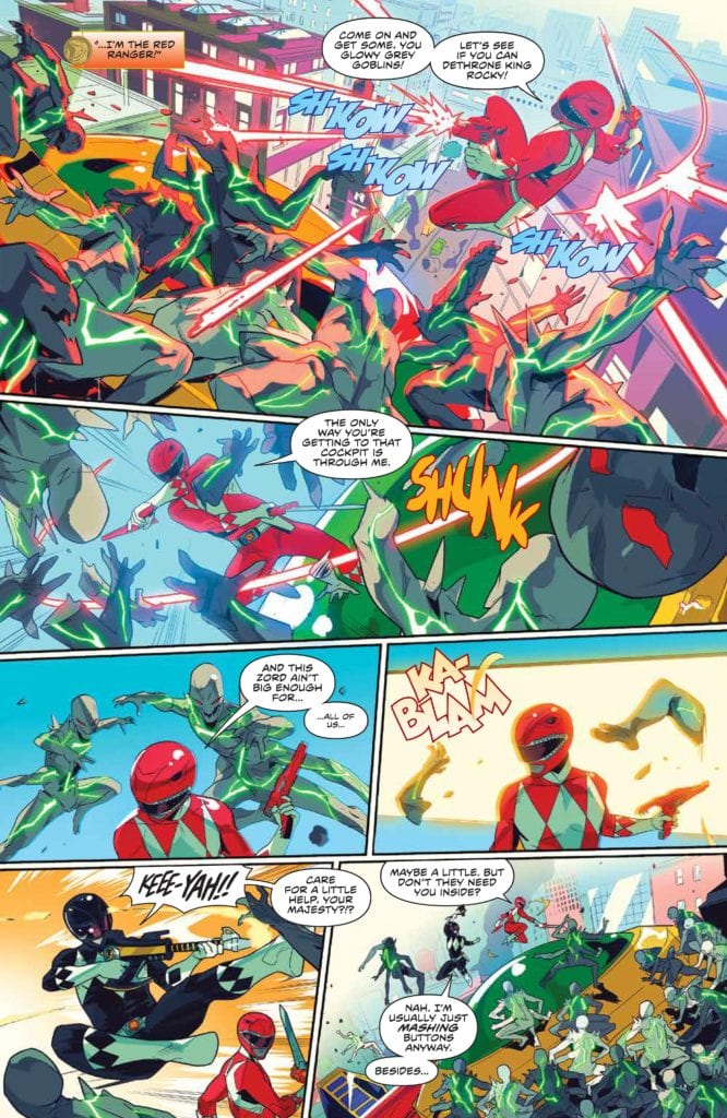
A prime example of this is Rocky, the Red Ranger. In the book, Rocky charges headfirst into a battle, and it’s possible it’s as a sacrificial play. Countless Red Rangers have done this on the show throughout its nearly thirty year run. However, here we see Rocky wrestle with being in his predecessors’ shadow. It allow us to see this Red Ranger developing into a strong force on the team. The issue is full of solid action, and the ending feels like our heroes cannot possibly win. It also leaves the reader on the edge of their seat, counting down the days to next month.
While I am excited and pleased with the overall direction this story took, I am little disappointed by the big reveal. Since the ending of the original series there has been an ongoing mystery woven into the books. Who is the new Green Ranger? Issue four pulls back the curtain and shows you just who is behind the helmet. It is a major let down, and it is pretty obvious. The reveal lands with a bit of a thud, and most everyone reading the series has already guessed who it is. Hopefully, there will be more to this unveiling in future issues to make it more compelling. For right now, it is deeply disappointing in an otherwise amazingly crafted story.
Art
Marco Renna’s illustrations are exactly what a Power Rangers book needs. The Rangers and the Zord look awesome. The action is tight and gives a chaotic feel to a battle where the Power Rangers are overwhelmed. The character moments, outside of the helmets, particularly the Eltar backstory and Bulk and Skull’s aside, feel real and honest. Lord Zedd and the Putty Prime are well drawn villains. Renna knocks it out of the park on this issue.
Color
Walter Baiamonte manages a bright palette to perfection. Baiamonte nails the feeling of the show that is vibrant and colorful without making the work feel aimed at children. The coloring on the section where Zedd is appearing to Putty Prime as a hologram is a great example of how the colors on this book enhance the overall work. Baiamonte uses a neon green that, while bright, does not take away from the evil and vile presentation Lord Zedd emits. Baiamonte’s colors pair with Renna’s illustrations and Parrott’s story to create a really fun piece of comic art.
Letters
Ed Dukeshire’s lettering in this book is very competent. The use of fonts and colors to distinguish Zordon and Alpha-5’s voice work really well to give those characters a different feel from the others. I continue to be perplexed by the fact nothing is done with Lord Zedd’s voice. The voice crafted by the late Robert Axelrod for Lord Zedd was gravelly and the sound of pure evil to children everywhere. It deserves to be portrayed on the page in a way that is differentiated from Tommy and the other Rangers. That one mind-boggling omission aside, the lettering in this book is great and enhances the story unfolding before those who read this work.
Conclusion
Parrott and company continue to kill it on the Power Rangers line. Issue four is filled with great action and deep story telling. The strengths of the book greatly outweigh the flaws in the Green Ranger Reveal. Once again, I am left with the feeling that two Power Rangers books a month is not enough, and that is a great feeling for this long time fan.
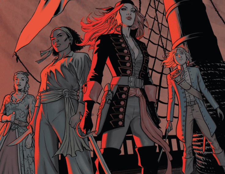
A Man Among Ye comes from Image Comics’ Top Cow imprint, with a trade releasing on February 10. But what’s left to say about writer Stephanie Phillips and artist Craig Cermak’s little Shanty? I mean, MFR already has its name on the back cover of the trade courtesy of our own Darryl Robson. But let’s talk about how this series explores being a pirate in the best and worst ways?
A Man Among Ye: Not From History Books
A Man Among Ye is first and foremost an alternate history about Anne Bonny and her companion Mary Read. Phillips makes this stand out by making Mary a decade younger than Anne, whereas historically Read was older than Bonny. Continuing off from one of Darryl’s other reviews, this is Phillips and Cermak’s defiance to the status quo. What better way to show piracy than by stealing the narrative and changing it to suit their needs? I’m a fan of Once Upon A Time In Hollywood and this series scratches that same itch.
Even if, narrative wise, characters who espouse to treasure freedom like Charles Vane make backstabbing deals. Then again, piracy does involve backstabbing.
Suspend Your Disbeliefs
Cermak uses artistic techniques to keep the reader’s attention. Cermak, in all of his pencils and inking, evokes very sensational scenes straight out of a pulp novel. An opening involving a pirate ship and a navy ship in battle certainly makes a strong first impression. Especially when that pirate ship takes up the most space, that shows how powerful a presence the pirates are.
The coloring duties go between different artists, each with their own styles. Cermak does the first issue whose use of the color red steals the spotlight. Anne essentially epitomizes that with her red hair and her use of fire to burn a ship down.
John Kalisz gives a much more muted coloring in the other three issues, where the adventurous atmosphere becomes stunted. That is until elements of importance like the poisoning of a drink come up.
The final pages with coloring by Brittany Pezzillo is where new life springs into A Man Among Ye. Amid the flames, gunshots, everyone in the area (especially Anne) looks like they’re ready for a new chapter in their lives.
As for letterer Troy Peteri, you have to appreciate what he puts behind the words. Every word has a font rough enough for characters to actually talk like pirates. The SFX are just as wild, each crafted for a specific purpose like gunshots from different guns or splashing water. All of this is presented in a way that makes the actions louder.
Can A Man Among Ye Talk Like A Pirate?
A Man Among Ye does what it wants, when it wants, because that’s what pirates do. People are more than guaranteed to have a good time reading it.
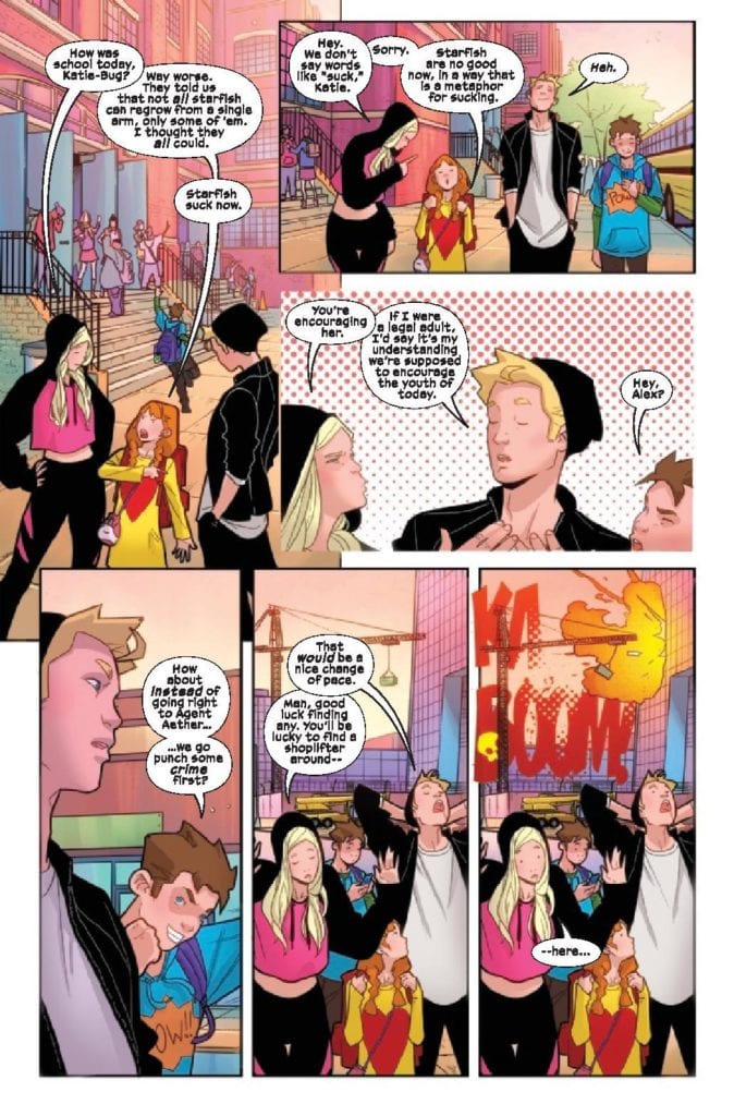
Power Pack #3 from Marvel Comics publishes on February 10 with a special focus on Lightspeed. Ryan North writes this character with a lot of introspection on how a superhero should act. Artist Nico Leon and colorist Rachelle Rosenberg keep up the cartoony style, even as things get serious. Letterer Travis Lanham also makes sure that the more serious moods still intersect with the lighter touches.
Background
Continuing on from the last issues, the Power Pack find a mentor in Agent Aether to get Outlawed antagonists CRADLE off their backs. In doing so, they apply their powers to a science project, meant to help people. But what if the pack’s new mentor has ulterior motives?
Power Pack #3: Still All-Ages
Power Pack #3 takes Julie/Lightspeed’s perspective, as readers look at the sibling’s family dynamic. Julie often tries to act as the Pack’s voice of reason when they get into their minor quarrels. If anybody has relatives that drive each other crazy, wanting to calm everybody down is relatable. North takes this a step further by showcasing how Lightspeed thinks on her feet in battle against Taskmaster. Thanks to Julie’s experience outside of the Pack, she knows how to goad powerful fighters like Taskmaster, to her and the Pack’s advantage. It’s always good to see heroes work with what they’ve got when they’re at a disadvantage.
The Best Things In Magenta
Leon’s art keeps the light cartoony flow going in Power Pack #3. The fight with Taskmaster might be life threatening, but Leon still manages to keep things light. A bullet, aimed at the Pack, almost hits them. But then they have cartoonish fall to safety, thanks to Zero-G. And right after, we see the Pack’s funny reaction. They’re complaining, kind of like a Jackie Chan action-comedy scene.
Rosenberg includes a lot of magenta in this issue with its focus on Lightspeed (it’s the color of her costume). Whether it’s the lights, mental images of her girlfriend, or the background, it serves as a way to tell the reader that Julie pulls the most weight in this issue. This extends to the captions from Lanham who uses them in juxtaposition with Lightspeed’s mood. When she’s going in for an attack, she screams out her frustrations. It’s nice to see that while Lightspeed does have experience, she is still young and has quirks that make her more relatable.
Check Back In On Power Pack #3
One of Power Pack‘s main strengths is how each family member gets a voice. Lightspeed is taking center stage on all fronts in Power Pack #3. Julie shows off her ability to keep everybody on target. Not only does her experience allow her to take advantage of the situation, but despite this she still has more to offer than heroism. Now fans have more to look forward to when it comes to the rest of the Pack.
Eternals #2 from Marvel Comics publishes on February to further showcase this future MCU cast. Writer Kieron Gillen demonstrates the reach of these godlings in Marvel history. Artist Esad Ribic displays the stakes of this part of the greater Marvel world. This is all the more apparent in the coloring by Matthew Wilson, that makes events look like they’re being recorded in paintings. All while letterer Clayton Cowles gives this issue three distinct voices that interact and bring everything together.
Eternals #2: How Gods Look At Time
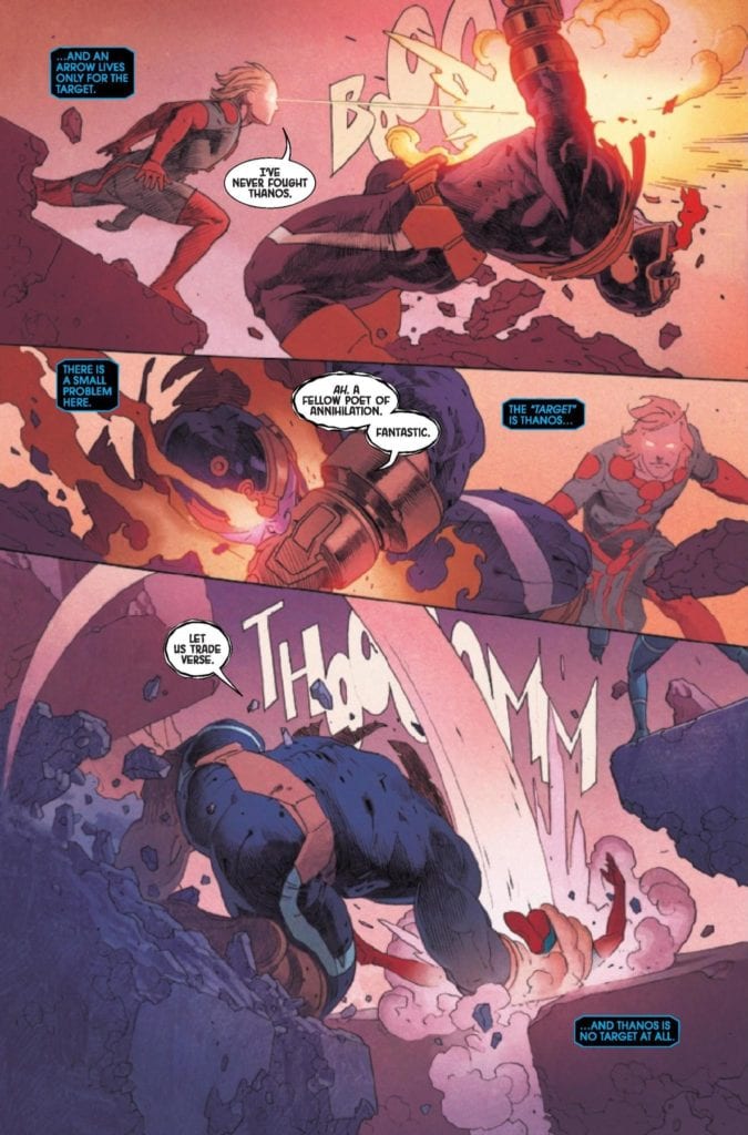
Gillen goes to lengths to display how the cast of Eternals #2 look at the world. To them, events and stakes are just records to do their tasks. For Ikaris, threats are only things to hit, no matter where they take place. Even someone as significant a threat as Thanos means very little to the politics of these godlings. Eternals like Druig are more focused on keeping their standings than worrying about Thanos. It’s an entire history lesson in-story.
With political tensions at an all time high in the real world, it’s easy for readers to feel the weight of some of these actions. Even if that means the reader doesn’t quite understand how Ikaris’ actions will turn out. The last time he tried to fight a monster, he mistakes the time it appears with the place.
Portraying An Epic
Eternals #2 has Ribic’s art show the angles and dynamic positions of the situation at hand. In Ikaris’ battle against Thanos for example, Thanos’ height and movement demonstrate his control over the situation. Which is incredibly ironic, considering the effects of the Great Machine. It helps Ikaris fight Thanos in many different time periods, through a series of portals. No matter how chaotic and familiar Ikaris is with his world’s resources, Thanos remains an ever-powerful threat to him.
Wilson’s details in coloring give the above situation the feeling of an epic. Like a painting by Giovanni Bellini, the lines, shading, and brightness are an extension of an action taking place. Thanos’ apparent victory over Ikaris has so many details in it, that if not for captions by Cowles, it’d be a blink-and-you’ll-miss-it moment.
Cowles lettering does more than just guide readers, it provides context to character’s roles. The Great Machine with how it/she(?) speaks is like an omniscient narrator. Which is why the reader needs to pay attention when she speaks about a past event. It indicates that she has been tampered with. That’s why the marginally related Thanos is able to escape her gaze. With how Thanos’ word balloon looks distorted in comparison to most characters, it furthers how much of a threat he is.
Eternals #2: Prepare For The Next Epic Chapter
Eternals #2 is shaping up an already impressive series into something that can only be epic. Each member of the creative team collaborates to give weight and meaning in their roles. All while making the titular cast, in a world so unlike our own, looks fascinating yet detached. Something’s going on and the reader will want to stick around.
The campaign that started it all is back in CRITICAL ROLE: VOX MACHINA ORIGINS III #1. Available in comic book stores on Wednesday, February 10th, this issue details the next chapter of Vox Machina’s adventure. The setting is Westruun, a bustling town that’s become familiar with the adventurer’s exploits. Coupled with a massive amount of coin acquired from their most recent client’s mission, will Vox keep their egos (and money purses) under control?
Story
Readers are brought along to Westruun with Vox, which features a cozy tavern where the group agrees to pick up and spend their earnings. Some, like Scanlan, express joy at just the fact that the team is celebrating Winter’s Crest with ale and friends. Unfortuantely, we also see the eccentric group blow through the earnings almost immediately, forcing them to seek out another source of income.
Fortunately, a potential source of funds comes in the form of a poor woman looking for her lost son. Despite the apathy of the local patrons, and many of the Vox members themselves, Keyleth opts to show mercy.
But before she can offer assistance, Grog gets into a fight with one of the patrons, which forces the team to leave the tavern.
It’s here that Vox’s next adventure really begins. After watching the goliath brawl, a mysterious figure named Kradin Grimthorne introduces himself, offering Vox a sponsorship in the Brawler’s League of Exandria.
Jody Houser’s narrative captures the distinct and often conflicting personalities found within Vox. Readers get a clear sense of the difference in characters like Keyleth and those closer to Grog; the former is in tune with those in need while the latter seeks battle more than anything. But rather than offering a judgement as to which is better, Houser’s commitment to characterization offers space for fans to identify with the characters that embody their own personalities.
Artwork
We loved the immense amount of detail featured in this issue. Olivia Samson’s penciling and ink work offers fully realized illustrations of not only the protagonists, but the background characters as well. This helps readers immerse themselves in the world of Critical Role. Coupled with Msassyk’s coloring, these images pop off the page with pleasing colors that work well together. It was also great to see letterer Ariana Maher’s use of various large fonts to represent environmental noises. These various elements meshed together effectively to create a harmonious issue.
Conclusion
CRITICAL ROLE: VOX MACHINA ORIGINS III #1 kicks off the next Vox adventure with an engaging story. We’re excited to see how the adventurers fair in the upcoming brawling tournament.
Do you think Vox stands a chance against their opponents in the Brawler’s League? Let us know in the comments below!
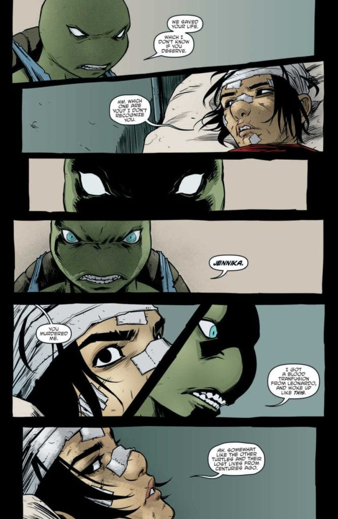
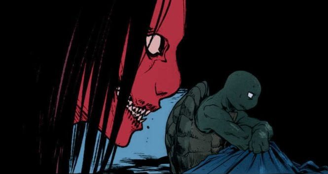
TEENAGE MUTANT NINJA TURTLES #114, available in stores on Wednesday, February 10th, continues to follow a future version of Lita as she seeks to prevent a disastrous future. #113 detailed Karai’s shady business deal with Hob, which allowed her to procure two huge “baby” mutants. However, shortly after their helicopter crashed. Now the two mutants are on the run and Karai is badly hurt. Will the turtles do anything to help their enemies?
Story
The story opens with the mind-boggling meeting of present and future Lita. Normally, such an event would lead to temporal ramifications. And indeed, future Lita nonchalantly comments on this fact. It makes the reader wonder if the time traveler has the same reckless attitude toward her other endeavors.
The crux of the issue, however, lies in Jennika’s confrontation with the injured Karai. Jennika reminds Karia who she is and what the Foot assassin did to her life. The scene is so tense readers can almost feel the heated rage between the two.
Writer Sophie Campbell structures the narrative effectively; her story paces well when moving from the Splinter Clan base to the streets of Mutant Town. Throughout this process virtually every character’s personality displayed, especially that of Jennika. Readers will find themselves drawn into these tense interactions as if they’re a part of them.
Artwork
The illustrations in this issue did a great job of crafting emotive characters. Campbell’s penciling and ink work provided detailed expressions on characters like Jennika and Karai, highlighting their troubled history.
This dynamic is further fleshed out by colorist Ronda Pattison; her effective use of shadows highlight the deep-seated rage within these characters. In addition, Shawn Lee’s lettering is placed strategically around each characters so as not to distract readers from the illustrations.
Conclusion
TEENAGE MUTANT NINJA TURTLES #114 is the dramatic issue we’ve been waiting for. Tensions are high between Jennika, Karai, and other the characters, which could lead to wild changes in the future.
Do you like think the Splinter and Foot clans will ever come together? Let us know in the comments below!
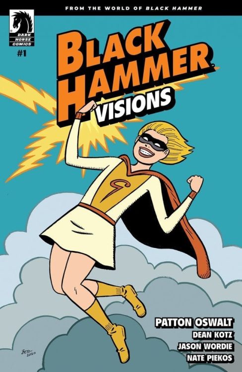
Graduation day is huge. It feels like the end of everything. But it’s tempting to downplay the whole event. Hell, it’s just high school, right? But writer Patton Oswalt, artist Dean Kotz, colorist Jason Wordie, and letterer Nate Piekos have empathy for teenagers leaving the world they know. Black Hammer: Visions #1 follows two teenage girls on their graduation day. They talk about their lives in Rockwood and the people who have left a mark on them. Dark Horse’s new series, Black Hammer: Visions, is a collection of one-shots, featuring some of our favorite Black Hammer characters. This first issue is a charming starting place.
Writing
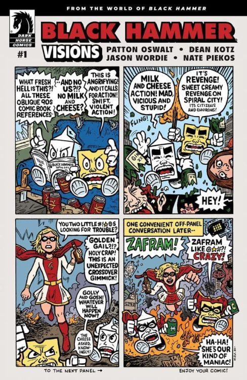
Oswalt immediately has us liking high schoolers Barbara and Eunice. They’re a couple of misfits, but they’re proud of that. They talk about high school, a world they’re leaving behind, with a subtle mix of wisdom and denial. Eunice knows it’s not the end of the world, that they’re just graduating, but Barbara knows it’s the end of something. Yet neither of them spend much time talking about leaving high school. Oswalt makes it seem like that might be because they’ll secretly miss it. Instead, Eunice reminds Barbara of that one girl they knew back in elementary: Gail. Eunice’s stories about Gail don’t have big, dramatic moments. They’re stories about her swearing in class and being caught with cigarettes in the bathrooms. But it’s in all the mundane details that Oswalt sprinkles in tiny, significant moments. Gail may have actually shaped Eunice into who she is. And because Oswalt’s way of showing this is quiet and unassuming, it’s also deeply moving.
Art
Kotz makes this issue look like a photo album or scrapbook. Panels overlap each other, looking like photos that have been glued in place. It’s a perfect look for a story about memories and graduations. But Kotz also shows us what memory felt the most intimate to Eunice. As she relays all the times she remembers seeing Gail, we see Gail as a small figure on the page. She’s another kid in the crowd. But, in one brief moment, Barbara, Eunice, and Gail are all playing out in a field together. We get a close up look of Gail’s face as she runs towards the reader. What’s odd is, she’s smiling. Then the image shifts. She’s still close, but her face has changed. She’s got her eyes clenched shut and she’s sweating. Her face is full of pain. Eunice is remembering the one time she felt close to Gail and so Kotz is depicting Gail as though she’s close to us, as readers. It’s the one time they had unadulterated fun together, but it’s also the one time Eunice got a glimpse of Gail’s inner turmoil.
Coloring
Wordie shows this graduation day as a bright time for Eunice and Barbara. The sun is out, the diner looks cozy, and everything seems optimistic. And when Eunice walks us through some of her memories, the color palette gets slightly dimmer. We get the sense that these were happy times. The coloring is still bright. But these are happy times that have faded with age, a little. They’re not as clear as the present day. And finally, when Eunice and Barbara end out the issue at a party, the colors get darker. Wordie makes the moment feel a little more serious, yet still full of beauty. It’s as though Wordie is telling us that these girls are growing up. Things will be colored differently in their lives from now on.
Lettering
Piekos’ lettering shows the playful banter that Eunice and Barbara have mastered. Their word balloons are connected by winding tails, giving a bounce to their dialogue. But there seem to be plenty of opportunities to create more rhythm in this issue. When Eunice yells at Gail, her speech is long and complicated. But it’s presented in one single chunk. Occasionally, this seems to be deliberate. Piekos communicates a breathless excitement through some of the dialogue. There are no pauses, the characters just charge right through to the end of their line. But there are a few moments that feel rushed over. Real moments of panic and confusion aren’t given time to sink in.
Dark Horse’s Black Hammer: Visions #1 is an empathetic and warm look at high school graduations. It follows Eunice and Barbara, two girls whose lives are changing. But Oswalt, Kotz, Wordie and Piekos never talk down to these characters. Instead, they remind us what it was like for us to graduate high school. They show that it doesn’t take Armageddon for worlds to end. Sometimes it just requires moving on, as hard as it may be. Pick up Black Hammer: Visions #1, out from Dark Horse February 10th, at a comic shop near you!
California Christmas is a heartwarming film starring Lauren Swickard and real-life hubby Josh Swickard as a pair of opposites coming together to find laughs and love. Director Shaun Paul Piccinio and Cinematographer Brad Rushing continued their long-time collaboration in a film bringing California and Christmas together.
Callie (Lauren Swickard) runs a dairy farm that’s been in her family for a long time. Its hard work made even more challenging after the loss of her husband. Joseph is a businessman with orders from his boss and mother to close a deal acquiring Callie’s farm. Joseph heads to the farm to get down to business when Callie mistakes him for the new ranch hand. It’s then that Joseph learns that Callie has no plans to sell, and he hatches a new plan to get the deal done.
PopAxiomspoke with Shaun and Brad about their road to making movies and creating a Christmas movie for Netflix.
Do It All
Shaun and Brad both grew up with a focus on being creative professionals.
BRAD: “My background was fine art. Since I was a little kid, drawing’s been a favorite thing. I’m also a musician, and I make a lot of music and write songs. I went to a fine arts high school called the High School for Performing and Visual Arts in Houston.”
SHAUN: “I grew up in the theatre. My father was a drama professor, and he produced Shakespeare in the park and other shows for 35 years. My first play was at five-years-old with Oliver Twist. My mother also encouraged me to pursue the arts.”
For both director and DP [Director of Photography or Cinematographer], their teenage years included deep dives into creativity.
BRAD: “We had a media department, and one of my friends came into the art department and asked if anyone wanted to draw some cells for an animated movie he was doing. I thought, ‘That sounds different and fun.’ I did it, I took it to 11, beyond his specifications because I threw myself into it. When I saw that and saw my art existing in the dimension of time with movement and change, a light went off.”
SHAUN: “My parents bought me a video camera when I was 11-years-old and started doing stop-motion animation and doing music videos. At sixteen, I started directing commercials for local mom and pop shops around town. I would go in there and pitch them a wild idea, and one out of five would say yes. Before I left for college, I had directed about 30 commercials in my hometown. That’s kind of how I cut my teeth. I was doing reel-to-reel editing.”
During and after college, both filmmakers found their strengths and passions.
BRAD: “I went into college as a double-major but eventually shifted my focus full-time to filmmaking. I initially wanted to be a director. The first film that I got to be a part of which was a low-budget indie thing. I watched the director. Everyone was coming at him from every direction wanting a piece of his time. Meanwhile, I saw the DP, and for the most part, people were leaving him alone, but he got all the toys. He got to make the visual magic.”
SHAUN: “I’ve done every job; I was an extra for a year, and I treated that as my film school. I brought notepads and took notes on the different terminology and departments. The way I looked at it, I was getting paid for film education. I was a runner getting lunches and coffee for TV shows. I viewed all of it as my education. Luckily, I was able to move up pretty quickly. The process of telling stories has always inspired me.”
“Years later, as I was reflecting,” Brad says, “so many of my interests converge at cinematography. The visual arts, science, history, even music. There’s a rhythm to the camera moving. I will find that there are rhythms in the way we do things, and beats happen.”
When Shaun said he’s done “every job,” he means it. “I also have a background in martial arts. I was also doing fight choreography and performing stunts. That lead to stunt coordination then second unit directing, which lead to first-unit directing.”
About California Christmas
If you think California Christmas is your typical Christmas movie, you’d be partially right. It’s got plenty of tweaks on the formula that make it interesting to a broader range of viewers.
BRAD: “It’s funny; I’ve had several friends who’ve said to me, ‘I’m not a Christmas movie, romance kinda guy, but my wife was watching the film, and I got hooked into it.’
SHAUN: “It was a conscious choice to do things differently. There are a lot of tropes that we do still hit. But we tried to bring in interesting things, different characters. Amanda Detmer’s performance and her story are unexpectedly heavy. We found a nice balance for people to enjoy.”
How did Shaun and Brad become a part of California Christmas?
SHAUN: “We both have a friend, a producer, and also a stunt coordinator, Noel Vega. He brought us together. He’d worked with both of us. Noel suggested Brad. Now, California Christmas is our sixth or seventh project together.”
BRAD: “What I would add, the editor of California Christmas, Brett Hedlund, is a friend of mine from way, way back. We met working for Roger Corman at Concord/New Horizons in the 1990s. We have been friends ever since. We’ve done a variety of projects and enjoy one another’s company. I knew a lot of players on the project. It was serendipitous. It was so fun making the movie even with the challenges of COVID protocol.”
So, what makes California Christmas different than your usual Christmas movie? The answer is in the title.
SHAUN: “It’s a Christmas movie, but it’s also got California in the title. People have an image of California with sunny coastlines. We wanted to invoke that warm quality, glowing light to the imagery. We looked to Robert Redford films like A River Runs Through It and Horse Whisperer. The city portion of the film, which is not that long, has cool tones and a little more sterile versus when we arrive at the ranch.”
BRAD: “Shaun is a huge lens geek. He’s got this wonderful collection of all these lenses that he’s curiously picked up over the years. One of the things he likes to do is shoot on vintage anamorphics. For this one, we went with a KOWA. Part of the design and what we got from the films we looked at was the framing and the showcasing of these gorgeous natural vistas. Huge, lingering wide shots that give viewers a sense of place, time, and identity.”
“I’m a geek for two things,” Shaun says before pausing for a moment to think about that, “well, probably more things, but I love filmmaking and technology. I love the look of old films and film, so we try to recreate that with digital. What I loved about the KOWA was that they’re a great size. A lot of times, an anamorphic lens is big and heavy. I was impressed with the KOWA.”
Brad shares a bit of guerrilla filmmaking due to modern restrictions. “There were many things that we did to mitigate the challenges of the COVID protocols. One of those was, Shaun and I went out on our own, even on days off, and shot with his Black Magic pocket cinema camera, using his vintage lenses and an anamorphic adaptor from SLR Magic. We shot b-roll, establishing shots, we used a drone. All that b-roll was just the two of us. With the schedule, it was the only way to do it.”
https://www.youtube.com/watch?v=28MO3ngJNto
About That Scene
California Christmas plays with tropes, does its own thing, and even adds a moment that will make most viewers squirm. Don’t worry, readers; we won’t spoil the specifics. But the scene is a perfect marriage of movie magics.
SHAUN: “That makes me so happy that the illusion worked! It’s a combination of visual FX, camera tricks, and some old-school movie tricks. When it’s all stitched together, it all works.”
BRAD: “The performances too help us with the misdirection. Most of it is cheating and implied action. You’re buying the story based on the reactions and dialogue.”
SHAUN: “The sound design too. Our team does such amazing work. Our art department, too, they whipped up some great FX for that scene.”
“You should tell the story of how you met the VFX artist who put it all together,” Brad jokes.
Shaun laughs and reveals the mystery “I did the sequence myself. I did a temp for it. Everyone thought the temp looked great and said I should just do it. I’d done a lot of the work already, and so I took care of it.”
Wrapping Up
As life-long fans of all things creative, who make up part of their respective creative DNA?
BRAD: “I come from a fine arts background. My inspiration is very eclectic. Everything from classic artists like Hieronymous Bosch to Edvard Munch, they’re both so incredibly evocative. In terms of filmmakers, one of the most influential films to me was the original Alien. That is, in so many ways, my favorite film. I’m a horror fan going way back. My dad would let me stay up and watch old black and white horror films like The Thing From Another World or The Man From Planet X, all of that crazy stuff. Alien is one of the first of two movies that scared the bejeezus out of me. I love that word, the characters, that ship, and the lighting. The other thing I would throw into it is that I’m a big believer in my world experiences. When we talk about Robert Redford films, we use it as a starting point and add my real-world experience to it.”
SHAUN: “My film influences are wide and vast, from Buster Keaton to Ridley Scott. Alien is probably my favorite horror movie, Blade Runner is amazing, and so is Legend. Kurosawa is a big influence on me. The first Rocky movie, the performances, and the way it comes together. You know, he doesn’t win at the end, but he does. Also, the story of how that film was even made is so inspirational to me. Robert Rodriquez, he is a huge influence, especially the way he made El Mariachi. One of the first feature films we did it on the same budget that he did, around $7,000, and that was a conscious choice. We wanted to try and make a feature with the same resources that Robert had. I’d love to work with him. Guy Ritchie, Tarantino, and Tom Tykwer, who did Run Lola Run. The creativity in that film was a moment for me. Braveheart was another big one for me.”
What do Shaun and Brad think of remakes, and how would they approach an opportunity to play in the world of a long-time franchise?
SHAUN: “I don’t know if I want to say. I’ll give the idea away. I hate to do remakes of masterpieces, but I would say I want to do a live-action remake of The Last Unicorn. That is on my wishlist. Someone will beat me to it, or maybe they won’t do it, but that’s been on my dream board for a long time. I know I can tell that story in a way that honors the original piece.”
BRAD: “I am not a fan of remakes at all. Sometimes when you remake something for a new generation, it can exist alongside the original. The Thing From Another World is one of my favorites, and I do like John Carpenter’s The Thing. So, I’d like to do a sequel and play in a world. Being a Star Trek fan, people ask me if I want to Star Trek and I kind of don’t. It’s my indulgence, and I don’t know if I want to go behind the curtain. But I would love to do more space-based science fiction. I’m such a huge fan of the genre and working with visual FX. I’d love to do a historically accurate film set in ancient Egypt.”
California Christmas was a hit on Netflix during the holiday season and will bring a smile to viewers’ faces all year round on the streaming giant. So, what’s next for the long-time collaborators?
SHAUN: “Brad and I both have a couple of projects that will hopefully release in 2021. One is a World War II epic we filmed. We shot a bunch of amazing stuff. The other one is Salvage Marines, which is a science fiction action series. Both projects star Casper Van Dien. Be on the lookout. Also, American Fighter is coming to the US in March through Lionsgate.”
Is California Christmas on your watch list?
Thanks to Shaun Paul Piccinio, Brad Rushing,
and Kingmaker Communications for making this interview possible.
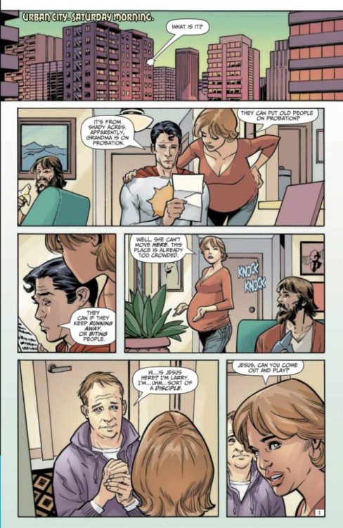
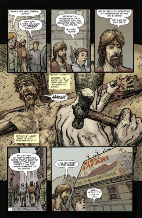
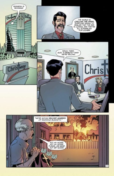
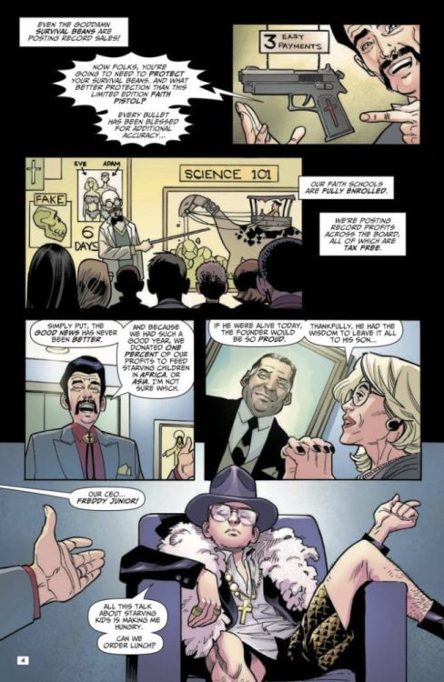
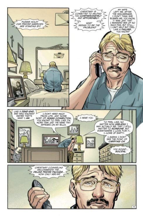
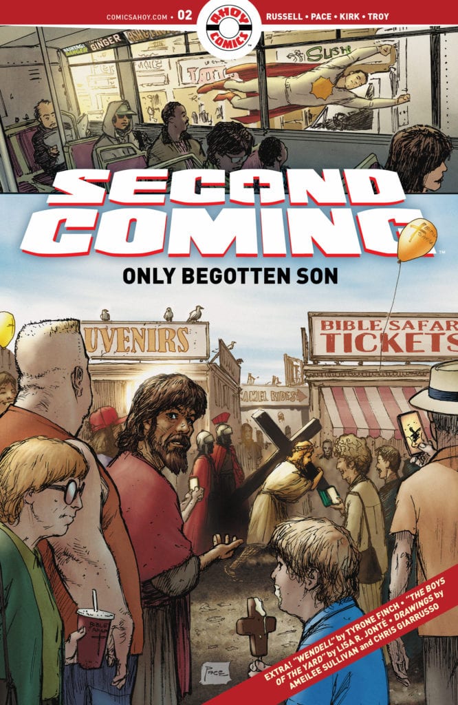
SECOND COMING: ONLY BEGOTTEN SON #2 hits your local comic books shop on February 17, but thanks to Ahoy Comics, Monkeys Fighting Robots has a five-page preview for our readers.
The book is written by Mark Russell, with art by Richard Pace, Leonard Kirk is the finisher on the Sunstar pages, Andy Troy is the colorist on the Sunstar pages, and you will read Rob Steen’s letter work. Pace created the cover.
About the issue: Chaos, weirdness, and corndogs reign when Jesus innocently stumbles into Bible Safari, a profit-squeezing amusement park that trades in his image. Meanwhile, Sunstar gets some disturbing news about his earthly foster-grandmother. Later, Jesus stands to recruit a new disciple—if he can inspire said disciple to keep on living! Also featuring illustrated bonus stories in the AHOY tradition.
Check out the SECOND COMING: ONLY BEGOTTEN SON #2 preview below.
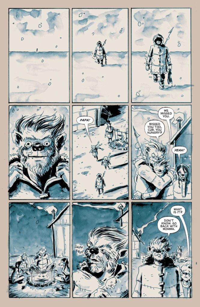
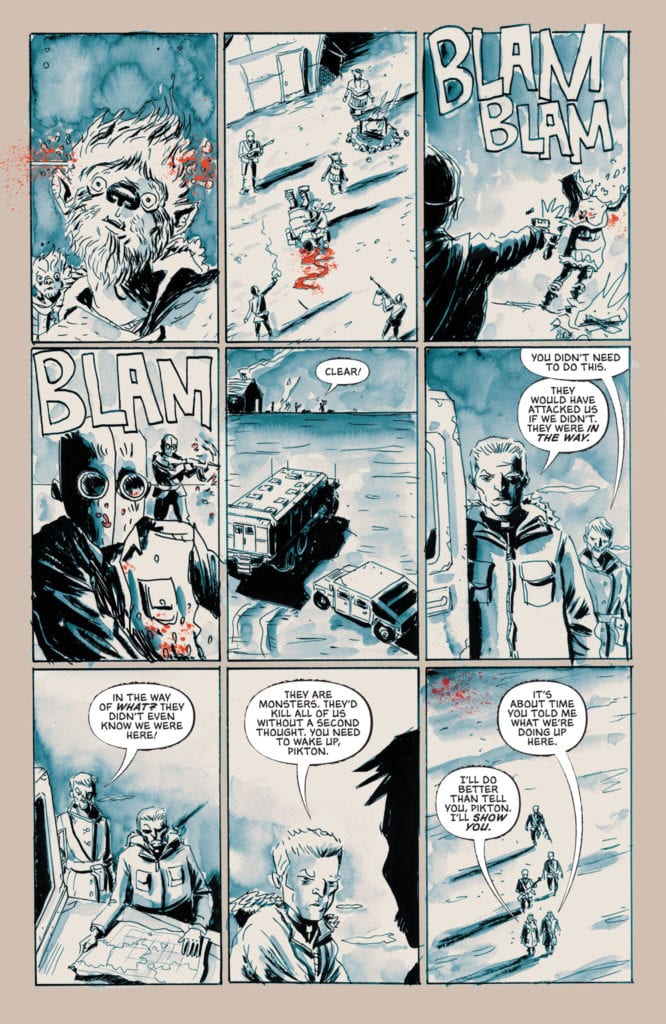
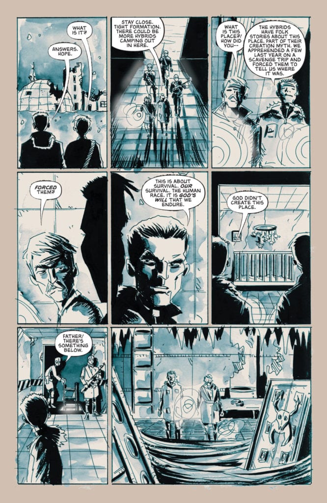
The mysteries behind writer and artist Jeff Lemire and colorist Jose Villarrubia’s sequel-series are revealed in “Sweet Tooth: The Return” #4. This chapter finally irons out all of the secrets and connections between this series and its predecessor, and in a manner that builds the characters in ways that are meaningful. Complete with dirtbag villains and lovable protagonists, this is yet another winner from Lemire’s catalog and is certain to be a treat of an issue for fans of the original comic.
“Rejoice! For at long last the tale of the Boy’s miraculous birth is revealed. A savior born of holiness and science! Truly, such a feat could only be conducted by one as holy as Father. Behold! As the stage is set for the final confrontation between man and the abhorrent hybrid beasts that walk the earth! Praise! For out of nothing Father has birthed a savior: the Boy.”
Writing & Plot
Jeff Lemire’s focus in “Sweet Tooth: The Return” #4 is to catch the audience up on how exactly this story came to be in reference to the original. This is arguably the issue that everyone has been waiting for, the answer to why and how this story exists when the original wrapped up so perfectly. Lemire handles these events through the same flashback lens that the original comic used, though saying anymore would definitely lead to major spoilers. Many characters and events from the first Sweet Tooth series are namedropped here, and this is going to be the issue that gets fans talking about this mini-series. Admittedly, this is a much more dialogue and exposition-heavy issue than most Lemire comics, but it’s all delivered so naturalistically and in such a character-centric manner that it’s never boggy or boring. The main villain in this comic goes from your average a-hole to a prime example of complete human garbage over the course of this issue as we examine what his motivations are. While ‘The Boy” and his friends don’t get much attention this time around, there is enough development around them tied in with this issue’s revelations to keep developing our interest in this trio of kids. This is an comic that satisfies our long-standing curiosity about how this story came to be, as well as leaves us deeply anticipating the next chapter.
Art Direction
Every time a new issue comes out, I have to talk about just how perfectly charming Jeff Lemire’s pencils are. So, once again for “Sweet Tooth: The Return” #4, Lemire crafts this story with his artistic skills just as much as he does through writing. His wiry, rough hewn penciling is offered with a definite attention to character, with simplistic but effective expression animation. His panel direction is relatively straightforward, even with how this comic bounces from past to present. Lemire’s style really sells the uncanniness of the more haunting settings in bone-filled crypts and disturbing laboratories. Despite its outward lack of polish, Lemire’s art always has this sense of care in the visual work that makes his art all the more endearing. Now admittedly, much of what makes the visuals work so well here, and did in the original comic, is the colorwork of Jose Villarrubia. His tone-rich watercolors set the tone perfectly for every scene, ranging from the deep browns and greens of the woods to the dirty ruins of an old lab. Villarrubia also uses a neat kind of faded postcard look for the flashback sequences, and it’s a really neat take on the black and white color scheme. Overall this is once again another perfectly fitting visual experience for the story being told.
“Sweet Tooth: The Return” #4 is the piece of the puzzle we’ve all been waiting for. Jeff Lemire takes us through the events that separate the original series from this one via character-focused flashbacks and familiar plot devices. His visual work is his usual perfectly charming and unpolished style that is aided to perfection by Jose Villarrubia’s colors. This issue makes the wait for the following chapter almost intolerable, so join in on the suffering by picking up this comic when it hits shelves on 2-9!


 A Man Among Ye is first and foremost an alternate history about Anne Bonny and her companion Mary Read. Phillips makes this stand out by making Mary a decade younger than Anne, whereas historically
 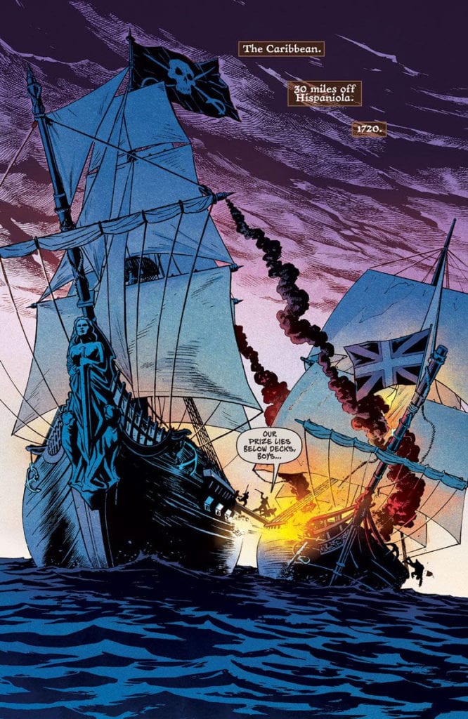 Cermak uses artistic techniques to keep the reader’s attention. Cermak, in all of his pencils and inking, evokes very sensational scenes straight out of a pulp novel. An opening involving a pirate ship and a navy ship in battle certainly makes a strong first impression. Especially when that pirate ship takes up the most space, that shows how powerful a presence the pirates are.
 Power Pack #3 takes Julie/Lightspeed’s perspective, as readers look at the sibling’s family dynamic. Julie often tries to act as the Pack’s voice of reason when they get into their minor quarrels. If anybody has relatives that drive each other crazy, wanting to calm everybody down is relatable. North takes this a step further by showcasing how Lightspeed thinks on her feet in battle against Taskmaster. Thanks to Julie’s experience outside of the Pack, she knows how to goad powerful fighters like Taskmaster, to her and the Pack’s advantage. It’s always good to see heroes work with what they’ve got when they’re at a disadvantage.
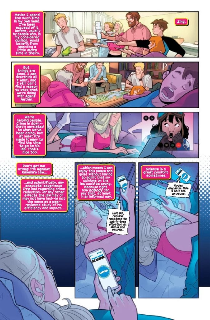 Rosenberg includes a lot of magenta in this issue with its focus on Lightspeed (it’s the color of her costume). Whether it’s the lights, mental images of her girlfriend, or the background, it serves as a way to tell the reader that Julie pulls the most weight in this issue. This extends to the captions from Lanham who uses them in juxtaposition with Lightspeed’s mood. When she’s going in for an attack, she screams out her frustrations. It’s nice to see that while Lightspeed does have experience, she is still young and has quirks that make her more relatable.
 Eternals #2 has Ribic’s art show the angles and dynamic positions of the situation at hand. In Ikaris’ battle against Thanos for example, Thanos’ height and movement demonstrate his control over the situation. Which is incredibly ironic, considering the effects of the Great Machine. It helps Ikaris fight Thanos in many different time periods, through a series of portals. No matter how chaotic and familiar Ikaris is with his world’s resources, Thanos remains an ever-powerful threat to him.
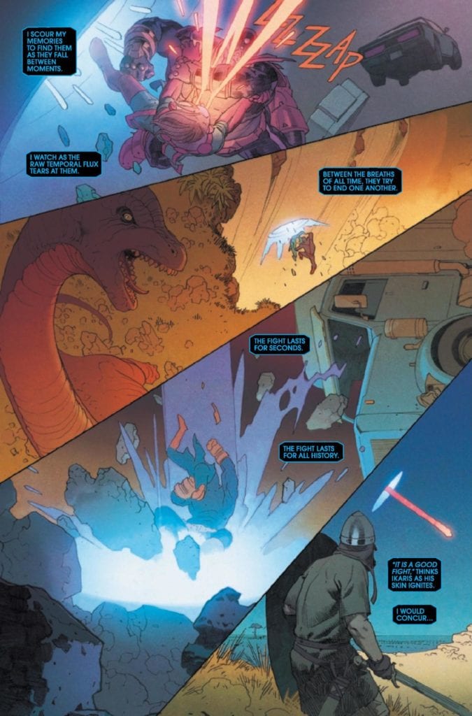


")