Radiant Black #1, out now from Image Comics, is a new superhero for a new generation. It’s the thrilling adventures of the superhero comics you love that isn’t hampered by confusing and complicated continuity.
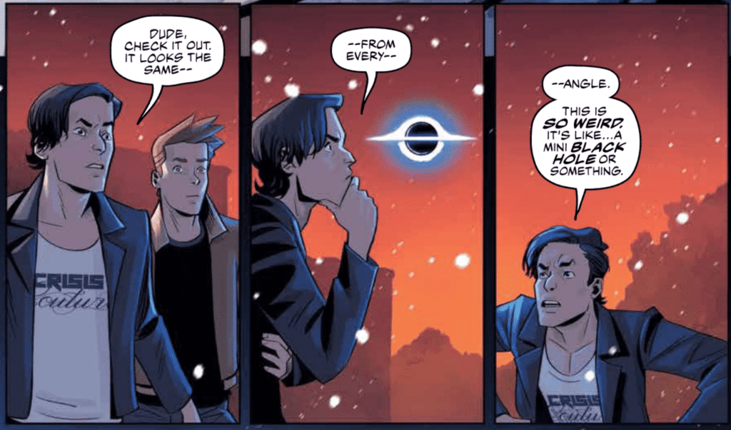
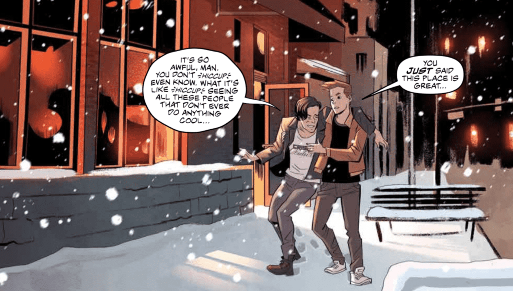
Kyle Higgins creates a deeply relatable character in Radiant Black #1. Nathan Burnett is a man at a low point in this life who lost much of his confidence after having troubles pursuing his dream of being a professional writer. When he stumbles upon an item that gives him superhuman abilities, Nathan has to acclimate to this new way of life, all the while dealing with a fear of failing again. Many have felt a similar way, and Higgins can use these character flaws to establish a connection between the character and the reader immediately. Higgins writes some of the dialogue in Radiant Black #1 so well that they have no trouble touching the reader’s heart. The writing has a strong voice, which helps create genuine emotional moments and sets up the fun, light-hearted superheroics we all know and love.
Radiant Black #1 features the art and colors of Marcelo Costa, which are sure to please. Costa’s semi-realistic art style is perfect for the superhero genre. We don’t see too much action in this first issue, but the series is sure to be full of dynamic fights and glorious visuals from what we do see. The spreads in the issue are enough to take your breath away, and some are framed in a way that shows off the potential of the comics medium.
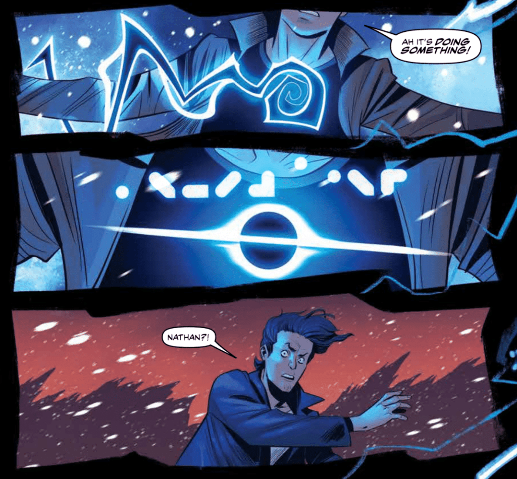
Costa’s colors in Radiant Black #1 are relatively mild at the beginning of the issue. The palette is bland and reflects the monotonous nature of everyday life. When Nathan receives his powers, the palette is flipped on its head and is replaced with vibrant blues and dark backgrounds. Even the colors of the setting that we already saw have changed slightly to show more of the setting sun’s beautiful colors. Everything is more vibrant and full of energy, highlighting the exciting change in Nathan’s life.
Becca Carrey’s lettering allows the story of Radiant Black #1 to flow smoothly and heavily assists the emotional moments of the issue. Carrey uses the technique of a smaller font for dialogue to indicate whispering, which helps inform the reader of how specific lines are said. For instance, the smaller font is used when Nathan admits something he is ashamed of, and the fact he is whispering illustrates his reluctance to do so. Examples like this may seem small but have a significant impact on the reader’s subconscious.
Radiant Black #1 is a series you will want on your pull list. It is new superhero fun with a flawed and relatable main character. Higgins has set exciting events to follow, and Costa’s art is always sure to impress. If you’re a fan of good superhero comics, this is a book for you.
Norse Mythology #5, out now from Dark Horse Comics, tells one of the most heartbreaking Norse myths that is brought to an entirely new level through clever layouts and magnificent art.
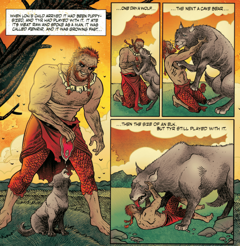
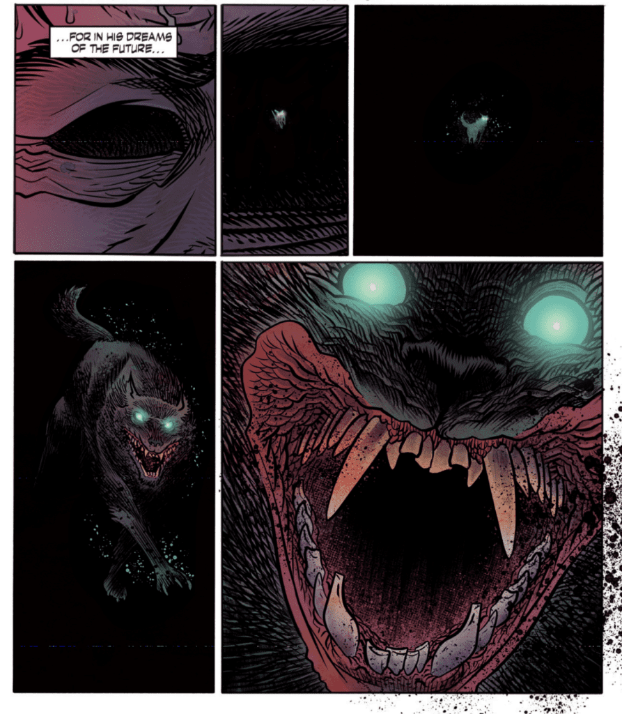
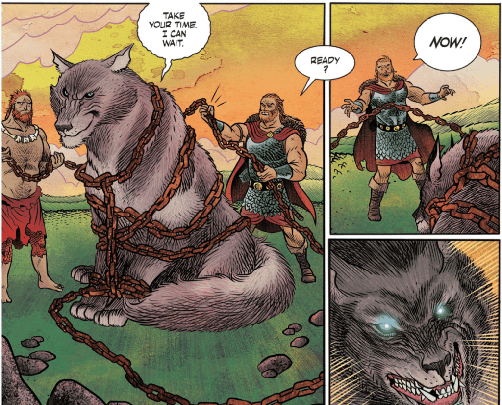
P. Craig Russell’s script and layouts — based upon the stories told in Neil Gaiman’s novel — for Norse Mythology #5 are breathtaking. Russell uses silent panels to build suspense, such as in Odin’s dream about Fenrir, the wolf. There could have been captions and vicious action, but instead, the lack of dialogue or captions gave the dream an eerie and spooky feel that has a more lasting impact on the reader. Russell also uses the technique of breaking up a single motion into multiple panels, which essentially slows the flow of time and adds tension to a scene. The issue features two stories: “Loki’s Children” and the other “Freya’s Unusual Wedding.” All of the story of “Loki’s Children” is contained within the issue, leading to a satisfying beginning, middle, and end. The choice of story is superb, as this Norse tale has heartbreaking emotional beats that keep the reader engaged. “Freya’s Unusual Wedding” is an excellent beginning and not much else. The story is cut off and will be continued in the following issue, but so little of it is contained within Norse Mythology #5 that I see little reason that it is tacked on after the previous story. I understand that it gives readers a cliffhanger that urges them to purchase the next issue. Still, I believe that providing the reader with a self-contained story would better urge the reader to pick up the following issue due to Russell and Gaiman’s incredible writing abilities. “Freya’s Unusual Wedding” seems misplaced in this issue, but this is a minor detail, and the story is a strong start.
The first story of Norse Mythology #5, “Loki’s Children,” featured art and colors from David Rubín, who draws the reader in on every page. There are so many things to say about his work on this issue. His art for Fenrir is incredibly vicious-looking. He possesses an extraordinary ability to create gruesome art, the method of making objects such as the chains Fenrir breaks shoot out past the panel’s border is highly effective at immersing the reader in the moment, and character facial expressions are perfect and make silent panels all the more impactful. There are few negatives things that anyone would be able to say about Rubín’s work.
Jill Thompson’s art and colors in “Freya’s Unusual Wedding” is impeccable. The use of bright colors and her watercolor style cements the idea that the world we are seeing is full of magic. Thompson can also be very intricate with her backgrounds, which makes the fantasy realm more believable.
Galen Showman’s lettering in Norse Mythology #5 helps emotional beats land a harder punch. There are so many exciting choices that Showman makes in the issue, all of which help improve the story. For example, when Fenrir breaks through the chains that bind him, his speech bubble contains a bold, colorful font. This makes clear how powerful the wolf is becoming and makes the moment more shocking. Showman also uses techniques such as no border around narration, extending speech bubbles past panel borders, and a disposition between the style of lettering and the scene behind it. The issue undoubtedly contains some awe-inspiring lettering.
Norse Mythology #5 is an issue that will leave you in awe and have you desperately waiting for the next issue. The storytelling is so enthralling that it’d be hard to put the issue down once you have picked it up. Rubín and Thompson’s art is just astounding, and creates a spectacle on each page, and Showman’s lettering is the final polish that makes the issue an unforgettable read.
After the big reveals and twists in the previous episode, “All-New Halloween Spooktacular” gives more information that could have big implications for the MCU.
Wanda’s brother, Pietro has returned from the dead and now lives as the cool uncle figure to her kids. When the Maximoffs go out trick-and-treating, Vision uses the opportunity to explore the outskirts of Westview. On the outside of Westview, the director of S.W.O.R.D. sidelines Monica, Jimmy, and Darcy, leading them to believe he knows more than he lets on.
This episode sees the world of Westview more on to the late ‘90s/early 2000s, a period I am much more familiar with. The sitcom world now looked like it was shot using a single camera format, Tommy broke the fourth wall like he was Malcolm from Malcolm in the Middle, and the commercial had a Claymation surfing shark.
The twist at the end of “On a Very Special Episode” was the return of Pietro and now being played by Evan Peters, the actor from the Fox X-Men movies. The fandom has questioned what this means for the MCU. It could be that Marvel Studios are going to introduce the Fox X-Men cast via the multiverse or was this Pietro just an illusion. Even Wanda was suspicious because her brother died and now has a different appearance. She tries questioning Pietro about their past, but he knew the answers and he even asked some questions like how Wanda was able to create Westview and the ethical issues about mind control. Pietro referred to himself as kick-ass which was a fun reference to the 2010 film since Aaron Taylor-Johnson played the title character and Evan Peters had a supporting role. In this episode, Vision goes investigating whilst Wanda was distracted. He started off acting like Superman flying in the air before he explores the edges of Westview. His discovery was incredibly eerie because people acted like they were NPCs in a video game. They were performing tasks in a loop. One was a woman who was hanging the laundry and crying a tear due to having no control of her body. In the series, Agnes was the wildcard because she knew more than she lets on and I personally theorized she was a sleeper agent of some sort. That theory has been blown out the water because of her interactions with Vision in the episode.
One of the major influences on WandaVision was the “House of M” storyline. In that storyline Wanda created a perfect world for mutants but when her illusion broke most mutants in the comics were depowered. There has been speculation that WandVision is going to do a reserve House of M and Wanda accidentally creates mutants. This episode has provided evidence of that because Darcy revealed that Monica’s DNA has changed after going through the Hex. There are two possible outcomes, that either the people in Westview are going to become mutants, or this change is simply going to allow Monica to have space adventures with Captain Marvel in Captain Marvel 2.
WandaVision has shown the director of S.W.O.R.D., Tyler Hayward (Josh Stamberg), to be a dubious figure. He has undermined the main trio we follow within S.W.O.R.D. and in “All-New Halloween Spooktacular” the trio discovered what he really knows: that he had been monitoring Vision’s movements within Westview and hid Monica’s blood test results from her. Hayward’s actions reminded me of Nick Fury in The Avengers, especially when Tony Stark and Steve Rogers discovered S.H.I.E.L.D. were trying to turn the Tesseract into weapons. Hayward was a lot more weaselly than Fury ever was.
“All-New Halloween Spooktacular” was a solid piece of television, but it doesn’t quite match the excellent work of “We Interrupt This Program” and “On a Very Special Episode.” “All-New Halloween Spooktacular” had a great atmosphere and added more some intrigue to the proceedings.
How To Study Comics and Graphic Novels, Image Credit: Oxford Comics Network
I think it is a safe bet to make that the majority of people who read comics do so for the entertainment factor. A small group, however, have an interest in studying the form, whether that’s professionally or purely as a hobby. Comics Studies still have to find a comfortable home in academia, but that hasn’t stopped it from growing as a field of study. These days, you can fill a shelf with books about comics history, meaning, form and reason. Year after year, the use of comics at every level of education is growing, and last week the Oxford Comics Network released an open access comic book about this very subject.
The book, How to Study Comics & Graphic Novels: A Graphic Introduction to Comics Studies, is published by TORCH, The Oxford Research Centre in the Humanities, and is available to read for free on the Issuu website (click here).
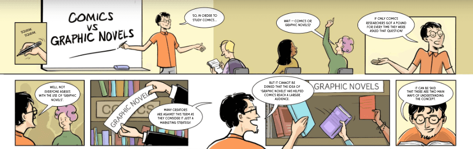
It was created by several lecturers from different fields of study, all of whom use comics in their educational courses. The creators’ work is presented in the form of a standard comic book that most people will instantly recognize. Unlike more challenging pieces of work, like Nick Sousanis’ Unflattening (2015), that use the comics form in imaginative and often complex ways to discuss an academic theory, How to Study Comics is fairly straightforward with an emphasis on ‘easy to read’. In this respect, it owes a lot to Scott McCloud’s Understanding Comics, a work that is cited in this new book. The shape that the ‘narrative’ takes is educational and gives the impression that the reader is being led through a seminar on the subject of Comic Books and Graphic Novels. This easy, hand-holding approach suits the book that these writers have produced which is an introduction to comics and the potential of the medium for study.
How To Study Comics and Graphic Novels, Image Credit: Oxford Comics Network
Text and Study
After an initial introduction, the writer’s avatars, drawn by Josean Morlesin Mellado, lead the reader through a series of short chapters in an attempt to capture the breadth of study that is available. The book is aimed at University students, according to the Oxford Comics Network twitter feed, who may have no previous experience with the medium. This is obvious from the layout and subjects that the book covers. The simplistic style will be a massive bonus for the uninitiated but perhaps is a little too simplistic for people experienced with comics or who have read the likes of Thierry Groensteen and Hillary Chute. Even devoted fans of mainstream comics who have no interest in formal studies will find some of the book oversimplified, but that is unavoidable with an introductory title like this.
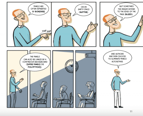
The topics on offer range from the language of comics to the production and on through to traditions of the medium. Some of the elements are quickly skirted over and if you blink you’ll miss them. But, again, this comes from attempting to fit such a varied subject into a 44 page book. Enrique del Rey Cabero, Michael Goodrum, and Josean Morlesin Mellado aim to open the readers’ eyes to the variety of disciplines involved with Comics Studies. The speed at which everything is covered stands as a testament to the complexities of the subject. To include everything would require a dense tome that would instantly put people off. How to Study Comics is a toe dip into the ocean of the subject; something which the preface makes clear.
How To Study Comics and Graphic Novels, Image Credit: Oxford Comics Network
Drawing the Subject
Mellado’s artwork is worthy of mention for a number of reasons. His reductive style, but attention to comic convention, really electrifies the argument put forward by the writers. With limited space, difficult explanations are presented in quick, easy to grasp visuals. Even though it’s presenting complex forms relating to comics and their history. The artwork is inspired by a range of material from British children’s anthologies to the seminal work of Chris Ware. Mellado’s art instantly attracts the reader with it’s soft edges, warm colors, and friendly shapes. From the opening page to the final panel, How to Study Comics is a safe and welcoming space.
While a greater experimentation around the artwork may help to represent the wider subject matter, in a production like this it would more likely confuse the argument. Brief attempts are made by Mellado to incorporate different, historical styles but the general aesthetic remains the same. This is similar in nature to IDW Publishing’s recent publication, The Comic Book History of Animation, where subtle nods to the original styles of animation are made but do not saturate the narrative.
The artwork in How to Study Comics is very clear and precise. The addition of color makes it appealing but actually challenges the tradition of black and white images for educational works. Some readers may find the style of this book off-putting and a distraction from the textual, educational element. However, the visual challenge the book sets reflects the greater inherent conflict within Comics Studies and arguments of acceptance. What is a comic and what makes it worthy of study? These questions lie at the heart of the subject and are raised, albeit subconsciously, through the visualization of the narrative.
How To Study Comics and Graphic Novels, Image Credit: Oxford Comics Network
Conclusion
How to Study Comics & Graphic Novels: A Graphic Introduction to Comics Studies is a fascinating, simple look at the growing field of Comics Studies. I would highly recommend it to anyone interested in getting into the subject as it offers a rounded, quick guide to the potential fields of study. It is also worth reading if you are already a comic reader, as it may highlight an aspect of the subject that you had not thought of before.
While it does not have any in-depth discussions around any of the disciplines it features, the book does draw your attention and provide a handy ‘further reading’ list so that you can begin your own journey. It also includes an interview with Nick Souranis, regarding his work and processes. This addition gives the book something extra for those already familiar with Comics Studies and is definitely worth reading.
The presentation and simplification of the text is this book’s major selling point and this dictates the readership it is aimed at. It is an enjoyable read and will appeal to a large group of people. I found the pace of the book too fast, with large areas of study seemingly passed over in the gutters or, if they were lucky, in a single panel. It’s unfortunate but it’s to be expected from a book like this. Greater representation of cultures and readers could have been included. But if there is one thing that this book makes clear, it is that, with 44 pages, you can only scratch at the surface of the Comics Studies field
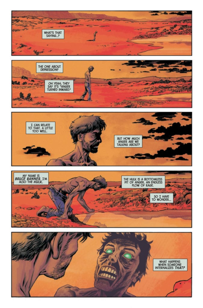
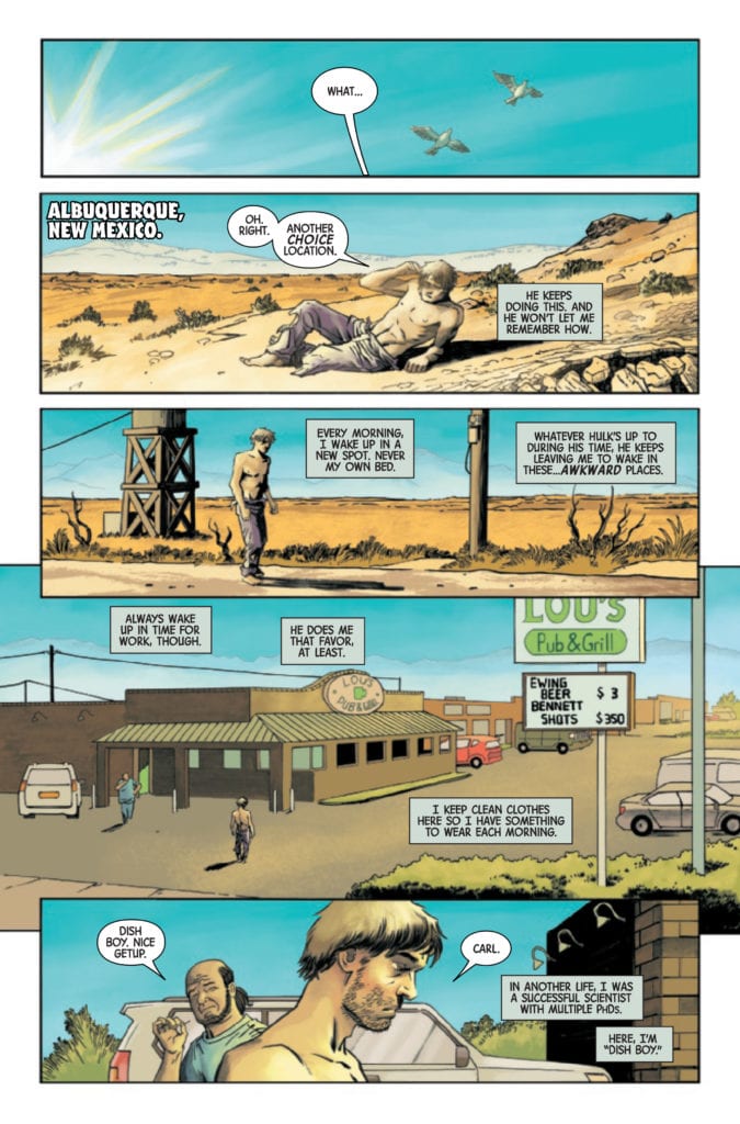
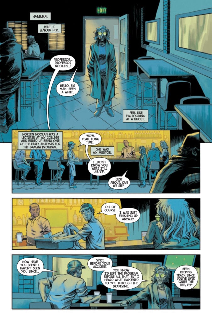
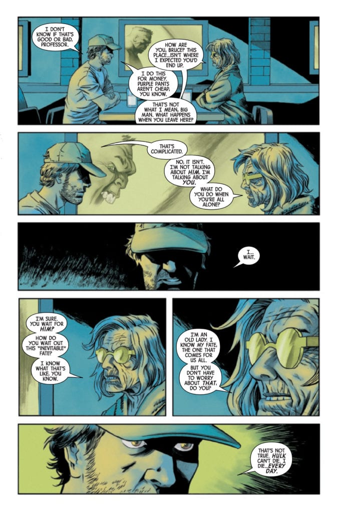
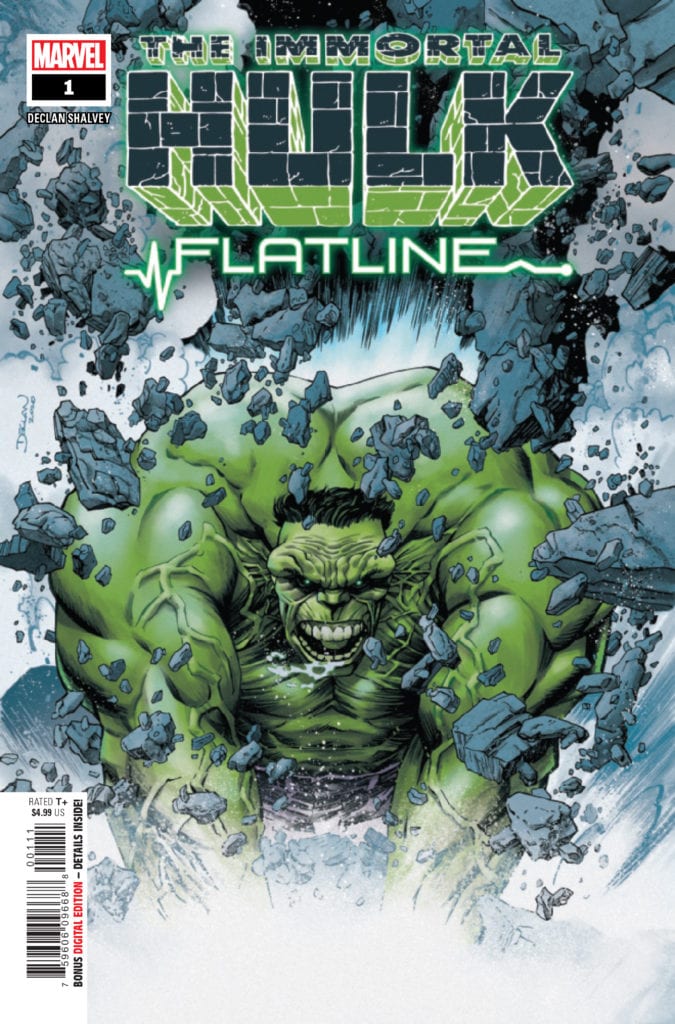
IMMORTAL HULK: FLATLINE #1 hits your local comic book store February 17th, but thanks to Marvel Comics, Monkeys Fighting Robots has an exclusive five-page preview for you.
About the issue: Declan Shalvey writes and draws an IMMORTAL HULK tale that gets to the heart of gamma! Every morning, Bruce Banner wakes up in a new place. The Hulk is trying to tell him something – but Bruce has had enough of his green-veined alters. When a new gamma-powered villain shows up in a small New Mexico town, Bruce is forced to confront the source of his anger… and it’s not what you expect. Don’t miss an extraordinary tale from one of the industry’s top talents!
As stated in the solicit text, IMMORTAL HULK: FLATLINE #1 is by writer/artist Declan Shalvey. It’s the latest in a series of IMMORTAL HULK one-shots that act as supplements to the main series. Previous one-shots include IMMORTAL HULK: GREAT POWER by Tom Taylor and Jorge Molina and IMMORTAL HULK: THE THRESHING PLACE by Jeff Lemire and Mike Del Mundo.
Check out the IMMORTAL HULK: FLATLINE #1 preview below:
What’s been your favorite IMMORTAL HULK one-shot so far? Sound off in the comments!
LostSoldiers is a 5-issue mini-series written by Ales Kot and drawn by Luca Casalanguida, with colors from Heather Moore. It’s published by Indie comics heavyweight Image Comics, and it may very well be the most crushing series they’ve ever had across their table. Lost Soldiers is a devastating yet poetic examination of how war affects the people who fight it both on the field – and especially years after the bullets have stopped. With a haunting script from Kot and surreal, graphic visuals from Casalanguida and Moore, this is one of the best war comics ever published.
“Vietnam, 1969. Juarez, 2009. Three men tied together by the war they left behind—on a collision course with the new one. As old grievances resurface close to the border, the bodies pile up. Can the men escape the cycles of violence, or will they be swallowed by them again, this time forever?”
Writing & Plot
The bulk of Ales Kot’s narrative in the five issues of Lost Soldiers takes place not in the heads of its scarred protagonists, but in the grim poetic machination of the voice of war. At least, that’s what we imagine it is. Both the disembodied narration from this unknown malevolent force and the actions of our main protagonist stalk the pages with a desperate, cloying hunger. The story’s switching focus between 1969 Vietnam and 2009 Juarez is held together not only by the haunting experiences of the two lead characters, but by this malevolent voice that slithers its way into many-a panel in this series. This series focuses less on combat then it does the inner turmoil of our unnamed protagonist. Not giving him a name is a symbolic choice here. This character obviously goes through his own intense traumas during his time in Vietnam – not going to get into spoilers, but more intense than even most accounts of warfare would likely bring about. He lives an existence afterward that many soldiers would likely have. This is the point. Despite this character’s experiences being very much his own, Kot decides to make him a symbol for the effects of war and unimaginable shock and what they do to the mind. More than this, Kot’s story is an examination of three different men’s response to extreme PTSD. One man has done all they can in terms of therapeutic resources to resume a semblance of a normal life. One has taken their hardened stoicism that they had 40 years prior and doubles down on it for the wars of today. The last – our nameless protagonist – never left the jungle. Saying any more would be giving up the goods.
Art Direction
The relentless, sullen tone of Lost Soldiers is brought to life by the combined efforts of Luca Casalanguida’s pencils and Heather Moore’s colors. Their work on this comic series sees its settings transform from the humid jungles of Vietman to the sandy streets of Juarez, but painting them in an almost surreal, otherworldly light. The visual effects brought out in this series make this comic feel like equal parts Full Metal Jacket and Apocalypse Now. Sequences of feasible reality will twist and morph into impossible, nonsensical imagery rife with rays of color shooting through the panels. The eyes of men with thousand yard stares color this comic in a way that makes us see the world through their eyes. The wear and tear is visible in the creases in the faces of the three men this comic centers on, and just getting looks at them put us as readers in their mindset without ever even having to go to the battlefield sequences. There is a masterful command of character art in terms of detail, shadow, and color in this comic that is rarely seen by even the industry’s best talents. This comic is so striking visually during just the quiet scenes of conversation or reflection that when the action hits it has the intended effect of being brutally shocking. The combat sequences are full of their own detached color scheme, like reality is fading before the eyes of the soldiers fighting. This uncanny atmosphere is permeated by the sight of tracer rounds and oh, so much blood. There are the standard shots of dead men that one would expect in a war story, but there’s an added cerebral horror to the carnage by Moore’s colors and Casalanguida’s choices with both gore and character reactions. There’s a disturbing sense of realization that Casalanguida brings to the faces of injured and dying men that is unnervingly haunting. This is a searing and vivid visual experience of a book, and potentially the most effectively drawn war comic I’ve ever read.
Lost Soldiers is more than a war comic. It is a treatise on people who never truly come home from war, and will live the rest of their lives on a battlefield. This is a book about three men who have found war, and have found way to satiate its appetite – but can and will never leave its call. Writer Ales Kot and artists Heather Moore and Luca Casalanguida have created an unforgettable and haunting experience that may be one of the most essential comic reads of the past several years. Be sure to grab this complete collection when it arrives on shelves on 2-10.
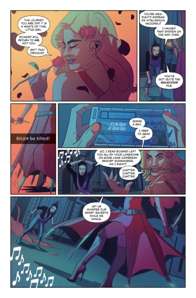
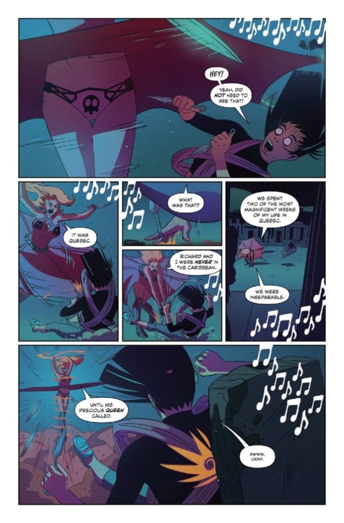
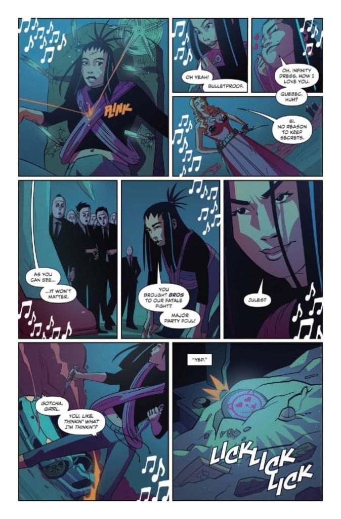
The talented team over at 12-Gauge Comics, responsible for badass works such as The Ride: Burning Desire and the acclaimed Kill Whitey Donovan, are back with another insane ride of a series via Kickstarter. And as usual, not only have I got a bit of a first look at what this story is all about, I’ve got the jams – chosen by the creator – to go along with the read.
“Bloodsoaked katanas, sentient Lamborghinis, and a soundtrack that can level city blocks. Yumi—the world’s greatest hacker, demolitions expert, and parkour savant—embarks on a globe-trotting mission of vengeance as she tracks down her kidnapped boyfriend, super spy Richard. The 136-page graphic novel Yumi: Spy Fatale, Baddie Royale arrives from the feverish minds of writer Doug Wagner (Plastic, The Ride, Thomas River), artist Hoyt Silva (Last Stop, Mongrel), colorist Kevin Lennertz, letterer Frank Cvetovic, designer Sasha Head, editor Lisako Yamauchi, and publisher 12-Gauge Comics. Trailblazing a path of pulp spook fiction for a new generation, Yumi is a rush of pop culture adoration and hyper-kinetic brawls that resculpt the genre.”
YUMI JAMS
“You Should See Me in a Crown”
Billie Eilish
DOUG: I pulled up this song completely by accident and immediately fell in love with it. There’s this deadly creepiness to it that’s paired with this odd self-aware love that just spoke to me. Plus, I thought the title worked perfectly for invading MI-6.
HOYT: As soon as I heard the chorus drop, I knew this was a vibe for Yumi. It has this whole focused intensity and insane determination sound to it that’s a cornerstone to Yumi’s character.
“Problem”
Natalia Kills
DOUG: How could I pass on the perfect song title and artist’s name for a book like Yumi. That alone would have gotten it into the book, but after I listened to it, I knew it had to be the soundtrack for the first fatale duel on Lover’s Bridge.
HOYT: I think this one so perfectly sets the tone for Yumi’s attitude. That take-no-prisoners-but-have-fun-while-you’re-doing-it energy is what I wanted to get across with every panel I could.
“Kill V. Maim”
Grimes
DOUG: To this day, I’m enamored with this video. It’s like a mix of Tank Girl, The Road Warrior, and The Fifth Element. It’s the exact kind of thing Yumi would find irresistible.
HOYT: The way this track stirs a variety of flavors together speaks to my favorite aspects of Yumi’s sassy and sour; love-you-while-kicking-you-in-the-face personality.
“It’s On Again”
Alicia Keys (featuring Kendrick Lamar)
DOUG: To be completely transparent, I find Alicia Keys to be one of the most interesting human beings on the planet. She’s this amazing mix of genius intelligence and empathic understanding. It’s so rare to see both in the same person. Yumi’s first adventure wouldn’t be complete without Alicia in it.
HOYT: Hard to recall a track by Alicia Keys that doesn’t make your hair stand on end. Talk about a song that will get you back on your feet and back at it again.
“One Woman Army”
Porcelain Black
DOUG: Attitude for days. That’s what drew me in. The song is about being sexy, independent, and a total badass. That speaks to what I wanted to create in Yumi.
HOYT: If this track didn’t nail the right attitude, the title certainly did. Not to mention the pretty/tough balance we were going for throughout the book, this one had it all.
“Look What You Made Me Do”
Taylor Swift
DOUG: Has there ever been a better song title for a finale than this one? The song is the epitome of Yumi’s transformation from who she was to who she becomes.
HOYT: Yeah, I have to agree with Doug here. Taylor captures where we take Yumi from beginning to end, and the vibe is just *chef’s kiss.*
“Kill This Love”
BLACKPINK
DOUG: Sadly, I wasn’t aware of BLACKPINK until Hoyt sent this one to me. I’ve been obsessed with them since I pressed play.
HOYT: Our editor Lisako actually put me onto BLACKPINK and I was instantly hooked. Their entire catalogue was in heavy rotation while I worked on pages.
“Truth Hurts”
Lizzo
DOUG: For this book, I had to spend a lot of time searching for the right music to put on Yumi’s playlist. I happened on Lizzo one night and immediately fell in love. Then I found this song and knew it was the right song to close out the book.
HOYT: While Doug was figuring out the music, he had me throw together a list of what I was listening to without seeing what he was considering, and this was a track that we both put up at the top, so you know it had to stay, and what a perfect fit it had at the end of the story.
THE SONGS THAT INSPIRED IT ALL
“Wrecking Ball”
Miley Cyrus
DOUG: Although this song didn’t make it into the book, it was the first song I started listening to in hopes of channeling the right tone for the book. As with all the female artists on this list, I admire and adore Miley’s unapologetic inner strength, massive success, and independent mindset.
HOYT: Originally we were considering this for the opening scene and I think it would’ve worked great because that’s exactly how Yumi shows up, like a wrecking ball. Ultimately what we went with worked tighter with the scene and the tone we wanted to set, but it’s a classic nonetheless.
“Bad Blood”
Taylor Swift (featuring Kendrick Lamar)
DOUG: I loved this song the second I heard it. The lyrics and music fit what I was hoping to achieve with Yumi from the outset. Then… I watched the video. It encapsulates the tone, sassiness, and carefree spirit I wanted for Yumi. I watched it almost every day just before I started working on the book.
HOYT: Yeah, when this one dropped we were mid stride in the book and I called Doug the second I saw the video. It’s like they pulled the vibes for Yumi right out of our heads and I loved every second of it.
“Mine”
Phoebe Ryan
HOYT: What we ended up coming up with is a story about picking up and moving on when things aren’t right. Taking those pieces and embracing your faults is a part of growing as a person, and Phoebe hits that in stride with this one.
DOUG: Am I supposed to add something to that?
HOYT’S PERSONAL LIST HE USED WHILE DRAWING
“I Do”
Cardi B (Featuring SZA)
HOYT: You know who pulls no punches? These two women right here. This joint hits right where I think Yumi would; the neck.
“thank u, next”
Ariana Grande
HOYT: We’re a culmination of our past experiences and relationships. This one here really encapsulates that and is very much the journey this book takes.
“Lovesick Girls”
BLACKPINK
HOYT: If there was ever a general theme for the whole story, it’s in this song right here. I think it hits all the right notes and who doesn’t need more BLACKPINK in their playlist?
DOUG’S PERSONAL LIST HE USED WHILE WRITING
“Gone”
Charli XCX & Christine and the Queens
DOUG: This was one of my two go-to songs for writing the insanely absurd fight scenes Hoyt and I did for the book.
HOYT: Now I see why every scene had a great build up. It’s unapologetic heart definitely checks all the boxes for Yumi’s strong personality.
“Level Up”
Ciara
DOUG: And this was the second of my two go-to songs for unleashing Yumi on the world.
HOYT: This one so rightfully captures those victory vibes that it had to be on the list.
“Yumi pays homage and respect to the massive contribution Ian Fleming gifted the literary world, while bringing a modern flair to the genre,” Wagner explains. “Yumi may sound like a spy story, but it embraces so much more. Yumi is about how love can inspire a person to become more than they believed of themselves. It’s ridiculous and over the top. It’s a story of unconditional, all-consuming love filtered into an action blockbuster—Scott Pilgrim meets Kingsman, all wrapped in a sassy, heartwarming pancake.”
“So many explosions. So many countries. So many battle sequences. Yumi: Spy Fatale, Baddie Royale is one of the most adrenaline-fueled projects of my career—Doug’s script crackles with momentum,” Silva explains. “It was an amazing challenge to match that sheer energy.”
The graphic novel is available in three softcovers editions with covers from Lois van Baarl, Eliza Ivanova, and Chris Brunner. Two limited edition hardcover editions feature art from Eliza Ivanova and Lois Van Baarl. The project is available on Kickstarter now until March 11, 2021.
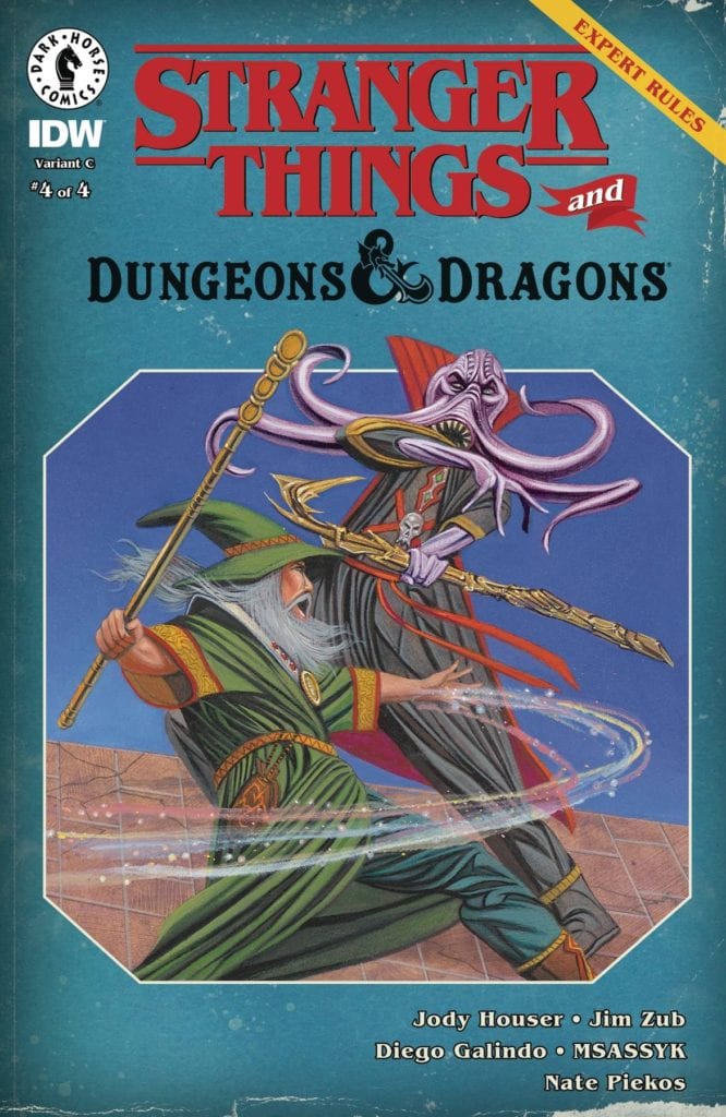
A mighty battle awaits in Stranger Things and Dungeons & Dragons #4.
STRANGER THINGS AND DUNGEON & DRAGONS #4, available February 17th from Dark Horse Comics, concludes this crossover event, as one young crew of players bring their latest campaign to an end.
A mighty battle awaits in Stranger Things and Dungeons & Dragons #4.
Stranger Things and Dungeons & Dragons #4 may wrap up this miniseries, but we all know that the story of Stranger Things isn’t quite over yet. Who knows, they might even make time for another game or two, in between saving the world.
This series started out telling us the story of three friends who found a world to escape into. Through it, they gained a fourth friend, as well as a way to cope with everything the world threw at them. Even literal monsters.
Now, the group has grown, as this issue is so happy to point out. They still have a passion for D&D, though it has changed over the past few months. Really, that feels like the true focus for this final issue.
A familiar look for this variant cover of Stranger Things and Dungeons & Dragons #4.
The Writing
Written by Jody Houser, Jim Zub, Stranger Things and Dungeons & Dragons #4 perfectly wraps up this plot arc. It’s surprising to see how much time has passed over the course of these four issues. It all started before the Netflix show kicked off, and quickly gets up to date with the main storyline.
Yet it never felt rushed. Each issue was a short story, a vignette, providing a new perspective in everything they’ve gone through in recent times. What makes this issue so compelling is how much subtext got written into Will’s campaign.
It feels like the elephant in the room is finally being addressed, and that it bittersweet. Yeah, we know that the series isn’t over, and obviously we have to assume that the gang will all get back together somehow. But that doesn’t dampen the impact of this story.
There are a few surprises as well, which help to keep this issue from getting too dark at times, and the ending itself does carry with it a sweet note. If anything, this whole series might help those fans that can’t wait for season four to drop.
The Art
Stranger Things and Dungeons & Dragons #4 is full of bold artwork, most of which should feel familiar to the fans. Told in two forms, there’s the world set in Hawkins, and then there’s a fantasy world: the world of D&D.
Both work together pretty nicely, all things considered. Diego Galindo is the artist who merged the two together, portraying familiar faces on the pages, while also dreaming up what sort of characters the newcomers would enjoy playing.
Meanwhile, Msassyk’s colors provide a sense of time and grounding. There’s no doubting what time period this series is set in – even if the details are on the subtle side of things. The colors also help to make the transition between the two worlds easy to spot.
Nate Piekos did a fantastic job of balancing the narrative. This issue has a lot going on in it, in terms of communication. There’s narration, Will’s campaign, and even just the conversations had between each character. Yet Piekos’ work help to keep it all clear.
Conclusion
Stranger Things and Dungeons & Dragons #4 is the conclusion that this series deserved. It wrapped up everything neatly, but more importantly, it held true to the tone of the main series. It brought all of that full circle while providing just a touch of insight to everything that had gone on.
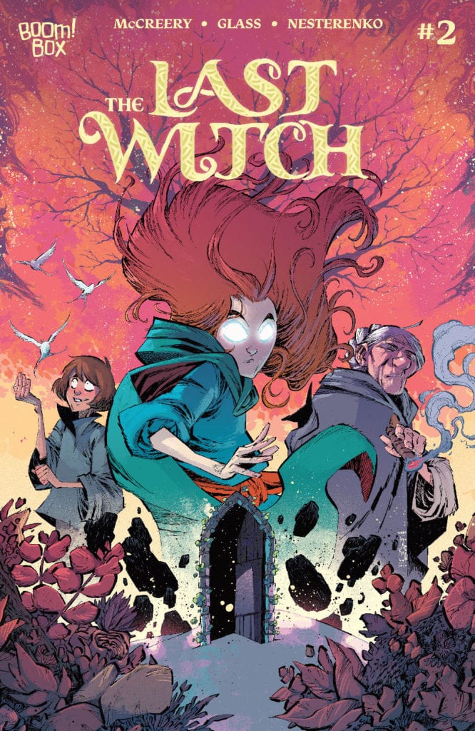
THE LAST WITCH #2, available now from BOOM! Studios, continues the tale of little Saoirse and the dangerous adventure she and her brother have found themselves embroiled in. This is a tale of legends, witches, and an everlasting hunger.
It’s time to learn the truth in The Last Witch #2.
The first issue of The Last Witch quickly introduced fans to Saoirse and her family, as well as the danger they all faced. It also hinted at several other major revelations for down the road. All in all, it made for a strong and compelling start.
So it is safe to say that The Last Witch #2 was an anticipated issue, at least for this reviewer. I’m not ashamed to say that I’m invested in what happens next, especially after the way the last issue left off!
This series promises to blend fairy tale tropes of witches and a coming of age story into something new and interesting. There are plenty of familiar notes to be found along the way, but I have no doubt that there will be twice as many surprises.
We all know that this isn’t going to end well.
The Writing
The Last Witch #2 is yet another issue that immediately pulls the reader into the story. The stakes at hand make it all but impossible to look away from it, as Saorise follows a path that many of us would turn from.
Written by Conor McCreery, this issue truly feels like it belongs in another world. A world where magic exists, and it is not the friendly sort of magic one happily dreams about. The first half of the issue builds on that creeping sense of dread the series left off on.
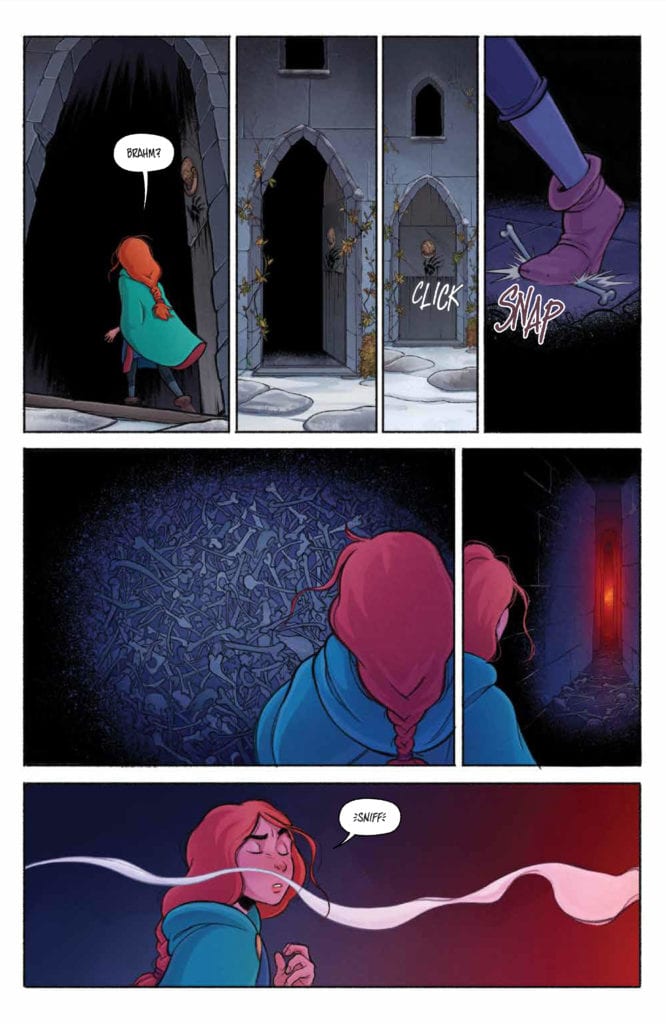
Though it isn’t afraid to throw in some true horror as well, albeit in surprisingly delicate ways. From there the story seems to take up a life of its own, delivering on some of the hints and promises made.
One of the highlights from The Last Witch is the way in which relationships are captured. Saoirse and her grandmother are a solid example. There’s a clear sense of faith and trust there. Though ironically it’s the little moments between Saoirse and her brother that steal the show, grounding the world in a way little else could.
Well, she found her little brother…and the witch.
The Art
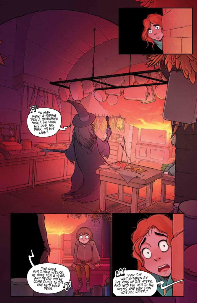
The Last Witch #2 at times feels like a cross between a classic fairytale, and something right out of Studio Ghibli. There’s so much personality infused into each and every panel, and the overall aesthetic is stunning.
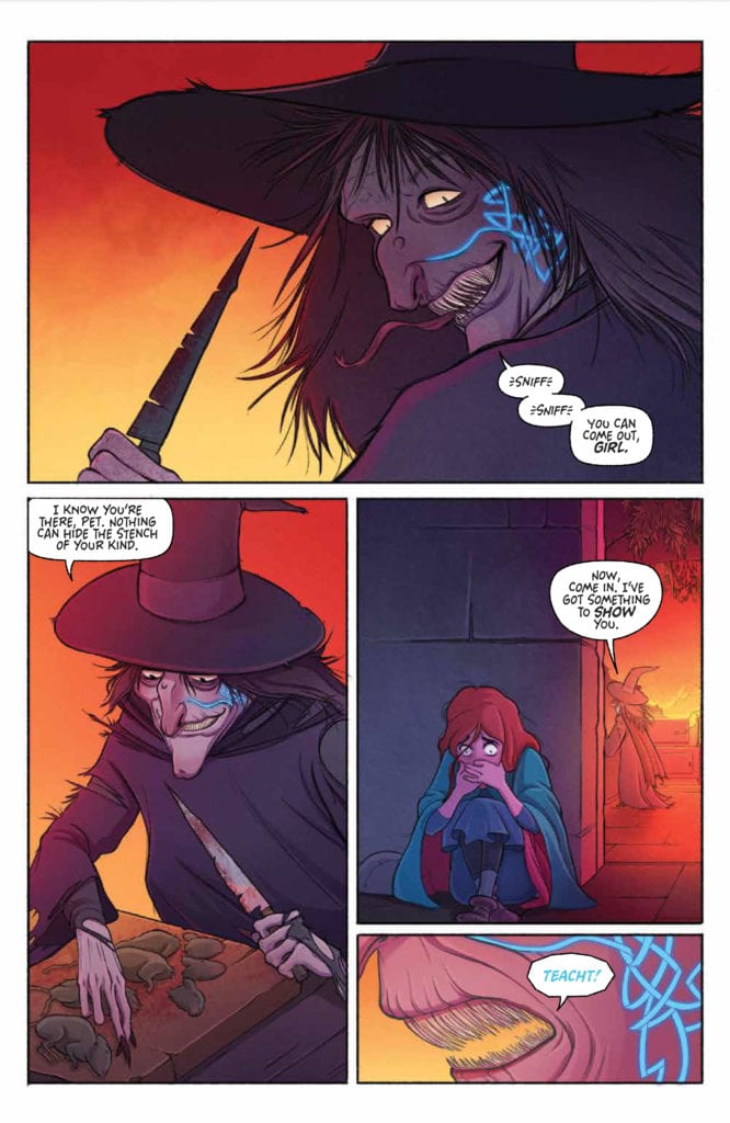
V.V. Glass’s characters really do demand attention, from Saoirse herself to the witches shown – both in true form and in silhouette. They’re chilling and terrifying at the same time, without crossing that line into being too much. In short, they’re the perfect villains for this world.
The colors, provided by Natalia Nesterenko, are vibrant and deep, adding weight to this tale of little girls and witches. The snow makes for a sharp contrast against it all, with the end result being something both memorably and beautiful.
Jim Campbell deserves some of the credit for how human the characters in this tale appear. Well, how human Saoirse and her brother feel. Their interactions flow so organically, helped along by a little detail or lettering here and there.
Well, that’s an image that will never go away.
Conclusion
The Last Witch #2 held up to the expectations created by the first issue. Actually, it arguably might have surpassed them. This is turning out to be a thrilling tale, one of magic, revenge, and familial responsibilities. I for one cannot wait to see how it unfolds from here.
Children of the Grave #2 releases February 10 from Scout Comics. This issue is written by Sam Romesburg and Ben Roberts with art by illustrator Gioele Filippo, colorist Marco Lesko and letterer Justin Birch. Within this part of a sci-fi horror thriller, conflict rears its ugly head. Because, in times when the paranoid are being punished, finding someone to trust can be nerve wracking.
Background
Children of the Grave is about a post-apocalyptic Earth now known as Terra. People are blissfully ignorant of the world around them, choosing to blindly follow the Providers who give them everything they need to survive and thrive. All except Daniel, who finds the life on Terra both boring if not outright dominating.
Children of the Grave #2: Cult Behaviors
What makes Children of the Grave #2 stand out is how Romesburg and Roberts implement perspective. The lead character, Daniel, is by all accounts a conspiracy theorist. No matter how right he is about a situation, he’s unhappy with his life. It certainly doesn’t help that the decisions he has to make don’t seem to be leading to anything good.
The priest, Brother Cruise, who serves as ambassador of the Providers, is anything but nurturing. He’s more than willing to harm and imprison others who go against him. The way Cruise makes it all sound like Daniel is a public enemy only furthers the cult-like connections.
Then there’s Daniel’s potential new ally, “The Mother,” who asks Daniel to meet her alone. She seems to be wanting to alienate him. Abusers use alienation from loved ones to maintain their power. So, she may not be trustworthy. It’s a nice surprise, then, when Daniel brings a friend along and she doesn’t scold him. Not that it makes the revelations she’s about to provide any easier to digest. Truths can be more of a burden than a blessing.
It’s certainly good that a series takes strides to make readers feel things like this. This way readers keep interest for much longer.
Uneasy Perspectives
The artwork by Filippio provides this ever present sense of unease in Children of the Graves #2. In certain panels, the architecture looks distorted, making the reader empathize with the ever vigilant Daniel even more. The scenes with Mother holding a rifle as Daniel and Cyrus go to meet her also feels ominous. Daniel had, in all respects, disobeyed Mother and it looks like she was ready to punish him for it.
The semi-muted coloring from Lesko certainly helps bring a sense of melancholy, especially in the darkened areas Daniel hides in. Things might look all nice and dandy in the town, especially to the citizens. But to Daniel, it’s all just a reminder of Cruise hiding something important.
The lettering by Birch gives even more weight to Children of the Graves #2. With tensions already high, the word balloons take up the panels and add more weight. This, in juxtaposition with some actions taking place, makes tensions rise until a bigger action explodes onto the page.
Get Children of the Graves #2 When You Can
Children of the Graves #2 is a point where readers are getting absorbed into the plot. The series beckons them to see the rest of it all through. That is if the scary secrets like cult abuse don’t drive the readers away. Ignorance, in this case, may be bliss. Nobody ever says that truths are easy. Consequently, this allows for empathy and connection to characters going through hard times. That’s enough for me to keep reading.


 Kyle Higgins creates a deeply relatable character in Radiant Black #1. Nathan Burnett is a man at a low point in this life who lost much of his confidence after having troubles pursuing his dream of being a professional writer. When he stumbles upon an item that gives him superhuman abilities, Nathan has to acclimate to this new way of life, all the while dealing with a fear of failing again. Many have felt a similar way, and Higgins can use these character flaws to establish a connection between the character and the reader immediately. Higgins writes some of the dialogue in Radiant Black #1 so well that they have no trouble touching the reader’s heart. The writing has a strong voice, which helps create genuine emotional moments and sets up the fun, light-hearted superheroics we all know and love.