

Radiant Black #1, out now from Image Comics, is a new superhero for a new generation. It’s the thrilling adventures of the superhero comics you love that isn’t hampered by confusing and complicated continuity.
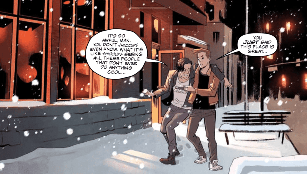 Kyle Higgins creates a deeply relatable character in Radiant Black #1. Nathan Burnett is a man at a low point in this life who lost much of his confidence after having troubles pursuing his dream of being a professional writer. When he stumbles upon an item that gives him superhuman abilities, Nathan has to acclimate to this new way of life, all the while dealing with a fear of failing again. Many have felt a similar way, and Higgins can use these character flaws to establish a connection between the character and the reader immediately. Higgins writes some of the dialogue in Radiant Black #1 so well that they have no trouble touching the reader’s heart. The writing has a strong voice, which helps create genuine emotional moments and sets up the fun, light-hearted superheroics we all know and love.
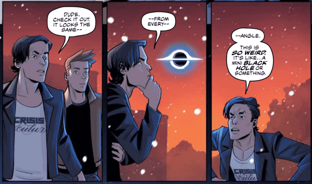
Radiant Black #1 features the art and colors of Marcelo Costa, which are sure to please. Costa’s semi-realistic art style is perfect for the superhero genre. We don’t see too much action in this first issue, but the series is sure to be full of dynamic fights and glorious visuals from what we do see. The spreads in the issue are enough to take your breath away, and some are framed in a way that shows off the potential of the comics medium.
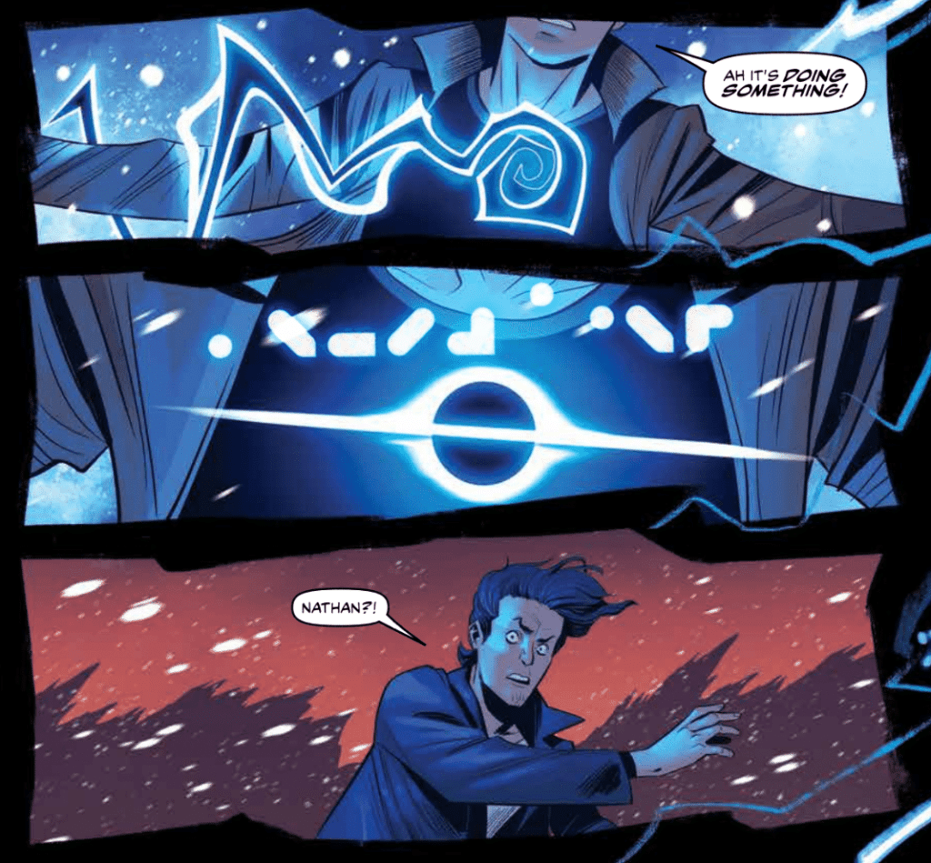
Costa’s colors in Radiant Black #1 are relatively mild at the beginning of the issue. The palette is bland and reflects the monotonous nature of everyday life. When Nathan receives his powers, the palette is flipped on its head and is replaced with vibrant blues and dark backgrounds. Even the colors of the setting that we already saw have changed slightly to show more of the setting sun’s beautiful colors. Everything is more vibrant and full of energy, highlighting the exciting change in Nathan’s life.
Becca Carrey’s lettering allows the story of Radiant Black #1 to flow smoothly and heavily assists the emotional moments of the issue. Carrey uses the technique of a smaller font for dialogue to indicate whispering, which helps inform the reader of how specific lines are said. For instance, the smaller font is used when Nathan admits something he is ashamed of, and the fact he is whispering illustrates his reluctance to do so. Examples like this may seem small but have a significant impact on the reader’s subconscious.
Radiant Black #1 is a series you will want on your pull list. It is new superhero fun with a flawed and relatable main character. Higgins has set exciting events to follow, and Costa’s art is always sure to impress. If you’re a fan of good superhero comics, this is a book for you.