Home Blog Page 189

The Representation of Gambling in Comics

The thought of comics brings different terms like villains, heroes, the supernatural and superpowers, and aliens to mind. A term like gambling is probably the last one that would associate with comics. Notwithstanding, comics and gambling have come a long way together and have also evolved over the years. 

Lately, several kinds of gambling comic books that feature plots that relate to betting and or characters who like to gamble have surfaced. And to make it more interesting, people’s love for comics has grown to the extent that lots of the industry’s most loved characters can be found in slot games on the game floors of land-based casinos and online casinos as well. This makes us wonder when exactly did the relationship between gambling and comics begin? Well, here’s a brief history of their evolution together. 

The Representation of Gambling in Comics

Comics did not just provide entertainment in the early-mid-20th century, and they served as moral lessons for all to share, including the dangers of gambling. The history of gambling in comics can be traced to two Superman stories from the 1940’s worth noting. 

The stories are ‘The Gambling Racket in Metropolis’ and ‘Superman and the Number’s Racket.’ The two tales focus on suicidal gamblers who are saved and helped by Superman. As a matter of fact, the Man of Steel was so disturbed by his encounter with the gambler in ‘Superman in the Number Racket’ that he goes on a warpath against all of Metropolis’s gambling syndicates. 

Furthermore, the misrepresentation of gambling also affected every form of betting activity in comics. Children were all warned to steer clear of gambling as it was described as a way to ruin your life’. 

Gambling and comics went farther apart as gambling villains starting to feature in comics. The Green Lantern villain, Steven Sharpe III, for instance, was famous for his terrible gambling addiction. The addiction led to his death eventually, and this was one of the many examples of gambling ruining a life. But when the likes of Harvey Dent, one of the most popular Batman villains, joined, characters that placed bets became famous and exciting to the readers. 

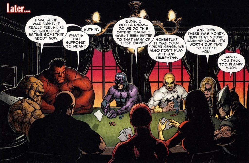
However, the cast of characters that had gambling addictions was totally unrelated. Their lives outside comics didn’t determine how they acted. A perfect example that proved that you didn’t have to be a villain to gamble was Marvel’s mutant, Gambit. Gambit is one of the X-men characters that love to play poker, and gambling is mostly part of who he is. 

Casinos and Comics 

However, there have been several technological advancements in both gambling and comics, such that superheroes like Spiderman, Ironman, Batman, and Superman have been inspirations to different casino games. Now, we have casinos paying homage to the superheroes and comics by featuring them in their game selections. Initially, it started with superhero and comic-inspired slots made available in land-based casinos in Las Vegas. 

One of such is the Iron Man slot based on the very first Iron Man movie. Then, online casinos like comeon.com started offering them to players also, as some slots and casino games were superhero-themed and comic-based. These games include; Flash Slot, Kick-Ass Slot. Justice League Slot, Green Lantern Slot, Hellboy Slot, and many others. The provision of these games has become a win-win situation for both players and casinos. 

Comic book fans can now play real money games themed after their favorite superheroes, and casinos have also been able to grow their followers and bond with their customers. What started as a means for criminal activity with the sole aim of dissuading children from gambling has now become an interesting, enjoyable aspect of comic plots and characters.    

Monkeys Fighting Robots Youtube

Review: SATOR Delivers A Satisfactory Folk Horror

Sator sets a grim tone for itself early on and manages to establish a chilling atmosphere, but still comes up short. There’s so much attention to creating this unsettling atmosphere that little attention was given to the characters involved. Sator is a slow burn that almost gets it right, but with a story carried by hollow characters and subpar acting, it squanders the potential it showed.

The most frustrating aspect of Sator is its ability to keep you invested in the story despite the lackluster characters it centers on. The mythos of Sator isn’t fully fleshed out, but this knowledge of a supernatural entity stalking this forest is built up tremendously. A brilliant build to the film’s final moments where this entity is finally showcased. Directed and written by Jordan Graham, Sator stars Michael Daniel, Rachel Johnson, Aurora Lowe, Gabriel Nicholson, Wendy Taylor, and June Peterson. The film follows a family as they are terrorized in the forest by an entity known as Sator. Taking place primarily in a cabin in the woods, Sator has come to claim them all.

Graham’s supernatural entity is what keeps this screenplay afloat, and it’s this constant uncertainty of where it is during most of the runtime that makes the film uncomfortable at times. Besides that, the family it centers on is there to assist with making Sator more important than they are. The screenplay doesn’t balance out the development for these characters, which results in them coming off one dimensional. They are reduced to being nothing more than hype men for the entity you will anxiously be waiting to meet. Sator takes place mostly with Adam (Nicholson), a member of this broken family who is secluded in the woods. Graham’s screenplay doesn’t offer much about Adam, so there’s no room to care about him or his fate.

Thankfully, Sator is more interested in evoking fear with its lingering sense of dread that only intensifies with each scene. The atmosphere in this film is undeniable, and it assists with some horrific shots that are shown at certain points. The overused jump scare methods are in short supply here, but the terror is still present thanks to a concern with generating fear from within by playing with the human psyche. Performance-wise, Sator doesn’t include many performances that should be considered good, but they are sufficient enough. Nicholson is fine as Adam, but his delivery is flat almost every time and he isn’t given much to do. It’s mostly people standing around with glazed over looks, or just staring in the direction of the camera.

When a filmmaker understands how to spark fear through tension building, long tracking shots, and creating a spine-tingling atmosphere, it should never go unnoticed. Graham may have come up short with his script, but he directs this film very well. He opts to build on this fear of the unknown by establishing this unsettling vibe from the moment Sator starts and doesn’t relinquish it until the film fades to black. Also, the cinematography from Graham is beautiful as well. It accompanies the grim mood he manages to consistently keep throughout the film’s runtime. Graham put together the haunting score that will linger in your mind after the film has concluded as well.

Sator might be similar to Hereditary and The Witch, but what it lacks is quality characters to become invested in. A slow burn that will continue to be felt for some time after and Graham has put together a solid folk horror that keeps you on the edge. Sator could be in the discussion of art-house horror for its style and technical strengths highlighted throughout. Unfortunately, Graham’s genius behind the camera didn’t fully translate to the script, which keeps Sator from reaching its potential in the end.

Monkeys Fighting Robots Youtube

Review: Backed into a Corner in FUTURE STATE: DARK DETECTIVE #3

Dark Detective Tamaki DC Comics

Bruce and Grifter find themselves backed into a corner in DC Comics’ Future State: Dark Detective #3. In “Games,” written by Mariko Tamaki, with art by Dan Mora, coloring by Jordie Bellaire, and lettering by Aditya Bidikar, Bruce Wayne on a tight budget is beginning to really understand the scope of the Magistrate’s power. And in “No Future Past, pt. 2,” written by Matthew Rosenberg, with art by Carmine Di Giandomenico, colors by Antonio Fabela, and letters by AndWorld Design, this creative team shows that when Grifter is at the end of his rope, he’ll live up to his name.

A Scared Bruce Wayne in “Games”

Writing

Tamaki’s script does a beautiful job of lulling readers into a feeling of safety. This is a script for a detective story. Bruce Wayne is finally rolling up his sleeves and getting to work. He’s following clue after clue down a thread that he hopes will lead him straight to the Magistrate. Yet things aren’t as simple as they once were for Bruce Wayne. He doesn’t have the same money or resources. And so, Bruce is capable of just enough detective work to figure out one thing: he’s screwed. Overwhelmed by the sheer power of the Magistrate, Tamaki leaves us with a Bruce Wayne who has been backed into a corner. Tamaki’s shift from a typical detective thriller to a story of a David and Goliath gets our hearts beating. For the first time in a long time, we’re not sure if Bruce is up to the task.

Dark Detective Tamaki DC Comics

Art

Mora’s art plays on our fear of surveillance. At times, we’re seeing things through Bruce’s goggles. Other times, Mora is showing that the Magistrate sees everything. It’s funny, though, that we’re either seeing people surveilled by Bruce or by the Magistrate. Some scenes make a lot of the Magistrate’s toys look suspiciously like Batman’s. Mora doesn’t let us forget that Bruce has been behind all kinds of spying, himself. But again, this Bruce doesn’t have all the same gadgets he once did. Mora shows the stark contrast between Bruce and the Batman he once was. When Bruce and the new Batman briefly come face-to-face, Mora divides a picture of their faces down the middle, making them look like two halves of one person. Except that they look nothing alike. Bruce is scruffy, panicked and grimy, compared to the clean-cut new Batman, an image of who he once was. He’s changed a lot.

Coloring

Bellaire uses a lot of blues, purples, pinks and yellows in this chapter. The purples and pinks are familiar. The previous issues have been covered in these colors. That’s because these colors represent the technology that surrounds these characters: the neon billboards and the glow of the city’s lights. They have almost become synonymous with Gotham. Every cityscape we see is in a pinkish-purple hue. This technological rise has become inescapable. But the yellows and blues represent a fight against all of it. Blue is used to show Bruce’s own technology. These are his moments of fighting fire with fire. He’s watching the watchers. And the yellows are moments of chaos and panic. When Bruce gets to the end of his rope, the yellow explosions we see become a visual representation of his inner panic coming to a head.

Lettering

Bidikar makes each caption box almost look like a text box from online messaging. The first time we see Bidikar’s captions, they’re placed on top of an actual screen: an interrupted game of cyber-golf. And when the Magistrate’s drones arrive, their word balloons look similar to the caption boxes. They’re shown with straight edges and look like the corners have been cut off. Every panel, under Bidikar’s lettering, becomes a screen. These are no longer Bruce’s thoughts we’re hearing. We’re rifling through his phone, reading his private text messages. And so, Bidikar makes it so that we can’t experience this discussion of surveillance guilt-free. No, as we read, we become more and more aware of how much it feels like we’re spying on the characters.

Dark Detective Tamaki DC Comics

Grifter Living up to His Name in “No Future Past, Pt 2”

Writing

Rosenberg amps up the action by keeping each line of dialogue short and to the point. He creates a sense of panic. From the get-go, Grifter has no time to talk or think. Every character is fighting for their lives, from the first page to the last. In fact, when characters calm down a little and begin to talk more, we panic. Rosenberg sets up such a fast-paced beginning that we get the sense these characters don’t actually have time to sit and chat. And with an explosive conclusion, he shows we weren’t wrong.

Art

Di Giandomenico plays with time in this chapter. He places some panels on top of others. These moments are so fast that they seem to occupy the same moment in time. A hand grabs at a character’s ankle and, on the panel beneath, he topples to the floor. He has no time to catch himself. But later, Di Giandomenico slows things down. As one character shoves another’s face into the ground, Di Giandomenico shows the sequence in five thin panels. Everything slows. The character is finally given time to take in his surroundings, even if half his face is in the ground.

Coloring

Fabela juxtaposes moments of calm blue with fiery orange. As our characters fight on a dock, Fabela adds speckles of orange flames all around the panel. It creates an almost 3-D effect. But Fabela mostly gives us a sense of hope. Every moment, though covered in chaos, looks like it could be peaceful. Each scene looks like a quiet morning that’s had destruction painted over the top of it. Fabela makes us think that these characters might have a future, if they ever get out of this. But as the story progresses, the presence of the orange destruction grows. Any chance of peace seems further and further from possible.

Lettering

AndWorld Design’s lettering creates pacing whenever possible. As Huntress and Grifter argue, she interrupts to tell him to shut up. Her word balloon almost gets in the way of some of his lettering. Her line is urgent and fast. Then, the sound of a smoke bomb being thrown through a window gets two separate noises. The “CRSH” of the glass breaking looks different than the “HSSSSSS” of the smoke. In these quick moments, AndWorld Design’s lettering still finds ways to show the sequence of events.


DC Comics’ Future State: Dark Detective #3 is another thrilling issue of a great new series. It has a brilliant and terrifying new chapter of Bruce Wayne’s days in a new Gotham and features the explosive conclusion to Grifter’s partnership with Luke Fox. Pick up Future State: Dark Detective #3, out from DC Comics February 9th, at a comic shop near you!

Monkeys Fighting Robots Youtube

Review: Comedy and Casual Violence in RORSCHACH #5

Rorschach King DC Comics

DC Comics’ Rorschach #5 connects all the dots. But the picture we get isn’t much clearer. Writer Tom King, artist Jorge Fornes, colorist Dave Stewart and letterer Clayton Cowles open the floodgates of information in this thrilling mystery, but with every answer we have more questions.

Writing

King isn’t one to exposition dump. So, when he does flood a panel with information, it’s worth taking note. In the first moments of Rorschach #5, King essentially gives us a run through of everything we know so far. Characters sit at a bar and try and make connections. But the Rorschach and The Kid characters, that our detective has been chasing, remain just as untouchable and mysterious as ever. On top of that, King brings in more complicating factors. We meet Turley. Turley is meant to be the people’s man. Rorschach and the Kid were violent insurrectionists trying to kill a man so they could hold onto their outdated values, right? Yet Turley doesn’t seem like any kind of hero. His nonchalance about violence and fetishization of The Comedian make him a character to worry about. And our protagonist certainly seems as disturbed as we are.

Rorschach King DC Comics

Art

Fornes highlights the absolute indifference all these characters have to what’s going on around them. One character is shown gunning down Rorschach and the Kid. His face doesn’t move as Rorschach screams over Laura’s dead body. He simply reloads his gun and unloads another clip. Our protagonist’s face never changes either. Whether he’s being asked to see Turley, watching a man take a dump, or listening to stories of murder and mayhem, he’s unmoved. Turley seems quite similar. Fornes first shows him, speaking with a crowd of smiling people behind him. He looks somber and serious. It’s not until he tells the detective about his time in the Vietnam War that we see the big difference between the two of them. Turley speaks fondly about his kills during the war and laughs at the thought of all that death. It’s the one time we see him smile, and we’re left wishing he wouldn’t.

Coloring

A lot of this issue is rather somber looking. Stewart uses faded colors to depict a rainy day. But Turley’s button and tie are bright. The reds and blues look artificial compared to the dark colors around them. The bright blue suit of one of Turley’s men only serves to make him look like he’s out of touch with the world around him. These painted-on colors don’t speak to us of patriotism. They speak of a sickly sweet façade. The only other moments that Stewart uses bright coloring are moments of extreme violence. The gunning down of Rorschach and the blood pooling around a Vietnamese man’s head are shown in brilliant red. It’s as though Stewart is saying that that’s what is truly American. To pull the trigger without flinching. To look into the abyss, convincing yourself that it isn’t looking back.

Rorschach King DC Comics

Lettering

Cowles makes every line that someone speaks look full of the weight of responsibility. When Turley speaks, his lines are rarely shown over his head. His words are over the heads of others. It’s like some kind of power play. His dialogue has a presence in the room, and that presence is heavy over whoever he wants to push around. One of his security guards is similar. He speaks to the detective and every word balloon is pictured over the detective’s head. It’s as though he’s saying “This is my house, I’m watching you.” But the liaison between our detective and Turley is different. When he speaks, bringing messages back and forth between Turley and our protagonist, his words surround him. He’s trapped in his responsibilities and he feels the weight of Turley’s power, even when Turley isn’t in the room.


DC Comics Rorschach #5 reminds us of what we know so far. The answer? Not much. This creative team continues to drench each chapter in mystery. With every answer, there are a hundred new questions. Pick up this neo-noir thriller, out from DC Comics February 9th, at a comic shop near you!

Monkeys Fighting Robots Youtube

INTERVIEW: Filmmaker Celia Jaspers Hunts Houses And Spreads Compassion

Milk is a heartwarming short film directed by Celia Jaspers, who’s been involved with filmmaking for nearly three decades, including House Hunters International on HGTV, where she travels the world to makes real estate look great.

PopAxiom spoke with Celia about becoming a filmmaker, making Milk, and traveling the world for House Hunters International.

28 Years

“I was lucky,” Celia says of her start in showbiz. Getting a start early from high school, she had work experience in several several workplaces to get a taste of career choices.

Celia’s next stop was a film set, right? Not exactly. “I was going to be an architect and was first placed in an architect’s office, but it was so boring, I thought I can’t do this for a job!”

But luckily she had a chance for a behind the scenes peek in the local television studio. She reveals “I found out they made a kid’s show that I watched. I asked if I could come back in and watch it go out live. I turned up very early on the weekend of recording and took a bit of initiative and helped a cameraman with cables. They asked if I wanted to come back next week and that was my in!”

After being offered a part time job to begin with, moving through the ranks, Television New Zealand gave her the chance of a life time as a full time intern/trainee upon completing high school, “It was so lucky, I’ve never looked back and I’ve been at this 28 years now.”

celia jaspers-cinematographer-milk

About Milk

Whilst a prolific career in television followed, film was always Celia’s passion and this year she realized that dream creating a short film “Milk”, the product of a desire to make more narrative films and the effects of the global pandemic. “We were on lockdown in New Zealand. We had seven weeks of Level 4, as we call it, where you couldn’t leave your house. So, I first made a simple short film called Homeschool with my kids.”

Success with this film, inspired the next more elaborate production, Milk. Its a simple story with some beautiful cinematography and an adorable lead character played by Celia’s daughter, Charlotte. “I was so excited to do another movie,” Celia reveals, “I was driving to the market with my daughter and ideas started percolating. The Milk story came up about compassion and kindness and I thought that’s perfect.”

“The climate in New Zealand and perhaps the world is very much about looking out for other people,” she says. “I wrote a script, and the ball started rolling. Before we knew it, I had a van load of gear and technicians and we took over the whole little village where I live. It was zero budget, but we kept high standards despite not having much to work with.”

Celia’s daughter is onscreen for nearly every second of Milk’s runtime. “We had a few rehearsals at home before I was certain she could carry it, there was a lot riding on an 8 year old! But she had great focus in the moment for some long takes and has quite a deep emotion range for a child.”

Making Milk was “exciting” for Celia, and she proclaims without reservation, “I want to make another one!”

house hunters-celia jaspers-cinematographer

House Hunters International

“I’d never heard of the show before they contacted me,” she says about House Hunters, “they had been filming in New Zealand for a few years but it wasn’t shown here at that time, so when I realized how big it was overseas, it was an amazing opportunity.”

Celia is one of “only a few directors from around the world” working on the show. “We keep the same teams so it’s often easier just to send us to different locations than train up new crew, so we get to travel a lot. It’s a fantastic show to travel with. You get to see amazing places and meet a lot of cool people.”

Shooting House Hunters episodes are “very fast,” Celia says, “Each half-hour program takes about five days. It’s a lot of content to get through often in foreign and challenging environments”.

Celia’s a pro now. “I know the format pretty well now, though; it’s all in my head. And if a spanner is thrown in the works, you just have to adjust.”

Wrapping Up

When asked about directors she admires, “I do love Ron Howard,” she answers. “I’ve been doing his master class, and it’s been inspiring hearing him speak.” She adds two more to the list: “Ridley Scott and Chris Nolan.”

The talk of directors turns to New Zealand born and bred filmmakers. “Niki Caro and Jane Campion. Jane Campion very much inspired this whole thing. I was 15 when I watched The Piano, and I was swept away by that film. And it was shot in New Zealand, by a woman, which was so rare at the time.”

“Taika Waititi is doing amazing things,” she adds, “Peter Jackson and Richard Taylor of course, the whole industry is so strong now. We’re not this tiny little outpost at the bottom of the pacific; we’re our own Hollywood.”

Celia’s goal is to continue making her films. “I love family films and action films. And stories that have a lot of heart interest me. I would dearly love to do a feature”.

There’s more to come from Celia in 2021. “I have two shorts in development. One’s a fun film about elderly people taking their power back, and the other is a beautiful story about a man finding his voice to make music.”

“Also more House Hunters in the new year,” she says, “I also do a popular documentary series in New Zealand about people living off the land and farming, so I’m pretty busy most weeks. We’re off to the Chatham Islands next, a very remote set of islands several hours east of New Zealand. Making content and traveling it doesn’t get much better than that”.

Are you a fan of House Hunters International?

Thanks to Celia Jaspers and Impact24 PR
for making this interview possible.

Read more interviews from Ruben R. Diaz!

Monkeys Fighting Robots Youtube

FINGER GUNS: Having The Power To Bring Out Emotions

Finger Guns Cover

Finger Guns is a mini-series releasing on Octboer 28 from Vault Comics. Writer Justin Richards gives a youth-friendly story about reaching out to others. Despite the mostly relaxing artwork by Val Halvorson and surreal coloring from Rebecca Nalty, the lettering from Taylor Esposito directs readers to more serious themes.

Get Out Your Finger Guns

Puberty is a time when life can get downright depressing and/or absurd. Richards takes the time to instill that feeling into the main characters, Wes and Sadie. Both of these middle school students feel lonely and directionless. Wes’ mother died and his father works, while Sadie deals with her own abusive father. It’s times like these that people find small things to pass time. Fortunately, squishing heads between fingers isn’t the subject of this story. Instead protagonists Wes and Sadie find out they have the power to influence people’s emotions through Finger Guns.

What happens when preteens who feel empty find out these finger guns can do more than intended? First, they start with just a few harmless pranks at a strangers’ expense. This leads to the characters bonding over their powers and shared griefs.

Mood Shift Cartridges

Halvorson presents Finger Guns in the beginning at a relaxed pace. This allows things in Finger Guns to be funny and serious in the same space. This is helped through the different uses of grids that shift perspectives. From the classic 9-panel grids to the wide 5-panels, most of them evoke different moods.

A small number of the pages even have panels completely disappear, with only the characters left. This presents a notable shift in mood and is a defining character moment. The reader actually learns about the characters.

Nalty makes a lot of use of shifting color to mark highly emotional scenes. This naturally includes the finger gun shots. Red for anger and blue for calmness. But in panels where the background is gone, all that the reader can see are color-coded feelings. Some light greens that mark unease and darker reds that evoke hate.

Taylor Esposito as letterer makes use of words for big emotional moments in Finger Guns. Some of them look tailor made for bigger situations, like when Sadie’s dad beats her mom with some resonating thudding sounds. Some words even burst out of the balloons.

Finger Guns Will Make You Feel Things

When it comes to discussing empathy or projecting emotions onto others, Finger Guns fires on all cylinders. The reader should see how all the storytellers do their parts in this series. There are many ways comics can make the reader feel certain emotions, from how characters present themselves to how a comic is built. Finger Guns is a culmination of all of those efforts.

Monkeys Fighting Robots Youtube

Op Ed: RYAN CHOI – Defined In DEATH METAL: THE LAST 52

Ryan Choi and every part about him

Ryan Choi is a character DC fans will be aware of, thanks to his appearance in Injustice 2. But who is this version of the Atom? More importantly, why is his story in the recent anthology Death Metal The Last 52: War of the Multiverses his defining story? That has to do with who The Atom is and his optimism.

Who Is Ryan Choi?

Ryan Choi was created by Gail Simone to replace Ray Palmer as the Atom. Unlike Palmer, who embraces the absurd adventures of being a superhero through his shrinking suit, Ryan prefers to devote himself to science. The funny thing about Ryan is how he takes the absurd in strides. He always tries to find rationality in things that don’t make sense. It’s not even out of scientific fanaticism, but out of optimistically treating every moment as a learning experience. Fans like Ryan so much he makes several appearances in other media including the infamous Justice League: Zack Snyder Cut. The problem is, fans don’t get enough time to enjoy Ryan as a character. He’s a secondary character, and most of his appearances are plot-driven.

Unstable Atoms

Enter Dark Nights Death Metal The Last 52 War of the Multiverses, an anthology piece where creators get a chance to show off in a crossover event. Writer Kyle Higgins decides to delve into a conflict that strikes at Ryan Choi spiritually. In the story of Unstable Atoms, Ryan is working with some of DC’s lesser-known geniuses, like Mister Terrific and Dr. Magnus, on a plan that might turn things around in the battle against the Nightmares: dark counterparts of DC heroes. But in a reality where the laws of physics and nature twist on a dark god’s whim, Ryan feels helpless. Unlike magic, where things at least have some rules, science doesn’t exist in the Dark Multiverse. Ironically, anxiety in the face of overwhelming absurdity makes Ryan a better character.

Because if he wasn’t anxious he would’ve become his Nightmare, Ra. This radioactive version of the Atom lacks fears and curiosity. All that matters to Ra are results. This warps him into an unstable psychopath. This is in stark comparison to Ryan who, in their fight, utilizes Ra’s powers to turn the tide and enhance his own. Because what better way to show you’re literally the bigger man? What sets Ryan Choi apart is how even in the most absurd of circumstances, he never wastes the opportunity to learn. His optimistic outlook juxtaposes perfectly against the bleak conflict of Death Metal. It’s the perfect place to cultivate Ryan.

Ryan Choi: The Atom

Since the beginning, with Ray Palmer, the Atom mantle has been defined by optimism. Look no further in Palmer’s case than when he becomes an Indigo Lantern, even after some hardships. When things get dark, it helps to find the bright side. For Ryan Choi, that means rolling with the punches that come with absurdity and using these moments to grow.

What do you all think? Is the optimistic spirit of the Atom ready for more appearances? Or is DC trying too hard to get Ryan’s presence out? Leave your thoughts in the comments.

Monkeys Fighting Robots Youtube

DYING IS EASY: It’s A Neo-Noir Style Divine Irony

Dying is Easy Cover

IDW’s Dying Is Easy is a crime story from horror writer Joe Hill and artist Martin Hammonds. With Dee Cunniffe providing additional coloring and lettering by Shawn Lee, this stylistic Neo-Noir series captures an era as it develops. A collection releases to stores on October 28th at the crux of these developments near the election.

Dying Is Easy AKA Syd’s Inferno of Bias

Dying Is Easy follows ex-cop and failing comedian Syd Homes. Syd is a very sympathetic character. Most people never let him have a break. Some of it is justified. Syd wants people to laugh at him rather than with him during his stand-up. Others aren’t as justified, like Syd’s ex-father-in-law blaming him for his daughter being gay. This turns out to be all the justification that man needs when Syd is framed for murder. Hill’s ability in showcasing conflict and stakes leaves the reader rooting for Syd all the way. Hill even gets the reader to laugh with Syd instead of at him when Syd does something crazy like chase suspects on skates.

The Art of Dying Is Easy

Artist Martin Simmonds gives plenty of detail and atmosphere in Dying Is Easy. Some pages feature wide two-page spreads with panels reacting to big scenes. Take, for example, when panels tilt diagonally as he’s chasing a jeep on roller skates. Other times one page can foreshadow an action that comes later in an issue, as is the case in issue 5.

The coloring, with assistance from Dee Cunniffe, helps set the mood. Most of the indoor locations have bright colors in an otherwise dim place. The characters all look like they’re in a state of confusion. The fact that they practically blend into the monochromatic backgrounds of these settings is like they’re walking through a limbo. Unlike when actual sunlight is shining and the characters act more lively.

Shawn Lee, as designer and letterer, helps ensure that no element is too small to fit this atmosphere. The word balloons and empty word marks look like extensions of the brushwork by Simmonds. As for the filled SFX, they might not match Simmonds artwork but they remain a consistent white that never feels out of place in Dying Is Easy.

Some Bonus Subject Matter

On a side note, Dying Is Easy has a hiatus period during the Covid-19 lockdowns. It seems Joe Hill goes to great lengths distill events down, keeping things relevant. When Syd is fed some intel that some black kids had the victim’s wallet and supposedly hears their confession, he pursues them in an over-the-top way. Naturally, this comes with some bad implications that can be outright racism in a certain context. Confirmation bias is a powerful thing that can manipulate people into changing truths to suit only their needs. Considering how much of that happens in the real world between and after issues 4 and 5, lends a lot of emotional weight.

Truths Are Hard But Satisfying

Dying Is Easy is a good story made slightly better for its depiction of confirmation bias. When every bad thing in life can look too convenient to blame on someone else, it just might be. There are a lot of complicated factors that people will be sure to miss. Whether it’s in the narrative or real life, this collection could not release at a better time.

Monkeys Fighting Robots Youtube

Review: LOST SOLDIERS #5: Setting Up Boundaries With Trauma

Lost Soldiers #5 Cover

Lost Soldiers #5, from Image Comics, completes a powerful mini-series about post-war trauma. Writer Ales Kot shows the ultimate tragedy of connecting with people through traumas. Artist Luca Casalanguida and colorist Heather Marie Lawrence Moore further this feeling with hallucinogenic visuals. Letterer Aditya Bidikar gives each of these moments time to sink in.

Lost Soldiers #5: Breaking Off Intersections

Lost Soldier #5 setup page
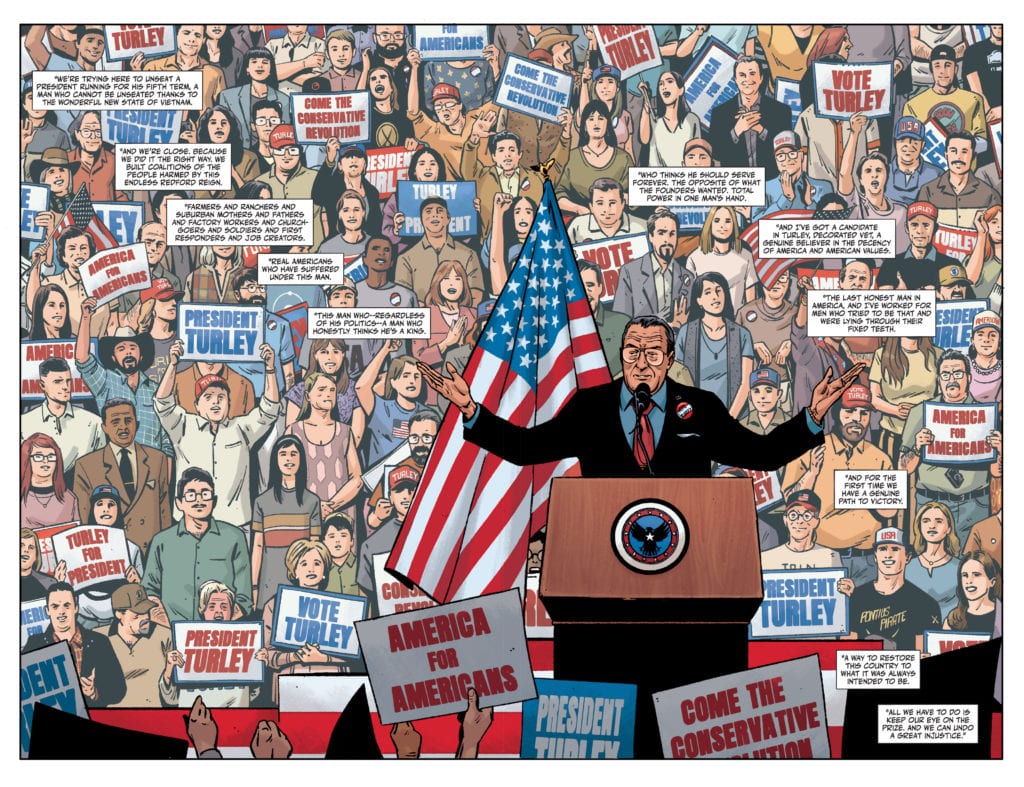
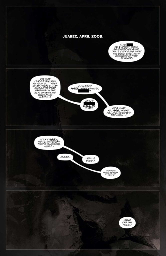
Kot’s story in Lost Soldiers #5 demonstrates the long term effects of trauma. We no longer follow our unnamed protagonist, who lost his narrative strength in the last issue. Instead, his squad mate Trey takes charge.

In Trey’s therapy group, he speaks about how lucky he was to avoid the protagonist’s route. Life has been kind to him, thanks to therapeutic sessions he’s attending, unlike the protagonist’s attempts at catharsis. But he feels guilty for failing to connect to the protagonist. Trey and the protagonist had something in common. There was a chance to turn everything around. Instead Trey lied and said he couldn’t hear “the drums”.

Despite this, Kot assures the reader there was a reason Trey backed off. The protagonist is accused of some transgressions against his African American wife and mixed kids. Thanks to some of the uglier aspects of the Vietnam War, like Confederate flag waving, it’s very understandable that Trey kept his distance. This leaves Lost Soldiers #5 with a very melancholic mood that shows how warfare scars people for life.Twist Reveal

A Session Across Time And Space

Lost Soldiers #5 Time Talk
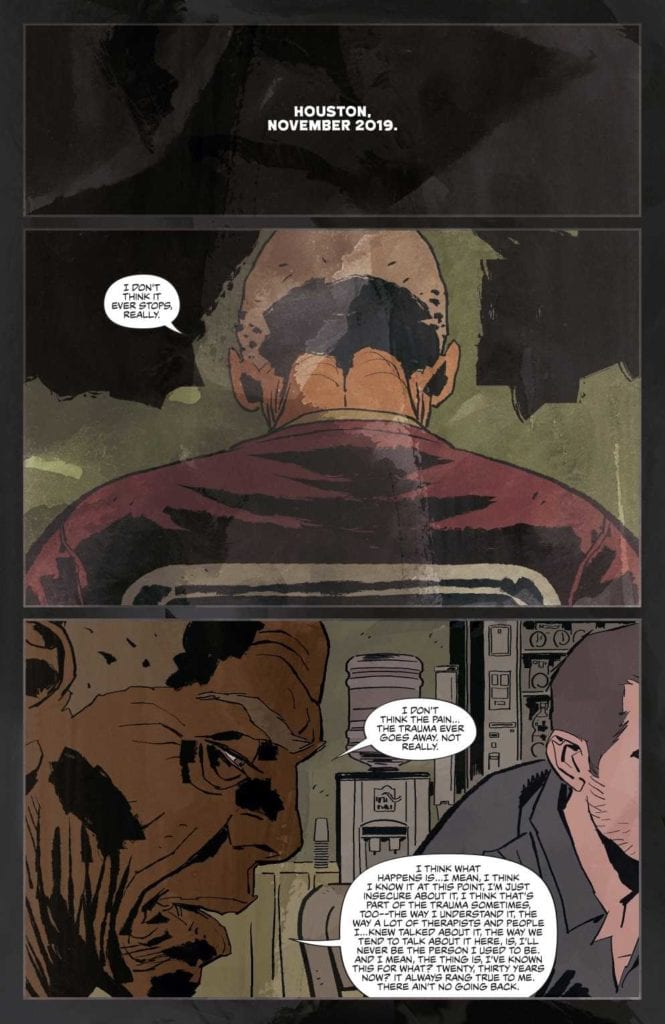
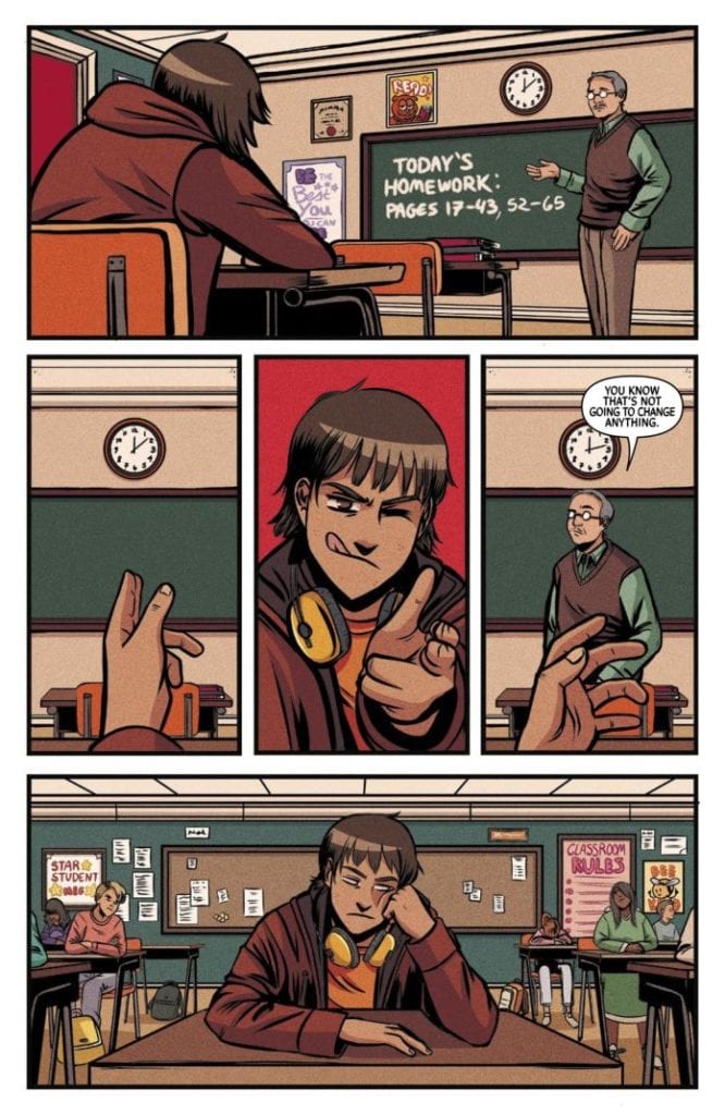
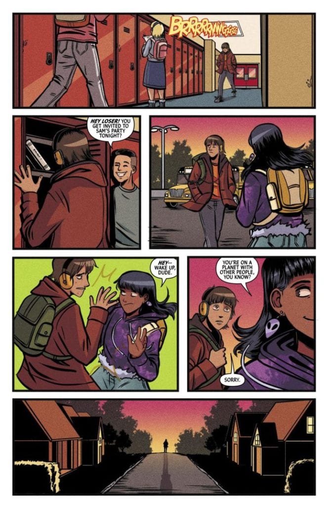
Casalanguida retains some of the more surreal artwork in Lost Soldiers #5. Shifting between the eyes of Trey and the protagonist, it appears there is a subtle conversation between them. Considering this is between a ten year time gap, it’s almost like Trey is speaking at the protagonists’ funeral.

Then there’s Moore’s colors that bring home the surreal feelings, causing images to look more hallucinogenic. Perhaps the most obvious is the palm tree tapestry in the group therapy room. Considering a chunk of the soldiers in that room are Vietnam veterans, it’s what connects them across time. The protagonist even mentions seeing the tapestry despite not being in the same room.

A talk across time
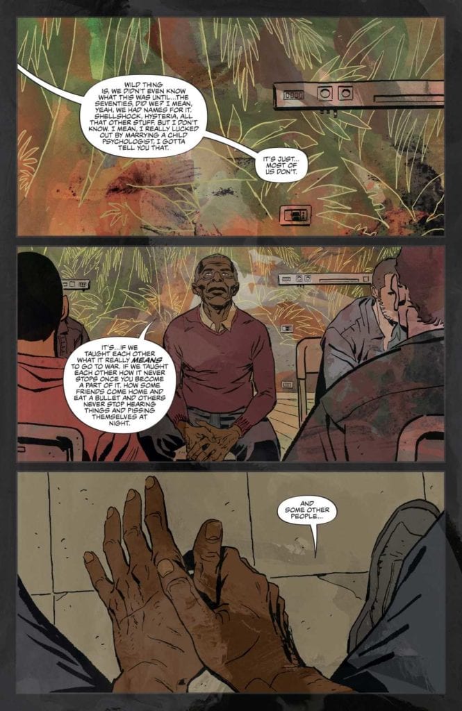
Finally, Bidikar does nothing too fancy to bring home the conversations between the characters. Every word balloon feels heavy. It makes the moments in each panel sink in. By slowing down the pacing, the reader feels the weight of the situation. Most of the dialogue happens at the beginning of the page, almost loading the reader up for some emotional whiplash. All of this, and the accompanying visuals, give the reader the feelings of distress throughout.
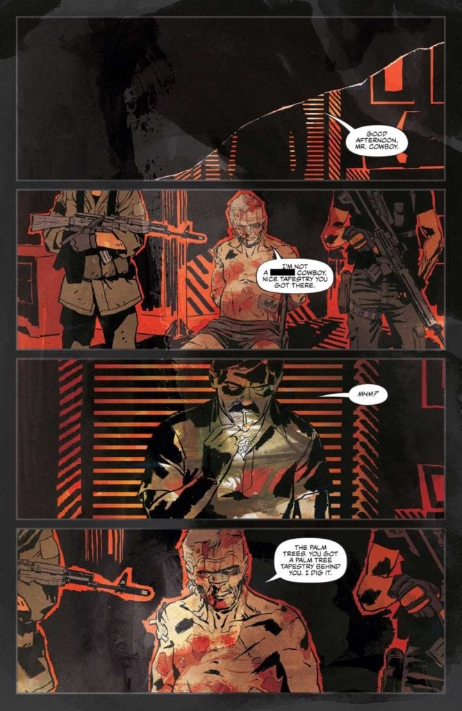
Lost Soldiers #5 Is Complete

Readers will never forget Lost Soldiers #5. The excitement from the action of previous issues will make them feel complicit in the violence. But that’s the point. Communicating across time and reflecting on the decisions made is the essence of trauma. It’s a powerful feeling that readers may have to deal with in real time and make the connection despite the hardships. It’s what makes Lost Soldiers such a powerful series despite the familiar trope of the Shell Shocked Veteran. Because not every soldier fights the same war the same way.

Monkeys Fighting Robots Youtube

Review: FUTURE STATE: IMMORTAL WONDER WOMAN #1

Main Cover

Available now, Future State: Immortal Wonder Woman #1 follows both Diana Prince and Nubia in the aftermath of the Death Metal arc. Divided into two storylines, writers Becky Cloonan and Michael Conrad took on Diana’s part while L. L. McKinney wrote Nubia’s. Illustrators Mark Morales and Alitha E. Martinez drew Nubia’s half, and Jen Bartel drew Diana’s. Jen Bartel also contributed colors for Future State Diana, where colorist Emilio Lopez took Nubia’s part. Finally, Pat Brosseau lettered Diana while Becca Carey lettered Nubia.

spoilers ahead

Future State: Immortal Wonder Woman #1 delivers an equally philosophical and bracing prelude to an uncertain future with classic DC flare. The issue opens with Diana traveling through the Bat Cave ruins surrounded by cold neon blue. She mourns the deaths of her fellow heroes while reflecting on her immortality and worldly purpose. Jen Bartel’s style here feels like if Nicolas Winding Refn decided to make comics, and it’s breathtaking.

But Diana doesn’t have much time to philosophize. She spots a potential threat flickering in the stars and goes to warn the Amazons on Themyscira. Off Diana’s flight, the action cuts to the planet Apokolips where The Undoing, a dark force reminiscent of the Sentinels from The Matrix, is taking over the planet. Instead of standing with his people to fight, Darkseid flees to Earth.

Neon-Noir

From there, the action intercuts between Darkseid traveling like a comet to Earth and Diana on Themyscira. Diana tries to persuade her fellow Amazons to flee, but they have never run before. Here and in the later fight sequence, Bartel indulges in the dazzling neon-noir style. In his panels, Darkseid flies past blue, pink, and red stars, himself surrounded by inky black clouds and crackles with energy.

By contrast, Diana and Themyscira are softer, replete with bright yellow, light blue, and green. The layout augments this contrast: Darkseid’s panels are lopsided parallelograms while Diana’s are standard. Bartel then combined each element once Darkseid and the Amazons fight. Brosseau’s SFX lettering flashes with each punch or stab, often taking up half the background like graffiti. Moreover, Cloonan and Conrad’s equally matter-of-fact and poetic dialogue and steady pacing allow the art to tell the story. The result is an intense, energetic sequence that ends on a cliffhanger in which the lives of our favorite heroes hang in the balance.

Nubia

L. L. McKinney’s Nubia story flips the Diana plot. It begins with an action sequence Lopez colored a cold blue and which Morales and Martinez framed like Polaroids. Nubia and Grail, the villain she’s fighting, even appear to be moving panel by panel. The only splash of neon comes up when Nubia visits her Aunt Nancy’s club to learn more about what Grail is after.

Once Nubia sits down with her aunt, the colors and layout become more naturalistic. McKinney’s dialogue is also quite realistic, which helps make Nubia and her world feel three-dimensional. These fluid transitions help ground the entire issue.

But just when we’re settling into the dynamic between Aunt Nancy and Nubia, Nubia is suddenly sucked into a portal. Now with two cliffhangers in one issue, we’re left to question how these two wonder women might work together to secure the future of Earth.

Monkeys Fighting Robots Youtube