Bruce and Grifter find themselves backed into a corner in DC Comics’ Future State: Dark Detective #3. In “Games,” written by Mariko Tamaki, with art by Dan Mora, coloring by Jordie Bellaire, and lettering by Aditya Bidikar, Bruce Wayne on a tight budget is beginning to really understand the scope of the Magistrate’s power. And in “No Future Past, pt. 2,” written by Matthew Rosenberg, with art by Carmine Di Giandomenico, colors by Antonio Fabela, and letters by AndWorld Design, this creative team shows that when Grifter is at the end of his rope, he’ll live up to his name.
A Scared Bruce Wayne in “Games”
Writing
Tamaki’s script does a beautiful job of lulling readers into a feeling of safety. This is a script for a detective story. Bruce Wayne is finally rolling up his sleeves and getting to work. He’s following clue after clue down a thread that he hopes will lead him straight to the Magistrate. Yet things aren’t as simple as they once were for Bruce Wayne. He doesn’t have the same money or resources. And so, Bruce is capable of just enough detective work to figure out one thing: he’s screwed. Overwhelmed by the sheer power of the Magistrate, Tamaki leaves us with a Bruce Wayne who has been backed into a corner. Tamaki’s shift from a typical detective thriller to a story of a David and Goliath gets our hearts beating. For the first time in a long time, we’re not sure if Bruce is up to the task.

Art
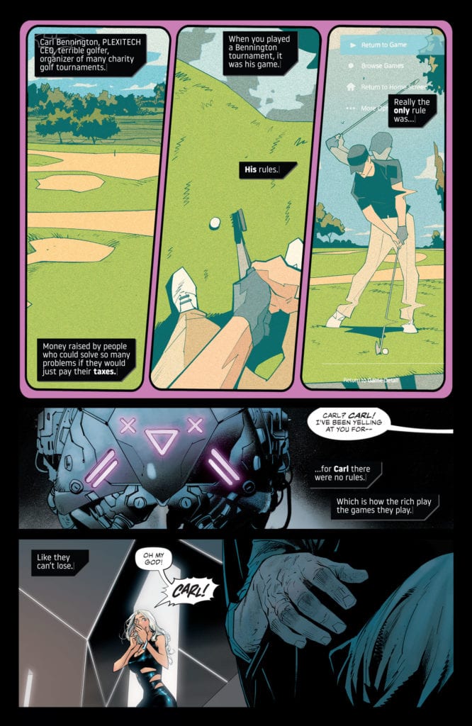
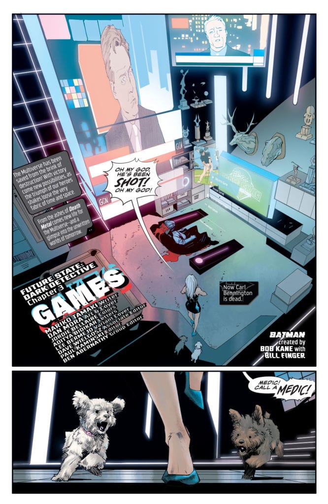
Mora’s art plays on our fear of surveillance. At times, we’re seeing things through Bruce’s goggles. Other times, Mora is showing that the Magistrate sees everything. It’s funny, though, that we’re either seeing people surveilled by Bruce or by the Magistrate. Some scenes make a lot of the Magistrate’s toys look suspiciously like Batman’s. Mora doesn’t let us forget that Bruce has been behind all kinds of spying, himself. But again, this Bruce doesn’t have all the same gadgets he once did. Mora shows the stark contrast between Bruce and the Batman he once was. When Bruce and the new Batman briefly come face-to-face, Mora divides a picture of their faces down the middle, making them look like two halves of one person. Except that they look nothing alike. Bruce is scruffy, panicked and grimy, compared to the clean-cut new Batman, an image of who he once was. He’s changed a lot.
Coloring
Bellaire uses a lot of blues, purples, pinks and yellows in this chapter. The purples and pinks are familiar. The previous issues have been covered in these colors. That’s because these colors represent the technology that surrounds these characters: the neon billboards and the glow of the city’s lights. They have almost become synonymous with Gotham. Every cityscape we see is in a pinkish-purple hue. This technological rise has become inescapable. But the yellows and blues represent a fight against all of it. Blue is used to show Bruce’s own technology. These are his moments of fighting fire with fire. He’s watching the watchers. And the yellows are moments of chaos and panic. When Bruce gets to the end of his rope, the yellow explosions we see become a visual representation of his inner panic coming to a head.
Lettering
Bidikar makes each caption box almost look like a text box from online messaging. The first time we see Bidikar’s captions, they’re placed on top of an actual screen: an interrupted game of cyber-golf. And when the Magistrate’s drones arrive, their word balloons look similar to the caption boxes. They’re shown with straight edges and look like the corners have been cut off. Every panel, under Bidikar’s lettering, becomes a screen. These are no longer Bruce’s thoughts we’re hearing. We’re rifling through his phone, reading his private text messages. And so, Bidikar makes it so that we can’t experience this discussion of surveillance guilt-free. No, as we read, we become more and more aware of how much it feels like we’re spying on the characters.

Grifter Living up to His Name in “No Future Past, Pt 2”
Writing
Rosenberg amps up the action by keeping each line of dialogue short and to the point. He creates a sense of panic. From the get-go, Grifter has no time to talk or think. Every character is fighting for their lives, from the first page to the last. In fact, when characters calm down a little and begin to talk more, we panic. Rosenberg sets up such a fast-paced beginning that we get the sense these characters don’t actually have time to sit and chat. And with an explosive conclusion, he shows we weren’t wrong.
Art
Di Giandomenico plays with time in this chapter. He places some panels on top of others. These moments are so fast that they seem to occupy the same moment in time. A hand grabs at a character’s ankle and, on the panel beneath, he topples to the floor. He has no time to catch himself. But later, Di Giandomenico slows things down. As one character shoves another’s face into the ground, Di Giandomenico shows the sequence in five thin panels. Everything slows. The character is finally given time to take in his surroundings, even if half his face is in the ground.
Coloring
Fabela juxtaposes moments of calm blue with fiery orange. As our characters fight on a dock, Fabela adds speckles of orange flames all around the panel. It creates an almost 3-D effect. But Fabela mostly gives us a sense of hope. Every moment, though covered in chaos, looks like it could be peaceful. Each scene looks like a quiet morning that’s had destruction painted over the top of it. Fabela makes us think that these characters might have a future, if they ever get out of this. But as the story progresses, the presence of the orange destruction grows. Any chance of peace seems further and further from possible.
Lettering
AndWorld Design’s lettering creates pacing whenever possible. As Huntress and Grifter argue, she interrupts to tell him to shut up. Her word balloon almost gets in the way of some of his lettering. Her line is urgent and fast. Then, the sound of a smoke bomb being thrown through a window gets two separate noises. The “CRSH” of the glass breaking looks different than the “HSSSSSS” of the smoke. In these quick moments, AndWorld Design’s lettering still finds ways to show the sequence of events.
DC Comics’ Future State: Dark Detective #3 is another thrilling issue of a great new series. It has a brilliant and terrifying new chapter of Bruce Wayne’s days in a new Gotham and features the explosive conclusion to Grifter’s partnership with Luke Fox. Pick up Future State: Dark Detective #3, out from DC Comics February 9th, at a comic shop near you!

