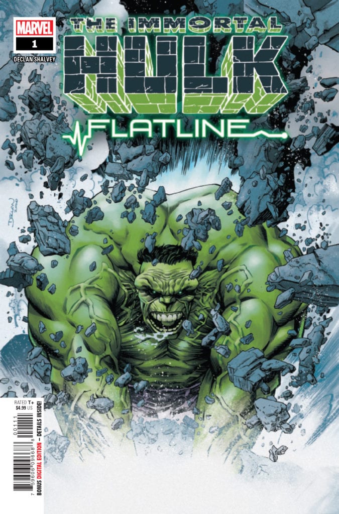
IMMORTAL HULK: FLATLINE #1 hits your local comic book store February 17th, but thanks to Marvel Comics, Monkeys Fighting Robots has an exclusive five-page preview for you.
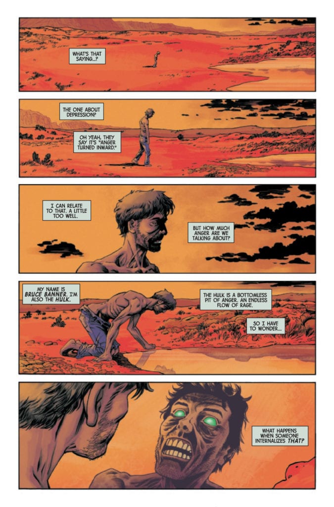
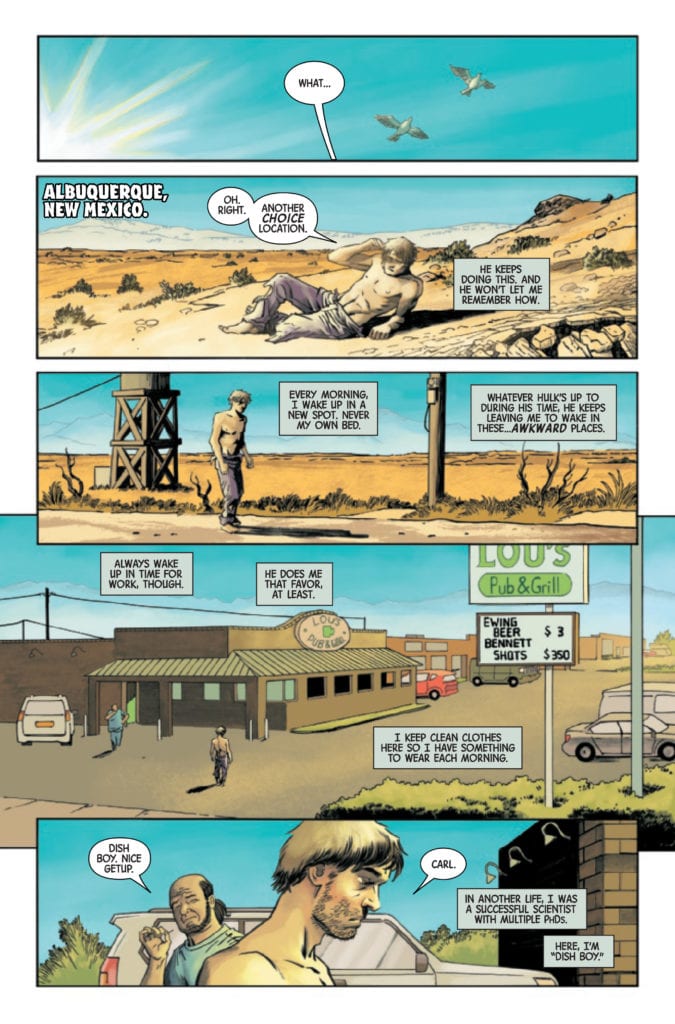
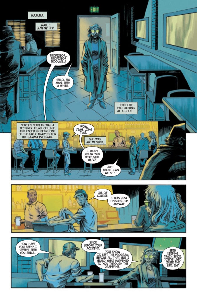
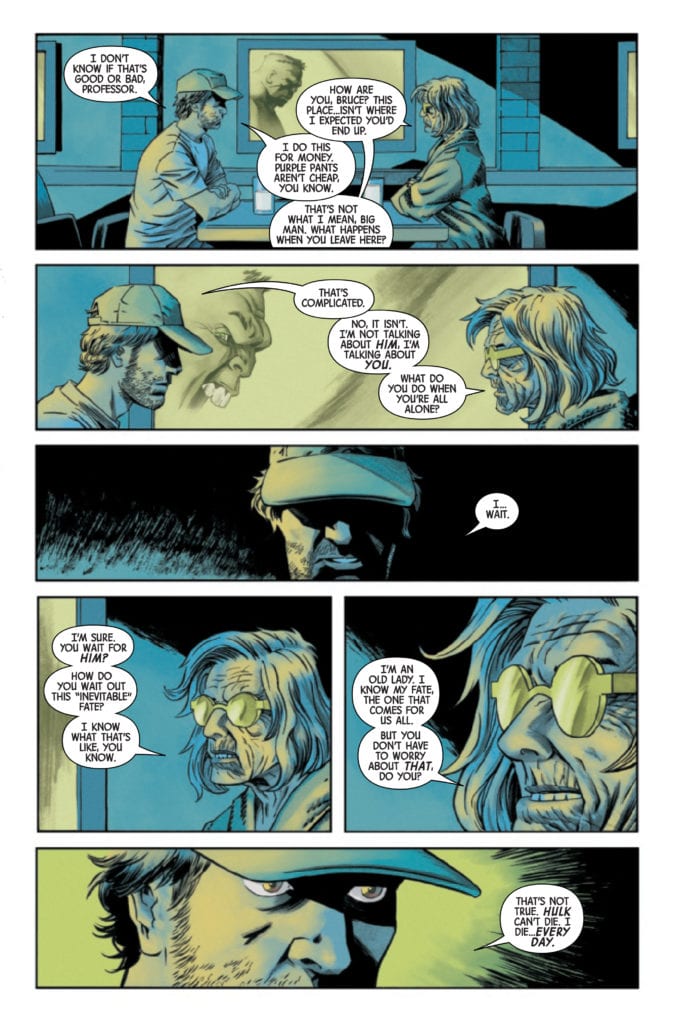
About the issue: Declan Shalvey writes and draws an IMMORTAL HULK tale that gets to the heart of gamma! Every morning, Bruce Banner wakes up in a new place. The Hulk is trying to tell him something – but Bruce has had enough of his green-veined alters. When a new gamma-powered villain shows up in a small New Mexico town, Bruce is forced to confront the source of his anger… and it’s not what you expect. Don’t miss an extraordinary tale from one of the industry’s top talents!
As stated in the solicit text, IMMORTAL HULK: FLATLINE #1 is by writer/artist Declan Shalvey. It’s the latest in a series of IMMORTAL HULK one-shots that act as supplements to the main series. Previous one-shots include IMMORTAL HULK: GREAT POWER by Tom Taylor and Jorge Molina and IMMORTAL HULK: THE THRESHING PLACE by Jeff Lemire and Mike Del Mundo.
Check out the IMMORTAL HULK: FLATLINE #1 preview below:
What’s been your favorite IMMORTAL HULK one-shot so far? Sound off in the comments!
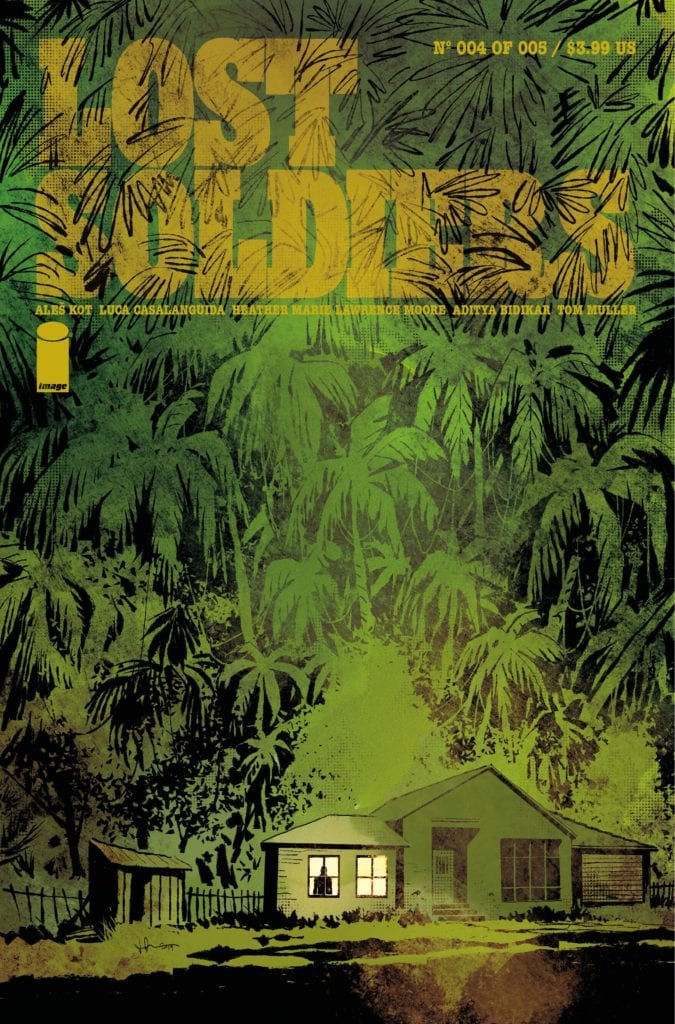
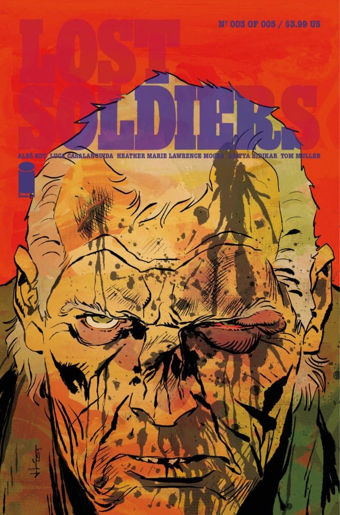
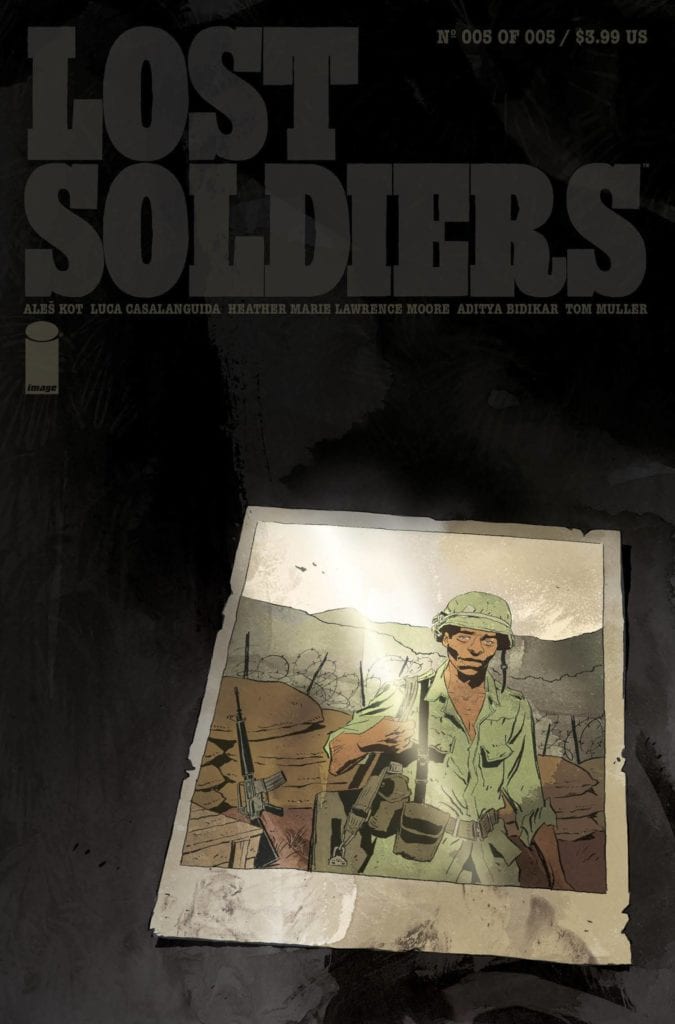
LostSoldiers is a 5-issue mini-series written by Ales Kot and drawn by Luca Casalanguida, with colors from Heather Moore. It’s published by Indie comics heavyweight Image Comics, and it may very well be the most crushing series they’ve ever had across their table. Lost Soldiers is a devastating yet poetic examination of how war affects the people who fight it both on the field – and especially years after the bullets have stopped. With a haunting script from Kot and surreal, graphic visuals from Casalanguida and Moore, this is one of the best war comics ever published.
“Vietnam, 1969. Juarez, 2009. Three men tied together by the war they left behind—on a collision course with the new one. As old grievances resurface close to the border, the bodies pile up. Can the men escape the cycles of violence, or will they be swallowed by them again, this time forever?”
Writing & Plot
The bulk of Ales Kot’s narrative in the five issues of Lost Soldiers takes place not in the heads of its scarred protagonists, but in the grim poetic machination of the voice of war. At least, that’s what we imagine it is. Both the disembodied narration from this unknown malevolent force and the actions of our main protagonist stalk the pages with a desperate, cloying hunger. The story’s switching focus between 1969 Vietnam and 2009 Juarez is held together not only by the haunting experiences of the two lead characters, but by this malevolent voice that slithers its way into many-a panel in this series. This series focuses less on combat then it does the inner turmoil of our unnamed protagonist. Not giving him a name is a symbolic choice here. This character obviously goes through his own intense traumas during his time in Vietnam – not going to get into spoilers, but more intense than even most accounts of warfare would likely bring about. He lives an existence afterward that many soldiers would likely have. This is the point. Despite this character’s experiences being very much his own, Kot decides to make him a symbol for the effects of war and unimaginable shock and what they do to the mind. More than this, Kot’s story is an examination of three different men’s response to extreme PTSD. One man has done all they can in terms of therapeutic resources to resume a semblance of a normal life. One has taken their hardened stoicism that they had 40 years prior and doubles down on it for the wars of today. The last – our nameless protagonist – never left the jungle. Saying any more would be giving up the goods.
Art Direction
The relentless, sullen tone of Lost Soldiers is brought to life by the combined efforts of Luca Casalanguida’s pencils and Heather Moore’s colors. Their work on this comic series sees its settings transform from the humid jungles of Vietman to the sandy streets of Juarez, but painting them in an almost surreal, otherworldly light. The visual effects brought out in this series make this comic feel like equal parts Full Metal Jacket and Apocalypse Now. Sequences of feasible reality will twist and morph into impossible, nonsensical imagery rife with rays of color shooting through the panels. The eyes of men with thousand yard stares color this comic in a way that makes us see the world through their eyes. The wear and tear is visible in the creases in the faces of the three men this comic centers on, and just getting looks at them put us as readers in their mindset without ever even having to go to the battlefield sequences. There is a masterful command of character art in terms of detail, shadow, and color in this comic that is rarely seen by even the industry’s best talents. This comic is so striking visually during just the quiet scenes of conversation or reflection that when the action hits it has the intended effect of being brutally shocking. The combat sequences are full of their own detached color scheme, like reality is fading before the eyes of the soldiers fighting. This uncanny atmosphere is permeated by the sight of tracer rounds and oh, so much blood. There are the standard shots of dead men that one would expect in a war story, but there’s an added cerebral horror to the carnage by Moore’s colors and Casalanguida’s choices with both gore and character reactions. There’s a disturbing sense of realization that Casalanguida brings to the faces of injured and dying men that is unnervingly haunting. This is a searing and vivid visual experience of a book, and potentially the most effectively drawn war comic I’ve ever read.
Lost Soldiers is more than a war comic. It is a treatise on people who never truly come home from war, and will live the rest of their lives on a battlefield. This is a book about three men who have found war, and have found way to satiate its appetite – but can and will never leave its call. Writer Ales Kot and artists Heather Moore and Luca Casalanguida have created an unforgettable and haunting experience that may be one of the most essential comic reads of the past several years. Be sure to grab this complete collection when it arrives on shelves on 2-10.
The talented team over at 12-Gauge Comics, responsible for badass works such as The Ride: Burning Desire and the acclaimed Kill Whitey Donovan, are back with another insane ride of a series via Kickstarter. And as usual, not only have I got a bit of a first look at what this story is all about, I’ve got the jams – chosen by the creator – to go along with the read.
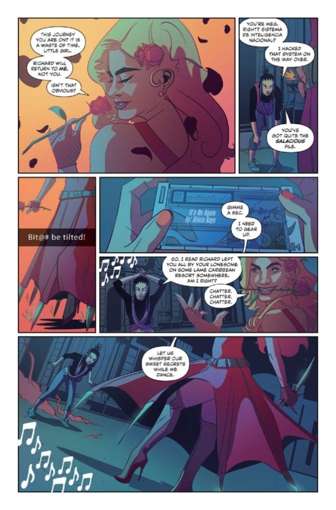
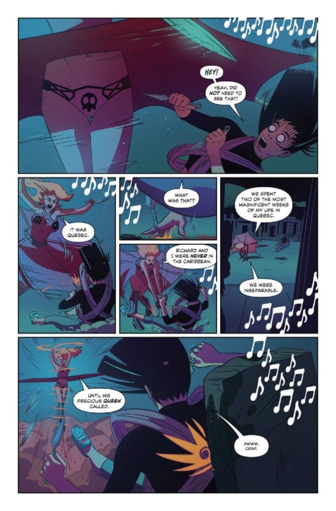
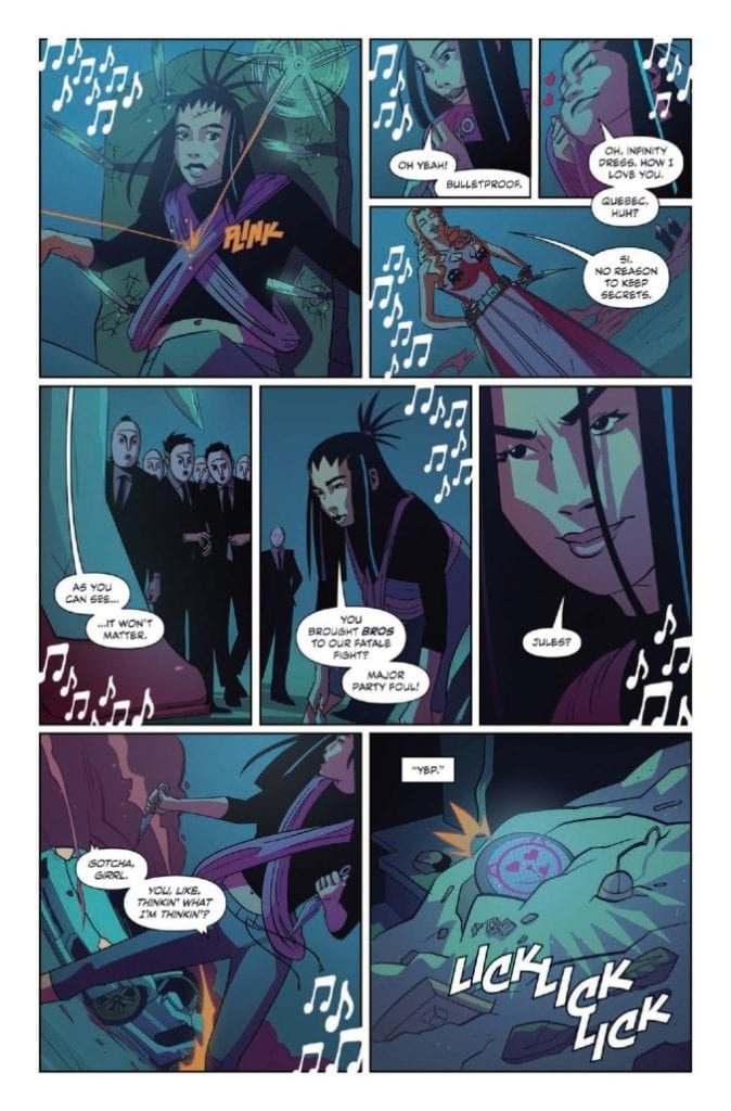
“Bloodsoaked katanas, sentient Lamborghinis, and a soundtrack that can level city blocks. Yumi—the world’s greatest hacker, demolitions expert, and parkour savant—embarks on a globe-trotting mission of vengeance as she tracks down her kidnapped boyfriend, super spy Richard. The 136-page graphic novel Yumi: Spy Fatale, Baddie Royale arrives from the feverish minds of writer Doug Wagner (Plastic, The Ride, Thomas River), artist Hoyt Silva (Last Stop, Mongrel), colorist Kevin Lennertz, letterer Frank Cvetovic, designer Sasha Head, editor Lisako Yamauchi, and publisher 12-Gauge Comics. Trailblazing a path of pulp spook fiction for a new generation, Yumi is a rush of pop culture adoration and hyper-kinetic brawls that resculpt the genre.”
YUMI JAMS
“You Should See Me in a Crown”
Billie Eilish
DOUG: I pulled up this song completely by accident and immediately fell in love with it. There’s this deadly creepiness to it that’s paired with this odd self-aware love that just spoke to me. Plus, I thought the title worked perfectly for invading MI-6.
HOYT: As soon as I heard the chorus drop, I knew this was a vibe for Yumi. It has this whole focused intensity and insane determination sound to it that’s a cornerstone to Yumi’s character.
“Problem”
Natalia Kills
DOUG: How could I pass on the perfect song title and artist’s name for a book like Yumi. That alone would have gotten it into the book, but after I listened to it, I knew it had to be the soundtrack for the first fatale duel on Lover’s Bridge.
HOYT: I think this one so perfectly sets the tone for Yumi’s attitude. That take-no-prisoners-but-have-fun-while-you’re-doing-it energy is what I wanted to get across with every panel I could.
“Kill V. Maim”
Grimes
DOUG: To this day, I’m enamored with this video. It’s like a mix of Tank Girl, The Road Warrior, and The Fifth Element. It’s the exact kind of thing Yumi would find irresistible.
HOYT: The way this track stirs a variety of flavors together speaks to my favorite aspects of Yumi’s sassy and sour; love-you-while-kicking-you-in-the-face personality.
“It’s On Again”
Alicia Keys (featuring Kendrick Lamar)
DOUG: To be completely transparent, I find Alicia Keys to be one of the most interesting human beings on the planet. She’s this amazing mix of genius intelligence and empathic understanding. It’s so rare to see both in the same person. Yumi’s first adventure wouldn’t be complete without Alicia in it.
HOYT: Hard to recall a track by Alicia Keys that doesn’t make your hair stand on end. Talk about a song that will get you back on your feet and back at it again.
“One Woman Army”
Porcelain Black
DOUG: Attitude for days. That’s what drew me in. The song is about being sexy, independent, and a total badass. That speaks to what I wanted to create in Yumi.
HOYT: If this track didn’t nail the right attitude, the title certainly did. Not to mention the pretty/tough balance we were going for throughout the book, this one had it all.
“Look What You Made Me Do”
Taylor Swift
DOUG: Has there ever been a better song title for a finale than this one? The song is the epitome of Yumi’s transformation from who she was to who she becomes.
HOYT: Yeah, I have to agree with Doug here. Taylor captures where we take Yumi from beginning to end, and the vibe is just *chef’s kiss.*
“Kill This Love”
BLACKPINK
DOUG: Sadly, I wasn’t aware of BLACKPINK until Hoyt sent this one to me. I’ve been obsessed with them since I pressed play.
HOYT: Our editor Lisako actually put me onto BLACKPINK and I was instantly hooked. Their entire catalogue was in heavy rotation while I worked on pages.
“Truth Hurts”
Lizzo
DOUG: For this book, I had to spend a lot of time searching for the right music to put on Yumi’s playlist. I happened on Lizzo one night and immediately fell in love. Then I found this song and knew it was the right song to close out the book.
HOYT: While Doug was figuring out the music, he had me throw together a list of what I was listening to without seeing what he was considering, and this was a track that we both put up at the top, so you know it had to stay, and what a perfect fit it had at the end of the story.
THE SONGS THAT INSPIRED IT ALL
“Wrecking Ball”
Miley Cyrus
DOUG: Although this song didn’t make it into the book, it was the first song I started listening to in hopes of channeling the right tone for the book. As with all the female artists on this list, I admire and adore Miley’s unapologetic inner strength, massive success, and independent mindset.
HOYT: Originally we were considering this for the opening scene and I think it would’ve worked great because that’s exactly how Yumi shows up, like a wrecking ball. Ultimately what we went with worked tighter with the scene and the tone we wanted to set, but it’s a classic nonetheless.
“Bad Blood”
Taylor Swift (featuring Kendrick Lamar)
DOUG: I loved this song the second I heard it. The lyrics and music fit what I was hoping to achieve with Yumi from the outset. Then… I watched the video. It encapsulates the tone, sassiness, and carefree spirit I wanted for Yumi. I watched it almost every day just before I started working on the book.
HOYT: Yeah, when this one dropped we were mid stride in the book and I called Doug the second I saw the video. It’s like they pulled the vibes for Yumi right out of our heads and I loved every second of it.
“Mine”
Phoebe Ryan
HOYT: What we ended up coming up with is a story about picking up and moving on when things aren’t right. Taking those pieces and embracing your faults is a part of growing as a person, and Phoebe hits that in stride with this one.
DOUG: Am I supposed to add something to that?
HOYT’S PERSONAL LIST HE USED WHILE DRAWING
“I Do”
Cardi B (Featuring SZA)
HOYT: You know who pulls no punches? These two women right here. This joint hits right where I think Yumi would; the neck.
“thank u, next”
Ariana Grande
HOYT: We’re a culmination of our past experiences and relationships. This one here really encapsulates that and is very much the journey this book takes.
“Lovesick Girls”
BLACKPINK
HOYT: If there was ever a general theme for the whole story, it’s in this song right here. I think it hits all the right notes and who doesn’t need more BLACKPINK in their playlist?
DOUG’S PERSONAL LIST HE USED WHILE WRITING
“Gone”
Charli XCX & Christine and the Queens
DOUG: This was one of my two go-to songs for writing the insanely absurd fight scenes Hoyt and I did for the book.
HOYT: Now I see why every scene had a great build up. It’s unapologetic heart definitely checks all the boxes for Yumi’s strong personality.
“Level Up”
Ciara
DOUG: And this was the second of my two go-to songs for unleashing Yumi on the world.
HOYT: This one so rightfully captures those victory vibes that it had to be on the list.
“Yumi pays homage and respect to the massive contribution Ian Fleming gifted the literary world, while bringing a modern flair to the genre,” Wagner explains. “Yumi may sound like a spy story, but it embraces so much more. Yumi is about how love can inspire a person to become more than they believed of themselves. It’s ridiculous and over the top. It’s a story of unconditional, all-consuming love filtered into an action blockbuster—Scott Pilgrim meets Kingsman, all wrapped in a sassy, heartwarming pancake.”
“So many explosions. So many countries. So many battle sequences. Yumi: Spy Fatale, Baddie Royale is one of the most adrenaline-fueled projects of my career—Doug’s script crackles with momentum,” Silva explains. “It was an amazing challenge to match that sheer energy.”
The graphic novel is available in three softcovers editions with covers from Lois van Baarl, Eliza Ivanova, and Chris Brunner. Two limited edition hardcover editions feature art from Eliza Ivanova and Lois Van Baarl. The project is available on Kickstarter now until March 11, 2021.
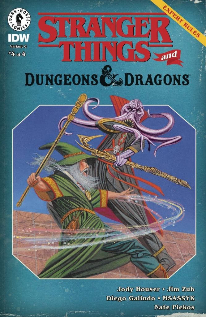
A mighty battle awaits in Stranger Things and Dungeons & Dragons #4.
STRANGER THINGS AND DUNGEON & DRAGONS #4, available February 17th from Dark Horse Comics, concludes this crossover event, as one young crew of players bring their latest campaign to an end.
A mighty battle awaits in Stranger Things and Dungeons & Dragons #4.
Stranger Things and Dungeons & Dragons #4 may wrap up this miniseries, but we all know that the story of Stranger Things isn’t quite over yet. Who knows, they might even make time for another game or two, in between saving the world.
This series started out telling us the story of three friends who found a world to escape into. Through it, they gained a fourth friend, as well as a way to cope with everything the world threw at them. Even literal monsters.
Now, the group has grown, as this issue is so happy to point out. They still have a passion for D&D, though it has changed over the past few months. Really, that feels like the true focus for this final issue.
A familiar look for this variant cover of Stranger Things and Dungeons & Dragons #4.
The Writing
Written by Jody Houser, Jim Zub, Stranger Things and Dungeons & Dragons #4 perfectly wraps up this plot arc. It’s surprising to see how much time has passed over the course of these four issues. It all started before the Netflix show kicked off, and quickly gets up to date with the main storyline.
Yet it never felt rushed. Each issue was a short story, a vignette, providing a new perspective in everything they’ve gone through in recent times. What makes this issue so compelling is how much subtext got written into Will’s campaign.
It feels like the elephant in the room is finally being addressed, and that it bittersweet. Yeah, we know that the series isn’t over, and obviously we have to assume that the gang will all get back together somehow. But that doesn’t dampen the impact of this story.
There are a few surprises as well, which help to keep this issue from getting too dark at times, and the ending itself does carry with it a sweet note. If anything, this whole series might help those fans that can’t wait for season four to drop.
The Art
Stranger Things and Dungeons & Dragons #4 is full of bold artwork, most of which should feel familiar to the fans. Told in two forms, there’s the world set in Hawkins, and then there’s a fantasy world: the world of D&D.
Both work together pretty nicely, all things considered. Diego Galindo is the artist who merged the two together, portraying familiar faces on the pages, while also dreaming up what sort of characters the newcomers would enjoy playing.
Meanwhile, Msassyk’s colors provide a sense of time and grounding. There’s no doubting what time period this series is set in – even if the details are on the subtle side of things. The colors also help to make the transition between the two worlds easy to spot.
Nate Piekos did a fantastic job of balancing the narrative. This issue has a lot going on in it, in terms of communication. There’s narration, Will’s campaign, and even just the conversations had between each character. Yet Piekos’ work help to keep it all clear.
Conclusion
Stranger Things and Dungeons & Dragons #4 is the conclusion that this series deserved. It wrapped up everything neatly, but more importantly, it held true to the tone of the main series. It brought all of that full circle while providing just a touch of insight to everything that had gone on.
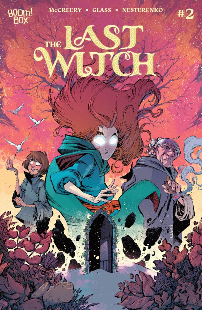
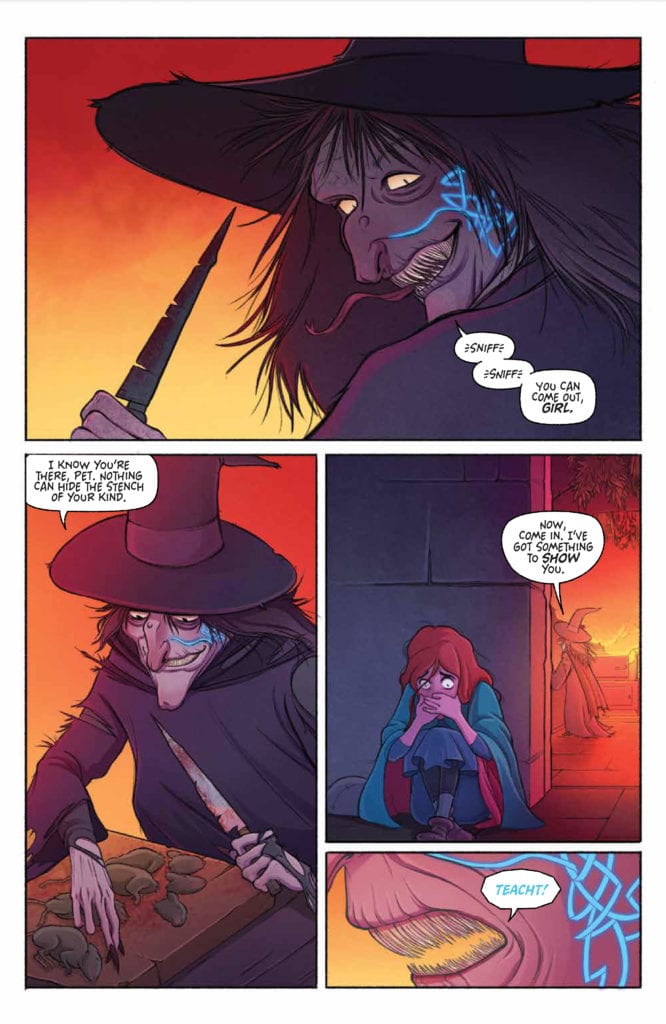
THE LAST WITCH #2, available now from BOOM! Studios, continues the tale of little Saoirse and the dangerous adventure she and her brother have found themselves embroiled in. This is a tale of legends, witches, and an everlasting hunger.
It’s time to learn the truth in The Last Witch #2.
The first issue of The Last Witch quickly introduced fans to Saoirse and her family, as well as the danger they all faced. It also hinted at several other major revelations for down the road. All in all, it made for a strong and compelling start.
So it is safe to say that The Last Witch #2 was an anticipated issue, at least for this reviewer. I’m not ashamed to say that I’m invested in what happens next, especially after the way the last issue left off!
This series promises to blend fairy tale tropes of witches and a coming of age story into something new and interesting. There are plenty of familiar notes to be found along the way, but I have no doubt that there will be twice as many surprises.
We all know that this isn’t going to end well.
The Writing
The Last Witch #2 is yet another issue that immediately pulls the reader into the story. The stakes at hand make it all but impossible to look away from it, as Saorise follows a path that many of us would turn from.
Written by Conor McCreery, this issue truly feels like it belongs in another world. A world where magic exists, and it is not the friendly sort of magic one happily dreams about. The first half of the issue builds on that creeping sense of dread the series left off on.
Though it isn’t afraid to throw in some true horror as well, albeit in surprisingly delicate ways. From there the story seems to take up a life of its own, delivering on some of the hints and promises made.
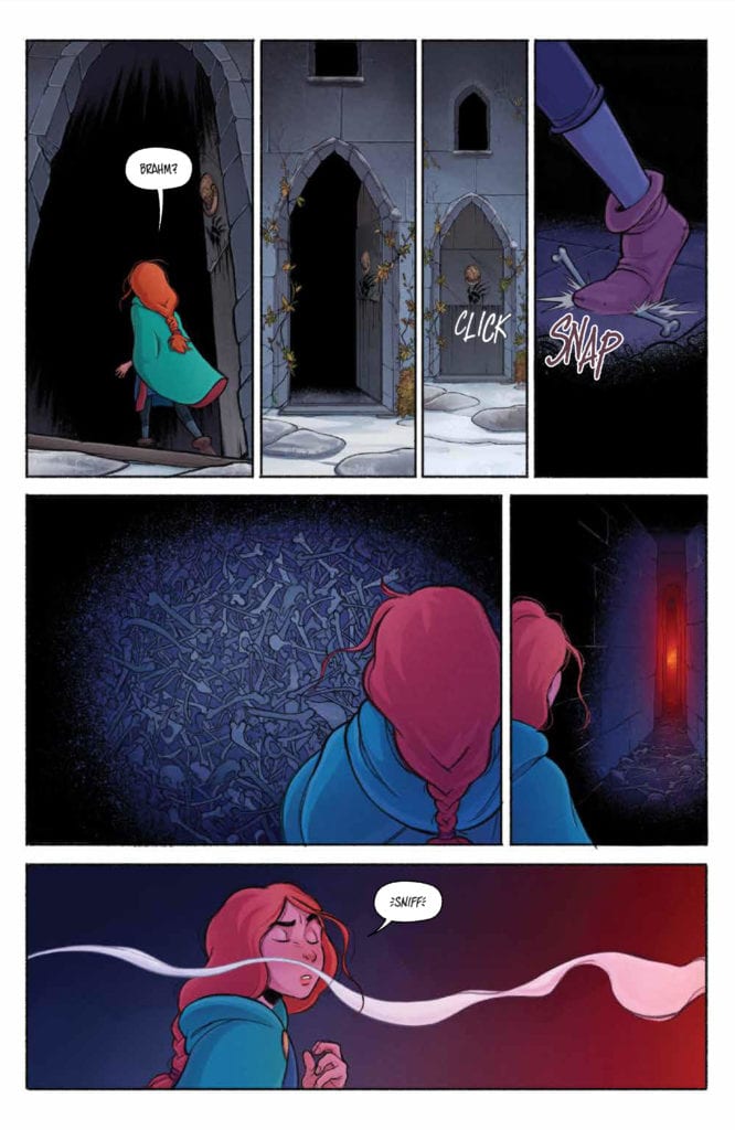
One of the highlights from The Last Witch is the way in which relationships are captured. Saoirse and her grandmother are a solid example. There’s a clear sense of faith and trust there. Though ironically it’s the little moments between Saoirse and her brother that steal the show, grounding the world in a way little else could.
Well, she found her little brother…and the witch.
The Art
The Last Witch #2 at times feels like a cross between a classic fairytale, and something right out of Studio Ghibli. There’s so much personality infused into each and every panel, and the overall aesthetic is stunning.
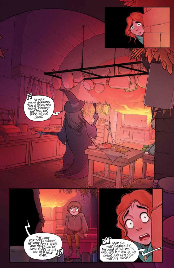
V.V. Glass’s characters really do demand attention, from Saoirse herself to the witches shown – both in true form and in silhouette. They’re chilling and terrifying at the same time, without crossing that line into being too much. In short, they’re the perfect villains for this world.
The colors, provided by Natalia Nesterenko, are vibrant and deep, adding weight to this tale of little girls and witches. The snow makes for a sharp contrast against it all, with the end result being something both memorably and beautiful.
Jim Campbell deserves some of the credit for how human the characters in this tale appear. Well, how human Saoirse and her brother feel. Their interactions flow so organically, helped along by a little detail or lettering here and there.
Well, that’s an image that will never go away.
Conclusion
The Last Witch #2 held up to the expectations created by the first issue. Actually, it arguably might have surpassed them. This is turning out to be a thrilling tale, one of magic, revenge, and familial responsibilities. I for one cannot wait to see how it unfolds from here.
Children of the Grave #2 releases February 10 from Scout Comics. This issue is written by Sam Romesburg and Ben Roberts with art by illustrator Gioele Filippo, colorist Marco Lesko and letterer Justin Birch. Within this part of a sci-fi horror thriller, conflict rears its ugly head. Because, in times when the paranoid are being punished, finding someone to trust can be nerve wracking.
Background
Children of the Grave is about a post-apocalyptic Earth now known as Terra. People are blissfully ignorant of the world around them, choosing to blindly follow the Providers who give them everything they need to survive and thrive. All except Daniel, who finds the life on Terra both boring if not outright dominating.
Children of the Grave #2: Cult Behaviors
What makes Children of the Grave #2 stand out is how Romesburg and Roberts implement perspective. The lead character, Daniel, is by all accounts a conspiracy theorist. No matter how right he is about a situation, he’s unhappy with his life. It certainly doesn’t help that the decisions he has to make don’t seem to be leading to anything good.
The priest, Brother Cruise, who serves as ambassador of the Providers, is anything but nurturing. He’s more than willing to harm and imprison others who go against him. The way Cruise makes it all sound like Daniel is a public enemy only furthers the cult-like connections.
Then there’s Daniel’s potential new ally, “The Mother,” who asks Daniel to meet her alone. She seems to be wanting to alienate him. Abusers use alienation from loved ones to maintain their power. So, she may not be trustworthy. It’s a nice surprise, then, when Daniel brings a friend along and she doesn’t scold him. Not that it makes the revelations she’s about to provide any easier to digest. Truths can be more of a burden than a blessing.
It’s certainly good that a series takes strides to make readers feel things like this. This way readers keep interest for much longer.
Uneasy Perspectives
The artwork by Filippio provides this ever present sense of unease in Children of the Graves #2. In certain panels, the architecture looks distorted, making the reader empathize with the ever vigilant Daniel even more. The scenes with Mother holding a rifle as Daniel and Cyrus go to meet her also feels ominous. Daniel had, in all respects, disobeyed Mother and it looks like she was ready to punish him for it.
The semi-muted coloring from Lesko certainly helps bring a sense of melancholy, especially in the darkened areas Daniel hides in. Things might look all nice and dandy in the town, especially to the citizens. But to Daniel, it’s all just a reminder of Cruise hiding something important.
The lettering by Birch gives even more weight to Children of the Graves #2. With tensions already high, the word balloons take up the panels and add more weight. This, in juxtaposition with some actions taking place, makes tensions rise until a bigger action explodes onto the page.
Get Children of the Graves #2 When You Can
Children of the Graves #2 is a point where readers are getting absorbed into the plot. The series beckons them to see the rest of it all through. That is if the scary secrets like cult abuse don’t drive the readers away. Ignorance, in this case, may be bliss. Nobody ever says that truths are easy. Consequently, this allows for empathy and connection to characters going through hard times. That’s enough for me to keep reading.
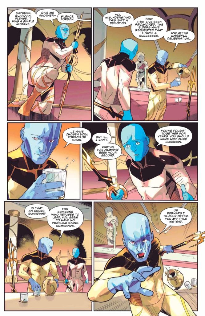
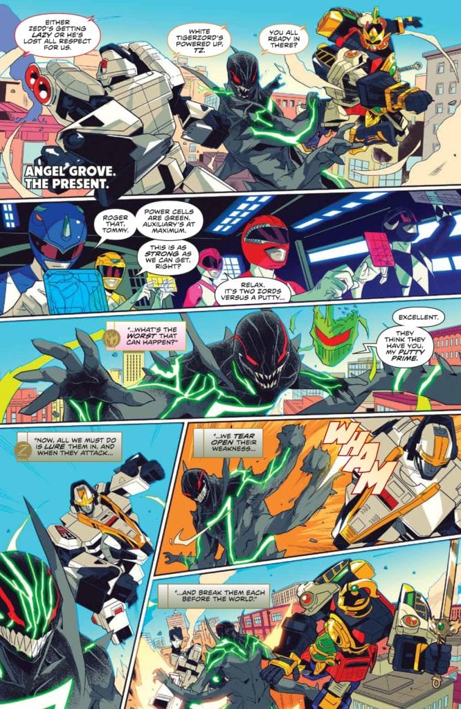
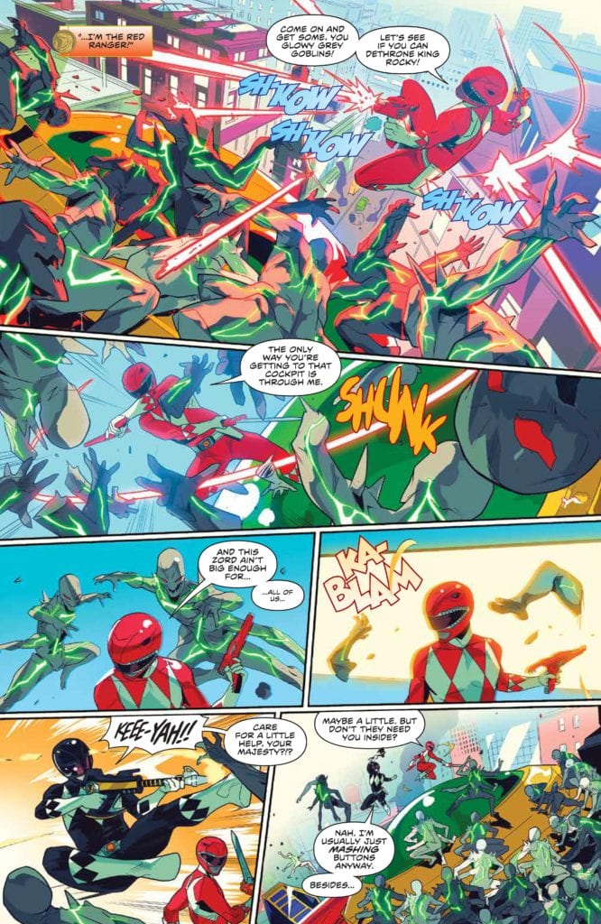
Boom Comics releases its fourth issue of the Mighty Morphin series on February 10, 2021. It’s another strong entry in Mighty Morphin Power Rangers line relaunch. The story is written by Ryan Rarrott. Marco Renna handles the illustrations. Colors are provided by Walter Baiamonte and the book is lettered by Ed Dukeshire.
Story
Ryan Parrott continues to spin tales that enhance fan nostalgia for Power Rangers. Issue four is like so much of his work. Characters are developed, the plot thickens, and complexity abounds on every page. However, it never comes at the cost of what fuels the nostalgia. Issue four feels like the end of a second act. Our heroes are on the verge of being conquered by Lord Zedd’s Chaos Putties. This alone testifies to how well Parrott understands the source material behind his work. This could be an episode of Power Rangers. But since the book is aimed for an older audience, we get some great moments of nuanced writing.
A prime example of this is Rocky, the Red Ranger. In the book, Rocky charges headfirst into a battle, and it’s possible it’s as a sacrificial play. Countless Red Rangers have done this on the show throughout its nearly thirty year run. However, here we see Rocky wrestle with being in his predecessors’ shadow. It allow us to see this Red Ranger developing into a strong force on the team. The issue is full of solid action, and the ending feels like our heroes cannot possibly win. It also leaves the reader on the edge of their seat, counting down the days to next month.
While I am excited and pleased with the overall direction this story took, I am little disappointed by the big reveal. Since the ending of the original series there has been an ongoing mystery woven into the books. Who is the new Green Ranger? Issue four pulls back the curtain and shows you just who is behind the helmet. It is a major let down, and it is pretty obvious. The reveal lands with a bit of a thud, and most everyone reading the series has already guessed who it is. Hopefully, there will be more to this unveiling in future issues to make it more compelling. For right now, it is deeply disappointing in an otherwise amazingly crafted story.
Art
Marco Renna’s illustrations are exactly what a Power Rangers book needs. The Rangers and the Zord look awesome. The action is tight and gives a chaotic feel to a battle where the Power Rangers are overwhelmed. The character moments, outside of the helmets, particularly the Eltar backstory and Bulk and Skull’s aside, feel real and honest. Lord Zedd and the Putty Prime are well drawn villains. Renna knocks it out of the park on this issue.
Color
Walter Baiamonte manages a bright palette to perfection. Baiamonte nails the feeling of the show that is vibrant and colorful without making the work feel aimed at children. The coloring on the section where Zedd is appearing to Putty Prime as a hologram is a great example of how the colors on this book enhance the overall work. Baiamonte uses a neon green that, while bright, does not take away from the evil and vile presentation Lord Zedd emits. Baiamonte’s colors pair with Renna’s illustrations and Parrott’s story to create a really fun piece of comic art.
Letters
Ed Dukeshire’s lettering in this book is very competent. The use of fonts and colors to distinguish Zordon and Alpha-5’s voice work really well to give those characters a different feel from the others. I continue to be perplexed by the fact nothing is done with Lord Zedd’s voice. The voice crafted by the late Robert Axelrod for Lord Zedd was gravelly and the sound of pure evil to children everywhere. It deserves to be portrayed on the page in a way that is differentiated from Tommy and the other Rangers. That one mind-boggling omission aside, the lettering in this book is great and enhances the story unfolding before those who read this work.
Conclusion
Parrott and company continue to kill it on the Power Rangers line. Issue four is filled with great action and deep story telling. The strengths of the book greatly outweigh the flaws in the Green Ranger Reveal. Once again, I am left with the feeling that two Power Rangers books a month is not enough, and that is a great feeling for this long time fan.
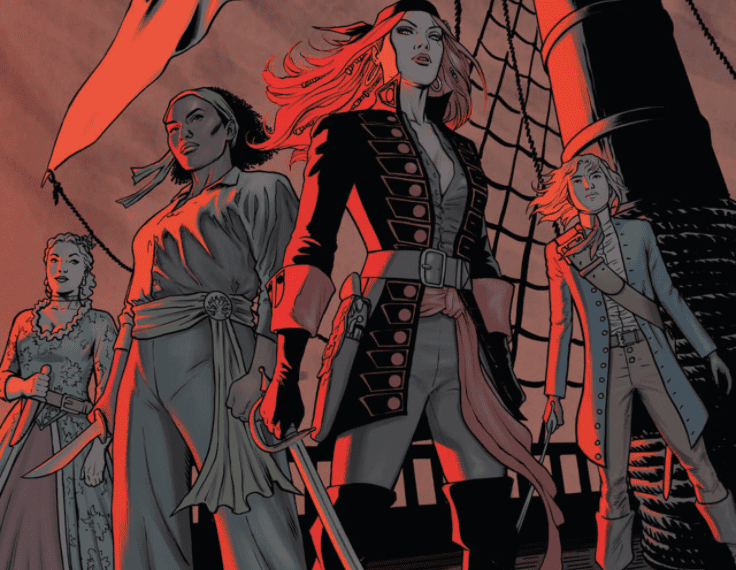
A Man Among Ye comes from Image Comics’ Top Cow imprint, with a trade releasing on February 10. But what’s left to say about writer Stephanie Phillips and artist Craig Cermak’s little Shanty? I mean, MFR already has its name on the back cover of the trade courtesy of our own Darryl Robson. But let’s talk about how this series explores being a pirate in the best and worst ways?
A Man Among Ye: Not From History Books
A Man Among Ye is first and foremost an alternate history about Anne Bonny and her companion Mary Read. Phillips makes this stand out by making Mary a decade younger than Anne, whereas historically Read was older than Bonny. Continuing off from one of Darryl’s other reviews, this is Phillips and Cermak’s defiance to the status quo. What better way to show piracy than by stealing the narrative and changing it to suit their needs? I’m a fan of Once Upon A Time In Hollywood and this series scratches that same itch.
Even if, narrative wise, characters who espouse to treasure freedom like Charles Vane make backstabbing deals. Then again, piracy does involve backstabbing.
Suspend Your Disbeliefs
Cermak uses artistic techniques to keep the reader’s attention. Cermak, in all of his pencils and inking, evokes very sensational scenes straight out of a pulp novel. An opening involving a pirate ship and a navy ship in battle certainly makes a strong first impression. Especially when that pirate ship takes up the most space, that shows how powerful a presence the pirates are.
The coloring duties go between different artists, each with their own styles. Cermak does the first issue whose use of the color red steals the spotlight. Anne essentially epitomizes that with her red hair and her use of fire to burn a ship down.
John Kalisz gives a much more muted coloring in the other three issues, where the adventurous atmosphere becomes stunted. That is until elements of importance like the poisoning of a drink come up.
The final pages with coloring by Brittany Pezzillo is where new life springs into A Man Among Ye. Amid the flames, gunshots, everyone in the area (especially Anne) looks like they’re ready for a new chapter in their lives.
As for letterer Troy Peteri, you have to appreciate what he puts behind the words. Every word has a font rough enough for characters to actually talk like pirates. The SFX are just as wild, each crafted for a specific purpose like gunshots from different guns or splashing water. All of this is presented in a way that makes the actions louder.
Can A Man Among Ye Talk Like A Pirate?
A Man Among Ye does what it wants, when it wants, because that’s what pirates do. People are more than guaranteed to have a good time reading it.
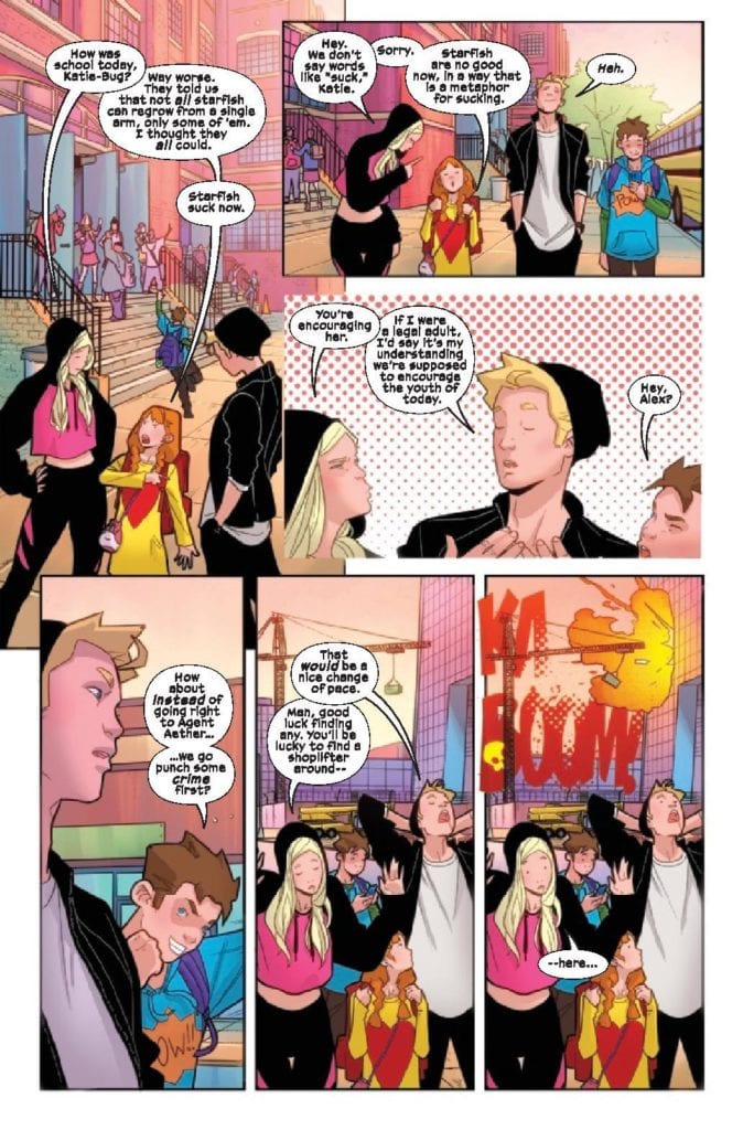
Power Pack #3 from Marvel Comics publishes on February 10 with a special focus on Lightspeed. Ryan North writes this character with a lot of introspection on how a superhero should act. Artist Nico Leon and colorist Rachelle Rosenberg keep up the cartoony style, even as things get serious. Letterer Travis Lanham also makes sure that the more serious moods still intersect with the lighter touches.
Background
Continuing on from the last issues, the Power Pack find a mentor in Agent Aether to get Outlawed antagonists CRADLE off their backs. In doing so, they apply their powers to a science project, meant to help people. But what if the pack’s new mentor has ulterior motives?
Power Pack #3: Still All-Ages
Power Pack #3 takes Julie/Lightspeed’s perspective, as readers look at the sibling’s family dynamic. Julie often tries to act as the Pack’s voice of reason when they get into their minor quarrels. If anybody has relatives that drive each other crazy, wanting to calm everybody down is relatable. North takes this a step further by showcasing how Lightspeed thinks on her feet in battle against Taskmaster. Thanks to Julie’s experience outside of the Pack, she knows how to goad powerful fighters like Taskmaster, to her and the Pack’s advantage. It’s always good to see heroes work with what they’ve got when they’re at a disadvantage.
The Best Things In Magenta
Leon’s art keeps the light cartoony flow going in Power Pack #3. The fight with Taskmaster might be life threatening, but Leon still manages to keep things light. A bullet, aimed at the Pack, almost hits them. But then they have cartoonish fall to safety, thanks to Zero-G. And right after, we see the Pack’s funny reaction. They’re complaining, kind of like a Jackie Chan action-comedy scene.
Rosenberg includes a lot of magenta in this issue with its focus on Lightspeed (it’s the color of her costume). Whether it’s the lights, mental images of her girlfriend, or the background, it serves as a way to tell the reader that Julie pulls the most weight in this issue. This extends to the captions from Lanham who uses them in juxtaposition with Lightspeed’s mood. When she’s going in for an attack, she screams out her frustrations. It’s nice to see that while Lightspeed does have experience, she is still young and has quirks that make her more relatable.
Check Back In On Power Pack #3
One of Power Pack‘s main strengths is how each family member gets a voice. Lightspeed is taking center stage on all fronts in Power Pack #3. Julie shows off her ability to keep everybody on target. Not only does her experience allow her to take advantage of the situation, but despite this she still has more to offer than heroism. Now fans have more to look forward to when it comes to the rest of the Pack.
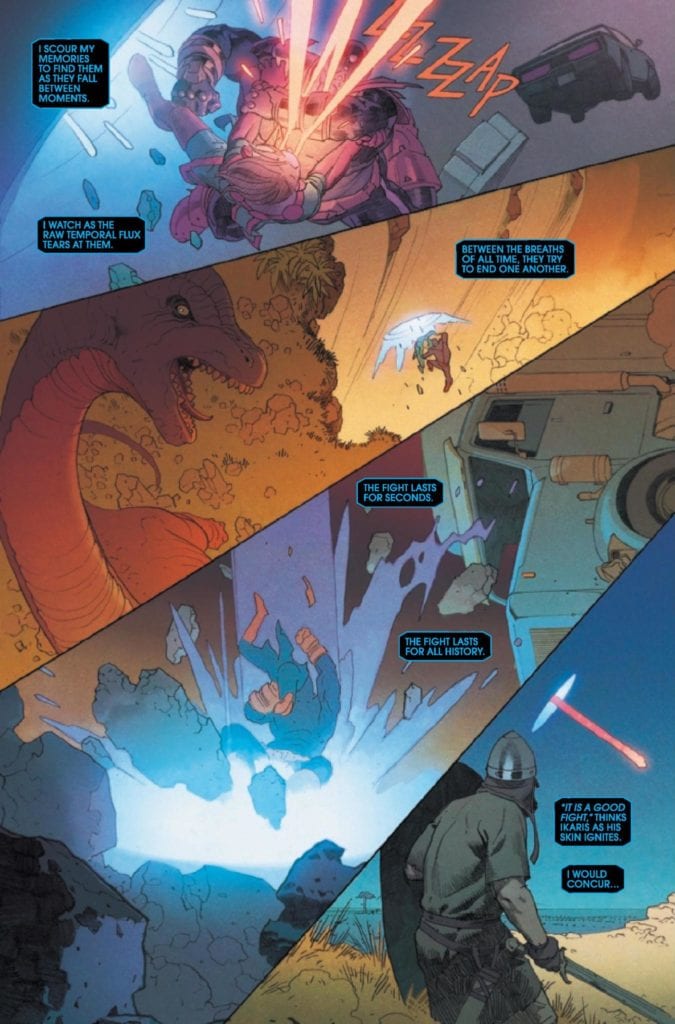
Eternals #2 from Marvel Comics publishes on February to further showcase this future MCU cast. Writer Kieron Gillen demonstrates the reach of these godlings in Marvel history. Artist Esad Ribic displays the stakes of this part of the greater Marvel world. This is all the more apparent in the coloring by Matthew Wilson, that makes events look like they’re being recorded in paintings. All while letterer Clayton Cowles gives this issue three distinct voices that interact and bring everything together.
Eternals #2: How Gods Look At Time
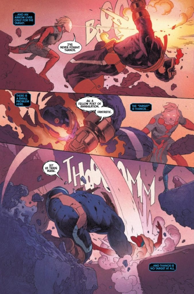
Gillen goes to lengths to display how the cast of Eternals #2 look at the world. To them, events and stakes are just records to do their tasks. For Ikaris, threats are only things to hit, no matter where they take place. Even someone as significant a threat as Thanos means very little to the politics of these godlings. Eternals like Druig are more focused on keeping their standings than worrying about Thanos. It’s an entire history lesson in-story.
With political tensions at an all time high in the real world, it’s easy for readers to feel the weight of some of these actions. Even if that means the reader doesn’t quite understand how Ikaris’ actions will turn out. The last time he tried to fight a monster, he mistakes the time it appears with the place.
Portraying An Epic
Eternals #2 has Ribic’s art show the angles and dynamic positions of the situation at hand. In Ikaris’ battle against Thanos for example, Thanos’ height and movement demonstrate his control over the situation. Which is incredibly ironic, considering the effects of the Great Machine. It helps Ikaris fight Thanos in many different time periods, through a series of portals. No matter how chaotic and familiar Ikaris is with his world’s resources, Thanos remains an ever-powerful threat to him.
Wilson’s details in coloring give the above situation the feeling of an epic. Like a painting by Giovanni Bellini, the lines, shading, and brightness are an extension of an action taking place. Thanos’ apparent victory over Ikaris has so many details in it, that if not for captions by Cowles, it’d be a blink-and-you’ll-miss-it moment.
Cowles lettering does more than just guide readers, it provides context to character’s roles. The Great Machine with how it/she(?) speaks is like an omniscient narrator. Which is why the reader needs to pay attention when she speaks about a past event. It indicates that she has been tampered with. That’s why the marginally related Thanos is able to escape her gaze. With how Thanos’ word balloon looks distorted in comparison to most characters, it furthers how much of a threat he is.
Eternals #2: Prepare For The Next Epic Chapter
Eternals #2 is shaping up an already impressive series into something that can only be epic. Each member of the creative team collaborates to give weight and meaning in their roles. All while making the titular cast, in a world so unlike our own, looks fascinating yet detached. Something’s going on and the reader will want to stick around.


 A Man Among Ye is first and foremost an alternate history about Anne Bonny and her companion Mary Read. Phillips makes this stand out by making Mary a decade younger than Anne, whereas historically
 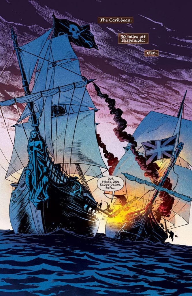 Cermak uses artistic techniques to keep the reader’s attention. Cermak, in all of his pencils and inking, evokes very sensational scenes straight out of a pulp novel. An opening involving a pirate ship and a navy ship in battle certainly makes a strong first impression. Especially when that pirate ship takes up the most space, that shows how powerful a presence the pirates are.
 Power Pack #3 takes Julie/Lightspeed’s perspective, as readers look at the sibling’s family dynamic. Julie often tries to act as the Pack’s voice of reason when they get into their minor quarrels. If anybody has relatives that drive each other crazy, wanting to calm everybody down is relatable. North takes this a step further by showcasing how Lightspeed thinks on her feet in battle against Taskmaster. Thanks to Julie’s experience outside of the Pack, she knows how to goad powerful fighters like Taskmaster, to her and the Pack’s advantage. It’s always good to see heroes work with what they’ve got when they’re at a disadvantage.
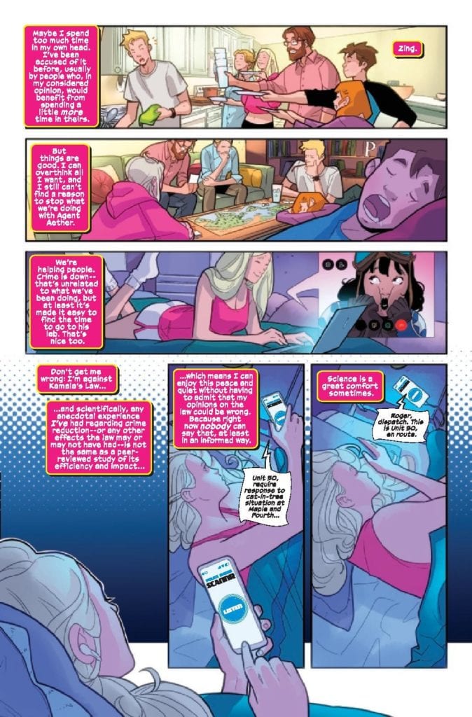 Rosenberg includes a lot of magenta in this issue with its focus on Lightspeed (it’s the color of her costume). Whether it’s the lights, mental images of her girlfriend, or the background, it serves as a way to tell the reader that Julie pulls the most weight in this issue. This extends to the captions from Lanham who uses them in juxtaposition with Lightspeed’s mood. When she’s going in for an attack, she screams out her frustrations. It’s nice to see that while Lightspeed does have experience, she is still young and has quirks that make her more relatable.
 Eternals #2 has Ribic’s art show the angles and dynamic positions of the situation at hand. In Ikaris’ battle against Thanos for example, Thanos’ height and movement demonstrate his control over the situation. Which is incredibly ironic, considering the effects of the Great Machine. It helps Ikaris fight Thanos in many different time periods, through a series of portals. No matter how chaotic and familiar Ikaris is with his world’s resources, Thanos remains an ever-powerful threat to him.