Home Blog Page 186

INTERVIEW: Cinematographer Richard Schaefer Wrestles With Cole Hauser In The Last Champion

Cole Hauser (Yellowstone, Rogue) stars in The Last Champion, a film from director Glenn Withrow (Dirty Dozen, ALF) about a disgraced former Olympian wrestler returning to his hometown forced to face his past and create a better future.

Hauser plays John Wright, a Greco-roman wrestler who reached the sport’s pinnacle when he made it to the Olympics. As a sports celebrity, John’s life came with a lot of scandals that pushed him to the depths of disgrace. When his mother dies, John returns home to pick up the pieces of her life and his own. The journey home will either break John or become a new path toward redemption.

PopAxiom spoke with the film’s cinematographer Richard Schaefer about making The Last Champion and more.

Supernatural

Cinematographers take a lot of pictures for a living, but Richard’s road to filmmaking “started by playing drums in the fifth grade and getting into music and bands by high school.”

“At the same time,” he explains, “I would buy a lot of sound equipment. In high school, I joined the theatre department doing lighting, sound, and building sets. I spent a lot of my time through high school doing rock and roll and theatre.”

Near the end of high school, Richard “was accepted into Chapman University, a film school.” But between the end of high school and the start of film school, Richard spent a summer on the road. “I went out with the Monsters of Rock tour with bands like Metallica, Scorpion, and Van Halen. I toured the east coast. It was an introduction to professional rock and roll and traveling and that world. This helped me realize I didn’t want to do this full-time, I wanted to find another way to express my creativity.”

By the start of college, Richard “wasn’t sure if I wanted to go more into film or more theatre. I love them both.”

“It dawned on me that a career in theatre tech meant sitting in a black box night after night,” Richard says, “while in film, you can go on location.”

“I’m technically wired,” Richard admits, “I’m a gear head. As a musician, blending art and tech was my forte.” The musician-turned-DP “found cinematography to be something supernatural that drew me in.”

the last champion-cole hauser-film

About The Last Champion

Richard spends a lot of time setting up shots for commercials, and it was through that world that The Last Champion came to him. “I know producer Brian Gork from the commercial world. He said he had a project I might be interested in and sent me the script.”

Richard liked the script, and “a few days later, I met John and Glenn. We chatted a bit about the movie. I wasn’t signed on to the project, so I was hesitant to give my opinion, but a few times during that meeting, they looked at me and wanted my instinct on it.” Richard’s instincts proved to be on point. “A couple of days later, they asked me to be on the project.”

“It’s very much pacific-northwest, winter, snowy,” he says about the moody but picturesque The Last Champion. “I love David Fincher and cinematographer Jeff Cronenweth; those guys are some of my heroes. So, I thought Girl with the Dragon Tattoo and Gone Girl were blueprints, looks-wise.”

No matter the project, research, and inspiration lead to creating a language of references to share. “I studied the masters, pulled a lot of stills, and had discussions with Glenn, showing him references and the way they treated the snow and cold.”

“We didn’t quite have the same budget as those guys,” Richard jokes, “but we had enough to get it done.”

Director Glenn Withrow co-wrote the film with his daughter Ivy and wife Hallie, who also co-stars in the movie. “They had such depth to the character development. Cole Hauser put so much into it, too. He came in with so much backstory for who John is and where he’s been before the film.”

“I enjoyed working with him,” he says definitively about Cole Hauser. “There were times when it was just him and me driving around in a pickup truck with a camera on my shoulder. He’s a professional on set and a great off-set.”

“We shot about thirty days of principal photography,” Richard says of the film, which made the most of a modest budget. “Forty locations, and a cast of 50. Forty locations in 30 days, we were moving.”

Shooting Wrestling

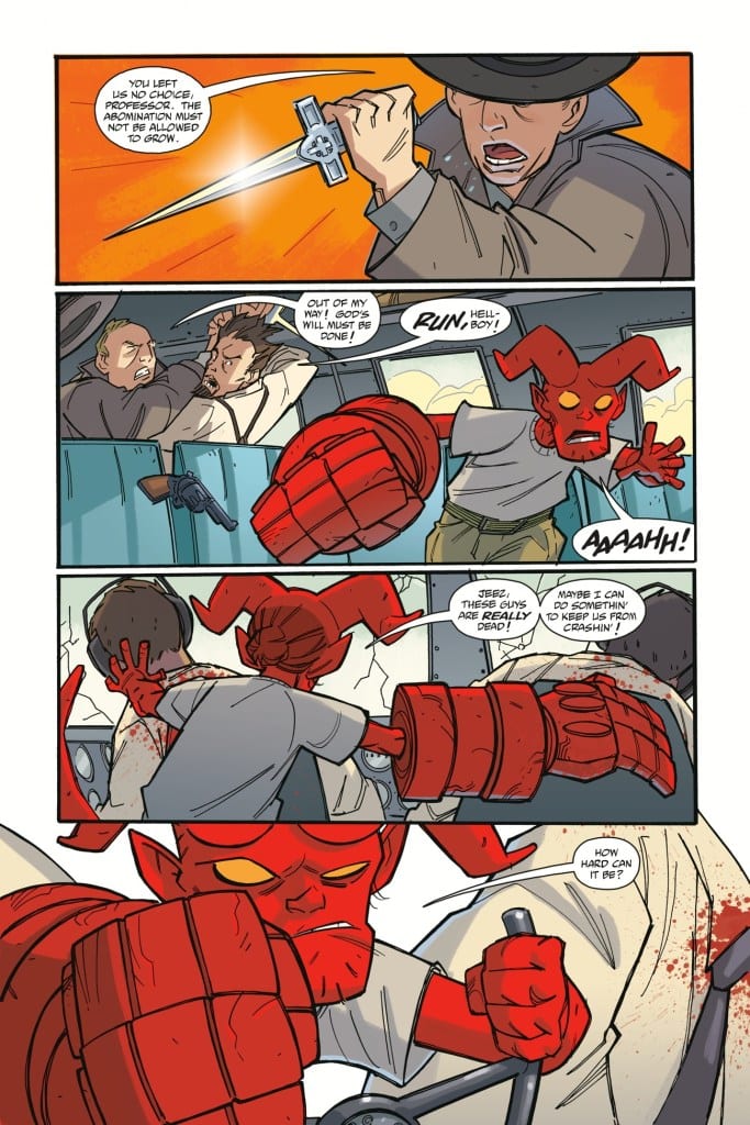
The Last Champion revolves around the world of Greco-roman wrestling and features plenty of action in the ring. “I wrestled in high school for four years. We won the prep-school nationals three out of four years. Glenn was a wrestler. A lot of the actors wrestled. There were a lot of people making this movie that were very passionate about wrestling.”

“We were unforgiving about the quality of the wrestling,” he says with a bit of a laugh escaping. “These guys were rehearsing matches for two months prior to shooting. It was a lot of work. But there would be times where we’d be shooting, the day is long, and they do a take, but I just don’t believe it. They’re moving too slow.”

We’ve all seen sports movies where the actors aren’t truly competing, and there is a softness in the opposition. “If you were wrestling to win, you’d be chopping him in the neck harder; you’d be jerking him on the ground harder. We made the actors go 120 percent on everything because it was important to everyone that the wrestling look legitimate.”

Getting the wrestling right was one challenge, but so was shooting it for maximum effect. “I wanted to engage the viewer and put them in the match. So, I used a handheld with a wide lens, and I was in as close as I could without endangering the actors.” A key to getting it all right was preparation. “We’d do half-speed rehearsals to get the movements then picking up the speed while pushing in as close as we can.”

Between the wrestling action of The Last Champion, there is a lot of deep-diving into the characters powering this story. Richard contrasts shooting those scenes against the wrestling. “Dialogue scenes are very different. It’s a long lens; it’s pretty with a narrow depth of field and lots of BOCA focus. Soft lighting.”

How does Richard sell The Last Champion to a stranger? “John Wright, an Olympic wrestler from a small, Pacific Northwest town, was disgraced, lost his medals, and left town. It’s ten or fifteen years later, his mom’s passed, and he’s come back to sort out her business. In doing so, he has to reconcile with his past. The local high school finds itself in need of a wrestling coach. It’s a win-win situation where he can earn his dignity back, and the team can succeed.”

Richard Schaefer-interview-the last champion

Wrapping Up

Richard mentioned David Fincher and Jeff Cronenweth as significant influences and added, “… Wes Anderson and definitely Roger Deakins.” Richard says another surprising influence “Even early Michael Bay stuff like the 1993 ‘Got Milk’ commercial. It blew my mind when I saw it and helped inspire me as a young filmmaker.”

“I’d love to do anything with Fincher,” he asserts, once again cementing how much he loves the legendary director. “I love his storytelling.”

The Last Champion is out on digital services. So, what’s next for Richard? “I’ve got a bunch of commercials brewing. There are a couple of film projects in early discussion, but nothing official yet.”

Is The Last Champion on your watch list?

Thanks to Richard Schaefer and Backlight PR
for making this interview possible.

Read more interviews from Ruben R. Diaz!

Monkeys Fighting Robots Youtube

Review: BATMAN CATWOMAN #3 Daughter of the Bat or the Cat?

Catwoman DC Comics King

DC Comics’ Batman Catwoman #3 includes the exciting addition of a fan favorite character, Helena Wayne. Helena, AKA Huntress, is the child of Selina and Bruce. But writer Tom King, artist Clay Mann, colorist Tomeu Morey, and letterer Clayton Cowles make us ask a simple question: whose daughter is she really? This isn’t to say she’s not biologically Selina and Bruce’s daughter. The creative team is instead making us look closely at the character to see who she takes after the most.

Writing

As is so often the case, King writes lines that are fantastically full of subtext. We follow Selina, both in the future and in the present day, as she deals with her growing connection to the Joker. In one timeline, Selina is trying to figure out how to keep Bruce in the dark. In bed with the “World’s Greatest Detective,” King has her evading and distracting Bruce like a pro. But with Helena on her tail, in the future timeline, things aren’t quite so clear. Sure, Selina is still evasive and full of distractions, but she’s no longer dealing with someone who has point blank questions for her. Instead, she’s dealing with her own daughter. A woman who may be just as underhanded and careful as her mother, with all the moral fortitude of her father. King turns Helena Wayne into a dangerous mix of her parents. A tireless righter of wrongs with all the subtlety of a thief in the night.

Selina DC Comics King

Art

Clay Mann is the king of subtlety in this chapter as well. Whenever he can pull back, leaving the details a little obscured, he does. We see a murder in an empty flat. Except all we actually see is a hand and blood streaks on the window, as the killer stands above their victim. At one point, Selina talks with the Joker. Mann depicts the Joker in a shadowy setting. All we see is his disembodied smile. Mann knows that we’ll be more frightened by what we can’t see than by what we can.

While Mann’s art is fantastic in this issue, it does occasionally feel a little oversexualized. In one of Selina’s fights, she’s in her underwear. Her pink top seems to come apart more and more with each passing panel. While it doesn’t detract from his other strengths, it’s a small moment that feels a little unnecessary.

Coloring

Morey makes moments of extreme tension look warm and inviting, and makes spooky moments look calm and serene. It’s a brilliant approach. Every moment is compounded by the fact that the colorist almost seems to be “ignoring the tone.” But Morey isn’t. Morey is playing against every moment. We can feel the tension in the room because the characters seem to be ignoring it. And when we’re witnessing a grizzly murder, we’re disturbed by how beautiful it all looks. Morey shows us the peacefulness in fights to the death and fear in intimacy. No moment looks like it “should.” Morey rises above clichés and delivers scenes that pack a devastating punch.

Lettering

Cowles does a fantastic job of making some of the dialogue feel calm or low effort. There’s something about a word balloon that goes downward from a character’s face that makes it feel nonchalant. It’s as though these words just fall out of their mouths. So when Helena and Selina talk at the dinner table, their tones seem quite different. Selina’s words extend above her head. She’s talking purposefully, deliberately. Helena responds without seeming emotionally invested. Each of her lines either hangs in the air, right next to her head, or stretches down below her. Her word balloons rarely touch the top of the panel. Then, finally, she acts like her father would. She asks a straight forward question. “Mother. Is everything all right?” Her words graze the top of the panel. It’s a simple, slight shift in the dynamic, but it’s in these subtleties that this creative team is telling their story.

Catwoman DC Comics King


DC Comics’ Batman Catwoman continues to humanize a mythos that feels huge. King, Mann, Morey and Cowles tell a story of heroism that is tainted by the grit of our day-to-day ethics. It’s not black and white, it’s not right and wrong: it’s complicated and messy. And with every new issue, it promises to get messier. Pick up Batman Catwoman #3, out from DC Comics February 16th, at a comic shop near you!

Monkeys Fighting Robots Youtube

Review: SNOW ANGELS #1 Opens A World Of Danger And Mystery

snow angels #1 review comixology

Snow Angels #1 by writer Jeff Lemire and artist Jock is out today from ComiXology Originals, and it’s a textbook case of how to hook readers with an intriguing opening chapter. Rounding out the creative team is veteran letterer Steve Wands.

The story is about Milliken and Mae Mae, two sisters growing up in a frozen tundra with their father. All they know is The Trench — a vast, literal trench carved into the icy earth. The Trenchfolk live by three simple testaments:

    1. You must never leave The Trench.
    2. The Trench provides.
    3. The Trench is endless.

And they must adhere strictly to these rules, lest they fall prey to The Snowman who stalks outside their borders. But The Snowman is just a boogeyman story parents tell their kids…right?

Lemire excels at establishing mysterious new worlds that make you beg to know more. He’s done it in Sweet Tooth, in Black Hammer, in Descender, and he’s done it again in Snow Angels. By the end of the first issue, you’ll have a million questions about this world, its history, and all of the characters. Lemire gives you just enough one-off lines and little clues to pique your curiosity and ensure you’ll be back for future issues — and you will be back.

This is a world overcast by mystery and dread. A palpable sense of danger radiates off every page. Jock’s raw, edgy style is the perfect fit for Snow Angels. He uses a generally white color palette, but knows just where to throw in some dark shadows and bright reds to add tension. Certain hard-hitting moments hit even harder thanks to this contrast.

And yet, while Jock’s landscaping fills you with a sense of dread, his character work is something else entirely. Through close-ups and a heavy emphasis on eyes, Jock adds a ton of humanity and personality to Milli, Mae, and their father. You get a sense of who they are just by how they look at the world. The girls are spunky; they have some attitude. Their father is tough, hardened by this cold world, but there’s some fun and joy to him too. And in their eyes — the girls’ especially — there’s something else. I’m not sure if I would classify it as “hope” but there’s definitely something there that makes you care for them and feel concern for their safety. Through all their spunk and attitude, you can see that they’re still just young girls who are coming of age, and Jock manages to convey that all through their eyes.

Wands’ lettering flows seamlessly with Jock’s art. The font and sound effects emphasize the rough and gritty nature of this world. The white narration boxes blend in with the white backgrounds. What’s most impressive, though, is how Wands sets the pace for Snow Angels. There’s quite a bit of narration in this issue, and no small amount of dialogue, and yet reading it all feels like a breeze. There’s such a natural rhythm to this book, and that’s a credit to both Wands’ lettering and Jock’s layouts.

Honestly, with the talent behind this book, it hardly needed this review. It’s Jeff Lemire, Jock, and Steve Wands — their respective track records speak for themselves. If you like intriguing stories with lots of mystery and spunky young protagonists, check out Snow Angels #1 right now.


Check out the first few pages of SNOW ANGELS #1:

snow angels #1 review comixology

snow angels #1 review comixology

snow angels #1 review comixology

snow angels #1 review comixology

snow angels #1 review comixology

Monkeys Fighting Robots Youtube

Oped: THREE JOKERS, Batman Inc., and the Problem with the Red Hood

Jason Todd

DC Comics has a Jason Todd problem.

Jason Todd, the second Robin, was unceremoniously killed by a fan vote in 1988’s Batman: A Death in the Family. As a kid reading Batman in the 90s, one could read about how Batman was continually haunted by Jason’s death, as the cover for Batman #496 beautifully illustrates.

Then, in 2004, Jason Todd returned to plague Batman in Judd Winick’s famous “Under the Hood” story arc. Jason’s return had been teased in 2003 in Batman: Hush, in what turned out to be a fake out (which was later retconned to at least partially be the real Jason). The means of his return were explained in the most comic book-y way imaginable (just google “Superboy punches reality”). This was indeed the real deal.

The fake out return of Jason Todd in Hush, later revealed to only be “sort of” a fake out.

“Under the Hood” was a great Batman story (and probably one of the best DC animated adaptations). But after it was over, DC had a Jason Todd problem. While the initial story was powerful, addressing Batman’s regrets and insecurities, DC kept the character around long after his original narrative purpose had expired.

That isn’t to say that all of the stories involving Jason Todd were terrible. For a while Jason’s “arc” consisted of him trying to find his new identity in a world that had moved on and forgotten him. What we eventually find, however, is that DC has a problem with the Red Hood becoming a narrative cul de sac, as exemplified in Geoff Johns and Jason Fabok’s Batman: Three Jokers. Though that story ends with the Red Hood embarking on a journey of redemption (that DC seems to be ignoring), Grant Morrison already redeemed Jason and set him on a new narrative path back in Batman Inc.

Jason Searches for His Identity

In Geoff Johns’ Teen Titans #29, Jason confronts Tim Drake at Titans Tower, taking off the Red Hood outfit to reveal an updated Robin outfit underneath. He fights Tim, all while jealously bemoaning that, despite being a Titan, he had been forgotten, yet Tim had been fully accepted and embraced.

Red Hood
Tim Drake will always be the best Robin!

Then, after Infinite Crisis and during the One Year Later story arc, Nightwing relocates to New York City, only to discover that there is another, more murderous Nightwing killing criminals. That second Nightwing’s identity? You guessed it: Jason Todd.

Todd eventually gives up the Nightwing mantle. He then gets shuffled off into a crazy multiverse adventure, Countdown to Final Crisis. This event not only holds the honor of being one of DC’s worst events, but it really shows that DC had no idea what to do with Jason. Still, it’s on this adventure that he temporarily adopts yet another identity besides the Red Hood, that of Red Robin. Again, this is only a temporary change.

Not too long afterward, Batman was believed dead at the end of Final Crisis. This led to Tony Daniel’s “Battle for the Cowl” storyline. This story saw Jason become a murderous Batman before being taken down by Nightwing, who assumes the mantle of Batman.

It was becoming clear that DC didn’t know what it was doing with the character. After he served his original purpose, he jumped from identity to identity, each time ending with a dead end and a new reinvention. Jason was beginning to stall.

Enter Grant Morrison

Dick and Jason come to blows again in Grant Morrison’s Batman and Robin. Jason returns to the mantle of the Red Hood, taking advantage of social media and marketing to become the new face of crimefighting in Gotham. He sets himself up as a rival to Batman and Robin. This marks one of the last times Jason is a direct antagonist of the Bat family.

Jason is captured and eventually escapes imprisonment, but Morrison wasn’t done with him. Perhaps recognizing that Jason was heading for a narrative cul de sac, Morrison sets Jason up for a new status quo at the end of his Batman Incorporated run. Rather than allowing Jason to slide into narrative limbo and turn into a storytelling device with diminishing returns, Morrison sets the character on a new, hopeful path. Giving his second son a chance at redemption, Batman offers him membership in Batman Inc. under the identity of Wingman (an obscure Silver Age character that appeared earlier in Morrison’s Batman run who had broken bad).

Red Hood

Red Hood
Jason is given another chance as Wingman.

And then the New 52 happened. Well, actually, it had already happened. Keeping continuity straight between Red Hood’s status quo in the New 52 and his use by Morrison can be tough. It’s obvious that Morrison had specific plans for Jason at the end of their Batman run, allowing the character a chance at redemption; however, since Morrison was no longer driving the Bat-train at DC, this is a change that didn’t stick (this happens a lot with Morrison).

Instead, the Red Hood became an antihero member of the Batfamily. This is where the character really starts to spin his wheels from a narrative viewpoint. As an antagonist to the Batfamily, Jason’s story could be compelling. But as long as he remains the Red Hood, it’s really hard to take Jason in new directions since he lives in the liminal space between villain and redemption (but again, without a lot of clear narrative path). The character needs to remain a villain, or grow and heal.

The Three Jokers

Whatever Morrison’s intention for Jason’s future, DC ignored it and returned Jason to the identity of the Red Hood. Really, because the character had an ongoing title, Red Hood and the Outlaws (as a part of the New 52), he never really stopped being the Red Hood (Red Hood and the Outlaws #18 does acknowledge Jason’s time as Wingman, in a “thanks, but no thanks” sort of way).

Whatever growth Jason experiences thanks to Morrison is done away, although Jason is no longer a Batfamily antagonist. He’s just an anti-hero, with less relevance. He is able to somewhat reconcile with the Batfamily, but some members carry a distrust for him because of his past misdeeds. And the character just became…stale.

Geoff Johns seems to recognize this, having Jason confront his fear and hatred of the Joker. At the end of Johns and Fabok’s tale, Jason abandons the Red Hood identity (in order to be with Barbara Gordon. That’s out of left field).

Red Hood

Really, I can’t emphasize enough how unearned this moment is. Barbara and Dick have always had a de facto on-off again dynamic, but Jason? It’s really hard to find support for something like this in the history of the two characters. I guess the point is that they bond over their shared trauma with the Joker.

But Johns, like Morrison before him, tries to move Jason’s character forward to prevent stagnation, even if it makes for an awkward storytelling choice.

The Red Hood worked as a Batfamily antagonist in “Under the Hood.” He even served as a decent nemesis or “violent twin” for Dick Grayson after that. He came to symbolize what happens when one of Batman’s proteges breaks bad. But as a Bat-themed antihero, the character stalls.

The narrative options for the Red Hood are clear: 1) return him to his status as a Batfamily antagonist, who strikes at the intimate heart of the Batfamily, 2) Let the character stall as an antihero, 3) let the character fully heal and find redemption, or 4) kill him off.

DC seems to prefer strategies 1 and 2, having given the Red Hood a new outfit and even making him an antagonist in Future State.

However, I think Johns recognizes that there is a story of redemption to be told with Jason. There is a future for him where he heals and moves on to better things. Too bad Morrison already beat Johns to it 7 years ago, and arguably, did it in a way that felt earned and wasn’t about being in a relationship with Barbara Gordon.

Don’t worry, though, Geoff. DC will probably ignore your idea, too.

Monkeys Fighting Robots Youtube

Interview: Thomas Sniegoski Talks YOUNG HELLBOY: THE HIDDEN LAND

Hellboy Dark Horse Sniegoski

Writer Thomas Sniegoski spoke with Monkeys Fighting Robots about his new series, Young Hellboy: The Hidden Land. Written by Sniegoski and Mike Mignola, with art by Craig Rousseau, colors by Dave Stewart, and letters by Clem Robins, Young Hellboy: The Hidden Land #1 is a fun, pulpy adventure with a joyful tone. It follows Hellboy as a child, flying with Professor Bruttenholm on a project for the BPRD. But when the airplane crashes near an island full of giant mythical creatures, anything can happen!


MONKEYS FIGHTING ROBOTS: While Young Hellboy is clearly dealing with all the same characters from the Hellboy universe, something about it all seems brighter and full of fun. And it’s not just because Hellboy is younger. We’ve seen a young Hellboy before, just not quite as bright-eyed and swashbuckling. What were some of the ways you began to stake out a new tone for the character?

Thomas Sniegoski: Mike and I love when a plan comes together. That whole ‘brighter and fun’ feeling was purely intentional. We wanted this particular Hellboy mini-series to have a strong sense of fun, and adventure, very much like something out of the old 1930’s pulps, or those cool jungle movies that we all used to watch on Sunday afternoons. So yeah, we wanted this take on the character to feel ‘younger’ more full of life and excitement–very much like your typical 10 year old boy.

Hellboy Dark Horse Sniegoski

MFR: As big a role as Bruttenholm plays in Hellboy’s life, it feels like we don’t get to see much of the character. We definitely don’t get a lot of moments of the two interacting. It’s exciting to see so many pages featuring the professor. But clearly, somewhere down the line, they become much more distant. How would you like the dynamic that you show between them to affect how readers see the older versions of the characters?

Sniegoski: I think we always got a sense from the previous Hellboy stories that he and the Professor had a strong, father and son type relationship, but in Young Hellboy: The Hidden Land we wanted to actually show it. We wanted to show them interacting, show that they really do care a great deal for one another. I think our take on the Professor and Hellboy’s relationship in this mini just solidifies that they did indeed love each other, and consider themselves father and son. It was really kind of cool getting to write their relationship.

MFR: You introduce a new character to the Hellboy Universe: Scarlett Santiago, the Sky Devil! What were the inspirations for this character and do you hope to bring her back for more Hellboy appearances in the future?

Sniegoski: Scarlett was an absolute blast to write. She’s pure pulp adventurer… something right out of Thrilling Air Stories. And most definitely, we would LOVE to do more with her… especially since she’s got a little secret that’s exposed in our mini series that makes her even MORE interesting.

MFR: This feels like such a classic set up for an adventure: stranded on an island with giant mythical creatures. It’s King Kong style fun! What about this set up made you want it to be young Hellboy on the island, instead of showing one of his lost adult years?

Sniegoski: Mike and I thought that were was so much untapped potential for fun in this time period, as well as being some pretty serious formative years for our young hero. If you think about it, what better sort of an adventure could there be for him at this age. He’s still very young, still looking at the world around him with wonder. This kind of over the top adventure story is perfect for that sort of “Gee Whizz” attitude.

MFR: The last page takes us from being in a swashbuckling adventure that could be told just about anywhere, to being firmly rooted in the Hellboy mythos. It just goes to show how new and fresh this story feels. What was some of your process, trying to make sure enough established Hellboy-isms were sprinkled in, while telling a story that goes in a bold, new direction?

Sniegoski: Mike and I were bound and determined that this mini-series was going to be fun and exciting and filled with more cool crap than you could shake a stick at… but it also had to be, and feel like a Hellboy story, and there are certain types of things that need to be present for it to feel like a Hellboy story. There’s mood, a connection to an ancient past and all the funky legends that are connected to that nearly forgotten past, and most importantly–a sense of humor. Can’t be a Hellboy story without that weird sense of humor. So, we took all that stuff, threw it in a cauldron, gave it a good stir and BOOM! Young Hellboy: The Hidden Land! Personally, I think everybody involved did an amazing job. I’m very proud of this series.


Check out Dark Horse’s Young Hellboy: The Hidden Land #1, out on February 17th. It’s loads of fun, and as Sniegoski makes clear, it’s only going to get more fun!

Monkeys Fighting Robots Youtube

Review: THE AMAZING SPIDER-MAN #59 – Heartwarming Emotional Moments

The Amazing Spider-Man #59 Cover

The Amazing Spider-Man #59, out now from Marvel Comics, is full of action and emotional moments that make the issue a wild ride.

The Amazing Spider-Man #59 Story Example
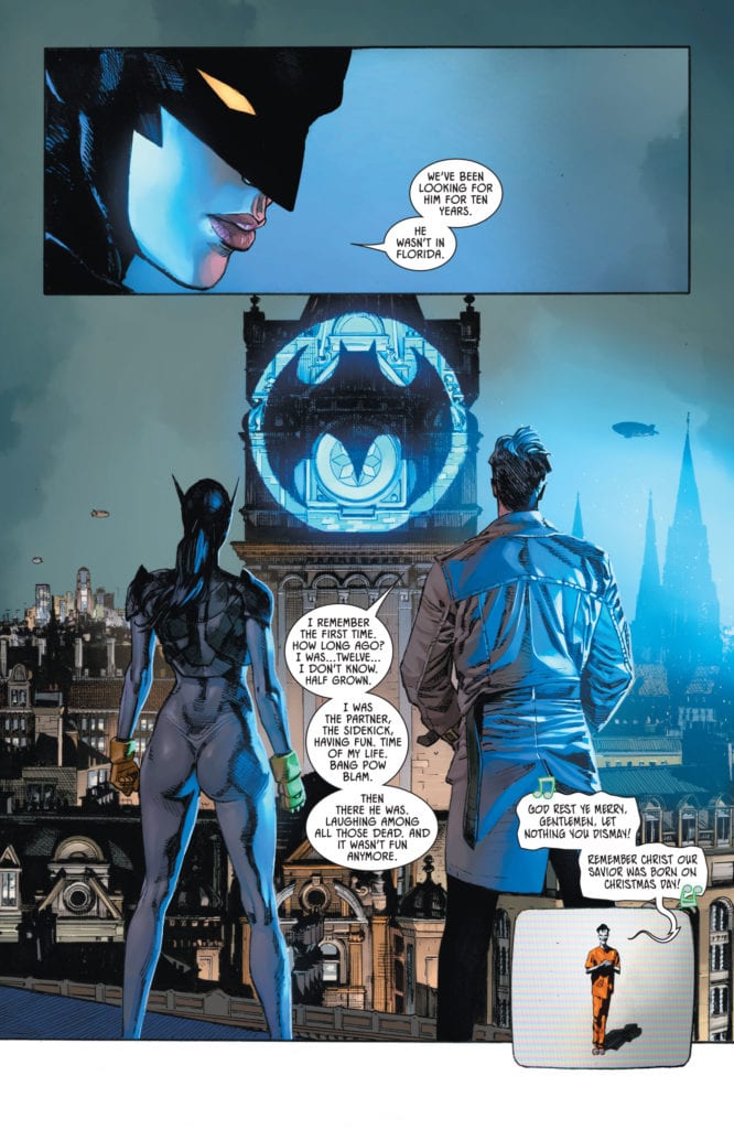
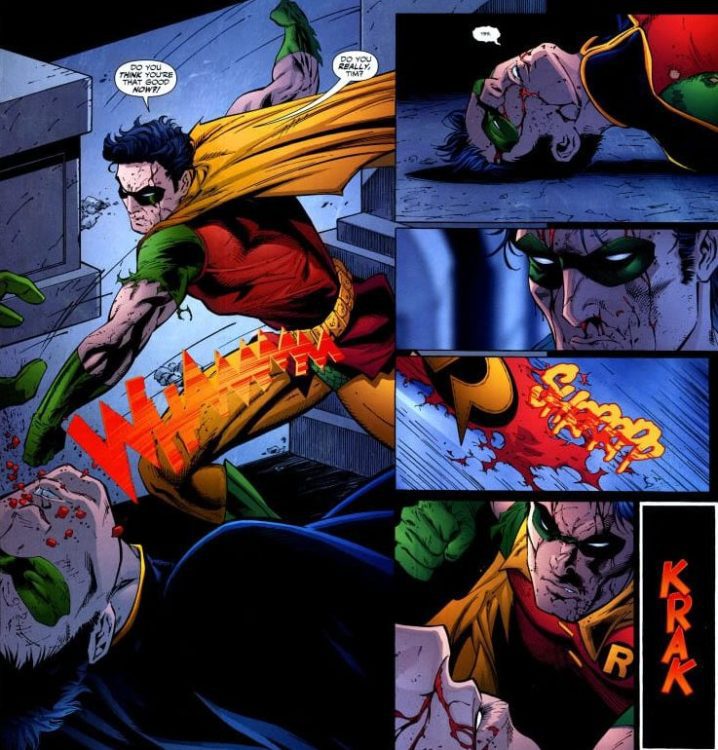
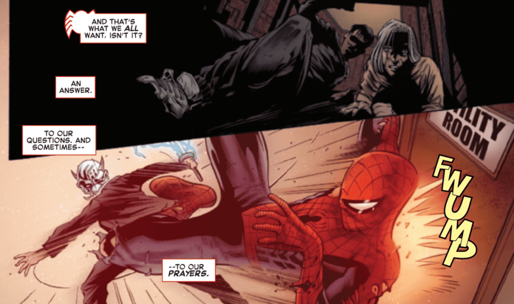
Nick Spencer fills The Amazing Spider-Man #59 with extraordinary dialogue. The issue features a lot of fighting but also continues the emotional moments of the previous issue. There are many private conversations with dialogue that comes directly from a character’s heart, and Spencer captures this perfectly. The issue also makes use of silent panels, which helps build the suspense of a scene. It feels like you’re holding your breath as the event you’ve been dreading occurs over the course of several completely silent panels.

The Amazing Spider-Man #59 Story Example

Marcelo Ferreira’s pencils and Wayne Faucher’s inks in The Amazing Spider-Man #59 are full of dynamism and create some impressive action scenes. During these action-heavy sequences, Ferreira and Faucher utilize action lines and motion blur to add energy to the panels, making them more visually exciting. Ferreira’s and Faucher’s ability to portray intense emotion is another notable part of this issue and assists the emotional scenes with drawing the reader in.

The Amazing Spider-Man #59 features the coloring talents of Morry Hollowell with Andrew Crossley, who do a fantastic job of having the palette reflect the tone. For the moments in the fight-heavy issue, Hollowell and Crossley use bright, single-colored backgrounds to add energy to the combat. When dealing with an emotional moment, calm gradients are used for backgrounds that allow tender moments to shine.

The Amazing Spider-Man #59 Art Example

VC’s Joe Caramagna utilizes a wide selection of lettering techniques for The Amazing Spider-Man #59. He uses a bold and colorful font within a speech bubble to represent a character yelling. Caramagna thickens the border of some speech bubbles for emphasis. He even inverts the color scheme of speech bubbles for one character. The story flows uninterrupted and helps reflect the tone and volume of some characters’ lines. It is some wonderful work that makes the book a more enjoyable read.

The Amazing Spider-Man #59 continues the showdown with Mr. Negatives goons, all the while having Spider-Man deal with the inner turmoil he has been facing since his encounter with Kindred. The dialogue is spectacular, the art is an excellent fit for the contents of the issue, and the coloring reflects the tones phenomenally. The lettering is the final polish that allows the story to continue without a hitch, and the result is an entertaining issue containing some touching moments.

Monkeys Fighting Robots Youtube

Review: RADIANT BLACK #1 – A Relatable New Hero

Radiant Black #1 Cover

Radiant Black #1, out now from Image Comics, is a new superhero for a new generation. It’s the thrilling adventures of the superhero comics you love that isn’t hampered by confusing and complicated continuity.

Radiant Black #1 Writing Example
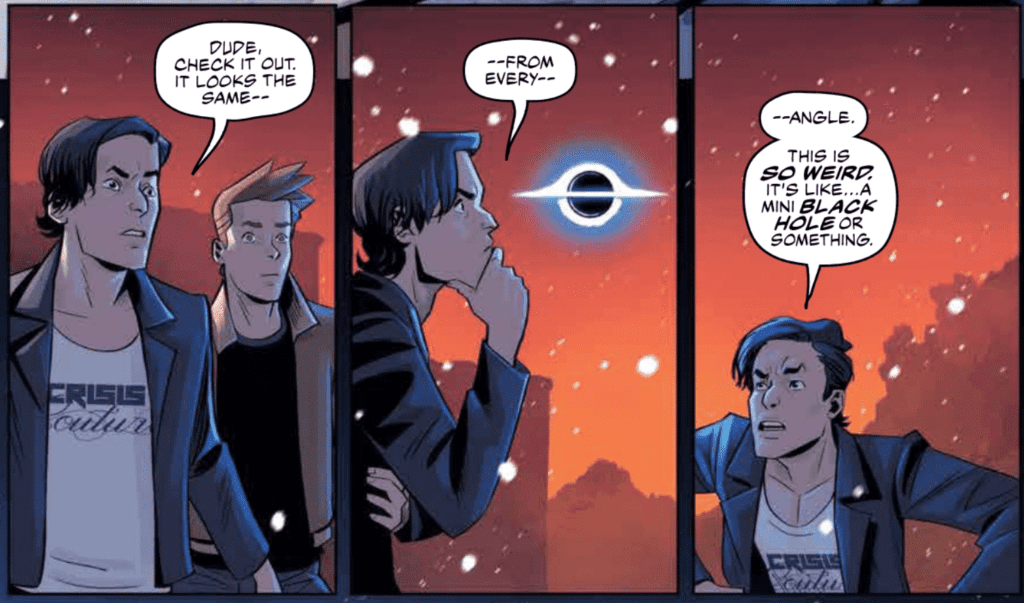
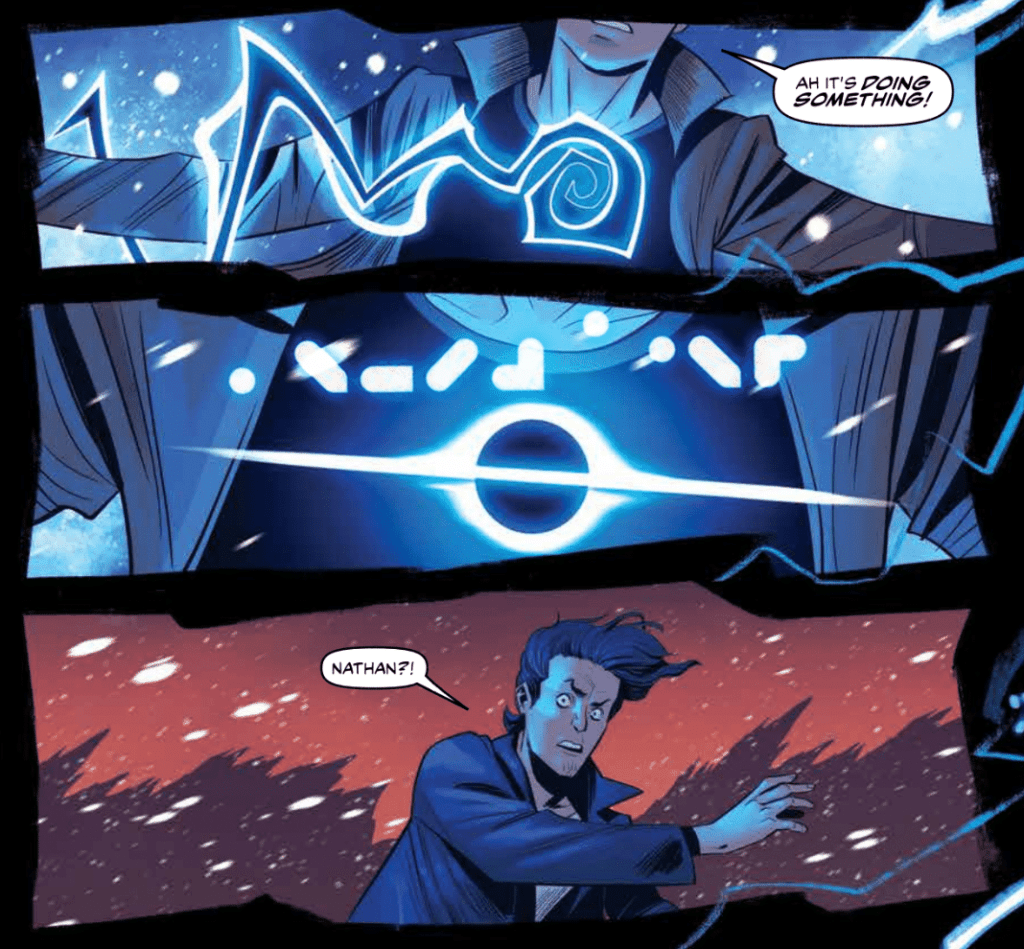
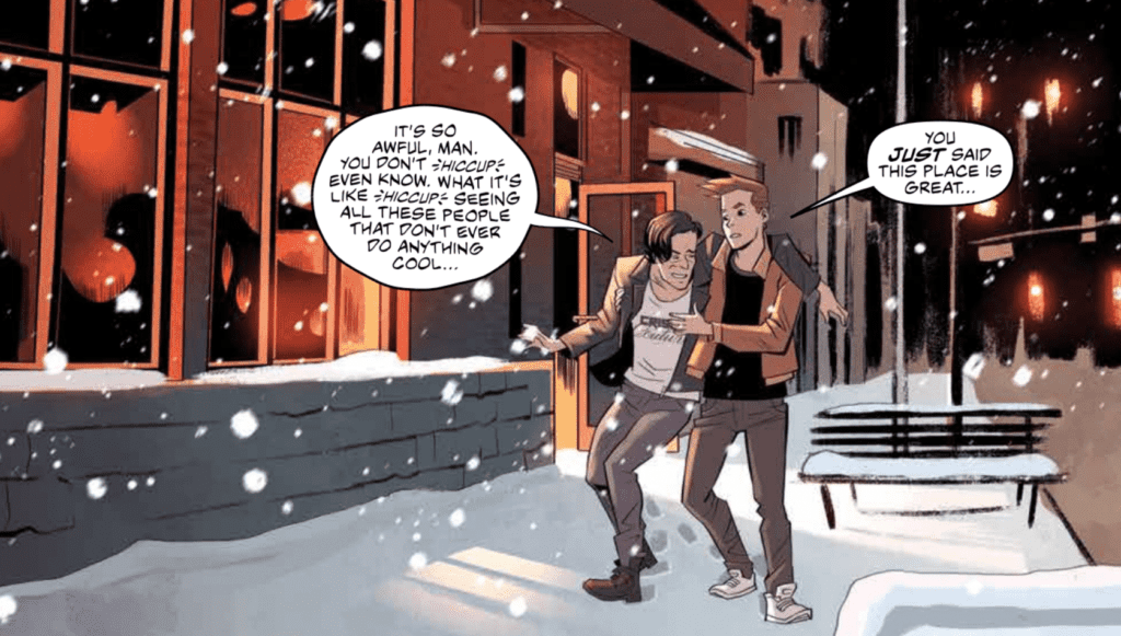
Kyle Higgins creates a deeply relatable character in Radiant Black #1. Nathan Burnett is a man at a low point in this life who lost much of his confidence after having troubles pursuing his dream of being a professional writer. When he stumbles upon an item that gives him superhuman abilities, Nathan has to acclimate to this new way of life, all the while dealing with a fear of failing again. Many have felt a similar way, and Higgins can use these character flaws to establish a connection between the character and the reader immediately. Higgins writes some of the dialogue in Radiant Black #1 so well that they have no trouble touching the reader’s heart. The writing has a strong voice, which helps create genuine emotional moments and sets up the fun, light-hearted superheroics we all know and love.

Radiant Black #1 Art Example

Radiant Black #1 features the art and colors of Marcelo Costa, which are sure to please. Costa’s semi-realistic art style is perfect for the superhero genre. We don’t see too much action in this first issue, but the series is sure to be full of dynamic fights and glorious visuals from what we do see. The spreads in the issue are enough to take your breath away, and some are framed in a way that shows off the potential of the comics medium.

Costa’s colors in Radiant Black #1 are relatively mild at the beginning of the issue. The palette is bland and reflects the monotonous nature of everyday life. When Nathan receives his powers, the palette is flipped on its head and is replaced with vibrant blues and dark backgrounds. Even the colors of the setting that we already saw have changed slightly to show more of the setting sun’s beautiful colors. Everything is more vibrant and full of energy, highlighting the exciting change in Nathan’s life.

Radiant Black #1 Color Example

Becca Carrey’s lettering allows the story of Radiant Black #1 to flow smoothly and heavily assists the emotional moments of the issue. Carrey uses the technique of a smaller font for dialogue to indicate whispering, which helps inform the reader of how specific lines are said. For instance, the smaller font is used when Nathan admits something he is ashamed of, and the fact he is whispering illustrates his reluctance to do so. Examples like this may seem small but have a significant impact on the reader’s subconscious.

Radiant Black #1 is a series you will want on your pull list. It is new superhero fun with a flawed and relatable main character. Higgins has set exciting events to follow, and Costa’s art is always sure to impress. If you’re a fan of good superhero comics, this is a book for you.

Monkeys Fighting Robots Youtube

Review: NORSE MYTHOLOGY #5 – The Heartbreaking Tale of Fenrir

Norse Mythology #5 Cover

Norse Mythology #5, out now from Dark Horse Comics, tells one of the most heartbreaking Norse myths that is brought to an entirely new level through clever layouts and magnificent art.

Norse Mythology #5 Story Example

P. Craig Russell’s script and layouts — based upon the stories told in Neil Gaiman’s novel — for Norse Mythology #5 are breathtaking. Russell uses silent panels to build suspense, such as in Odin’s dream about Fenrir, the wolf. There could have been captions and vicious action, but instead, the lack of dialogue or captions gave the dream an eerie and spooky feel that has a more lasting impact on the reader. Russell also uses the technique of breaking up a single motion into multiple panels, which essentially slows the flow of time and adds tension to a scene. The issue features two stories: “Loki’s Children” and the other “Freya’s Unusual Wedding.” All of the story of “Loki’s Children” is contained within the issue, leading to a satisfying beginning, middle, and end. The choice of story is superb, as this Norse tale has heartbreaking emotional beats that keep the reader engaged. “Freya’s Unusual Wedding” is an excellent beginning and not much else. The story is cut off and will be continued in the following issue, but so little of it is contained within Norse Mythology #5 that I see little reason that it is tacked on after the previous story. I understand that it gives readers a cliffhanger that urges them to purchase the next issue. Still, I believe that providing the reader with a self-contained story would better urge the reader to pick up the following issue due to Russell and Gaiman’s incredible writing abilities. “Freya’s Unusual Wedding” seems misplaced in this issue, but this is a minor detail, and the story is a strong start.

Norse Mythology #5 Art Example

The first story of Norse Mythology #5, “Loki’s Children,” featured art and colors from David Rubín, who draws the reader in on every page. There are so many things to say about his work on this issue. His art for Fenrir is incredibly vicious-looking. He possesses an extraordinary ability to create gruesome art, the method of making objects such as the chains Fenrir breaks shoot out past the panel’s border is highly effective at immersing the reader in the moment, and character facial expressions are perfect and make silent panels all the more impactful. There are few negatives things that anyone would be able to say about Rubín’s work.

Jill Thompson’s art and colors in “Freya’s Unusual Wedding” is impeccable. The use of bright colors and her watercolor style cements the idea that the world we are seeing is full of magic. Thompson can also be very intricate with her backgrounds, which makes the fantasy realm more believable.

Norse Mythology #5 Art

Galen Showman’s lettering in Norse Mythology #5 helps emotional beats land a harder punch. There are so many exciting choices that Showman makes in the issue, all of which help improve the story. For example, when Fenrir breaks through the chains that bind him, his speech bubble contains a bold, colorful font. This makes clear how powerful the wolf is becoming and makes the moment more shocking. Showman also uses techniques such as no border around narration, extending speech bubbles past panel borders, and a disposition between the style of lettering and the scene behind it. The issue undoubtedly contains some awe-inspiring lettering.

Norse Mythology #5 is an issue that will leave you in awe and have you desperately waiting for the next issue. The storytelling is so enthralling that it’d be hard to put the issue down once you have picked it up. Rubín and Thompson’s art is just astounding, and creates a spectacle on each page, and Showman’s lettering is the final polish that makes the issue an unforgettable read.

Monkeys Fighting Robots Youtube

WANDAVISION – All-New Halloween Spooktacular | TV Review

After the big reveals and twists in the previous episode, “All-New Halloween Spooktacular” gives more information that could have big implications for the MCU.

Wanda’s brother, Pietro has returned from the dead and now lives as the cool uncle figure to her kids. When the Maximoffs go out trick-and-treating, Vision uses the opportunity to explore the outskirts of Westview. On the outside of Westview, the director of S.W.O.R.D. sidelines Monica, Jimmy, and Darcy, leading them to believe he knows more than he lets on.

This episode sees the world of Westview more on to the late ‘90s/early 2000s, a period I am much more familiar with. The sitcom world now looked like it was shot using a single camera format, Tommy broke the fourth wall like he was Malcolm from Malcolm in the Middle, and the commercial had a Claymation surfing shark.

The twist at the end of “On a Very Special Episode” was the return of Pietro and now being played by Evan Peters, the actor from the Fox X-Men movies. The fandom has questioned what this means for the MCU. It could be that Marvel Studios are going to introduce the Fox X-Men cast via the multiverse or was this Pietro just an illusion. Even Wanda was suspicious because her brother died and now has a different appearance. She tries questioning Pietro about their past, but he knew the answers and he even asked some questions like how Wanda was able to create Westview and the ethical issues about mind control. Pietro referred to himself as kick-ass which was a fun reference to the 2010 film since Aaron Taylor-Johnson played the title character and Evan Peters had a supporting role.

In this episode, Vision goes investigating whilst Wanda was distracted. He started off acting like Superman flying in the air before he explores the edges of Westview. His discovery was incredibly eerie because people acted like they were NPCs in a video game. They were performing tasks in a loop. One was a woman who was hanging the laundry and crying a tear due to having no control of her body. In the series, Agnes was the wildcard because she knew more than she lets on and I personally theorized she was a sleeper agent of some sort. That theory has been blown out the water because of her interactions with Vision in the episode.

One of the major influences on WandaVision was the “House of M” storyline. In that storyline Wanda created a perfect world for mutants but when her illusion broke most mutants in the comics were depowered. There has been speculation that WandVision is going to do a reserve House of M and Wanda accidentally creates mutants. This episode has provided evidence of that because Darcy revealed that Monica’s DNA has changed after going through the Hex. There are two possible outcomes, that either the people in Westview are going to become mutants, or this change is simply going to allow Monica to have space adventures with Captain Marvel in Captain Marvel 2.

WandaVision has shown the director of S.W.O.R.D., Tyler Hayward (Josh Stamberg), to be a dubious figure. He has undermined the main trio we follow within S.W.O.R.D. and in “All-New Halloween Spooktacular” the trio discovered what he really knows: that he had been monitoring Vision’s movements within Westview and hid Monica’s blood test results from her. Hayward’s actions reminded me of Nick Fury in The Avengers, especially when Tony Stark and Steve Rogers discovered S.H.I.E.L.D. were trying to turn the Tesseract into weapons. Hayward was a lot more weaselly than Fury ever was.

“All-New Halloween Spooktacular” was a solid piece of television, but it doesn’t quite match the excellent work of “We Interrupt This Program” and “On a Very Special Episode.” “All-New Halloween Spooktacular” had a great atmosphere and added more some intrigue to the proceedings.

Monkeys Fighting Robots Youtube

Review: Comics Studies: HOW TO STUDY COMICS

How to Study Comics
How To Study Comics and Graphic Novels, Image Credit: Oxford Comics Network

I think it is a safe bet to make that the majority of people who read comics do so for the entertainment factor. A small group, however, have an interest in studying the form, whether that’s professionally or purely as a hobby. Comics Studies still have to find a comfortable home in academia, but that hasn’t stopped it from growing as a field of study. These days, you can fill a shelf with books about comics history, meaning, form and reason. Year after year, the use of comics at every level of education is growing, and last week the Oxford Comics Network released an open access comic book about this very subject.

The book, How to Study Comics & Graphic Novels: A Graphic Introduction to Comics Studies, is published by TORCH, The Oxford Research Centre in the Humanities, and is available to read for free on the Issuu website (click here).

It was created by several lecturers from different fields of study, all of whom use comics in their educational courses. The creators’ work is presented in the form of a standard comic book that most people will instantly recognize. Unlike more challenging pieces of work, like Nick Sousanis’ Unflattening (2015), that use the comics form in imaginative and often complex ways to discuss an academic theory, How to Study Comics is fairly straightforward with an emphasis on ‘easy to read’. In this respect, it owes a lot to Scott McCloud’s Understanding Comics, a work that is cited in this new book. The shape that the ‘narrative’ takes is educational and gives the impression that the reader is being led through a seminar on the subject of Comic Books and Graphic Novels. This easy, hand-holding approach suits the book that these writers have produced which is an introduction to comics and the potential of the medium for study.

How To Study Comics
How To Study Comics and Graphic Novels, Image Credit: Oxford Comics Network

Text and Study

After an initial introduction, the writer’s avatars, drawn by Josean Morlesin Mellado, lead the reader through a series of short chapters in an attempt to capture the breadth of study that is available. The book is aimed at University students, according to the Oxford Comics Network twitter feed, who may have no previous experience with the medium. This is obvious from the layout and subjects that the book covers. The simplistic style will be a massive bonus for the uninitiated but perhaps is a little too simplistic for people experienced with comics or who have read the likes of Thierry Groensteen and Hillary Chute. Even devoted fans of mainstream comics who have no interest in formal studies will find some of the book oversimplified, but that is unavoidable with an introductory title like this.

The topics on offer range from the language of comics to the production and on through to traditions of the medium. Some of the elements are quickly skirted over and if you blink you’ll miss them. But, again, this comes from attempting to fit such a varied subject into a 44 page book. Enrique del Rey Cabero, Michael Goodrum, and Josean Morlesin Mellado aim to open the readers’ eyes to the variety of disciplines involved with Comics Studies. The speed at which everything is covered stands as a testament to the complexities of the subject. To include everything would require a dense tome that would instantly put people off. How to Study Comics is a toe dip into the ocean of the subject; something which the preface makes clear.

How to Study Comics
How To Study Comics and Graphic Novels, Image Credit: Oxford Comics Network

Drawing the Subject

Mellado’s artwork is worthy of mention for a number of reasons. His reductive style, but attention to comic convention, really electrifies the argument put forward by the writers. With limited space, difficult explanations are presented in quick, easy to grasp visuals. Even though it’s presenting complex forms relating to comics and their history. The artwork is inspired by a range of material from British children’s anthologies to the seminal work of Chris Ware. Mellado’s art instantly attracts the reader with it’s soft edges, warm colors, and friendly shapes. From the opening page to the final panel, How to Study Comics is a safe and welcoming space.

While a greater experimentation around the artwork may help to represent the wider subject matter, in a production like this it would more likely confuse the argument. Brief attempts are made by Mellado to incorporate different, historical styles but the general aesthetic remains the same. This is similar in nature to IDW Publishing’s recent publication, The Comic Book History of Animation, where subtle nods to the original styles of animation are made but do not saturate the narrative.

The artwork in How to Study Comics is very clear and precise. The addition of color makes it appealing but actually challenges the tradition of black and white images for educational works. Some readers may find the style of this book off-putting and a distraction from the textual, educational element. However, the visual challenge the book sets reflects the greater inherent conflict within Comics Studies and arguments of acceptance. What is a comic and what makes it worthy of study? These questions lie at the heart of the subject and are raised, albeit subconsciously, through the visualization of the narrative.

How To Study Comics
How To Study Comics and Graphic Novels, Image Credit: Oxford Comics Network

Conclusion

How to Study Comics & Graphic Novels: A Graphic Introduction to Comics Studies is a fascinating, simple look at the growing field of Comics Studies. I would highly recommend it to anyone interested in getting into the subject as it offers a rounded, quick guide to the potential fields of study. It is also worth reading if you are already a comic reader, as it may highlight an aspect of the subject that you had not thought of before.

While it does not have any in-depth discussions around any of the disciplines it features, the book does draw your attention and provide a handy ‘further reading’ list so that you can begin your own journey. It also includes an interview with Nick Souranis, regarding his work and processes. This addition gives the book something extra for those already familiar with Comics Studies and is definitely worth reading.

The presentation and simplification of the text is this book’s major selling point and this dictates the readership it is aimed at. It is an enjoyable read and will appeal to a large group of people. I found the pace of the book too fast, with large areas of study seemingly passed over in the gutters or, if they were lucky, in a single panel. It’s unfortunate but it’s to be expected from a book like this. Greater representation of cultures and readers could have been included. But if there is one thing that this book makes clear, it is that, with 44 pages, you can only scratch at the surface of the Comics Studies field

Monkeys Fighting Robots Youtube