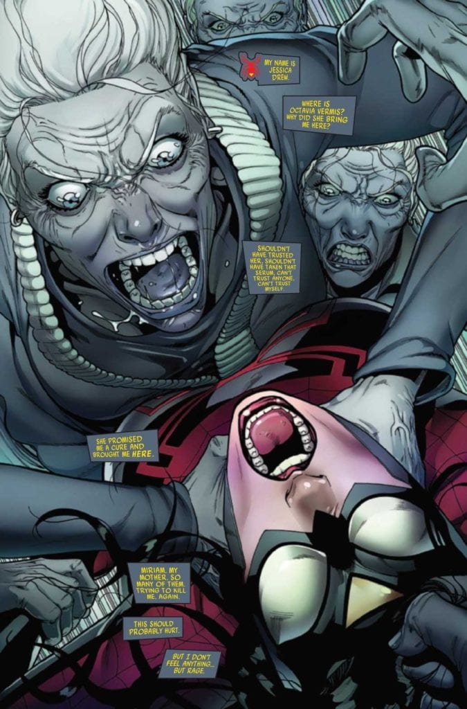
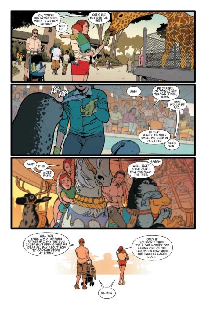
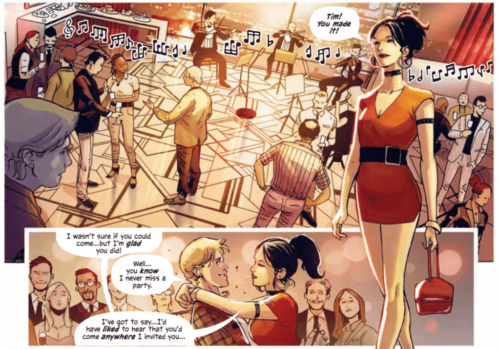
SPIDER-WOMAN #9, available now from Marvel Comics, continues Jessica Drew’s desperate hunt for a cure. Once again she’s in a surprising situation, as she finds herself in the home of several distracting surprises and revelations.
Talk about a startling introduction to this issue!
So far, Spider-Woman‘s latest series has forced Jessica Drew through quite a lot. She learned more about her family than she probably ever wanted (which is saying something), she is sick, and now fears for her son. That was all before Knull invaded, changing the world around her even as she continued to fight for a cure.
Oh! And don’t forget Spider-Woman’s current ally, who feels like a risky decision at best. Especially for any fan who is up to date in Spider-Verse and the various characters that it introduced.
Spider-Woman #9 continues from that point, throwing Jess into yet another chaotic and dangerous situation. It seems that she still can’t catch a break, though she is apparently getting closer to her goals, so there’s that.
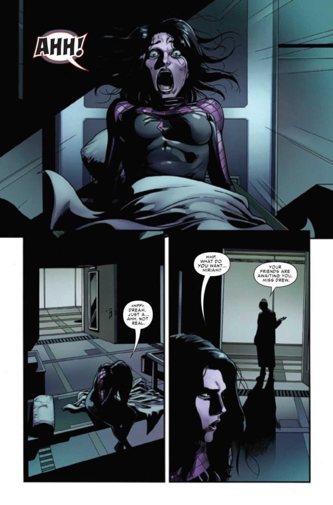
Thankfully, it appears that it was all a dream. Well, perhaps not all of it…
The Writing
Spider-Woman #9, written by Karla Pacheco, really does nail that whole family drama vibe. But with a Spider-Woman twist, naturally. After all, it isn’t every day that you come across a woman interacting with a room full of clones of her own mother. No, that’s the sort of luck that only Jessica Drew (and probably Peter Parker, if we’re being honest) could come up with.
All things considered, Spider-Woman #9 is a fascinating issue. One that drops a whole lot of information, without falling into the sins of show/tell issues. A liberal use of flashbacks helps to explain the situation, while also raising many more questions along the way.
On the bright side, it does answer a few longer running questions in the process, so we’re not going to go and complain about it. Yet even with that in mind, there is a lingering sense of dread that grows as each page passes.
That probably has something to do with a gut feeling for how this is all going to play out. There are many elements that feel achingly familiar here, for Spider-Man fans. That isn’t to say that the plot is derivative, more like it’s taking advantage of our knowledge and understanding to create something subtly haunting.
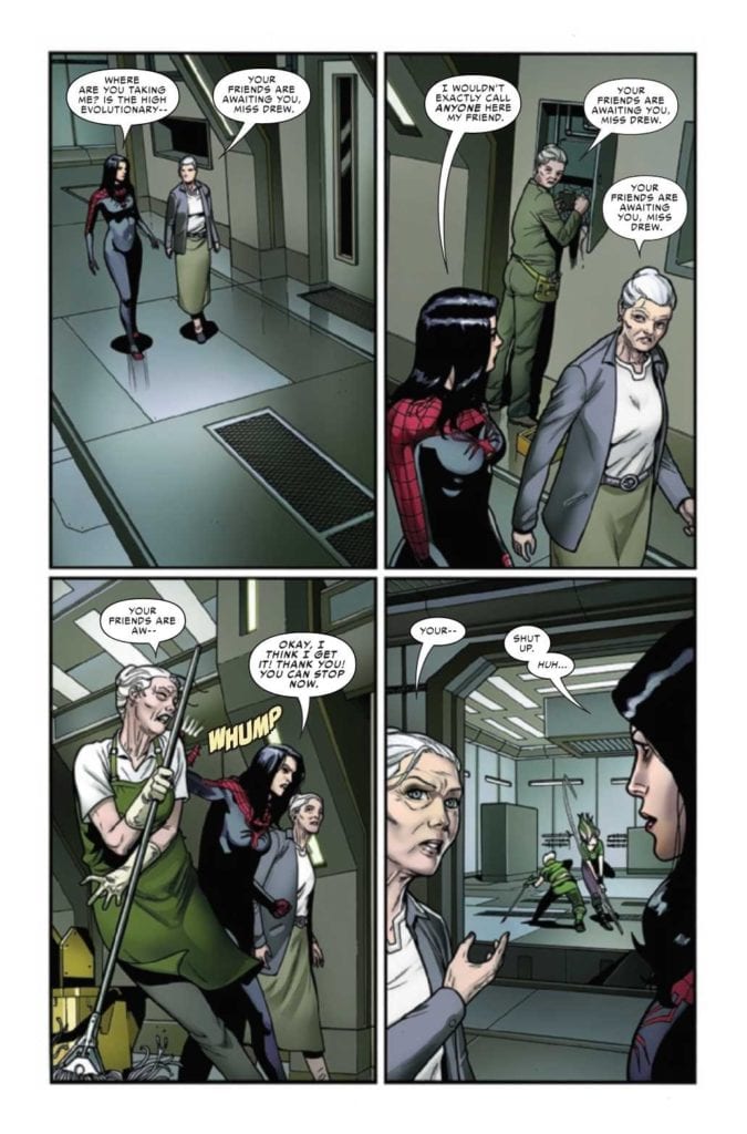
There are a lot of…familiar faces around here.
The Art
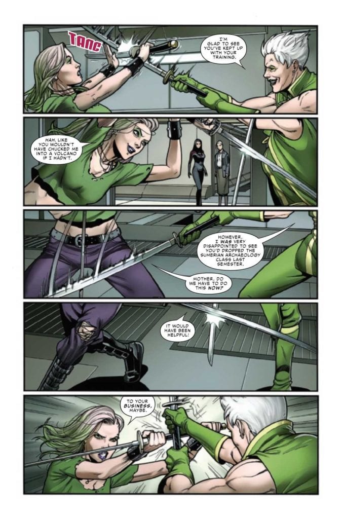
Spider-Woman #9 has some of the best cut scene/flashback art I’ve seen in quite some time. It quickly runs the readers through years of backstory, and it does so quickly and smoothly. These small vignettes easily layout the lives before us, while still leaving some room for imagination to fill in the gaps.
That isn’t the only highlight from this issue, naturally. With Pere Perez as the lead artist, this is an issue full of visual twists and turns. Most of them being memorable ones at that. The overall layout for this issue is remarkable, literally. As are the character designs, cameos, and fight scenes.
Frank D’Armata’s do help to enhance the scenes, naturally. There’s heavy use of negative space for the layouts, leaving plenty of white on the pages. Meaning that the colors really pop, especially those familiar greens and purples.
The lettering, provided by VC’s Travis Lanham, really gives a sense of impact, especially during the fight scenes. There’s nothing quite so satisfying as knowing that a hit landed, or that somebody undoubtedly received a solid zap.
Meanwhile, a sparring match is going on.
Conclusion
Spider-Woman #9 is one of the most visually compelling issues I’ve read in recent times, and coupled with the clever writing, it leaves a strong impression. A positive one, to be clear. Naturally, we’re all left wondering how that cliffhanger is going to get resolved.
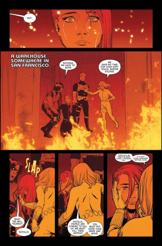
BLACK WIDOW #5, available now from Marvel Comics, concludes the first plot arc of the series, ‘The Ties That Bind.’ In doing so, it brings both an ending and a beginning to Natasha Romanoff, aka Black Widow.
What a different life she could have had.
The latest run of Black Widow has been getting a lot of ink and attention – and with good reason. Her narrative has always had so much potential, and now it has become truly groundbreaking. Her story has changed in unexpected ways, reacting to the risks that have been written into her world.
To put it simply, it has been fascinating to see this different version of Natasha. Even now, when she’s back to a state fans are more familiar with, she’s still changed. She will likely always be changed, thanks to what she has already gone through.
Black Widow #5 is an issue that we’ve all been waiting for, thanks heavily to the way the previous issue wrapped up. To say that it’s been a tense month would be a bit of an understatement, and now it’s time to see how it all plays out.
Meanwhile, back in the present, where her worst nightmare has just occurred.
The Writing
Over the course of five issues, Kelly Thompson has taken Natasha’s life and turned it upside down. She’s done so in brilliant fashion, creating a storyline that most of us will remember for a long time to come. That includes the character affected, of that I have no doubt.
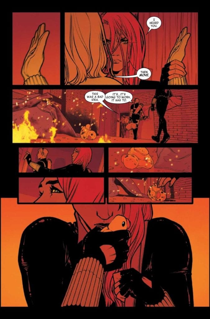
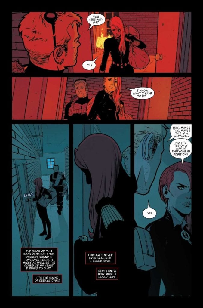
Black Widow #5 is an emotionally tense read, as Black Widow seeks to find a balance between her new life and her old one. She’s dealing with grief so raw and new she can barely contain it, yet she has little choice on the matter.
It’s safe to say that this is quite possibly the most human we’ve seen her, at least in quite some time. But don’t worry, there’s also plenty of action to be had – after all, there is still a hunt going on, even if Black Widow really could use the time to absorb all of what she’s been through.
There’s a lot to love about this issue, frankly. The fact that it openly discusses the elephant in the room cannot be ignored, nor can we ignore how clever the ending itself is. Throw in that raw pain, and how human Natasha comes off, and it makes for a memorable conclusion to this arc.
Side note: bonus points for the inclusion of an adorable black cat (Logan), and the confirmation that he is fine. So fear not animal lovers of the comic book world!
She’s present, and ready to fight – but that doesn’t mean she’s happy about any of this.
The Art
As it turns out, both the writing and artwork for Black Widow #5 are evocative and memorable. Given how the previous few issues have been, that is also not a surprise. It is however highly appreciated.
Visually, there’s so much going on within these pages. From flashbacks to what could have been, and everything in between. Including what is real: a raging fire and battle surrounding everyone. It’s just one of many dramatic scenes, providing tension and vibrance all in one go.
Elena Casagrande and Rafael de Latorre did a brilliant job of portraying all of this, and so much more. Black Widow’s series have always had a sense of style. Especially when it comes to combat, and that shines through beautifully here.
Jordie Bellaire’s colors are exquisite, and they truly are a sight to behold. They adapt flawlessly to the setting. Becoming muted during night battles, and as vibrant as the fire they represent in other cases. The end result is a visually stunning masterpiece.
Finally, VC’s Cory Petit letters are exactly what this issue needed. The details are just one of the ways in which the lettering stands out, creating a sense of cohesion to go with all the organized chaos.
Black Widow always knows what she has to do.
Conclusion
Black Widow #5 marks the conclusion of the series first plot arc, and it is impressively done. Personally, I’m thrilled that the series doesn’t end here. As I am not emotionally prepared to let it go. And can’t wait to see what Natasha gets up to next. Especially with this creative team at the helm.
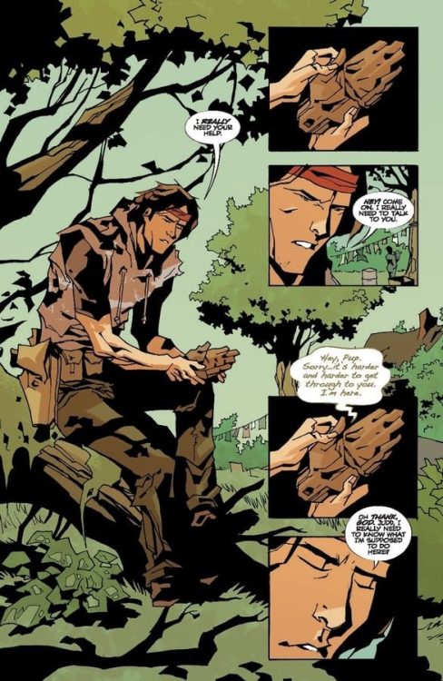
FAMILY TREE #11, available now from Image Comics, brings with it more change in an already horrifying tale. All as one family fights with everything they have to stay together, even against all odds.
He’s grown so much, and yet still needs his grandfather’s advice.
This is a family who has seen more than their fair share of loss, and from the look and feel of things, that part of their story is far from over. Family Tree #11 is a dark addition to this journey, one that branches into a future we can only imagine.
Created by Jeff Lemire, Phil Hester, Eric Gapstur, and Ryan Cody, this is a series that blends horror and family drama together in a way that I have never seen before. Though admittedly it’s been heavier on the horror as of late, shifting the scales ever so slightly.
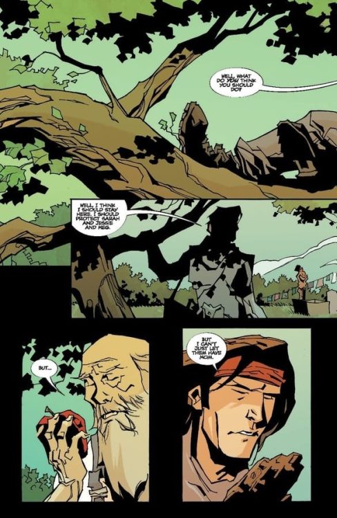
Decisions, decisions.
The Writing
Family Tree #11 is an issue full to the brim of risks, challenges, and changes. That in itself isn’t really a surprise. After all, there’s just one issue left to this dynamic series, meaning that everything is officially on the line.
I always knew that this series would get darker before it concluded. Even from the very first issue, they never really made any effort to hide that fact. Still, there’s knowing it, and then there’s seeing it.
This is one of those issues that will punch you in the gut, emotionally speaking. It also once again grabs onto the curiosity that resides within us all, as we try and figure out how everything pieces together. And more importantly, how it will all conclude.
The writing itself flows smoothly, bouncing back and forth between the past and the future with ease. One explains how the family got to this point, while the other continues to increase in tension. It’s a delightful balance, one that has kept us guessing this whole time.
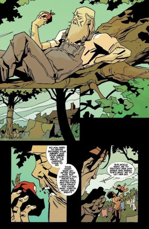
Time to decide between the head and the heart.
The Art
Family Tree #11 is full of that iconic look readers have come to know and expect. It’s this brilliant blend of styles that feel rough and organic all at the same time. Granted, the subject matter frequently being trees doesn’t hurt that aesthetic any.
There was a lot going on within these pages, with jumps between the two points in time, and so much more. It felt like every page was showing some form of change, which can be both beautiful and horrifying, depending on how you want to look at it.
The colors help to tie everything together, with a natural and heavy use of green, as well as plenty of other bold colors. As always, the colors also help to establish a transition between timelines, which is always appreciated. All of it feels so cohesive and really does perfectly fit the tone of this series.
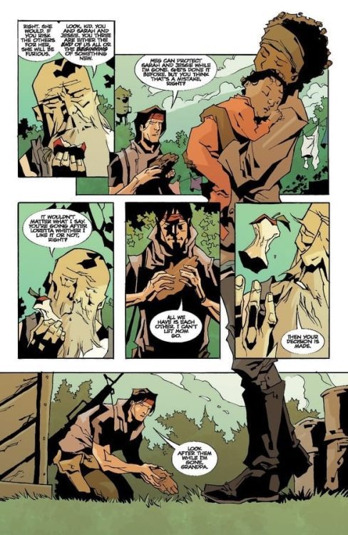
He knows which option he’ll go with, every time.
Conclusion
Family Tree #11 brings us ever closer to the end of the series, and naturally had a lot of setting up to do. The ending is as close to a cliffhanger as we’re ever going to get, leaving us all desperate to see what happens next. To see how this one family will continue their fight, no matter what.
The Picture of Everything Else #2, out today from Vault Comics, pulls the reader in and asks the question: can old friends still be trusted?
The Picture of Everything Else #2 continues to follow Marcel as he is haunted by his previous encounter with the monstrous painter Basil Hallward: a name fans of Oscar Wilde’s novel The Picture of Dorian Gray should recognize. Dan Watters’ writing utilizes many techniques that make the issue a thoroughly entertaining read. The first is the introduction of characters the reader is most likely familiar with. The first issue introduced us to Basil Hallward, and this issue introduces another character that is sure to pique readers’ interests. The dialogue also flows smoothly throughout the issue, and the elevated manner of speaking that many of the characters possess gives an almost lyrical quality to the writing.
Kishore Mohan’s art and colors of The Picture of Everything Else #2 are gorgeous. The stylized way Mohan draws the issue fits so wonderfully with the story, and the choice of having the borders of panels being hand-drawn lines rather than perfectly straight makes the entire issue feel more organic. The colors of the issue shift to a bright red when violence occurs, which stands out against the rest of the color palette and makes the moment horrifying. Mohan also creates many scenes with dramatic lighting, which gives them a stunning aesthetic.
The Picture of Everything Else #2 features one of the most impressive caption placement uses that I have seen in a long time. Lettered by Aditya Bidikar, the issue’s speech bubbles and captions direct the reader’s line of sight without trouble. There is never any confusion on order, and it works with the art spectacularly. The most stunning case of this is a single page featuring several tall panels stretching the page’s length. The panels depict an artist chiseling away oil from the surface of a painting and the chips of oil fluttering to the ground. The captions on the page are diagonal across the page, so as you read left to right, your eyes fall down the page, just like how the oil chips fall down the page. It is a subtle yet effective technique that turns the stagnant panels into a moving moment that submerges the reader in the scene and makes the caption’s words seem more dramatic.
The Picture of Everything #2 is an issue you will not want to put down after picking up. The story is always twisting and introducing new characters and events to hook the reader, the art is utterly magnificent, and the lettering takes steps to enhance the read. There are so many reasons to love this issue and so few reasons not. The series is one I would definitely recommend putting on your pull list.
Deep Beyond #1, out now from Image Comics, scrapes the surface of a vast and imaginative world full of horrors and excitement.
Written by Mirka Andolfo and David Goy, Deep Beyond #1 starts the series off strong. One of the most notable scenes of the issue is its opening, which quickly establishes the dangers of this new world Andolfo and Goy have created. The scene raises the issue’s energy as we witness a woman clinging to life and facing a monstrous horror.
Andrea Broccardo’s art brings the extraordinary vision of Andolfo and Goy to life in a fantastic way. The glimpse we have into this expansive world that the main character is pushed into is incredibly imaginative and is sure to capture the reader’s interest. Character’s facial expressions are easy to read and perfectly get across the intended emotions, whether it be classic fear or harder to portray emotions such as dread. The emotive expressions of Broccardo’s characters, as well as her fascinating creatures, make for a gripping read.
Barbara Nosenzo’s coloring in Deep Beyond #1 does a brilliant job reflecting the moods of scenes. Her work makes the frightening moments mortifying and the sad moments heartbreaking. This link between palette and tone is especially useful when there is an abrupt shift in tone. The quick change from bright and warm colors to cold, dark colors causes this change in mood to be more impactful and makes for an exciting sequence. Nosenzo also utilizes the technique of single-colored backgrounds for certain panels. This is done when the characters are surprised or shocked and draws your attention to the people and items involved in the panel rather than the setting. It is a highly effective way to direct readers’ attention.
Deep Beyond #1 has an exceptional diversity of lettering styles, ad it showcases many of them within the first few pages. Fabio Amelia uses a different style for nearly every sound effect in the issue, which gives each of them their own place and prevents them from blending together in the reader’s mind. Each sound effect is distinct, and Amelia treats it as such. The only complaint I have is one instance where multiple captions of the same style contained dialogue from two different characters, making it difficult to differentiate who is speaking.
Deep Beyond #1 is a strong start to the limited series. It has frights, action, and it gives us a glimpse at the vast world ahead of us. While much of the issue is set up for what is to come, there is plenty to keep readers engaged and have them desperately waiting for the next issue.
So we are breaking format here on I’d Buy That For A Dollar. Instead of talking about a great bin find, I will be talking to one of the best, if not the best, when it comes to dollar bin diving; the one and only crew known as POWER COMICS. Spread across various media outlets, the guys in Power Comics do extremely researched and passionate dives into the most obscure and unique indie comics from the ’80s and ’90s. These are the kind of fans that transcend into historians, and end up being as important to the medium as the creators. I wouldn’t be doing this column without finding Power Comics first. I reached out to them and heard back from Evan Husney, the Power Comics O.G. Check out my chat with Evan below, and then head over to one of Power Comics outlets and start that deep dive. You will find all their links here: https://linktr.ee/powercomics.
Monkeys Fighting Robots: Hey there Evan, first of all, thanks for taking the time to talk to us at Monkeys Fighting Robots. What you do is so unique, can you give our readers the rundown on what you do with Power Comics.
Evan Husney: The main objective with Power Comics is to identify, archive and canonize the weirdest and wildest small press comics from the ’80s and ’90s to show the universe that these forgotten works have now perfectly aged into the fine wine of outsider art. This particular era of comics produced so many hastily attempted indie ventures by singular basement dwellers, which at the time of their release were not celebrated at all – in fact, most of the comics from the DIY boom were heavily maligned by the greater comic community. To us, these comics are far more interesting than most work from the mainstream, and their purity would be impossible to replicate in today’s modern internet era of self-awareness and ironic style humor. Our staff and I spend way too much time and money digging through dusty quarter bins to unearth these forgotten dreams and to resurrect the unfulfilled artists of the past. The best way to describe and/or identify a “Power Comic” is via our motto: “where enthusiasm meets frustration”. If the art and writing appear to be made under those circumstances, it’s likely a Power Comic.
MFR: Is it a solo venture?
EH: Thank heavens no! Power Comics began as a tag team duo of myself and my dear friend Zack Carlson, the author of DESTROY ALL MOVIES!!!, and also a legendary film curator from Austin, TX. Then, a few years into the venture, we added another super close friend of ours Gabe Dikel into the mix, who also possesses the Power Comic obsession, keen eye and hunger for awkwardly drawn muscles.
MFR: How long has Power Comics been going?
EH: I believe that Power Comics will be turning 10 this year! We started back in late 2011. Hard to believe!
MFR: So how do you find these hidden gems? What’s the research/searching process like?
EH: Digging through any quarter bins we can find is our preferred method, but there’s also a lot of painstaking hours scouring online comic retailers like Mile High Comics, Atomic Avenue, mycomicshop.com, etc, going through EACH and every publisher from A-Z to make sure NOTHING has been missed. Tons and tons and tons of hours. When you find one comic you like, that takes you on a whole separate journey to see if the same artist, publisher, writer, etc did anything else that is as remotely untarnished as the other issue you found. Rabbit holes within rabbit holes. Can’t tell you how many comics we’ve blind purchased online only to find out that when we finally get to thumb through them in the flesh, they are either “too good” or “too self-aware.” Can be majorly discouraging.
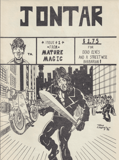
An example of a ‘power comic’- Jontar #1 by Bill W. Miller & Tony Lorenz
MFR: Do you mostly find scans/pdfs, or are you finding and receiving more actual physical books? And do you have a preference?
EH: Physical books only. We have to touch them.
MFR: How many media platforms are you guys spread on? And where can comic fans get the most out of what you do?
EH: The main dig is Instagram. We recently launched a YouTube channel (www.youtube.com/powercomics) where we plan to do tons of in-depth reviews, interviews with Power Comic creators, and we just kicked off a Power Comic book club with Benjamin Marra. Our most exciting new venture though is our Patreon (www.patreon.com/powercomics) where for just $5/month we grant folks access to our growing digital library where they can read through the most fascinating, rare comics we’ve discovered.
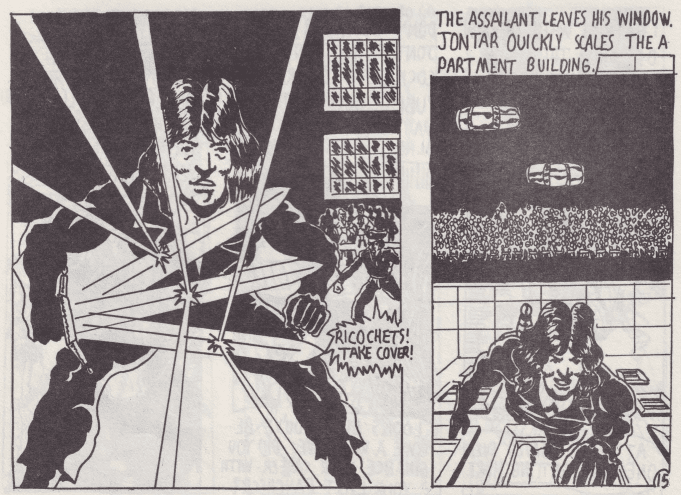
Jontar art by Tony Lorenz
MFR: When did your interest in these kinds of comics start? Did a specific book get you going?
EH: It pretty much all started when Zack Carlson exposed me to Ken Landgraf and Bob Huszar’s New York City Outlaws back in 2009/2010, which is an amazing DIY/heavy metal take on The Warriors. It was that moment when a huge door opened, and I realized that there was this whole hidden underground world of small press ’80s comics, and it grew into a total obsession to find more like NY Outlaws. At the time, none of these comics were worth ANYTHING. So I would spend hours on MileHighComics.com just going through all the publishers and searching various things and would order a HUGE box of like 200 comics shipped to my house for $40. All gems. And it was this awesome feeling of being on to something, and collecting something special that no one else had yet caught on to – not sure if that was true or not, but that is how it felt at the time.
MFR: How did you come to the term ‘Power Comics’?
EH: I honestly can’t remember exactly, but we wanted to launch a Tumblr back in 2011 to showcase these discoveries and we needed a name for the site as we wanted to create a portal where all of these odd duck comics could be united and live together. The innocuously simple, but very fitting title POWER COMICS was chosen.
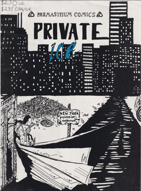
Cover to power comic ‘Private Ice’ #1.
MFR: Do you have a particular favorite discovery?
EH: My favorite discovery is actually a ’70s large-format comic zine called Mistique from the UK. We posted on Instagram, but I’ve never seen ANYWHERE else, and can’t find any information about it. The art is so amazing, I want to make 30 different t-shirt designs from it ASAP. But my favorite Power Comic is Dream Weaver issue #2. I believe it to be the perfect Power Comic specimen, and it even reaches transcendent levels of poetic brilliance.
MFR: Is there a book you are still looking for? Is there a Power Comics Holly Grail find out there?
EH: There’s MANY. The one that’s high on the MOST WANTED list at this present moment is a title called Baneful Ground. If you got it, get in touch.
MFR: Why do you think these comics are important to shed a light on? What can they showcase about our beloved medium?
EH: Similar to how the film world has its most devoted fans of ultra-low-budget action film discoveries, and/or shot-on-video horror films of the ’80s, or like how rare record heads in the music world obsesses over obscure, private press basement demos, power comics is just that for the world of comics. Power comics is the outsider reflection of this medium’s mainstream.
MFR:On top of highlighting comics, you guys have also recently interviewed a few creators. What kind of response have you gotten from some of the creators whose books you have highlighted?
EH: It’s been a trip. The response to the creators we’ve spoken to thus far has been mostly shock. Most can’t believe we’ve tracked them down, that anybody cared, or even likes the comic they created 30+ years ago. At first, I wasn’t sure if I wanted to peek behind the curtain to find out the real truths behind some of my favorite Power Comics as that could spoil the mystique, but so far it’s been super rewarding talking to some of these creators and also finding out the things you always suspected regarding the creation, limitations and dreams they originally had, were true.
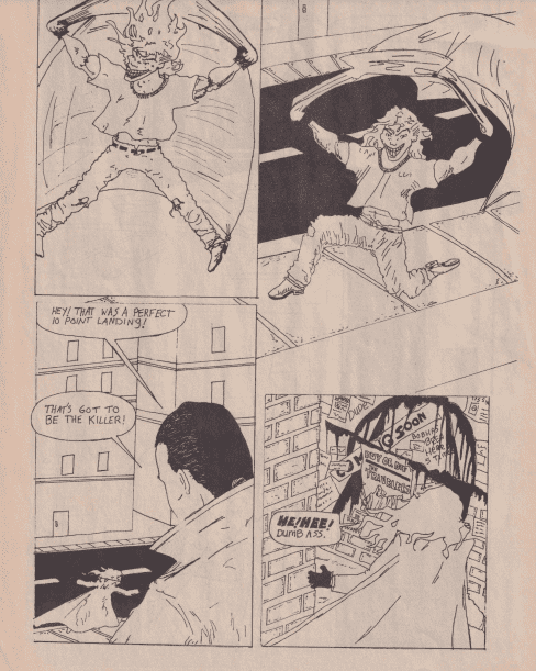
Interior art from ‘Private Ice’ #1, another ‘power comics’ gem.
MFR: Do you make any comics of your own?
EH: I don’t – I’m just a fan and an admirer of comics.
MFR: Where do you want to take ‘Power Comics’ in 2021? Anything new on the horizon?
EH: We want to grow our following on IG, YouTube and Patreon the most we can! We have some killer things and hugely AMBITIOUS goals planned, but they may only work if we can grow our audience x4 this year!
MFR: Any parting comments for our readers?
EH: YES. If you have any “Power Comics” that we don’t or noticed we haven’t posted yet, please assume we don’t have them/it, and definitely make sure to send us a message on IG, Patreon, or YouTube with any tips on new Power Comic discoveries! We’re ALWAYS on the hunt!!
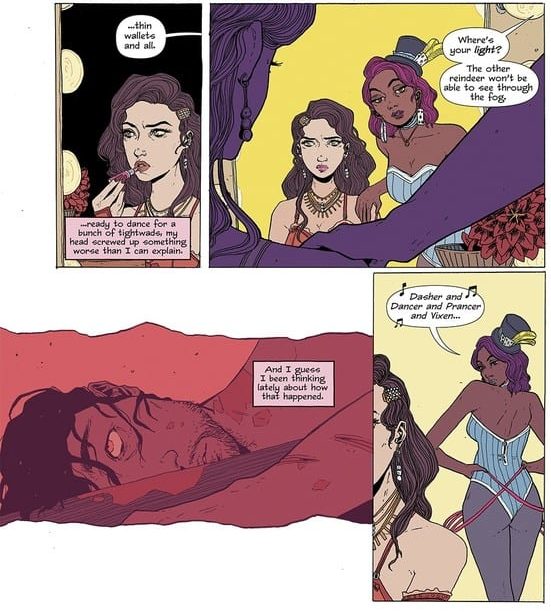
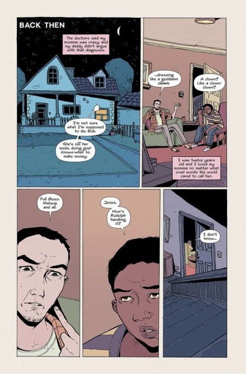
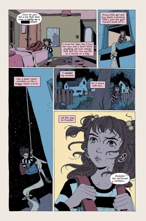
HAHA #2 hits comic book stores on Wednesday, February 17th, continuing W. Maxwell Prince’s take on clown life. This issue hones in on a performer named Rudolph—a young woman who seems less than enthusiastic about putting on a show. But as readers will learn, her present predicament is a direct result of another person’s experiences. Her identity has been forged by her mother’s life.
Story
Much like W. Maxwell Prince’s classic works, such as the Ice Cream Man series, each issue appears to be its own standalone story. This issue tells the story of Rudolph’s childhood and the way her life changed once her mother was deemed “crazy.”
But is dressing up as a clown and doing what makes one happy classify them as “crazy?” The issue doesn’t give a direct answer, but leaves the interpretation up to the reader. They’re able to live vicariously through Rudolph as they determine whether her mother is actually off her rocker or has tapped into something more.
One of the brilliant pieces of this issue shows itself when Rudolph’s mom reveals their destination: Funland. Readers will remember this as the amusement park from the previous issue worked as a clown. By choosing this setting, Prince connects this world to his other seemingly unrelated stories, which makes us wonder what unifying element could be tying them together.
Artwork
Zoe Thorogood’s penciling and ink work, Chris O’Halloran’s coloring, and Good Old Neon’s lettering worked well together in this issue. The characters and scenes appear to be drawn with slight squiggles in their outlines, adding to the slightly eerie nature of this story. These illustrations are fleshed out with traditional circus-esque colors to set the issue’s tone further. We also enjoyed the narration word balloons, which were colored pink to both go with the clown theme and represent the innocence of young Rudolph.
Conclusion
HAHA #2 is a sobering tale of the absurdities in life—both in its many obstacles and our own ways of fighting them. We’re excited to see how the next issue connects with Funland in its own way.
Do you see any other elements tying this story to the first issue? Let us know in the comments below!
TEENAGE MUTANT NINJA TURTLES: THE LAST RONIN #2, the highly anticipated second installment of the ambitious series, hits stores on Wednesday, February 17th. Readers learned the ninja protagonist was in fact Michelangelo. But before we see what happened to his brothers, the seasoned warrior falls from a building while searching for the mysterious Hiroto. Mikey believed he was done for and attempted to die a warriors death, but someone saved him. And they may be connected to the legendary April O’Neil.
Story
An aged version of April awakes in her apartment in the first panels of this story. The reader watches as she experiences a vivid flashback of a night many years ago. In it the Foot Clan attacks Splinter and the turtles, leaving the elderly rat severely wounded.
The flashbacks soon shift to the present version of Mikey recovering in April’s home. He continues his conversation with his deceased brothers, which starts out quite peaceful. But a rage soon boils over in the ninja much like the heated tea kettle he set. It’s clear Mikey still struggles to forgive Raphael for his “hot-headedness.” His actions on the night of the Foot Clan’s attack were the last straw, and they’re laid out for readers in stunning detail.
Kevin Eastman, Peter Laird, and Tom Waltz’s narrative offers amazing characterization for Mikey. Rather than leaving readers wondering how he changed so much, they show us the life experiences, choices, and memories of his brothers that led him on a new path. What’s more, we learn what’s become of April and the mysterious figure who’s been assisting her.
Artwork
Eastman, Esau Escorza, and Isaac Escorza’s penciling and ink work did a fantastic job of crafting scenes of both the past and present versions of our protagonists. Penciled lines of age are present on both April and Mikey, while their flashback selves are drawn using smoother styles. Samuel Plata and Luis Antonio Delgado’s coloring work helped differentiate between the flashbacks and present reality by adding faint tannish tones to the memory scenes, generating a feeling of feeling of haziness due to their spot in the distant past. We also enjoyed Shawn Lee’s lettering, which shifts seamlessly between each character’s internal dialogue through varied word balloon colors.
Conclusion
TEENAGE MUTANT NINJA TURTLES: THE LAST RONIN #2 simultaneously answers many of our questions from issue #1 while posing an onslaught of new queries. We are anxious to learn more about what led to the present state of Mikey and April’s world.
Are you excited about Mikey’s reunion with April? Let us know in the comments below!
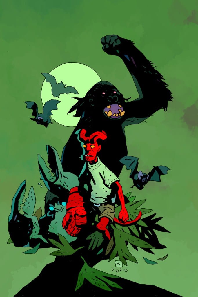
The Hellboy universe is already known for its wide array of adventure genres, from haunted house ghost stories to good ol’ Kaiju beat ’em ups. However, one thing I don’t think I’ve ever seen this series do is a classic Land of the Lost style prehistoric island tale. This is exactly what we get with “Young Hellboy: The Hidden Land” #1. This first of a four issue mini-series by writers Mike Mignola and Thomas Sniegoski, artist Craig Rosseau, colorist Dave Stewart, and letterer Clem Robins has all the making of a fun dinosaur and monster-filled adventure tale, but with the added twist of the Hellboy mythology and the complications that arise from his presence. With a tightly paced and sharp script, as well as great visual work, this is just the sort of Hellboy as a young lad story I didn’t know I needed.
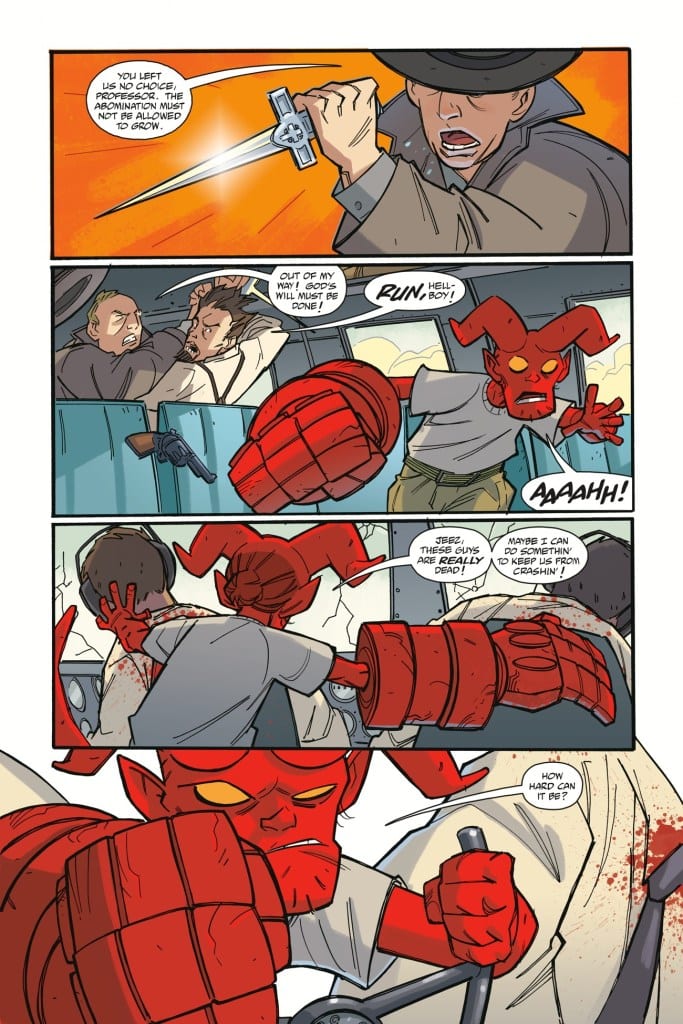
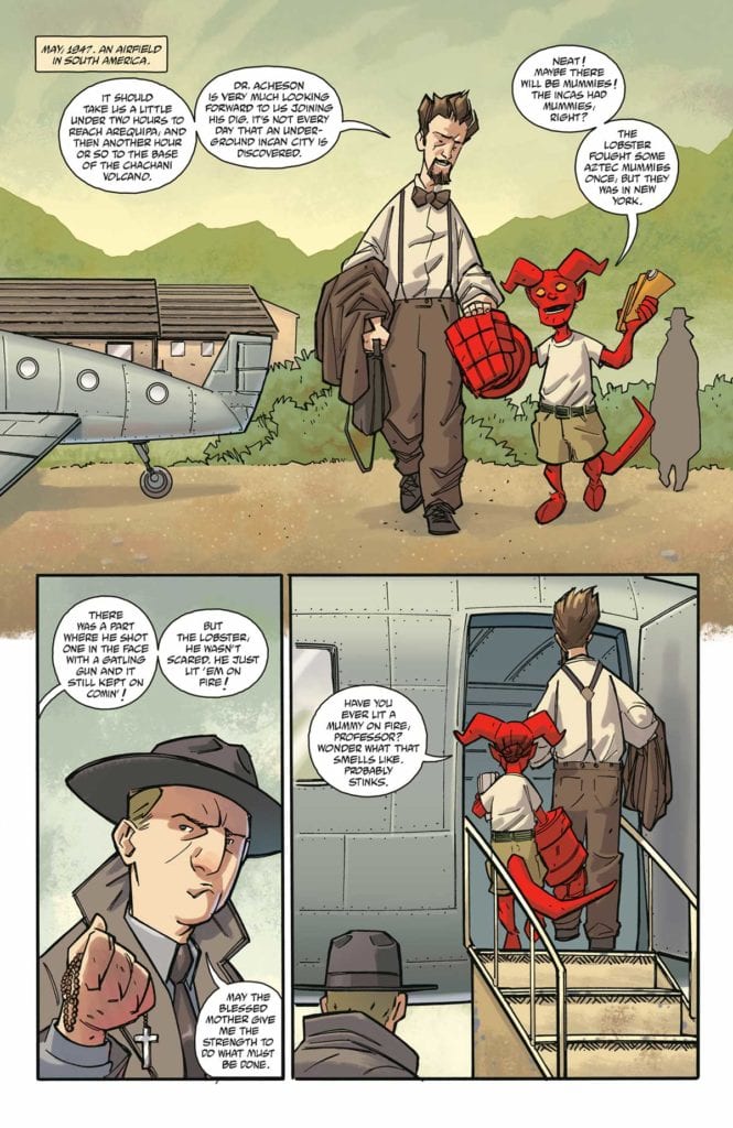
“Stranded on a strange island after a mishap on their way to a South American dig site, Hellboy and Professor Bruttenholm are confronted by all manner of monsters! But even when the stranger who rescues them turns out to be one of Hellboy’s heroes, they aren’t as safe as they think they are!”
Writing & Plot
The script from Hellboy creator and vanguard of this universe Mike Mignola and his cowriter Thomas Sniegoski is one of simplicity, focused on being a fun adventure romp. The perspective of big Red when he was still just a inquisitive kid bugging his old man is a fun and refreshing take we don’t often get in the Hellboy universe. In fact, many of the interactions we get in Hellboy and the B.P.R.D. stories that involve young HB and his adoptive father Professor Bruttenholm are ones where the latter is too busy for his charge. Seeing the two together is a great thing on its own, and the environment that they are placed in is even more of a bonus. This comic is a big tribute to classic mysterious island adventure stories of old, which can trace their lineage back to early 20th century young boys’ novels and golden/silver age adventure comics. Crashing on a land full of oversized crabs, dinosaurs, and irritable apes is a classic trope familiar to the adventure genre, but one that never seems to go out of style. This comic offers up every one of those lovable tropes, but with the twists involved with Hellboy as a character and the world he inhabits. The dialogue is simplistic and fun, with most of it consisting of young HB asking tons of questions (as kids do) and making loud exclamations. This isn’t the kind of comic book that’s going tp blow you away, but it’s certainly fun enough to keep you engaged from start to finish, whether you’re a Hellboy fan or just someone who likes a good adventure.
Art Direction
The Hellboy universe is especially well-known for its uncanny artwork, mostly because of the signature style of the legendary Mike Mignola. Any book that comes out as a part of this universe has to in some way math the sort of strange and eerie aesthetic that this universe demands. What’s special about “Young Hellboy” #1 is how penciler Craig Rosseau and colorist Dave Stewart manage to achieve this effect while also creating an uncharacteristically bright adventure for this universe. Rosseau’s pencils utilize the same sort of thick and shadow-heavy style that resembles Mignola and other Hellboy artists, while still maintaining a kind of distance from those other works. The look of the characters and the monsters that arrive in this comic undoubtedly have that Mignola-esque look to them, but there’s a kind of youthful light that isn’t there in the other Hellboy and B.P.R.D. books…and not just because this is a young HB. Now, much of this is due to Dave Stewart’s choice of colors. Every surface in this comic is drenched in sunshine, and I can’t help but feel that a lot of that light comes from how Stewart chooses to demonstrate how our young Agent Hellboy affects the people around him and the story as a whole. The enjoyment we get out of reading this character, decades before the tumultuous events leading to the end of his story some 70 years later, is made into a visual experience by how bright and vivid this book is. The darkly saturated colors of the older Hellboy stories and that of the B.P.R.D. and other tales in this universe are directly juxtaposed to this youthful adventure comic. The lettering from Clem Robins shares its fonts with basically every other book in this universe,, including its sound effects. Would we really want it any other way, though?
“Young Hellboy: The Hidden Land” #1 is a delightful start to this adventure mini-series. Thomas Sniegoski, with help from universe creator Mike Mignola, puts together a stellar yet simple homage to lost island adventure stories of decades past, but with the twists that come with the inclusion of a young and energetic Hellboy. The visuals of Craing Rosseau and Dave Stewart blend in seamlessly with the overall aesthetic of the rest of the Hellboy Universe, but manage to have a brighter look due that matches this comic’s focus. Whether you’re a diehard Hellboy fan or a fan a good adventure stories, be sure to pick this issue up when it hits shelves on 2-17!
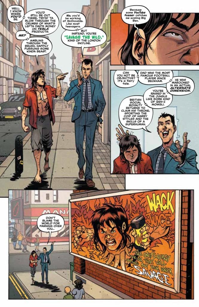
Savage #1 begins a new series from Valiant Entertainment on February 17. Continuing the adventures of the titular character, writer Max Bemis throws him into modern London as an influencer. Only for the art by Nathan Stockman to showcase how Savage’s wild movements are a commodification. A bunch of frustrations and pent-up energy explode onto the scene in this grand opener.
Background
Savage follows Kevin Sauvage Jr., son of wealthy British socialites, who crash land onto a mysterious island full of dinosaurs. After surviving the island and violent marauders, this modern-day Tarzan ends up in London under the care of his siblings.
Savage #1: Repurposing The Natural
Savage #1 wastes no time by making a fish-out-of-water scenario for the hero. Bemis takes a modern approach by making Kevin an influencer. With Kevin’s opportunistic brother, Henry, wasting no time in publicizing/monetizing him, Kevin is everywhere.
With real-life social media influencers being a topic of interest, this series goes into what makes them attention-worthy. Consumers always look for the most exotic and relatable mindsets because applying somebody’s out-of-box thinking to their everyday lives can be a welcome change. While nobody expects to face dinosaurs in their time, Savage’s thought process of keeping an active mind is universal with the right words. It is what makes Kevin aware of the wider implications of celebrity life in Savage #1. The phrases to say and the interactions with people like autographs are something Kevin understands; it just doesn’t satisfy him. Because by all accounts, Savage and the reader feel how inauthentic the ads are.
The Wild Instinct
Stockman brings this feeling out in the body language of Savage. Throughout the first half of Savage #1, Kevin mentally struggles with his celebrity life. The orderly way feels too constraining on him, unlike when he explains his way of thinking with extended limb movements. It’s a feeling of authenticity that people try to recreate for advertising, but for Kevin, the attempts are just as scripted as everything else. So with the reader sharing this feeling of not seeing the real thing when these wild and exaggerated movements come out during a dinosaur attack, it’s a strong liberating sensation.
The colors by Tríona Farrell serve as a good foil for Savage’s mindset and desires. In most panels where he’s up close, there is a red background that displays Kevin’s aggression. So when dinosaurs are attacking London’s people, this red lightens to an orange color. Unlike before, this signifies that despite being able to go “Savage,” Kevin’s mindset is to protect people instead of taking his anger out on the dinosaurs. It’s what makes me want to root for him.
Letterer Hassan Otsmane-Elhaou emphasizes the difference between scripted dialogue and instinct in Savage #1. In many instances where people say things in a small font, it feels like a natural reaction. As one of the choreographers’ notes within a panel indirectly notes, there’s no emotion or boldness in what people are saying to the point of displaying that in bold words. When people speak in colored words, there is a real sense of emotion and passion that the reader will hook onto.
Follow/Subscribe To Savage #1
Savage #1 is only the beginning of Valiant’s newest character. The life of a feral social media influencer certainly looks enticing. But it’s how the reader can genuinely connect and relate to Kevin that makes him good as a character and influencer. Despite his frustrations with the modern world, he still has goodwill towards the people living in it. Because by all accounts, learning to live with these frustrations with an active mind is something people can use.


 Savage #1 wastes no time by making a fish-out-of-water scenario for the hero. Bemis takes a modern approach by making Kevin an influencer. With Kevin’s opportunistic brother, Henry, wasting no time in publicizing/monetizing him, Kevin is everywhere.
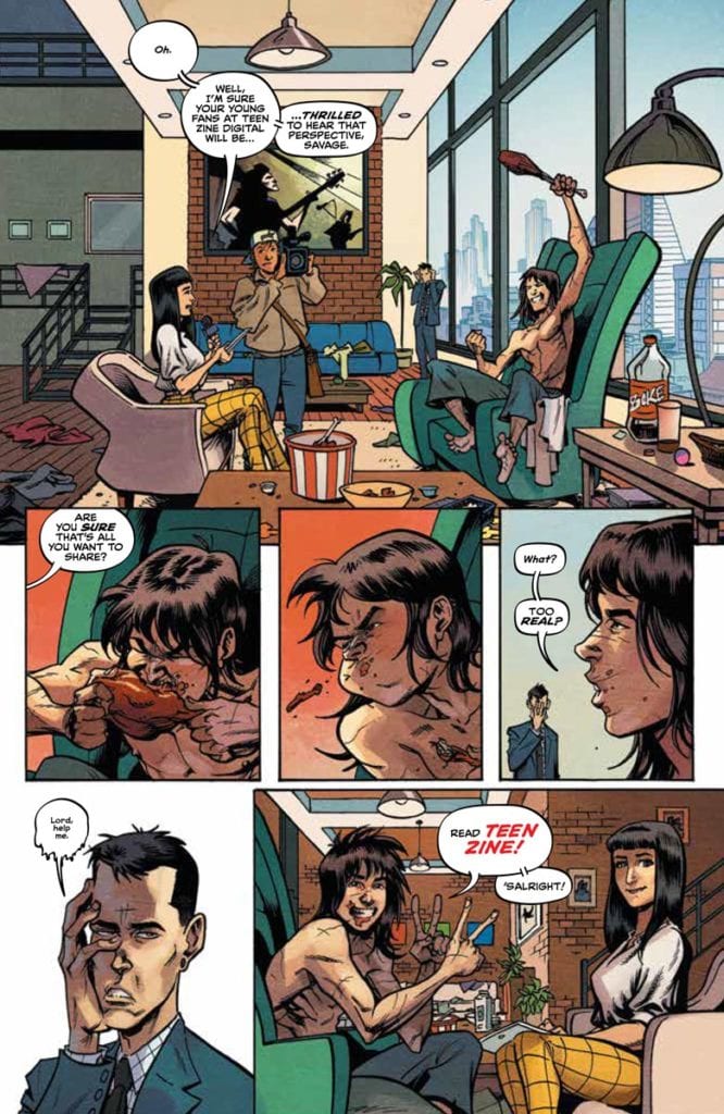 With real-life social media influencers being a topic of
 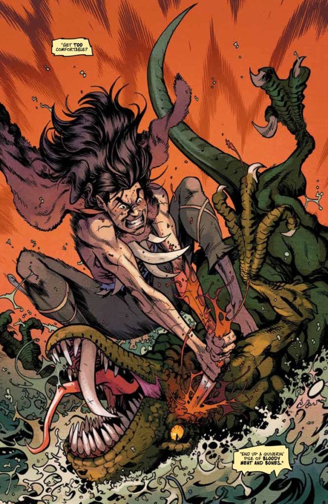 Stockman brings this feeling out in the body language of Savage. Throughout the first half of Savage #1, Kevin mentally struggles with his celebrity life. The orderly way feels too constraining on him, unlike when he explains his way of thinking with extended limb movements. It’s a feeling of authenticity that people try to recreate for advertising, but for Kevin, the attempts are just as scripted as everything else. So with the reader sharing this feeling of not seeing the real thing when these wild and exaggerated movements come out during a dinosaur attack, it’s a strong liberating sensation.