

Deep Beyond #1, out now from Image Comics, scrapes the surface of a vast and imaginative world full of horrors and excitement.
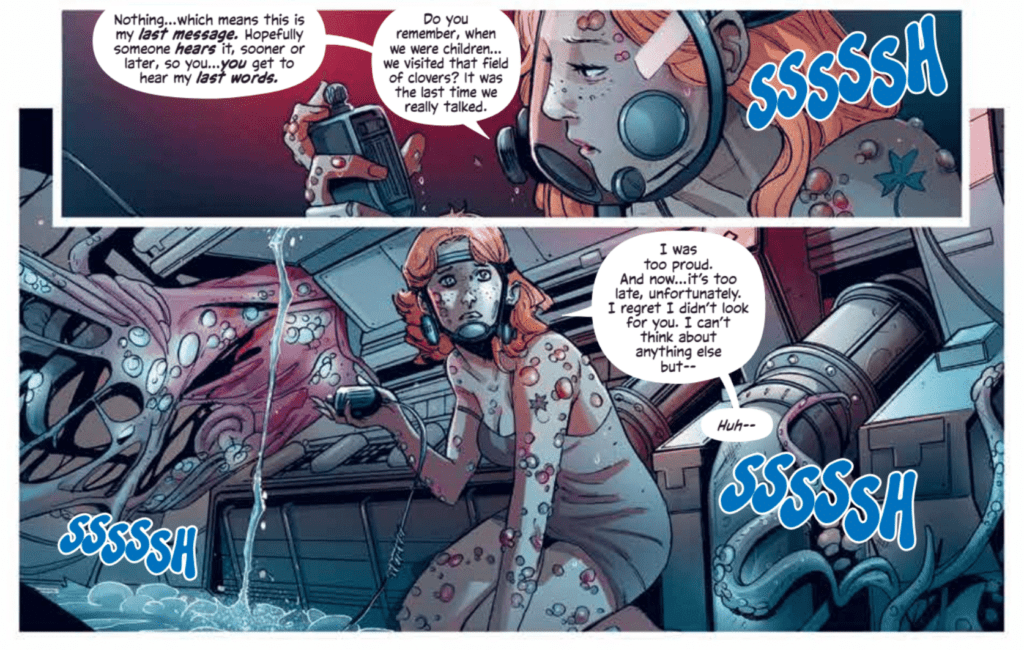
Written by Mirka Andolfo and David Goy, Deep Beyond #1 starts the series off strong. One of the most notable scenes of the issue is its opening, which quickly establishes the dangers of this new world Andolfo and Goy have created. The scene raises the issue’s energy as we witness a woman clinging to life and facing a monstrous horror.
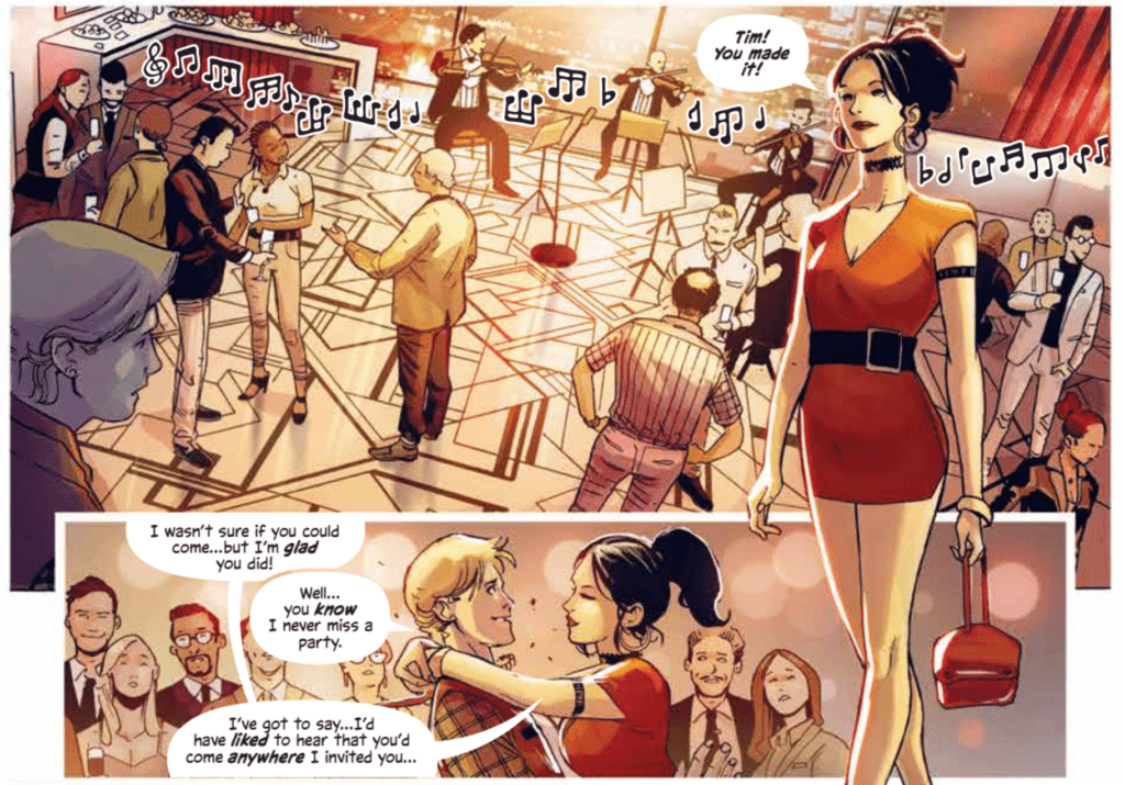
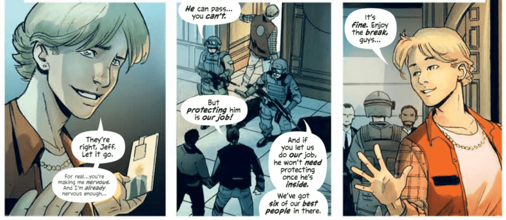
Andrea Broccardo’s art brings the extraordinary vision of Andolfo and Goy to life in a fantastic way. The glimpse we have into this expansive world that the main character is pushed into is incredibly imaginative and is sure to capture the reader’s interest. Character’s facial expressions are easy to read and perfectly get across the intended emotions, whether it be classic fear or harder to portray emotions such as dread. The emotive expressions of Broccardo’s characters, as well as her fascinating creatures, make for a gripping read.
Barbara Nosenzo’s coloring in Deep Beyond #1 does a brilliant job reflecting the moods of scenes. Her work makes the frightening moments mortifying and the sad moments heartbreaking. This link between palette and tone is especially useful when there is an abrupt shift in tone. The quick change from bright and warm colors to cold, dark colors causes this change in mood to be more impactful and makes for an exciting sequence. Nosenzo also utilizes the technique of single-colored backgrounds for certain panels. This is done when the characters are surprised or shocked and draws your attention to the people and items involved in the panel rather than the setting. It is a highly effective way to direct readers’ attention.
Deep Beyond #1 has an exceptional diversity of lettering styles, ad it showcases many of them within the first few pages. Fabio Amelia uses a different style for nearly every sound effect in the issue, which gives each of them their own place and prevents them from blending together in the reader’s mind. Each sound effect is distinct, and Amelia treats it as such. The only complaint I have is one instance where multiple captions of the same style contained dialogue from two different characters, making it difficult to differentiate who is speaking.
Deep Beyond #1 is a strong start to the limited series. It has frights, action, and it gives us a glimpse at the vast world ahead of us. While much of the issue is set up for what is to come, there is plenty to keep readers engaged and have them desperately waiting for the next issue.