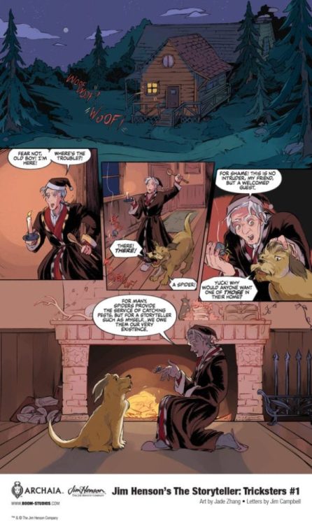
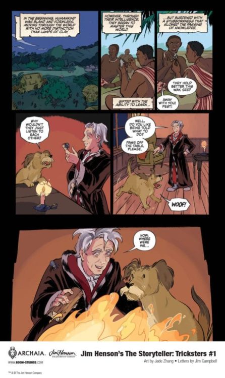
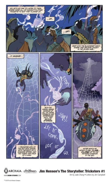
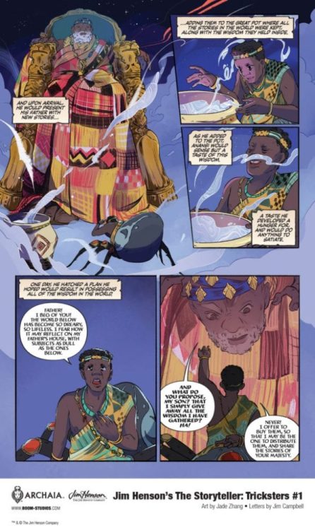
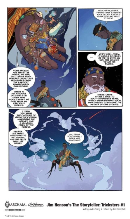
JIM HENSON’S THE STORYTELLER: TRICKSTERS #1 hits your local comic book shop on March 17, but thanks to BOOM! Studios, Monkeys Fighting Robots has an exclusive five-page preview for our readers.
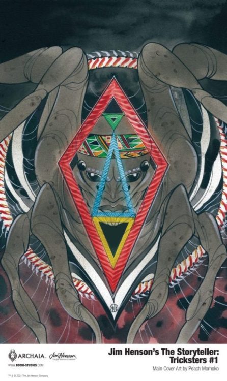
The book is written by Jonathan Rivera, with art by Jade Zhang, and you will read Jim Campbell’s letter work. The main cover is by Peach Momoko, with a variant cover by Dani Pendergast.
About JIM HENSON’S THE STORYTELLER: TRICKSTERS #1: Discover the fascinating tale of Anansi, the spider-god, and his quest to free all Stories from his father, the sky god Nyame. But when Anansi becomes the Keeper of Stories, what will he decide to do with all of his new, potentially world-changing knowledge?
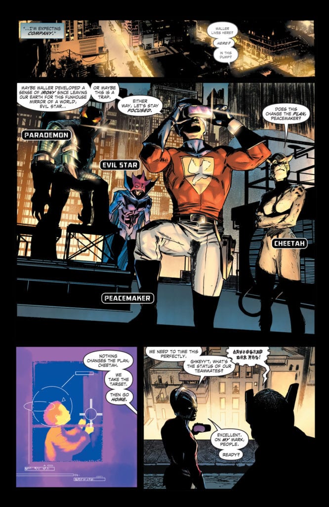
DC Comics’ Future State: Suicide Squad #2 is a story about the end of worlds. In “Task Force: Next!” writer Robbie Thompson, artist Javier Fernandez, colorist Alex Sinclair and letterer Wes Abbott show where a Justice League led by Amanda Waller leads. And in Future State: Black Adam, writer Jeremy Adams, penciller Fernando Pasarin, inker Oclair Albert, colorist Jeromy Cox, and letterer Wes Abbott tell us that even DC’s most powerful heroes may not be able to stand up against the tide of Armageddon.
Future State: Suicide Squad
Writing
Thompson brings us to the finish line, sticking close to all of the strengths of our first chapter. Future State: Suicide Squad #2 isn’t any less mysterious. We’re left with just as many questions as we have answers. Part of the reason this issue is so mysterious, is because Thompson doesn’t hold our hand. When Peacemaker and Waller talk, there’s a history we’re not privy to. We’re watching two people who know each other deeply as they talk about things we can’t understand. It’s fantastic! It’s natural dialogue, free of exposition dumps and full of tension. If the quality of Future State: Suicide Squad #2 is any kind of sign of what to look forward to in Thompson’s Suicide Squad run, we’re in for a real treat.
Art
Fernandez takes us on a journey with his page layouts. We begin this story with a moment of peace. We see Superman watching over his teammates. His x-ray vision is depicted like word balloons. It’s ordered and tidy. But then, as Peacemaker’s team strikes, the page begins to fall part. Panels get jumbled and crooked. A scene of Mirror Master and the Flash fighting makes it hard to know which are mirrors and which are panels. It’s a fantastic infusion of chaos. But what is really interesting is Fernandez’s next page. More fighting, more death and destruction, shown in a page of right angles and ordered panels. It’s what defines the Suicide Squad. Little moments of extreme violence that don’t seem to phase the characters. The page layout is unsympathetic to the loss, just like our “protagonists.”
Coloring
A lot of Sinclair’s colors are slightly muted in this chapter. Our characters look like they haven’t been out in the sun in a while. Their skin is pale, their surroundings are often dull. Sinclair shows us a dark timeline. But there are a few tiny moments of color. Most often, these are moments of violence. The few moments of violence that actually effect our characters. One that stands out, due to Sinclair’s striking red used in the blood, is when a character doesn’t mean to have killed the person. We mirror their shock when we see the sudden use of brilliant color. But by the end of the story, everything looks like it’s turning grey. Sinclair shows us how these people have come to find casual violence dull. But it’s also draining them of life.
Lettering
Abbott brings a levity to this chapter that didn’t exist in the previous issue. Everything was quite final in Future State: Suicide Squad #1. Characters spoke their mind in short chunks. There was very little rhythm to what they said. Abbott showed in that chapter that these characters were just coasting. They said what they had to say and got right to the point. In this issue, however, everyone seems to be getting a little sing-songy. Most of the dialogue is parsed out into tiered word balloons. Rarely do we see characters say everything they have to in one go. Again, this shows us the casual reaction these characters have to violence. They’re almost laid back about killing each other. This is the reality they know. It’s the reality they’re comfortable in. Abbott really helps us see just how cheap life is to them.
Future State: Black Adam
Writing
Nothing about Adams’ writing should work. The whole script is riddled with exposition dumps. Gold Beetle enters, a Deux Ex Machina with all the answers in the world, and Adams gives us a text-heavy run through of what we need to know. It breaks just about every rule of writing. But somehow it still works. Maybe it’s Adams’ self awareness in this chapter. The previous issue suffered from taking itself a little too seriously at times. But in this issue, Gold Beetle is a breath of fresh air. Sure, she has answers, but she’s more interested in talking about her many exploits. And the twisty, strange and confusing journey that Adams takes us on does require a fair bit of explaining. This script might break a lot of rules, but it more than makes up for it by being boatloads of fun.
Art
Pasarin and Albert had their work cut out for them in this issue! Every page looks like something out of Where’s Waldo? They don’t skimp on any details. And, as a result, the story maintains its feeling of epic poetry. These don’t look like scenes from a comic book. They look like scenes from some grand mythology. It’s fitting, though. These are the death throws of the universe. And all of these moments of extreme drama are juxtaposed with Gold Beetle’s hilarity. Even her moments of real panic, coupled with her dialogue, lighten the mood. She brings the perfect balance to what could have been a melodramatic ending.
Coloring
There’s a heavy emphasis on blue and gold in this issue. It comes to signify which characters are our protagonists. Gold Beetle is a mash up of the two colors and Black Adam has a gold trim along his cape and a blue hue to the lightning bolt on his chest. These colors tend to be the only things that stick out when the Unkindness arrives. The sea of purple and red engulfs everything else. It’s the blue and gold that still stands out, a sign of our protagonists’ resiliency. But it’s also interesting, as we begin to associate Black Adam’s powers with blue, to see how close the blues and purples are to one another. We get the sense that Black Adam could be on the side of the Unkindness. He has that type of power. And as the issue ends, we’re left wondering if someday he really could break bad.
Lettering
Future State: Black Adam is actually a great companion piece to Suicide Squad. And not just because of its shared themes and tones. Abbott’s work in one really highlights his work in the other. Where Suicide Squad is nonchalant and rhythmic, Black Adam is earnest and dramatic. Gold Beetle’s lines don’t get the tiered-word-balloon treatment. They’re breathless chunks. She’s getting all the bragging in that she can before she’s interrupted. And the other characters seem like they can’t get a word in edgewise. They have tiny interruptions in word balloons with long tails. Abbott’s underlining the effort it takes them to be heard. It’s a funny, brilliant way of showing just how talkative Gold Beetle is.
DC Comics’ Future State: Suicide Squad was mysterious and explosive. Future State: Black Adam was an epic that delivered on its promises. Both of these stories were fantastic examples of why Future State was ripe with potential. These creative teams took that potential and showed just how far it could stretch. Pick up Future State: Suicide Squad #2, out from DC Comics February 23rd, at a comic shop near you!
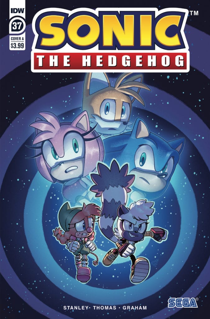
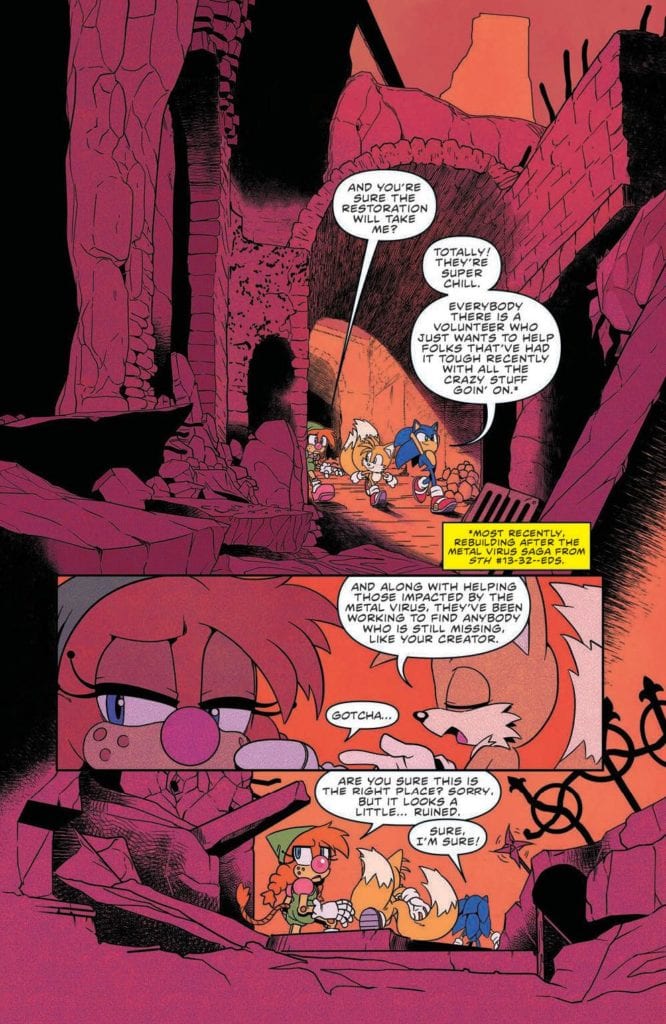
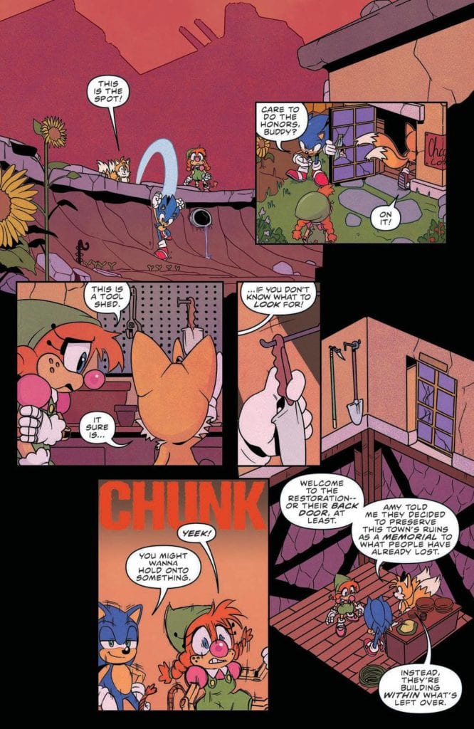
Sonic The Hedgehog #37 out this week from IDW Publishing is the start of a fresh adventure for the members of the resistance. The mysterious yet adorable Belle the Tinkerer works to try and find a new calling thanks to Sonic and Tails. This new story comes courtesy of Evan Stanley (writer), Adam Bryce Thomas (linework), Reggie Graham (colors), Shawn Lee (letters).
There’s a new kid on the block! And a new… tower? While Tangle tries to initiate Belle into the Restoration, Sonic, Amy, and Tails investigate a mysterious looking tower that has popped up. Everyone is pushed to their limits in “Test Run”!
Writing
After being invited to join the resistance, Belle has the worst first day ever trying to fit in. She messes up everything she attempts, no one trusts her because she’s a robot (or at least some form of one), and she still doesn’t know who she can really trust. Luckily for her Tangle shows up and is more than willing to give Belle a hand.
Evan Stanely doesn’t just focus the entire issue on Belle though and instead sends Sonic, Tails, and Amy to investigate a mysterious location. They find the place to be guarded by robots so they are pretty sure Dr. Eggman is involved. Overall it’s a slower beginning than the previous storyline but seems like it can pick up steam pretty quick.
Artwork
The linework by Adam Bryce Thomas feels inconsistent from panel to panel. Considering Thomas has been a long contributor to the series there are plenty of examples of fine work in previous issues. This one though has some great facial expressions in some panels and some rather off-putting ones in others.
The colorwork by Reggie Graham also feels not up to the same quality as usual. This is mainly due to the use of burgundy as a background color between the panels making the pages distracting and hard to get used to. It feels very unnatural when instead of just being used as a filler between panels it becomes the background behind characters.
The lettering work by Shawn Lee is up to the level of quality one would expect from this series. Lee utilizes an easy-to-follow style with the speech bubbles which creates a great flow from panel to panel. At the same time, the sound effects offer a great audio experience to the reader without detracting their focus.
Conclusion
Sonic The Hedgehog #37 isn’t a bad comic it’s just not phenomenal. It’s the first issue of a new arc (which can be slow-moving) and the art team doesn’t seem to have brought their A-Game (which was bound to happen sooner or later). Still, there is a good chance the team will be able to pull themselves up and deliver a monumental arc moving forward.
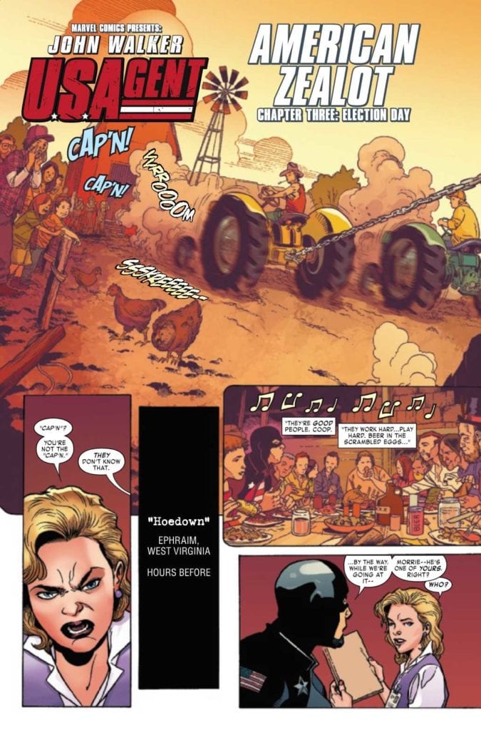
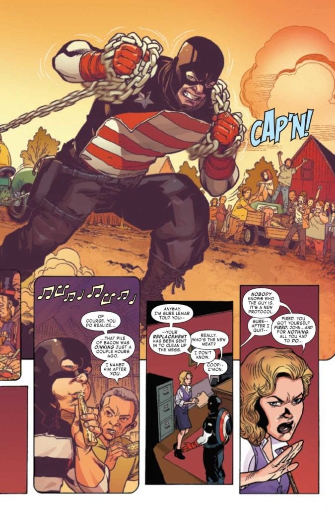
U.S. Agent #3 comes out this week from Marvel Comics about a politically charged clash of American ideals. Christopher Priest continues to provide some smart commentary between America’s division through John Walker’s relationships. The creative team rocks this issue as well. Penciler Georges Jeanty gives weight to every interaction, inker Karl Story displays who has the most narrative weight, Matt Milla’s colors present an ever-changing mood to reflect the conflicts, and Joe Sabino’s letter work plays like notes for a song.
U.S. Agent #3: The American Zealot
After several buildups from the last issue, Priest takes the plot to detail John Walker’s relationships and how it relates to America’s division. By revealing how John’s loss of the U.S. Agent title was because of a misunderstanding that calls back to an increasing number of police riots, it comments about how instead of taking responsibility, officials are more willing to place the blame on who fail their expectations like police chiefs.
This brings out the central conflict with John’s sister Kate and his replacement as U.S. Agent (who is also her boyfriend). Kate and the “Saint” possess extremely holier-than-thou attitudes that come across as psychotic. Last issue, after her boyfriend kills her co-workers, Kate kisses Saint like it was foreplay. And the Saint beats (if not outright kills) black men like John’s ex-partner Lemar Hoskins (Battlestar) for failing to meet his expectations, which in Saint’s case, being a successful model minority. If these people replace John and the details behind it all are so secretive, what does this say about the policymaker behind the U.S. Agent program? Especially since this secret central antagonist shows his true colors after some foreshadowing in U.S. Agent #3.
It’s this kind of political intrigue that can show a person’s real character. U.S. Agent #3 certainly takes the time to bring out John’s more caring side despite his flaws. John may be a little dishonest with himself; he wants people to believe he quit the service when he really was fired, but I want to root for someone who wants to help his sister who has psychosis than an American Zealot like the “Saint.”
The Weight of Factionalism
Jeanty presents many sections of U.S. Agent #3 with layers of narrative weight. A couple of pages feature double-page spreads to evoke great feelings of the moment. When John explains to his ex-handler Cooper his reasons for trusting the townspeople, there’s a sense of wholesomeness found. The inking that broadens John’s appearance by Story shows just how much of a presence John has in these moments. Of course, it takes the time to showcase that this isn’t quite as wholesome with some back and forth conversations that exchange between the past and future.
The above spread and its flashback sequences feel twice as wholesome with coloring by Milla. The orange colors bring a sense of warmness absent in the rest of U.S. Agent #3, where darker and more morbid colors display a sharp change in the setting’s mood. A riot that explodes in the spur of a moment can certainly look dark.
So with everything being presented like a song that changes as it plays, the lettering by Sabino is like notes. They keep the pace of the moments of every action and reaction. It’s almost like when the climax near the end of the issue, a chorus is playing. One large SFX gets accompanied by smaller ones for one big moment.
Pick up U.S. Agent #3!
U.S. Agent #3 is a great read as a socially relevant political thriller mixed in with a family drama. The character of John Walker continues to show his layers; despite his flaws like lying to be Captain America at one point, what makes John a hero is his willingness to help people even the ones who get under his skin like Kate. Because when times get dark, it’s important to find small but important details. It’s what gets readers invested in stories like this.
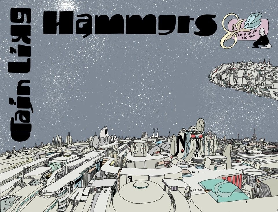
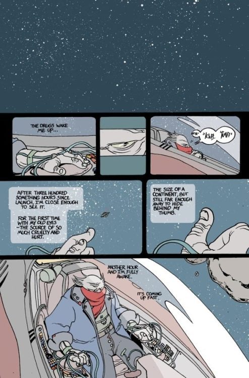
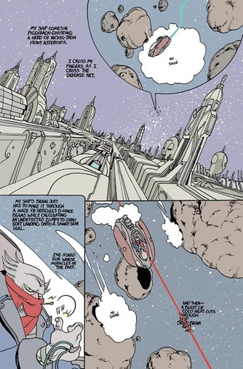
Avant-Garde comics creator Brandon Graham return with the frantic and fascinating second issue of “Rain Like Hammers.” This 2nd chapter in this high-concept sci-fi comic anthology is much more crammed than its predecessor, but it manages to keep focused due to the attention paid to this world and the emotional core of its lead character. With a clever-as-usual writing, great humor, and Graham’s signature uncanny visual style, this is yet another brilliant comic issue from this esteemed creator.
“Infamous criminal Brik Blok makes a desperate crash landing on the artificial palace-world of Skycradle, where he transfers his mind into the body of a vat-grown butler to remain undetected. In his new butler body, he sets off to save El, a young woman who has unknowingly entered a deadly competition for immortality.”
Writing & Plot
While nearly every aspect of “Rain Like Hammers” #2 is impressively insane, Graham’s most impressive feat here is how he manages to put together a completely original science fiction rule set in the span of the first few pages. Brik Blok’s landing and subsequent takeover of a butler’s body – a vat-grown non-human butler, no less – and all the following building blocks of this world are presented at a breakneck pace. Somehow though, everything Graham throws at the wall sticks, and despite the pace at which information is tossed at the reader, all of it sticks. This has to do with how the lead character is presented. Blok’s presence in this story is one spent in a new body trying to adapt to a new situation and learn the nuances and requirements necessary to save El, all while trying to go unnoticed. As such, we experience this new world as he experiences it, and we’re along for the ride as Brik explores this grueling caste society. The wit and humor displayed by Graham make this strange setting all the more engrossing to experience as well, as its absurdity kinda makes sense given just how bizarre this comic is. Graham has this neat habit of describing background noise or even totally discernable dialogue or music coming from a random extra within earshot of the protagonist as “random notes of bad singing” or “totally useless information I don’t care about.” It’s part of Graham’s sense of humor that works so brilliantly well in this wacky comic. There’s still a heartfelt emotional core to the storytelling as well that you’re almost ambushed into being compelled by. I didn’t realize just how invested I was in Brik Block’s struggle until I got genuinely excited when El made an appearance. While this is certainly a much more jam-packed and fast-paced comic than the first issue – which may throw some readers off – this is just as wonderfully brilliant as its predecessor, albeit in different ways.
Art Direction
Brandon Graham’s writing in “Rain Like Hammers” #2 works pretty much solely because of how superbly weird his visual work is. Graham has made his name on his signature brand of uncanny, abstract art, and that’s because of how it winds together with the events on the panel in such a perfect manner. Those off moments of humor and his ability to unsuspectingly make us readers care for his protagonists comes from how he presents their stories in his eclectic visual style. His quirky and soft-edged pencils make for a charming visual experience where the characters and background setting kind of blend in together as both seem organic in a way. There’s a simplicity within the lines that almost tricks you into thinking things aren’t detailed, but that’s false – the only aspects that have more intricate detail are the things that need this detail. Everything on every page has a purpose, from the gaudy dressing of a passing aristocrat to the bundle of scarves on Brik’s old body. Every detail tells its own story, and nothing here is just window dressing. The visual direction is pure comics wonder, and by saying that I mean it’s the kind of stuff that can only be pulled off in this wonderful medium. The way Graham sequences events and intercuts scenes with little in-panel flashbacks, as well as the numerous little clever asides made about any and everything, are all pure comics-making gold. I can offer nothing but praise for Graham’s brand of storytelling, and the visual storytelling on display here is singular and unbelievably fun.
“Rain Like Hammers” #2 is an info-packed and breakneck paced follow-up to the much more calm (but equally brilliant) debut issue. Brandon Graham supports all of the sensory overload the reader is exposed to in this new alien world giving us the lens of a sympathetic and humorous protagonist who sees this insane planet for exactly what it is. The eclectic visual style is a work of comics storytelling mastery, offering views, structure, and commentary in a manner only this medium can in an unmistakably abstract style. This is a brilliant comic, one that deserves a place on your pull list when it hits shelves on 2-24!
Frank at Home on the Farm #2 continues Scout Comic’s post-war horror thriller on February 24. In this issue, writer Jordan Thomas goes into the trauma and fear of loss. Because with art and lettering from Clark Bint and LetterSquids, feeling sanity slipping is a given.
Background
Frank at Home on the Farm follows a veteran’s return to his family farm after World War I; only to find the farm empty save for the animals. With loneliness setting in, Frank Cross seems to begin hallucinating the animals talking to him.
Frank at Home on the Farm #2: War For Comfort
Thomas takes an interesting turn for juxtaposition in Frank at Home on the Farm #2. Instead of Frank, the issue brings up an old soldier living a happy life with his bedridden wife. With how independent his wife is to try and pee on her own and have an open sex life despite her poor health, the old Sergeant feels lucky to have her. When the old Sergeant’s wife collapsed trying to pee, he wants less work time to help out. Now compare that to Frank, who wants to find his missing family but has to take care of the farm animals.
Both of these men want to spend more time to spend with their families, but their responsibilities get in the way. It’s that feeling of wanting to hold onto the people they love that hooks the reader. After the war took much away from these veterans, the reader genuinely wants these people to be happy.
War On A Cross
Bint’s illustrations can range from wholesome to outright horrifying with surrealism. Just the opening pages features an innocent-looking drawing made by a child. In juxtaposition is the old sergeant going home to his wife to hold her hand where they make a heart shape. It brings a sense of warmth that Frank never got after coming home. Instead, he has hallucinations where he sees the farm animals in enemy uniforms as if blaming the animals for his family’s disappearance.
It certainly doesn’t help that LetterSquids provides one hallucination with a dark and foreboding word balloon that makes the pig speaking look demonic. That’s a terrifying sensation where the reader gives Frank the benefit of the doubt when he starts to feel paranoid about the animals.
Love Your Family After Frank at Home on the Farm #2
Frank at Home on the Farm #2 brings a tremendous sense of empathy through its presentation. Seeing something so wholesome at first only to provide some whiplash at the sight of the title character’s psyche doesn’t just hook the reader in; it simultaneously gives both sympathy and empathy. Because all the characters really need, is someone to give them love.
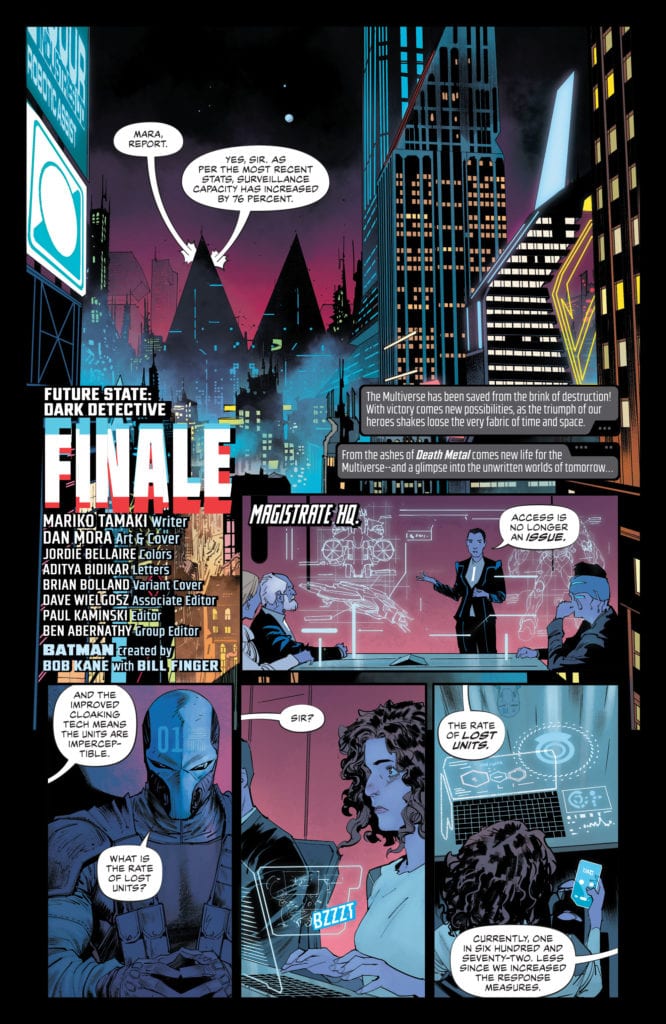
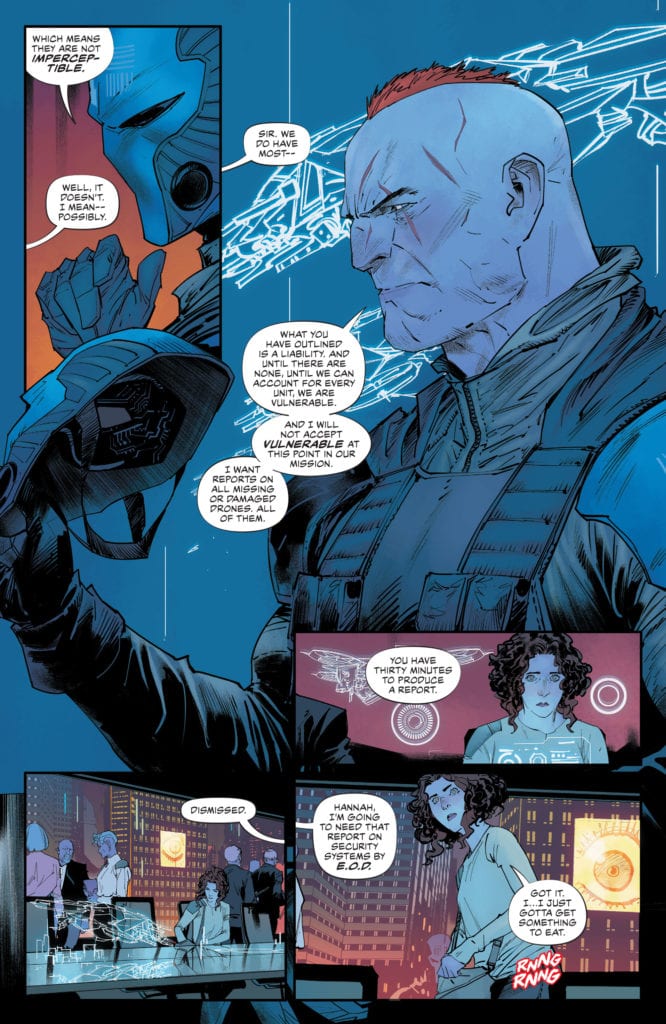
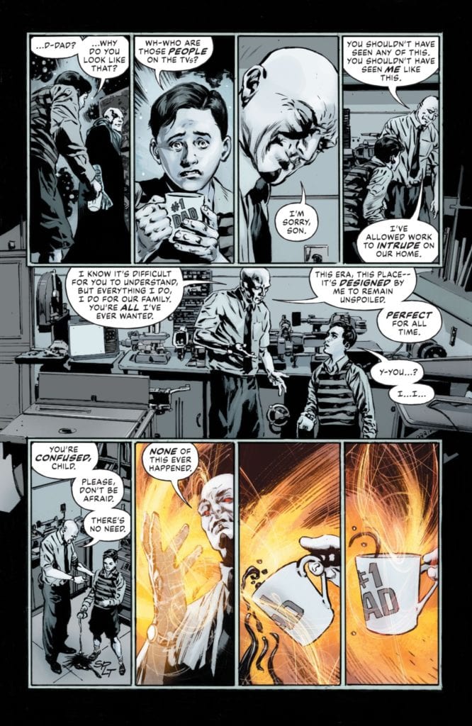
Writer Mariko Tamaki, artist Dan Mora, colorist Jordie Bellaire and letterer Aditya Bidikar solidify Dark Detectiveas the best title out of DC Comics’ Future State. Future State, a bold event that was rooted in brilliant storytelling motifs, is one of the strongest events to come out of DC Comics, certainly in recent times at least. I could count on one hand the titles that I didn’t like. So, Dark Detective had some stiff competition, but this creative team hit it out of the park. Their final issue, Future State: Dark Detective #4, is an explosive conclusion to a thought provoking miniseries. It goes to show that Tamaki, Mora, Bellaire and Bidikar are as good at action as they are at hard boiled mysteries.
Writing
Tamaki creates a clear rhythm in this issue. She begins the issue slowly, simply with her word count. We see the Magistrate’s Peacekeepers discussing their loss of equipment. They’ve had a bunch of their drones taken right out of the sky. They talk out possibilities. It’s slow, text-heavy and a sign of the rising danger to Bruce Wayne. Even in these slow moments, Tamaki creates a sense of fear. It’s the Peacekeepers’ casual belief in their own control that shows just how powerful they must be. And as the danger goes from theoretical to physical, Tamaki drains the page of words. We only get the brief bit of dialogue here and there between punches and explosions. Tamaki amps up the stakes by speeding our eyes through each page. She gets us anxious to get to the next line of dialogue, and keeps it brief enough that we can read through these pages in a heart-thumping frenzy.
Art
Mora adds in a sense of chaos in the action scenes. He stacks panels on top of each other to show the sheer break-neck pace of time. There’s such an urgency to these moments. Mora makes them look as though they happen within milliseconds. And when things get truly out of control, Mora makes the destruction work to his advantage. Shards of glass, flying through the building, are turned into panels. These moments are so clearly dangerous and chaotic. Even the progression of the page becomes slightly unclear. We become briefly unsure of what panel we’re supposed to read next. But Mora does this deliberately. He wants us to feel a moment of panic, the pause between panels of trying to decide which to read, just as the characters are experiencing panic. Not only does he somehow, in the confusion, maintain a sense of order, but he allows us to empathize with the characters in these tiny moments.
Coloring
Bellaire practically color codes each page. Every page has a single overwhelming color. We see the blue of the Peacekeepers’ meeting, the green of Bruce’s bunker, and the orange of destruction and fire. When we transition from the Peacekeepers to Bruce doing research, Bellaire makes each page look quite similar. The blue glow of Bruce’s computer screen makes his room look similar to the Magistrate’s offices. In using the same colors, we get this feeling of “Haven’t I seen this already?” It sticks out as repetitive. But there’s two pages of Bruce working first. Two pages of purple, of Bruce climbing on roofs and checking equipment, before we get to the blue. Bellaire makes us feel as though Bruce is only just catching up. He might be playing the same game as the Peacekeepers, but he’s a couple pages behind.
Lettering
One of the best things that Bidikar does in this chapter is communicate a sense of dismissiveness. We see Hannah, Bruce’s roommate’s daughter, sitting among the Peacekeepers. She’s in the room, she works with them, but she’s practically invisible. We know this because every line spoken to her by her colleagues is done from off-panel. The balloon tails lead right of the panel. We never see the pointed end of the tail, almost as if the words barely come out of the speakers’ mouths. If we saw the full word balloon, Bidikar would be communicating to us that these people are making an effort to communicate with Hannah as an equal. They’re speaking in a way that their whole line fits into her world. Even if they’re not fully in the panel, what they’re saying is. But with the tails leading off all the way, it feels like a power play. It’s an invading line of dialogue spoken by someone who has no interest in truly relating to their colleagues.
DC Comics’ Future State: Detective Comics has turned out to be Future State’s best title. It has mystery, action, horror, and social commentaries out the wazoo. And this issue also has a charming Red Hood backup story by Joshua Williamson, Giannis Milonogiannis, Jordie Bellaire, and Troy Peteri, that deserves a review of its own. If Dark Detective is a sign of what we can expect from Tamaki’s upcoming tenure on Detective Comics, well… it’s nothing but a very good sign. Pick up Future State: Dark Detective #4, out from DC Comics February 23rd, at a comic shop near you!
Generations Forged is a special one-shot by DC Comics out on February 23, celebrating different parts of DC’s history. With a massive creative team backing it up and DC’s more obscure elements like Dr. Light and Steel, there’s something for everyone.
Generations Forged: Carving The Niche
Generations Forged features three writers in collaboration for an epic about celebrating the past vs. living in it. The central villain Dominus is practically a stand-in for publishers and editors who are also DC fanatics. By removing nonessential elements of the current DC Universe like Ultra-Humanite and the Golden Age Batman, he lives a perfect life. One that he can change on a whim to avoid the ugliness. But doesn’t this take away the efforts and sacrifices that build character?
Dan Jurgens, one of the main writers and artists, is a DC history aficionado. The inclusion of his creation, Booster Gold, and his time travel equipment allow Jurgens to show off elements that people tend to forget. Characters like Dr. Light might have peaked in notoriety in events like Crisis On Infinite Earths, but that doesn’t mean people won’t use them again.
Robert Venditti, another writer of Generations Forged, made his career around exploring the DC Universe, hence the inclusion of Green Lantern Sinestro. Characters like him are complex enough for many depictions. Shouldn’t that mean giving creators and characters the chance to develop?
Andy Schmidt is continuing this story by building it off of Generations Shattered. After some developments in his career at DC, like Generation One coming up short for “reasons,” he and the other creatives take time to make their efforts memorable. After seeing Kamandi, OMAC, and Steel in action, I felt compelled to learn more about them.
Art In Sequence
In terms of artwork, Generations Forged features a revolving door of artists who show off their capabilities. Mike Perkins shows off Dominus’ home life in simple black and whites, a style that is easily malleable to suit the villain’s wants. Thanks in no small part to colorist Hi-Fi using sparse red and orange to demonstrate Dominus’ control of his domain.
Marco Santucci gives his pages a style evoking DC’s 70s and early 80s comics, which is larger than life and full of energy. Starfire alone steals the show with how much space her hair takes up. It’s to the point where it’s played for laughs when she uses it to leave a trail.
Paul Pelletier and Norm give an epic art style that full of thrills. Steel and Superboy face unimaginable threats on an alien world they stick out in. No amount of power will help them, with their movements signifying resourcefulness over might.
Bernard Chang gives his sections a sense of evocative emotions. One moment, the reader sees a world so flashy it’s easy to get distracted until a character’s actions pull them into one moment where the world blanks out.
Joe Prado shows off Dr. Light’s uniqueness in a gritty art style that tells a serious situation. So when Dr. Light harnesses crackling energy glowing red, she saves the moment by becoming one with the threat. This gives her more power over a situation than before.
Colleen Doran makes a double-page spread where all of the art coalesces into a style that allows all the characters to exist in the same plane.
But it’s when Bryan Hitch and Andrew Currie present these characters in action, do these eras of art become something new. The bright colors of the pre-20th century begin to show signs of layered art.
So when Jurgens and Kevin Nowlan take the pen, it completes the transition into the modern era. The art becomes more layered, more diverse in coloring, and in focus, has fine details in wrinkles and light shading.
All of Generations Forged comes wrapped together with lettering by Tom Napolitano. The word balloons practically reflect the eras each character comes from. The amount of words Booster speaks about times and Humanite quieting him practically reflect a need for less expositional storytelling. Then there are the SFX which look tailor-made for actions like roars and hits from a hammer.
Generations Forged: Eternal Fandoms
Generations Forged calls back to some of DC’s efforts for collaborative passion projects like 52. With so much of the DC Universe ready to explore, when creatives get the freedom to collaborate, they can create great things. Being able to communicate and share what you love is something that any DC fan shares.
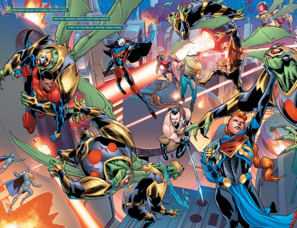
Future State: House of El #1 out on February 23 from DC Comics. Serves as a sort of finale to the Superman section of Future State, writer Phillip Kennedy Johnson depicts Superman’s legacy at its peak. Bringing forth the epic/mythic scale of the Man of Steel comes artist Scott Godlewski. All while colorist Gabe Eltaeb and letterer Troy Peteri provide further decorations.
House of El #1: Man vs. Super
At the heart of House of El #1 is what makes Superman an iconic piece of the DC universe. Superman, in his best depictions like American Alien, emphasizes his humanity. Within the pages of the issue, Johnson makes this humanity so notable, the alien identity of Kal-El is treated as a myth. What makes so Johnson so memorable is how he gets all of the cast to question what makes them worthy of the emblem. Especially since a family feud practically erupts over how the titular family sees Superman. Because what better way to affirm your faith in both the man and the super than questioning it all? It allows people to explore the nuances of it all.
Epically Larger Than Life
Throughout House of El #1 are several double-page spreads to show off the scale of the characters. With every El family member in action, their very presence can hold the weight of their world. When they separate, each member focuses on a single moment in all of the chaos, practically warping the page with their actions.
The costume designs certainly add to this effect. Each emblem-bearing costume is practically an extension of the original Man of Steel in some way. Brandon Kent, for example, wears regular street clothes as a tribute to Clark Kent, unlike most of his relatives.
No reference is too small, especially when Eltaeb can make the ultimate reference to Superman Red/Blue. Blue Lantern Rowan Kent and the Red King’s color-coded costumes are equal parts tribute as well as points of conflict in House of El #1. No specifics as those would be spoilers.
Finally, Peteri makes all of the lettering hold narrative weight as extensions to every action. The scenes featuring Brainiac 4 with word balloons taking up space in a panel tell a dire situation without actually seeing it. The SFX, in the meantime, are as big and loud as the actions in battle. The humming sound of the Black Racer speeding by might sound quieter in juxtaposition, but that just means she’s all the more dangerous. In all the excitement, it’s easy to lose track of danger in House of El #1.
House of El #1: The Family Who Has Everything
In this last piece of Future State for Superman, House of El #1 gives a grand finale in tribute to the Man of Steel. The best parts of Superman might be his humanity, but it’s always good to show his sensational aspects in juxtaposition. With so many characters following in his lead, you need to ask the right questions to see why. Superman’s very spirit can hold the weight of the entire universe because the emblem and costumes are points of inspiration.
The seventh episode of Wandavision was the most psychological entry in the series so far as Wanda has to deal with the consequences of her actions.
Wanda has expanded the boundaries of the hex to save Vision’s life (again). However, she has fallen into a deep depression that has resulted in her fantasy world glitching and Agnes offering to care for the twins. Vision finds himself at the S.W.O.R.D. camp that has now turned into a circus and resolves to get back to Westview. Monica and Woo discovered that Hayward wanted to turn Vision into a weapon and try to find a way to warn Wanda.
Throughout the series Wanda has been refusing to face Vision’s death. Westview was meant to be the ideal suburb, the American dream that TV often projects. If anyone challenges Wanda she would exile them or reverses time so she can preserve her illusion. But as time progressed the illusion became harder to maintain with Vision asking questions.
“Breaking the Fourth Wall” opened with Wanda lying in her bed like she was both hungover and depressed and the twins being concerned for her. The commercial for an anti-depressant spelled out the theme of the episode and the voiceover saying that one of the side effects was ‘facing your problems.’ The setting has moved to a late Noughties/early 2010s look – Wanda and Agnes spoke to the camera like the characters in Modern Family and they spoke about their feelings. Westview looked more grounded than in the previous episodes and there was less attempt at humor involving Wanda’s story.
Most of the humor in the episode came from Vision and Darcy. Darcy has always been a comedic character and she got to shine as both an escape artist in the S.W.O.R.D. circus and as herself when traveling with Vision. Even though their interactions were comedic, there was still a dark undertone because Darcy tells Vision about what happened to him before Wandavision and they find out Wanda was trying to keep Vision from returning to Westview.
The big character developments involved Monica and Agnes. In the previous episode Monica found out her DNA has changed after going through the static twice. She goes through the static a third time and it finally gives her superpowers, something that will be important for Captain Marvel 2.
Agnes was always the wildcard in the series. In previous episodes she appeared whenever Wanda and Vision needed help and S.W.O.R.D. didn’t find out her real identity. This episode finally revealed who Agnes really was and it confirmed most fan speculation. It led to a catchy song and finding out Agnes did the evillest action in the MCU. The big questions now are what’s her game plan and what does she want with Wanda?
“Breaking the Fourth Wall” worked as the metaphorical/psychological episode that explored Wanda’s mental states and sets up a big conclusion for the series.


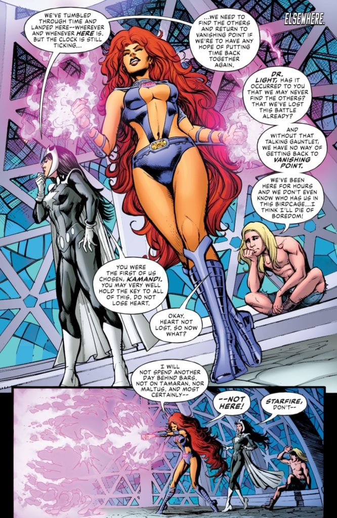 Marco Santucci gives his pages a style evoking DC’s 70s and early 80s comics, which is larger than life and full of energy. Starfire alone steals the show with how much space her hair takes up. It’s to the point where it’s played for laughs when she uses it to leave a trail.
 Throughout House of El #1 are several double-page spreads to show off the scale of the characters. With every El family member in action, their very presence can hold the weight of their world. When they separate, each member focuses on a single moment in all of the chaos, practically warping the page with their actions.
