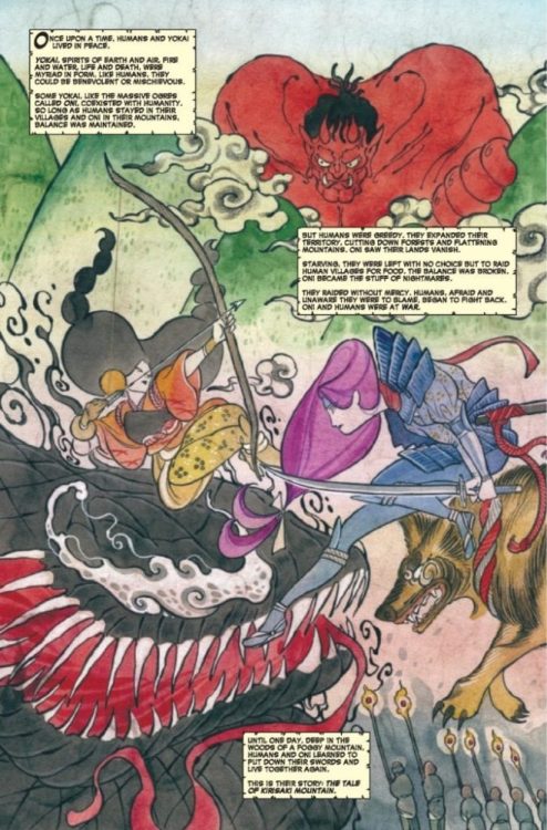
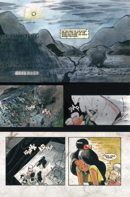
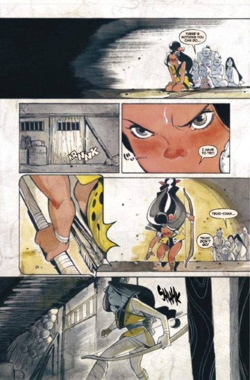
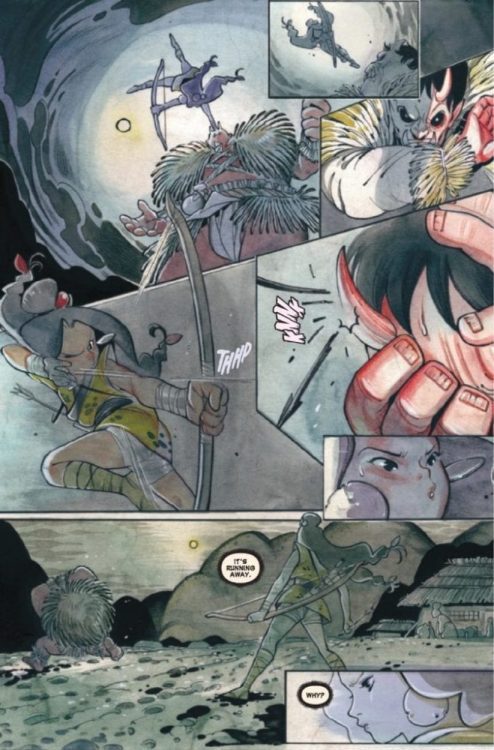
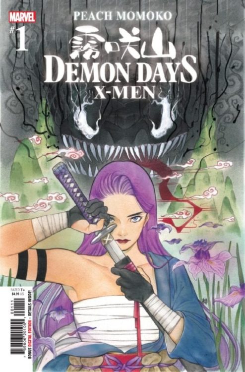
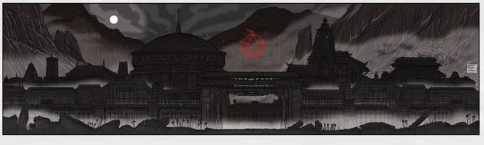
DEMON DAYS X-MEN #1 hits your local comic book shop next week, but thanks to Marvel Comics, Monkeys Fighting Robots has a five-page preview for our readers.
The story and art are by Peach Momoko, Zack Davisson adapted the story to English, and Ariana Maher lettered the English version.
About DEMON DAYS X-MEN #1: From STORMBREAKER PEACH MOMOKO comes a Marvel story unlike any you’ve ever seen before! A wandering swordswoman with a psychic blade arrives at a village that’s being targeted by demons. One demon is black and white with a terrifying red tongue, and another may be the strongest demon there is! In the stunning kick-off issue of this prestige quarterly story, you’ll see a revolutionary reimagination of the Marvel Universe that could only come from Peach Momoko. Ready your katana and enter a mysterious world of demons, monsters, mutants, and magic! Book ONE of FIVE of the DEMON DAYS saga!
Passing from first-time director Rebecca Hall stars Tessa Thompson (Thor: Ragnarok, Creed) and Ruth Negga (The Town, The Gift) in a period drama that wraps its story in a loving musical embrace thanks, in part, to music supervisor Alexandra Eckhardt.
In Passing, Thompson plays Irene “Rene” Redfield, a light-skinned African American woman living in Harlem with her family during the 1920s. Irene’s life is comfortable and convenient, but that changes when she runs into an old friend, Clare Kendry, played by Negga. Clare lives a carefree life, choosing to racially “pass” as white without mention of the black half of her ancestry. The two women are fascinated by the juxtaposing paths each other has taken, and it begins a journey into more profound questions about identity and racial passing.
PopAxiom sat down with Alexandra Eckhardt to discuss becoming a musician, what exactly is a music supervisor, and the making of Passing.
Work Out
“Both of my parents are musicians, bass players, as am I, as you can tell.” Alex points to a collection of bass guitars behind her.
Alex does not know a life without music. “I’ve grown up playing music and listening to music. It’s a huge part of my life.”
Fast-forward through many lessons, gigs, tours, and a lot of work behind-the-scenes on Broadway. “Rebecca Hall and I have played in a band for a few years. We get together with friends and play music as a creative outlet when we’re in town working on various projects. She has super eclectic taste and is a fantastic singer. We’d play Arctic Monkeys, Bjork, and Nina Simone. We’d work out arrangements in Brooklyn.”
About Passing
Rebecca told Alex about her directorial debut that was in the works. Alex said, “I approached her about it and asked if she had anyone on her music team yet. That’s how I became a part of the team, working directly with her and creating a musical soundscape for the film.”
“Passing is a very personal story for Rebecca,” she says. “It’s based on a 1929 novel by Nella Larsen that explores racial passing and identity. It was important to capture the history, culture, and evolving musical landscape of that era.”
Taking place during the Harlem Renaissance, Alex said “I became obsessed with researching periodicals and Cotton Club bills with Duke Ellington or female jazz singers like Alberta Hunter and Ethel Waters who are semi-forgotten now.”
Making Passing “was fun” for Alex, especially “doing deep-dive research and talking with Rebecca about how she wanted to portray the characters living in this world.”
Being A Music Supervisor
A movie or TV production includes many people doing a lot of jobs that aren’t entirely understood. “A music supervisor for film oversees all aspects of anything music-related,” said Alex. “We help with composer selection, working with the composer and acting as a translator between the production and creative sides; we pitch source cues for certain scenes; licensing music, clearing music, and doing the whole legal component.”
“For this film, because it was based in the 1920s, I wanted to utilize as much public domain music as I could,” she explains. “We had an indie budget, so I was creative and resourceful. I quickly learned the nebulous nature of public domain music, but it’s interesting to understand all the different laws.”
Passing uses public domain music during “an on-camera performance where a jazz combo plays in a speakeasy scene. I contracted two amazing musicians and two actors to be featured on-screen, and a 4-piece band of some of the best NYC jazz musicians to play the pre-records prior to filming.”
Rebecca’s direction for this scene included filming the trumpet and clarinet players with “very, very close camera work where you can see all their fingerings on the instruments and breathing.”
Finishing the film faced a big challenge. “Post-production happened remotely as we were at the start of the pandemic. We had to do some re-records for the on-camera performance tracks all remotely, which was insane. I produced the sessions from home by creating custom musical arrangements adapted to the picture edit and had the musicians record individually. The final cut was already there; we had to reverse-engineer the audio to fit the video. Chad Birmingham is an amazing music editor and we worked together to bring out the musicality of this scene and highlight its improvisatory tone.”
“We’re thrilled with how it all came out.”
Emahoy
“When Rebecca and I first talked about the film, she expressed that she could not see the film without having this Ethiopian nun pianist be a great part of the score,” Alex explains.
The pianist is Emahoy Tsegué-Maryam Guèbrou. “Emahoy is 96 years old currently and lives in Jerusalem. She escaped religious persecution in Ethiopia then became this prolific pianist. She made one album in the 60s then gave it up to join a monastery.”
“Emahoy’s rights owners were very concerned about the material because it had to align with her religious values,” Alex says about working to clear Emahoy��s songs. “Rebecca wanted to weave her music throughout the film, in addition to the work of composer Devonté Hynes. It was an interesting patchwork.”
Will viewers hear Emahoy’s music in the final film? “Luckily, Emahoy’s team loved it,” she happily answers. “They couldn’t be happier. It all worked out beautifully. Her music underscores the inner dialogue of the characters and heightens the tone and tension of the film.”
Pet Peeve
Alex shares one last story about Passing. “There’s a cool scene where there’s a Cotton Club style dance hall, and we had a huge band of background actors.”
“Talk about the different responsibilities of the music supervisor,” she says, “I gave each actor mini-lessons on how to hold the trombone the right way or how to hold drumsticks.”
Actors playing instruments wrong is, understandably, one of Alex’s “biggest pet peeves. I wanted to avoid that at all costs. I can think of so many movies where it’s off.”
So, what’s a movie that gets it right? “Soul. I could not believe how they animated the notes that are being played. Also That Thing You Do, The Commitments, and Amadeus all portrayed live performances so authentically.”
Wrapping Up
Alex’s musical journey has seen her play with many incredible artists. She mentions one that she adores. “I’ve been lucky to play with Sara Bareilles. We played on Colbert together but also at the Museum of Natural History in that room with the huge whale. We played directly under it.”
On music she grew up with, Alex says, “When I was little, I had these bizarre mixtapes that would go from Stevie Wonder to Green Day to Brazilian Tropicalía to Eartha Kitt to, man, just everything.”
Passing premiered at Sundance and soon after was acquired by Netflix. “It’s one of the ten pieces in the US Dramatic Competition. It’s super-exciting. I’m ecstatic to be a part of it.”
Alex is in the works to become the music supervisor for several upcoming projects. “As a musician, I’m looking forward to restarting rehearsals for a Broadway show at The Public Theater called The Visitor, based on the 2007 Tom McCarthy film.”
Is Passing on your watch list?
Thanks to Alexandra Eckhardt and Lumos PR
for making this interview possible.
Ricardo Delgado launched a new project on Kickstarter this week, as he reimagines Bram Stoker’s classic vampire story in an illustrated novel DRACULA OF TRANSYLVANIA, which features an original story and more than 20 illustrations. Monkeys Fighting Robots spoke with Delgado about the project and all things Dracula.
Enjoy the Ricardo Delgado interview below:
MFR: Ricardo, thank you for taking the time to talk with me.
Ricardo Delgado:Hey my pleasure! Always happy to talk about things that go bump in the night.
MFR: You mention that your Dracula will be fresh and unsettling; what does that mean?
Delgado:It means that this is not your grandpa’s Dracula. It’s THE EXORCIST meets LORD OF THE RINGS. Horror amid sprawling adventure. There’s also a deep acknowledgment of the Victorian-era ghost story. I’m a big fan of M.R. James. I love the whole idea of having a story that alternates between all of these moods and aesthetics. Somehow there’s this modern interpretation of the count as a romantic, as a failed Romeo, and I wanted to put a stop to that in my version. Here he’s Vader, Lector, Sauron. A marauder. A conquering monster.
MFR: What are the elements you bring to the table to portray horror?
Delgado:A working knowledge of the stuff that’s come before me. Referring to M.R. James earlier, my favorite story of his is AN EPISODE OF CATHEDRAL HISTORY, which is pretty much a vampire story in my opinion. And I really enjoy Sheridan Le Fanu’s CARMILLA, just a dark fairy tale that was a major part in starting off the whole vampire lore in literature. Kind of taking all that into the film realm, aside from the major vampire films, two I appreciate are Carl Dryer’s VAMPYR, and as much as I love the original film, Herzog’s NOSFERATU THE VAMPYRE is in my opinion, the BLADE RUNNER of vampire flicks. So anyway, that’s what I bring to my story, a working acquaintance with the ghost story involving the undead, whether it be in print or moving picture form—that combination of the modern blockbuster roller coaster melded with the prose of the classic ghost story.
MFR: Are you using any special artistic techniques in DRACULA OF TRANSYLVANIA? If so, why?
Delgado:Yeah, I’m working more on the overall shape, trying to create a memorable silhouette. Also, just focusing on concepts that have not been seen in a film or illustration. All that modern VFFX is wonderful, but before that, much of the transformation stuff in my book would have been possible, but SUPER expensive. But not here. Just cool ideas. I love the stuff in THE THING, AMERICAN WEREWOLF IN LONDON, ALIEN, and PREDATOR, just seminal concepts that created memorable characters and moments. That’s what I’m hoping for, that people read this book, take in the concepts and say, ‘Hey, have not seen that before!” That in a nutshell, is the job of a concept artist.
MFR: What is it about Dracula that keeps fans coming back for more?
Delgado:The different incarnations. They are made then remade. For example, I love the 1979 Frank Langella version of the story because it is steeped in tried and true mood and horror, while BRAM STOKER’S DRACULA is rich with art, artisanry, and the stage magic of the early 20th century. Then you have the version in HOTEL TRANSYLVANIA, directed by my friend Genndy Tartakofsky. There’s literally something for everyone with Dracula.
MFR: How has your work in film prepared you to unleash hell with DRACULA OF TRANSYLVANIA?
Delgado:My experience in film taught me that I could take my concepts and apply them to my stories without a budget filter. As I’ve stated before, much of the VFX decisions in film are affected by budgeting, but here I’m not limited by anything other than my imagination and my taste. I wanted to create stuff that both felt original yet also could fit in with the classic monster film images. It’s a tough, narrow road to hoe, yet I feel like I’ve been able to walk that line with these ideas. For example, I’ve seen Dracula in mist form enough to have those ideas in previous stories and films force me to up my game so to speak, to come up with a concept that’s new yet fits nicely in with the monster stuff off old, and boy have I done that! No VFX bucks or schedule to worry about here, just pure and simple story and concept. Very liberating, actually.
MFR: What scares you, and how did you apply that to your book?
Delgado:You can put a tarantula on my hand and I’m cool, but not a big roller coaster fan, which is ironic because this story is a complete roller coaster, so figure that one out, lol!
MFR: With Kickstarter, there are several ways to measure success. What will success look like to you?
Delgado:When people come up to me with the book in their hand and a smile on their face. I’ve already had the pleasure in writing and drawing it; now I look forward to getting readers’ thoughts. That’ll be cool.
MFR: Launching a Kickstarter campaign, you put your faith in fans. Do you get nervous putting yourself out like that?
Delgado:Nah, because I know I have a good product. A great story with great designs. Look forward to letting everyone see what I’ve come up with.
MFR: Which version of Dracula over the past 90 years has scared you the most and why?
Delgado:Oh, the Dracula in Herzog’s NOSFERATU THE VAMPYRE is pretty horrifying, and it ironically harkens back to my early youth when the Barlow vampire, based on the makeup on the original Murnau NOSFERATU. Interesting that both came out around the same time, late 1970’s. That first SALEM’S LOT TV show was really shocking for its time, though I would really recommend reading the Stephen King novel. Lots of depth and thought there along with the horror.
MFR: Ricardo, thank you again for your time, and best of luck with DRACULA OF TRANSYLVANIA.
Delgado:Hey, thank you, appreciate your time as well.
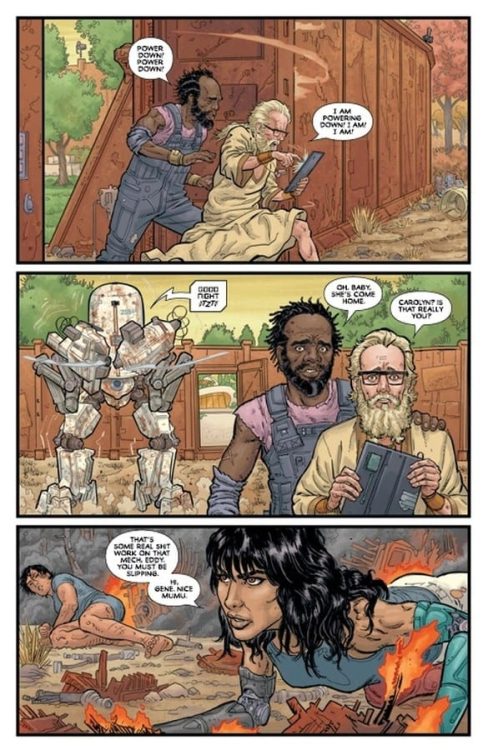
POST AMERICANA #3 hits stores on Wednesday, February 24th, bringing readers one step closer to the fight between the “bubble” and the post American wasteland. Carolyn and Mike have been on the run for three issues now, but there’s still a lot we don’t know about their predicament. Fortunately, the duo has just arrived at a seemingly safe settlement. But could there be more going on?
Story
The issue opens with Carolyn and Mike arriving at the hardened warrior’s most recent abode. Yet their greeter is slightly less than welcoming.
It is here we meet Edward and Gene, two tinkerers who use their skills to protect their community from wasteland cannibals. Their reaction to Carolyn’s return is heartwarming. Readers see that despite the harshness of their environment (and the means by which they’ve been forced to defend themselves) this family still has the capacity to show love to one another.
Writer Steve Skroce weaves together an immersive backstory for this already enthralling series. He provides us with just enough information to whet our appetites for more exciting developments. And the surprise at the end seals this present of an issue wonderfully.
Artwork
Skroce’s penciling and ink work creates suspense via slowly paced sequences between panels. These are fleshed out with colorist Dave Stewart’s warm shades set behind the metallic colors of Carolyn, Edward, and others using steampunk-esque technology.
Fonografiks’s lettering was impressive—Mike’s narrative is placed perfectly around the illustrations to simultaneously inform the reader and point them to the intricate panel details.
Conclusion
POST AMERICANA #3 gives readers the backstory they’ve been waiting for. We’re excited to see what develops from the revelations within this issue.
Did you like the long-awaited backstory? Let us know in the comments below!
Nomen Omen #12 gives a moment for other characters to shine.
NOMEN OMEN #12, available Wednesday from Image Comics, continues one dark tale of magic and other worlds. Only, the distance between these worlds is shrinking, and it’s all thanks to the forces at play.
Nomen Omen #12 gives a moment for other characters to shine.
We’re nearing closer to that inevitable end, and Nomen Omen #12 is clearly not afraid to raise the stakes. Then again, the conclusion of the previous issue did a shocking job of that as it stands, leaving fans with a cliffhanger to end all cliffhangers.
This whole time Becky has been fighting to get her heart back, yet that’s not all there is to this story, is it? Her story started many years before her heart was stolen (in the most literal sense possible). Now it’s time to see what that will mean, and how it will bring the story forward from this point onward.
*As with the last several issues, Nomen Omen #12 does briefly touch upon a traumatic moment. It has been more graphically implied in the past, and these scenes are more of a quick reminder than anything else. Still, it’s good to remember that this is a series that can get pretty dark.
The Writing
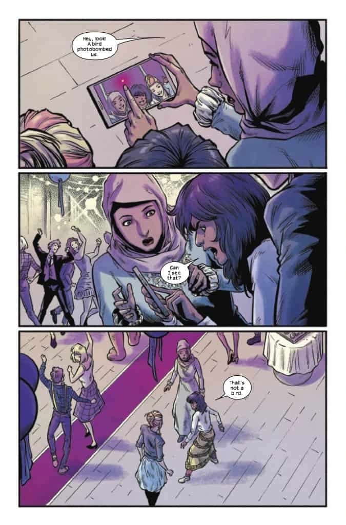
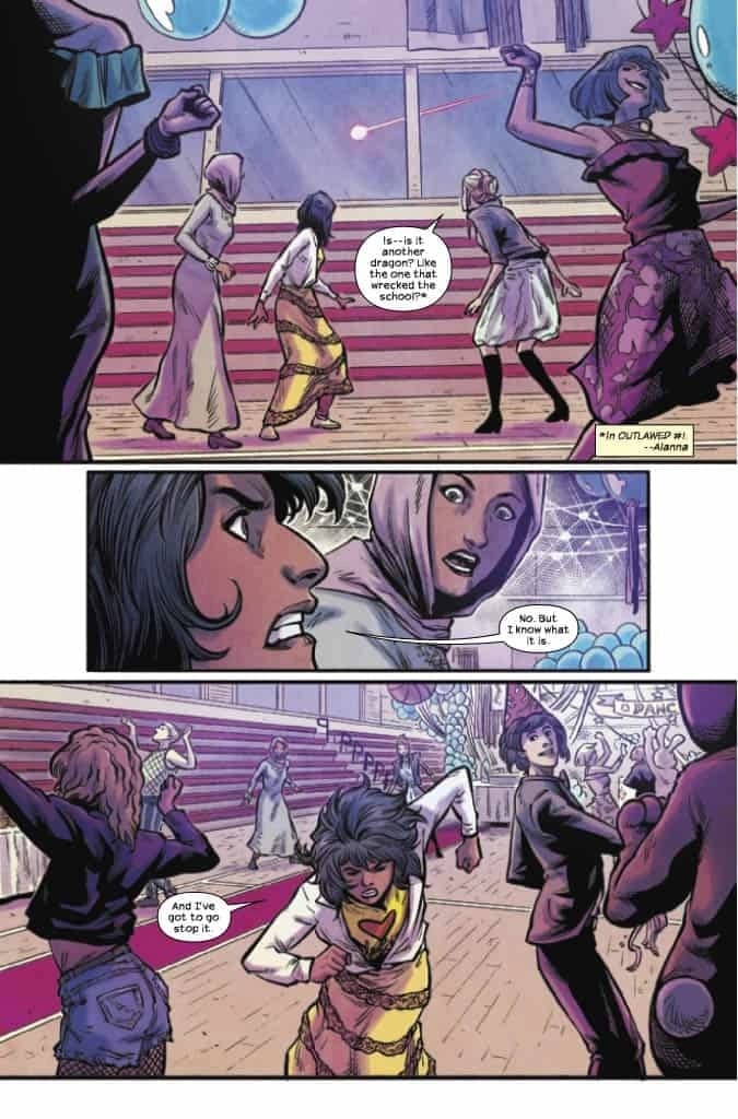
Sometimes, even in the middle of a series, it’s easy to have absolutely no clue what is in store for you. That is the case for Nomen Omen #12, as readers dive in with hundreds of questions, hoping to gain at least a little insight.
Marco B. Bucci did an excellent job of raising alarm alongside all of those questions. The world created here has changed drastically – in the manner of just a few issues. It is a terrifying sight and prospect. Yet there is this lingering sense of hope.
That hope accompanies the varied supporting characters that have been introduced along the way. They are bright spots in what otherwise could be a very concerning issue. Then there’s the mystery and the implications that this issue brings with it.
It’s enough to keep us thinking, at least until the next issue drops. On that note, there are now only three issues left before the series concludes, and that means there’s only so much time left for our characters – heroes and villains alike – to sort themselves out.
The Art
It won’t surprise you to hear that Nomen Omen #12 is another brilliant spectacle. The series has always been able to boast of vibrant and beautiful artwork. The stylistic choices surrounding magic and its portrayal remain among some of my favorites thus far.
Really, that’s only the beginning here. Jacopo Camagni’s artwork takes leaps and bounds in this issue, portraying a wonderful (and admittedly sometimes horrifying) merger that is a remarkable sight to behold.
This issue is also one of the brightest issues to date, and I do mean that literally. Fabiola Enne’s colors take over the pages, seeping across each panel as the magic does its thing. The variety of hues make the contrast even starker – and memorable.
The lettering is the final touch needed in this issue, provided by Fabio Amelia. Much of it is subtle, but there are moments where even that is a key component in everything else that is happening.
Conclusion
Nomen Omen #12 has somehow found a way to raise the ante even further. A fact that I didn’t think was possible, given the conclusion of the previous issue. There are still so many questions left to be answered before these characters will be allowed their rest.
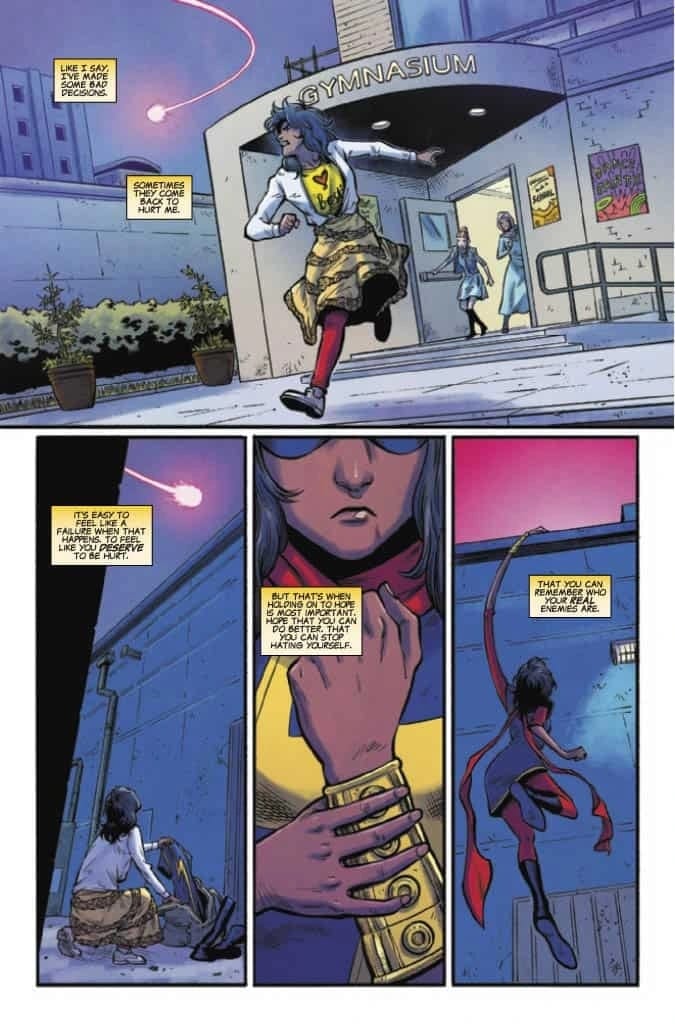
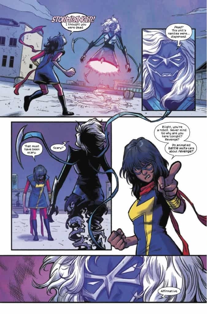
THE MAGNIFICENT MS. MARVEL #18, available Wednesday from Marvel Comics, is a bittersweet moment. It celebrates the 75th issue of Kamala Khan’s solo series, while also being the final issue to her current run.
She really can’t get a moment to feel like a normal teenager, can she?
While it may be sad to think of her series ending (and it certainly is), there is still the knowledge that her story is far from over. This is Kamala Khan we’re talking about. She’s a Champion, a fighter of justice, and so much more. We’ll be seeing her again.
Until then, let’s talk about The Magnificent Ms. Marvel #18. This issue marks the end of Saladin Ahmed and Minkyu Jung’s run of the character. They’ve pushed her plot farther, taking risks and introducing new characters in the process.
Now it’s time to see how they’re going to wrap up this final plot arc, one that promises to bring back a villain from a not-so-distant past.
On the bright side, Kamala clearly knows what is going on.
The Writing
One thing is certain, Kamala Khan knows how to go out on a high note. The Magnificent Ms. Marvel #18 is full of all of those emotional highs fans have come to expect from her series, and it carries much of the same impact as well.
Saladin Ahmed’s take on Ms. Marvel has resulted in a few changes, as have current events (looking at you, Kamala’s Law), and yet at the core, this is still the Ms. Marvel we know and love. It’s just that now she has more in her past, as well as a few new allies.
The issue does a great job of immediately pulling readers into the thick of things, only to set up back in time and see all of the buildup. From there, it touches upon many plot points that have come up over the past 17 issues, giving a strong sense of closure by the time it’s all said and done.
That isn’t to say that the issue lacks action – the very first page of this issue promises for quite a bit of that, actually. It just does so with all of the flair that Ms. Marvel is known for.
Time to get into gear, Ms. Marvel!
The Art
The Magnificent Ms. Marvel #18 is a vibrant addition to the Ms. Marvel collection. She stands out in a crowd, no matter what she’s wearing. As do her friends – and enemies. This issue flawlessly transitions from moments reminiscent of teen youth, to moments only a young superhero can expect to deal with.
Minkyu Jung’s art is essential to this plot arc. The sense of movement, abilities, and tension is unavoidable. Then there are the character designs themselves, with special notice left for the newest hero (Amulet). His design is striking, and makes a sharp contrast from Kamala’s.
That’s where Ian Herring’s colors really come into play. That specific blue hue that is used is quite spectacular, and helps make Amulet pop out from the pages. Along with his shields, of course. That isn’t the only highlight of this issue, as there is a clever use of color essentially everywhere, but especially when it comes to making a memorable panel.
VC’s Joe Caramagna provided the letters, and that wraps both the writing and the artwork together. The sense of impact is further enhanced, which is vital given Kamala’s ability set. You can also practically see her emotions streaming across the page, in a way that makes her feel so wonderfully human.
Looks like Stormranger isn’t as dead as we had hoped.
Conclusion
The Magnificent Ms. Marvel #18 is a strong addition to Ms. Marvel’s series, even if it happens to be the last issue. At least, for now. It’s bold and memorable, and did an excellent job of wrapping up as many loose ends as possible. All while leaving an overall positive impression – just the way Kamala would have it.
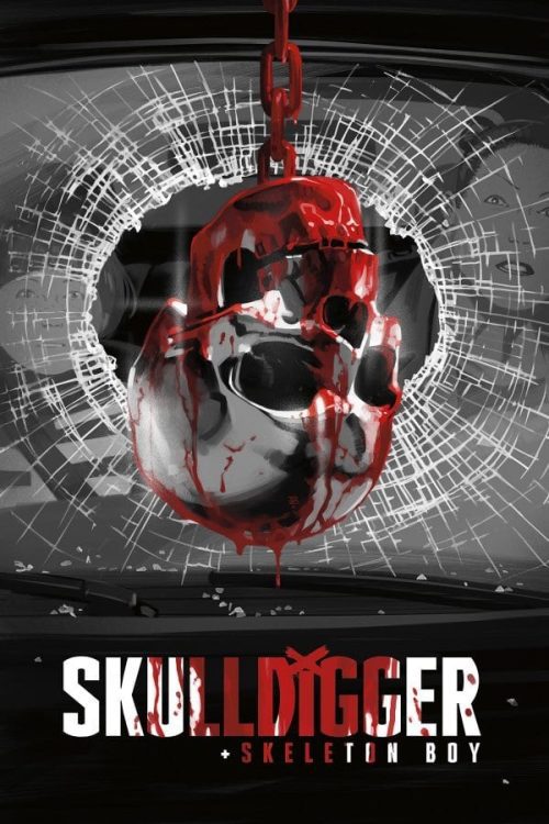
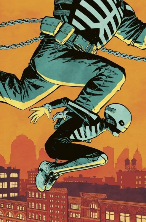
Dark Horse’s Skulldigger and Skeleton Boyhas been a fantastic series. Writer Jeff Lemire, artist Tonci Zonjic, and letterer Steve Wands present a battered, brutal version of their own Gotham City. Except, in Lemire’s Gotham, anything can happen. The Batman-esque character, Skulldigger, could die at any moment. The cop that’s chasing him, Detective Reyes, could put him behind bars for life. Lemire’s Black Hammer Universe is a universe full of stakes. So it’s disappointing when Lemire suddenly seems a little gun-shy. Instead of pulling off a grand finale, Lemire stops the plot in its tracks.
Writing
Part of the purpose of Skulldigger and Skeleton Boy was to underline the dysfunction in a Batman and Robin type relationship. Skulldigger wears his brutality like a badge of honor, and the preteen Skeleton Boy seems to take his mentor’s lead in getting a twisted sense of fulfillment from the bloody violence. Yet there’s so much to be said about their relationship. Lemire shows how Skulldigger sees himself in his ward. He wishes he’d had someone to show him the ropes and his heart reaches out to this confused kid. Meanwhile, Reyes sees Skulldigger’s brutality for what it is. She wants to protect Skeleton Boy from the trauma of vigilantism. Lemire yanks us in two directions, leaving a middle ground that’s ripe with complex emotional stakes.
He’s fantastically set up the dynamics between these characters. The reader feels like a lost dog between two kind owners, each with treats spilling out of their pockets. It should be a moment of intense emotion. Yet Lemire skips to the end. We skip the decision and just see its results. It’s almost as though he ran out of pages. Perhaps he wanted to leave us with an ending that felt normal. Maybe his point is that life isn’t the dramatic reality Batman teaches us about. Life’s a bunch of people trying to muddle through, not even knowing when they’re making life-altering decisions. But something doesn’t click. If that’s what Lemire’s saying, maybe he shouldn’t have given us any ending at all. The last few pages of Skulldigger and Skeleton Boy #6 feel unearned. It’s a payoff for work Lemire chose not to show.
Art
On the other hand, Zonjic’s art certainly isn’t anticlimactic. Zonjic, at one point, uses three double-page spreads in a row. And it’s his work in these pages that sets up the difference between Reyes and Skulldigger. Skulldigger is full of rage and vengeance. In small, methodical panels, Zonjic shows Skulldigger working his way through a crowd of goons. It’s a brutal play-by-play of every bone he breaks and every skull he crushes.
He’s almost supernatural in his violence. But Reyes is instead worried about Skeleton Boy. It’s him she’s focused on, not the chance to get back at Grim Jim. Zonjic shows us each of their approaches on the same page. We see the picturesque storm of violence, with Skulldigger at its center, at the top of the page and the crouched and careful Detective Reyes at the bottom of the page. It’s in this visual juxtaposition that Zonjic teaches us so much about the characters.
Coloring
Through the repetition of color palettes, Zonjic highlights Skulldigger’s problems. First, we see a picture of him as a young kid, fighting with Tex. It’s a horrible moment between the two. Skulldigger is rejecting Tex’s teachings, claiming to be beyond help. The scene is colored in a light red, like dried blood. And when we get back to the modern day Skulldigger, the color scheme is the same. Zonjic is telling us Skulldigger is still that scared little kid. He hasn’t grown.
And when Skulldigger begins his beatdown, the red intensifies. He’s at his most dysfunctional in that moment, reveling in the same violence that screwed him up in the first place. Meanwhile, the glow of police lights fills the room. Each time they’re lighting up Skulldigger, they’re red, and when they light Reyes, they’re blue. She might be scared, even angry, but the blue is calm. Reyes isn’t allowing her emotions to take over. She’s level-headed.
Lettering
Wands does beautiful work in this issue. He finds the perfect balance in stylization and minimalism. A “SNAP,” in the center of a double-page spread might look normal, but the crease between pages actually makes the sound look like it snapped in half. The sound of sirens are colored to mimic the police lights. The “WEEE” of the sound is red and the “OOOOO” is blue. Wands is finding the fun in the tiny details. No sound effect steals the show. They blend in perfectly with the rest of the story. But when you look closely at them, you’re amazed by their little quirks. Wands shows that violence is commonplace to these people. That’s why these sounds don’t look big and traumatic. But the small moments like the “SNAP” or the sirens show the sounds that stick, even with thick-skinned goons.
Skulldigger and Skeleton Boy #6 has so much going for it. Zonjic’s art and colors are gorgeous, and Wands’ letters are subtle masterpieces. But Lemire’s script just feels a little rushed. We breeze through moments we should live in for a while, as though he’s antsy to end the issue. Luckily enough, this series is so fantastic, a rushed ending doesn’t ruin it. Lemire, Zonjic, and Wands have still done some beautiful character work to get here, and that does not go down the drain. Dark Horse’s Skulldigger and Skeleton Boy is a brilliant series. This final issue is out February 24th at a comic shop near you!
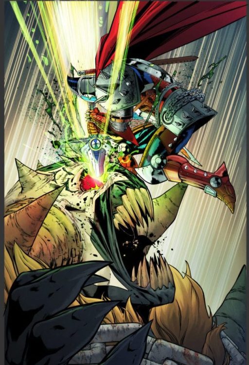
SPAWN #315, available in comic book stores on Wednesday, February 24th, offers readers one of the most thrilling surprises in a story—even by Spawn’s standards. The battle between Spawn and the mighty Omega Spawn seemed all but settled in favor of the latter, but a last minute newcomer shows there’s a chance to even the odds.
Story
The issue picks up in the middle of Spawn’s losing fight with Omega. Readers will remember how hopeless this fight seemed last issue, but in an epic introduction, the presumed dead Medieval Spawn joins in the fight.
What appeared to be a losing fight from the get-go turns into a massive turnaround. The unexpected introduction of Medieval Spawn comes when our hero is at his absolute lowest, which draws readers into the narrative that much more. His presence shocks Spawn out of his wits, but the two form an unlikely union in the face of so great a threat as Omega.
Todd McFarlane’s writing flows smoothly from scene to scene. The relatively calm narration provides a great balance to the exclamations from each character in the thick of their fight. And, as it turns out, there are more surprises that lie in store for the reader later in the story.
Artwork
Carlo Barberi’s penciling and ink work made sure every possible detail was included in this story. Whether it’s the chains and armor on Medieval Spawn or the gushing necroplasm, we’re treated to fully realized panels. These are rendered with beautiful shades of reds, blacks, and greens by colorist Jay David Ramos. And Tom Orzechoski’s lettering does a brilliant job of framing these scenes, informing the reader while helping focus the frames on each character.
Conclusion
SPAWN #315 is full of exciting surprises long time fans of the series are sure to enjoy. We can’t wait to see where the next issue goes after this story’s shocking events.
What was your favorite part of the issue? Let us know in the comments below!
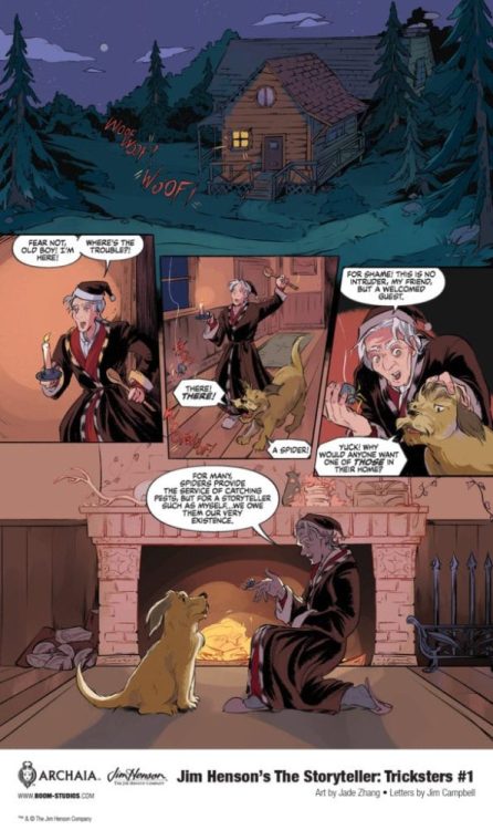
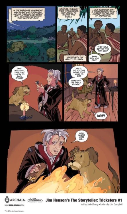
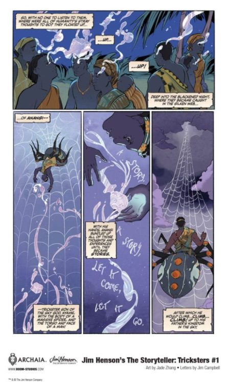
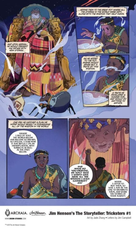
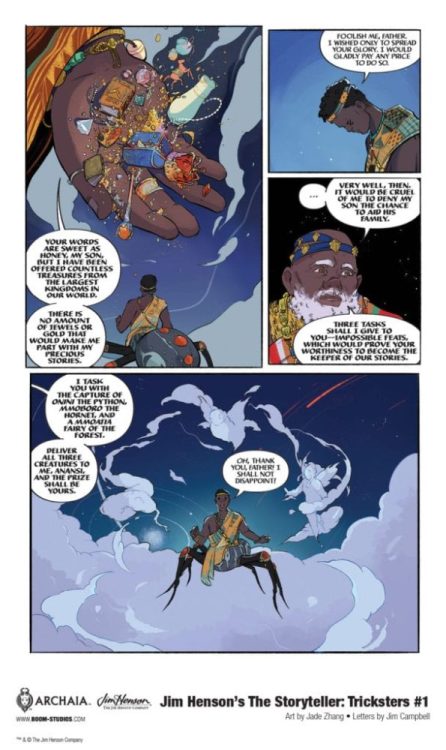
JIM HENSON’S THE STORYTELLER: TRICKSTERS #1 hits your local comic book shop on March 17, but thanks to BOOM! Studios, Monkeys Fighting Robots has an exclusive five-page preview for our readers.
The book is written by Jonathan Rivera, with art by Jade Zhang, and you will read Jim Campbell’s letter work. The main cover is by Peach Momoko, with a variant cover by Dani Pendergast.
About JIM HENSON’S THE STORYTELLER: TRICKSTERS #1: Discover the fascinating tale of Anansi, the spider-god, and his quest to free all Stories from his father, the sky god Nyame. But when Anansi becomes the Keeper of Stories, what will he decide to do with all of his new, potentially world-changing knowledge?
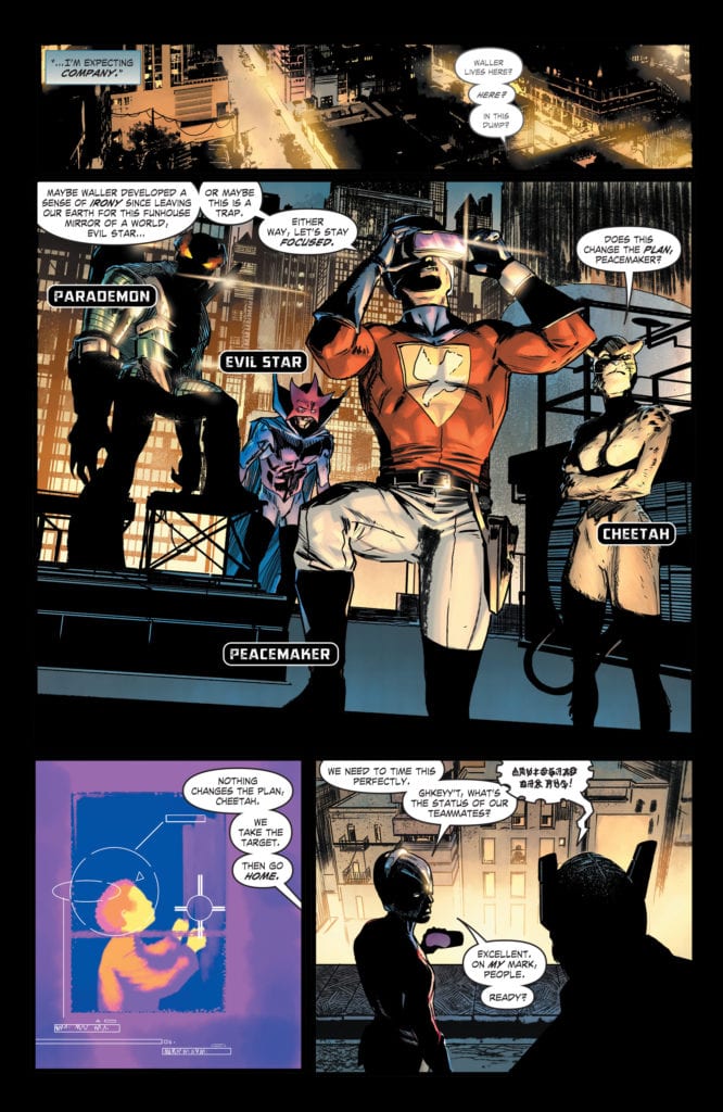
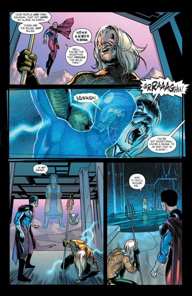
DC Comics’ Future State: Suicide Squad #2 is a story about the end of worlds. In “Task Force: Next!” writer Robbie Thompson, artist Javier Fernandez, colorist Alex Sinclair and letterer Wes Abbott show where a Justice League led by Amanda Waller leads. And in Future State: Black Adam, writer Jeremy Adams, penciller Fernando Pasarin, inker Oclair Albert, colorist Jeromy Cox, and letterer Wes Abbott tell us that even DC’s most powerful heroes may not be able to stand up against the tide of Armageddon.
Future State: Suicide Squad
Writing
Thompson brings us to the finish line, sticking close to all of the strengths of our first chapter. Future State: Suicide Squad #2 isn’t any less mysterious. We’re left with just as many questions as we have answers. Part of the reason this issue is so mysterious, is because Thompson doesn’t hold our hand. When Peacemaker and Waller talk, there’s a history we’re not privy to. We’re watching two people who know each other deeply as they talk about things we can’t understand. It’s fantastic! It’s natural dialogue, free of exposition dumps and full of tension. If the quality of Future State: Suicide Squad #2 is any kind of sign of what to look forward to in Thompson’s Suicide Squad run, we’re in for a real treat.
Art
Fernandez takes us on a journey with his page layouts. We begin this story with a moment of peace. We see Superman watching over his teammates. His x-ray vision is depicted like word balloons. It’s ordered and tidy. But then, as Peacemaker’s team strikes, the page begins to fall part. Panels get jumbled and crooked. A scene of Mirror Master and the Flash fighting makes it hard to know which are mirrors and which are panels. It’s a fantastic infusion of chaos. But what is really interesting is Fernandez’s next page. More fighting, more death and destruction, shown in a page of right angles and ordered panels. It’s what defines the Suicide Squad. Little moments of extreme violence that don’t seem to phase the characters. The page layout is unsympathetic to the loss, just like our “protagonists.”
Coloring
A lot of Sinclair’s colors are slightly muted in this chapter. Our characters look like they haven’t been out in the sun in a while. Their skin is pale, their surroundings are often dull. Sinclair shows us a dark timeline. But there are a few tiny moments of color. Most often, these are moments of violence. The few moments of violence that actually effect our characters. One that stands out, due to Sinclair’s striking red used in the blood, is when a character doesn’t mean to have killed the person. We mirror their shock when we see the sudden use of brilliant color. But by the end of the story, everything looks like it’s turning grey. Sinclair shows us how these people have come to find casual violence dull. But it’s also draining them of life.
Lettering
Abbott brings a levity to this chapter that didn’t exist in the previous issue. Everything was quite final in Future State: Suicide Squad #1. Characters spoke their mind in short chunks. There was very little rhythm to what they said. Abbott showed in that chapter that these characters were just coasting. They said what they had to say and got right to the point. In this issue, however, everyone seems to be getting a little sing-songy. Most of the dialogue is parsed out into tiered word balloons. Rarely do we see characters say everything they have to in one go. Again, this shows us the casual reaction these characters have to violence. They’re almost laid back about killing each other. This is the reality they know. It’s the reality they’re comfortable in. Abbott really helps us see just how cheap life is to them.
Future State: Black Adam
Writing
Nothing about Adams’ writing should work. The whole script is riddled with exposition dumps. Gold Beetle enters, a Deux Ex Machina with all the answers in the world, and Adams gives us a text-heavy run through of what we need to know. It breaks just about every rule of writing. But somehow it still works. Maybe it’s Adams’ self awareness in this chapter. The previous issue suffered from taking itself a little too seriously at times. But in this issue, Gold Beetle is a breath of fresh air. Sure, she has answers, but she’s more interested in talking about her many exploits. And the twisty, strange and confusing journey that Adams takes us on does require a fair bit of explaining. This script might break a lot of rules, but it more than makes up for it by being boatloads of fun.
Art
Pasarin and Albert had their work cut out for them in this issue! Every page looks like something out of Where’s Waldo? They don’t skimp on any details. And, as a result, the story maintains its feeling of epic poetry. These don’t look like scenes from a comic book. They look like scenes from some grand mythology. It’s fitting, though. These are the death throws of the universe. And all of these moments of extreme drama are juxtaposed with Gold Beetle’s hilarity. Even her moments of real panic, coupled with her dialogue, lighten the mood. She brings the perfect balance to what could have been a melodramatic ending.
Coloring
There’s a heavy emphasis on blue and gold in this issue. It comes to signify which characters are our protagonists. Gold Beetle is a mash up of the two colors and Black Adam has a gold trim along his cape and a blue hue to the lightning bolt on his chest. These colors tend to be the only things that stick out when the Unkindness arrives. The sea of purple and red engulfs everything else. It’s the blue and gold that still stands out, a sign of our protagonists’ resiliency. But it’s also interesting, as we begin to associate Black Adam’s powers with blue, to see how close the blues and purples are to one another. We get the sense that Black Adam could be on the side of the Unkindness. He has that type of power. And as the issue ends, we’re left wondering if someday he really could break bad.
Lettering
Future State: Black Adam is actually a great companion piece to Suicide Squad. And not just because of its shared themes and tones. Abbott’s work in one really highlights his work in the other. Where Suicide Squad is nonchalant and rhythmic, Black Adam is earnest and dramatic. Gold Beetle’s lines don’t get the tiered-word-balloon treatment. They’re breathless chunks. She’s getting all the bragging in that she can before she’s interrupted. And the other characters seem like they can’t get a word in edgewise. They have tiny interruptions in word balloons with long tails. Abbott’s underlining the effort it takes them to be heard. It’s a funny, brilliant way of showing just how talkative Gold Beetle is.
DC Comics’ Future State: Suicide Squad was mysterious and explosive. Future State: Black Adam was an epic that delivered on its promises. Both of these stories were fantastic examples of why Future State was ripe with potential. These creative teams took that potential and showed just how far it could stretch. Pick up Future State: Suicide Squad #2, out from DC Comics February 23rd, at a comic shop near you!