Home Blog Page 177

Review: PARENTHESIS—On Recovery

IDW Cover

Some non-fiction graphic novels leave an indelible mark on the reader, and Parenthesis is one of them. Written and illustrated by Élodie Durand, Parenthesis offers an unglamorous and tender account of living with and recovering from tumor-related epilepsy. Originally published in French under the title La Parenthèse by Editions Delcourt in 2010, Parenthesis is now available from IDW’s imprint Top Shelf Productions.

Durand establishes her non-linear, epistolary story of Judith with her cutting her hair short. These hair clippings fall in the shape of parentheses. Then the narrative jumps to a past meeting with a friend which serves as the inciting incident for Judith’s reconciliation with her past, of her self-image, and her relationships, chiefly with her mother. In fact, it is to her mother that the novel is addressed.

From the opening scene, the plot moves forward and back as the protagonist pieces together the memories she nearly lost. And with her parents’ help, Judith reconfigures events she thought she knew. Once her timeline encroaches on the present, Judith finally contends with the shame she expressed in the beginning. While this structure might seem confusing as described, it is not so on the page. Durand takes things slow, steeping the reader in the minutiae of her daily life.

A Scattered Mind

Artistically, the book is not messy as such, but it isn’t polished. This choice seems intentional, to reflect the protagonist’s scattered mind and Durand’s stream of consciousness approach to the narrative. This style also reflects Judith’s view of herself while experiencing epilepsy and during her recovery; she saw herself as monstrous, if not without an identity entirely.

JUDITH VIEWS HERSELF AS MONSTROUS.

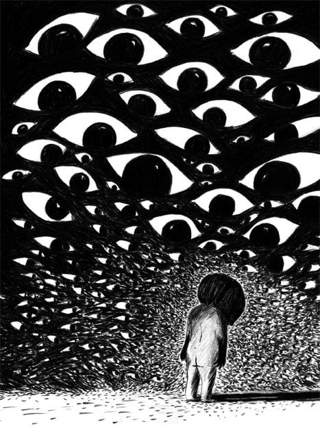
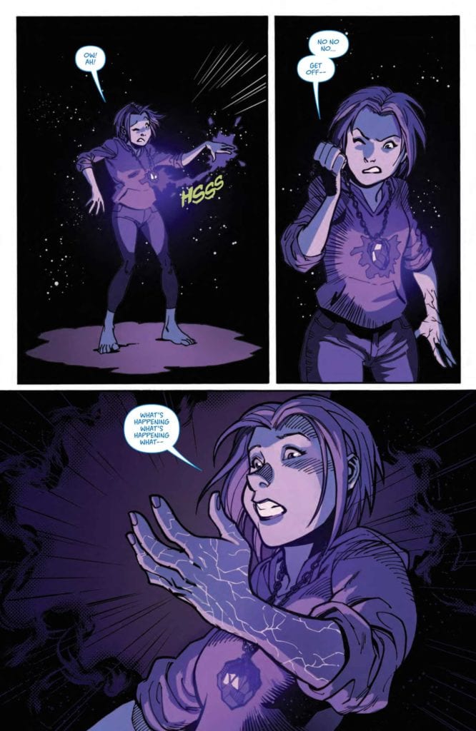
Durand’s use of intercut “self-portraits” illustrate her sense of self as they devolve in form sequentially from diagnosis to post-recovery. These self-portraits are genuinely disturbing, but I couldn’t look away. When you’re presented with something so authentic and unapologetic, you’re forced to interrogate your own self-image.

Moreover, it’s these self-portraits putting us in the mind of the author that help create sympathy when Judith does out-of-character things. At the start, Judith has symptoms she can’t explain. Therefore, she lashes out angrily at friends. Without proper context, you might be quick to call Judith rude and inconsiderate. But because of the schema from the art, you sympathize.

Later we learn that the increasing severity of her illness forces Judith to rely heavily on her parents—especially her mother—to perform basic daily tasks. This is undeniably devastating and relatable. As someone who is around the same age as Durand was at the time of her diagnosis, I understand the frustration stemming from loss of control, loss of a mature identity when you’ve only recently achieved independence.

Throughout Judith’s story, Durand maintains a strict black-and-white color palette, which gives the sense that the reader is looking into her secret sketchbook. Black-and-white also represents the past, and the haziness of memory. Here, as in the self-portraits, Durand seeks not to gloss up her past, but to simply piece it all together into a cohesive narrative. The effect, while tragic, is a mundane quality to the book as opposed to an over-the-top dramatic one. The reader comes to realize that life goes on despite and because of illness.

ALL EYES ARE ON SICK JUDITH.

Universal And Particular

Reinforcing the private sketchbook (or diary) aesthetic is the lettering and layout. Durand’s cursive captions and minimal use of panel borders contribute to the stream of consciousness quality. However, while these choices make the whole reading experience specific and intimate, the crafting is clear. Durand has spent hard time making this graphic novel. According to her own caption narration, Parenthesis covers roughly ten years of Judith’s life.

And it’s a combination of the time, raw style and narration which make Parenthesis such an effecting, timeless and timely graphic memoir. The novel’s poignancy lies in its specificity. Ten years after its initial publication, Durand’s memoir has resonance for those who have struggled and those who have not.

For these reasons, I believe this is a must-read for fans of non-fiction graphic novels. You may find a bit of catharsis in the story, even if you weren’t looking for it. Who knows, you might discover a close for the parentheses of your own recovery.

Monkeys Fighting Robots Youtube

Review: BUFFY THE VAMPIRE SLAYER #23—Impractical Magic

Buffy

As the plans of villains Anya and Xander clash, a greater magic force threatens to upend everything. From Boom! Studios, Buffy the Vampire Slayer #23 is written by Jeremy Lambert and illustrated by Ramon Bachs. Two other frequent Boom! contributors, Raul Angulo and Ed Dukeshire, provide colors and lettering respectively.

By this point, so much has happened to the Scooby Gang, one wonders how things could get worse. But if you remember the TV series as well as the comic series team does, then you know there’s one more trick to pull.

Warning: Spoilers ahead!

spoilers ahead

The Ring of Fire arc has turned multiple friends into foes. Anya, the former Watcher, continues her secret plot against the Watcher Council. Meanwhile, Xander’s a vampire hell-bent on trapping Willow with him. Now, through the magic of a mysterious gift from issue #20, Willow has been taken over by an eerie sort of doppelganger.

Previously On…

So, yes, we now have our very own comic book ret-con of Dark Willow. Lambert’s choice of ret-con feels earned instead of arbitrary, perhaps making it more agreeable for long-term fans of both the show and comic book series. Willow’s struggle to understand her powers has been able to develop over twenty-two issues and a spin-off full of introspection and growing self-awareness.

Dark Willow
SOMETHING SINISTER TAKES OVER WILLOW.

Giving Willow an evil doppelganger means real Willow doesn’t shoulder all the blame. Besides, it’s Anya pulling the strings. Overall, Lambert’s choices have successfully condensed and simplified the Dark Willow story arc while maintaining Willow’s likeability. As a fan of both the show and comics, I must admit I didn’t like the show’s take on Dark Willow.

Dark Willow

While I understood the how and why of her magic addiction, it was heartbreaking to see Willow become the bully. Once it happened, I felt I could no longer relate to my favorite character. So far, the approach to a Dark Willow arc in the comics has been more relatable, due in part to the fact that vampire Xander is the one who lured Willow into the underworld. But, again, it’s not exactly his fault that she’s gone dark.

On the art side of things, Bachs has adapted Dark Willow’s look from the show as well. Bachs’ style seems to pay homage to pop art and early comics by using dot shading and severe action lines. There’s even a striking extreme close-up panel that could have been drawn by Roy Lichtenstein himself. All this to say that Bachs’ Pop Art-inspired inking and character design a la Bob Montana (Archie Comics) betrays a deep love for comics while supporting the playful campiness inherent in the Buffyverse. His choices here lend a sense of familiarity to the art.

Moreover, Angulo’s tendency to wash (or fill) colors lends a neo-noir, cinematic mood to this issue. Each color also corresponds to a place or character. For example, Dark Willow’s parts of the issue are awash in a deep shade of purple, a color of mystery and royalty. This color helps emphasize Dark Willow’s power and momentary control over the Scoobies in the latter half of the issue. On a baser level, she just looks so imposing and badass.

Changed Utterly

On a final note, Dukeshire’s lettering is pretty consistent except for a minor problem on the second to last page. On a previous page, Dukeshire outlined Willow’s telepathic dialogue with her Dark Self in blue. Then on page 23, he outlined what appear to be Dark Willow’s response to Willow in the same shade of blue. But that dialogue could also be Willow’s own inner monologue. It’s only a little confusing given that Dark Willow’s other speech bubbles have been colored black and outlined in purple. Adding to the confusion is the fact that what Willow “says” in the thought bubbles sounds more like Dark Willow.

Regardless, such a small flaw is forgivable with an issue so satisfying. With each new tantalizing twist and obstacle, the Ring of Fire arc challenges the Scooby Gang in ways we’ve never seen before. Now the question is how will Buffy take on two changed versions of her best friends? Not to mention Anya. It is on that delicate thread that our hope for the future of the Scooby Gang hangs.

Monkeys Fighting Robots Youtube

SCOUT’S HONOR #3: Separating The Inspiration From Toxicity

Scout's Honor #3 Cover

In AfterShock Comics’ Scout’s Honor #3, writer David Pepose puts the protagonist, Kit through a test of character. The art by Luca Casalanguida details this gritty situation while the colors by Matt Milla bring some brightness to these difficult moments. Through captions and sound effects, Carlos M. Mangual’s lettering brings a dramatic echo to every dire situation Kit faces.

Scout’s Honor #3 The Badge Of Courage

Pepose solidifies the reader’s support of the protagonist Kit after much build up from previous issues. With everything she does and her inspiration of the Ranger Scouts in question after some startling revelations, where does Kit have left to go? As it turns out, the answer is simple nowhere but up.Scout's Honor #3 page arc

Throughout Scout’s Honor #3, Kit’s greatest challenge is the difference between strength and honor. Kit believes in the Ranger Scouts’ ideals that prioritize surviving in a post-apocalyptic world, but she’s against the “Boy’s Club” mentality. Her journey echoes that of her friend-turned bitter rival Dez.

In his attempt to live up to his father’s expectations as well as his own, Dez only finds disappointment and rejection. The reader can’t help but sympathize with him when his father, the Scoutmaster slaps him. That reaction particularly rings true when one considers that the Scoutmaster is anything but the honorable man he pretends to be.

Kit’s relationship with her father is quite different. He’s Kit’s inspiration for living. Even after his death in the series’ second issue, Kit holds him close. While she still keeps her guard up around the scouts, Kit maintains the values her father taught her without conforming to the scouts’ dominant ideals.

Smoothing Out The Grittiness

Casalanguida gives Scout’s Honor #3 a generally gritty style, aside from some important moments. The issue features an impressive amount of shading and detail to characters and terrains. Visually, it looks like the characters are trying to be as tough as the post-apocalyptic world they are living in. That toughness doesn’t seem to end very well when Dez almost gets killed when he tries to defeat an enemy.

By comparison, the smooth panels and the bright colors Milla uses for Kit’s scenes offers the reader a chance to catch a breath and relax in the middle of the aforementioned despair.Kit's personal situation

Otherwise, Mangual makes every action and word impactful in Scout’s Honor #3. The words of Kit’s drone companion, captured in green caption-like word balloons, is some of the only comfort she has. Its simplicity in its support of Kit is both comforting and sad, considering their bond stems from Kit’s role as the drone’s leader. Every other human connection she has ranges from plain to passive aggressive. Unfortunately, there’s nobody she can trust, other than a programmed drone.

Even cheers for her in repetitive sound effects don’t resonate with Kit, as they echo a lie she tells to be among them. Kit might have passed the scouts’ trials, but she had to pretend to be a boy to even qualify. This tension is exemplified by the scouts calling her “Brother Kit”. The reader feels Kit’s emptiness by sharing her awareness of her real gender.

Pick Up Scout’s Honor #3

Scout’s Honor #3 reaffirms the reader’s faith in Kit after losing this trust had been lost in previous issues. Now, it’s so easy to root for her because now the only thing she has left to lose is her honor. The other scouts clearly lack this desirable trait, so Kit stands out among the rest. Now, all she and the reader have left to do is see the series to the end.

Monkeys Fighting Robots Youtube

ELSEWHERE VOLUME 2: A Multiverse Full Of Storytelling Passions

Elsewhere Volume 2 Cover

Elsewhere Volume 2 has a Kickstarter campaign ending on March 17. Continuing this anthology in dedication to Unlikely Heroes Studios co-founder Zack Dolan are a mass of creative talents. Passionate creators craft an collection of short stories that span a diverse range of genres, moods and objectives. Some are short and sweet while others are pitches for something more extensive. Regardless, the art and imagination on display are wildly enjoyable.

Background

Unlikely Heroes ForeverUnlikely Heroes Studios is an indie comics company run by a team that’s spread throughout the United States. Founded in 2012, co-founder Zack Dolan used modern technology to connect his team to produce work like Super! and The Surgeon. Dolan unfortunately passed away on 2019, with the last of his artwork featured in the first Elsewhere book. Now, UHS continues to honor Dolan’s memory through series like Up In The Sky and The Unthinkables.

Elsewhere Volume 2: Stories To Showcase

With Crushed, writer J. Michael Donohue delivers a surprising story where each twist and turn keeps readers on their toes. These brief plots are genuinely straightforward yet unpredictable, making them easy to digest and compelling to read.

The art by Jeremy Simser certainly adds to this feeling by bringing a large sense of scale. Plus, the bright colors by Roman Stevens, set against a cold night, produce a stark contrast, and Micah Myers provides impactful sound effects for every major action.

Elsewhere Volume 2 content
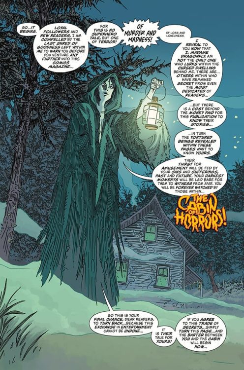
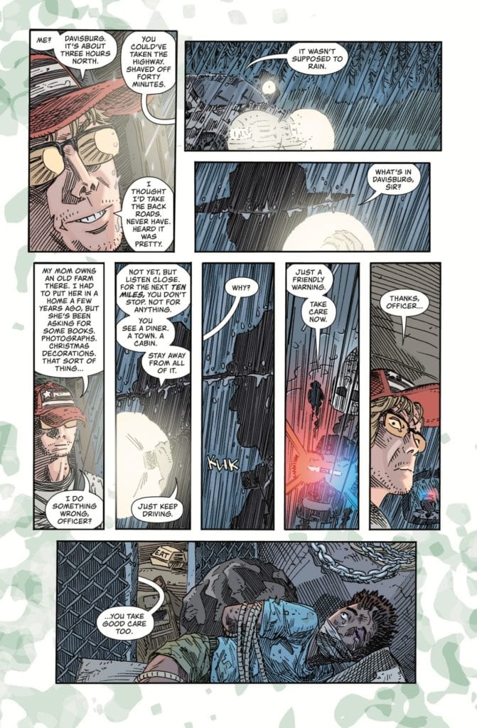
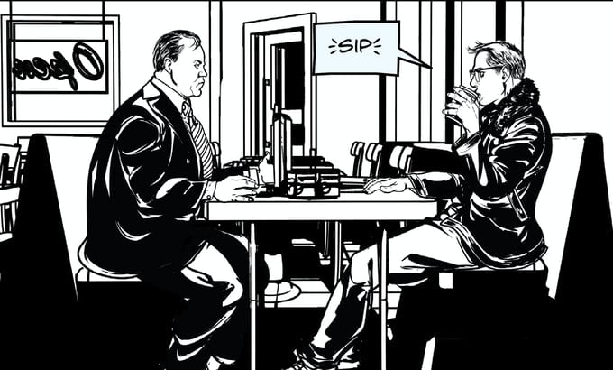
Other titles, like Stayin’ Alive, look like pitches for future series. The black-and-white coloring, along with the semi-realistic art, by Amelia Woo evoke the hard-boiled atmosphere of a detective story. The protagonist’s with a difficult past provides the story with a lead that the audience can invest in.

Of course, some of these Elsewhere Volume 2 “pitches” won’t be in UHS. Like when the entire Short Fuse Media network shows off a prelude to a Crisis Crossover, some of these stories will simply go down as one-offs that could have been more.

Personal Standout

Probably the chapter/pitch that made the most notable impression in Elsewhere Volume 2 comes from Miss Medusa’s Monstrous Menagerie. The synergy of writer Paul Hanley and artist Matt Frank jumps off the page throughout the story.

Through the issue, the common experience of a stressful job interview can be felt adds extra realism to the narrative. Protagonist Laurin Stillevok’s confidence is rewarding, as far too many stories that feature this trope center around insecurity and failure. Stillevok’s ruthless boss, Gina Medusa makes the former even more sympathetic.

If Medusa’s red eyes and sharp tongue don’t scare you off, her animated snake hair sure will. It also helps that her office has a distinct window, as it features a prominent eye that makes her employees feel like Medusa is always watching them. Frank also utilizes plenty geometric and facial language to further establish Gina’s powerful grasp on the setting.

Back Elsewhere Volume 2 Now!

Unlikely Heroes Studios continues to impress comic fans with the amount of talent they attract. Elsewhere Volume 2 is full of imaginative, wildly unpredictable characters that make each story feel memorable. Some of them feel good enough to be standalone series, but if nothing else this book offers the reader an assembly of fun stories that are worthwhile.


What do you all think? Is this an anthology you want to invest in? The link to the campaign is up top and here.

Monkeys Fighting Robots Youtube

Review: SUPERMAN #29 Questions the Mortality of Clark Kent

Superman 29 cover

The Burden of Superman

Future State has finally passed, and we see a very different future for Superman. Clark is gone, and in his place is Jon, who has become obsessive about protecting Metropolis. It’s a different yet interesting take on Superman’s successor. Now that we’re in the present, we now pick up where Bendis’ run left off: The now teenaged Jon Kent teaming up with his father to save the world. We have seen the beginning of Superboy’s journey, then the formative years with the Legion of Superheroes. All that remains is the question of how he takes the title of Superman? What happens to Clark?

Superman 29 cover

**Some Spoilers Below**

Story:

We open with the Man and Boy of Steel, protecting a STAR Labs satellite from aliens. These aliens have been coming from a breach the scientists have been studying under the orders of Amanda Waller, who is hoping to see the limits of the Kryptonians. During one of the battles, Superman gets cut by the aliens, revealing they have the potential to kill him. This upsets Superboy as he knows his father’s death is soon. Before he can assure Jon that this can be avoided, another attack begins on the satellite, with the largest alien yet.

Superman 29 p1

The idea of a Superman successor has been done before, but with his biological son, this feels more emotional. Since we first met Jon, he has been looking up to his father, using him as the basis of the hero he is meant to be. Just like life, a son would grow more sad and desperate to keep his father alive. For Superboy, he knows how and when it will happen, so he begs Superman to stay out of the fight. It’s honestly heartbreaking.

Unfortunately, this is executed rather poorly. We really don’t get a lot in terms of Superman, with the only real lines from Clark talking about a childhood game. We get a cool fight sequence with the Supermen, but to a newcomer, they would know nothing about them. If this is the end for Clark Kent, give us something to latch onto.

superman 29 p2

Art:

While the story has its interesting points, the art doesn’t do this comic any favors. Phil Hester is the illustrator here, and his style just doesn’t fit in a Superman story. There is a blocky design that honestly makes the world feel flat, especially when given the brilliantly bright colors of Hi-Fi. I could see this art fitting in a darker comic like Batman or Justice League Dark, but not here. 

There is actually some good art in this issue despite this. Sami Basri does the Tales of Metropolis story in the backup, and honestly, I would have preferred the artists had switched roles. Basri’s style fits the staple action for Superman, while Hester’s would have fit Bibbo’s story. It’s good art, just with the wrong story.

Conclusion:

Overall there was stuff to get interested in for this coming Superman tale. The Man of Steel’s days are numbered, and Jon’s emotions are real enough to begin getting attached. The problem is that while this idea is great, it was poorly executed. Hopefully, the subsequent issues will help smooth it out. In terms of art, Hester’s work just doesn’t fit this tale and honestly distracts from the story. The backup story’s art would honestly fit better, but at least Hi-Fi’s color fits the world of Superman. There’s enough here to give this run a chance, but the creative team really needs to deliver.

Monkeys Fighting Robots Youtube

Review: BLACK HAMMER: VISIONS #2 – Doesn’t Deliver

Black Hammer Johns Dark Horse

The Black Hammer Universe is home to some of the best comics. The main Black Hammer series, Colonel Weird: Cosmagog, and even Black Hammer: Visions #1 are all examples of subtle, nuanced storytelling. So, reading a comic like Black Hammer: Visions #2 hurts. It’s a bump on an otherwise smooth road. Writer Geoff Johns, artist Scott Kollins, colorist Bill Crabtree and letterer Nate Piekos deliver an issue full of empty promises and soulless scares.

Black Hammer Johns Dark Horse

Writing

From page one, Johns is off his game. Typically a strong writer, seeing clumsy exposition from him is kind of heartbreaking. We open on Madame Dragonfly. In 1960’s-horror-comics fashion, she addresses the reader. It’s your typical “turn back now, horrors lay ahead” schpeel. By the end of Madame Dragonfly’s lines, we’ve gotten the point and then some. And as she warns that there’s a price to reading the comic: “It is their tale for yours!” it’s hard to feel any chills. It’s a speech that’s laced with self-importance but ultimately lands on an empty promise. No reader will sit there and think that they’ll have to tell their life story to Madame Dragonfly, and the comic itself doesn’t get meta enough in its themes to create any kind of fear of that. It’s simply a modern story, bookended by an anachronistic addressing of the reader.

This could work if the modern story were up to snuff. But it’s full of strange exposition-heavy moments. A cop stops a man driving down the road. “For the next ten miles, you don’t stop. Not for anything,” the cop says. And, of course, the man promptly runs out of cigarettes and sees a gas station. It’s your typical horror tale setup. But even though we see the cop’s warning only one page before, Johns feels the need to repeat the panel. He shows us the cop saying that line again, in the man’s mind’s eye, just so we’re clear he’s ignoring the cop’s advice. It’s a little belittling to the reader. It connects obvious dots and does all the work for us. Due to many more moments like this, a cast of characters that feel inorganic and unsympathetic, Johns’ script falls flat.

Black Hammer Johns Dark Horse

Art

Something about Kollins’ art doesn’t match the tone of the story either. Moments supposed to show a character’s anger, fear or sadness often come off as just a little funny. Kollins’ style is an odd mix of minimalistic and detailed. All the wrong details get the focus, with a few exceptions. It’s often the surroundings of a character that are detailed. We see the splinters on the door of the cabin, but the look on a young boy’s face is out of focus. It has a cartoony effect. In pulling us away from the characters’ faces, we get pulled away from what they’re feeling. And when we see their eyes only as dots, or their mouths as an angry triangle, it seems more funny than terrifying. Ultimately, Kollins doesn’t help fulfill Johns’ promises either. He shows us a world that just isn’t very scary.

Coloring

Crabtree also creates a strange tone. When we first meet our characters, they’re driving down a street through the rainy night. But the panels that they’re in are brightly colored. The driver is shown in fleshy tones. Crabtree doesn’t set the stage as a spooky late night. These panels could be happening in the middle of the day. And as the story continues, these problems persist. Nearly every scene feels strangely colorful. And Kollins’ art isn’t scary enough for it to feel like Crabtree is playing against each moment. No, the two simply work together to create a scare-free horror comic.

Black Hammer Johns Dark Horse

Lettering

Piekos’ lettering is the one thing that occasionally rises above the rest of the story. Moments like a kid falling through a door and his “AAAHHHH!” flying out of his word balloon help create a sense of movement. When the same kid shows up in another room, there’s a word balloon that says, “Who is that?” The lettering is small and sheepish. The follow-up “Who are you?” is bigger and more confident. You can hear the difference just by looking at the page. But Piekos’ sound effects don’t mesh with the story well. The bright yellow, thick block lettered “BAM” of a knock on the door takes the reader out of that moment. We’re all too aware we’re reading a sound effect and not hearing a noise.


Dark Horse’s Black Hammer: Visions #2 is flat and emotionless. We’re presented with characters that feel empty. They don’t have a past, they barely have a present, and we’re left not caring about their future. Every moment of horror is like a jump scare. It’s cheap, brief, and ultimately not scary in its own right. Johns, Kollins, Crabtree, and Piekos don’t go deep into this issue. As a longtime fan of both Johns and Black Hammer, I’m disappointed. Black Hammer: Visions #2, from Dark Horse Comics, is out March 10th.

Monkeys Fighting Robots Youtube

A Ghoulish Introduction in KARMEN #1

A vibrant cover for Karmen #1

KARMEN #1, available Wednesday from Image Comics, dives into a dark and disturbing world, one that will raise twice as many questions as it seeks to answer. This is already proving to be a read not designed for the faint of heart.

A vibrant cover for Karmen #1

Karmen #1 is the beginning of a five-issue miniseries written and illustrated by Guillem March (known for Catwoman, Batman, and Harley Quinn, among other series). This series is about an angel who at times may appear to be anything but.

They say that death is only the beginning. That may just be the case for Karmen, a skeletal looking angel with a strong and unique personality. She may not be what you picture, when you think of a shepherd, but that’s half the point, is it not?

This series is already proving to be dark and disturbing, one that isn’t afraid to show the more disturbing sides of humanity and pain. On that note, this is perhaps not an issue for everyone. (Spoiler/trigger warning) Karmen #1 depicts imagery of self-harm and suicide, and it is present often enough to make it impossible to skip over.

Just a casual stroll up an apartment building stairway.

The Writing

Karmen #1 is every bit as dark and disturbing as the description promises. Yet it is so much more than that as well. Much like the dreams described within these pages, there is an ethereal feeling to the introduction.

There’s a hidden depth to what has already been introduced. It’s so easy and tempting to theorize what Guillem March is trying to say here. But at the end of the day, it almost feels better to wait and see what the next issue holds. What the next issue will reveal, and how it will change this path we’re seeing for Karmen.

Not to mention her human ward. Her story is a complex and heartbreaking tale. One that feels so human in the way pain is portrayed. In how her whole life is shown through a series of moments, only to transition into something so very different.

Those are admittedly the more difficult scenes to take in, as is the overall implication of what has happened. On the bright side (I promise you there is one), Karmen’s bright personality really does help to balance out the weighted reality that Cata brings with her.

What an odd series of events, no?

The Art

The artwork in Karmen #1 stands out about as much as her personality. That is to say – it will stand out among the crowd. Now and always. Guillem March’s style is so strong here, portraying a variety of scenes, happily bouncing back and forth between tones and implications. It’s almost too much to take in.

For every evocative and ethereal moment described in this issue, the artwork takes it several steps further. Karmen really does look like a warped angel, and is a stark contrast to that of Cata – her pain, her appearance, everything.

Guillem did have a color assistant, Tony Lopez, and together they created something so surreal. The colors themselves seem to be trying to tell a story – to hint about the truth well before it’s confirmed directly.

One that note, I would once again like to remind readers that this series really isn’t going to be for everyone. The artwork doesn’t shy away from the reality of the situation, even if it does dance around it from time to time. There are certainly a few scenes that some might find extremely upsetting.

The roommate doesn’t appear to be willing to pay any attention to the world.

Conclusion

Karmen #1 is going to be one of those issues that sticks with me for years to come, I just know it. The story and the artwork have wormed their way into my head, leaving me curious about Karmen and her intentions. I know I will not be the only reader so captivated by this tale.

Monkeys Fighting Robots Youtube

The Battle Rages On In THE LAST WITCH #3

THE LAST WITCH #3, available Wednesday from BOOM! Box continues the tale of one budding witch – and the many battles that lay in her path. Right before our eyes, Saoirse is turning into something new.

The next battle is nearly here.

It’s hard to believe how quickly everything has changed for little Saoirse. Just two issues ago she was a young girl – one who found herself in the middle of a horror story. Now, we’re in the process of watching her turn into something so much more.

The Last Witch #3 brings us back to Saoirse, her brother, and her grandmother. Her world may have narrowed in some ways, but it looks like there is much for her to gain. Assuming she can survive the battles ahead.

After all, she is now on a path where she must battle the surviving witches. Her great-aunts, as the case may be. Given how Black Annis treated her upon arrival, it’s safe to assume that the rest of her family won’t react kindly to her appearance.

A memory, and a showing of what is to come.

The Writing

While there are many things that have changed, there are likewise many elements that feel the same in The Last Witch #3. You can still see much of the subtlety in Conor McCreery’s writing, even if the scale is steadily increasing.

Saoirse’s bond with her family is still very much a necessary and grounding element of this story. Without it, there’s this impression that she could have ended up just like all the other witches that are so dreadfully whispered about.

It’s difficult to infuse something so carefully such as that, without it becoming overpowering. But that balance has been struck here. It is a nice counter to the brutal battle that Saoirse willingly walks into.

On that note, the battle itself is really quite clever, showcasing all of the reasons why it had to be fought – as well as all of the reasons why it had to be Saoirse. Every move and decision seems to reinforce that she’s the woman that can – and will – set things right.

What makes this whole situation all the more intriguing is, despite that feeling, there really is no guarantee for how this will fall out. Already we’ve been reminded of the corrupting nature of magic itself, and thus the risks that Saoirse takes on a daily basis.

A plan has been made, but what next?

The Art

The artwork inside The Last Witch #3 is truly a sight to behold. It’s not just the major moments that stand out (though there certainly is that), but the smaller moments as well. The moments where Saoirse has never felt so human. It ties in strongly with the theme of the series.

V.V. Glass is one of the best visual storytellers I’ve seen in recent times. There are many small details that bring the story to life, from the way Saoirse interacts with her family (they really do look and feel related – and their care for one another shows), to the grim determination on her face during battle.

Natalia Nesterenko’s colors further bring that world to light. While the colors have been stunning up to this point, there is always something so iconic about the juxtaposition between water and fire. Thus, this issue, with a battle between a fire and water witch, was always meant to be spectacular.

Jim Campbell really nailed the humanizing elements of this series. You can practically feel Saoirse’s hesitation – her fear about leaving her little brother behind. Yet the lettering also grasps the grander scale, portraying the strength of the wind and water that is at play.

To be fair, she does have an excellent point.

Conclusion

The Last Witch #3 has somehow found a way to continue to up the ante – and our expectations. This series may feel larger than life at times, but in many ways, it is still very much the story of a young village girl trying to do right by her family.

Monkeys Fighting Robots Youtube

Review: A Dangerous Family Reunion In TEENAGE MUTANT NINJA TURTLES: JENNIKA II #5

TEENAGE MUTANT NINJA TURTLES: JENNIKA II #5, available in comic book stores on Wednesday, March 10th, offers readers the reunion they were waiting for. Lucia Rosetti, widow of the deceased mob boss Antoni Rosetti, has enlisted the help of Jennika to connect her with her non-mutant son. Originally, the ninja was only able to deliver messages, but there might be an opportunity for a family meeting in this issue. What could go wrong?

Story

The issue opens with a tense discussion between Jennika and Raphael in the Turtle’s home base. The latter is opposed to former’s involvement with a mob connection, but she jumps into an argument immediately.

The reader knows Jennika chose to help Lucia due to her felt responsibility for her child’s well-being. We remember the recent reveal that the ninja herself murdered Antoni while working for the Shredder. She later opens up to Alopex in a heartfelt conversion, showing readers what a vulnerable friendship looks like.

Jennika spends most of the issue tackling the challenges we saw in the previous story—delivering messages from Lucia to her son Junior. What changes in this issue, however, is an unexpected party waiting at the house. And, ironically, they might spur on the reunion between the mother and son.

However, readers will remember that Lucia revealed much of her nefarious last issue. Will Jennika uncover the truth before it’s too late? Writer Ronda Pattison does a brilliant job of guiding us through the narrative with just the right pacing, revealing some of the answers we were waiting for.

Artwork

Jodi Nishijima’s penciling and ink work, alongside Pattison’s coloring, brought the characters within this issue to life. Jennika’s bright yellow headband stands out against the bland backgrounds throughout Mutant Town and the Rosetti’s home. This distinction helps readers sense that Jennika is facing off against the forces of both locales. We also like how Shawn Lee’s lettering used a similar color to Turtles’ dojo for the ninja’s internal dialogue boxes, giving us a sense of where her true heart resides.

Conclusion

TEENAGE MUTANT NINJA TURTLES: JENNIKA II #5 takes this story to the next level. The stakes are high for Jennika and the young Junior, so we’re anticipating a huge event next issue.

Do you think Jennika will discover Lucia’s true motivation? Let us know in the comments below!

Monkeys Fighting Robots Youtube

Review: GOD OF WAR: FALLEN GOD #1 – Can We Run From Our Destiny?

GOD OF WAR: FALLEN GOD #1 hits stores on Wednesday, March 10th, giving fans a look at Kratos’s life between the events of God of War III and God of War (2018). The demigod is more than tired of dealing with the divine powers sitting atop Olympus, opting for a much quieter locale. But readers will find that Kratos must learn an important lesson—Destiny does not meet us on our own terms. And the past we try to escape has a way of catching up with us.

Story

Fresh out of the battles in (detailed in God of War lll), Kratos decides it’s time to bury his past as the “Ghost of Sparta.” His Blades of Chaos serve as the perfect representation of that from which he is fleeing, so he throws them into the ocean.

Unfortunately for Kratos, the past isn’t that easy to get rid of. Somehow, the Blades find him. Readers will see that no matter where Kratos runs, his past is there to greet him.

Chris Roberson’s narrative uses the Blades as the perfect metaphor for both the protagonist’s past and destiny. Their chains represent the past that anchors us to the world, while their reach shows how our purpose guides us forward. But the writer adds in one more step to help Kratos along the way; a mysterious guide who leaves the warrior cryptic messages about his future. Where will this all lead?

Artwork

The illustrations in this issue look as if they’re taken straight out of a God of War video games; the transition of Kratos into this comic book former is seamless. Tony Parker’s penciling and ink work provides highly detailed illustrations of Kratos, showcasing his raging emotions. This is complemented beautifully by Dan Jackson’s coloring, which provides harsh reds and yellows to represent the demigod’s constant rage. And Jimmy Betancourt of Comiccraft’s lettering meshes well with these colors using beautiful red word boxes for Kratos’s inner thoughts.

Conclusion

GOD OF WAR: FALLEN GOD #1 sets up an intriguing new chapter in Kratos’s life. We’re excited to see where this series takes us next.

Who do you think the mysterious figure is? Let us know in the comments below!

Monkeys Fighting Robots Youtube