Home Blog Page 167

Review: TEENAGE MUTANT NINJA TURTLES: JENNIKA II #6 — The Conclusion Of Jenny’s Redemption Arc

TEENAGE MUTANT NINJA TURTLES: JENNIKA II #6, available on Wednesday, April 13th, is the concluding issue of Ronda Pattion, Jodie Nishijima, and Shawn Lee’s story of Jennika’s personal life. Readers have followed the ninja through her personal transformation while interacting with fellow people in Mutant Town. And things have been tough. But this issue concludes one of the most impactful redemption arcs in a TMNT series.

Story

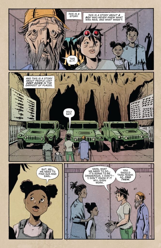
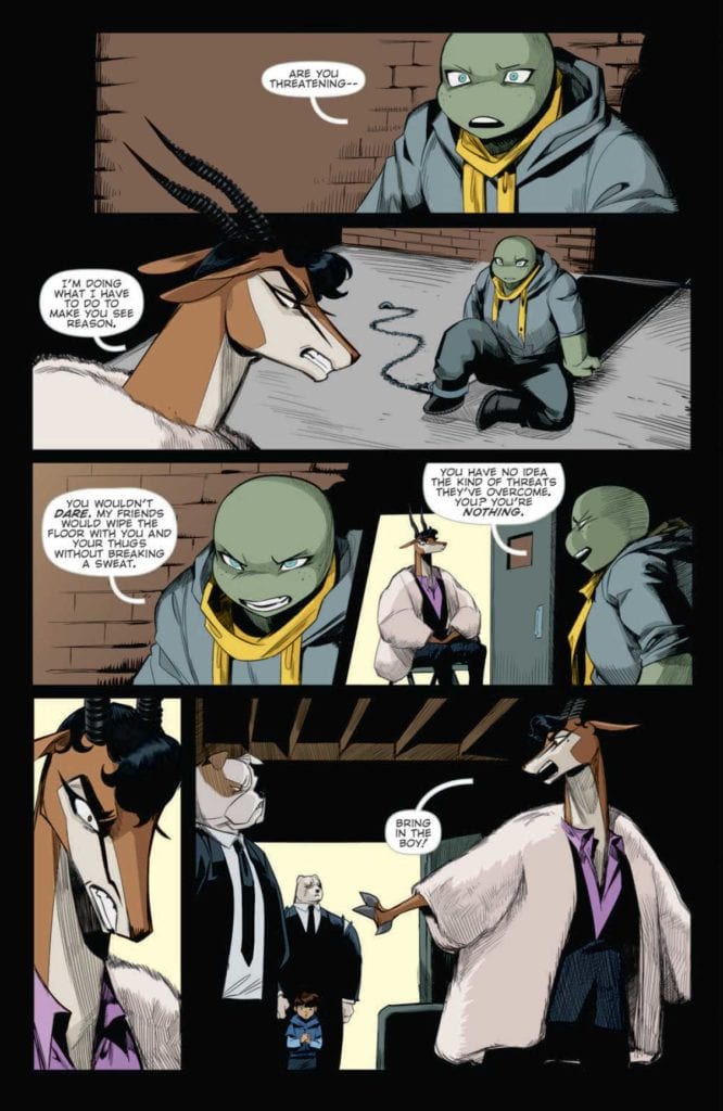
Last issue, Jennika was captured by Lucia Rosetti and her henchmen after refusing to serve as her personal assassin. The nefarious gazelle isn’t ready to give up, opting to further torture the ninja by playing on her past life as a killer.

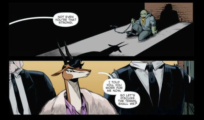
Refusing to bend to Rosetti’s will, Jennika invokes the names of her found family, reminding the crime lord what a powerful force they are. But the villain’s cruelty knows no bounds. Readers will be shocked to find that Rosetti stoops to harming her own child in order to reach her goals.

Pattison’s narrative accomplishes two important tasks—it allows Jennika to confront her past life as a criminal and forgive herself for those very actions. We see the culmination of an issues-long transformation of the ninja as she seeks to save a boy whose life hangs in the balance.

Artwork

This issue’s illustrations fit perfectly with the story’s mob movie themes. Nishijima’s illustrations, combined with Pattison’s coloring, set Jennika and Junior’s forms against dark shadows to represent her assailants’ forms. Readers can feel the pressures faced by the duo, especially the shock Rossetti’s attack. Lee’s lettering also worked well with these depictions of our protagonists by increasing font sizes for their exclamations.


Conclusion

TEENAGE MUTANT NINJA TURTLES: JENNIKA II #6 wraps up this six-part series with the perfect balance of heart, redemption, and action. We hope to see a lot more of Jennika in future stories.

Were you happy with the conclusion to this series? Let us know in the comments below!

Monkeys Fighting Robots Youtube

Review: HOME #1 Unveils The Harsh Realities Of Refugee Life

HOME #1, available in comic book stores on Wednesday, April 14th, is the first installment of a brilliant new series honing in on the injustices facing immigrants. Readers will join in the travels of people fleeing for their lives. The American Dream purports to offer opportunity for everyone, but this groundbreaking issue reveals a harsh truth most of us already know: some people are barred from our country’s promises.

Story

The story introduces us to an unnamed mother and child making their way to what’s presumed to be the United States. We see them catching bus rides and sleeping outside in the hopes of finding a better life.

Rather than detailing the characters’ dialogue, the story relays what appears to be a speech from an official of the former President’s administration. The language is thoroughly xenophobic, filled with a hatred and fear of immigrants. This contrasts with the images of the refugees simply seeking safety.

The most scathing indictment of the administration’s attitude toward immigrants and refugees comes from the former President’s words himself.

The family eventually arrives at the border to the U.S. where they prepare to meet with border police officers. What ensues is a horrific process of separation that will change the young family’s life forever.

Julio Anta’s powerful story weaves together elements of hope and terrible circumstances. His ability to depict the harsh realities faced by immigrants is eye-opening—even for those who claim they’re aware of these human rights violations.

Artwork

The illustrations within this issue tell a story of hope and heartbreak—arguably more so than the written narrative. Anna Wieszczyk’s penciling and ink work detail the traumatic experiences of the protagonists. Fleshed out with Bryan Valenza’s coloring, the reader sees the red flushes on their weary faces to represent the hardships experienced. In addition, Hassan Otsmane-Elhaou’s lettering does a brilliant job of differentiating between the Spanish and English dialogue using alternating red and black fonts.

Conclusion

HOME #1 is the story we need right now. It’s great to see a tale told from a marginalized group’s perspective in the comic book medium.

Do you think more real world traumatic events will be featured in subsequent issues? Let us know in the comments below!

Monkeys Fighting Robots Youtube

SCOUT’S HONOR #4: Re-Root Your Values To Grow Anew

Scout's Honor #4 Cover

Scout’s Honor #4 from AfterShock Comics comes out to comic stores on April 14. Writer David Pepose brings this mini-series to its climax. With art by Luca Casalanguida, colors by Matt Milla, and lettering by Carlos M. Mangual, readers experience the protagonist’s mind going through a crisis.

Scout’s Honor #4 And Lack Thereof

Pepose has Kit feel the weight of her decisions and revelations in Scout’s Honor #4. Calling back to previous issues, Kit now faces everything she believed in turned upside down. The reader experiences Kit’s helplessness as despite knowing the risks towards herself, they learn from Kit the empowerment of being a scout. Kit’s disillusionment is all the more worse, considering how it parallels with real-life cases of abuse in scout troops.

It’s a good thing something else builds from previous issues; despite the foundations of the scouts, the inspiration still exists. Kit has always been a survivor, Scout’s Honor #4 is where she displays that in full. With one more issue to go, the reader will eagerly await Kit’s final stand.

Striking Art

Everything to know about Scout's Honor #4
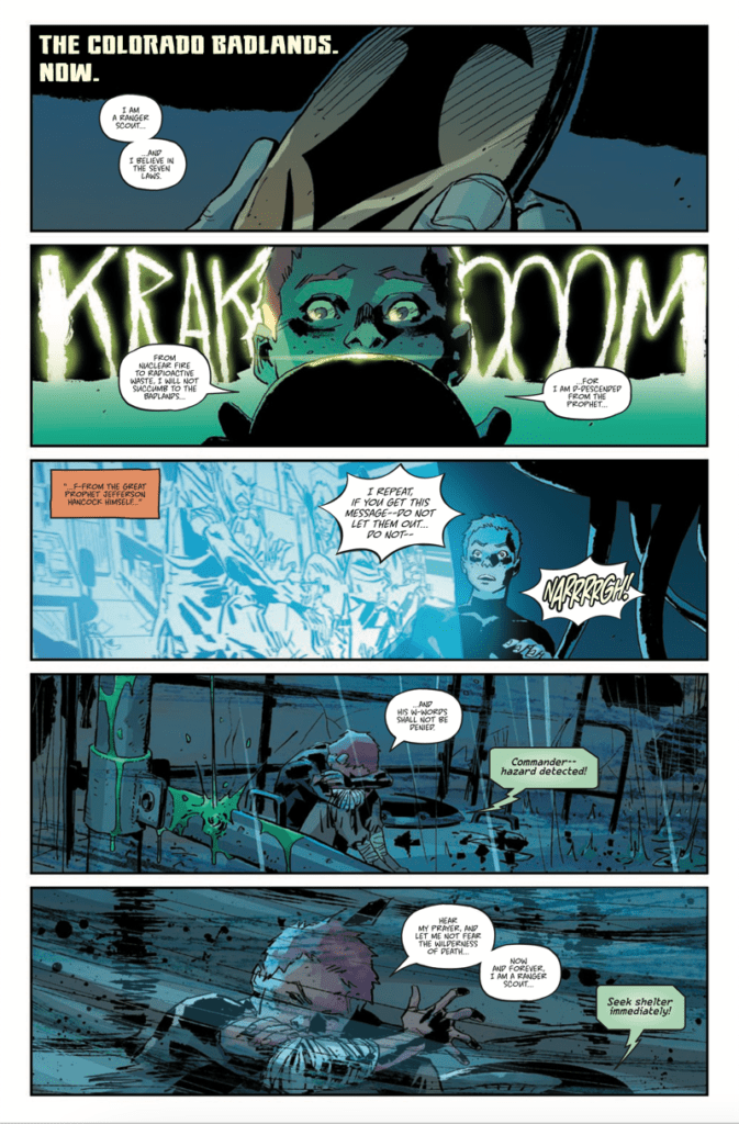
Casalanguida continues to give the art a strong sense of grittiness. A large amount of shading displays how much the Ranger Scouts operate, as ruthless as the stormy post-apocalyptic wilderness. Kit’s reactions both in and out of shelter with how she curls up in a helpless position explain her situation.

Milla’s coloring adds to Kit’s sense of helplessness in Scout’s Honor #4. Her red hair is almost muted out in the dark corners she finds herself in. Also, with a sulfur storm featuring a green aesthetic coming in, the danger intensifies. In contrast, the warm orange color brings back some brightness to Kit’s appearance.

The lettering from Mangual gives these situations a more intense resonance. The thundering sound effects look engineered for these specific instances. Not only does the hand-drawn look eye-catching, but they are in juxtaposition with Kit’s mindset. In one instance where the thundering sound effect lights up, she’s reciting an oath for clarity.

Prepare For Scout’s Honor #4

Scout’s Honor #4 is where this series becomes a must-read. With a protagonist the reader comes to love reaffirming herself against her darkest hour, the readers are ready for one last stretch.

Monkeys Fighting Robots Youtube

When Adaptations Meet Science Fiction in JULES VERNE’S LIGHTHOUSE #1

Image Comics’ JULES VERNE’S LIGHTHOUSE #1, available April 14th, is an adaptation of a classic piece of fiction history. Far out on the edges of the galaxy exist a crew. Their purpose is to maintain a supercomputer that helps navigate ships through wormholes.

Space pirates! Not the sort of people I would want to fight.

Jules Verne’s The Lighthouse at the End of the World was originally published back in 1905. Though ironically, the piece was not published until after he had passed. Much of the story itself is based on real events (piracy in the South Atlantic), though the adaptation takes this theme a few steps further.

Jules Verne’s Lighthouse is not set in the South Atlantic. It’s not even set on earth. Instead, it is set at the edge of the galaxy. Here a crew of people (not all entirely human) works to maintain a supercomputer designed to help spaceships through wormholes.

It’s safe to say that the core of the premise is the same, just taken to a new extreme. Science fiction helps to add tension and interest in Jules Verne’s Lighthouse #1. All while leaving plenty of room for the famous thriller elements.

Unicorns, pirates, and betrayal – what next?

Writing

Jules Verne’s Lighthouse #1 is the first of a five-part miniseries written by David Hine and Brian Haberlin. If you read The Marked or Sonata, those names will likely sound familiar right about now.

Space pirates have been a concept for about as long as real pirates have been around. When humans dream of space, we just can’t help but imagine all of the horrible events that could occur way out in the galaxy.

It’s what makes this adaptation feel so organic, despite the heavy science fiction inclusion. It doesn’t take long for this story to kick-off, throwing the characters into a battle for their lives as a pirate crew invades.

In fact, the story actually begins before readers really get much of a chance to get to know the characters involved. However, the relevant backstories do come out over the course of the first issue, with hints of more to come.

Ironically, one of the more humanized characters isn’t even a human. They’re not even organic – they’re a nanny bot, but their motivations are clear. Their presence has already helped to drive the story forward, and I look forward to seeing what they’ll do next.

Good to know that at least Moses has a plan.

Artwork

Jules Verne’s Lighthouse #1 is full of that trademark style that Brian Haberlin is so well known for. The backgrounds are stunning, naturally – full of images of space, stars, and other eye-catching details.

Meanwhile, the characters have a detailed yet harsher design to them. One that fits in nicely in a world of science fiction. The tech around them feels appropriately futuristic while still giving off the impression that it could all use a good tuneup. Out of all the characters, the nanny bot stands out the most, and I imagine many Hitchhiker’s Guide fans will appreciate the overall design there.

Geirrod Van Dyke’s colors are a fascinating combination of bold and muted. When light pops into a scene, it’s dazzling. Yet, there are many panels that feel like they lack light, implying a darker setting and tone. It helps to set the scene and makes those stunning backdrops all the more memorable.

Francis Takenaga’s lettering shines in this first issue. Moses’ (the nanny bot) voice is distinct from the rest – but it’s more than that as well. Moments of dissonance are made painfully clear through subtle tweaking of the letters.

Things do not look good for the rest of the crew.

Conclusion

Jules Verne’s Lighthouse #1 is a daring start to this adaptation. In some ways, it feels so very different from the source material. That’s not a bad thing. The creative team has successfully added new life to a classic tale.

Monkeys Fighting Robots Youtube

Tackling the Past in STAR TREK: THE NEXT GENERATION ‘THE GIFT’

IDW’s STAR TREK: THE NEXT GENERATION ‘THE GIFT,’ available April 13th, is a reprinting of a classic Star Trek story. One that feels more relevant than ever, with the promise of a fan-favorite returning to Star Trek: Picard.

It’s important to note that Star Trek: The Next Generation ‘The Gift’ was originally published in the 1990s. What we’re getting here is a reprinting, albeit a reprinting alongside a stunning new cover (thank you, J.K. Woodward).

The Gift was written by John de Lancie, which is ironic, given his role as Q in the show. Additional dialogue was provided by Michael Jan Friedman, with artwork from Gordon Purcell, Pablo Marcos, Julianna Ferriter, and Bob Pinaha.

The reason I mentioned the irony is fairly straightforward. The Gift is a Q heavy plotline, as he gives Picard a chance to right a wrong of his past, but as always: one should be careful what they wish for.

Writing

The Gift is a story that feels right at home with The Next Generation’s earlier seasons (between seasons three and four, if you want to get specific). As far as when it fits in the timeline, it’s shortly following Deja Q’s events – which makes sense, given everything that is about to happen.

This is a thrilling romp through Star Wars history, one that is very much on point with the adventures that Q tends to bring with him. It’s also a shockingly tense read, as it deals with one of the worst memories from Picard’s history – that alone should be saying something.

It’s always refreshing to see a character drive plot – but The Gift takes that a step or two further. After all, it’s written by one of the characters driving the story. Okay, not quite so literally, but about as close as we can get.

Honestly, it’s almost difficult to believe that they were able to fit so much into what is only sixty-four pages. It ends up feeling more like reading a novel – and I mean that in a good way, of course.

Artwork

Here’s where it is important to remember that The Gift was originally published back in 1990. The artwork is not what is typically published these days. Though the cover is new and stunning – once again, thanks to J.K. Woodward.

Naturally, the artwork inside doesn’t match the cover. The colors are extremely bold and bright, as was typical of the time period. The red and yellow shirts pop off the page in a way that feels so familiar to the show itself.

There’s little in terms of lighting or shading, but again, that was the style. Meanwhile, each and every character truly does look like their television versions. Though perhaps with a little bit of that comic flair here and there.

The lettering went above and beyond when it comes to making sounds and impacts clear. There’s no hiding from traumatic events here. Their sounds carry, hitting all the harder because it relates to a beloved character.

Conclusion

Star Trek: The Next Generation ‘The Gift’ is a fun, and thrilling read worth read. It doesn’t matter if you’re a new fan or an old one; the odds are good that you’ll find something to appreciate here. And of course, let us not forget how this helps to set the scene for what will surely happen in Star Trek: Picard.

Monkeys Fighting Robots Youtube

Review: BLACK HAMMER: VISIONS #3 and a Superhero’s Midlife Crisis

Black Hammer Zdarsky Dark Horse

Dark Horse’s Black Hammer: Visions #3 follows Abraham Slam, a superhero who owes a lot of his creative DNA to Captain America, as he wrestles with his own retirement. Writer Chip Zdarsky, artist Johnnie Christmas, colorist Dave Stewart, and letterer Nate Piekos show us what it’s like to be itching to get back out into the world. This issue couldn’t have landed at a better time.

Writing

Zdarsky makes us understand what it’s like to be in Abe’s skin. Abe feels useless and old. Zdarsky gives us some perspective for this though. He shows us how Abe is haunted by his daring, younger, superhero self. It’s natural for him to feel hit harder than most by his old age. To make things worse, a new hero is cracking heads under the name “The Slam.” Abe has every reason to be angry, but so do the people around him as he lets his life implode. Zdarsky writes about what it means to finally grow up. It’s not always about doing the right thing. Sometimes it’s about being big enough to know you’re not the right person to do the right thing.

Black Hammer Zdarsky Dark Horse

Art

Christmas brings a whole lot of humanity to Abe. We see him, furious as people mock him, right next to an image of him looking into the mirror, defeated. In just those two panels, Christmas tells us everything we need to know. Abe has a huge amount of rage in him. He sees what’s wrong and he wants to right it. But he’s depressed over the fact that he just doesn’t have it in him anymore. Yet slowly, Abe learns that being a superhero isn’t as important as he thought. Christmas shows how kicking ass is impersonal and small compared to what Abe could be doing with his life. The fighting all happens in blurs, with faces turned away. No, it’s Abe’s conversations with an old friend, him getting groceries, or making dinner that are shown in great detail by Christmas. These are the things that should be occupying Abe.

Coloring

And while Christmas shows us what things should be important to Abe, Stewart is showing us how Abe feels about them. His life is pretty colorless at first. His apartment is colored in light browns, purples and beige. But when he springs into action, the page lights up. We see deep blues and oranges. These moments make Abe feel alive again. But the resulting return to normal is bleaker than before. Abe feels even less fulfilled, having tasted a little of the glory days again. But funnily enough, when we see Abe walk out of the gym as the issue ends, his normal life is looking colorful. There are no fist fights or big world threats, just Abe walking down the road. Yet the bricks are a deep red and the windows are lit up in yellow. Abe is starting to see things differently.

Black Hammer Zdarsky Dark Horse

Lettering

When Abe gets into a fight with The Slam, Piekos’ lettering mimics the feel of the fight. The captions are short and spread out. They have our eyes darting around the page. We get the feeling of Abe being hit from all angles, too fast to respond. And later, as Abe thinks back over it, the captions stay even. They don’t move around the page much. Abe’s thoughts are calm and “matter of fact” now. He’s telling himself he’s an old loser like that’s just the truth. But Piekos gets him out of his pity party by placing a word balloon over part of a caption. Throughout this issue, Piekos does a fantastic job of giving us a window into how Abe is feeling.


Dark Horse’s Black Hammer: Visions #3 is a simple and charming story, much like the first of this series. It tells the story of Abraham Slam trying to teach himself it’s okay to retire. It’s a pleasant addition to the Black Hammer Universe. Pick it up, out from Dark Horse April 14th, at a comic shop near you!

Monkeys Fighting Robots Youtube

Review: LOCKE & KEY/SANDMAN: HELL & GONE #1 – A Bumpy Start

Locke & Key Hill IDW

Neil Gaiman’s Sandman has left an unforgettable mark on the comic book industry. And in recent years, we’ve seen comics that feel like descendants of the series. Joe Hill and Gabriel Rodriguez’s Locke & Key is one such series. So it’s fitting, and very exciting, to see these worlds collide. IDW Publishing and DC Comics partner to bring us Locke & Key/Sandman: Hell & Gone. But in this first issue, writer Joe Hill, artist Gabriel Rodriguez, colorist Jay Fotos, and letterer Shawn Lee seem a little daunted by the task at hand.

Writing

Hill’s Locke & Key is charming and brilliant. It seamlessly mixes horror with moving character development. The same could easily be said of Gaiman’s Sandman. So it’s a little odd that Hill’s script for this first issue is so clunky. Lots of characters deliver dialogue that feels out of place, often in the form of exposition dumps. And Hill’s versions of some of Gaiman’s characters don’t seem to be themselves. Cain speaks in a way that’s giddy and more verbose than we’ve seen him. But ultimately, these are all problems that are typical of a first issue.

Any writer starting a series would be overwhelmed by all the information they have to convey. Add onto that all of the pressure of playing in Gaiman’s proverbial sandbox (pun totally intended) and you can see why Hell & Gone #1 suffers from these issues. Hill is a capable writer, finding his footing in a world that isn’t totally his own. If Hill’s track record tells us anything, this issue is just him struggling to his feet. Once he’s comfortable, we’re in for a wild ride.

Art

Rodriguez suffers from some of the same problems. His art is beautiful, and with every issue of Locke & Key he pens, it gets more nuanced. But one of the Sandman characters we meet, at the start of the issue, looks very unlike his appearance in the parent series. While that starts us off on a confusing note, the excitement of seeing Rodriguez’s versions of some of our favorite characters quickly eclipses that feeling. His landscapes and character designs will leave you wondering why he never did work on the original Sandman series. He’s perfectly fitted for it.

Coloring

Fotos’ choices in this issue are interesting. The entire issue uses subtle coloring. We don’t get any striking pages of deep colors. At first, the only truly colorful things in Hell & Gone are things of magic. We see a deep purple energy come from the Anywhere Key and a red glow from the Dream Stone. But when we see the Dreaming, we’re seeing a world of magic. Some of that magic is nightmarish, to be sure. In those instances, the bleak color palette is fitting. But occasionally, we see landscapes that are just a little too pale to be breathtaking. Perhaps there’s a reason for Fotos’ reserved approach, but this issue has a tendency to feel a little visually bland.

Locke & Key Hill IDW

Lettering

Lee’s lettering seems equally reserved, with a few exceptions. These pages aren’t littered with big sound effects or much experimenting with fonts. At one point, as Mary Locke stumbles onto something horrific, her font changes. “What’s that about your buddies Willard and…” she says in a simple, polite way. She follows up with “AHHHHH GOD OH GOD OH FUCK!” in messy, big lettering. Her panic is clear. But this is a highlight in an otherwise run-of-the-mill approach to the lettering. Hopefully, in the issues to come, we’ll see Lee attempt new things that bring life to the page.


IDW’s Locke & Key is charming and exciting, DC Comics’ Sandman is mysterious and moving. With these worlds colliding, we have reason to hope Locke & Key/Sandman: Hell & Gone will be all of the above. The first issue shows a creative team that’s nervous to enter a new world. But it’s all the shortcomings typical of a first issue. This creative team has shown themselves to do brilliant work in their prequel series In Pale Battalions Go. Hopefully, we’ll see them bring some of that magic in future issues. Pick up Locke & Key/Sandman: Hell & Gone #1, out from IDW April 14th, at a comic shop near you!

Monkeys Fighting Robots Youtube

Check Out Aaron Kuder’s Cover For THOR ANNUAL #1 – Infinite Destinies Crossover

Check Out The Cover To THOR ANNUAL #1 - Infinite Destinies Crossover

Hey MFR readers! Marvel Comics sent us the cover to THOR ANNUAL #1 coming out in July, and part of the Infinite Destinies Crossover.


THOR ANNUAL #1

AARON KUDER (W) • AARON KUDER (A/C)

THOR VS. THOR!

Thor and the other leaders of the Ten Realms (and, uh, Hawkeye?) have gathered for a World Tree celebration! But the festivities come to an abrupt halt when a mysterious guest — and his otherworldly powers — crashes the party. And his “plus-one” is a dark, twisted version of Thor who is determined to become the iron-fisted ruler of all the realms!

ALSO IN THIS ISSUE: Part 5 (of 8) of “Infinite Fury”!


Check Out The Cover To THOR ANNUAL #1 - Infinite Destinies Crossover

About Infinite Destinies:
The Infinity Stones have played a key role in some of the Marvel Universe’s most defining moments, and now they’ve returned in the hands of Marvel’s most popular new characters. The chase for the powerful Infinity Stones will play out in INFINITE DESTINIES, launching this summer!

In a series of eight annuals, each installment will pair Marvel’s biggest heroes like Captain America and Iron Man with some of Marvel’s newest heroes and villains including Star, Amulet, and more. These exciting new additions to the Marvel mythos may or may not possess one of the sought-after stones — but the real question will be who will be holding them in the end, and what will it mean for the future of the Marvel Universe?

“We’ve had a wave of incredible new characters over the last few years, and INFINITE DESTINIES will shine a light on eight of them,” Editor Nick Lowe said. “We’ll discover new aspects of these heroes and villains in adventures with our the most archetypal Marvel heroes.”

Writer Jed MacKay (Black Cat) and artist Ibraim Roberson (Old Man Logan) kick things off in IRON MAN ANNUAL #1. When Iron Man learns about the strange people who kidnapped and tortured Miles Morales, he HAS to look into it. What he finds out about the Assessor and especially Quantum will shock him…and you!

“The Infinity Stones have found new homes — as people!” Jed MacKay said. “INFINITE DESTINIES is the next chapter in the story of the Infinity Stones and the people they’ve bonded with — and the powers in the Marvel Universe who are taking interest in these powerful new players.”

Writer Gerry Duggan (Marauders, Cable) and artist Marco Castiello (Doom 2099) will then turn the focus on the fugitive known as Overtime in CAPTAIN AMERICA ANNUAL #1. After breaking out of death row when the Time Stone chose to bond with his soul, Overtime was gifted powers he barely understood. Now, thanks to Captain America… his time is up.

Each annual will also contain a chapter of “Super-Spy vs. Super-Spy,” a story following Nick Fury as the Agent of Nothing and Phil Coulson as the Agent of Mephisto — two brothers-in-arms who will face off and reunite for the first time since Coulson’s death.

The Infinity Stones and their abilities have always been shrouded in mystery, but one thing is for certain: where these stones go, trouble follows. Expect cataclysmic battles, shocking twists, and jaw dropping revelations about some of Marvel’s most promising new characters when INFINITE DESTINIES begins this June! Stay tuned for announcements about other INFINITE DESTINES annuals coming in July and August from Marvel’s top talent including Kelly Thompson (Captain Marvel) and Saladin Ahmed (Miles Morales: Spider-Man).”

via marvel.com

Check Out The Cover To THOR ANNUAL #1 - Infinite Destinies Crossover

Monkeys Fighting Robots Youtube

Review: SWEET TOOTH: THE RETURN #6 – So What Was That All About?

Contemporary comics all-star Jeff Lemire (Moon Knight, Black Hammer, Animal Man) and colorist Jose Villarrubia end their return to the world of hybrids and apocalyptic plagues in Sweet Tooth: The Return #6. The final chapter of this sequel series is full of the satisfying emotional beats and character-focused storytelling that we come to expect from Lemire, complete with great nods to the original series. It’s taken down a peg however by ultimately rendering this sequel as inconsequential. With consistently perfect visuals and ever-strong writing, this issue – and the series at large – is struck down by its own context.

“Once upon a time a young boy with antlers lived in a little house under the earth. He had a father and two nannies. They raised him to be good and to obey their every command. They said they loved the boy, and maybe some of them did, but Father? Well, he only loved himself. Father says the boy is a weapon against those who stand in opposition to humanity, while the rebellious Undersider dissidents believe the child to be the second coming of a mythological savior from the past. Haunted by dreamlike memories of a life he never lived and hunted by the man who created him, the boy must choose what and who he will be, and bring this chapter of his life to a close.”

Writing & Plot

Purely in terms of writing quality, Sweet Tooth: The Return #6 is just as solid a script as any of Lemire’s other chapters of this story. The ending does not feel rushed, the payoffs all feel earned, and the emotional weight of the end feels satisfying and is a fitting tribute to the original series. The nods to the motifs and characters from the prior series are all great nods that will no doubt land in the right spot for long time Sweet Tooth fans. So this all being said, what exactly is my issue with this final chapter – and by extension, the rest of this mini-series? If someone who were a Sweet Tooth fan were to ask me if The Return were worth the read, my answer would be yes – but you don’t have to. It isn’t going to do anything to alter your experience of Sweet Tooth, it’s just a neat and well-made diversion if you wanted to spend some more time in the universe of this tale (a tale which has one of the single best endings of any long-form comic). This isn’t dragging Jeff Lemire or his desire to return to this world; it’s reasonable to understand why he might want to revisit the story that essentially launched his career (and that is getting the Netflix treatment). It’s just I wish there were reason for this story’s existence than it just being more Sweet Tooth.

Art Direction

If there’s any single lesson that should come from Sweet Tooth: The Return #6 it’s that no one but Jeff Lermire and Jose Villarrubia should ever be the art team for a Sweet Tooth comic. Lemire’s charming lo-fi pencils convey the setting and characterization in this comic in a way that sells the story’s tone and message perfectly. Some fourteen years after this comic’s introduction, it still blows me away how Lemire is able to craft such relatable, likeable (and detestable) characters with such a rough-hewn and simplistic art style. The watercolors from Jose Villarrubia set the atmosphere for every panel with a mixture of tonal approaches. There’s a warmth and still beauty to the emotional and human scenes, which can switch on a dime to a cold or almost esoteric atmosphere when The Boy/Gus starts visualizing plot points from the world prior. Sweet Tooth has always been a comic known for its unusual but endearing visual work, and the final issue of The Return cements that legacy.

Sweet Tooth: The Return #6 is a well-written and superbly well-made final issue to this sequel-series that finishes this wholly solid mini-series, but ultimately renders the story kind of unnecessary. The plot and characterization that Lemire put on display here is up to par with the rest of this work and even the original Sweet Tooth as a whole, but it fails to make itself a necessary sequel in any way outside of it just being some more Sweet Tooth. His and Jose Villarrubia’s visuals are brilliantly charming and match up perfectly with the original series. If you’re a fan of the original comic, then this is a solid recommendation if you just want more of Lemire doing that thing he does so well but from a different perspective. Be sure to grab this final issue when it hits shelves on 4-13!

Monkeys Fighting Robots Youtube

Review: Something Like RORSCHACH #7 Has Never Been Done

Rorschach King DC Comics

This comic shouldn’t exist. Rorschach #7 throws out the rulebook. It’s not a comfortable, exciting, neo noir thriller. It’s an uncomfortable and experimental dissection of the comic book medium. Writer Tom King, artist Jorge Fornes, colorist Dave Stewart, and letterer Clayton Cowles aren’t here to provide a mainstream fluff piece. With DC Comics’ Rorschach #7, they’re breaking all the rules to show that they mean business.

Writing

King’s boldness rivals that of Quentin Tarantino in this issue. He seamlessly melds together his own version of history with the events of his story. Real people, though the details about them have been fictionalized, not only appear in the story but they play major roles in moving the plot forward. But the plot almost seems secondary to King’s interests. He’s more interested in discussing the medium of comics. After all, that’s what much of our investigation into the life of this new Rorschach has turned out to be.

Wil Myerson, the man behind the mask, is a comic book writer. And so, we not only learn more about his work and drive, but about how his work has touched others. In this issue, King discusses the legacy a comic book writer leaves behind and the huge shoes one comic writer must fill when a predecessor has reinvented a character. And through all this, King never loses sight of his plot. Though it’s clear King’s main goal is to discuss comics, he sprinkles in clues to where this is all headed. For every epiphany we get about the medium, we also get one about the characters and plot. It’s interesting, nuanced, and incredibly close to home.

Rorschach King DC Comics

Art

Fornes is living in an artist’s playground in this issue. We see Watchmen-esque versions of famous comic covers. We see alternate versions of The Dark Knight Returns and Amazing Fantasy #15. His ability to effortlessly move from the style of the 60’s to modern figures is incredible. We get glimpses of panels that come right out of Watchmen itself. Through all of this, Fornes manages to maintain his own unique style, while borrowing from the styles of others. Yet the scenes that are actually occurring in the comic couldn’t be more different than those other time periods. Fornes makes the whole thing feel cinematic. We focus in on the small changes, watching a door close or seeing someone press buttons on a tape recorder. Fornes takes us on a tour of the medium’s highlights, all while sticking to his subtle approach to this story.

Coloring

We’ve seen in past issues that colors mean something in Rorschach. Myerson’s memories are often shown in a red tint. He’s a very angry person and that colors everything he does. But Laura’s scenes are often shown with bright yellows. When she meets Myerson, their colors begin to coincide. They complete one another. In this issue, we see similar things happen. We see Myerson’s red memories and Laura’s yellow aura. But when they go to meet a third party, it’s clear they leave their mark. Stewart shows us, when the detective meets this third party, that Laura and Wil still occupy this man’s mind. We stare down at the scene, looking at the red table with yellow chairs. It’s as though Laura and Wil never left.

Rorschach King DC Comics

Lettering

There’s something about placing captions at the bottom of a page that makes a character’s thoughts sound defeated. Cowles knows this and uses it to his advantage. When we meet with this mysterious character who met Wil years ago, he explains what it was like to meet one of his heroes. He’s doing a pretty good job, in what he’s saying at least, to not sound disappointed. But it’s clear he was. “I didn’t speak to him again for what? Fifty years,” he finally says. Cowles places this all the way in the corner. But later, when he reconnects with Laura and Wil, Cowles shows this man succumb to their charm. As he sees them out, we see captions narrating his thoughts. Each caption is lower than the one before, like stairs going down the page. Cowles gives us a visual representation of a man giving in to insanity, slowly letting it take his will.


There isn’t anything like Rorschach #7. And there probably won’t be anything like it again. This creative team is actively pushing themselves to shake things up. And they’re breaking all kinds of rules to do it. DC Comics’ Rorschach #7 is a fantastic discussion of the comic book medium and a brilliant next step in this incredible plot. Pick up Rorschach #7, out from DC Comics April 13th, and prepare to have your mind blown.


Monkeys Fighting Robots Youtube