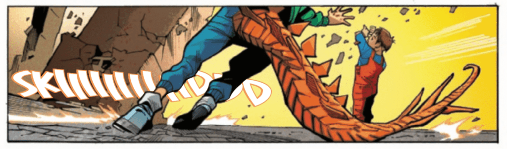
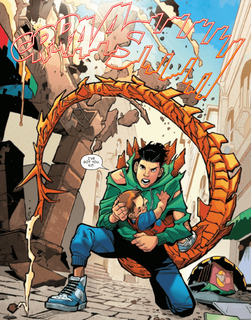
Reptil #1, out now from Marvel Comics, gives new life to the character and sets up a fun and fast-paced adventure.
Terry Blas writes Reptil #1 in such a way that the series welcomes readers unfamiliar with Reptil with open arms. There is a quick and concise retelling of Reptil’s origin and the introduction of new conflicts for the character. Blas keeps us entertained throughout the entire issue with twists, turns, and a gripping cliffhanger to end it all. Not to mention the way he is able to address the serious problems the characters are facing while also making much of the issue feel light-hearted. Blas also has the main characters use Spanish phrases throughout the issue, which adds to their character and makes them seem more three-dimensional.
The pencils of Enid Balám and the inks of Victor Olazaba give Reptil #1 the fun feel it needs. The style features emotive and cartoonish figures that allow for a pleasant tone for much of the issue and serious moods when the story calls for it. The figures in this issue are also incredibly dynamic, which causes fight scenes to draw you in easily.
Reptil #1 benefits significantly from Carlos Lopez’s use of color. The entire issue has a broad color scheme, which causes the story to feel energetic. At certain moments, Lopez chooses to have a single color dominate a panel, which is a highly effective way to make the mood of a scene clear. This technique isn’t often used, which helps make the moments where it is used more impactful.
VC’s Joe Sabino’s lettering talents do wonders to help the story in Reptil #1. The lettering is standard for many moments, but when things get heated, the lettering changes to reflect that. By having moments where the lettering isn’t very eye-catching and moments where it is, Sabino creates a contrast that is certain to catch the reader’s attention, especially when Sabrino provides some stunning choices for sound effects during fight scenes.
Reptil #1 is a fantastic reintroduction to the character that starts a new intriguing storyline while also filling in new readers into what happened before. The art is light and enjoyable and perfect for a series of this style. If you want to join in on a wild adventure, be sure not to miss this excellent start to a new series.
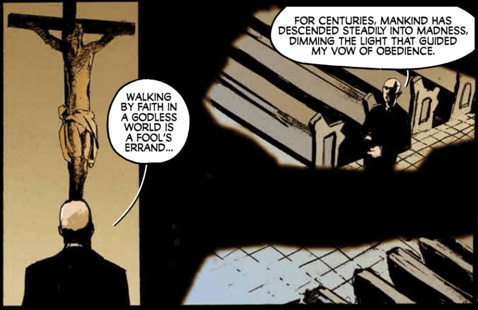
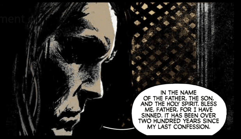
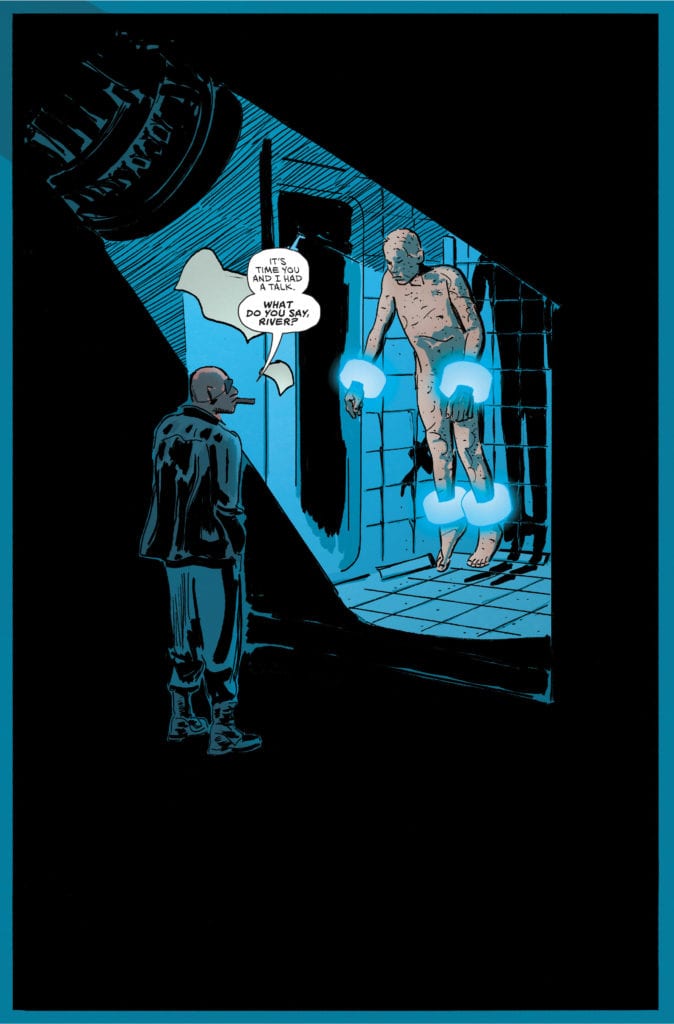
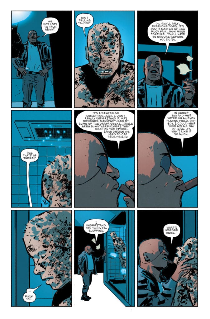
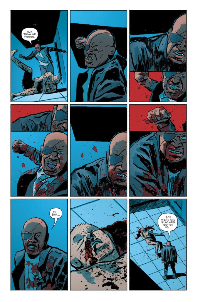
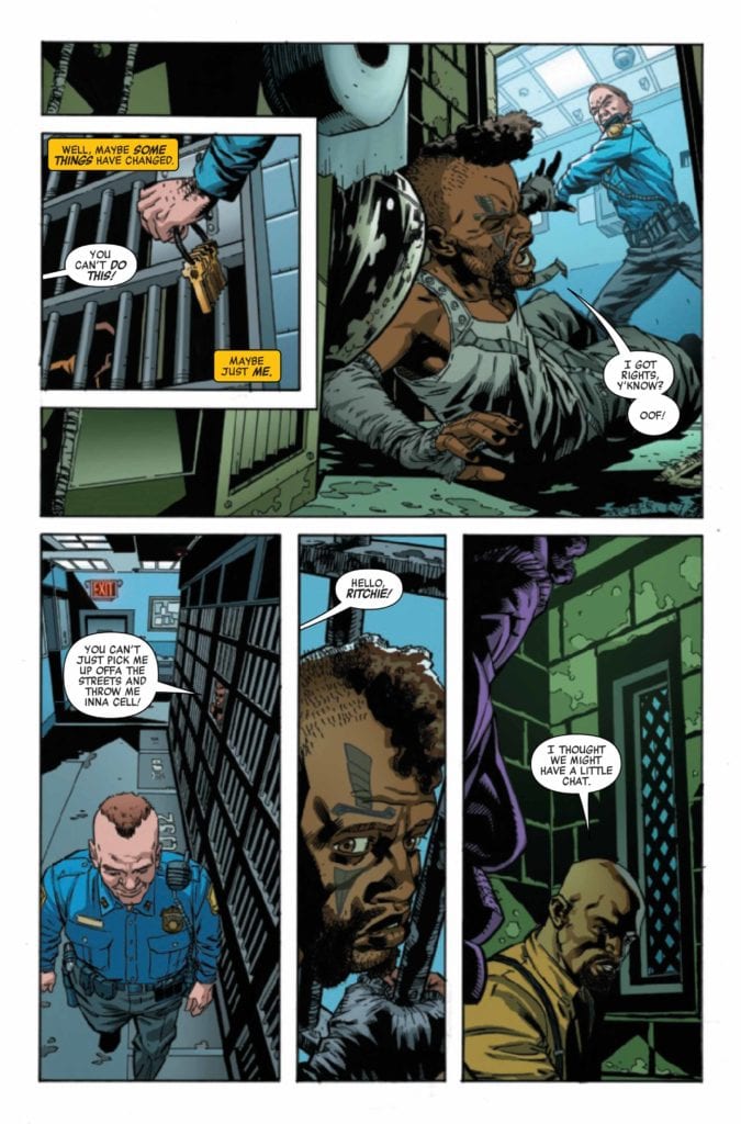
Killadelphia #13, out now from Image Comics, once again brings us a captivating story with stunningly gruesome art.
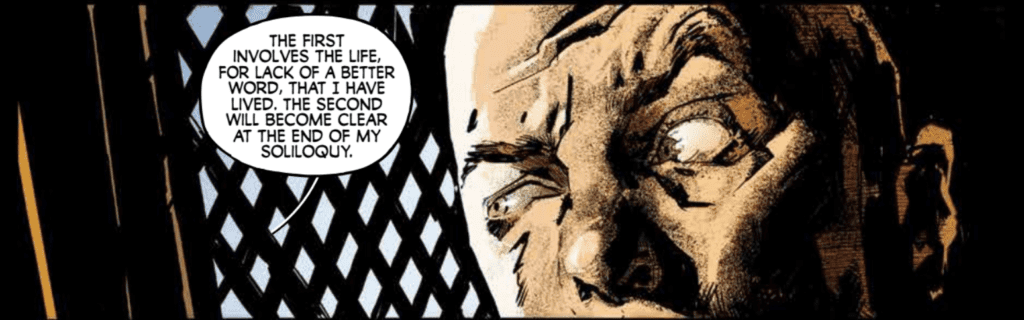
Throughout the series, Rodney Barnes provides several backstories for historical figures that have lived up to the modern-day as vampires and somehow he is always able to make these tales thoroughly engaging. It has been done for John Adams, Abigail Adams, several characters who lived through historical times, and now a new figure in Killadelphia #13. Barnes’ choice of having this backstory be told through a confession booth is an intriguing way to get the character monologuing, and it is highly effective. The issue also features an awaited confrontation between two characters, and the result does not let the reader down.
Killadelphia #13 is another issue filled with stunning art. Jason Shawn Alexander provides some gorgeous and gruesome imagery, expressive yet realistic faces, and impressive use of shadows. Many panels in this issue are composed of character silhouettes, which significantly helps the atmosphere of scenes. A panel that stood out in this issue had a character surrounded by a completely black background while they were coming to an important realization. The black blended in with the panel borders, so the void surrounding this character added lots of weight to this specific moment.
Luis NCT’s colors in Killadelphia #13 almost always focus on tone rather than the natural colors of the setting depicted, which results in a pleasant, stylized look. When a scene becomes violent and chaotic, reds will overpower the rest of the colors, making the scene more intense. It’s choices like these that make NCT’s coloring pair fantastically with the art of Alexander.
Marshall Dillon’s lettering in Killadelphia #13 gets the job done and allows the story to flow freely. Dillon uses several techniques to accomplish this. One such technique is providing a specific color for caption bubbles so the reader can be certain which character is speaking. The green color chosen for these captions is distinct from the rest of the palette, making it stand out from other captions. Dillon also changes the font and color of dialogue when some characters shout, and his font choices for sound effects always help scenes become more immersive.
You are missing out if you haven’t been following the Killadelphia series, and this issue reaffirms that point. Killadelphia #13 has the impactful moments and the beautiful art that this vampire tale has consistently provided us with, and it is not an issue you want to miss.
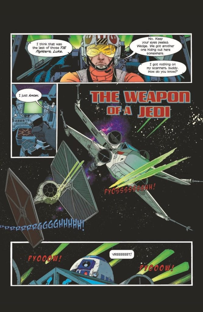
Luke’s Rebel mission takes a back seat on a journey from the Force. Available now from IDW Publishing and Disney, Star Wars Adventures: The Weapon of a Jedi #1 adapts Jason Fry’s 2015 novel. Written by Alec Worley and illustrated by Ruairí Coleman, the issue takes place somewhere between A New Hope and The Empire Strikes Back. Chris O’Halloran and Amauri Osorio provide colors and lettering respectively with design help from Germany’s 49 Grad Medienagentur company.
No classic Star Wars adventure would be complete without the usual suspects of Luke Skywalker, C-3P0, and R2D2. The gang’s all here in this issue. But here, Luke isn’t a Jedi quite yet. He has visions from the Force and senses things he doesn’t quite understand. So, when one Rebel mission is thwarted by an Imperial blockade, Luke follows the signs to the planet Devaron.
Homage
In fewer than forty pages, Worley and Coleman include two epic battles and carefully placed flashbacks that don’t slow down the pace. Other than a couple superfluous captions, everything is in service of character and plot. Worley’s script allows Coleman to show off the vastness of space and give us the action sequences fans expect.
THE FORCE CALLS LUKE.
Artistically, Coleman copies the aesthetic of the original trilogy with a Silver Age drawing style. That is: line work is thin, there’s lots of cross-hatching, and inks are blotchy. Moreover, Coleman makes full use of page space with plenty of master shots and POVs to heighten the tension in action sequences. It’s so aesthetically satisfying and a fitting homage to the original trilogy.
Adventurous Adventure
Maintaining the homage is O’Halloran’s color palette. Earthy green, ruddy yellow, and deep Navy blue dominate in diluted hues. Nothing stands out as being particularly warm or cold, saturated or de-saturated. It’s familiar and so cool precisely because it doesn’t change or try to “fix” the tried and true Star Wars formula.
However, my one nitpick is that Osorio overuses special effects. It felt as if the letterer was trying too hard to evoke the sound effects of the films. Otherwise, Osorio’s font choice and dialogue placement complement the overall style well.
Regardless, as a peripheral fan of the Star Wars franchise, I see this issue for what it is: good nostalgic fun. I may not be invested in the series’ continuation, but I can appreciate this as being accessible to newcomers and another item in a seasoned fans’ collection. Star Wards Adventures: The Weapon of a Jedi #1 is an adventure indeed.
Compass #1 (of 5) from Image Comics hits your local comic book shop on June 16; the issue feels familiar, but then opens up a world that is vast and rich with potential.
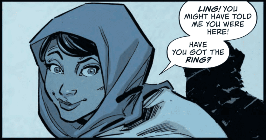
About COMPASS: Shahidah El-Amin is many things: scholar, cartographer, astronomer, mathematician, scientist, explorer, adventurer, and—when need be—two-fisted fighter. Setting out from Baghdad’s legendary House of Wisdom during the Islamic Golden Age, Shahi’s quest brings her to 13th-century Britain…where the Welsh are whispered to possess the secret of eternal life. But Shahi’s not the only one after it…
Writers Robert McKenzie and Dave Walker set up the story at a basic level without expanding on characters. This left parts of the story open for me to interpret, and it creates a shared journey between myself and the main character, Shahidah El-Amin. McKenzie and Walker also set up the first issue to build towards a specific moment, but cuts the reader off right before this moment. Where the story stops in the first issue is perfect because now I’m thirsty for the second issue. In the world of binging comics in trade form or watching a full season of TV in one sitting, it’s surprisingly satisfying to have to wait for the next issue and think about the story you just read. Since Compass has a mystery element, I can see people rereading the issue looking for clues.
Justin Greenwood has a Chuck Jones style to his art, which creates intoxicating moments with characters’ eyes. Greenwood’s artwork also brings several feelings to the table and forces me to adjust my perceptions. How Shahi moves in a panel, her smile, and the weapons she uses had me looking at the issue through the lens of Dick Grayson or Tim Drake, aka Robin, in the first action sequence as she is looking for the treasure. This is not bad because Robin is a character I like, and now there is a bond with Shahi by association. Then, as the story progresses, Shahi slowly breaks through the lens and becomes her own character, but never leaves my previous attachment. Greenwood changes how Shahi moves when she arrives in Britain, and this is where the “Robin” lens fades. There is a tougher, more determined feeling to how she is presented in a panel.
Daniela Miwa’s colors work well in the issue. The first half is very dark, with the back half very bright. The colors add to the storytelling elements as the world begins to expand as the pages get brighter. You literally go from tunnel vision to wide-open spaces. The dark colors make you focus on page details, where the brighter, more calming colors make you look at the page as a whole.
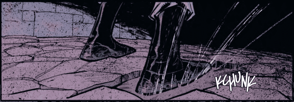
Letterer Simon Bowland doesn’t use a ton of sound effects, but when he does, you listen. The beginning of the issue is very dark and quiet, so when you read a “KCHUNK,” you almost jump out of your seat in fright. Bowland uses a well-balanced approach to the letter work that allows the reader to clearly understand the story and look for hidden meanings in the bold typeface.
Overall, Compass #1 (of 5) is a fun read with a solid mystery that grabs the reader’s attention. If you pick up the first issue, be prepared to have feelings and emotions that remind you of some of your favorite memories.
YOUTH Season 2 #3 hits the internet June 1st, but thanks to comiXology, Monkeys Fighting Robots has an exclusive six-page preview for you.
Sex. Drugs. Liquor. Murder. Superpowers.
About YOUTH Season 2 #3: One of the kids dies. One of the kids lives. Nothing is what it seems. The truth is revealed.
YOUTH Season 2 is by writer Curt Pires and artist Alex Diotto, with colors by Dee Cunniffe and letters by Micah Myers.
YOUTH is currently in development for Amazon Prime Video. It’s part of the comiXology Originals line of exclusive digital content only available on comiXology and Kindle. These titles will be available as part of comiXology Unlimited, Kindle Unlimited and Prime Reading at release.
Check out the YOUTH Season 2 #3 preview below:
Are you a fan of comiXology’s YOUTH? Sound off in the comments!
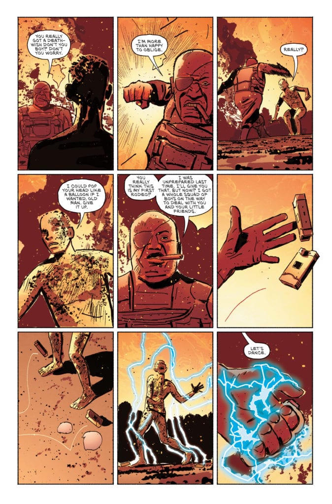
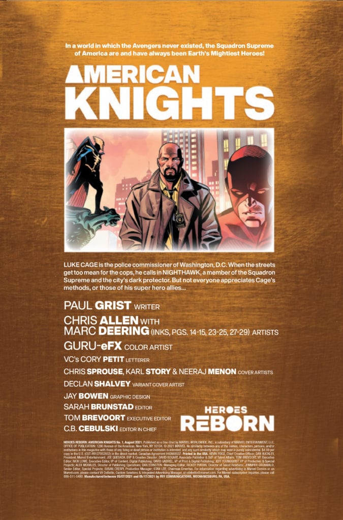
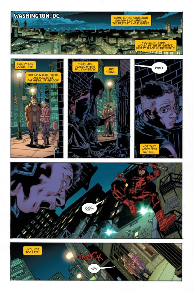
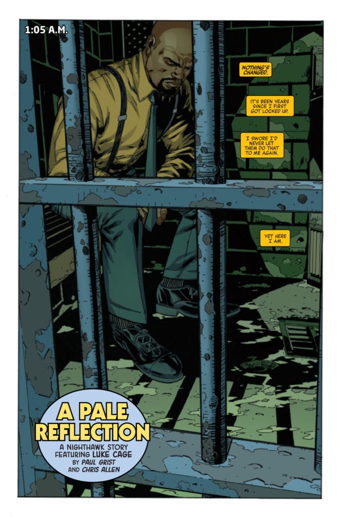
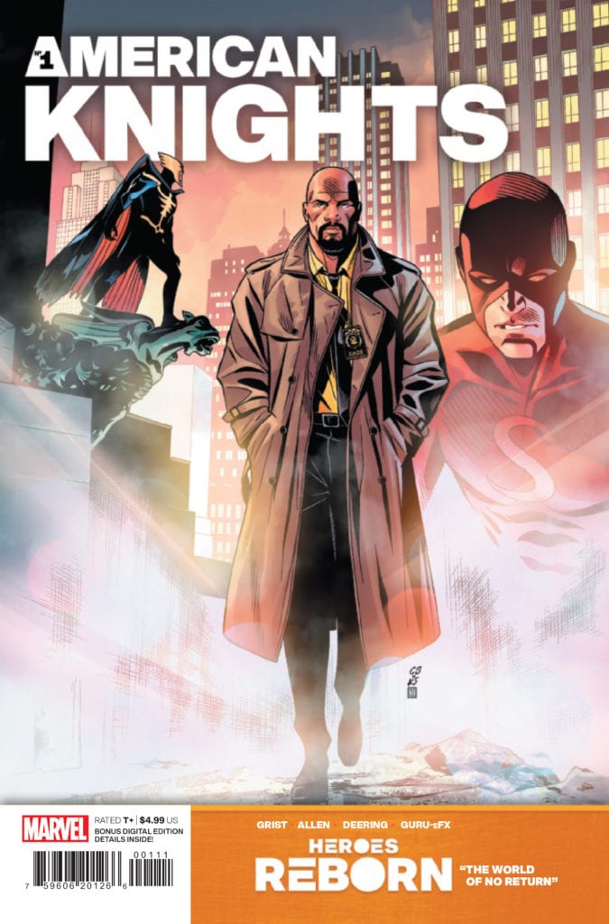
HEROES REBORN: AMERICAN KNIGHTS #1 hits your local comic book store June 2nd, but thanks to Marvel Comics, Monkeys Fighting Robots has an exclusive 4-page preview for you.
About the issue: An epic, oversize slugfest between the Squadron Supreme and an otherworldly group of Avengers for the final fate of the whacked-out world of HEROES REBORN.
The issue is by writer Paul Grist and artists Chris Allen and Marc Deering, with colors by Guru-eFX, and letters by Cory Petit. The main cover is by Chris Sprouse, Karl Story, and Neeraj Menon.
AMERICAN KNIGHTS is a 56-page one-shot set in the HEROES REBORN universe. It is a play on the street-level MARVEL KNIGHTS stories featuring alternate versions of Luke Cage and Daredevil.
Check out the HEROES REBORN: AMERICAN KNIGHTS #1 preview below:
What are you thinking of Marvel’s HEROES REBORN so far? Sound off in the comments!
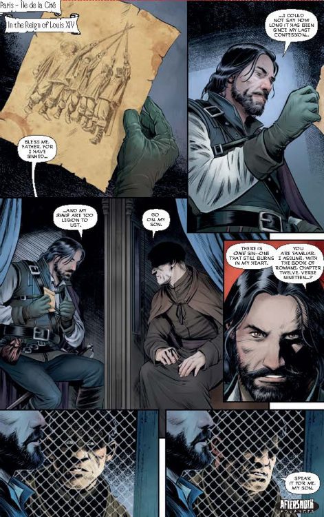
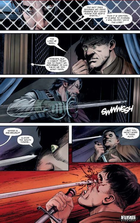
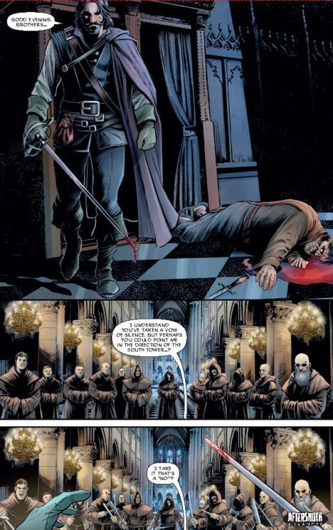
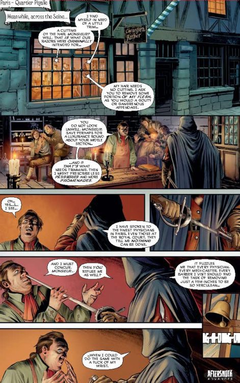
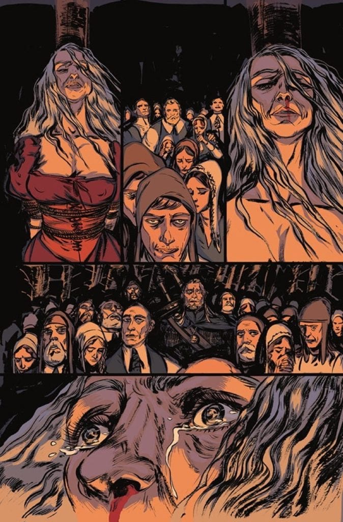
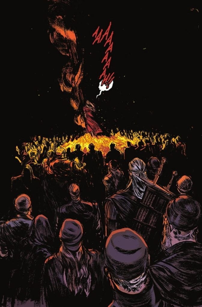
SEVEN SWORDS #1 hits your local comic book store June 16th, but thanks to AfterShock Comics, Monkeys Fighting Robots has an exclusive four-page preview for you.
About the issue: A weary and jaded D’Artagnan is drawn into a final conflict with the wicked Cardinal Richelieu, whose ruthless quest for power has led him to the supernatural. But the Last Musketeer can’t defeat these infernal enemies alone.
To save the world, he’ll need to join forces with seven iconic swashbuckling heroes: Don Juan, Captain Blood, Cyrano de Bergerac, to name a few. SEVEN SWORDS, who must overcome their host of differences and work together if they have any hope of thwarting Richelieu’s diabolical plans.
SEVEN SWORDS #1 is by writer Evan Daugherty and artist Riccardo Latina, with colors by Valentina Bianconi and letters by Dave Sharpe. The main cover is by Andy Clarke and Jose Villarrubia, with the incentive cover by JG Jones.
Daugherty has previously written films such as Snow White and the Huntsman, Divergent, and Teenage Mutant Ninja Turtles (2014).
Check out the SEVEN SWORDS #1 preview below:
Are you excited for SEVEN SWORDS? Sound off in the comments!
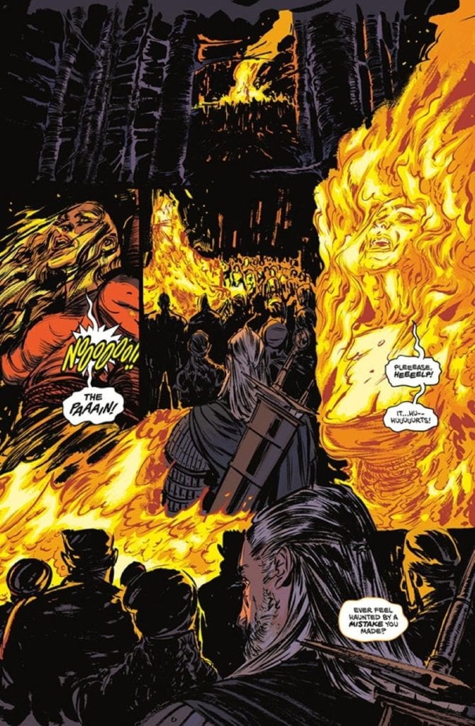
Writer Bartosz Sztybor and artist Vanesa Del Rey bring us the first issue of a four part mini-series set in the monster and blood-filled universe of CD Projekt Red’s masterpiece RPG trilogy. “The Witcher: Witch’s Lament” #1, with layouts by John Starr, colors from Jordie Bellaire, and letters from Aditya Bidikar, is a rough but entertaining start to this comic series. Uneven pacing and inconsistent art are saved by a fantastic atmosphere and characterizations that will take fans of the game series right back to this brilliant world based on Andrzej Sapkowski’s novels.
“Flames rise as a witch is burned at the stake. As Geralt searches for his next job, disturbing images of the fatal persecution appear before him, bringing an ominous warning.”
Writing & Plot
Bartosz Sztybor’s script for “The Witcher: Witch’s Lament” #1 does a solid job of setting up its immediate conflict and creating an eerie sense of tension from the opening page. The tone of the story is immediately crafted with Geralt watching a witch be burned at the stake, an event that he is responsible for in some way. Those who have played the Witcher games (or read the original novels, which this comic does not take as much influence from) know about Geralt’s complicated associations with witches and sorceresses, so seeing this as an opening is a seriously intriguing and emotionally conflicting start for any series fan. Sztybor nails Geralt’s characterization, from his gruff single syllable vocabulary to his internal conflict and thinly veiled remorse about his actions. His mercenary attitude is always just a front for his altruistic nature, but he still won’t suffer a fool or a double-cross. Unfortunately, this issue has a bit of trouble keeping its audience focused. It feels like the script can’t quite decide what the most important part of the issue is. This comic almost seems like its emulating the games in that its setting up side quests and subplots that complement the main arc; a maneuver that really only works in the gaming medium. There’s obviously an endgame in mind here, it’s just taking a roundabout way of getting there. This is still a solidly written issue that Witcher fans are sure to enjoy, it just has some bumps here and there that could easily be smoothed out in the coming chapters.
Art Direction
Visually, “The Witcher: Witch’s Lament” #1 is a properly atmospheric and eerie looking comic, albeit also a bit inconsistent. At its best, the pencils are absolutely stunning. Vanesa Del Rey’s thick and shade-heavy pencils populate this desperate world with an ever-threatening landscape and weary individuals. The ever-stonefaced Geralt of Rivia contrasts with the desperate, frightened, and scheming people he constantly runs into, perfectly replicating his visage and that dynamic from the games. The monsters are taken straight from CD Projekt Red’s artbook, with all the details there to make RPG fans rejoice. The panel layouts from John Starr are directionally easy to follow and flow reasonably well, making for a structurally solid reading experience. Jordie Bellaire’s colors are deep and varied, with an array of tones dancing across every surface and perfectly reflecting whatever light source is found in the panel (which in this world is only moonlight or fire, or nothing at all). Unfortunately, the way this comics dark atmosphere is handled can sometimes be a bit inconsistent. There are moments where it is hard to discern where the setting is and not just due to the comic’s atmospheric direction. This issue’s very stylized art direction can sometimes make character’s faces rougher than usual to the point where the art looks rushed. The lettering from Aditya Bidikar on the other hand is perfect for a comic set in this world, with scratchy and eerie font choices that vary based on character and tone of voice. This is a mostly solid looking comic, with just a couple of minor issue that drag the visual presentation down a bit.
“The Witcher: Witch’s Lament” #1 is a creepy and atmospheric opening issue that nails the voice and feel of the games (and novels) it is based on, while also a bit marred by some uneven pacing and inconsistent art. The character voice and main plot thread here is enticing and engaging to read, even though it can be hard to decides what needs to be focused on. The visuals are perfectly dark and unnerving for a nighttime hunt for ghouls and witches, although they can dip into the sloppy and rushed side from time to time. If you’re a fan of this grim and lore-rich universe, be sure to grab this issue when it hits shelves on 5/26!
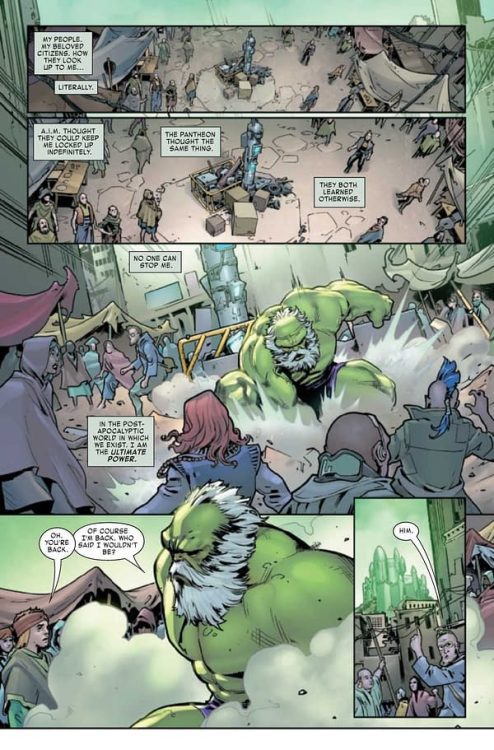
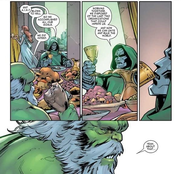
MAESTRO: WAR AND PAX #5 hits comic book stores on Wednesday, May 26th, bringing an end to this exciting Maestro miniseries. The Jade Giant found himself face-to-face with Doctor Doom, who he presumed to have perished with the other superpowered types in the past. Readers will witness a clash of titans in their vie for the throne in Dystopia. Bruce Banner might be the strongest there is, but Doom is known for having plenty of tricks up his sleeve.
Story
The story opens with an engaging internal monologue from Banner. Hearing how the tyrant views himself helps readers understand why he makes the choices he does. It confronts us with an unsettling question: If we had unlimited power, would we use it to rule over others? For Maestro, the answer is clear.
The city dwellers point Banner to Doom, who is now claiming the title of ruler in Dystopia. Readers would reasonably expect the two to dish it out upon meeting, but, surprisingly, they exchange formal greetings. They even have a shared meal. All seems too good to be true until Banner reveals the wine Doom sipped was poisoned, leading to the clash of egos we were waiting for.
Though the two often found themselves at odds in the past, something seems more enticing about this interaction. The jabs, insults and monologuing between these two is priceless. If readers didn’t know Banner had crossed the threshold into full villainy, they do now.
Peter David’s narrative writes both characters with impressive authenticity. These two are more similar now than ever before, yet they retain the unique aspects of their personalities that led us to love them.
Artwork
Javier Pina and Germán Peralta’s penciling and ink work, Jesus Aburtov’s coloring, and VC’s Travis Lanha’s lettering offered high quality illustrations for readers. The bulging muscles, colorful sorcery and destroyed buildings throughout the story’s setting draws us into its world. We also loved how the word balloons framed each moment of action, giving readers the details they needed while pointing them to the visual elements.
Conclusion
MAESTRO: WAR AND PAX #5 wraps up this miniseries in perfect Hulk fashion. The massive power of each opponent is only matched by their enormous egos.
What do you think lies in store for the citizens of Dystopia? Let us know in the comments below!
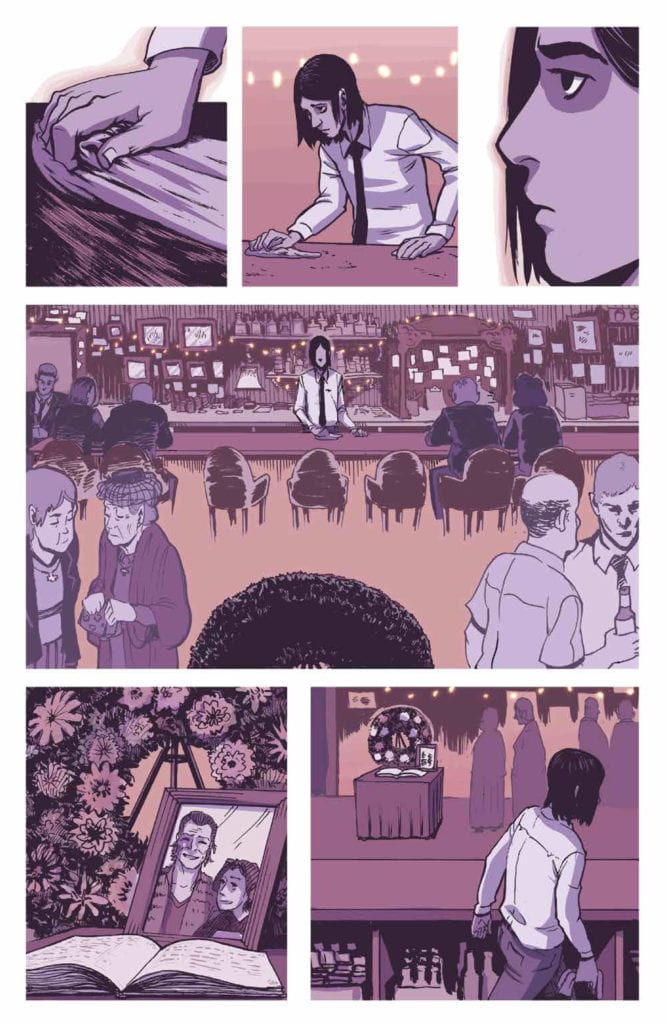
For a tale that takes a twist into unsettling waters, The Down River People from Archaia is an enthralling and moving story. Through the antagonist’s journey, Adam Smith and Matthew Fox are able to touch the reader’s heart while playing with modern horror tropes.
Smith and Fox use the long format of the graphic novel and create an undulating rhythm in the narrative that spreads across 13 uneven chapters. It touches on family loss, family reunion, police brutality, honor, and tradition. And through it, all Myers, the central character, has to deal with the growing depression within himself. It is a comic with many levels, and as a reader, you will have the urge to rip away at them to get to the end. However, Smith and Fox constantly slow you down and force you to experience the comic at their speed.
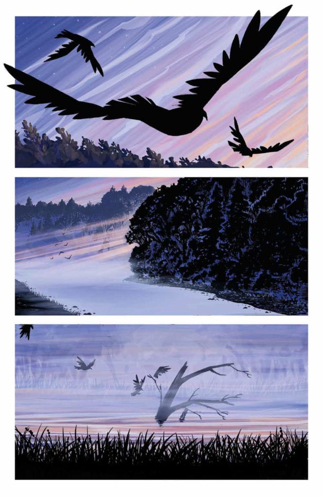
The Down River People Credit: BOOM! Studios
On the Bank
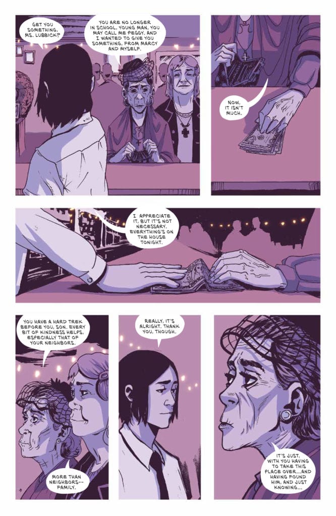
The opening three pages, which are almost wordless, set the scene beautifully for the rest of the book. Fox slowly introduces you to the world of The Down River People, swooping you in like one of the birds depicted in panels. The sequence also highlights one of the main features of Fox’s design for this book; minimalist mise en scene. The scenery is expressively rendered but always at a distance, a beauty to behold but not encountered. This contrasts Myers’ home and his life, where the sets are as simple as the flatbed trailer bar, and the props are sparse. There is a strong focus on two aspects of Myers’ life within the opening chapters, and almost all of the props guide the reader to these two things: alcohol and music.
Fox’s artwork is lyrical and focuses on the details; the wrinkles on an old man’s face, a close-up of a family photograph, or the constant reference to drinking through images of glasses and bottles. Myers’ life is soaked in the business of buying and selling alcohol. This appears to be his world but is it only because it was inherited from his father, Darnell? There is an emptiness to Myers’ life when we are first introduced to him, and this comes across superbly thanks to Fox’s manipulation of the world we see. This emptiness is explored in the narrative as Smith slowly reveals the details of Darnell’s death and the reappearance of Myer’s estranged mother. The book’s first half is an emotional toil for Myers, illustrated by constant drowning imagery as the antagonist is metaphorically pulled out of his depth.
The Down River People Credit: BOOM! Studios
Into the River
Some of the greatest horror films have slow build-ups that could be mistaken for a slice of life drama. Films like Audition by Takashi Miike, Midsommar by Ari Aster, and Nicolas Roeg’s seminal 1973 movie Don’t Look Now, all ease the viewer into a world before tearing it apart. The Down River People follows the same pattern of storytelling and is able to do so because of the graphic novel format. Smith and Fox build an encompassing, realistic world full of grief and cruelty over the space of 200 plus pages. The mundane, day-to-day life that Myers lives, despite his father’s death, is central to the opening chapters, leading the reader to believe that the plot could go down the ‘man against the system’ route. But there are hints that something else is coming and when the narrative shifts, the disturbing horror takes hold.
The horrific element of The Down River People is not of the slasher fair or grotesque demonic nature; it stems from a disturbing cult and the power the leaders have over people. Myers’ journey is about becoming dislodged from his life, and this leaves him susceptible to outside influence. The cult becomes a metaphor for the unstable and insecure world that has been born in recent years. The anxieties and paranoia that have spread through social media and even infiltrated legitimate news companies are repurposed here into a hierarchy of worship. Power is used to manipulate the weak, and the creepy mandate of love, which is used to cover the cruelty, makes your skin crawl more than any deformed, monstrous beast will ever do.
The Down River People Credit: BOOM! Studios
Style and substance
The pacing of the narrative and the page layouts draw you in and control your path through the book so that it becomes nearly impossible to put down. Even as the disturbing elements begin to emerge, the creators have you transfixed like one of the cult members. Part of the charm is the poetic nature of the art/text combination that elevates the experience by creating a magical-realist world—a place of wonder even when in disorder.
The devil is in the details, and The Down River People pays close attention to those details. Fox’s artwork is carefully crafted to draw the reader’s attention exactly where it needs to be. This is helped significantly by Mike Fiorentino’s lettering. The lack of harsh black lines around the speech balloons allows the text to sit within the image much better. It becomes a part of the scene. It also allows for greater emphasis within the speech itself. A word in bold stands out against the whiteness of the balloon.
The color works in much the same fashion as the lettering. Fox’s simplified color washes create a tone and a sense of location but do not overpower a scene. The color provides the backdrop for a page while the panels let the characters come through and be noticed. At times the colors create an idyllic, peaceful environment for cast interaction; at other times, there is a coldness that fuels the conflict in the narrative.
The Down River People Credit: BOOM! Studios
Conclusion
The Down River People is a thoughtful, moving, and then disturbing dreamlike narrative. It is a gripping read from the first chapter, with the creators having complete control over the reader. It is easy to read in a single sitting but demands that you take your time. This will be several hours of your time well spent.
Horror is experiencing a surge at the moment, even infiltrating the Big 2, and comics have a unique position to explore this genre, a visual medium that is to a large degree not constrained by budget requirements. Barry Windsor-Smith has recently returned to the comic world with a monstrous graphic novel packed with grotesquery. In Smith and Fox’s book, a subtler examination of the human spirit is played out with modern horror motifs leading the way. It has a slow build-up but is extremely rewarding at every step of the way.
This book took hold of me like no other comic has this year, and I highly recommend it. It’s for fans of the medium, fans of the genre, and fans of great storytelling. There is a lot to discover in the narrative and the artwork, making you want to re-read before even putting it down for the first time.


 Terry Blas writes Reptil #1 in such a way that the series welcomes readers unfamiliar with Reptil with open arms. There is a quick and concise retelling of Reptil’s origin and the introduction of new conflicts for the character. Blas keeps us entertained throughout the entire issue with twists, turns, and a gripping cliffhanger to end it all. Not to mention the way he is able to address the serious problems the characters are facing while also making much of the issue feel light-hearted. Blas also has the main characters use Spanish phrases throughout the issue, which adds to their character and makes them seem more three-dimensional.