DC Comics’ Dark Knights of Steel #1 looks simply like it’s taking DC characters and putting them in a medieval setting. But that’s just the tip of the iceberg. Writer Tom Taylor, artist Yasmine Putri, and letterer Wes Abbott make huge changes to these DC characters, showing us that anything is possible.
Writing
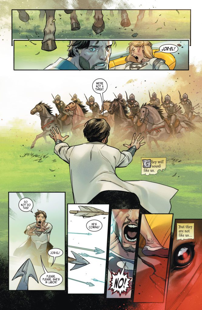
Taylor has fantastic knack for shaking things up. From his work on Injustice to Suicide Squad, Taylor has shown he likes to see familiar characters working through uncomfortable new dynamics and circumstances, with real stakes. It’s refreshing. The safety of it being a “superhero comic” is stripped away by Taylor’s audacious scripts. And in the very first scene of Dark Knights of Steel, Taylor proves that this series is no different. He takes the most familiar origin story in DC Comics and changes it, drastically. As the issue progresses, we see that his changes ripple out into the world he’s practically building from the ground up. We’re no longer sure who is a hero and who’s a villain. Better yet, we have no clue what’s going to happen next.
Art & Coloring
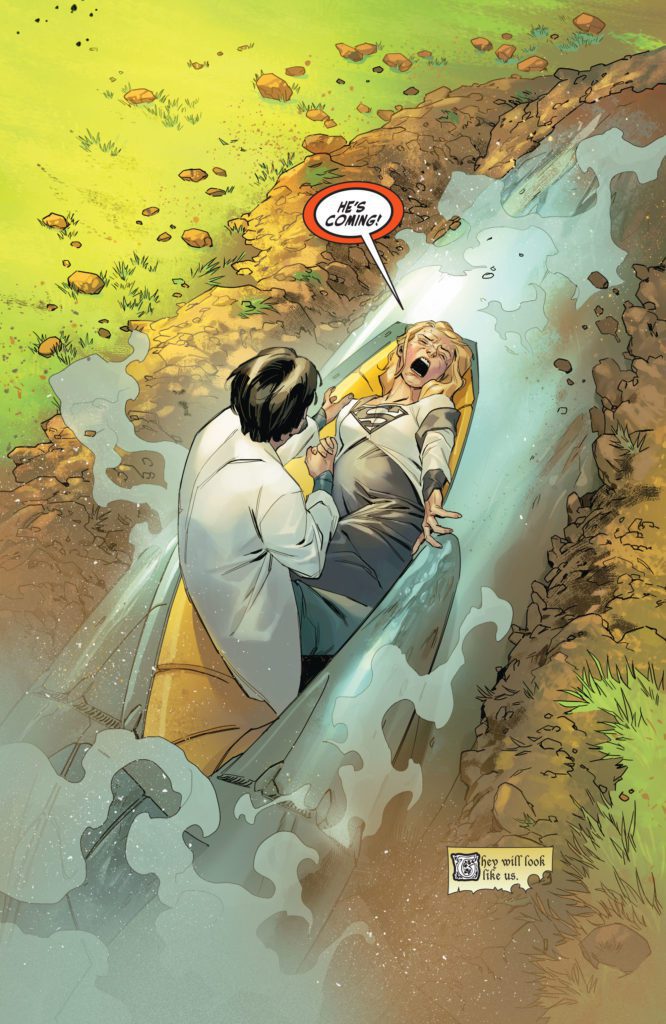
Putri bounces back and forth between deeply emotional beats and light, funny ones. She seems just as comfortable drawing Constantine, convulsing on the floor from prophetic visions, as she is drawing Harley Quinn’s cartoonish expressions as she taunts the Bat Prince. At one point, Putri gives us reason to question whether these versions of Superman and Batman – here, he’s called the Bat Prince – are quite like the characters we’re familiar with. We see Superman pictured in cool blue. He’s holding his hand over a woman’s mouth, looking at her with curiosity. The next panel shows the woman in red, then we see the Bat Prince in the same cool blue tone, holding the hilt of his sword up where the woman’s head had been.
Putri makes the movement of these panels seem almost like a standoff. It reads innocently enough, but the coloring of the scene sows the seeds for tension and strain in this pivotal relationship. Putri also gives each scene a real sense of timing with her coloring. The lighting of each scene changes, making it feel like we experience a full day with the characters. It’s a small thing that makes a big difference, putting readers right into the story.
Lettering
From the get-go, we’re introduced to a world of chaos. The large “RRRRRMMBBBLLLLLLE” of a planet breaking apart finds its way into each panel. But once the characters have gotten clear of the destruction, the chaos doesn’t subside. Dialogue and sound effects zigzag randomly across the page, making your eyes dart around to take it all in. Abbott makes the scene feel overwhelming. It puts readers right into the minds of the characters. Readers feel the chaos and tension, all from the balloon placement and spacing, just as the characters experiencing it all do.
DC Comics’ Dark Knights of Steel #1 not only introduces us to a new world but to what feels like a whole new set of characters. This creative team is boldly changing up classic stories to cast them in a new light. Pick up Dark Knights of Steel #1, out from DC Comics November 2nd, at a comic shop near you!
DC Comics’ The Human Target #1 starts with a dead body. It’s not floating in a pool, but it’s still the kind of opening that would make Billy Wilder proud. So much of The Human Target borrows from classic noir stories, namely those of legendary writer/director Billy Wilder. It’s part Sunset Blvd, part The Lost Weekend, with a dash of Double Indemnity. Writer Tom King, artist Greg Smallwood, and letterer Clayton Cowles present a hard-boiled mystery about a doomed private eye, who has a knack for theatrics and disguises. This issue is one that’s steeped in dramatic irony, so be warned that spoilers abound!
About The Human Target:
Originally created as a side character in Detective Comics by Edmond Hamilton and Sheldon Moldoff, “The Human Target,” Fred Venable, was a man who offered a very specific service. Venable would dress up as his clients, people who were wanted dead. Then, when an attempt was made on his life, he’d be there to catch the killer red-handed.
Rebranded and rewritten now as Christopher Chance, by Len Wein and Carmine Infantino, Chance carried on Venable’s legacy as the Human Target in the pages of Action Comics. Now, King, Smallwood, and Cowles bring Chance back to DC Comics. He’s down on his luck, doomed from the start, and hopelessly in love. It’s everything you could want in a superhero-studded detective story.
Writing
This isn’t King’s first outing into noir territory. His writing often employs noir devices, but The Human Target sees King embracing those influences to their full extent. King writes from Chance’s perspective. Chance has all the charm and panache of Humphrey Bogart. He’s confused, even desperate, beneath a cool and calm exterior. He references Fred Astaire and says words like “dandy.” And Christopher Chance, like the best noir protagonists, is totally self-destructive. Of course he is, who would do his job if they weren’t a little ready to bite the bullet? But the way King writes him, you can’t help but love him.
King also commits, wholeheartedly, to the dramatic irony of this story. Not only do we see Chance, quite literally, in his deathbed as we open, but King shows us a one panel snippet of each day that led up to this moment, before taking us back to the beginning. These single panels range from pivotal moments – gunshots and fistfights – to innocuous banter. But it sets the tone for this series. This looks like it’s going to be a series about the overwhelming evil of man, and the little meaningful moments of kindness that happen in the pauses between the waves of chaos.
Art & Coloring
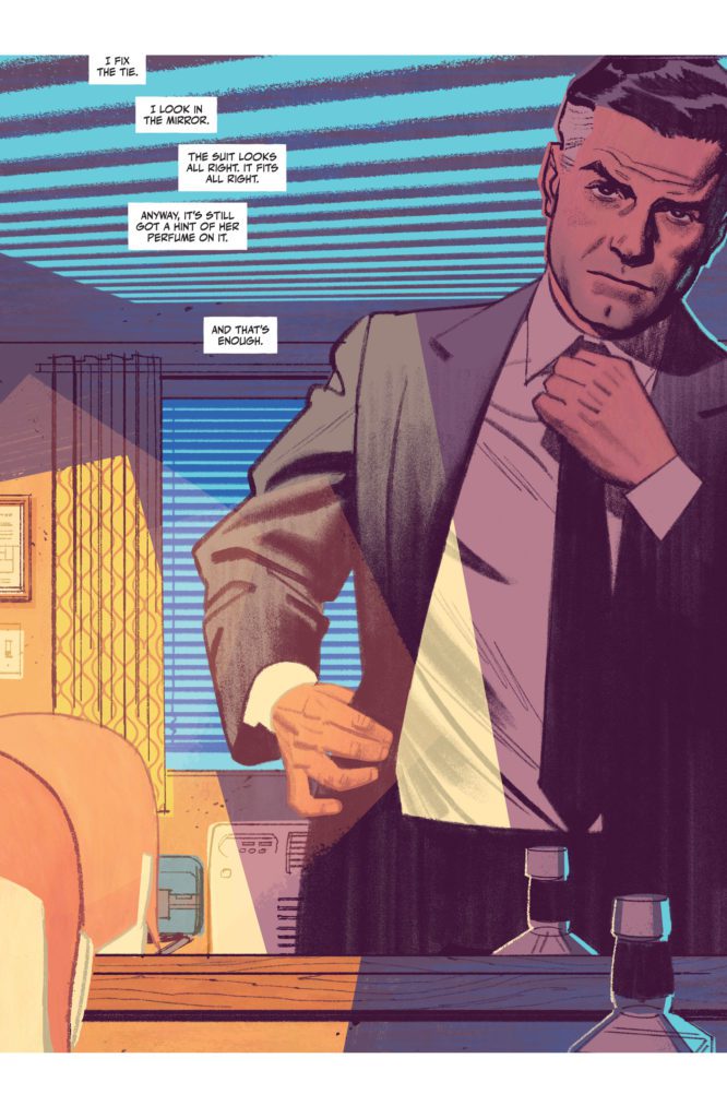
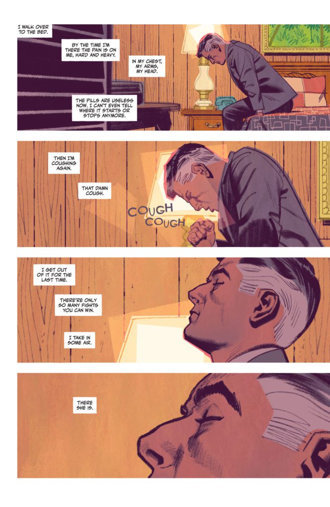
Smallwood’s art is incredibly cinematic. When Chance lays down in his bed, Smallwood closes in on Chance’s closed eye, zooming in with each panel. Smallwood lulls us into the rhythm of this story. It’s the slow, easy pace of a mystery that is going to be steadily unraveling. We see Chance from above his bed. He looks peaceful. But the next panel shows Chance from a similar angle, only now he’s being slapped across the face. The panel isn’t colored in the soft blues and browns of the previous pages. It’s a neon green.
Smallwood, himself, almost seems to be slapping the reader across the face. He’s waking us up with this sudden shift. It introduces us to the violence in this story, too. And Smallwood continues coloring the comic this way. Scenes of a dark blues, with a smidge of green, are interrupted by moments of dark red. He’s telling us this is a series where peace is fleeting. And Smallwood is telling us this in the most visually stunning way possible.
Lettering
Many of the sound effects are part of Smallwood’s art. He draws in the scattered “CLAP” noises of an audience’s uneven clapping. The subtle “RING RING” of a phone next to Chance’s head is shown in small blue letters. Many of the louder sounds, like the “BANG” of a gun or the “KRAK” of a punch, are used as panel borders. It shows how those moments are defined by that noise and what’s making it.
Cowles’ lettering for the captions and dialogue gives this comic such a smooth, slow feeling. The captions snake lazily through the page, effortlessly connecting panels together. When Chance begins to think that something might be wrong with him, the lettering changes. It begins to bounce around panels, mimicking the frantic nature of Chance’s thoughts. And once Chance knows what’s going on, the lettering resumes its gentle course through each page.
King, Smallwood and Cowles are wearing their influences on their sleeves. They’re harkening back to old noir movies, seamlessly adding little nods to these classics into a story that feels destined to become a classic, too. King’s script is engrossing, Smallwood’s art is hypnotically beautiful, and Cowles’ lettering sets the pace perfectly. Pick up The Human Target #1, out from DC Comics’ November 2nd, at a comic shop near you!
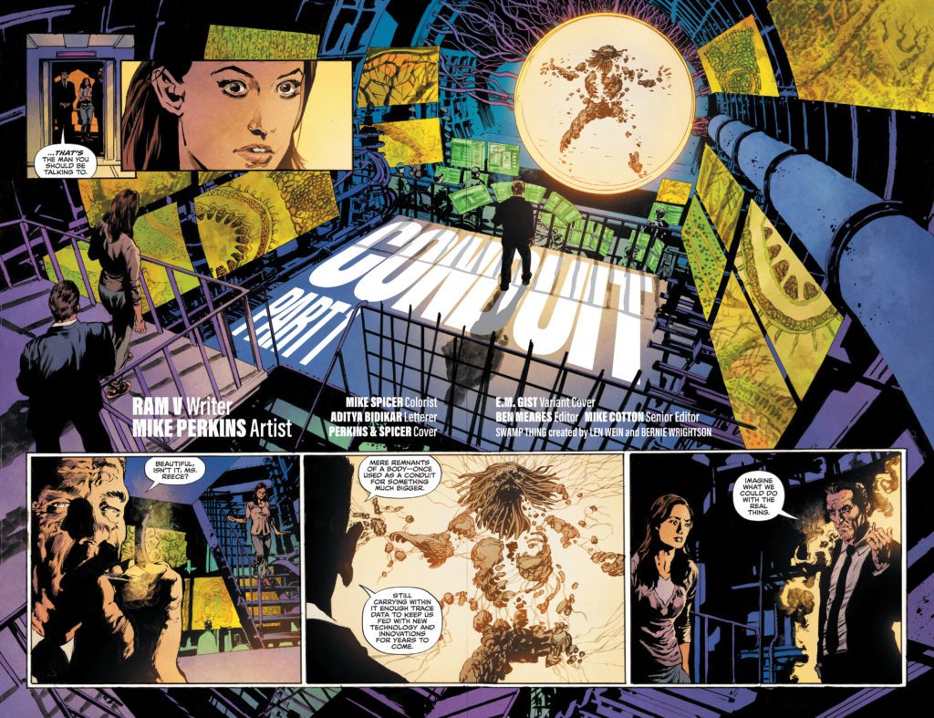
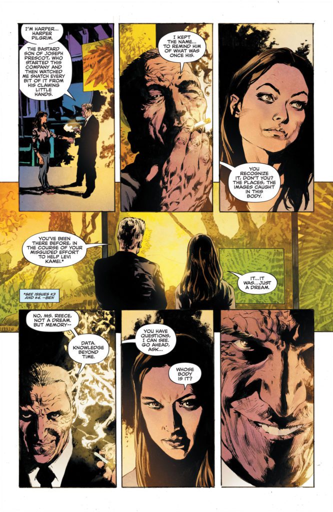
DC Comics’ The Swamp Thinghas been a story about a lot of things. It’s a series about environmentalism, the immortality of ideas, and it’s a story about family. The Swamp Thing #9 manages to touch on all of those themes, while also eagerly employing classic comic book tropes. Writer Ram V, artist Mike Perkins, colorist Mike Spicer, and letterer Aditya Bidikar have tons of fun withThe Swamp Thing #9. It’s an issue with lots of heart.
Writing
V brings all of the threads of this sprawling series together. Our mysterious villain, Mr. Pilgrim, and our heroes are finally meeting face-to-face. And, nearly immediately, Pilgrim begins monologuing. V’s pulling right from classic comics with this scene, and it feels just right. Part of what makes Pilgrim’s history lesson work is that V is constantly jumping around in this script. We see Levi racing to the rescue, thinking back on all the omens and warnings he’s scene that have told him everything would lead to this, then we come back to hear more about Pilgrim’s plans.
As we reach the final scene, V shows how his deep, philosophical character study and his pulpy, tropey comic script fits together. Braiding both aspects of the story together seamlessly, V leaves us on a rousing story beat. It will leave you on the edge of your seat, waiting for the last issue in this miniseries.
Art
So much of this comic’s ability to have its cake and eat it too comes from Perkins’ brilliant art. When V’s script transitions from a pulpy action sequence to a scene of Levi wrestling with his past, it’s Perkins who makes the switch feel seamless. That’s because, even in Perkins’ action sequences, you can see the fear in Swamp Thing’s eyes. He never loses the humanity at the core of this story. But he’s also full of the comic book tropey fun, too. Pilgrim’s face shows up in a variety of sinister expressions throughout the issue. He’s a character who’s evil and proud of it. Perkins makes the character terrifying, though you still can’t help but kind of love him too.
Coloring
In this issue, we see Pilgrim’s collected research on the Swamp Thing. He has screens lit up with decades of research. Each screen, Spicer colors in a shade of green. But it’s not the rich, dark green that we’ve become familiar with in this series. It’s a yellowing green, a green that almost seems to be rotting. With this, Spicer makes Pilgrim’s efforts to connect to the Green look counterfeit and off. Then, when Levi shows up as the Swamp Thing, we see the deep green of nature come flying into the picture. Spicer’s coloring is both stunning and meaningful.
Lettering
Bidikar’s lettering choices are always rich with purpose. When we see one of Levi’s memories, the dialogue is shown in a faded grey font. It’s easy to picture the sound of it, like an echo in your head, not something you hear out loud. Later, Bidikar shows Swamp Thing screaming in desperation. The letters burst past the outline of his word balloon, like they can’t be contained. Then, as the issue closes, we see Swamp Thing speak his first bolded word. Bidikar holds off using bold earlier in the issue to give this final moment all the punch it needs.
DC Comics’ The Swamp Thing continues to be bafflingly beautiful. V, Perkins, Spicer, and Bidikar have delivered a series that’s both complex and fun at the same time. This issue sets us up for a grand finale. Hopefully, that’s not the last we see of these characters. There still seems to be plenty of story to tell. Pick up The Swamp Thing #9, out from DC Comics November 2nd, at a comic shop near you!
If you ever wanted The Neverending Story re-made with Jewish themes and characters, The Unfinished Corner is your answer. Available now from Vault Comics’ middle-grade imprint, Wonderbound, The Unfinished Corner is an adventure graphic novel following four kids and an angel. They travel through dimensions, seeking to find and finish God’s legendary unfinished corner of the universe. This marks the debut of writer Dani Colman. Her collaborators include illustrator Rachel Petrovicz, colorist Whitney Cogar and letterer Jim Campbell.
Full disclosure, Ms. Colman was an instructor of mine at Academy of Art University, and I’m quite sure she was working on this book while instructing my Writing for Comics course. At the time, I was in the process of my conversion to Judaism and trying to write my own eight-page Jewish adventure comic. That was nearly four years ago. While my script is collecting dust in my file box, I get to enjoy the product of Ms. Colman’s years-long effort.
I give you the above story in order to make a point about writing. You see, I have found it difficult to decide what exactly I want to say about my relationship with Judaism. It seems my problem lies in how relatively new I am to the faith. In my opinion, The Unfinished Corner represents a mature view of Judaism, neatly packaged into a narrative that encourages young Jews to create their own stories. That said, I wonder if I might have found my way to Judaism sooner if I had had this book as a kid.
LILITH AND HER DEMONS.
Repairing the World
Colman’s mature, moving and timely storytelling emphasizes the theme of tikkun olam (repairing the world) and gives perspective on Judaism. However, my one issue with the book is the feeling that the third act was a bit rushed. Once the kids are granted access to the unfinished corner, it only takes one panel for the completed corner to be revealed. In fact, Miriam is hardly ever shown drawing in the book, despite art being her passion. If more of the process of finishing the corner were shown, then the third act would have had more impact.
Artistically, the team clearly had fun creating the look of this book. For one, the use of natural-looking lights and shadows lent a sense of realism to an otherwise cartoonish overall design. Furthermore, Cogar’s color palette is as diverse and vibrant as the characters. In the heavenly realms, the colors consist of cold purples, blues, pinks and greens. Not only do these colors help differentiate between realms, but they present a fantastical, playful image of what the heavens are like. It’s nothing like readers could imagine themselves.
Speaking of playful, Petrovicz’s layout gives the book a distinct whimsy. For example, one of my favorite pages of the book follows the kids as they traverse a precarious mountain. Petrovicz brilliantly shapes each panel as a rocky feature of the mountain. Hands stretch across the gutter of a panel as if it’s a narrow passage, and the top of a cliff becomes its own panel.
MIRIAM AND AVI CHAT ON THE BUS.
Coming of Age
This personality carries over into Campbell’s lettering as well. He uses broad, scratchy font for most of the SFX, but is understated when necessary. For example, when the kids are searching for the Golem of Prague, the focus is placed on the dialogue, while the sound effects are shown in small font. By doing this, Campbell effectively builds ambience within the two-dimensional space. It’s part of what makes the Golem of Prague scene one of my favorites in the whole book.
Ultimately, The Unfinished Corner is a heartwarming adventure and coming of age narrative for Jews and non-Jews alike. Also, as an adult, I can say the book has appeal for all ages beyond its target middle-grade audience. Everyone can and should find joy and inspiration from this wholesome graphic novel.
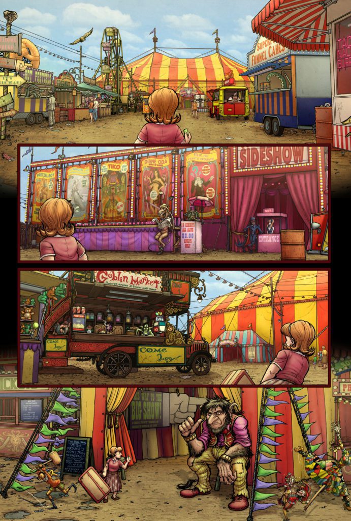
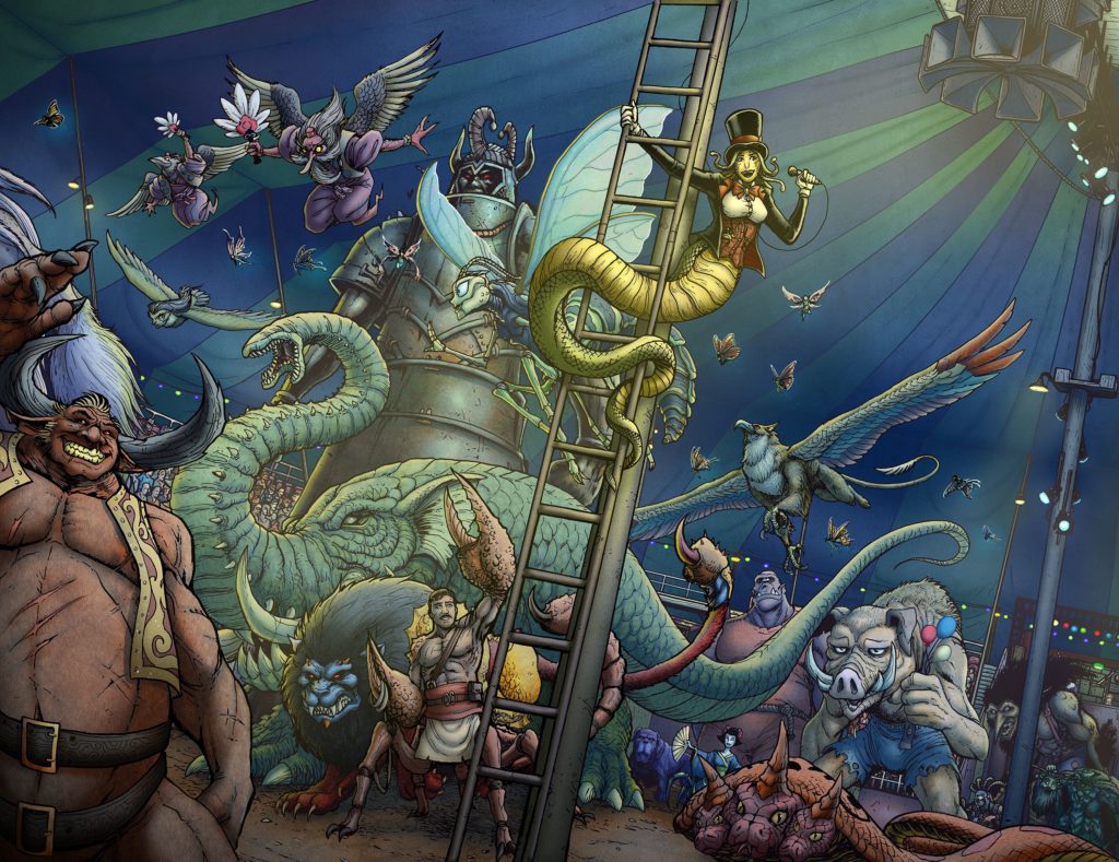
Miss Medusa’s Monstrous Menagerie #1 is a title Unlikely Heroes Studios previewed back in Elsewhere Volume 2. With the Kickstarter going on until November 5, now’s a good time to show everyone that it’s well worth following. Not only does this issue expand on the story from the anthology, it shows off the passions of this creative team.
Press Release Summary
From the official press release: It’s 1963, and having a carnival of 666 monsters ain’t the draw it used to be. Miss Medusa’s Monstrous Menagerie is one of the last two Mythic shows left in the U.S., trucking from one backwater town to the next. It’s dirty work, and sometimes you barely make the nut, but America’s still the land of plenty (of rubes). For this season at least, Miss Medusa’s hiring, and you can still run away and join the circus!
Miss Medusa’s Monstrous Menagerie #1 Memo
Miss Medusa’s Monstrous Menagerie #1 builds up from the initial Elsewhere story in atmosphere and character. Through the POV character Sharon, the reader feels a strong sense of going into the unknown. Series writer Paul Hanley injects the issue with genuine wonder and the tension of sharing a space with monsters. Some of them, like the title character Gina Tatapolous, are surprisingly human. Along with their outgoing personalities, the financial struggles they face are all too relatable. Readers can feel Sharon’s need to be a part of the circus, in spite of Gina’s hustling.
The Most Colorful Detail
Miss Medusa’s Monstrous Menagerie #1 features the talents of several brilliant artists. In addition to being the writer, Hanley illustrates some very lively backgrounds. Matt Frank, meanwhile, has the honor of designing the larger-than-life monsters that populate these settings. Both of which entice readers to reread the issue to see the little things, hidden in each panel. Those elements tell stories independent of the main one. Fortunately, Frank’s bold inking around main characters keeps readers’ focus in case they wander too far.
The coloring in the meantime is a group effort which brings out the richness of the art. Rob Cloma works the flats, while Hanley and Jon Kutzer handles flourishes like shading and lighting. All of these together create an almost photorealistic appearance. It gives the feeling that the reader is looking at something that is actually happening.
All of this is to say nothing of the phenomenal lettering of Matt Krotzer. All of the captions and words over the microphone are in an all caps comic sans font. It makes the words sound as loud as they intend to be. Most of the regular dialogue meanwhile is in a smaller font, with a few exceptions. For example, a Harpy has a big scratchy font while fae folk speak with a fancier font. It’s also important not to forget the SFX for situations like a fairy dog’s barking or an artistic rendering of a crash sound.
Reserve Your Ticket For Miss Medusa’s Monstrous Menagerie #1
Miss Medusa’s Monstrous Menagerie #1 makes a grand first impression. To go along with the outrageous designs of the monsters and lively circus, there is a feeling of embracing the unknown. The characters feel very human in the best and worst ways. But the uncertainty of where it all goes is far too alluring to ignore.
Gamblers have a reputation for being bold, daring, and adventurous at least in the movies. They’re not afraid to be different from the crowd or take risks just for the fun of it. Although gambling is seen as an undesirable behavior by some people today, gamblers have been around since ancient times. Accordingly, there have been a lot of famous gamblers throughout some of our favorite comics and video games,
In this article, we take a closer look at five of the most famous gamblers in pop culture. We also explore how these characters are connected to the gambling world and why they enjoy throwing their money away so much.
Gambit
Gambit from X-Men is one of the most famous gamblers in comic history, and he loves to take risks with his fellow mutants when it comes to facing evil forces that might be lurking around every corner.
Gambit’s main weapons are playing cards he imbues with kinetic energy, lending a pinkish glow to the cards as he uses his mutant powers to manipulate them. He’s known for having a good time and is always up for an adventure.
His love for gambling often gets him in tough spots, but he always manages to come out on top—and we love him for it.
The embodiment of the lovable scamp archetype, Gambit is a fan favorite for his charming, unflappable, and risk-taking personality.
Two-Face
Two-Face, the villain from Batman is known for being a ruthless killer with an affinity for all things gambling. He began his life as straitlaced District Attorney Harvey Dent but after an accident, he
Two-Face loves to play games of chance because he believes in Lady Luck, even when his luck runs out and gets him into trouble. His obsession with flipping coins to make decisions about what course of action he will take keeps both himself and Batman on their toes at all times.
Two-Face is introduced to the concept of gambling through his famous coin that he uses to make a decision between good and evil. However, we don’t actually see Two-Face’s main foe, aka Bruce Wayne, indulge in gambling. Even so, there are still many slot machine games for Batman fans to enjoy.
Despite his deadly tendencies, Two-Face is an iconic DC comic book character that was brought to life with great success on the silver screen by Aaron Eckhart in The Dark Knight.
The Penguin
Another Batman character, The Penguin is a cold, conniving criminal mastermind with an affinity for the finer things in life. He’s always decked out in the finest suits and is a smooth talker that can convince anyone of anything with his silver tongue.
He’s known to be a bit of a dandy and has no problem using his cunning demeanor to get what he wants out of anyone that crosses him. Even though The Penguin doesn’t appear as if he would have any interest in gambling, his base of operations is a nightclub and casino called the Iceberg Casino, which is a perfect cover for all of his illegal activities.
Despite his sinister reputation, The Penguin is a splendid casino host—as long as you don’t cross him. Iceberg Casino is one most famous hangouts in the Gotham underworld, and it’s no surprise that The Penguin is the one behind its success.
Chance
Unlike other characters on this list, Chance doesn’t just gamble in his free time as a way to decompress. Chance, whose real name is Nicholas Powell, is a professional gambler by day—once night comes, however, he becomes the supervillain Chance.
Chance is a master of probability and became obsessed with the concept, applying it to his own supervillainy.
As a gambler, Chance—as Powell—began to grow weary of high-stakes casino gambling. Needing more excitement, he began to hire out his services as a hitman.
The coolest thing about Chance is that he makes bets with every client. He only accepts the payment if he is successful; if he fails, Chance takes it on the chin like a real gambler and forfeits the payment.
The Witcher
The Witcher is a series of action role-playing video games, based on the popular comic book series from Dark Horse that follows the adventures of Geralt of Rivia, a renowned monster hunter.
The Witcher games allow players such as Geralt to gamble with dice poker and a unique trading card game called Gwent to increase their income.
Although Geralt doesn’t have to gamble, it’s a key part of the gameplay that helps players build their character and earn special rewards. The game of Gwent was itself released as a stand-alone game and has enjoyed a lot of success ever since.
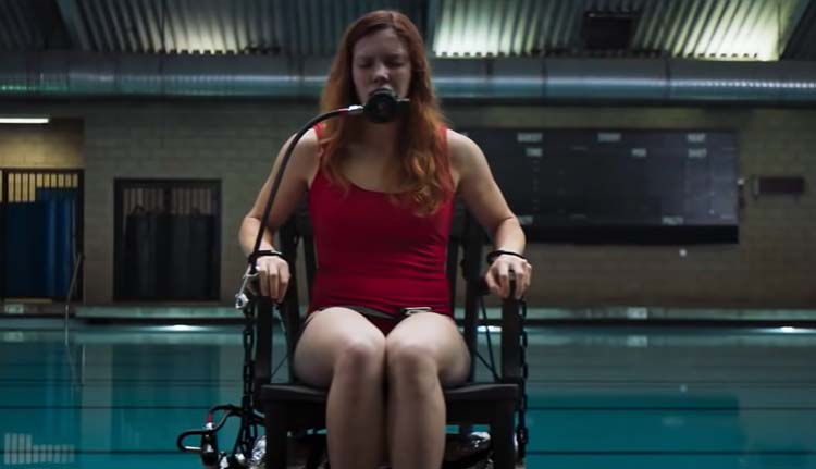
In the new film Witch Hunt written and directed by Elle Callahan (Head Count) and starring Elizabeth Mitchell (Lost), witches exist alongside us in the present day, but they’re persecuted and hunted. Production designer Holly Trotta brought this wicked world to life.
It’s modern-day America, and witches are real, but they’re hunted by an official organization known as the Bureau of Witchcraft Investigation (BWI). Martha Goode (Mitchell) and her teenage daughter Claire (Gideon Adlon, The Craft) are a family with a secret; they smuggle witches out of the country and into Mexico, where witchcraft isn’t persecuted. However, standing in the way during this politically-flavored horror-thriller is Hawthorne, an agent determined to stop Martha’s illegal activities and kill any witch he finds, including young Claire, who’s developing powers of her own.
PopAxiom spoke with Holly Trotta about becoming a production designer and creating the world of Witch Hunt.
Inner Workings
Holly grew up with a fine artist mother and engineer father. “So, it was built into my DNA that there was an artistic side and a technical side.”
However, Holly struggled with “learning disabilities, and I was dyslexic. So I struggled a lot in school with reading, writing, and arithmetic.”
“I found my love of the arts,” she adds, “I went to the School of Visual Arts in Manhattan. That was amazing because I was just able to study art. Also, a lot of the faculty works in the industry. So, that’s one of the big reasons I ended up going there. So, you get to work on actual projects and things that are going to be published.”
Holly majored in advertising, but her education in that field “led me to 3D design. I fell in love with being able to make and hold things.”
“I was studying with one of my mentors,” Holly’s professional artistic career slowly took shape, “Kevin O’Callahan, who said that I should be going out and doing these things and not sitting behind a computer.”
Holly started working with Kevin “on the side while in school. I had an internship at Atlantic Records and eventually started freelancing. A lot of early on production design was segueing into music videos.”
“I didn’t want just to do music videos,” she says, “so I started getting into fashion. Coming up the ranks with set designers like Mary Howard. She’s worked with the best-of-the-best photographers in the world. I eventually designed with Mary, who gave me so much hands-on experience with sets and the inner workings.”
Fashion & Film
Holly was getting intimate perspectives on different ways to dress a scene between fashion shoots and music videos. “Fashion photography is very different from film because you’re in a moment, a vignette. In film, you’re creating a whole 3D world. So there’s a lot of similarities, but I see it as taking a set from a photo and expanding it for a film.”
“Some of the best photo sets I was on,” she adds, “were with photographers who would shoot on the RED camera and grab stills from the video. I think that’s where I thought,’ this is amazing; I want to create a world.’ So, the combination of music videos and fashion lead me down this road to production design.”
Holly’s love for film is rooted in the “narrative aspect. There’s so much backstory. You create a set for a character, and you think to yourself, ‘this person would have this furniture because they grew up in this area around this time.’ There’s so much to tell through the sets to make the sets believable. I enjoy diving into and living in these worlds.”
“Film is so collaborative,” she continues, “you’re not only in the art department and tapped to do sets but working with the director, the DP, costumes; there are so many crossovers. I love the collaborative experience.”
About Witch Hunt
It’s Holly’s collaborations that paved the way to the gritty world of Witch Hunt. “I worked with Defiant Studios on two previous films. So, Chris Abernathy, the line producer, contacted me and asked if I was interested in reading the script. I definitely was.”
“Even before pre-production started,” Holly shares, “Elle [Callahan] and I had a lot of discussions. She sent me what she was looking to do, the feel, and the inspiration. I thought it had potential to be a lot of fun.”
Witch Hunt takes place in our modern world, but “it does have this stylized look almost like a period piece.”
The film begins with a traditional scene for a movie about witches with a burning at the stake. However, just seconds into the film, that stylized look is apparent. “The burning at the stake we pulled a lot of references from American Horror Story, compiled with research and a lot of old-school photographs.”
“Elle said early on,” Holly adds, “that she did not want to feel like this was shot in California. She said, ‘I don’t want to see a single palm tree. I want this feel like it’s Salem.’ If you’ve ever been to Salem, there’s an air about the place. Granted, I went during Halloween times, so there’s that extra element, but the architecture and the vibe are special.”
Making Witch Hunt
Witch Hunt undoubtedly has a modern, western, period piece vibe. “There was a mashup of locations to create a weird sort of setting for the movie to take place.”
Later in the film, there’s another element from traditional witch stories but turned on its head with the intensity cranked up to eleven. “The dunking scenes were a particular style of furniture. It was supposed to feel like you were at a school. So, we used some older elements that you’d find in a schoolhouse and converted it to this weird chair. We modified an existing chair to create this contraption and equipment for people to test witches.”
One of Witch Hunt’s antagonists is a massive wall blocking witches from escaping into Mexico. “We created a 24-foot wide wall that was elongated in post.”
The CG process is another collaboration for Holly. “I’m working with the post-supervisor either beforehand or on set. We talk about where we need markers and green screen setups. In conjunction with on-set, post-production person working with us on the day, who makes sure that the markers are a specific length and size depending on their position. Things that are farther away need larger markers.”
Wrapping Up
“I love Wes Anderson,” Holly answers immediately when asked about directors she loves. “Everyone loves him. Legends like Tim Burton who does such weird, obscure, off-beat stories.”
Inspiration for creative professionals comes from all sorts of places. “Something that’s inspired me lately are programs such as Unreal Engine. You can do so much in it, and I’m excited by being able to learn the inner workings of that and continue to grow with the capabilities of these programs.”
“Coming from much more an old-school background,” she says, “a lot of the things that were learned were conceptual first before the technology. So, the way the world is shifting into a digital platform, it’s important to be up-to-date and stay ahead of the curve as to where things are going.”
“As a production designer,” she adds, “it’s so important to paint pictures for the directors through concepts.” That’s where things like Unreal Engine come in “It’s a great launch point.”
Holly loves dreams but says, “I think in the way of goals. It helps make things a bit more tangible. My goal is to work on larger productions for some of the big, classic studios. I have a fascination with getting involved with science fiction, too, and psychological thrillers. Those resonate with me, and anything that resonates with an artist is easier to dive into.”
Is Witch Hunt on your watch list?
Thanks to Holly Trotta and Projection PR
for making this interview possible.
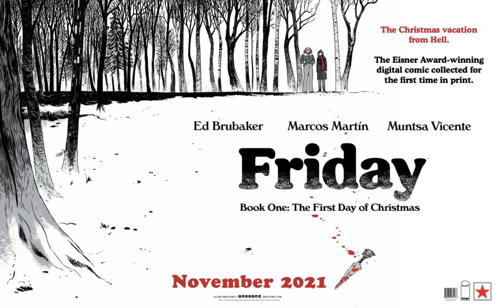
Panel Syndicate’s Friday is back! In Friday #4, writer Ed Brubaker, artist and letterer Marcos Martin, and colorist Muntsa Vicente show us how the events of the last issue have changed everything. Spoilers ahead for people who haven’t read Friday #3!
Writing
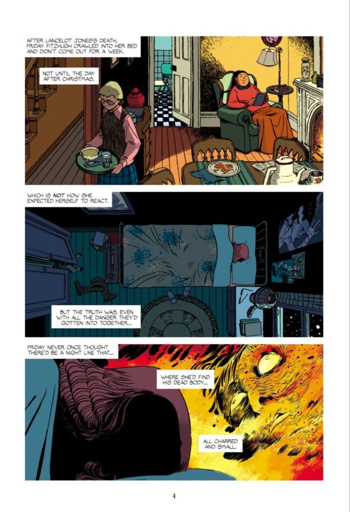
Lancelot Jones is dead. Brubaker makes that absolutely clear, with images of Lancelot burning in the wreckage of his and Friday’s headquarters. This wasn’t a fake-out. It would make sense for the plot to kick into overdrive at this point. Friday has all the motivation she needs to get to the bottom of this case. But Brubaker doesn’t treat Lancelot like a plot device. His death isn’t merely an inciting incident, and Friday’s grief is the main focus of this issue. She’s paralyzed by loss.
But there’s a complexity to Friday’s grief, too. When a cop asks Friday about the night Lancelot died, she mentions the scene of the crime. “At your clubhouse, I saw some science equipment in there…?” She says. “It was our headquarters, not a clubhouse,” Friday responds. There’s a fury bubbling beneath her sadness and Brubaker makes us fear, not for Friday, but for whoever is behind all of this. We see her move from a state of mourning to being furiously hungry for answers. There’s going to be hell to pay.
Art
Martin’s art is gorgeous, as always. We see Friday’s rollercoaster of emotions in her eyes. There are bags under her eyes, at times, that show her tiredness and her hopelessness. Sometimes the fatigue gives way to fury, shock, or a even a look of intrigue. We’re piecing together Friday’s internal struggle, just as she’s piecing together the case. She’s pulling herself up by her bootstraps and getting to work, all while screaming on the inside.
Martin also shows us deliberately conflicting things. We see Friday’s confidence as she starts investigating. Her face is clear, she’s not going to let anyone get in her way. But Martin also shows us how small she feels. She talks to the sheriff, getting information out of him while telling him how things are going to be. But when he gets in his car, she looks tiny and slouched over in the panel. Her confidence is a way to push her self-doubt away. Every time she falters in that, Martin makes it heartbreakingly clear.
Coloring
There’s a lot of warmth to the color palette in this issue. Where there was once pale blue and dark purple, there’s now soft browns and vibrant reds. It has the feeling of Friday coming in from the cold. She’s in a safe place. But Vincente is just showing how Friday thinks she ought to feel. She should feel safe and warm, but she feels empty. Vicente’s coloring is a beautiful way of showing the support Friday has, while also showing the pressure she feels to be “back to normal.”
And of course, we have more fantastic uses of the color yellow. Vicente shows us a flashback of Lancelot burning. He burns in startling yellows and oranges. And later, when Friday’s high school boyfriend comes climbing through her window, he’s wearing a yellow coat. But the shade is off, muddled by the darkness of the night. It makes him look like a cheap knock-off of the bright Lancelot Jones.
Lettering
There’s something incredible I hadn’t noticed about Martin’s lettering, until this issue. All of the caption boxes, from our third-person omniscient narrator, are placed in the upper left-hand corner of every panel. Of course, this makes logical sense. We read from left to right, from top to bottom. So, anything in the top left-hand corner you’ll read first. But even the longer captions tend to hug the corners. Instead of allowing the longer sentences to lengthen the box, a new line will start. It makes the narration, which feels like an extension of Friday’s inner monologue, feel full of hesitation.
There’s one big exception to this, in this issue. Every caption box stays in the corner or doesn’t venture out far, except for when Friday is thinking about Lancelot’s corpse. “Where she’d find his dead body…” it says in a box, directly above Friday’s head. “All charred and small.” With this, Martin shows how invasive these thoughts are. Her trauma doesn’t stick to the corners, it pushes past the borders and into the scene. It is there to be noticed and to get in the way of her trying to sleep.
Panel Syndicate’s Friday continues to be a delight. Maybe someday this creative team will produce an issue that’s anything short of perfect. That day is not today. Go to Panel Syndicate’s website to buy yourself a digital copy. You can pay what you want to for it! And, don’t forget to pick up a physical copy of Friday, Book One: The First Day of Christmas, out in comic stores from Image Comics on November 3rd!
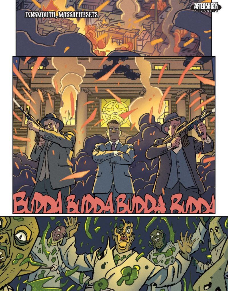
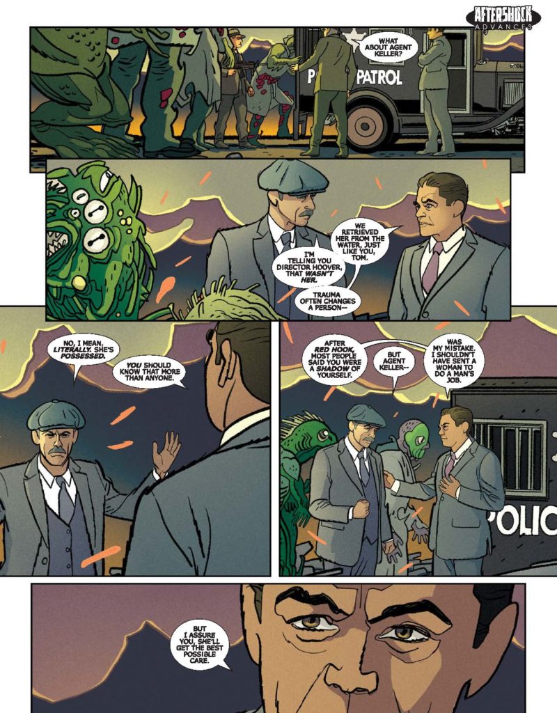
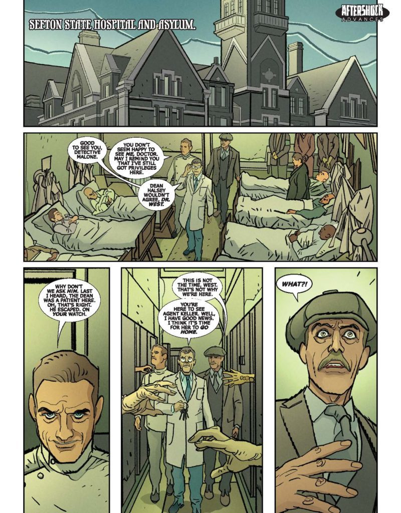
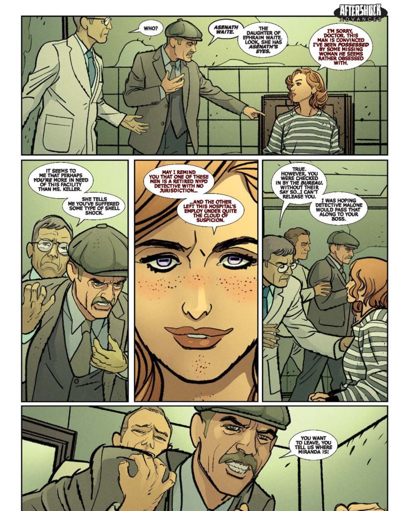
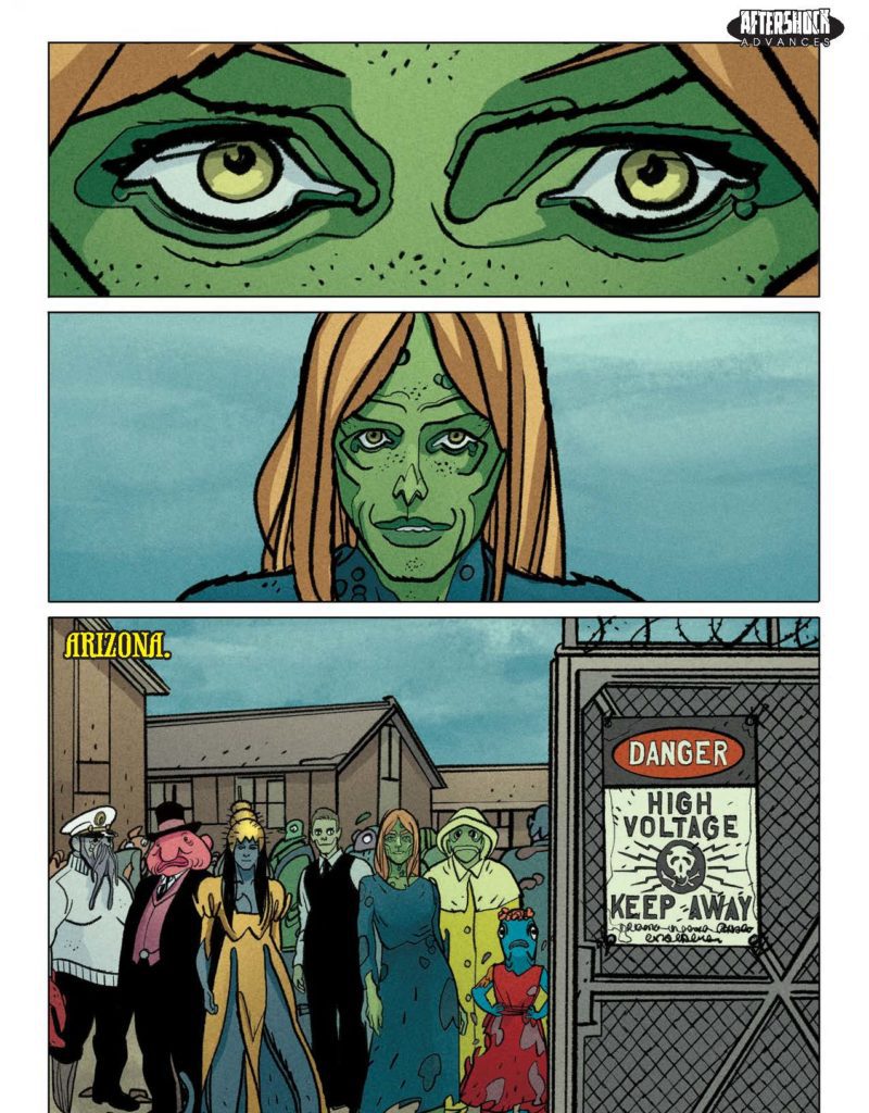
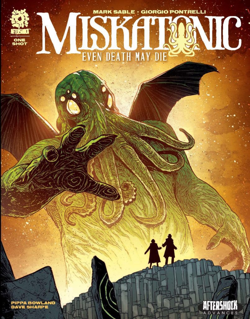
MISKATONIC: EVEN DEATH MAY DIE hits your local comic book store November 24th, but thanks to AfterShock Comics, Monkeys Fighting Robots has an exclusive six-page preview for you.
About the issue: The hit series returns!
The horrifying events in the Miskatonic Valley have torn apart retired detective Tom Malone and ex-FBI agent Miranda Keller. Miranda tries to escape a Deep One concentration camp and a traumatized Tom is obsessed with finding and freeing her. But soon they both start sharing dreams of Cthulhu, a monstrous entity in the South Pacific who will soon awaken and bring about the end of the world as we know it.
The one-shot is by writer Mark Sable and artist Giorgio Pontrelli, with colors by Pippa Bowland, and letters by Dave Sharpe. The main cover is by Jeremy Haun; there is also an incentive variant by Cliff Richards.
EVEN DEATH MAY DIE is a follow-up to the five-issue MISKATONIC series, which came out earlier this year in paperback.
Check out the MISKATONIC: EVEN DEATH MAY DIE preview below:
Did you read MISKATONIC? Sound off in the comments!
An unabridged version of this interview was originally published on the site Popular Culture and Theology by Monkeys Fighting Robots writer Matthew Brake.
Matthew Brake: I know you and I have talked a little bit about the inception of this story, but could you talk a little bit about your motivations for writing Unfinished Business?
Paul Levitz: I don’t think I’m ever quite sure what motivates me to write something that isn’t an assignment along the way. Mike Richardson over at Dark Horse was asking me what I wanted to do next. He was suggesting at the time that the preferred format they were working in was four-part miniseries.
Okay, what do I feel like doing?
Tim Hamilton, who I had worked with on Brooklyn Blood, my immediately preceding project for Dark Horse, wasn’t in the mood to do more of that. He was playing with children’s books for a while to figure out something new to do, and this came to me.
Brake: Say a little bit more about that, because you’ve said before that this story is, in part, inspired by a joke.
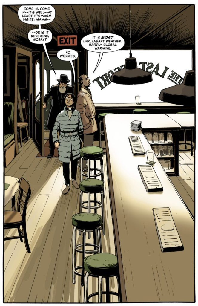
Levitz: Oh, I mean, the heart of the story, obviously, is the opening joke about “a rabbi, a priest, and a minister walk into a bar.” There’s lots of variations on it. But that’s sort of a classic gum line and then what’s the payoff for it? And I went to, perhaps, the most extreme possibility.
Brake: So that was the inception, and then, was it taking that joke and then crafting the story of where this could go? Or did you already have some ideas in mind about a message you were trying to convey?
Levitz: It’s not so much a “message story.” As a writer, I think my philosophies or my politics are relatively transparent within my work, but I don’t usually sit there and say, “This is a time to do a tract about or this is a time to do a sermon about [blank].” I had a dear old friend who was down with cancer at the time who was a rabbi. That may have been a piece of the influence. I wanted to do a story that could sort of include him. I mean, the rabbi in the story is not defined as being of the same sex and behaviors as my friend, David, but he was a bit of an homage to him and probably part of that came from conversations I was still having with David in the years of his illness.
Brake: I do want to come back and talk about your friend David later because I appreciated your afterword where you discuss that relationship. But when you’ve come to my class, you’ve spoken about the difference between art and craft and how with craft you put together a story where you understand the mechanics of the story, can write a story correctly, and meet a deadline. However, with art, it can come from a more personal place. I’m curious with this story, the craft is there, but would you call it art because it comes from a personal place?
Levitz: You know, art is in the eyes of the beholder to some extent, and I don’t know that what I accomplished with the story rises to my definition of art. I think a lot of it was based in my craft. To the extent it was art, it was because I was touching subject matter that was unusual for me to play with and that opens some interesting doors to being thoughtful about it.
Brake: I appreciated the way the three protagonists come together. They come together. They’re uneasy with each other, and then for a time, they part ways. It almost reminded me of the Chinese restaurant scene from the Defenders on Netflix where you have Daredevil, Luke Cage, Jessica Jones, and Iron Fist come together.
Levitz: I didn’t see that series, so I don’t know the reference. But I can imagine.
Brake: It’s sort of worth the watch…well, about half sort of worth the watch (laughs).
But I liked how the minister, the rabbi, and the priest seem almost like superheroes gathering. Before they become a team, they’re uneasy with each other. Then they temporarily part ways, but they come back together later. Did the structure of that kind of superhero storytelling affect any of your writing or those character decisions?
Levitz: That’s an interesting question.
Maybe.
I mean, most of the stories I’ve done in my life use superhero tropes. But I think part of it was really an attempt to capture a very human moment. There are times in our lives when circumstances throw us together with people we wouldn’t actually be together with. You don’t really have room in the structure of a comic to go through that, but in the real world, you go through that exercise that is a search for common ground: “Where did you go to school?” “What did you study?” “Where did you grow up?” “I don’t recognize that accent.”
All of the kind of dumb opening lines aren’t pickup lines, but are part of how we connect to each other. We search for what we have in common. I’ve never had the privilege of being in a room with multiple religious figures from different religions, but I would certainly imagine that it’s a different kind of dance. And certainly, if you’re dealing with a very Orthodox rabbinical figure, they’re generally not comfortable around women. They have a host of formal prescriptions of what they can and cannot do in the presence of a woman, including any physical contact.
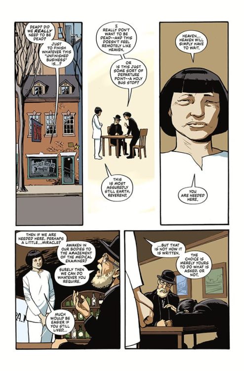
I think the two Christian figures would not have as complicated of a situation but still would have some interesting barriers. The Catholic priest was deliberately chosen out of the African tradition which is perhaps more classical or more conservative than the American, and the idea of a woman priest/minister would be perhaps not uncomfortable in the same way as it would be to an Orthodox Jew, but confusing in some fashion. And then the woman comes out of a very open liturgical tradition and how does she fit with all of this? How does she deal with people who may be more closed-minded? Does she take offense? There isn’t a lot of room to explore all of that, but some of that takes place in the subtext. I did my best to indicate that all three of these people were people of genuine religious belief and sincere faith, living out whatever the right way is that they would feel their faith should be expressed. But being in that room and that bar would confuse anyone alive or dead, including them, no matter how sincere their beliefs.
The bartender, whatever the bartender represents, whether it is a sending of God or a secondary or tertiary supernatural figure, how do you react to that, and that would certainly be a bewildering moment.
If my memory serves, I wrote most of this before The Good Place was on the air. A wonderful, wonderful show. But to some degree, when I saw it, it reminded me of what I was trying to do. Kristen Bell’s character shows up, “Where am I? What am I?” and Ted Danson is feeding her the bill of goods. Does she buy into it entirely? What makes her suspicious of it at what point? Lovely, lovely show. Beautifully written.
Brake: I did want to ask you about the bartender. It’s interesting you throw in a little bit of ambiguity about who she represents. As I was reading it, I was reading her as a God figure, which I found interesting because it made me think of the book The Shack, which is about a man who is dealing with the loss of a child and goes into a shack and encounters God. The author is a Christian, so his God is Trinitarian, but God the Father appears as a Black woman, for instance, and all the different members of the Trinity appear as various ethnicities, genders, and so on, so I found that interesting. I wasn’t sure if there was influence there. But if this figure does represent God, I appreciated the choice of having her be an Asian woman whose age we can’t quite identify.
Levitz: [Simon] Fraser gets a lot of the credit for that. He didn’t care for my original description of the bartender, which was probably more traditional, and he came up with this figure, which I thought was wonderful, and then I wrote to it as best I could. I think in any modern way of looking at religion, whether you go to the ancient traditions that the Jews had or the Muslims adopted, you cannot depict God. Any modern way of looking at it has to concede that either we cannot understand what God physically could represent as, if there is such a figure, and the whole idea that we are created in God’s image has to be a metaphorical statement.
And what it means, whether that image is in the image of the mind of God or the image of the biochemistry of what God envisions, we don’t get to know. And any discussion of the physical image of God just sort of reminds me of the scene in Avenue Q where they start arguing back and forth, and the actor who’s playing a pseudo-Gary Coleman is loudly announcing that God was a black man, and I think it’s the Princeton character who responds to him by pointing out, “No, no. Jesus was Jewish,” and everybody just cracks up and that’s the end of it. This is obviously an incomprehensible contradiction to this group of people.
Brake: This question is more tongue-in-cheek, but I can’t help but notice that of the three “people of the cloth,” the Jewish rabbi comes out looking the best. Personal bias creeping in perhaps? (laughs)
Levitz: Probably. I mean, I tried to give them each their moment. The priest gets sort of the physical victory in the process and gets the most directly tortured, so he overcomes the most in it. Reverend Moore gets sort of the most personal battle in dealing with her unborn child. I obviously have my biases, and, as I said, part of the inspiration for the book was to do something in honor of David, who did not get to read the book ultimately or read the script, but I had hoped he would be around long enough to.
Brake: One of the things I do appreciate about this volume, as I said, is your personal afterword where you acknowledge your religious heritage, coming from a Jewish background, while also acknowledging your own lack of adherence to organized religion.
But I want to return to the figure of Dr. David Kaufman, who you name your Jewish rabbi protagonist after. I’m wondering if you could say something about his influence on you because you mentioned your conversations with him. So was he someone you engaged in conversations of religion and spirituality with? And if so, would you mind providing some insight into the nature of some of those conversations? Were they religious and theological inquiries? Were they of a personal nature? You can also decline to answer of course if that’s too personal.
Levitz: David and I had an interesting journey. As a young man, he was a student in English at Tulane. He loved the Legion of Superheroes and would send long, long letters about it, many of which were published, and we connected through that. He was an aspiring comic writer, and we connected a little bit on that. And then he kind of vanished from my radar.
He popped up again a couple of decades later as an English professor at Tulane who was looking to connect to the actor who was playing Jimmy Olsen on Lois and Clark to get him to New Orleans for a menorah lighting ceremony, if I’m remembering correctly, and he was hoping I could help him with that. Ultimately, that didn’t work out. This was after Katrina maybe. A little time had passed. A lot of renewal was happening in New Orleans at that moment.
Anyway, we got back in contact, and he had converted to a Hasidic order. He was brought up relatively secularly, so this was a sizable conversion. We never talked about what motivated him to the conversion. He had a pack of kids and a complicated life structure around all of that. He was qualified technically as a rabbi but was not functioning as whatever the equivalent for a parish rabbi would be. I don’t know what the right term for that is. His personal philosophy and work were remarkably worldly and liberal for a member of that Hasidic order. He made part of his living writing for politicians, speech writing and things like that, and often for liberal politicians, which was a fascinating contradiction.
He was an aspiring detective storywriter, and he wrote a couple of novels that, as he went through different drafts, he sent back and forth to me and we’d give it them look. They often turned on plot points that were based in Jewish lore or Jewish culture with a pair of detectives who were an orthodox Jew and an Irishman. Both very vividly depicted. We got together a number of times in New York and at least once in New Orleans. I got the chance to visit him when I was down there for Neil Gaiman’s birthday party that he threw when he turned 50. While there, I got a window into his life a little bit and part of the time during that period was a particularly challenging time in my life, and he provided good counsel through it that was very helpful to me.
You can read the full unabridged interview on Popular Culture and theology by clicking here, and be sure to check out Unfinished Business at the Dark Horse website or your local comic book store!


")


 Levitz: [Simon] Fraser gets a lot of the credit for that. He didn’t care for my original description of the bartender, which was probably more traditional, and he came up with this figure, which I thought was wonderful, and then I wrote to it as best I could. I think in any modern way of looking at religion, whether you go to the ancient traditions that the Jews had or the Muslims adopted, you cannot depict God. Any modern way of looking at it has to concede that either we cannot understand what God physically could represent as, if there is such a figure, and the whole idea that we are created in God’s image has to be a metaphorical statement.