

DC Comics’ The Human Target #1 starts with a dead body. It’s not floating in a pool, but it’s still the kind of opening that would make Billy Wilder proud. So much of The Human Target borrows from classic noir stories, namely those of legendary writer/director Billy Wilder. It’s part Sunset Blvd, part The Lost Weekend, with a dash of Double Indemnity. Writer Tom King, artist Greg Smallwood, and letterer Clayton Cowles present a hard-boiled mystery about a doomed private eye, who has a knack for theatrics and disguises. This issue is one that’s steeped in dramatic irony, so be warned that spoilers abound!

About The Human Target:
Originally created as a side character in Detective Comics by Edmond Hamilton and Sheldon Moldoff, “The Human Target,” Fred Venable, was a man who offered a very specific service. Venable would dress up as his clients, people who were wanted dead. Then, when an attempt was made on his life, he’d be there to catch the killer red-handed.
Rebranded and rewritten now as Christopher Chance, by Len Wein and Carmine Infantino, Chance carried on Venable’s legacy as the Human Target in the pages of Action Comics. Now, King, Smallwood, and Cowles bring Chance back to DC Comics. He’s down on his luck, doomed from the start, and hopelessly in love. It’s everything you could want in a superhero-studded detective story.
Writing
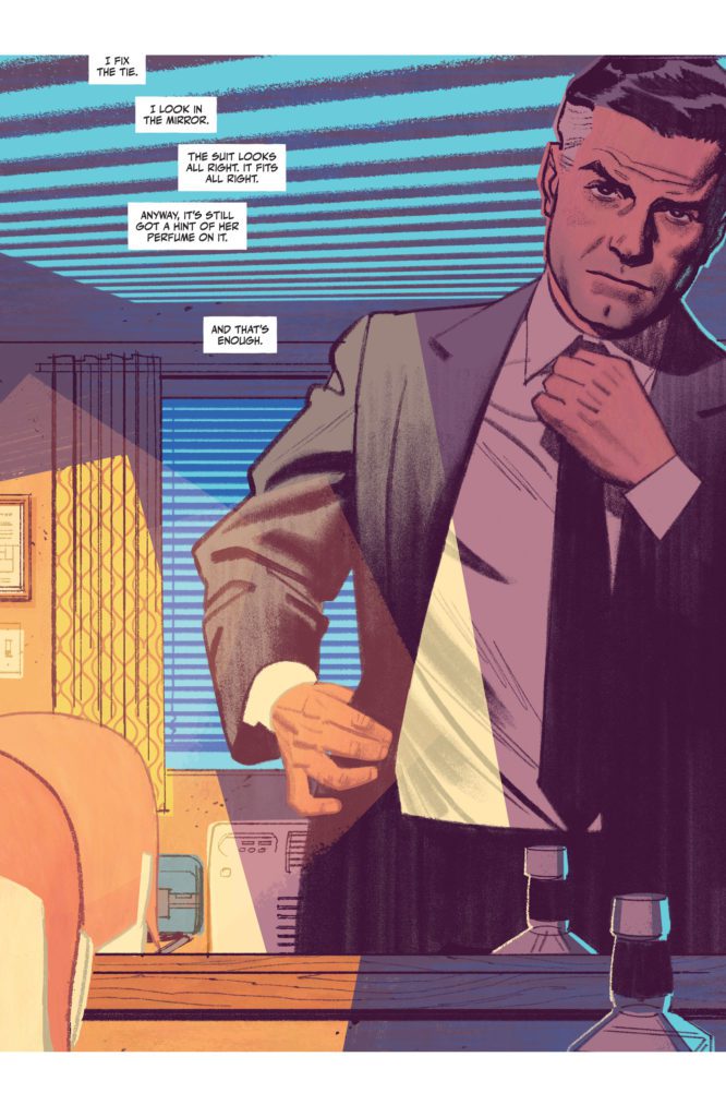
This isn’t King’s first outing into noir territory. His writing often employs noir devices, but The Human Target sees King embracing those influences to their full extent. King writes from Chance’s perspective. Chance has all the charm and panache of Humphrey Bogart. He’s confused, even desperate, beneath a cool and calm exterior. He references Fred Astaire and says words like “dandy.” And Christopher Chance, like the best noir protagonists, is totally self-destructive. Of course he is, who would do his job if they weren’t a little ready to bite the bullet? But the way King writes him, you can’t help but love him.
King also commits, wholeheartedly, to the dramatic irony of this story. Not only do we see Chance, quite literally, in his deathbed as we open, but King shows us a one panel snippet of each day that led up to this moment, before taking us back to the beginning. These single panels range from pivotal moments – gunshots and fistfights – to innocuous banter. But it sets the tone for this series. This looks like it’s going to be a series about the overwhelming evil of man, and the little meaningful moments of kindness that happen in the pauses between the waves of chaos.
Art & Coloring
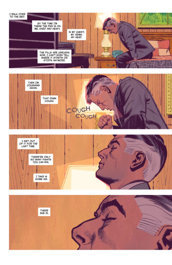
Smallwood’s art is incredibly cinematic. When Chance lays down in his bed, Smallwood closes in on Chance’s closed eye, zooming in with each panel. Smallwood lulls us into the rhythm of this story. It’s the slow, easy pace of a mystery that is going to be steadily unraveling. We see Chance from above his bed. He looks peaceful. But the next panel shows Chance from a similar angle, only now he’s being slapped across the face. The panel isn’t colored in the soft blues and browns of the previous pages. It’s a neon green.
Smallwood, himself, almost seems to be slapping the reader across the face. He’s waking us up with this sudden shift. It introduces us to the violence in this story, too. And Smallwood continues coloring the comic this way. Scenes of a dark blues, with a smidge of green, are interrupted by moments of dark red. He’s telling us this is a series where peace is fleeting. And Smallwood is telling us this in the most visually stunning way possible.
Lettering
Many of the sound effects are part of Smallwood’s art. He draws in the scattered “CLAP” noises of an audience’s uneven clapping. The subtle “RING RING” of a phone next to Chance’s head is shown in small blue letters. Many of the louder sounds, like the “BANG” of a gun or the “KRAK” of a punch, are used as panel borders. It shows how those moments are defined by that noise and what’s making it.
Cowles’ lettering for the captions and dialogue gives this comic such a smooth, slow feeling. The captions snake lazily through the page, effortlessly connecting panels together. When Chance begins to think that something might be wrong with him, the lettering changes. It begins to bounce around panels, mimicking the frantic nature of Chance’s thoughts. And once Chance knows what’s going on, the lettering resumes its gentle course through each page.
King, Smallwood and Cowles are wearing their influences on their sleeves. They’re harkening back to old noir movies, seamlessly adding little nods to these classics into a story that feels destined to become a classic, too. King’s script is engrossing, Smallwood’s art is hypnotically beautiful, and Cowles’ lettering sets the pace perfectly. Pick up The Human Target #1, out from DC Comics’ November 2nd, at a comic shop near you!