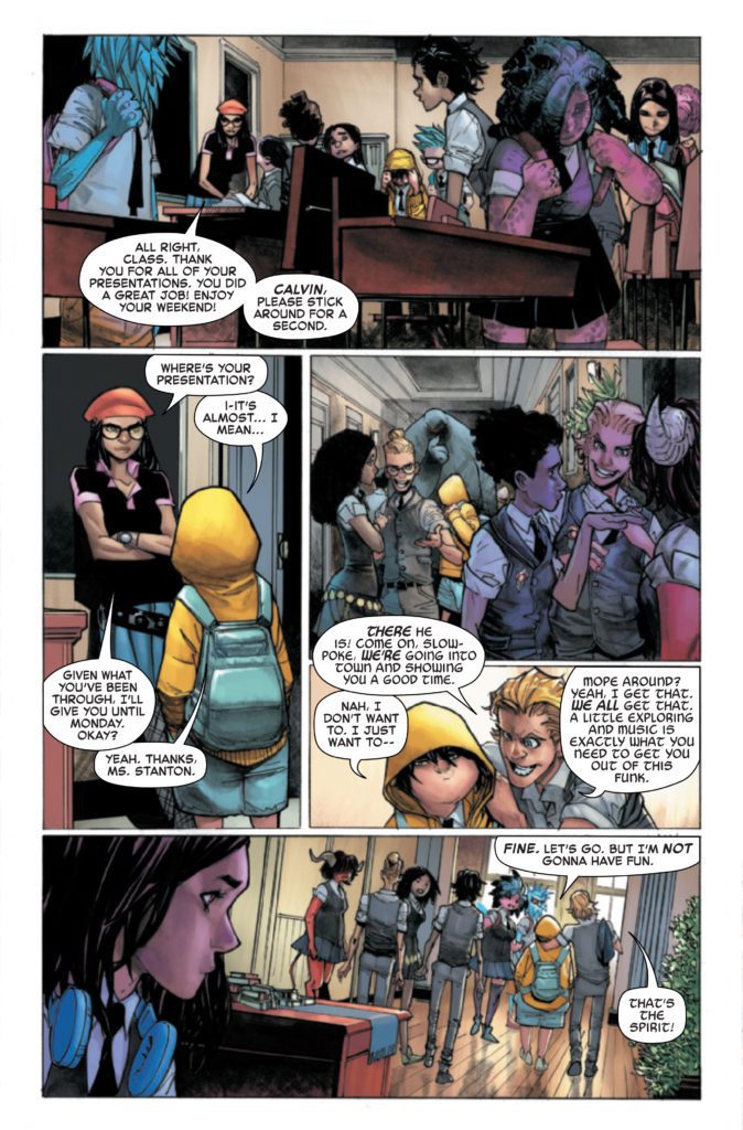
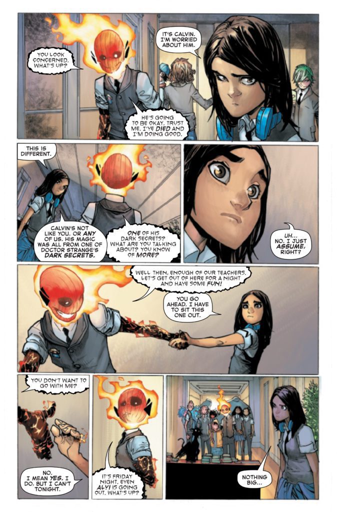
STRANGE ACADEMY #13 hits your local comic book store November 10th, but thanks to Marvel Comics, Monkeys Fighting Robots has an exclusive four-page preview for you.
About the issue: The Strange Academy kids have a night on the town in New Orleans! Some kids go for a tour of a famous NOLA graveyard, and I’m sure you know how teens in graveyards usually go. Emily takes a field trip of her own, and we also learn the SECRET ORIGIN OF ZOE LAVEAU!
The issue is by writer Skottie Young and artist Humberto Ramos, with colors by Edgar Delgado, and letters by Clayton Cowles. The main cover is by Ramos and Delgado.
Check out the STRANGE ACADEMY #13 preview below:
Are you reading STRANGE ACADEMY? Sound off in the comments!
LUKE CAGE: CITY OF FIRE #3 (OF 3) hits comic shops in February, but thanks to Marvel Comics, Monkeys Fighting Robots has an exclusive first-look at the book and its two covers!
About the issue: A TURNING POINT FOR CAGE!
As the city burns, the Regulators set their sights on an innocent child who’s unwittingly holding critical information. Luke Cage races to get to the girl first, which brings him face to face with Jo Rockhead, the lethal leader of the Regulators who has the power to turn people to stone.
It’s a fight for the very soul of the city – but when Luke finds out he and Rockhead have something in common, will his resolve waver?
The issue is by writer Ho Che Anderson and artist Sean Damien Hill. CITY OF FIRE is a tie-in to DEVIL’S REIGN, the new Marvel event spinning out of Chip Zdarsky and Marco Checchetto’s DAREDEVIL.
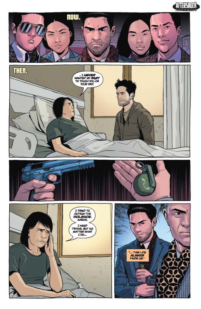
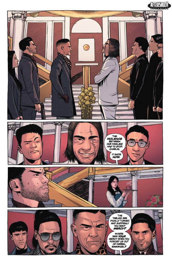
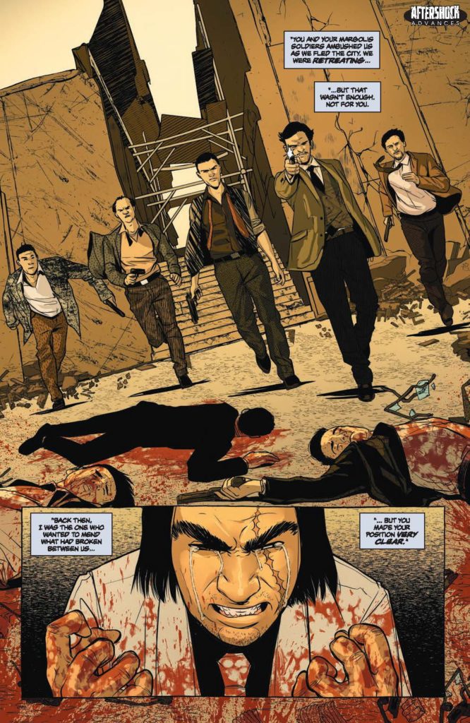
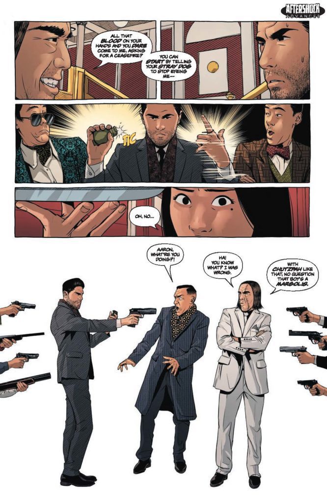
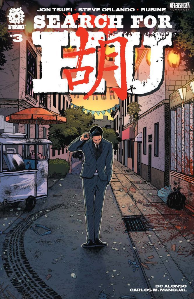
SEARCH FOR HU #3 hits your local comic book store December 1st, but thanks to AfterShock Comics, Monkeys Fighting Robots has an exclusive four-page preview for you.
About the issue: Aaron Tse’s path of revenge has already taken him from America to China to avenge an attack on his parents perpetrated by his own family. After a disastrous shootout between the Hu and Margolis sides of said family, Aaron questions everything. Is this a war he can’t win? Just when Aaron thinks the stakes can’t get any higher, tragedy strikes again, and this time, it might finally push him past the point of no return.
The series is by writers Steve Orlando & Jon Tsuei and artist Rubine, with colors by DC Alonso, and letters by Carlos M. Mangual. The cover is by Rubine and Alonso.
Check out the SEARCH FOR HU #3 preview below:
What’s your favorite current AfterShock series? Sound off in the comments!
Glen Carabin is a new writer and artist in the comics industry. His debut work, Dartmouth, is a fun, pulpy, experimental blast of comics, right to the face! Monkeys Fighting Robots got the chance to chat with Carabin about his creative process and inspirations behind Dartmouth.
Monkeys Fighting Robots: So, Glen, you mentioned to me before that part of the reason you have such a unique style in Dartmouth is because you just didn’t think you could draw. And so, you photoshopped actual photos of scenes and added lettering over it. It really does create a unique and interesting style though, kind of born out of a “shortcut” so to speak. Do you plan to keep this style going in more works that you produce or are you looking for a more conventional artist for your future projects?
Glen Carabin: If I had to illustrate this book, it would never get done, and I’d have nothing to prove my interest in making comics. That said, I am not an illustrator, but, after creating the Dartmouth character through photo-manipulation on an iPhone app, and writing the story for this book, I would mention it in conversations at comic shops and show the images to people in hope of finding someone interested in illustrating it for me.
I eventually realized though, that’s probably not going to happen. So, with some encouragement, I decided to do my own art for the project. I enjoy working in photoshop. I consider it a hobby or pastime to develop scenes and sequences each night with a game on in the background. I also now realize it would be a ton of work for an artist to illustrate these next couple of books, so I’m not even going to think about it.
But, to answer your question, the reason I wrote this book in the first place, and did the artwork, is to show artists that I am willing to do the work, that I am serious about making comics. And the last thing I want to do is insult artists by passing off what I’m doing as a replacement for the work they do. It’s not. Like I said, if I didn’t do the artwork on this book, it would never get done. I had to do it, and incidentally, while I was making Dartmouth, I read Brian Michael Bendis’ book Words for Pictures. In it, he writes, “Comic art does not have to be inked line art. It can be painting, etching, photography, multimedia, or any combination thereof.”
That passage gave me the confidence to continue working through this project. Like what I was doing was ok. Furthermore, I absolutely do hope to collaborate with illustrators, real artists on other projects someday. In the meantime, I am certainly open to giving the covers of the next two or three issues of Dartmouth (front, back, inner and outer) to artists interested in developing any cover art for the project. Just let me know.
And one final note, there’s a website called Blambot. These guys offer fonts for indie creators to use to develop professional quality lettering for their comics. I need to give them a mention here. Their fonts really improved the overall quality of Dartmouth.
MFR: This question is a two-parter. There are some clear references in Dartmouth to real life events, places, and things. Even the name, Dartmouth, is like Dartmouth, Nova Scotia, which I know is your stomping grounds. What were some of the real-life inspirations for this work?
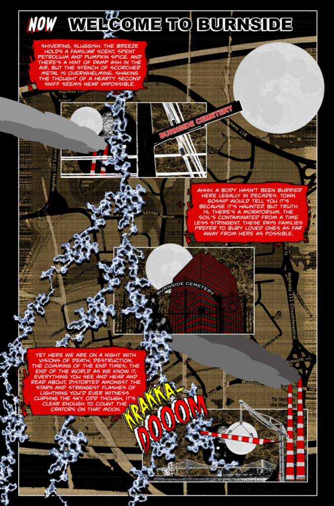
Carabin: First off, in Dartmouth there’s an important body of water called Boonamoogwaddy Harbour. It’s actually spelt Ponamogoatitjg. It’s what the Mi’kmaw First Nation called the area we now know as Dartmouth, Nova Scotia. The initial inspiration for the lead character and for this book obviously comes from the city’s name, Dartmouth, but also, if you live here and take a closer look at the lay of the land, it eerily resembles the geography of Gotham. For example, if you cross from Halifax into Dartmouth via the MacKay Bridge, you arrive near a district called Burnside.
Likewise, in Gotham City, if you cross Brown Bridge, I believe it’s called, you arrive in Burnside and, as you know, Batgirl keeps watch over Burnside. So there’s a nod to that character and her alter-ego in Dartmouth through a bookstore called Gordon’s Gently Loved Books. Then there’s Tufts Cove Generating Station (Burnside Power Plant in the book). It’s situated near Burnside, Nova Scotia, in a location similar to where Interstate Light and Power is located in Gotham, on the Burnside side of the bridge. And next to Tufts Cove Generating station you will find Tufts Cove Cemetery (Burnside Cemetery in the book). Tufts Cove Cemetery is neither haunted nor contaminated, however, it’s been restored by a volunteer community group and is now a beautiful, historic landmark in the city. The similarities Halifax Regional Municipality has with Gotham City, especially the Burnside locale, along with this idea for Dartmouth that was rattling around in my head, made it near impossible to ignore. It felt almost like the city was screaming at me every day to write this book.
MFR: Second part of the question: There are just as many references to fictional or literary inspirations. Bernie Wright feels like a nod to the brilliant artist Bernie Wrightson, the Dark Side Lounge kind of nods at both Darkseid and the Dark Side Club from DC comics. What were some of the literary and fictional inspirations to your work?
Carabin:Dartmouth is absolutely a tribute to Bernie Wrightson. In fact, along with Spawn and Batman, Dartmouth certainly takes inspiration from Swamp Thing and, the last page of the final climactic sequence in Dartmouth is modelled after Bernie Wrightson’s contribution to Batman #400. Then, you’re right, there’s the Dark Side Lounge. Locally, Dartmouth is nicknamed the dark side. I’m not from this city, I moved here a number of years ago, so I’m not sure where this nickname comes from but I am a huge fan of DC Comics. I couldn’t resist making some kind of a reference and found the Dark Side Lounge satisfied that compulsion.
There’s also a reference to the Court of Owls in a little coffee shop in Burnside called Night Owl’s Coffee. You may also see/feel/hear inspiration in my writing coming from the great Jack Kerouac. On a side note, if you ever have a chance to read the Kerouac/Burroughs collaboration, And the Hippos Were Boiled in Their Tanks, take some extra time to enjoy chapter 6, where Kerouac writes about the time he spent in Sydney, Nova Scotia. And finally, to comment on some inspiration for the artwork in this book, Grant Morrison and Liam Sharp’s Green Lantern run provided me with a sense of artistic freedom that was essential in the creation of Dartmouth.
MFR: Lastly, this definitely feels like it’s the start of something bigger. Do you plan to come back to the world of DARTMOUTH, continuing the story further?
Carabin: Absolutely, Dartmouth is a 3 or 4 book story. Don’t get me wrong, Issue 1 is a complete story with a satisfying payoff for the final sequence. But, reading it may leave you with a few questions that will be answered in the first few pages of issue number two, which I am currently working on.
Check out Carabin’s brilliant debut, Dartmouth, available digitally on Gumroad. Hopefully it’s not long before we get the next chapter of this wild series!
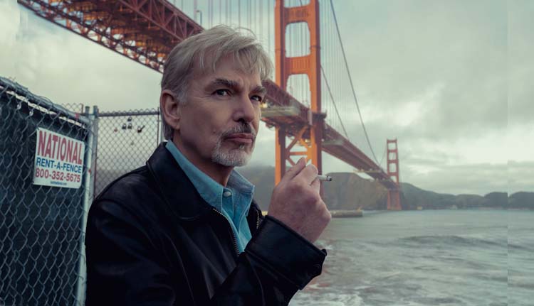
GOLIATH is an Amazon series starring Billy Bob Thornton (Sling Blade) as a formerly brilliant lawyer turned alcoholic after he blames himself for a case that ended in tragedy. Jon Ehrlich and Jason Derlatka added the sonic layers that elevate the show’s drama.
Billy Bob Thornton stars as Billy McBride, a former lawyer living in an extended stay hotel. McBride founded a successful law firm and was one of the best lawyers in town. However, McBride helped a murderer walk free. Unfortunately, that murderer went on to kill more people, and the tragedy sent McBride into a downward spiral that included a lot of alcohol. Soon to start its fourth season (and final), Goliath’s an evolving dark drama that’s sure to stun viewers as it comes to an end.
PopAxiom spoke with Jon and Jason about their journey to create music for film and television and arriving at Goliath season four.
When did music come into their lives?
Jon: Music has always been a part of my life. It’s hard to find my way back to the origin. I was the kid who played the piano. I went along with it because people applauded. Scoring to picture was not where I originally thought I was headed. I was in high school and bands thinking I would go on tour and be an artist. But I fell in love with theatre and, in college, wrote a bunch of musicals. I was working in the theatre for a bit, and I think I had that lightning bolt moment that I should probably do this with moving pictures.
Jason: I grew up pretty remotely in Montana. There was always music in my house growing up. My family would sing and perform in church. We had a piano, an organ, a drum set, some keyboards, and a multi-track recorder. So I always knew I wanted to create music and tracks. When I got to college, we had a music technology program. I had a little exposure scoring to picture.
How did they become composers for film and television?
Jon: Initially, that was working on commercials, but then a friend who was in graduate school at NYU and making his student film asked me to help him out. I thought, ‘this is great, so I went to LA to do a year at USC in film scoring. By the time I finished that year, I was already immersed in the world out there.
A friend of mine from the theatre, Shaun Cassidy, was out here producing, and the minute he could, he got me a gig on the show Roar with Heath Ledger.
Jason was a part of my early commercial music house years.
Jason: I was able to do a concert that was part of the university fund-raising efforts involving producer David Foster. That inspired me. He said, ‘You need to move down to LA and immerse yourself in the business.’ So after college, I moved to LA, started networking, and hanging out at the record plant. I did a little bit of everything. Through that period, I met Jon. Through the Jingle House that he set up, I got opportunities scoring to picture with a few commercials. That started our working relationship.
I loved the idea of telling a story through music. So my trajectory changed from the record side of things to scoring to picture. It started with these projects with Jon.
How did their working relationship evolve?
Jon: Initially, with the commercial stuff and spillover work, but then we got into a groove. We were in the same space in Santa Monica, and it just worked. We’ve worked together longer than some marriages. We’ve got good chemistry and different strengths as well.
Jason: We compliment each other. We have similar sensibilities.
Jon: I think we also inspire each other. On Goliath, one of the first things I think of when I come up with something that I like is how Jason will use the theme.
Jason: We also don’t have egos when it comes to the work together. It’s very collaborative. When you’re working under deadlines, it’s nice to have someone to bounce things off of that does sort of know what you do. You have that in the back of your head. I know what his sensibilities are; if I get stuck, there’s a sort of a safety net.
Jon: After COVID, though, it got a little strange. We were in the same space for a long, long time. Our studios were down the hall from each other.
How did they connect with Goliath?
Jon: Larry Trilling, who became the showrunner, was an executive producer and a director of many episodes. By the third season, he was directing every episode. We worked on Invasion with him, and he was an EP on Parenthood. He brought us in to score the pilot, which they were re-doing after scrapping the original version.
What was the problem with the original pilot?
Jon: I think the problem was that the world of Billy and the world of Cooperman in the first season were starkly different. It was very black and white, and it felt like two shows. It wasn’t holding together. That was my take. We came in and worked to connect those worlds.
Jason: We were fortunate to earn a degree of trust fairly quickly. It was nice to get to a point where we could dig in and do what your instincts tell you. With Goliath, that seems to be the sentiment at the beginning of the season. This show, the musical vocabulary, the sounds, the changing locations, and new characters, it’s constantly changing things up. We were excited to get in there and add new elements. The new season, in particular with the Chinatown-noir feel. It helps to do a job when you have that sort of trust.
How did they earn that trust to evolve Goliath’s score?
Jon: In some ways, the key is like a lot of things, it’s that first week where we’re in meetings, or on the phone, your first reaction to the first thing they expose you to tells them if you understand their vision. In this case, they were sort of figuring out the show. We were able to say, ‘here’s how the music can supply connective tissue and provide something that you can’t accomplish visually.’ It’s always the coolest choice for a score to find what it can do that the picture can’t.
Where will season four take viewers?
Jason: In season four, we get into Billy’s psychology, and he goes into the wormhole of his recollections with his father, an emotionally abusive man. Billy’s struggling with pain and that psychic distress. He goes back to that relationship in his head.
Jon: Season four is like watching classic noir like Rear Window, Vertigo, and High Noon. So, the season’s seen through the prism of his fragmented memory of those moments. He transforms them into his storyline for season four.
After season three, he’s struggling with dependency while also going up against Big Pharma.
One of the big things that the score could do for season four was play off the visuals we see that are sometimes shot-for-shot homages of these movies that we know. So, the score is classic noir. We get to kind of put on a costume. It’s sort of Halloween for a composer.
Jason: We don’t always have the luxury of being featured, but this was an opportunity to do that. I know Billy Bob had thoughts and ideas that we considered and were inspired by when we worked on season four.
Jon: He directed the first episode. While he was cutting it, he had some exciting ideas. Billy [the character] lives in an apartment in Chinatown, and the set looks so much like Rear Window. So, there’s this whole community of people, and there’s a woman incessantly practicing trombone with a piece by Tchaikovsky called “None But the Lonely Heart.” It becomes this haunting thing that’s always there. He’s going in and out of these hallucinations that bring us into his recollections. Is this real or a hallucination? We hear snippets of this melody.
So, we take this source music, and it becomes a part of his unconscious. He’s heard it so much that it becomes this sort of romantic theme that supports Billy’s vision of himself as the classic film noir cynical hero.
Jason: It’s a rare opportunity for us to write big in places and let it go dramatically in ways that you wouldn’t be able to get away with in other projects. But you could here with the vernacular and the style of storytelling.
Jon: Also, part of our process in building these sounds and establishing this vocabulary involves messing with things. Taking instruments played unconventionally and turning them on their side, reversing things, pitching, and effecting them to create something completely different. This score is orchestral and noir, but there are elements underneath that are more twisted. That’s been a lot of fun.
What composers live in Jon and Jason’s creative DNA?
Jason: Jon and I admire some of the same people. Some of our writing is undoubtedly inspired by people like Thomas Newman and Carter Burwell.
Jon: Trent Reznor too. If we’re connecting things to season four of Goliath, the show has that dark, twisted, Trent Reznor-y vibe as an element. Whereas season three was probably more Thomas Newman or Carter Burwell. But season four is classic noir; Bernard Hermann and Alex North. I’m a huge Jerry Goldsmith fan. Basic Instinct is a gorgeous film noir kind of score.
Is Goliath on your watch list? Watch it now on Amazon!
Thanks to Jon Ehrlich and Jason Derlatka, and Rhapsody PR
for making this interview possible.
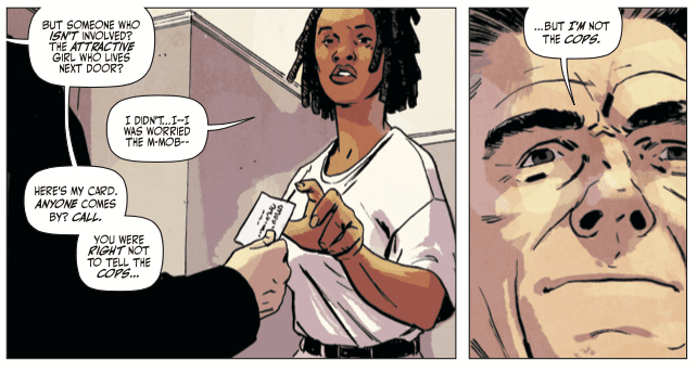
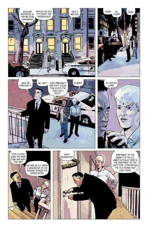
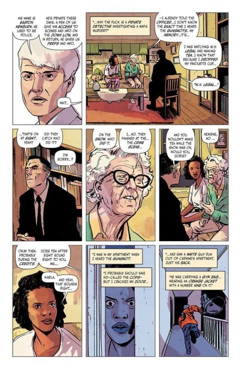
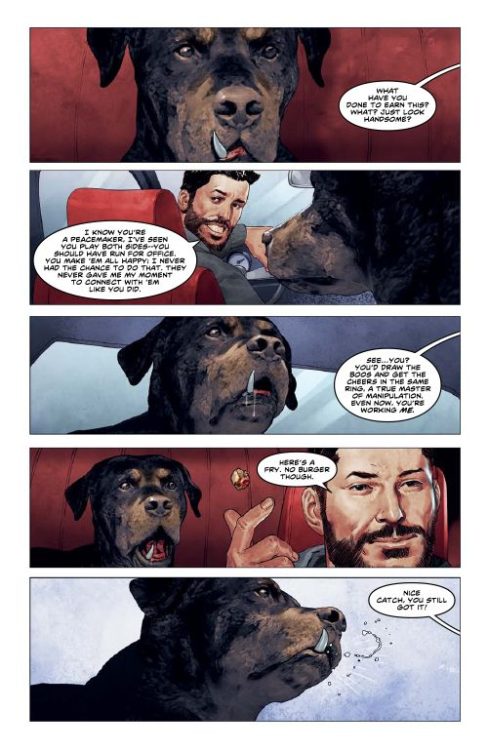
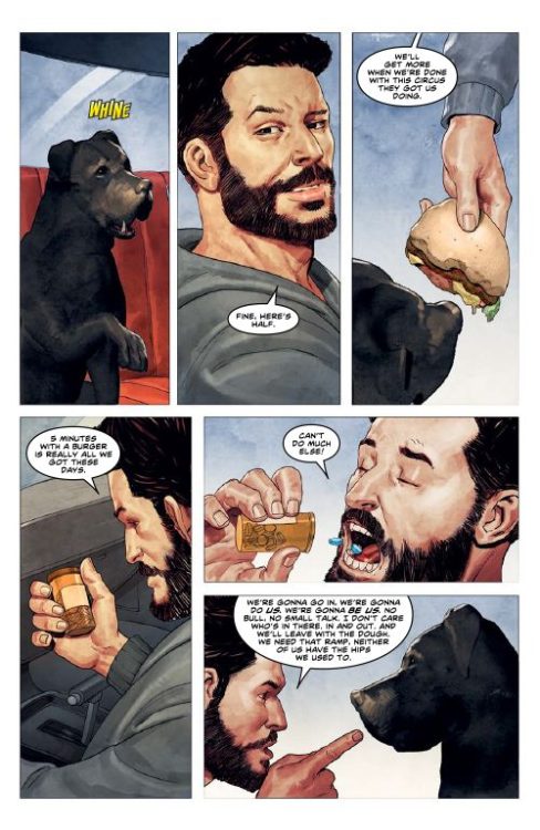
Newburn #1 is going to make you hate writer Chip Zdarsky and artist/colorist/letterer Jacob Phillips. Not because the new series from Image Comics isn’t great — it’s fantastic, fresh, and funny. And that’s exactly the problem. When you read about Easton Newburn, you’re going to be pissed off you hadn’t come up with him first. Zdarsky and Phillips introduce readers to their own version of Columbo. Difference is, this guy might kill you if you cross him.
About Newburn #1 (from Image Comics):
EASTON NEWBURN is a private detective without loyalties, investigating conflicts between rival crime factions while collecting enemies along the way. In this DEBUT ISSUE, a man is murdered after stealing from his own mafia family, but they aren’t the ones who ordered the hit…
Writing
Zdarsky’s script for Newburn #1 has several plates spinning at once. It’s a brilliant crime thriller, an interesting mystery, and it has a dash of comedy. But none of these factors are competing against one another; they were perfectly in sync. In fact, it’s the gritty, no-nonsense tone that makes the jokes land so well. And it’s the laughable disregard these characters have for other people that makes them feel so damn dangerous. When Newburn is stopped at the entrance to a club, he wastes no time in getting his arm around the bouncer’s neck, ready to choke him out. When the club owner comes out, he just tells Newburn to go easy on the new guy. It’s all part of a day’s work for these characters. Their casual responses to violence are both hilarious and disconcerting at the same time.
Art
Maybe it’s Phillips art that puts the Columbo connection in my mind. There’s a dry smugness to Easton Newburn. It’s like he has the whole thing figured out from the first scene, but he’s waiting for his cue to blow the lid off the case. He’s waiting for his “one more thing” moment. You can see it on his face. He’s completely emotionless as other characters get riled up, but then he grins slightly when he knows they’re really pissed off. It’s these little flashes of self-satisfaction, between the lifeless looks of a man on the job, that we learn everything we need to know about Newburn. His is the face of a man who knows far more than he’s letting on.
Coloring
Through Phillips’ coloring, every scene in Newburn has a kind of glow to it. The night air is a dark, rich purple. The inside of a seedy, Russian bar is cast in a deep red hue. Even one of the character’s apartments has a soft pink glow to it. Phillips reinforces a sense of time and place to each scene. He gives buildings a personality and street corners a sense of character. It’s a beautiful issue that completely immerses you in the world it’s portraying.
Lettering
Phillips’ lettering is definitely the issue’s biggest weak point. Word balloons often show up with very long tails that jut into the faces of some of the characters. It’s often a little distracting. And when we see Emily’s journal — Emily is at the center of Newburn’s case and her thoughts show up as pages from her journal — it’s odd that there’s no effort to make those pages actually look like a journal. Instead, we see her entries in white and yellow on a black background. It’s a strange design choice that takes the reader out the world for a second. But all of this is small potatoes in the face of this fantastic issue that Zdarsky and Phillips have put together.
You definitely don’t want to miss this series. Zdarsky and Phillips are doing some of their best work with Newburn. Pick it up and check out the awesome backup story “Brooklyn Zirconia – Part One” by writer Nadia Shammas, artist Ziyed Yusuf Ayoub, and letterer Frank Cvetkovic. Newburn #1 is out from Image Comics November 3rd at a comic shop near you!
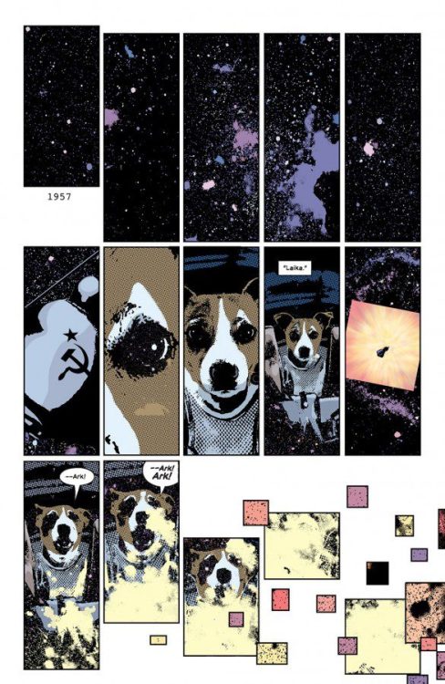
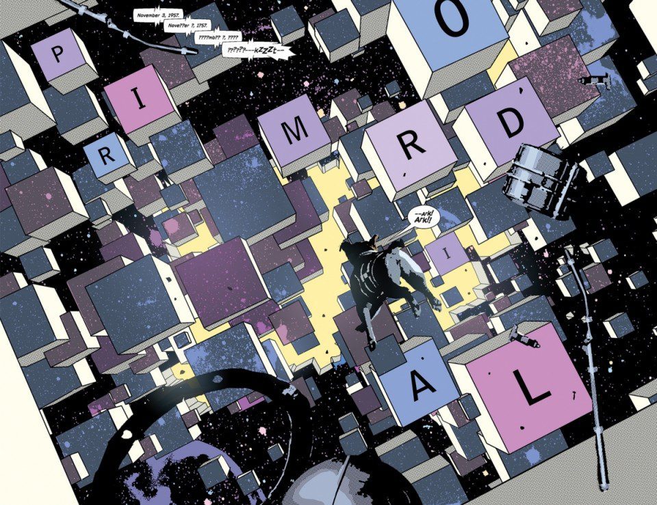
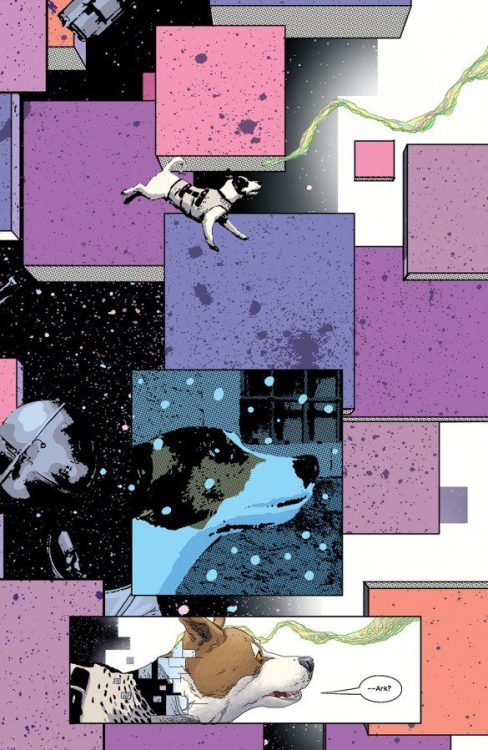
Image Comics’ Primordialis an incredibly complex series. It seems to be about time travel, government conspiracies, and animal rights. But yet, it’s also such a simple series. That’s because writer Jeff Lemire, artist Andrea Sorrentino, colorist Dave Stewart, and letterer Steve Wands boil down their story to the necessary. They give us each step of this journey through space and time in bite-sized, tangible pieces. Primordial #2is a perfect, heartbreaking example of that.
Writing
Lemire shows us life through the eyes of Laika, the space dog. His script is simple, but deeply effective. We see all the people that touched Laika’s life. We hear the things they said to her when no one else was around. But through all of it, we’re focused entirely on her. It’s hard to even write about Lemire’s script, it speaks on such a deep level in such an effortless way. At times, it feels like we can understand Laika’s barking more than we can understand the words that are spoken to her in plain English. Lemire gets us so invested in this little dog, leaving us wondering if she’s the only one who’s really “human.”
Art
Sorrentino makes you fall in love with Laika on page one. Her wide-eyed innocence as she experiences something she couldn’t understand will break your heart. And Sorrentino keeps us fixed on Laika. We see her face in nearly every panel, occasionally switching to see her point of view instead. Except for the last few pages, Sorrentino has Laika constantly in frame. And yet, his images of her differ quite a lot. We see some, drawn in the style we’ve come to know Sorrentino for. Her face is shadowed and photo-realistic. But then we see her drawn through traditional linework. Sorrentino proves he’s a master of both formats and can break our hearts in any style he wants.
Coloring
When we first meet Laika, she’s out in the cold on a snowy night in Russia. Stewart paints the page in a cold, blue hue. When a man is taking out the trash, he spots her and gives her a kick. Stewart shows the panel of the man’s foot making contact in a warm orange and brown. It’s interesting to see that. The coloring looks safe and comforting, but what’s happening is violent. Later, Stewart makes sense of it. Laika comes into contact with a woman who’s going to take care of her. Stewart colors these scenes in the same orange and brown tones. Stewart shows that Laika is hesitant. All Laika knows about people is that she’s been abused by them. So now, in the warm company of a woman who loves her, Laika is slowly figuring out that people might not all be bad. Or maybe Laika’s just too trusting.
Lettering
Wands’ lettering simplifies the often complicated page layouts. Lemire and Sorrentino use layouts that include scattered panels and interrupted images. The intention, which works brilliantly, is to overwhelm the reader. But it’s Wands job to make sure that, after the initial feeling of being overwhelmed has passed, the reader can dive right back into the story. And so, Wands takes us through each page, like we’re following a lazy river. Each word balloon points us to the next, guiding us through the page. Wands helps us get lost in the story.
Pick up Primordial #2, out from Image Comics on November 3rd. It’s a beautiful story that will rip your heart right out. This creative team is taking complex ideas and connecting them to bite-sized pieces. We’re experiencing everything through the wide-eyed perspective of the animals at the center of it all.
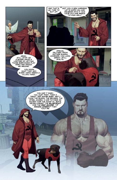
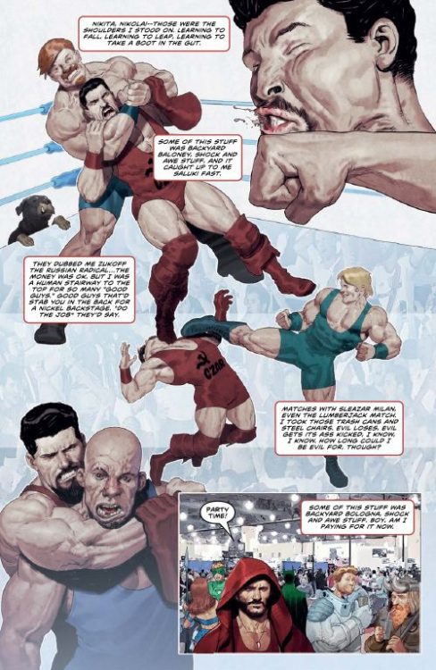
The phenomenal hip-hop supergroup Czarface has teamed up with Z2 Comics and artist Ariel Olivetti for an insane fictional-biographical graphic novel in Czarface: A Czar Is Born. Full of music, wrestling, alien invasions, and dudes dressed like dogs, this absurdly fun comic story is the kind of treat made by comic fans, for comic fans, in a way only comics can accomplish. I got to sit down and talk to lead writer and Czarface member Seamus Ryan, a.k.a. MC Esoteric, about his influences and the creative process behind bringing this graphic novel to life.
“Hero to some, villain to others, Czarface’s true origins have remained a mystery…UNTIL NOW! Who are the Zarta Ku? And why has their desperate mission brought them to Planet Earth? Meanwhile, Zach and his dog were just a washed up wrestling tag team making ends meet on the comicon circuit when they crossed paths with a woman who will change both their lives forever. Written by Czarface’s own Esoteric (Merry X-Men Holiday Special) with art by veteran illustrator Ariel Olivetti (Cable; Punisher War Journal), this landmark original graphic novel is a must-have for Wednesday warriors, wrestling marks, and hip-hop heads–or fans of all three combined!”
MFR: You writing a comic about Czarface and full of all the over-the-top comic moments and tropes makes too much sense. Where did some of these characters, namely Zach and Fang, and the Zarta Ku, find their origin alongside you guys in this comic?
MCE: Czarface’s origin previous to A Czar Is Born was told in our release First Weapon Drawn, and had similar themes, using Zach as a washed-up wrestler exploiting an ’80s Russian gimmick, but nothing to do with the music. With Z2 approaching me about an OGN, I wanted to steer it in a different direction. Since their lane is connecting music to comics, I saw that as an opportunity to bring the actual music aspect of Czarface into the fold of his comic story. The Zarta Ku’s names, mainly Wageet & Feent, were names my kids invented for themselves as we were all losing our minds during the pandemic. Fang was inspired by Pepper, one of the two dogs we adopted during the pandemic, and also loosely inspired by Matilda, the mascot of the wrestling tag team The British Bulldogs.
MFR: Anyone who listens to your music could probably make a guess as to your favorite comics. What comics and creators did you find most influential while creating A Czar Is Born?
MCE: I always keep Jack Kirby’s art close, and I was reading Invincible so having Ryan Ottley draw Czarface for a print that came with the book was pretty damn cool. I’m pretty sure I was also reading Black Hammer from Jeff Lemire, Al Ewing’s The Immortal Hulk around the time I was writing A Czar is Born, but the past two years have been verrry fuzzy.
MFR: Z2 has been helping a lot of cool stories see the light of day as comics. How did you get in touch with them and how did they contribute to making this vision come to life?
MCE: Chris Robinson held an editorial position there, and hit me up about the opportunity. I had known Chris from when he held a similar position at Marvel and asked me to write an X-Men story there, so Chris has done a lot to pull me into the comics world, and thankfully this venture with Z2.
MFR: A Czar Is Born is brilliantly drawn by Ariel Olivetti and co-written by Chris Robinson. How did you get involved with this creative team and how was the process of putting this book together?
MCE: With Chris it was mostly over the phone, I had a lot of thorough conversations with him about the ideas I was developing and, with his experience, he helped me decide what worked and what was missing and how to rectify that. Thankfully Ariel was up for the job as illustrator. That connection was cool because I was a fan and already had some of his books like Punisher: War Journal and Venom: Space Knight, so I was able to visualize how he’d illustrate Czarface, and he really knocked it out of the park. Our communication was essentially done through Chris and then through a translator, as Ariel’s from Argentina and I’m here in Boston, so that was a unique process for me.
MFR: More and more I feel like I’m seeing wrestling culture and comics collide, and here we have it again with Zach in Czar Is Born. In your experience, how do these two mediums get along so well and what draws them together?
MCE: Yeah shouts to Aubrey Sitterson, he put in a ton of work on his The Comic Book Story of Professional Wrestling… I feel there’s always been that wrestling element dating back to Crusher Hogan in Spider-Man’s first appearance, and I remember that short run from the early ’90s that Marvel did with WCW! I think they relate because there’s the good vs. evil element and the combat element, and the wild storylines that keep fans roped in!
MFR: Kind of a follow-up on that last question, Hip-Hop, and music in general really, has always had a sort of clandestine relationship with the comics medium. How do you think that works, and how do you channel it in A Czar Is Born?
MCE: I think they’re both artforms that take a ton of passion and a touch of imagination. They’re also escapes from reality for a lot of people, where they can feel like or become the main character of something in a moment alone. A lot of hip-hop gets its power from confidence and bombastic boasts, where you’re positioning yourself as larger than life, and I feel a lot of music artists draw inspiration from heroes they read in comics or saw in animated series….and artists when writing or animating or illustrating can get some refreshing vibes from the music. To me…where I’m sticking my sword into both worlds, it’s symbiotic.
Be sure to grab this rad as hell graphic novel from Z2 Comics today!
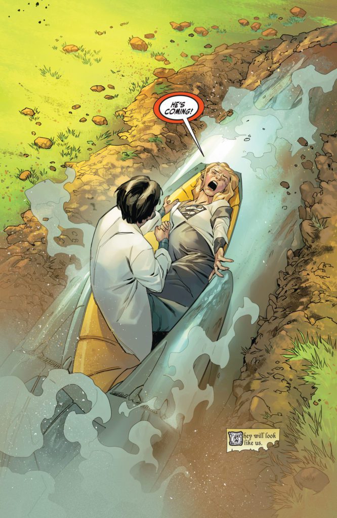
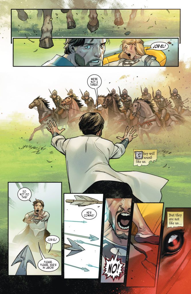
DC Comics’ Dark Knights of Steel #1 looks simply like it’s taking DC characters and putting them in a medieval setting. But that’s just the tip of the iceberg. Writer Tom Taylor, artist Yasmine Putri, and letterer Wes Abbott make huge changes to these DC characters, showing us that anything is possible.
Writing
Taylor has fantastic knack for shaking things up. From his work on Injustice to Suicide Squad, Taylor has shown he likes to see familiar characters working through uncomfortable new dynamics and circumstances, with real stakes. It’s refreshing. The safety of it being a “superhero comic” is stripped away by Taylor’s audacious scripts. And in the very first scene of Dark Knights of Steel, Taylor proves that this series is no different. He takes the most familiar origin story in DC Comics and changes it, drastically. As the issue progresses, we see that his changes ripple out into the world he’s practically building from the ground up. We’re no longer sure who is a hero and who’s a villain. Better yet, we have no clue what’s going to happen next.
Art & Coloring
Putri bounces back and forth between deeply emotional beats and light, funny ones. She seems just as comfortable drawing Constantine, convulsing on the floor from prophetic visions, as she is drawing Harley Quinn’s cartoonish expressions as she taunts the Bat Prince. At one point, Putri gives us reason to question whether these versions of Superman and Batman – here, he’s called the Bat Prince – are quite like the characters we’re familiar with. We see Superman pictured in cool blue. He’s holding his hand over a woman’s mouth, looking at her with curiosity. The next panel shows the woman in red, then we see the Bat Prince in the same cool blue tone, holding the hilt of his sword up where the woman’s head had been.
Putri makes the movement of these panels seem almost like a standoff. It reads innocently enough, but the coloring of the scene sows the seeds for tension and strain in this pivotal relationship. Putri also gives each scene a real sense of timing with her coloring. The lighting of each scene changes, making it feel like we experience a full day with the characters. It’s a small thing that makes a big difference, putting readers right into the story.
Lettering
From the get-go, we’re introduced to a world of chaos. The large “RRRRRMMBBBLLLLLLE” of a planet breaking apart finds its way into each panel. But once the characters have gotten clear of the destruction, the chaos doesn’t subside. Dialogue and sound effects zigzag randomly across the page, making your eyes dart around to take it all in. Abbott makes the scene feel overwhelming. It puts readers right into the minds of the characters. Readers feel the chaos and tension, all from the balloon placement and spacing, just as the characters experiencing it all do.
DC Comics’ Dark Knights of Steel #1 not only introduces us to a new world but to what feels like a whole new set of characters. This creative team is boldly changing up classic stories to cast them in a new light. Pick up Dark Knights of Steel #1, out from DC Comics November 2nd, at a comic shop near you!
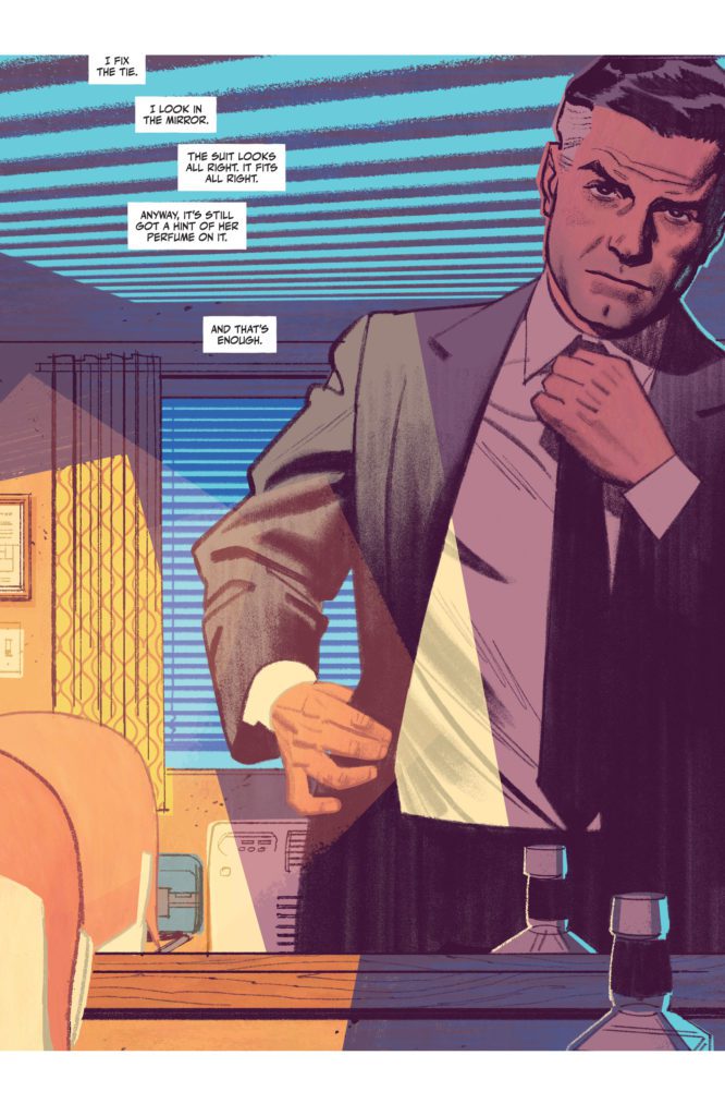
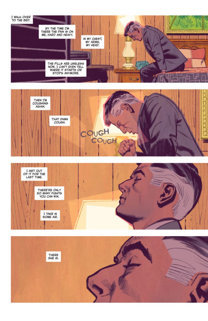
DC Comics’ The Human Target #1 starts with a dead body. It’s not floating in a pool, but it’s still the kind of opening that would make Billy Wilder proud. So much of The Human Target borrows from classic noir stories, namely those of legendary writer/director Billy Wilder. It’s part Sunset Blvd, part The Lost Weekend, with a dash of Double Indemnity. Writer Tom King, artist Greg Smallwood, and letterer Clayton Cowles present a hard-boiled mystery about a doomed private eye, who has a knack for theatrics and disguises. This issue is one that’s steeped in dramatic irony, so be warned that spoilers abound!
About The Human Target:
Originally created as a side character in Detective Comics by Edmond Hamilton and Sheldon Moldoff, “The Human Target,” Fred Venable, was a man who offered a very specific service. Venable would dress up as his clients, people who were wanted dead. Then, when an attempt was made on his life, he’d be there to catch the killer red-handed.
Rebranded and rewritten now as Christopher Chance, by Len Wein and Carmine Infantino, Chance carried on Venable’s legacy as the Human Target in the pages of Action Comics. Now, King, Smallwood, and Cowles bring Chance back to DC Comics. He’s down on his luck, doomed from the start, and hopelessly in love. It’s everything you could want in a superhero-studded detective story.
Writing
This isn’t King’s first outing into noir territory. His writing often employs noir devices, but The Human Target sees King embracing those influences to their full extent. King writes from Chance’s perspective. Chance has all the charm and panache of Humphrey Bogart. He’s confused, even desperate, beneath a cool and calm exterior. He references Fred Astaire and says words like “dandy.” And Christopher Chance, like the best noir protagonists, is totally self-destructive. Of course he is, who would do his job if they weren’t a little ready to bite the bullet? But the way King writes him, you can’t help but love him.
King also commits, wholeheartedly, to the dramatic irony of this story. Not only do we see Chance, quite literally, in his deathbed as we open, but King shows us a one panel snippet of each day that led up to this moment, before taking us back to the beginning. These single panels range from pivotal moments – gunshots and fistfights – to innocuous banter. But it sets the tone for this series. This looks like it’s going to be a series about the overwhelming evil of man, and the little meaningful moments of kindness that happen in the pauses between the waves of chaos.
Art & Coloring
Smallwood’s art is incredibly cinematic. When Chance lays down in his bed, Smallwood closes in on Chance’s closed eye, zooming in with each panel. Smallwood lulls us into the rhythm of this story. It’s the slow, easy pace of a mystery that is going to be steadily unraveling. We see Chance from above his bed. He looks peaceful. But the next panel shows Chance from a similar angle, only now he’s being slapped across the face. The panel isn’t colored in the soft blues and browns of the previous pages. It’s a neon green.
Smallwood, himself, almost seems to be slapping the reader across the face. He’s waking us up with this sudden shift. It introduces us to the violence in this story, too. And Smallwood continues coloring the comic this way. Scenes of a dark blues, with a smidge of green, are interrupted by moments of dark red. He’s telling us this is a series where peace is fleeting. And Smallwood is telling us this in the most visually stunning way possible.
Lettering
Many of the sound effects are part of Smallwood’s art. He draws in the scattered “CLAP” noises of an audience’s uneven clapping. The subtle “RING RING” of a phone next to Chance’s head is shown in small blue letters. Many of the louder sounds, like the “BANG” of a gun or the “KRAK” of a punch, are used as panel borders. It shows how those moments are defined by that noise and what’s making it.
Cowles’ lettering for the captions and dialogue gives this comic such a smooth, slow feeling. The captions snake lazily through the page, effortlessly connecting panels together. When Chance begins to think that something might be wrong with him, the lettering changes. It begins to bounce around panels, mimicking the frantic nature of Chance’s thoughts. And once Chance knows what’s going on, the lettering resumes its gentle course through each page.
King, Smallwood and Cowles are wearing their influences on their sleeves. They’re harkening back to old noir movies, seamlessly adding little nods to these classics into a story that feels destined to become a classic, too. King’s script is engrossing, Smallwood’s art is hypnotically beautiful, and Cowles’ lettering sets the pace perfectly. Pick up The Human Target #1, out from DC Comics’ November 2nd, at a comic shop near you!


")