In 1959, two monkeys by the names of Able and Baker left our little blue and green orb to see the wonders of space. They never made it back. Actually, they did make it back, and their successful mission to the stars paved the way for man to walk on the moon a short ten years later. But in Image Comics’ Primordial #1, that’s not how things happened. Writer Jeff Lemire, artist Andrea Sorrentino, colorist Dave Stewart, and letterer Steve Wands show us an alternate look at history. And this new take underlines some of humanity’s greatest fears.
Writing
Lemire rewrites history in this issue… literally! And he wastes no time catching us up to speed. Either you remember this footnote in the history of the space program or you don’t. (If you’re like me, you do a quick Google search and find yourself still reading up on the US and Russian space programs an hour later.) But Lemire goes beyond just changing the facts. Laika the space dog, from one of Russia’s launches, and Able and Baker don’t just disappear. They change the course of history. With three animals mysteriously blinking out of existence, Lemire shows how humanity quickly becomes too scared to see what’s up there. Lemire’s use of historical details, his extrapolation on how it would effect things years down the line, and his “sink or swim” treatment of the reader makes this issue a ballsy, enthralling, and exciting read.
Art
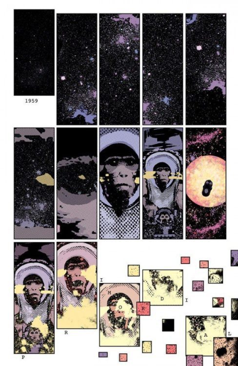
Sorrentino is doing some of his best work in this issue. With things like Gideon Falls, Green Arrow, and Old Man Logan under his belt, that’s really saying something. But this issue sets the stage perfectly for Sorrentino to have a blast. Every page is a tug of war between order and chaos. We open on a 15 panel grid, three rows of five. We see space, then zoom out to see one of our space monkeys. But then, as the monkey sees something, everything changes. Sorrentino turns the last four panels on the page into many tiny panels, all over the place, depicting confusing details.
Throughout the issue, Sorrentino really highlights dead space. Some pages have a beautiful backdrop for the panels, but then a large margin of white sits at the bottom of the page, interrupting the image. Other pages have large, uneven spaces between each panel, emphasizing the white between them. Even the actual words “dead space” tell us a little about what Sorrentino is doing here. He’s highlighting our fears: our fears that we will lose control of our world, that chaos can come in at any moment, or even our fear of the vast, expansive canopy of “dead space” itself.
Coloring
There’s a gentle, soft coloring to much of this issue. Stewart uses pinks, purples, blues, and browns for most scenes. It feels like the whole issue is happening with the lights turned down. It’s relaxing and beautiful. There’s even a moment in the issue that specifically calls for a rainbow. But Stewart colors the rainbow in soft purples, pinks and oranges. It looks like the colors of a popsicle, or something off of a 70’s movie poster. On one page, however, Stewart snaps us out of our gentle dream. He uses neon yellow, bright green, dark reds and vibrant purple. The whole page begs us to ask ourselves what’s really going on. It makes us look past the lens of this being a historical moment. Instead, we’re asked to look at the cruelty and panic beneath this page that’s out of a history book.
Lettering
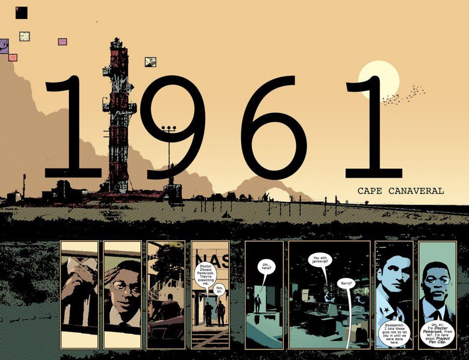
Wands makes a point of giving an orderly and scientific feel to much of the lettering. Time stamps appear on several pages, and they often show up as white lettering on a small black text box. It has the look of something churned out of a label maker, like something used in an official dossier. But things change up when the issue gets a little supernatural. On the left hand page, the caption boxes are flat and simple. But on the right hand page, they pop out, like the words are written on the side of a cube. With this slight difference, Wands hints at a new reality that can bend and warp everything, even the way this story is being communicated.
Image Comics’ Primordial #1 is a ballsy work of historical fiction. It not only puts a twist on history and science, but it asks us to reexamine things that have come to feel more like a footnote in a textbook than anything else. Pick up Primordial #1, out from Image Comics on September 15th, at a comic shop near you!