The first thing you’ll notice about Radio Spaceman is how confident it is. Writer Mike Mignola, artist Greg Hinkle, colorist Dave Stewart, and letterer Clem Robins have a fully fleshed-out world they’re inviting us into. Every character has a reputation. Every planet has a history. But instead of painstakingly walking us through their worldbuilding, this creative team dives right into the story. It’s a fantastic and fun approach.
About Radio Spaceman #1 (from Dark Horse Comics):
When a ship crashes and lands on a mysterious planet and some of the surviving crew go missing, the mysterious mechanical hero Radio Spaceman is called to investigate. But the planet hides much more than the missing crew, and Radio Spaceman may be stumbling into more than even he can handle.
Writing
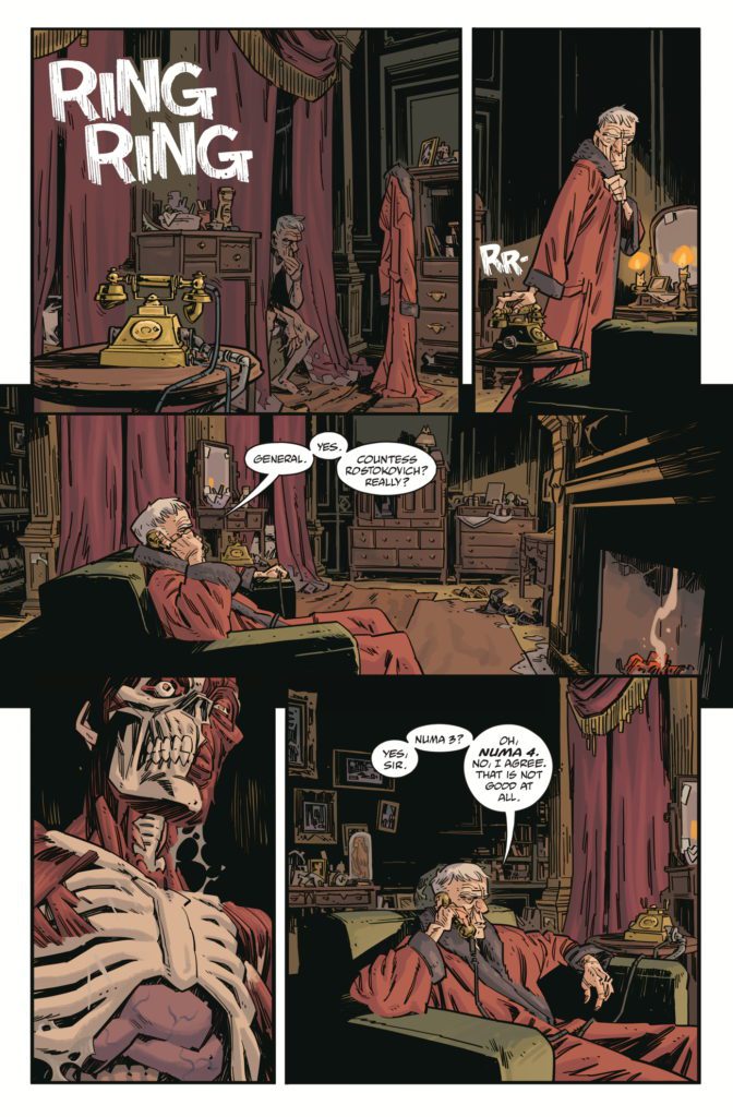
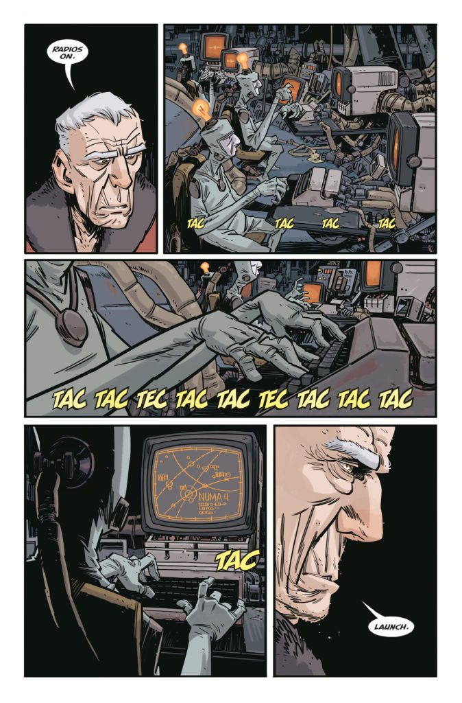
In the opening pages, we see an old man get out of bed and answer his phone. We only hear half of the phone call, but we’re led to believe there’s someone very important on the other end of the line. A planet is in danger and they need his help. We’re immediately wondering, “What’s so impressive about this guy that he’s called on to protect planets?” He’s not exactly formidable. But then he shuffles into another room. With a few key words, the room comes to life. He plugs himself into a control console and begins his latest mission. Nuna 4, the planet in question, may be on the brink of destruction. Yet everything about this scene tells us that to our main character, who isn’t even named, this is just another day of the week.
Mignola’s script is brilliantly understated. He speaks more in silences than he does in actual dialogue. In fact, there are a good half dozen pages with no dialogue at all. Many more have no more than a couple word balloons, total. That’s because Mignola knows he’s communicating plenty as it is. He tells us everything we need to know with his character designs and the action of each scene. And in holding back on his script, Mignola gives his main character a casual charm. The man’s not a talker, he’s there to get shit done. Radio Spaceman #1 is all about getting right to the action.
Art
This creative team, other than Hinkle, has worked together plenty of times before. Mignola, Stewart, and Robins have done scores of issues on Baltimore and Hellboy. They’re a team that just gels. And Hinkle fits right in. He might be the newcomer to their group, but it feels like he’s always been there. His characters are so full of personality. The main character, the mind behind the Radio Spaceman, is the very picture of boredom. He’s constantly looking a little upset that he got out of bed for this. The same can be said of a character, near the end of this issue, who is supposed to be in mortal danger. She’s not scared or worried, she knows she’s getting out of this. She’s just impatient for the cavalry to arrive. Hinkle compounds the feeling that these characters have a long history of doing this kind of thing. They’ve faced bigger baddies, more impossible odds, and now every danger is just another reason they’ll be getting back home later than expected.
Coloring
Stewart, as always, gives every scene a tangible ambiance. You can see the faded glory of our main character’s bedroom in the light browns and the discolored reds. You can almost smell the dust on the grey counters of the dilapidated control room. But then, once we’re seeing the landscape of Numa 4, the pages begin to buzz with a warmth and light. The pinks and purples of the alien flora are subtle but beautiful. The bright green sparks of extraterrestrial guns and the vivid red of blood give the action sequences an extra kick. Stewart will have you fully immersed in the world he’s given color to. You’ll taste, hear, and smell it – not just see it.
Lettering
Robins seems to be having a ton of fun with this issue. You can see his sound effects in bright pinks, oranges, and reds sprinkled across every page. And while many of his sound effects remain effectively the same, with subtle differences, he has a few that stand out in the crowd. The ringing of the phone at the start of this issue is written in large, white font that has cracks like streaks running through each letter. You can hear the hollowness of the sound compared to the full-bodied noises of machinery and sci-fi weapons. When a group of aliens runs out of their hiding place, the “WUAAAAAAA” noise they make as they charge is placed behind their figures. Their heads and arms get in the way of the yellow letters, making the sound feel like it’s coming from deep within their cave. These, and many other little variations to Robins lettering, bring a ton of life to Radio Spaceman #1.
If you want to sit back and enjoy a sprawling, action-packed alien world, Radio Spaceman is the comic for you. It’s somehow both subtle and bombastic at the same time. This creative team has earned the right to be confident in their storytelling. Radio Spaceman is a wonderful result of that confidence. Pick up Radio Spaceman #1, out from Dark Horse Comics March 2nd, at a comic shop near you!
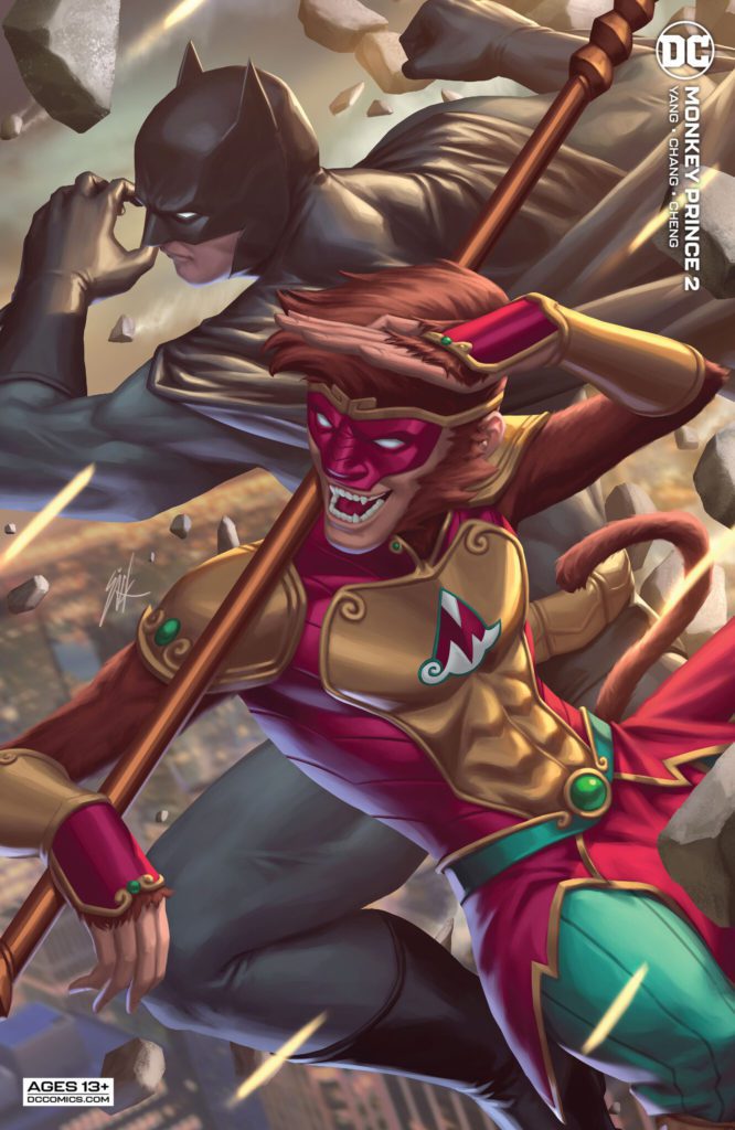
Writer Gene Luen Yang and artist Bernard Chang return with a fantastic new chapter of their mythology/superhero hybrid in Monkey Prince #2. With colors from Sebastian Cheng and letters by Janice Chiang, this follow-up to the stellar first issue continues the momentum with a goofy and immensely fun comic. With a silly yet engaging script and outstandingly animated visuals, this issue proves that Monkey Prince is a must-read in the DC stable.
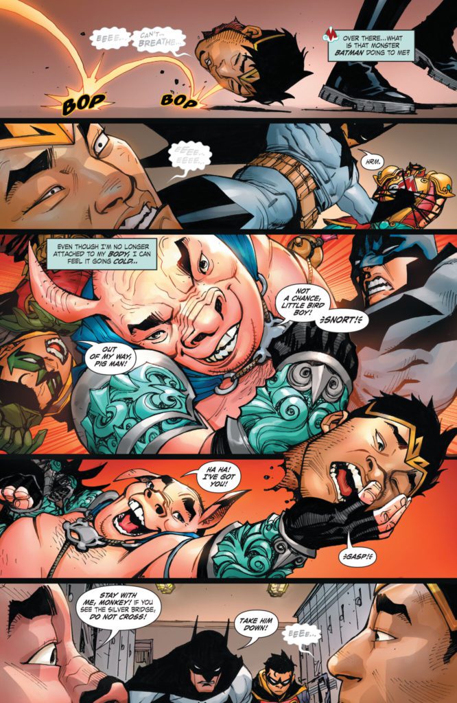
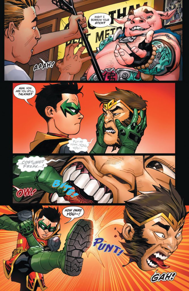
“Batman and Robin fight with Pigsy over…a part of Monkey Prince’s body that fell off and is rolling around moving on its own? And Pigsy better grab it quickly, before Monkey Prince transforms back into Marcus Sun, because there’s no way a regular teenager could survive that!”
Writing & Plot
Gene Luen Yang has struck the proper balance of relatable, inspiring, and absurd with his script for Monkey Prince #2. Marcus, understandably comparable to a young Peter Parker, functions with all the confused naivete of a teenager going through puberty – and a new set of magical superpowers. Naturally, after getting his head cut off in his monkey form and having it kicked around and caught in a lacrosse net by a determined Robin, he’s more than a little apprehensive about his new abilities. This apprehension results in some great exchanges with Sifu Pigsy (aka the best character in this book), as well as some serious irony involving his time with his family. The humor in this issue never lets up and it always lands with its signature over-the top physical comedy and witty dialogue. I can admit I was apprehensive about the inclusion of Batman and Robin in this comic. I mean, seriously, does Bats really need more page-time right now? However, Yang utilizes him in a uniquely comedic manner. He’s written in a way that I would imagine the Adam West Batman series would have been done if it were created today. The way Batman’s seriousness keeps getting tripped up on the strange magical hijinks of the Monkey Prince and Pigsy is a genuine source of good comedy here. This comic is a delightful read, and Yang’s work will keep me coming back here month after month.
Art Direction
This comic’s infectious energy is due to the fantastic and animated pencils of Bernard Chang. The former Wonder Woman artist’s unique yet familiar designs for both our mythical cast and the DC classics continue to be delightfully impressive. If we could get a Sifu Pigsy spinoff drawn by him, I’d be a happy man. Chang’s character animations are fluid and tie in with his panel direction to keep this book’s momentum moving swiftly. What I’m most impressed by is how Chang designs and utilizes the characters from the Chinese myth and places them into the DC universe. The Monkey Prince, Pigsy, and numerous new villains that show up in this chapter all look completely unique and stick out among the DC cast. However, they still retain a comic book-ish iconic hero/villain style.
So much of what makes the visual experience so vibrant is Sebastian Cheng’s coloring. Each panel explodes with life and action thanks to his work filling in Chang’s pencils and inks. There’s an almost youthful flair to this comic’s hi-fidelity style that, to be frank, reminds me of a Marvel book. The lettering from Janice Chiang is modern and has tons of flexibility within the dialogue bubbles. Every aspect of this comic visually is genuinely outstanding.
Verdict
Monkey Prince #2 is a ridiculously fun follow-up chapter to the already stunning debut. Gene Luen Yang’s writing is stylistically unique among Western comics, and consistently nails his humor while moving the plot forward in an engaging direction. The visuals from Bernard Chang and Sebastian Cheng are energetic, vivid, and brilliantly animated, making this one of the best looking ‘Big 2’ comics on stands today. Be sure to grab this issue when it hits shelves on March 1st!
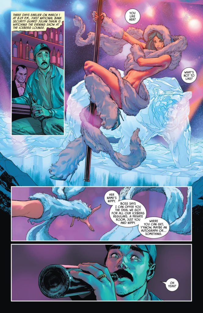
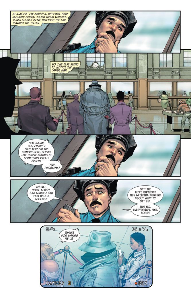
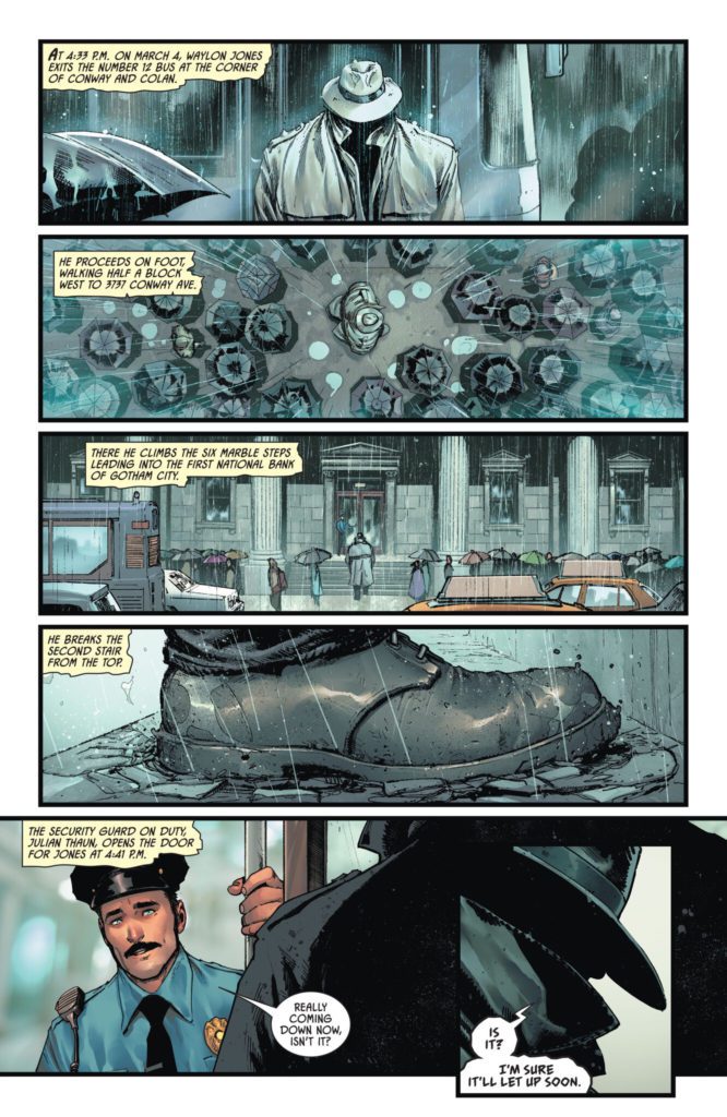
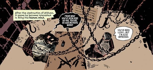
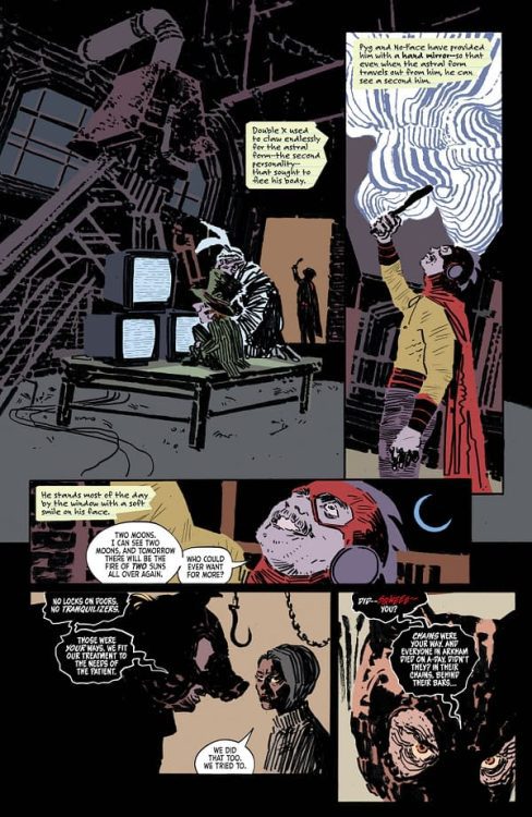
Back when Frank Miller and Alan Moore were working separately to bring more adult sensibilities to Batman, they both came to the same conclusion: Batman is crazy. Which is what a more realistic Batman will always come back to. Dressing as a bat and doing karate is a perfectly sensible solution to an evil crime clown. But it won’t solve any real-world problems. The closer Batman is written to reality, the more of a maniac he becomes. So almost as a sort of counter-balance, Batman has accrued a rogues gallery of serious weirdos over the years. Characters like a shambling corpse who can only recite poetry, a man with eyes in his fingers, and a woman with a hole where her face should be. But that manic edge to Batman and his allies has never quite gone away. So what we’re left with is a Gotham both populated and run by odd, broken people. Which is why this issue of Arkham City: The Order of Things finds the infamous Professor Pyg deciding he’d be better at running his own asylum than the old Arkham handlers. The worst part is, he’s not doing a bad job.
WRITING
Following the reveal last month that Professor Pyg has been gathering escaped inmates from Arkham Asylum, this issue wastes no time in establishing that Pyg’s plan was simply to rehabilitate them. Not so much in a way that would make them fit to re-enter society. Just finding ways to make them happy or calm and less prone to hurting people. Doctor Joy, disturbingly unperturbed by working for a serial killer in a deserted meat-packing plant, has decided to join his staff. She wouldn’t want to abandon her former patients after all. But despite admitting that Pyg’s done some good work, Joy is growing increasingly worried at his plans to release the most dangerous patient under his care.
While the reveal of Pyg’s plan starts this issue with a bit of curveball, Dan Watters still manages to neatly wrap up the main plot while continuing to build on the fun character work he’s done with the former Arkhamites. Ten-Eyed Man is the clear standout of the series. Once a silver-age villain with a gimmick that seemed more a hindrance than a help, Watters brings out the inherent creepiness of a man sporting eyes in his fingers and adds a sense of mystery to his powers. The series is all too happy to leave the villain’s grasp on reality ambiguous. Is he a babbling madman or a true mystic? Who knows? Doctor Joy certainly doesn’t.
ART
Befitting a work that keeps reality at arm’s length, Dani’s work with colorist Dave Stewart eschews outlines, relying instead on solid blocks of color and blots of ink. It feels ethereal, shadows and shapes taking precedence over all else. A big part of Ten-Eyed Man’s success is owed to Dani’s redesign, as well. His new look is immediately striking and spooky. His blank, featureless mask providing great contrast to the bright, multicolored eyes that dot the ends of his fingers. His body language is that of a contortionist, knees often bent over his head, and his body naturally folding itself into uncomfortable positions.
Stewart has considerable experience coloring for minimalist linework, and his colors confidently define the contours Dani’s lines often hint at. The technicolor weirdos under Pyg’s care always manage to brightly stand out against the duller purple, grays, and browns of the meat plant.
Letterer Aditya Bidikar gets to play around, too. They often change styles, switching to use lowercase letters on excerpts from Joy’s memos, or the bright red squiggles of Professor Pyg’s squeals.
VERDICT
Arkham City: the Order of the World is my favorite title to come out of DC in a long while. With three out of four creators returning to working together from the Image book Coffin Bound, Arkham City has managed to harness that same creative energy towards a story centered around the Ten-Eyed Man, of all things. And it works. Wherever these creators go from here, together or apart, I’ll make sure to keep my eyes on them.
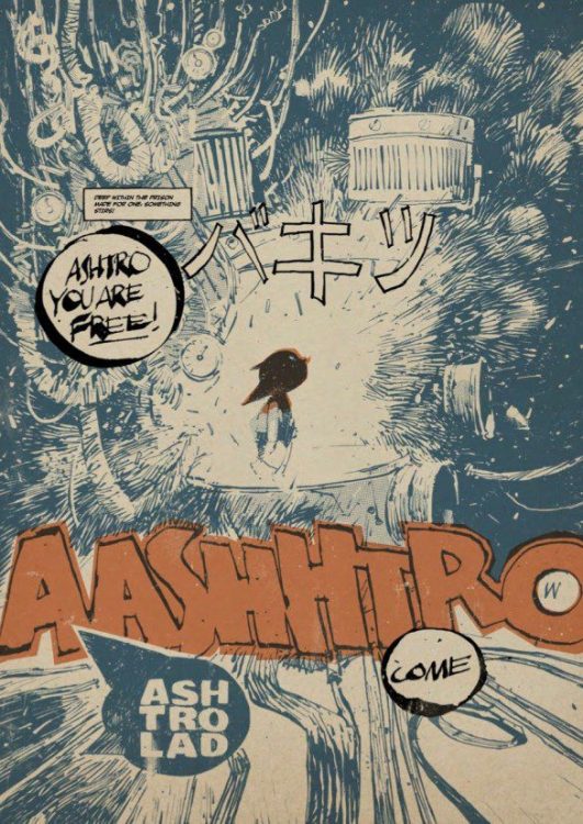
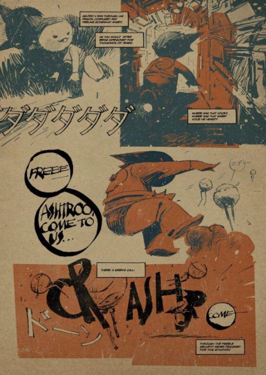
Coming from Image Comics this week is the 7174 Annual No. 1: a collection of comic strips, pin ups, and mind-bending artwork from the brilliant minds of T.P. Louise and Ashley Wood. This 88-page spectacular brings together for the first time a selection of rare works originally produced and published elsewhere. The images are faintly familiar, and the stories have a recognisable tint to them, but that is because Louise and Wood’s work is a uniquely warm homage to both East and Western comic book storytelling. From the obvious Ashtro Lad to the subtler War Comic references, the 7174 Annual is a smart and witty pastiche of comics, and a visual treat from cover to cover.
7174 ANNUAL Credit: Image Comics
Mixed Philosophy
The art direction of the comic is striking and the cover sets the tone, letting you know exactly what you will get. Blocks of color are overlaid on the heavy inks in order to bring the characters to life. The style gives the images shape and form in a bold and brash way. Wood’s artwork demands attention and his multiple artistic endeavours, working on television, film, toy design, and game graphics, seeps into every page of this comic.
The book opens with the origin of Ashtro Lad, mimicking the famous Atomu (Known internationally as Astro Boy) comics and cartoon series from the 1950s and 1960s. But this is more than a passing homage to Osamu Tezuka; it is recognition of the profound effect the Japanese creator had on popular culture both in his homeland and abroad. At first, it seems to poke fun at the concept but, through the superb scripting from Louise, it actually enhances the mythic quality and the world building potential of the mechanical boy.
Louise draws on European comic traditions and sensibilities to bring eroticism to elements of the story. The concepts of sex, birth, and responsibility are embedded into the comic and the narrative. Constant voice-overs, portrayed in caption boxes, don’t always have clear owners but this doesn’t appear to matter as the narrative point is made nonetheless. This constant stream of consciousness, in style and substance, is a call back to classic Heavy Metal Magazine strips and the works of Moebius and other Bande dessinee creators.
7174 ANNUAL Credit: Image Comics
There is a mix of art influences from Eastern and Western comics history, but there is also a merging of innocence and experience in the narrative, a further combination of the child friendly Japanese comic strips and the adult themed European books. Louise and Wood blend these influences together in each short story to produce something that is funny, endearing, and often risque.
This comic is a collection of short stories that share a background narrative link. On occasions the stories bleed into one another seamlessly, while at other points the jump is a little more jarring. However, the ongoing adventure and the cavalier way in which the narrative is edited together adds charm to the story. Subtle gestures produce laugh out loud moments while over the top moments of mechanical madness are visually awe inspiring. This comic is clearly a labour of love, wearing its influences on its sleeve. Older readers will be whisked back to the 1990s with the Pixie-esqu lyrics, Industrial rock aesthetic, and the manga obsession of merging organic and machine parts that was sweeping the world from Japan. Newer readers will be faced with a plethora of ideas to indulge and explore.
7174 ANNUAL Credit: Image Comics
Conclusion
The 7174 Annual stands out against Image’s usual output, and will appeal to readers of other erotic fictions like Faithless from BOOM! Studios, or Melinda Gebbie and Alan Moore’s Lost Girls. It has the anarchic wit of Tank Girl and the Kafkaesque psychology of Dan Watters’ Limbo or Coffin Bound. Somewhere within this melee of style is the beautifully crafted poetry of Louise’s words, unfortunately, they do sometimes get lost beneath the striking artwork and dynamic page layouts.
With a myriad of pin ups and splash pages, the 7174 Annual is packed with everything an Ashley Wood and T.P. Louise fan could desire. If you have read any of Wood’s UV Explorer Newsletters and were left wanting more, then this is the comic you’ve been waiting for. It is unusual, stylistic, and innovative. One of my hopes for comics this year is a desire to see bolder and different experimentation’s with the form. Comics like the 7174 Annual will lead this experimentation as it showcases that influences do not have to be limited to one source to tell a story. Mixing a host of influences from around the world can create mind blowing results.
Let the mantra be chanted: ‘Not naked, but draped in art!’
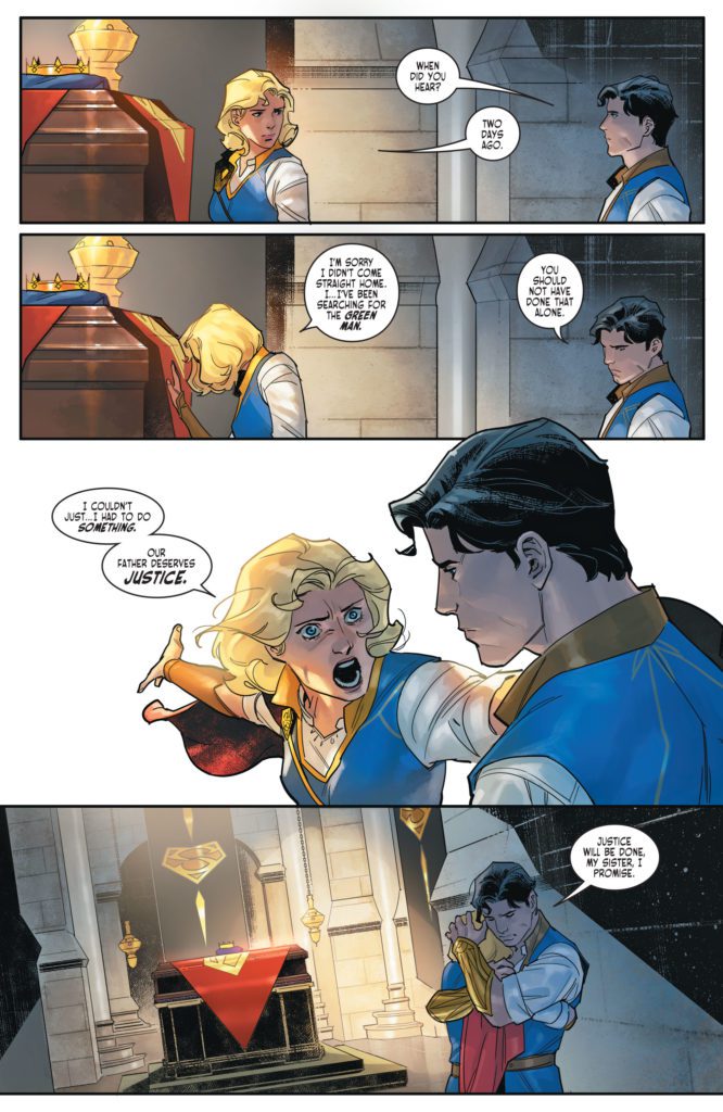
It’s hard to review a comic like Dark Knights of Steel #5. It’s an issue that packs a lot of punch and could lead down some really interesting paths. But it feels like it’s caught in the crossfire of fan service and upending expectations. DC Comics’ Dark Knights of Steel #5 makes bold moves and only time will tell if they’re the right moves. For now, writer Tom Taylor, artist Yasmine Putri, colorist Arif Prianto, and letterer Wes Abbott seem to be telling a story that is a little unsure of what it wants to be. Some mild spoilers ahead.
Writing
From the start of this series, Taylor has made it clear that this is a very different version of the DC Universe. It’s often exciting to see his new takes on old characters. But Dark Knights of Steel #5 feels like it’s being pulled in two directions. Taylor is taking characters down drastically different roads than the ones we know, while also filling these pages with references to existing DC lore. Earlier in this series, Taylor struck a refreshing balance with the old and the new. Now, it feels like his script is becoming a slave to these nods and twists. Where they were once interesting Easter eggs and peripheral details, they now feel like they’re the whole point of the story. Perhaps the biggest twist of the series happens in Dark Knights of Steel #5 – certainly the biggest twist so far – and we’ll have to see where that leads. It definitely opens up plenty of interesting possibilities. But all in all, Dark Knights of Steel is beginning to feel a little contrived and dry.
Art
Though Taylor’s script is starting to stumble, Putri’s art is really beginning to shine. Her page layouts are dynamic and constantly adapting to the plot. When a character loses her balance, the panels shift to be slightly off-kilter. When the dust settles, her panels are shown in neat, orderly groups with right angles. And this theme continues through Putri’s work. When a fight begins again, the corners shift and the panels almost look like they’re about to tumble off the page. It’s a fantastic way to show the power of the characters involved. It feels like they’re barely contained, like they could burst out of the artwork at any moment.
Coloring
Dark Knights of Steel #5 could certainly be described as a gloomy chapter in this series. Characters face betrayal, heartache, and close calls with death. But Prianto doesn’t let that stop him from creating a picturesque world. Prianto’s colors make each scene feel like it’s happening during a cool Spring afternoon. While there are certainly moments of the color shifting, an occasional bright green or dazzling red, these moments are incredibly rare. Even in the midst of violence and backstabbing, Prianto maintains his soft color palette. It brilliantly contrasts the mood of the writing. Prianto makes every sad story beat even harder to deal with. You almost want to yell at the characters, “Why don’t you stop fighting and just enjoy the beautiful day?”
Lettering
Abbott juxtaposes a character’s anguished cry with their weakened mumble. As they’re attacked and hurt, they yell a crooked “HRRK!” in a word balloon with uneven edges. They look up at the character who did this to them and speak their name. The letters are almost like small black dots on a big white canvas. Abbott’s lettering speaks for itself. The first “HRRK!” has the perfect font to hear the mix of confusion and pain. But in having the opposite happen right after, the quiet, breathless mumble that’s barely heard, Abbott highlights the strengths of each line of dialogue.
DC Comics’ Dark Knights of Steel is at a crossroads of sorts. With the big choices this creative team is making, this could turn out to be a very satisfying and unique story. But as it stands, the series feels like it’s trying to do too many things. Is it dedicated to upending expectations or to paying homage to DC canon? In trying to do both, it’s beginning to lose its footing and intrigue. Pick up Dark Knights of Steel #5, out from DC Comics today, at a comic shop near you.
Industry phenom Tom King teams up with artist David Marquez to deliver a stupidly fun and drop-dead gorgeous heist comic in Batman: Killing Time #1. Featuring colors by Alejandro Sanchez and lettering from Clayton Cowles, this issue seamlessly mixes blockbuster heist hijinks with the dark seriousness of a true Batman comic. With a sharp, clever script from King and jaw-dropping visuals, this is a read that fans of the Caped Crusader’s rogues gallery won’t want to miss.
“Three villains, one Dark Knight, and a deadly heist gone wrong. Catwoman, the Riddler, and the Penguin join forces to pull off the greatest robbery in the history of Gotham City. And their prize? A mysterious and priceless artifact in the secret possession of Bruce Wayne! But, as the events unfold, what fun is a heist without a bloody double cross or two?”
Writing & Plot
Tom King flexes his heist-writing muscles with his script for Batman: Killing Time #1. His knack for tightly-paced, engrossing plots is here on full blast, this time with a story starring some of the Caped Crusaders best rogues. These versions of Riddler, Killer Croc, and especially Catwoman are more sinister and classically criminal than their current, more relatable versions. Reading a Tom King Batman comic where Selina is holding a woman hostage in her own home is almost odd. Still, it’s refreshing to see King take such a comparably old school approach to these characters. This book also takes place early in Batman’s career, and so it offers more opportunity for a streamlined heist-conspiracy without years of history potentially bogging down the plot. The McGuffin (what Nygma, Kyle, and Jones stole) itself has yet to be revealed, and that mystery has created more tension going forward in a way these sorts of devices rarely do.
King’s writing style here is a bit different than what we usually see. Most of his actual in-panel writing is an overhead narrative, describing the steps of the heist and what Bats and other characters do in response. I could almost hear it in George Clooney’s voice. This isn’t at all an uncommon narrative technique, especially not in heist stories. However, it’s handled so sharply that it’s still a joy to read. King’s character dialogue and interactions have always been immensely memorable, and we still get that here. Every exchange is framed perfectly for the delivery and each scene has a layer of subtext underscored by charm and/or dread. This is a great script for the opening issue that makes the wait for the next one almost unbearable.
Art Direction
David Marquez stands tall among the other Bat artists King has worked with in Batman: Killing Time #1. His work admittedly is aesthetically similar to that of other recent Batman artists, landing somewhere in-between Lee Weeks and Mikel Janin. However he still differentiates himself in his details and distinct character drawings. His own takes on Riddler, Penguin, Croc, and Catwoman are classic designs in line with the story, but brought to a new level of life through their expressiveness. Marquez may have my single favorite drawing of Catwoman in existence within these pages. His directorial eye is fantastic as well. He pulls off unique angles and perspectives in this comic that adds to its slightly cinematic but still totally comic book reading experience.
Alejandro Sanchez’s colors finish Marquez’s linework with stunning detail shading and tonal choices. This coloring is right in line with much of the work we’ve seen in Tom King’s main Batman run, which is great since every one of those comics has looked incredible. Sanchez brings incredible atmosphere to every page and panel and wraps the whole visual experience in crisp, high-fidelity color-work. The lettering from Clayton Cowles is clean and sharp, differentiating itself slightly between the narration and dialogue. It’s a solid lettering style that works well for the reading experience but kind of stays out of the way. Overall, this is an incredible looking Batman comic.
Verdict
Batman: Killing Time #1 is an engrossing and fun start to this mini-series. Tom King’s script is taut with tension and lined with clever dialogue and sharp narration. The visuals from David Marquez and Alejandro Sanchez are astonishingly detailed, making this one of the finest looking comics of 2022 thus far. Be sure to grab this new issue when it hits shelves on March 1st!
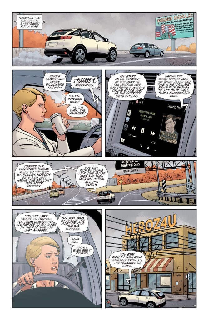
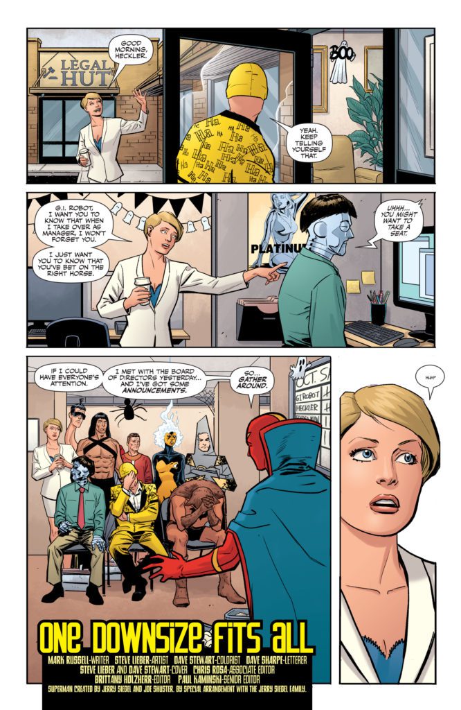
There are lots of comics out there that don’t have much of a point. They deliver gasps, laughs, and gut punches, and then they just end. No big takeaway. No moral. Just a story for the sake of story. I love comics like that. They’re fun and entertaining. But every once in a while, you need a comic that isn’t about the fistfights or the villainous monologues. You need a comic that has a point – that makes you think. DC Comics’ One-Star Squadron #4has made its home in the tension between these two kinds of comics. Writer Mark Russell, artist Steve Lieber, colorist Dave Stewart, and letterer Dave Sharpe have created a world that has plenty to say, populated with characters that wish they were just there to tell a flashy story.
Writing
Russell isn’t trying to be subtle with the points he’s making. He’s making it all too clear: success is a castle with a moat. Once you’re in, you pull up the drawbridge and keep the whole damn thing to yourself. As Powergirl cruises through town, listening to Max Lord’s book on tape, we hear plenty of similar ideas. But One-Star Squadron is also a superhero comic. You get characters like Red Tornado, who used to be on the Justice League, fighting against capitalism with all the drama of a battle to save the world. Red Tornado’s inner monologue is full of melodramatic soul-searching, that’s often comedically oblivious to its own intensity.
At one point, through an anguished admission of feeling spared from a round of downsizing, Red Tornado says he feels “Like a kid who just survived another round of musical chairs.” These are superheroes that Russell is writing, but they’re facing the monotony of office jobs instead of the schemes of Darkseid. You can practically see them looking at the other books on the shelf, wishing they were fighting for their lives and not their careers.
Art
Lieber’s art is similarly pulled in two directions. It’s hard not to laugh a little when you see Flying Fox walk into Red Tornado’s office. He’s wearing his superhero costume – what amounts to a loin cloth and a cape – while sitting on a desk. The image is ridiculous. But Lieber doesn’t overdo it. He leans into the emotion of the scene too. Flying Fox is there to beg for his job. He might stand out like a sore thumb, but the quietly resigned look on his face will break your heart. One-Star Squadron #4 also takes place during Halloween. So every scene of this rather heavy plot is peppered with smiling ghosts and grinning pumpkins. Lieber simultaneously cuts through the tension and piles on the misery. It’s funny that such depressing scenes are happening around such goofy decorations, but it also has a sad irony to it.
Coloring
Speaking of sad irony, Stewart’s coloring is full of it. I’ve mentioned before that Stewart’s coloring is rarely very bright. The brightest colors are always shown in the superhero costumes of our characters. Everything else has a natural look to it, with plenty of browns, greys, and blues. As always, we get plenty of Red Tornado’s crimson skin. As a robot, he doesn’t have the luxury of hanging up the ol’ superhero duds when he gets home. His insignia is painted right on his chest. His cape follows him everywhere. Often, Stewart uses the vibrant colors of Red Tornado as a juxtaposition to the bleak events that are going on. He exists as a harsh reminder that these characters once lived a full, rich life before they left it all behind. But in One-Star Squadron #4, we see a brief moment where Red Tornado feels like his old self. Instead of being the striking patch of color in the corner, his blues, reds and yellows take up the majority of the page. For one glorious moment, Stewart shows us an island of brilliance in a faded sea.
Lettering
There isn’t a ton of action in One-Star Squadron. So when we get fight scenes and battles, Sharpe makes sure that they pop. At one point of One-Star Squadron #4, a character begins fighting a group of people. Every sound effect is shown in neon lettering. Phrases pop out of word balloons in red, orange, or yellow letters. The scene looks like something out of your typical superhero comic. Except that this isn’t a typical superhero comic. So when a page like this comes up, it’s very noticeable. And in making it look like other superhero comics, Sharpe also shows how fighting might be what this character feels most comfortable with. He’s used to throwing punches. He’s not used to sitting at home and trying to be peaceful.
DC Comics’ One-Star Squadron #4 is depressingly aware of the facts. Success is a commodity that’s hoarded by a few, and shared with no one. In One-Star Squadron, even legendary Justice Leaguers have to figure out where next month’s rent is coming from. This would be a hard pill to swallow if it weren’t also delivered with a ton of laughs. Pick up One-Star Squadron #4, out from DC Comics March 1st, at a comic shop near you!
TORI AMOS AND Z2 COMICS PARTNER FOR LITTLE EARTHQUAKES 30TH ANNIVERSARY GRAPHIC NOVEL AND VINYL RELEASE
This unique graphic novel creation celebrating Tori Amos’s landmark album features the massive talents of writers such as Neil Gaiman (Sandman, American Gods) and Margaret Atwood (The Handmaid’s Tale), as well as artists like David Mack, Colleen Doran, and Bilquis Evely.
I got to sit down and chat with Z2 editor and the man overseeing this project Rantz Hoseley. Here we discussed the process for getting this team of creators together, the links between comics and music as storytelling mediums, and more.
MFR: Tori Amos has almost always been inextricably tied to the comics medium in some way or another. That in mind, was the idea for Little Earthquakes: The Graphic Album something that had been brewing for years, or something that suddenly struck as the 30th anniversary approached?
RH: Well, this can be traced back to me staying at Tori’s place in Hollywood while she was writing and recording Little Earthquakes. I was interviewing for a position on The Simpsons, and there was a lot of waiting to hear back from the studio, so I would go to Hi De Ho and Golden Apple and buy a lot of comics, and that resulted in stacks of comics lying all around her place, so one day she was asking ‘which of these should I read?’ and I gave her the ‘Calliope’ issue of The Sandman, and that was that. She was hooked.
I don’t think at the time I thought, ‘oh, this music should have a comic book component,’ but certainly after Comic Book Tattoo the two of us have kept an eye out for an opportunity to do a graphic novel project again. With the 30th anniversary of Little Earthquakes, plus me being at Z2, it made sense to ‘put the band back together,’ so to speak.
MFR: You have assembled a group of some of the most monstrously talented storytellers on the planet contributing to this book; from writers Neil Gaiman to Margaret Awood, to artists such as David Mack, Colleen Doran, and a personal favorite of mine in Bilquis Evely. How did you manage to get this sort of talent to fill this book with their interpretations of Amos’s work?
RH: I think it’s a combo of the success of Comic Book Tattoo. Creators very clearly know what level of quality we’re aiming for in putting this together… and a love and appreciation for the poetry and depth in Tori’s music. I’ve tried to include some folks who are icons when it comes to storytelling, and some folks who I think are some of the most promising newer creators in comics and prose. It was the approach that I took with CBT, and it ended up being very successful, so if anything it’s just refining the formula and approach. That’s the nature of creative work at its best, really—keep moving it forward, and learn from experience in the past to do work to push the boundaries in the storytelling form.
MFR: Other than Amos’s obvious love for the comics medium, how did you figure that the lyrical storytelling of Little Earthquakes could be reinterpreted into a collection of comic stories?
RH: A big part of why Tori’s music and lyrics work so well in comics is because there’s a lot of secondary and tertiary meaning in how she structures a line. She plays with theme and allegory and narrative tangents in a way that echoes the liminal process of how thought works. Since it isn’t declarative and literal, there’s a lot of room for personal attachment and interpretation. It’s the same reason her music resonates with so many people.
MFR: Related to that last question, you and the folks at Z2 have been pumping out graphic novels by musicians about their music left and right – several of which I’ve covered myself. What is it about the comics medium that you think makes it uniquely suited for these adaptations and/or reimaginings of musicians’ work?
RH: Structurally, they are very similar. They both rely on elements of timing and ‘beats’ to convey emotional impact. A full page spread echoes a long held note. A series of small identical panels echo the effect of a staccato rhythm pattern. I spend a lot of time examining the formalist aspects of storytelling, and I think that they work together because of a combination of that echo in structure, and the fact that the surge you get from a dramatic moment in comics is very similar to the surge you get from a powerful moment in music. They are both an internal, personal, interpretive experience, where the audience’s individual background and perception of it plays a critical role in the experience of consuming it. Much moreso than most films or TV shows.
MFR: Do you think any of this awesome work – from Amos’s incredible discography to this graphic album – would have turned out the way it did if you hadn’t slipped Neil Gaiman that demo tape?
RH: I’m a huge fan of Kieślowski’s films, and a recurring theme in his work—Blind Chance, The Double Life Of Veronique, etc—is the idea of possible vectors that a life can take. What the outcome could be. In the exchange of one possibility, what do you gain? What do you lose? TL;DR – “What Ifs.”
On a personal level, I think ‘what ifs’ are great for storytelling, but from a real-life point of view, I don’t really consider them. I’m much more practical and pragmatic about it. I gave Neil the tape… and I can’t honestly even say how much impact it had on Tori’s career, or on mine, or on Neil’s. Tori and Neil and I are all friends, and that is certainly the one measurable impact of me giving Neil the cassette, but past that? There are too many variables to even consider vectors and outcomes, honestly.
Released in 1992, Amos’ debut album Little Earthquakesestablished her iconic thematic voice, as well as her live intensity behind the keys with unflinching lyrics and songs that would inspire generations of artists and musicians. Thirty years later, Z2 will publish a graphic novel that demonstrates the lasting influence of this defining work with 24 stories inspired by the 12 songs on the album, as well as the 12 ‘B-sides’ that accompanied the album and its associated singles. The book will be assembled by Z2 editor Rantz Hoseley, who previously edited the multi-award-winning Comic Book Tattoo, and who painted the cover for her recent Christmastide EP.
Tori Amos says “To have some of the most creative graphic artists interpret the songs from Little Earthquakes, is a true honor. I enjoyed working with Rantz on Comic Book Tattoo so much that when he contacted me about putting something together for the 30th Anniversary, I had no hesitation. Artwork is such an important part of my musical world and to see these songs come to life in graphic form is such a joy.”
Editor Rantz Hoseley states “Having been present during the writing of many of these songs, I can tell you they are inextricably bound to comics. They were on the early demo cassette that I snuck to Neil Gaiman at the San Diego Comic-Con in 1991, telling him ‘this is my friend, she sings about you, please don’t sue her.’ It’s been too long since Comic Book Tattoo, and it’s truly a pleasure to get to make comics with Tori again.”
Tori Amos is a classically trained pianist and singer-songwriter, who came to prominence in 1992 with Little Earthquakes, an album spun out of her religious upbringing and struggle to establish her individual identity. The album served as her commercial and artistic breakthrough, entering the British charts in January 1992 at #15. Little Earthquakes was released in the United States 30 years ago in February and slowly, but steadily, began to attract listeners, gaining attention with the video for the first single, “Silent All These Years.” Since that time, Amos has sold over 12 million albums across 16 releases, with her most recent effort, Ocean to Ocean,released in October 2021.
This graphic novel release demonstrates the breadth of impact of Amos’ work through the 24 stories inspired by the album and its accompanying B-sides. The contributors to the book are an all-star cast of literary and artistic talent, including Tori’s longtime friend Neil Gaiman (The Sandman, American Gods) telling a tale inspired by “Tear In Your Hand” with artist Bilquis Evely (The Dreaming), and legendary author Margaret Atwood (The Handmaid’s Tale) who will bring to life the iconic song “Silent All These Years” with acclaimed artist David Mack (Kabuki), who has also painted the stunning cover. Other contributors include Leah Moore, Colleen Doran, Derek McCulloch, Lar deSouza, Annie Zaleski, Marc Andreyko, Cat Mihos, Neil Kleid, and Alison Sampson. A full list of participating creators and the stories they are creating will be released on March 11th, coinciding with the first part of Tori’s Ocean to Ocean tour.
Little Earthquakes: The Graphic Album will be available in three editions. The 8”x8” standard hardcover edition will be released in finer bookstores, comic shops, and record stores everywhere in September 2022, and will be available for pre-order through Z2 and ToriAmos.com. The limited Deluxe and Platinum Artists Editions will be available exclusively through Z2’s website in limited quantities.
The oversized 12”x12” Deluxe Edition will belimited to 1,450 units, which will come packaged in a collectors slipcase, with vinyl releases of Little Earthquakes and the previously unavailable vinyl picture disc of Little Earthquakes: The B Sides, as well as 12”x12” art prints by Comic Book Tattoo contributors Jason Levesque, KAKO, and David Mack.
The Platinum Artists Edition islimited 500 copies, and includes the signed and numbered oversized 12”x12” graphic novel with a foil embossed hardcover, the vinyl album of Little Earthquakes and the exclusive B-Sides picture disc vinyl, prints by Jason Levesque and KAKO, and a print of the cover signed by David Mack and Tori Amos, and a sketchbook/diary, contained in a die-cut clamshell collectors box that echoes the wooden crate that is synonymous with the cover of this album. There will not be a second pressing of the limited picture disc vinyl of Little Earthquakes: The B-Sides that is available with the Deluxe and Platinum editions.
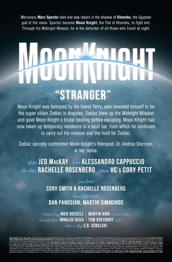
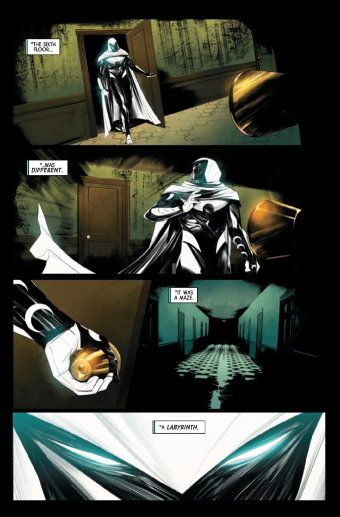
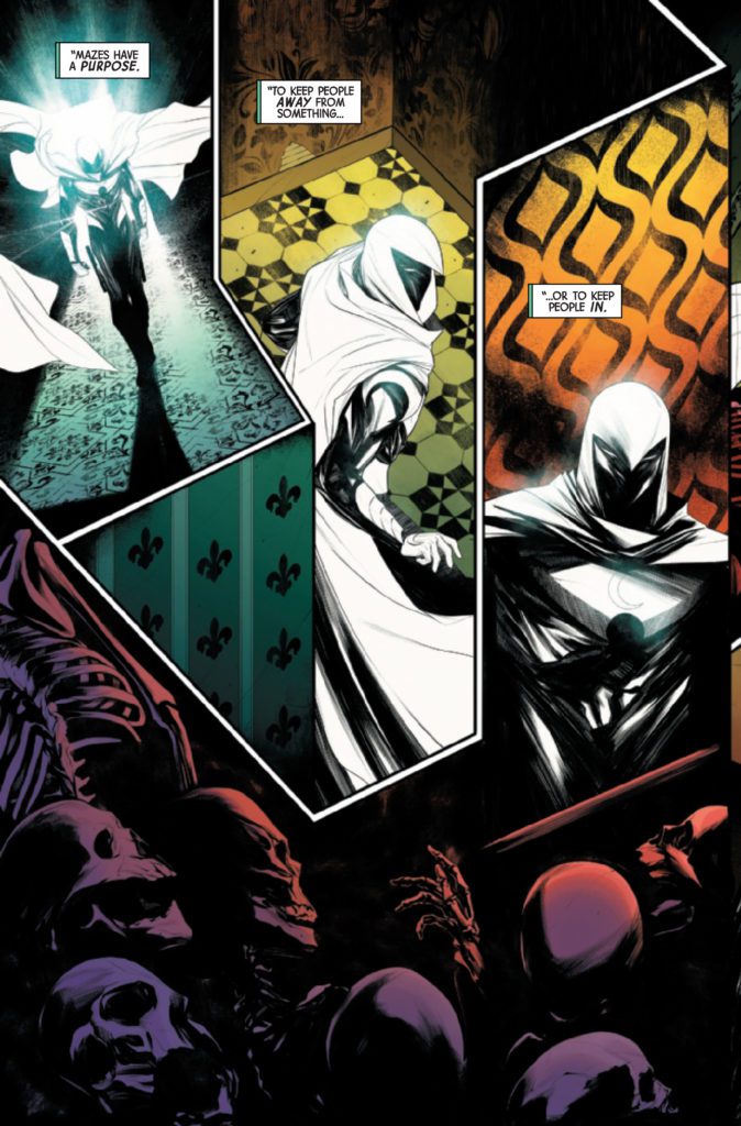
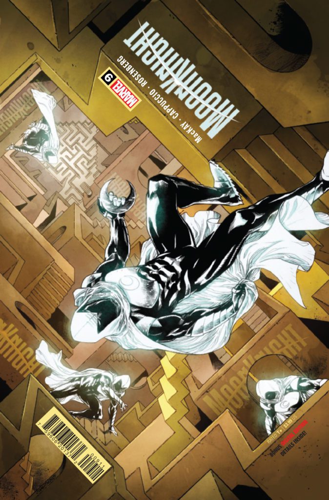
MOON KNIGHT #9 hits your local comic book store March 2nd, but thanks to Marvel Comics, Monkeys Fighting Robots has an exclusive four-page preview for you.
About the issue: Mazes have one of two purposes: to keep people out or to keep people in. An unnatural labyrinth has swallowed up people under Moon Knight’s protection — but how do you fight a maze? How do you kill a labyrinth? And will Moon Knight emerge victorious, or will his body and mind be broken by the Fifth Floor?
The issue is by writer Jed MacKay and artist Alessandro Cappuccio, with colors by Rachelle Rosenberg, and letters by Cory Petit. The main cover seen below is by Cory Smith and Rachelle Rosenberg.
Check out the MOON KNIGHT #9 preview below:
Are you reading the current MOON KNIGHT run? Sound off in the comments!
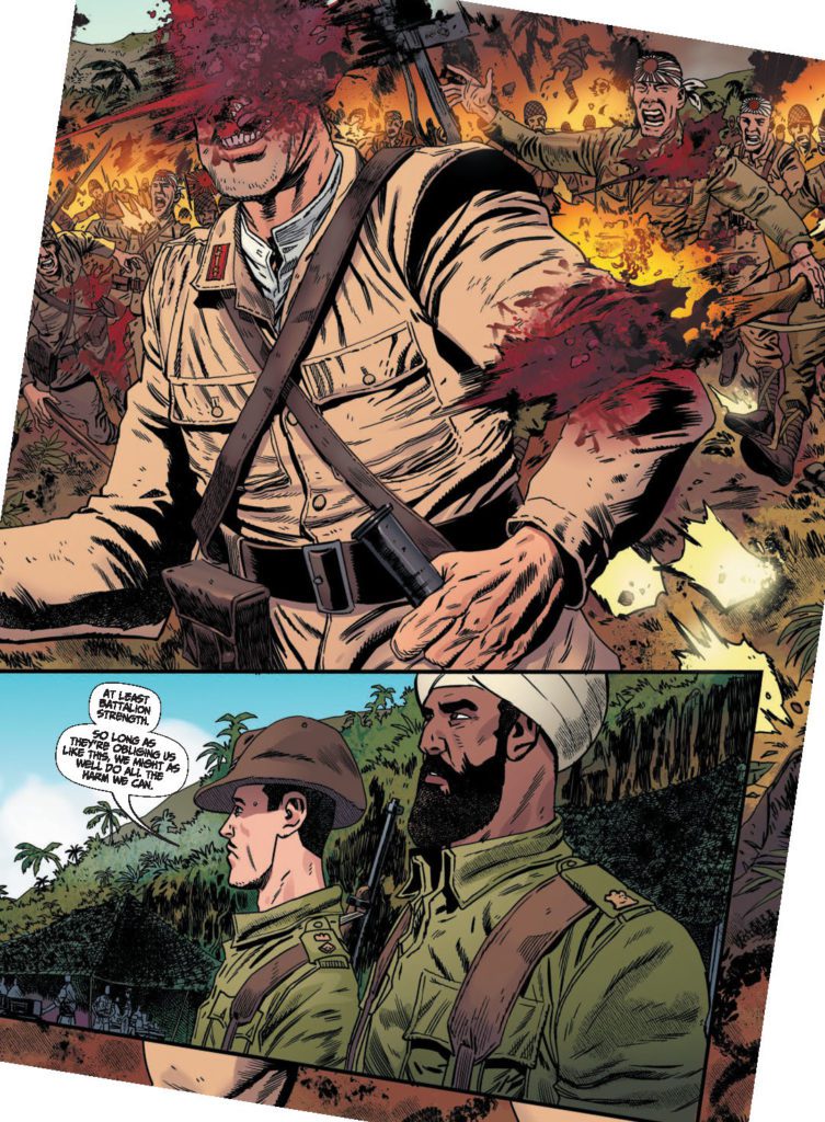
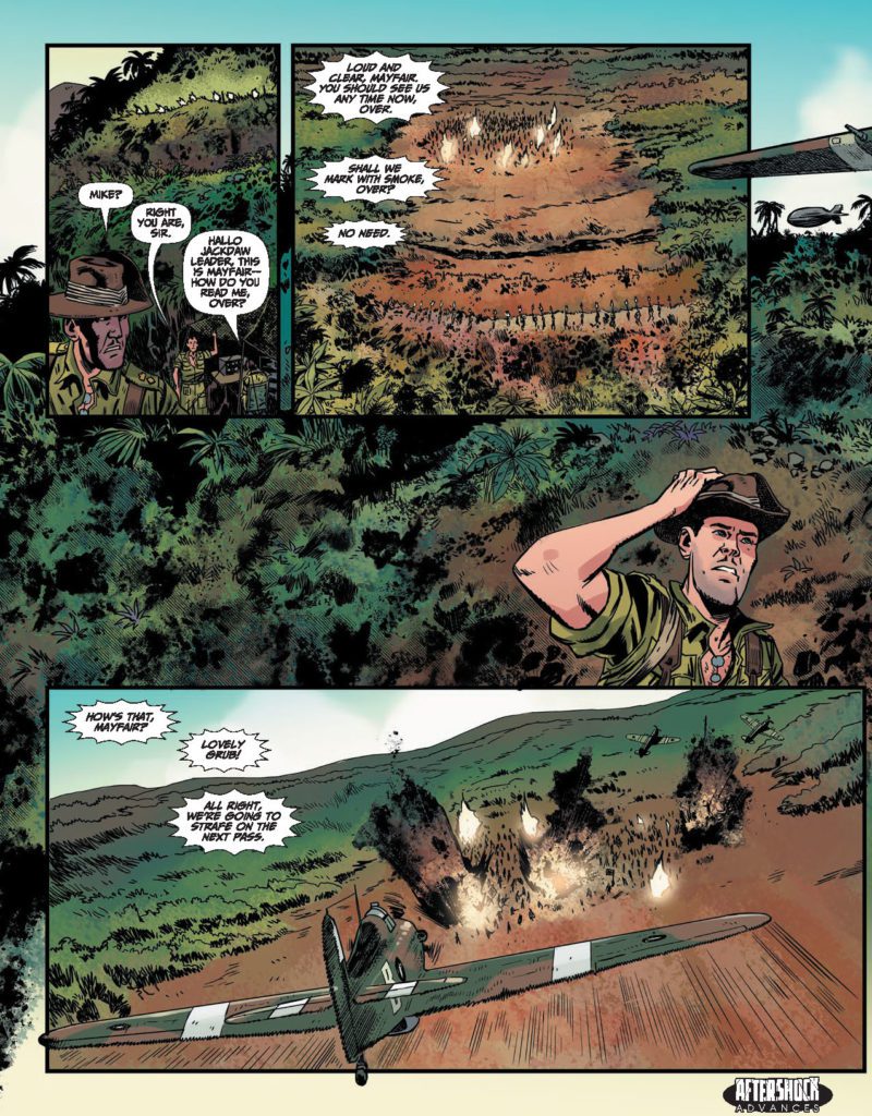
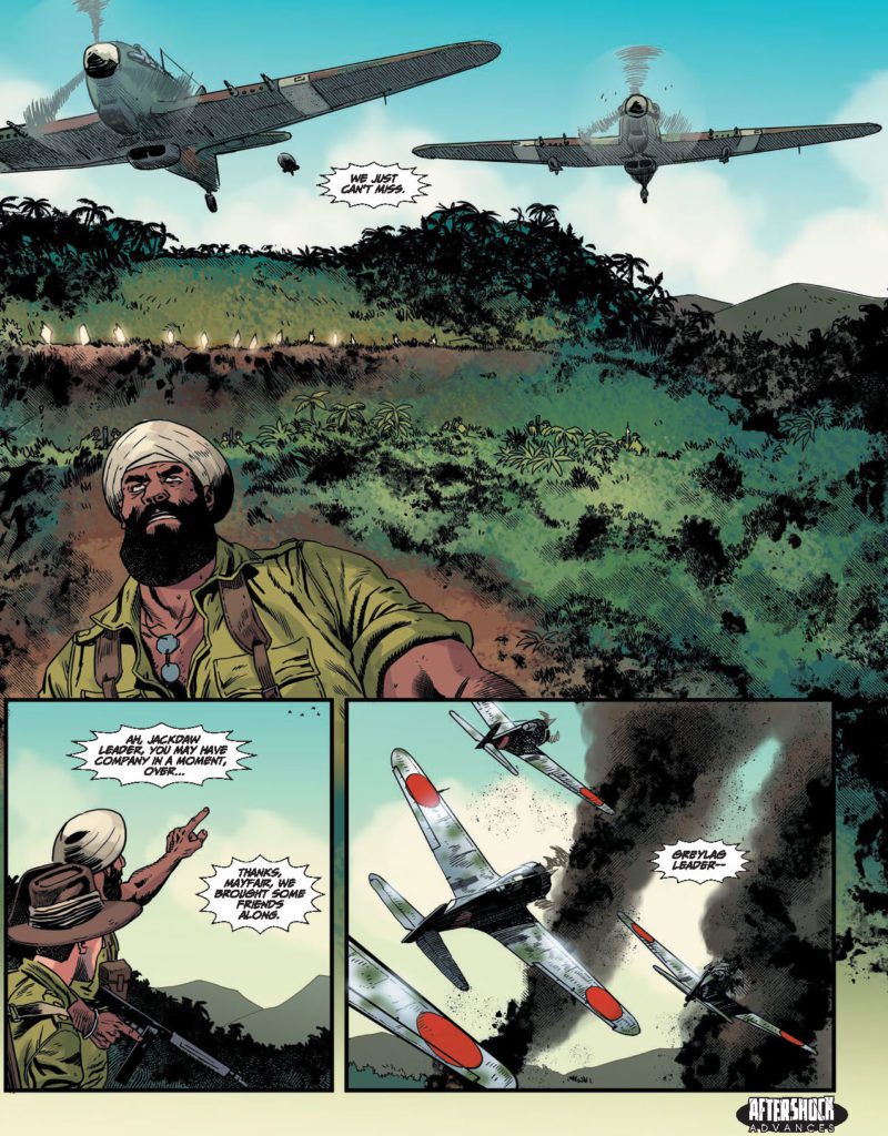
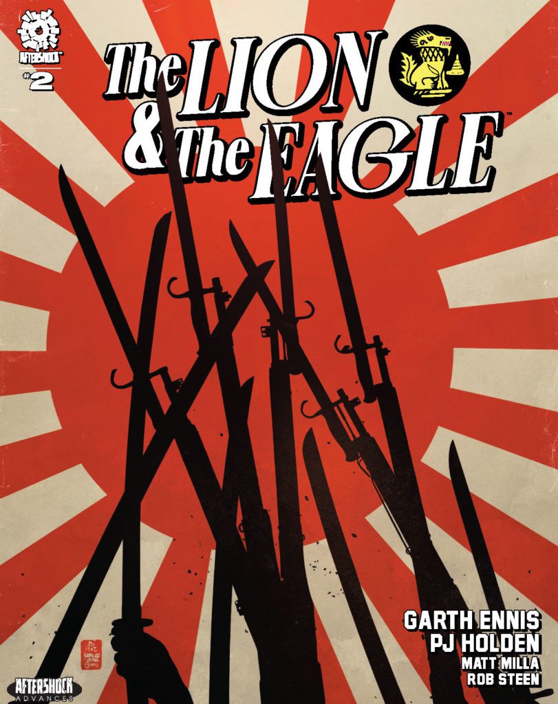
THE LION AND THE EAGLE #2 hits your local comic book store March 23rd, but thanks to AfterShock Comics, Monkeys Fighting Robots has an exclusive four-page preview for you.
About the issue: The battle begins in earnest as the British unleash a holocaust of high explosive on their enemy, and fanatical Japanese courage comes face to face with the fury of the Gurkhas. But a change in command sees the Chindits’ mission change from offense to defense, and soon the British unit is surrounded — and fighting for survival against increasingly heavy odds.
The “oversized prestige format miniseries” is by writer Garth Ennis and artist PJ Holden, with colors by Matt Milla, and letters by Rob Steen. The main cover is by Tim Bradstreet, and the incentive variant is by Keith Burns.
Check out the THE LION AND THE EAGLE #2 preview below:
Did you pick up the first issue of THE LION AND THE EAGLE? Sound off in the comments!


")


")