It’s hard to review a comic like Dark Knights of Steel #5. It’s an issue that packs a lot of punch and could lead down some really interesting paths. But it feels like it’s caught in the crossfire of fan service and upending expectations. DC Comics’ Dark Knights of Steel #5 makes bold moves and only time will tell if they’re the right moves. For now, writer Tom Taylor, artist Yasmine Putri, colorist Arif Prianto, and letterer Wes Abbott seem to be telling a story that is a little unsure of what it wants to be. Some mild spoilers ahead.

Writing
From the start of this series, Taylor has made it clear that this is a very different version of the DC Universe. It’s often exciting to see his new takes on old characters. But Dark Knights of Steel #5 feels like it’s being pulled in two directions. Taylor is taking characters down drastically different roads than the ones we know, while also filling these pages with references to existing DC lore. Earlier in this series, Taylor struck a refreshing balance with the old and the new. Now, it feels like his script is becoming a slave to these nods and twists. Where they were once interesting Easter eggs and peripheral details, they now feel like they’re the whole point of the story. Perhaps the biggest twist of the series happens in Dark Knights of Steel #5 – certainly the biggest twist so far – and we’ll have to see where that leads. It definitely opens up plenty of interesting possibilities. But all in all, Dark Knights of Steel is beginning to feel a little contrived and dry.
Art
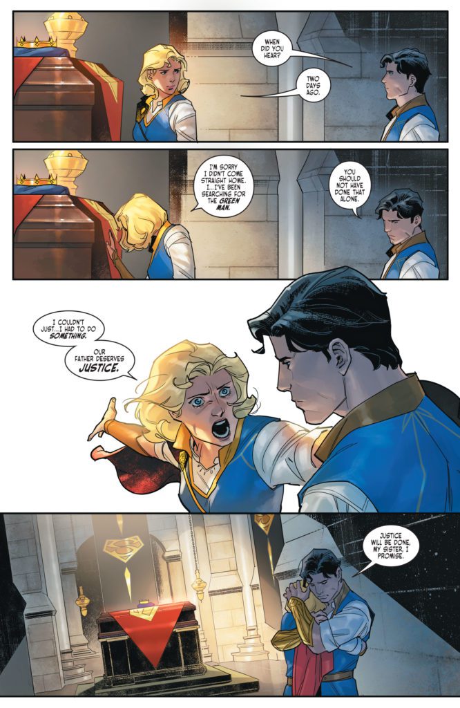
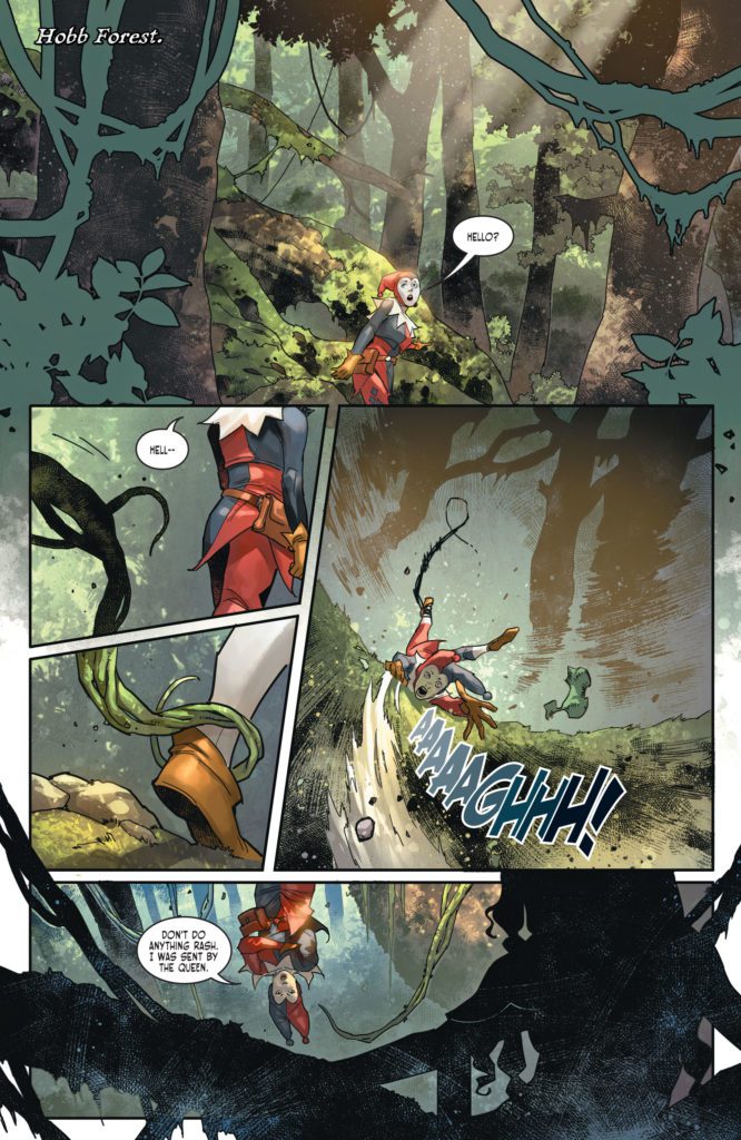
Though Taylor’s script is starting to stumble, Putri’s art is really beginning to shine. Her page layouts are dynamic and constantly adapting to the plot. When a character loses her balance, the panels shift to be slightly off-kilter. When the dust settles, her panels are shown in neat, orderly groups with right angles. And this theme continues through Putri’s work. When a fight begins again, the corners shift and the panels almost look like they’re about to tumble off the page. It’s a fantastic way to show the power of the characters involved. It feels like they’re barely contained, like they could burst out of the artwork at any moment.
Coloring
Dark Knights of Steel #5 could certainly be described as a gloomy chapter in this series. Characters face betrayal, heartache, and close calls with death. But Prianto doesn’t let that stop him from creating a picturesque world. Prianto’s colors make each scene feel like it’s happening during a cool Spring afternoon. While there are certainly moments of the color shifting, an occasional bright green or dazzling red, these moments are incredibly rare. Even in the midst of violence and backstabbing, Prianto maintains his soft color palette. It brilliantly contrasts the mood of the writing. Prianto makes every sad story beat even harder to deal with. You almost want to yell at the characters, “Why don’t you stop fighting and just enjoy the beautiful day?”
Lettering
Abbott juxtaposes a character’s anguished cry with their weakened mumble. As they’re attacked and hurt, they yell a crooked “HRRK!” in a word balloon with uneven edges. They look up at the character who did this to them and speak their name. The letters are almost like small black dots on a big white canvas. Abbott’s lettering speaks for itself. The first “HRRK!” has the perfect font to hear the mix of confusion and pain. But in having the opposite happen right after, the quiet, breathless mumble that’s barely heard, Abbott highlights the strengths of each line of dialogue.
DC Comics’ Dark Knights of Steel is at a crossroads of sorts. With the big choices this creative team is making, this could turn out to be a very satisfying and unique story. But as it stands, the series feels like it’s trying to do too many things. Is it dedicated to upending expectations or to paying homage to DC canon? In trying to do both, it’s beginning to lose its footing and intrigue. Pick up Dark Knights of Steel #5, out from DC Comics today, at a comic shop near you.