Home Blog Page 108

INTERVIEW: Production Designer P. Erik Carlson And The Journey From MEMENTO To QUEENS

queens-interview-production designer

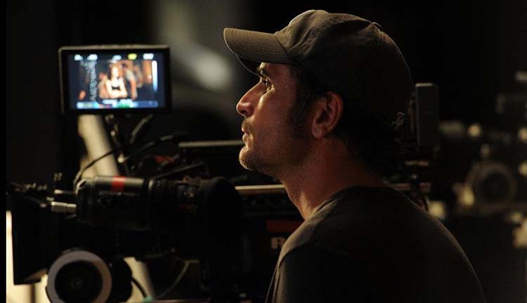
Queens is a musical drama on ABC starring platinum-selling artist Brandy Norwood about an all-female rap group trying to rekindle their magic decades after being superstars. P. Erik Carlson is the production designer bringing the world of Queens to life.

In Queens, the “Nasty Bitches” were a group of musicians that dominated the 90s hip hop scene. The four women became legends in the world of music. However, Brianna (Eve J. Cooper), Naomi (Brandy), Jill (Naturi Naughton), and Valeria (Nadine Velazquez) are now in their forties and aren’t the tight-knit group they once were. So can the former superstars of music, once known as Professor Sex, Jill Da Thrill, Xplicit Lyrics, and Butter Pecan, find success again?

PopAxiom spoke with Erik about his career, starting with two beloved projects and on through to Queens on ABC.

memento-interview-production designer

Memento

Erik moved out to LA and landed two jobs thanks to some timely connections. The first was the Judd Apatow cult hit Freaks and Geeks. The second Christopher Nolan’s breakout film, Memento. “At the time, I thought every movie I was going to work on would be like Memento. Every project would be as unique and special as that. It’s one of the only scripts I sent home to my brother to read because when I read it, my mind was blown. I got spoiled thinking everything would be a Christopher Nolan movie.”

“Nolan’s preparation was amazing,” he says about the iconic filmmaker. “He, along with his brother, had visualized everything in Memento. So if you had a question about how the timeline worked, he’d already thought of it.”

Creating Memento required attention to detail. “We took the script and put it into continuity order so that we could prepare. Then, whenever we had an issue with scenes not matching, Nolan instantly had an answer. He had it all assembled in his head.”

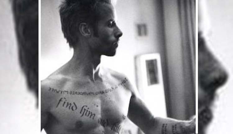
“I had a great experience with Guy Pearce too,” he says about the film’s star. “I was blown away by him. We designed all the tattoos and printed them out in various sizes to see what would fit him. He walked into the art department, took off his shirt, took a sharpie, and said, ‘Start drawing on my body.’ He was there for the next few days working out each of the tattoos.”

Pieces

Erik’s journey into production design started with a completely different goal. “I went to architecture school in Colorado. I was taking systems and analysis where you size plumbing systems and memorize zoning laws and code. Then, in my senior year, I took a film class to fill credits. The film class teacher asked if I had any interest in film production.”

“This idea of creating a world for every project seemed fantastical,” he thought at the time. “There’s this job that stretches across all these different things.”

Erik was a “ski bum” for a short while, “building log cabins in Colorado. By that point, though, I’d made up my mind that I was going to move out to Los Angeles and see if I could find my way into this business.”

“When I got to LA,” he continues, “I had no idea what I was doing. I went to job boards at colleges to see if anyone needed anything. I started out that way. I lucked out and landed a job as a PA with an amazing designer, Tom Walsh, who became my mentor. I worked with him off and on for 10 or 12 years.”

Meeting Tom was a chance meeting. “Luck plays a part, there’s no doubt, but preparation makes it possible to seize those lucky opportunities that come around.”

The lucky or unlucky effect is persistent in the business. “Every show or movie has situations where things don’t work out, but problem-solving is a big part of this business. What do you do with the pieces that you’re given?”
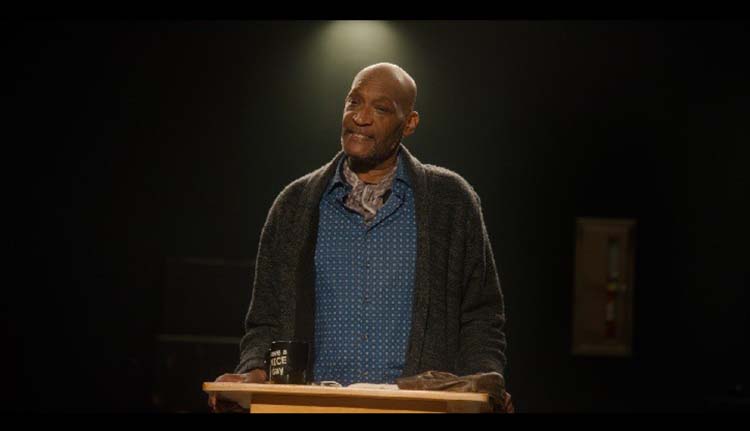
queens-interview-production designer

About Queens

“I’d like to try and read scripts through before thinking about what the production might do, but it’s impossible,” he shares. “Once I’m three or four scenes in, and there’s a new set or new concert, I stop and start making notes. I think I internalize a script better if I break it down as I go. It helps it sink into me.

Queens is a larger-than-life type of show with many challenges for any production designer. So what concerned Erik when going into the production? “The concerts. We do several concerts, arena-sized concerts.”

“I’ve done sort of small concerts, underground concerts, clubs, but nothing like we do on Queens,” he adds. “I’ve grown an appreciation for the people who put these things on for a living.”

“When I read the first few scripts,” he continues, “that was out of my comfort zone, but that’s also why I like working on Queens. It’s a world I didn’t grow up in, so it’s exciting to me to dig in and understand.”

Choosing projects like Queens that take him out of his comfort zone is something Erik seeks out. “I sort of always choose the project that scares me the most. I like getting thrust out of my comfort zone and into a new situation. Some of the choices are certainly about working with people I’ve worked with before. But a lot of it is not getting honed in on one thing. As a designer, you’re always adapting to the next project, and I like that.”

Wrapping Up

From where does Erik draw his inspiration? “Travel. My wife and I love to travel. Unfortunately, though, it’s also annoying to her,” he laughs. “The first thing I do when we go to a new hotel room is take photos. I think that goes back a little to Desperate Housewives.

The ABC hit series with Terri Hatcher, and Eva Longoria featured a lot of hotels and waiting rooms. “So, whenever I go into a waiting room, I take pictures of everything.”

“I might see a texture on a wall, and I take a picture,” he continues, noting that he takes “photos of everything. You never know what script will need some sort of detail. I’m sure my family’s annoyed by it.”

Erik loves creating worlds. Who would he like to create with next? “There are so many good directors and writers out there. I thought it would be fun to work with people like Seth Rogan. It would be fun to reunite after 20+ years and create with people like that from Freaks and Geeks. It’s really about wanting to work with fun, collaborative, creative people.”

Is Queens on your watch list?

Thanks to P. Erik Carlson and Impact24 PR
for making this interview possible.

Loved this interview? Find more here!

Monkeys Fighting Robots Youtube

AfterShock Comics Exclusive Preview: ALMOST AMERICAN #5

aftershock comics exclusive preview almost american

ALMOST AMERICAN #5 hits your local comic book store March 30th, but thanks to AfterShock Comics, Monkeys Fighting Robots has an exclusive four-page preview for you.

About the issue:
Husband-and-wife intelligence agents Janosh and Victorya Neumann fled Russia for their lives, winding up as assets for the United States. But when the U.S. government abandons them, Jan and Victorya are on their own as their past, in the form of a Russian operative, confronts them. With only each other to depend upon, will the couple have a future? The real-life saga reaches its finale, courtesy of acclaimed writer Ron Marz and artist Beni Lobel.

The series is by writer Ron Marz and artist Beni Lobel, with colors by Juancho!, and letters by Rus Wooton. The main cover is by Wooton.

Check out the ALMOST AMERICAN #5 preview below:

aftershock comics exclusive preview almost american

aftershock comics exclusive preview almost american

aftershock comics exclusive preview almost american

aftershock comics exclusive preview almost american

aftershock comics exclusive preview almost american

aftershock comics exclusive preview almost american


Are you reading ALMOST AMERICAN from AfterShock? Sound off in the comments!

Monkeys Fighting Robots Youtube

Review: LOVE EVERLASTING #2 Can’t be Put in a Box

Love Everlasting

The premise of writer Tom King and artist Elsa Charretier’s Love Everlasting might not be simple, per se, but in the space of one chapter they had already established a rhythm and pattern to the story. Yet, in Love Everlasting #2, only a chapter later, they are already throwing out the playbook. It’s clear that this is not a series you’ll be able to predict. King, Charretier, colorist Matt Hollingsworth, and letterer Clayton Cowles are trying new things at every opportunity.

About Love Everlasting #2 (from Everlasting Productions):

Joan wakes into another nightmare of love. It is 1920. She is the maid and Roger is the heir to the great manor, and though it is forbidden, they are inevitably drawn together. But soon clichés begin to crumble and blood begins to spill as Joan finds her own power in “The Hunt for Love”!

Love Everlasting King Charretier

Writing

Love Everlasting #2 does not pick up where the last chapter left off. It’s immediately confusing. What are we missing? How did Joan get here? And why do we seem to have gone back to square one? You can almost feel King smile as you scratch your head. He has you right where he wants you. But then, something even stranger happens. Love Everlasting #1 seemed to establish two things: a pattern of short love story vignettes that wrap up every few pages, and an exploration of the horror behind the idea of love being everlasting. Yet, ten pages in, we arrive at the second chapter of the same love story. It’s cheesy, it’s melodramatic, it’s full of all kinds of clichés, but damn it if it isn’t kind of lovely too. The story draws you in to the point that you almost forget the seeds of horror and meta commentary King has been sowing. And right when you’ve given up on figuring out what’s going on, King brings back every thread in a quiet, measured, and explosive way. If you think you have a handle on Love Everlasting and its themes, this issue is a surefire way of learning that you ain’t seen nothing yet!

Art

Charretier’s art continues to be delightful. It’s hard to go into many of the themes and storytelling Charretier has at work here without spoiling some of this issue, so let it be said that the subtleties of her art are incredibly rewarding upon a second read. The first major thing we see in Love Everlasting #2 is the difference between Joan, our main character, and her lover Roger. Roger is so unaware of his own privilege. He feels subdued and persecuted by his own rank, completely oblivious to how Joan must feel as his maid. Charretier places panels of each of them side by side. Joan’s face is concentrated as she bends over a bucket full of laundry that she’s washing by hand. Roger, placed in a similar position in the frame, looks downcast and sad as he listens to his wealthy father’s list of demands. As we continue through the story, Roger is always seen above Joan in any panel that they share. He’s quite literally her superior, yet she smiles up at him with doting eyes. With this, the twists and turns that shake Joan and Roger’s dynamic, and each of the playful page layouts, Charretier tells us volumes about these characters in the space of just a few pages.

Love Everlasting

Coloring

Joan and Roger may occupy the same house, but Hollingsworth makes it clear that they live in two different worlds. Roger’s world is in a perpetual sunset. The golden hues of the landscape are picturesque and beautiful. Joan’s world is dim and dank. You can practically smell the mildew in the gray broom closets and kitchens where Joan does her work. Throughout, we see Joan getting invited into Roger’s world. The grays give way to the yellows and oranges of Roger’s evening escapades. But Roger can never fully enter Joan’s world. Only once do we see him go into Joan’s dimly lit bedroom. Even then, the golden rays of the sun outside the window stream in and cast a faint light over Roger’s face. Hollingsworth gives us a clear picture of what makes the gap between these two so large. Roger has never known poverty. He can’t even fathom what it would be like. Joan is all too aware of the riches she’s only every allowed to partake in as a guest of others.

Lettering

Cowles lettering has a very playful feel to it in this issue. Often, we see word balloons with bumpy edges. The balloon itself seems to hug the words, so that these lines of dialogue have their own unique rhythm and character to them. The same can be said of Cowles’ sound effects. While Joan and Roger hunt, we see two dogs barking. The “AROOOF” letters on the page grow and dwindle to put emphasis on the middle of the noise. Each sound has a specific lettering to it, not only to give it its own noise, but to match the mood of each scene.

Verdict

Love Everlasting is charming and terrifying. Better yet, it’s a story you won’t be able to predict or get a handle on – at least, not until it already has its hooks in you. In the space of two issues, this creative team has already shown that they plan to swerve and adapt at every turn, keeping us on our toes for what’s next. Love Everlasting #2 is available to paid subscribers on Everlasting Productions and will be available for free in two weeks time.

Monkeys Fighting Robots Youtube

Review: PUNISHER #1 – The King Of Killers Moves East

Writer Jason Aaron (Scalped, Thor) and artists Jesus Saiz and Paul Azaceta bring Frank Castle to a new land and a brand new start with Punisher #1. Featuring colors by Dave Stewart and lettering from Cory Petit, this opening chapter offers an intriguing premise that is sure to be divisive among the character’s fanbase. With an engaging first-chapter script and solid, engrossing visuals, this fresh start for Marvel’s iconic sociopath is too compelling to keep away from.

“WILL THE PUNISHER’S WAR END? Born of tragedy. Devoted to war. Unstoppable in his rage. As the Punisher, Frank Castle has become the most accomplished killer the world has ever seen. Now it’s time for him to face his true destiny. What shocking secret from Frank’s past will convince him to take the reins of the Marvel Universe’s most notorious clan of assassins? And once Frank becomes the warlord of the deadly ninjas of the Hand, will it also mean an end for the Punisher? Or a whole new bloody beginning?”

Writing & Plot

Okay look, I have a lot of respect for Jason Aaron as a writer. His runs on Thor and Star Wars are some of the best stories Marvel has published in the last 20 years. However, as recent events have uncovered, the guy just needs to know when and how to stay in his lane. Punisher #1 is exactly that. Aaron has handled the gun-toting vigilante before in his run on Marvel’s old MAX label; a run that followed up the seminal work of Garth Ennis. Aaron’s first issue here, being a part of the main Marvel timeline, isn’t the brutal introspection that Ennis or even his own MAX run are. I have to admit, my impressions of Frank Castle are based entirely on his appearances out of continuity. I’ve always found the character an ill-fit for the mainstream Marvel universe. Aaron could very well change my mind.

Here, we get a Punisher working with legendary Daredevil antagonists The Hand. Together, they’re hunting down and slaughtering an international group of well-armed killers…among other people. Frank’s motivations for joining the ninja-assassin group appears purely work-related at first; after all, the Punisher will go anywhere to kill bad guys. The final page twist reveals the real reason he’s joined up, and friends it’s a game-changer. For the most part though, this issue just introduces us to Castle’s new life situation and setting. There’s a lot of narrative explaining The Hand’s motivations for bringing Punisher into the fold. It’s entertaining, especially getting to witness their uh…explosive first meeting. Outside of the ending though, there isn’t anything here that’s truly surprising. Castle is written from an outsiders perspective, with no narration from his POV. This sells the classic, frightening stone-cold characterization of The Punisher and, despite the mainstream Marvel trappings, really nails the feeling for a Punisher comic.

Art Direction

Admittedly, the polished visual work of Jesus Saiz and Paul Azaceta in Punisher #1 isn’t the sort of art style I imagine for the character. The clean, digital design is a far cry from the likes of Goran Parlov or Leandro Fernandez. However, their work is still very impressive and sharp by any comic’s standards. Saiz and Azacea craft vivid animations and kick-ass action in every panel. Their blocking and direction match the pacing of Aaron’s script and bring it to life with explosive clarity. I have to mention though, there is at times a sort of uncanny valley effect. The digital, semi-cgi style used by Saiz and Azaceta doesn’t have the subtle stylings of comic artists who use a similar style (Mikel Janin and Jamal Campbell, for example). In fact, despite the polish and direction, the visual style as a whole is a bit bland. In terms of fidelity it’s great, but it just seems so plain, especially for a Marvel comic.

Even the colors of veteran and legend Dave Stewart can’t quite save this comic’s visual experience from feeling oddly detached. Stewart’s rich, saturated tones do admittedly work very well for the styling of this comic. However, despite how impressively high-fidelity every panel looks, it still can’t quite shake this strange clay-like look. Cory Petit does a solid job of keeping the lettering manageable and flexible through the many full word balloons laden with expository dialogue. His SFX work comes in handy as well for really selling the actions sequences. All in all this is a well-crafted but oddly bland Punisher comic.

Verdict

Punisher #1 is an impressive mixed bag. Jason Aaron’s script takes some commendable risks and has a hell of a final page twist to lead to an entertaining (if mostly unsurprising) opening chapter. The visuals from Jesus Saiz, Paul Azaceta, and Dave Stewart are sharp and well-directed, but often just bland in their execution. Still this is mostly a solid start to this controversial new chapter for Frank Castle. Be sure to grab this issue when it hits shelves on March 9th!


Monkeys Fighting Robots Youtube

REVIEW: ALIEN #10 is a Terrifying Book That Continues to Scare

Of all the comic book genres to write, horror may be the most difficult. To show images or words on a printed page that are enough to creep readers out is not an easy task. For writer Phillip Kennedy Johnson and artist Salvador Larroca, it seems to come naturally. Alien #10 is out from Marvel Comics, and it’s another terrifying chapter in the series. Joining Johnson and Larroca is GURU-eFX on colors and Clayton Cowles on letters.

WRITING

With books and movies like the Alien franchise, sometimes the characters can be a little thin on development. Johnson, however, has done a good job of introducing us to the new survivors in this series. Jane is clearly the most important of the new characters. Johnson shows us she is a character that is willing to do what it takes to survive. Jane has kept the head of Ambrose, their traitorous android, to help her navigate the new world they’ve just landed on. This is a problem for members of the current crew since Ambrose was responsible for some deaths last issue. Johnson knows that while the survivors are important, on a book like this, it’s all about the monsters. About halfway through the book things start to take a creepy turn. Johnson starts giving us clusters of Xenomorphs hidden in pages. There are busted alien eggs all over the place and civilians in alien goo. All of these images are unsettling and straight from the movies. Johnson delivers a good script that will win fans of the franchise over.

ART

The pencils by Larroca are crucial to an issue like this. Larroca had to create a new settlement station with his work. Larroca does an amazing job of giving us establishing pages that show what this new settlement looks like. There are jungles and run down buildings where our survivors explore. Larroca draws everything flawlessly in this beat up space station. Piles of junk, beat up houses and splattered blood are scattered everywhere. This sets the tone for the type of atmosphere our survivors are walking into. The Xenomorphs look menacing as they attack our survivors. Some of the kills Larroca draws are ruthless and downright creepy. His pencils are a master class in comic book art.

The colors by GURU-eFX compliment Larroca’s pencils perfectly. GURU-eFX captures how dark and dreary this space station really is. Smokey grays and dark blues are used throughout the issue that add depth and effect to the mood. The background colors of the jungle earlier in the issue grab your attention. For such a depressing issue, the greens of the leaves provide a vibrant escape from the darkness ahead. GURU-eFX completely crushes his colors this week. His work is gorgeous and a great addition to the Alien mythos.

Clayton Cowles has the most fun job in this book. He gets to letter Xenomorphs hissing. Needless to say, that’s an iconic sci-fi movie sound. As one survivor goes off to look for a friend, we see the “ssssssss” scrolling across the page. This is probably one of the most terrifying sounds any character can hear in this series. The sound effects of guns being shot or a survivor being ripped down from goo are all spot on as well.

CONCLUSION

Alien #10 is a chilling entry into the new Marvel series. No character is safe and all of them are in a state of constant danger. Phillip Kennedy Johnson has solidified himself as not only a great storyteller, but a brilliant horror writer. Phenomenal pencils and colors make this book a must read. Alien #10 is out at a comic shop near you!

Monkeys Fighting Robots Youtube

Review: THE BATMAN Revives The Dark Knight With Cinematic Gold

Matt Reeves’ The Batman will go down as one of the best comic book movies ever. Nearly 10 years after Christopher Nolan’s trilogy, Batman returns in this dark and spectacular iteration of the caped crusader. The Batman will keep audiences enthralled with its cinematography, terrifying villain, and unique portrayal of Bruce Wayne. I can’t decide where it ranks, but The Batman left me excited to see what could come next.

Initially, Robert Pattinson’s involvement was a concern, but he silenced my doubts here with a gripping performance as Batman. The film’s production struggles also were a source of concern, and thankfully, these hurdles didn’t stop it from being the near-perfect film that it is. The Batman managed to tell an engaging noir-style story with a grim backdrop, Gotham City. Reeves directs and co-writes alongside Peter Craig, and for horror fans, you may get the feeling you are watching Seven.

Pattinson is joined by some great talent, including Zoe Kravitz, Paul Dano, Jeffrey Wright, Colin Farrell, Andy Serkis, and John Turturro. The Batman Follows Bruce Wayne, as he navigates the streets of Gotham while pursuing the Riddler (Dano). Kravitz stars as Selina, better known as Catwoman, a wrench in Batman’s good vs evil thought process. The similarities between the two allow them to form a complex romance. Selina’s emotional turmoil is captured tremendously by Kravitz, who does a great job in the role.

This approach to Batman plays with the murder mystery, which keeps the narrative so intense. In fact, Batman’s character comes off as very menacing due to the way the story is handled. He’s the hero, that is expected, but certain shots speak to the internal trauma within Bruce Wayne. His silhouette arrives on the scene, slowly appearing out of the shadows, as his foes look on with terror and intrigue. These shots effectively build interest regarding Bruce and his struggles. You get the traditional comic book lore, orphaned at a young age, but the film handles the death of Wayne’s parents in a refreshing manner.

Riddler is hyped up throughout the film, so much that his inevitable meet-up with Batman feels like an earned payoff. He’s threatening and unnerving, and this is only amplified by Dano’s powerful performance. Commanding your attention every moment Riddler is on screen, delivering his lines in a calm, yet sinister fashion. The Batman is one of the most aesthetically pleasing films in recent memory, Greig Fraser’s cinematography captures the hopeless, depressed, and grim nature of Gotham. The lighting assists in setting the bleak tone that is maintained throughout the film.

Batman’s symbol of hope only grows stronger as his silhouette stands out among the miserable city. Certain frames capture that theme gloriously, and one, in particular, happens right after a thrilling chase sequence. A fire rages on behind him, but Batman slowly walks ahead towards his target. It’s a shot that compliments the mystery of the character so well, while also creating fear from the villain’s perspective and maybe some audience members too. Michael Giacchino’s brilliant score heightens the drama that unfolds and effectively builds on the suspense that constantly swells up.

Reeve’s direction here has earned him the honor of being responsible for one of the best depictions of Batman. The Batman has breathtaking shots and is possibly the most grounded iteration. I would say the pacing could have been better in the third act, and there were a few instances that felt unnecessary. Still, Reeves delivers a tense, gritty, and highly suspenseful detective story that keeps you engaged.

The Batman will be regarded as one of Pattinson’s best achievements, as the film is truly near-perfect. He is incredible in the role, and I look forward to seeing him return as Batman. Gotham is depicted as a crumbling waste land, so that was an aspect millions will instantly talk about for many months. The film doesn’t rank above The Dark Knight for me, but this is another brilliant Batman movie.


Monkeys Fighting Robots Youtube

AfterShock Comics Exclusive Preview: THE OCEAN WILL TAKE US #1

aftershock comics exclusive preview ocean will take us

THE OCEAN WILL TAKE US #1 hits your local comic book store April 6th, but thanks to AfterShock Comics, Monkeys Fighting Robots has an exclusive four-page preview for you.

About the issue:
Something’s lurking in the waters of Almanzar Bay – and when Casey March tries out for the swim team, he learns firsthand that messing with the social order of his new high school can have dangerous – even deadly – consequences!

The series is by writer Rich Douek and artist Carlos Olivares, with colors by Manuel Puppo, and letters by Dave Sharpe. The main cover is by Olivares, and the incentive variant is by Hayden Sherman.

“A new tale of horror and intrigue – where a group of high school outcasts band together to fight a growing evil in their school and town.”

Check out the THE OCEAN WILL TAKE US #1 preview below:

aftershock comics exclusive preview ocean will take us

aftershock comics exclusive preview ocean will take us

aftershock comics exclusive preview ocean will take us

aftershock comics exclusive preview ocean will take us

aftershock comics exclusive preview ocean will take us


Are you looking forward to THE OCEAN WILL TAKE US? Sound off in the comments!

Monkeys Fighting Robots Youtube

Review: COWBOY BEBOP #2 – Far Better Than It Has Any Right To Be

Writer Dan Watters and artist Lamar Mathurin return to hunting bounties across the solar system with Cowboy Bebop #2. Along with Roman Titov on colors and lettering from Richard Starkings and Jimmy Betancourt, this 2nd chapter continues their stellar adaptation of Shinichiro Watanabe’s iconic anime. With a script that flows like jazz and stand-out stylized visuals, this issue solidifies this series as a must-read for Bebop fans everywhere.

“An original story set in the year 2171. The bounty hunter crew of the spaceship Bebop chase an ex-gang member who holds a vest which gives the wearer unlimited luck.”

Writing & Plot

Reading Cowboy Bebop #2, it becomes abundantly clear the love and understanding of the source material that Dan Watters has. I’m not embellishing at all when I say that both issues of this comic thus far have genuinely felt like Bebop episodes. From the ludicrous issue-specific plot point to the quiet interactions these characters all have, this feels like a lost chapter of the anime brought to life in a new medium. Here, the crew of the Bebop lands on Cyllene, a moon orbiting Jupiter that is also home to an abandoned colony effort. I won’t spoil why this planet was left alone, but the twist is just so classically Bebop. The planet also, in true Bebop form, presents our Jet, Faye, and Spike with specific dilemmas regarding their morality, their pasts, etc. Watters’ dialogue has that loose, stylistic feeling that reads just like scripts of the anime. Every character sounds and acts just like their anime counterparts, with little to no influence from the recent (deservedly cancelled) Netflix adaptation that this comic is technically based on. Everything from the deep, philosophical conversations presented by strangers, subtext-filled exchanges, and glances into the troubled visages of our main cast is spot-on with the original series and damn entertaining even without context.

Art Direction

What ultimately sets Cowboy Bebop #2 and the prior issue apart from the original work is the art of Lamar Mathurin. His uniquely stylized pencils and heavy inks craft a Bebop vison that will is familiar, but actively plays to its own tune. Characterizations are detailed and exaggerated, carrying the identity and swagger of the source material to new levels. The weight that each cast member carries (heh) can be seen in the expression Mathurin crafts in his scenes. The emotional gravity of the source material is alive and well in this comic. Mathurin’s work here carries huge amounts of tone and atmosphere, and creates a whole new way to experience this iconic post-Earth reality.

Roman Titov’s colors really bring this new yet familiar vision to life in a tonally rich way. His hazy, darkened use of a very used-future Cyberpunk-Western style echoes the original series while absolutely maintaining its own style. The lettering from Richard Starkings and Jimmy Betancourt plays it pretty safe in dialogue and narration balloons with a clean, modern font. Then it really surprises with creatively stylistic SFX letters, both blending into and sticking out just the right amount for this comic’s visual experience. Artistically, every aspect of this comic is absolute gold.

Verdict

Cowboy Bebop #2 is a stellar continuation of this comic adaptation of Shinichiro Watanabe’s legendary anime. Dan Watters’ script is fun, goofy, and almost musical in its composition, while also carrying the thematic and philosophical weight of the source material. The visuals from Lamar Mathurin and Roman Titov are brilliantly unique and convey the personality, atmosphere, and overall direction of this story in a stunning manner. This is a must-read for Bebop fans and newcomers alike. Be sure to grab this issue when it hits shelves on March 2nd!

Monkeys Fighting Robots Youtube

Marvel Comics Exclusive Preview: AMAZING SPIDER-MAN #92

marvel comics exclusive preview amazing spider-man

AMAZING SPIDER-MAN #92 hits your local comic book store March 9th, but thanks to Marvel Comics, Monkeys Fighting Robots has an exclusive four-page preview for you.

About the issue:
“BEYOND” NEARS ITS END!

WHAT IS BEHIND DOOR Z?! Ben makes his way to the same place Miles Morales was last at, and he is nowhere to be found. Just door after door of true horrors. Any door’s resident could kill Spider-Man, but Door Z’s might just destroy the whole city!

The issue is by writers Kelly Thompson & Jed MacKay and arists Fran Galán, Sara Pichelli, & Zé Carlos, with colors by Brian Reber, and letters by Joe Caramagna. The main cover is by Arthur Adams and Alejandro Sánchez.

The Amazing Spider-Man “Beyond Board” consists of Thompson, Cody Ziglar, Saladin Ahmed, Patrick Gleason, and Zeb Wells.

Check out the AMAZING SPIDER-MAN #92 preview below:

marvel comics exclusive preview amazing spider-man

marvel comics exclusive preview amazing spider-man

marvel comics exclusive preview amazing spider-man

marvel comics exclusive preview amazing spider-man

marvel comics exclusive preview amazing spider-man

marvel comics exclusive preview amazing spider-man


Is AMAZING SPIDER-MAN on your pull list? Sound off in the comments!

Monkeys Fighting Robots Youtube

INTERVIEW: Cinematographer John Orphan Talks Horror Film STOKER HILLS

stoker hills-interview-cinematographer

There’s something sinister happening in Stoker Hills, the new horror film from director Benjamin Louis (State’s Evidence) that’s one part found footage frights and equal part noir detective procedural.

Stoker Hills begins with several film students who are making their thesis project. Horror fans will recognize Professor Smith as acting legend Tony Todd. As the burgeoning film crew is at work at night on the street, Erica (Steffani Brass) is taken by a hooded figure. The remaining students, Ryan (David Gridley) and Jake (Vince Hill-Bedford), try to survive the ensuring chaos as the hooded figure torments them too. Their experience is captured by their video equipment and investigated by Detectives Adams (Eric Etebari) and Stafford (William Lee Scott).

PopAxiom spoke with cinematographer John Orphan about becoming a director of photography, his artistic instincts, and making Stoker Hills.

john orphan-cinematographer-interview

What If

John begins in a place where a lot of creative minds start. “I loved movies my whole life, but I didn’t think it was possible …” Growing up in Grand Rapids, Michigan, John lived in a mindset “where you grow up and get a job, and you don’t pursue the arts.”

“I was interested in photography as a hobby. I’d do it on the side for fun,” John shares that the passion for cinematography was alive inside. However, everything changed when he “worked as a PA. That’s when I saw what the cinematographer was doing and thought, ‘that’s what I want to do.’

Despite the upbringing nudging him toward something more practical, John’s PA experience provided a realization. “I had to do this because I didn’t want to get old and think ‘what if.'”

About Stoker Hills

John doesn’t recall how he came into Ben’s radar. But remembers, “We talked about influences.” Up until that point, John says, “I’d been doing a lot of commercial work which doesn’t lend itself to making the kind of stuff I want to make. So, when they called about making a dark, moody horror movie, I said’ absolutely.'”

“We talked about the two things going on,” he says about pre-production. “There are the detectives, and we’d shoot in a more traditional cinematic style. Then there’s the kid’s point of view that uses their equipment as found footage.”

The two perspectives mean the film draws from different influences. “From the detective’s point of view, we were probably leaning real hard on the Fincher’s Seven.” But for the found footage stuff, he says, “Ben loved the look of a movie called Honey, so that’s the color and saturation look we went for with the kids’ footage.”

tony todd-stoker hills-interview

Dark

Though the film has two distinct looks, John explains, “We shot it all on the RED Weapon 6k. It’s a big camera with big lenses.” To achieve the different looks, “we messed around with it more in post to make it look dirtier.” However, a handful of moments when another camera is at work, “There’s some running footage where we’d grab a DSLR.”

Balancing the look of the film required careful planning. “We did a bunch of test shots in advance. Then, we got in a studio for a day and tried different lighting schemes that we knew would happen. From there, we decided which one works best and based the colors on that.” Planning requires good execution from the team. “Our colorist Dan Edwards at Changing Frames did an amazing job.”

“The first pass of the movie was probably twice as dark and scary as it is now,” he says of a cut that was considered too intense. However, the film didn’t shed too much of its darkness. In one scene, “There’s a surplus of bodies in a room. So we used actual people; covered them in blood and mixed them in with prop body parts.”

Those near-naked actors spent a lot of time on concrete floors in a cold room. For John, “It was arresting to walk into that room to shoot because it looks so real to the eye. That was my favorite stuff to shoot.”

Wrapping Up

“Coming up, I was into Roger Deakins (Blade Runner 2049), which I’m sure a lot of people say the same or Emanuel Lubeszki (Saving Private Ryan),” he answers about influences. “Another guy I think is a master is Robert Richardson (A Few Good Men, Once Upon A Time In Hollywood). I’ve learned a lot from studying his work. My favorites of the newer guys are Bradford Young (Arrival) and Greg Fraser (Dune).”

John’s a big fan of horror and “dark thriller kind of stuff. The things we did with the detectives [in Stoker Hills) if I could make a career out of doing that, I would be happy.”

“I think it’s what naturally comes out of me,” he says about this ‘dark side.’ “It’s strange. I’m a happy person, I love to laugh, most of my friends are standup comedians. But artistically, what comes out of me is this darkness. It’s the kind of visual art that excites me. That’s the kind of world I love.”

Stoker Hills is available on Amazon and other on-demand services. So what’s next for John? “I just finished another horror movie filmed in Montana called For the Night. After that, I’ll be doing another dark thriller called Reap/Sow in my hometown.”

Is Stoker Hill on your watch list?

Thanks to John Orphan and Projection PR
for making this interview possible.

Find more interviews from Ruben R. Diaz!

Monkeys Fighting Robots Youtube