

Industry phenom Tom King teams up with artist David Marquez to deliver a stupidly fun and drop-dead gorgeous heist comic in Batman: Killing Time #1. Featuring colors by Alejandro Sanchez and lettering from Clayton Cowles, this issue seamlessly mixes blockbuster heist hijinks with the dark seriousness of a true Batman comic. With a sharp, clever script from King and jaw-dropping visuals, this is a read that fans of the Caped Crusader’s rogues gallery won’t want to miss.
“Three villains, one Dark Knight, and a deadly heist gone wrong. Catwoman, the Riddler, and the Penguin join forces to pull off the greatest robbery in the history of Gotham City. And their prize? A mysterious and priceless artifact in the secret possession of Bruce Wayne! But, as the events unfold, what fun is a heist without a bloody double cross or two?”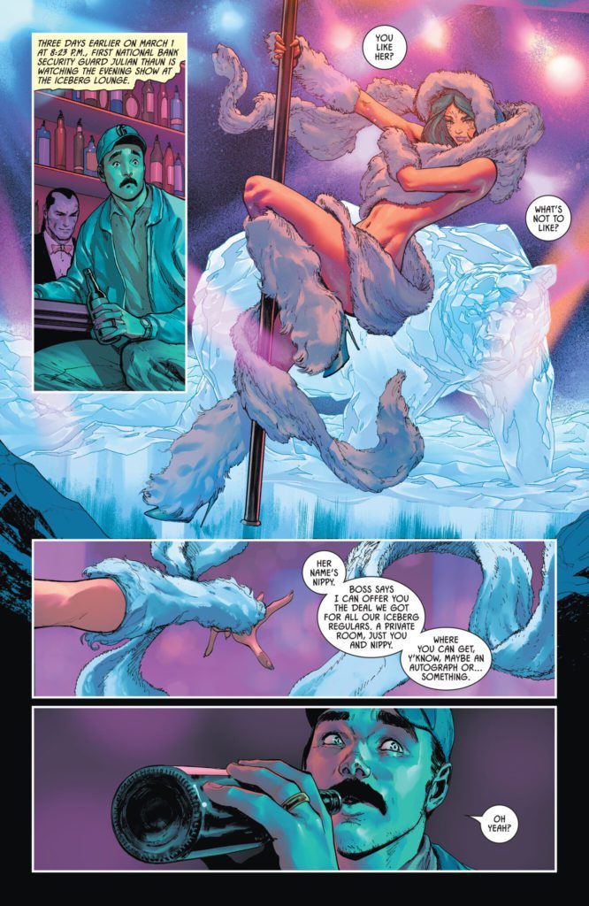
Writing & Plot
Tom King flexes his heist-writing muscles with his script for Batman: Killing Time #1. His knack for tightly-paced, engrossing plots is here on full blast, this time with a story starring some of the Caped Crusaders best rogues. These versions of Riddler, Killer Croc, and especially Catwoman are more sinister and classically criminal than their current, more relatable versions. Reading a Tom King Batman comic where Selina is holding a woman hostage in her own home is almost odd. Still, it’s refreshing to see King take such a comparably old school approach to these characters. This book also takes place early in Batman’s career, and so it offers more opportunity for a streamlined heist-conspiracy without years of history potentially bogging down the plot. The McGuffin (what Nygma, Kyle, and Jones stole) itself has yet to be revealed, and that mystery has created more tension going forward in a way these sorts of devices rarely do.
King’s writing style here is a bit different than what we usually see. Most of his actual in-panel writing is an overhead narrative, describing the steps of the heist and what Bats and other characters do in response. I could almost hear it in George Clooney’s voice. This isn’t at all an uncommon narrative technique, especially not in heist stories. However, it’s handled so sharply that it’s still a joy to read. King’s character dialogue and interactions have always been immensely memorable, and we still get that here. Every exchange is framed perfectly for the delivery and each scene has a layer of subtext underscored by charm and/or dread. This is a great script for the opening issue that makes the wait for the next one almost unbearable.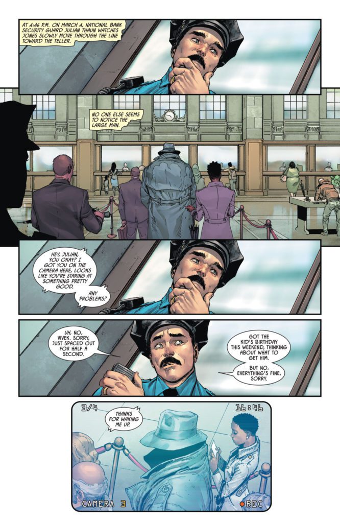
Art Direction
David Marquez stands tall among the other Bat artists King has worked with in Batman: Killing Time #1. His work admittedly is aesthetically similar to that of other recent Batman artists, landing somewhere in-between Lee Weeks and Mikel Janin. However he still differentiates himself in his details and distinct character drawings. His own takes on Riddler, Penguin, Croc, and Catwoman are classic designs in line with the story, but brought to a new level of life through their expressiveness. Marquez may have my single favorite drawing of Catwoman in existence within these pages. His directorial eye is fantastic as well. He pulls off unique angles and perspectives in this comic that adds to its slightly cinematic but still totally comic book reading experience.
Alejandro Sanchez’s colors finish Marquez’s linework with stunning detail shading and tonal choices. This coloring is right in line with much of the work we’ve seen in Tom King’s main Batman run, which is great since every one of those comics has looked incredible. Sanchez brings incredible atmosphere to every page and panel and wraps the whole visual experience in crisp, high-fidelity color-work. The lettering from Clayton Cowles is clean and sharp, differentiating itself slightly between the narration and dialogue. It’s a solid lettering style that works well for the reading experience but kind of stays out of the way. Overall, this is an incredible looking Batman comic.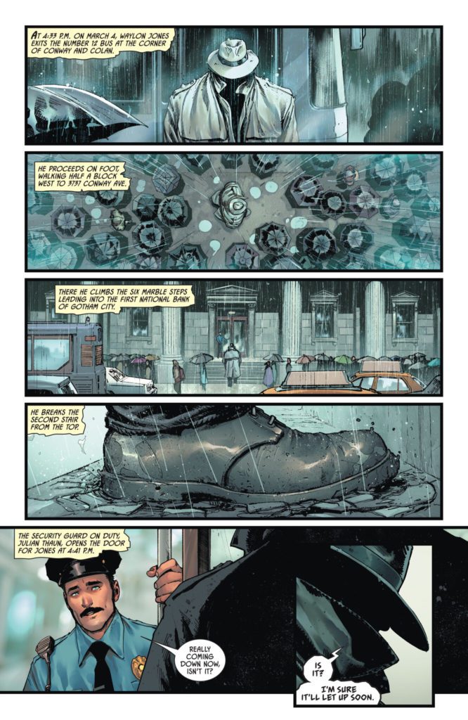
Verdict
Batman: Killing Time #1 is an engrossing and fun start to this mini-series. Tom King’s script is taut with tension and lined with clever dialogue and sharp narration. The visuals from David Marquez and Alejandro Sanchez are astonishingly detailed, making this one of the finest looking comics of 2022 thus far. Be sure to grab this new issue when it hits shelves on March 1st!