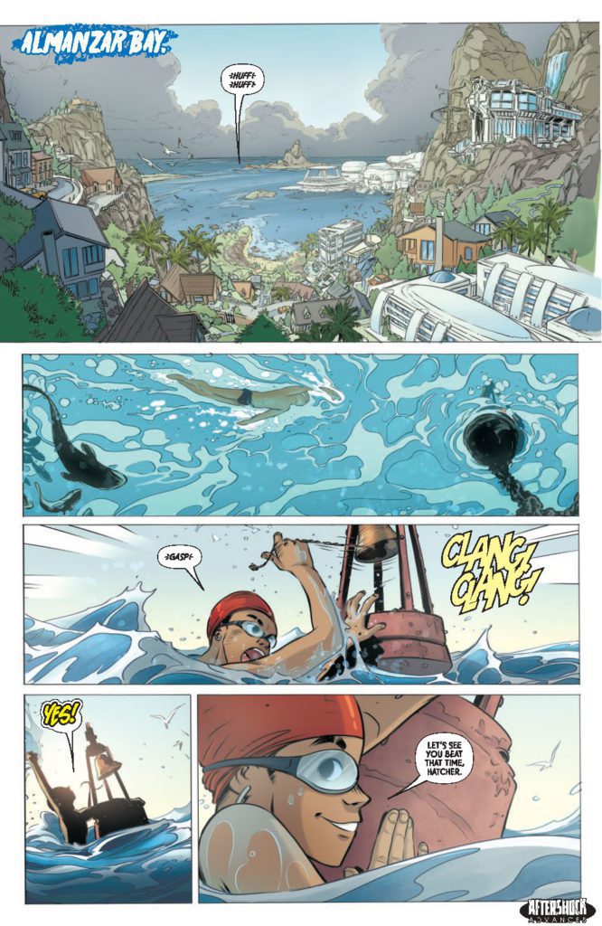
THE OCEAN WILL TAKE US #1 hits your local comic book store April 6th, but thanks to AfterShock Comics, Monkeys Fighting Robots has an exclusive four-page preview for you.
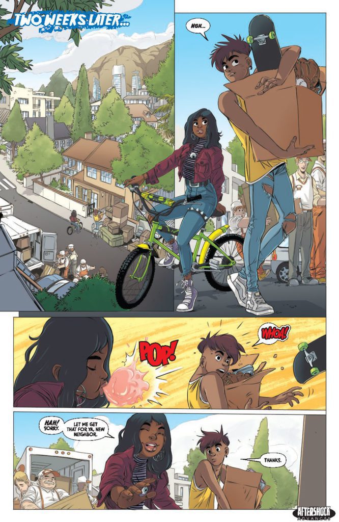
About the issue: Something’s lurking in the waters of Almanzar Bay – and when Casey March tries out for the swim team, he learns firsthand that messing with the social order of his new high school can have dangerous – even deadly – consequences!
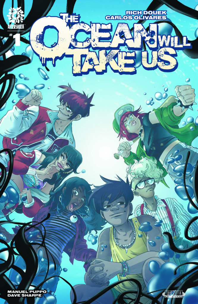
The series is by writer Rich Douek and artist Carlos Olivares, with colors by Manuel Puppo, and letters by Dave Sharpe. The main cover is by Olivares, and the incentive variant is by Hayden Sherman.
“A new tale of horror and intrigue – where a group of high school outcasts band together to fight a growing evil in their school and town.”
Check out the THE OCEAN WILL TAKE US #1 preview below:
Are you looking forward to THE OCEAN WILL TAKE US? Sound off in the comments!
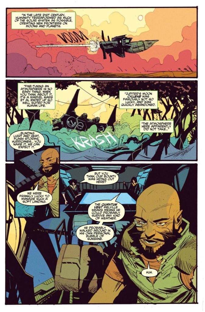
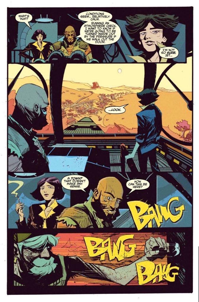
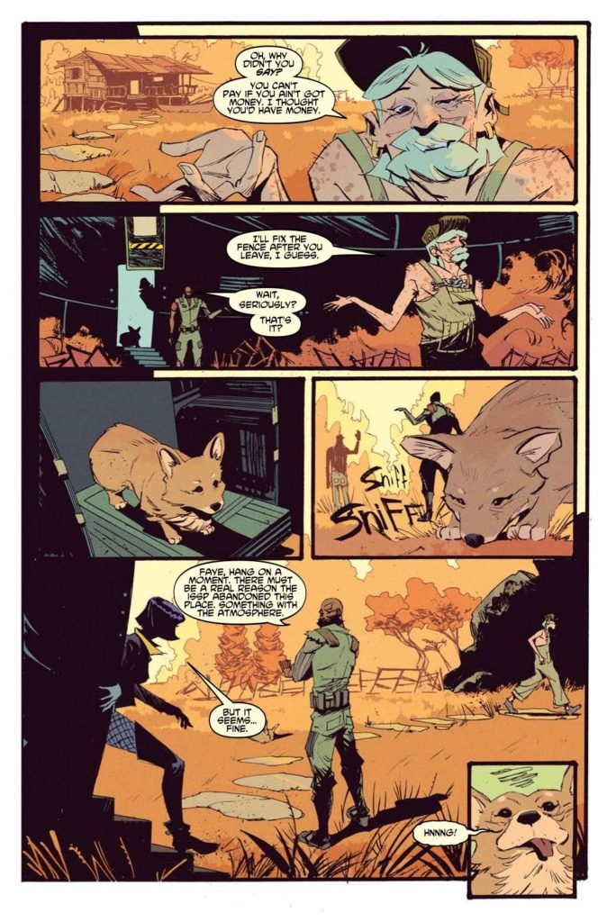
Writer Dan Watters and artist Lamar Mathurin return to hunting bounties across the solar system with Cowboy Bebop #2. Along with Roman Titov on colors and lettering from Richard Starkings and Jimmy Betancourt, this 2nd chapter continues their stellar adaptation of Shinichiro Watanabe’s iconic anime. With a script that flows like jazz and stand-out stylized visuals, this issue solidifies this series as a must-read for Bebop fans everywhere.
“An original story set in the year 2171. The bounty hunter crew of the spaceship Bebop chase an ex-gang member who holds a vest which gives the wearer unlimited luck.”
Writing & Plot
Reading Cowboy Bebop #2, it becomes abundantly clear the love and understanding of the source material that Dan Watters has. I’m not embellishing at all when I say that both issues of this comic thus far have genuinely felt like Bebop episodes. From the ludicrous issue-specific plot point to the quiet interactions these characters all have, this feels like a lost chapter of the anime brought to life in a new medium. Here, the crew of the Bebop lands on Cyllene, a moon orbiting Jupiter that is also home to an abandoned colony effort. I won’t spoil why this planet was left alone, but the twist is just so classically Bebop. The planet also, in true Bebop form, presents our Jet, Faye, and Spike with specific dilemmas regarding their morality, their pasts, etc. Watters’ dialogue has that loose, stylistic feeling that reads just like scripts of the anime. Every character sounds and acts just like their anime counterparts, with little to no influence from the recent (deservedly cancelled) Netflix adaptation that this comic is technically based on. Everything from the deep, philosophical conversations presented by strangers, subtext-filled exchanges, and glances into the troubled visages of our main cast is spot-on with the original series and damn entertaining even without context.
Art Direction
What ultimately sets Cowboy Bebop #2 and the prior issue apart from the original work is the art of Lamar Mathurin. His uniquely stylized pencils and heavy inks craft a Bebop vison that will is familiar, but actively plays to its own tune. Characterizations are detailed and exaggerated, carrying the identity and swagger of the source material to new levels. The weight that each cast member carries (heh) can be seen in the expression Mathurin crafts in his scenes. The emotional gravity of the source material is alive and well in this comic. Mathurin’s work here carries huge amounts of tone and atmosphere, and creates a whole new way to experience this iconic post-Earth reality.
Roman Titov’s colors really bring this new yet familiar vision to life in a tonally rich way. His hazy, darkened use of a very used-future Cyberpunk-Western style echoes the original series while absolutely maintaining its own style. The lettering from Richard Starkings and Jimmy Betancourt plays it pretty safe in dialogue and narration balloons with a clean, modern font. Then it really surprises with creatively stylistic SFX letters, both blending into and sticking out just the right amount for this comic’s visual experience. Artistically, every aspect of this comic is absolute gold.
Verdict
Cowboy Bebop #2 is a stellar continuation of this comic adaptation of Shinichiro Watanabe’s legendary anime. Dan Watters’ script is fun, goofy, and almost musical in its composition, while also carrying the thematic and philosophical weight of the source material. The visuals from Lamar Mathurin and Roman Titov are brilliantly unique and convey the personality, atmosphere, and overall direction of this story in a stunning manner. This is a must-read for Bebop fans and newcomers alike. Be sure to grab this issue when it hits shelves on March 2nd!
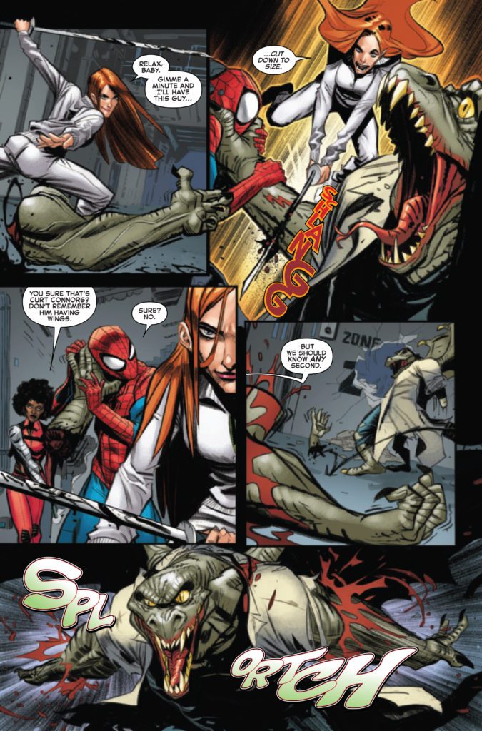
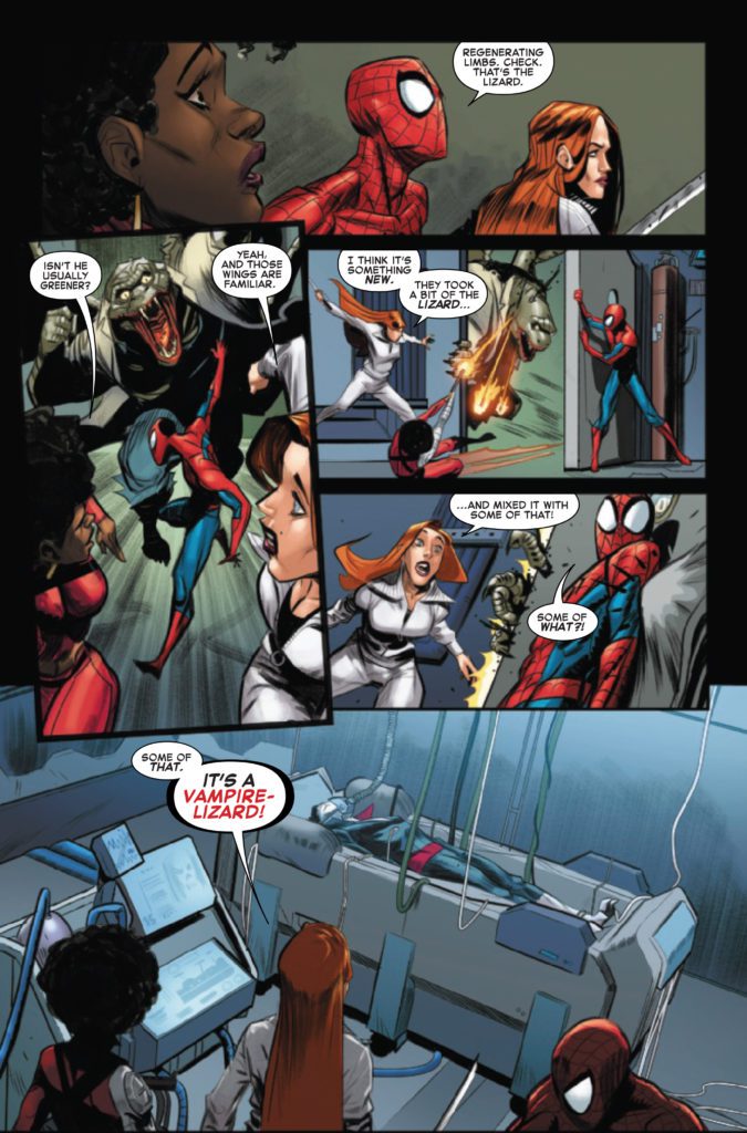
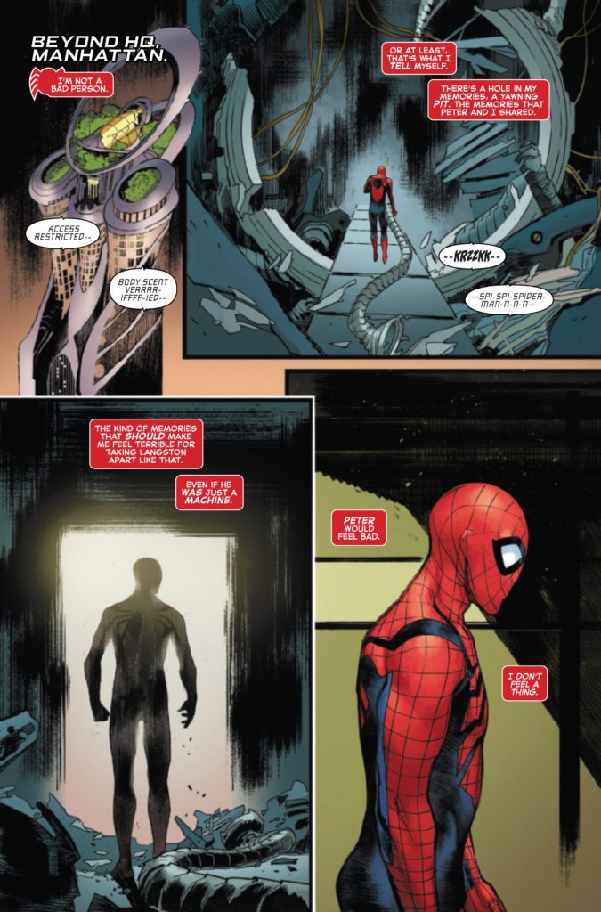
AMAZING SPIDER-MAN #92 hits your local comic book store March 9th, but thanks to Marvel Comics, Monkeys Fighting Robots has an exclusive four-page preview for you.
About the issue: “BEYOND” NEARS ITS END!
WHAT IS BEHIND DOOR Z?! Ben makes his way to the same place Miles Morales was last at, and he is nowhere to be found. Just door after door of true horrors. Any door’s resident could kill Spider-Man, but Door Z’s might just destroy the whole city!
The issue is by writers Kelly Thompson & Jed MacKay and arists Fran Galán, Sara Pichelli, & Zé Carlos, with colors by Brian Reber, and letters by Joe Caramagna. The main cover is by Arthur Adams and Alejandro Sánchez.
The Amazing Spider-Man “Beyond Board” consists of Thompson, Cody Ziglar, Saladin Ahmed, Patrick Gleason, and Zeb Wells.
Check out the AMAZING SPIDER-MAN #92 preview below:
Is AMAZING SPIDER-MAN on your pull list? Sound off in the comments!
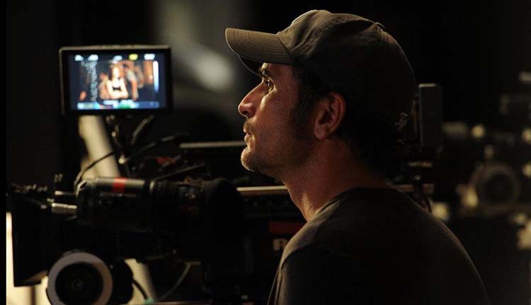
There’s something sinister happening in Stoker Hills, the new horror film from director Benjamin Louis (State’s Evidence) that’s one part found footage frights and equal part noir detective procedural.
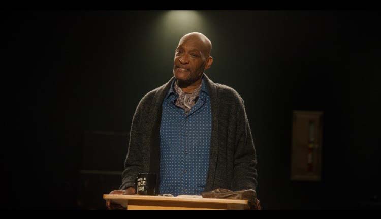
Stoker Hills begins with several film students who are making their thesis project. Horror fans will recognize Professor Smith as acting legend Tony Todd. As the burgeoning film crew is at work at night on the street, Erica (Steffani Brass) is taken by a hooded figure. The remaining students, Ryan (David Gridley) and Jake (Vince Hill-Bedford), try to survive the ensuring chaos as the hooded figure torments them too. Their experience is captured by their video equipment and investigated by Detectives Adams (Eric Etebari) and Stafford (William Lee Scott).
PopAxiom spoke with cinematographer John Orphan about becoming a director of photography, his artistic instincts, and making Stoker Hills.
What If
John begins in a place where a lot of creative minds start. “I loved movies my whole life, but I didn’t think it was possible …” Growing up in Grand Rapids, Michigan, John lived in a mindset “where you grow up and get a job, and you don’t pursue the arts.”
“I was interested in photography as a hobby. I’d do it on the side for fun,” John shares that the passion for cinematography was alive inside. However, everything changed when he “worked as a PA. That’s when I saw what the cinematographer was doing and thought, ‘that’s what I want to do.’
Despite the upbringing nudging him toward something more practical, John’s PA experience provided a realization. “I had to do this because I didn’t want to get old and think ‘what if.'”
About Stoker Hills
John doesn’t recall how he came into Ben’s radar. But remembers, “We talked about influences.” Up until that point, John says, “I’d been doing a lot of commercial work which doesn’t lend itself to making the kind of stuff I want to make. So, when they called about making a dark, moody horror movie, I said’ absolutely.'”
“We talked about the two things going on,” he says about pre-production. “There are the detectives, and we’d shoot in a more traditional cinematic style. Then there’s the kid’s point of view that uses their equipment as found footage.”
The two perspectives mean the film draws from different influences. “From the detective’s point of view, we were probably leaning real hard on the Fincher’s Seven.” But for the found footage stuff, he says, “Ben loved the look of a movie called Honey, so that’s the color and saturation look we went for with the kids’ footage.”
Dark
Though the film has two distinct looks, John explains, “We shot it all on the RED Weapon 6k. It’s a big camera with big lenses.” To achieve the different looks, “we messed around with it more in post to make it look dirtier.” However, a handful of moments when another camera is at work, “There’s some running footage where we’d grab a DSLR.”
Balancing the look of the film required careful planning. “We did a bunch of test shots in advance. Then, we got in a studio for a day and tried different lighting schemes that we knew would happen. From there, we decided which one works best and based the colors on that.” Planning requires good execution from the team. “Our colorist Dan Edwards at Changing Frames did an amazing job.”
“The first pass of the movie was probably twice as dark and scary as it is now,” he says of a cut that was considered too intense. However, the film didn’t shed too much of its darkness. In one scene, “There’s a surplus of bodies in a room. So we used actual people; covered them in blood and mixed them in with prop body parts.”
Those near-naked actors spent a lot of time on concrete floors in a cold room. For John, “It was arresting to walk into that room to shoot because it looks so real to the eye. That was my favorite stuff to shoot.”
Wrapping Up
“Coming up, I was into Roger Deakins (Blade Runner 2049), which I’m sure a lot of people say the same or Emanuel Lubeszki (Saving Private Ryan),” he answers about influences. “Another guy I think is a master is Robert Richardson (A Few Good Men, Once Upon A Time In Hollywood). I’ve learned a lot from studying his work. My favorites of the newer guys are Bradford Young (Arrival) and Greg Fraser (Dune).”
John’s a big fan of horror and “dark thriller kind of stuff. The things we did with the detectives [in Stoker Hills) if I could make a career out of doing that, I would be happy.”
“I think it’s what naturally comes out of me,” he says about this ‘dark side.’ “It’s strange. I’m a happy person, I love to laugh, most of my friends are standup comedians. But artistically, what comes out of me is this darkness. It’s the kind of visual art that excites me. That’s the kind of world I love.”
Stoker Hills is available on Amazon and other on-demand services. So what’s next for John? “I just finished another horror movie filmed in Montana called For the Night. After that, I’ll be doing another dark thriller called Reap/Sow in my hometown.”
Is Stoker Hill on your watch list?
Thanks to John Orphan and Projection PR
for making this interview possible.
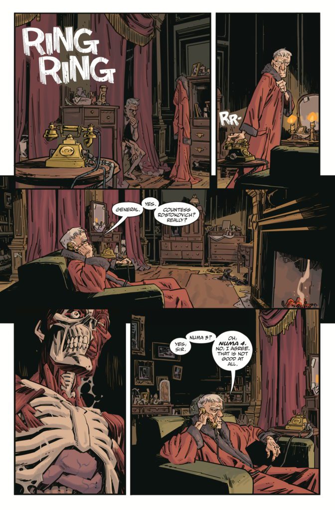
The first thing you’ll notice about Radio Spaceman is how confident it is. Writer Mike Mignola, artist Greg Hinkle, colorist Dave Stewart, and letterer Clem Robins have a fully fleshed-out world they’re inviting us into. Every character has a reputation. Every planet has a history. But instead of painstakingly walking us through their worldbuilding, this creative team dives right into the story. It’s a fantastic and fun approach.
About Radio Spaceman #1 (from Dark Horse Comics):
When a ship crashes and lands on a mysterious planet and some of the surviving crew go missing, the mysterious mechanical hero Radio Spaceman is called to investigate. But the planet hides much more than the missing crew, and Radio Spaceman may be stumbling into more than even he can handle.
Writing
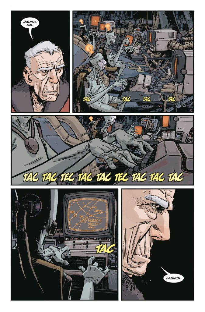
In the opening pages, we see an old man get out of bed and answer his phone. We only hear half of the phone call, but we’re led to believe there’s someone very important on the other end of the line. A planet is in danger and they need his help. We’re immediately wondering, “What’s so impressive about this guy that he’s called on to protect planets?” He’s not exactly formidable. But then he shuffles into another room. With a few key words, the room comes to life. He plugs himself into a control console and begins his latest mission. Nuna 4, the planet in question, may be on the brink of destruction. Yet everything about this scene tells us that to our main character, who isn’t even named, this is just another day of the week.
Mignola’s script is brilliantly understated. He speaks more in silences than he does in actual dialogue. In fact, there are a good half dozen pages with no dialogue at all. Many more have no more than a couple word balloons, total. That’s because Mignola knows he’s communicating plenty as it is. He tells us everything we need to know with his character designs and the action of each scene. And in holding back on his script, Mignola gives his main character a casual charm. The man’s not a talker, he’s there to get shit done. Radio Spaceman #1 is all about getting right to the action.
Art
This creative team, other than Hinkle, has worked together plenty of times before. Mignola, Stewart, and Robins have done scores of issues on Baltimore and Hellboy. They’re a team that just gels. And Hinkle fits right in. He might be the newcomer to their group, but it feels like he’s always been there. His characters are so full of personality. The main character, the mind behind the Radio Spaceman, is the very picture of boredom. He’s constantly looking a little upset that he got out of bed for this. The same can be said of a character, near the end of this issue, who is supposed to be in mortal danger. She’s not scared or worried, she knows she’s getting out of this. She’s just impatient for the cavalry to arrive. Hinkle compounds the feeling that these characters have a long history of doing this kind of thing. They’ve faced bigger baddies, more impossible odds, and now every danger is just another reason they’ll be getting back home later than expected.
Coloring
Stewart, as always, gives every scene a tangible ambiance. You can see the faded glory of our main character’s bedroom in the light browns and the discolored reds. You can almost smell the dust on the grey counters of the dilapidated control room. But then, once we’re seeing the landscape of Numa 4, the pages begin to buzz with a warmth and light. The pinks and purples of the alien flora are subtle but beautiful. The bright green sparks of extraterrestrial guns and the vivid red of blood give the action sequences an extra kick. Stewart will have you fully immersed in the world he’s given color to. You’ll taste, hear, and smell it – not just see it.
Lettering
Robins seems to be having a ton of fun with this issue. You can see his sound effects in bright pinks, oranges, and reds sprinkled across every page. And while many of his sound effects remain effectively the same, with subtle differences, he has a few that stand out in the crowd. The ringing of the phone at the start of this issue is written in large, white font that has cracks like streaks running through each letter. You can hear the hollowness of the sound compared to the full-bodied noises of machinery and sci-fi weapons. When a group of aliens runs out of their hiding place, the “WUAAAAAAA” noise they make as they charge is placed behind their figures. Their heads and arms get in the way of the yellow letters, making the sound feel like it’s coming from deep within their cave. These, and many other little variations to Robins lettering, bring a ton of life to Radio Spaceman #1.
If you want to sit back and enjoy a sprawling, action-packed alien world, Radio Spaceman is the comic for you. It’s somehow both subtle and bombastic at the same time. This creative team has earned the right to be confident in their storytelling. Radio Spaceman is a wonderful result of that confidence. Pick up Radio Spaceman #1, out from Dark Horse Comics March 2nd, at a comic shop near you!
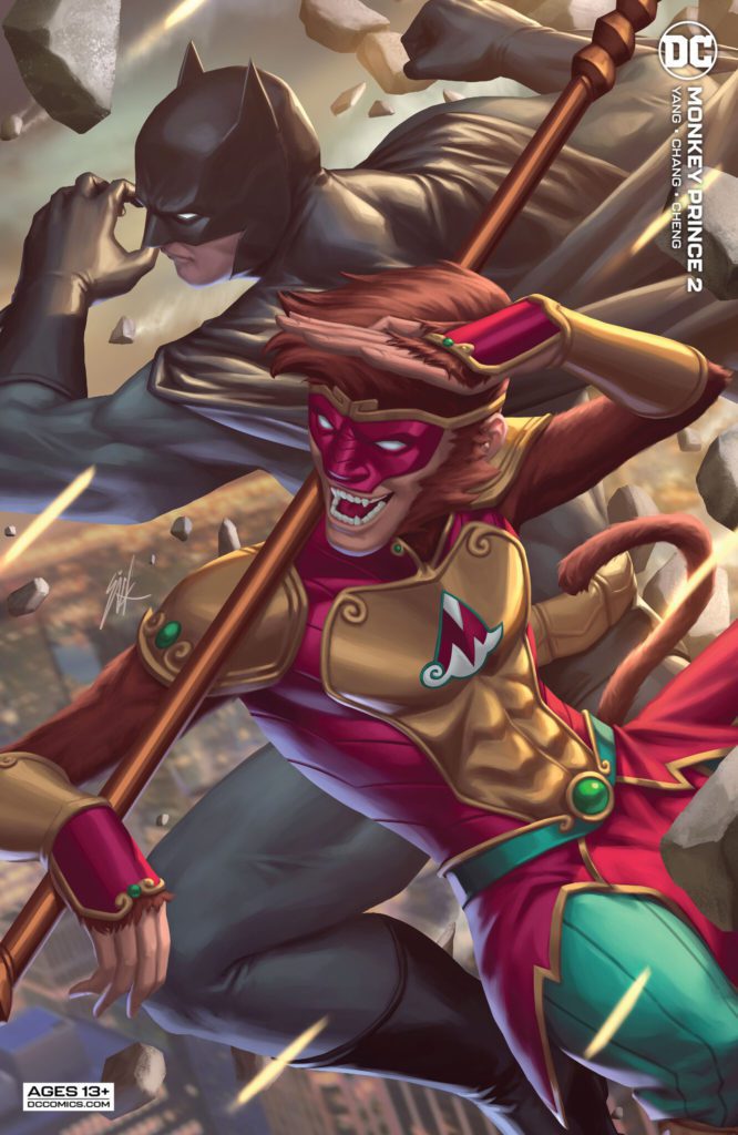
Writer Gene Luen Yang and artist Bernard Chang return with a fantastic new chapter of their mythology/superhero hybrid in Monkey Prince #2. With colors from Sebastian Cheng and letters by Janice Chiang, this follow-up to the stellar first issue continues the momentum with a goofy and immensely fun comic. With a silly yet engaging script and outstandingly animated visuals, this issue proves that Monkey Prince is a must-read in the DC stable.
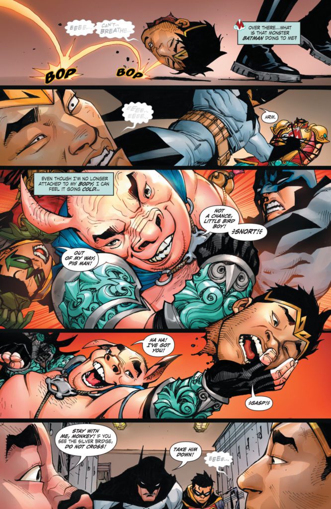
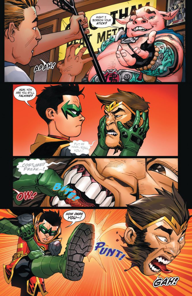
“Batman and Robin fight with Pigsy over…a part of Monkey Prince’s body that fell off and is rolling around moving on its own? And Pigsy better grab it quickly, before Monkey Prince transforms back into Marcus Sun, because there’s no way a regular teenager could survive that!”
Writing & Plot
Gene Luen Yang has struck the proper balance of relatable, inspiring, and absurd with his script for Monkey Prince #2. Marcus, understandably comparable to a young Peter Parker, functions with all the confused naivete of a teenager going through puberty – and a new set of magical superpowers. Naturally, after getting his head cut off in his monkey form and having it kicked around and caught in a lacrosse net by a determined Robin, he’s more than a little apprehensive about his new abilities. This apprehension results in some great exchanges with Sifu Pigsy (aka the best character in this book), as well as some serious irony involving his time with his family. The humor in this issue never lets up and it always lands with its signature over-the top physical comedy and witty dialogue. I can admit I was apprehensive about the inclusion of Batman and Robin in this comic. I mean, seriously, does Bats really need more page-time right now? However, Yang utilizes him in a uniquely comedic manner. He’s written in a way that I would imagine the Adam West Batman series would have been done if it were created today. The way Batman’s seriousness keeps getting tripped up on the strange magical hijinks of the Monkey Prince and Pigsy is a genuine source of good comedy here. This comic is a delightful read, and Yang’s work will keep me coming back here month after month.
Art Direction
This comic’s infectious energy is due to the fantastic and animated pencils of Bernard Chang. The former Wonder Woman artist’s unique yet familiar designs for both our mythical cast and the DC classics continue to be delightfully impressive. If we could get a Sifu Pigsy spinoff drawn by him, I’d be a happy man. Chang’s character animations are fluid and tie in with his panel direction to keep this book’s momentum moving swiftly. What I’m most impressed by is how Chang designs and utilizes the characters from the Chinese myth and places them into the DC universe. The Monkey Prince, Pigsy, and numerous new villains that show up in this chapter all look completely unique and stick out among the DC cast. However, they still retain a comic book-ish iconic hero/villain style.
So much of what makes the visual experience so vibrant is Sebastian Cheng’s coloring. Each panel explodes with life and action thanks to his work filling in Chang’s pencils and inks. There’s an almost youthful flair to this comic’s hi-fidelity style that, to be frank, reminds me of a Marvel book. The lettering from Janice Chiang is modern and has tons of flexibility within the dialogue bubbles. Every aspect of this comic visually is genuinely outstanding.
Verdict
Monkey Prince #2 is a ridiculously fun follow-up chapter to the already stunning debut. Gene Luen Yang’s writing is stylistically unique among Western comics, and consistently nails his humor while moving the plot forward in an engaging direction. The visuals from Bernard Chang and Sebastian Cheng are energetic, vivid, and brilliantly animated, making this one of the best looking ‘Big 2’ comics on stands today. Be sure to grab this issue when it hits shelves on March 1st!
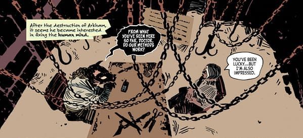
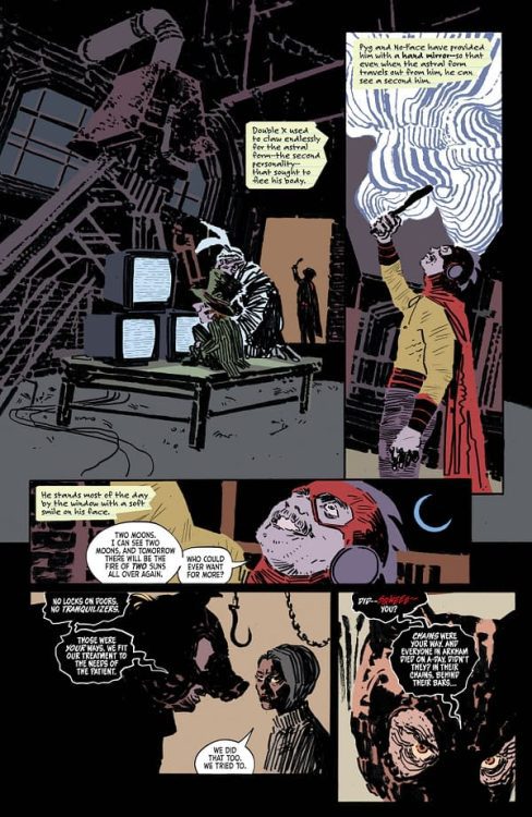
Back when Frank Miller and Alan Moore were working separately to bring more adult sensibilities to Batman, they both came to the same conclusion: Batman is crazy. Which is what a more realistic Batman will always come back to. Dressing as a bat and doing karate is a perfectly sensible solution to an evil crime clown. But it won’t solve any real-world problems. The closer Batman is written to reality, the more of a maniac he becomes. So almost as a sort of counter-balance, Batman has accrued a rogues gallery of serious weirdos over the years. Characters like a shambling corpse who can only recite poetry, a man with eyes in his fingers, and a woman with a hole where her face should be. But that manic edge to Batman and his allies has never quite gone away. So what we’re left with is a Gotham both populated and run by odd, broken people. Which is why this issue of Arkham City: The Order of Things finds the infamous Professor Pyg deciding he’d be better at running his own asylum than the old Arkham handlers. The worst part is, he’s not doing a bad job.
WRITING
Following the reveal last month that Professor Pyg has been gathering escaped inmates from Arkham Asylum, this issue wastes no time in establishing that Pyg’s plan was simply to rehabilitate them. Not so much in a way that would make them fit to re-enter society. Just finding ways to make them happy or calm and less prone to hurting people. Doctor Joy, disturbingly unperturbed by working for a serial killer in a deserted meat-packing plant, has decided to join his staff. She wouldn’t want to abandon her former patients after all. But despite admitting that Pyg’s done some good work, Joy is growing increasingly worried at his plans to release the most dangerous patient under his care.
While the reveal of Pyg’s plan starts this issue with a bit of curveball, Dan Watters still manages to neatly wrap up the main plot while continuing to build on the fun character work he’s done with the former Arkhamites. Ten-Eyed Man is the clear standout of the series. Once a silver-age villain with a gimmick that seemed more a hindrance than a help, Watters brings out the inherent creepiness of a man sporting eyes in his fingers and adds a sense of mystery to his powers. The series is all too happy to leave the villain’s grasp on reality ambiguous. Is he a babbling madman or a true mystic? Who knows? Doctor Joy certainly doesn’t.
ART
Befitting a work that keeps reality at arm’s length, Dani’s work with colorist Dave Stewart eschews outlines, relying instead on solid blocks of color and blots of ink. It feels ethereal, shadows and shapes taking precedence over all else. A big part of Ten-Eyed Man’s success is owed to Dani’s redesign, as well. His new look is immediately striking and spooky. His blank, featureless mask providing great contrast to the bright, multicolored eyes that dot the ends of his fingers. His body language is that of a contortionist, knees often bent over his head, and his body naturally folding itself into uncomfortable positions.
Stewart has considerable experience coloring for minimalist linework, and his colors confidently define the contours Dani’s lines often hint at. The technicolor weirdos under Pyg’s care always manage to brightly stand out against the duller purple, grays, and browns of the meat plant.
Letterer Aditya Bidikar gets to play around, too. They often change styles, switching to use lowercase letters on excerpts from Joy’s memos, or the bright red squiggles of Professor Pyg’s squeals.
VERDICT
Arkham City: the Order of the World is my favorite title to come out of DC in a long while. With three out of four creators returning to working together from the Image book Coffin Bound, Arkham City has managed to harness that same creative energy towards a story centered around the Ten-Eyed Man, of all things. And it works. Wherever these creators go from here, together or apart, I’ll make sure to keep my eyes on them.
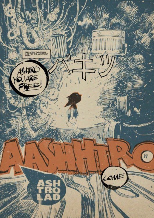
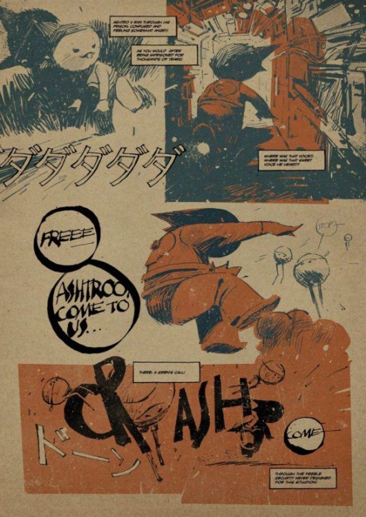
Coming from Image Comics this week is the 7174 Annual No. 1: a collection of comic strips, pin ups, and mind-bending artwork from the brilliant minds of T.P. Louise and Ashley Wood. This 88-page spectacular brings together for the first time a selection of rare works originally produced and published elsewhere. The images are faintly familiar, and the stories have a recognisable tint to them, but that is because Louise and Wood’s work is a uniquely warm homage to both East and Western comic book storytelling. From the obvious Ashtro Lad to the subtler War Comic references, the 7174 Annual is a smart and witty pastiche of comics, and a visual treat from cover to cover.
7174 ANNUAL Credit: Image Comics
Mixed Philosophy
The art direction of the comic is striking and the cover sets the tone, letting you know exactly what you will get. Blocks of color are overlaid on the heavy inks in order to bring the characters to life. The style gives the images shape and form in a bold and brash way. Wood’s artwork demands attention and his multiple artistic endeavours, working on television, film, toy design, and game graphics, seeps into every page of this comic.
The book opens with the origin of Ashtro Lad, mimicking the famous Atomu (Known internationally as Astro Boy) comics and cartoon series from the 1950s and 1960s. But this is more than a passing homage to Osamu Tezuka; it is recognition of the profound effect the Japanese creator had on popular culture both in his homeland and abroad. At first, it seems to poke fun at the concept but, through the superb scripting from Louise, it actually enhances the mythic quality and the world building potential of the mechanical boy.
Louise draws on European comic traditions and sensibilities to bring eroticism to elements of the story. The concepts of sex, birth, and responsibility are embedded into the comic and the narrative. Constant voice-overs, portrayed in caption boxes, don’t always have clear owners but this doesn’t appear to matter as the narrative point is made nonetheless. This constant stream of consciousness, in style and substance, is a call back to classic Heavy Metal Magazine strips and the works of Moebius and other Bande dessinee creators.
7174 ANNUAL Credit: Image Comics
There is a mix of art influences from Eastern and Western comics history, but there is also a merging of innocence and experience in the narrative, a further combination of the child friendly Japanese comic strips and the adult themed European books. Louise and Wood blend these influences together in each short story to produce something that is funny, endearing, and often risque.
This comic is a collection of short stories that share a background narrative link. On occasions the stories bleed into one another seamlessly, while at other points the jump is a little more jarring. However, the ongoing adventure and the cavalier way in which the narrative is edited together adds charm to the story. Subtle gestures produce laugh out loud moments while over the top moments of mechanical madness are visually awe inspiring. This comic is clearly a labour of love, wearing its influences on its sleeve. Older readers will be whisked back to the 1990s with the Pixie-esqu lyrics, Industrial rock aesthetic, and the manga obsession of merging organic and machine parts that was sweeping the world from Japan. Newer readers will be faced with a plethora of ideas to indulge and explore.
7174 ANNUAL Credit: Image Comics
Conclusion
The 7174 Annual stands out against Image’s usual output, and will appeal to readers of other erotic fictions like Faithless from BOOM! Studios, or Melinda Gebbie and Alan Moore’s Lost Girls. It has the anarchic wit of Tank Girl and the Kafkaesque psychology of Dan Watters’ Limbo or Coffin Bound. Somewhere within this melee of style is the beautifully crafted poetry of Louise’s words, unfortunately, they do sometimes get lost beneath the striking artwork and dynamic page layouts.
With a myriad of pin ups and splash pages, the 7174 Annual is packed with everything an Ashley Wood and T.P. Louise fan could desire. If you have read any of Wood’s UV Explorer Newsletters and were left wanting more, then this is the comic you’ve been waiting for. It is unusual, stylistic, and innovative. One of my hopes for comics this year is a desire to see bolder and different experimentation’s with the form. Comics like the 7174 Annual will lead this experimentation as it showcases that influences do not have to be limited to one source to tell a story. Mixing a host of influences from around the world can create mind blowing results.
Let the mantra be chanted: ‘Not naked, but draped in art!’
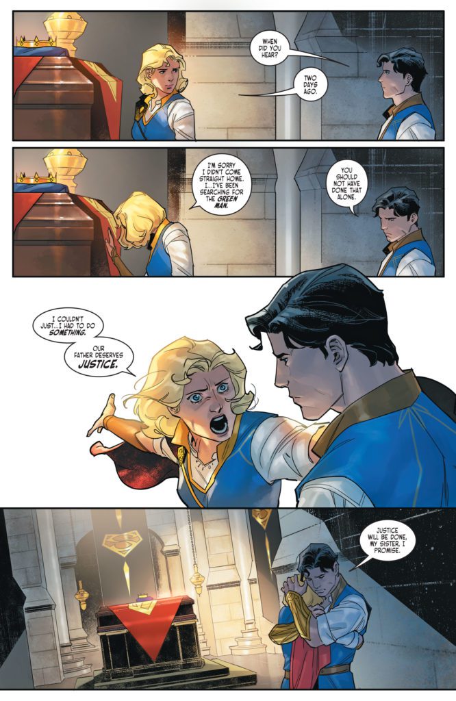
It’s hard to review a comic like Dark Knights of Steel #5. It’s an issue that packs a lot of punch and could lead down some really interesting paths. But it feels like it’s caught in the crossfire of fan service and upending expectations. DC Comics’ Dark Knights of Steel #5 makes bold moves and only time will tell if they’re the right moves. For now, writer Tom Taylor, artist Yasmine Putri, colorist Arif Prianto, and letterer Wes Abbott seem to be telling a story that is a little unsure of what it wants to be. Some mild spoilers ahead.
Writing
From the start of this series, Taylor has made it clear that this is a very different version of the DC Universe. It’s often exciting to see his new takes on old characters. But Dark Knights of Steel #5 feels like it’s being pulled in two directions. Taylor is taking characters down drastically different roads than the ones we know, while also filling these pages with references to existing DC lore. Earlier in this series, Taylor struck a refreshing balance with the old and the new. Now, it feels like his script is becoming a slave to these nods and twists. Where they were once interesting Easter eggs and peripheral details, they now feel like they’re the whole point of the story. Perhaps the biggest twist of the series happens in Dark Knights of Steel #5 – certainly the biggest twist so far – and we’ll have to see where that leads. It definitely opens up plenty of interesting possibilities. But all in all, Dark Knights of Steel is beginning to feel a little contrived and dry.
Art
Though Taylor’s script is starting to stumble, Putri’s art is really beginning to shine. Her page layouts are dynamic and constantly adapting to the plot. When a character loses her balance, the panels shift to be slightly off-kilter. When the dust settles, her panels are shown in neat, orderly groups with right angles. And this theme continues through Putri’s work. When a fight begins again, the corners shift and the panels almost look like they’re about to tumble off the page. It’s a fantastic way to show the power of the characters involved. It feels like they’re barely contained, like they could burst out of the artwork at any moment.
Coloring
Dark Knights of Steel #5 could certainly be described as a gloomy chapter in this series. Characters face betrayal, heartache, and close calls with death. But Prianto doesn’t let that stop him from creating a picturesque world. Prianto’s colors make each scene feel like it’s happening during a cool Spring afternoon. While there are certainly moments of the color shifting, an occasional bright green or dazzling red, these moments are incredibly rare. Even in the midst of violence and backstabbing, Prianto maintains his soft color palette. It brilliantly contrasts the mood of the writing. Prianto makes every sad story beat even harder to deal with. You almost want to yell at the characters, “Why don’t you stop fighting and just enjoy the beautiful day?”
Lettering
Abbott juxtaposes a character’s anguished cry with their weakened mumble. As they’re attacked and hurt, they yell a crooked “HRRK!” in a word balloon with uneven edges. They look up at the character who did this to them and speak their name. The letters are almost like small black dots on a big white canvas. Abbott’s lettering speaks for itself. The first “HRRK!” has the perfect font to hear the mix of confusion and pain. But in having the opposite happen right after, the quiet, breathless mumble that’s barely heard, Abbott highlights the strengths of each line of dialogue.
DC Comics’ Dark Knights of Steel is at a crossroads of sorts. With the big choices this creative team is making, this could turn out to be a very satisfying and unique story. But as it stands, the series feels like it’s trying to do too many things. Is it dedicated to upending expectations or to paying homage to DC canon? In trying to do both, it’s beginning to lose its footing and intrigue. Pick up Dark Knights of Steel #5, out from DC Comics today, at a comic shop near you.
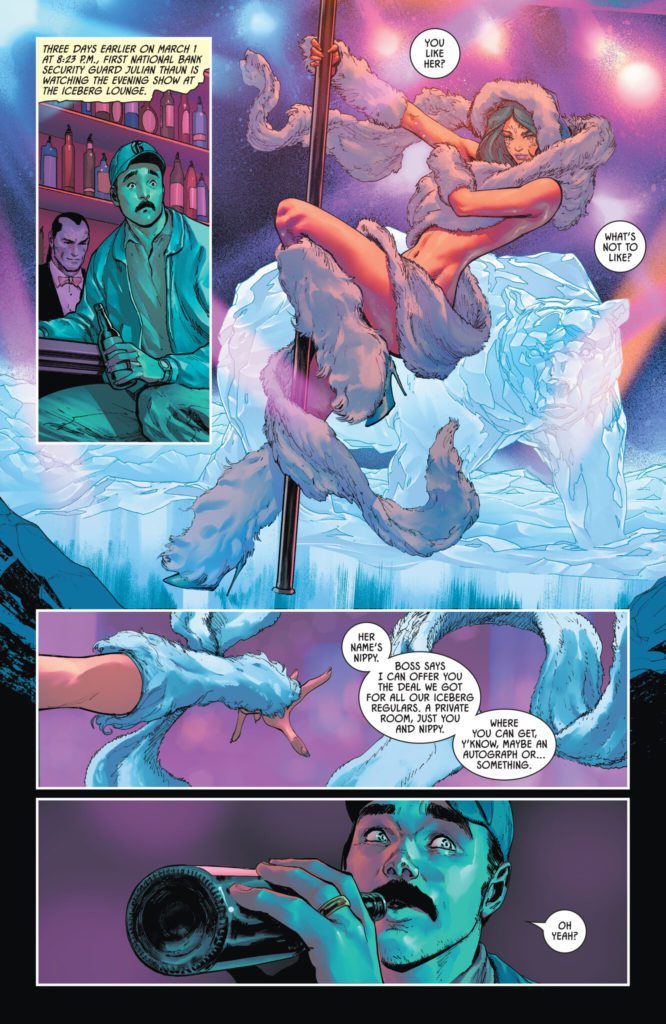
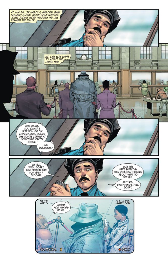
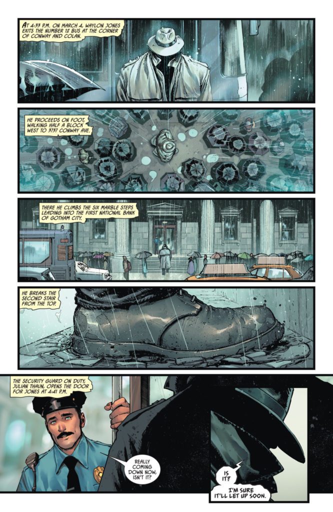
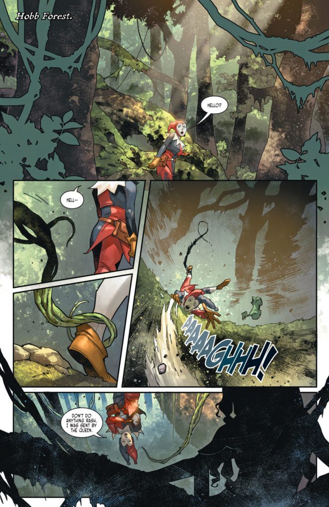
Industry phenom Tom King teams up with artist David Marquez to deliver a stupidly fun and drop-dead gorgeous heist comic in Batman: Killing Time #1. Featuring colors by Alejandro Sanchez and lettering from Clayton Cowles, this issue seamlessly mixes blockbuster heist hijinks with the dark seriousness of a true Batman comic. With a sharp, clever script from King and jaw-dropping visuals, this is a read that fans of the Caped Crusader’s rogues gallery won’t want to miss.
“Three villains, one Dark Knight, and a deadly heist gone wrong. Catwoman, the Riddler, and the Penguin join forces to pull off the greatest robbery in the history of Gotham City. And their prize? A mysterious and priceless artifact in the secret possession of Bruce Wayne! But, as the events unfold, what fun is a heist without a bloody double cross or two?”
Writing & Plot
Tom King flexes his heist-writing muscles with his script for Batman: Killing Time #1. His knack for tightly-paced, engrossing plots is here on full blast, this time with a story starring some of the Caped Crusaders best rogues. These versions of Riddler, Killer Croc, and especially Catwoman are more sinister and classically criminal than their current, more relatable versions. Reading a Tom King Batman comic where Selina is holding a woman hostage in her own home is almost odd. Still, it’s refreshing to see King take such a comparably old school approach to these characters. This book also takes place early in Batman’s career, and so it offers more opportunity for a streamlined heist-conspiracy without years of history potentially bogging down the plot. The McGuffin (what Nygma, Kyle, and Jones stole) itself has yet to be revealed, and that mystery has created more tension going forward in a way these sorts of devices rarely do.
King’s writing style here is a bit different than what we usually see. Most of his actual in-panel writing is an overhead narrative, describing the steps of the heist and what Bats and other characters do in response. I could almost hear it in George Clooney’s voice. This isn’t at all an uncommon narrative technique, especially not in heist stories. However, it’s handled so sharply that it’s still a joy to read. King’s character dialogue and interactions have always been immensely memorable, and we still get that here. Every exchange is framed perfectly for the delivery and each scene has a layer of subtext underscored by charm and/or dread. This is a great script for the opening issue that makes the wait for the next one almost unbearable.
Art Direction
David Marquez stands tall among the other Bat artists King has worked with in Batman: Killing Time #1. His work admittedly is aesthetically similar to that of other recent Batman artists, landing somewhere in-between Lee Weeks and Mikel Janin. However he still differentiates himself in his details and distinct character drawings. His own takes on Riddler, Penguin, Croc, and Catwoman are classic designs in line with the story, but brought to a new level of life through their expressiveness. Marquez may have my single favorite drawing of Catwoman in existence within these pages. His directorial eye is fantastic as well. He pulls off unique angles and perspectives in this comic that adds to its slightly cinematic but still totally comic book reading experience.
Alejandro Sanchez’s colors finish Marquez’s linework with stunning detail shading and tonal choices. This coloring is right in line with much of the work we’ve seen in Tom King’s main Batman run, which is great since every one of those comics has looked incredible. Sanchez brings incredible atmosphere to every page and panel and wraps the whole visual experience in crisp, high-fidelity color-work. The lettering from Clayton Cowles is clean and sharp, differentiating itself slightly between the narration and dialogue. It’s a solid lettering style that works well for the reading experience but kind of stays out of the way. Overall, this is an incredible looking Batman comic.
Verdict
Batman: Killing Time #1 is an engrossing and fun start to this mini-series. Tom King’s script is taut with tension and lined with clever dialogue and sharp narration. The visuals from David Marquez and Alejandro Sanchez are astonishingly detailed, making this one of the finest looking comics of 2022 thus far. Be sure to grab this new issue when it hits shelves on March 1st!


")


")