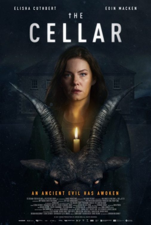
The Cellar is an atmospheric film that provides a narrative for you to invest in, but the payoff isn’t satisfying. The film had its debut at the South by Southwest 2022 film festival event. It does a great job at building tension, suspense, and the performances help save its weaker moments. Sadly, The Cellar starts to lose its footing in the second act before it builds to a thrilling finale.
Supernatural horror delivered two notable franchises in the last decade, Insidious and The Conjuring. The Cellar takes elements from both and it comes out to a mixed result. A family moves in, a child goes missing, and a presence is felt. The film isn’t bad, but the explanation of the activity takes away from its terror. I’ll just say that a certain school subject made the film slightly comical.
Directed and written by Brendan Muldowney, The Cellar follows Keira Woods, a mother who searches for her daughter after she disappears in the cellar of their new home. Elisha Cuthbert stars as Keira Woods and is joined by Eion Macken, Abby Fritz, and Dylan Fitzmaurice. House of Wax fans will enjoy Cuthbert in this role, as she does a tremendous job at portraying a concerned mother who wants to keep her family safe. It was great to see her return to the horror genre, even if the results aren’t that memorable.
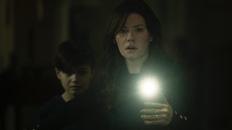
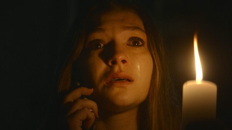
An eerie atmosphere is established early on and grows more unsettling as the narrative progresses. The unease is felt by the viewer and Keira as she researches the house’s history. If not for its atmosphere and competent performances, The Cellar may have been a misfire. Its narrative is gripping, but the characters involved feel like an afterthought. Brian (Macken), Keira’s husband, is the standard in denial father. There’s tension between Keira and her daughter so that development allows you to root for while she researches.
The Cellar becomes less compelling as the mystery unravels, but it’s kept alive by a horrific final act. Exposition dumping takes over, which brings the mystery to a displeasing halt. Cuthbert shines as a mother who must remain strong for her younger son, yet is visibly broken by her daughter’s disappearance. As mentioned above, performances are strong for everyone, but their characters feel unimportant. Outside of Keira, the narrative doesn’t allow this family to be fleshed out before the terror tears them apart.
I wish the film kept playing with your mind because it opts to reveal its monster, which does allow some stellar VFX from that department. Muldowney effectively builds tension through the exterior shots of the house, its spooky cellar, and Keira navigating its dark halls. While its monster is revealed, The Cellar doesn’t overexpose the entity, it’s a quick glimpse at best. What’s effective about this is it still raises intrigue but doesn’t squander it through overexposure of the creature.
The creature design isn’t that unique, and posters for the film will showcase this as well. Shudder acquired The Cellar and will be releasing it soon on its platform. Horror fans will find something to enjoy from this new film. It’s not that good, but it isn’t the worst thing either. Its atmosphere is inviting, which makes up for the weak characters, and lackluster exposition dumping.
The Cellar is an enjoyable haunted house film that manages to retain your interest, despite coming to mixed results. Cuthbert’s performance was the strongest aspect that kept me invested, but the first act does a great job at reeling you in as well. Solid performances, a haunted house, every horror cliche, and a competent story that doesn’t go completely bonkers. The Cellar will satisfy some horror fans, and I’d say this one will be worth revisiting one day.
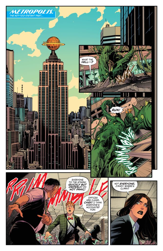
Possibly the most hyped creative team of 2022 so far, writer Mark Waid (JLA: Tower Of Babel, Kingdom Come) and artist Dan Mora (Klaus, Power Rangers) come together to create possibly the best Cape comic of the year with Batman/Superman: World’s Finest #1. Featuring the impeccable coloring talents of Tamra Bonvillain and letters from Aditya Bidikar, this comic brings DC’s two flagship characters back together for a tense and wildly fun ride – featuring the Doom Patrol!
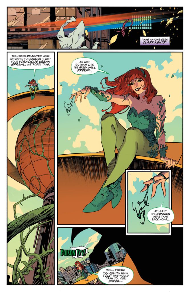
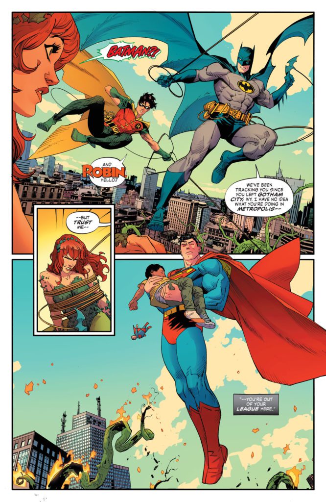
“In the not-too-distant past, Superman’s powers are super-charged from a devastating chemical attack by the villain Metallo…and the only ally that the ultra-powerful Man of Tomorrow can turn to in this turbulent hour is Gotham’s own dark vengeance: the Batman. A nearly fatal burst of power drives Bruce Wayne to his own extreme measures to help his friend…enlisting none other than the Doom Patrol for aid. It’s the world’s greatest superheroes from the world’s greatest comic book talent in an epic comic book experience that kicks off the next big events in the DCU. Get ready, it’s time to soar.”
Writing & Plot
You know, I could scarcely think of a better writer in 2022 for Batman/Superman: World’s Finest #1 than Mark Waid. His bibliography includes some of the best stories the ‘Big 2’ have to offer and demonstrates that few writers understand the superhero genre as he does. Waid brings his Silver Age influenced style to the pages of this iconic team-up and makes it a complete joy. World’s Finest #1 feels like a 60’s DC book but with modern structure and sensibilities. I’ll never get tired of reading a good ol’ Bats and Supes team-up comic, and this first issue sets up what could go on to be one of the most memorable yet. Waid takes some familiar ingredients – a Batman villain causing trouble in Metropolis followed by Superman getting poisoned as part of a secret plot – and throws in splashes of modern creativity to make them feel fresh.
The real treat that drew me to this comic was without a doubt the inclusion of the “World’s Strangest Superheroes – The Doom Patrol!” Waid effortlessly blends this cult classic team into this book. His modernized version of the original Arnold Drake and Bruno Premiani team is a wonderful treat, and he writes them exceptionally well (especially Robot Man). If you were expecting a Morrison/HBO series take on them, prepare to be disappointed. This is a Silver Age-style pastiche in every way, and a wonderfully entertaining comic through and through.
Art Direction
Dan. Freaking. Mora. The modern comics phenom blesses the pages of Batman/Superman: World’s Finest #1 with his signature brand of clean and hyper-kinetic penciling. His designs for our favorite classic DC characters here match what Waid does in the script. He takes the older designs and modernizes them through his own art style. Poison Ivy and other villains have scarcely looked better, and the Doom Patrol come across has highly refined versions of their classic selves – red and white uniforms and all. Mora injects life and personality into his characters through his highly detailed animations. His action sequences feel both immense and lightning-fast. If you’ve seen Mora’s work before, you know how hard his scenes hit when fists and superpowers are unleashed. Every page is busy but still focused. Mora is a master of using blocking to direct a comic’s pacing and the reader’s eyes.
The only thing that could improve the artwork of Dan-Freaking-Mora is the color-work of one Tamra Bonvillain. The former Doom Patrol colorist (Way & Derington run) brings her bright and vivid palette to this heavy-hitting superhero book with incredible results. She’s the perfect complement to Mora’s energetic pencils, offering colors that are reminiscent of the bright optimism of the Silver Age, but with modern fidelity. Lastly, Aditya Bidikar’s lettering is in absolutely perfect form for this comic. Their contemporary style constantly shifts like a liquid reacting to rocks being thrown in it, then crescendos into perfectly placed and effective SFX letters. This is a phenomenal work of visual storytelling, with an absolute S-tier art team making possibly the best-looking Superhero comic of the year so far.
Verdict
Batman/Superman: World’s Finest #1 is an absolute treat of a superhero comic, and a reminder of what DC comics are like at their very best. Mark Waid leverages his years of expertise in the genre to pen a script that is equally fun and intense, with plenty of suspense to carry it into the next chapter. The visuals from Dan Mora and Tamra Bonvillain are nothing short of jaw-dropping, as they have crafted possibly the best-looking ‘Big 2’ comic of 2022. Be sure to grab this incredible #1 when it hits shelves on March 15th!
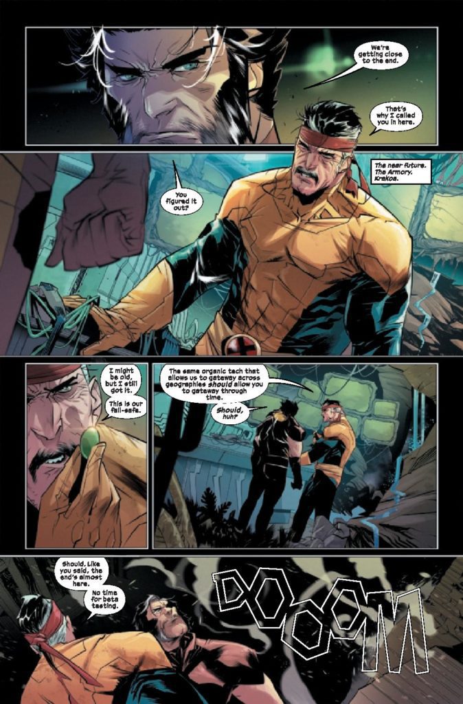
To take on two big stories at one time is a hard task. Jonathan Hickman pulled it off flawlessly when he did House of X and Powers of X. Now, Benjamin Percy is trying his hand at doing this with X Deaths of Wolverine and X Lives of Wolverine. As we enter the fourth issue of X Deaths of Wolverine, things start to take shape and boundaries are being crossed. Percy is joined on X Deaths of Wolverine #4 by Federico Vicentini on pencils, Dijjo Lima on colors and Cory Petit on letters.
WRITING
The fun thing about this series is that it takes place immediately after Inferno. Benjamin Percy has been writing Wolverine since X-Force #1, so he has a good grasp on who the character is. This book is a little different though since it uses alternate versions of Wolverine. This future version of Wolverine is different, but still has a lot of the same priorities. Wolverine still values his family and kids. We see this as Logan confronts Arnab. One of the reasons Wolverine has come back is to stop his family from dying horribly. He discusses this with Arnab and uses it as motivation to complete his mission. Percy has done a great job of villainizing Moira throughout this series. This issue she does something so despicable that she can never go back to being a decent person. This behavior feels like a natural progression for a character that feels betrayed and abandoned by everyone she loved.
ART
The pencils by Federico Vicentini offer a good art style to go along with Percy’s script. Vicentini doesn’t overcomplicate the backgrounds on many panels. Sometimes things can get too messy and too detailed, but Vicentini allows the panels room to breathe by not bogging everything down. There is a panel that will most likely stick with you after reading this issue. As Moira does an unspeakable act, she disregards any care she had for mutant kind. Vicentini draws this panel very creepily. The look on Moira’s face afterward shows us that she’s dead inside.
Dijjo Lima steps up and takes on the coloring duties for this book. The color palette is lighter for this issue with lots of pastel like blues and reds. The gold on the future Wolverine really sticks out. The Phalanx gold is a good contrast to the dark colors on the rest of Wolverine’s costume. As Moira faces off against an astral Professor X, Lima uses a texture on Xavier to blur his form. This blurred and faded image breaks up the colors used in the rest of the issue. It makes thing visually more interesting for a couple of pages.
The letters by Cory Petit work well with this style of art. In the beginning of the issue, as sentinels come for Logan and Forge, Petit uses a transparent “DOOOM.” No Wolverine book would be complete without the infamous “SNIKT” as Logan unleashes his claws. The sound effects for this issue really enhance the reading experience and that is, by and large, thanks to Petit.
CONCLUSION
X Deaths of Wolverine #4 is one of the better entries of the series so far. Benjamin Percy keeps giving us little glimpses of the unsettling future for our favorite mutants. The future may be grim for mutants in this book, but Percy’s star keeps shining brighter. X Deaths ofWolverine #4 is out at a comic store near you.
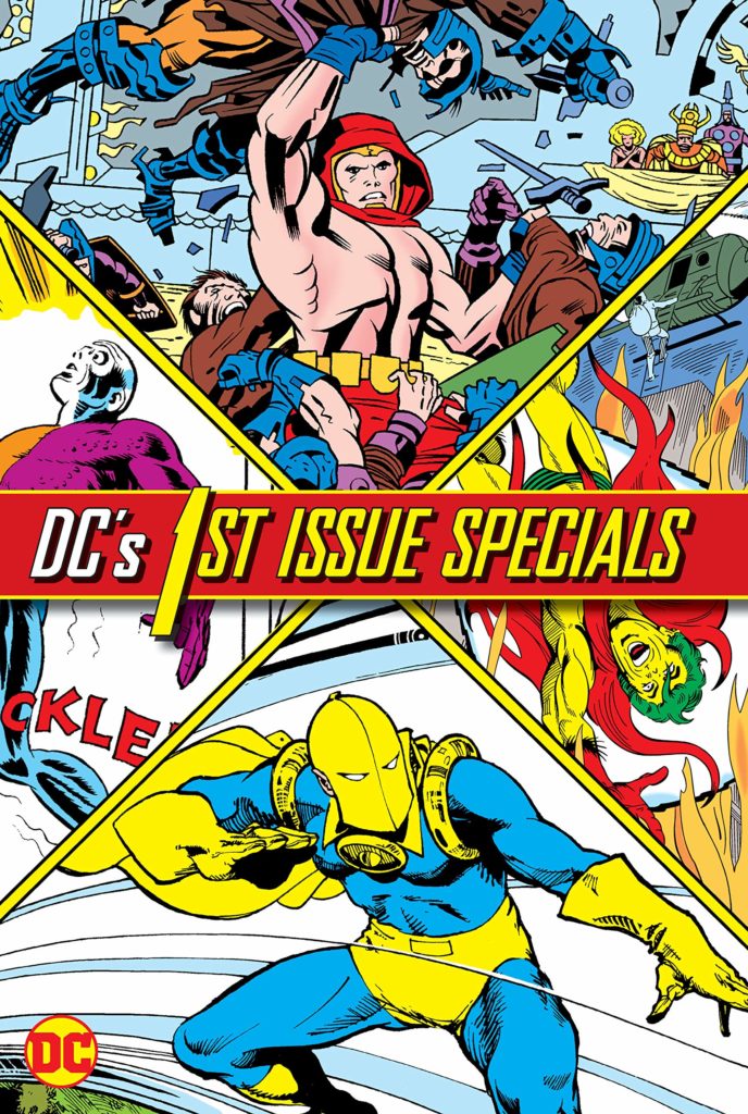
Last month, DC Comics announced a new series called Danger Street. The series, written by Tom King, with art by Jorge Fornes, and colors by Dave Stewart, centers around a host of mostly-forgotten DC characters. The characters of Danger Street are ripped right from the pages of DC Comics’ experimental series DC 1st Issue Special. I sat down to read the 13 issue run. Originally, I’d planned to write an article with a title along the lines of “I Read 1st Issue Special So You Don’t Have To.” By the time I was done with the series, however, I was convinced that everyone needs these characters in their lives.
The Cast that Time Forgot
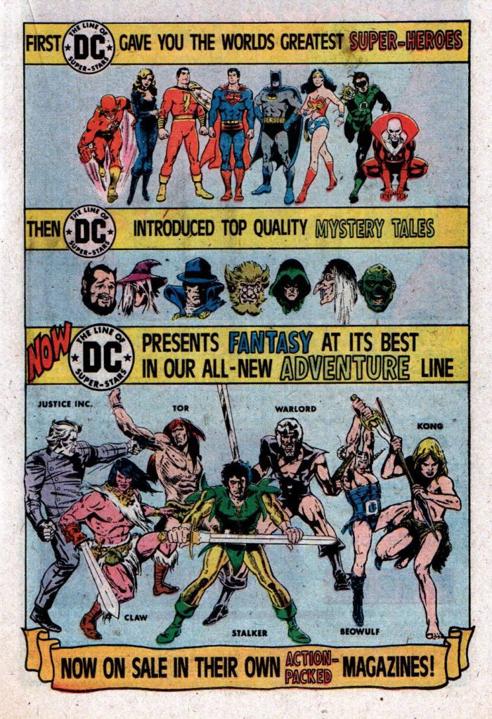
What’s a little odd about 1st Issue Special is that it seems like a failure of an experiment. Out of 13 issues, published from April 1975 to April 1976, only two went on to become full-fledged series. One of those series, Warlord, had been announced months before the titular character’s appearance in 1st Issue Special. The other was a revival of DC’s New Gods. But, despite the series’ many pleas for fans to send letters in if they wanted to know more about each story, it seems like this series was never meant to go places.
A DC house ad in the pages of 1ST ISSUE SPECIAL #5 featuring Warlord, months before his debut in 1ST ISSUE SPECIAL #8.
You see, 1st Issue Special was actually a rebranding of an old concept from DC. From the 1950s to the early 1970s, DC had a series called Showcase. (It popped back up again in 1977). Showcase would do exactly what its title suggests: It would present a character and see if readers were interested in knowing more. But where 1st Issue Special only produced one issue of a series, Showcase would produce three, bi-monthly. This would give the publisher time to see if there was real interest in the story, and to begin drafting ideas for where the series would lead if numbers were looking promising. If an issue of 1st Issue Special sold well, the average turnaround time for a new series in 1975 meant that any interest garnered by the debut would surely have died off by the time of publication.
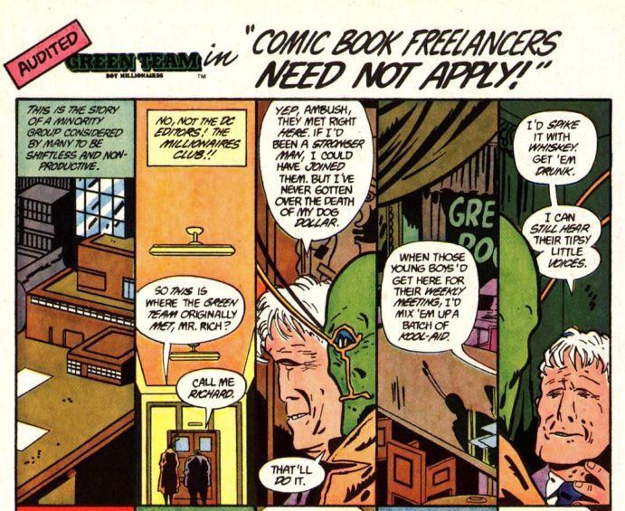
In issue #71 of the magazine Back Issue!, Jack Abramowitz’s article “1st Issue Special – It Was No Showcase (But It Was Never Meant to Be)” quotes Gerry Conway as saying “In many cases, the concepts were created simply to fill the space of another issue for that month, not because we actually were trying to start a new series, although, obviously, we would have liked it if a new series had resulted. Mostly, it was just, ‘We have to come up with something for next month – here we are!'” (Page 40). And so 1st Issue Special was the product of spur of the moment premises and “filler” ideas. The characters, mostly never intended to go onto longer series, were relegated to being punchlines in issues of Ambush Bug and having two panel cameos in The All-New Atom. Needless to say, I was surprised to find comic book magic in these pages. Not only are some of these unpolished concepts fresh and full of life, but there are deeply interesting themes that run through the series as a whole.
The disappearance of “The Green Team,” boy millionaires from issue #2 of 1ST ISSUE SPECIAL, is investigated by Ambush Bug in AMBUSH BUG #3 (1985)
They’ll Never Let You Do That in a Comic!
The first thing you’ll notice about 1st Issue Special is the wildness of its concepts. Whether it’s the Dingbats of Danger Street or the Outsiders (no, not those Outsiders), this issue is full of strange characters. The second thing you’ll notice are the names on the credits page. Legends like Jack Kirby, Mike Grell, Gerry Conway, Joe Simon, Walt Simonson, and Steve Ditko brought these oddballs to life. Even a “throwaway” idea from these folks is worth its weight in gold. And these creators seem to find a freedom in not being too worried about whether these issues sold or not. The Outsiders in particular are joyfully strange.
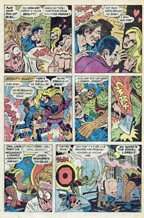
In 1st Issue Special #10, writer Joe Simon, artist Jerry Grandenetti, and inker Creig Flessel, introduce us to this team comprised of a lizard boy, a deformed doctor whose face was reshaped by aliens, and a boy whose bottom half is a small truck, among others. There’s not much of an attempt to explore the psychological aspects of the Outsiders. There’s not even an explanation for how they can careen out of a hospital every night to fight crime without anyone catching on to where their headquarters is. No, the Outsiders are simply strange and that’s all that they’re supposed to be.
Much of 1st Issue Special also plumbs the depths of DC canon for pre-existing weirdos. The Creeper, Metamorpho, Dr. Fate, and Manhunter all make comebacks within these pages. Donned in bright colors and fighting larger-than-life villains, their issues remind readers of a more experimental time in DC’s history. But even in these issues, we see this series begin to grapple with the typical trappings of a comic book. It’s not enough to harken back to stranger days. No, 1st Issue Special is chock-full of one over-arching question:
“Why Do Comics Have to Be This Way?”
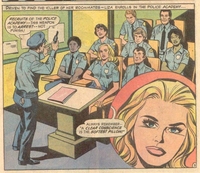
It starts most noticeably in 1st Issue Special #4, written by Robert Kanigher, with art by John Rosenberger and Vince Colletta. The issue follows the character known as “Lady Cop.” Despite the less-than-imaginative name, this issue is perhaps the most interesting in the series. It features Liza Warner, a young woman who witnesses the murder of her roommates while she hides under her bed. She only sees the murderer’s boots. Cursing herself for not doing something to stop him, she dedicates her life to pursuing justice and enrolls herself in the police academy.
The whole issue is based around the idea that she’s a woman, therefore she must be unfit to be a cop or a hero. But over and over again, Warner bests people who underestimate her. She headbutts crooks, flings men over her shoulder, and helps a girl who has just learned she may have an STD. Warner challenges the idea that she can’t be a hero because of her sex, while also using the casual misogyny of others to her advantage. She finds kindred spirits among others in her story who are also maligned or ignored. Just as Warner challenges the status quo of her environment, you can feel the creative team challenging the status quo of theirs.
And they’re not alone in this. In Dr. Fate’s appearance, he interrupts a cliché of comics – the villain’s big monologue – by kicking the guy in the face. When the Creeper appears, it’s alongside Batman villain Firefly, whose Silver Age style duds give him the upper hand when no one will take him seriously. The Codename: Assassin story is heavy-laden with expository thought bubbles. But the issue later reveals that the main character has the power to read minds, and so even the heavy-handedness of the writing has a purpose in the story. A lot of 1st Issue Special is very tongue-in-cheek. Even some of the advertisements in the pages of these issues, one-page comics about Shazam and Batman saving the world with the help of Hostess Twinkies, speak of a time when people had learned to laugh at comic book clichés. 1st Issue Special is full of comic book creators grappling with the medium’s many tropes. In the spirit of Liza Warner, these creators use your assumptions of comic books to their advantage.
Same-Same but Different
In a similar vein, a lot of 1st Issue Special rehashes some old characters, but each with a new twist. Codename: Assassin is a man who lost his parents at a young age. When a loved one is violently murdered in front of him, he vows to have his vengeance on the criminals responsible. He’s not unlike Batman, or even the Punisher (who debuted a year before), except that he has telekinesis and telepathy on his side. The mix of the gritty mob scene the character is investigating, along with the fantastical nature of his powers makes for an odd yet delightful combination.
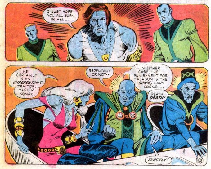
And though Starman shares a name with an existing DC character, it’s actually the Martian Manhunter that he most resembles. Even his name, Mikaal Tomas, rivals J’onn J’onnz at being perfect for a quick English translation. But where J’onn is noble and the only survivor of his home planet, Mikaal tells the other members of his race “I just hope you all burn in Hell.” This is not a man driven by the high ideals of Silver Age heroes.
Mikaal arrives out of the sky in a damaged spaceship, looking like Ziggy Stardust. Despite the fact that they’ve seen him appear from space, a few thugs immediately arrive to try and mug him. Writer Gerry Conway and artists Mike Vosburg and Mike Royer are creating 1st Issue Special #12 thirty-eight years after Superman crash landed on earth. They’re showing us a world that has become used to the supernatural. The denizens of the DC Universe are no longer fazed by blue skin or shining amulets. This is just another Wednesday to them.
The Return of the New Gods – A Return to Form
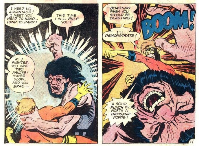
If 1st Issue Special #1-12 is a type of experimentation, then issue #13 goes back to basics. With the return of the New Gods, we also see a return of the trappings of your everyday comic book. Where Liza Warner once stood, kicking sexual offenders in the shins, we now see Big Barda fighting in what amounts to a metal bikini. (Though Barda, twice the size of her husband and able to lift a tank, has always been a fantastic juxtaposition to your typical woman in comics). Where Codename: Assassin was surrounded by the thought bubbles of people he could hear telepathically, we now see Orion think out every step of his movement across each page, for no one’s benefit but his own.
Orion tells Kalibak that boasting is what’s slowing him down in this fight. So Orion punches him, and boasts about it. I’m not sure the irony occurs to him…
It’s tempting to call this finale disappointing. It abandons a lot of the themes that were experimented with for the “tried-and-true” approach. But the juxtaposition that this finale creates for the rest of the series actually makes the finale all the more charming. Sure, there’s not much to it beyond good old fashioned comic book fun. But what’s wrong with some good old fashioned comic book fun? In a way, 1st Issue Special is a journey through a strange land, and the finale brings you back home. The New Gods story went on to be picked up in Return of the New Gods #12, which lasted until issue #19 with some backup stories in Adventure Comics that closed out the series.
I Read 1st Issue Special, So Now You Should Too!
DC Comics’ 1st Issue Special, from 1975, is more than just a conglomeration of unique characters. It’s an experimentation with the medium of comics. Whether the series is throwing things up against the wall to see what ideas stick, commenting on the tropes and clichés of comics which we’d come to take for granted, or launching characters like Warlord who would be around for over 190 appearances, it’s all done in a fresh and interesting way. Without the actual burden of launching a series (despite what the editor’s notes will tell you) this series had the liberty to just have some fun. Not only should you be excited to see these characters pop back up on May 3rd in the pages of Danger Street #1, but you should check out where all of these wonderful personalities found their start.
Writer and artist Livio Ramondelli returns to the astonishing original universe he created with The Kill Lock: The Artisan Wraith #1. Featuring lettering from Shawn Lee, this debut issue brings us back to this story in full creative force. With Ramondelli’s air-tight pacing, careful and compelling dialogue, and ever-incredible artwork, this may very well be the strongest opening issue of 2022 thus far.
“The Kill Lock unified four criminals in a quest to escape their seemingly inevitable, linked deaths. They managed to escape destruction by merging their consciousnesses, and now one of the smartest-and most malicious-bots in the universe has an unbreakable body and a planet at his command. Homeworld won’t allow it, and so two of the deadliest assassins in the universe are tasked to kill the Artisan Wraith.”
Writing & Plot
What made Ramondelli’s writing on the original Kill Lock series so special is how he built his universe and characters through thoughtful dialogue and the expertise of his visual framing. I’m pleased to announce these talents carry over to The Artisan Wraith #1 in spades. Ramondelli drops us back into his original universe much like he did the first time we entered it. We don’t entirely know where we are or how we got here. Set an undisclosed amount of time after the end of the first series, Ramondelli carefully presents us with the fallout of the Artisan’s decisions at the end of the last book. He introduces us to a couple of intriguing new bots set to go after the new Artisan Wraith. I’m very much looking forward to seeing just how the protagonist/antagonist angle fits in this series, since the lines are intentionally muddled from here.
Just like with the original series, what draws readers into this world so quickly is the life and personality Ramondelli gives these sentient machines. From the opening scene we’re treated to how he crafts these characters as individuals through the struggles and interactions with one another. Where the prior series had us focusing almost solely on the main four characters, this issue presents us with a wider view of this universe and its denizens. Our two main assassin characters we are introduced to are wonderfully characterized, with notable quirks and flaws to make them feel real. This return to The Kill Lockis on par with the quality of the prior series, and proves that Ramondelli is an up-and-coming master of the craft.
Art Direction
While you’ll no doubt stay for the carefully crafted plot, you’re no doubt picking up The Kill Lock: The Artisan Wraith for the art work. As a former Transformers artist, Ramondelli demonstrated his unique skill with the incredible designs and visuals in the original Kill Lock. All of that signature style and atmosphere has returned with this sequel series. The cyberpunk, used future sci-fi styling feels desolate and claustrophobic. The desperation seared into the faces and mannerisms of the bots in this story – even the ones not wearing a Kill Lock – sells this as a cyberpunk of a slightly different fashion. Despite the incredible land and cityscapes and the simplistic yet effective robot designs, the real reason for this comic’s endearing success is Ramondelli’s ability to humanize them. His machine cast members can’t change their facial expressions. Somehow, he’s able to extract empathy and heart from the cold steel facias of these troubled robots. They’re made to be more understandable – more human – than many human characters created by writers attempting the same kind of storytelling. Ramondelli’s visual work is endlessly impressive, and I’m so glad to see this series return with more of it.
Verdict
The Kill Lock: The Artisan Wraith #1 is a phenomenal return to this compelling universe. Livio Ramondelli has proven himself a juggernaut of comics talent. His tense yet heartfelt scripting creates instantly memorable characters and moments. At the same time, his artwork is stunning, sharp, and creates unimaginable empathy with his cast of (often highly dangerous) machines. This is a fantastic opening issue, so be sure to grab a copy when it hits shelves on March 9th!
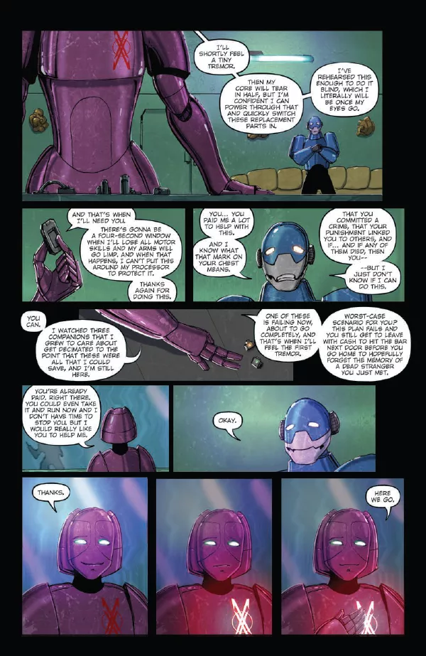
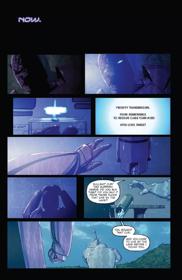
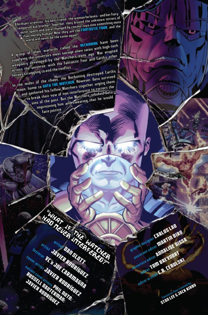
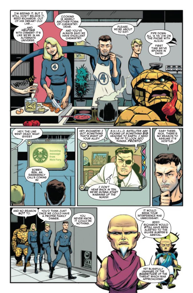
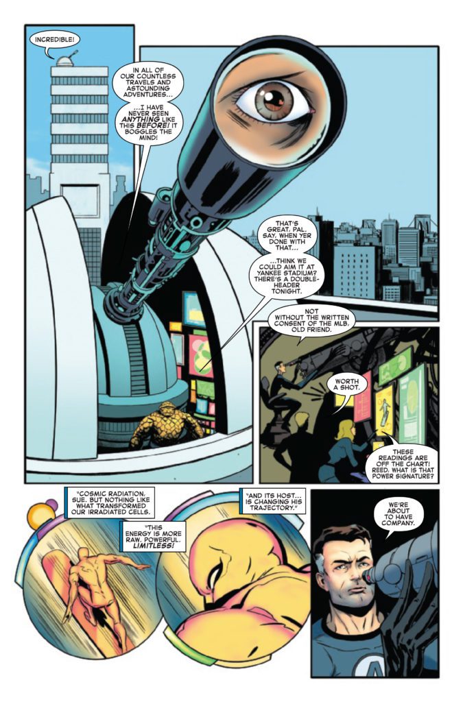
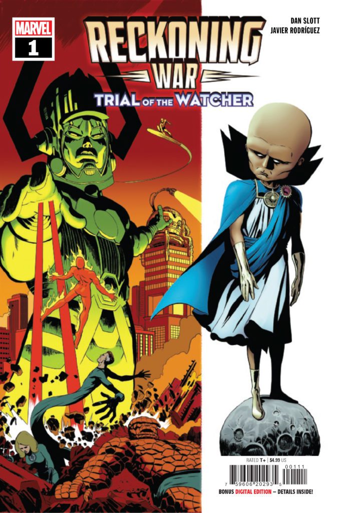
RECKONING WAR: TRIAL OF THE WATCHER #1 hits your local comic book store on March 16th, but thanks to Marvel Comics, Monkeys Fighting Robots has an exclusive four-page preview for you.
About the issue: In all of the Multiverse, there is only one “What If” world that Uatu has avoided watching – one “What If” that he never wished to see. And now it will be revealed – The story that could damn him for all time…and a revelation that could change everything in this universe. Guest starring the Fantastic Four, Galactus and the Silver Surfer.
The issue is by writer Dan Slott and artist Javier Rodríguez, with letters by Joe Caramagna. The main cover is by Rodríguez.
The book is a tie-in to the current Fantastic Four event RECKONING WAR, also written by Slott, and “starring the FF, She-Hulk, Jack of Hearts, the Unseen, the Silver Surfer and everyone in the whole damn Marvel Universe.”
Check out the RECKONING WAR: TRIAL OF THE WATCHER #1 preview below:
Have you been reading Marvel’s RECKONING WAR? Are you excited for TRIAL OF THE WATCHER #1? Sound off in the comments!
Queens is a musical drama on ABC starring platinum-selling artist Brandy Norwood about an all-female rap group trying to rekindle their magic decades after being superstars. P. Erik Carlson is the production designer bringing the world of Queens to life.
In Queens, the “Nasty Bitches” were a group of musicians that dominated the 90s hip hop scene. The four women became legends in the world of music. However, Brianna (Eve J. Cooper), Naomi (Brandy), Jill (Naturi Naughton), and Valeria (Nadine Velazquez) are now in their forties and aren’t the tight-knit group they once were. So can the former superstars of music, once known as Professor Sex, Jill Da Thrill, Xplicit Lyrics, and Butter Pecan, find success again?
PopAxiom spoke with Erik about his career, starting with two beloved projects and on through to Queens on ABC.
Memento
Erik moved out to LA and landed two jobs thanks to some timely connections. The first was the Judd Apatow cult hit Freaks and Geeks. The second Christopher Nolan’s breakout film, Memento. “At the time, I thought every movie I was going to work on would be like Memento. Every project would be as unique and special as that. It’s one of the only scripts I sent home to my brother to read because when I read it, my mind was blown. I got spoiled thinking everything would be a Christopher Nolan movie.”
“Nolan’s preparation was amazing,” he says about the iconic filmmaker. “He, along with his brother, had visualized everything in Memento. So if you had a question about how the timeline worked, he’d already thought of it.”
Creating Memento required attention to detail. “We took the script and put it into continuity order so that we could prepare. Then, whenever we had an issue with scenes not matching, Nolan instantly had an answer. He had it all assembled in his head.”
“I had a great experience with Guy Pearce too,” he says about the film’s star. “I was blown away by him. We designed all the tattoos and printed them out in various sizes to see what would fit him. He walked into the art department, took off his shirt, took a sharpie, and said, ‘Start drawing on my body.’ He was there for the next few days working out each of the tattoos.”
Pieces
Erik’s journey into production design started with a completely different goal. “I went to architecture school in Colorado. I was taking systems and analysis where you size plumbing systems and memorize zoning laws and code. Then, in my senior year, I took a film class to fill credits. The film class teacher asked if I had any interest in film production.”
“This idea of creating a world for every project seemed fantastical,” he thought at the time. “There’s this job that stretches across all these different things.”
Erik was a “ski bum” for a short while, “building log cabins in Colorado. By that point, though, I’d made up my mind that I was going to move out to Los Angeles and see if I could find my way into this business.”
“When I got to LA,” he continues, “I had no idea what I was doing. I went to job boards at colleges to see if anyone needed anything. I started out that way. I lucked out and landed a job as a PA with an amazing designer, Tom Walsh, who became my mentor. I worked with him off and on for 10 or 12 years.”
Meeting Tom was a chance meeting. “Luck plays a part, there’s no doubt, but preparation makes it possible to seize those lucky opportunities that come around.”
The lucky or unlucky effect is persistent in the business. “Every show or movie has situations where things don’t work out, but problem-solving is a big part of this business. What do you do with the pieces that you’re given?”
About Queens
“I’d like to try and read scripts through before thinking about what the production might do, but it’s impossible,” he shares. “Once I’m three or four scenes in, and there’s a new set or new concert, I stop and start making notes. I think I internalize a script better if I break it down as I go. It helps it sink into me.
Queens is a larger-than-life type of show with many challenges for any production designer. So what concerned Erik when going into the production? “The concerts. We do several concerts, arena-sized concerts.”
“I’ve done sort of small concerts, underground concerts, clubs, but nothing like we do on Queens,” he adds. “I’ve grown an appreciation for the people who put these things on for a living.”
“When I read the first few scripts,” he continues, “that was out of my comfort zone, but that’s also why I like working on Queens. It’s a world I didn’t grow up in, so it’s exciting to me to dig in and understand.”
Choosing projects like Queens that take him out of his comfort zone is something Erik seeks out. “I sort of always choose the project that scares me the most. I like getting thrust out of my comfort zone and into a new situation. Some of the choices are certainly about working with people I’ve worked with before. But a lot of it is not getting honed in on one thing. As a designer, you’re always adapting to the next project, and I like that.”
Wrapping Up
From where does Erik draw his inspiration? “Travel. My wife and I love to travel. Unfortunately, though, it’s also annoying to her,” he laughs. “The first thing I do when we go to a new hotel room is take photos. I think that goes back a little to Desperate Housewives.
The ABC hit series with Terri Hatcher, and Eva Longoria featured a lot of hotels and waiting rooms. “So, whenever I go into a waiting room, I take pictures of everything.”
“I might see a texture on a wall, and I take a picture,” he continues, noting that he takes “photos of everything. You never know what script will need some sort of detail. I’m sure my family’s annoyed by it.”
Erik loves creating worlds. Who would he like to create with next? “There are so many good directors and writers out there. I thought it would be fun to work with people like Seth Rogan. It would be fun to reunite after 20+ years and create with people like that from Freaks and Geeks. It’s really about wanting to work with fun, collaborative, creative people.”
Is Queens on your watch list?
Thanks to P. Erik Carlson and Impact24 PR
for making this interview possible.
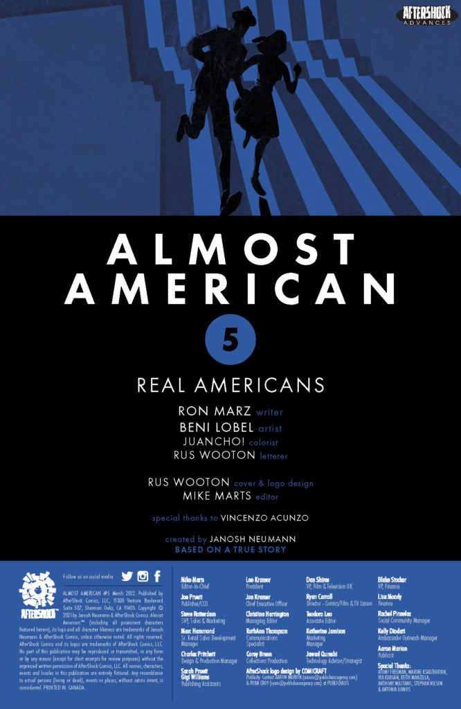
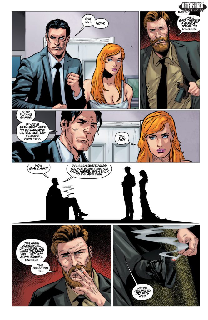
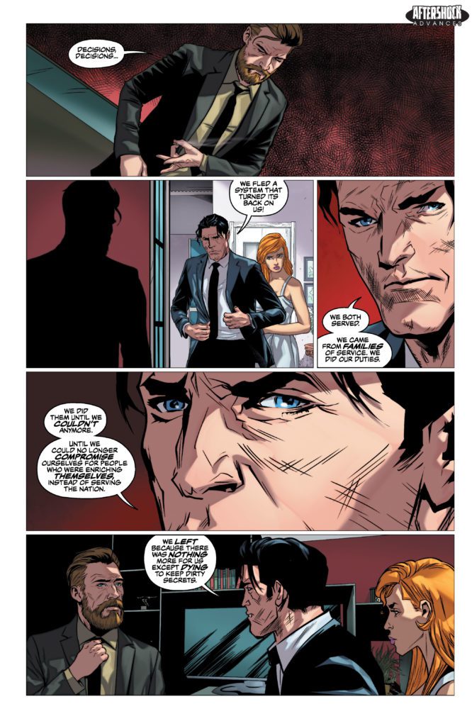
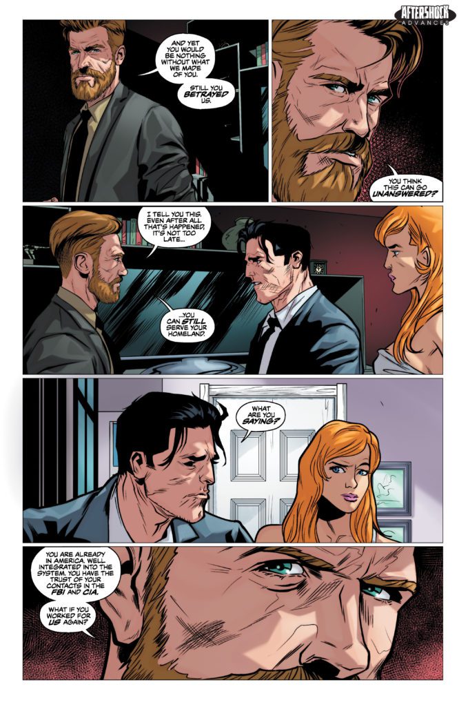
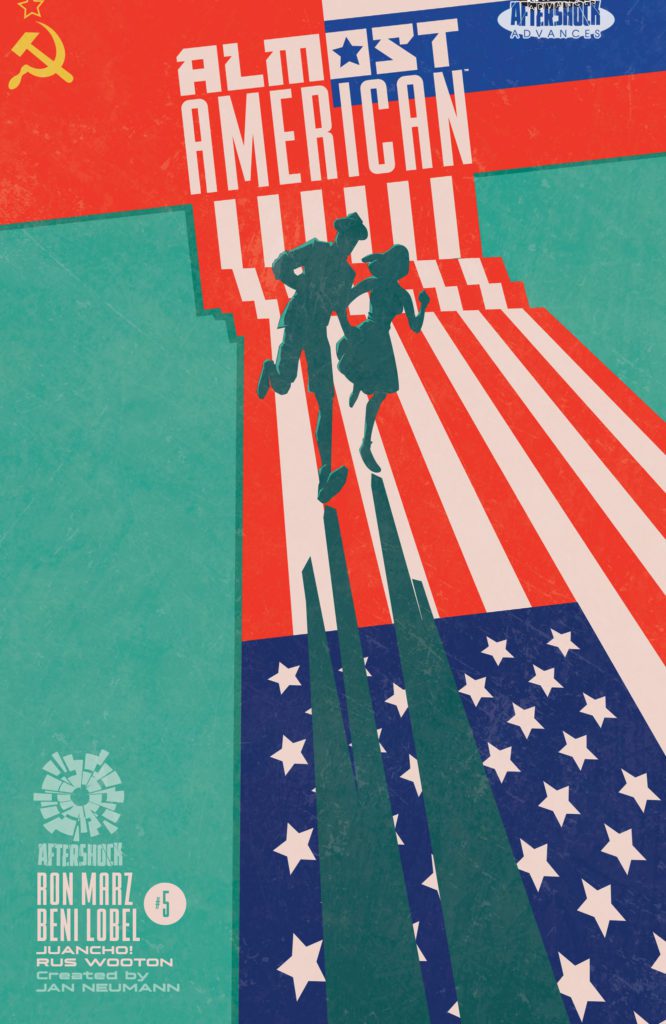
ALMOST AMERICAN #5 hits your local comic book store March 30th, but thanks to AfterShock Comics, Monkeys Fighting Robots has an exclusive four-page preview for you.
About the issue: Husband-and-wife intelligence agents Janosh and Victorya Neumann fled Russia for their lives, winding up as assets for the United States. But when the U.S. government abandons them, Jan and Victorya are on their own as their past, in the form of a Russian operative, confronts them. With only each other to depend upon, will the couple have a future? The real-life saga reaches its finale, courtesy of acclaimed writer Ron Marz and artist Beni Lobel.
The series is by writer Ron Marz and artist Beni Lobel, with colors by Juancho!, and letters by Rus Wooton. The main cover is by Wooton.
Check out the ALMOST AMERICAN #5 preview below:
Are you reading ALMOST AMERICAN from AfterShock? Sound off in the comments!
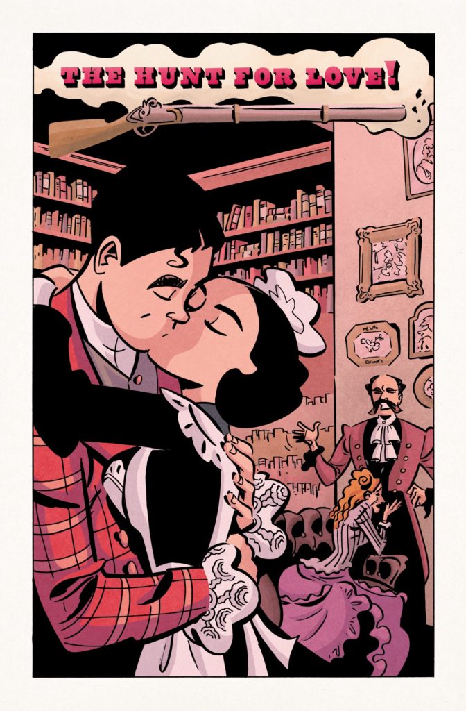
The premise of writer Tom King and artist Elsa Charretier’s Love Everlastingmight not be simple, per se, but in the space of one chapter they had already established a rhythm and pattern to the story. Yet, in Love Everlasting #2, only a chapter later, they are already throwing out the playbook. It’s clear that this is not a series you’ll be able to predict. King, Charretier, colorist Matt Hollingsworth, and letterer Clayton Cowles are trying new things at every opportunity.
About Love Everlasting #2 (from Everlasting Productions):
Joan wakes into another nightmare of love. It is 1920. She is the maid and Roger is the heir to the great manor, and though it is forbidden, they are inevitably drawn together. But soon clichés begin to crumble and blood begins to spill as Joan finds her own power in “The Hunt for Love”!
Writing
Love Everlasting #2 does not pick up where the last chapter left off. It’s immediately confusing. What are we missing? How did Joan get here? And why do we seem to have gone back to square one? You can almost feel King smile as you scratch your head. He has you right where he wants you. But then, something even stranger happens. Love Everlasting #1 seemed to establish two things: a pattern of short love story vignettes that wrap up every few pages, and an exploration of the horror behind the idea of love being everlasting. Yet, ten pages in, we arrive at the second chapter of the same love story. It’s cheesy, it’s melodramatic, it’s full of all kinds of clichés, but damn it if it isn’t kind of lovely too. The story draws you in to the point that you almost forget the seeds of horror and meta commentary King has been sowing. And right when you’ve given up on figuring out what’s going on, King brings back every thread in a quiet, measured, and explosive way. If you think you have a handle on Love Everlasting and its themes, this issue is a surefire way of learning that you ain’t seen nothing yet!
Art
Charretier’s art continues to be delightful. It’s hard to go into many of the themes and storytelling Charretier has at work here without spoiling some of this issue, so let it be said that the subtleties of her art are incredibly rewarding upon a second read. The first major thing we see in Love Everlasting #2 is the difference between Joan, our main character, and her lover Roger. Roger is so unaware of his own privilege. He feels subdued and persecuted by his own rank, completely oblivious to how Joan must feel as his maid. Charretier places panels of each of them side by side. Joan’s face is concentrated as she bends over a bucket full of laundry that she’s washing by hand. Roger, placed in a similar position in the frame, looks downcast and sad as he listens to his wealthy father’s list of demands. As we continue through the story, Roger is always seen above Joan in any panel that they share. He’s quite literally her superior, yet she smiles up at him with doting eyes. With this, the twists and turns that shake Joan and Roger’s dynamic, and each of the playful page layouts, Charretier tells us volumes about these characters in the space of just a few pages.
Coloring
Joan and Roger may occupy the same house, but Hollingsworth makes it clear that they live in two different worlds. Roger’s world is in a perpetual sunset. The golden hues of the landscape are picturesque and beautiful. Joan’s world is dim and dank. You can practically smell the mildew in the gray broom closets and kitchens where Joan does her work. Throughout, we see Joan getting invited into Roger’s world. The grays give way to the yellows and oranges of Roger’s evening escapades. But Roger can never fully enter Joan’s world. Only once do we see him go into Joan’s dimly lit bedroom. Even then, the golden rays of the sun outside the window stream in and cast a faint light over Roger’s face. Hollingsworth gives us a clear picture of what makes the gap between these two so large. Roger has never known poverty. He can’t even fathom what it would be like. Joan is all too aware of the riches she’s only every allowed to partake in as a guest of others.
Lettering
Cowles lettering has a very playful feel to it in this issue. Often, we see word balloons with bumpy edges. The balloon itself seems to hug the words, so that these lines of dialogue have their own unique rhythm and character to them. The same can be said of Cowles’ sound effects. While Joan and Roger hunt, we see two dogs barking. The “AROOOF” letters on the page grow and dwindle to put emphasis on the middle of the noise. Each sound has a specific lettering to it, not only to give it its own noise, but to match the mood of each scene.
Verdict
Love Everlasting is charming and terrifying. Better yet, it’s a story you won’t be able to predict or get a handle on – at least, not until it already has its hooks in you. In the space of two issues, this creative team has already shown that they plan to swerve and adapt at every turn, keeping us on our toes for what’s next. Love Everlasting #2 is available to paid subscribers on Everlasting Productions and will be available for free in two weeks time.
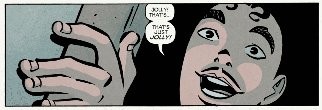
Writer Jason Aaron (Scalped, Thor) and artists Jesus Saiz and Paul Azaceta bring Frank Castle to a new land and a brand new start with Punisher #1. Featuring colors by Dave Stewart and lettering from Cory Petit, this opening chapter offers an intriguing premise that is sure to be divisive among the character’s fanbase. With an engaging first-chapter script and solid, engrossing visuals, this fresh start for Marvel’s iconic sociopath is too compelling to keep away from.
“WILL THE PUNISHER’S WAR END? Born of tragedy. Devoted to war. Unstoppable in his rage. As the Punisher, Frank Castle has become the most accomplished killer the world has ever seen. Now it’s time for him to face his true destiny. What shocking secret from Frank’s past will convince him to take the reins of the Marvel Universe’s most notorious clan of assassins? And once Frank becomes the warlord of the deadly ninjas of the Hand, will it also mean an end for the Punisher? Or a whole new bloody beginning?”
Writing & Plot
Okay look, I have a lot of respect for Jason Aaron as a writer. His runs on Thor and Star Wars are some of the best stories Marvel has published in the last 20 years. However, as recent events have uncovered, the guy just needs to know when and how to stay in his lane. Punisher #1 is exactly that. Aaron has handled the gun-toting vigilante before in his run on Marvel’s old MAX label; a run that followed up the seminal work of Garth Ennis. Aaron’s first issue here, being a part of the main Marvel timeline, isn’t the brutal introspection that Ennis or even his own MAX run are. I have to admit, my impressions of Frank Castle are based entirely on his appearances out of continuity. I’ve always found the character an ill-fit for the mainstream Marvel universe. Aaron could very well change my mind.
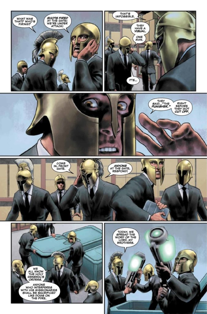
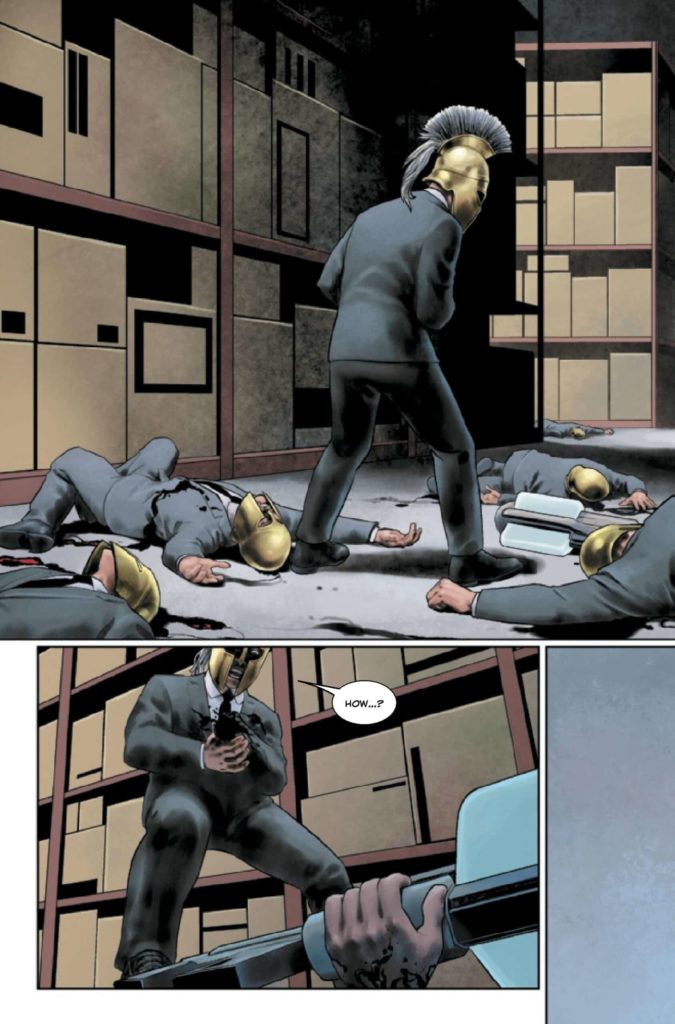
Here, we get a Punisher working with legendary Daredevil antagonists The Hand. Together, they’re hunting down and slaughtering an international group of well-armed killers…among other people. Frank’s motivations for joining the ninja-assassin group appears purely work-related at first; after all, the Punisher will go anywhere to kill bad guys. The final page twist reveals the real reason he’s joined up, and friends it’s a game-changer. For the most part though, this issue just introduces us to Castle’s new life situation and setting. There’s a lot of narrative explaining The Hand’s motivations for bringing Punisher into the fold. It’s entertaining, especially getting to witness their uh…explosive first meeting. Outside of the ending though, there isn’t anything here that’s truly surprising. Castle is written from an outsiders perspective, with no narration from his POV. This sells the classic, frightening stone-cold characterization of The Punisher and, despite the mainstream Marvel trappings, really nails the feeling for a Punisher comic.
Art Direction
Admittedly, the polished visual work of Jesus Saiz and Paul Azaceta in Punisher #1 isn’t the sort of art style I imagine for the character. The clean, digital design is a far cry from the likes of Goran Parlov or Leandro Fernandez. However, their work is still very impressive and sharp by any comic’s standards. Saiz and Azacea craft vivid animations and kick-ass action in every panel. Their blocking and direction match the pacing of Aaron’s script and bring it to life with explosive clarity. I have to mention though, there is at times a sort of uncanny valley effect. The digital, semi-cgi style used by Saiz and Azaceta doesn’t have the subtle stylings of comic artists who use a similar style (Mikel Janin and Jamal Campbell, for example). In fact, despite the polish and direction, the visual style as a whole is a bit bland. In terms of fidelity it’s great, but it just seems so plain, especially for a Marvel comic.
Even the colors of veteran and legend Dave Stewart can’t quite save this comic’s visual experience from feeling oddly detached. Stewart’s rich, saturated tones do admittedly work very well for the styling of this comic. However, despite how impressively high-fidelity every panel looks, it still can’t quite shake this strange clay-like look. Cory Petit does a solid job of keeping the lettering manageable and flexible through the many full word balloons laden with expository dialogue. His SFX work comes in handy as well for really selling the actions sequences. All in all this is a well-crafted but oddly bland Punisher comic.
Verdict
Punisher #1 is an impressive mixed bag. Jason Aaron’s script takes some commendable risks and has a hell of a final page twist to lead to an entertaining (if mostly unsurprising) opening chapter. The visuals from Jesus Saiz, Paul Azaceta, and Dave Stewart are sharp and well-directed, but often just bland in their execution. Still this is mostly a solid start to this controversial new chapter for Frank Castle. Be sure to grab this issue when it hits shelves on March 9th!


")