Home Blog Page 104

Review: WONDER WOMAN HISTORIA: THE AMAZONS #2 – Mercy & Wrath

Writer Kelly Sue DeConnick teams up with artist Gene Ha to weave the 2nd part of their mythic tapestry in Wonder Woman Historia: The Amazons #2. With colors from Wesley Wong and letters by Clayton Cowles, this issue offers the same brand of grandiose and powerful storytelling as the prior issue and gets us closer to the creation of the Amazons as we understand them. With a deeply powerful script from Deconnick and staggering visual work from Ha and Wong, this chapter continues what could end up being one of the greatest stories DC has ever published.

“The second installment of the jaw-droppingly ambitious history of the Amazons finds their future queen, Hippolyta, cutting a swath through the world of men, desperate to be reunited with the astonishing women who saved her life…but unfortunately for her, they’re hard folk to find. Perhaps it is the will of the Goddesses that they cross paths again…but before that moment, Hippolyta will gather to herself a tribe of her very own—and find that the hearts of all women do not necessarily burn with a flame as righteous as her own…”

Writing & Plot

Having gotten all the groundwork done in the opening chapter, Kelly Sue DeConnick is able to launch further into the story proper in Wonder Woman Historia: The Amazons #2. This issue feels less massive and epic than its predecessor, but this is clearly intentional. Our focus in this comic shifts from the Goddesses of Olympus to Hippolyta herself as she becomes acquainted with the Amazons who saved her. Much like the prior issue, this comic has this dual nature of feeling faintly familiar while also being immensely distinct. Hippolyta, future queen of Themyscira and mother of Wonder Woman, is certainly still the character long time readers will recognize. We’ve just never seen her presented in such a manner. Deconnick writes her with a strength and vulnerability that makes her instantly endearing. This is what’s special about DeConnick’s brand of feminist writing here and in her mainstream superhero writing as a whole. She takes traits and values typically construed as “female” – compassion, emotional vulnerability, etc. – and reframes them as strengths instead of the weaknesses they are often misrepresented as. She, and Wonder Woman, and every other great fictional woman character in this set of circumstances, are strong because of their values as women, not in spite of them.

None of that is to say that this comic spares the violence. Quite the contrary, it’s filled with bloodshed. However, that violence is used as a device in the story’s thematic complexity. When is violence needed, and when is mercy the answer? Even more so, what are the consequences for answering these questions incorrectly? DeConnick poses these questions in front of the character and we get to watch them answer. The dialogue and narration in this issue, much like the prior one, feel like the perfect formal and grand tone this mythic tale deserves. Conversations come across like riddles and lessons, and the narration sings of coming discoveries both illuminating and threatening. Deconnick nails the tone and direction of this script, making for one of the most epic-feeling comics in recent memory.
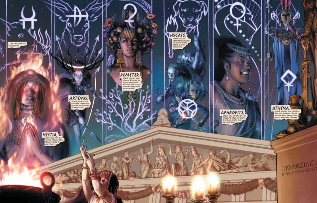
Art Direction

Artist Gene Ha has the unenviable position of following up Phil Jimenez here in Wonder Woman Historia #2. Fortunately, he is more than up to the task. I will be fully transparent here at the start, I personally prefer Jimenez’s work in the prior issue. However, Gene Ha also has a different sort of job than Jimenez did with this 2nd chapter. Whereas the prior issue set the stage and introduced this version of ancient Greece and the Olympians, Gene Ha is charged with telling a more “point A to B” narrative chapter. He excels in this task. His narrative direction carries the story’s visual experience with creative direction and often stunning, mind-boggling displays of artistic prowess. Ha’s details and his depictions of Jimenez’s designs are great of course, even if they aren’t quite up to par with the prior artist. His handling of the quieter thematic moments, however, are something that was largely absent from that first issue. Watching the expressions of Hippolyta and the other Amazons as they deliberate and debate is compelling due to how Ha visually frames their conversations. This comic feels especially like witnessing the building of folklore through seeing these deliberations take place. Ha’s art can unfortunately feel a bit inconsistent at times, particularly in his facial animations. However, this is completely overshadowed by the intricacies of what he ends up pulling off panel after panel.

Colorist Wesley Wong’s gorgeous, vibrant, and unique work here brings Ha’s pencils to life and makes this comic feel like an almost cosmic experience. His painted digital tones are lush and perfectly reflect the atmosphere of each page. Wong follows up the incredible coloring work of the prior issue with his own immense skill, and sticks the landing in every regard. Clayton Cowles returns with his lettering, and as always he does excellent work. His fonts are expressive and fluid, guiding the reading experience along with the proper tone in the narration and characters’ voices. Visually this book is a marvel, and a worthy successor to the impeccable first issue.
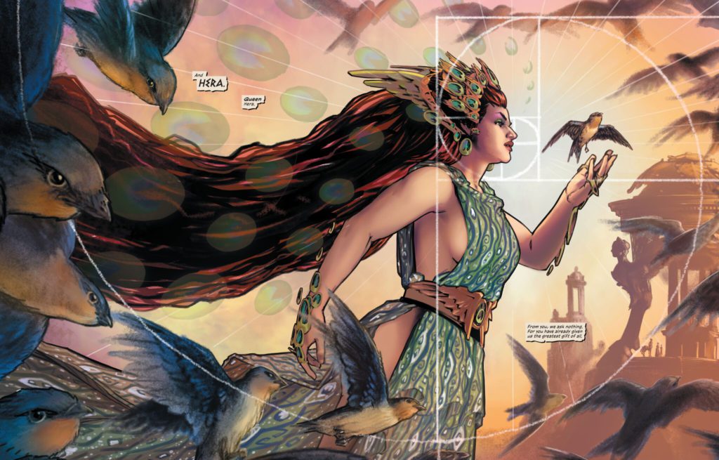
Verdict

Wonder Woman Historia: The Amazons #2 is a compelling and fascinating comic that wonderfully continues the story which had its foundations laid in the opening chapter. Kelly Sue DeConnick continues the write the best scripts of her career, with this comic offering up memorable conversational scenes and well-paced, methodical plot progression. The visuals from Gene Ha and Wesley Wong are, while a tad inconsistent, overall outstanding and make for an enrapturing experience while reading through this issue. Be sure to grab this newest chapter when it hits shelves on April 5th!

Monkeys Fighting Robots Youtube

Review: Losing Your Soul in ONE-STAR SQUADRON #5

One-Star Squadron Russell

There are plenty of ways to lose your soul in the world of comics. You could be like Johnny Blaze, making a deal with the devil, or you could become host to a force that’s greater than yourself, like the Spectre. But in One-Star Squadron we get one of the most chilling examples of characters losing their souls. They simply live each day, scrounging for money and sacrificing their values to make ends meet. Until one day, they realize they’re not who they once were. One-Star Squadron is a series that has never shied away from the nitty-gritty details of mundane life. With One-Star Squadron #5, writer Mark Russell, artist Steve Lieber, colorist Dave Stewart, and letterer Dave Sharpe deliver their most devastating chapter yet.

Writing

The characters in One-Star Squadron cover the panels in their long-winded thoughts, shown in caption boxes that dot every page. They’re melodramatic, often trying to find meaning and symbolism in the strangest places. Red Tornado has soliloquized about the unfairness of the game musical chairs and characters opposite him have delivered unconvincing rants about how famous they once were. Russell wants you to laugh. He wants you to see the ridiculousness of their thoughts and actions. He wants you to notice the melodrama of it all. But One-Star Squadron #5 does something different. The tone doesn’t change. We still live in the world of high-minded speeches and self-important internal monologues. But now, the events of this series rise to meet the tone of the dialogue and captions. Now, their exaggerated reactions to everything no longer feel exaggerated at all. All the tragedy they’ve claimed has surrounded them in their lives is finally here. And so Russell is no longer in it for the giggles. He’s here to break your heart.

One-Star Squadron Russell

Art

Lieber’s art is incredibly emotive. The smiles, frowns, and grimaces on his characters’ faces are as clear as day. But in One-Star Squadron #5, he pulls the emotion back. We still get moments of extreme emotion: we see G. I. Robot’s eyes bugging out as he yells through a drunken stupor and we see a villain smiling ear to ear as everything seems to be coming into place. It’s the really emotional scenes, though, that feel played down. At one point, Powergirl feels like she’s at the end of her rope. Lieber draws her face with a rather normal expression, but you can’t help but notice the tears welling up in her eyes. The next panel, she’s rubbing her eyes and looking down. Lieber shows us characters who fight back emotions before their fear and depression finally takes over. It’s heart-wrenching to witness.

Coloring

Stewart’s color palette for this series tends to look a little strange at first glance. You have our characters in gaudy yellow and red costumes standing around in relatively colorless settings – painted in greys, browns, and whites. Red Tornado stands out like a sore thumb. And Stewart has doubled down on this. Even in scenes that happen at night, there’s always a light around to shine on Red Tornado so he stands out as bright as ever. Stewart’s coloring highlights how odd it is to see these characters in regular, real-life scenarios. Their costumes ought to be surrounded by the vibrant colors of battle, not the bland shades of an office space. And while this approach continues in One-Star Squadron #5, we get one scene where our characters’ costumes look muted by the darkness of the setting. They stand around in the rubble of their lives, and the dullness of their existence is finally getting to them.

One-Star Squadron Russell

Lettering

There isn’t a ton of action in One-Star Squadron. After all, it’s a story about down-on-their-luck superheroes trying to make ends meet. But Sharpe makes the most of the action that’s there, pulling out all the stops. Whether it’s Powergirl being questioned by police, and losing her patience in yellow font that explodes past the borders of her word balloon, or the “CRAAASSH” and “KABOOM” of a building going up in flames, Sharpe makes sure these moments stand out in all their bombastic glory.

Verdict

One-Star Squadron has always been funny with a hint of the tragic. Now, the comedy is taking a backseat in this series. We’re seeing the devastating consequences of characters forfeiting their souls so that they can feel special one more time. Pick up One-Star Squadron #5, out from DC Comics today, at a comic shop near you!

Monkeys Fighting Robots Youtube

INTERVIEW: Composer Phillip White Scores Tyler Perry’s A Madea Homecoming

tyler perry-interview-phillip white

Tyler Perry’s A Madea Homecoming is the 11th film in the long-running series about a loud and proud black woman played by writer-director Tyler Perry. Composer Phillip White blends family drama and comedy for the film’s score.

The new film in the Madea franchise centers around the return of Madea’s great-grandson, Tim (Brandon Black), who is coming home from college. Tim’s brought Davi (Isha Blaaker), his biracial roommate. Unfortunately, Tim’s also got a secret to share with his family. The film descends into hilarious chaos with bulls having erectile dysfunction, fights between romantic rivals, and a botched marriage proposal. A Madea Homecoming delivers when it comes to everything the franchise promises, from film to film.

PopAxiom and composer Phillip White discussed instruments, becoming a composer, and scoring Tyler Perry’s A Madea Homecoming.

Supernatural

Phillip grew up in Madrid, where he picked up a guitar at around thirteen. But he moved across the pond for college. “I went to Tufts and New England Conservatory for a double degree program. It was a five-year program where you go to two schools and have two degrees. It was great. I don’t think I would’ve enjoyed going to just one or the other. I felt I needed the liberal arts education, but I wanted a strong musical education.”

“I moved out to USC to do a one-year program for composing,” he says. Soon after, he met “Chris Leonard and started assisting him in 2005. Super-guy, I could not have asked for a better mentor. In 2008, he gave me a shot at a video game named James Bond Quantum of Solace.”

A lifelong film fan, Phillip’s time on Quantum of Solace was “heaven getting to use those themes. From then on, he brought me into more projects to collaborate.”

One of those collaborations included a show with a legendary run on television — Supernatural. “I started programming and assisting Chris. Then, he gave me more opportunities to write until I wrote entire episodes.”

tyler perry-interview-composer-madea

About Madea’s Homecoming

Phillip’s collaborations with Chris brought the young composer into the world of Madea. “Perry asked Chris if he’d come work on Boo 2: A Madea Halloween, but Chris was getting pretty busy. So, Chris suggested that he collaborate with me on it. Perry and his team were very gracious to agree to the whole thing. So now, Madea Homecoming is my fourth collaboration with the studio.”

“He’s a performer in the true sense of the word. He can inhabit anybody,” Phillip says about Tyler Perry. After Boo 2, Phillip scored Nobody’s Fool, Madea Family Funeral, and Madea Homecoming and spoke to the filmmaker’s impact. “He’s created this incredible studio outside Atlanta that employs tons of people. I have tremendous respect for the guy. Also, considering his tough upbringing.”

Phillip came on board with a “close-to-locked cut.” So, the process for this project began with viewings with key collaborators. “I sat down with Joel High, the music supervisor for Tyler Perry Studios, and is like Perry’s musical right hand. He and Sammy Posner, who worked together on this along with Music Editor Johnny Caruso, were there too.”

“We figured out where the music should start and where it should,” he says about the results of those meetings. “We figured out what styles we were looking for in different areas.”

Phillip explains that the music “needed to serve the comedy and the more intense family moments.” So how did he accomplish that balance? “For the comedy, I relied on a band sound with drums, upright bass, electric bass, electric guitar, hand percussion, and I think that’s it. That provided a feeling for whenever Madea and her entourage were onscreen.”

“For the more family moment,” he continues, “we had a 22-piece string ensemble with piano and a couple of woodwinds. We had a month or a month-and-a-half before it had to be delivered. So, a month of writing and a couple of weeks of recording.”


Adjustments

The filmmaking process is an ebb and flow of creativity and compromise. “There’s a little bit of flexibility,” Phillip says about the process for A Madea Homecoming. “Our music editor created a temp track, not for the whole movie but about half or two-thirds.”

“So, when we spot it, we can play with it and come in or out of a cue sooner or later,” he continues. “Even at the mix stage, we’re still making adjustments. A spot might feel empty, so we’ll need something there, or another spot might feel like the music’s competing.”

The rhythm of creating for film and television requires multiple viewings to understand the whole picture. “Sometimes when you’re spotting, you’re stopping and starting a lot, so it’s hard to get a flow. So, there’s always little adjustments.”

Wrapping Up

“It depends on what I’m hearing the score should be,” Phillip answers about whether or not he has a ‘go-to’ instrument. “I find that if it’s going to be guitar-centric, I’ll start on the guitar. If I write for guitar, it tends to be for the guitar. The advantage of the piano is that it can be for anything, at least for me. I can imagine it for any number of instruments, even at a keyboard. I’ll hum or sing different tunes if it’s a more lyrical instrument like a string or wind instrument.”

Phillip’s brief list of influences begins with John Williams. “Not to be cliche, but it’s true. I remember watching Raiders of the Lost Ark in theaters when I was seven. I was blown away by the movie. I feel like he scored my childhood; Star Wars, Jaws, and ET, then later Schindler’s List.”

“I love Thomas Newman. I think he’s so unique,” he continues his list. “Gabriel Yared, who is most famous for the English Patient. I love his writing. Tōru Takemitsu, who did Ran, is just phenomenal. It’s an orchestral score with a few Japanese instruments.”

Phillip also admires Bernard Herman and his collaborations with Hitchcock. “There’s a flashback scene in Madea Homecoming that we scored in a noir style nod to Herman.”

“If I could collaborate with any of my previous collaborators, I would be in heaven. It was such a joy working with everyone at Tyler Perry Studios,” Phillip declares.

Finally, what’s a dream project Phillip would like to work on someday soon? “I love animation. I’d love to do more animated projects or a musical. I have a real soft spot in my heart for musicals.”

Is Tyler Perry’s A Madea Homecoming on your watch list?

Thanks to Phillip White and Impact24 PR
for making this interview possible.

Find more interviews from Ruben R. Diaz!

Monkeys Fighting Robots Youtube

Review: THE HARBINGER #6 – Sweet Reunions

The Harbinger #6 best cover

The Harbinger #6 from Valiant Entertainment released to comic stores on March 30th and it features Faith Herbert. This fan favorite character’s presence feels like a friendly reunion before things get uglier.

Synopsis (from Valiant Entertainment)

The war for Chicago begins! It’s FAITH vs THE HARBINGER — PSIOT CITY vs THE RENEGADE — BLAM vs… everyone! Can Peter Stanchek save a city when everyone he knows has their knives at his neck? It might be the end for The Harbinger….

Meet Faith In The Harbinger #6

The Harbinger #6 dynamic
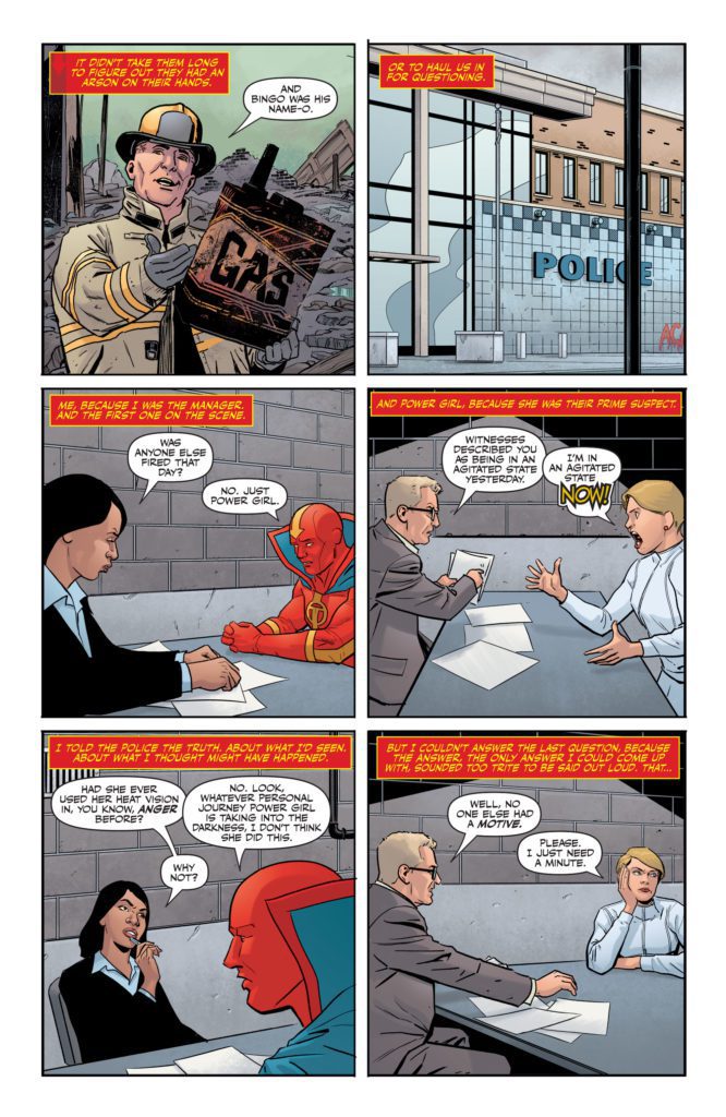
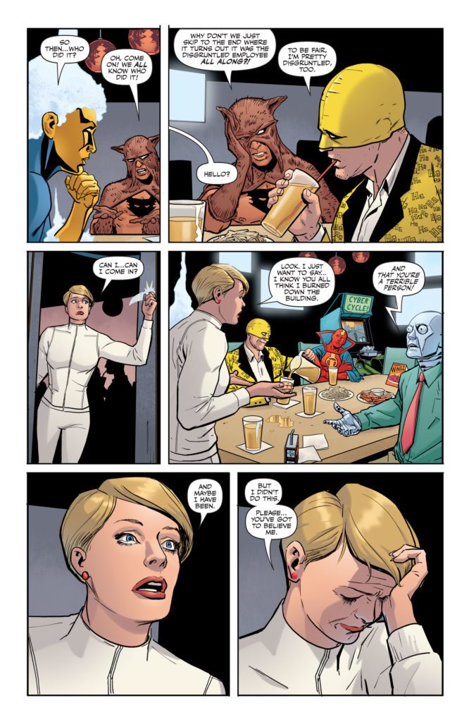
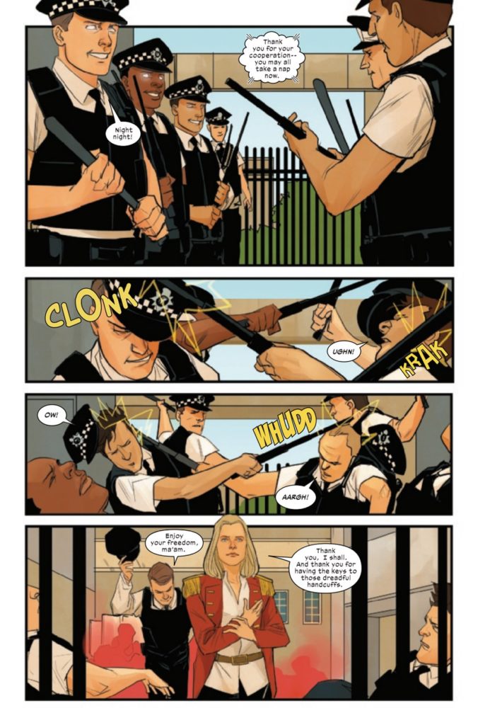
Collin Kelly and Jackson Lanzing make The Harbinger #6 go a little slower, to showcase Faith. She is presented in a way that makes her fleshed out and serve as a good foil to Peter. Faith is a supportive friend to him in helping out Psiot City; but she also connects to readers in awareness to Peter’s new status as the cause of problems. However, they spend so much time going over past events, that not much happens until the third act of this issue.

Fancy Presentation

Just one more part
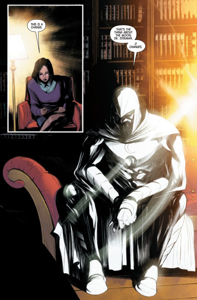
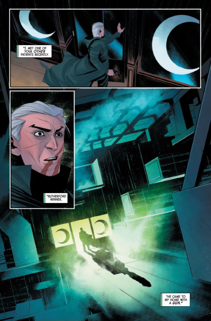
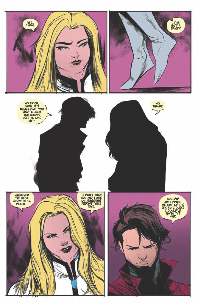
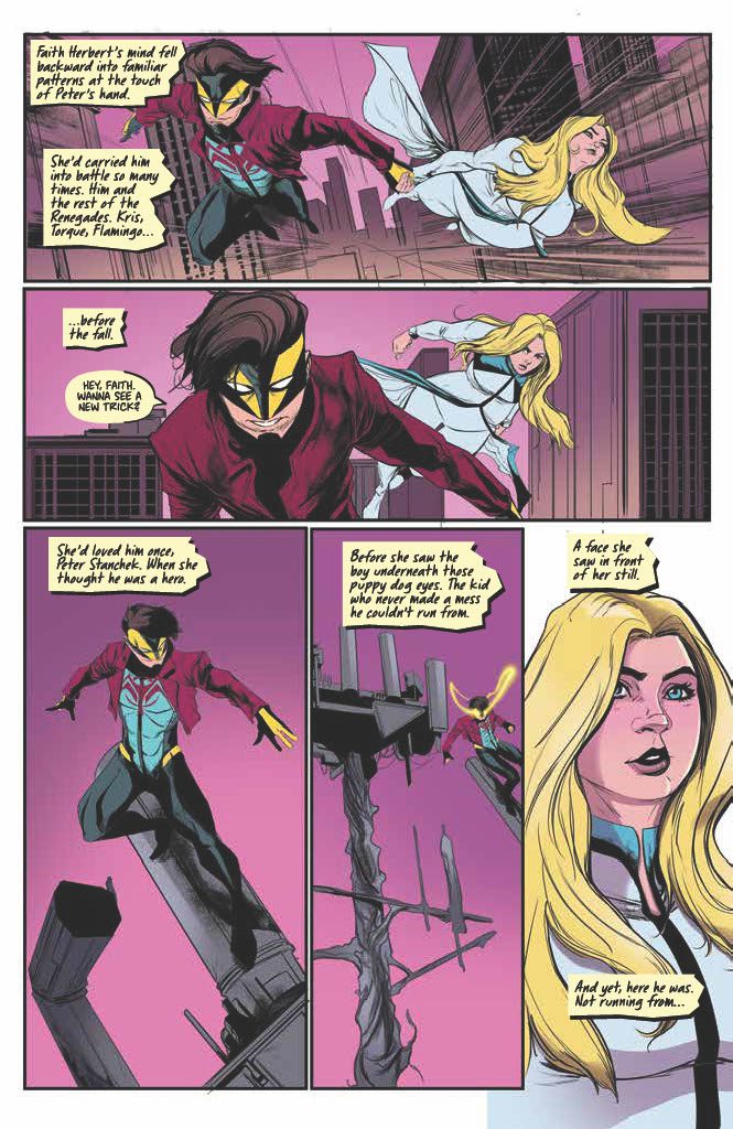
Robbi Rodriguez continues to present a stable foundation to the series along with colorist Rico Renzi. A few pages in The Harbinger #6 feature classic grids and dramatically presented splash pages. In these instances there is a feeling of struggling to find peace. In a therapy session with calm green backgrounds, two characters are making empathetic connections with subtle changes in their expressions. There’s a real sense of progress when it comes to dealing with trauma in these instances. But when the ghoulish presence of the Renegade builds up alongside this in the form of red miasma it feels like a predator is stalking its  prey. When the splash page opens, it’s like the threat pounces, disturbing a resolution.

Hassan Otsmane-Elhaou’s lettering best displays the personalities of characters in The Harbinger #6. A few word balloons show the excitement of a Psiot City crowd who is cheering for Faith. When the clap SFX are in the same size and style of the biggest font, it really shows how authentic the applause feels.

A Quick Look Through The Harbinger #6

The Harbinger #6 feels a little slow in plot, but at least the introduction of Faith has been given some breathing room. The artwork still shows how much is at stake with how it presents the Renegade. There’s plenty to love with this series going forward.

Monkeys Fighting Robots Youtube

Review: DEVIL’S REIGN X-MEN #3 Gives the Kingpin a Frosty Ending

Gerry Duggan has taken control of one of the most popular teams in comic books with the X-Men. He’s been building up his team issue by issue and showing the readers that it takes time to gel. This week, he gets to write Emma Frost in Devil’s Reign X-Men #3. Frost is not on Duggan’s team book, but she is a character that shows up from time to time in the title. With a whole mini series devoted to Emma, we get to see what Duggan can do with one of the most polarizing telepaths in comics. Joining Duggan on this issue is Phil Noto on pencils and colors and Cory Petit on letters.

WRITING

Gerry Duggan not only gets the privilege of writing Emma Frost this issue, but he also writes an underrated favorite character, Union Jack. The interaction between Emma and Union Jack is pleasant, even though the two characters clearly have different objectives. Duggan uses these opening pages to show us just how dangerous Emma Frost truly is. Even though Union Jack’s people are prepared for Emma, with a power dampening collar, she still finds a way to get out of her arrest. Duggan also allows us to see Emma’s softer side as she meets up with the young girl Isabelle from the previous issues. What works with the dialogue in these pages is how genuine it feels. Both Emma and Isabelle are written as smart characters, and when they speak to each other, they’re honest. Isabelle asks why she wasn’t mind wiped and Emma gives her the truth. Duggan does deliver a final blow to Kingpin from Emma that is one hundred percent in character for her. Duggan doesn’t have Emma pull any punches in her confrontation and solidifies her as a mutant you should never cross.

ART

The pencils and colors in this issue are done by Phil Noto. Noto’s pencils are clean and easy on the eyes. Action sequences flow nicely, like police officers hitting each other with their nightsticks. Emma’s escape is handled well, as Noto takes us panel by panel on how she gets out of her handcuffs. The panels of the police officers being mind controlled is eerie. Noto gives the officers smiles on their faces as they spray one another with bear mace. Noto’s pencils work well with the script and give the reader a smooth reading experience.

As mentioned above, the colors are also handled by Noto. The color palette for this issue is light and many of the background panels feature a bland peach color to them. Noto applies a nice red hue on the page as gas grenades fly from the officers as they squabble with each other. Noto’s colors shine most on the uniforms that people wear. Union Jack’s outfit has a nice contrast of dark blue and vibrant reds. As Emma leaves captivity, her red coat is eye catching.

Cory Petit does the lettering for this issue. Any X-Men issue that features a telepath features the classic mind link word balloon. Petit uses these throughout the issue as Emma talks to dogs or has people do her bidding. When there is an action sequence, Petit uses a “THWACK” to signify a punch has been thrown. It also allows us to see that Isabelle is a skilled fighter and can hold her own against Union Jack. As the fight takes place, when Isabelle lands a punch, the “THWACK” is diagonal and placed where the hit occurs. These little touches show the power behind each swing.

CONCLUSION

Devil’s Reign X-Men #3 is a satisfying conclusion to the mini-series. Gerry Duggan has proven that he has the ability to write any character in the X-Men universe. Phil Noto uses his artistic vision and brings us a realistic looking issue that is sure to wow fans. Devil’s Reign X-Men #3 is out at a comic shop near you!


Monkeys Fighting Robots Youtube

Marvel Comics Exclusive Preview: MOON KNIGHT #10

marvel comics exclusive preview moon knight

MOON KNIGHT #10 hits your local comic book store on April 6th, but thanks to Marvel Comics, Monkeys Fighting Robots has an exclusive five-page preview for you.

About the issue:
An assassin infiltrates the Midnight Mission, while another hidden enemy strikes at Moon Knight where he is most vulnerable. Attacked on two fronts, the Fist of Khonshu is put on the back foot– but that’s where he’s most dangerous!

The issue is by writer Jed MacKay and artist Alessandro Cappuccio, with colors by Rachelle Rosenberg, and letters by Cory Petit. The main cover is by Cory Smith and Rachelle Rosenberg.

Marvel’s Moon Knight TV series launched on Disney+ this week, starring Oscar Isaac as Marc Spector/Moon Knight.

Check out the MOON KNIGHT #10 preview below:

marvel comics exclusive preview moon knight

marvel comics exclusive preview moon knight

marvel comics exclusive preview moon knight

marvel comics exclusive preview moon knight

marvel comics exclusive preview moon knight

marvel comics exclusive preview moon knight

marvel comics exclusive preview moon knight


Are you reading MOON KNIGHT? Sound off in the comments!

Monkeys Fighting Robots Youtube

AfterShock Comics Exclusive Preview: WE LIVE: AGE OF THE PALLADIONS #2

aftershock comics exclusive preview we live age of the palladions

WE LIVE: AGE OF THE PALLADIONS #2 hits your local comic book store April 20th, but thanks to AfterShock Comics, Monkeys Fighting Robots has an exclusive four-page preview for you.

About the issue:
Time has run out! The shield protecting Megalopolis 9 can fall at any moment. The future of the population is in the hands of the Palladions and the reconnection team, who come across an unexpected obstacle that can only be solved by spilling blood: the blood of an old friend. 

Destiny puts Tala and Hototo in the way of a hurtful crossroad that asks them to break their promises. Sometimes hearts are forced to be silent. 

Meanwhile, Nesbo and his nomad caravan face the hostility of the New Nature. Hope might be all that they have on their side and the only thing capable of guiding them to a safe port. 

Decisions and paths can’t be walked back, and storms can’t be stopped. 

Even when knowing that everything might be lost, forward is the only way to go.

The series is by brothers Inaki & Roy Miranda, with colors by Eva De La Cruz, and letters by Dave Sharpe. The cover is by Inaki Miranda.

Check out the WE LIVE: AGE OF THE PALLADIONS #2 preview below:

aftershock comics exclusive preview we live age of the palladions

aftershock comics exclusive preview we live age of the palladions

aftershock comics exclusive preview we live age of the palladions

aftershock comics exclusive preview we live age of the palladions

aftershock comics exclusive preview we live age of the palladions

aftershock comics exclusive preview we live age of the palladions


Have you been reading WE LIVE? Sound off in the comments!

Monkeys Fighting Robots Youtube

Review: War and Peace in STEP BY BLOODY STEP #2

Step By Bloody Step Spurrier Image Comics

From the first page of Image Comics’ Step By Bloody Step #2, something is evident: A storm is brewing on the horizon. Writer Si Spurrier, artist Matias Bergara, and colorist Matheus Lopes might not have dialogue or words in their toolbox to tell their story, but that doesn’t stop their storytelling from being crystal clear. With the return of this incredible silent comic, we’re introduced to the stakes and obstacles at play in this narrative.

Story

Step By Bloody Step #1 familiarized us with the world these characters inhabit. The young girl and the armored giant we follow cut their way through fantastical landscapes, populated with strange creatures. In that time, Spurrier did a ton of worldbuilding. Now, with Step By Blood Step #2, Spurrier begins to flesh out the plot. There are dark forces that are chasing our protagonists, and that seems to be why they’re unyielding in their journey. We don’t know a ton about these new baddies, as the language they speak is written in undecipherable hieroglyphs, but Spurrier teaches us enough about them through their actions. They are a powerful force with a sprawling empire, intent on capturing our protagonists through whatever means necessary. Throughout Step By Bloody Step #2 we see them prey on the weak, sacrifice the innocent, and destroy natural beauties all for the sake of empire.

Step By Bloody Step Spurrier Image Comics

Art

Bergara creates a lovely juxtaposition between our two main characters. We see what it is that’s important to each of them through how they’re placed on each page. In one scene, the girl is playing on a beach. She’s splashing around in the water and having a good time. She’s front and center on the page, and the armored giant sits in the background looking small and unmoving. Then, when the giant begins prepping a raft for them to escape on, her big metal arms take up most of the page. The little girl is sequestered to smaller panels where she looks defiant and annoyed. She works on her own crafts, intent on making the most of her life on the run. You can see this theme throughout the whole issue. Whenever the little girl is having fun, the armored giant sinks into the background. Whenever danger rears its head, the girl is nowhere to be scene and the giant jumps to action. On some level you feel for the girl, whose fun feels essential to her survival, but you also can’t help but love this big hunk of metal that’s always stepping up to the plate when things get hairy.

Coloring

Again, Lopes helps you disappear into every scene. Each moment has such a distinct time and place to it. Step By Bloody Step #2 does more than just give us a sense of the temperature in each setting, though. This issue sees many moments of war and conquest. Lopes makes us feel like we’re in each battle. With the dark backgrounds starkly contrasted against buildings that are going up in flames, you almost want to hold your breath so you don’t get soot in your lungs. And as the issue progresses, we ping pong back and forth between moments of bright joy and scenes of destruction. Soon, each beautiful landscape, painted in vibrant colors, comes with the promise that smoke and flame will inevitably snuff it out. Lopes gives us stunning highs and horrible lows, all in such quick succession that it truly gives us a taste of the pandemonium that is war.

Step By Bloody Step Spurrier Image Comics

Verdict

Step By Bloody Step is experimental and potent. This is a creative team full of commanding storytellers who are absolutely up to the task of producing a comic series that has no words. Pick up your copy of Step By Bloody Step #2, out from Image Comics now, at a comic shop near you!

Monkeys Fighting Robots Youtube

Review: Meditations and Melodrama in THE SWAMP THING #11

The Swamp Thing

The Swamp Thing #11 isn’t the first time this series has managed to have its cake and eat it too. This entire run reads like Jack Kirby writing slam poetry. It’s beautiful, soul-bearing, dramatic, and then suddenly pulpy and action-packed. The Swamp Thing returns for its second season with issue #11, and writer Ram V, artist Mike Perkins, colorist Mike Spicer, and letterer Aditya Bidikar get right back to the weird world of lyrical comic book mayhem.

Writing

V’s script is chock full of symbolism and melodrama. These are characters that are at the beginnings of big things. Their world is changing, because they are changing it. As such, the characters often give each scene a dramatic flare. There are pep talks, monologues, and flourishes galore. All they need is a pipe organ and a velvet cape to complete the look. While this would feel over the top in another writer’s hands, V absolutely nails the campy joy of old monster movies, while also balancing these moments with subtle, more meditative scenes. Our heroes are grounded by their tortured search for the right path, as our villains revel in the glory of their misdeeds. V fully embraces the quirks of the monster/horror genre. Sometimes, you can almost hear him giggling as excitedly as his baddies.

The Swamp Thing

Art

Often, I’ll discuss the coloring and artwork of a piece in two separate sections. For The Swamp Thing #11, that’s practically impossible. Perkins and Spicer work so beautifully in tandem with one another, it’s often unclear where one’s work ends and the other’s begins. Some scenes have a warm, penciled look to them. The characters look like they’ve been lovingly rendered on an artist’s sketchpad. You can see the texture of the pencils in both Perkins’ linework and Spicer’s fleshy tones. The inviting nature of these scenes is juxtaposed against a backdrop of haunting blues and purples, full of twisted shapes right out of a Cronenberg flick. Each page is such a mix of feelings, it perfectly sums up Jennifer Reece’s own complicated feelings about the hero-monster at the heart of this story.

Even Tefé Holland is a paradox of a character. Perkins gives her a look that makes her seem stern and unsympathetic. But it’s Spicer’s colors – the pleasant greens, pinks, and skin coloring – that show the empathy and courage that lives inside her calloused exterior. And as we shift over to our antagonists, this art style is abandoned. Suddenly, the scenes feel cold and stark. Perkins’ work is still stunning, but it has a mechanical accuracy and precision to it. Spicer’s colors cease to blend in textured tones, and look to have harder edges to them. With these subtle differentiations, Perkins and Spicer make us immediately feel different about this new setting. We just know as we join our villains that something has changed, and some of the understated beauty of this world has gone away.

The Swamp Thing

Lettering

As always, there are plenty of beautiful variations to Bidikar’s lettering. We have the light green word balloons, with straight edges, of Jason Woodrue’s speech. This reminds us that even if he looks human, he’s really a twisted devil in a skin suit. His own voice betrays him. But even in each character’s dialogue, Bidikar adds subtle differentiations to the lettering to show their mood. Whether it’s the wavy edges of a word balloon – matched with the lower case font inside it – that represents a stifled sob, or the jagged sides and scratchy letters of the lines of a character that’s gone feral, Bidikar knows how to make you hear each moment.

Verdict

DC Comics’ The Swamp Thing #11 is an incredible jump back into the saddle. This creative team continues to balance its poeticism with pulp and its subtle beauties with theatrical villainy. This series continues to mesmerize at each turn. Pick up your copy of The Swamp Thing #11, out from DC Comics March 29th, at a comic shop near you!

Monkeys Fighting Robots Youtube

Review: A Hulk For All Seasons in HULK: GRAND DESIGN #1

After two of Marvel’s premier teams were given the Grand Design treatment, the Hulk — the publisher’s jolly green ball of rage — is finally stepping up to the plate. But the other two Grand Design projects tried to weave decades of continuity into a single narrative, an approach that puts the Hulk at a serious disadvantage. Early on, The X-Men and Fantastic Four both had long, sustained runs by stable creative teams that formed the backbone of their respective histories. The Hulk… doesn’t. His early history is defined by being kicked from title to title, trying to find an angle that worked. Thankfully, cartoonist Jim Rugg isn’t trying to convince anyone that the Hulk was a product of careful planning. He’s here to show all the wild, weird places the Hulk has been. If there’s one constant, it’s that Bruce Banner will never, ever catch a break.

WRITING

Starting from the fateful nuclear accident that ruined Bruce Banner’s life, Hulk: Grand Design #1 covers the first twenty years of Hulk comics. Instead of a more traditional plot structure, the comic engages in a sort of narrative scrapbooking. The Hulk bounces between different phases in his life, each declared with small recreations of classic comic covers and splashy headers. A character dies only to reappear pages later, a caption box offhandedly mentioning that yes, they returned from the dead again. It all starts out a bit disorienting. Thankfully, it doesn’t take too long to settle into the comic’s unique rhythm and let it guide you from moment to moment.

ART

Rugg’s art is the main star of the issue, as is his ability to copy the styles of other artists. From Jack Kirby to Micky Demo to Herb Trimpe, Rugg changes the Hulk’s appearance to fit the different artists of each era. But more than just comics are referenced in this issue. An entire splash page is dedicated to the Hulk jumping out of a TV, against a collage of different advertisements for the Incredible Hulk TV show. A small aside notes a Trimpe Hulk drawing appearing on the cover of Rolling Stone. And Hulk’s first fight against Wolverine is drawn with colored pencils on notebook paper. Because what schoolkid wasn’t obsessed with that matchup? This Grand Design doesn’t feel like a tribute to the Hulk’s comics, as much as it does to the Hulk as a pop culture icon.

Special attention must be given to Rugg’s skill with expressions. For a comic focused on a green monster whose overriding emotion is rage, there’s a good amount of variety to the Hulk’s angered expressions. Sometimes he’s drawn with a squat face, clenched teeth, and small eyes turned condescendingly downward. Other times, his eyes take up the entire panel in vein-popping detail. It’s a Hulk that broods, simmers, rages, and screams. It’s those faces that keep the comic’s narrative from spiraling out of control — the Hulk’s cycle of loneliness and rage grounding tales of space aliens and nuclear mutants.

VERDICT

Hulk: Grand Design #1 is a history lesson as frantic as the character himself. Pieces of the character’s past are violently thrown together in a haze of fists and clenched teeth. But every so often the smoke clears, and in a moment of reflection, he realizes that he’s truly, hopelessly alone. Then the fighting kicks back in. And so the cycle continues. It always will.


Pick up Hulk: Grand Design #1 this Wednesday at your local comic book store, and check out our interview with Jim Rugg right here on Monkeys Fighting Robots!

Monkeys Fighting Robots Youtube