Home Blog Page 105

Adventure Films Continue To Excite Audiences

Adventure Films

The adventure genre has returned to the limelight with the release of two very different action-adventure films in 2022 involving an elaborate search for treasure: Uncharted and The Lost City.

Uncharted, starring Tom Holland and Mark Wahlberg, is already a box office smash, grossing $226.4 million worldwide. The film features the adventures of the treasure hunter Nathan Drake, played by Holland, and Wahlberg’s character Victor Sullivan. The two protagonists set out on an adventure to find the lost fortune of the explorer Ferdinand Magellan.

Adventures in modern entertainment

It is no surprise to see adventure films achieve box office success. The genre is popular on various entertainment platforms. One example is the popularity of adventure plots in comic books, such as A Man Among Ye. Written by Stephanie Phillips and illustrated by Craig Cermak, it tells the tale of the pirate queen Anne Bonny and Mary Read.

The adventure element also features in the comic novel Sea of Sorrows by Rich Douek, which involves a search for sunken treasure at the bottom of the sea. In addition, the adventure genre has appeared in new and innovative forms, such as Live Gonzo’s Treasure Hunt on Betway live casino. The character of Gonzo, who is a Spanish explorer seeking the lost city of Eldorado, is based on the archetypal treasure hunter found in films and comic books. The treasure hunt game is the first live casino game to offer players the opportunity to play the game in virtual reality mode. Television shows about real-life treasure hunts, such as Mystery at Blind Frog Ranch, have also proven popular. Evidently, the adventure genre continues to provide inspiration for innovations in the wider entertainment industry.

Indiana Jones returns for his swansong

Over the years, there have been many iterations and remakes of adventure films. Examples include Treasure Island, the 1950 adventure film based on the Robert Louis Stevenson novel, and film franchises such as the Indiana Jones film series, which began with Indiana Jones and the Raiders of the Lost Ark in 1981. Indeed, the fifth and final film in the Indiana Jones saga will be released in 2023. This highlights the timeless nature of the genre, which continues to be enjoyed in adventure films to this day.

This was taken a step further by Romancing the Stone, a 1984 adventure film starring Michael Douglas, Kathleen Turner, and Danny DeVito, which added a romantic comedy element to the plot. The film was so successful at the box office that the actors returned the following year with The Jewel of the Nile.

The return of the rom-com adventure

This phenomenon of adventure-romance films continues to this day with the 2022 film The Lost City, starring Sandra Bullock, Channing Tatum, and Daniel Radcliffe. The film has been favorably compared with the aforementioned 80s adventure and romantic comedy classics, with Tatum hopeful that the film can represent a new version of the genre.

Bullock plays Loretta Sage, an author of adventure novels, who is kidnapped by an eccentric billionaire while promoting her new book with Alan, a cover model played by Tatum. The billionaire, played by Radcliffe, is convinced she can help him find an ancient city’s lost treasure, which had featured in her latest novel.

Nevertheless, the film is an outlier in an industry that prefers masculine action-adventure heroes like those found in The Expendables film franchise starring Sylvester Stallone, Jason Statham, and a cast of macho action-movie veterans such as Arnold Schwarzenegger, Jean-Claude Van Damme, and Chuck Norris.

The gamble pays off

The rom-com adventure has already exceeded expectations. The Lost City cost $68 million, a large sum for a film of this type, but made $31 million on the opening weekend, toppling The Batman from the number one position.

This achievement validates the decision of Paramount Pictures to take a punt on this film. ScreenRant has reported on a theory provided by Bullock explaining why big-budget romantic comedies are no longer made: “I think when everything swung toward the very masculine action-adventure, women got relegated to the arm piece or damsel in distress. Then, when rom-com came up, it was always like, ‘Oh, we’re going to let the women come back in, but it’s going to be this formula that we like, and it can’t be too edgy.” It is not always the case that female characters are sidelined in adventure storylines. The Adventureman comic series features a single mother as the main protagonist.

Evidently, the adventure genre remains highly popular in modern entertainment. The treasure hunter theme provides a ready-made plot template for filmmakers to follow. As we have seen, the adventure-romance storylines of the 1980s are making a comeback, which will perhaps lead to a shift from male-dominated action-adventure films in the future.

Monkeys Fighting Robots Youtube

Marvel Comics Exclusive Preview: HULK #5 — “SMASHSTRONAUT” Continues!

marvel comics exclusive preview hulk

HULK #5 hits your local comic book store on March 30th, but thanks to Marvel Comics, Monkeys Fighting Robots has an exclusive three-page preview for you.

About the issue:
“SMASHSTRONAUT” part 5 of 6!

As President Thunderbolt Ross rains down gamma-irradiated hell, Bruce Banner’s Starship Hulk experiment faces its toughest field test yet – this time, it might crack under the pressure. Bruce Banner thinks his control over the Hulk is now absolute…but what if he’s wrong?

The issue is by writer Donny Cates and artist Ryan Ottley, with inks by Cliff Rathburn, colors by Frank Martin, and letters by Cory Petit. The cover is by Ottley and Romulo Fajardo Jr.

Check out the HULK #5 preview below:

marvel comics exclusive preview hulk

marvel comics exclusive preview hulk

marvel comics exclusive preview hulk

marvel comics exclusive preview hulk


Are you reading HULK? Sound off in the comments!

Monkeys Fighting Robots Youtube

Kickstarter Spotlight: Getting Twisted in SICK & PARTY INVASION

The two-part horror comic, Sick & Party Invasion, has a very simple mission statement: It’s going to terrify you, disturb you, and it’s going to do all of this without an ounce of mercy. Writer AJ O. Mason and artist, colorist, and letterer Ethan Lu will play with your expectations. They’ll introduce you to charming characters and familiar themes, but they won’t offer the comfort these tropes usually provide. No, it’s all part of their plan to get you feeling vulnerable and open. The Kickstarter is live, and you’ll want to make sure you get yourself a copy while there’s still time.

Sick Mason Lu

Writing

Mason begins the first story, “Sick,” with a protagonist we’ve seen before. A young man sits on a bus with his earphones in. He’s bored with life and he’s angry that he feels stuck in a rut. But soon, a beautiful woman wanders up and asks if she can take the seat next to him. The bus, shown in the background of each panel, is empty. She’s here for a purpose. She wants to tell Holden, our bored protagonist, a story. Just when you think you’ve heard her story before, Mason pulls the rug out from under you. You’re left with a simple thought, one that Mason’s title suggests he intends to leave you with: “This is sick.”

Sick Mason Lu

“Party Invasion” is equally twisted, but Mason still manages to get you to hope for a happy ending. The trio of partygoers aren’t unlike your typical main characters from a pulpy slasher flick. They’re irreverent and funny. They want to play beer pong and make mistakes. Again, Mason is inviting you into familiar territory. He’s creating a false sense of security. You know where this is going! You already feel yourself trying to spot the final girl, but then the story swerves suddenly. The comforting pulp and schlock of a slasher film are abandoned. You feel your heart drop in your chest as you turn to the final page. Mason’s designs aren’t fun and campy, they’re truly terrifying.

Art

Lu is the perfect thematic partner for Mason. The horror of these stories comes from normal – or even beautiful – things being twisted. It starts in “Sick” with images of a marriage. Pictures of two attractive people at the altar, smiling and in love. Each character occupies their own panel. As they lean towards each other, Lu brings their panels closer and closer together, until they’re one. The next page, this panel repeats itself but it begins to change. We see it over and over again, except now the panel feels cramped. You see the characters pull away from each other and the panel itself begins to rip. Lu’s visual language here is stunning and heartbreaking. He takes the picturesque and tarnishes it. He makes us question the visions we have for our life, as he shows how quickly it can all go to shit.

Party Invasion Mason Lu

In “Party Invasion,” Lu is flat-out hilarious. We see the main character, Brittney, looking towards the hosts of the party, telling a joke. It’s 9 panels of essentially the same image, except her face is contorting as she tries to give the joke everything she has. She’s incredibly animated until the joke doesn’t land. She stands there with a half smile frozen on her face before wandering off. As “Party Invasion” also unveils its terrifying turn, it quickly becomes clear that Lu can deliver the gasps just as effectively as he can deliver the laughs.

Party Invasion Mason Lu

Verdict

Sick & Party Invasion is not for the faint of heart. Mason and Lu are a couple of twisted minds that are here to make you squirm. If you’re a fan of horror, this delivers on so many levels. It will pull you in with its charming characters and promises of a good time, before turning into a waking nightmare that you won’t soon forget. You can back the Kickstarter for Mason and Lu’s Sick & Party Invasion here!

Monkeys Fighting Robots Youtube

AfterShock Comics Exclusive Preview: THE LION AND THE EAGLE #3

lion and the eagle aftershock comics exclusive preview

THE LION AND THE EAGLE #3 hits your local comic book store April 27th, but thanks to AfterShock Comics, Monkeys Fighting Robots has an exclusive four-page preview for you.

About the issue:
Stuck on their desolate hill in the jungle, surrounded and outnumbered by Japanese forces, the British dig in for the long haul – but events elsewhere conspire to rob them of supplies and resources they so desperately need. As the perimeter shrinks under relentless enemy assault, more and more of the men reach their breaking point – and not just on the front line, with even medical personnel forced into almost impossible decisions. With no hope of relief in sight, how long can Crosby, Whitamore and Singh preserve their force against annihilation?

The “oversized prestige format miniseries” is by writer Garth Ennis and artist PJ Holden, with colors by Matt Milla, and letters by Rob Steen. The cover is by Tim Bradstreet.

Check out the THE LION AND THE EAGLE #3 preview below:

lion and the eagle aftershock comics exclusive preview

lion and the eagle aftershock comics exclusive preview

lion and the eagle aftershock comics exclusive preview

lion and the eagle aftershock comics exclusive preview

lion and the eagle aftershock comics exclusive preview


Are you reading THE LION AND THE EAGLE? Sound off in the comments!

Monkeys Fighting Robots Youtube

Review: GHOST CAGE #1 – Children Of Akira

From writer/artist Nick Dragotta (East Of West) and co-writer Caleb Goellner (Sonic The Hedgehog) comes a manga-inspired masterpiece first issue in Ghost Cage #1. A comic that is part socio-political satire, part Otomo pastiche, and all massive action, this comic is a 10-megaton gut-punch of visual storytelling. With a sharp & fun script and absolutely astounding visuals, this is likely the most impressive comic of 2022 thus far.

“When his megacorp power plant falls under attack by terrorists, the super-scientist who revolutionized and controls all energy on Earth sends his ultimate creation (and an adequate employee) in to destroy his most monstrous secrets.”

Writing & Plot

It’s honestly easy to forget that Ghost Cage #1 is a Western comic and not a manga chapter. If you’ve read East Of West, then you’re already well-aware of Dragotta’s highly Otomo-influenced art style. Here. his and co-writer Caleb Goellner’s writing is a specifically Western-tinged pastiche of Otomo’s work on Akira. While cyberpunk has always been a criticism/warning of the endgame of late-stage capitalism, Ghost Cage confronts this element with a noticeably more direct approach. The scummy greed of the megacorp-owning multi-trillionaire isn’t reflected by background environmental storytelling like in Akira or Bladerunner. Here, this corruption is the main plot device. A naïve and hopelessly dedicated employee is directed by her uber-boss to maintain his magnum opus – a semi-sentient energy source/robot designed to kill off all other power sources. All of these other power sources exist basically as kaiju, and this new creation and its maintenance buddy have to ascend the megacorp’s massive tower to kill each one. It’s easily the best utilization of manga & anime style and structure I’ve ever seen replicated in a Western comic.

Dragotta and Goellner maintain the cynical, and over-the-top atmosphere largely through the stylized dialogue. Our main antagonist, the ultra-rich scientist and .0001 percenter, is almost cartoonishly evil at points, but is then undercut by moments of being genuinely sinister. The writing takes constant swings at faux-friendly corporate culture with hapless, hopeful employees being taken advantage of in the name of profit. They handle this in the comic’s uniquely styled dialogue that, in all honestly, could pass for localized Japanese. I say this positively. This is an effective satire and tribute all in one because of its stylistic choices in terms of its writing – and as we’re about to discuss, its art.

Art Direction

Not since opening the pages of Akira or the late master Kentaro Miura’s Berserk have I been so impressed by a black & white comic as I am with Ghost Cage #1. Nick Dragotta goes absolutely full-bore on every page of this book, with break-neck action and monolithic scenes that will stay with you long after reading. Much like his work on East Of West, every character has an instantaneously memorable design that perfectly matches their demeanor. The robotic creation and his backpack and puffy jacket-clad “babysitter” have the potential to be the most memorable duo in comics this year, based on design alone. This is to say nothing of the other massive creations.

The influence of mangaka has been the best thing to happen to action in Western comics since the medium’s birth. With this comic, Dragotta has joined the ranks of Daniel Warren Johnson, James Stokoe, and Tradd Moore in utilizing that Japanese influence to make unbelievably kinetic action sequences with unimaginable scale. Dragotta uses these huge, sweeping movements of massive size and force and combines them with that signature magna-styled action feel that can be traced all the way back to Dragonball Z to make something that feels like it’s kicking you in the jaw while you’re reading it. The black & white color choice just emphasizes this further. The lack of color allows you to focus on the raw force of movement generated by Dragotta’s pencils. It’s absolutely astounding, and if you don’t like black & white comics then…I don’t know, read some good manga then come back, because you need to. The lettering feels like a part of the art in a way letters rarely do. The fonts are legible and shift like liqud based on the tone of the speaker. The real treat though is the SFX lettering, which almost disappears into the panel as part of the art. It gets sandwiched and smashed between colliding objects and it looks so natural while it happens. Visually, this comic is an absolute masterwork through and through.

Verdict

Ghost Cage #1 is a tour de force of comics talent, with smart stylized writing and incredible art making for the biggest surprise of the year so far. Nick Dragotta and Caleb Goellner’s script stays on the more fun side of socio-political satire, with slick manga-esque dialogue that’s fun to read while never overstaying its welcome. Dragotta’s art is immense and stunning, with massive hyper-kinetic action scenes being offset by memorable quieter character moments, all in a captivating black & white finish. This comic is the perfect pastiche of Otomo-style Japanese cyberpunk that utilizes Dragotta and Goellner’s own unique sensibilities to create something truly phenomenal. Do yourself a favor and grab this issue when it hits shelves on March 23rd!


Monkeys Fighting Robots Youtube

Review: SHADOWMAN #7 – A Hopeful Suspense

Shadowman #7 Cover

Shadowman #7 from Valiant Entertainment was released to comic stores on March 16th. In this penultimate issue, readers become enthralled with the overwhelming presence of the Deadside, accompanied by a sense of hope for the finale.

Background

Jack Boniface (Shadowman) tried his best to find peaceful coexistence with the embodiment of the Deadside. But this seemingly all powerful spirit only wants to dominate the living world. Now it looks like nothing can stop her.

Shadowman #7: A Scenic Meditation

Shadowman #7 brooding
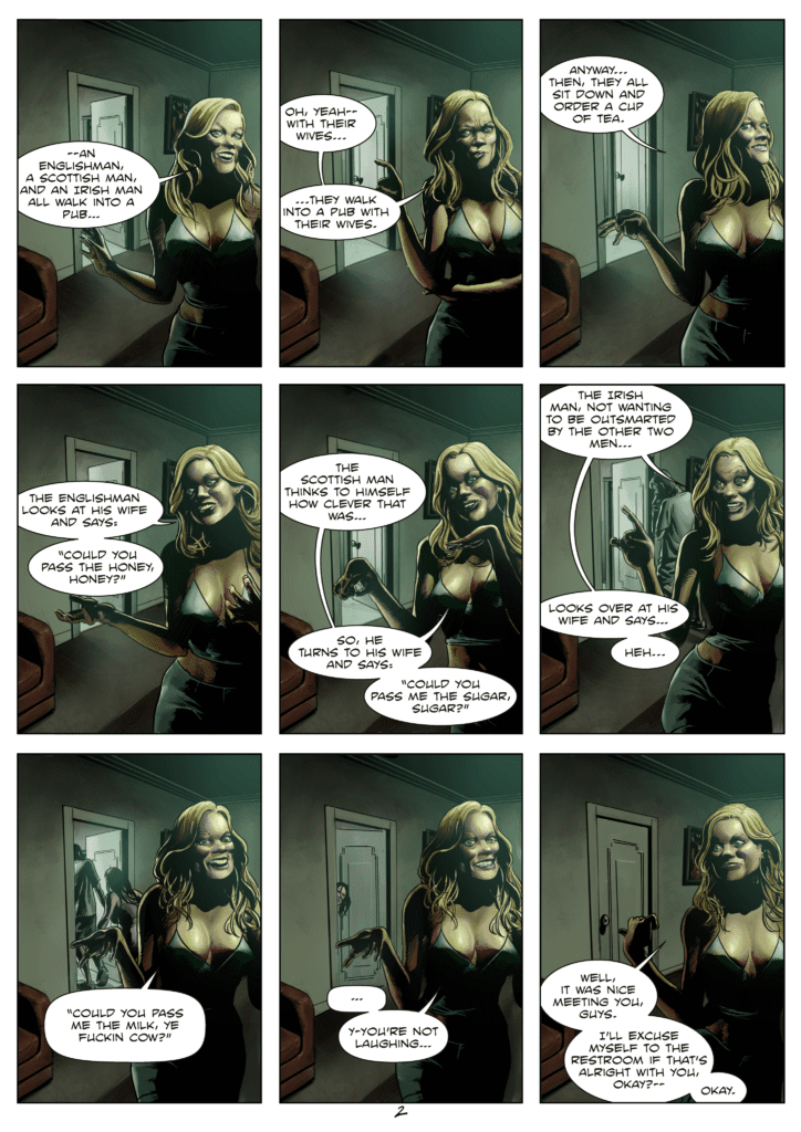
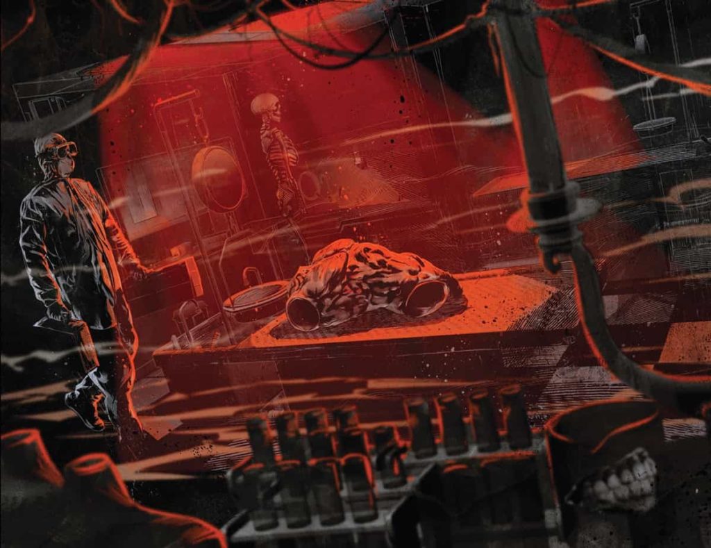
Cullen Bunn makes Shadowman #7 a genuine crisis of faith after the worst comes to pass. Since the resolution of the last arc, the Deadside spirit feels like an unstoppable force that permeates everything. There’s a strong sense of failure that allows readers to empathize with Shadowman as he’s contemplating his actions. But this same situation also allows readers to feel a sense of hope through some serious self-reflection, thanks to the Shadow Loa empowering our protagonist. It feels reminiscent of finding inner strength and inspiration during such a crisis. This all sets up a finale that readers cannot afford to miss.

Ever Chaotic Sets

Shadowman #7 best art
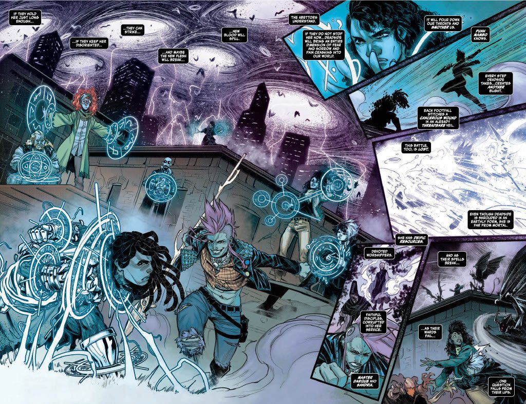
The artwork by Pedro Andreo presents a setting so chaotic, it feels like moving through a war zone. With so much going on in Shadowman #7 readers get a genuine sense of the conflict through panel layouts. One of the best examples comes in a two page spread with varying images. The best picture looks like a moment of triumph only to come tumbling down as smaller dynamically placed panels disrupt this small victory. It helps that the coloring by Jordie Bellaire makes these moments stand out with bright magic spells and silhouettes that bring a sense of contrast.

A special mention should go to Clayton Cowles’ lettering. Throughout Shadowman #7, the titular character’s inner monologue gives weight to every situation. Each word reflects the situation at hand with a sense of cynicism. It allows readers to genuinely connect with Jack in his hopelessness. Just the way captions are positioned in a two page spread, away from a triumphant moment, echoes a feeling of defeat. But when Shadowman speaks in an actual word balloon, it signals a return to his confidence after a lot of self-reflection.

Prepare Yourself in Shadowman #7

Shadowman #7 feels like the climax to everything this run hopes to achieve. With an atmosphere that readers can’t help but engage with, it allows them to feel the character’s struggles and triumphs. Now that Shadowman has reaffirmed his beliefs, there’s a killer sense of anticipation for the finale.

Monkeys Fighting Robots Youtube

Review: SHADOWMAN #6 – The Terror Breaks Through

Shadowman #6 cover

Shadowman #6 from Valiant Entertainment released on February 16th, 2022 and shows the terror of the Deadside War.

Background

Shadowman knows that he can’t win against the blights that bring spirits to the living world. So he tries to break traditions and inspire the spirits to live in coexistence with mortals. Only, the Deadside spirit is out to dominate and has the power to do so.

Shadowman #6: Fear The Deadside

Shadowman #6 page
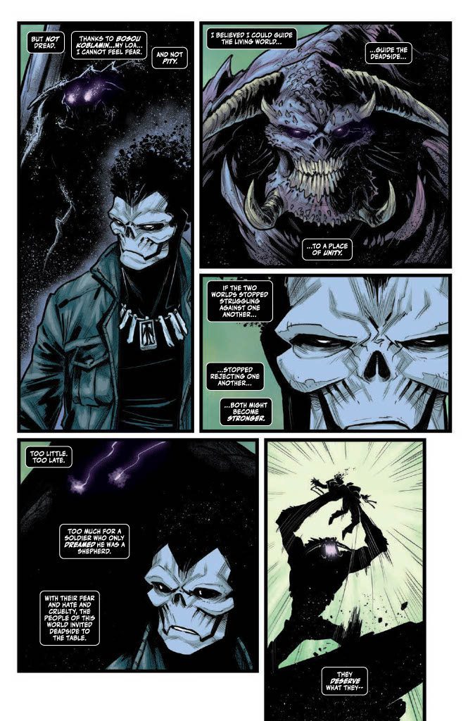
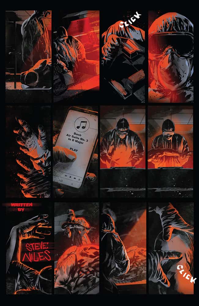
Cullen Bunn after much buildup shows just how fearsome the Deadside is. Her very influence is even on pages she doesn’t appear on with how characters invoke her. That’s not even including how she makes the Voodoo gods and Shadowman archfoes, the Darque siblings, her servants. The Deadside comes across as a terrifying otherworldly force that’s all but unstoppable. From the looks of things, readers can’t help but empathize with Jack who seems to be in a hopeless situation.

Dark Arts

The return of Punk Mambo
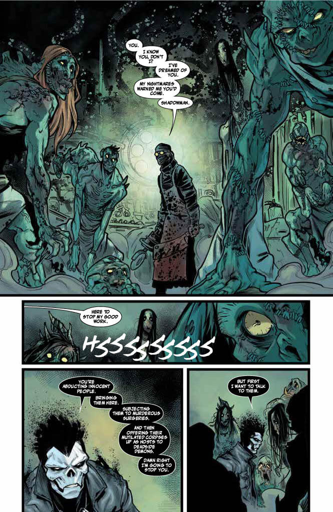
Pedro Andreo’s art tells most of the story of Shadowman #6 with expressive designs and body language. The masked vessels of the Darque twins not only look scary but, during their fight, their masks get damaged in such a way that it looks like they have a demented smile. Also, the way Punk Mambo appears with magical smoke is a pretty interesting design choice. It serves as a way of highlighting her unique abilities and asserting her presence. Which, along with her outfit’s brighter coloring by Jordie Bellaire makes her really stand out.

Meanwhile Clayton Cowles’ lettering highlights a few unique voices in relation to who’s more dominant. In regards to the Darque siblings, the ghoulish font of their dialogue makes a strong impression. It shows how they are more powerful than the other creatures.

Shadowman #6 Is Pretty Heavy… Metal

Shadowman #6 sets up a pretty bleak scenario but still gets you to invest in it. With older characters returning to show just how powerful the Deadside is, readers will be left in suspense for the next development.

Monkeys Fighting Robots Youtube

Review: Immerse Yourself In The Blood Curdling A TOWN CALLED TERROR

A Town Called Terror
A Town Called Terror #1 Cover art Credit: Image Comics

The horror genre is extremely popular since the early days of comics. Within horror, there are many subcategories, an array of different narratives telling different types of twisted and unsettling stories; psychological; ghost stories; body horror. Steve Niles has turned his hand to a range of subsections, with 30 Days of Night being one of the most famous. In his new title, published by Image Comics, he works with artist Szymon Kudranski to bring you the birth of a new world in A Town Called Terror.

On the surface, the comic looks like a homage to classic horror movies from the 1950s and 1960s with a modern flair reminiscent of 30 Days of Night. There is a sense of Hammer House of Horror about the project, and no one would be surprised if Peter Cushing and Christopher Lee played the lead characters. But such a comparison is a little unfair and a touch misleading. Judging the cover does not give you a real sense of the story inside, aside from the apparent horror story vibe. Niles and Kudranski mix influences and build a bridge between old-world terrors and futuristic horror. The result is occasionally off-putting, but it is an exciting and surprising read for the most part.

The modern gothic lab in A Town Called Terror #1 Credit: Image Comics

Concepts

Employing a mix of dense panels, numbering up to thirteen on some pages, and large double-page spreads, the opening of A Town Called Terror sets the tone for the narrative that follows. Niles leaves the first five pages virtually speechless, allowing the blood-red colors and heavily shadowed artwork by Kudranski to lead the story. The design of the opening, with the credits spread across several pages, feels like a 1980’s television mini-series introduction; think of The Stand. It’s not difficult to imagine Blue Oyster Cult’s (Don’t Fear) The Reaper playing over the top, although the strip informs the reader that the protagonist is listening to Bach.

This small detail is essential because it highlights the combination of classic and modern at the heart of A Town Called Terror. The opening has narrative elements similar to scenes from Frankenstein while being presented in a contemporary pandemic aesthetic. The eerie atmosphere of a Gothic castle laboratory is combined with a high-tech medical facility, thus drawing on a range of horror tropes from across the board. Niles does not limit himself but instead uses broad strokes to introduce the story and leave the reader uncertain where the narrative will go.

The artwork combines classic and modern visuals, mixing heavy shading and limited color with heavily detailed inking. There are hints of Tales From The Crypt buried in The Empty Man-style renderings. However, the impression that this first issue gives is of a modern-day story told for fans of classic horror.

A touch of Bach from A Town Called Terror #1 Credit: Image Comics

Art and Story

A Town Called Terror is soaked in horror tropes. It is overwhelmed with imagery and cliches at some points as if all the props from a cinematic franchise had been put into a single set. However, the beauty of Niles’ tongue-in-cheek scripting and Kudranski’s commitment to engaging visuals means that the overloaded pages never feel cluttered or superfluous. The solid conviction of the creators gives the impression of importance to every aspect of the comic. The atmosphere is built around striking gothic visuals and the intense use of red, being virtually the only color present throughout the comic. These visual elements feedback into the narrative, giving the script and the outlandish story some weight.

There are moments where you want to laugh at the ridiculousness of the cliches, but Kudranski’s art makes these moments particularly unsettling. His page layouts and the design of the panel borders are a constant encroachment on the reader’s safety as they aren’t presented in an expected way. The panel borders are often rough and jagged, breaking into several panels like unwelcome intruders. Adding to this unease are the wonderfully macabre lettering decisions by Scott O. Brown and Marshall Dillon. The sound effects appear scratched across the surface of the comic, and the speech contains visual inflections that give the presence and personality of the characters.

There isn’t much in the way of character development on offer in this first issue because the emphasis is on atmosphere and tone. That’s not to say that the characters aren’t interesting, and there is definite growth potential. It is simply that characters are not the focus. Instead, as he often does, Niles is setting up a world for the readers to drop into. It is a world containing mystery, horror, and most importantly, unpredictability.

A Town Called Terror #1 features some dark humor Credit: Image Comics

Conclusion

The problem with playing with broad sections of a genre, blending and mixing them together, is that your audience actually decreases in size. A comic like A Town Called Terror will not appeal to a large readership because it asks a lot from its readers. You have to be versed in the genre, knowledgeable of horror comic history and, to a large extent, the cinematic equivalent, and also be able to see past the surface imagery to the creator’s intent buried beneath. This comic looks like a cheap demonic Hammer House of Horror knock-off or Stephen King-inspired suburban nightmare, but there is so much more depth to Niles and Kudranski’s tale of terror.

A Town Called Terror is a playful jibe at horror while also being a loving homage to the genre. If you wish to ride the surface story, you’ll find an enjoyable romp stuffed with humorous cliches and tongue-in-cheek scripting. But if you care to dig a little deeper, there is a wealth of exciting references, callbacks, adoptions of ideas, and clever artistic treats. Niles manages to find just the right collaborators to bring out the best in his work, and A Town Called Terror is a testament to that. Kudranski, Brown, and Dillon take the script and elevate it to a worthwhile addition to the annals of horror comic history. I am sure it is a title that will be discussed at length in future publications.

A Town Called Terror will be released by Image Comics on 13 April 2022.

Monkeys Fighting Robots Youtube

Review: ARMORCLADS #1 – The Pre-Revolution

Armorclads #1 cover

Armorclads #1 from Valiant Entertainment releases March 23rd as the beginning of a fresh new intellectual property. In this series, readers connect with enslaved children who are fighting against the titular antagonists.

Summary

Armorclads #1 opening
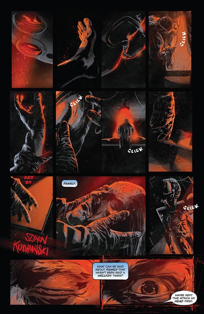
From Valiant’s official description:

As warring nations in a different solar system are locked in a continuing battle for supremacy wielding advanced exoskeletal known as Armorclads, a new rebellion is about to be sparked when one of the genetically engineered workers in construction-class mechs called Ironclads is killed. Now, by taking the fight to their oppressors, the Ironclads including Peris, Lela and Jac will soon discover a destiny defined by legacy.

How Armorclads #1 Stirs A Connection

What readers need to feel

Armorclads #1 is creator JJ O’Connor’s first comic project. It’s a very impressive start to his career. Alongside veteran writer Brian Buccellato of Injustice and Flash fame, O’Connor presents a harsh and oppressive world through the Ironclad protagonists. They’re all but powerless against the Armorclads, who are vulnerable to the alien world they’re all on. So seeing these enslaved children overcome what beat their slavers feels cathartic. But this same rock-paper-scissors dynamic comes with some very suspenseful consequences. It keeps readers on their toes as they await the next issue.

There’s an Art in Tribute

They look just like the 40K space marines
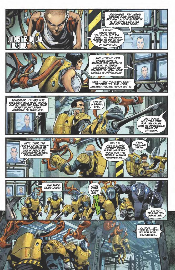
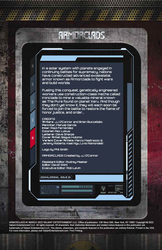
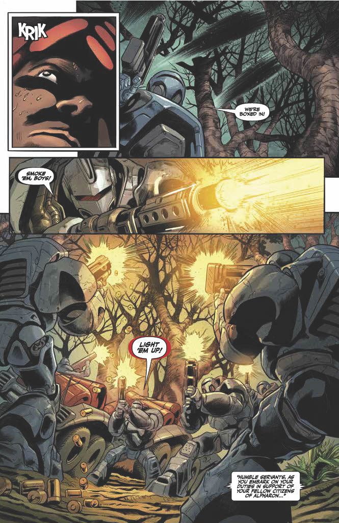
Artist Manuel Garcia injects Armorclads #1 with an atmosphere similar to the Warhammer franchise. The titular Armorclads, for example, greatly resemble the iconic space marines. More importantly, Garcia and inker Raul Fernandez put special attention on the angles and viewpoints of characters. There’s a genuine sense of being overwhelmed whenever a character looks upward. This sense of a threat is color-coded by Rex Locus. The darker the antagonist, the more dangerous they are, in sharp contrast to the bright yellow Ironclads.

Finally, letterer Dave Sharpe gives specially designed sound effects, creating incredible dramatic effects. The reader can practically feel the whir of a drill in one instance. But, probably the most significant example of SFX is the handcrafted kind that embeds into the panels.

Get Ready For Armorclads #1

Armorclads #1 makes a big first impression as a new Valiant title and the debut of a creator. This world and characters have an engaging premise that readers would like to see more of. That’s because it’s presented in such a way that it’s almost impossible to look away.

Monkeys Fighting Robots Youtube

Comics Studies: The Manga-esq Style Of GHOST CAGE

Ghost Cage Cover art
Ghost Cage #1 Credit: Image Comics

The origins of modern Manga, like Comics as a whole, are challenging to map out, but its influence on the industry the world over is apparent. Exhibit A: Ghost Cage by Nick Dragotta and Caleb Goellner, published March 23 by Image Comics.

A quick flick through the opening pages reveals two things. First is Dragotta’s distinctive style, and second is the unapologetic manga homage. Everything about this comic is a love letter to the storytelling techniques of master artists such as Osamu Tezuka, Katsuhiro Otomo, and Hiromu Arakawa. Falling into the seinen manga traditions, Ghost Cage is both a spiritual successor to Dragotta and Hickman’s East of West series and an exploration of manga traditions through Western eyes.

(Spoiler Warning: The following may contain mild spoilers for Ghost Cage #1)

Ghost Cage Interior Art Credit: Image Comics

Shared Motifs

Throughout the first issue of Ghost Cage, Dragotta plays with the motifs and styles of seinen manga to produce something that will be familiar to his fans but is also clearly drawing influence from elsewhere. Anyone not familiar with Manga will find the expressive visuals excessive, and the general pacing of the narrative may be confusing. However, Dragotta will attract a reader who is well-versed in different comic formats, so this stylization is nothing new. It was impossible, for example, to read any of East of West without engaging with the manga influence.

In Ghost Cage, the reader is treated to several seinen motifs that have become synonymous with the young boys’ comics of Japan. The comic has a strong focus on action and conflict from the very beginning. The opening page contains the illusion of a face constructed from a grotesque collage of body parts. This is instantly followed by a cityscape that resembles a massive explosive force reminiscent of the destruction in the pages of Akira from Katsuhiro Otomo. Undoubtedly, this narrative will feature violence as an overwhelming element of its structure, and Dragotta prepares the reader for the oncoming onslaught.

But in true seinen fashion, the violence is just a tool for more profound, more political storytelling. Dragotta creates a ‘them and us’ aspect to the characters with a clear divide between the rich and powerful and the poor and oppressed. This is an awe-inspiring task as there are very few characters in this opening issue. What Draggotta creates, similar to several classic Japanese science fiction stories, is a hierarchical society of location and landscape. The visual representation of society symbolizes human struggles. The opening includes a silhouetted city that is towered over by a single structure of power. This edifice turns out to be the actual source of power for the sprawling city beneath it. The phallic erection in the center of the page represents corporate greed and domination. And everything that follows furthers the ongoing struggle of the working classes against the corrupt, self-obsessed ruling classes. The hero of the story is a tech nerd who spends her time desperately trying to impress her bosses just so that she can advance through a system that uses and abuses her. It’s a story of manipulation that many readers will identify with.

However, there is an overwhelming sense of hope in the narrative. Doyle, the central character, grows in emotional strength and confidence with each conflict. She can change her initial obedience into a survival instinct and then transform herself into an opposing force against the system. The working-class hero or underdog is a major feature of many science fiction manga comics. The conflict between an overpowering corporation and youthful defiance plays well with the seinen target audience, as it does the readers of Image comics. Image Comics, reaching its 30th year in publishing this year, was initially set up by several artists and writers disgruntled with the corporate nature of the two main comics publishers, Marvel and DC. The founders were making a stand against the dominance of those publishers and were fuelled by their youthful exuberance. That defiance is reflected in the pages of Ghost Cage.

Akira City Landscape Credit: Katsuhiro Otomo

Landscaping

One feature of Manga is the treatment of landscapes. The setting is very important to the narratives, but there is also a disregard for backgrounds. Locations are used to create a setting and give the narrative its grounding or location, but the focus dramatically shifts to the characters when the action starts. Action lines drown out the need for background, and after the initial establishing shots, the readers are expected to place the drama. However, when landscapes are used within Manga, they are superb, complex worlds, often beyond imagining. From the expressive streets of Neo Tokyo in Akira to the machine underworlds of Tsutomu Nihei’s Blame! landscapes are more than settings. They are an integral part of the narrative symbolism.

The accent aspect of Ghost Cage is reminiscent of Blame! Within both comics, the opening paints a dystopian future world of contrasts between light and darkness, of expansive vistas and closed spaces, and of life and death. The setting creates an ever-present threat, and, in both examples, the futuristic landscapes are vast in scale and, somehow, confining and claustrophobic. You never get a feeling of freedom, only oppression, and entrapment. The world is closing in, and the only option is to fight against it and physically rise up from the depths. The single-minded violence, as represented by the fight sequences devoid of backgrounds, is a necessity born from the world in which the characters live but want to escape.

Blame Interior Landscape Credit: Tsutomu Nihei

Awe-Inspiring Homage

Dragotta has a fairly distinctive style in his mainstream work, but it is in the independent and creator-owned work where his style really shines. East of West was a powerhouse of storytelling with visuals that are worth returning to again and again. With Ghost Cage, Dragotta has leaped fully into recreating a modern manga-style comic, reflecting some of the most excellent seinen strips from the last 40 plus years. But, again, there is evident respect for the Japanese traditions, and Dragotta enjoys playing in the vast sandbox of manga techniques.

Manga is a massive art form, and there are plenty of books out there if you are interested in the subject. But be warned, it’s not like getting into a different genre; it is more like learning a new language. Ghost Cage interprets that language and adapts it to fit a monthly American comics release. Even before you look at the narrative, the visual onslaught of Dragotta’s work will have you transfixed to this extraordinary comic.

Monkeys Fighting Robots Youtube