Armorclads #1 from Valiant Entertainment releases March 23rd as the beginning of a fresh new intellectual property. In this series, readers connect with enslaved children who are fighting against the titular antagonists.
Summary
From Valiant’s official description:
As warring nations in a different solar system are locked in a continuing battle for supremacy wielding advanced exoskeletal known as Armorclads, a new rebellion is about to be sparked when one of the genetically engineered workers in construction-class mechs called Ironclads is killed. Now, by taking the fight to their oppressors, the Ironclads including Peris, Lela and Jac will soon discover a destiny defined by legacy.
How Armorclads #1 Stirs A Connection
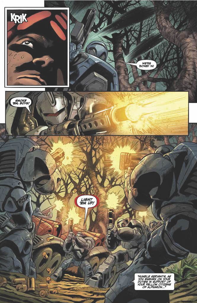
Armorclads #1 is creator JJ O’Connor’s first comic project. It’s a very impressive start to his career. Alongside veteran writer Brian Buccellato of Injustice and Flash fame, O’Connor presents a harsh and oppressive world through the Ironclad protagonists. They’re all but powerless against the Armorclads, who are vulnerable to the alien world they’re all on. So seeing these enslaved children overcome what beat their slavers feels cathartic. But this same rock-paper-scissors dynamic comes with some very suspenseful consequences. It keeps readers on their toes as they await the next issue.
There’s an Art in Tribute
Artist Manuel Garcia injects Armorclads #1 with an atmosphere similar to the Warhammer franchise. The titular Armorclads, for example, greatly resemble the iconic space marines. More importantly, Garcia and inker Raul Fernandez put special attention on the angles and viewpoints of characters. There’s a genuine sense of being overwhelmed whenever a character looks upward. This sense of a threat is color-coded by Rex Locus. The darker the antagonist, the more dangerous they are, in sharp contrast to the bright yellow Ironclads.
Finally, letterer Dave Sharpe gives specially designed sound effects, creating incredible dramatic effects. The reader can practically feel the whir of a drill in one instance. But, probably the most significant example of SFX is the handcrafted kind that embeds into the panels.
Get Ready For Armorclads #1
Armorclads #1 makes a big first impression as a new Valiant title and the debut of a creator. This world and characters have an engaging premise that readers would like to see more of. That’s because it’s presented in such a way that it’s almost impossible to look away.
The origins of modern Manga, like Comics as a whole, are challenging to map out, but its influence on the industry the world over is apparent. Exhibit A: Ghost Cage by Nick Dragotta and Caleb Goellner, published March 23 by Image Comics.
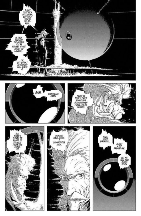
A quick flick through the opening pages reveals two things. First is Dragotta’s distinctive style, and second is the unapologetic manga homage. Everything about this comic is a love letter to the storytelling techniques of master artists such as Osamu Tezuka, Katsuhiro Otomo, and Hiromu Arakawa. Falling into the seinen manga traditions, Ghost Cage is both a spiritual successor to Dragotta and Hickman’s East of West series and an exploration of manga traditions through Western eyes.
(Spoiler Warning: The following may contain mild spoilers for Ghost Cage #1)
Ghost Cage Interior Art Credit: Image Comics
Shared Motifs
Throughout the first issue of Ghost Cage, Dragotta plays with the motifs and styles of seinen manga to produce something that will be familiar to his fans but is also clearly drawing influence from elsewhere. Anyone not familiar with Manga will find the expressive visuals excessive, and the general pacing of the narrative may be confusing. However, Dragotta will attract a reader who is well-versed in different comic formats, so this stylization is nothing new. It was impossible, for example, to read any of East of West without engaging with the manga influence.
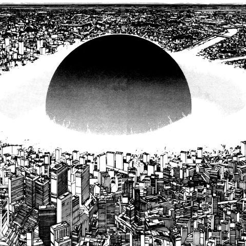
In Ghost Cage, the reader is treated to several seinen motifs that have become synonymous with the young boys’ comics of Japan. The comic has a strong focus on action and conflict from the very beginning. The opening page contains the illusion of a face constructed from a grotesque collage of body parts. This is instantly followed by a cityscape that resembles a massive explosive force reminiscent of the destruction in the pages of Akira from Katsuhiro Otomo. Undoubtedly, this narrative will feature violence as an overwhelming element of its structure, and Dragotta prepares the reader for the oncoming onslaught.
But in true seinen fashion, the violence is just a tool for more profound, more political storytelling. Dragotta creates a ‘them and us’ aspect to the characters with a clear divide between the rich and powerful and the poor and oppressed. This is an awe-inspiring task as there are very few characters in this opening issue. What Draggotta creates, similar to several classic Japanese science fiction stories, is a hierarchical society of location and landscape. The visual representation of society symbolizes human struggles. The opening includes a silhouetted city that is towered over by a single structure of power. This edifice turns out to be the actual source of power for the sprawling city beneath it. The phallic erection in the center of the page represents corporate greed and domination. And everything that follows furthers the ongoing struggle of the working classes against the corrupt, self-obsessed ruling classes. The hero of the story is a tech nerd who spends her time desperately trying to impress her bosses just so that she can advance through a system that uses and abuses her. It’s a story of manipulation that many readers will identify with.
However, there is an overwhelming sense of hope in the narrative. Doyle, the central character, grows in emotional strength and confidence with each conflict. She can change her initial obedience into a survival instinct and then transform herself into an opposing force against the system. The working-class hero or underdog is a major feature of many science fiction manga comics. The conflict between an overpowering corporation and youthful defiance plays well with the seinen target audience, as it does the readers of Image comics. Image Comics, reaching its 30th year in publishing this year, was initially set up by several artists and writers disgruntled with the corporate nature of the two main comics publishers, Marvel and DC. The founders were making a stand against the dominance of those publishers and were fuelled by their youthful exuberance. That defiance is reflected in the pages of Ghost Cage.
Akira City Landscape Credit: Katsuhiro Otomo
Landscaping
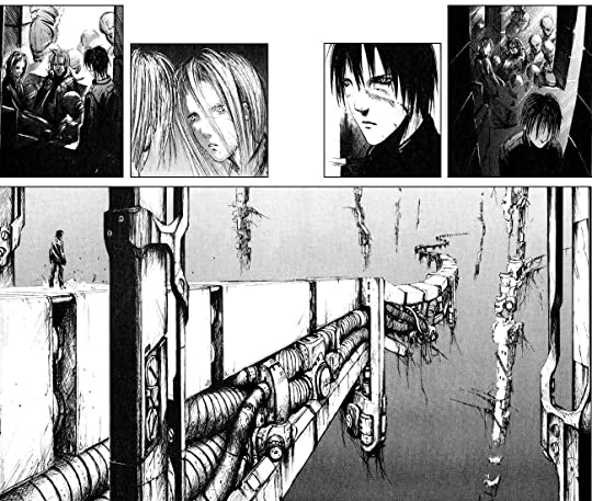
One feature of Manga is the treatment of landscapes. The setting is very important to the narratives, but there is also a disregard for backgrounds. Locations are used to create a setting and give the narrative its grounding or location, but the focus dramatically shifts to the characters when the action starts. Action lines drown out the need for background, and after the initial establishing shots, the readers are expected to place the drama. However, when landscapes are used within Manga, they are superb, complex worlds, often beyond imagining. From the expressive streets of Neo Tokyo in Akira to the machine underworlds of Tsutomu Nihei’s Blame! landscapes are more than settings. They are an integral part of the narrative symbolism.
The accent aspect of Ghost Cage is reminiscent of Blame! Within both comics, the opening paints a dystopian future world of contrasts between light and darkness, of expansive vistas and closed spaces, and of life and death. The setting creates an ever-present threat, and, in both examples, the futuristic landscapes are vast in scale and, somehow, confining and claustrophobic. You never get a feeling of freedom, only oppression, and entrapment. The world is closing in, and the only option is to fight against it and physically rise up from the depths. The single-minded violence, as represented by the fight sequences devoid of backgrounds, is a necessity born from the world in which the characters live but want to escape.
Blame Interior Landscape Credit: Tsutomu Nihei
Awe-Inspiring Homage
Dragotta has a fairly distinctive style in his mainstream work, but it is in the independent and creator-owned work where his style really shines. East of West was a powerhouse of storytelling with visuals that are worth returning to again and again. With Ghost Cage, Dragotta has leaped fully into recreating a modern manga-style comic, reflecting some of the most excellent seinen strips from the last 40 plus years. But, again, there is evident respect for the Japanese traditions, and Dragotta enjoys playing in the vast sandbox of manga techniques.
Manga is a massive art form, and there are plenty of books out there if you are interested in the subject. But be warned, it’s not like getting into a different genre; it is more like learning a new language. Ghost Cage interprets that language and adapts it to fit a monthly American comics release. Even before you look at the narrative, the visual onslaught of Dragotta’s work will have you transfixed to this extraordinary comic.
Fantasy World #1 possibly the first Comic Fanzine printed in 1936 by David Kyle
Comic Books Incorporated by Shawna Kidman is a book that challenges accepted myths about comic book history and the industry surrounding it. The book’s focus stays away from the artistic merit of comics and, instead, centralizes on the industry infrastructure. This stance somewhat undermines the modern argument that comics have endured because they are a successful Art Form. However, industry, technology, and money (whether corporate or otherwise) have always played an important role in manipulating the art and cultural markets. Modern Artists, such as Tracey Emin and Damien Hurst, are as much business tycoons as they are creatives. The famous painters of the Renaissance period only survived, in the same way, that their artwork has survived to this day, because of the funding behind it coming mainly from the Church and the State. And it wasn’t the decline of creativity that killed off EC Comics or brought about the first Comic Book market crash in the 1950s, as Shawna Kidman demonstrates in her book.
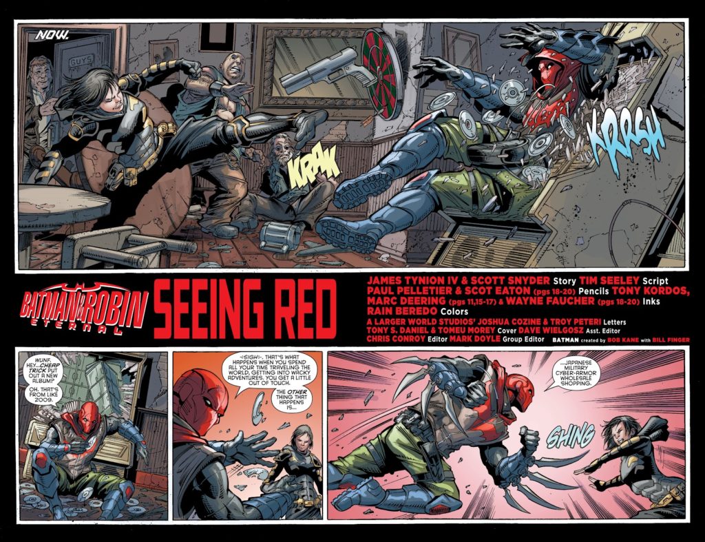
But why have comics become so entrenched in their own mythology and so beholden to stories and histories that only tell part of the greater picture? Everyone knows the story of Batman’s creation and how, for decades, Bob Kane was given all of the credit. It wasn’t until 2015 that Bill Finger started to receive shared recognition in the comics, although his involvement has been part of comics lore for much longer. Situations such as this are rife within the comic industry, with gossip and rumor spreading throughout the community to the point that the tales become fact, obfuscating the truth. In the Batman example, the policy held by DC Comics at the time was that a single artist would receive credit for the story or character irrespective of how many people worked on the actual finished product. Therefore, the industry practice cemented the history that Bob Kane created Batman and was standard practice in the publishing industry. It was only because of a) the ever-growing popularity of the character and b) the obsession from certain fans that anyone cared to look into and argue for Bill Finger’s case. This leads you to wonder how many other creations are not correctly credited and how many artists and writers deserve a larger mention in the history of Comics.
Batman and Robin Eternal #3 where Bill Finger is first credited as joint creator
Emerging Communities
One of the problems Comics Studies faces is that much of the history and discourse over the years has been produced by the fans or the creators of the comics. This is especially true in the US marketplace, where the study of comics was frowned upon because it was deemed low culture and not accepted into the halls of academia. As a result, a lot of the writing about the comics industry came from fanzines which were more interested in the comics and creators and less interested in the markets and corporations behind the productions. They also had a particular bias towards superhero comics because the most prominent publishers, Marvel and DC, created the fan bases by controlling much of the distribution and share market.
Aaron Kastan notes in his chapter from Keywords for Comics Studies that the ‘fan community emerged in the 1960s, [.] and is organized around institutions such as comic conventions, comic book stores, and fan magazines.’ (1) As the distribution and sales of comics shrank, the community was stereotyped based on the active members of the fandom, those who went to the conventions, regularly frequented the specialist comic shops, and submitted articles to the underground fanzines. Marvel and DC relied on the continued support of this fandom and began marketing directly to them. Without a larger, diverse audience, what was deemed necessary in the comic industry was dictated by a few members of this community and, in a less direct way, the publishers themselves. In much the same way that the early defenders of comics were employed by the industry (2), the emerging history of comics was being led by fans of superhero comics. ‘The limited body of scholarship on comics fandom tends to assume that normative comics fandom is the primary readership for comics and that this community is mostly straight, white, and male’ (3) explains Kashtan and which became the standard stereotype for comic readers for decades. This culture was brought about and fed by the large publishers who ‘increasingly oriented their products toward a small, essentially subcultural audience, many of whom self-consciously identified as comic book fans.’ (4)
“The New York City Comic Convention Main Floor.” by Tancread is marked with CC BY-NC 2.0.
Creating a Niche Market
The creation of the direct market made it even easier to interact directly with fans while at the same time reinforcing a niche market. Benjamin Woo points out that as, ‘an unintended consequence,[.] comic books became increasingly foreign to the everyday experience of most Americans.’ (5) Quoting Jean-Paul Gabillet, Woo continues; ‘comic books were no longer a mass medium, but were a sector of the cultural industry that was increasingly structured around a ‘fan’ audience,’
It wasn’t long before many of the people who pursued a career in comics came from this world of fandom, in essence solidifying the niche culture even further. It is also worth noting that comics studies’ growth came from this fandom. Woo tells us that the ‘history of comic books and the careers of their creators is due to the efforts of the fans who documented it.’ (6) Therefore, the information and knowledge is biased, more often than not, towards the superhero comic and in turn champions specific creators and the comic books that were the favorites of the fandom. Many titles and creators who only had a small following disappeared into the annals of history, barely making a footnote. For example, if Batman had been canceled in the late 1950s, which was a real possibility at the time, then Bill Finger’s involvement would probably not have become the topic of much discussion and research, and Bob Kane would have remained the sole creator linked to the character.
Cover for Comic Books Incorporated by Shawna Kidman
Expanding the Field
Many important aspects of comic book studies, especially when it involves the history of the format, have very little documented scholarship to draw from, and what does exist is usually from a small group of dedicated fans whose main interests lay in their obsession with the comics and not in examining them as cultural objects or works of art. Therefore, it is easier to accept established mythologies surrounding a small collection of comics than it is to take into account the vast multimedia worlds that comics were, and still are, a part of. Shawna Kidman says in her book, ‘Comic books dominate the cultural landscape, and it is worth knowing where they come from, what they mean, and who and what gave them that meaning.’ (7) Without expanding our understanding of the histories surrounding comics, looking beyond the ‘known’ myths, it will become increasingly difficult to understand and accept the current position comics hold in our multimedia world. Narrow-minded approaches to the past will instill narrow-minded views of the present. Still, thanks to books like Comic Books Incorporated, different outlooks are starting to be discovered, shared, and built upon. Many art forms have arrays of books, often contradicting each other, that invite discussions around their histories and cultural status, and I can’t see why such discussions shouldn’t exist within the comics discourse.
References
1 Fawaz/Streeby/Whaley. Keywords For Comics Studies New York University Press 2021 (pg 89)
2 Kidman, Shawna. Comic Books Incorporated University of California Press 2019 (pg 51)
3 Fawaz/Streeby/Whaley. Keywords For Comics Studies New York University Press 2021 (pg 91)
4 Hatfield/Beaty. Comics Studies: A Guidebook Rutgers University Press 2020 (pg 116)
5 Hatfield/Beaty. Comics Studies: A Guidebook Rutgers University Press 2020 (pg 117)
6 Hatfield/Beaty. Comics Studies: A Guidebook Rutgers University Press 2020 (pg 118)
7 Kidman, Shawna. Comic Books Incorporated University of California Press 2019 (pg 45)
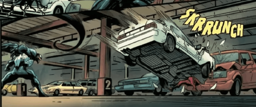
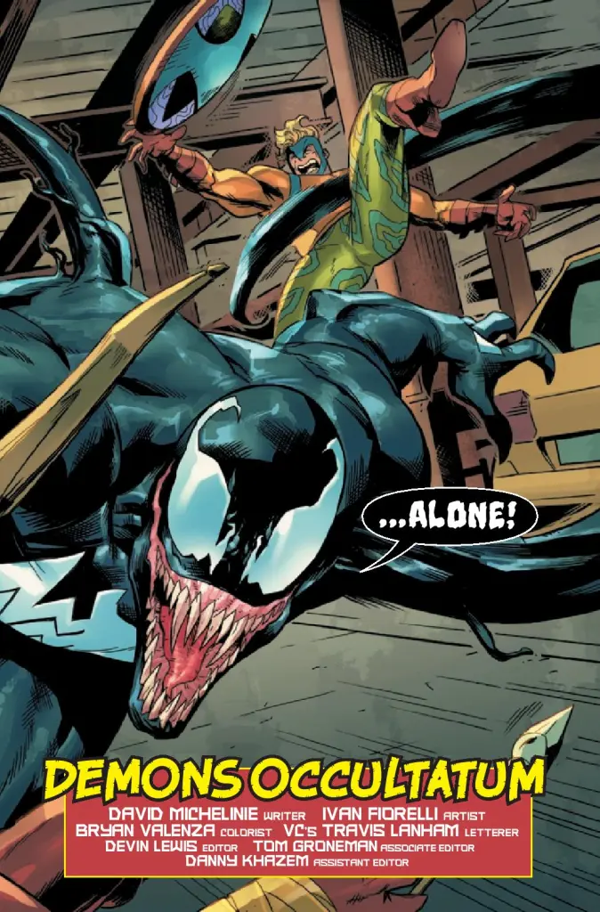
Venom’s string of solo titles in the 90’s may have been stretching things by calling him an “anti-hero.” Though, according to the writers of the time, that was definitely what the publishers wanted him to be. Dark, evil-looking Spider-Man’s suddenly a hit character? Give him his own title and have him fight even worse guys! Except, in practice, a lot of effort was put into making the character true to his villainous early appearances. Which meant Venom was still an unstable maniac. His greatest superpower: rationalizing whatever he did as either heroic or caused by someone else. Sure, sometimes he’d fight villains. Sometimes he’d try to kill J Jonah Jameson by mistake! That’s the take character co-creator David Michelinie is returning to in Venom: Lethal Protector #1. So if you’re not into Venom becoming a better person, here he’s throwing cars at petty thieves.
WRITING
Set during the early days of Venom’s career, the issue finds Eddie Brock trying to figure out his place in the world. He knows he wants to protect the innocent (and kill Spider-Man), but is upset his attempts at vigilante justice aren’t being appreciated. Things aren’t helped when he has a bit more trouble than expected with a bumbling villain out to prove himself. And a returning sinister organization begins to carry out their plans for poor Venom…
This issue is a reunion of sorts for Spider-Man characters Michelinie introduced during his long tenure on the title. The fake Avengers Taskmaster trained in Amazing Spider-Man #367 show up in the opening pages, and the obscure villains only continue to reappear from there. But the D-list villains with silly powers help add to the darkly comedic tone Venom Lethal Protector #1 sets for itself. This is a Venom whose time as a journalist has left him with a flowery vocabulary – “That’s why we lead you here, where we wouldn’t be bothered by buttinskies with badges!” he shouts in the opening pages. It all comes with an air of goofiness. That’s not to say that none of Venom’s concerns are treated seriously. But this is a character with a monster-face whose attempts at eloquent language just end up scaring old ladies. So hell, why shouldn’t he be fun?
Eddie also tries to open up to his symbiote throughout the issue, in what ends up being a one-sided conversation. All his attempts to get the symbiote to talk about its past are met with silence. This is interesting, since the relationship between Eddie and his symbiote has always been best described as that of two enablers. Both coming off sour rejections, bonding over shared hatred, and pushing one another to further destructive extremes. But here, we see a frostier symbiote acting more as an occasional voice of reason. Eddie even decides he needs someone more human to talk to, and seeks out his ex-wife. Though she’s… less open to conversation. Eddie’s only gonna end up relying on his alien friend more and more.
ART
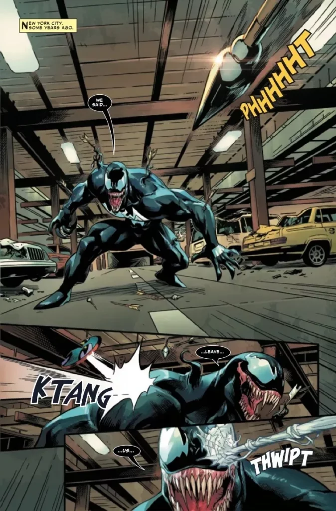
Venom’s the kind of cool, clean design that’s inspired thousands and thousands of doodles in school notebooks across the country. Guy must be fun to draw. Ivan Fiorelli definitely looks like he’s having fun. He provides plenty of closeups on Venom’s sinister grin, dozens of perfectly sharpened little teeth protruding from his gigantic gums. And for an issue centered around a man with a permanent grin, there’s a lot of expressiveness on show here. A certain guest villain that the climax of the issue revolves around is presented with droopy, ill fitting clothes, and a lanky, cartoony body. Eddie gives a delightfully smug smirk after an attempted good deed.
Bryan Valenza, meanwhile, goes for a cartoony, bright color palette. Though he also relies on a lot of urban browns and greys. Superhero or not, this is a comic about a man who lives in the sewers. It’s up to the silly costumes of the comic’s cast to provide splashes of color, along with autumn leaves, and the vibrant city skyline at night. VC’s Tavis Lanham provides clear, pleasant lettering throughout. Venom himself is given a subtly wobbly, horror-tinged font whenever he yells, giving his speech a properly monstrous character to it. Though his white-on-black speech bubbles certainly help as well.
VERDICT
Venom: Lethal Protector #1 is a fun throwback to before Venom and the symbiotes splintered off into their own corner of the Marvel universe. This issue doesn’t let you forget Venom is primarily a Spider-Man character- its world populated by petty thugs in spandex and ungrateful New Yorkers. But sometimes its fun to take a spin with a character who’s a lot less responsible than that uptight Peter Parker. So keep a lookout for when the issue releases from Marvel Comics on March 23rd.
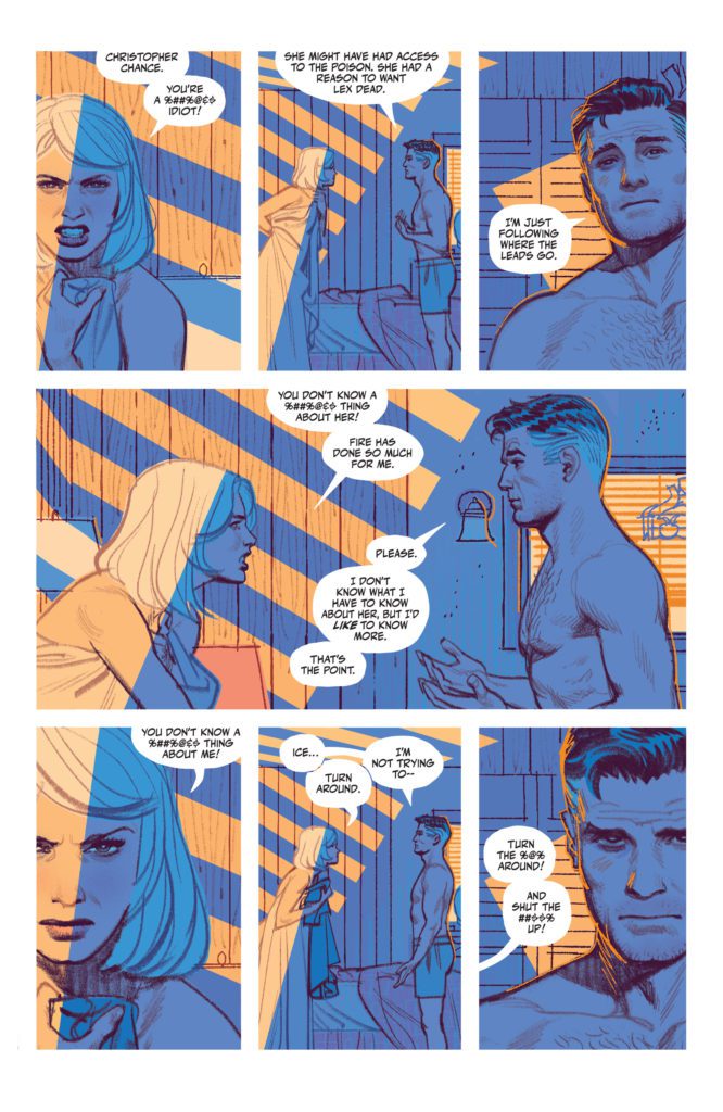
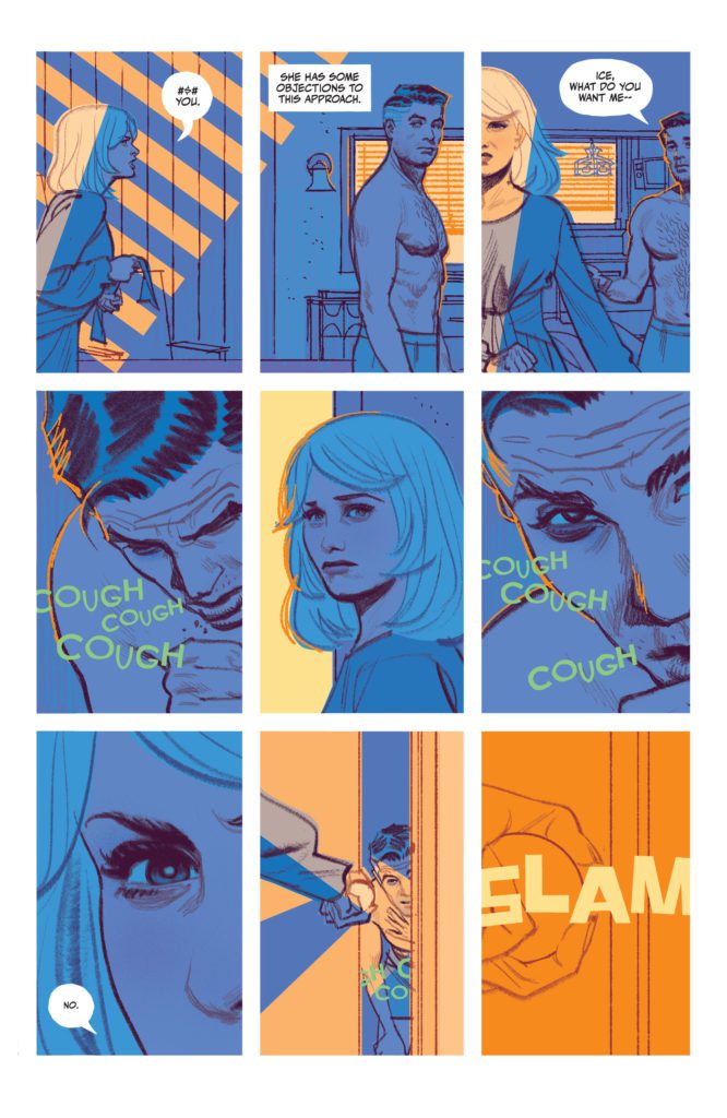
“Christopher Chance. You’re a %##%@&$ idiot!” These are the words that are yelled at the beginning of The Human Target #6. They seem a little unfair. Chance, who has found out he has 12 days to live (6 days ago) isn’t thinking right. He’s being pulled in a million directions, trying to decide how his last days would be best spent. Obviously, he’s going to make some rash decisions. But by the end of The Human Target #6, Chance himself can’t deny those words spoken to him at the beginning of the day. He is an idiot and he’s in a hell of a lot of trouble.
Writer Tom King, artist Greg Smallwood, and letterer Clayton Cowles end out the first season of DC Comics’ The Human Target in a ruthless and dramatic fashion. It will be September before we see the next chapter of this series – it goes on hiatus for the next 6 months. With The Human Target #6, this creative team is making damn sure that its readership is going nowhere.
Writing
Christopher Chance is making a lot of bad decisions. Chief among them happens on an “OH SHIT” page in this issue, which also parodies a great comedic moment in DC’s history. King drives the knife in deep. Not only does he show us that this story is going to have real, lasting stakes, but he does so with a wink to happier times. This issue really captures the suddenness of a huge mistake and the human desire to run from what we’ve done. Immediately after something drastic happens, we see the other characters in the scene almost act like nothing occurred. They turn to each other and talk about anything but what they’ve done. As everything sinks in, they begin to quietly panic. This issue has screaming matches, fistfights, and buckets of blood. But every scene is punctuated and driven home by the little moments of evasiveness and denial. King just gets people, in all their ugly glory.
Art
King and Smallwood are, simply put, a match made in Heaven. Every moment of subtlety and nuance in King’s script absolutely sings on the page through Smallwood’s visuals. In the moment of our characters’ denial, Smallwood shows us their blank stares. They sit down like the life has gone out of them, unable to process what has happened. In their eyes, there’s a slight sadness. A page later, Chance is back to business as usual. But there’s a new eagerness to his face, like he’s trying to look unfazed. A smile pulls at the sides of his mouth and his eyebrows are raised, almost playfully. As the issue ends, we get one final look at Chance. The charade has ended, his eyes look lifeless and his brow is furrowed in worry. Smallwood perfectly captures human emotions on the faces of his characters. He speaks volumes through the creasing of a nose, the clenching of a jaw, or the lowering of an eyebrow. He tells us so much in the smallest details.
Coloring
There’s a lot of strife in this issue. Right off the bat, we begin The Human Target #6 in the middle of a fight between Ice and Chance. But Smallwood’s colors play against the writing. Ice and Chance yell at each other in a scene of soft blues and warm oranges. Their fighting is intense, but the scene is gentle and cozy. Later, Smallwood does a similar thing when the shit really hits the fan. The horrors of what goes down all occurs in a brightly lit room, with golden sunlight streaming in from one of the windows. Smallwood’s choices create a dissonance in the scene that highlights the darkness of what is going on. But his choices also play into these characters embracing denial as a way of dealing with events. Just as they want to pretend nothing happened, the scene itself is painted in beautiful colors that almost make it seem like nothing did.
Lettering
There’s a calmness to Cowles’ lettering. In most pages, we see Chance’s inner monologue lined up in caption boxes along the left side of the page. They lazily snake their way to the bottom of every panel, creating a smooth and straightforward roadmap for our eyes. When the issue suddenly shifts, and danger rears its ugly head, Cowles switches up the placement of his caption boxes. They begin to appear on the right side of the page, creating an off-kilter feeling. And then they begin to ping pong back and forth on every page. With this, Cowles creates a sense of movement that mimics the goings on of the scene. Just as things become chaotic for the characters, things become dynamic for our eyes.
Verdict
The Human Target is not just a sexy series with smooth storytelling and even smoother visuals. It also packs one hell of a punch. The Human Target #6 ends out the first half of this series with a bang, promising that season two will see these characters engaging in a completely different story. Pick up The Human Target #6, out from DC Comics March 22nd, at a comic shop near you!
Nottingham #7 of Mad Cave Studios comes to comic stores on May 11th with the Final Order Cutoff on April 18th. In this issue, loyalties and ethics are tested as an inevitable betrayal builds to a boiling point.
Background
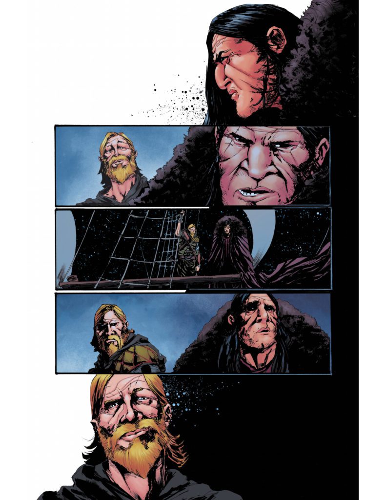
Sheriff Blackthorne and Robin Hood make an uneasy alliance to rescue King Richard from France. Meanwhile, Lady Marian is making advances to take control of the Merry Men.
Nottingham #7: Backstabbing Paramount
David Hazan writes Nottingham #7 with a strong sense of uneasy tension throughout the issue. Just about every interaction between characters feels like a subtle attempt at domination. With a murder aboard Blackthorne and Hood’s ship, there’s a suspenseful debate of ethics on how to deal with the assassin. Which gets worse as it feels like it’s going to lead to even more problems.
Then there’s how Marian uses the Merry Men in a very gruesome fashion. Marian is very much preparing for a war, but what really arrests readers’ attention is where her loyalties lie. If anything, Marian is out for herself and how she proceeds keeps readers in suspense. It’s this kind of writing that pulls you in and has you waiting for the next issue.
Art Directing Focus
Shane Connery Volk’s artwork puts a tremendous focus on important situations. The most important plot points of Nottingham #7 manifest in panels devoid of background. It gives the feeling that everything else disappears, at least in juxtaposition with letterer Justin Birch’s placement of dialogue. Seeing only Lady Marian’s green eyes, red mouth, and the blood on her face in colorist Luca Romano’s black background makes her words twice as impactful.
Catch up to Nottingham #7 Immediately!
Nottingham #7 arrests the readers attention with well-presented suspense. Every major character has a powerful narrative stake that clashes with another’s. As an inevitable betrayal inches closer, readers are sure to commit to seeing the entire plot through.
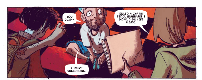
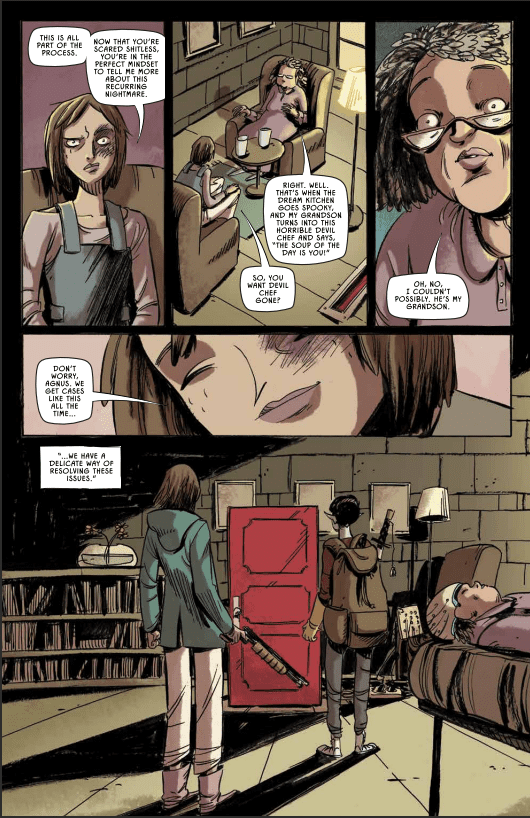
Storytellers think a lot about dreams. It’s a natural obsession, since they often consist of snippets of information from our everyday lives, swirled about into something that almost-but-not-quite resembles a narrative. Connect a few dots and you can spin stories out of them. Maybe learn something about yourself. But then again, dreams can also be about falling off a building or getting an “F” on a test, so sometimes they can just be a plain nuisance. Image Comics’ Slumber #1, which is available now, stars Dream Detective Stetson. The character is best described as a kind of punch-clock nightmare exterminator. She’s not here to tell you why you dream the things you dream. She’ll just crawl inside your head and shoot the stuff that stresses you out. Sure, maybe it’s not the most romantic take on dreamscapes, but it gets the job done, doesn’t it?
WRITING
An everyday police detective named Finch has been investigating the “Sleepwalker Killings,” a string of murders carried out by seven different killers in their sleep. Finch has a hunch that the killings might be connected to a different kind of detective: the aforementioned dream-diving Stetson. Meanwhile, Stetson is keeping busy at her dream-healing agency. But it quickly becomes clear that wading through the dreamscapes of strangers is more than just a job for her. She’s looking for someone. And that someone might just have their eyes on Detective Finch.
Tyler Burton Smith approaches Slumber #1 with a mix of weary sarcasm and growing dread. When the issue works best is when it draws out the main character’s sleep-deprived recklessness. Though some of the turns into wackier hijinks don’t land quite as well. The sudden swerves from serial-killer noir material to a buddy-cop comedy in a dream carnival are ambitious, at least. But it feels odd spending 2 pages on a joke about the main character explaining a poor lemons-into-lemonade analogy given all the threads this issue has to set up.
I’d be lying, though, if I said those threads didn’t pique my interest. There’s a lot being hinted at here, including a more supernatural twist on the classic “got into the detective business to hunt one man down” trope. Other aspects of the world are simply presented as-is in a way that could or could not be expanded upon later. I’m fairly certain we’ll learn why Stetson’s partner is a blue, supernatural creature eventually. But all the whys and hows behind her dream-traveling technology are ignored in a way I admire. Jump right into the story, and all the details will maybe get sorted out later. They’re not really the focus anyway.
ART
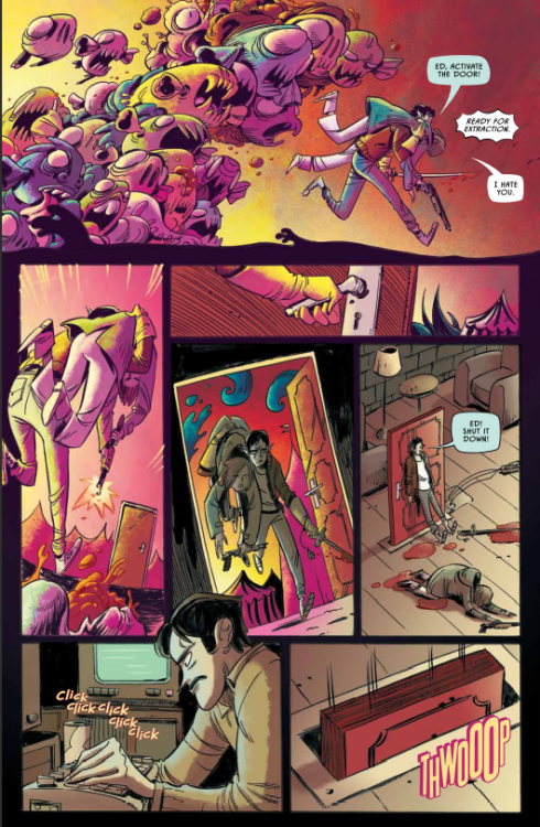
Vanessa Cardinali starts the issue with establishing shots of suburbs and cityscapes – all harsh, inorganic grids contrasting her cartoony character work. So when it comes time for the characters to enter dreams, the world itself comes alive with the same sense of loose caricature. She’s clearly having fun drawing the strange creatures that populate dreams, having them clamber over one another until they move as a single mass of eyes and teeth.
Simon Robins provides colors that add to the sickly unease of the world the comic presents. The real world tends to use a lot of dark browns and greens, while the colors of dreams are rendered in nauseating yellows and pinks. It keeps the whimsy often associated with dreams in an off-kilter register. These are, after all, the kinds of dreams that keep the characters from the sleep they desperately desire.
Steve Wands’ lettering work is also given a chance to show off in the unreality of dream logic. A Nightmare creature has the letters giving life to his screams practically fall out of his speech bubble. Another dream creature has their speech rendered in a thin, stark font, with a white font on a pink word balloon.
VERDICT
Slumber #1’s tone can stumble in the moment-to-moment, but still manages to paint a clear overall picture. It’s one of the most fundamental sources of childhood whimsy reduced to a gory, grueling day job. One where the main source of excitement is hoping you can find a runaway killer inside someone else’s head. Just make sure to follow all the 30+ rules, and file all the paperwork in the right places. Sign here, please.
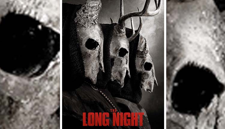
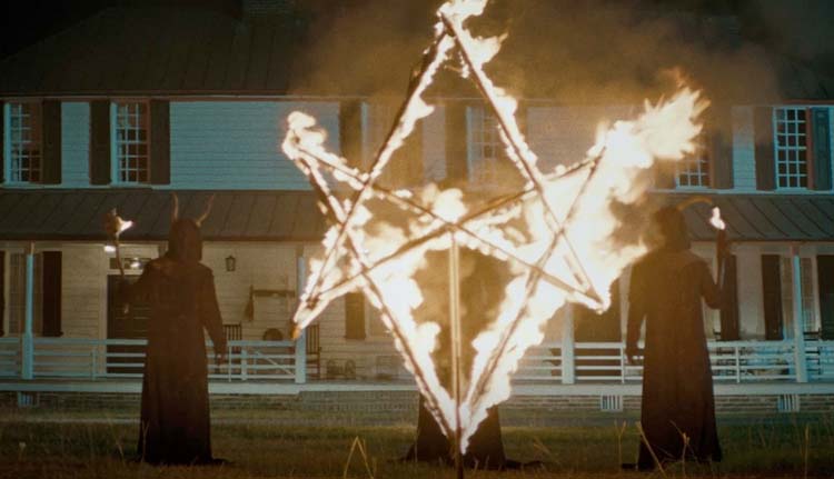
The Long Night is a horror film by director Rich Ragsdale (Chevelle: Door to Door Cannibals) that brings a demonic cult to rural America where they torment a couple on a farmhouse in service to a greater evil.
Scout Taylor-Compton (Triple Threat) plays Grace, a young woman with no understanding of her family history. She’s spent years trying to track them down when a call from an investigator presents a new lead. Grace and her boyfriend Jack (Nolan Gerard Funk) leave New York City for a trip deep into southern, rural America. Things start weird and get progressively stranger and more terrifying. Snakes keep showing up in the large farmhouse. Phone reception’s gone haywire, and there’s an altar in the nearby woods. To make matters all the more frightening, a cult wearing goat-head masks surrounds the property.
PopAxiom and producer Daemon Hillin discussed becoming part of the film business and making The Long Night.
Get Up
Daemon’s been producing for 14 years with more than two dozen projects now in his filmography, including Death of Me and Final Kill. How did he become a producer? “I fell into it. I had a background in fashion. I was in front of the camera for years. From about 17 years old to 23, I did shows in Italy, Germany, Greece, and Japan.”
“I wanted to stay in entertainment and blend business,” he shares as he lost interest in the fashion work he was doing, “but I didn’t have a background.”
What did Daemon do? “I went into real estate and finance.” The move proved to be the right step. “That is what bridged me to production and production finance. I used many tools for mortgages and the [real estate] industry to finance films and package projects. That was the stepping stone for me.” But it was a big struggle. “I was working in a bar and working for a film company for free.”
It can be argued that no one is more important to a film than its producer. “It’s the Rolodex. Who can you call to put this together? It’s turning all that creativity into numbers. How do I explain why I need thousands of dollars of goat-head masks.”
“You have to get back up,” Daemon says about producing, though it’s advice with broad application. “It’s a constant getting dropped on your butt. People are putting you down, especially in LA, where you’ll hear a lot ‘oh, sure, everyone’s a producer.’ So get back up and fight if you love it.”
About The Long Night
Daemon undeniably loves it and finds projects that motivate him to put productions together. “The Long Night came to me through my mentor. He brought me this script and asked if I could help him make it. I read the script and loved it.”
“It had this supernatural feel,” Daemon says and adds, “My mom loves covens and witches, so I was gravitating towards it because my mom would like it.”
What’s the first step for him as a producer? “… getting numbers and understanding what the value of the movie is. From there, what actor will generate the kind of revenue we need to make this movie.”
“Our movie was green-lit, and we all went to Charleston, North Carolina,” he shares as the process seemed to be going as planned. “However, in the time to get the movie greenlit, schedules changed, and we lost the director and a lot of the cast.”
Primal
Daemon and his team “were devastated. We thought we were going to lose it all. But we took it on the chin and kept going forward.” They got back up. “We had our crew and our trailers. So, we had to figure out how to fix this situation quickly. I called Rich Ragsdale, who I previously worked with on Ghost House. We had Scout Taylor-Compton in that too.”
“Working on Ghost House in graveyards in the middle of Thailand was grueling.” From that experience, he understood, “I needed to bring in people that worked together before and could work under pressure.”
As the process continued, “we brought in another writer to make it more about folklore than a coven.”
The new writer resulted from Rich Ragsdale, who Deamon explains was the “new captain of the ship, and he’s the visionary. He wanted to put his mark on the film. So, to make it to his liking and what he’s visualizing, he needed to bring in a writer he trusted to do a rewrite. We said ‘no problem.’”
“The foundation was always there,” he explains about script changes. “The characters were similar. But it turned more into folklore; the snake aspect came in, and it became more primal.”
Being a Producer
It’s a miracle that movies are ever made, “There are so many moving pieces, and then you have the human factor. Different creative choices, different amounts of time, moods, attitudes, and changes in the financing.”
“You know, you might have an investor who makes a bad investment elsewhere and suddenly doesn’t have the money for this movie,” he explains. “You have three days to find $750,000. Go!” No pressure.
The Long Night came to Daemon through a mentor. Otherwise, he doesn’t “go look for stuff” and instead uses a different method to find stories to tell. “I’ll talk to my distributor and see what the market needs. Then, I’ll go to my writer friends and say, ‘give me three loglines and synopsis for this kind of movie.’ Then, I’ll take that to the distributor who will say, ‘I like idea number three’ then I hire the writer to write a script for me.”
“I stopped the days of going and looking for scripts,” he continues. “It’s too much. So this way to me is ideal because it gives you a sense of the pulse of what people are looking for.”
Wrapping Up
Each movie is part of a larger goal to grow as a producer. Daemon has big dreams. “One day, I would love to have the kind of budget to make things like Lord of the Rings or Star Wars. I love fantasy; I love heroes and sacrifice. For those things, you need huge FX.”
The Long Night is available on VOD platforms such as iTunes and Prime Video. Daemon recommends VOD “because it helps independent filmmakers.”
Is The Long Night on your watch list?
Thanks to Daemon Hillin and Impact24 PR
for making this interview possible.
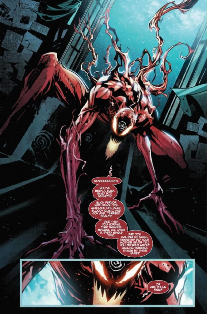
Back in 1995, Carnage met the Joker during a crossover. While they initially hit it off, what caused them to turn on one another was Joker’s insistence that murder was an art. When he killed, it was out of a sense of theatricality, an attempt to make a point about the cosmic joke. Carnage… didn’t. He just kind of wanted to do it. 27 years later, Carnage’s symbiote has found itself without its trigger-happy host, courted by a serial killer with artistic ambitions. So the question, then, is whether the alien will want a partner with the soul of a killer poet. But for those who wanted Cletus, don’t worry – a backup story has him doing what he’s always done best.
WRITING
As with, Carnage Forever, Carnage #1 (no subtitle) features three stories. A twenty page main story, a ten page backup story, and one page of newspaper-style gag strips. The main story is written by Ram V, following detective Jonathan Shayde as he pursues a serial killer who goes by the moniker “The Artist.” What quickly becomes clear is that the killer’s spree is all an attempt to court the Carnage symbiote, recently left without a human host. But the symbiote quickly reveals itself to have… different ambitions.
The original Carnage stories were written in a time where serial-killer investigation dramas were exploding in popularity, and the character always carried some of that with him. The many stories that try to go into Cletus’ mind have all opted for different serial killer clichés. Sometimes he’s begging for death, sometimes he’s a helpless child trying to exert control, and sometimes he’s simply a moral black hole, devoid of emotion. This first issue leans heavy on those influences by opening with a very classic Silence of the Lambs type set-up, a harried detective chasing an eccentric killer with a flashy theme, only for the symbiote to show up and admit it has little interest in what the killer has been doing. When the symbiote says it wants to find its own meaning rather than just doing what Cletus did, it’s rejecting the influences that have defined Carnage up to this point (give or take a few excursions into dark god worship). What does it want, then? The issue doesn’t answer that yet. It’s more a table-setting exercise for a new direction, starting by setting itself against what’s come before.
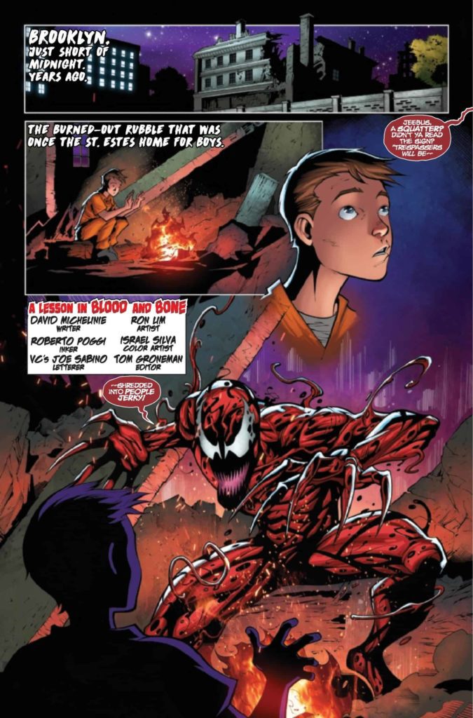
As a balance against Carnage’s new direction, we also have a backup story starring Cletus and written by Carnage co-creator David Michelinie, set during the character’s 90’s heyday. The story has a young child in Juvie try to recruit Cletus to murder some bullies that have been giving him trouble. Cletus agrees, but his spree rattles the child, who ultimately decides to stand up to the killer and decry his brand of bloody vengeance. While Ram V’s take on Carnage is influenced by Donny Cates’, who writes the character as a supernatural agent of chaos, Michelinie’s version is someone who really wants to be an agent of chaos. Michelinie has always written Cletus as a bit pathetic, which makes sense for a character who uses his power to hurt people weaker than him and literally nothing else. His Cletus is a blowhard big-talker who shouts his flimsy motivations to anyone who will listen. He even falls for the same trick he fell for many times in the 90’s – someone telling him “Since you’re an agent of chaos, then the most chaotic and unexpected thing for you do would be doing exactly what I want.” So naturally, he’s ultimately defeated in this story by being stood up to like a schoolyard bully. Carnage rules, up until he picks on someone with a backbone.
Finally, Ty Templeton gives two more newspaper-style cartoons on the final page to act as a bit of a palate-cleanser. After two stories of filth and murder, it’s nice to end on two cuter, bouncier strips about murder. His cartoons were a highlight of Carnage Forever, so I’m glad to see the tradition continuing strong.
ART
Francesco Manna starts the issue by cutting lose – reality tears apart and detective Shayde is stretched like taffy as a dimensional portal sucks him in amidst imagery of floating shapes and eyeballs. After that, he’s free to scale things back for a creepier, more grounded aesthetic. Caution tape, grimy warehouses, and rooms lit by a single open window. It’s a detective thriller. But as soon as Carnage shows up, expect more close-ups on molecules and magic portals- something colorist Dijo Lima gives an unearthly glow to. The second half of the issue involves Carnage using Hydro-Man as a conduit for the aforementioned magic portal, and Lima depicts it by showing Hydro-Man’s cool blues becoming overtaken by Carnage’s piercing reds. When they struggle against one another, the red and blue overlap to create a neat, 3d-glasses effect. It’s a moody, blue comic that sells its descent into chaos.
As for the backup, Rom Lim is someone who’s been drawing symbiotes since the 90’s, and his work with Roberto Poggi harkens to classic Carnage. Carnage is a writhing mass of red and black spaghetti strands wrapped around a muscular man like a suit. Colorist Roberto Poggi even gives him his pink void of a mouth. As opposed to Manna’s more moody and mysterious tone, Lim goes for a cartoonier aesthetic, complete with plenty of off-screen PG-13 kills. Poggi renders it all in bright reds and oranges – this is much more the Carnage you can imagine leaping from the pages of Spider-Man.
VC’s Joe Sabino letters both stories, and you can tell he’s having fun indulging in the occasional 90’s horror-style font for credit-boxes and captions. The bolding of some words helps establish the flow of the dialogue, which helps for a motor-mouth like Carnage.
Ty Templeton’s cartooning is effortless and bouncy. He effectively simplifies the writhing, slimy designs of the symbiotes into Peanuts-esque characters.
VERDICT
Carnage #1 is more than anything a statement of intent. The new series is moving past serial killers into more grandiose, cosmic horrors. How that will look is still unclear, but the previews given by the comic’s brief interludes into portal-induced madness definitely keep me curious.
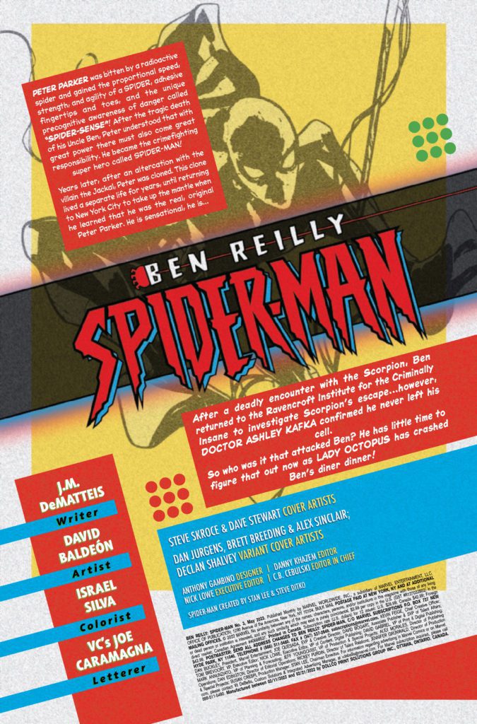
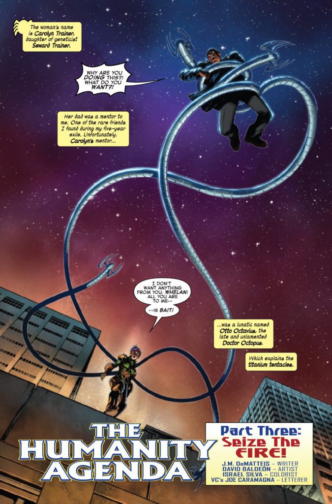
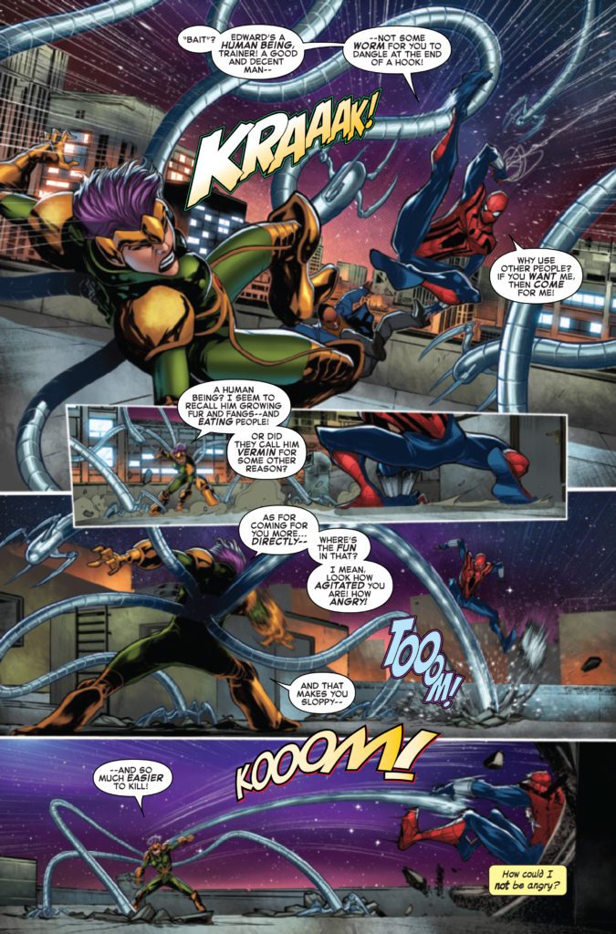
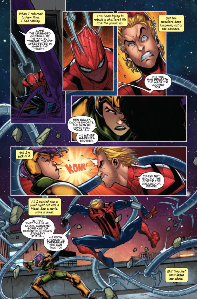
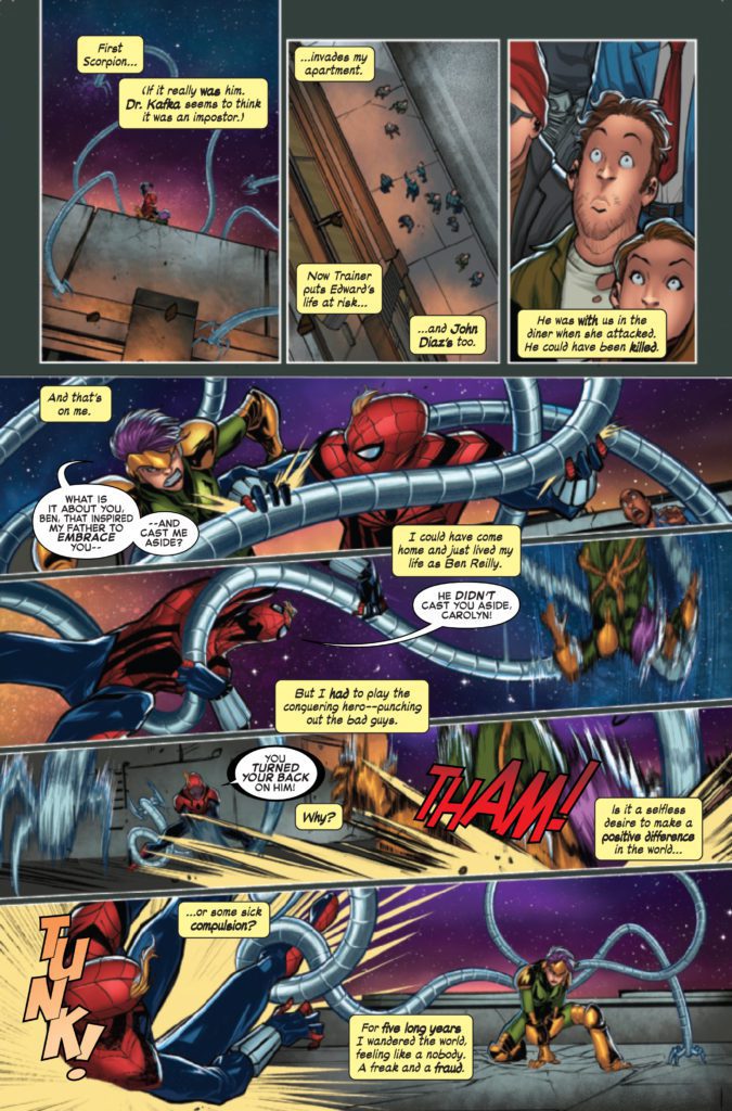
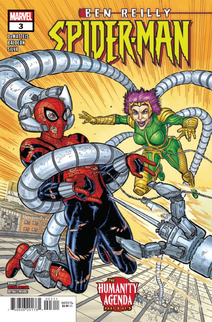
BEN REILLY: SPIDER-MAN #3 hits your local comic book store on March 23rd, but thanks to Marvel Comics, Monkeys Fighting Robots has an exclusive four-page preview for you.
About the issue: ENSNARED BY DOCTOR OCTOPUS! Jealousy strikes as Carolyn Trainer takes her anger out on Spider-Man! But who’s REALLY behind this cavalcade of villains? And is Ben ready to face that truth? Find out as J.M. DEMATTEIS and DAVID BALDEÓN bring the action – and heart! – you know and love in a Spidey story!
The issue is by writer J.M. DeMatteis and artist David Baldeón, with colors by Israel Silva, and letters by Joe Caramagna. The main cover is by Steve Skroce and Dave Stewart.
This series is an “untold story” from Ben Reilly’s past, taking place during his time as Spider-Man following the 90’s “Clone Saga.”
Check out the BEN REILLY: SPIDER-MAN #3 preview below:
Have you been reading BEN REILLY: SPIDER-MAN? Who is your favorite spider-person? Sound off in the comments!


 From Valiant’s official description:
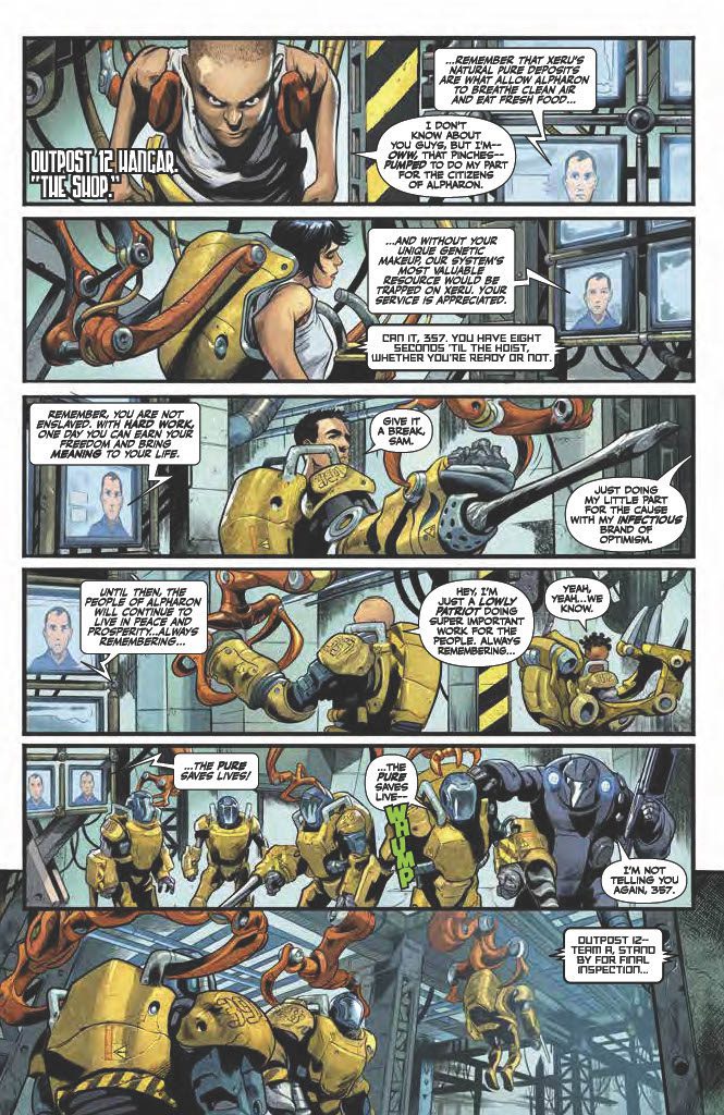
 Artist Manuel Garcia injects Armorclads #1 with an atmosphere similar to the Warhammer franchise. The titular Armorclads, for example, greatly resemble the iconic space marines. More importantly, Garcia and inker Raul Fernandez put special attention on the angles and viewpoints of characters. There’s a genuine sense of being overwhelmed whenever a character looks upward. This sense of a threat is color-coded by Rex Locus. The darker the antagonist, the more dangerous they are, in sharp contrast to the bright yellow Ironclads.


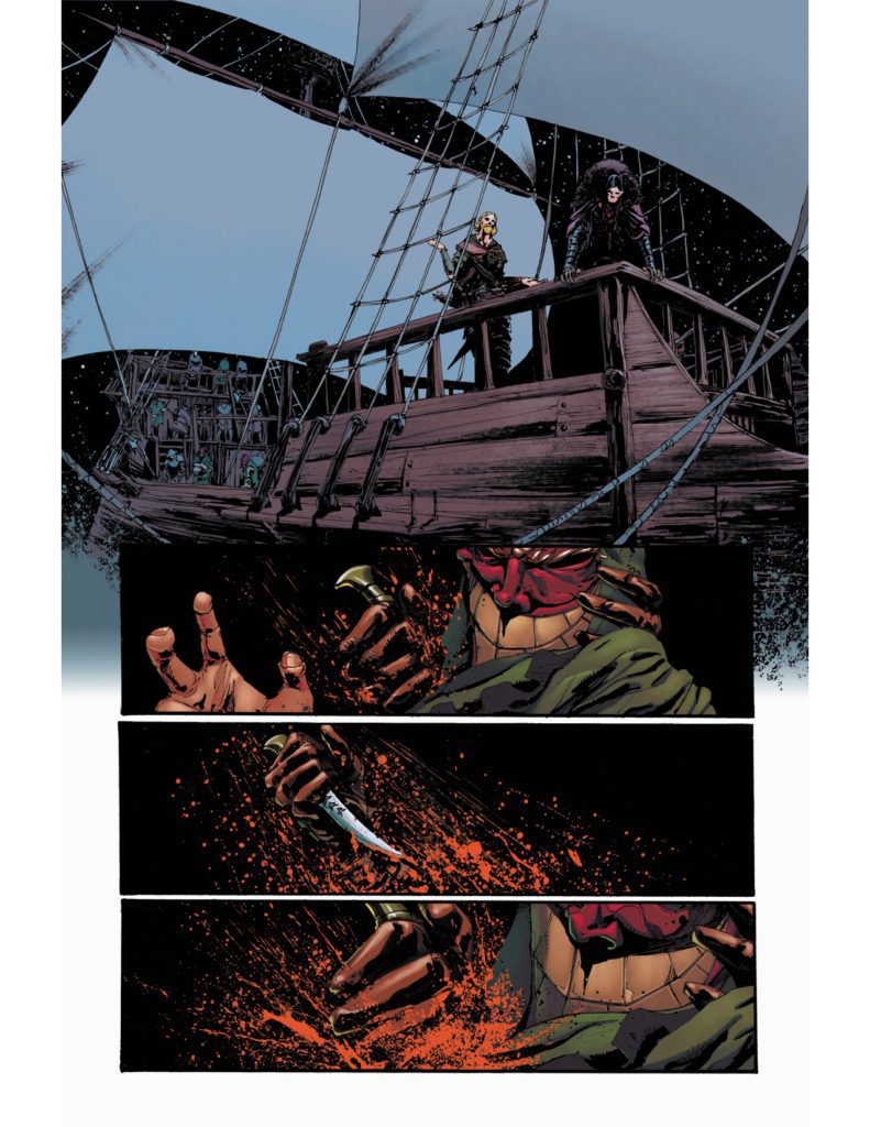 Shane Connery Volk’s artwork puts a tremendous focus on important situations. The most important plot points of Nottingham #7 manifest in panels devoid of background. It gives the feeling that everything else disappears, at least in juxtaposition with letterer Justin Birch’s placement of dialogue. Seeing only Lady Marian’s green eyes, red mouth, and the blood on her face in colorist Luca Romano’s black background makes her words twice as impactful.