Home Blog Page 67

Self-Published Spotlight: Sam Tsohonis’ The Transmigatory Adventures of Phillip K

Cover to issue #3

Welcome to Self-Published Spotlight, a regular interview column where I will be highlighting self-published comics and the creators and small print publishers who make them.


When you read as many comics as I do it’s hard to find something that challenges you, seems totally fresh and makes you see comics and creativity in a new light. Sure I love a lot of comics, but sometimes even the best of them can sometimes be easily compared to something else or pitched in one sentence. The Transmigatory Adventures of Phillip K. In The Land of The In-Betweeners is not like that. It’s a book that really does defy category and genre, a description that can also be applied to its creator, Sam Tsohonis. I’ve never read a comic quite like this one nor have to a creator like Sam. His book is as awesome as he is. Reading it and talking to him were both trips completely worth taking. So read this fantastic chat and more importantly check out The Transmigatory Adventures of Phillip K. In The Land of The In-Betweeners, because you will not be disappointed! 

Monkeys Fighting Robots: Sam, what’s your comic book origin? How did you discover comics?
Sam Tsohonis: The first stuff I got was off the newsstands, as a kid back in the 80s. First the occasional Marvel Star Wars books, and then GI JOE—which I was mostly into just for Snake Eyes and Storm Shadow. Then everything opened up when I discovered Wolverine. I think it was either Uncanny X-Men #239 or Wolverine #1 (the ongoing series) that I bought first, and I was hooked on X-books after that. I’d always been onto drawing, but that was when I first began to take the idea of developing the skills to do comic book art seriously. In high school I got into music, and I wanted girls to take me more seriously—and like a lot of fans who were reading comics at the time, I got a little disappointed after following my favorite creators over to Image, as the stories weren’t quite as good as they were at Marvel. But I was also disinterested in Marvel books, after all the Image crew had left. But mostly because I was associating my artistic impulse with my inability to get girls as a kid, I stopped reading comics and drawing for some time. Of course many of us still remember, society was fairly rough on comic geeks back then! I came back after somebody convinced me to check out Preacher. Then I became more interested in Vertigo books and stuff like that.

MFR: Preacher is a goodone, it’s what brought me back to comics also.
ST: Yeah, it hits a lot of good spots!

MFR: When did you decide you wanted to create comics? Was there a specific moment or book?
ST: Yeah I think it was Marc Silvestri and Dan Green’s work on Uncanny X-Men, followed swiftly by Lee and Williams when they took over. I felt an immediate kinship to Silvestri’s style. It felt fast and furious, and he didn’t worry if a leg and foot were somewhat rough or suggestive. I see now that it helped me to access my own gestural energy when I was drawing. But soon I would be agonizing for a while as a kid over my inability to understand how to do the Lee/Williams feather-shading and linework, and trying to challenge my inner architect to surface, get things precise and clean and accurate—and that’s remained pretty strong, except for when I get bored or in a hurry. I can redraw a figure a million times before I settle on what I want. I also dug Liefeld and McFarlane a ton, and I was also checking out Ron Lim’s stuff. Sam Kieth was another big inspiration, though more for his rendering than the exaggerated forms he drew. I remember not liking BWS as a kid because he drew noses too long, which I saw as an especially embarrassing weakness because I’d already become aware that was a tendency I had, too. And Art Adams always felt like he was drawing action figures or something—and it’s funny because now those two are some of my favorite artists! I was an arrogant little kid! Like, I just stare and stare at Art Adams’ work, now. He has such a gorgeous style, the way he uses crosshatching with such subtlety and control…

Art by Sam Tsohonis

MFR: When did you create your first comic?
ST: In college I started working on a postapocalyptic thing called Easterwest, which I ended up finishing 24 pages of in 2004. It was black and white, and I was smoking a lot of pot and the ink work turned out REALLY sloppy, while I remember having taken some real time to carefully draw the pencils. I think I got in a hurry to get it done and sorta ruined it. Then it was maybe five years before I gave it another go, and I did about 12 pages in color and sent it around but got no responses, and sort of gave up for a while to do some different creative projects. That was 2009. I still want to do that story, but since then ‘East of West’ has become a property, which is too close to Easterwest, so now I have a different title in mind. I started drawing Philip K a few years before I started working on those early Easterwest pages, though. Except I always thought it would be an animation. The first drawings I did of Philip K and his pals were in colored pencil in fact—I think I might get Sam J Royale to do a cover when it comes time to do the graphic novel compiling issues 1-6, because his style of rendering is actually really close to what I first envisioned, though I wasn’t really very skilled with colored pencils.

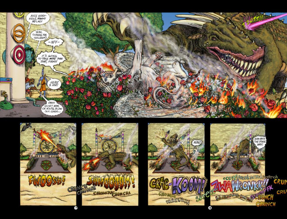
MFR: So currently you are at the tail end of a Kickstarter for issue #3 of your excellent comic, The Transmigatory Adventures of Phillip K. In The Land of The In-Betweeners. For those folks who haven’t read the book yet, what’s your elevator pitch for it?
ST: Well, it’s ‘Defending Your Life’ in Toontown. Basically a guy dies and he gets to this ‘other place’, a different reality so to speak, but it ain’t Heaven or Hell. and he’s ultimately working out the issues that affected him in life, but he has a sort of vague connection to what life was before—hence the sort of generic elongated smiley face he has.

MFR: From reading your backmatter in the first issue, I loved reading about the journey of creating the story as well. Can you share that with our readers?ST: Well, that really is a long story. In this first story arc I’m doing I’ve doubled down on the woo-woo stuff, but the original Philip K story in my head always involved him and a girl, and trying to impress her. Before it was really a story, though it was a song. I had a cassette four-track recorder in 1997, and my friend Jozef and I started recording tunes together in my parents’ garage under the name ‘Purr 17’. I had been drawing Philip and one day started making a song about him. I don’t think anybody else played on that four-track tune, even though it appeared on our first cassette release ‘Eunuch Dong’ and we played it live, the handful of times we played concerts. At that point it was just about ‘Philip in the Land of the In-Betweeners’. And in the original lyrics he’d actually killed himself, out of sheer curiosity about what happens when you die. It’s significant to issue 3 in particular because a big inspiration in my life at the time was this guy Pythagamus Toadstool (he’d legally changed his name), who’d introduced me to the Church of the Subgenius and a lot of other fun, weird stuff. He was also releasing lo-fi albums on cassette; had just moved to my hometown Wenatchee, from Los Angeles. I think I was reading the Book of the Subgenius when I first started drawing and imagining Philip K, and now the Subgenius mascot/figurehead J.R. “Bob” Dobbs is appearing in issue 3 as a character! Throughout college I was drawing Philip K in ballpoint pen a lot, and writing little entries in my sketch journal when I had new ideas about the plot. Most of the projects I did in the couple years of Animation studies I pursued in college featured Philip. Although on the first day of animation class at Evergreen, my professor Ruth Hayes told us all that while she was going to teach us how to animate our drawings, if we wanted to tell our own stories through animation we needed to learn how to WRITE. My undergrad career was a drawn-out smorgasbord of different creative studies, but I did take a significant amount of Creative Writing courses throughout the span of it. I would come back to it throughout my adult life, when inspiration hit, but it wasn’t until years after college when I finally wrote a couple of drafts of a screenplay for a full-length animated feature of Philip K—the first in 2014, when after ditching my failed graphic design career I was hopping trains and hitchhiking back and forth between Los Angeles and Albuquerque, and working for my bed in hostels (sounds like a story of ruin but the year was actually incredibly therapeutic).  The original script barely has any resemblance to what has happened in issues 1-3, other than his trippy death sequence, the desert and meeting Big Fish at Small Pond. I think that all happened in the first 15 pages, in fact! And the only mystically- or spiritually-oriented figures he encountered were other tweens, who had no reference to the culture of the real world (or the Great Before-It-All, as it is known in the Between-Lifes). It was more about this princess who he’d become obsessed with, and whose only interest in him was to use him when it suited her. And a different girl he completely ignored, that was actually good for him. And a whole bunch of other cool, silly stuff. And while my intent is definitely to get into a lot of that content, eventually, I wanted to take more time if I was going to do a comic, and stir up the idea of ‘Gods and Heroes (and even fictional characters) walking among us’, and just give it a more mystical sort of foundation before delving into this other stuff, where he chases around a rather abusive and manipulative princess, and gets in trouble from her dad, and gets in trouble from Judge Knott, and the Council of wise Guys, and constantly has these red balloon manifestations harassing him and pissing other Tweens off. By the end of issue 6, my plan is to have him in a position where he can start having some version of the adventures from that script, and maybe by that point, I’ll be able to get the book with a publisher, and maybe pay some people to ink and color so I can get it out on a more regular basis!Art by Sam Tsohonis

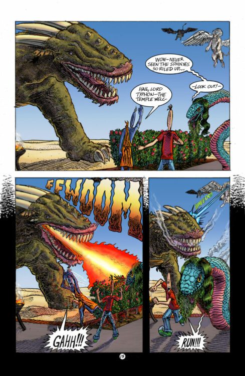
MFR: One of the most interesting things that stood out to me was the juxtaposition of Phillip K., who I read as a very innocent and sweet character flung, violently I should add, into this bizarre world. That pairing works so well. Did you intend for Phillip to come across as innocent and if so, what made you make that decision?
ST: That’s definitely the case, although I hope to reveal greater complexity as the story goes on—like, the Meanie-Balleenies, these little red balloons that show up in issues 1 and 3, they’re manifestations of his anger, which he’s always bottling up for the sake of remaining positive. There’s a subtheme there that is sort of known to me, but I’m also letting it play out. He might find by the end of his story that he’s not as perfectly good as he thought, not that I would have that read as any kind of condemnation, or anything.

MFR: There is also a free-flowing, almost dreamlike path the narrative has. Do you use dreams or other meditative thinking to explore or help create your stories?ST: In my late teens and early twenties I spent a lot more time trying to meditate, and maybe during the era when I originally started drawing him I was having some kind of uncanny dream experiences that stuck with me. And since High School, I’ve been an off-and-on indulger in psychedelic substances (or Entheogens, as we say when we want to sound sophisticated about it), which have definitely influenced the way I perceive the world and its shape. Although I have been on a hiatus from that stuff, in hopes of opening up again to more significant experiences in dreams—sometimes I feel like maybe the two paths are at odds, you know, the path of augmentation or that of purely internal mystical self-reliance.

MFR: Also I love how Phillip K, with his elongated head, is a drastically different visual than any of the other humans we see in issue one. Was this always the case, for Phillp to, for lack of a better term, have a more cartoony look?
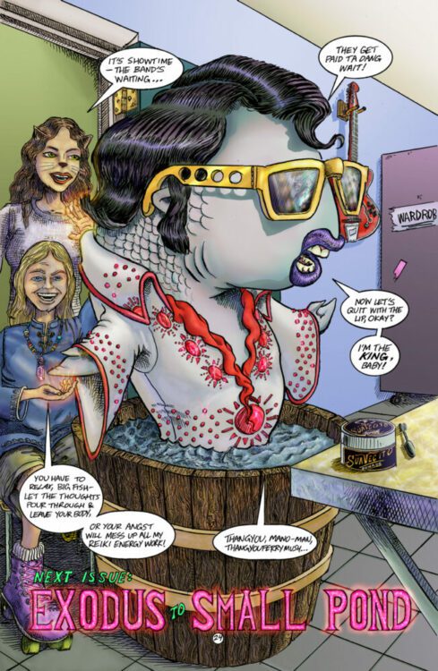
ST: Yeah, it was always my intent to have him like that and then to have all the other characters fill in the spectrum from realistic to their own version of cartoony. Some tweens are sorta boring and lifelike, not very changed from their original living form. And some are straight-up comical in the way they look. Sammy Sourpuss is a character with a lemon for a head, and he’s a bit of a wet blanket most of the time. There will be other characters that have a similar structure to Philip. the princess does, and then the apple of her eye—basically just a much cooler version of Philip named ‘Wavy Phil’. They should both show up, at least briefly, by issue 6 but they’ll play a big part of the story as it goes on from there.Art by Sam Tsohonis

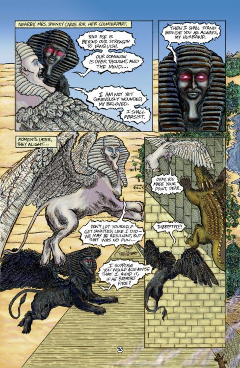
MFR: Also I love that you include backmatter, letters from readers and process notes and art in the book. Not enough of that in comics. What made you want to throw that stuff in?
ST: I guess it’s just that self-indulgence one gets up to when they have finally put together a real comic book for the first time—I just wanted to have it feel like the trappings of all the comics I grew up loving as a kid. I hope to get more stuff like pinups from other artists, etc, but the last year has been economically challenging to me, to say the least, so I couldn’t really solicit any of that. I’m a bit bummed that I didn’t receive any letters from issue 2, but I’ll write something on that letters page, all the same. Issue 3 will have a couple character sketches I did of Z-Ra and Mano-Man, who cameo in the end of issue 2 but play a bigger role in 3. They’re actually based on my friends Chelan and Israel’s kids up in Seattle. Chelan backed the Kickstarter of issue 2 with the option to have a character appear based on somebody from life, so they’re astrally projecting into the Between-Lifes. And I’ve been sending comics to Dave Sim to get his take, and he responded to a drawing I sent of Philip and Cerebus hanging out together with his own drawing of the two, so that will also appear. I’m not very closely aligned with a lot of Sim’s takes on the world, but I was definitely inspired by some of the earlier Cerebus stuff when I started envisioning Philip K, so to have a drawing of my character by one of the most accomplished indy creators of all time is pretty exciting.

MFR: Speaking of process, what is yours? How do you put pen to paper? Is it digital? Analog? What tools do you use?
ST: presently I’m doing pencils and inks of linework and lettering on paper, and then coloring in Photoshop. I have this 13″ XP-Pen tablet hooked up to a 2010 Macbook stuck in El Capitan (which is maybe getting ready for the glue factory), and there are some buggy-ass things that tablet does, but so far I’ve made it on the gear I have. I got in a hurry with issue 3 so I didn’t pencil as thoroughly as I wanted to but with issue 2 I really took time going through drafts of pencils, beginning with thumbs and then roughs at comic size, and then a final set of pencils on 11×17 printer paper. For each stage of the pencils I would scan in, render in blue line, print out on the next size and tighten pencils in graphite over the blue. And finally, I printed the final pencils onto the Strathmore 11×17 bristol for inking. I REALLY liked the way inking went with that because I have a hard time keeping the page from getting messy with pencil smears and half-erased lines. It was the most aesthetically pleasing inking experience I’ve had to date. It does suck though that an issue of blue lines seems to go through an entire Cyan cartridge in my Epson WF-7280. For Inking, I’m mostly using a Hunt 102 nib, and a pentel pocket brush for fills. I use a lot of the ’10’ size white gel roller pens that are out there, but the smaller sizes never seem to work like I want. I’ve also gotten into using a brush with DR Martens pen-white but I only like to use that as a final touch, as it doesn’t take a crowquill very nicely at all if I want to run black over it again. I’ll probably get some white acrylic paint at some point, as I gather that’s where a lot of artists end up with the quest for the right white media.

MFR: Let’s get into issue three. What can we expect? And did anything change in how you created each issue, especially this one?
ST: Well, like I said I got in a bit of a hurry with this one. Some of the pencils were somewhat loose this time, and I did them live on the final inking surface as opposed to the method I described from issue 2. And I used crow quill to letter instead of a micron—I just end up erasing too much when inks are down to use tech pens, they almost inevitably get half-erased and need to be redrawn when I use them. As far as content, there are a lot of dead celebrity cameos, and a lot more characters interacting in general. I reread issue 1 and it feels very slow and still, compared to what I’ve been doing since. But I sort of wanted that feeling for the beginning, when he’s wandering the desert. I think it will make the collected version of 1-6 read with a more dynamic sense of pacing. Even though the pencils were looser I think I did even more detailed rendering in much of the inks, and in general issue 3 seems to continue the trend of tightening up the art, as I’m finding my real style and flow as a comic illustrator.

MFR: What’s the status of the new book? I know the Kickstarter campaign just hit its funding, so congratulations on that. But where are you as far as the creation of the book?
ST: I’m coloring it now, with the goal that by the time I see the money in my account it will be ready to send to the printer—I’ve come to the point where that seems a workable point from which to launch, although I think my Kickstarter campaigns could look flashier if I had color images of the pages to share! I might still be coloring another week or so after the campaign ends, realistically, but I don’t probably have to tell your readers what a slog it is doing every goddamn piece of the work yourself! I try and keep a regular routine going on but I must admit allowing myself to get distracted by what I have playing on the TV sometimes. I think I’d go a little nuts if I didn’t have that going, though—It’s funny because when I write, I just like to have instrumental music in the background, and I can go for hours on end that way, but when I’m drawing I really crave that narrative content on a screen, even if I’m not looking at it.

MFR: And finally, where can people find your work outside of the comic?
ST: I’ve done a lot of different stuff over the years, but only so much of it is very available to view. The main thing is, people should check out the issue 3 Kickstarter here—there’s also some original art for sale at my portfolio site, tsohonis.com (and you can find links there to other stuff I have going online) and back issues of Philip K for sale at mnemoniccomics.com.

Art by Sam Tsohonis
Monkeys Fighting Robots Youtube

AfterShock Comics Exclusive Preview: BULLS OF BEACON HILL #2

aftershock comics exclusive preview bulls of beacon hill

BULLS OF BEACON HILL #2 hits your local comic book store February 22nd, but thanks to AfterShock Comics, Monkeys Fighting Robots has an exclusive five-page preview for you.

About the issue:
Boston Surgeon Christopher Boldt is getting more famous by the day – but that’s the problem. Chris’ secret doesn’t just threaten himself, it threatens the person he’s ashamed to say he’s related to: his mobster father, Orin Paige. After all, in the hyper aggressive world of Boston crime, Orin having a gay son makes him look weak. So, he does the unthinkable, and puts a hit on his own son. But he never expects the hit to fail.

The series is by writer Steve Orlando and artist Andy MacDonald, with colors by Lorenzo Scaramella, and letters by Carlos M. Mangual. The main cover is by MacDonald.

Check out our BULLS OF BEACON HILL #2 preview below:

aftershock comics exclusive preview bulls of beacon hill

aftershock comics exclusive preview bulls of beacon hill

aftershock comics exclusive preview bulls of beacon hill

aftershock comics exclusive preview bulls of beacon hill

aftershock comics exclusive preview bulls of beacon hill

aftershock comics exclusive preview bulls of beacon hill

aftershock comics exclusive preview bulls of beacon hill


Did you check out the first issue of BULLS OF BEACON HILL? Sound off in the comments!

Monkeys Fighting Robots Youtube

Review: Knock at the Cabin joins Shyamalan’s list of classics

M. Night Shyamalan has returned with another thought-provoking piece, Knock at the Cabin. A film that relishes in building tension while also providing viewers with a great group of characters to invest in. Shyamalan has garnered a reputation for being hit or miss but as a fan of his work, I’m proud to say this was one of his best outings since Split. In true Shyamalan fashion, Knock at the Cabin keeps you on edge and makes you feel every emotion.

Based on the novel by Paul Tremblay, Knock at the Cabin is a terrifying exploration of humanity, faith, and trauma. Three ingredients one would tend to find in any Shyamalan project. On a technical level, Knock at the Cabin is almost perfect, but the story can sometimes drag. Thankfully, a talented group of actors enhances the narrative that unfolds, especially Dave Bautista. Knock at the Cabin follows a young girl named Wen, and her two fathers. During a getaway, Wen and her parents are confronted by four strangers that want their help to prevent the apocalypse.

Shyamalan co-wrote this terrifying story alongside Steve Desmond and Michael Sherman. Knock at the Cabin stars, Dave Bautista, Jonathan Groff, Ben Aldridge, Nikki Amuka-Bird, Rupert Grint, Abby Quinn, and Kristen Cui. Cui stars as Wen, a young child who is forced to face an unfortunate reality with her parents. Eric and Andrew, played by Groff and Aldridge, are Wen’s parents. Together they must choose which one of them will die to stop the apocalypse. Up until that decision, the film does a great job at developing this trio. Eric and Andrew both have different outlooks on humanity, and we learn this through various flashbacks.

There are enough layers pulled back that help give their decision emotional weight later on. As for our intruders, Bautista plays Leonard, a school coach who has a big heart but must make an unforgivable choice to save humanity. Leonard has brought three other individuals with him. Redmond (Grint), Sabrina (Bird), and Adrienne (Quinn), all appear to be sharing a delusion. Shyamalan is able to tell a compelling story that challenges your perspective with each new possibility proposed by Andrew, who doubts that the apocalypse is near. There are some twists that don’t completely work but do provide more depth to our trio.

A few exposition dumps can weaken the tension because it contradicts previous events. The film can feel tonally uneven, specifically early on during comedic moments that don’t fit. Once those are gone, Knock at the Cabin becomes a tense and stressful experience to endure. Perhaps the constant closeup shots might grow tiresome, but the camerawork overall is very impressive. Bautista’s performance is tremendous from start to finish. Leonard’s inner sorrow and regret are conveyed in a profound way that makes him easy to feel sorry for.

It’s also what continues to challenge whether you believe these intruders. Shyamalan was also able to secure yet another excellent child performance. Cui, Aldridge, and Groff all had terrific chemistry that made their family dynamic believable. When the movie isn’t becoming incoherent with its desire to explain, the family at the center keeps the story afloat thanks to the performances enhancing the characters. The pacing isn’t perfect, but the important sequences are able to breathe, letting the viewer feel the emotions involved with the story.

Knock at the Cabin is sure to be divisive like several other Shyamalan projects, which is fine. A new Shyamalan film always sparks a discussion amongst moviegoers before and after its release. This latest outing is an effective exploration of humanity, drenched in constant tension that swells to an emotionally draining conclusion. I’m certain the symbolism that exists throughout the film will allow it to be considered a hit by most viewers.

Monkeys Fighting Robots Youtube

Self-Published Spotlight: Jonathan Thompson on NIGHT OF THE COMET

Cover to the over-sized editon.

Welcome to Self-Published Spotlight, a regular interview column where I will be highlighting self-published comics and the creators and small print publishers who make them.


Jonathan Thompson is no stranger around the MFR headquarters. I try and talk to the prolific scribe anytime he’s dropping a new project. But this talk is unique, as Jonathan is taking one of his best books, NIGHT OF THE COMET, and bringing it back bigger and bolder than before after a somewhat bumpy road that led to and from a publisher and back to another Kickstarter campaign.   So like the titular comet of the book, I scoped out its path and hit Jonathan up just in time for the launch of the campaign.  So read on and make sure to support the campaign, because this book is going to look incredible in this new format.

Monkeys Fighting Robots: So Jonathan, when Night of the Comet originally came out, I actually only spoke to Attila Schwanz, the artist, about it. That’s when the book was going to be called The Killer-In The Dead of Night.  You and I never actually talked about this book! So from your perspective, how did the project initially get rolling way back before the original kick starter was successful?Jonathan Thompson: I guess we didn’t. It started with me seeing a cover by Attila from his book SYMPOSIUM CLUB out of Italy. I got in touch with him through a mutual acquaintance and he forward me the book. What I saw inside blew me away. It was raw and insane and I knew I wanted to do something with Attila. Fortunately, he felt the same.

MFR: This book has already been published through a successful Kickstarter and has had a turbulent path toward being published recently. Can you tell us what happened with Source Point Press?
JT:
You know, I wish I knew the truth. I can only speculate. We ran a Kickstarter almost two years ago to create the book. As Kickstarters go you tend to ask for less than you need to get it across the finish line. We got it across the finish line by the skin of our teeth but it still left us in the red. We were in early talks with SPP because they put out my first book (Tales from the Dead Astronaut). They liked the book and we signed a contract for it. Then it seems like the company underwent a leadership change. But, I had faith because I have faith in the book. When we ran the Kickstarter a lot of top creators saw the pages and supported us. That support turned into some amazing pull quotes from Martin Simmonds, Cullen Bunn, Ho Che Anderson, Rich Douek, and Michael Conrad. All creators who’s work was in line with what our book is. For SSP that didn’t do enough for them to get the orders where they need to be. I can understand that. Attila and I are unknown creators. It’s harder to get a comic shop to say yes to half a dozen copies of a book like this to start. But, maybe that lies with the pre-order process. Relying on a book to do big numbers on the first Wednesday might be flawed thinking. This is a book that should be discovered. Readers lack that chance of discovery if it’s not on a shelf. I don’t blame SPP for not getting our pre-order numbers in the place they need to be. I think there are too many factors at play. It was just disheartening to have our emails ignored for all of Dec/Jan leading up to when I was asking about order numbers. If we had known what trouble we were in, then we would have known that we needed to take our promotion to another level. But, we found out our book was canceled the day before it was supposed to release. We spent over a year anticipating our book to see a wider audience and were smacked in the face by finding out like this. So we dissolved the contract and took the book back. On Kickstarter selling 200 copies is equivalent to selling 5k copies through traditional publishing. And we can put the book out the way we want, which is why we are doing the European-sized hardcover through this print run. (only 100 copies though!) I’m not a publisher. I’m a creator hoping to entertain and delight readers. So, most likely this is the last print run that Night of the Comet will have.

MFR: Wow, that’s quite a path! So are you adding anything to this edition? I mean I’m sold on the larger edition because these pages need to be seen like that. It’s fantastic work. But any extra goodies you and Atilla are tossing in?
JT: 
Well, the hardcover I think is the best showcase for Attila’s work. It’s big and loud and a glorious (or rather gory) way to display the art. We’ll load it up to 100 pages with a 12-page Diary of a Madman piece Attila did, a photo gallery of what Attila’s painted pages look like, and an interview talking about the process of making the book. The campaign will also have a standard trade paperback version with a different cover. Pretty much the version of the book that was supposed to come out. All backers will get a pinup print that Martin Simmonds did for us which is a neat bonus from a creator who loved our book and wanted to support us. Plus, you can grab a lot of my back catalogue of books like Burn Residue #1, Airplane Mechanics, A Game of Doubles, and the soon-to-be-released ALL IN.

Cover to the soft-cover edition.

MFR: Getting all those other books is a true reward. That’s a badass move. So how would you describe the book to someone who hasn’t read it yet? Plots, themes, good stuff like that.
JT: You’re right, maybe we should actually talk about the book! So, NIGHT OF THE COMET takes place in a cliff-top mansion of an aged samurai, run down from a life battling against a yakuza mob trying to take him out and prevent his mass surveillance system. Tonight is a special night for the samurai as it is the anniversary of his wife’s murder by the hands of the yakuza and also the night with a particular comet will pass by signaling a gateway to the underworld. The Yakuza has a plan, too, they’ve set their most vicious killer, a blood-hungry maniac in sunglasses after our hero. I like to think of it as a Batman vs Joker story!

MFR: Now that you mention it, having read the book a few times, I totally see that Batman and Joker dynamic. Damn good job (laughs).
JT:
Our main inspiration was Arkham Asylum from the art to the tone.

MFR: I was about to ask about that book specifically. What else served as inspiration?
JT: 
I’d say Blue in Green was one that stuck out to me. Same with Department of Truth. I was trying to find books with more abstract art and try and find a new way to tell a pretty classic story.

MFR: I just started reading Department of Truth and totally agree. As a writer how do you approach something that you want more abstract art for?
JT:
Honestly, my scripts got looser. I knew I could trust Attila to run wild.

MFR: Anything final you want to add or share? Maybe mention something I didn’t touch on?
JT: I just want to say if you grab a copy of our book during this campaign you won’t be let down. You’ll find a story filled with heart as well as terror. It will delight you. Make you smile with every page turn. You’ll spend time with each page too. Maybe after you’ve burned through the story you’ll go back and you’ll gaze into the depths of Attila’s beautiful work. It will be a treasured book on your shelf. I hope you enjoy it and love it as much as we did creating it.
JT: Thanks, man!
You can find and support the Kickstarter campaign here.
Monkeys Fighting Robots Youtube

Storm & The Brotherhood Of Mutants #1 Gives Us A Glimpse Of The Future

With the takeover of Mr. Sinister in Sins of Sinister #1, life for mutants has been rough. This week sees the release of Storm and the brotherhood of mutants #1, which follows Storm and her gang on a quest to save mutants. Life for the mutants has been altered, Arrako is gone, but Storm fights on with a rag-tag group of survivors. Dangerous alliances are formed, lives are lost, and Sinister is still a cocky jerk. This issue is written by Al Ewing, the regular writer on X-Men Red. Paco Medina on pencils, Jay David Ramos on colors, and Ariana Maher on letters are joining him on this journey.

WRITING

Storm and the brotherhood of mutants #1 is kind of a big issue because it is the first comic released after the alpha issue. Al Ewing had to reel readers and give them faith in the event. With this issue, we get the introduction of some new characters, Ironfire, and some older characters who have changed their appearance, like Cable. This issue takes place ten years in the future, so things are altered. We don’t know everything that has happened between the present and the last ten years, but Ewing does fill in some gaps. What works best for Ewing on this issue is the voice he gives everyone. The characters feel genuine, like Mystique still being a conniving mutant out for herself. The introduction of Ironfire is a welcome addition. Ewing uses him to fill the tough guy role in the group, and he comes off as Storm’s right-hand man. We know very little about him, but he is an interesting character. Ewing uses this issue to set us up for what is coming next, but by the end of the issue, you’ll have to question what that is. Storm and the brotherhood of mutants #1 is a good issue to move the event forward. With the way the issue ended, anything is possible for the next.

ART

Paco Medina handles the pencils for this issue. Few artists in the industry can draw a book as flawlessly as Medina does for this book. Everything from the action panels to the smirk on Mystique after she gets attacked looks excellent. On one page, as Ironfire and Mystique tussle, Medina sets the panels slightly slanted. This is used to surprise the reader, much like the action on the page. Medina gives us big pages of battles, like Sugar Man attacking our heroes or a fight with some Chimeras. Everything about the pencils in this issue seems well thought out and plotted. Medina knocks the pencils out of the park on this book.

The colors by Jay David Ramos play just as important a role as the pencils. Ramos has to bring what Medina lays down on the page to life with colors. The colors compliment Medina’s style and allow those images to stand out and pop. Whether it’s using darker backgrounds to show how dark the world has become or bright blue as the team teleports. Ramos makes sure to make mutant powers vibrant as they are being used. When Ironfire unleashes his bolts from his arm during an attack. Ramos uses a stunning reddish-orange color as they fly toward the reader.

Ariana Maher does the letters. Word balloons are placed well and never interfere with the images on the page. Maher places them high enough and out of the way, but they are easy to read as your eyes can slide to each word bubble. I would have liked more sound effects when powers are used, but Maher gives us a nice “CKRAANK” as Storm uses her powers. Maher does a fine job with the lettering and gets better every time she takes on an issue.

CONCLUSION

Storm and the brotherhood of mutants #1 is a good introductory issue to the series. Al Ewing played to his strengths and gave each character a good voice and personality. The pencils and art couldn’t have been better than what we saw in this book. Storm and the brotherhood of mutants #1 is available at a comic shop near you!

Monkeys Fighting Robots Youtube

Review: PHANTOM ROAD #1 – Haulin’ On A Haunted Highway

From industry mega-talents writer Jeff Lemire (Sweet Tooth, Gideon Falls) and artist Gabriel Hernandez Walta (Vision, Sentient) comes a horror story about 18-wheeling down a desolate, monster-filled road in Phantom Road #1. Featuring colors by Jordie Bellaire and letting from Steve Wands, Phantom Road is a great concept that starts off exceptionally well, this new series published by Image Comics promises another great experience full of terror from the publisher. With a tight, tense script and atmospheric visuals, this is a great start to this new horror series.

“Dom is a long-haul truck driver attempting to stay ahead of his tragic past. When he stops one night to assist Birdie, who has been in a massive car crash, they pull an artifact from the wreckage that throws their lives into fifth gear. Suddenly, a typical midnight run has become a frantic journey through a surreal world where Dom and Birdie find themselves the quarry of strange and impossible monsters.”

Writing & Plot

Over the course of his career, Jeff Lemire has steadily built himself up as one of the comics medium’s premier horror writers, and this trend continues with Phantom Road #1. Lemire has always had a knack for pulling unique horror scenarios out of a hat, and this opening issue contains one of his most intriguing premises yet. The basic concept – driving an 18-wheeler hauling a weird artifact in a parallel dimension’s highway while being chased by monsters – is stupidly enticing. As insane as the core premise may sound, Lemire manages to ground it via his sharp characterization. We get just enough of Dom and his backstory to make him relatable and feel like a real human being. His somber mannerisms and speech make his reality as a lonesome trucker with a bit of trauma feel palpable. Throwing a person that feels so real into such a genre twist makes the story all the more exciting. Being an as well, Lemire knows how to let the visual work do the talking. There are plenty of wordless panels where character expression, environment, or the reveal of some ugly monster does all the work with no words needed. Lemire’s dialogue sensibilities feel very natural and make the readers feel more at home with the characters we meet – as well as let their reactions to the change of setting feel more real. This first issue is a textbook example on how to open a great horror story.

Art Direction

Phantom Road #1 is graced by the distinct, nuanced visual direction of Gabriel Hernandez Walta. Walta’s thin pencils and detailed inks go on to create memorable character design, genuinely unnerving monsters, and a setting that feels real and lived in. His subtle approach works perfectly with Lemire’s lack of dialogue in many places, as Walta takes advantage of the comics medium’s visual storytelling with stellar sequential direction and distinct artistic touches. There’s a great recurring image that he uses where Dom’s reflection can be seen in the windshield of his truck as he drives. Dom is literally reflecting on himself as he reflects on his past while driving down the highway, living the often very lonely life of a truck driver. Walta nails the subtle simplicity of regular existence in truck stops and diners before pivoting to the horror elements. This opening issue is pretty light on actual monsters and horrific reveals, but like all great horror, it’s about quality over quantity. The opening monster reveal is shocking and memorable enough to stay in readers’ minds long after they close the book while keeping true terror fanatics excitedly awaiting what else Walta has cooking.

Veteran color artist Jordie Bellaire creates a hazy, dust-filled atmosphere that captures the feeling of driving on a desert highway. This effect also manages to capture that sense of isolation felt by Dom as he travels. This alters though when he runs into Birdie, as Bellaire lets up on the haze to capture the jolt of weirdness that takes us into the monster-filled new reality. The hazy effect becomes grayer and more fog like, resembling the visual atmosphere of Silent Hill in a way. I focus on Bellaire’s use of dust, as it alters the color approach to every surface in the comic. The color palette tends to veer closer to the darker, more saturated ends of each tone, making for a rich but grounded visual experience in every panel. The lettering from Steve Wands is a mixture of legible and dynamic dialogue lettering and subtle yet standout SFX work that punctuates every scene. Overall, the artistic storytelling in this opening issue is a stellar representation of how to tell a character-centric horror story.

Verdict

Phantom Road #1 is a thoughtful and unique new horror chapter from two of the industry’s most acclaimed creators. Lemire’s script gets the reader affiliated with Dom with careful characterization before dunking us into the genre twist, all while leaving plenty of space for the visuals to do the storytelling. The art by Gabriel H. Walta and Jordie Bellaire is atmospheric and detailed, providing an engrossing setting and unnerving creatures to keep readers glued to the book from beginning to end. Be sure to grab this debut issue when it hits shelves on March 1st!

Monkeys Fighting Robots Youtube

Project 365: One Comic Every Day, Week 6

comics
One Comic a Day - box of comics

The premise is simple: read one comic every day for the entire year. It seems like a simple task but there is no way that I read 365 comics last year, even if you count the individual issues in collections. So, this year, I am committing myself to this reading challenge, in the hope that I can broaden my reading habits and fully engage with my favorite hobby again.

Get the Danny Elfman soundtrack on and the face prosthetics ready because it’s Dick Tracy week.

Starting as a newspaper strip in 1931, Dick Tracy, created by Chester Gould, soon became a success with spin-off radio shows, movie serials, comic books, and a plethora of merchandise. The tough detective fought a range of crimes with the same no-nonsense adherence to justice, even if his methods were occasionally brutal and single minded. The strip represented Gould’s beliefs and was a reflection of his own tough stance on crime. It employed real police procedures and a few science fiction elements that were only just ahead of their time.

The 1930’s was a fairly steady time for Dick Tracy as Gould built up his world and packed it with interesting supporting characters. Most of the criminals came and went, nothing more than fuel to move the story forward, and not many of them were particularly memorable. But then came the 1940’s and Gould introduced a series of villains who could match any superheroes rogues gallery while still maintaining an element of realism. The grotesques, as they came to be known, were characters whose physical appearance reflected their internal criminal intentions. The comic strip shot from being a good police soap opera to a magnificent crime adventure.

For most of this week I will be reading from volumes 7 and 8 of IDW’s The Complete Dick Tracy. IDW published a series of treasury books that reprinted all of Gould’s original comic strips from 1931 up to 1977 when he retired from the strip. With volume 7, I am starting at the beginning of the rise in quality and adventure.

Dick Tracy
A Tragic Accident leads to a new villain’s introduction

Comic Number 36: July 13, 1941 to September 16, 1941

Not all Dick Tracy stories start with a crime, but there is usually a crime just around the corner. In this instance, the narrative picks up with Tracy on his way to the hospital for a check-up, but the journey is interrupted by a runaway tram. The trolley car, out of control, takes a bend too fast and crashes into a building. Upon investigation, Tracy and Pat discover that the driver has been shot.

And so begins the story of Littleface Finney. Like a number of the criminals in a Dick Tracy strip, Littleface doesn’t have much of a backstory, and it’s the present day that matters most. When the reader is first introduced to Littleface, he is shown reprimanding member’s of his gang. In a cruel punishment, which turns to ironic justice for the crime boss, Littleface sets one of his gang members on fire. What follows is a classic hide and seek story, a format that Chester Gould employed time and time again. What makes the format exciting is Gould’s imagination and ingenuity. In this storyline, Tracy is left dangling from a high rise building only to be rescued by a circus performer. Meanwhile Littleface is trapped by a cab driver and plunged into a river. He escapes upon being rescued, crashes another car, hides in a meat packing truck, and almost dies from frostbite. It’s a short but thrilling ride and demonstrates Gould’s ability to make a routine chase into something exciting and special.

Dick Tracy
The Mole watches in horror as his hideout begins to flood

Comic Number 37: November 15, 1941 to December 24, 1941

Deep underground, hidden like a Fantastic Four villain, lives the Mole. He hides criminals on the run and takes all of their money. He has very few scruples, however, he really hates backstabbers, as petty crook Duke discovers when he tries to make a run for it early in this story.

The Mole is a classic Gould villain with features and habits that are more animalistic than human. But while the brute force of evil is at work below the streets, Tracy is above ground demonstrating another aspect of Gould’s superb storytelling techniques: police procedures. While it is easy to remember the violence inherent in the Dick Tracy strips, especially in these early stories, there is also clear attention given to police investigation. After the strangled body of Duke has been found, the police force are shown taking fingerprints, analyzing samples of mud, and cross referencing data bases. Dick Tracy is a real investigator and Gould enjoys this aspect of the storytelling as much as the criminal activities and the violence.

This story arc also demonstrates another of Gould’s strengths: his rendering of weather and environmental elements. Halfway through the story, there is a snow storm which in turn leads to the flooding of Mole’s underground lair. Gould captures the biting, wind chilled snow storm beautifully, creating an environmental contrast between the warm interiors and the freezing exteriors. He also gives the flood water such energy that it becomes a force of nature and a real danger, at first for Mole and then for Tracy.

Despite only having a small number of panels to play with each day, Gould is able to create encompassing environments that set the scene visually and atmospherically. Throughout the years his draftsmanship often overtakes his storytelling to become the most compelling aspect of his work.

Dick Tracy
Cold Hearted Killer, BB Eyes notices he is being spied on

Comic Number 38: February 3, 1942 to April 18, 1942

The saga of BB Eyes is a story in two acts. Act one is a revenge driven tale where the villainous gangster kidnaps and attempts to kill Dick Tracy and Debby Thorndike, a socialite BB blames for the death of his brother. When the murder attempt goes south, BB returns to his gang of illegal tire thieves.

The first act is packed with comedic moments, something lacking from the previous stories I’ve read this week. Gould peppered his scripts with humor and comic relief, especially with some of the supporting characters, so it’s not a surprise to find it here. Tracy’s contempt for the socialite Thorndike is brilliantly witty, but it also allows for some growth in the character as the detective and the club owner have to struggle together to survive. It’s a proper odd couple moment.

As we move into the second act the humor falls away as the viciousness of BB Eyes takes center stage. He kills a policeman as a warning to Tracy and risks the lives of his gang just to get a little payback. He is cruel and heartless, just like the type of criminal that would feature in the newspapers where this strip first appeared. Due to the collective nature of these books, a lot of the paratext associated with the strips is lost. We don’t know what was front page news the day that BB Eyes’ demise was published, however the IDW collections do contain several fascinating essays that touch upon both Gould’s life and the society surrounding the stories publications.

Dick Tracy
Super Spy Pruneface makes a mistake

Comic Number 39: November 1, 1942 to February 3, 1943

The introduction of Boche, better known as Pruneface, demonstrates Gould’s love of the grotesque but it also shows how the creator had his finger on the societal pulse. By the end of 1942, the Second World War had been raging for over 3 years, and American Comics were doing their part to spread anti-Axis propaganda. Pruneface, and his immediate superior Number 20, were agents of the Axis powers and embedded in America to sabotage the war effort. But neither of them had reckoned with the daring American people.

There is a patriotic feel to this story arc, and everyone pulls together to capture and fight the enemy on home soil. But, at the same time, there is an affiliation with the villain. As readers, we don’t agree with their actions, but we enjoy their character as much as the straitlaced Tracy and his police pals. In one of the opening essays to Volume 8, Max Allan Collins notes that ‘the character designs [..] are so striking, so compelling, that our conscienceless eyes fall in love with them.’ Comic fans love a good villain; in fact the most popular superhero comics rely on their great rogues gallery for their popularity. And Dick Tracy has one of the best rogues galleries in comic history.

Dick Tracy
88 Keyes watches his murderous plan unfold

Comic Number 40: April 15, 1943 to July 12, 1943

Dick Tracy once more removes himself from the hospital and stops for a steak on the way home. Unbeknownst to him, within that very building a murder is being planned, and so begins the story of 88 Keyes.

I have a soft spot for this villain because of Mandy Patinkin’s portrayal of him in the 1990 movie where he’s not so villainous and more of a man out of his depth. He tries his best to impress both the father figure in Big Boy, and the beautiful woman Breathless Mahoney.

The 1943 story, however, is more violent, nasty, and moralistically dubious. It also contains some racist caricatures that are difficult to overlook. As Marc Singer has noted, ‘Comics rely upon visually codified representations in which characters are continually reduced to their appearances’ (from his article ‘Black Sins’ and White Masks’, published in African American Review Vol 36 No 1). This reductionism has often created images and characters that are unacceptable by later generations. There are several examples of it in Gould’s comic strip throughout the early years and, unfortunately, the example in this story does make this arc problematic. A number of essays have been devoted to racial representation in comics, and Marc Singer’s article is a good place to start.

Another problematic element of this story is the way in which Tracy heartlessly, and matter-of-factly, dispenses with the villain. He finds out where 88 Keyes is hiding and without negotiation, riddles the hiding spot with bullets from a machine gun. Afterwards, as Tracy explains to Pat how he knew where 88 Keyes was hiding, he says that the pianist wasn’t going to come peacefully but in the previous days strip, that isn’t illustrated. There is just the cold hearted, brutal murder. Maybe the following story, and the treatment Tracy receives in the hands of Mrs Pruneface, is a recompense for the detective’s actions here.

All in all, the problems with this story arc manage to overshadow the story itself. If you were only exposed to this continuity you would be left with a poor impression of Gould’s ongoing strip.

Dick Tracy
Big City Blues. Book one of the Dick Tracy trilogy published by Disney in 1990

Comic Number 41: True Hearts and Tommy Guns (issues 1 and 2)

In 1990 Disney issued a three-part miniseries called True Hearts and Tommy Guns to tie in with the release of Warren Beatty’s movie adaptation. The series was drawn by Kyle Baker and is, without question, one of the most visually exciting versions of Dick Tracy you are likely to see. The artwork across the three issues is sublime. It is modernist in approach and draws on the grittiness of the original comic strip and merges this with the visual flair of the movie.

Issues one and two, Big City Blues and Vs The Underworld, are two of the comics I have read the most over the years. It is part origin story, part prequel, and includes all of the villains I have been reading this week, plus a whole bunch more, including Flattop, Big Boy, and Lips Manlis. All of the characters from the film are here along with some of Gould’s other greatest villains, such as the Mole.

Even if you ignore the actual narrative and aren’t a fan of Dick Tracy, or crime comics in general, you will still get a kick out of the art in this miniseries.

Have I used the word ‘Outstanding’ yet?

Dick Tracy
The Complete Dick Tracy Volume 8 Credit: IDW Publishing

Okay, I will probably start a discussion with my final “comic” choice this week. In fact, some may argue that it’s not a comic at all. However, there are Comic Books, which are what most people read and are dominated by superheroes in the American Market; there are comic strips, which appear largely in newspapers and online; then there are Comics, a medium that is transcending the printed page and starting to become something more. Since the first comic characters, there has been multimedia tie-ins and merchandising. It is not something new that Marvel has created with their Marvel Cinematic Universe. In fact Dick Tracy has had radio serials and movie serials since 1934, starting less than 3 years after the strip first appeared. Therefore, my final ‘reading’ this week is..

Dick Tracy
Dick Tracy Movie Poster looking like the panel of a comic

Comic (movie) Number 42: Dick Tracy (Beatty, 1990)

“But a film isn’t a comic!” I hear you cry. And I agree with you, however, the Dick Tracy movie is arguably the best comic book movie ever made. It is one of the few movie adaptations that takes on the structures and constraints of the comic strip to create something that is as close to a comic as possible, but on film. All of the DC and Marvel films attempt to translate the source material to a new medium, but Warren Beatty wanted to adapt the visual nature of the comic strip for the screen, not just re-interpret the characters in a new medium. Producing something that looked and felt like a comic was Beatty’s intention from day one, and the final product is a masterpiece of media adaptation.

Michael Cohen wrote about Beatty’s version of Dick Tracy in the book Film and Comics. He noted that the movie was “the most meticulous effort to capture the aesthetic of a comic in a live-action film.” Beatty used static cameras to create the sense of a ‘panel’ within the film. The mise-en-scene involved creating an overall scene setting shot followed by distinctive empty backgrounds and limited props to focus primarily on the characters. This is a technique that comic artists use all of the time and is a contrast to the usual approach to mainstream film making. Drew Morton explained that “Beatty and his production team graphically remediated the iconographic minimalism of Gould’s compositions and the limited color palette the writer/artist was bound to” (taken from his 2017 book Panel to the Screen : Style, American Film, and Comic Books During the Blockbuster Era). The use of reductive yet instantly recognizable scenery had become commonplace in the comic strip but was actually something new in Cinema and this avantgarde approach led to the mixed reactions that the movie’s release received.

The film has no pretensions of reality, it is aiming to be a comic book movie in the truest sense, even down to the framing of the shots and the reproduction of color. It is an example of hyper-realism, something even most superhero films try to avoid, and it adapts the language and aesthetics of comic strips more so than 99% of other ‘comic book’ films.

Dick Tracy
The Complete Dick Tracy Volume 7 Credit: IDW Publishing

There is so much to discover in comic strips, and in the space of two years, Chester Gould’s Dick Tracy has a lot to offer its readers, but also historians and those wishing to study comics. Excitement and adventure sit side by side with social propaganda and questionable representations. Morality is at the heart of much of Gould’s work or, as Linda A Mooney and Carla-Marie Fewell put in their essay Crime in one long-lived Comic Strip, “The continued theme of the cartoonist, Chester Gould, was a ‘morality play’ i.e. the triumph of good over evil.”

I would recommend the collected editions from IDW Publishing if you want to learn more about Dick Tracy, because not only do they include the uninterrupted run of strips, but they also contain some wonderful essays about the creator and his creation. The books, however, are not easy to come by.

Coulton Waugh describes the work of Gould best in his book The Comics: “There is a gruesome intimacy here which is perhaps only possible in such a frank medium as these innocent-looking little funny sheets.”

And when all is said and done, in the worlds of Dick Tracy and his creator, Chester Gould, Crime does not pay.

Monkeys Fighting Robots Youtube

Marvel Comics Exclusive Preview: SPIDER-MAN #5

marvel comics exclusive preview spider-man peter parker spider-verse slott bagley

SPIDER-MAN #5 hits your local comic book store on February 15th, but thanks to Marvel Comics, Monkeys Fighting Robots has an exclusive four-page preview for you!

About the issue:
“The End of the Spider-Verse” continues! See a new side of Peter Parker and the Spider-mythos! Shathra and her forces work towards the extinction of Arachnida sapiens.

PLUS! This issue includes a special super heroic back-up storyfeaturing Spider-Man and Photon celebrating Black History Month!

The issue is by writer Dan Slott and penciller Mark Bagley, with inks by John Dell, colors by Edgar Delgado, letters by Joe Caramagna. The main cover is by Bagley and Delgado.

Check out the SPIDER-MAN #5 preview below:

marvel comics exclusive preview spider-man peter parker spider-verse slott bagley

marvel comics exclusive preview spider-man peter parker spider-verse slott bagley

marvel comics exclusive preview spider-man peter parker spider-verse slott bagley

marvel comics exclusive preview spider-man peter parker spider-verse slott bagley

And a page from the Black History Month backup story by Justin A. Reynolds, Julian Shaw, GURU-eFX, & Joe Caramagna:

marvel comics exclusive preview spider-man peter parker spider-verse slott bagley

marvel comics exclusive preview spider-man peter parker spider-verse slott bagley


Are you reading SPIDER-MAN? Sound off in the comments!

Monkeys Fighting Robots Youtube

AfterShock Comics Exclusive Preview: ALL NIGHT & EVERY DAY

aftershock comics exclusive preview all night every day

ALL NIGHT & EVERY DAY hits your local comic book store February 15th, but thanks to AfterShock Comics, Monkeys Fighting Robots has an exclusive six-page preview for you.

About the issue:
It’s time to party! While celebrating is the last thing grief-stricken introvert Michaela wants to do, her friends drag her out for the night and end up trapping her in a hellish curse: a party that never ends, with no way to escape…not even by dying!

Now she must navigate the labyrinth of the legendary Banquet Hideous all on her own and learn its terrible secrets before she is consumed forever!

The 48-page prestige format one-shot will retail for $7.99, and is by writer Ray Fawkes and artist Andrea Frittella, with colors by Sara Colella, and letters by Matt Krotzer. The main cover is by Fritella, and the incentive variant is by Fawkes.

Check out our ALL NIGHT & EVERY DAY preview below:

aftershock comics exclusive preview all night every day

aftershock comics exclusive preview all night every day

aftershock comics exclusive preview all night every day

aftershock comics exclusive preview all night every day

aftershock comics exclusive preview all night every day

aftershock comics exclusive preview all night every day

aftershock comics exclusive preview all night every day

aftershock comics exclusive preview all night every day


Are you picking up ALL NIGHT & EVERY DAY? Sound off in the comments!

Monkeys Fighting Robots Youtube

ComiXology Originals Exclusive Preview: EDGEWORLD #7

comixology originals exclusive preview edgeworld

EDGEWORLD #7 hits the internet February 14th, but thanks to ComiXology Originals, Monkeys Fighting Robots has an exclusive five-page preview for you.

About the series:
On the edge of known space, on the backwater, frontier planet of Pala, magistrate Killian Jess, and native Palan Cheela fight to protect a planet, and people, the rest of the galaxy has forgotten. Battling military occupation, alien invasions, otherworldly infestations, drug running, gang violence, black market traders, and the disastrous, ecological aftermath of a brutal, planet-wide war, they must learn to work together and collect any allies they can from the castoffs, misfits, and aliens occupying Pala, in order to save the world they love.

About EDGEWORLD #7:
Things come to a head between Cheela and Killian when a mysterious gunslinger comes to town. But is everything as it seems in this apparently open and shut case?

EDGEWORLD is by writer Chuck Austen and artist Patrick Olliffe, with colors by Lee Loughridge, and letters by Jodi Wynne. The main cover is by Olliffe and Loughridge.

The series is billed as a “far-future noir” perfect for fans of Saga.

Check out the EDGEWORLD #7 preview below:

comixology originals exclusive preview edgeworld

comixology originals exclusive preview edgeworld

comixology originals exclusive preview edgeworld

comixology originals exclusive preview edgeworld

comixology originals exclusive preview edgeworld

comixology originals exclusive preview edgeworld

comixology originals exclusive preview edgeworld


Are you reading EDGEWORLD? Sound off in the comments!

Monkeys Fighting Robots Youtube