

From modern comics all-stars writer Donny Cates (God Country, Thor) and artist Ryan Stegman (Inhumans, Absolute Carnage) create a tale of rejecting magic and blood-soaked vengeance, 90’s style with Vanish #1. With JP Mayer on inks, Sonia Oback’s colors, and letters by John J. Hill, Vanish is an edge-filled and grimy love letter to Image comics of yester-year, but with its own insane twists. Featuring a gnarly script by Cates and gritty-yet stunning art from the visual team, Vanish #1 is a must-read for old-school Image Comics fans.
“Oliver Harrison was a mythical hero who slayed the greatest threat to his realm before even hitting puberty. But that was then. As an adult, Oliver leads an average cookie-cutter suburban life—aside from the fact that he’s mentally unstable, massively paranoid, smokes like a chimney, and gets blackout drunk every night to hide from his horrific nightmares. Will the arrival of a superhero team called the Prestige prove the madness isn’t all in Oliver’s head? And what about all the epic fantasy crap from his childhood?”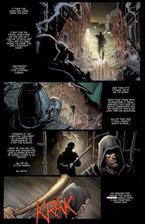
Writing & Plot
It would be easy to misinterpret Donny Cates’s writing in Vanish #1 as dark cynicism – if everything wasn’t so tongue-in-cheek. The overall plot – a wizard turned angry drunk takes vengeance on some superheroes tied to the death of his parents – is pretty cookie-cutter as a concept. However, specific details and circumstances arise to specifically throw these tropes sideways. These little plot events are by and large shocking in hilarious ways, while still absolutely coming off as something that would have been dead serious in a 90’s comic. Cates’s dour narrative and character-specific predictable dialogue perfectly set the expectation for the sort of comic this will be. Vanish immediately has that grimy and nihilistic touch that will ingratiate itself with 90’s Image diehards and fans of that sort of storytelling in general. The comic’s clincher though is one particular scene that I cannot spoil, but is flat out one of the most hilarious twists in comics this year. Cates knew exactly what he wanted this story to be and went for it, all while making something that can still be compelling to those wanting a more class-style grimdark comic book.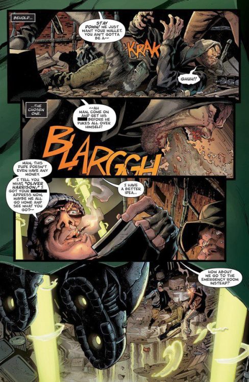
Art Direction
Anyone who has been reading Marvel comics for the past several years is familiar with the work of modern artistic heavyweight Ryan Stegman. Having him as the penciler for a throwback-style book like Vanish #1 is a perfect fit. Stegman’s hatching-heavy and detail-focused work comes across like the work of McFarlane or Silvestri but with a slice of modern refinement. His characters all look unique while simultaneously appearing very 90’s. He captures the grime and pollution of the “current” timeline city Oliver lives in now, then switches over to a place of magic without skipping a beat. Due to his specific art style however, the aesthetic never skips a beat. Even the majestic magical realm we visit retains an element of edgy darkness. A lot of this consistency is helped out by JP Mayer’s inks, which perfectly complement the atmosphere. Stegman’s action choreography and sequencing are busy, but easy to follow and well-paced. Vanish is constantly throwing hooks at a breakneck pace, but it’s also structurally expertly managed. The colors from Sonia Oback are rich and vibrant, but intentionally smothered so as to keep with the book’s aesthetic. Every panel feels like it has a layer of grease over it, but this is very much the point. This coloring approach caps off that classic 90’s feel Vanish goes for. Finally, John J. Hill’s letters carry the reader through with dynamic and easy to read fonts, with great SFX design. He utilizes a couple of different font styles for different characters, one in particular being very unique. The SFX work mimics a more old school approach, however, just like book as a whole, still delivers something modern and original unto itself. Visually, Vanish #1 is a love letter and a marvel on its own.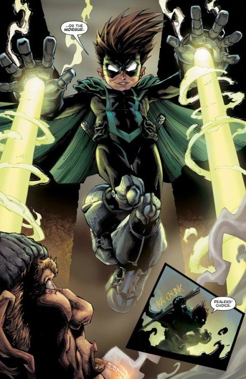
Verdict
Vanish #1 is a smart and compelling love letter to Image Comics of yesteryear. Donny Cates’s script is brutal and grim exactly when it should be, while being punctuated with hilarious twists that make the story an unexpected joy to read. The visuals from Ryan Stegman, Sonia Oback, and John J. Hill are brutally stunning and intricate, combining that grimdark 90’s aesthetic with modern artistic touches and skillful sequencing to make this book a blast to read. Be sure to grab this new #1 when it hits shelves on September 21st!!