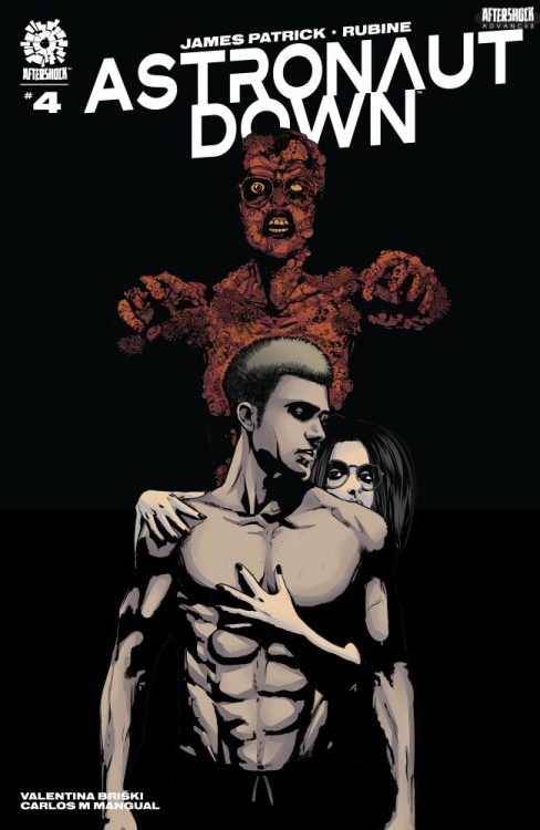
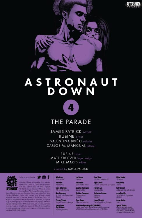
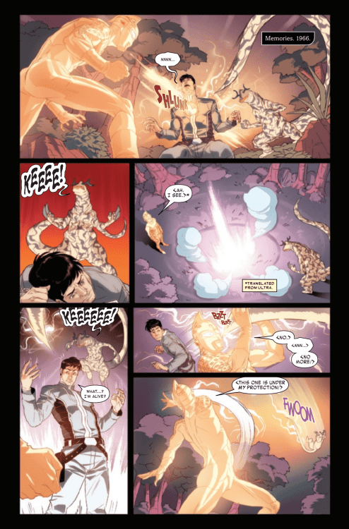
ASTRONAUT DOWN #4 hits your local comic book store on October 12, but thanks to AfterShock Comics, Monkeys Fighting Robots has an exclusive four-page preview for our readers. The book is written by James Patrick, with art by Rubine, Valentina Briški drops the colors, and you will read Carlos M. Mangual’s letter work.
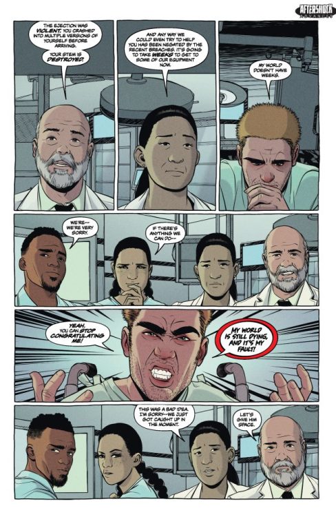
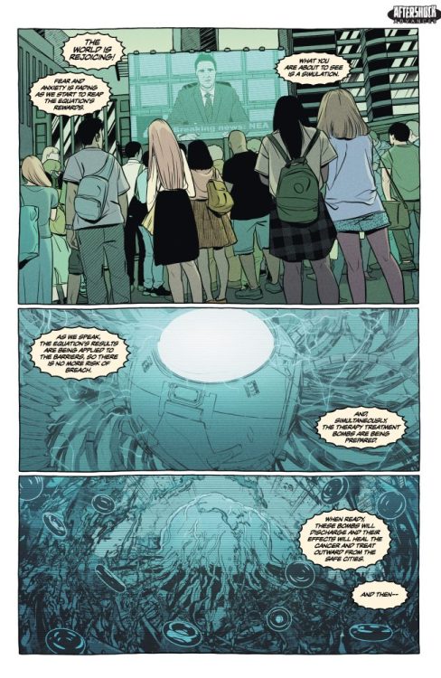
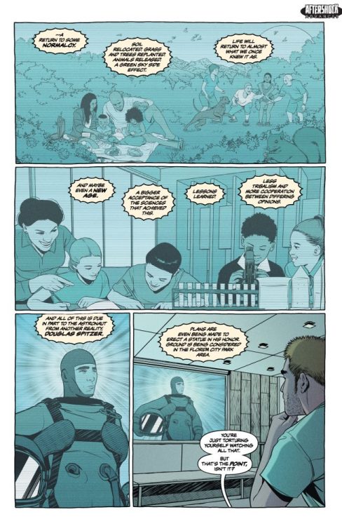
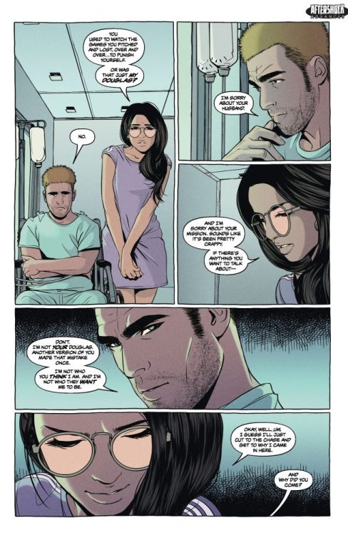
About ASTRONAUT DOWN #4: Douglas has crash-landed in a new reality. He’s stranded there, his ability to send a transmission is gone, and the worst thing possible has happened: In this reality, he’s a hero, and everything he’s ever wanted exists…including his wife. But it all comes at the expense of his own reality. Every thank you, every gift, and every dream come true is now torture since he can’t save the dying world he once called home…or can he?
Halftime is a documentary taking viewers behind the scenes of Jennifer Lopez’s dazzling 2022 halftime show at the Super Bowl. Music editor Katerina Tolkishevskaya (The Morning Show, Claws) worked quickly behind the scenes to get the music just right for the peak behind the magic of such a legendary performance.
In 2022, the Los Angeles Rams played the Cincinnati Bengals in the Super Bowl, one of the most watched events in the world. Performing legend Jennifer Lopez dazzled fans during the halftime show with a brilliant display of visual flare and music to make us dance. But that show was only the beginning. Jennifer Lopez used the experience to create a documentary called Halftime that takes viewers through music and the madness behind the scenes of such a large-scale event—making the documentary required a crew of cameramen, producers, editors, and audio specialists.
PopAxiom spoke with Katerina Tolkishevskaya about becoming a music editor, learning on the job, and the making of Halftime.
Something Worked Out
Becoming a musician wasn’t exactly Katerina’s decision. “My mom made me go to piano lessons at five before I even went to elementary school. So I wouldn’t say it was my choice at that point. But I didn’t mind. She would also not let me quit until I was 17,” she says.
“A majority of it I enjoyed,” she adds, “but like any teenager, you don’t want to do that thing anymore at some point. So I competed professionally for classical and jazz piano, which was pretty intense.” And while this was already a rigorous and impressive music feat, Katerina’s music lessons did not stop there.
Katerina added voice and singing lessons, then became interested in the production side of music and ultimately studied at Berklee in Boston.
Once at Berklee, Katerina started with voice performance, but decided it wasn’t going to happen. Her passion drove her towards production, and the school provided a rough road map with Berklee having a good video game audio minor.
After setting her sights on sound design, Katerina moved to Los Angeles. Upon her arrival, the jobs rolled in slowly but surely. “A few friends of mine reached out to score for their shorts. That was fun. At the same time, I was interning as a composer’s assistant,” Katerina explains. “Scoring those short films made me understand that it is close to what I’d want to do, but not quite there yet.”
Katerina found herself searching for where her musical talents and passions best fit. One of those paths was when she assisted on the TNT show Claws. “That was an interesting experience,” she says about the show that set her direction. “That was my first big project, during which I had the opportunity to take on a lot of responsibilities. It was stressful, but it stuck. It’s been six years since then, so something worked out.”
About Halftime
The filmmaking biz takes shape in various ways from project to project. How did Katerina become part of the Halftime team? “Halftime already had a brilliant music editor, Robin Whittaker, who was working on the score. But schedules lately are a little crazy, especially after the last couple of years with everything being delayed. I worked with [producer] Terry Leonard on the Biggie doc, and he was one of the producers of Halftime. I got a call from him saying, ‘can you take care of source music this week?’That’s how Halftime happened for me,” she laughs.
Katerina recognizes that it’s not the typical journey for a music editor. “Generally, we’re brought on pretty early to help with the temporary score,” she says about life as a music editor. “It’s an interesting in-between job. First, you’re working with directors and producers to determine what they like. Then, you also work with the composer to help with score placement and picture change.”
It seems like a creative endeavor, but there’s another side. “You’re also working with the music supervisor who’s working on licensing and all that. So it’s a little creative and a little technical. You’re helping with creative decisions and keeping track of the music in the picture. On the technical side, it’s similar to an editor but just for music. Fitting songs in just right.”
The job description of music editor was no less creative and wide ranging. “On Halftime, since we had an editor working on the composer’s score, I was busy working on all of J.Lo’s songs for rehearsals and Super Bowl performance,” Katerina explains. “When it’s a music doc, it’s crucial to get the music synched up. There are plenty of nerdy technical things that happen during all that.”
What has Katerina learned from year one to now, year six? “From year one to now, I would say, I’ve learned that building a good relationship with the people on your team is important. When they’re starting, some music editors think more about the technical aspect of going into ProTools and cutting things up. That’s probably less than half the job. A lot of the time, when you have those relationships, those people would look to you to say, ‘you’re not feeling that song because it starts too early or it needs to be cut a different way or the chorus needs to start here.’ It’s a lot about trusting your instincts and not being afraid to speak up. Most of the time, that’s what people are looking for from you.”
Wrapping Up
“I was fortunate early on to work with two outstanding editors,” Katerina says about the people who have influenced her work. “They were open to mentoring me. On Claws, I worked with Brad Hamilton. He was very trusting, letting me do my thing. He encouraged me and told me that I knew what I was doing. Then, I worked with Michael T. Ryan. He used to teach, so he was a good mentor. He’d go out of his way to show me whatever I needed to know. Finally, on The Morning Show, I got to work with Adam Smalley.”
Katerina’s worked on a variety of shows. Is there a type of project she’s looking forward to trying? “Music documentaries have been very fun,” she says. “I love dramatic shows like The Morning Show. I haven’t done a kid’s animation, and I think that would be fun.”
What’s coming next for Katerina? “A lot of stuff, but nothing I can tell you specifically. Some Christmas stuff for Netflix and a series on Paramount.”
Is Halftime on your watch list?
Thanks to Katerina Tolkishevskaya and Impact24 PR
for making this interview possible.
A.X.E. Judgement Day #5, out this week from Marvel Comics, delivers something that will change the game for mutants in the future, as well as the people of Earth. Where things go from here is anyone’s guess, but this issue is integral to the Marvel Universe moving forward. Kieron Gillen writes this issue with Valerio Schiti on pencils, Marte Gracia on colors, and Clayton Cowles on letters.
WRITING
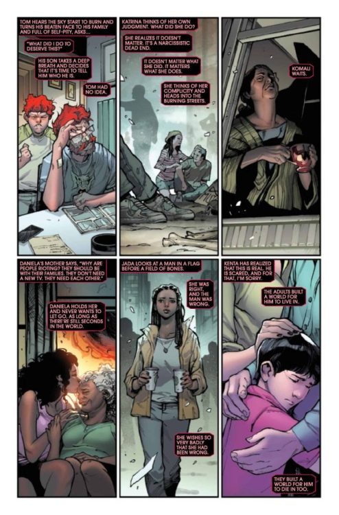
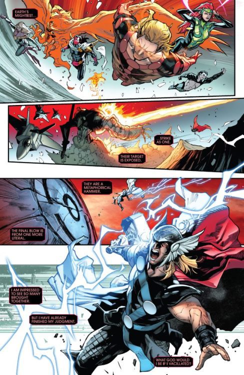
Gillen has been doing some wonderful things since his return to the X-Universe. Immortal X-Men is one of the best X-titles on the shelf, thanks to his impressive plot and pacing. With Avengers-X-Men-Eternals Judgement Day #5, we get to the world’s destruction. This is not a test or an illusion. Gillen delivers on the action side of this issue. Your favorite characters get destroyed. This isn’t a spoiler because literally everyone gets annihilated. What works for this is the internal monologue from the Celestial. Gillen lets us know why he’s killing our heroes, and he describes how he does it. This is a book that turns the Marvel Universe upside down. Things are in disarray. It’s not your typical end-of-the-world issue where one main character dies. It all goes south pretty quickly. Gillen also makes sure to give us little character moments too. There is a touching moment between Captain America and Jada as they bond while the world burns. This is where Gillen makes his money. He gives us thought-provoking storytelling that allows the reader to think about their own life.
ART
Once again, we’re treated to Schiti on pencils. Schiti has a tough task with this issue since most of the book is either fighting or emotional moments. As mentioned earlier, the Jada and Captain America conversation works well because we can see that both characters make small talk as the world collapses around them, and Schiti portrays these panels with a sense of uneasiness as these characters let out an uncomfortable smile or a look of great concern. Action sequences are handled perfectly. It’s rare that you can see so many of your favorite heroes die and be perfectly fine with it because the art is amazing. The splash page with every hero going into battle is inspiring. Schiti draws this image and doesn’t dip any quality. Event books are tough to do, but Schiti continues to crush the art duties.
Gracia has become one of the best colorists on Marvel’s roster. There is a lot of red in this issue as the world burns around the heroes. Gracia uses dark reds as bridges collapse, or heroes fall. There are also some cooler whites and light blues used in this issue as well. With the Jada and Captain America conversation, Gracia uses a lighter blue to capture the background. White ash falls from the sky, which plays a nice contrast to the grayish blue in the calmer sky. Gracia rocks this issue with perfect colors that fit the dire need of our heroes.
The letters are handled by Cowles. Sound effects in an issue like this are crucial. As Nightcrawler transports Captain America to the battle, “Bamfs” are perfectly curved around the teleports. Another key part of this issue is the narration boxes. Cowles uses red and black lettering. Normally this might seem like a bad combination that is tough to read, but Cowles makes it work by using a lighter red for the words.
CONCLUSION
A.X.E. Judgement Day #5 is a huge issue that changes things in the Marvel Universe. Gillen absolutely crushes this issue. Throw your expectations out the window, as there is no way to predict what will happen next. The art is amazing and enhances the reading experience. You might not find better pencils and colors on a book this week. A.X.E. Judgement Day #5 is on sale at a comic shop near you!
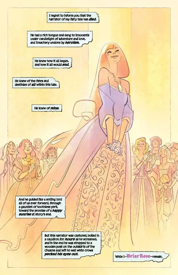
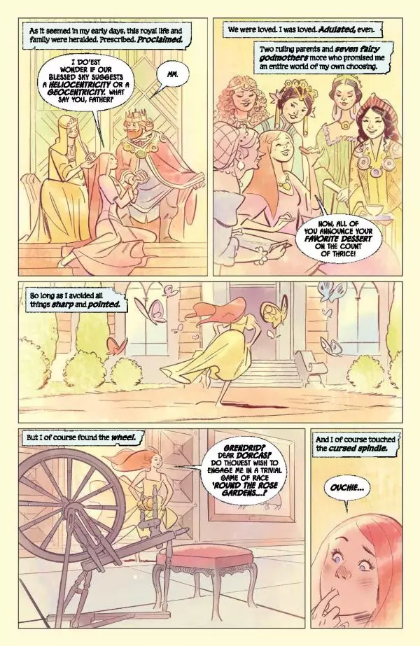
Writer Christopher Cantwell (Halt and Catch Fire, Star Wars: Obi-Wan) and artist German Garcia (Ka-Zar: Lord of the Savage Land) team up for a dark twist on the fairy tale genre with Briar #1. Featuring colors by Matheus Lopes and lettering from AndWorld Design, this first chapter takes the beloved classic fairy tale and throws it headlong into the savagery of Robert E. Howard-style Sword & Sorcery. With a tense, clever, and darkly compelling script and unique & brilliant visuals, this first issue is a gem for people wanting a true twist on some known fantasy conventions.
“What if Sleeping Beauty never got her happily ever after… and instead had to save herself? Set in a brutal fantasy world that time forgot, this isn’t the fairy tale you know!”
Writing & Plot
Christopher Cantwell‘s script for Briar #1 succeeds not just because it’s wholly entertaining, but because it dissects and twists these respective fantasy genres so well. The original Sleeping Beauty princess, or this comic’s Aurora stand-in, leads the stereotypically charmed life guided by a lofty narrator until getting pricked by that infamous spindle. After being betrayed and ignored by her supposed “Prince Charming,” she awakens 100 years later to her castle in ruins and her world shredded. Long gone is the era of royal balls and frivolity, for the time of the sword and the axe is nigh. Briar almost literally sends us from a Disney princess film to a Robert E. Howard Conan novel. The switch is jarring for sure, but is also surprisingly natural feeling. The notion that the barbarous and brutal setting of a sword and sorcery story would come after the era of fantastical royal courts, and not the other way around, is in itself a unique concept. Cantwell’s idea too that the narrator in fairy tale is the core component for guiding the story to its lighthearted conclusion, and taking that voice away brings chaos, is a very clever idea. Cantwell’s use of different types fantasy-speech, from storybook fairytale to tavern-dwelling freebooter, is sharply written and pulls the reader into this comic’s experience effortlessly. Briar starts off with an original and highly compelling script that makes me eager to see where these characters go – and just how far Cantwell pushes the boundaries of these fantasy genres.
Art Direction
Bringing a suitably unique and memorable visual aesthetic to Briar #1 is Ka-Zar art team German Garcia and Matheus Lopes. The duo behind one of the best-looking comics of the past couple years now lends their talents to this outstanding fantasy tale. Thanks to them, the transition from bright and beautiful fairy tale to the blood-soaked wastes of sword & sorcery is sufficiently jarring but still comes off as natural and within the comic’s aesthetic feel. Garcia’s character and world design is certainly familiar, but comes off as so singular because of his unmistakable penciling style. His thin pencils, thicker detail touches, and no use of shading or hatching allows for a reading experience that comes off as almost dreamlike – fitting for a fantasy tale about Sleeping Beauty rousing into a nightmare. Garcia’s sequencing perfectly paces the reading experience, lending both intensity to the survivalist aspects while making the passage of time feel appropriately massive. Mat Lopes’s watercolor approach adds to how unique Briar’s aesthetic is, while offering a surprising amount of range for this sort of coloring style. While Lopes’s work lends itself perfectly to brighter sequences, it’s also surprising how dense the nighttime and more gory scenes come off as. So much of this comic’s atmosphere is built around what the colors are doing, and with former The Dreaming colorist at the helm the results are fantastic. AndWorld Design’s lettering is dynamic and matches the comic’s setting perfectly. They switch from a classic medieval-fantasy font for the narration in the intro to excellent, hand drawn-styled dialogue lettering that shifts with characters’ tones naturally. Every aspect of Briar‘s artistic approach successfully draws readers in to make for one hell of an engrossing comic book.
Verdict
Briar #1 is an unsettling and brutally engrossing hybrid twist of fantasy genres. Christopher Cantwell crafts a script blending a classic fairytale with the savagery of Conan the Barbarian and nails the landing with a comic that is a tense blast to read. The visuals from German Garcia and Matheus Lopes are stunning and shift from the dreaminess of a princess story to the blood-filled wastes of sword & sorcery, with a distinct artistic approach making for one of the best-looking comics of the year. Be sure to grab this debut issue when it hits shelves on September 28th!
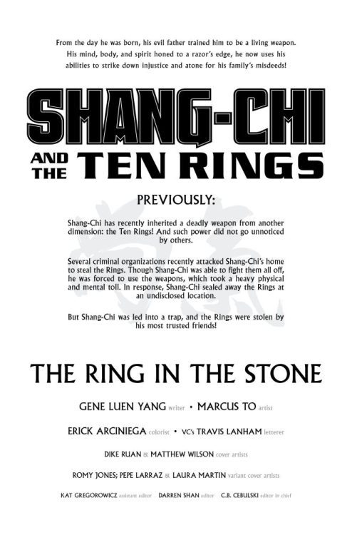
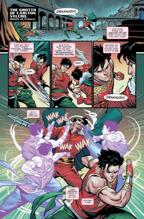
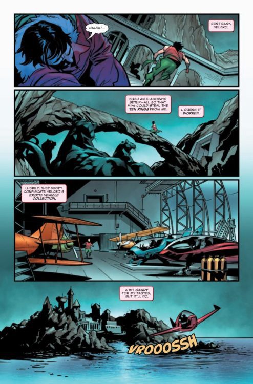
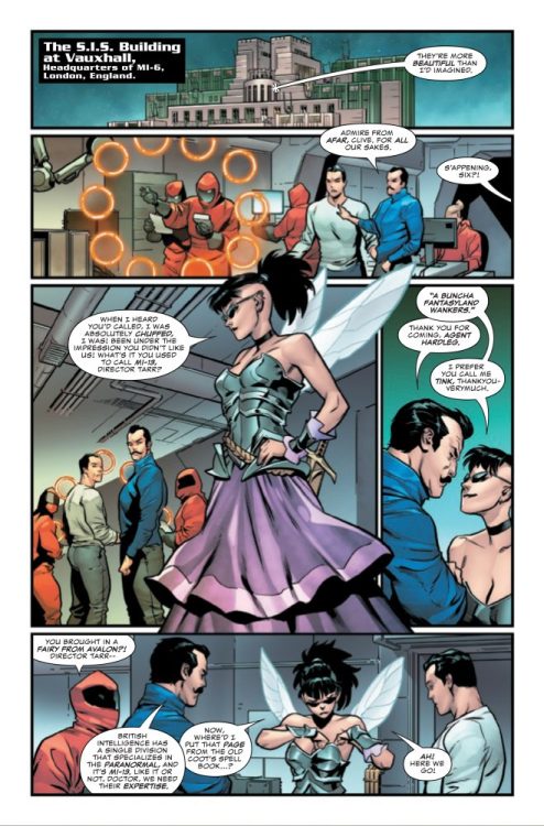
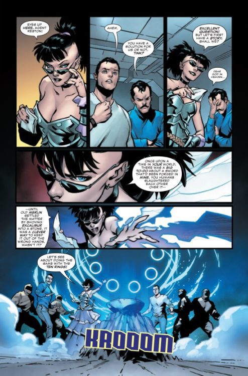
SHANG-CHI AND THE TEN RINGS #3 hits your local comic book store on September 28th, but thanks to Marvel Comics, Monkeys Fighting Robots has an exclusive four-page preview for you!
About the issue: Shang-Chi has lost the Ten Rings! But who stole them? The answer will shock Shang-Chi, as the Rings’ unknown power is about to be unleashed!
The issue is by writer Gene Luen Yang and artist Marcus To, with colors by Erick Arciniega, and letters by Travis Lanham. The main cover is by Dike Ruan and Matthew Wilson.
Check out the SHANG-CHI AND THE TEN RINGS #3 preview below:
Are you reading SHANG-CHI AND THE TEN RINGS? Sound off in the comments!
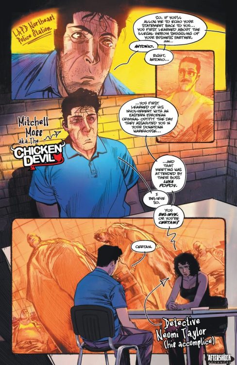
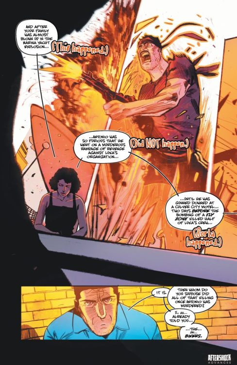
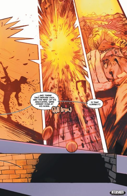
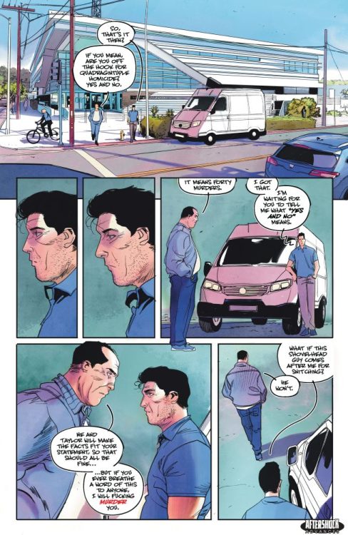
CHICKEN DEVILS #1 hits your local comic book store October 12th, but thanks to AfterShock Comics, Monkeys Fighting Robots has an exclusive four-page preview for you.
About the issue: The world’s FIRST (and perhaps only) hot chicken sandwich-inspired vigilante is BACK…and this time he’s not flocking around!
See Mitchell Moss thrust in the middle of a new gang war! Watch Mitch battle his family as they actively thwart his efforts to keep them safe! And let out an exasperated SIGH alongside Mitch as he is forced into teaming up with the kill-crazy bad cops!
Written by Brian Buccellato (Injustice: Gods Among Us, Detective Comics: Endgame) and illustrated by Mattia Monaco (KNOCK ‘EM DEAD), these are the further adventures of a regular guy plucked out of obscurity by destiny to deliver justice with all the fixins.
The series is by writer Brian Buccellato and artist Mattia Monaco, with letters by Hassan Otsmane-Elhaou. The main cover is by Hayden Sherman, and there is an incentive variant by Francis Manapul.
CHICKEN DEVILS is the second volume of the AfterShock series CHICKEN DEVIL which began last year. It retains the same creative team, except Monaco is taking over interior art duties from Hayden Sherman.
Check out our CHICKEN DEVILS #1 preview below:
Did you read the first volume of CHICKEN DEVIL? Sound off in the comments!
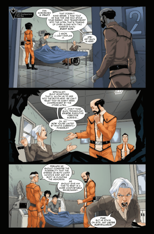
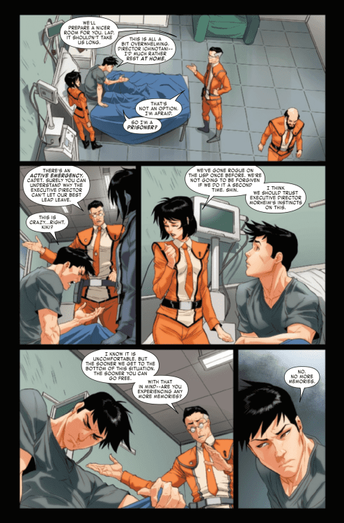
Ultraman: Mystery of Ultraseven #2 continues to unveil the mysteries introduced in the first issue. The questions surrounding what really happened with Dan Moriboshi are addressed. This latest installment in this entertaining mini-series comes thanks to Kyle Higgins and Mat Groom (writing), Davide Tinto (art), Espen Grundetjern (coloring) and VC’s Ariana Maher (lettering).
Shin’s powerless and trapped in the lion’s den. With the walls closing in, all hope rests on unravelling the decades-long mystery that led the USP to this point. How is it related to a galactic conspiracy, how can Dan Moroboshi still be alive…and why is Ultraseven menacing Japan?
Writing
The second issue takes the time to finally show Dan Moroboshi and Ultraseven bond as they try to get through a terrible situation together. Unlike Shin and Ultraman where the relationship was more about the overall mystery of what the Ultras, the relationship between Dan and Ultraseven has less of a hurdle of trust to get over. The pair have no choice but to work together to survive and its a treat to witness.
Kyle Higgins and Mat Groom offer a great tone which offers an atmosphere to address the mysteries but keeps a great sense of suspense. This comes to a head as Shin and Kiki find they have to take drastic measures and face the wrath of Executive Director Morheim. In a way which may cost them much more than their jobs in the USP.
Artwork
The art by Davide Tinto offers some intense action as Ultraseven and Dan work to survive in Kaiju Limbo. It also offers a great flow to the action as the pair fight against various monsters. Unfortunately a few of the panels feature some extreme facial expressions which distract more than they help the flow of the story.
The coloring work by Espen Grundetjern enhances the atmosphere of the issue and helps draw the reader in. It also helps with showing Dan as a projection of himself while he is merged with Ultraseven. It also helps with panels where the power is cut in USP headquarters and everything is shown through night vision.
The lettering by VC’s Ariana Maher helps to direct the story from panel to panel. The attention to placement of the sound effects adds an auditory experience of the issue without distracting from the action scenes. The scenes where the monsters roar but the monsters themselves are still incredibly intimidating are the best example of this.
Conclusion
Ultraman: The Mystery of Ultraseven #2 continues to be a fantastic read thanks to the mystery and suspense. The bond between Ultraseven and Dan proves to be an important and enjoyable aspect of the story. It will be interesting to see where things go from here and due to the overall quality of the book, readers will definitely be coming back for more.
If you are here at Monkeys Fighting Robots, it’s probably because you are a fan of comics and read them regularly. Most of you will be used to the antics and principles of modern superhero comics, with a pull list consisting of Marvel or DC monthlies and a generous helping of Image, sci-fi, and fantasy titles. Stories will be built around immediate drama and sudden threats. The threat and danger are immediate. It plays a significant role in the narrative and features front and center in the comic. ‘Here is the drama,’ the narrative screams, ‘Here are the obstacles to be overcome.’
That cannot be said of Sunburn, a new graphic novel due from Image Comics in November. Andi Watson doesn’t write superhero comics; he writes slice-of-life dramas. This allows him to slowly coax out the drama over many pages, building an uncomfortable tension that has the hairs on the back of your neck standing up.
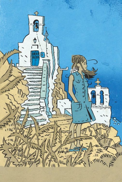
Sunburn Credit: Image Comics
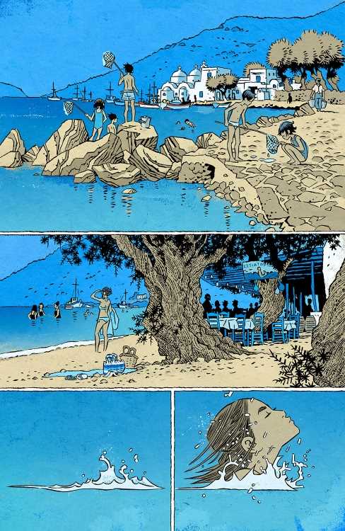
Sunburn, written by Watson and illustrated by Simon Gane, see’s the teenage Rachel accept the holiday of a lifetime from a family friend on an unnamed Greek Island. She is introduced to the islanders and taken under the wing of her host and hostess, The Warners. Sun, sea, and even a little romance await her among the beautiful vistas. However, there are secrets hidden in hushed conversations and sly glances. As the weeks stretch out, Rachel is forced to stand up for herself and confront those closest to her.
Watson’s script is subtle and sublime. He perfectly captures the experience of young adventures in foreign lands through the teenage Rachel’s eyes. The awe-inspiring landscapes, beautifully illustrated by Gane, form the backbone of the book; at first, they are mysterious and full of promise, then they are luxurious and playful, but soon they become foreboding and uncontrollable. The internal emotions seep out into the landscape, altering the reader’s perspective of it, which, in turn, alters the reader’s engagement with the narrative. Watson slowly implies a darker aspect to his story and builds layers of tension and mistrust in the scenes. As the book progresses, the reader, through Rachel, becomes increasingly uncomfortable as we try to guess what secrets the characters are keeping. We stop trusting everyone and begin to think the worst. There are moments in Watson’s superb story where you almost scream at the heroine to pack her bags and leave. Having grown up on tales like the Wicker Man, my fear of a disturbing ending was fueled by Watson’s cheeky warnings and misdirection.
There is no imminent threat in Sunburn. Instead, it is an excellent world-building exercise around a central, empathetic character. The cast swims in and around Rachel’s experiences as she journeys from childhood into adolescence. It is, at its heart, a coming-of-age story, beautifully written and expertly illustrated. There is a softness to much of the lettering, produced by broken speech balloons and a handwritten appearance in the text. This helps to create a pleasing atmosphere which is enhanced by the comforting color pallet. Between them, Watson and Gane present a world that you would like to be a part of, a world that draws you in, just as the Greek island draws in Rachel.
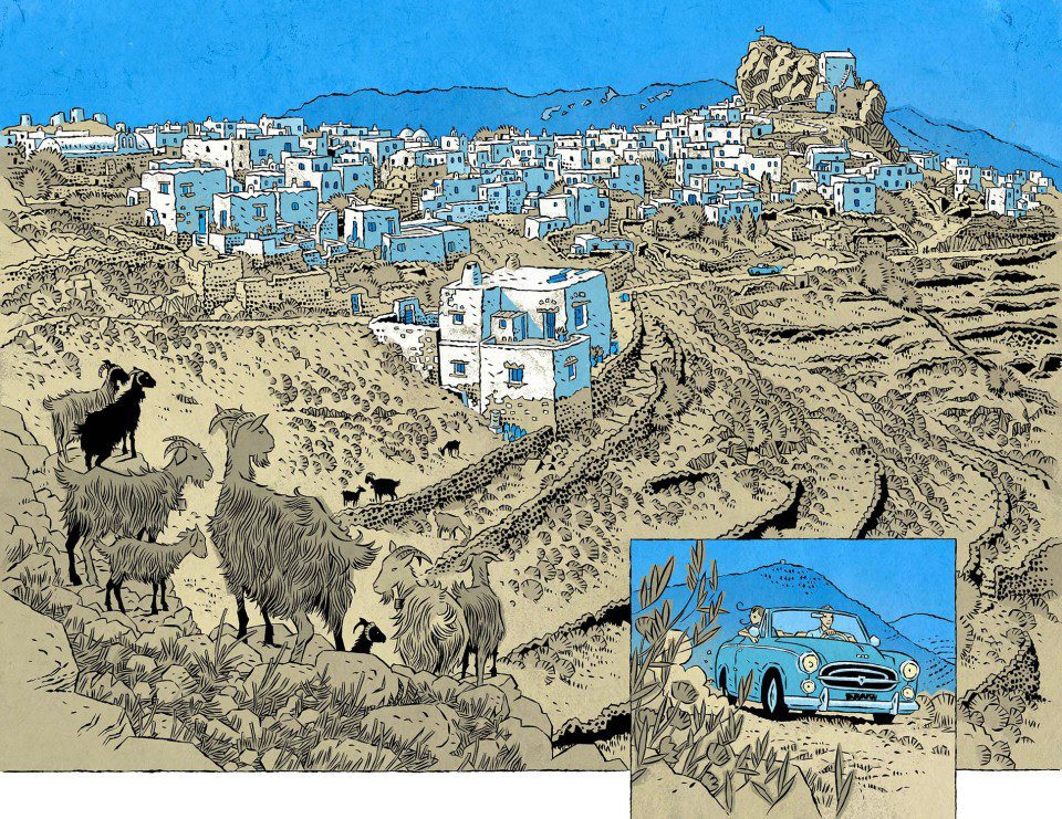
The Spectacular Vistas of Sunburn Credit: Image Comics
Gane’s art style is clean and emotional. He focuses on facial expressions and bodily gestures to enhance the emotional states of the characters and, quite often, contradict the speech. Gane creates complexity in the characters that are important to the narrative flow. Coupled with the outstanding landscapes, the art in this book swings from breathtaking overviews to concise emotional struggles and back again. The graphic novel format allows the narrative to progress naturally, with plenty of space for Gane to take his time over the progressions from scene to scene. One of the overwhelming aspects of Sunburn is the landscape, as it seems to infect not only the panels but the pages and even the book itself. When you open the cover, you are as much a visitor to the island as Rachel, and Gane allows you to experience it in the same way the central character does.
Sunburn is the memory of a perfect holiday crossed with the illusion-crushing reality of life. The book sweeps you away and brings you home a changed person. Awe-inspiring double-page spreads show nature’s beauty, while close, intimate moments help you connect to the characters on a human level. These two aspects of the comic allow the creators to pull at your nerves and your heartstrings. They control your emotions from the opening pages making this a book that is very, very difficult to put down.
Watson and Gane have created a wonderful romance novel. It is packed with emotional connections to people and places. It will move you just like any family drama or teenage coming-of-age story should. You will not find immediacy here, but the narrative is better for its slow, dreamy walk through the lives of its characters. Sunburn hits your local book shop on November 23.
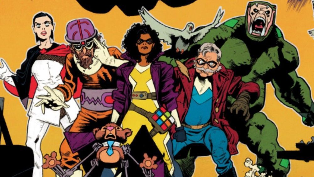
Minor Threats, from Dark Horse Comics, is one of the year’s best new comics. Co-written by comedian Patton Oswalt and Jordan Blum (who worked together on Hulu’s excellent M.O.D.O.K series) with pencils by Scott Hepburn (Deadpool/Drax, Spider-man and Deadpool), Minor Threats tells the tale of a bunch of low-level supervillains who in an effort to take the heat off the criminal underworld and themselves, get together to take down another much more dangerous, murderous villain (The Stickman! Great name!) after he has killed one of the cities beloved heroes. The creative team was awesome enough to take some time off their uber-busy schedule to talk to us at Monkeys Fighting Robots. So check out the chat below and make sure you add Minor Threats to your pull list. Special thanks to series editor Daniel Chabon and Anthony Mauro from Dark Horse PR for making this interview possible.
Monkeys Fighting Robots: Guys, for our readers who haven’t had the pleasure of reading this book, can you give us a classic elevator pitch? Patton Oswalt: Low-level costumed villains try to take down a high-level villain to score points with the high-level heroes.
MFR: What’s everyone’s comic book origin? How did you get into comics? PO: Comics were always just…there. Spider-man on The Electric Company and then the animated show, and all of my friends read them every week. I kind of fell out of comics for a while in middle school — Dungeons and Dragons and just sci-fi, in general, came along, and then of course, girls. But by the end of high school, you had Watchmen and Dark Knight Returns and Alan Moore’s Swamp Thing. And by the time I got to college, there was Neil Gaiman’s The Sandman and that was it. I was back in for life.
Jordan Blum: My dad learned to speak English by reading comics. They were always just there. Like a pile on my highchair. I also came up during prominent toy tie-ins so I’d read Super Powers and Secret Wars and then go buy the action figures. I grew up loving Superman, Batman and Captain America but I think it was X-Men in the late 80s early 90s that made something more – where it went from hobby to lifelong obsession.
SH:I’ve been a comic book collector from a young age. At 8 or 9 I was arranging my bagged books like art on my bedroom walls. By college, the animation industry was in a full resurgence and one of the very few schools offering animation was up here just outside Toronto. So I cut my teeth drawing, designing and storytelling at entry-level tv animation gigs but always with the intention of drawing comics once I had built up my skill set. And then a quick decade or so later I was a regular artist for the Big Two.
MFR: Is this the first comic you have written? PO: I’ve done work for DC, Marvel and Dark Horse, but this is my first creator-owned title.
JB: I’ve written a few projects for the Spidey office and have some other Marvel work coming down the pipeline. This is [also] my first creator-owned book.
MFR: Did you learn anything about comics by writing your first comic? PO: Yeah — don’t be so wordy. Give the artist room to show, rather than you telling.
JB: World building is intoxicating and also a trap. We worked really hard to make the first issue focus on Frankie and lead us through Twilight City from her perspective. There’s so much history we want to cover but luckily Scott’s art did most of the heavy lifting so our words could be about Frankie.
MFR: I know this was based on a pitch you did for DC Comics using some of Batman’s Rogues Gallery. So when you changed it did that change anything in the story or narrative? Did anything new come from having to create the characters?PO: Oh absolutely. With their different backgrounds, and being able to build them from the ground up, we were able to expand this entire universe, instead of just keeping it Gotham-centric. Twilight City is the setting but we were able to add hints of much larger things that were going on in the world itself.
MFR:As a punk rock fan, I gotta ask; is the title Minor Threats a nod in any way to the great 1980s DC hardcore band Minor Threat? PO: We ran through a LOT of possible titles but when we landed on that it felt so right.. I’m a huge fan of the band so I was very aware of the comparison.
MFR: When you had to retool this by creating your own characters, where and how did you start that process? How did you start creating the themes and concepts for each character? And what made you choose those particular themes, costumes and personalities? Was there a first character creation that set a tone? PO: I think the themes are more or less universal when you’re talking about crime, privilege, class structure and poverty. We just had way more fun smuggling all of that into a superhero narrative.
JB: I had written a screenplay many years ago about super villains so I pulled some elements from that to create the dynamic of Frankie, her relationship to her mother Loretta, their legacy of villainy and wanting to protect her daughter Maggie from a similar fate. We wanted to bridge the silver age into the modern age so we landed on toys as a gimmick for Frankie. We discussed with Scott that the toys could lose a little of their innocence, be half-built little Terminator-looking teddy bears and he ran with that. The rest of the characters sort of fell into place. Patton had a great take on a low-rent Riddler-type that has succumbed to his own personal demons so we ended up with Brain Tease. We knew we wanted a muscle character who felt more 90s so Snakestalker came from that. In wanting to explore the culture of blue-collar villainy we started asking where they get treated for bullet wounds and broken bones and Scalpel was born out of that conversation. In discussing the code of villainy and some of our crooks holding onto the “good old days” we started to talk about an older villain refusing to let go like Pigeon Pete. I think the biggest thing was giving them really different voices, voices that would clash and fight with each other. This led to us switching narrators every issue to let those voices come through
MFR: Scott, Did you have a favorite sequence or character to draw? SH: I mean… all of them? It’s really about treating everyone in the crowd like a full character. And every location is like a place that’s been around and changing for a long time.
Villains Unite!
MFR: As much as this is a pretty dark story you guys are telling, there are a lot of moments of levity and humor. You both obviously come from a comedy background, but what made you want to inject that into the story? Why was adding humor so important? PO: I think even in real life, in real life “dark” situations, fate or the human psyche reacts with humor. Otherwise, I think the overall fabric of reality would have been torn to bits decades ago.
JB: I think the comedy comes out of character. These aren’t hardened a-list criminals, their c-listers who want to be taken seriously which in itself is inherently funny, especially when they’re dressed in snake costumes.
MFR: Does either of you have a favorite character? Is there one you loved to write more than the others? PO: I have this weird affection for Pigeon Pete. I mean, Playtime is obviously charismatic and fascinating and is our protagonist, but someone who’s kind of their own ghost always lands with me.
JB: I mean Frankie is such a classic noir character and a blast to write but Scalpel really emerged as a favorite for me. I think Scott’s art and acting for the character really influenced how we wrote her. Once we cracked her origin I really fell for her complexities.
MFR: Are there any specific comics you looked to for inspiration for Minor Threats? Any story arcs or creative teams you had in the back of your heads? PO: Astro City, for me, obviously.
JB:Yeah, Astro City. Spider-Man and his Superior Foes. In general, for me it’s always been the Rogues from Flash.
MFR: What made you go with Dark Horse as the publisher? PO: It was such a no-brainer. They’re this wonderful combination of tight storytelling within expanded universes — Black Hammer and Hellboy and The Umbrella Academy and especially Mind Mgmt, which I’m now re-reading.
JB: They have an amazing track record for building universes from scratch and successfully launching them. Especially our editor Daniel Chabon who edits the Black Hammer line.
MFR: Did you guys ever work together before the M.O.D.O.K. show (which was amazing!) and Minor Threats? PO: We did a pilot together for FOX that didn’t go — more of a working-class superhero rather than a villain. But imaginary realms are where we operate the best.We worked with Scott on our M.O.D.O.K. comic and the way we were fighting over who’d get to own certain pages, just the way we were instantly fan-boys of his look and style. Again, another no-brainer.
JB: Patton and I met years ago on a [that pilot]. It was the first thing I ever sold and I was absolutely fan-boying out when Patton came aboard. We realized very early that we speak the same geek language and our ideas mesh perfectly together. We fell in love with Scott’s talents in our M.O.D.O.K. book so we knew we wanted to create something new with him. Scott had worked with our colorist Ian and Nate came through Dark Horse and we had been fans of his work. It’s an absolute dream team top to bottom. Every choice they make just elevates the book.
SH: I really lucked out and got connected to Patton and Jordan early [with that] M.O.D.O.K mini-series. We just fit well together as a team. I think we all have a shared love for the range of craziness that comic book stories carry so well.
MFR: Scott, A series like this, which includes so many analogue characters and references to other well-known pop-culture stores presents some challenges. But you certainly nailed it. How do you and did you go about creating something that will remind readers of a character they know, yet still keep it wholly its own unique thing? SH: Yeah we are creating a lot of new worlds, but the depth of inspiration is so deep. It’s really about treating everyone in the crowd like a full character. And every location is like a place that’s been around and changing for a long time.
MFR: What was the creative process like? Patton and Jordan did you write a traditional script first or did you maybe use something like the Marvel method or any other more comic book style writing? PO: We’d get together and hash out the overall story and then start writing script pages. A lot of times I’d overwrite stuff and Jordan, who’s so good at character and focus, would tighten things up.
JB: We tend to break the story and heavily outline together. Then we’ll sometimes break up scenes, pass them back and forth or write specific ones together. It’s always just suggestions for Scott, just to get him thinking. He’s such a genius and we absolutely trust him to build off the script and make it better.
SH:The three of us are in a pretty constant state of communication, with text threads and emails and the odd zoom meeting to go over scripts
MFR: Any consideration of further exploring this world? PO: Oh my goodness yes. And that’s all I’m gonna say.
JB: We have SOOOOOO many stories to tell within this universe. Every time we get a new character design back from Scott, no matter how insignificant the character, we start hashing out entire arcs for these bit players.
Scott Hepburn: I like to think of Minor Threats as a rapidly expanding world like Marvel in the sixties but seen from the gutter!
MFR: Minor Threats#2 starts to delve more into the past and motivations of some of the characters, like Brain Tease. What makes villains so captivating to explore and read in more detail?
PO:Well, every villain’s origin is about how does someone react to trauma, abuse or insult? Do you rise above or decide to become a bigger abuser? And who’s to say that a hero, given a slightly different set of circumstances, wouldn’t have become a villain?
JB: We want to subvert expectations. Here’s a disturbed maniac in a brain helmet obsessing over puzzles, how do we make you care about him? I think all of these characters are born out of tragedy, why else would they end up at that bar. Brain Tease is also a bit of an unreliable narrator so it’s fun to write voice-over for him as it conflicts with the flashback moments Scott is drawing.
MFR: So what can readers expect in the rest of the series? Wanna drop some juicy teases without spoiling the fun? PO:I’m keeping my lip ZIPPED!
JB: Issue #3 has the craziest chase scene we’ve ever written which allows us to see more of Twilight City, specifically the effect 60 years of superhero continuity has had on it. Eventually, our heroes will find the Stickman and they will absolutely come to regret that decision. The death count in this book gets quite high. Also, The Insomniac is still out there, I wonder if he’ll come back?
Minor Threats #2 is scheduled to be released on October 5th, 2022, and is available at your local LCS!
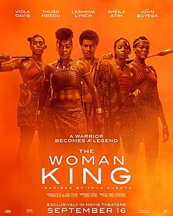
The Woman King is the latest film to demonstrate why Viola Davis is one of the greatest. While the narrative is historically inaccurate, a twisted history resulted in an empowering movie. Davis shines as the film’s lead while almost being outdone by her tremendous co-stars. The Woman King will go down as one of the most epic films this decade has to offer. Some viewers might be turned off by the dishonest presentation, but this is a true work of art.
Basing a film on true events is nothing new, but this has already drawn a lot of attention to The Woman King. Viewers have noticed the trailer isn’t telling the whole truth about its characters. The story centers on Amazon warriors that represent the Kingdom of Dahomey, which has a dark history related to slave trades. Director Gina Prince-Bythewood and writer Dana Stevens have crafted a story that doesn’t overlook the dark history. Instead, that history is converted into this inspiring theatrical accomplishment.
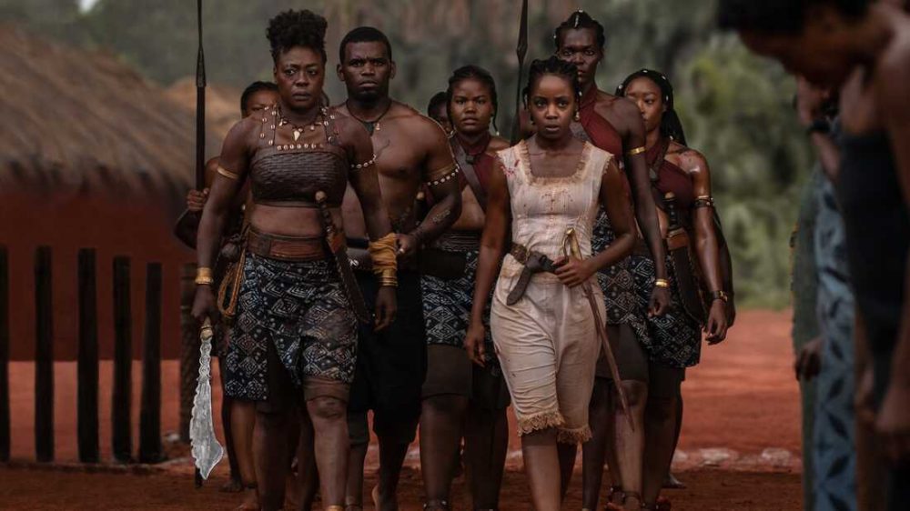
Davis is joined by Thuso Mbedu, Lashana Lynch, Sheila Atim, and John Boyega. The Woman King takes place during the 1820s. A group of warriors led by general Nanisca (Davis) train in preparation to fight off their enemy to protect the kingdom. Stevens’ screenplay works for many reasons, but the most profound reason is that it focuses on two people seeking their purpose in life. Nanisca might be their general, but she’s had to make a lot of unfortunate sacrifices along the way. Audiences will instantly feel connected to Nanisca due to the character’s traumatic background that Davis is able to make so compelling.
As mentioned, Stevens’ doesn’t shy away from the entire truth about the Kingdom of Dahomey. Glimpses of their slave dealings are present, and we’re even shown a few questionable scenes. While this is from a heroic lens, Dahomey isn’t portrayed as an innocent kingdom. Stevens incorporates enough to allow this progressive spin to feel rewarding. One major aspect this film excels at is its fighting sequences that never disappoint. The choreography was mesmerizing, and when accompanied by the score it becomes a gripping sequence of events.
Our cast of warriors is impressive in their roles, with Lynch being the standout as Izogie. A character that has been hardened by her abusive past yet refuses to let that define who she is. Lynch emphasizes this character’s resolve through an emotional performance that left me wanting to learn more about Izogie. Mbedu is another outstanding talent, as this is deemed her breakout performance. Starring as Nawi, a young woman with several similarities to Nanisca. The Woman King doesn’t always have the best pacing, and this is most evident with certain relationships and battle sequences.
Despite that, enough is established to grow invested in the narrative and the journey these characters embark on. The screenplay does have an unnecessary Romeo and Juliet subplot that isn’t engaging when it unfolds. If this wasn’t included then certain action sequences could have been allowed time to breathe. The Woman King does feel restricted by its rating, which makes some sequences unconvincing than others. That’s why the performances are crucial as well because they make you feel attached to everything on screen.
The Woman King is a movie that might upset some people, but if given a chance, you’ll see this isn’t a glorification of Dahomey’s slave trading practices. Elements of their history are changed to present this stellar action drama film. Davis is a true pleasure to witness in any role, and she doesn’t disappoint here as Nanisca. This is an emotional, action-packed, and inspiring tale about a group of women discovering themselves and defending their kingdom.