Home Blog Page 437

ALIENS: RESCUE #1 – How Will Alec Brand Handle His Latest Encounter?

Monkeys Fighting Robots

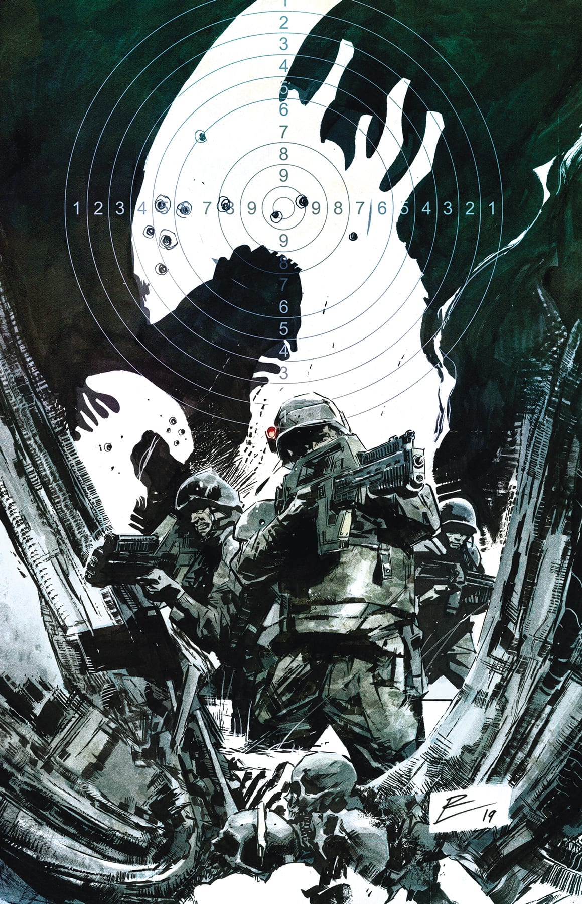
ALIENS: RESCUE #1 picks up years after ALIENS: RESISTANCE concluded. Now the young Alec Brand is all grown up. And he’s ready to follow the footsteps of his heroes.

Aliens Rescue 1 Cover
An appropriately dramatic cover for Aliens: Rescue #1

***SPOILER WARNING***

Aliens: Resistance left a mark on the fans of the Aliens franchise, so it was an exciting day when a followup series was announced. For those that may not recall (or those that simply want to pick up at this point), Alec Brand was once a young boy hoping to join a new colony. That was all before the aliens came into his life and with them his heroes Amanda Ripley and Zula Hendricks.

Now Alec is all grown up – and he’s a Colonial Marine to boot. He’s looking to save others just like his heroes saved him. More than that – he’s hoping to find his saviors, and maybe even return the favor someday.

Aliens Rescue 1 Alt Cover
The alternate cover of Aliens: Rescue #1 reminds us of the impending tension.

So far this series looks like it’s going to have a strong followup to the original, which isn’t always a given. Alec has truly grown up, a fact that took only a few panels to make clear. The events of his past clearly affected him, but who can blame him for that?

Aliens Rescue Pg 2
Little Alec Brand all grown up, and not all that little anymore.

Brian Wood did an excellent job of establishing the new plot, while also throwing in reminders of what the original series covered. He managed to keep the tension in the air, even when so many cards were on the table. A few quick bait and switches helped him in that area, at least.

The deep dive into Alec’s past was intriguing and gave us some new perspective on his character. Suddenly he’s more than a kid that was in the wrong place at the wrong time. Now he’s a man carrying the hopes of an entire village – quite an extreme difference.

It was an effective way to make the readers concerned for Alec. Now we’re all rooting for him to succeed since his success means his small village’s success. It was also a poignant reminder of the best parts of humanity – something that is sometimes lost in the darker alien tales.

This issue spent most of its time setting up for what is surely going to be a large plot. Now we know all of the important details about Brand’s history, as well as a connection between him and the other two characters (Ripley and Hendricks). The question is, what sort of situation are they in, exactly?

Aliens Rescue Pg 3
Alec confronting his past, with hopes of repaying the heroes who saved him.

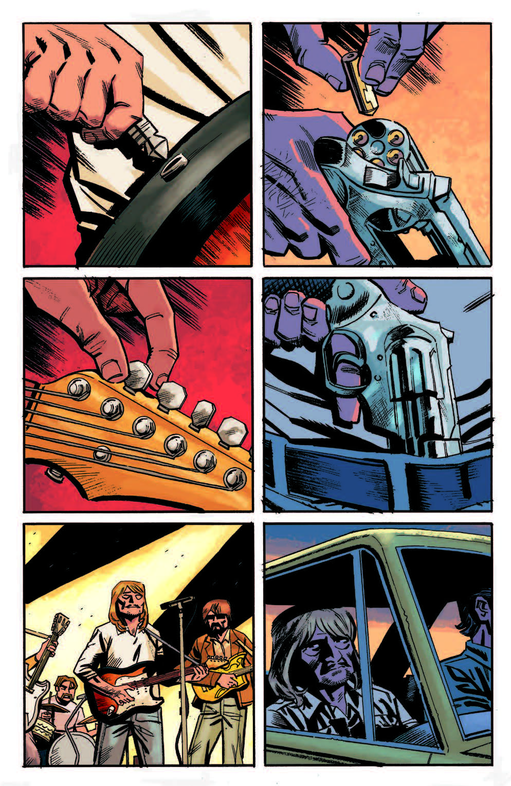
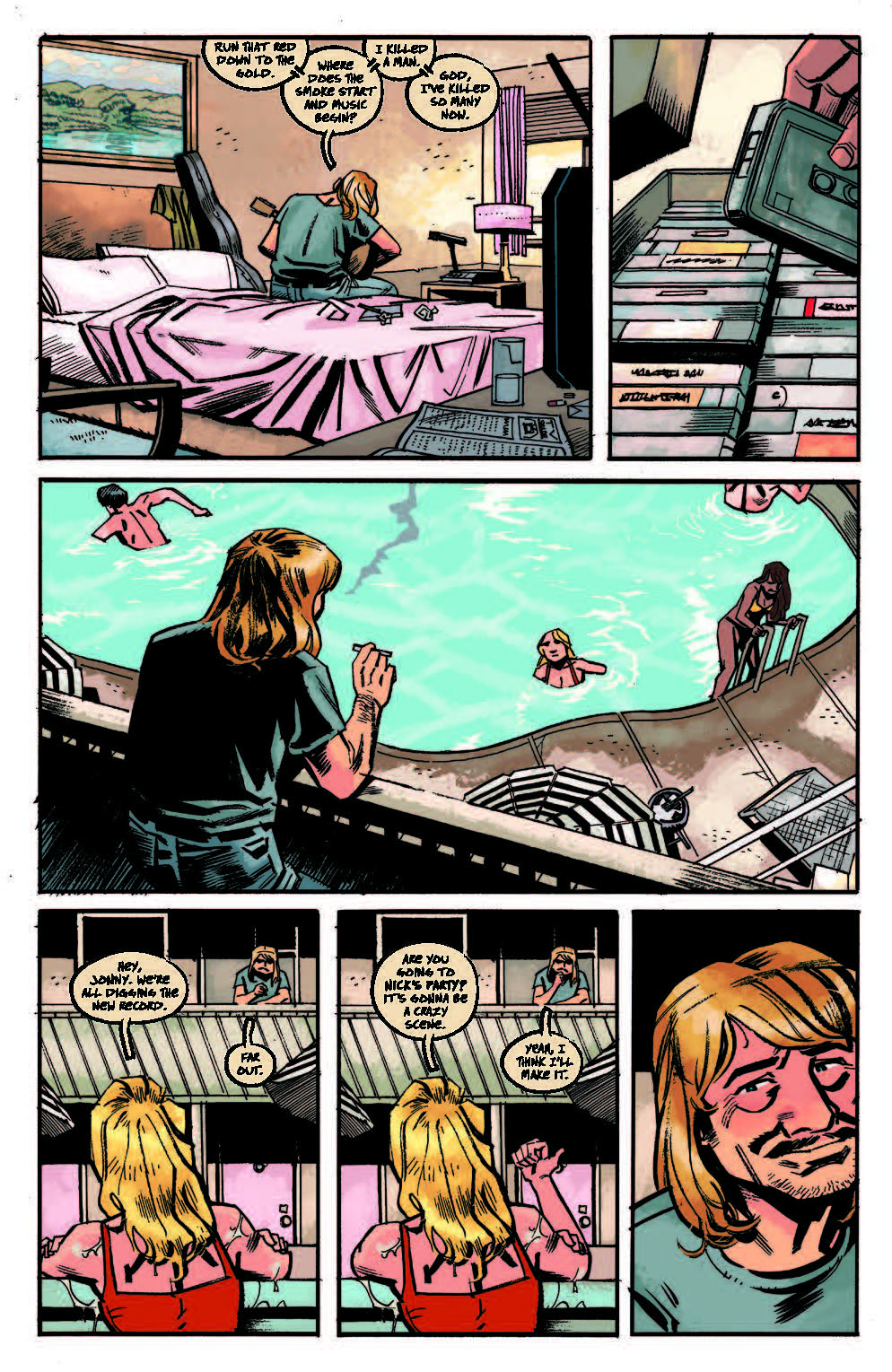
The art style for Aliens: Rescue #1 was nice and crisp. It’s a style that lends well to a space exploration tale, as well as creatures that don’t require a lot of shading. Such as the aliens, for example. It does leave the less intense panels feeling a bit bland at time. But that is something that’ll change soon enough.

Kieran McKeown was the penciler for this issue, while JL Straw did the inking. Together they created a basis for art that can go in any extreme. This is essential for what likely lies ahead. Meanwhile, Dan Jackson provided the colors – and the color palette matched perfectly to expectations based on the Aliens franchise.

There were some panels that were extremely effective, even early on in the issue. The split panels between Brand and his new commander, for example. It was oddly evocative, the dichotomy between the two.

Another smart decision was putting a slight patina effect over all of the flashbacks. It immediately gave the impression of an older film. This is something that allowed us to immediately translate the events as ‘older’, thus saving time on an explanation. Dan Jackson was the color artist on the issue.

The lettering for this issue was solid. Everything was clear and easy to read, even the location and date identifiers in the corners. All credit goes to Nate Piekos (of Blambot) for that.

Aliens Rescue Pg 1
Aliens: Rescue #1 had a massive team involved with the project.

Aliens: Rescue #1 has made the series look like it’s going to be an interesting run. While it is based on events in the previous series, they’ve clearly put effort into making it approachable for new fans as well, which is always a smart call.

Spending the first issue establishing the situation and characters was a smart call. Now the series will be free to focus on all of the action it desires. And since this is an Alien series, that is bound to happen.

What do you think about the plot so far? Will Alec Brand get to his heroes in time?

Monkeys Fighting Robots Youtube

Review: Get a Cosmic Master Class with THE HISTORY OF THE MARVEL UNIVERSE #1

Monkeys Fighting Robots

With 80 years of continuity, reboots, alternate worlds, and conflicting origins in the can, the Marvel universe can get a little confusing. Parsing decades of established canon is intimidating, especially for new readers. Fortunately, The History of the Marvel Universe #1 is here to set the record straight.

The book is like what DC did with their History of the DC Universe book back in the 80s, which outlined the official post-Crisis DC canon. It establishes a firm outline of what is gospel within the Marvel comics multiverse.

The Writing

The History of the Marvel Universe #1 is an abridged survey of everything from the pre-origins of the multiverse, to the early-Twentieth Century. The book outlines how the current multiverse came into existence on a varying scale. We begin at the macroscopic, cosmic level, and eventually dial-in on key figures in Marvel Comics history.

Releasing a book like this could be a great help for newcomers to the Marvel readership, many of whom tend to feel intimidated, or even put-off, by decades of complex canon and cosmology. It’s an interesting compendium for those new readers, and a vital resource for Marvel aficionados alike. Unfortunately, what it’s not—at least in this first issue—is a particularly compelling narrative.

The History of the Marvel Universe #1 reads like an outline, rather than a story. It lists out events as they occurred, with just a skeletal narrative tying it together involving Galactus and Frank Richards. The pair, the last surviving entities of the universe, provide a framing device for the story. Beyond that, it’s essentially CliffsNotes to the Marvel canon; so much so, in fact, that the book’s entire last third consists of annotations for cross-referencing key issues. As such, it’s difficult to judge it as a fully-constructed narrative.

It will be interesting to see what transpires in the next several issues. Will it foretell what’s coming in Marvel’s future? Will we see how the Marvel universe we all know ultimately meets its end…and what comes after that? It’s too early to really speculate on the scope of the story based on this issue alone.

History of the Marvel Universe #1

History of the Marvel Universe #1

History of the Marvel Universe #1

The Artwork

The artwork by Javier Rodriguez and Alvaro Lopez—the former on pencils and colors, the latter on ink—is one of the book’s strong points. The pair of artists provide a dreamy tapestry of images to illustrate Galactus’s outline of Marvel history and cosmology.

Early pages illustrating the formation of Earth and the cosmos flow borderless and shapeless from one into another. Later, The History of the Marvel Universe #1 becomes more firmly paneled as the Marvel cosmos grows and takes shape. It’s a clever device that achieves a nice visual effect along with the storytelling.

The illustrations, despite portraying a lot of contrasting images, maintain a sense of cohesion throughout. Between surreal space-scapes and illustrations of characters, the work still manages to feel uniform, which is a testament to the artists’ skills.

The color work is similarly brilliant. It’s vibrant and possesses a wide range of contrasts, but it manages to avoid overloading the reader’s eye. The colors and line work fit together to deliver a sublimely cohesive final presentation.

Final Thoughts

The History of the Marvel Universe #1 is a great quick reference guide, but it doesn’t offer much beyond that. I highly recommend Marvel fans pick this up for research and reference purposes. However, don’t expect a thrilling story out of it. Pick it up this Wednesday at your local comic book shop.

Monkeys Fighting Robots Youtube

Review: VALKYRIE JANE FOSTER #1 Back in the Saddle Again

Monkeys Fighting Robots

Post War of the Realms, Jason Aaron takes the helm, along with Al Ewing, for a new Jane Foster story as the last Valkyrie.

Aaron’s run on Thor saw Jane become Thor, culminating with her “death” in #705. This is the story of what comes next. CAFU is taking care of the pencils in this series, and right off the bat, you can see that this is some of the best interior art among current Marvel books. Ewing’s run on Immortal Hulk takes the series back to its horror roots; in Valkyrie, he’ll have Jane juggling her lives as a superhero and a doctor. Since the writing duties are split, it appears Aaron will be writing most of the story as it pertains to her human life and saving lives on Midgard. I think Ewing will be handling her other role with death as the last Valkyrie. Jesus Aburtov has the colors on lock. The armor glistening in the sun and the bursting weapons impacting during battle make for captivating fight scenes, as we are learning what Jane can do with her new powers. Joe Sabino has lettering duties and he is perfect for a story diving into the depths of Valhalla. The gold letters on a multi-hued blue background, matches the lead character and conveys a sense of regalia.

Spoilers follow

Valkyrie opens with Jane sizing up the Fast Five, who have robbed Damage Control and taken some Dark Elf and Asgardian weapons, Dragonfang being one of those weapons. Introducing Undrjarn, Jane’s new All-Weapon, that seems to change shape into whatever she needs at the time. Silver Ghost of the Fast Five uses her powers to become invisible, proving to be of no use against Jane with her new powers, as she can see Ghost flee and easily incapacitates her. Gold Rush, the coward of the group, possesses Dragonfang so Jane goes after him, before she can get to him, Redline throws a car full of people, allowing Gold Rush to escape with the sword. He doesn’t get too far as he is tripped up by a dark shadowy figure who stabs Dragonfang through GR’s heart. As we have learned, having two lives is quite tricky to maintain, so while Jane was fighting as Valkyrie, she arrives late to her own performance review at the hospital.

Jane is transferred to Morgue Assistant, upon arriving there is already a body present with a familiar wound, the body is Gold Rush. Learning this Jane summons her Valkyrie powers and teleports to Valhalla, here we learn the All-Weapon is also the key to the gate. Brunnhilde is inside, the owner of Dragonfang, and she explains the powers of this sword and why it is so dangerous in the wrong hands. Jane explains that she knows what she’s doing; she was Thor, then Brunnhilde delivers my favorite line of the book “Thor is a God. Valkyrie… is a job” The wielder of Dragonfang is given the ability to hide from God-Sight, so Jane recruits the help of Heimdall, who’s eyes are healing after the War. Jane gains some understanding of how to control her power that allowed her to see the invisible villain from earlier. She can also see the fates of anyone she looks upon; their deaths are visible to her.

Jane explains everyone has a fate, some large and some tiny, as she turns to Heimdall she sees that his is the largest of all. Rising from behind, we see Gold Rush’s murderer and Dragonfang’s newest owner. It’s a shocker!

Hopefully, Ewing has some awe-inspiring Valhalla quests lined up for this book. We’ve seen his version of Hulk’s hell. I can’t wait to see Jane navigating the world of the dead and see what horrors she comes back with. CAFU’s art in this first installment is absolutely gorgeous and Aburtov brings out the best in the art by blending the colors so realistically almost every millimeter of every page is a different color or different shade. Bringing the art alive with glowing eyes and shimmering weapons is exactly what you would expect from a story about a former God.

Pick up the issue on Wednesday to see how it ends.

What do you think of Jane Foster’s new role in the Marvel Universe? Is this a peek into Natalie Portman’s future in the MCU as well? Let us know what you think in the comments.

Monkeys Fighting Robots Youtube

Review: STAR TREK THE Q CONFLICT Limps Towards The Final Frontier

Monkeys Fighting Robots

All good things must come to an end and this week sees the epic Star Trek crossover The Q Conflict reach its dramatic conclusion. With Star Trek popularity riding high at the moment, it has been an ideal time for IDW to release this ambitious franchise wide undertaking.

But, in the final moments, how did the various crews of the various space vessels handle themselves in the face of such overwhelming odds? And were the creators bold enough to pull off such an epic enterprise?

STAR TREK THE Q CONFLICT Limps Towards The Final Frontier
Star Trek: The Q Conflict #6 Credit: IDW Publishing

In this issue the four captains have been given an opportunity to strike back against Q and his dangerous games. With the arrival of Wesley Crusher, Amanda Rodgers, and the mysterious Traveler, there is finally some light at the end of the tunnel.

But Q will not go down without a fight. A hoard of different aliens are called upon to fight the mutiny against Q’s games and all of the Universe hangs in the balance. It is up to the best of the Federation to stop an outrageous God for going too far.

And ‘going too far’ is a good way to describe the plot as presented by Scott and David Tipton. The original concept was strong but as each issue has floundered under the weight of an idea, the ending crashes to the ground without ceremony. It reads as though the Tipton’s have an Encyclopaedia of Star Trek Aliens in their lap and are ticking each one off as they include them in the story. An already overcrowded comic is simply packed with more and more character references. The narrative buckles beneath the cameo appearances and the plot just disappears.

STAR TREK THE Q CONFLICT Limps Towards The Final Frontier
Star Trek: The Q Conflict #6 Credit: IDW Publishing

Unfortunately, this is nothing more than a web of set pieces that the writers thought would be ‘cool’, spun together around the character of Q just because they can. There is no real rhyme or reason to any of it and the constant references to a universal war do not add enough meat to the bones of the story.

It is a disappointment to see The Q Conflict end in such a way because it had such good intentions to start with. The art work by David Messina and Elisabetta D’Amico has improved as the series has progressed, although it is noticeably again in this issue that Messina favours the closed mouth look for all of his characters in almost every panel. The character representations are solid enough for instant recognition but also have room to express emotional responses to the situations around them.

The fine inking by D’Amico allows for more detailed illustration in the panels. This helps to set the scenes early on but also draws attention to some moments due to the lack of detail. Occasionally the backgrounds drop away and the reader is left with the characters and their reactions. This storytelling technique is also evident with Alessandra Alexakis’ colors. In some panels there is a full color spread, picking up different aspects of the art but in other panels, the color is simplified. It focuses on the characters and their clothing while the background becomes a wash of natural color.

STAR TREK THE Q CONFLICT Limps Towards The Final Frontier
Star Trek: The Q Conflict #6 Credit: IDW Publishing

There are examples of awkward character work and the design is uninspired throughout but this is down to the unimaginative story. It seems to be important that everything is a reference to something. The Tipton’s want the readers to drowning in Easter Eggs instead of having to pick them out of subtext on a second or third reading. This is possibly due to the fact that this comic isn’t going to be read more than once. It is a difficult read, not because of complex storytelling or hard hitting narrative, but because the concept is watered down issue after issue until it is almost none existent.

Neil Uyetake attempts to inject some life into the comic via his lettering. He is clearly having fun with the sound effects and desperate to fill a lot of the white void that is Q’s battlefield. However, it is not enough to engage the reader. It is like putting an upbeat soundtrack over the slow paced movie. Here, as a reader, you take time out of the comic to appreciate the work the letterer has done in certain panels but then have no desire to return to the story.

Star Trek: The Q Conflict had lofty aims but in the end failed to hit any targets. The Artwork was consistent throughout but was ultimately let down by the dull story and over use of referencing. Luckily for fans of the franchise there are much better Star Trek comics currently being published. In some ways it probably a good thing that this particular story has finally come to an end.


Monkeys Fighting Robots Youtube

Review: SWORD MASTER #1 Energetically Blends Fantasy, Martial Arts, Manga And American Comics

Monkeys Fighting Robots

Sword Master #1 slashes it’s way out of Marvel Comics recent ‘War Of The Realms’ crossover and blends action, fantasy, mythology and martial arts into a manga-influenced book with tons of energy.

MIGHTY MARVEL MARTIAL ARTS DOUBLE TROUBLE! ALL-NEW ONGOING SERIES! You saw him tear through Fire Goblins in WAR OF THE REALMS with his big, damn magic sword! Now learn the mysterious origins of LIN LIE, A.K.A. SWORD MASTER, Marvel’s newest Chinese superhero, in the English language debut of the original series written by Shuizhu and drawn by Gunji! Haunted by dreams of demons, Lin Lie hunts for his missing archeologist father – and for the secret of the black sword he left behind. And in a brand new story written by Greg Pak (NEW AGENTS OF ATLAS), Sword Master teams up with SHANG-CHI! What happens when an undisciplined, untrained kid with a magic sword, tangles with the one and only, undisputed MASTAninditoER OF KUNG FU? (Spoiler alert: they will indeed drive each other crazy, with huge ramifications for the Marvel Universe!)Sword Master

Sword Master #1

‘Sword in The Tomb’
Written by: Shuizhu
Art by: Gunji
Adapted by: Greg Pak

‘Sword Master & Shang-Chi: Master Class’
Written by: Greg Pak
Art by: Ario Anindito
Colors by: Rachelle Rosenberg
Letters by: Travis Lanham

Story

Sword Master #1 contains two stories, and although they are different in style and look, both have the same narrative purpose in mind: catch up readers on who Sword Master is, what his purpose is and how this new character fits into the post War Of The Realms Marvel Universe. Both chapters succeed and create a fast, action-packed reading experience.

The first story, ‘Sword in The Tomb’, is a translation of a previously printed tale. This short chapter is a solid introduction. It suffers a bit from exposition and an often used dream sequence to get a lot of information across, but it moves fast and it’s engaging enough that it doesn’t drag or bore. There’s plenty of action and pathos. You also get a definite feel as to who Lin Lie is though his conversation and relationship with his friend Cheng (who is a classic best friend/sidekick right off the bat). Lin seems to be on then Peter Parker type of young superhero; he’s driven by tragedy but is not overly dark. It’s clear he feels he has a responsibility to find out what happened to his father and how he fits into this new world he has been thrust into. It also ends on a good cliffhanger.Sword Master

The second story, ‘Sword Master & Shang-Chi: Master Class’, takes Lin to New York, dropping the reader in medias res of Lin confronting a few unsavory dudes. It’s here that we get one of the highlights of the issue, an awesome appearance by Shang-Chi, Marvel’s Master of Kung-fu. Shang-Chi is one of Marvel’s ‘cult’ characters, and an appearance by him is always welcome. It means we’re going to get to explore a different side of the MU and that’s always exciting. This chapter is written by Greg Pak, and the writer creates an instant sensei/student dynamic between Lin and Shang-Chi that feels natural. Hopefully, this relationship remains central to the book. The training sequence, in particular, is nicely done and also serves as a good way for people who may not know who Shang-Chi is to get a good idea of who/what the character is.

Art

Both stories here have really strong art, and each feels distinct to its own chapter. ‘Sword In The Tomb’, illustrated by Gunji, is very much of the manga school (big eyes, lots of speed lines, body movement and dramatic, intense facial expressions. Here there is only a hint of western comics influence coming out via panel placement and structure. It’s a visual treat; it’s just pretty to look at.Sword Master

Chapter two’s art falls in line more closely with what we see in most Marvel Comics, but it still has the same energy, flare and dynamics we got in ‘Sword In The Tomb’.  Ario Anindito and Rachelle Rosenberg have good synergy and create a slightly darker tone that gives ion the New York atmosphere that helps create a strong sense of place. Sword Master

Conclusion

Sword Master #1 shouldn’t be missed. It’s great to see Marvel give a different kind of hero and story a chance. Comic readers should do the same. So grab a comic at your local comic shop!

Monkeys Fighting Robots Youtube

Review: FEARLESS #1 Seems Great On Paper But Falls Short On Execution

Monkeys Fighting Robots

Fearless #1 takes a promising idea but fails to deliver the goods because two of the stories are memorable for the wrong reasons.

Fearless #1
Storm’s dialogue is one of the highlights of Fearless #1

Fearless #1

“Campfire Song” 

Writer: Seanan McGuire

Artist: Claire Roe

Color Artist: Rachelle Rosenberg

“Style High Club”

Writer: Leah Williams

Artist: Nina Vakueva 

Color Artist: Rachelle Rosenburg

“Unusual Suspects”

Writer: Kelly Thompson

Artist: Carmen Carnero

Color Artist: Tamra Bonvillain

Lettering: Janice Chiang

In theory, Fearless #1 is exactly the kind of content that Marvel needs to be producing. It’s a comic that features women characters and it’s written exclusively by women. Plenty of readers might hear that and think, “Yes! Sign me up!” This writer is part of that group. This series is inherently exciting because, at least on some level, it demonstrates that Marvel knows diversity and representation need to be a priorities moving forward. But Fearless #1, as a comic book, fails to tell compelling stories and it doesn’t provide many reasons to hope for the rest of the miniseries.

Fearless #1
Carol’s unnamed coworker steals the show in this scene.

Let’s focus on the most successful of the three mini-stories included in the issue, “Campfire Song.” This snippet is the only one of the trio that will receive another installment in the series; writer Seanan McGuire’s snippet was the only one that ended with “too be continued.” The beginning of McGuire’s plot isn’t perfect; Carol Danvers, who the writer calls the “heroine of heroines,” is a non-factor and she’s conversationally outshined by her unnamed French coworker. Danvers’ usually snappy dialogue is absent and she’s practically invisible in the portion of the story.

Fearless #1
Will Sue Storm’s distrust of the camp prove to be valid?

Speaking of invisible, Sue Storm kicks things off in a scene with her husband Reed Richards. The dialogue between the two effectively sets the stage for what’s to come; McGuire establishes that Storm distrusts the Gloriana Leadership Camp for Female Empowerment, where she and other heroes will be giving speeches to the technological geniuses of tomorrow. Storm thinks the camp is too secretive but Reed encourages his wife to ignore her instincts and attend the event anyway. Reed’s actions are fair because Storm could be overly paranoid. But, given that this is a Marvel Comics, it’s far more likely than shenanigans are on the horizon.

Fearless #1
Storm is the MVP of Fearless #1.

Of the trio of heroines involved in “Campfire Song,” Storm (relatively) fares the best. She fends off some loggers who insult her because she’s a mutant. Storm doesn’t show much restraint with these men; after they criticize her and one of them throws a rock at her, Storm unleashes a nasty storm of lightning and rocks on them. This aggressive approach seems to defy the lessons of Charles Xavier but Storm redeems herself with some moving lines after these actions.

“Men and their money,” Storm says. “They have the means for making more than they’ll ever need without violating pristine boreal forests like this one. Have they never heard the word ‘enough’ before? But perhaps none of us know what ‘enough’ means.” Storm’s words add some much-needed weight to what had been a mostly unmoving story. Hopefully, she, along with Storm and Danvers, will receive more chances to explore meaningful real-world issues as the miniseries continues.

Fearless #1
In “Campfire Song,” the settings feel like organic places.

The art team of Claire Roe and Rachelle Rosenberg deserves credit because they make each of the settings (a camp in Maine, an apartment in Manhattan, a station in Earth’s orbit in space and a forest in Canada) feel genuinely distinct from one another. At the camp site, you can practically smell the bug spray and campfire smoke. Roe fills the background with trees and Rosenberg’s usage of rich greens complement the feeling that the camp is deep in the woods. You can also practically hear the sounds of traffic when the story shifts to the Richards’ home in Manhattan; the buildings look particularly industrialized and the effect is augmented by the jarring juxtaposition of the city and the campsite. Finally, the astronomical purples used by Rosenberg help transition the story’s setting from the city to outer space and the dreary gray skies help contrast the Canadian forest from the one seen at the campsite. Roe and Rosenburg help make each part of the story feel fresh but the consistent art styles remind readers that each piece is connected.

Quick Hits

“Style High Club,” the second portion of the issue, could have been really enjoyable. Writer Leah Williams had the opportunity to dig deep and satirize society’s superficial value of appearance. Instead, the story features the worst of Instagram culture, where most people are obsessed with selfies. Most of the story reads like an episode of a CW show about teenagers. Chili is a stereotypical mean girl (armed with loud sunglasses and a coffee drink from the equivalent of Starbucks) and a chunk of the snippet focuses on her rivalry with Millie, the main character. Like the issue itself, “Style High Club” takes a fascinating idea and doesn’t make the most of it.

Fearless #1
In “Style High Club,” Chili is embodiment of several cliches.

The third mini-story, “Unusual Suspects,” will disappoint the reader because it sets up an intriguing mystery and abruptly ends. Elsa Bloodstone calls Jessica Jones and asks her for help without providing many details. Writer Kelly Thompson and the art team of Carmen Carnero and Tamra Bonvillain establish this mysterious tone because Thompson doesn’t give a lot of explanation and the artists draw Bloodstone in close-up panels so the reader can’t see her surroundings. Jones comes to Bloodstone’s rescue and finds her surrounded by miniature versions of Marvel’s leading heroines, including Captain Marvel, Gwenpool, Ms. Marvel, X-23 and others.

Fearless #1
Fearless #1 ends on a frustrating note.

But there’s no resolution; Bloodstone simply says, “I don’t want to bloody talk about it, Jones!” Then, the story simply ends. What happened to the heroes? The world may never know. Maybe Thompson is just playing with the fans but, as a reader, that’s a frustrating tease, especially when it closes out the issue.

Given the talent that’s involved, fans should trust that the miniseries will get better. But, based on this opening installment, it’s off to a lackluster start.

What do you think of Fearless #1? Where do you hope to see it go from here?

Monkeys Fighting Robots Youtube

Review: KILLER GROOVE #3 Is A Masterful Work Of Storytelling

Monkeys Fighting Robots

Music and murder go hand in hand in the third issue of AfterShock Comic’s Killer Groove. As Ollie Masters begins to tie up the numerous threads of his story, the readers are in for a visual treat.

Jonny’s music career is beginning to take off as his violence inspired songs become hits. He has started to play the big gigs and frequent the hip parties but on the side, his other career as hired hit man, is also blossoming.

Meanwhile Jackie has a new case, one involving the music business. During her search for a guitar her path crosses with her former boyfriend, Jonny, and the consequences will be far reaching.

Killer Groove #3
Killer Groove #3 Credit: AfterShock Comics

The plot might be fairly straight forward but Masters’ handling of it is not. The comic starts with three set pieces, each establishing character and each with the same narrative rhythm. They also set up the main bulk of the story for this issue; leading the characters and readers all to the same place. It is fascinating to see Masters draw the story together, nudging the plot and tightening the narrative so it all comes naturally together by this issues close.

The conflict between the cast drives the story while developing the characters. It is a comic about interactions and contrasts. The duality of Jonny is juxtaposed against the straight forward, black and white thinking of Jackie. The extras in the cast are there to highlight certain elements of each lead in the same way that the plot does. By the end of this issue the reader has a greater understanding of both Jackie and Jonny.

Killer Groove #3
Killer Groove #3 Credit: AfterShock Comics

Eoin Marron’s expressive art work is flush with gesture and expression. Each scene has an establishing shot, often of an outside location, which is then followed up by mostly close ups, often with only one character in shot. This focus on the character allows Marron to control the narrative, allowing the reader only to see what Marron wants the reader to see. The occasional wide shots add additional information only when it becomes relevant to the plot or the tone.

As with previous issues the overall tone of the comic is provided by Jordie Bellaire’s colors. She injects each page with an overall feeling that grabs you the minute you turn a page. Then she alters the occasional panel to give a particular moment a punch, making it stand out on the page.

An act of violence, for example, is shrouded in red tones with a solid red background; this draws you to the panel instantly and then you read the page around it. The act of violence becomes the important part of the page and the reader is then forced to interpret the motivations and consequences by reading the surrounding panels. It creates a focal point which the narrative flows around.

Killer Groove #3
Killer Groove #3 Credit: AfterShock Comics

The other important aspect of the comic, and helps the reader understand the character interactions, is the superb lettering by Hassan Otsmane-Elhaou. The speech balloons with their flat ended tails instantly gives Killer Groove a unique look. The coloring makes the speech blend with the artwork so that it fits naturally on the page and doesn’t create a barrier between the images and the speech. The complex handling of the text, changes in font style and size, adds yet another layer to the comic which is already stacked high with interacting storytelling techniques.

Killer Groove is a pulp crime story that revels in being a comic. It embraces all aspects of comic book storytelling and is a prime example of what it is possible to do with a page of art, color and text. The story is fascinating and emotionally gripping and the way that the story is being told is masterful. In the same way that Raymond Chandler wrote stories that were a pleasure to simply read, Masters and co. have produced a comic that elicits the same, all-encompassing delight just by opening the pages.

Monkeys Fighting Robots Youtube

Review: COLLAPSER #1 – Nice Guy DJ Turns Superhero

Monkeys Fighting Robots

It doesn’t seem like a popular trend to make the main protagonist in your comic book a genuinely nice guy, such as Liam James in Collapser #1. I’m not dense there will always be the genuine all-American nice guy Superman, your friendly neighborhood Spiderman, most of the energetic Flash incarnations, and so many more A-List optimists dressed in colored tights. But these characters can feel a bit cartoonish sometimes, almost nice for the sake of being nice. Writers Mikey Way and Shaun Simon, artist Ilias Kyriazis, colorist Cris Peters, and Simon Bowland with letters team up to create something new, a genuinely anxious-nervous too-nice guy and an all-around solid introduction to the world of Collapser.

Collapser #1 centers around soon-to-be hero Liam James receiving a package that turns out to be a black hole that seemingly changes the world around him. Writers Way and Simon do an adequate job of setting the world around James, but very much excel at making him feel real.

Throughout James’s inner monologue during his work shift, he is determined to play a game of chess with his elderly patient, Mr. Edgar. Even in his monologue during his DJ setlist, he is coaxing himself through it- reassuring himself to keep his anxieties at bay. Even as he gets into a fight with his girlfriend, he is stating how is making the right choice.

The use of the monologs sell how introspective and anxious Liam is, and it draws a sharp distinction between the more cocksure or stoic nice guys of more popular books. In a word, Liam is simply real compared to his contemporaries, someone you could imagine struggling in this world. Unfortunately, there was not as much information on the rest of the chapter regarding the rest of the plot. Most of this issue was dedicated to the introduction of Liam and his situation.

Due to this singular focus, it can get confusing as to what exactly the black hole does. It seemingly allows him to speak to people that are dead, but that feels empty and punchless so it cannot possibly be it.

Liam James with sword
That sword isn’t a toy anymore

Kyriazis’s lines are detailed and expressive. His style can come off a tad cartoonish, which meshes well with the nice-guy attitude Liam has, but when Kyriazis is allowed to run wild on splash pages is where he shows his stuff. At Liam’s DJ set, people are dancing, making out, and just jamming and Kyriazis fits right at home depicting the hectic chaos of the event. His quieter scenes feel sterile and plainer in comparison. Cris Peter’s colors add to the cartoony elements of the story. Peter uses deep blues and reds with frequency, and it compliments Kyriazis’s splash panels very well.

It’s hard to not like a chapter when it’s sole purpose is to set up its main character as a nice relatable guy. Luckily, Mikey Way and Shaun Simon succeed at bringing Collapser’s hero Liam James to life and Kyriazis and Peter’s combine to bring the mood and overall vision to the forefront. Collapser #1 does nothing but inspires for the future of the series.

Monkeys Fighting Robots Youtube

Review: SONATA #2: Cool Creature Designs Carry Another Solid Issue

Monkeys Fighting Robots

Sonata #2 follows a stellar debut with a not as sensational second entry. All of the items fans adored with the first issue, stellar world-building, interesting characters, and cool technology and monsters are still present. But writers David Hine and Brian Haberlin’s story can be a bit overwhelming with fictional lingo or borderline cliché tropes. Haberlin’s lines are still impressively detailed and depicted, and Geirrod Van Dyke’s colors mesh well with the worn-in aesthetic of the setting, but there is something off-putting that will push away some readers. But these are mainly minor personal gripes, and readers who fell in love with the first issue will find more of the same in Sonata #2.

Sonata #2 revolves around Pau finding Sonata and Treen in the Lumani’s forbidden area, and how Pau and Sonata’s tribes react to finding they are missing. There are certain tropes here that Haberlin and Hine are playing into in this chapter that will go over differently with certain readers.

It certainly feels that they are using a “Romeo & Juliet” vibe between Pau and Sonata, especially as Pau directly thinks that she is ‘Definitely’ into him, and of course the “uneasy pact between warring factions that will most certainly end in betrayal” theme between the Rans, Tayans, and Lumani.

All of this is made bearable by the fact that Sonata, Pau, and Treen are interesting and fully developed characters. Sonata is rebellious, independent, and brave while Treen is staunchly neutral and sticks with the tenets and beliefs of his tribe. Pau serves as a source of playful chaos in the group dynamic with his cocksure attitude and heavy reliance on technology.

Unfortunately, their tribes do not get the same treatment and are shaded in a more black and white manner, with minimal differences and no subtlety. The Rans are peaceful, The Tayans are warriors that rely on tech, and the Lumani are the indigenous people. That’s pretty much all the differences. Hopefully Haberlin and Hine give the same amount of attention and nuance to the tribes as they do their three main characters in later issues; otherwise, this series could grow a bit stale.

God crushes guy
All hail your new lord, a giant stone colossus thing.

Haberlin’s linework is incredibly detailed and impressive. His style veers more towards photo-realism, but there is something not quite right about it. Perhaps it is Van Dyke’s colors because when it comes to people the figures look almost superimposed onto the background like a bad PS3 cut scene. This is a style that is seen in other books, and it is most certainly not bad, but it can be off-putting to some audiences.

That being said, the monster and overall character designs are top-notch. The chimera-bird-creature that attacked Sonata and the god that awoke at the end of the issue is truly breathtaking.

Sonata #2 is a solid entry into the series. While not as effective as the debut Brian Haberlin and David Hine’s story is still effective as is Haberlin and Geirrod Van Dyke’s art and Frances Takenaga’s letters. Sonata remains a book to watch out for sci-fi fantasy fans.

Monkeys Fighting Robots Youtube

Review: THE LION KING Is An Unnecessary, But Delightful Trip Down Memory Lane

Tales of MFR #1

The Lion King was a massive success upon its release in 1994, and to this day remains one of the best-animated stories ever told. The film was praised for its animation, memorable songs, and the talented voice actors that brought it all to life. Now, an updated take on the story has been released for a new generation to enjoy. However, the same emotional impact isn’t there.

Directed by John Favreau (The Jungle Book) and written by Jeff Nathanson, the film features a star-studded cast consisting of Donald Glover, Seth Rogen, Chiwetel Ejiofor, Alfre Woodard, John Oliver, James Earl Jones, Beyonce, and many more lending their voice talents. Just like the original, The Lion King follows Simba, a young lion prince tricked into leaving behind his birthright after a tragedy occurs, but later discovers who he is and returns to claim his rightful place as king. The film doesn’t have its own identity, as it stays very close to the original. While that is probably for the best, it also proves that The Lion King didn’t need to join in on the rising trend of remakes in Hollywood.

Even though most of them are underutilized, the vocal contributions are impressive across the board. Timon and Pumbaa, voiced by Billy Eichner and Seth Rogen, are resurrected in a manner that almost outshines the original. Jones’ reprisal of Mufasa lacks the enthusiasm he possessed the first time around, and it more than likely is due to how realistic this movie ended up being. Glover’s portrayal of Simba was an unexpected delight as well, but a lot of the supporting cast was acceptable at best or just not giving it their all.

THE LION KING – Featuring the voices of John Oliver as Zazu, James Earl Jones as Mufasa and JD McCrary as Young Simba, Disney’s “The Lion King” is directed by Jon Favreau. In theaters July 19, 2019. © 2019 Disney Enterprises, Inc. All Rights Reserved.

Despite that, The Lion King is a visual spectacle, and the circle of life has never looked this awe-inspiring. Favreau’s immersive landscape, combined with its loveable inhabitants and their infectious singing, makes for a fantastic experience from start to finish. After his success with The Jungle Book, it isn’t surprising that he has created a sensational depiction of Pride Rock, which many would consider a masterpiece. However, the realism of our animals is the film’s most significant detraction.

While the visual effects are a remarkable component, they also strip the on-screen characters of anything that resembles an emotion. The voice acting can’t be executed or delivered in a manner that was present in 1994. Most of the lines feel downplayed and nonchalant. These animals are supposed to be “live-action” and in our own real-world now. So because of that, some if not all of the animal’s expressions do not match with what is being said, it’s as if they couldn’t care less, which is what a real-world animal would appear like.

The beauty of The Lion King wasn’t merely in its story or catchy tunes; it also relied heavily on the animations of the animals, which made the content more impactful to viewers. The anguish, and heartbreak in Simba’s eyes after he finds Mufasa is no longer present, so the moment doesn’t hit home the same way. Luckily, Nathanson’s screenplay doesn’t go off the rails, and he plays it safe by telling a frame-for-frame story that millions can adore. There’s even some refreshing banter added between Timon and Pumbaa, which is one of few extra additions to this far too familiar tale.

THE LION KING – Featuring the voices of Florence Kasumba, Eric André and Keegan-Michael Key as the hyenas, and Chiwetel Ejiofor as Scar, Disney’s “The Lion King” is directed by Jon Favreau. In theaters July 19, 2019. © 2019 Disney Enterprises, Inc. All Rights Reserved.

Adding to that, the iconic opening sequence featuring “The Circle of Life” is present, Simba gets his expected solo, and of course, “Hakuna Matata” outshines them all. Scar, who is magnificently voiced by Chiwetel Ejiofor, has his iconic song “Be Prepared” stripped down to a waste of time sadly. With a near thirty-minute extra runtime, it’s a bit disappointing that the song wasn’t given a proper spotlight. Hanz Zimmer returns to compose the score, as he should, and delivers all the same tunes for a new generation to join in on.

While not a horrendous reimaging, The Lion King is the year’s risk-free remake that tries to avoid upsetting an entire generation by staying close to home. Substituting animations for a photo-realistic Africa landscape, the film loses out on recreating lively animals. It does retain the charming characters though, which is enough for some moviegoers. Since this is so similar to the original, the overall story isn’t bad by any means, it just isn’t as impactful and feels like an unnecessary rehash.

Monkeys Fighting Robots Youtube