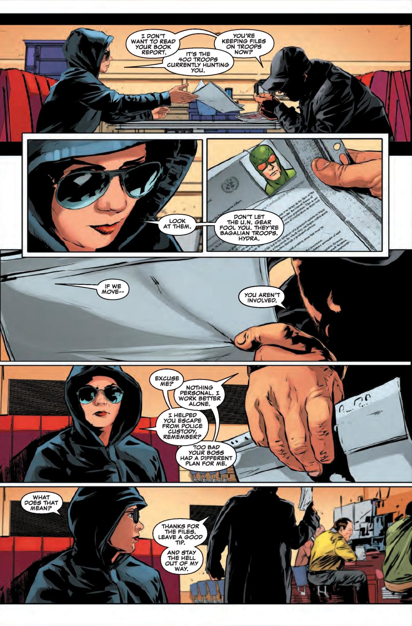
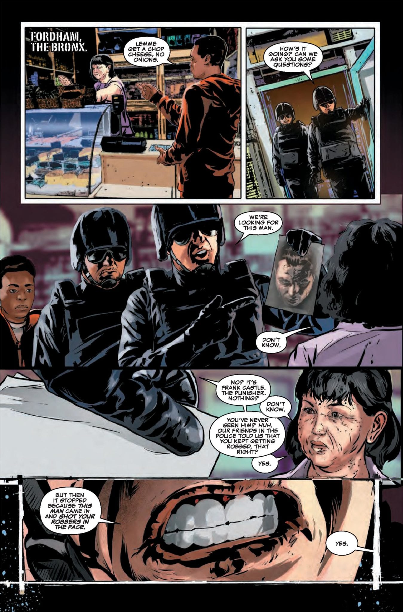
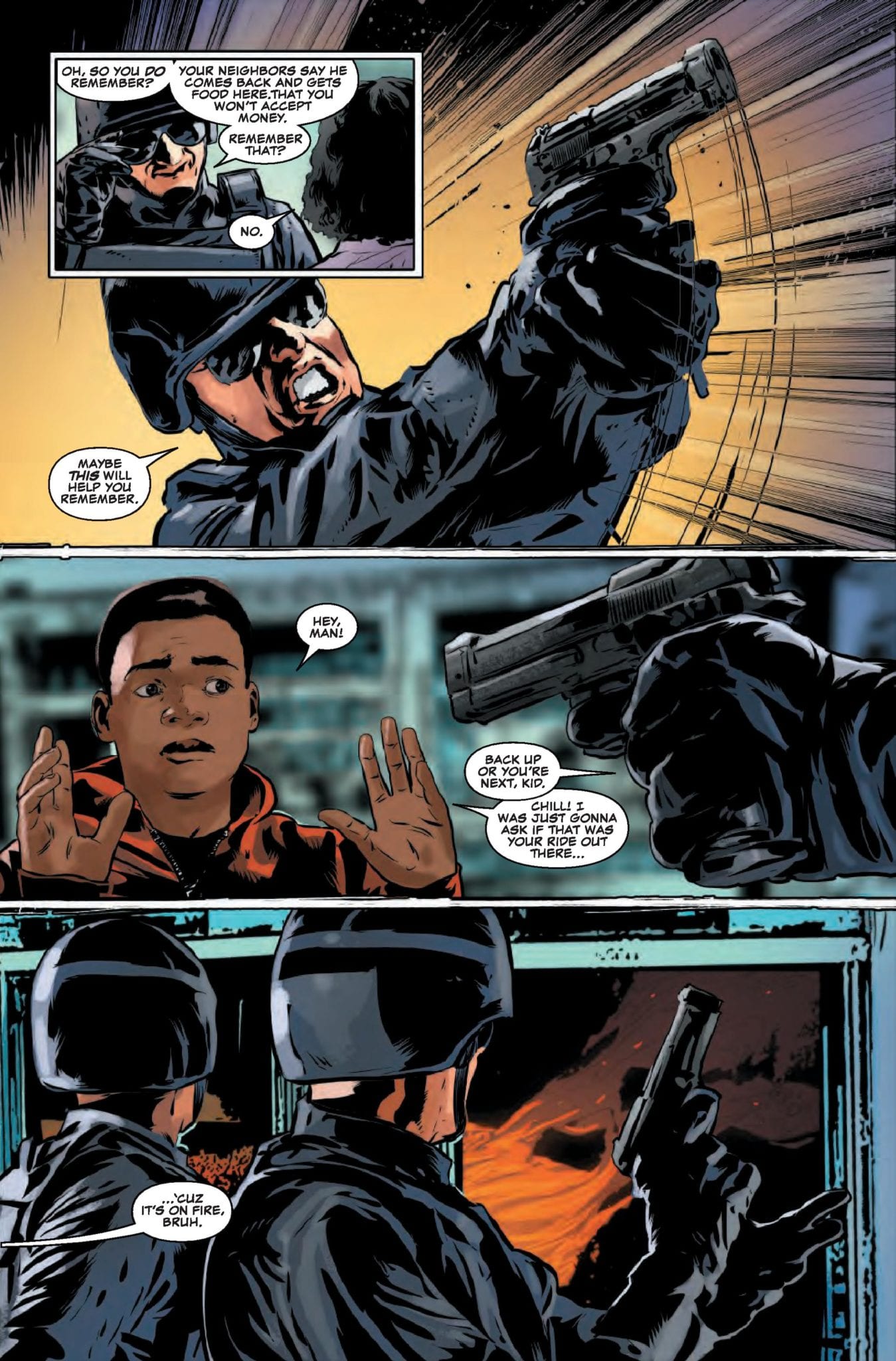
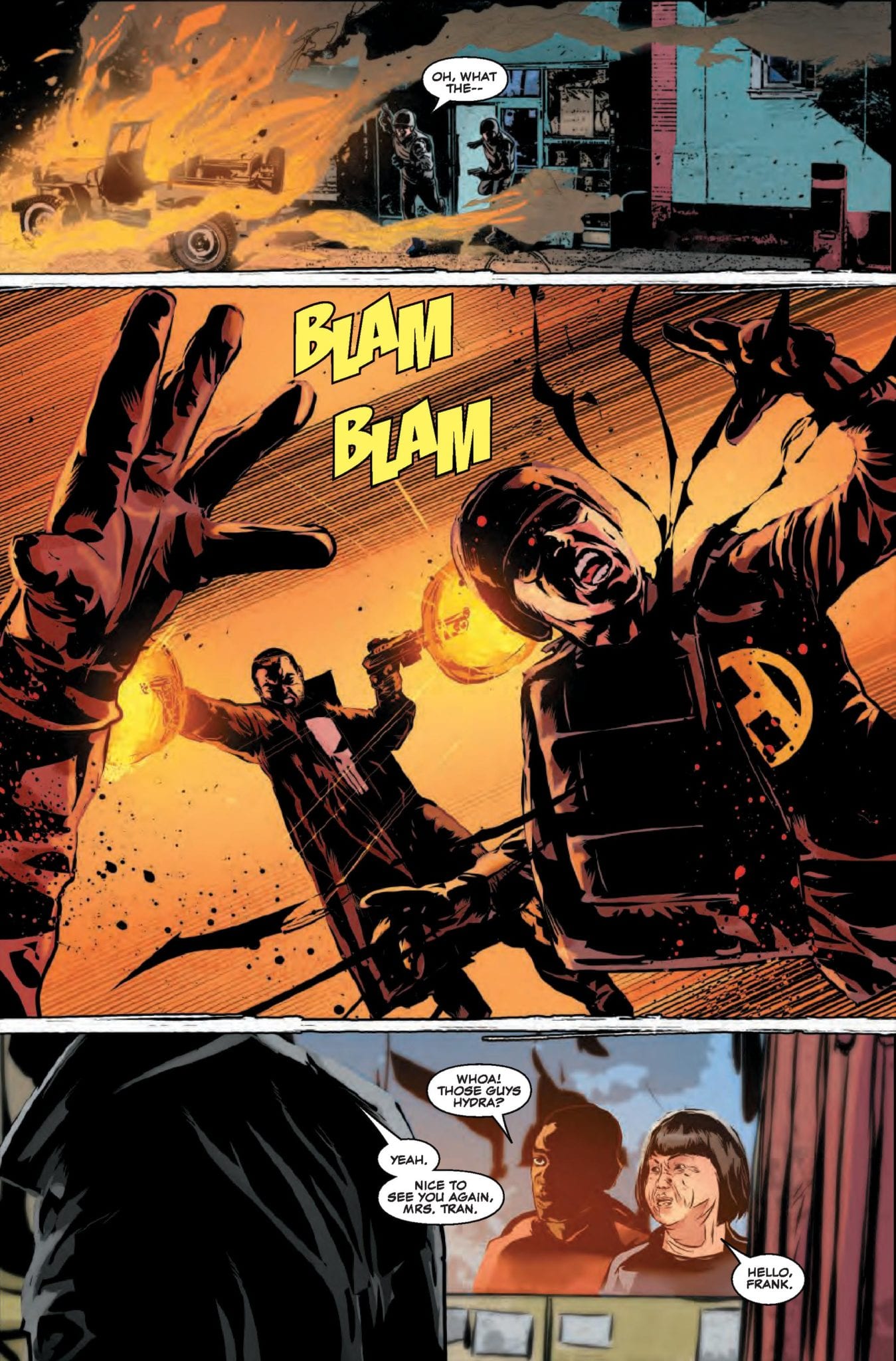
The Punisher #14 is out August 7th, but thanks to Marvel Comics, Monkeys Fighting Robots has an exclusive four-page preview to share with you.
The book is by writer Matt Rosenberg and artist Szymon Kudranski, with colors by Antonio Fabela and letters by Cory Petit. The cover is by Greg Smallwood.
About the issue: Zemo’s battle against the Punisher hits the streets of Manhattan! It’s all-out war…just the way Frank likes it. Someone’s brought backup for Frank, but the Punisher doesn’t play well with others…
This issue is part three of the “War On The Streets” storyline. It deals with the fallout from Marvel’s 2017 Secret Empire event, with Frank Castle going head-to-head with Baron Zemo.
Rosenberg took over writing the previous volume of The Punisher with issue #218. After eleven issues, the series was renumbered at #1, and Kudranski joined Rosenberg on the book. The two have worked on every issue of this volume together except one (Smallwood did interiors on #6 in addition to the cover), which is a consistency you don’t see often nowadays in Big Two comics.
Take your first look at THE PUNISHER #14:
What are your thoughts on the current Punisher run? Let us know in the comments!
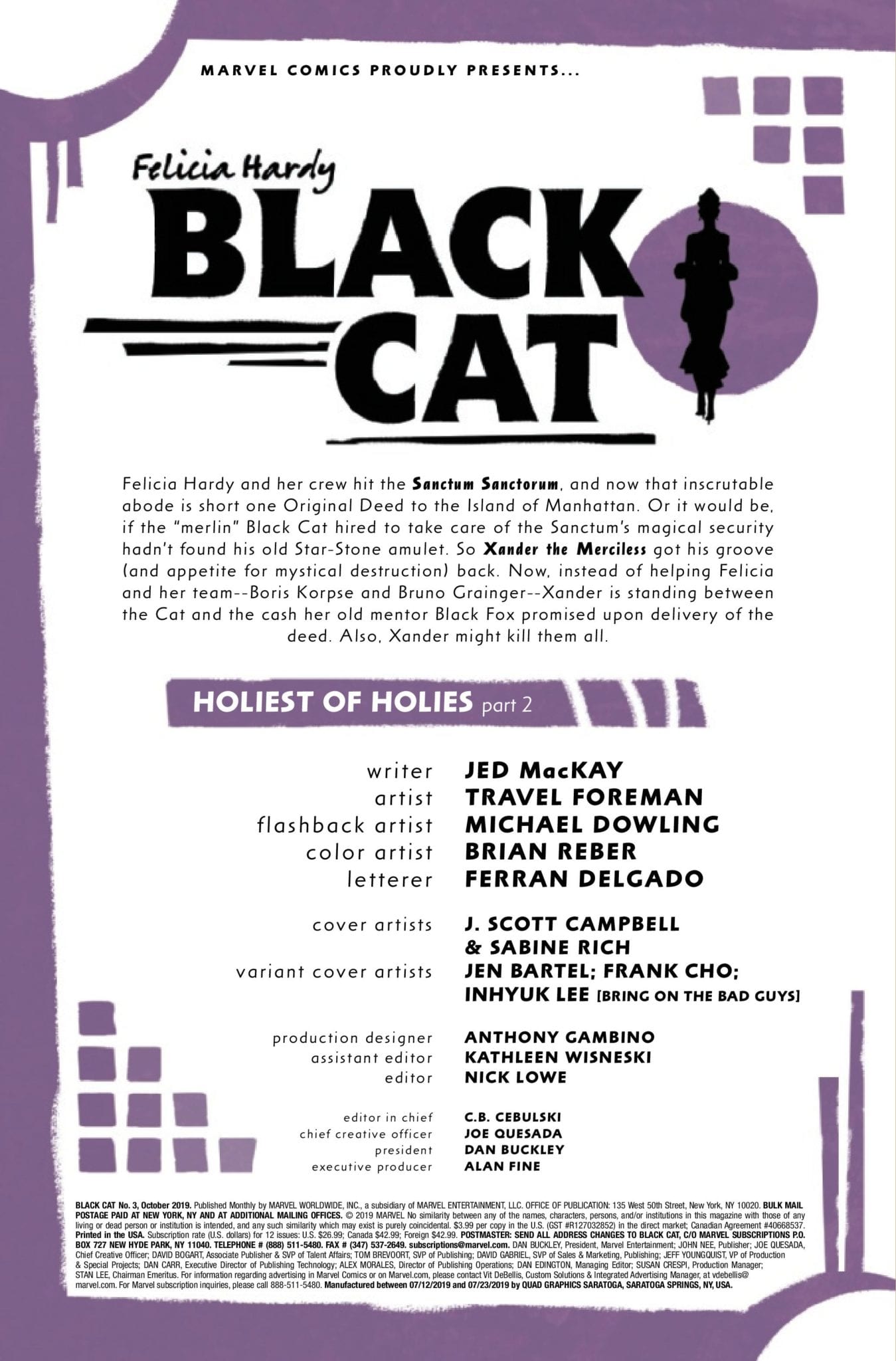
Black Cat #3 hits your local comic book store August 7, but thanks to Marvel Comics, Monkeys Fighting Robots has a four-page preview of Felicia Hardy’s crazy adventure.
About the issue: Surprising no one, Black Cat’s heist of Doctor Strange’s Sanctum Sanctorum has gone horribly wrong. Felicia and her crew are under attack in a place where any wrong turn or opened door means certain death. It would take an insane amount of luck to get out alive. How much luck would it take to get out alive with the loot?
Black Cat #3 is written by Jed MacKay, with art by Travel Foreman, Michael Dowling is listed as the flashback artist, colors are by Brian Reber, Ferran Delgado lettered the book. The cover is by J. Scott Campbell and Sabine rich, with variant covers by Jen Bartel, Frank Cho, and Inhyuk Lee.
The Black Cat was created by writer Marv Wolfman and artist Dave Cockrum, and back in the summer of 1979 she first appeared in The Amazing Spider-Man #194.
CHECK OUT THE BLACK CAT #3 PREVIEW BELOW:
What do you think of MacKay’s take on the Black Cat? Comment below with your thoughts.
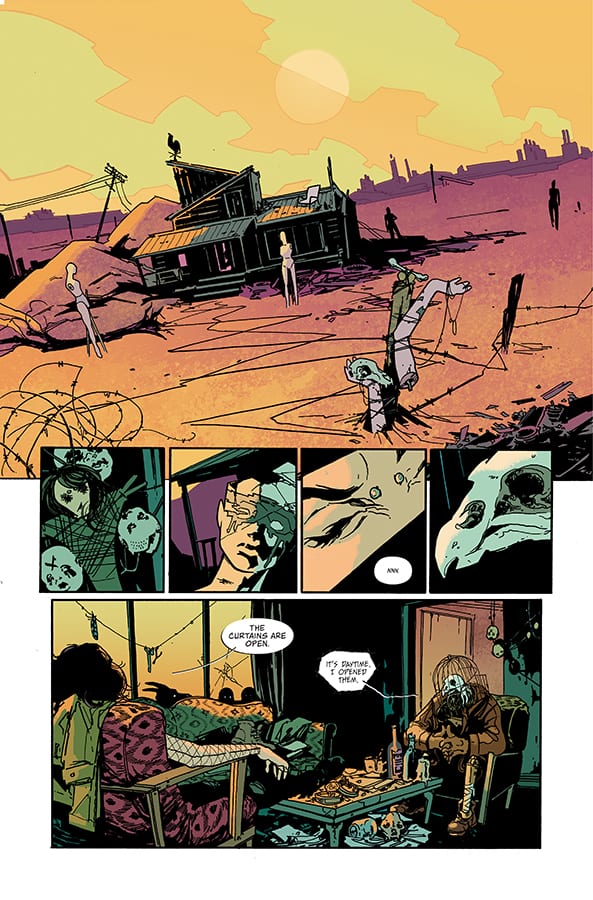
Tank Girl meets John Wick in Image Comics’ new dystopian title Coffin Bound, released next week. It is a bleak action story that skirts the fringes of fantasy and horror to tell the story of one woman who is dragged back into a world she hoped was gone.
Dan Watters tells the story of Izzy Tyburn; a character bursting with attitude, prone to violence, and someone who just wants to be left alone. However, if the killers on her trail won’t leave her be then no-one is going to get any peace.
Coffin Bound #1 Credit: Image Comics
Watters sets the scene from the very first panel. The world of Coffin Bound is desolation and decay. This idea is picked up by the characters that the reader is introduced to in the opening pages, especially that of the Vulture. His appearance symbolises death and one of his opening statements refers to himself as ‘circling the dying’.
The character design offers a nod to classic comics like The Sandman but also more recent offerings like the fantasy western Pretty Deadly. Dani’s artwork captures the characters very succinctly. You get an instance idea of the personalities on the page from the visuals. When the car of suited men turns up in the desert, their murderous intent is instantly recognisable.
Dani draws on stereotypical imagery to speed up the storytelling and also poke fun at mass media conventions. The typical gangster appearance and the dystopian desert world, set up a scenario which is instantly recognisable and in turn allows the writer and artist to play with the reader’s expectations. The opening scene, especially when it comes to the page layout and panel composition, is about scene setting and stating visual intent.
Coffin Bound #1 Credit: Image Comics
There is an element of abstraction within the artwork that focuses on character moments or actions. The dropping of the background or removal of features creates unrealistic images but gives the moment weight. Dani’s layouts are about enhancing elements of the story or character in the most striking possible way.
The color work by Brad Simpson is surprisingly vibrant for such a darkly themed comic. The landscapes especially have a brightness to them that frames the characters in the foreground. When a darker tone is required, such as during night scenes, Simpson still brings the panels to life with deep purples ad crimsons that accentuate the black outlines and shadows.
The art style gives Coffin Bound a grunge look; like a modern version of The Crow. You can almost hear the alternative rock score playing in the backgrounds. One of the ways that the comic achieves this aesthetic is through Aditya Bidikar’s lettering. He has adapted the style of the speech balloons to match the gritty, road movie vibe. The ellipses do not have neat edges and only the underside has a black boarder, like a shadow on the speech. This creates the impression that the speech is merging with the art, becoming part of the scenery.
The Vulture’s speech is almost the opposite. It is jarring and has sweeping, hand drawn slashes for boarders. It gives The Vulture an otherworldly presence within the comic, similar to Morpheus’ speech in The Sandman.
Coffin Bound #1 Credit: Image Comics
Coffin Bound is like a road movie with its own visual language and narrative beats. The plot is unravelled through the actions of the cast and their introduction to the reader. The abstract element within the art takes its cue from the disjointed story and nothing can prepare the reader for the series of events that unfold.
Imagine Tank Girl starring in an Alan Moore horror comic and you will have a pretty good idea what to expect from Coffin Bound. Violence, fantasy grotesques and nods to modern music, such as a background cameo from the late, great Keith Flint, make up an exhilarating ride of a comic.
In a year already filled with great comics, releases like this just keep pushing the bar higher and higher.
Strayed #1, a new sci-fi series from Dark Horse Comics hits your local comic book store on August 14. The tagline does engage readers with an interesting premise, Most cats have nine lives, but the fates of billions rest on this feline.
I was excited to read Strayed #1 because who hasn’t ever wanted to speak with their cat or dog? Despite the unique and fun premise, the first issue does not reach the high goals it sets for itself. Unfortunately, writer Carlos Giffoni and artist Juan Doe miss the mark with poor characterization, depressing tone, and confusing world-building decisions. While the premise still holds incredible potential, it will take some work to fulfill it.
Strayed #1 introduces us to Lou, the cat, and Kiara, his owner aboard a spaceship in orbit. Kiara invented a device that lets her communicate with her cat, then learned her cat can astral project to basically anywhere in the universe. The government (I guess, Giffoni never explains who is actually holding Lou and Kiara.) learned of this invention and forced Lou and Kiara to scour the planets for a new homeworld full of resources and capable of sustaining human life.
Needless to say, the government lies and holds Kiara and Lou hostage until they find the origin of a mysterious, infinite energy resource. Along the way, the government also co-opts Kiara cat communicating technology to torture indigenous aliens for information.
Perhaps the biggest critique with Giffoni’s script is how serious it is. If Giffoni wants to take Strayed in a darker more political direction, there is a story to tell there as long as the tone remains balanced. Unfortunately, the script feels unnecessarily dower and distrusting. There is no moment of levity to balance it out unless you find the premise of cats astral projecting to find hospitable planets funny in of itself. Kiara as the central protagonist of Strayed is uninteresting and unfulfilled as well. It seems the only thing she does in this spaceship is yearn for her cat.
More questions pop up throughout the issue. Why did Kiara had over her animal communicating technology to the government? What happened to Earth? Are they just using Lou or are other cats involved? And Giffoni does not seem interested in answering these questions at all, yet they are integral to the characters future decisions. If we even got a quick expository flashback with all of the answers, it would be incredibly enlightening.
Nothing could possibly be wrong with anything that glows that incandescent green color.
If there is one highlight in Strayed #1, it is Juan Doe’s art and colors and contributions from letterer Matt Krotzer. While the humans and spaceship settings can be cookie-cutter by design and drenched in sepia, the scenes drawn from Lou’s perspective are interesting and borderline trippy. When Lou is projecting too far-off planets, the colors are vibrant, lively, and allow Doe to experiment with panel layout and framing. When Lou remembers his past, prior traumatic events are flashed on the panel beside his alarmed eyes. When depicting explosions and other kinetic scenes, Doe can be heavy-handed with the bright colors. One scene in which the humans destroy a planet almost hurts the eyes when stared at too long.
Strayed #1 has such a unique and whimsical premise, and Giffoni’s script and the story are allowed to be dark and distrusting, as long as the script and tone remain balanced. However, Giffoni’s tale feels troubled and incomplete. Doe’s art and colors lift the plot when they can, but the visuals are not strong enough to carry the first issue. The second issue needs to come out strong to hook the reader for the long term.
Jeff Lemire, Mike Deodato, and Frank Martin bring the blood, sweat, and tears with Berserker Unbound.
Do you love it when terrible people are relieved from the burden of having his or her head attached? When evildoers lose limbs for what he or she has done? I sure do, and you should too!
Deodato and Martin establish the homeland of our lead character right off the bat. Harsh suns, desert sands, and some smaller mountains in the distance, reminiscent of the old Looney Tunes Road Runner episodes when you see the dust being kicked up from miles away. The Mongrel King struts into view with some of the fiercest uggs you’ll ever see. He dons very intimidating clothing, but just what you would expect from a barbarian, skulls, chains, more skulls, animal fur, some large slicing and chopping utensils, and a shield.
WARNING: SPOILERS FOLLOW FROM THIS POINT ON.
The intensity of the sun could be a character itself. Martin has given every scene a blistering red tint like the entire sky is on fire. Unfortunately for the Mongrel King, his village is actually on fire. In barbaric fashion, he finds his wife and daughter murdered on the floor of his home, and the rage fuels his guilt and lust for blood. Steve Wands is a perfect fit for this story carrying plenty of experience with this creative team. His lettering feels like old scrolls we would be grabbing off the foot of a raven, helping to immerse the reader into this universe of blood.
While fantastically done, Lemire’s writing takes a backseat to Deodato’s artwork in this issue. Breathtaking full-page spreads are broken up into panels for seemingly no reason at all except to remind us that we are reading a comic and not standing in an art gallery. After the Mongrel King learns the fate of his beloved and his daughter, Deodato stretches his feet and gives us some of the most brutal battle scenes in recent memory. Blood spattering everywhere, arms, legs, hands, heads, arrows, fists, punches, all are flying through the air towards an unfortunate recipient.
Lemire gives us an excellent rendition of a barbarian epic that might seem overdone, but you would be wrong. While the likes of Conan are arrogant and fearless, the Berserker is not. He has doubts, fears, and has lost his family as well as his will to live. A mysterious entity known as the Mist is foreshadowed by a menacing figure holding one of the coolest weapons I’ve ever seen. The character designs are nothing to be dismissed here either. Heavily reliant on furs and skulls, these characters wield the unyielding. These swords and axes would crush you even if you managed to block the blow.
When the Mongrel King falls victim to sorcery, he is sucked into some kind of inter-dimensional terminal. The Berserker is presented with eight bright neon symbols which he believes to be different pits of hell, and he chooses the enter the pink one. This is the type of thing that might be ignored by your average reader, but in my experience, the seven other symbols that the Mongrel King did not enter could mean possibilities for seven more stories to emerge from this one.
The creative team of Lemire and Deodato does it again. If we’ve learned anything from past Lemire stories, there promises to be more sadness, loss, and despair ahead. Whether you’re a fan of fantasy, epic battles, mystery, suspense or just what promises to be a great story, strap in because it’s going to be one hell of a bloody ride, partner.
Were there enough severed body parts for you? Let us know what you thought in the comments!
A technologically advanced society clashes with a Beat Generation sensibility in the second issue of Test from Vault Comics.
Fusing a spiritual quest with drug like hallucinations and an obsession with the possibilities of technology, writer Christopher Sebela has created a David Lynch-esq landscape populated with social misfits and science fiction cast offs.
In this second issue of Test, the history of Laurelwood begins to unravel along with it’s possible future. Sebela takes the fears of modern life and moulds them with an off kilter landscape to create a discussion about society. His central character appears detached from much of the world around him, lost in an addictive haze which allows Sebela to leap from idea to idea seemingly without connection.
However, there is a tightly controlled plot holding everything together and it only seems chaotic as the reader, like Aleph, wanders lost through the mysterious town of Laurelwood.
Test #2 Credit: Vault Comics
Testing Storytelling
The artwork is as off kilter as the story it is trying to tell. Jen Hickman uses harsh inked lines to scratch out the characters in the panels, favouring shadows made of lines instead of solid blocks. This gives the images an eerie appearance almost as unsettling as swords thrust through hands or needles stabbed into arms.
The characters in Test have been rendered in such a way that the technological elements stand out on the page. Alien like handcuffs and upgrading implants appear more fluid and natural against the harshness of the humans themselves. The story is a topsy-turvy contradiction and the art work represents that.
The coloring attempts to match this approach to the world building. Harry Saxon uses unpleasant color choices for backgrounds and contrasts the technology with the natural world.
The highlight, from a coloring point of view, is the switch between the past and present in Aleph’s life. Saxon makes it clear which panels belong to in the past and which are part of Aleph’s modern day view. The transition is smooth and clear so as not to disrupt the flow of the story. The narrative jumps back and forth between the time periods with an easy distinction for the reader.
In contrast Aleph’s internal narration sweeps its way across the page linking the present to the past physically and ideologically. Hassan Otsmane-Elhaou uses a font unique to Aleph clearing marking out his internal dialogue from the rest of the speech.
Otsmane-Elhaou’s lettering feels as experimental as the rest of the art work. Small touches in the design of the speech balloons or the more obvious integration of sound effects into the artwork itself gives each page something extra for the reader to digest.
The break-up of large speeches and the positioning of speech balloons, overlapped with caption boxes, controls the reader on the page. The overlaying speech balloons create a naturalistic flow of conversation, similar in style to Steven Spielberg’s obsession with having characters talking over the top of each other in his movies. The effect is the same: it lacks the unnatural pauses between lines of dialogue making it feel more realistic.
Test #2 Credit: Vault Comics
Conclusion
Test is a visual onslaught. The panels seem to oscillate on the page as the narrative punches its way through. The creators embrace the comic book format while subverting it to create an uncomfortable world for the reader. There is a unravelling stream of consciousness that is not always easy to follow but that is the point. As a reader you are being pulled along by the meandering river of the narrative and expected to take in the sights. Only after the ride has finished do you have time to fit the pieces together.
Just like issue 1, Test #2 has an experimental theme running through it; starting with the plot and running through into the art. It is a fascinating experience and a pleasurable read if you allow yourself the freedom to let go of conventions.
THE RUNAWAYS continue their emotional journey in ‘But You Can’t Hide Pt IV.’ They’ve been facing a lot of changes of late, with lots of surprises and twists. And it looks like it’s finally time to talk things out.
***SPOILER WARNING***
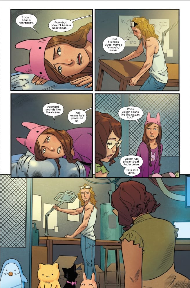
Victor and Doom Bot, two unlikely friends.
If you’ve been following the series lately, then you already know that there’s been a lot of internal drama going on within our Runaways team. Relationships are changing, characters are feeling and expressing doubt, and others are branching out to try new and different things.
In short, it’s a bit of a hot mess. But at least that makes it an exciting read for its fans. The last issue left fans off at a bit of an anxious point, not knowing the fate of Victor or the oddly adorable Doom Bot he’s befriended.
Look at all of Molly’s (presumably) adorable stuffed animals!
Naturally, this issue sought to give us those answers. But it did so in a shockingly emotional manner. Every now and then Runaways surprises us with these curveballs (especially back when Brian K. Vaughan was at the helm). You’d think we’d learn to expect them, but nope.
Victor and Doom Bot aren’t as bad as we feared…but their conversation is more akin to an emotional journey than just two pals chatting. It’s intense, but it’s also something they needed to talk for a long time.
Rainbow Rowell did an excellent job of infusing all of the confusion and emotions Victor and Doom Bot were feeling. It turned what could have been a bland talk into something bigger. Something almost groundbreaking. What had been an attempt to save a friend turned into a debate about the very nature of what makes us human.
Molly isn’t always the best when it comes to coping.
Meanwhile, everyone else is trying – and failing – to avoid the elephant in the room. On the bright side, perhaps it’s a good thing that everyone was able to air their emotions and concerns. That’s the first step in growing up and accepting, right?
There were a few brighter moments to lighten up the heavier tone in this issue. Most of them revolved around characters not having intense heart-to-hearts, unsurprisingly.
It’s been interesting to see this team change and evolve over time. Every time we get complacent with the situation, Marvel Comics has switched it up. And that’s probably a good thing – even if it does make our hearts hurt from time to time. At least this time they haven’t brutally murdered any of the characters. Yet.
Everyone could use a break right about now…
The artwork for this issue was interesting. One the one hand everything looked more or less like we expected it to. Bright colors, bold shapes, the works. And of course, all of our characters looked like they should. But on the other hand, there are the panels in which Victor and Doom Bot are talking. These images all look slightly different. It’s the same art style…but it’s harsher and more feral. And it’s all very appropriate for the situation when you think about it.
Andres Genolet was the lead artist for this issue, while Matthew Wilson provided the colors. Interestingly, we have two more artists to cite as well. The first is VC’s Joe Caramagna, the letterer for the issue. The second is Niko Henrichon. They’re listed as the Doom dialogue artist. It’s not every day you see somebody pulled in for something so specialized. But in this case, it seems like it was the right call.
The photo on the right always seems to show a happier time for this crew.
Runaways #23 was an interesting read, on the whole. It may not have been full of action, but it covered a lot of points that are vital to the characters we’ve grown accustomed to seeing. It’s clear that they’re setting up for even more changes to our crew, the only question is, what’s next?
A serial killer that’s supposed to be dead is murdering children again! Leave on the Light, the title is great. It’s a little jarring and that works.
Another entry from Antarctic Press, this time in the slasher horror genre. Bradley Golden and George Aguilar provide the script for this installment. Alex Sarabia takes care of the pencils, with Lahkem Amiyr handling inks. Shannon Smith has the colors, and Hector Negrete is lettering.
Sarabia’s art in this serial killer crime story has the perfect feel. Your attention is drawn directly where it needs to be, and an often overlooked quality of this art, the characters are distinct. A great amount of detail has gone into making sure the characters look different, and no one gets mistaken for someone else, which, to me, is the most important part of telling a horror story.
Leave on the Light has some great artwork, but lack of originality leaves much to be desired. With the slasher horror genre, it is hard to be original, but that’s where great characters like Michael Myers, Jason Voorhees, and Freddy Krueger have survived for decades. They are all strong and intriguing characters, and that why people come back again and again for more.
The killer is revealed pretty early in the story, so we’re not given any sense of mystery into his identity, except for a name. His design is nothing original as he appears to be still wearing his prison jumpsuit. Michael Myers was channeled for this killer just without a mask, and admittedly with a cooler knife.
Where most horror stories steer clear, and where I must give Golden and Aguilar credit, is the willingness to push the envelope and kill children. Usually, that’s something most books won’t even consider so they can avoid controversy or backlash. Just look at the crap DC Comics got for a title like Second Coming, the petition ultimately did nothing as it was just released by a different publisher, but I digress.
The most disappointing trope in Leave on the Light is the tired older lead detective that doesn’t play by the rules, punches reporters, smoke cigarettes, his kid is dead, and I’m willing to bet he doesn’t get along with his superiors either, and his partner makes excuses for him that he’s just misunderstood.
Leave on the Light is disappointing, because I wanted to enjoy this story, but with the current economic climate of the world, this $3.99 would have been better spent on a cheeseburger.
What did you think? Am I horribly wrong about my assessment? Tell me why and what else you thought about Leave on the Light.
STAR WARS: AGE OF RESISTANCE SPECIAL truly does live up to its name. In this issue there are three tales told, all focusing on the rebels we all know and love. So if you’re a fan of Holdo, Maz, BB-8, or Poe Dameron, this is an issue to check out.
***SPOILER WARNING***
Our heroes striking dramatic poses.
You never quite know what to expect when a special comes out, especially not for a series so well known as Star Wars. Yet Age of Resistance Special was a pleasant surprise, splitting the issue into three separate tales. The tales all follow different characters introduced in the latest round of movies, but the cover likely gave that element away.
Maz knows who to hire when a job needs to be done.
‘Maz’s Scoundrels’ is more or less exactly what one would hope for and expect from a story involving Maz Kanata. She’s wily, oddly charismatic, and overall a very quirky little character. So any plot involving her is going to be as well.
Her short went a long way in reminding us of the reasons she has the reputation she does. Not only does she know who to hire for the job, but she isn’t afraid to get her hands dirty along the way. The subtle edge of manipulation didn’t hurt things either.
Tom Taylor was the author behind this plot, which explains a lot about the feel of it. He gave Maz plenty of credit when it comes to her skewed intellect. And he kept up the banter we know and love from Chewie and Solo.
Meanwhile, Matteo Buffagani provided the art, and Chris O’Halloran did the coloring. Together they made a piece that was clearly influenced by the movies themselves – the characters looking like they walked right off the screen.
What a charming little plant.
‘The Bridge’ is the second story in this issue, and it focuses on a character that only made it into one of the Star Wars movies. We’re talking about Holdo here. Obviously, anyone who has seen Star Wars: The Last Jedi is well aware of what happened to Holdo and thus knows that this event took place before the movie.
This is the tale of how Holdo got her reputation. It explains everything about how she came into her rank…as well as telling us her preference for how to handle situations. An iconic scene of hers is mirrored here, but that is more telling than anything.
G. Willow Wilson wrote the plot, and you can see how much effort was put into making this character standout. They didn’t have a lot of time to work with Holdo’s character, nor did they have a lot of source material to pull from. But they did an interesting job nonetheless.
Elsa Charretier and Nick Filardi are the artists for this one, and they went the opposite direction of ‘Maz’s Scoundrels.’ While you can still tell which character is which, they opted for a more stylized version of the world, full of vibrant colors and blockier shading. It was effective, and oddly endearing for the plot.
Poe’s excited about another mission, which sounds about right.
And finally, the last tale in this special issue is ‘Robot Resistance.’ This is likely the one that’ll become a fan favorite, thanks to the presence of BB-8. A known favorite for obvious reasons. BB-8’s almost comical personality shines through perfectly in this story. And it didn’t skimp on the opportunity to give the little droid all of the credit he deserved.
Speaking of, while even the characters gave BB-8 and his new friends all that credit, the lines did feel a little forced at times. But perhaps that isn’t a major complaint, in the grand scheme of things. It was still fun seeing the little droid scoot around, create trouble, and ultimately save the day.
Chris Eliopoulos is the author who gave BB-8 so much airtime and credit. And you can tell he had a lot of fun writing this one. Extra credit has to be given for all the scenes he snuck in that allowed for droids to zap storm troopers.
Javier Pina and Guru-eFX are the final artists to be listed for this issue. They opted to go with an art style more typical to the Star Wars franchise. But even so, there was a lot of personality snuck into those droids and their antics.
A huge set of creators for this issue.
There are two major elements that helped to tie these three plots together. One was the overall theme. Each character was showing off his or her ability to resist, distract, or otherwise cause chaos for their side. The second element was more visual – there was only one letterer, VC’s Travis Lanham, who worked on the entire issue, thus ensuring a sense of consistency throughout.
Overall, STAR WARS: AGE OF RESISTANCE SPECIAL is a solid set of short stories, that are full of charismatic moments and interesting artwork.
So what did everything think of this issue? Was BB-8’s tale your favorite, as predicted? Or did you enjoy one of the other plots more?
Set in the world of Valiant’s Ninjak series, Killers #1 is the perfect jumping-on point for newcomers who want to read a simple, clean, and visceral action series. Writer B. Clay Moore, artist Fernando Dragnino, colorist José Villarrubia, and Letterist Jeff Powell craft a brutal and straightforward entry point for new readers into the Ninjak and Valiant extended universe.
The script will not wow you, as it is formulaic, but it achieves what it sets out to do, be a visceral revenge tale with tons of action and violence. Moore’s words are efficient and kinetic, meaning the story mainly acts as a vehicle to direct the reader from fight to fight. The story boils down to someone is tracking down and attempting to murder a group of enhanced assassin’s called Ninjas. Ninja’s can live longer and have supernatural abilities such as invulnerable skin, super strength, quick reflexes, etc. A couple of Ninja’s survive their assassination attempts and join together to defeat their attackers.
If the plot sounds familiar, it’s because it is. But Moore adds some fun flavor to it to keep the reader entertained. The character’s dialogue is punchy and abrupt, and characters breeze through plot exposition efficiently. It’s almost as if some of the characters have heard this story and just want to get to the action as much as the readers have. While Ninja-G’s interrogation scene would have taken a third of the chapter in similar issues, in Killers #1, G gets her information within three chapters.
Some of the characters definitely have more thought behind them than others. It is evident in the number of unique quirks present in each one. Ninja-G acts as a pure force of destruction with little to no personality, which is understandable considering her circumstances, while Ninja-J is witty and personable with local merchants. J even goes to extra lengths to inflict punishment because his attacker destroyed his favorite Vape pen. Little details like that make the difference when fleshing out characters and making them relatable.
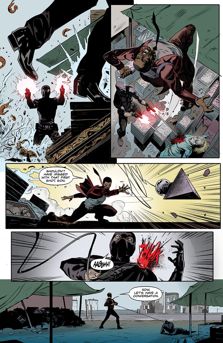
Agent J Handles His Attackers
Dragino’s art and Villarrubia’s colors contribute immensely to Killers #1. Dragnino’s style is more realistic with intense and distinguishable line work, and Villarrubia’s heavy shading gives the story a noir vibe.
Where Dragnino and Villarrubia especially excel, is at depicting fight scenes. The best example is Ninja-J defending himself against his attackers. The entire fight takes place within five pages, but so much controlled destruction happens within those pages, and it is an excellent showcase for J’s fighting prowess and abilities. There is a fantastic kinetic energy in this scene that makes the reader jump from panel to panel, and each series of movement is punctuated with J doing something supernatural like breaking a knife on his body or deflecting bullets. There are individual touches like the environment shifting to green whenever something supernatural is happening and then fading away as the fight ends that are incredibly effective.
Killers #1 if anything is a violent romp through the Ninjak universe. Moore’s script is punchy and engaging enough to carry the plot towards Dragnino and Villarrubia’s frantic fight scenes. While not perfect, there is nothing wrong with having some violent fun with Killers #1.