Home Blog Page 433

Review: SONS OF CHAOS Is An Epic Tale Of Revolution

Monkeys Fighting Robots

Sons of Chaos is out now from IDW, and it’s an epic, gritty tale of war, independence, and betrayal, all based on a true story.

The graphic novel is by writer Chris Jaymes and artist Ale Aragon. Hi-Fi Design did the colors, Pablo Ayala did the letters and the map, and Mariah Huehner edited the book. The cover is by Dave Palumbo. The story itself is credited to both Jaymes and Jordan Beckett.

Chaos is set largely in 1821 during the Greek War for Independence, “a conflict that quietly influenced the entire world.” It’s the story of Marcos Botsaris, the son of a Greek leader who was taken prisoner as a child by one of the Ottoman Empire’s most villainous pashas.

sons of chaos review

But before even discussing the story or the art, we have to praise the format of this book. It’s put out in this beautiful, oversized hardcover format. The panoramic format of the pages gives the story a wide-screen, cinematic feel. The layout allows you to take in every gory detail; it almost feels like you’re reading the storyboards for an epic film the likes of Ben-Hur or Gladiator. Much thought was clearly put into the presentation of this story, and it shows.

The story itself has already drawn comparisons to Game of Thrones, 300, and Les Miserables, and those are all apt comparisons, but Sons of Chaos also feels completely like its own thing unto itself. Jaymes has written a captivating story, with plenty of twists and turns to keep you reading, and enough tragedy to make Shakespeare gasp. These characters are put through hell.

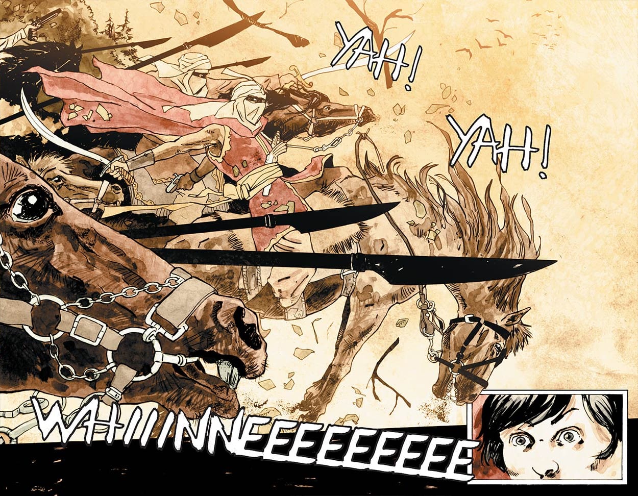
Sons of Chaos is first and foremost a war comic, and a brutal one at that. Jaymes and Aragon do not shy away from showing how savage this conflict was. Aragon’s art has a sketchy, edgy style to it that’s perfect for this story. It’s raw and realistic; it feels historical. The pages literally look to be stained by blood. If you were asked to close your eyes and imagine what a comic of the Greek War of Independence would look like, Aragon’s art is what you would see. 

sons of chaos review

Ayala’s letters have the same effect. His caption boxes have uneven borders. The sound effects have rough edges, and the dialogue looks handwritten. Hi-Fi’s muted colors then have this gorgeous painted quality to them, which sometimes does make it look as if the art was colored with blood. It all comes together to create this bleak, intense atmosphere. You’ll lose hours just studying the intricacies and beauty of the art. 

Beneath all the blood and carnage, Sons of Chaos is actually a very personal story. It’s a coming-of-age tale. Readers watch Marcos grow up over the course of the war. Through the various tragedies he goes through, he learns to not only be a fighter, but a leader. It’s an inspiring transformation. Marcos is our window into this world, and Jaymes writes him as a very sympathetic character. We build a strong connection to him as readers, which makes his arc all the more fulfilling by the time we turn the final page.

sons of chaos review

It’s also a story of fathers and sons. Marcos has a tangled relationship with his father, something mirrored in the story of his rival, Muhktar, son of Ali Pasha. Then there’s Marcos’ own relationship with Ali, his captor. These men have certain expectations that their sons never seem to meet, and in Ali’s case, very serious control problems. These complicated relationships makes Chaos more than just a story about Greece fighting for its independence; it becomes a story about people fighting for their own personal independence. War stories aren’t popular because of the blood and guts and mayhem. That’s part of it, sure, but the most successful war stories have this human element to them.

Chris Jaymes, Ale Aragon, and their whole team have crafted something special with Sons of Chaos. It’s an epic story in the purest sense of the word, and you’ll even learn a little about a lesser known conflict that had major ramifications on the world. To quote another great piece of historical fiction that celebrates independence, “let’s raise a couple more to the revolution!”

Monkeys Fighting Robots Youtube

Review: PAPER GIRLS #30 and the Pain of Nostalgia

Monkeys Fighting Robots

Well, this is it. After nearly four years, Paper Girls #30 signals the end to the strange, time- and space-traversing adventures of four girls from the town of Stony Stream. It’s scantly the longest run in comic book history. Regardless, this story grew into an expansive, always surprising—and surprisingly touching—coming-of-age tale.

If you read the previous issue, then you’ve already seen the climax of the story. It’s now the morning after Halloween and the girls are back  home, as if nothing ever happened. Rather than the time-traveling action that became the series’ trademark, Paper Girls #30 chooses to end the story on a somewhat quieter note.

In an ordinary review, I’d break down the issue, examine what works and doesn’t work with the writing and craft, discuss the artwork and whether it illustrates the narrative well…and so on. This book somewhat resists that approach, though. Not least because it’s the final chapter in an ongoing story that, in universe, likely transpired over the course of a matter of hours (it’s hard to tell, time travel is like that, after all). Here, though, I think it’s best to take a different approach.

Paper Girls #30 is, on one hand, a departure from much of the series in terms of setting and concept. What it does instead is concisely tie together the themes present throughout the narrative in a surprisingly poignant manner.

Age and the passing of time are at the core of this series. The conflict between teens and the Old Timers; characters running into themselves at different chronological points and places; the idea of time itself as a fluid and ever-changing dimension; all meet at that key intersection.

The Pain of Homecoming

The word “nostalgia” is derived from two Greek words: nóstos, meaning “homecoming,” and álgos, meaning “pain” or “ache.” It’s literally the pain of returning to the past, knowing you can never really recapture it; you can never really be part of that world again.

Paper Girls plays with this idea, supposing a world in which you can revisit the past through time travel. Even then, the central thesis rings true. You can visit different times and experiences, but you can never really be who you were at the time again.

The characters themselves are on the cusp of leaving childhood behind. They find themselves caught between the security of childhood and the independence of being an adult. That’s an exciting—and terrifying—time in one’s life. You have the sensation of being caught between two different realities. You’re eager for the freedom of adulthood, but in exchange, must lose a different kind of freedom you can only really have as a child. The tragedy of it is that the latter is something you only really appreciate once it’s gone.

Throughout the series, the girls become unwitting observers to a generational war that plays out over eons. Until the climax, they never seem to really know who they can trust. Is it the coolly authoritative Old Timers? The passionate, rebellious youths? Through it all, their express intent is to make it home alive; to return to their own proverbial Kansas and security of Aunt Em and Uncle Henry’s farm. By the book’s end, though, they find the idea of going back impossible. They’ve been outside the cave, and what they found changed them so profoundly that they can’t imagine losing what they’ve gained.

The Kids are Alright

Even upon return to Stony Stream in 1988, despite not remembering their adventure…they can never really return to the people they were when they left. In Paper Girls #30, we see that Erin, KJ, Tiffany, and Mac have indeed changed from who they were at the series’ beginning. That’s not a bad thing; growth is a positive thing. It’s a matter of how we contextualize it that matters.

Each of the four paper girls begins this narrative in search of something. It might be identity, or purpose, or even acceptance of the inevitability of time itself. By the book’s end, each character’s arc is complete. Even if they don’t recall the events of the story, they’ve still undergone that journey and come out the other end different from the girls they were when we began.

The conclusion illustrated in Paper Girls #30, thus, suggests that their change was inevitable. If they don’t remember the events that transpired, then the development they experience occurs naturally, as time ceaselessly marches on.

 You Can Never Go Home Again

It’s easy to draw comparisons between a series like Paper Girls and, say, a show like Stranger Things. They’re both about a group of suburban kids in the 1980s who find themselves drawn into a supernatural adventure. The difference is that, in Stranger Things, it’s the adventure that molds the characters’ story arcs. In Paper Girls, though, the adventure molds how we, as readers, interpret the characters’ story arcs.

A large part of the series’ appeal is the sense of nostalgia it inspires. It’s not necessarily a specific nostalgia for the setting or the ‘80s gadgets; it’s a deeper, more permeating sense. It derives, I’d argue, from looking back at adolescence as we now think of it, as some bizarre and often horrible, yet irresistibly appealing adventure, rather than as the day-to-day tedium it seemed at the time we lived it. Like the characters here, we nonetheless come out of it very different from who we were when we started.

From the first issue through to Paper Girls #30, we get a lens through which we can observe the abstract notion that is growing up. It gives us the tools to examine, contextualize and understand a process that we never fully notice until it’s already passed. In that way, Paper Girls allows us to wrestle with nostalgia, without being subsumed by it. We have the rare treat to examine the past as a sweet memory, without overlooking the bad parts.

In the end, we know that regardless of what happens, whether we’re spirited away on a grand adventure or live out another boring day in the ‘burbs, change is inevitable. Try as we might to hang on, things are going to slip away. The best we can do is embrace that change, and keep going. We can move forward with the knowledge that, while the past is nice to visit, we can’t—and shouldn’t—long to stay.

Paper Girls #30 is now available at your local comic book shop.

Monkeys Fighting Robots Youtube

What is HIS DARK MATERIALS and Why You Should Be Excited

The His Dark Materials trilogy is one of my favorite series of novels – a fantasy that sprawls multiple worlds and focuses on a war for reality itself. It is being turned into a TV series for the BBC and HBO and the first full trailer was recently released. It already shows a lot of promise and could be a big-budget fantasy show for years to come. There is plenty of reasons why audiences should be excited.

The novels were the creation of Phillip Pullman, an Oxford-educated writer. He started his writing career as a children’s author. His most popular series before His Dark Materials was the Sally Lockhart novels which were adapted by the BBC and PBS. His Dark Materials was Pullman’s magnum opus. The series was well-received, it earned awards like the Carnegie Medal and Whitbread Book of the Year in 2001 and the British public voted it the third-best novel in the BBC’s Big Read in 2003.

Pullman had numerous influences when writing His Dark Materials. The biggest was Paradise Lost by John Milton. Paradise Lost was a 17th-century poem about the original sin and the fall of man and His Dark Materials acted as a retelling for modern audiences. Pullman was also influenced by the writing and art of William Blake, German writer Heinrich von Kleist and Renaissance artists. And Pullman used the novels as a way to express his atheist views.

Being a trilogy, His Dark Materials is comprised of three novels: The Golden Compass (Northern Lights in the UK), The Subtle Knife, and The Amber SpyglassThe Golden Compass is set in a steampunk world and follows a 12-year-old girl, Lyra Belacqua In this world everyone has a dæmon, a physical representation of someone’s soul. A dæmon can turn into any animal up until the age of 13 where it settles into its permanent form. A human and dæmon are the same person. In Britain children across have been disappearing, leading to Lyra and a group of water faring people to travel to the Arctic Circle to find them.

It’s a fantasy story that features witches, armored bears, prophecy, and technology like airships. It was also a dark story that had children being experimented on, losing their souls, and even dying.

The second novel sees Lyra enter our world and meets Will Parry, a boy on the run after accidentally killing a man. They end up in the possession of a knife that can cut open holes to other universes. Because of this many factions want this item: it is a weapon that could turn the tide of the upcoming war for reality. The final novel was the epic war story that was as long the previous two books combined. This was where the war between the forces of The Authority and Lord Asriel’s rebellion and the two Lyra and Will could play an important to defeat the forces of evil.

His Dark Materials has been adapted a few times already. BBC Radio 4 adapted as a three-part radio part with each episode lasting 2.5 hours and starred Terrance Stamp. The Royal National Theatre produced a two-part play in 2003/2004 which starred Timothy Dalton. The play was met with critical acclaim and won awards for its set design and lighting.

The most famous adaptation was the 2007 film adaptation. It was made after the success of Lord of the Rings where every studio was looking for the next fantasy franchise. The Golden Compass was made by New Line Cinema, the same studio that made Lord of the Rings and there were some good signs. It had a great cast, having actors like Daniel Craig, Nicole Kidman, and Eva Green in major roles. But it was a troubled production – it changed director numerous times, with Chris Weitz leaving and coming back. Weitz threw out a screenplay written by the acclaimed playwright Tom Stoppard and wrote it himself.

The biggest mistake the producers made with the film adaptation was straying too far from the source material. The books are known for being critical organized religion and the third even had the death of God. New Line Cinema was fearful of the reaction of the backlash from fundamentalist Christians so toned down the religious themes. This was the worst decision the producers could have made because they were trying to appease an audience that wouldn’t be interested in the film and upset fans of books. The decision was even more illogical because figures like Rowan Williams, the former Archbishop of Canterbury, defended the books and I personally have known people of faith who have enjoyed the trilogy as a fantasy story.

The film adaptation toned down darker and important moments from the novel. The biggest example was the ending where the film cut off early. It made the characters look like they’re going onwards to a whimsical adventure instead of there being a dark betrayal. It was made even worst because Chris Weitz did shoot an ending closer to the novel’s and even released it for the Director’s Cut. The film also ruined what happened to Tony Makarios – a child who was experimented on and lost his dæmon. The event was so traumatic that it killed him and adults feared him because a child literally lost his soul. The film changed the character to be someone who lived and his mother gives him hope by saying they will get his dæmon back. This undercut an important moment where that set up the stakes and it was incredibly tragic.

Due to The Golden Compass being a critical and commercial flop the proposed sequels were never commissioned and New Line Cinema was brought under direct Warner Brothers control.

At the tail end of 2015 the BBC announced they were going to adapt the novels with New Line and Bad Wolf Productions. Whilst there was a risk that being adapted by the BBC would mean the series would lack the funding it needed the involvement of Bad Wolf gave fans hope. Bad Wolf is a new company, formed by Jane Tranter and Julie Gardner. Tranter was a former controller of fiction at the BBC and head of BBC Worldwide. During her time at the BBC, the corporation made popular shows like Spooks and Waking the Dead and critically acclaimed miniseries such as Bleak House and State of Play. One of the most notable shows under reign was the revival of Doctor Who which Gardner produced. Bad Wolf is a reference to the story arc in the first season of the new-Doctor Who. Bad Wolf’s first TV show was A Discovery of Witches for Sky One in the UK which was met with positive reviews and nominated at the National Television Awards for the Best New Drama. These are people who know how to make entertaining genre television.

The production of the show moved forward quickly. Jack Thorne was hired to write. Thorne has worked as a screenwriter for film and TV and a playwright. His most famous work is probably the play Harry Potter and The Cursed Child and has won BAFTAs for his work on The Fades and This is England ’88. Most of Thorne’s work is critically acclaimed and he is an in-demand writer. Tom Hooper, the director of films like The King Speech and Les Misérables was brought in to act as a producer and has directed the first two episodes. Some of the cream of British film/TV industry is working on the show.

HBO had a first option deal with Bad Wolf which they used. HBO’s reputation is unassailable and their involvement means the show has money, expertise and prestige. The BBC and HBO are unafraid at tackling controversial subjects so should keep the anti-religious themes of the novel. The BBC and HBO have a good track working together, making shows like RomeYears and Years, and Gentleman Jack.

The cast also shows a great deal of ambition. Dafne Keen was cast as the Lyra. This is a huge coup for the show because this is her first role since appearing in Logan. The show has James McAvoy, Ruth Wilson, and Lin-Manuel Miranda as Lord Asriel, Mrs. Coulter and Lee Scoresby – three major characters in the novel. As a fan I did have my own casting choices for those roles but I am not going to complain about them. Plus some casting choices are utterly inspired – Anne-Marie Duff is an inspired choice as Ma Costa and Will Keen (Dafne’s father), has been cast as Hugh MacPhail who seems a lot more accurate to the books than Christopher Lee in the film. Even rising stars like Georgina Campbell (Black Mirror‘s “Hang the DJ,” Krypton) have been cast in relatively minor roles.

A teaser and a trailer have been released so far and the show already looks promising. The show is going for a darker, gothic look that is more in line with the novels and seemingly a faithful to the story. The CGI for the dæmons, Iorek Byrnison, and the airships was impressive in the trailer, so the signs are positive. As a fan of the novels there would have been some things I would have changed – I would have made Lyra blonde and there are some casting choices I would have done differently, but this is me just being a book purest – it doesn’t matter in the grand scheme of things. If the series is loyal to the tone and the story I will be happy.

The BBC and HBO already have high hopes for His Dark Materials because they have already renewed a second season before the first season has even aired. Young actor Amir Wilson has already been cast as Will Parry and it will only be a matter of time before more actors will be cast. HBO should be able to avoid the trouble they had making Game of Thrones because the His Dark Materials series has an ending, so the show only need three or four seasons.

On a final note, the show is being filmed at Pinewood Studios Wales. It is the biggest production to be filmed there and hopefully, the show could do for Wales what Game of Thrones did for Northern Ireland – build up the talent and facility which could benefit the whole film/TV industry.

Monkeys Fighting Robots Youtube

DC Comics Exclusive Preview: HARLEY QUINN #64 – Enter Apex Lex!

Monkeys Fighting Robots

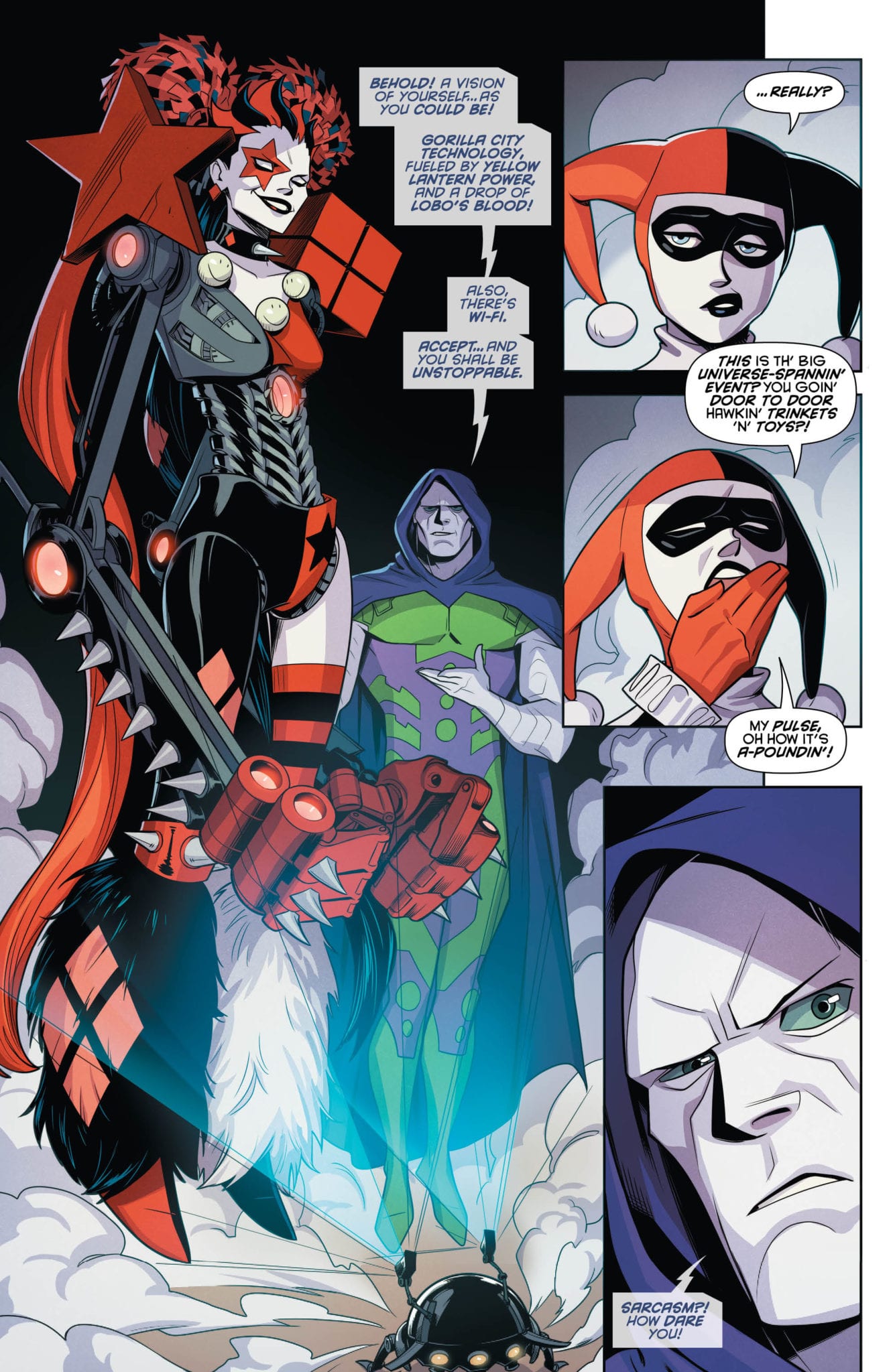
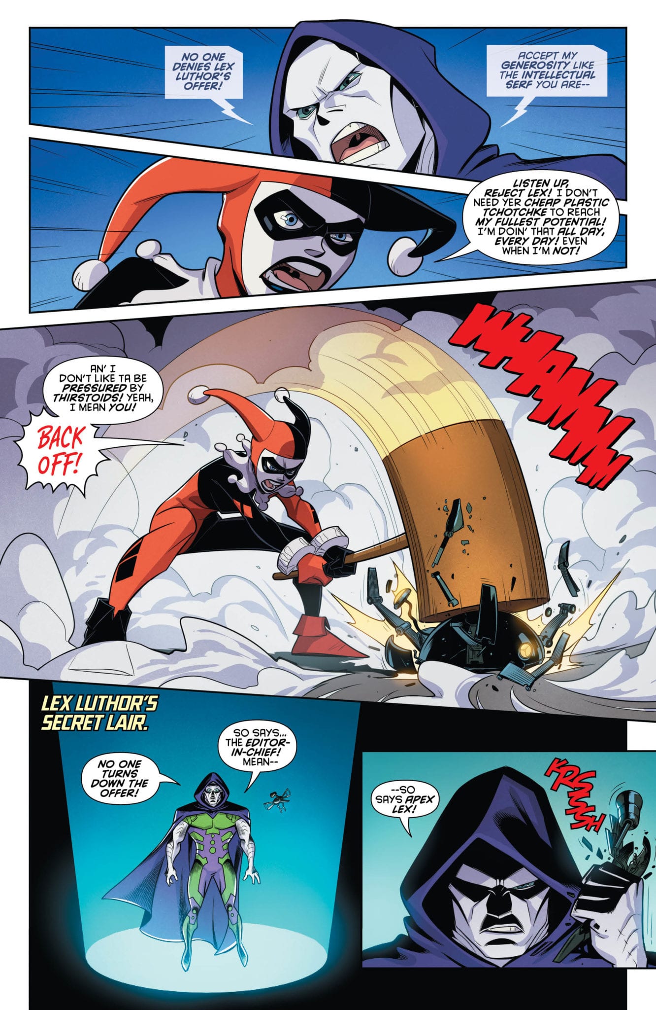
Harley Quinn #64 hits your local comic book store August 7, but thanks to DC Comics, Monkeys Fighting Robots has a five-page preview of this very unique take on the event crossover.

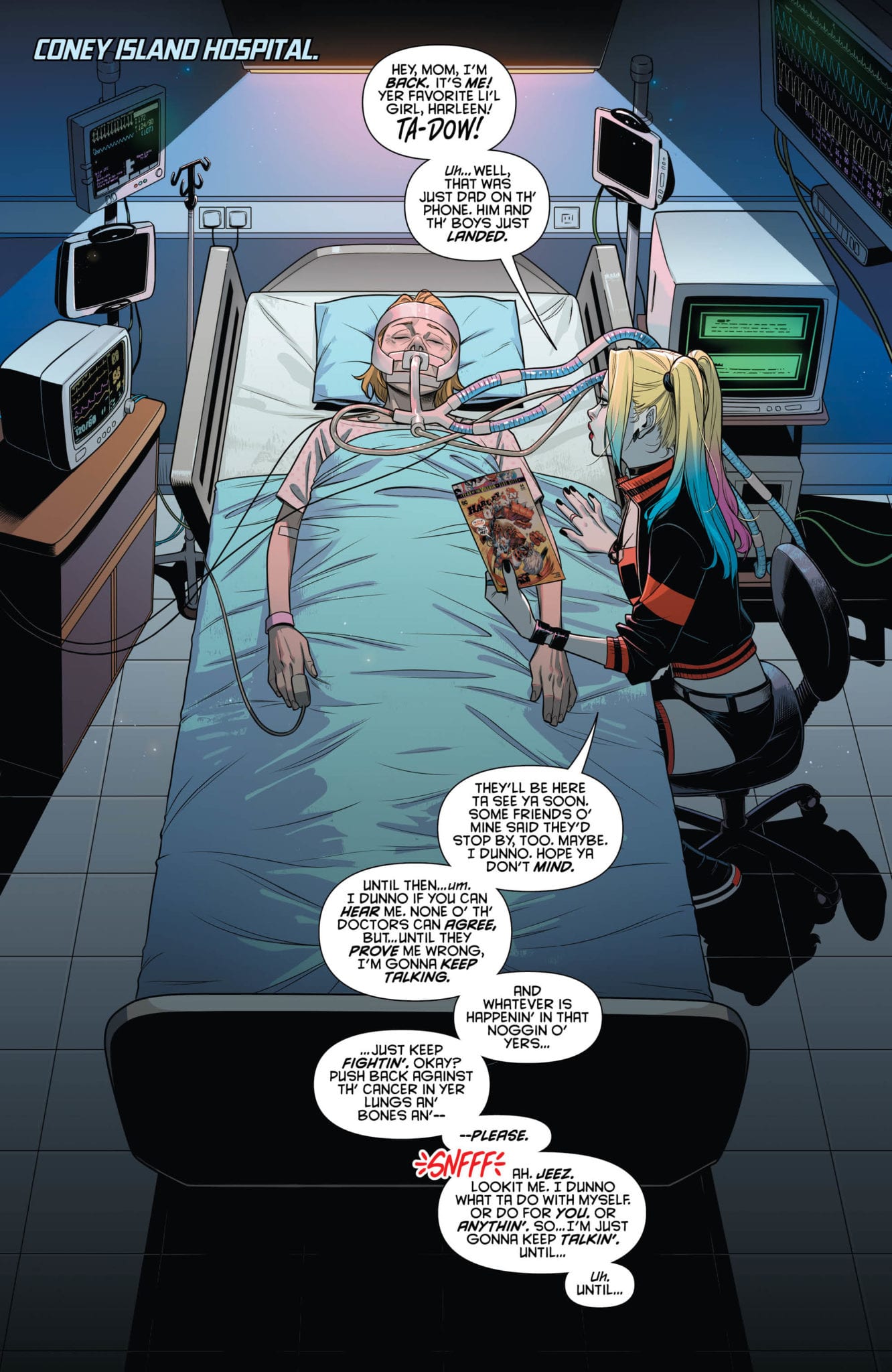
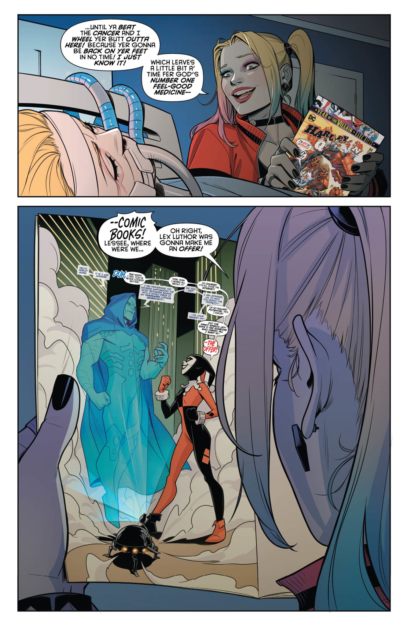
The issue is written by Sam Humphries, who takes you on an emotional rollercoaster as Harley sits bedside with her mother on one panel, and the next panel she’s challenging the order of the universe with Apex Lex.

“That’s the thing about Harley — she’s a character who is allowed to air out her contradictions. That’s what makes her such a great candidate for the Lords of Chaos and Order. When you’re doing a big epic story like the Trials of Harley Quinn and then Year of the Villain comes knocking, you have to bend like bamboo, not break like a promise from Luthor. And that’s what allows us to attack a shared universe crossover event from a different perspective. This is a Year of the Villain tie-in unlike any other. Heck, it’s a tie-in unlike any you’ve ever seen before,” said Humphries.

About the issue:
Harley’s tried everything to avoid Lex Luthor and his stupid “Offer”—she’s destroyed half a dozen of Lex’s drones, she’s changed her name, her cell phone number—she even faked her own death! Why won’t this bald, pasty-faced weirdo take no for an answer? Harley Quinn takes on the crossover event of the summer in this comic-within-a-comic take on “DC’s Year of the Villain”!

Harley Quinn #64 is by Humphries and artist Sami Basri, with colors by Jessica Kholinne and Hi-Fi, and letters by Steve Wands. The main cover is by Guillem March and Arif Prianto; Frank Cho and Sabine Rich worked on the variant cover.

Check out the HARLEY QUINN #64 preview below:


Are you reading Humphries’ Harley Quinn? Comment below with your thoughts.

Monkeys Fighting Robots Youtube

Marvel Comics Exclusive Preview: THE PUNISHER #14

Monkeys Fighting Robots

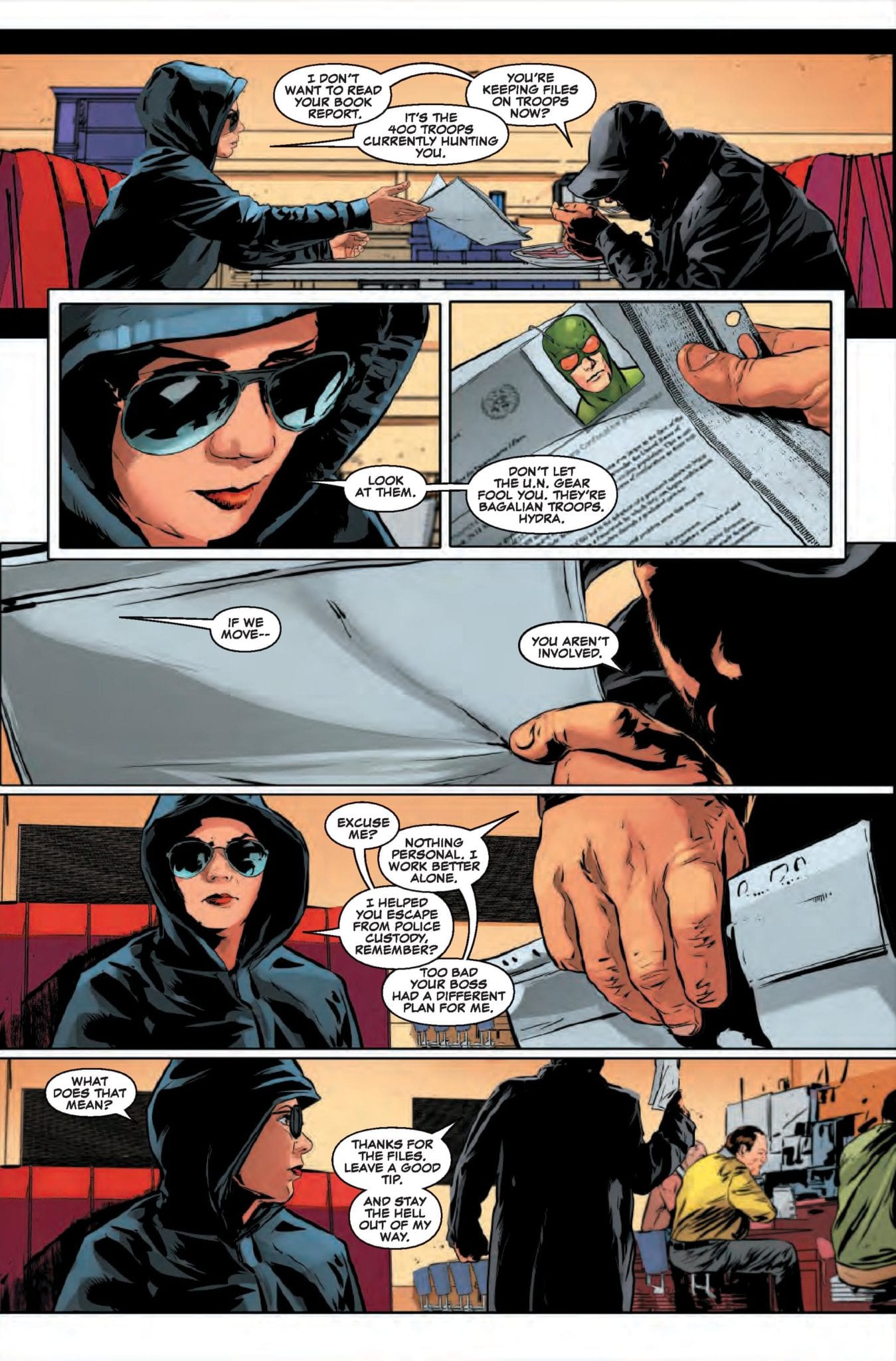
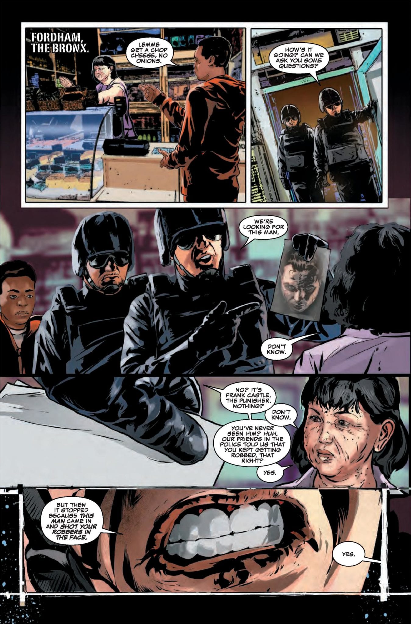
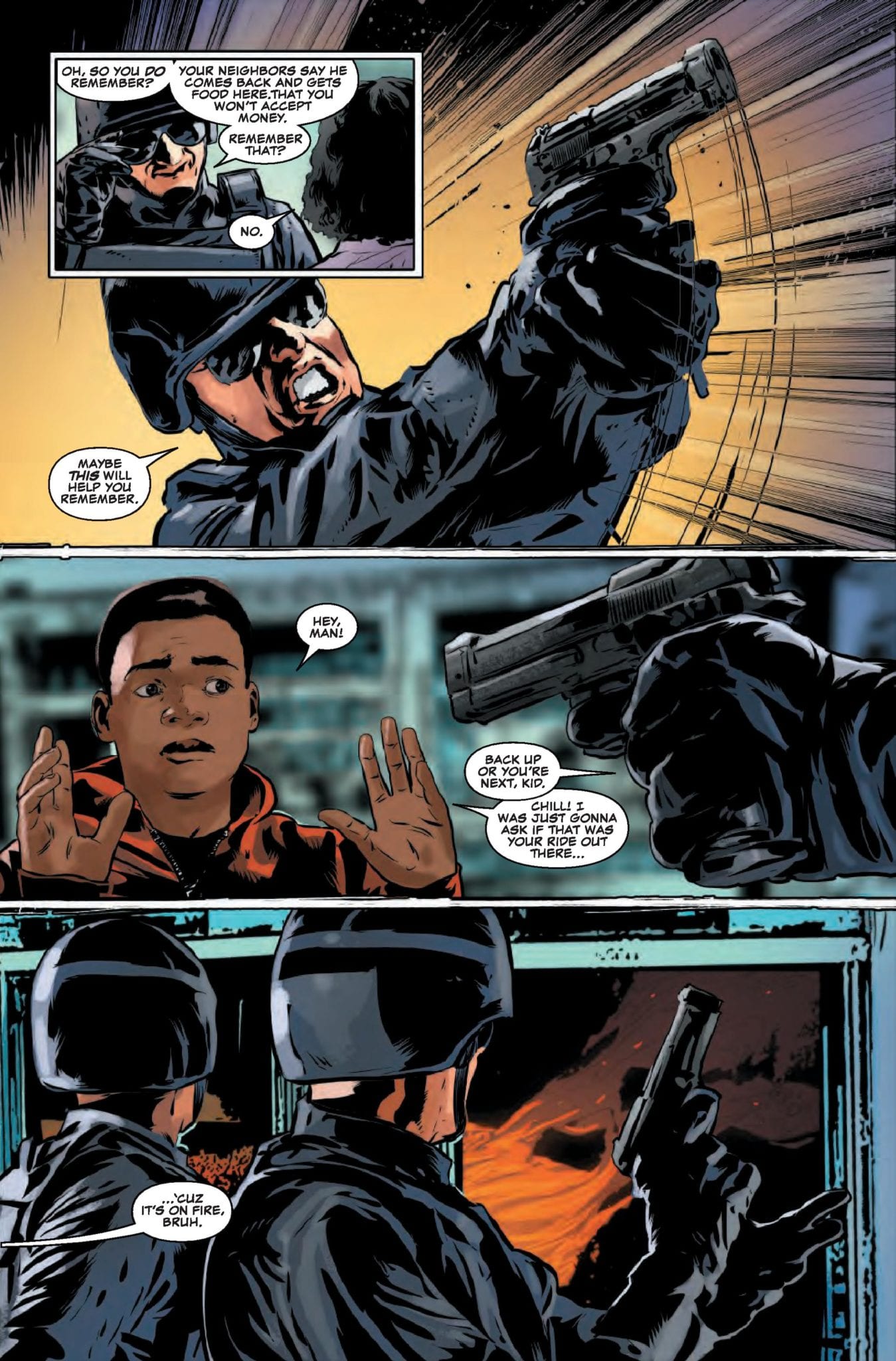
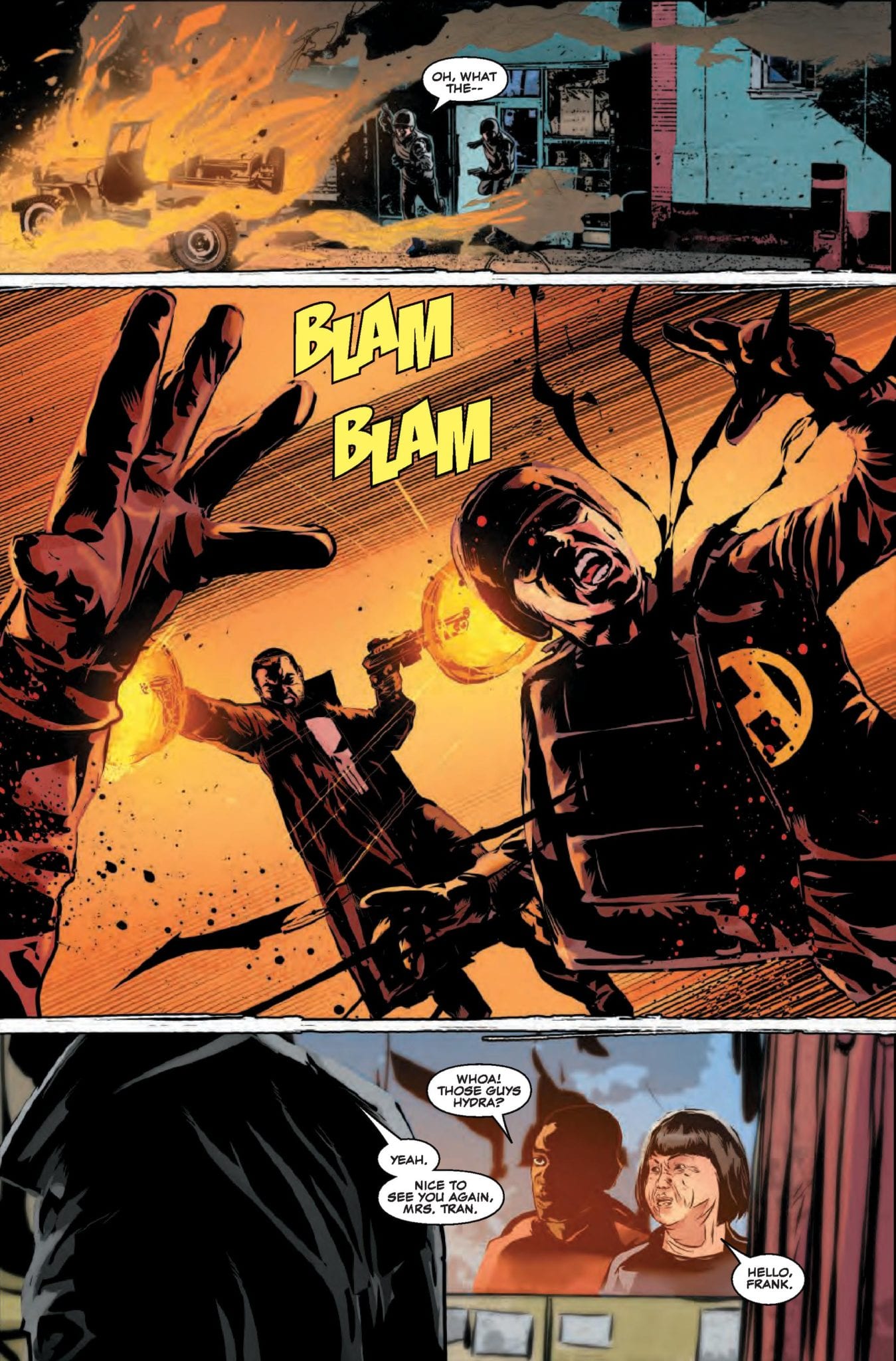
The Punisher #14 is out August 7th, but thanks to Marvel Comics, Monkeys Fighting Robots has an exclusive four-page preview to share with you.

The book is by writer Matt Rosenberg and artist Szymon Kudranski, with colors by Antonio Fabela and letters by Cory Petit. The cover is by Greg Smallwood.

About the issue:
Zemo’s battle against the Punisher hits the streets of Manhattan! It’s all-out war…just the way Frank likes it. Someone’s brought backup for Frank, but the Punisher doesn’t play well with others…

This issue is part three of the “War On The Streets” storyline. It deals with the fallout from Marvel’s 2017 Secret Empire event, with Frank Castle going head-to-head with Baron Zemo.

Rosenberg took over writing the previous volume of The Punisher with issue #218. After eleven issues, the series was renumbered at #1, and Kudranski joined Rosenberg on the book. The two have worked on every issue of this volume together except one (Smallwood did interiors on #6 in addition to the cover), which is a consistency you don’t see often nowadays in Big Two comics.

Take your first look at THE PUNISHER #14:


What are your thoughts on the current Punisher run? Let us know in the comments!

Monkeys Fighting Robots Youtube

Exclusive Marvel Comics Preview: BLACK CAT #3 Destroys Silvers Sable’s Rep

Monkeys Fighting Robots

Black Cat #3 hits your local comic book store August 7, but thanks to Marvel Comics, Monkeys Fighting Robots has a four-page preview of Felicia Hardy’s crazy adventure.

About the issue:
Surprising no one, Black Cat’s heist of Doctor Strange’s Sanctum Sanctorum has gone horribly wrong. Felicia and her crew are under attack in a place where any wrong turn or opened door means certain death. It would take an insane amount of luck to get out alive. How much luck would it take to get out alive with the loot?

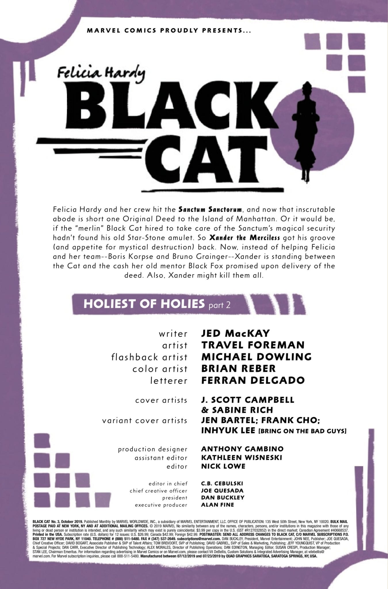
Black Cat #3 is written by Jed MacKay, with art by Travel Foreman, Michael Dowling is listed as the flashback artist, colors are by Brian Reber, Ferran Delgado lettered the book. The cover is by J. Scott Campbell and Sabine rich, with variant covers by Jen Bartel, Frank Cho, and Inhyuk Lee.

The Black Cat was created by writer Marv Wolfman and artist Dave Cockrum, and back in the summer of 1979 she first appeared in The Amazing Spider-Man #194.

CHECK OUT THE BLACK CAT #3 PREVIEW BELOW:


What do you think of MacKay’s take on the Black Cat? Comment below with your thoughts.

Monkeys Fighting Robots Youtube

Advanced Review: COFFIN BOUND #1 Bursts, Blood Stained, Into The World

Monkeys Fighting Robots

Tank Girl meets John Wick in Image Comics’ new dystopian title Coffin Bound, released next week. It is a bleak action story that skirts the fringes of fantasy and horror to tell the story of one woman who is dragged back into a world she hoped was gone.

Dan Watters tells the story of Izzy Tyburn; a character bursting with attitude, prone to violence, and someone who just wants to be left alone. However, if the killers on her trail won’t leave her be then no-one is going to get any peace.

COFFIN BOUND #1 Bursts, Blood Stained, Into The World
Coffin Bound #1 Credit: Image Comics

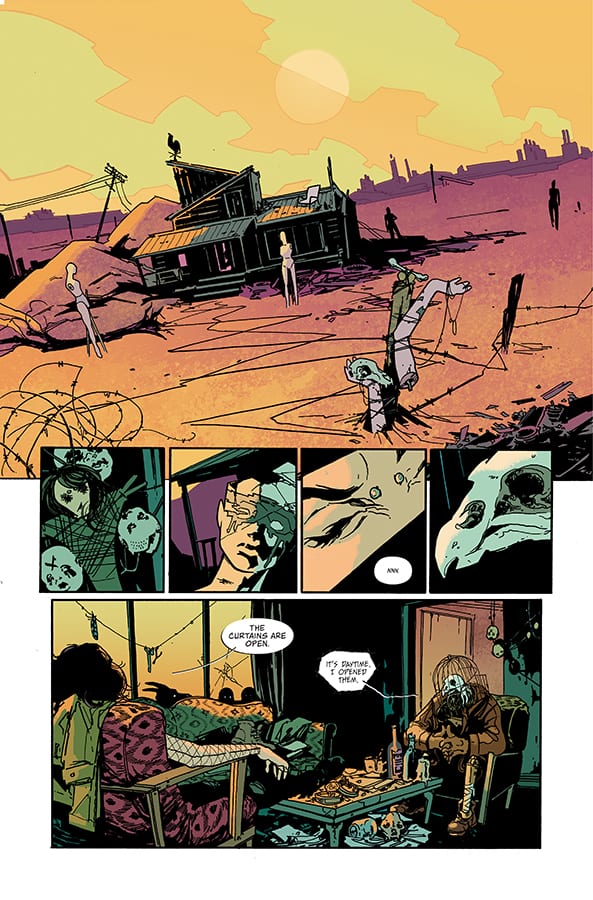
Watters sets the scene from the very first panel. The world of Coffin Bound is desolation and decay. This idea is picked up by the characters that the reader is introduced to in the opening pages, especially that of the Vulture. His appearance symbolises death and one of his opening statements refers to himself as ‘circling the dying’.

The character design offers a nod to classic comics like The Sandman but also more recent offerings like the fantasy western Pretty Deadly. Dani’s artwork captures the characters very succinctly. You get an instance idea of the personalities on the page from the visuals. When the car of suited men turns up in the desert, their murderous intent is instantly recognisable.

Dani draws on stereotypical imagery to speed up the storytelling and also poke fun at mass media conventions. The typical gangster appearance and the dystopian desert world, set up a scenario which is instantly recognisable and in turn allows the writer and artist to play with the reader’s expectations. The opening scene, especially when it comes to the page layout and panel composition, is about scene setting and stating visual intent.

COFFIN BOUND #1 Bursts, Blood Stained, Into The World
Coffin Bound #1 Credit: Image Comics

There is an element of abstraction within the artwork that focuses on character moments or actions. The dropping of the background or removal of features creates unrealistic images but gives the moment weight. Dani’s layouts are about enhancing elements of the story or character in the most striking possible way.

The color work by Brad Simpson is surprisingly vibrant for such a darkly themed comic. The landscapes especially have a brightness to them that frames the characters in the foreground. When a darker tone is required, such as during night scenes, Simpson still brings the panels to life with deep purples ad crimsons that accentuate the black outlines and shadows.

The art style gives Coffin Bound a grunge look; like a modern version of The Crow. You can almost hear the alternative rock score playing in the backgrounds. One of the ways that the comic achieves this aesthetic is through Aditya Bidikar’s lettering. He has adapted the style of the speech balloons to match the gritty, road movie vibe. The ellipses do not have neat edges and only the underside has a black boarder, like a shadow on the speech. This creates the impression that the speech is merging with the art, becoming part of the scenery.

The Vulture’s speech is almost the opposite. It is jarring and has sweeping, hand drawn slashes for boarders. It gives The Vulture an otherworldly presence within the comic, similar to Morpheus’ speech in The Sandman.

COFFIN BOUND #1 Bursts, Blood Stained, Into The World
Coffin Bound #1 Credit: Image Comics

Coffin Bound is like a road movie with its own visual language and narrative beats. The plot is unravelled through the actions of the cast and their introduction to the reader. The abstract element within the art takes its cue from the disjointed story and nothing can prepare the reader for the series of events that unfold.

Imagine Tank Girl starring in an Alan Moore horror comic and you will have a pretty good idea what to expect from Coffin Bound. Violence, fantasy grotesques and nods to modern music, such as a background cameo from the late, great Keith Flint, make up an exhilarating ride of a comic.

In a year already filled with great comics, releases like this just keep pushing the bar higher and higher.


Monkeys Fighting Robots Youtube

Review: STRAYED #1 – Solid Artwork Highlights The Issue

Monkeys Fighting Robots

Strayed #1, a new sci-fi series from Dark Horse Comics hits your local comic book store on August 14. The tagline does engage readers with an interesting premise, Most cats have nine lives, but the fates of billions rest on this feline.

I was excited to read Strayed #1 because who hasn’t ever wanted to speak with their cat or dog? Despite the unique and fun premise, the first issue does not reach the high goals it sets for itself. Unfortunately, writer Carlos Giffoni and artist Juan Doe miss the mark with poor characterization, depressing tone, and confusing world-building decisions. While the premise still holds incredible potential, it will take some work to fulfill it.

Strayed #1 introduces us to Lou, the cat, and Kiara, his owner aboard a spaceship in orbit. Kiara invented a device that lets her communicate with her cat, then learned her cat can astral project to basically anywhere in the universe. The government (I guess, Giffoni never explains who is actually holding Lou and Kiara.) learned of this invention and forced Lou and Kiara to scour the planets for a new homeworld full of resources and capable of sustaining human life.

Needless to say, the government lies and holds Kiara and Lou hostage until they find the origin of a mysterious, infinite energy resource. Along the way, the government also co-opts Kiara cat communicating technology to torture indigenous aliens for information.

Perhaps the biggest critique with Giffoni’s script is how serious it is. If Giffoni wants to take Strayed in a darker more political direction, there is a story to tell there as long as the tone remains balanced. Unfortunately, the script feels unnecessarily dower and distrusting. There is no moment of levity to balance it out unless you find the premise of cats astral projecting to find hospitable planets funny in of itself. Kiara as the central protagonist of Strayed is uninteresting and unfulfilled as well. It seems the only thing she does in this spaceship is yearn for her cat.

More questions pop up throughout the issue. Why did Kiara had over her animal communicating technology to the government? What happened to Earth? Are they just using Lou or are other cats involved? And Giffoni does not seem interested in answering these questions at all, yet they are integral to the characters future decisions. If we even got a quick expository flashback with all of the answers, it would be incredibly enlightening.

Glowing New Fuel
Nothing could possibly be wrong with anything that glows that incandescent green color.

If there is one highlight in Strayed #1, it is Juan Doe’s art and colors and contributions from letterer Matt Krotzer. While the humans and spaceship settings can be cookie-cutter by design and drenched in sepia, the scenes drawn from Lou’s perspective are interesting and borderline trippy. When Lou is projecting too far-off planets, the colors are vibrant, lively, and allow Doe to experiment with panel layout and framing. When Lou remembers his past, prior traumatic events are flashed on the panel beside his alarmed eyes. When depicting explosions and other kinetic scenes, Doe can be heavy-handed with the bright colors. One scene in which the humans destroy a planet almost hurts the eyes when stared at too long.

Strayed #1 has such a unique and whimsical premise, and Giffoni’s script and the story are allowed to be dark and distrusting, as long as the script and tone remain balanced. However, Giffoni’s tale feels troubled and incomplete. Doe’s art and colors lift the plot when they can, but the visuals are not strong enough to carry the first issue. The second issue needs to come out strong to hook the reader for the long term.

Monkeys Fighting Robots Youtube

Review: BERSERKER UNBOUND #1 – Bloody Heads Will Roll (And Arms And Legs…)

Monkeys Fighting Robots

Jeff Lemire, Mike Deodato, and Frank Martin bring the blood, sweat, and tears with Berserker Unbound.

Do you love it when terrible people are relieved from the burden of having his or her head attached? When evildoers lose limbs for what he or she has done? I sure do, and you should too!

Deodato and Martin establish the homeland of our lead character right off the bat. Harsh suns, desert sands, and some smaller mountains in the distance, reminiscent of the old Looney Tunes Road Runner episodes when you see the dust being kicked up from miles away. The Mongrel King struts into view with some of the fiercest uggs you’ll ever see. He dons very intimidating clothing, but just what you would expect from a barbarian, skulls, chains, more skulls, animal fur, some large slicing and chopping utensils, and a shield.

WARNING: SPOILERS FOLLOW FROM THIS POINT ON.

The intensity of the sun could be a character itself. Martin has given every scene a blistering red tint like the entire sky is on fire. Unfortunately for the Mongrel King, his village is actually on fire. In barbaric fashion, he finds his wife and daughter murdered on the floor of his home, and the rage fuels his guilt and lust for blood. Steve Wands is a perfect fit for this story carrying plenty of experience with this creative team. His lettering feels like old scrolls we would be grabbing off the foot of a raven, helping to immerse the reader into this universe of blood.

While fantastically done, Lemire’s writing takes a backseat to Deodato’s artwork in this issue. Breathtaking full-page spreads are broken up into panels for seemingly no reason at all except to remind us that we are reading a comic and not standing in an art gallery. After the Mongrel King learns the fate of his beloved and his daughter, Deodato stretches his feet and gives us some of the most brutal battle scenes in recent memory. Blood spattering everywhere, arms, legs, hands, heads, arrows, fists, punches, all are flying through the air towards an unfortunate recipient.


Lemire gives us an excellent rendition of a barbarian epic that might seem overdone, but you would be wrong. While the likes of Conan are arrogant and fearless, the Berserker is not. He has doubts, fears, and has lost his family as well as his will to live. A mysterious entity known as the Mist is foreshadowed by a menacing figure holding one of the coolest weapons I’ve ever seen. The character designs are nothing to be dismissed here either. Heavily reliant on furs and skulls, these characters wield the unyielding. These swords and axes would crush you even if you managed to block the blow.


When the Mongrel King falls victim to sorcery, he is sucked into some kind of inter-dimensional terminal. The Berserker is presented with eight bright neon symbols which he believes to be different pits of hell, and he chooses the enter the pink one. This is the type of thing that might be ignored by your average reader, but in my experience, the seven other symbols that the Mongrel King did not enter could mean possibilities for seven more stories to emerge from this one.

The creative team of Lemire and Deodato does it again. If we’ve learned anything from past Lemire stories, there promises to be more sadness, loss, and despair ahead. Whether you’re a fan of fantasy, epic battles, mystery, suspense or just what promises to be a great story, strap in because it’s going to be one hell of a bloody ride, partner.

Were there enough severed body parts for you? Let us know what you thought in the comments!

Monkeys Fighting Robots Youtube

Review: Exhilarating Experimentation in TEST #2

Monkeys Fighting Robots

A technologically advanced society clashes with a Beat Generation sensibility in the second issue of Test from Vault Comics.

Fusing a spiritual quest with drug like hallucinations and an obsession with the possibilities of technology, writer Christopher Sebela has created a David Lynch-esq landscape populated with social misfits and science fiction cast offs.

In this second issue of Test, the history of Laurelwood begins to unravel along with it’s possible future. Sebela takes the fears of modern life and moulds them with an off kilter landscape to create a discussion about society. His central character appears detached from much of the world around him, lost in an addictive haze which allows Sebela to leap from idea to idea seemingly without connection.

However, there is a tightly controlled plot holding everything together and it only seems chaotic as the reader, like Aleph, wanders lost through the mysterious town of Laurelwood.

Review: Exhilarating Experimentation in TEST #2
Test #2 Credit: Vault Comics

Testing Storytelling

The artwork is as off kilter as the story it is trying to tell. Jen Hickman uses harsh inked lines to scratch out the characters in the panels, favouring shadows made of lines instead of solid blocks. This gives the images an eerie appearance almost as unsettling as swords thrust through hands or needles stabbed into arms.

The characters in Test have been rendered in such a way that the technological elements stand out on the page. Alien like handcuffs and upgrading implants appear more fluid and natural against the harshness of the humans themselves. The story is a topsy-turvy contradiction and the art work represents that.

The coloring attempts to match this approach to the world building. Harry Saxon uses unpleasant color choices for backgrounds and contrasts the technology with the natural world.

The highlight, from a coloring point of view, is the switch between the past and present in Aleph’s life. Saxon makes it clear which panels belong to in the past and which are part of Aleph’s modern day view. The transition is smooth and clear so as not to disrupt the flow of the story. The narrative jumps back and forth between the time periods with an easy distinction for the reader.

In contrast Aleph’s internal narration sweeps its way across the page linking the present to the past physically and ideologically. Hassan Otsmane-Elhaou uses a font unique to Aleph clearing marking out his internal dialogue from the rest of the speech.

Otsmane-Elhaou’s lettering feels as experimental as the rest of the art work. Small touches in the design of the speech balloons or the more obvious integration of sound effects into the artwork itself gives each page something extra for the reader to digest.

The break-up of large speeches and the positioning of speech balloons, overlapped with caption boxes, controls the reader on the page. The overlaying speech balloons create a naturalistic flow of conversation, similar in style to Steven Spielberg’s obsession with having characters talking over the top of each other in his movies. The effect is the same: it lacks the unnatural pauses between lines of dialogue making it feel more realistic.

Test #2 Credit: Vault Comics

Conclusion

Test is a visual onslaught. The panels seem to oscillate on the page as the narrative punches its way through. The creators embrace the comic book format while subverting it to create an uncomfortable world for the reader. There is a unravelling stream of consciousness that is not always easy to follow but that is the point. As a reader you are being pulled along by the meandering river of the narrative and expected to take in the sights. Only after the ride has finished do you have time to fit the pieces together.

Just like issue 1, Test #2 has an experimental theme running through it; starting with the plot and running through into the art. It is a fascinating experience and a pleasurable read if you allow yourself the freedom to let go of conventions.


Monkeys Fighting Robots Youtube