Home Blog Page 326

Review: KILL A MAN Challenges Readers With A Heavy Punch

Kill A Man cover
Kill A Man Credit: AfterShock Comics

Coming soon from AfterShock Comics is an Original Graphic Novel that deals with the violence of Extreme Fighting and the difficulties faced by a young gay fighter. Kill A Man written by Steve Orlando and Phillip Kennedy Johnson pulls no punches and is a hard hitting story about individual choices and the consequences that follow.

With an eye catching cover and an exciting premise, Kill A Man makes some big promises from the get go. But the question is, can the creators keep the readers entertained for the full bout or does it all end abruptly in the first round?

Kill A Man
Kill A Man Credit: AfterShock Comics

The Story

To some it’s a world of entertainment and wealth, to others it’s nothing more than violence and hatred. For James Belly it is all he knows and he has become a slave in the ring of the Extreme Fighting Championships.

The young fighter is following in the footsteps of his late, great father, who was a champion of the ring years before. However, during a brutal fight, Belly Senior goads his opponent, Xavier Mayne, with homophobic slurs and the result is a literal fight to the death.

Riding the crest of his own popularity, James Belly fails to see the fall ahead of him and when he is publicly outed as being gay it all comes crashing down around him. Ostracised from his family and branded a cheat in the wrestling world, James has only one place to turn in his hour of need: the man who killed his father, Xavier Mayne.

Kill A Man
Kill A Man Credit: AfterShock Comics

Writing For the Ring

From the very beginning of the book you get a sense of the story Orlando and Johnson are telling. It has the initial air of showmanship, extravagance and performance, but very quickly the violence underneath takes over and the cruelty of people becomes the overriding theme.

There are two main themes throughout the book that battle for dominance but are so intrinsically linked it is impossible to separate them. The first is the sport itself. The Extreme Fighting Championship is a hard world for it’s fighters to live in. They have to live up to an image that is thrust upon them by the sport, it’s promoters and the fan base. People expect violence and the macho conflict in and out of the ring.

The bigotry and hatred of anything deemed not manly enough is rife within the story and the sport that it is portraying. At first it’s just the language of individuals but the writers make it clear that these opinions are born from deeper rooted problems within the promotion of the sport itself. When James is outed, on the eve of a title bout, Orlando and Johnson quickly make the reader realise that homophobia is embedded in society and not just the opinion of a few small minded people.

Although this is a book about a fighter coming to terms with his own sexuality, there is a much bigger picture on display. Orlando and Johnson are using their story and the EFC as a microcosm for the world at large and how underlying prejudices in society seep into everyday life.

The story is powerful and, due to its very nature, hard hitting. The plot is tightly written with each step building a complex picture of the world James lives in. The characters are believable and empathetic. The reader gets a good sense of who each person is and the role that they have to play in the story. Even the extra’s feel like fully rounded characters who have a story of their own to tell.

Kill A Man
Kill A Man Credit: AfterShock Comics

Violent Visuals

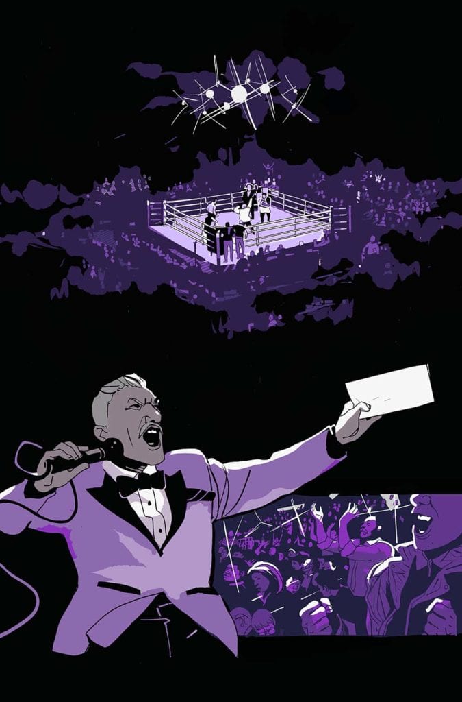
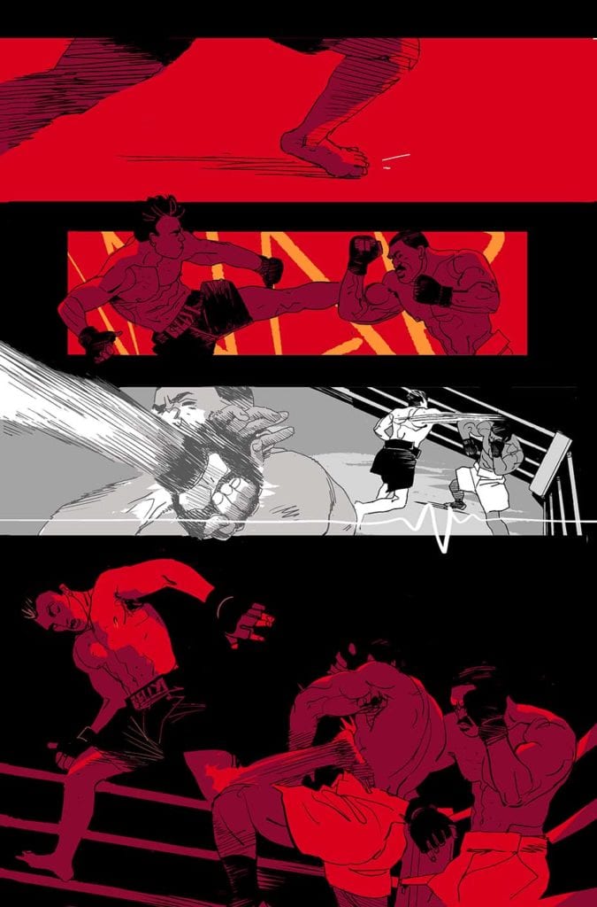
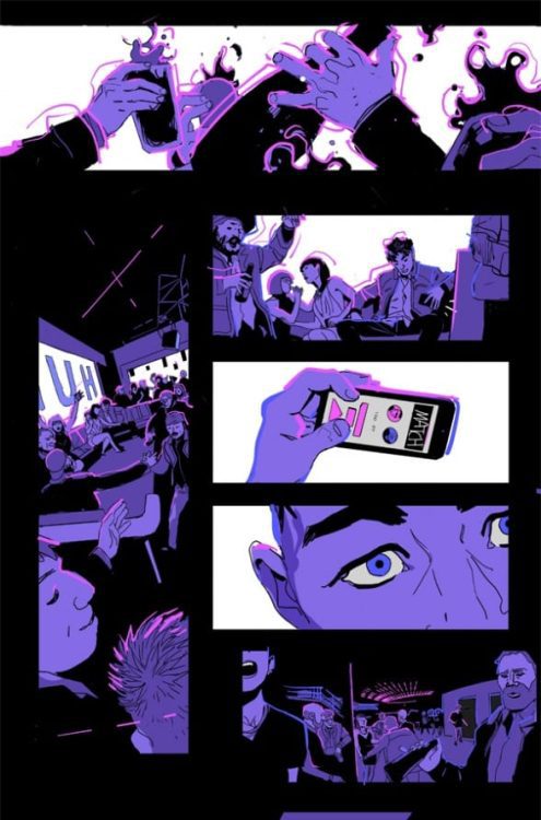
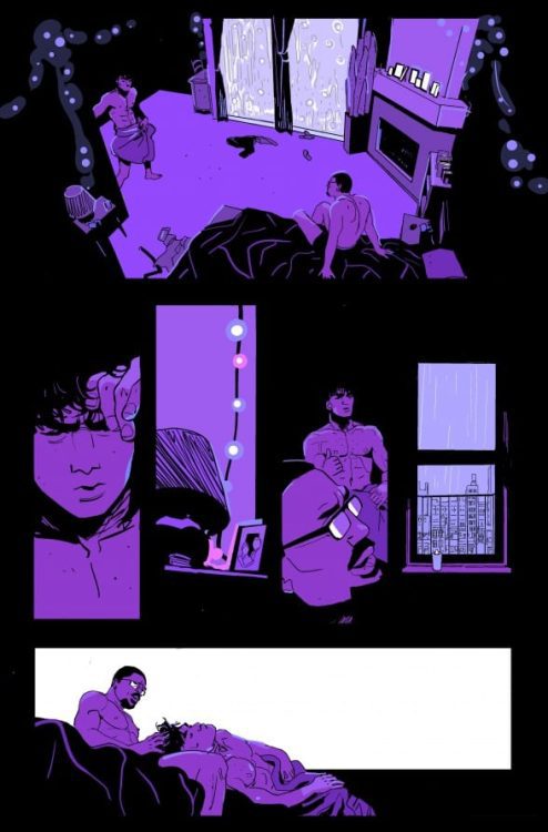
In the same way that there are two main elements to the narrative, there are two distinct elements to the brilliance of the Art. Both of these are provided by Al Morgan who colors his own inks.

The inking style is heavy handed with vast areas of black forming dense shadows across the panels. This intensity is heightened by the solid black gutters than frame the panels. The overall look is brutal and for a large part unwelcoming. It reflects the world of the fighters and the macho environment they inhabit.

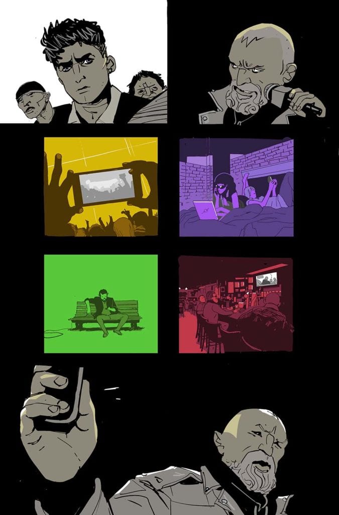
To counter this and interject an emotional element into the art work, Morgan uses block colors to differentiate scenes and moments. Small highlights of color give the images some depth but it is the strength of the solid coloring that has the most impact. A scene that shifts from black and white to blood red for every other panel brings out the violence of the moment. Similarly, a quick change in color between panels expresses a shift in emotional responses in the images portrayed.

The coloring in Kill A Man has the strongest initial effect on the reader. As you turn from page to page you are struck by the intense focus on a single color. This in turn makes you instantly aware of any deviation, drawing you directly to a specific moment on the page. Morgan sets a standard in the opening pages and from that moment on, he has complete control over where you look and the focus of the plot.

Kill A Man
Kill A Man Credit: AfterShock Comics

Rounds of Letters

Jim Campbell is an experienced letterer who knows how to get the best out of a script. He can pick up on subtleties in speech and creates a style to fit the artwork. In Kill A Man his most impressive achievement is differentiating between speech levels. By changing the shape of a speech balloon or the color of the font, Campbell is able to create loud, amplified voices and behind the back whispers.

The text itself is fairly straightforward as Campbell doesn’t experiment with different fonts. Instead he uses bold text for emphasising often hurtful language and type size to express emotion. The placement of the speech balloons also accentuate the feelings behind the spoken words. Large outspoken speeches hang above the characters, displayed for the world, whereas the cruel, personal insults often drop to the bottom of the panel to hover near the ears of the victims of abuse.

There is a streak of cruelty throughout the story and Campbell makes sure that this is obvious. He uses the lettering to make the attacks personal. As a reader you can see exactly who the verbal abuse is aimed at and, more importantly, how it is delivered: in hushed tones, just below the surface.

Kill A Man
Kill A Man Credit: AfterShock Comic

Conclusion

Kill A Man might seem like a difficult sell. On the surface it looks like a sport comic about Extreme Fighters which will have a limited audience. But like a number of great sport’s stories there is so much more going on. This comic is about self identity; it’s about institutionalised bullying; it’s about anger, and rage, and revenge.

At the heart of this book you have two characters from different generations who are trying to come to terms with the same thing: their own sexuality. The world they have chosen to live in does not accept them and they have each adopted a personality they can barely live with. What makes Kill A Man so impressive is the way in which their stories are told.

The inks, colors, and letters reinforce the society that surrounds the characters. It’s brutal and harsh and often not pleasant reading but that is the point Orlando and Johnson are trying to get across. This is more than just another Sports Comic, this is an intense examination of social acceptances and the pain they can bring.

Due to be released in early June from AfterShock Comics, Kill A Man is an exceptionally gripping read from the very first page. It is difficult to recommend this to everybody but if you have any interest in comic book storytelling you should be reading this.

Monkeys Fighting Robots Youtube

Crowdfunded Comics Bestsellers: Are They Exploitive?

Lady Death among notable Crowfunded Comics

Crowdfunded Comics are quickly gaining attention across the comics community. Even here on MFR, there is an entire section of reviews in dedication to Kickstarter comics. Looking at the trends on sites like Kicktraq and BackerKit however, some questions rise up. Many of the series involve women with certain “appeals.” In recent years some projects involve titles from the 90s like Lady Death and Shi. Does this mean that crowdfunding comics are just taking advantage of readers’ instincts? This is the research from the gutters.

Crowdfunding Platforms

Crowdfunding platforms like Kickstarter and Indiegogo are becoming the go-to means of creator-owned content to flourish. YouNeek Studios, in particular, lives up to the Kickstarter name for its publishing. Starting with E.X.O. The Legend of Wale Williams, comes a superhero fantasy franchise joining the ranks of legends like Marvel. Which, in turn, leads to several imitators like Epoch Comics. Even notable series like Witchblade go on these sites to get funding for their omnibuses when its publishers can’t provide it. Which brings up the next point.

Advertising Exploitation?

Crowdfunding is far from easy because that means giving your backers their money’s worth. Artwork, writing, printing, and distribution doesn’t come cheap. Most single issue comics usually need roughly $1000 just to get that bare minimum. So advertising is key to getting the necessary funds. At the same time, just throwing money at companies like Facebook doesn’t guarantee success. So there comes a controversial means of appealing to potential backers, taking advantage of their instincts.

Crowd Instinct

Some comics get a called out for suggestively dressed women on their covers. Even today, comics like Tarot: Witch of the Black Rose doesn’t shirk away from these depictions. Since most of the artists behind such series are men and appeal to men, there comes a familiar saying, “Sex Sells.” However, that’s not to say that female artists don’t draw women provocatively, including Sorah Suhng. This saying also appeals to female readers as well. One series that often appears in Kicktraq’s Closed Projects, Sweet Boy is a yaoi series, a demographic that appeals primarily to women for how attractive the men are. There’s a double standard for everything.

A webcomic that gets attention
Just imagine what this would look like in animation.

Neoteny is another aspect that often gets attention, especially in webcomics. Thanks to how youthful and simple designs can look, people can’t look away. Japan has an entire subculture in dedication to this, Kawaii. A good number of these webcomics also involve cats, including fan-favorite Lackadaisy. Probably because cats, even mature ones, retain their neoteny. The most successful crowdfunding projects, regardless of medium, however, go beyond surface appeal.

Crowdfunding On Nostalgia

Probably one of the most exploitive natures people use in entertainment is nostalgia. Whether it’s remakes, reboots, or relaunches, people are more than willing to stick with familiar names. The name of Lady Death alone amasses over 1 million dollars in crowdfunding for more than ten graphic novels. All while spearheading Brian Pulido’s Coffin Comics universe. It’s little wonder why Coffin Comics amasses enough net profits to get on the Diamond catalogs.

Did you know that Jim Starlin made this crowdfunded comic as a means of advertising?
From the maker of half of Cosmic Marvel, comes a Space Opera.

Of course, notable creators like Jim Starlin and Kevin Eastman use their names and influence to advertise. Starlin himself generates a lot of hype with his fans through his souring relationship with Marvel. His campaigns, in turn, advertises Creation.INK, “the first truly creator-owned company,” composed of veterans like Starlin and Ron Marz. Eastman meanwhile uses his fame from TMNT to catapult Drawing Blood. This series about what goes behind the scenes perfectly encapsulates the means behind crowdfunded comics.

Crowdfunded Comics Are For Fans

Crowdfunding is for all kinds of fans
Can you blame the guy for the fan-art crossovers?

It isn’t enough to generate interest through pin-up models or human psychology; crowdfunding has to be something fans can relate to. Relative newcomer, White Widow is quickly becoming popular in the comic community. Series artist and co-creator Jamie Tyndall makes a name for this title by crossing it over with fan-art. The Spider-Gwen crossover designs are so popular; cosplayers make regular use of them at conventions. But even more so, these designs have character.

Character is arguably the most significant piece surrounding these crowdfunded comics. Despite how underdressed many of these characters and series appear to be, there are real stories surrounding them. Some of them like Lady Death starts as ideas until they grow into something more, even to the point of a small publishing empire. Imagine how some fans feel about being the ones to bring these series into the public.

The Community of Crowdfunding

Comics are a medium of combining elements that are greater than the whole, a medium of community. While creators can direct readers to and through their content, readers experience it in ways they share with others. Crowdfunding is one-way fans give back to their creators, by being the ones to breathe life into it.

What do you think of bestselling crowdfunded comics? Leave your thoughts in the comments.

Monkeys Fighting Robots Youtube

Review: GIANT-SIZE X-MEN NIGHTCRAWLER Visits A “Haunted” X-Mansion

Giant-Size X-Men Nightcrawler, Davis cover

GIANT-SIZE X-MEN NIGHTCRAWLER, available from Marvel on March 25th, takes the reader on a mutant adventure away from the shores of Krakoa. Magik, Nightcrawler, and their team investigate odd sensor readings from the abandoned X-Mansion. Will the ghosts of Xavier’s past confront them? Let’s find out.

Cover

Alan Davis and Edgar Delgado pick up cover art duty for this “giant” issue. The art is clean and clear. Nightcrawler strikes a ready-for-anything action pose, and the silhouette characters give you a taste for what’s inside. If you look closely, you’ll even be able to spot a spoiler for the story’s mystery. On these counts, Davis and Delgado check all the boxes for a cover that grabs you with curiosity.

Writing

Jonathan Hickman wrote this issue as an extension to his current run of X-Men titles. Honestly, this is an odd book. Giant-Size issues either mark a milestone of some sort, or they establish a link from one storyline to another. This book is neither a milestone nor a bridge, so there’s nothing traditionally “giant-size” about this book other than its size (30 pages if you exclude the cover and credits). There’s nothing wrong with that as long as the story is entertaining, but it is a bit odd.

Hickman’s mystery setup is pretty straight forward. The mutant team takes a field trip from Krakoa to the old X-Mansion to investigate alarms from somebody trying to access a gateway portal. The portals are designed to let any mutant through to enter Krakoa, but this particular portal is denying entry to a mutant(?). Hickman plays up the haunted house vibe, even going so far as to show “ghosts” of X-Men past that has the team chasing shadows.

Without spoiling it, the team discovers the source of the mystery and brings the story to a quick, albeit slightly too convenient resolution. It’s no surprise some of the shades you see are Rachel Summers and John Proudstar, and that’s the primary issue with the story. You immediately know the “ghosts” are not what they seem from a mile away. Hickman’s mystery winds up being little more than a limp question with a mildly amusing “that’s it?” for an answer.

Right away, you realize this is not a Nightcrawler book. Nightcrawler is the titular character, but the story is very ensemble heavy. If you had to pick the main hero, it’s Cypher. Nightcrawler does showcase plenty of “BAMF”-ing, and he’s a treat to watch in action, but Cypher figures out the mystery and brings about the story’s resolution.

If the “Giant-Size” aspects of milestone or bridge aren’t present, Hickman needed to hit it out of the park in terms of story. It needed more mystery and surprise if it intended to go the haunted mansion route. Maybe those elements would have hit harder if the team experienced some type of scary hallucination to compliment the obvious phantoms. As it is, this issue is simply an over-long, milquetoast, Scooby-Doo mystery.

Coloring

Carlos Lopez tackles coloring, and he brings it with this issue. Too many artists are losing the craft of depth with colors, but not Lopez. In particular, it would be easy to defer the contouring of Lockheed’s head, wings, and body to the inks , but Lopez use a spectrum of purples to really highlight the little dragon’s ridges and curves. Nicely done work by Lopez.

Lettering

There’s a lot of bizarre sound effects going on in this book. Clayton Cowles manages to embody those sound effects believably through lettering to match their source, even when the source is otherworldly ala Warlock. Cowles does excellent work here.

Pencils/Inks

Alan Davis received credit for the internal art as well as the cover. Davis’ action panels are suitably dynamic, all the faces are expressive when the emotion of the panel calls for it, but here’s the standout achievement from Davis: Eye-Boy. Eye-boy is, in concept, a bizarre and ridiculous character. He’s a mutant covered with eyes that can see all different types of spectrums. Eye-Boy’s design fits more closely with a freak out of Batman’s Rogues Gallery, but Davis pulls off a design that works without looking overly silly. Not plausible, certainly. These are mutants after all, but you believe Eye-Boy as a physical character, and he presents well as being productive to the team.

If Davis is given another book featuring Nightcrawler, I would like to see him play up Kurt’s tail a little more. A prehensile tail is integral to how Nightcrawler moves and fights, but in this book, the tail is just there. It’s a small, character-based criticism in an otherwise excellent job from Davis.

Favorite Panel/Page: My favorite from this issue is the upper-right panel on page 18. Cypher/Warlock pops out some organic connection tools from his fingers, and you see/hear the letters “PLINK-PLORK-DOOP.” For some reason, that got a laugh out of me. Not only can I picture those sounds, surprisingly, since they have no real-world version, but the lettering matches the panel art perfectly. Kudos to Cowles.

Conclusion

GIANT-SIZE X-MEN NIGHTCRAWLER takes the reader on Hickman’s version of a mutant ghost story. The art is strong, but the story is bland. This book is best for hardcore X-Men fans that don’t mind the “Giant-Size” price tag.

Writer’s Note: Local Comic Shops (LCS) are going through a tough time right now with the pandemic outbreak of COVID-19. Comics fans of every flavor that care about his or her LCS should try to do what they can. So, here’s my part:

If you’re in Northern Delaware, South East Pennsylvania, or Southern New Jersey area, please take a moment to visit Captain Blue Hen Comics in Newark, DE. Say ‘hi,’ pick up a book, order a book (they’re on Comichub.com), and let them know you support them.

If you’re nowhere near that area, please find YOUR LCS using Comic Shop Locator and lend your support.

Thanks, and stay safe.

Monkeys Fighting Robots Youtube

How To Reinvent A Character In SAGA OF THE SWAMP THING

Saga of the Swamp Thing #21
Saga of the Swamp Thing #21 Credit: DC Comics

Everything runs its course, and even the best of ideas can become stale if they are not given the chance to be re-born. In 1983 DC comics hired a relatively new, up and coming writer to overhaul one of their more obscure horror titles: Swamp Thing.

Just like Neil Gaiman with The Sandman character, Alan Moore was given free reign to do with the comic whatever he wished. The result was a long, 40 plus issue run that not only blended a multitude of genres but, most importantly, made the Swamp Thing a must read comic.

Whatever you think about the later writings of Alan Moore, there is simply no denying that at the start of his career he wrote some of the greatest comics ever published. Watchmen continues to sell thousands of copies every year because it is a seminal work of sequential Art. DC are currently re-releasing The Saga of the Swamp Thing in collected volumes because new, and old, readers still find it as fresh and exciting as it was 36 years ago. Not many comics can make that claim.

Saga of the Swamp Thing #21
Saga of the Swamp Thing #21 Credit: DC Comics

Re-Writing The Saga

Alan Moore’s run on Saga of the Swamp Thing started with the often overlooked issue 20. The story was called Loose Ends and as the title suggests Moore uses that issue to address the previous plot lines before launching into his own story.

And launch he does. Issue 21, The Anatomy Lesson, is not only an examination of the central character but a treatise on the way that Moore approaches his projects. In this single issue Moore does something that DC have been trying to do since Crisis on Infinite Earths: he successfully retcon’s a character without dismissing any previous stories. In fact, it’s safe to say that Moore goes one step further and manages to incorporate a plot element that makes all previous versions of the Swamp Thing viable continuity.

The Anatomy Lesson is a physical dissection of the central character used as a metaphor for a larger dissection of the comic’s history. In it Dr Woodrue, the Floronic Man, takes a captured and frozen Swamp Thing and begins to open him up to see how the man inside can survive. What he discovers turns what was becoming a run of the mill superhero into a horror monster of a character. Moore strips away the humanity that was Alec Holland, peeling away the layers step by step and exposing the supernatural core that was to fuel much of Moore’s run.

The process is meticulous. Woodrue delves into everything that makes the swamp monster tick, breaking it down for the reader to see. And this is how Moore builds his stories by first separating out each strand and laying it out for examination. He then examines each individual element, finding its function and purpose before starting to wind it all back together. In The Anatomy Lesson, Swamp Thing is broken into his component parts before slowly reforming to wreak horror upon the people who imprisoned him.

Issue 21 has a Frankenstein feel about it. The obsessive scientist works on an artificial man who in turn becomes fuelled by rage at the truth of his own nature. The essence of Mary Shelley’s gothic horror is there on every page and is embedded into the story itself.

Saga of the Swamp Thing #21 Credit: DC Comics

Horrific Visions

No matter how good Moore’s writing is, the comic would not be the masterpiece it is without the artistic talents of Stephen Bissette and John Totleben. The intricate details of the dissection are brought to horrific life by the heavily shadowed inking and focused panels.

Each page is crammed with complex panel layouts which produce the claustrophobic tension necessary to relay the horror of the plot. The moody atmosphere is created in these tight, often abstracted images where the artists pay close attention to small details of the characters to emphasise reactions and emotions.

It’s interesting to note that the panel layouts, like the plot, challenge the concept of how a comic should be perceived. Even on pages where a standard panel layout is used, with a series of stacked panels for example, Bissette and Totleben enjoy playing with the format. They might nudge a panel just below it’s neighbour to create a staggered effect. Often inserts are used that cross two panels, breaking the borders and gutters, linking images and ideas.

For a large part of the comic, however, Bissette and Tutleben use obscurely shaped panels or do away with borders and gutters entirely, merging the images together to create a visual flow of consciousness.The Anatomy Lesson is about challenging the reader and setting a president for the stories that follow.

Saga of the Swamp Thing #21 Credit: DC Comics

Tones and Words

I read this originally in a black and white reprint, but if you look at the original color work by Tatjana Wood you can see that even with the limited range scope they had in the 1980’s Wood wanted to set a certain tone beyond recreating a realistic visual. Color is used to indicate character and emotion. The cold blues and natural greens are used to highlight contrast in the plot and identify particular characters.

The horror of the story is brought out with vivid yellows and reds. These hues are unsettling next to the comforting natural colors used for Swamp Thing. This draws the reader deeper into the book and gives us an idea of the turmoil that the central character is experiencing. We, as onlookers, are disgusted and horrified by what we witness.

John Costanza, in turn, gives the lettering a lyrical style, mimicking classic horror novels and the EC style comics from the 1950’s. Moore enjoys loading his comics with text, making it difficult sometimes to display on a page successfully. Constanza does it perfectly by breaking the speeches and narration up into smaller chunks, like the stanzas of a poem. He then places them across the page, leading from one to another with a rhythmic beat. It produces the same feeling as reading Rime of the Ancient Mariner, as if an epic poem has been overlaid onto Hieronymus Bosch artwork.

Saga of the Swamp Thing #21
Saga of the Swamp Thing #21 Credit: DC Comics

Conclusion

The important thing to remember about comics like Saga of the Swamp Thing is that they were breaking the moulds of mainstream comics. The Sandman, Animal Man, and a number of other titles that followed all created their own world and their own accents with which to speak.

Swamp Thing began life as a horror comic and the creators behind issue 21 of The Saga of the Swamp Thing majestically brought that concept back in a major way. The story and art are rooted in historical ideals and visions of horror. The conscious move away from Superheroes allows Moore to open up future stories to all sorts of genres as he stamped his mark on American comics.

The Saga of the Swamp Thing changed not only the characters of this comic but also how DC treated different genres within it’s catalogue. After a future issue of Sage was refused the Comic Code Authority seal of approval, DC abandons submitting further issues of Swamp Thing, ultimately leading to the creation of the much loved Vertigo line.

The Sage of the Swamp Thing #21 is an outstanding comic that changed a large part of the comic book world and, without it, so many important comics might not exist today.

Monkeys Fighting Robots Youtube

SUPERMAN: RED SON Provides Entertainment Years Later

Superman Red Son Cover

Long Live President Superman

Since 1938, Superman has been one of Comic’s examples of America’s greatest myths. Not because of his powers, but because of his ideals. He has always been portrayed as standing for truth, justice, and the American way. As time went on, that idealized version of the Man of Steel gained a variety of different forms, seen through the Multiverse. One such version decided to take a reversal on that old idealism and have Kal El’s ship land in Soviet Russia. The story, written by Mark Millar in 2003, has since gained fame as one of the most extraordinary Elseworlds stories ever written. Its popularity had earned a place in DC’s official Multiverse as well as a recent animated adaptation. How well does the Comrade of Steel’s tale hold up?

Superman Red Son Cover

**Major Spoilers Below**

Story:

Starting in 1953, Russia shows the world its newest soldier: Superman. Much like the Superman of the main DC Earth, he protects the people of the world. Despite being used for Soviet Propaganda, he does his best to help wherever he can, including America. This garners the affection of Josef Stalin, who sees him as the ultimate tool to spread the Soviet’s ideals across the world. This also causes the illegitimate son of Stalin, Pyotr Roslov(Pete Ross of this world) to grow jealous and plot against the Comrade of Steel.

Meanwhile, The United States begin to worry about their chances against Superman. This causes them to turn to the smartest man they have: Lex Luthor.

Superman Red Son p1Despite this story being nearly two decades old, it holds up incredibly well. One of the keys to making an Elseworlds story is creating an exciting world with the concept. Millar is able to provide this in spades with a fantastic alternate history. With Superman being on the side of the Soviets, we get an entire DC History where heroes appear against him. A Batman who spreads terror and chaos to tear down the Soviet Union, A Wonder Woman who joins Superman’s crusade to spread communism, and more. It paints a fantastical world that readers can get invested in with a story that spans decades.

The story itself could also be seen as an allegory for the rise and fall of the Soviet Union. Much like the start of the movement, Superman takes control of the Government with the intent of helping the people. This only changes after betrayal from one of the inner circle, causing our heroes to tighten his grip. It ended with the Soviet Union collapsing after Superman realized how far he’d gone and America picking up the pieces, similar to how the two nations ended up making a begrudged peace years after. Throw in one of the greatest twist endings in fiction, and we have a captivating story that stands the tests of time.

Superman Red Son p2

Art:

Our art team is able to provide a fantastic look for this Soviet Superman and his world. Dave Johnson provides several iconic panels and designs in this story. It’s a disservice he doesn’t get tapped for more mainstream DC work. His style presents a wide range of emotions: From hope when Superman holds up the Daily Planet stature to fear when we see the rebellion lobotomized. His style, along with fantastic ink and colorwork, provides an iconic look to fit a grand story.


Conclusion: 

Does Superman: Red Son hold up after nearly two decades? Well, in President Superman’s language, да. It’s one of the greatest Elseworlds stories that has earned its place in the DC Multiverse. Mark Millar provides a deep story with a fantastic, realistic world with plenty of action to keep even the more casual readers entertained. If you want a Superman story with a fascinating premise and incredible art, look no further than here!


Monkeys Fighting Robots Youtube

Review: NOCTURNAL COMMISSIONS #1 Is More Bite Than Bark

Nocturnal Commissions #1, Hinkle Cover

NOCTURNAL COMMISSIONS #1, available on Kickstarter, is the latest crowd-sourced comic from Jason McNamara and Greg Hinkle. Three monsters, heading a newly-formed detective agency, work to solve a case involving one of their own. Is it a Monster Squad rip-off or a monster book with its own unique take? Let’s find out.

Cover

Hinkle receives cover artist credit, and the cover works once you understand the context and theme of the book. The lead characters are not supernatural superheroes nor uncontrollable monsters of the night. You’ll see the monsters are self-aware and uniquely personable. There’s a bit of Rock & Roll Album Cover vibe to the cover, especially since Alton the Zombie is a pretty close match to Keith Richards. Or is it Keith Richards who could pass for an undead zombie?

Nocturnal Commissions #1, headshots
Separated at birth?
(photo credit: Sante D’ Orazio)

From left to right, the team is composed of a werewolf, a vampire, and a zombie. Hinkle’s rock-n-roll tone lets you know this group is serious, but you’re still in for a good time. I would have liked to see each monster with a little bit more monster-like attributes. For example, I couldn’t tell the vampire was a vampire until I dug into the book. This is a minor criticism, so good job overall.

Writing

McNamara wrote the inaugural issue. Except for a few bumpy spots, this was a fun read. True to the campaign’s description, McNamara wrote a very X-Files-like plot structure with the story. Without spoiling anything, a bizarre event occurs. The manager of an island resort calls in the werewolf/vampire detective team to investigate. The zombie involved in the case quickly joins the team. Campy monster shenanigans follow. I want to emphasize that this book is filled with a little camp, but not so much that it becomes corny.

McNamara’s pacing is perfect for a first issue that introduces several new characters. He transitioned each scene smoothly into the next, and his panels were never bogged down by too much dialog or exposition. If anything, I would have liked to see a few scenes filled out a little more, but that would have probably made the book too long.

McNamara could smooth out the bumpy bits, which were mostly related to the werewolf’s dialog. The werewolf is a bit of a wise@$$, but some of his quips don’t quite land. It’s another minor criticism, and it doesn’t affect the fun of the story at all.

McNamara’s writing is also very inventive for his unique take on the zombie model. In particular, McNamara created a type of chemical zombie with powers I had never seen before. I was impressed with the creativity of it. McNamara got me thinking about monsters in a new way that actually generated ideas about where the story could go. That’s the best compliment I can pay as a writer.

Coloring

Hinkle and Paul Little have coloring duty, and their approach in this book could best be described as “mood coloring.” Hinkle and Little color the daylight scenes with lush greens and bright, sunny colors to match what you would expect on a tropical island. When bloody battles breakout, Hinkle and Little change everything to harsh shades of blood red. During the toxic laboratory flashback, the art team-colored whole panels with saturated, chemical green. In this book, Hinkle and Little are using color to push the emotion of the scene. Nicely done!

Lettering

You can tell the artist and the letterer work well together. That’s because it’s also Greg Hinkle. I’m being a tad facetious, but this book is a prime example of why having the artist and letterer on the same page gives you next level results. For example, nearly every word bubble at the start of the book has no border line except for page 11. On that page, the word bubble is on top of a white car where it makes sense to separate the border of the bubble from the background. An average letterer would have put black outlines on every bubble throughout the book and left it at that. By taking the time to only use outlines where necessary, Hinkle integrates with the artwork, specifically the background colors, more cleanly. Excellent work by Hinkle.

Pencils/Inks

We’re talking about monsters here, so it would have been easy to fall into cliche character designs. Hinkle, again, does great work coming up with unique designs for every character. The (evil) werewolves are sufficiently terrifying, and Hinkle’s zombie design looks gross in the best way. The vampire does transform into a bat-creature, but again, I would have liked to have seen a little more vampiric quality to his resting vamp face. Overall, Hinkle’s art for this book is top-notch for designing monsters that are both dangerous and approachable as lead characters.

Conclusion

NOCTURNAL COMMISSIONS #1 is a very strong start to a new indie series. McNamara and Hinkle have created a monster book with some scares, a little camp, and a lot of quality. Highly recommended for any monster lover.

Writer’s Note: Local Comic Shops (LCS) are going through a tough time right now with the pandemic outbreak of COVID-19. Comics fans of every flavor that care about his or her LCS should try to do what they can. So, here’s my part:

If you’re in Northern Delaware, South East Pennsylvania, or Southern New Jersey area, please take a moment to visit Captain Blue Hen Comics in Newark, DE. Say ‘hi,’ pick up a book, order a book (they’re on Comichub.com), and let them know you support them.

If you’re nowhere near that area, please find YOUR LCS using Comic Shop Locator and lend your support.

Thanks, and stay safe.

Monkeys Fighting Robots Youtube

Review: BOJACK HORSEMAN SEASON 6 – A Fantastic End to a Seminal Series

It was a hell of a ride as we followed the highs and lows of Bojack Horseman and his friends over the years. After six seasons the show has come to end with a final two-part series.

Following the events of Season Five, Bojack has gone to rehab for his alcoholism and has to face up to his past. Princess Carolyn struggles with her newfound parenthood, and Mr. Peanutbutter suffers from guilt after sleeping with his ex-wife, Diane. Diane travels across America with Guy the cameraman, working as an investigative journalist.

The sixth season was split into two distinct parts: the first focused on Bojack’s recovery, the second being about Bojack’s world finally collapsing. Both are linked by the theme of the past. This was introduced in the first episode where Bojack has to look back at what drove him to alcohol with each flashback going further back in time. The shadow of Sarah Lynn continues to linger over Bojack. In the first episode, he sees a photo of Sarah Lynn when she was in rehab and a flashback showed Bojack inadvertently gave Sarah Lynn her first drink at the age of 10.

The first half of the season focused on Bojack’s recovery. He conquers his alcoholism and seemed to get his life on track. Even though Bojack can move on, other characters can’t. The episode “A Quick One, While He’s Away”  showed some of the characters who have been affected by Bojack. Kelsey had to make ‘immersive product placement’ since her career has hit the rocks, Gina suffered from PTSD, and Sarah Lynn’s mother believes there was more to her daughter’s death than a drug overdose; leading to two journalists to investigate. “A Quick One, While He’s Away” was a great episode because it showed what happened to these characters and adds to the wider theme that no one can run away from their past.

Bojack’s actions with Sarah Lynn leads to his downfall. The exposé about her death starts a chain reaction where all of Bojack’s misdeeds get revealed. Although the fans know the details about many of these incidents an outsider would see Bojack’s actions as incredibly dodgy. Bojack ends up going down his darkest path which is remarkable considering the number of benders the character has gone on. This all leads to one of the best episodes in the show’s entire run: “The View From Halfway Down.” In that episode, Bojack gets reacquired with characters who died throughout the series. “The View From Halfway Down” was poignant, especially during the second half when Bojack realizes what’s happening. Sarah Lynn’s final verse of her version ‘Don’t Stop Dancing’ and Bojack’s call to Diane were particularly moving and tragic, whilst Herb offers a grim view about what happens after death.

Whilst Bojack had the major journey, the other characters also have major milestones. Diane has the biggest subplot because she starts a new relationship with Guy and moves to Chicago. She finally faces up to her depression and becomes more relaxed because of this. She develops an attitude that the world is burning so what the hell. But she also becomes determined to write a book about her past so justify the abuse she suffered and comes to the false conclusion that her anti-depressants hold back her creativity. She finally gets her life sorted.

In the episode “Feel-Good Story” Diane acts as an investigator and tries to bring down an amoral tycoon.  I loved the ending which had a view that nothing changes and we can’t make a difference. It was similar to the ending of “Chickens” which was wonderfully nihilistic.

Todd has a storyline involving his troubled relationship with his parents. After six seasons we finally get to know more about family background. Todd ends having to help his mother and reconcile with her in his haphazard way. The episode “The Kidney Stays in the Picture” showcased Todd’s ability to luck his way through life and offered up satire about wealth and race in America.

Todd has two other plotlines. The bigger one was Todd launching a dating app for asexual people and seeks to a partner with similar interests. His previous girlfriends were Emily who wanted a sexual relationship and Yolanda who he had nothing in common with. Todd also does what he does best, come up with business ideas: this time he succeeds in childcare.

Finally, there is Mr. Peanutbutter who has relationship troubles with Pickles. He has a moral dilemma after sleeping with Diane. When Pickles finds out what happened Mr. Peanutbutter comes up with an unusual solution. When the public finds out the ever loveable Mr. Peanutbutter experiences something he never has: being hated. It gives a hint of what Bojack’s future might be.

The final season of Bojack Horseman does supply comedy as well as drama and was even able to mix the two. My favorite comedic subplots were the assistant’s strike which led to the collapse of Hollywoo and the introduction of two journalists who spoke in a fast manner like they were from a screwball comedy.

It’s bittersweet for a show like Bojack Horseman to finish but it was the right decision to let the show end on its own terms instead of going stale. The final season does end the show on a satisfying note and has the right mix of drama, tragedy, comedy, and social commentary.

Monkeys Fighting Robots Youtube

What Did Spider-Man Do After His Secret Identity Was Revealed?

During the end-credits scene of Spider-Man: Far From Home, Peter Parker discovers that Mysterio informed the world of the true identity of Spider-Man. The movie ends on that cliffhanger, and while we can’t be sure how this issue will be resolved, we can look back at when this happened in the comic books.

While millions have watched the movie Captain America: Civil War, far less have read the comic book the film was based on. The basis for the event was the superhuman registration act, which required every person with superpowers to reveal their secret identities, and then work for the government or give up the cape. To help boost public awareness of the act, Tony Stark had the famous web-slinger reveal his secret identity in front of a crowd of reporters, and everyone on earth knew the identity of Spider-Man following it.

Spider-Man Identity Reveal

Of course, this change couldn’t remain forever. A staple of the Spider-Man character is him attempting to hide his secret identity from those around him. Marvel Comics was eventually going to retcon the change. Enter Spider-Man: One More Day: an event created to solve this problem, and a comic book despised by most Marvel fans.

For most of 2007, Spider-Man existed with his identity revealed to the world, but after all the brutal battles of Civil War had concluded, Aunt May was shot when a sniper attempted to kill Peter Parker. The identity of this sniper was resolved during the story arc “Spider-Man: Back in Black,” but Aunt May’s wounds proved to be fatal, and it seemed that Parker could do nothing but wait by her bedside.

Aunt May shot because of Spider-Man's revealed identity

Spider-Man: One More Day follows Spider-Man as he appeals to Doctor Strange, the High Evolutionary, Mr. Fantastic, and even Doctor Octopus for help, but none could save Aunt May. It isn’t until the demon Mephisto makes a deal with the web-slinger that he is able to save his aunt’s life. Mephisto has been a part of the Marvel Universe since 1968 and was based upon the demon from the Faust legend with a similar name. In Spider-Man: One More Day, Mephisto plays a similar role as in the Faust legend and makes a deal with Peter to make it so his secret identity was never revealed to the world. Instead of Spider-Man’s soul, however, the demon wants the marriage of Peter and Mary Jane. The couple ultimately agrees to give up their marriage to save Aunt May, and the event ends after successfully retconning the marriage of Peter and Mary Jane and the revelation of Spider-Man’s identity to the world.

Spider-Man One More Day Mephisto offering to help world forget Spider-Man's identity

The event was hated by critics and fans alike, with many complaining that the story felt like a poor way to erase Spider-Man’s history. Many of those who disliked Spider-Man: One More Day were pleased when the alternate universe story Spider-Man: Renew Your Vows showed readers what would have happened to Spider-Man if he never had to reveal his identity or sacrifice his marriage, and eventually had a child with Mary Jane. This series initially spawned from the 2015 Secret Wars storyline but received so much praise that it continued until 2018.

Spider-Man and Mary Jane in Renew Your Vows if Peter had never revealed his secret identity

Due to the backlash experienced from Spider-Man: One More Day, it seems unlikely the Marvel Cinematic Universe will resolve Spider-Man’s identity being revealed through a deal with a demon. However, it is possible that the MCU’s Spider-Man may experience a tragedy similar to that of Aunt May being shot soon.


How do you think Spider-Man will fix his identity being revealed in the MCU? Leave your answer in the comments below!

Monkeys Fighting Robots Youtube

NEXTWAVE: The Surreal Life of Marvel’s D-Listers

Nextwave is the perfect way to kick back and enjoy anything when life turns sour. From the time of its creation to the ever divisive fandoms, this series is practically the perfect medicine. Who needs comics’ penchant for reboots, retcons, status quo changers, and events when you can just have fun? Squirrel Girl? Okay fair, but Warren Ellis got one over Ryan North when Marvel was tearing itself apart over Civil War, especially since this series comes with a dedicated theme song.

Nextwave: Nobodies Have Feelings Too

Nextwave revolves around the adventures of the titular team composed of Marvel D-Listers. Most of these characters on their own are pretty forgettable despite their fascinating power sets and backgrounds. Monica was Captain Marvel at one point, and Elsa’s a monster hunter. But there’s a chemistry about the cast reminiscent of dysfunctional families in sitcoms. The Captain’s the drunk dad; Tabby’s the rebel, Monica’s the authority, etc. But there’s a lot more to them with how they all interact with each other and the just as absurd world. Like when the team calls out their moves as if they’re in a video game.

Not only that, but there’s the general nonsense that comes from comics you can jump right into. Who needs vast overarching narratives when you can amuse yourself with the surrealism you can only find in comics? Men in pterodactyl suits, soldiers made out of broccoli, yet people accept that this is pretty normal. What’s not as normal is how underutilized concepts like Forbush Man appear, but none of the Marvel Universe A-Listers. Because who needs a cheap way to advertise Nextwave?

Nextwave On Defying Expectations

Comics have a very divisive reputation for several reasons: long histories, continuity, and an ever-changing status quo. Nextwave does practically none of that but still comes out on top. Despite the number of explosions that put Michael Bay to shame, Nextwave never takes itself seriously. That’s the problem with many high octane action sequences; with world-ending threats being so common, it’s better to treat them like a joke. If D-listers aren’t going to be remembered for characters, show-up the A-Listers.

Take the team’s numerous jokes at Captain America’s expense, or at least Mark Millar’s interpretation of him. Millar has Steve Rogers be the square-jawed old fashioned type, so much that his Ultimate Universe counterpart is practically a parody of the main one. Yet in Civil War, Millar has the main interpretation act more like the Ultimate version. So Ellis has Nextwave display their interpretations of the Sentinel of Liberty. In short, a stiff sexist ultranationalist; whereas the Captain America of all other times would be unlike this in every way. Hence why the actual Rogers never shows up. It’s all a joke at Millar’s expense.

Mark Millar Licks Goats

Considering nowadays Millar isn’t too fond of his more pessimistic work, he probably welcomes the mockery. Because who can blame him or Ellis for the jokes? During Civil War, Marvel was at its most divisive, for there was no clear message behind the Superhero Act. Yet people took it so seriously. So instead of being a part of the problem, Nextwave takes the opportunity to mock Millar and Marvel behind the scenes.

Marvel Doesn’t Notice Squat

Nextwave has a lot of content that both parodies and foretells events. For example, H.A.T.E. the SHIELD stand-in, has a Fury parody while blind to the fact that H.A.T.E. gets its funding from their enemies. This is way before Hickman’s SHIELD series. But more so than that, the Marvel writers like this series so much they go behind people’s backs to keep Nextwave’s spirit alive. All through the main cast who retain their quirky personalities as they go to guest star in other series. Even the Captain gets his moment in Sean Ryan’s Nova, if you call casually getting drunk during an invasion a moment. At least he’s not a casualty.

Nextwave: Style Over Substance

The art group certainly likes to play up some of the more absurd aspects of this series. Stuart Immonen’s designs range from action-packed to quirky dynamics. For example, the appearance of Fin Fang Foom, who cinematically rises out of the earth in kaiju fashion. All while Chris Eliopoulos’ stand-out captions display some of the more ridiculous aspects of the monster. From how he wants to find a mate but has no genitals. Which calls back to why Foom wears purple boxers for no reason.Never a dull moment in Nextwave

Other times Immonen’s designs regarding Dirk Anger’s appliances like a giant telephone and handgun steal the moment. Especially with how Wade von Grawbadger outlines them or how Dave McCaig provides the details through coloring. That’s not to say other more subtle designs come up every now and then to describe character. Tabby’s red clothes, for example, show how much she keeps her superhero life close to her civilian life. Because after having so many codenames that didn’t stick, she likes to have something only she identifies with unlike the rest of Nextwave, who don’t have much outside of superheroics.

Lettering With Attitude

Relax I bought the trade this is in.
Respect the creators!

As soon as Eliopoulos steps out, Joe Caramagna shows he’s got just as much moxy. Whether it’s giving specialized fonts to robotic or monstrous characters or the snarky captions in the logo, Caramagna brings the casually sassy attitude that completes Nextwave. Because who else can make the iconic message of “Do You Think This Letter On My Chest Means America?” in such irony?

Nextwave! (Explosion!)

Do you have some random event? Confusing continuity? Some toxic comic fans? Maybe you’re just getting tired of A-listers that aren’t at the top of their game. Find some comic retailer and get Nextwave! Parodies, over-the-top action and gimmicks, and a crew who are funny without really trying. It’s everything fans should love about comics.

Is Nextwave the comic for you? Leave your thoughts in the comments.

Monkeys Fighting Robots Youtube

BATMAN: THE ADVENTURES CONTINUE #1 is a Careful Continuation

Dini Batman The Adventures Continue DC Comics

Written by Alan Burnett and Paul Dini, with art by Ty Templeton, colors by Monica Kubina and letters by Joshua Reed, Batman: The Adventures Continue #1 out this week from DC Comics follows in the footsteps of the cartoon, and doesn’t stray far. The comic acts as a sequel of sorts to the animated series. With the legacy of the cartoon overhead, this creative team seems to follow the beats of the original series very carefully.

Writing

Burnett and Dini, writers of Batman The Animated Series, return to a world they’ve written for before. They emulate the show in very interesting ways. The action moments that on-screen often involved characters jumping around and grunting are just as action-based here. The fisticuffs and the villains are the focus. But the transition into the role of playboy billionaire is also very present. Burnett and Dini give Bruce Wayne his time in the sun too, and Wayne’s conversations with Luthor provide them with a chance to flex their dialogue-writing muscles. Batman is their silent knight, and Bruce Wayne is their silver-tongued diplomat. It creates a kind of symmetry for the character that’s often lacking elsewhere.

Art

Templeton’s art closely follows the character models we have come to know. Though it’s actually Templeton’s relaxed attitude that makes his art so appealing. Instead of working in the shadow of the animated series, Templeton occasionally veers off slightly into his own style. It never seems out of place, yet it seems fresh and new. With so much faithfulness to the original style, it’s nice to see slight variations. Much of Templeton’s layouts read like a cartoon too. With characters moving in a scene only slightly between panels. It creates a sense that we are watching the whole scene play out, instead of jumping into important moments.

Coloring

Kubina’s colors feel slightly out of place. The simplified coloring of each scene seems like the kind of coloring that works better on the screen than the page. Yet the Animated Series itself often created depth with its dark tones. Each scene is colored in solid blocks of color. Perhaps it’s the colors themselves that seem out of place. The red sky in the background looks odd when not given texture. It actually looks like the sky has gone red and you wonder to yourself why all the characters aren’t panicking. Many of the color choices themselves are more stylistic than literal, but when paired with Templeton’s more simplified art and not given texture, it often looks wrong.

Lettering

Reed’s lettering sets the pace for each scene. With the action-packed fight scenes requiring very little lettering, Reed doesn’t hesitate from creating large blocks of writing in the more conversational moments. Reed frees up earlier pages, making them a quick read, so we can slow down in the wordier moments. We read the conversations between Wayne and Luthor and are slowed down by how the lettering is presented. It gives us a chance to notice and digest what is being said. These conversations aren’t throwaway moments, and Reed wants us to take them in carefully.


Batman: The Adventures Continue #1 takes much of the charm of the cartoon and follows in its footsteps. It’s nice to see Bruce Wayne get some time out of the house, for one thing. Though the start of this series is charming, for sure, it does seem to carefully stay in the lines instead of taking risks. It delivers on what it claims to be and stops there. Fair enough! For fans of the show, this will surely be a worthy addition. Batman: The Adventures Continue #1 will be available on ComiXology on April 1st!

Monkeys Fighting Robots Youtube