Home Blog Page 326

BATMAN: THE KILLING JOKE Rises Above Its Troublesome Origin to Provide Inspiration

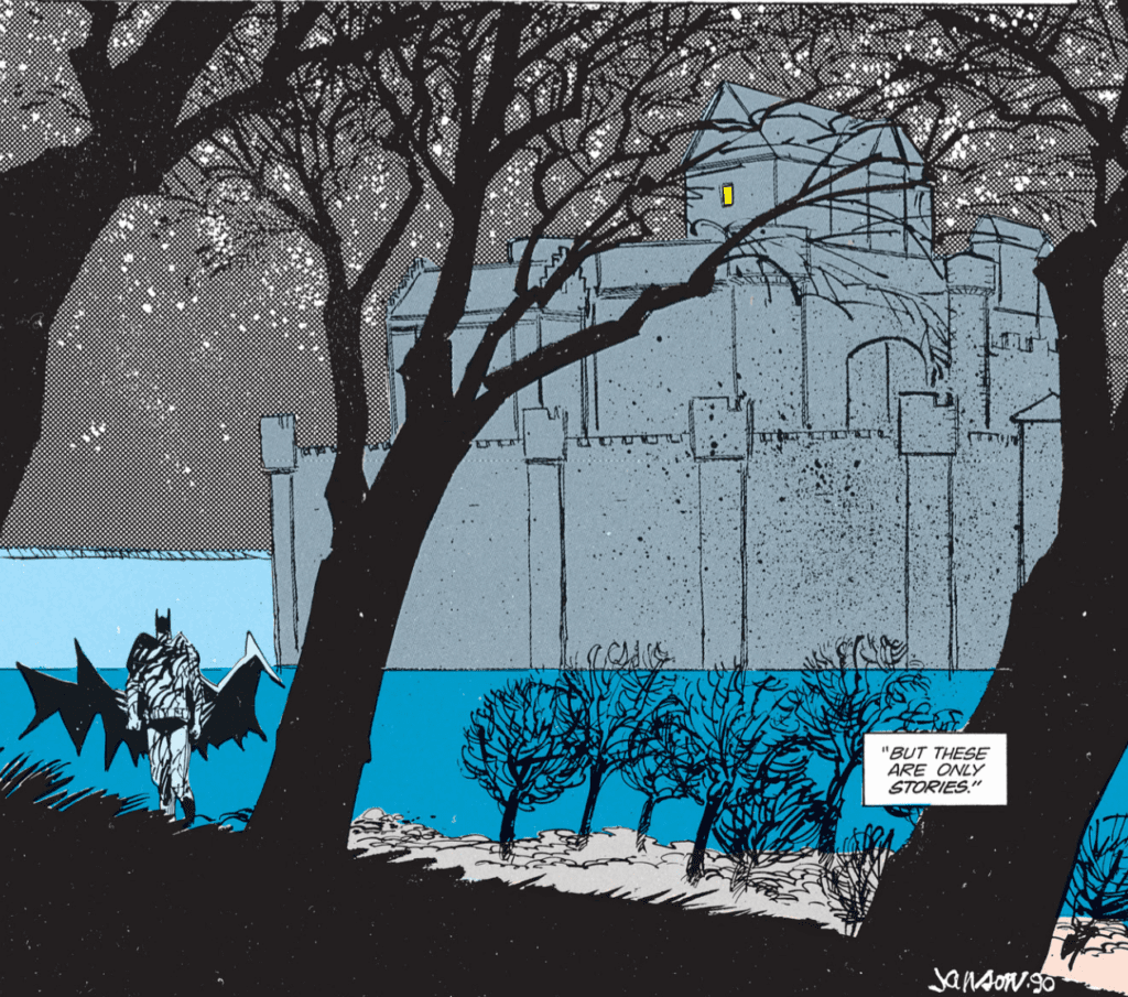
Batman: The Killing Joke remains after all these years what it has always been. Controversial. Somewhat problematic. And brilliant. Alan Moore’s disturbing tale of Gotham Police Commissioner Jim Gordon’s very bad day, as engineered by the Joker, continues to be the watermark by which the relationship of the Batman and the Joker is measured. In stark contrast is the beautiful art by Brian Bolland. Bolland’s pencils, mixed with John Higgins’ pop-art colors, produce an onslaught to the senses. It’s hard for one’s mind to accept the brutal story Moore tells with Bolland’s almost-cartoonishly clean lines.

The original theme of TKJ is mostly lost to a seminal moment in the DC Universe, which was an almost throwaway scene. And therein lies the controversy. We’ll touch on that in a second.

The Joker wanted to show Batman, via Gordon, that if anyone had a truly horrific day, their mind would simply break. The secondary story, supposedly the origin of the Joker, seems to bear this out. A failed stand-up comic, Joker looks to crime for a quick score in order to support his pregnant wife.

As he meets with the two men planning a robbery of the chemical plant where Joker used to work, two things happen in quick succession. The first is the introduction of the Red Hood costume he’ll wear as a distraction while the other two perform the heist. And the second is the arrival of the police, informing Joker his wife and unborn child were killed in a freak electrocution accident.

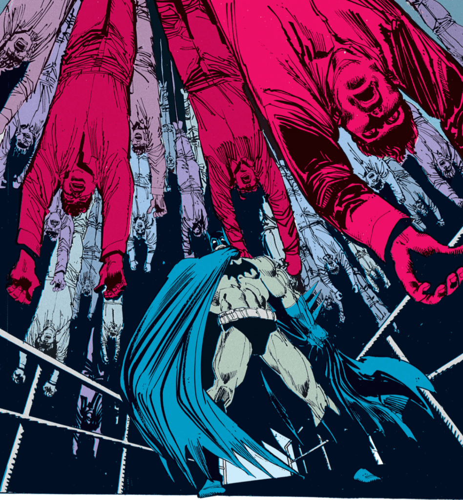
The rest is comic book lore. The trio arrives at the chemical plant and are immediately discovered. Batman is also on the scene, knocking Joker in a vat of chemicals. When he emerges, he’s white-skinned, green-haired, and insane. The Joker is born.

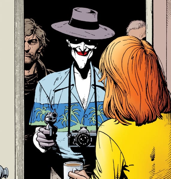
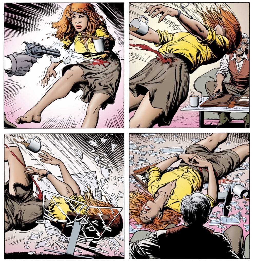
The scene I mentioned comes at the beginning of Joker’s experiment with Gordon. The Clown Prince of Crime shows up at the home of Gordon’s daughter, Barbara (secretly Batgirl). When she opens the door, he shoots her in the pelvis, shattering her spine. What follows is a scene of deviance no one saw coming in the DC Comics world of 1988. It’s still a hard read. Gordon is drug off by henchmen while Joker strips Barabara nude and begins taking very explicit photos of Jim’s gruesomely-injured daughter. The photos are later shown to Jim but fail to get the expected reaction. Batman arrives, rescues Jim, the Commissioner demanding the Dark Knight bring the Joker in by the book. If anything, Jim’s very bad day only made him a better cop.

(Still better than a copy of The Watchtower.)

The argument with this sequence of events is the practice of “fridging.” The concept was first voiced by writer Gail Simone after the body of Green Lantern’s girlfriend was found mutilated in her refrigerator in a 1994 storyline. Fridging portrays how a woman is introduced solely to move the male-dominated plot forward, not given respect as a character, sometimes not even given a name, and is considered to be a sexist and crude literary device and demeaning to women.

The Killing Joke was intended as a one-shot, non-canonical story. As such, Moore is accused of taking a fully-formed, deeply-rooted character in Barbara Gordon/Batgirl and fridging her, solely as a way to torture her father. Seemingly, there’s no thought of her future, or past for that matter. Critics accuse Moore and Bolland of being gratuitous in their depiction of Barbara’s shooting, using it solely as a vehicle to shock and titillate.

The other side of the argument is that the shooting may have ended Babara’s career as Batgirl, but it created Oracle. Gordon’s new persona is arguably a more important figure in Batman’s history, due to her role as the lead dispatcher/researcher for the Bat-Family and proof one doesn’t need to be able-bodied to make a difference. Barbara spent 20+ years in a wheelchair, and during that time, helped found the Birds of Prey, was Batman’s most-utilized source of assistance behind Alfred and continued to be a strong female role model, doing it without baring skin or using her fists.

Various pundits have pointed out; however, that wasn’t Moore’s intention. His alleged misogyny is right there for all to see, say some. He had no plans for Batgirl post-TKJ. Again, this was supposed to be a one-time story with no basis in the DC Universe. Some readers have also posited the Joker raped Barbara during this time; again, not what DC readers expected in the late 80s.

My interpretation of the story has always been this: sometimes, terrible things happen. The idea that the Joker, a deeply-disturbed sociopath, would commit such an unimaginable crime against the daughter of the police commissioner raised the stakes for the character. Now, nothing is off the table. We see the Joker as a being who should never be underestimated, neither for his capacity for evil, nor for his ability to carry it out.

The story itself isn’t original, not in the world we live in. Again, bad things happen all the time, but this time, it happened to a beloved character. And it was graphic and brutal and hard to read. But to me, that act not only gave us the type of Joker Denny O’Neil and Neal Adams hinted at in the 70s, unequaled in his desire to create chaos and torment Batman, but it gave us Oracle. Oracle, who may have lamented her lost legs and her lost identity as Batgirl, but never let it crush her spirit. She had the worst happen to her, and she rose above it.

She wasn’t a sidekick. She wasn’t some piece of fluff to ogle. She was an important character and one of the Bat-Fam’s top assets. Batgirl and Joker’s shared history provided some intense scenes during the New 52’s Death of the Family arc, where Barbara had to face Joker for the first time as Batgirl since the shooting. She rose above the terror and the psychological damage and did her part to defeat him. She faced her fear and won. That’s what inspirational characters do. They elevate beyond his or her limitations, beyond their tragic backstories, and in defiance of all the odds, they win.

Batman: The Killing Joke remains one of my favorite DC stories. It’s Moore at his best and most sinister. It’s Bolland providing beautiful, clean artwork for a script that was neither, making the contrast all the more blunt. Brutal things happen to good people. More often than not, those things leave a mark or outright destroy the person in question. Barbara Gordon rose above being used as a pawn for someone else’s very bad day and came out on top.

And isn’t that why we read comic books in the first place?

Monkeys Fighting Robots Youtube

Review: SCREAM Deconstructs Horror & Salutes Its Audience

During the ’90s, the big staples in horror at the time were struggling to release a good product, but then Scream came along and saved the genre. Ironically, the film would poke fun at and make mention of the three icons on multiple occasions. Of course, those three being Michael Myers, Jason Vorhees, and Freddy Kruger. When horror was at its lowest, Scream brought it back to life by being self-aware and not taking itself too seriously.  A film that not only knew its audience but wanted to subvert every expectation they had at the time.

Directed by the “Master of Horror” Wes Craven, the film was written by Kevin Williamson, who would go on to write future sequels. Scream stars Neve Campbell, Skeet Ulrich, David Arquette, Rose McGowan, Drew Barrymore, Matthew Lillard, Courteney Cox, Jamie Kennedy, and Roger L. Jackson. Set in Woodsboro, California, Scream follows Sidney Prescott (Campbell), a young teen who is still recovering from the year-old rape and murder of her mother. Her troubles are accelerated when a killer begins threatening her and her friends and claims to hold key information regarding the demise of her mother.

Ghostface in Wes Craven’s Scream

Now, if you were to just go off of that general synopsis to judge the movie then you’d be missing out on its magic. The film sounds like every other horror movie that has come out before it but it’s much more than that. Williamson’s script takes horror fans into a world where the characters are aware of slasher films and all of the cliche’s that come with them. These teens are not fully clueless, they understand that “Someone has taken their love of scary movies one step too far” as pointed out in the tagline. Williamson subverts your expectations from the start with one of the most iconic openings to any horror film. That scene alone was enough to understand Scream was set to pull the rug out from under viewers at any given moment.

Adding to that, since Scream has characters who are aware of movies like Halloween and Friday the 13th, it also offers some of the best dialogue amongst a group of teens who are essentially living out the genre they love so much. Sidney’s group of friends consists of her boyfriend Billy Loomis (Ulrich), Tatum Riley (McGowan), Stu Macher (Lillard), and Randy Meeks (Kennedy). Meeks is the audience’s mouthpiece, his informed stance on the inner working of horror films and his awareness that there appears to be “certain rules that one must abide by in order to successfully survive a horror film” are what made him one of the film’s most beloved characters. There’s even an entire scene of him explaining these rules amongst his peers as they watch Halloween at a house party.

Neve Campbell as Sidney Prescott in Scream

All of the characters offer something to like about them and it helps when most of them love horror movies. Sidney is a great protagonist, she isn’t as upbeat as her friends due to the death of her mom, but it’s safe to assume that she was just like them prior to that. Campbell’s portrayal of this innocent teen who is struggling to cope with the loss of her mom makes Sidney a great character to sympathize with and root for as she becomes the center of the killings. She is our final girl, and what the film does so well is it foreshadow’s her eventual outsmarting of the killer in the end. Strong female characters was another aspect that made Scream such a breath of fresh air. Sidney is in the same position as most heroine’s in horror for the majority of the runtime, but she uses her fear to fight back in the end and give the killer a taste of his own medicine.

Overall the cast is amazing, Cox, who was known for her role on Friends, gives a great performance as this seemingly rude, arrogant, entitled news reporter who will stop at nothing to prove that Sidney targeted an innocent man as the culprit responsible for killing her mother. Gale Weathers was a “tabloid twit” as Sidney put it and the two were at each other’s throats due to Gale covering her mother’s death. In the end, Gale is a hero and her thoughts regarding what really happened are found to be true. Kennedy’s performance as Randy gets praised still to this day, not because his acting was so great, but because of the fact that he does enough in the role for audiences to get behind a character that represents them. Randy is just as much a horror freak as half the people watching the film, which makes him easy to like and grow attached to.

Rose McGowan as Tatum Riley and David Arquette as Dewey Riley in Scream

Ulrich plays the dark and moody boyfriend of Sidney, he quickly becomes the suspect because of this darkness surrounding the character. They way Ulrich thrives in the role will keep audiences on their toes regarding Billy Loomis because he seems too in your face to be the killer, and the film makes it so obvious that he is being set up as the average red herring. McGowan stars as Tatum, the best friend of Sidney, and what’s great about this character is she is a clear mouthpiece for Sidney. When she has had enough and is too over it to stand up for herself, Tatum is right there to shut down anything threatening her best friend. Of course, Sidney finds her inner Tatum in the end when she is all alone in a final clash with the killer. Arquette plays Tatum’s brother, the incompetent but lovable cop, Dewey Riley. His performance is good for what it is, and he balances between can this guy be killed already and he is pretty cool.

Craven does what he does best and directs the film very well. He was the appropriate choice as he is known for his direction of Nightmare on Elm Street and The Hills Have Eyes. He understands and loves the genre, so no one was better to captain a film that deconstructs horror. Craven brings Williamson’s clever screenplay to life with ease as the terror and gore he is known for shines bright here. As with every great horror film, Scream features one of the best scores composed by Marco Beltrami. It’s so effective and memorable that Halloween H20: 20 Years Later borrowed bits of it two years later.

Courteney Cox as Gale Weathers, Jamie Kennedy as Randy Meeks, and Neve Campbell as Sidney Prescott in Scream

Scream is a clever shakeup of the genre that will even spark a few laughs in between the terror. The film is cherished amongst the horror community for popularizing the meta aspects of the film. Not only a ’90s treat that still holds up over two decades later, but also a near-perfect horror film.

Monkeys Fighting Robots Youtube

Exclusive Preview: THE SCENT OF MAY RAIN From Weekend Warrior Comics

scent of may rain exclusive preview

THE SCENT OF MAY RAIN is the latest release from Weekend Warrior Comics, and Monkeys Fighting Robots has an exclusive three-page preview for you.

About the book:
A Jewish golem woman created in 1920 spends 100 years on a journey to reveal her soul through her relationships with other women and theatre.

The 48-page comic is by writer Mark O. Stack, from a story by Stack and Rae Epsetin, and artist Kaylee Rowena. Cardinal Rae lettered the book. The character Pat Parker, War Nurse, was created by Jill Elgin.

You can purchase THE SCENT OF MAY RAIN right now at the Weekend Warrior Comics website. It’s available for pre-order in both digital and print.

SCENT OF MAY RAIN is a story about seeing the world with fresh eyes, without prejudice, and learning who you are.

MFR critic Gabriel Hernandez says of the book in his review:

“It’s a thought provoking piece of art that challenges the expectations of love, family, tradition, religion, and sexuality.”

Check out the SCENT OF MAY RAIN preview below:

scent of may rain exclusive preview

scent of may rain exclusive preview

scent of may rain exclusive preview


You can purchase your copy of THE SCENT OF MAY RAIN at www.weekendwarriorcomics.com and follow Mark O. Stack on Twitter @MarkOStack.

Monkeys Fighting Robots Youtube

The Everlasting Power of Tite Kubo’s BLEACH

bleach tite kubo

If you’re looking to get into manga but don’t know where to begin, you won’t find a much better starting point than Bleach, a highly addictive and insanely bingeable comic from mangaka Tite Kubo.

Originally published in Weekly Shōnen Jump, Bleach is the story of Ichigo Kurosaki, a high schooler with the rare ability to see spirits. He meets Rukia Kuchiki, a Soul Reaper whose job it is to help guide spirits to the afterlife and protect humans from evil spirits. Through a series of events, Ichigo becomes entwined in the world of the Soul Reapers and their enemies.

It’s an incredible tale with gorgeous art that will have you hooked from the first chapter, so let’s break down what exactly makes this tale of life and death such a powerhouse.

The Characters

In the beginning, Bleach scratches a lot of the same itches as Invincible or early Spider-Man stories: Ichigo is a high schooler with a strong moral code who is suddenly imbued with great power. The story is very character-driven. There’s drama and comedy in Ichigo’s day-to-day life that we can all relate to, with the awesome addition of late-night spirit fighting. It’s in these early chapters that we get to see who Ichigo is, and set down the building blocks of our relationship with him as readers. This is what sucks you in.

And then…something amazing happens.

The series explodes into a sprawling 74-volume epic with a MASSIVE cast of characters, each of whom stands out as unique and memorable. Seriously, as you meet all of the humans, and Soul Reapers, and villains, and every persona in between, you’ll think to yourself, “there’s no way I’ll be able to keep track of all these characters.” But you will. I promise that you will, because I myself have a sh*t memory, but I can stop reading Bleach for two months, read a bunch of other stuff in the interim, and then jump back into it without missing a beat.

Kubo writes his characters so well, and with such distinct voices, that your subconscious mind will absorb them all and store them with ease.

Sense of Growth & Progression

Bleach consists of four major story arcs over the course of its 74 tankōbon volumes. Each arc builds off the previous one, and as the story grows, so does the world within. It gives the overall tale a sense of momentum and growth. You always feel like you’re going forward while reading, always marching towards a destination. Sure, it’s an action comic, and some battles might go on for chapters (or volumes), but even they are building up to some specific endpoint.

Whereas some long-running series have lulls where it feels like they’re spinning their wheels in place, Bleach almost always has a sense of purpose to keep you reading.

But, while the story grows bigger and bigger, it still retains that personal, intimate connection with the characters thanks to those early chapters where things were a little more quiet. And in fact, the characters grow quite a bit with the story.

This is just as much a coming-of-age tale as it is an action story. Ichigo and his friends change greatly over the course of the series. We see them fail and make mistakes. We see them learn from those mistakes, and, in turn, we learn from them as well. Again, Kubo imbues Bleach with purpose and meaning, giving it weight and making it more than just a “demon beat ��em up” comic. It feels real; life continuously moves forward and changes, and so too does Bleach.

The Art

We can’t very well talk about a comic and not discuss the art, can we?

Bleach was only Kubo’s second ongoing series, the first being the short lived Zombiepowder. So when Bleach begins, the art, while good, is more raw and unpolished compared to what it becomes as the series progresses. We as the reader get to see Kubo’s style develop in real time. The action becomes more explosive; the characters become more crisp, and their expressions more nuanced.

It’s like a drug for art junkies who are obsessed with the cartooning process and seeing how styles change naturally over time.

And, this being an action comic, sometimes there will be pages and pages of little to no dialogue, leaving just the art to tell you what’s happening. To say the battles are “explosive” as previously stated is actually an understatement. The fight sequences are fast and fluid, which makes reading them a breeze, and when a “f*ck yea” moment hits, you’ll literally scream “F*CK YEA!!” out loud.

Plus, Kubo absolutely NAILS visual comedy. He’s up there with the likes of Steve Lieber, Max Sarin, or Ryan Browne in terms of being able to make you bust out laughing while reading. Which is a good lead-in to…

The Humor

Damn, Bleach is a funny comic.

Yes, there is insane over-the-top action that will blow your mind. Yes, the series ruminates on heavy subjects such as life and death, and the moral responsibility we owe others. But between all of that, there are tons of laugh-out-loud moments that I personally just don’t see as often in American comics.

There’s the visual comedy as mentioned, but the writing itself also never takes itself too seriously. Kubo maintains a constant sense of whimsy and levity throughout Bleach. The way characters bicker and argue adds a sense of reality to their relationship. And the banter during fight sequences rivals that of Peter Parker.

The humor balances out all the action and heavy themes, and that’s a big part of what makes this series so great and endlessly readable: it has a sense of perfect equilibrium.

It’s hard to not smile while you’re reading Bleach, for one reason or another.

The Message

Why do we love superhero comics? Why do the works of Stan Lee, Jack Kirby, Jerry Siegel, and Joe Shuster stand the test of time? There are many reasons, but one of the biggest is that they inspire readers. They show us characters at the peak of morality. They remind us to be and do good, or at least to try. Bleach does the same.

Now, Ichigo Kurosaki isn’t the same ideal specimen as Superman or Captain America. He’s more of a Peter Parker. Ichigo is an everyman. He’s flawed. Sometimes he’ll make the wrong decision thinking it’s the right decision. But at the end of the day, he wants to do good, and he puts forth the effort.

Kubo makes it very clear early on in the series that all Ichigo wants to do is help people, especially those who cannot help themselves.

And with Ichigo being more of an everyman, we as the reader can see ourselves more clearly in his shoes. We can see ourselves making the same choices, and hopefully, in a perfect world, when we stop reading, we go out into the real world and we try to help others when given the chance.

But again, Bleach is a series in equilibrium. So instead of just showing “good guys” going out and helping people, Kubo introduces plenty of characters who operate in the grey. There are characters who we would consider “antiheroes,” and those who outright resist the urge to do good.

These aren’t “bad guys,” and they aren’t bad characters. They’re great characters, some of the best in the series. They give a different perspective on the story, and in doing so, they provide another lesson to the reader: remember to look at things from different points of view.

Bleach shows that not everything in life is black and white. It reminds us to be a good person, yes, but also teaches us that we need to question things and understand other people’s point-of-view in order to be the best version of ourselves.

Surprises

Tite Kubo loves to pull the rug out from under his readers. Bleach is FULL of surprises for readers.

They all come out of nowhere. You’ll just be reading, chugging along in a good groove, and then BAM, out of nowhere you get slapped with a shocker. A dopey character will reveal him or herself to be a major badass, or the plot will zig when it looked like it was going to zag. It’s hard to discuss a series’ “surprise factor” without risking spoilers, but the point is that Bleach keeps its story fresh and interesting.

Reading these moments is like getting a glass of ice water thrown in your face. It wakes you up and reinvigorates your interest in the series just when you thought you had a handle on the story. It keeps you engaged, which is crucial when you’re talking about getting through 686 chapters of a story.

But here’s the thing. Here is what makes Kubo both a genius and a horrible tease of a man. He will surprise you with a twist, but then he’ll take it right back and hide it for a long, long time. Volumes will pass where the twist is not addressed. This is dramatic irony at its finest. The story beats on, and the characters will go along with their lives blissfully unaware of the bombshell that you – the reader – know is coming for them. You so wish that you can just scream through the page and let them know what’s coming. But you can’t. So you keep reading while a small thought continues to gnaw at the back of your brain, asking, “What about that one thing?”

And then…

Sweet Release

Ok, I didn’t mean to bury the lead, but this section right here is why I wanted to write about Bleach in the first place.

I’ve thrown a lot of praise at Bleach and Tite Kubo, but I’ve been very careful to avoid using the word “master” up to this point, and that’s because if there’s one place I want to use it, it’s right here.

Tite Kubo is a master of catharsis.

His storytelling in Bleach is all about building something. Building anticipation; building dread. This is particularly apparent during major battle sequences. Kubo will back his heroes into a corner and make it look like they have no way out. Now, comic readers are used to these scenarios. You think to yourself, “obviously the hero finds a way to get out of this.” But Kubo manages to dig his characters into holes so deep that you genuinely start to believe that they can’t get out of them. Instead of thinking, “how is Ichigo going to get out of this?” you begin to think, “oh man, maybe this story doesn’t go the way I thought it did.”

Kubo is able to build true, genuine dread in a way that readers just aren’t used to anymore in American superhero comics.

And then comes the payoff. The payoff isn’t always good, for the record. The good guys don’t always come out on top. But whichever way it goes, Kubo’s payoffs are almost always mind-blowing. They’re less a “wave of sweet release” and more of a volcanic eruption of awesome after the anticipation and dread built up inside you hits critical mass.

You would think after the third or fourth time something like this hits you, it would get repetitive and boring. But here’s the thing…it never does. Each time it happens, Kubo somehow manages to go bigger, raise the stakes higher, even when you thought they were maxed out the last time. This series exhilarates you and charges you up; you won’t want to stop reading.

Bleach is one of the all-time great reads for readers young and old. It’s rare to find a series that can balance huge action with personal intimacy so well. There’s a little bit of something for everyone, and – most importantly – it’s a fun read.


You can read the first three chapters of Bleach for free right now on the Shonen Jump app, or read all 686 chapters by signing up for just $1.99/month (You’ll also gain access to over 10,000 chapters of manga, including the full runs of Dragon Ball Z, My Hero Academia, and One-Punch Man. This is hands down the best deal in digital comics. #notsponsored).

Monkeys Fighting Robots Youtube

Longbox Legends: ASTONISHING X-MEN & Looking Back to Reach Forward

lThe story of the X-Men in comics is the medium’s equivalent of common biblical knowledge. Even casual non-comics fans are familiar with the trails of mutantkind and Charle Xavier’s team of naturally gifted heroes. From conflicts with Magneto’s Brotherhood of Mutants to the discovery of the Phoenix Force, and from Days of Future Past to the comic of Apocalypse, the X-Men’s history is considered some of the greatest work every put to the panelled page.

As it turns out,  Buffy the Vampire Slayer and  Firefly creator Joss Whedon is also a massive X-Men fan. So when he was offered the task of writing said X-Men – with near-complete creative freedom, mind – he happily obliged. Even better, he paired with visual tour de force and Planetary artist John Cassaday to bring his vision of the canonical comic team to life. The result is, well, *ahem* astonishing.

Writing & Plot

Taking place shortly after the events of Morrison’s New X-Men, with Magneto and Jean Grey dead and Charles Xavier in self-imposed exile, Scott Summers (aka Cyclops) becomes the new leader of the X-Men and headmaster of Xavier’s School. The team sees the return of old friends, with the likes of Kitty Pride (aka Shadowcat) and Peter Rasputin (aka Colossus) rejoining the ranks and teacher lineup along with Emma Frost, Beast, and Wolverine. The new class and celebrated returns marks a new start for both the mutant heroes and Xavier’s School for Gifted Youngsters. However, threats from beyond the stars and within the confines of their own home threaten the X-Men and their students at every turn. Alien warlords, vengeful A.I.’s, shady government groups and even treachery within the X-Men themselves make for a Marvel story that is an outstanding mix of modern themes and homage to decades past.

Joss Whedon‘s established style of writing has always been a simple but effective method for creating a compelling story. He sets the rules for a newly created world and investigates those rules through character action and interaction. In the case of  Astonishing X-Men, Whedon is entering a long-established world with a roster of beloved characters. He dances a difficult jig, having to both maintain the route Morrison set with the X-Men in his own run, while still letting his creativity and love for the classic material show through. So right off the bat he reintroduces longtime fan favorite Kity Pryde back into the mix, endearing his run to longtime fans as well as satisfying his own desires as a fan. Whedon’s character writing faced an intriguing challenge as well, having to maintain both long-established and newer character dynamics while still not running into series repetition. Fortunately, Morrison left him some interesting tools to play with for the future.

Whedon’s proven track record and playing out long-term plots with tight and believable character drama within works perfectly with  Astonishing X-Men. Emma Frost’s inclusion in Jean Grey and Professor X’s absences makes for several uneasy moments between Kitty Pryde and the former White Queen of the Hellfire Club. The troubled romance between Scott Summers and the former villain is a mix of stress-inducing and oddly sweet. Of course, the rest of the team’s dynamic is spot-on in terms of their classic repertoire while also elevated to contemporary dialogue. Whedon has a very screenplay friendly style of character presentation that also relies on visualization (more on that later) to represent all sides of his characters. The humor here is stellar and ranges from simple jokes to massive pieces of hilarious dramatic irony. While the students aren’t quite as large a focus as they were in the prior series, they are still given considerable importance in  Astonishing. A select few are given their own arcs – some inspiring, others tragic – and become instrumental in the X-Men’s success. Only one really builds a relationship with one of the teachers, however. This may be the one weaker aspect of the series, especially given how much time was spent developing the students as characters and the teachers as such in Morrison’s run. However, this is again made up for in just how much fun the series is to read.

Whedon takes a bold risk in  Astonishing X-Men by opting to create new villains instead of recycling old ones. The first arc, “Gifted,” introduces Ord of the Breakworld, as well as the narrative throughline culminates in the final issues. The stoic alien warrior’s motivations against mutantkind spark the creation of the now-famous “mutant cure.” This also runs the X-Men into the path of S.W.O.R.D. and their clandestine agendas involving alien activity. The other major enemy Whedon introduces comes as one of the more morally polarizing revelations in X-Men’s recent history: Danger. The mutant team’s longtime training room gains a malicious sentience, resulting in an arc that not only showcases one of the most, er, dangerous villains conceived in X-Men comics, but also brings up a fascinating conversation within X-Men lore. Where exactly does self-actualized artificial intelligence fit in among the species hierarchy among humans and mutantkind? Oddly enough, this is probably the weakest arc in the whole run. The pacing in this arc is muddled a bit by its exposition laden plot points. This being said, even “Danger” is still a wholly entertaining and unique chapter.

When Whedon does use preestablished villains in Astonishing X-Men, it’s more in the service of analyzing the core team instead of crafting an external threat. Without getting into spoilers for those who haven’t read this, the character of Emma Frost comes into frequent question. This applies both in terms of her place as a former villain turned X-Man, and how fans perceive her place here. The arc where enemies both classic and from Morrison’s run appear is used by Whedon to solidify her spot on the team. This is a peak example of respecting the direction Morrison started while also paying mind to the years of prior storytelling. The entire plot, for all of its twists and satisfying character deep dives, realigns itself on the character that becomes the sort of “heart” of the team and brings about one of the most gut-punching beautiful endings in mainstream comics. Let “Giant-Size Astonishing X-Men #1 reign as one of the greatest single issues in recent history.

Art Direction

Of course, none of this series would work if the visual direction didn’t match the cinematic action and character focus that Whedon’s scripts require. So it’s fortunate that an artist like John Cassaday, who brought his style specializing on cinematic action and character detail to bear on Warren Ellis’  Planetary,  was available for this endeavor. Cassaday’s work utilizes an almost digital style, creating a visual aesthetic that is indeed cinematic. This makes the comic easy to engage with in terms of character, as the character details for facial animations are entirely naturalistic. The art walks away from the standard superhero style that can sometimes come off as either “too cartoony” or “too slick” to be truly character driven. Cassaday is given a lot to work with from Whedon as well, since the writer scripts so many wordless panels that are driven solely by character expression or action. The X-Men have scarcely ever looked better, as their designs as both people and as heroes are slick and contemporary with a dash of classic superhero elements. Whedon’s decision to revert back to superhero costume designs is put into great effect thanks to Cassaday’s work.

While Cassaday’s lines of detail are the driver of character and action in  Astonishing X-Men, the sharp aesthetic is the result of colorist Laura Martin. Her work walks all manner of tones to while maintaining a slick refinement regardless of what’s happening on page. The lively blues and yellows of the team’s suits to the mottled green of alien skin tones all have texture to their design. The variance in shadow and lighting across both characters and a slew of environments both creates atmosphere and pulls the readers into a believably designed world. Colorists are often unsung heroes in the artistic world, and Martin’s work with Cassaday is proof of why they need recognition.

Joss Whedon and John Cassaday’s Astonishing X-Men is cemented as a must-read run among absolute classics. Whedon’s mixture of character analysis, witty humor and tightly knit plotting make for a gripping read from the first issue to the Giant-Size finale. John Cassaday and Laura Martin’s visual work creates a comic that is both cinematic in scope while taking advantage of the unique devices found in the comics medium. However, these accolades can be said about a fair number of great comic series, especially a few X-Men runs. What sets  Astonishing apart is the fact that it still sets forth in a new direction for the iconic characters. This direction continues the trajectory planted by Grant Morrison in  New X-Men while also choosing to realign itself closer to the tastes and decisions of X-Men fand and writers of old. All this and it still finds plenty of new things to say about these comic book icons and the torn anti-mutant world they live in.


Monkeys Fighting Robots Youtube

BATMAN: GOTHIC – Why More People Don’t Talk About This Series

During the first half of 1990, two much-beloved creators wrote a five-issue Batman story, Batman: Gothic, alas, 30 years later, it’s hardly spoken of.

Although the story may be 30 years old, beware of spoilers! A few do pop up.

Looking at the casting call, you’d be surprised it isn’t as high up on reader’s lists. You have Writer Grant Morrison, Artist Klaus Janson, Colorist Steve Buccellato, and Letterer John Costanza. By this time, both Morrison and Janson’s names are ones many fans would recognize in the 90s.

BATMAN: GOTHIC ROLL CALL

The year before (1989) Morrison had written Arkham Asylum: A Serious House on a Serious Earth. Thing is, the back cover of Batman: Gothic Deluxe says this is his first Batman story. We’ll agree to disagree and say it’s his first “canon” story. Janson’s name brings up memories of his work with Frank Miller: Daredevil and Batman: The Dark Knight Returns.

Nonetheless, the other creators of Batman: Gothic share a huge spotlight. Batman: Gothic is Buccellato’s first DC Comics work, yet he had been around since 1987 in a multitude of roles. Costanza is a veteran in the comic industry. Having begun his career in 1965, he would go on to letter for Jack Kirby, among many other comic giants. The team behind the five-issue Batman story was one to be trifled with. Question is, why isn’t it held up to high regard as the other great Batman stories?

Someone returns
The beginning of the end – Art by Klaus Janson, Colors by Steve Buccellato, and Letters by John Costanza

TIMING IS KEY

Much like another Batman story I love and feel like isn’t talked about (Batman: The Cult), it came out during a crucial period. During the late ’80s and early ’90s, a fair amount of now-classic Batman stories came out, redefining the character and his mythos. Plus, Elseworld stories that are well-beloved. So, for Batman: Gothic timing was important, but good timing it didn’t have.

Another factor can be Morrison’s writing and his use of religion, calling it a “Gothic Romance” and myriad use of operas and plays. Morrison leans hard on all these inspirations, stuff that some fans wouldn’t like or could make them shy away. Each issue begins with a playbill that would introduce the “cast,” a quote from a play, and the issues name—thus showing Morrison’s inspiration. Plus, the main villain uses the Riddlers motif, but with a poem.

Morrison’s work back then wore its inspirations on the sleeve more so than now, which accrued him dicey glances from others. Nonetheless, isn’t all stories inspired by others? Plus, one of Daredevil’s (Born Again) most famous stories is heavily influenced by religion.

Batman: Legends of The Dark Knight #6's Playbill.
Batman: Legends of The Dark Knight #6’s Playbill.

IN THE MIDDLE

Another fascinating fact about Batman: Gothic is its publication history. Batman: Gothic was the second five-part story that ran in 1989’s Batman: Legends of The Dark Knight, with it being issue numbers 6-10. Morrison’s story was perfectly in the middle of other amazing Batman stories; Shaman and Prey. Both these titles were written by long time Batman favorites, Dennis O’Neil and Doug Moench. Meaning, it had an amazing standard to live up too.

Unlike other Batman titles at the time (there were a few), Legends of The Dark Knight focused more on the darker, earlier side of Batman. Usually, this meant it was a more adult heavy series. Plus, this made the series more lenient towards obscure plots, mostly out of the ordinary plotting. This “looser” rule set played into Morrison’s favor, with him tapping into some “non-mainline” matters.

Dead bodies everywhere
Inverted bodies galore – Art by Klaus Janson, Colors by Steve Buccellato

A DEADLY BLAST FROM THE PAST

Morrison quickly introduces a long lost resident of Gotham once thought dead—Mr. Whisper. He also served as Bruce Wayne’s childhood teacher, Mr. Winchester. Yet, his history even goes further back with him being a monk named, Brother Manfred. Having caught the black plague, Brother Manfred sold his soul to the devil for three-hundred years. His arrival back in Gotham marked his ending days.

Much like Scott Snyder’s Batman: Court of The Owls, Morrison weaved Mr. Whisper’s story into the very soul of Gotham and its history. Twenty years past, when Bruce was in school, Mr. Whisper killed seven kids which gained the attention of Gotham’s local mobs. Back then, criminals of Gotham had some morals, plus they didn’t want the heat on them. They set out to kill him, only to find out it’s not possible. So, they drown him.

Nonetheless, twenty years past, and he returns to kill them to pass the time until his plan comes to fruition. For each of these deaths, a note is giving to the victim with a poem with a hint of how they’ll die. Look at it like a better/deadlier Riddler. Knowing their time is up, the criminal families involved go to Batman for help.

A spaking indeed
Bruce was a bad boy – Art by Klaus Janson, Colors by Steve Buccellato, and Letters by John Costanza

BATMAN: GOTHIC, A GOTHIC ROMANCE TALE

Batman: Gothic deals heavily with religion, yet with a somewhat supernatural feeling. But, at no point does Batman doubt any of it. Nor make light of the situation. Instead, Morrison writes a Batman that knows how to scare the criminals while taking everything seriously. When he sleeps, he has nightmares involving dead children, nursery rhymes, his father, and Mr. Winchester. As all the elements come into play, he makes a trip to Lake Dess to learn of what may be the truth.

Morrison’s plot can be boiled down to a structure he used in his later Batman run, and others too. A personal character that “maybe” immortal comes from Gotham’s/Batman’s past to haunt him and his city. Batman digs into his past to realize that character has always been there. Villian puts him in a death trap; once thinking he is done, they go their merry way with their plans, only for Batman to come back. This reads like Batman: RIP (minus losing his mind), and Court of Owls. Even the inverted theme throughout Batman: Gothic can be seen in RIP. Said inverted theme helps emphasize the religious matter and can be seen with the inverted cross, hanging victims, an inverted Bat-Signal, and Batman’s reflection, to name a few.

Batman: Gothic sets itself apart with how its villain is precisely as he seems. Yeah, in some parts it may not seem true, nonetheless, at the end, Satan returns to claim Mr. Whisper’s heart.

The end
The end comes for us all – Art by Klaus Janson, Colors by Steve Buccellato, and Letters by John Costanza

GOTHIC DESIGNS

Batman: Gothic focuses on the big three pieces all good Batman stories revolve around; Bruce, Batman, and Gotham City. Each of these elements is given spotlight via Morrison’s script, yet, even more so by Janson’s art. Whenever a panel focuses on a location, Janson’s art breathes it into life. The city feels as much alive as the characters seen throughout. Be it the gothic architecture, grimy streets, allies filled with sketchy characters, and the tall foreboding buildings. Janson’s Gotham designs are some of the best around.

Another aspect Janson excels at is showing reactions with full faces, or full bodies. When a character is showing tense emotions, Janson gets close to their face to show the fear. He uses this frequently, to amazing effect. This gives him the possibility to show every detail on their face, making the reader feel what they are.

Fearful faces
The fear in one’s eyes – Art by Klaus Janson, Colors by Steve Buccellato, and Letters by John Costanza

But, what would a Batman comic be without action? Luckily, Janson knows how to catch the reader’s eyes with a clean yet violent style that makes you feel each hit. In these fights, each violent action is portrayed in a panel that beautifully shows the motions, followed by a reaction. In his grasp during the final issue, Mr. Whisper has Batman strapped into a Rube Goldberg machine; because we all know this works out perfectly each time. Thing is when the machine starts, Janson never shows a full shot of it, as a way to keep the reader on their toes. Instead, each mechanism is showed working in a nine-panel grid. This method makes the trap feel deadlier and that Batman may not make it out.

Death trap
Can he escape? – Art by Klaus Janson, Colors by Steve Buccellato, and Letters by John Costanza

A HEROIC INTRODUCTION

It is interesting how a creative team introduces the titular character and his nemesis in series. Usually, this can excel the storytelling, or make it feel flat. The manner the team introduces Batman in Batman: Gothic is gorgeous. This is due to multiple factors, with Buccellato’s colors standing out greatly. As Batman mostly operates at night, Buccellato keeps Gotham draped in shadows, much like its protector. When we first see Batman, a spotlight flashes upon his cowl while he’s on a building. Telling the reader, “Hey, here he is.” The following panel’s background is a brighter blue, helping show the lights still there.

These two panels exemplify Buccellato’s colors, but the following Batman moment shows how making the colors a little unnatural help even further. Having followed the two criminals, Batman drops down with an epic one-liner showing himself to the criminal he left conscious. He’s colored his usual grey/blue, yet behind him is a thick black that shapes his outline. Nonetheless, the color that catches the eye is the bright red behind him, that honestly shouldn’t be there.

Buccellato’s use of red to amplify the scenes makes perfect sense with the theme, and the emotional level. The red may seemingly come from nowhere, yet that doesn’t matter when it helps sell the scene. This is important as this happens in a few places, but when it does, it dramatically improves the story.

The king of hell – Art by Klaus Janson, Colors by Steve Buccellato, and Letters by John Costanza

A NOT SO DELUXE EDITION

Batman: Gothic Deluxe Edition was released for the storyline’s 25th anniversary. Yet, there a more than a few negatives. It seems that Buccellato’s colors take a hit with them feeling washed out. Much like the recent Justice League: A New Beginning TPB, it looks like it was printed on glossy paper. The thing is, comic art from the ’80s and early ’90s doesn’t work well with this paper. The glossy paper makes the colors look blown out while killing some of the lighter lines from the artist. The colors don’t take as much of a hit as other reprints, yet when comparing to the original print and issues on the DC Universe app, it’s noticeable.

On a weirder note, some of the pages are cut short. It’s not to an extent where you’ll notice it, but this fact is weird. What makes these clipped pages worse is how the Deluxe Edition is a larger format Hardcover. The larger format works beautifully for Batman: Gothic, yet the clipped pages feel weird. Included in the Deluxe are Morrison’s original synopsis notes for each issue, except issue one. It’s nice that issue #2-5’s notes are included, but why not the first issues?

Nonetheless, Batman: Gothic Deluxe Edition includes one fantastic extra; Grant Morrison’s original sketch of the death trap. On a final note: the Deluxe Editions cover doesn’t measure up to the original TPB. The original fits the interior art better while catching your eyes.

BATMAN: GOTHIC 30 YEARS LATER

Looking back at Batman: Gothic and the stories following, Morrison’s tale never seems to be referenced in media or other comics. Nonetheless, that doesn’t take away how elegantly he and the team behind the story did. Despite a moment with hard to read lettering, you’ll finish the fiver-parter wondering way it isn’t spoken of more. Every element brought forth is seamlessly woven into the fabric of Gotham and Batman’s history. Meaning, even though it may not be referenced again, it all happened.

Plus, themes present here are brought forth in his legendary Batman run later on. His work here and Arkham Asylum: A Serious House on a Serious Earth can be seen as his building stones for the future.

We end with a simple quote from Batman: Gothic’s final panel.

Art by Klaus Janson, Colors by Steve Buccellato, and Letters by John Costanza
Monkeys Fighting Robots Youtube

Review: THE SCENT OF MAY RAIN Questions Tradition And Purpose

The Scent Of May Rain, cover

THE SCENT OF MAY RAIN is the latest independently-produced graphic novel from Mark O. Stack and team. It’s a thought provoking piece of art that challenges the expectations of love, family, tradition, religion, and sexuality.

The digital release is set for 5/27, with the print release tentatively set for 6/17. You can pre-order either version of the book at weekendwarriorcomics.com.

Writing

Mark O. Stack and Rae Epstein have writing credit for creating the story. In 1920’s New York, a man creates a golem to act as surrogate mother for his daughter and sometimes companion for himself. Esther (the golem) acts as the surrogate for the reader as well, experiencing the world around her with naive and unsullied eyes. She does not age, and the story chronicles how her view on purpose and living evolves over the course of the last century.

Stack and Epstein are playing with a lot of ideas in this book, far too many to fairly address in a single review. Her creator makes Esther from raw materials to serve a specific purpose, but he encourages Esther to learn through exposure to the arts. The creator wants Esther to grow, but only within the creator’s narrow view of acceptable behavior for women.

Stack and Epstein infuse every page with cultural references that are authentic to each time period. Esther reacts to revelations about marriage and motherhood as would a child without benefit of upbringing or family of her own. She was literally born yesterday, so Esther’s reactions are akin to a space alien arriving on Earth and struggling to understand Earth society. Esther’s reactions are genuine from moment to moment.

In the end, Esther transcends her given programming and purpose to adopt a life directed by choice. The ending is poignant and inspiring, and Stack and Epstein conclude with a spirit of possibility for Esther. Again, this is a thought-provoking story that covers too many ideas to do justice here. (Spoiler for the ‘Conclusion’ section: get this book, and you’ll have tons to think about.) This is an excellent piece of writing.

Pencils/Inks

Kaylee Rowena does nice work here matching the art to the characters in a way that augment Esther’s personality and surroundings. Rowena draws the entire book in sketchbook style, with rough strokes that look almost like charcoal. She draws characters loosely as if for a children’s book. That works well in, again, connecting the art to the character of Esther via her childlike naivete.

Coloring

Rowena also takes coloring credits here, and – in a positive way – she created a book that looks old and weathered. Mystical practitioners traditionally created golems from clay and dirt. Rowena saturates the early years with sepia tones that gives the book an old Black & White movie feel. The sepia also connects the book with the raw earthen materials that make up Esther. It’s a subtle connection point, but it makes all the difference.

Lettering

Cardinal Rae takes letterer credit, and does an admirable job. Rae juggles well between English and (translated) Yiddish in a way that was still easy to read. Well done on the lettering.

Conclusion

THE SCENT OF MAY RAIN is an insightful, thought-provoking book that looks at our society’s views on love and life, over the years, through fresh eyes. There’s almost too many ideas, but all of them are worth experiencing and discussing. Get this book!

Again, the digital release is set for 5/27, with the print release tentatively set for 6/17. You can pre-order either version of SCENT OF MAY RAIN at weekendwarriorcomics.com.


Author’s Note: Local Comic Shops (LCS) are going through a tough time right now with the pandemic outbreak of COVID-19. Comics fans of every flavor that care about his or her LCS should try to do what they can. So, here’s my part:

If you’re in Northern Delaware, South East Pennsylvania, or Southern New Jersey area, please take a moment to visit Captain Blue Hen Comics in Newark, DE. Say ‘hi,’ pick up a book, order a book (they’re on Comichub.com), and let them know you support them.

If you’re nowhere near that area, please find YOUR LCS using Comic Shop Locator and lend your support.

Thanks, and stay safe.

Monkeys Fighting Robots Youtube

Review: KILL A MAN Challenges Readers With A Heavy Punch

Kill A Man cover
Kill A Man Credit: AfterShock Comics

Coming soon from AfterShock Comics is an Original Graphic Novel that deals with the violence of Extreme Fighting and the difficulties faced by a young gay fighter. Kill A Man written by Steve Orlando and Phillip Kennedy Johnson pulls no punches and is a hard hitting story about individual choices and the consequences that follow.

With an eye catching cover and an exciting premise, Kill A Man makes some big promises from the get go. But the question is, can the creators keep the readers entertained for the full bout or does it all end abruptly in the first round?

Kill A Man
Kill A Man Credit: AfterShock Comics

The Story

To some it’s a world of entertainment and wealth, to others it’s nothing more than violence and hatred. For James Belly it is all he knows and he has become a slave in the ring of the Extreme Fighting Championships.

The young fighter is following in the footsteps of his late, great father, who was a champion of the ring years before. However, during a brutal fight, Belly Senior goads his opponent, Xavier Mayne, with homophobic slurs and the result is a literal fight to the death.

Riding the crest of his own popularity, James Belly fails to see the fall ahead of him and when he is publicly outed as being gay it all comes crashing down around him. Ostracised from his family and branded a cheat in the wrestling world, James has only one place to turn in his hour of need: the man who killed his father, Xavier Mayne.

Kill A Man
Kill A Man Credit: AfterShock Comics

Writing For the Ring

From the very beginning of the book you get a sense of the story Orlando and Johnson are telling. It has the initial air of showmanship, extravagance and performance, but very quickly the violence underneath takes over and the cruelty of people becomes the overriding theme.

There are two main themes throughout the book that battle for dominance but are so intrinsically linked it is impossible to separate them. The first is the sport itself. The Extreme Fighting Championship is a hard world for it’s fighters to live in. They have to live up to an image that is thrust upon them by the sport, it’s promoters and the fan base. People expect violence and the macho conflict in and out of the ring.

The bigotry and hatred of anything deemed not manly enough is rife within the story and the sport that it is portraying. At first it’s just the language of individuals but the writers make it clear that these opinions are born from deeper rooted problems within the promotion of the sport itself. When James is outed, on the eve of a title bout, Orlando and Johnson quickly make the reader realise that homophobia is embedded in society and not just the opinion of a few small minded people.

Although this is a book about a fighter coming to terms with his own sexuality, there is a much bigger picture on display. Orlando and Johnson are using their story and the EFC as a microcosm for the world at large and how underlying prejudices in society seep into everyday life.

The story is powerful and, due to its very nature, hard hitting. The plot is tightly written with each step building a complex picture of the world James lives in. The characters are believable and empathetic. The reader gets a good sense of who each person is and the role that they have to play in the story. Even the extra’s feel like fully rounded characters who have a story of their own to tell.

Kill A Man
Kill A Man Credit: AfterShock Comics

Violent Visuals

In the same way that there are two main elements to the narrative, there are two distinct elements to the brilliance of the Art. Both of these are provided by Al Morgan who colors his own inks.

The inking style is heavy handed with vast areas of black forming dense shadows across the panels. This intensity is heightened by the solid black gutters than frame the panels. The overall look is brutal and for a large part unwelcoming. It reflects the world of the fighters and the macho environment they inhabit.

To counter this and interject an emotional element into the art work, Morgan uses block colors to differentiate scenes and moments. Small highlights of color give the images some depth but it is the strength of the solid coloring that has the most impact. A scene that shifts from black and white to blood red for every other panel brings out the violence of the moment. Similarly, a quick change in color between panels expresses a shift in emotional responses in the images portrayed.

The coloring in Kill A Man has the strongest initial effect on the reader. As you turn from page to page you are struck by the intense focus on a single color. This in turn makes you instantly aware of any deviation, drawing you directly to a specific moment on the page. Morgan sets a standard in the opening pages and from that moment on, he has complete control over where you look and the focus of the plot.

Kill A Man
Kill A Man Credit: AfterShock Comics

Rounds of Letters

Jim Campbell is an experienced letterer who knows how to get the best out of a script. He can pick up on subtleties in speech and creates a style to fit the artwork. In Kill A Man his most impressive achievement is differentiating between speech levels. By changing the shape of a speech balloon or the color of the font, Campbell is able to create loud, amplified voices and behind the back whispers.

The text itself is fairly straightforward as Campbell doesn’t experiment with different fonts. Instead he uses bold text for emphasising often hurtful language and type size to express emotion. The placement of the speech balloons also accentuate the feelings behind the spoken words. Large outspoken speeches hang above the characters, displayed for the world, whereas the cruel, personal insults often drop to the bottom of the panel to hover near the ears of the victims of abuse.

There is a streak of cruelty throughout the story and Campbell makes sure that this is obvious. He uses the lettering to make the attacks personal. As a reader you can see exactly who the verbal abuse is aimed at and, more importantly, how it is delivered: in hushed tones, just below the surface.

Kill A Man
Kill A Man Credit: AfterShock Comic

Conclusion

Kill A Man might seem like a difficult sell. On the surface it looks like a sport comic about Extreme Fighters which will have a limited audience. But like a number of great sport’s stories there is so much more going on. This comic is about self identity; it’s about institutionalised bullying; it’s about anger, and rage, and revenge.

At the heart of this book you have two characters from different generations who are trying to come to terms with the same thing: their own sexuality. The world they have chosen to live in does not accept them and they have each adopted a personality they can barely live with. What makes Kill A Man so impressive is the way in which their stories are told.

The inks, colors, and letters reinforce the society that surrounds the characters. It’s brutal and harsh and often not pleasant reading but that is the point Orlando and Johnson are trying to get across. This is more than just another Sports Comic, this is an intense examination of social acceptances and the pain they can bring.

Due to be released in early June from AfterShock Comics, Kill A Man is an exceptionally gripping read from the very first page. It is difficult to recommend this to everybody but if you have any interest in comic book storytelling you should be reading this.

Monkeys Fighting Robots Youtube

Crowdfunded Comics Bestsellers: Are They Exploitive?

Lady Death among notable Crowfunded Comics

Crowdfunded Comics are quickly gaining attention across the comics community. Even here on MFR, there is an entire section of reviews in dedication to Kickstarter comics. Looking at the trends on sites like Kicktraq and BackerKit however, some questions rise up. Many of the series involve women with certain “appeals.” In recent years some projects involve titles from the 90s like Lady Death and Shi. Does this mean that crowdfunding comics are just taking advantage of readers’ instincts? This is the research from the gutters.

Crowdfunding Platforms

Crowdfunding platforms like Kickstarter and Indiegogo are becoming the go-to means of creator-owned content to flourish. YouNeek Studios, in particular, lives up to the Kickstarter name for its publishing. Starting with E.X.O. The Legend of Wale Williams, comes a superhero fantasy franchise joining the ranks of legends like Marvel. Which, in turn, leads to several imitators like Epoch Comics. Even notable series like Witchblade go on these sites to get funding for their omnibuses when its publishers can’t provide it. Which brings up the next point.

Advertising Exploitation?

Crowdfunding is far from easy because that means giving your backers their money’s worth. Artwork, writing, printing, and distribution doesn’t come cheap. Most single issue comics usually need roughly $1000 just to get that bare minimum. So advertising is key to getting the necessary funds. At the same time, just throwing money at companies like Facebook doesn’t guarantee success. So there comes a controversial means of appealing to potential backers, taking advantage of their instincts.

Crowd Instinct

Some comics get a called out for suggestively dressed women on their covers. Even today, comics like Tarot: Witch of the Black Rose doesn’t shirk away from these depictions. Since most of the artists behind such series are men and appeal to men, there comes a familiar saying, “Sex Sells.” However, that’s not to say that female artists don’t draw women provocatively, including Sorah Suhng. This saying also appeals to female readers as well. One series that often appears in Kicktraq’s Closed Projects, Sweet Boy is a yaoi series, a demographic that appeals primarily to women for how attractive the men are. There’s a double standard for everything.

A webcomic that gets attention
Just imagine what this would look like in animation.

Neoteny is another aspect that often gets attention, especially in webcomics. Thanks to how youthful and simple designs can look, people can’t look away. Japan has an entire subculture in dedication to this, Kawaii. A good number of these webcomics also involve cats, including fan-favorite Lackadaisy. Probably because cats, even mature ones, retain their neoteny. The most successful crowdfunding projects, regardless of medium, however, go beyond surface appeal.

Crowdfunding On Nostalgia

Probably one of the most exploitive natures people use in entertainment is nostalgia. Whether it’s remakes, reboots, or relaunches, people are more than willing to stick with familiar names. The name of Lady Death alone amasses over 1 million dollars in crowdfunding for more than ten graphic novels. All while spearheading Brian Pulido’s Coffin Comics universe. It’s little wonder why Coffin Comics amasses enough net profits to get on the Diamond catalogs.

Did you know that Jim Starlin made this crowdfunded comic as a means of advertising?
From the maker of half of Cosmic Marvel, comes a Space Opera.

Of course, notable creators like Jim Starlin and Kevin Eastman use their names and influence to advertise. Starlin himself generates a lot of hype with his fans through his souring relationship with Marvel. His campaigns, in turn, advertises Creation.INK, “the first truly creator-owned company,” composed of veterans like Starlin and Ron Marz. Eastman meanwhile uses his fame from TMNT to catapult Drawing Blood. This series about what goes behind the scenes perfectly encapsulates the means behind crowdfunded comics.

Crowdfunded Comics Are For Fans

Crowdfunding is for all kinds of fans
Can you blame the guy for the fan-art crossovers?

It isn’t enough to generate interest through pin-up models or human psychology; crowdfunding has to be something fans can relate to. Relative newcomer, White Widow is quickly becoming popular in the comic community. Series artist and co-creator Jamie Tyndall makes a name for this title by crossing it over with fan-art. The Spider-Gwen crossover designs are so popular; cosplayers make regular use of them at conventions. But even more so, these designs have character.

Character is arguably the most significant piece surrounding these crowdfunded comics. Despite how underdressed many of these characters and series appear to be, there are real stories surrounding them. Some of them like Lady Death starts as ideas until they grow into something more, even to the point of a small publishing empire. Imagine how some fans feel about being the ones to bring these series into the public.

The Community of Crowdfunding

Comics are a medium of combining elements that are greater than the whole, a medium of community. While creators can direct readers to and through their content, readers experience it in ways they share with others. Crowdfunding is one-way fans give back to their creators, by being the ones to breathe life into it.

What do you think of bestselling crowdfunded comics? Leave your thoughts in the comments.

Monkeys Fighting Robots Youtube

Review: GIANT-SIZE X-MEN NIGHTCRAWLER Visits A “Haunted” X-Mansion

Giant-Size X-Men Nightcrawler, Davis cover

GIANT-SIZE X-MEN NIGHTCRAWLER, available from Marvel on March 25th, takes the reader on a mutant adventure away from the shores of Krakoa. Magik, Nightcrawler, and their team investigate odd sensor readings from the abandoned X-Mansion. Will the ghosts of Xavier’s past confront them? Let’s find out.

Cover

Alan Davis and Edgar Delgado pick up cover art duty for this “giant” issue. The art is clean and clear. Nightcrawler strikes a ready-for-anything action pose, and the silhouette characters give you a taste for what’s inside. If you look closely, you’ll even be able to spot a spoiler for the story’s mystery. On these counts, Davis and Delgado check all the boxes for a cover that grabs you with curiosity.

Writing

Jonathan Hickman wrote this issue as an extension to his current run of X-Men titles. Honestly, this is an odd book. Giant-Size issues either mark a milestone of some sort, or they establish a link from one storyline to another. This book is neither a milestone nor a bridge, so there’s nothing traditionally “giant-size” about this book other than its size (30 pages if you exclude the cover and credits). There’s nothing wrong with that as long as the story is entertaining, but it is a bit odd.

Hickman’s mystery setup is pretty straight forward. The mutant team takes a field trip from Krakoa to the old X-Mansion to investigate alarms from somebody trying to access a gateway portal. The portals are designed to let any mutant through to enter Krakoa, but this particular portal is denying entry to a mutant(?). Hickman plays up the haunted house vibe, even going so far as to show “ghosts” of X-Men past that has the team chasing shadows.

Without spoiling it, the team discovers the source of the mystery and brings the story to a quick, albeit slightly too convenient resolution. It’s no surprise some of the shades you see are Rachel Summers and John Proudstar, and that’s the primary issue with the story. You immediately know the “ghosts” are not what they seem from a mile away. Hickman’s mystery winds up being little more than a limp question with a mildly amusing “that’s it?” for an answer.

Right away, you realize this is not a Nightcrawler book. Nightcrawler is the titular character, but the story is very ensemble heavy. If you had to pick the main hero, it’s Cypher. Nightcrawler does showcase plenty of “BAMF”-ing, and he’s a treat to watch in action, but Cypher figures out the mystery and brings about the story’s resolution.

If the “Giant-Size” aspects of milestone or bridge aren’t present, Hickman needed to hit it out of the park in terms of story. It needed more mystery and surprise if it intended to go the haunted mansion route. Maybe those elements would have hit harder if the team experienced some type of scary hallucination to compliment the obvious phantoms. As it is, this issue is simply an over-long, milquetoast, Scooby-Doo mystery.

Coloring

Carlos Lopez tackles coloring, and he brings it with this issue. Too many artists are losing the craft of depth with colors, but not Lopez. In particular, it would be easy to defer the contouring of Lockheed’s head, wings, and body to the inks , but Lopez use a spectrum of purples to really highlight the little dragon’s ridges and curves. Nicely done work by Lopez.

Lettering

There’s a lot of bizarre sound effects going on in this book. Clayton Cowles manages to embody those sound effects believably through lettering to match their source, even when the source is otherworldly ala Warlock. Cowles does excellent work here.

Pencils/Inks

Alan Davis received credit for the internal art as well as the cover. Davis’ action panels are suitably dynamic, all the faces are expressive when the emotion of the panel calls for it, but here’s the standout achievement from Davis: Eye-Boy. Eye-boy is, in concept, a bizarre and ridiculous character. He’s a mutant covered with eyes that can see all different types of spectrums. Eye-Boy’s design fits more closely with a freak out of Batman’s Rogues Gallery, but Davis pulls off a design that works without looking overly silly. Not plausible, certainly. These are mutants after all, but you believe Eye-Boy as a physical character, and he presents well as being productive to the team.

If Davis is given another book featuring Nightcrawler, I would like to see him play up Kurt’s tail a little more. A prehensile tail is integral to how Nightcrawler moves and fights, but in this book, the tail is just there. It’s a small, character-based criticism in an otherwise excellent job from Davis.

Favorite Panel/Page: My favorite from this issue is the upper-right panel on page 18. Cypher/Warlock pops out some organic connection tools from his fingers, and you see/hear the letters “PLINK-PLORK-DOOP.” For some reason, that got a laugh out of me. Not only can I picture those sounds, surprisingly, since they have no real-world version, but the lettering matches the panel art perfectly. Kudos to Cowles.

Conclusion

GIANT-SIZE X-MEN NIGHTCRAWLER takes the reader on Hickman’s version of a mutant ghost story. The art is strong, but the story is bland. This book is best for hardcore X-Men fans that don’t mind the “Giant-Size” price tag.

Writer’s Note: Local Comic Shops (LCS) are going through a tough time right now with the pandemic outbreak of COVID-19. Comics fans of every flavor that care about his or her LCS should try to do what they can. So, here’s my part:

If you’re in Northern Delaware, South East Pennsylvania, or Southern New Jersey area, please take a moment to visit Captain Blue Hen Comics in Newark, DE. Say ‘hi,’ pick up a book, order a book (they’re on Comichub.com), and let them know you support them.

If you’re nowhere near that area, please find YOUR LCS using Comic Shop Locator and lend your support.

Thanks, and stay safe.

Monkeys Fighting Robots Youtube