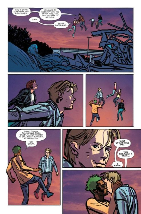
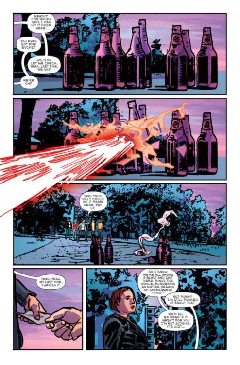
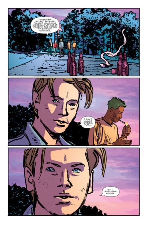
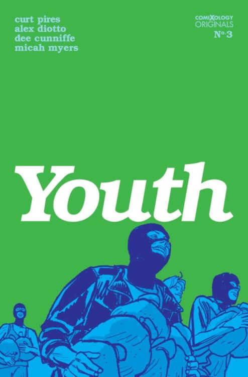
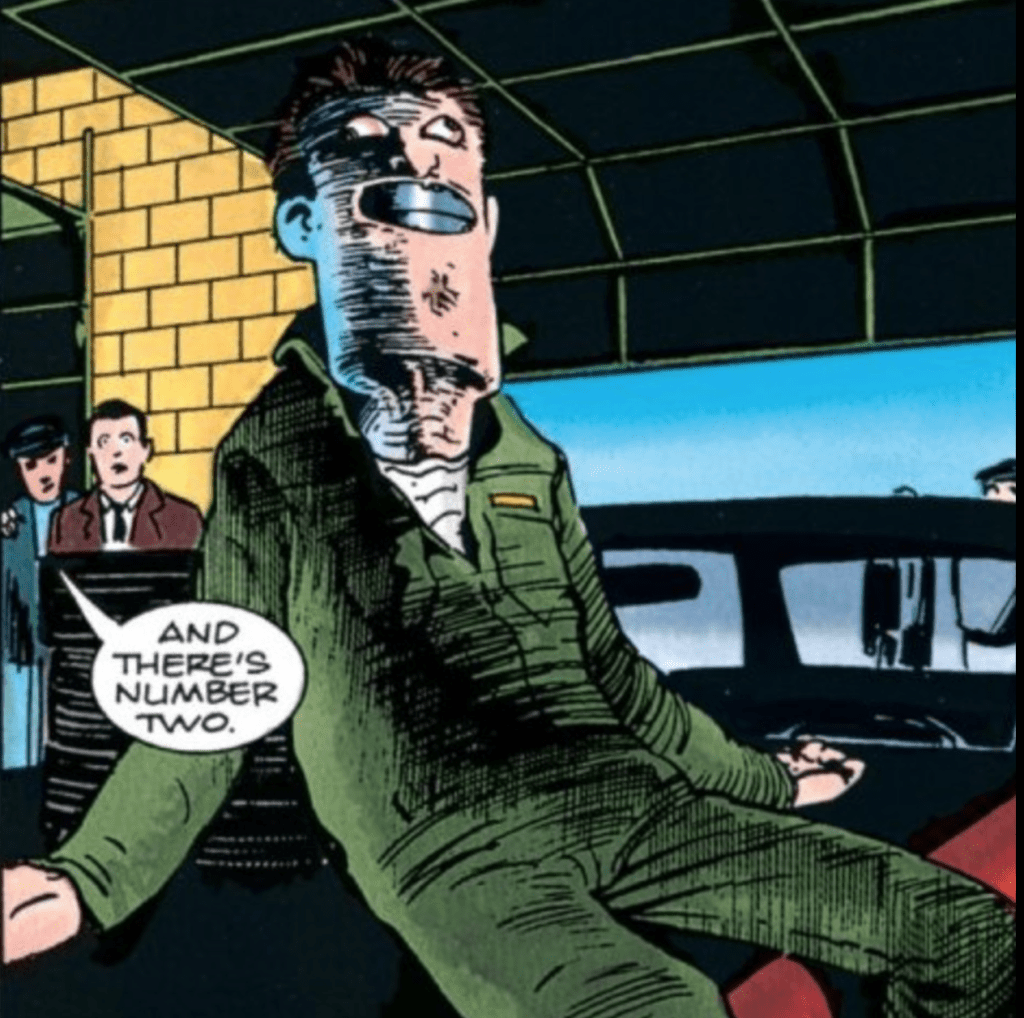
Youth #3 (of 4) hits comiXology on May 26, but thanks to the publisher, Monkeys Fighting Robots has an exclusive four-page preview. In issue three, the kids decide to rob a bank. What could possibly go wrong?
The ComiXology Originals series is written by Curt Pires, with art by Alex Diotto, Dee Cunniffe drops the colors, and you will read Micah Myers’ letters.
About the Youth: YOUTH is a coming of age story that tells the story of two queer teenagers as they run away from their lives in a bigoted small town, and attempt to make their way to California. Along the way, their car breaks down, and they join up with a group of fellow misfits on the road. Embarking together in a van traveling the country, they party and attempt to find themselves. And then something happens… YOUTH is Larry Clark’s KIDS meets CHRONICLE. X MEN by way of FRANK OCEAN. It smashes together the violence of coming of age with the violence of the superhero narrative–as well as the beauty.
Check out the YOUTH #3 preview below:
What comiXology Originals books are you reading? Comment below with your thoughts.
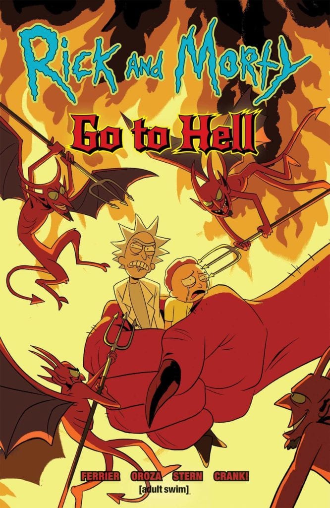
Since its premiere in December of 2013, Rick and Morty have grown into one of, if not the biggest shows Adult Swim had ever aired. To the five people who might not know the story, it follows Rick Sanchez and his grandson Morty as they travel across different realities and planets in raunchy comedic adventures. Due to this aspect of going to different realities, it allows the characters to cover various styles of adventures. From fighting aliens to traversing giant kingdoms, the adventures of Rick and Morty can be translated anywhere. This time around, their destination is a staple for most comic characters at one point or another. It’s time for Rick and Morty to go to Hell!
**Some Spoilers Below**
Story:
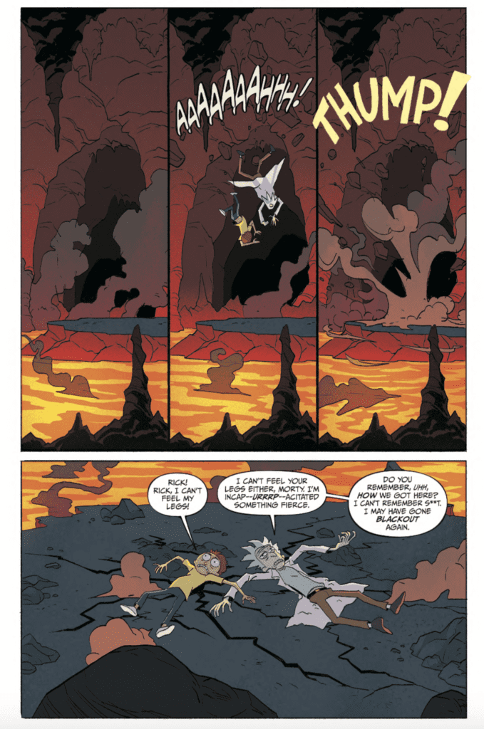
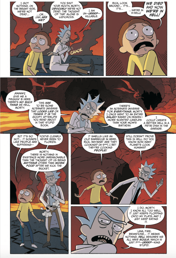
We open up with Rick and Morty crashing through the ceiling of Hell. Both of our protagonists can’t remember what happened before they crashed, but they take their surroundings in. While Morty begins to panic and wonders how they died, Rick doesn’t believe the place they arrived in is Hell. They soon come across other people, including the family, all confused about how they got there. Jerry believes that Rick is to blame, but the old scientist brushes him off as he takes Morty to the gates of Hell. The pair head into the fiery depths to get a grasp of where they are, though Morty has already accepted this place is Hell.
Maybe it’s because of the subject matter, but there was something that felt off about this issue. Rick is an atheist, and as such, believe the place they’re in is just a random reality that looks like Hell. This makes sense to Rick’s character, and he is written how he’s supposed to, but it still feels off. Usually, when comic book characters go to Hell, it’s to kill demons in the style of the Doom video game. Here, we’re dealing with denial, and it’s strangely unfunny.
That’s not to say that there aren’t funny parts in this comic. Morty pointing at the student Rick froze to death in the pilot, makes an appearance, as well as the human resources of Hell being the DMV, got plenty of laughs. Honestly, the funniest moment came from something as simple as Morty eating a burger made of maggots. The world(?) of Hell is actually fascinating, and I honestly can’t wait to see what the rest of the place looks like.
Art:
Constanza Oroza is the illustrator for this issue, and she captured the look perfectly. When I was first reading through it, I thought an artist from the show had to have played a part in the creation. When I reread it, I noticed that Oroza provided her own spin to the details. The slime from food, the tasing Morty gets at the gates, from the flames of Hell itself, she took the time to put as much detail as she could. It’s very well done, and I hope to see more very soon.
Conclusion:
Overall, this is a decent start for a Rick and Morty adventure. We have laughs where we need it, and commentary sprinkled throughout. Rick’s stubbornness to accept their situation is irritating, but that’s just his character. We know there is going to be a twist that will prove Rick right, but maybe we can get some sort of character development for Rick throughout this miniseries. When it comes to the art of the issue, Oroza did a fantastic job of capturing the feel of the original series while adding extra details. If you’re a fan of Rick and Morty, this might be a good comic for you.
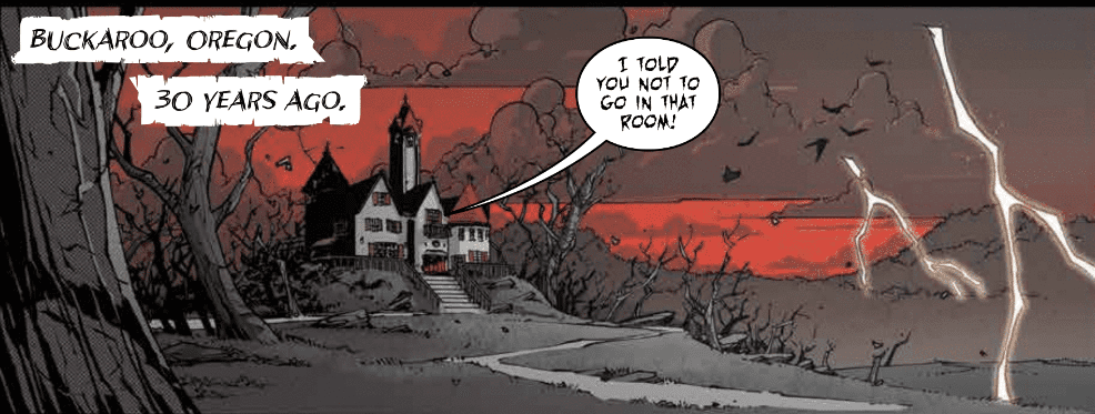
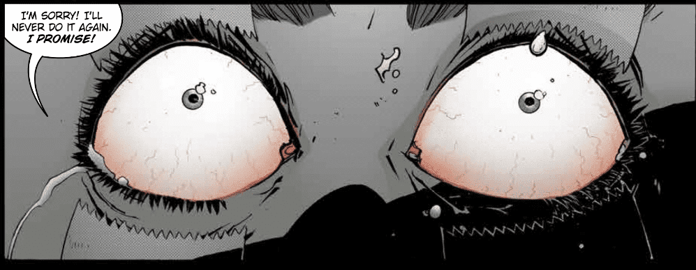
Sixteen serial killers have been birthed in Buckaroo, Oregon. Then came the Butcher in Black, Officer Vaughan, Agent Barker, the Devil Killer, and The Master. In Nailbiter Returns #1 from Image Comics, we learn there might have been a 17th butcher that is elated by eyeballs and an expert in eschatology.
Sequels
If there was ever a great time for Indie books to make a huge splash, now is that time. The big two publishers are scaling back the number of releases for the near future. DC and Marvel will not dominate the shelves in the first few weeks after shipping resumes. The time for Indie books to thrive is now.
We’ve learned from the film industry that sequels make money, they don’t even have to be decent, just tied into a previously successful franchise. Nailbiter was a fantastic series, so to return with a followup right out of quarantine is a fantastic move by Image Comics.
First Impressions
The Buckaroo Butchers are as unique as they are deadly. Some elicit instant fear and others seem silly, but it appears we’ll get a closer look at all of them. Something in this issue tells me so.
Creative Team
Joshua Williamson returns to writing with the same creative team. Mike Henderson restores Buckaroo with Adam Guzowski on colors and lettering by John J. Hill. I finished reading the first 30 issues before completely diving into this review. I wanted everything to be fresh.
Nailbiter is an amazingly well-written murder mystery that I’m reading for the first time since the initial monthly run. Nailbiter Returns picks up right after the end of Nailbiter #30. Reading through I noticed a misspelling in the artwork of Nailbiter Returns #1. The new eyeball fanatic has the list of Buckaroo Butchers on the wall and on it reads “HATE WATER”. It sounds like this new killer hates the very thing that allows him to live.
Henderson’s art looks just like the first 30 issues, and even more refined since then. The characters don’t look hyper realistic, but they don’t need to. Hill’s lettering is fantastic and appears reminiscent of the Joker terrorizing Gotham. Guzowski’s colors immerse us back into this creepy and mysterious universe. The palette is vibrant and jumps off the page thus keeping the eyes thoroughly entertained throughout. If you enjoyed the idea of Twin Peaks, but could do without all the weird, seemingly unrelated scenes, this is a great murder mystery for you.
Conclusion
Nailbiter Returns to the stands with a vengeance. There’s blood, there’s death, there’s old friends, and new acquaintances. With a little taste of YOU and Dexter, this run promises to delight. We learned the mystery of Buckaroo but many parts were missing. Are these the missing parts or just more chaos from the hellish depths of Buckaroo? The mystery unravels June 3rd.
What did you think of Nailbiter Returns? Are you excited to get back to the throat slashing world of the Buckaroo Butchers? Let us know in the comments below.
VENGEANCE OF VAMPIRELLA #7, available from Dynamite on May 27, follows the resurrected vampiress as she begins to form a rebellion against the demonic forces enslaving Earth. Meanwhile, Nyx has her own problem as the Fathers question her authority and force a power struggle. The demon war for Earth is coming.
Cover Art
Lucio Parrillo turns in another beautiful painting on the cover. There’s a special quality about Parrillo’s depiction of Vampirella that evokes the sexy, 70’s vibe that. The shadows are smokey, and the silhouettes for each character are not cartoonish or exaggerated. Parrillo’s cover would work just as well as a velvet painting in the lounge of a night club, in the best possible way.
Writing
Thomas Sniegoski continues Vampirella’s resurrection arc. Now that sunlight has been restored to the Earth’s surface, Vampirella searches for a way to bring back the Danse Macabre to help her and the humans with the rebellion.
Sniegoski is juggling a big story with multiple threads, so it would be easy for the reader to get lost. What helps keep it all centered and moving is Sniegoski’s attention to each character’s motivations and actions. Vampirella is trying to find herself after being “dead” for 25 years. Pendragon is looking to marshal all the resources he can to ensure the survival of humanity. Nyx is killing everyone and everything in her way to hold on to her seat of power. You never get the impression that a decision is random or an action feels out of place. It’s deceptively complex storytelling, and Sniegoski manages to keep it all clear.
Pencils/Inks
The art was uneven in the last issue (read the review here), but Michael Sta. Maria picks up art duties here and does a great job. Nyx gives a speech to a stadium full of assorted demons, and each one is drawn distinctly and cleanly. At one point, Vampirella and Pendragon are attacked by bed sheets. Yes, that’s right…bed sheets, and yet, Sta. Maria succeeds in making bed sheets dangerous. Really nice job here with the artwork from Sta. Maria.
Coloring
Omi Remalante Jr has coloring duty. The shading and eye color are the two high points from Remalante’s work. This is Vampirella after all, so there’s quite a bit of skin showing with the main character. Remalante uses shading to great effect to keep Vampirella’s skin from looking flat in a wide array of lighting settings. Vampirella is on a spaceship, then broad daylight, then inside a “haunted” safehouse and everything in between, but her skin never look plain or flat.
Vampirella’s eye pop with color in several spots to add emotional weight to her mood. The second to last panel on page 23 is the favorite panel for this issue specifically because of the pop of eye color. Vampirella has a look of shock/surprise at the sound of a terrifying voice, and the red color of her eyes is practically electric.
Lettering
Troy Peteri has done something interesting here with the lettering. Throughout a large chunk of the book, both Pendragon and Vampirella hear the disembodied voice of Passion (the “ship’s” computer) to guide them through their mission. Peteri chose to use an action bubble instead of a standard word balloon to keep the voices separate. It largely works, but it takes a little getting used to. The Fathers are also shown as a disembodied voice using a word balloon without the tail. Again, it largely works, but it may get a little confusing keeping all the voices straight in future issues. It may help if Peteri use more background colors in the balloons to create distinction between the voices a little more clearly.
Conclusion
VENGEANCE OF VAMPIRELLA #7 is a strong continuation of the resurrection story. The writing is solid and the art is significantly better than the previous issue. Vampirella fans should pick this up.
Author’s Note: Local Comic Shops (LCS) are going through a tough time right now with the pandemic outbreak of COVID-19. Comics fans of every flavor that care about his or her LCS should try to do what they can. So, here’s my part:
If you’re in Northern Delaware, South East Pennsylvania, or Southern New Jersey area, please take a moment to visit Captain Blue Hen Comics in Newark, DE. Say ‘hi,’ pick up a book, order a book (they’re on Comichub.com), and let them know you support them.
If you’re nowhere near that area, please find YOUR LCS using Comic Shop Locator and lend your support.
RED SONJA #15, available from Dynamite on May 20, picks up immediately after the events of last issue (read the issue #14 review here). Sonja must decide to either abdicate her throne to serve the man who murdered her mentor, or watch her people starve. Her choice isn’t easy, and the consequences may be more dire than she realizes.
Cover Art
Jae Lee paints a mesmerizing cover for this issue. There’s a whimsical quality to Jae Lee’s art that’s very reminiscent to Mike Mignola with respect to anatomy. The proportions for Sonja are misshapen in an almost dreamlike way. Where Mignola’s renditions are blocky and coarse, Lee’s paintings are dream-like and sharp. Lee’s cover is masterful work.
Writing [No Spoilers]
Mark Russell continues Queen Sonja’s story from the last issue, and he uses flashbacks to help her make a tough moral choice. Sonja’s past adventures, which ultimately caused some deaths, teach her how to balance the cost of life with the cost of death. Her choice isn’t one she takes or makes lightly. and past enemies seize the opportunity to pounce as soon as the decision is made.
Russell infused more action in this issue, and Sonja’s battle skills are on full display. However, the action didn’t take away from the progress of the story, and it nicely set up the conflict for future issue.
If there’s one area where Russell’s writing didn’t 100% work, it’s in the dialog. There were a few spots where the phrasing was too modern for the culture and the setting. These characters are in the middle dark ages and represent a diverse range of barbaric cultures. The last thing you expect to read is the Queen’s steward saying “Damn, we really are poor, aren’t we?” It’s a minor critique, but I felt pulled out of the story when those bits of modern vernacular sporadically popped up.
Art
Bob Q turns in another satisfying issue. Beyond the core story, Sonja’s flashback foreshadows a conflict that comes to a head in present day. Although that thread is written by Russell, Q peppers in the visage of a bull’s head in all the right spots to catch your eye and connect the dots. Q’s work is clever and adds layers to this book.
Coloring
Dearbhla Kelly turns in expert coloring work for this issue. Since a significant chunk of the story relates to flashbacks, Kelly adds an opaque filter to help the reader move through the time jumps and keep the events straight in terms of linear storytelling; all done with color. Kelly adds a nice signature by popping Sonja’s red hair just a little more than the surroundings during the flashbacks for visual interest. Really great job by Kelly.
Lettering
Hassan Otsmane-Elhaou does great work here with the lettering. The font is bold and easy to read. There’s no trace of clutter in any of the panels, which is especially impressive since the story is more dialog driven. Otsmane-Elhaou is particularly adept at panel transitions where the visual focus moves from the speaker to an object and the dialog follows. Those seamless transitions keep the story flowing without a skip or stutter in the reading experience. Nicely done by Otsmane-Elhaou.
Conclusion
RED SONJA #15 keeps the reader interested in the crimson-haired warrior as she struggles with problems that can’t be solved with a sword. The story is engaging, the art team turned out top-notch work, and I’m on board to see what happens next in this volume.
Author’s Note: Local Comic Shops (LCS) are going through a tough time right now with the pandemic outbreak of COVID-19. Comics fans of every flavor that care about his or her LCS should try to do what they can. So, here’s my part:
If you’re in Northern Delaware, South East Pennsylvania, or Southern New Jersey area, please take a moment to visit Captain Blue Hen Comics in Newark, DE. Say ‘hi,’ pick up a book, order a book (they’re on Comichub.com), and let them know you support them.
If you’re nowhere near that area, please find YOUR LCS using Comic Shop Locator and lend your support.
Welcome to Self-Published Spotlight, a regular interview column where I will be highlighting self-published comics and the creators and small print publishers who make them.
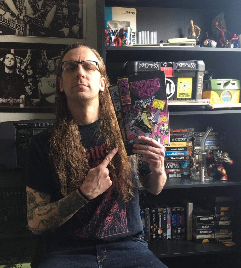
Do you like outlaw comics? Do you like punk rock/metal? Do you like anthologies? And do you like to sometimes hang out in a cloud of ‘smoke’? Well if it’s a yes to any or all of these things, you’re going to love Knife Hits Digest, a self-published gnarly anthology comic by A.R. Paulsen (aka Gloom Wvlf Comix). Knife Hits covers everything from pot-smoking barbarians to ninjas, zombies and punk rock house shows; all of it has a fantastic and irreverent attitude. And so does Paulsen himself, as we at MFR found out when we had the chance to chat with the comix artist.
Cartoonist A.R. Paulsen
Monkeys Fighting Robots: First of thanks for taking the time to talk to us at MFR. Adam Paulsen: Of course! Thanks for the opportunity. And thanks for picking up my comic.
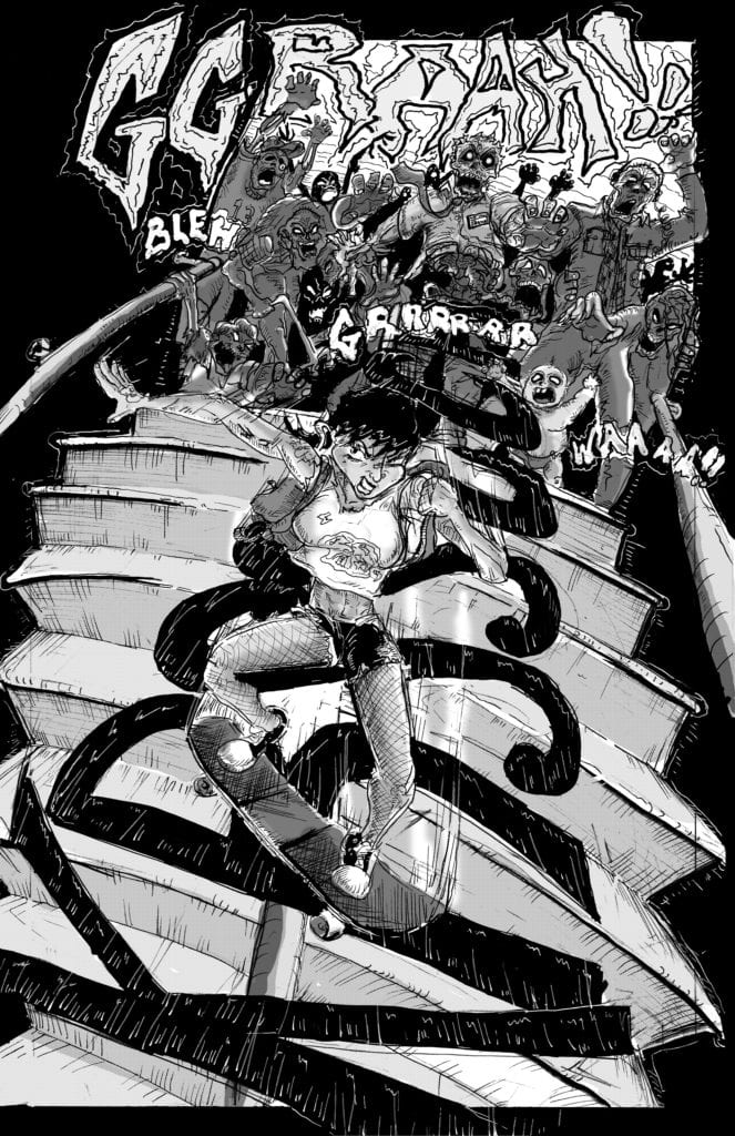
MFR: Yeah man, I was already stoked having read issue one. Anyway for those who may have not yet picked up your comic, why don’t you give them the scoop on Knife Hits Digest? Paulsen: Sure. It’s my black and white anthology series. Featuring stand-alone (mostly silent) stories. Intend to be read in one sitting. Inspired by a love for B movies and punk and metal music.From an artistic standpoint, each story is also a chance for me to practice a new way to tell a story or focus on a specific troupe. For example, the first story in Knife Hits #2 (zombie story with a punk skateboarding away from a hoard) is basically a chance for me to work out a chase scene.
MFR: That’s great. I love the idea of consuming a story like that, in one sitting. I also love that your book is an anthology. Comics need more anthologies. Paulsen: I feel ya, when I was a kid some of my favorite stories were ones I could just digest in one sitting. I mean there’s a time and place for epics, but as I got older I had less time to buy five to six issues to complete a story.
MFR: So the stories are consumed in one sitting, but I’m sure it’s a much longer process to put the bad boy together. So what’s your process like for a story? Like where and how do you start? Paulsen: I start with layouts and thumbnails. Fuck with those for a bit. And then move to pencils on Bristol board. I work most of my motion and dynamics out in pencil ( probably the longest part of the process) and once I’m happy with that, I go over it with blue pencil and erase the OG pencils. Then I add my inks and tighten up a lot of my rendering here. After that, it’s grey tones in photoshop do want to use screen tones at some point, but shits pricey and hard to find.
Skater vs. Zombies!
MFR: What about the printing process? What’s that like? Paulsen: Oh man, that was an adventure!
MFR (laughing): Okay, tell me about it! Paulsen: Well, it took me a sec to find a printer to work with. When I started out making my comic I knew I wanted it to be cheap. Cause I can’t stand it when comics are $5 or more. And as a rookie, I really felt my book needed to be super affordable. So that ruled out like all my online printing services. So I started shopping around locally and everyone was charging crazy prices, cause I think they thought I wanted to make a book. Finally, one dude got what I was going for and got me a barebones price. So I got my books down to about 1.67 an issue for #1 of getting the deal was the place printing it was crazydisorganized and they have to be babysat otherwise it doesn’t get printed (I actually went in and helped them print issue 2 (laughs), that’s why it didn’t take a month like last time (laughs). The second issue was a bit easier because it was fully funded by issue one and I knew how to deal with the printer (laughs). Also, hand cutting 500 comics makes your eyes blur (laughs).
Gloom Wvlf Art Studios
MFR: That’s awesome about issue one paying for issue two. That’s not common so quickly. So when did you get into comics? And what led you to self-publishing?
Paulsen: Always had a love for them, but as I got older and life happened comics kinda worked their way out of my life. My artistic outlet for a long time after that was playing in bands and writing music. But about four years ago, after not having been in bands for a good year or two I was really missing a creative outlet. So I started painting and doing pen and ink drawings for friends album covers and flyer art. And then at the beginning of last year (2019), I started rediscovering comics (all my outlaw shit from the 80s and 90s) and around the same time found “Cartoonist Kayfabe” on YouTube. After listening to those dudes for a few months I decided to get up the courage to do my own comic. So almost this same time last year I started the thumbnails for issue #1. And I decided to self publish because the bands I used to be in were all DIY, and had a strong work ethic in regards to self-promotion and not waiting for someone to do something for you.
MFR: I can totally see the punk flyer art in your work. There’s a total ‘zine feel to Knife Hits Digest. Paulsen: In my mind Knife Hits is like my “demo” (laughs).
MFR: That’s a great analogy. Paulsen: I looooove zines. When my last band toured we always had a large selection of zines at our merch table.
MFR: Where did the title Knife Hits come from? Paulsen: So are you familiar with what a knife hit is?
MFR: No. No clue. Paulsen: It’s one of the worst ways to smoke weed…
MFR (laughing): I’m ashamed I didn’t know that. But that is fantastic. Paulsen: So it involves heating up two kitchen knives over a stove or toaster. Once they are literally glowing you drop a chunk of resin (gnarly black pipe scrapings of leftover burnt weed and spit) then press the other hot knife on top of the other, stick your face over it and inhale. Hahaha. It is horrible. I named it that because it’s a gnarly intense way to get high, kinda like my comic; a really quick gnarly little dude.
MFR: Now I love the title even more. Paulsen: I’ve only done it a few times back when I was in my twenties and didn’t care. But now that I have access to good weed, I can wait to get high (laughs).
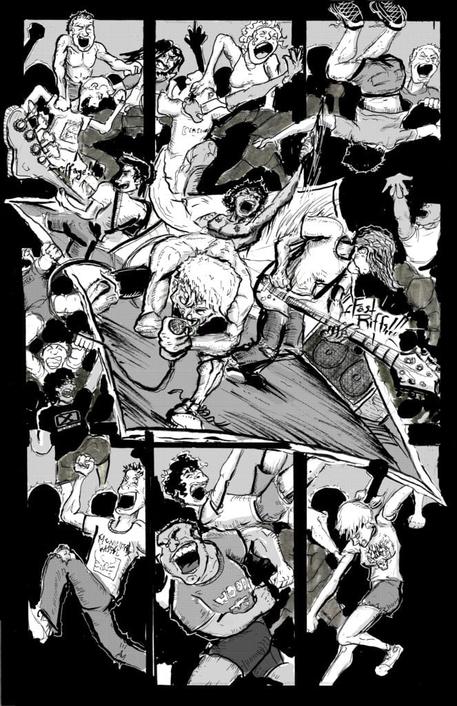
MFR: Do you have a favorite among the stories in Knife Hits so far or one you would say is the definite one to read? Paulsen: It’s hard to pick, they all have a special place in my heart. The hessian one from the first issue where he basically goes to Narnia I really enjoyed cause I got a chance to kinda build a mini world (draw a bunch of different environments and stuff). But ‘My War’ also holds a special place in my heart cause the event isn’t real, but the location and all the people in that comic are the homies I used to go to house shows and play in bands with. So that one was fun and nostalgic to draw. Taking the time to put real people in a story was fun.
MFR: Before I forget I gotta say I love how you use corner box art with a price. And also how you have changed the logo too. Paulsen: Thanks, man! I love corner box art (laughs). The inspiration for that was totally X-Men: Grand Design by Ed Piskor. His corner boxes are dope.
MFR: Oh yeah. I have a nice print I made out of one of his corner boxes up on my wall. Paulsen: Rad!
MFR: By the way the design of your cover is great. Paulsen: Thanks man, an homage to Cap #1 (Nazi punching!). In art and spirit (laughing).
MFR: So will some of the stories and characters be recurring? Paulsen:Yes, The Bongbarian has a three-part story that I have mapped out. His second story/ origin will be in issue 4. Have rough layouts done for that one. I’m excited to draw him again. And I think the second story will add some depth to his character and show his motivations for his killing spree. The Hessian is also going to be a reoccurring character of sorts, he’ll be in issue 3. And after doing My War I want each issue to have a story based of some real-life band/ tour shenanigans ( cause I have a bunch of great stories from touring days). And with Issue #3, I’m starting a recurring martial arts storyline called ‘Karate Island’.
MFR: Oh, now THAT sounds awesome Paulsen: It’s based on Mortal Kombat and JCVD movies (laughs).
MFR: Perfect! Or should I say “ Flawless Victory!”. So how long do you plan to keep Knife Hits going? Paulsen: I have so many stories I could go for a minute. At the moment I have five issues mapped out, and my original goal was to print at least four.
MFR: Are there any other projects you want to do or are working on outside of Knife Hits? Paulsen: After four issues at least I’m going to re-evaluate things. Consider doing a story in color, possibly raise the price, and start shopping it around to publishers. I’m doing album art still, and I’ve been working on an idea for a children’s picture book too actually. To totally boil down the kids’ book, I’d want it to be about a kid using music to cope with difficult emotions.
MFR: That’s diverse my dude. Awesome! Paulsen: Thanks, brother!
MFR: Where’s the best place for folks to find your work? Paulsen: Right now it’s my website gloomwvlfart.bigcartel.com and Empire Comics in Sacramento, Ca.I keep wanting to get them in more shops, but I’ve been selling out before I can distribute any!
MFR: You got a bestseller right there.! Well, thanks for taking the time again. We will eagerly away Knife Hits #3 over here at MFR! Paulsen: Thanks! Very much appreciate it!
You can follow A.R. Paulsen on his Instagram (@gloom.wvlf.art) and you should.
The Mask Omnibus Volume 1 was available for free on digital during the pandemic, giving readers a chance to see John Arcudi’s run on The Mask. Unlike later series including the divisiveI Pledge Allegiance to The Mask series, this original run presents something a little more. But what exactly does this series have that succeeding storytellers don’t have?
The Mask Omnibus Isn’t Formulaic
The initial stories involving Stanley Ipkiss and Police Lieutenant Kellaway set up the formula later series use. In it someone with troubles acquires the Mask, and when they wear it, the Big Head persona allows them to cut loose. Nothing from legal boundaries to the laws of physics can stop them. Unless they’re either not wearing the mask or their conscience kicks in. Playing the same tune, however, gets boring, and writer John Arcudi knew that better than anyone.
In addition to those above characters, the rest of Arcudi’s run plays with this formula. In the Return of the Mask section, the reader finds the usual formula only to change directions mid-way. This becomes a means of character growth to Kathy, Stan’s girlfriend, who once wore the Mask to kill him. She knows how dangerous the Mask is and is even hold onto her sanity, unlike Stan or Kellaway. Four teens later wear the Mask in The Mask Strikes Back. Most of them don’t even have chips on their shoulders, and the effects vary. One of them Hugo, never even gives into the insanity after seeing the psychedelic effects.
What Arcudi demonstrates in The Mask Omnibus is a two-fold message. The Mask might give its wearer power, but it’s an addiction that can control them instead. Furthermore, wearing the Mask doesn’t automatically drive people insane, even without an emotional crutch. Sometimes it just takes recognition of the harm it can cause.
Artwork
Which admittedly can be a little tough when looking at Doug Mahnke’s artwork in The Mask Omnibus. In the first couple of stories, he does the pencils, inking, and some of the coloring. His illustrations display a great range of styles. Even at the most mundane moments, cartoony thoughts permeate and foreshadow acts by the Mask. When Big Head does make an appearance, the wild effects evoke a sense of both humor and unease. Because what might’ve looked funny at first can become terrifying the next moment. Take when Big Head stuffs a muffler into a conning mechanic’s head and determine whether it’s funny or disturbing.
One man doing this alone, however, isn’t easy. In the Mask Strikes Back, inkers Keith Williams and Rich Perrotta bring out a style that emulates Mahnke’s. It’s not perfect, but it adds a bit of extra detail absent in The Mask Returns like shading lines. In addition to Mahnke, the colorists’ Matt Webb, Chris Chalenor, and Gregory Wright each contribute certain effects. Webb utilizes a wide range of colors that never blend in with one another and provide an amazing amount of detail. Chalenor keeps things simple but uses the right amount of contrast to keep the reader’s attention. Wright meanwhile uses color as a mood indicator for the background and effects to evoke feelings. Green and yellow in particular, evoke intrigue.
Lettering
Letterers Pat Brosseau, David Jackson, and Lois Buhalis each display their styles through Big Head. Throughout The Mask Omnibus, the persona displays a distinctive font and word balloon. Brosseau and Jackson give the character an uneven and rough design that displays the character’s chaotic nature. This is in stark contrast to characters who try to keep things under their control with a rounded rectangle balloon. Buhalis, in the meantime, retains the rough word balloons but with an assortment of even but different range of fonts in Big Head’s dialogue. Not least of which is the wordmarks that decorate these word balloons. It matches with the Big Head design that steals whatever moment he appears in.
The Mask Omnibus is #1
The first Mask Omnibus has everything that sets up subsequent stories. A zany main character that brings out people’s creative sides and a story that causes the characters to let loose. The only thing to really add to the series is what John Arcudi brings up later. The mask bringing out people’s outrage is one scenario too many. Arcudi displays that in order for the Mask to truly make a comeback, writers have to get more creative in their approaches because he finished his story with the Mask in this neatly wrapped package.
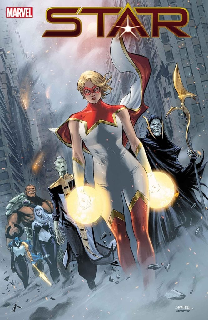
Captain Marvel and Star are about to have their rematch in Star #4.
STAR #4, out this Wednesday from Marvel Comics, finally brings us the rematch that fans have been waiting for. Captain Marvel and Star have been on a collision course from the start, and that moment has ultimately arrived.
Captain Marvel and Star are about to have their rematch in Star #4.
***SPOILER WARNING***
Remember when Ripley was just a happy reporter? She certainly is struggling to remember those days. Now she’s on the run, with a power stone in her chest. To say that she’s got people gunning for her life would be putting it mildly.
We’re almost at the end of this five-issue miniseries, and thus far Star has earned herself new allies and enemies alike. But we’ve all really been waiting for the moment when she got a chance to face off against Captain Marvel once again even if Star herself was slightly dreading that inevitable moment.
The Writing
Star #4 is every bit as dramatic and intense as fans have been hoping for. Considering we’ve been waiting for this rematch since Star first fell, that is certainly saying something. Though naturally, there’s a complication or two in the making.
Kelly Thompson is the mind behind this issue and this series. Through Star’s story, she’s forced us to realize the trauma somebody we perceive as a villain can go through. It’s a poignant reminder that they’re still human at the end of the day. Even if they’re committing acts that we don’t even remotely approve of.
All of these elements, and more, made the battle Star is facing all the more compelling. This wasn’t simply a battle of the fists. No, there’s raw emotion getting thrown into the mix. It’s intense and powerful, and that’s all before taking the power levels of our hero and villain into account.
It is difficult to believe that there is only one issue left of this miniseries. It’s even more difficult to predict how it will wrap up, and what will happen to Star when it does. The flashbacks provided in this issue have gone a long way in raising even more questions about what the future holds for young Ripley.
The Artwork
Star #4 is every bit as visually compelling as it is powerful. Given the artists involved in this project, that probably isn’t too much of a shock. Javier Pina, Jay Leisten, and Filipe Andrade were the lead artists for this issue.
Think about what you’d want to see in a fight between Star and Captain Marvel. Now add in the new abilities that Star has learned. That is what our artists delivered to you here, with a few surprises to keep things fresh. It is everything and more, with a strong sense of motion and impact to add weight to the fight.
Jesus Aburtov and Chris O’Halloran were the artists responsible for the coloring, and they brought everything to life through their work. The pages are vibrant – even when using a darker color palette. There’s this rich tone to the colors that are perfectly suited, both to Star’s story and to the power being thrown around.
VC’s Clayton Cowles is the one behind the lettering, and unsurprisingly he did a fantastic job. His careful placement added to the impact of specific scenes, making the dramatic sounds clear and resonant. Meanwhile, the internal monologue of Star was perfectly placed to remind us of what must be going through her head at any moment.
A sneak peek at what is in store in Star #5.
In Conclusion
The rematch was certainly the major highlight of Star #4, but there were many other memorable elements and moments from this issue. The creative team has pushed Star’s character arc as far as possible, breaking new ground while forcing perspective shifts.
For that reason, this series is surely going to linger in our memories for quite some time. It certainly will with Star, though perhaps for different reasons.
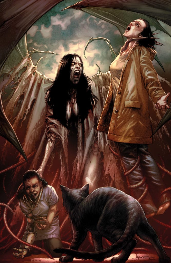
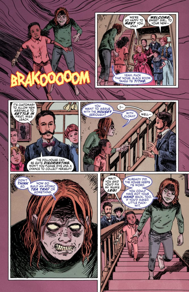
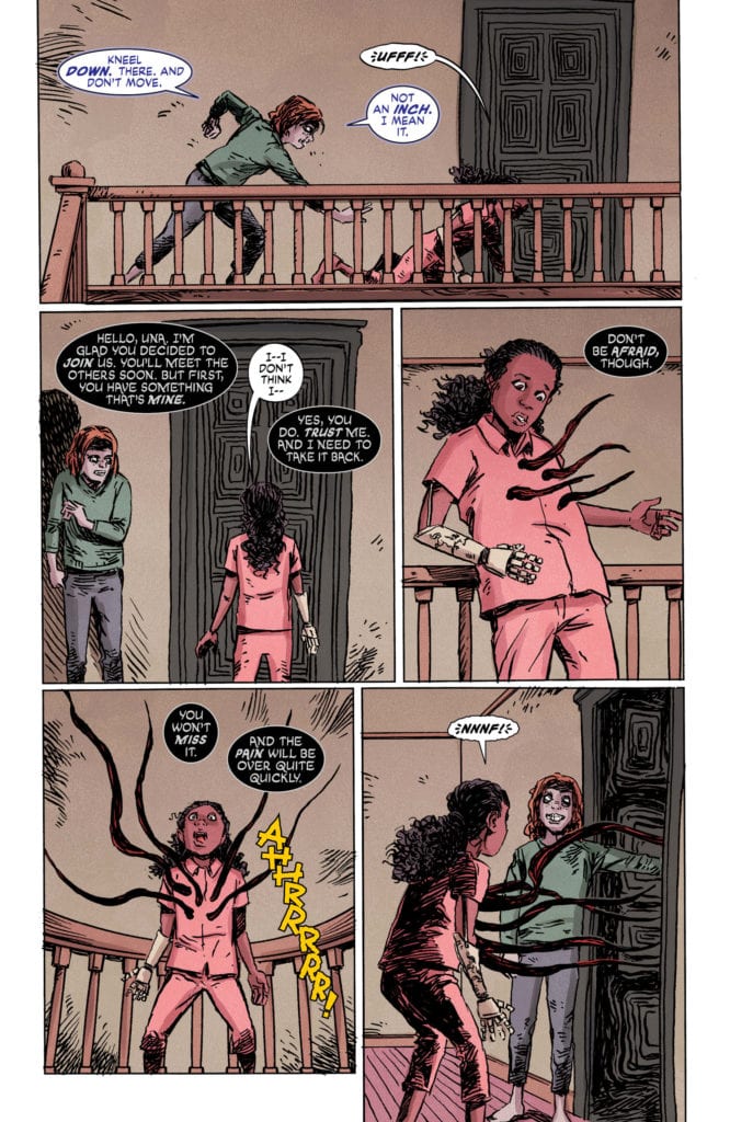
Creative duo M.R. Carey and Peter Gross (Lucifer, The Unwritten), along with artist Vince Locke ( Sandman, Books of Magic) return to finish their mysterious horror mini-series in “The Dollhouse Family” #6. The finale mixes this comic’s unique blend of haunted house, demonic, and cosmic horror into a satisfying end that manages to offer still more world-building – and the potential for more stories from this universe in the future.
“Nobody leaves the Dollhouse. All will be weighed. Only one can prevail.”
Writing & Plot
Writer M.R. Carey‘s seamless construction of complex yet near-effortless plots continues into the final issue of “The Dollhouse Family.” The tiny hints that have been teased in every issue thus far come forth in inventive manners that add a tremendous amount to the scope of this mini-series. This seemingly-demon or ghost focused story that danced around with the cosmic launches full-bore into the latter with wildly inventive revelations. The final conflict feels personal and satisfying to watch as Alice and her family work to overcome the entity that has been haunting her since childhood. This issue formally introduces a new ally into the fold that becomes the vehicle for most of the major revelations by offering explanations as to the gravity of the conflict the Dealy family finds itself in. A mistake often made in 6-issue mini-series such as this is to attempt to more story than the frame can hold. Carey impressively manages to dodge this in a final issue that, while slightly more exposition-heavy and faster-paced, offers a carefully constructed end to this finely tuned tale.
Art Direction
Peter Gross‘ layouts and Vince Locke‘s pencils close out “The Dollhouse Family” with their consistently unique visual touch. Gross’ layouts consistently provide the visual flow to carry the reader through Carey’s suspenseful script, often defying conventional panel construction in the process. Vince Locke’s a bit off-the-wall art style, which has always been a perfect look for this series, reaches a gory peak with this final fight. The often haunting visuals provided thus far climax into creations of fleshy demonic terror. Much of the atmosphere comes from the grim life Cris Peter’s colors give the pages. The color choice here crafts not only the eerie horror atmosphere of the slower moments but also the gory shock of the unfathomable monstrosities the Dealy family have to face off against. Horror, like most great comic genres, live and die on their visual integrity, so it’s fortunate “The Dollhouse Family” has had such a stellar art team to see it through.
This final issue of “The Dollhouse Family” brings about a fascinating and satisfying end to this unique horror mini-series. M.R. Carey’s script brings events to a tight close while opening the possibilities of this universe up to a potential future. The visual touches of Peter Gross, Vince Locke and Cris Peter collide to deliver one last cosmic and gory horror experience that is perfectly unique for this story. Be sure to catch the finale of this excellent series when it hits stands on 5/20!
Christopher “Titus” Strickland, better known as Twitch streamer and professional gamer FyrBorne, is a tattoo artist from Tennessee who doesn’t remember life without video games. His rise to fame began with EA’s Battlefield 4.
Battlefield 4 released in 2013 and is now in the annals of gaming history, so FyrBorne has turned his skills onto new games like Valorant and Call of Duty: Warzone. Using his Twitch stream, FyrBorne has amassed a dedicated following of fellow gamers and used his powers for good, working on behalf of charities. Between gaming and charities, FyrBorne works out of Ambition Tattoos in his hometown of Tennessee.
PopAxiom spent some time talking with Fyrborne about his work as an artist, charities, and his rise as a gamer and streamer.
Let’s Play
FyrBorne’s earliest memories include holding a controller with eyes locked on pixel characters. “I’ve been playing games since I can remember. One of my first memories is owning the original Nintendo Entertainment System when I was around four or five, and playing Super Mario Brothers 2.”
Many games later, FyrBorne’s hand-eye coordination, timing, and strategic thinking harmonized into potential gaming excellence. “The first game I was exceptionally good at was Rainbow Six: Vegas. I’ve been playing Rainbow Six titles since they first came out. Rainbow Six was the first one I got to sit down and spend a lot of time on. I’ve always been a first-person shooter player.”
Going from gamer to ‘gamer making a living from gaming’ wasn’t precisely a designed career path. “It was surprising to learn I could do this for a living. I didn’t realize it could be a job until I started working with EA.”
EA or Electronic Arts is one of the largest video game publishers on the planet. How did FyrBorne get together with the company that makes Star Wars and FIFA? “I started working with EA because of my rank on a leaderboard for Battlefield 4. I was the #1 Designated Marksman Rifle user in the world.”
FyrBorne’s ranking started an upward spiral of new connections and opportunities. “I ended up being interviewed by a local community for Battlefield, which got me introduced to a competitive team for a bunch of games and eventually introduced me to the community manager for Battlefield. I was invited to start streaming on their twitch channel. I had my own, but I was new and terrible at it.”
Becoming Number One
Leaderboards are standard now in most video games in some form or another. For Battlefield 4, EA featured a detailed ranking of players. “You could check to see where you were against other people in comparison to your town, as well as to all around the world. Their website was always keeping track of successful fights with pistols or rifles.”
FyrBorne was on board with Battlefield 4 from the time it was in beta. At that time, he explains, ��… the marksman rifle was hands-down the worst series of guns in the game.”
It didn’t deter FyrBorne from playing with the worst gun in the game. “I started playing with them and thought, ‘Wow, these are bad I’m going to just use these.’ It was funny. I would get messages from players saying, ‘How are you beating me with that thing?’”
FyrBorne’s mastery of the marksman rifle is a story that includes a mysterious rival from a far-off land. “I was racing a guy in Russia for #1 in the world. For three or four months in a row. We went back and forth for a long time.”
Learning To Stream
Streaming is the place where social media stars are made, but it takes the proper mix of skills to get it right. “When I first started, I was not very good at it. I was playing on streams specifically to show off my skill level. I thought ‘This would get me through. No one wants to hear what I have to say, they want to see what I can do.’ So, I streamed from one to nobody for months.”
FyrBorne was “… putting out good gameplay …” but the viewer numbers weren’t climbing the leaderboard so-to-speak. “I had someone join my channel, and they were talking to me, so I spoke to them while still playing the game. I realized more people wanted to talk. My strong suit is my ability to talk constantly and play decently.”
Talking Charities
As FyrBorne’s fame rose in the virtual world, he made strides to help in the real world. “My connection with charities started when I started working with the competitive [gaming] community. One guy left to go work with St. Jude. We started talking about his work there. I thought it was cool, so I joined one of their charity events.”
One year later, Fyrborne was at St. Jude’s Memphis campus for a special event, the St. Jude Play Live Summit.
At the summit, there’s lots of formal talk about St. Jude’s current state and its future. But FyrBorne found a deeper connection with the people on a personal level. “I got to meet some of the kids and see all the stuff they do there. That was the most profound experience to see all these people working towards the same goal. I’ve been working with them ever since.”
Charities are now as much a part of his life as tattoos and gaming. “So, my goal is to try and grow a strong community and continue to do more for St. Jude, and other charities I work with like Stackup, a military support charity.”
Body & Art
FyrBorne’s covered in tattoos and creates artwork on people when he’s not gaming. Who inspires his artwork? “Some of the artists who inspire me are mostly out in California. One of my favorites is Carlos Torres, he’s a black and grey realism artist. Another fellow named Mike Dorsey, he’s up in Ohio and did a piece on my shin. He does a lot of traditional Japanese work. Up in Detroit is Bob Tyrel.”
FyrBorne is a living canvass of colorful and beautiful art. But the motivation to start getting tattoos did not come from a desire to be that. “One of my biggest fears in the world is needles. So, I started getting tattoos to try and beat my fear of needles. It hasn’t worked. I’m fine with tattoos but piercings and hypodermic needles, oh man, I pass out.”
There’s a lot of intricate work on FyrBorne’s body, but what was his first tattoo? “My first tattoo was dragon scales on my spine. It was not my smartest move. Man, it was rough.”
If you ask him how many tattoos he has, FyrBorne will say, “… one. I’m just one big tattoo. If I had to guess, it would be 40 to 45 deep. All I have left is the back of my thighs, my stomach, and my lower back if I do not include my head.”
Wrapping Up
FyrBorne is currently killing suckers in PvP (Player-Versus-Player) content in two games: Valorant and Call of Duty: Warzone. What does he do to relax after a night of streaming and competitive gaming? “I play League of Legends every night after I stream. It makes me want to pull my hair out if I had any. It’s just like Valorant, it’s a very technically difficult game, and I play it because it gives me a challenge in a game mode I don’t play nearly as much as shooters.”
FyrBorne’s charity work has gone on strong during the global pandemic. He’s been raising money for St. Jude all the month of May by “… playing Minecraft or eating those nasty jellybeans, the Beanboozle ones, peppers, hot sauce, anything that will entertain people.”
Are you a fan of FyrBorne?
Thanks to Christopher “FyrBorne” Strickland and Impact24 PR for making this interview possible.


")


 Which admittedly can be a little tough when looking at Doug Mahnke’s artwork in The Mask Omnibus. In the first couple of stories, he does the pencils, inking, and some of the coloring. His illustrations display a great range of styles. Even at the most mundane moments, cartoony thoughts permeate and foreshadow acts by the Mask. When Big Head does make an appearance, the wild effects evoke a sense of both humor and unease. Because what might’ve looked funny at first can become terrifying the next moment. Take when Big Head stuffs a muffler into a conning mechanic’s head and determine whether it’s funny or disturbing.
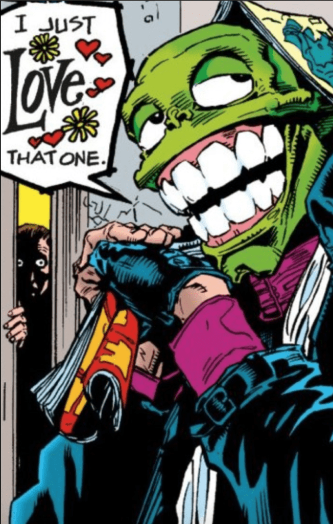 Letterers Pat Brosseau, David Jackson, and Lois Buhalis each display their styles through Big Head. Throughout The Mask Omnibus, the persona displays a distinctive font and word balloon. Brosseau and Jackson give the character an uneven and rough design that displays the character’s chaotic nature. This is in stark contrast to characters who try to keep things under their control with a rounded rectangle balloon. Buhalis, in the meantime, retains the rough word balloons but with an assortment of even but different range of fonts in Big Head’s dialogue. Not least of which is the wordmarks that decorate these word balloons. It matches with the Big Head design that steals whatever moment he appears in.
")