Home Blog Page 295

Review: Children Go To War In RED SONJA VOL. 3 #16

Red Sonja Vol. 3 #16, Lee cover

RED SONJA VOL. 3 #16, available from Dynamite on July 1st, tracks Sonja’s first task of leading child soldiers into war for the glory of Khitai. Instead of reveling in war for drama and excitement, Mark Russell’s story and Bob Q’s art paint the picture of a leader who views his people as disposable commodities. Sonja’s promise to serve him in exchange for saving her people, which quickly comes back to haunt her.

Cover Art

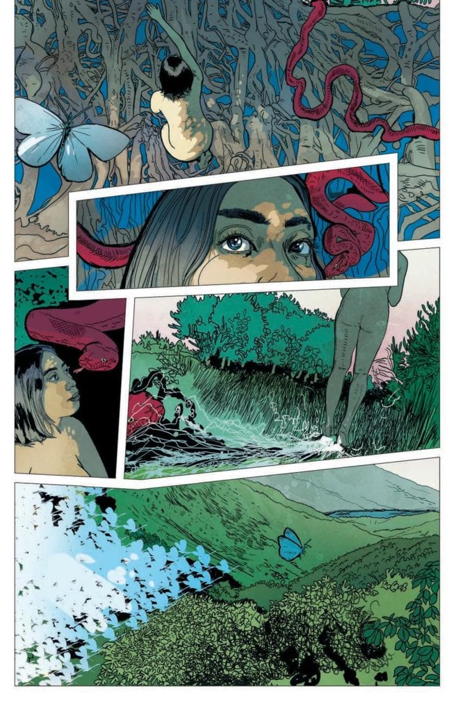
Jae Lee’s cover serves as a poignant encapsulation of this issue’s central theme. In the painting, Sonja is restrained from moving and speaking by the visage of death. Likewise, in the main story, Sonja feels powerless against the impending death of so many innocent lives as she’s bound by her oath to follow Jo’Qhan’s orders. It’s a beautiful painting, chock full of symbolism that pairs well with the story.

Writing

To this point, Mark Russell’s story arc has focused less on the adventurous aspects of Sonja’s life and more on the costs of leadership. Consistent with that theme, this issue de-glamorizes war and turns a glaring spotlight on the price of conquest, especially the price paid by innocent youth. It’s a strong message that, to Russell’s credit, isn’t preachy or heavy-handed.

In this issue, Sonja is commanded to annex a neighboring kingdom using a newly trained infantry. To her shock, Sonja discovers the soldier are little more than children conscripted in service to Jo’Qhan; a common practice within the kingdom. Sonja’s outrage is palpable, and yet, there are no easy answers as breaking her service to Jo’Qhan jeopardizes the lives of her starving people back home (see our review of issue #15 here).

The dilemma is thought-provoking, the dialog is organic, and the setup for the next issue is tailor-made for high drama.

Pencils/Inks

Bob Q’s art is in this issue is deceptive. The lines are clean, and the renderings are basic to the point of simplicity, but the simplicity in the backgrounds and character anatomy intuitively draws the reader to the character’s faces. Every face is painstakingly drawn to push the full range of emotion that’s going on within each panel.

There’s a lot of upset, angst, horror, and dismay going on in this issue, and you see it in full on Sonja’s face. When Sonja is presented with the “child” army, her eyes widen in shock. When Sonja discusses the hypocrisy of the kingdom’s traditions, here brow furrows in outrage. And when Zo’ran recalls how he was conscripted as a boy, his face sinks at the thought of a painful past. Bob Q’s face work carries this issue.

Coloring

Dearbhla Kelly’s coloring seems a little bolder in this issue than the previous issues. The child soldiers’ uniforms stand out in bright blue, directly contrasting with the impending doom of their situation. Kelly’s use of bright blue is complemented by brief punctuation of bright red in Sonja’s hair and Queen Phatmos’ robe. It’s a clever use of color that forms a link to the two characters that, so far, have not yet met.

Lettering

Hassan Otsmane-Elhaou’s lettering is outstanding for the use of selective bolding and font size changes within single word balloons. It’s common for a letterer to resort to scream bubbles to indicate raised voice or shouting, but Otsmane-Elhaou’s use of larger fonts provides a strong sense of speech emphasis on specific words. It’s a lettering style that feels more like natural speech, which helps the flow and pace of each panel—great work by Otsmane-Elhaou.

Conclusion

RED SONJA VOL. 3 #16, available from Dynamite on July 1st, takes a pulpy character and turns in a thoughtful story on the war’s impact on innocent children. The writing is well-balanced for the subject, and the art is deceptively emotional. Great job all the way around by the creative team.


Monkeys Fighting Robots Youtube

Review: ROGUE PLANET #2 Is Gross In The Best Way

Rogue Planet #2, MacDonald and Harren cover

ROGUE PLANET #2, available from Oni Press on June 24th, follows the Salvage Team as they navigate through alien “scarecrows” back to a ship with its own horrors. Written by Cullen Bunn and drawn by Andy MacDonald, ROGUE PLANET #2 is an effective cross between Event Horizon (1997) and Aliens (1987), with a dash of zombies thrown in for good measure.

Cover Art

Andy MacDonald and James Harren’s cover is a strong partner to the internal art and the overall design of the “scarecrows.” It’s not entirely clear what the creatures are…other than they “occupy” spacesuits of previous, and presumably deceased, visitors to Lonely Orphan. The perspective angle of the  “scarecrow” is unsettling, and the body horror aesthetic elicits a heavy amount of gross-out cringe. If the cover is intended to unnerve you, it works.

Writing

Cullen Bunn’s story is straight-up sci-fi horror at its most cinematic. The entire team is on edge after Jimmy’s death, so Bunn hits you with tight, anxious dialog to keep the tension up when minimal action is happening. The team’s actions waffle between “run for your life” and “shoot first, ask questions later,” but the slowed pace doesn’t drag at all. If anything, Bunn keeps the reader walking on eggshells the entire time.

Meanwhile, the onboard crew faces a new threat from within their ranks. Without spoiling it, there’s more than one kind of alien threat on Lonely Orphan, and it’s taking out the entire crew one-by-one. If this issue could be summed up in one word, it’s “tension.” Bunn does a masterful job keeping the reader wound tight as you anticipate the unknown to suddenly snatch up the next villain.

Pencils/inks

Andy MacDonald’s art is the highlight of this issue for pushing the concept of alien further than you would expect. The “scarecrows” are tangible, but their design makes little sense in a way that’s wholly disorienting. Their forms look like messy, disembodied organs that you can picture as writhing and pulsing with malevolent life. The designs are both gross and horrifying.

Further props go to MacDonald for the bloody and claustrophobic scenes aboard the salvage ship. When one of the crew is attacked, you feel every invading wound like the worst case of nails on a chalkboard every conceived. MacDonald’s art is stomach-turning in all the best ways to compliment Bunn’s story.

Coloring

Nick Filardi’s coloring helps to emphasize the gross-out factor in this issue. The heads(?) of the “scarecrows” are bulging masses that read as weird intestines or organs of some type. What sells that look and feel is the spectrum of pinks, purples, and mauves Filardi uses to give the alien heads the look of intestines or at least something that doesn’t belong on the outside of a body.

Lettering

CRANK!’s lettering helps to navigate the reader by showing the dialog when the panel is NOT focused on the characters doing the talking. For example, the salvage crew is laser-focused on the “scarecrows” for the slightest sign of aggression. When the panel transition to the team’s point of view, CRANK!’s lettering effectively places the word bubbles to put you in the team’s perspective without breaking the flow of the conversation and keeping the pace up.

Conclusion

ROGUE PLANET #2, available from Oni Press on June 24th, is a compelling horror chapter in the spirit of John Carpenter and David Cronenberg. The writing is atmospheric, and the art is mind-bendingly gross. Get your sci-fi horror fix with this issue.

Monkeys Fighting Robots Youtube

Review: STAR TREK: YEAR FIVE #12 Is On A Collision Course

Star Trek Year Five #12, Thompson cover

STAR TREK: YEAR FIVE #12, available from IDW on July 1st, finds Kirk willing to sacrifice himself, and the Enterprise, in a desperate bid to save the life of his crew from Gary Seven’s plans. Jackson Lanzing and Collin Kelly’s story does what Star Trek does best, show Captain Kirk finding a way to snatch Life from the jaws of Death. It’s a thrilling, albeit flawed, issue to cap off the current arc.

Cover Art

Stephen Thompson’s cover hits hard with its cliffhanger composition. You see the shadow of Kirk’s head, a pistol aimed squarely at the back, and a splash of blood on the wall. Thompson put all those elements together to evoke huge amounts of curiosity for what’s to come inside. This a prime example of a cover doing its job to maximum effect.

Writing

Lanzing and Kelly’s story picks up immediately after the end of issue #11 (read our review of #11 here) with Kirk and Seven locked in hand-to-hand combat for control of Enterprise. Meanwhile, Spock and the crew are scrambling to organize themselves on the planet surface below when they come under attack.

The story is simple and straightforward, almost to a fault. Lanzing and Kelly do a great job of setting up the conflicts among the different parties. It’s always fun to see Kirk get into pulpy fisticuffs, and watching Spock and Scotty work out a technical miracle to save the day plucks all the right nostalgia heartstrings.

It’s a classic Star Trek episode come to life, but it slightly suffers due to the lack of resolution and its utter predictability. Kirk and crew save the day (no surprise), but you learn nothing of Gary Seven’s plan or why destroying the Enterprise was so critical, so the ending is less satisfying than it could be.

Pencils/Inks

When you look at the credits, you see there were six artists and colorists in total. It’s possible the COVID-19 lockdown forced a shift in the art team midway through production, so the rest of the review will focus on the collective result rather than the individual contributions from Kieran McKeowan, Silvia Calafano, and Stephen Thompson.

The art works best during the action scenes throughout the issue. In particular, the perspective angles used in panels where you’re looking down Kirk’s arm as he reaches for a weapon, or you see somebody’s face coming at you after taking a punch to the jaw, are really effective. The artists display a solid command of anatomy and perspective to make the action feel like it’s coming at you.

What keeps the art from rising above average, is the lack of accuracy on the faces. A high point of the previous issue is the accurate rendering of the entire crew, so imminently recognizable in today’s culture. Here, the faces are not as realistic, and in a few panels, a bit rough looking. Again, this may be due to the shift in the art team, but the art seems rushed.

Coloring

Thomas Deer, John-Paul Bove, and Charlie Kirchoff worked together to capture a powerfully dramatic level of shading on the Enterprise’s bridge as Kirk says his last words. Spock and the crew’s phaser battle on the lifeless planet are blanketed with alien hues of Circe V. The red shirts (the characters always destined for death on any Star Trek episode) are just the right shade of red, but with enough gradient to give each (disposable) character’s uniform a healthy dose of texture. Excellent work by the colorist team.

Lettering

Neil Uyetake’s lettering does a great job keeping the reader’s eye moving along in a relatively fast-paced story. There’s not a lot of exposition, so there are very few caption boxes. It’s almost all dialog and quite a bit on some of the panels. Spock and Kirk both give fairly extensive speeches to their respective audiences, and Uyetake keeps the word bubbles tight and flowing with the action to keep the pace level up.

Conclusion

STAR TREK: YEAR FIVE #12, available from IDW on July 1st, is a strong finish to the Gary Seven invasion story. The admittedly predictable ending wraps up the plot neatly and sets up the conflict to come. The passable art is buoyed by great coloring and an expert lettering job.

Monkeys Fighting Robots Youtube

OLYMPIA #5: How Comic Books Reinvigorate Creators and Fans

Olympia #5 Cover

Olympia #5 (of 5) out this week from Image Comics is the end of the road for the passion project from Curt Pires and his late father, Tony Pires.

Recap

Olympia #5 finishes the story of comic fan Elon, who encounters his favorite superhero Olympian. However, things aren’t quite right with Olympian, which leads to an invasion by the villain, Vilayne.

Olympia #5 Greater Story

It is best to read Olympia as a trade due to previous issues putting forth character development and artwork improvements for this finale. Olympia as a whole is a passion project by Curt Pires and his father Tony, who was battling cancer as he worked on it. These two, in turn, reflect the primary characters of Elon and comic creator Kirby Spiegelman. Elon finds solace in his lonely life through the Olympian comics created by Kirby. Kirby however already felt dead from life’s misfortune including a divorce. With Olympian’s appearance, the conversation between creators and fans take form.

Kirby starts to take the effect Olympian has on others a little more seriously. This gives him a greater appreciation for his creation in Olympia #5 to the point of calling him a son. Even if Olympian can seem a little dull when executing his plan to stop Vilayne. Elon, in response, takes the inspirations from Olympian and Kirby to become a better person ready to face hardships. It’s a pretty standard sappy story, but a wholesome one nonetheless between a father and son.

Art of Passion

Throughout the series, Alex Diotto’s pencils and ink develop and improve with each issue. This finale comes with a greater variety of shorthand detail and expression. Every wrinkle, angle, and panel feels carefully crafted to fit the setting. Not to mention the cinematic styles of momentum of the page’s panels. In one page, is the use of repeating panels with subtle changes to display the changes Kirby goes through and contrasting that are the action scenes where the inconsistent panels reflect the chaotic situations. Where the iconic Kirby Krackle fits perfectly.

The colors by Dee Cunniffe look deceptively simple in Olympia #5 when it comes to characters and architecture. Unlike the sky, which features a watercolor-like appearance that highlights the atmosphere of the setting. Yet it’s the amount of those simple colors that really strikes at the reader—especially when the lighter and darker colors reveal detail in close-ups.

The lettering by Micah Myers comes to show how the characters reach out to one another. The word balloons are completely contained in panels, never going out of bounds. This makes the words spoken by characters feel like they are directly talking to the reader. Shouting, continuing on from the first issue, meanwhile is trying to reach out to someone else in the story. Which more often than not allows characters to speak in the same panel, offering them equal ground.

Olympia #5 Ends One Story For A New One

Olympia #5 marks the end of a project where a father and son share what they love. Curt Pires is already pushing himself to new ideas with the likes of Youth. But before he joins the ranks of legends, don’t forget about the series where Pires and the artists show why they love comics. Between the critical moments in time, it’s best to enjoy the moments and what each brings to an even greater narrative.

What do you all think? Is Olympia #5 the finale the series deserved? Leave your thoughts in the comments.

Monkeys Fighting Robots Youtube

Review: The Banshee Calls In JIM HENSON’S THE STORYTELLER: GHOSTS #3

Jim Henson's The Storyteller - Ghosts #3, Walsh cover

JIM HENSON’S THE STORYTELLER: GHOSTS #3, available from BOOM! Studios on July 1st, is a spooky tale about a young boy, still grieving the death of his mother, who encounters a dark spirit in the woods. Michael Walsh takes on the admirable task of writing, drawing, and coloring this simple and slightly gruesome, ghost story that follows an old Irish legend.

Cover Art

Despite Jim Henson’s name on this series, the story and art might be a little too intense for small children. Walsh’s cover does a great job of letting you know the story is spooky and macabre, and it sets up the tone of the internal pages perfectly. As an adult and lover of all things horror, this is right up my alley. That said, parents should review the issue first before handing it off to their youngsters.

Writing

Walsh’s story is a 100% pure, classic, campfire ghost story. A young boy, still grieving his mother’s death, hears the Banshee’s call and assumes it portends the death of another relative. In traditional Irish folklore, the Banshee portends a relative’s death, but it also grants a wish if you’re brave enough to catch it. As with all great ghost stories, the young boy finds the courage to get his wish but with horrifying consequences.

Walsh’s story is simple and effective, told almost exclusively from the boy’s point of view. There’s not a lot of complexity to the plot, and the dialog is sparse. Walsh wisely uses words only when necessary, and lets the art tell the story.

Pencils/Inks

Walsh’s art is well-suited for the story he tells. Every panel is saturated in moonlit blues, and the heavy use of shadow practically weighs down every page with sorrow and dread. The Banshee’s design is, also, suitably off-putting to emphasize how much courage the boy needs to “catch” it. Only a boy with true grit and determination would have the nerve to approach such a figure in the woods.

The slightly surprising part of the art is the mild shocks of gore for the Banshee and her “replacement” – eyes are bleeding, organs are hanging out, limbs are missing. It’s not a gratuitous amount of gore, but it’s enough to warrant consideration before giving this book to a young child. Occasional points of gore aside, the art is all atmosphere and very well done.

Coloring

Walsh uses a very narrow range of blues to set the tone of loneliness and dread lit by moonlight. It generally works, but it could use a little more contrast during the daylight hours to ratchet up the tension when nightfall comes. Outside the range of blues, there’s an occasional pop of red when blood is present to draw your attention. In short, great job by Walsh effectively using blues for shades and hues to push mood, but it tended to drift towards drab due to lack of contrast.

Jim Henson's The Storyteller - Ghosts #3, coloring sample

Lettering

Jim Campbell’s lettering hits the bullseye for its depiction of melodious speech. The Father sings a lullaby, the Banshee sings a different kind of lullaby and wails in the still of night, and the Banshee’s “replacement” sings the same ominous tune. It’s a lot of singing that needed to be lettered carefully to give both the impression of otherworldly voices and melodic speech at the same time. Since there’s not a lot of captions or narration, the brief bits of dialog and singing keeps the stories pace flowing at a brisk pace that still feels ethereal.

Jim Henson's The Storyteller - Ghosts #3, lettering sample

Conclusion

JIM HENSON’S THE STORYTELLER: GHOSTS #3, available from BOOM! Studios on July 1st, is a tight mix of campfire ghost stories and Irish folklore. The writing is gloomy in all the right ways, the art is creepy, and the monkey’s paw twist lands a punch. I highly recommend this book.

Monkeys Fighting Robots Youtube

DESPICABLE DEADPOOL Finale Overview

DESPICABLE DEADPOOL Finale Overview

Despicable Deadpool is a comic book released between 2017 and 2018. It is made by Gerry Duggan who gives us a take on the evil side of Deadpool hence the name – despicable. It goes without saying that there will be spoilers in this post and be warned.

The days of Deadpool being a superhero have ended. He has turned into what we love him for – an anti-hero. He starts with a shocking moment where he murders Cable in cold blood. Wade Wilson is out there to make sure that he is a good and compliant mercenary by finishing off his best friend. Tying off loose ends is one of the main points and thus he goes on a journey to complete the unfinished businesses like messing with Rogue, taking revenge on the agent of Hydra, and dealing with Madcap. This is not the end though, he even goes as far as to take out Apocalypse.

Graphic content

This is looking like a mad killing spree here…well not that far from truth to be fair. Reminds me of the Deadpool 3rd Series number 23 where Deadpool travels to Las Vegas to take revenge on the owner of a nightclub that has been bad-mouthing him. Although, the way he deals with people in Despicable Deadpool is far from the “civilized” way he takes in the Tricky Here Comes a New Shooter where he just rigs the panic button in the club so that once the owner pushes it the explosion happens. Deadpool just calmly continues to a next casino and gambles as much as he wants. This is one of those episodes where Deadpool indulges in gambling. As a fun fact, in 2010, this caused a lot of commotion in the online gambling markets in parts of the world where it is legal. For example, we saw a lot of Deadpool themed casino promotions in Canada flashing off his despicable nature in the faces of fans who also indulge themselves with such affairs. Anyhow, back to the topic the idea is that Despicable Deadpool is a clear show of the antagonistic nature of our beloved character.

Although it is arguable that Deadpool is becoming more dangerous to himself rather than people around him as he becomes extremely reckless. Captain America makes an appearance where he is trying to hunt down an old shield tech to somehow calm Deadpool down. However, at this point, he is going full mayhem on the rest of the superhero community. Maria is trying to set up a task force to bring him in. Deadpool ends up dressing up as a Hawkeye and infiltrating the group. The real deal Hawkeye outs him and this is where the fight starts involving Wade Clint and Cate Bishop. This is a potshot taken at a previous series where Hawkeye and Deadpool are kinda begrudging friends. Here the latter is angry as hell at Hawkeye due to the sheer fact that he helped out the resistance back in the times when there was a need but once the tables turned against Deadpool nobody even bothered to ask his side of the story. Maria Hill is also dancing around the discrepancies about how Coulson actually died while taking full credit for everything Deadpool did during the Secret Empire.

One of the original agents of SHIELD is also informed about the affairs and decides to come back to Earth and finish the job. Captain America is successful in his endeavor and manages to put Preston’s body back. Preston is very much determined to help finish the job though since she was the one who started with Deadpool. With no other options left Wade decides to pick up one of the superweapons that he got from his previous missions. This is the one that makes him even more disgusting than he is. Everyone who comes into contact with him becomes sick. Falcon is one of the first who was unfortunate enough to feel this effect with even Iron Man literally drowning in his puke.


Even Gerry Duggan is not protected from these events. Deadpool while making his way to New Jersey where Dr. Butler had one of his labs set up. He carjacks Gerry’s car while breaking the 4th wall. After conversation Deadpool “kindly” demands the car and takes off towards the lab. What he wants there is the mind erasing drugs that Dr. Butler using while harvesting his organs. Since neither superheroes nor supervillains were able to kill him Wade decides to go for a final solution himself and take so many mind-altering drugs to just forget everything that has happened.

From physical to psychological

After taking this drug we go on to see a very cool sequence where Deadpool is literally killing off his memories. Not only does he erase his past with Captain America and Wolverine but he also deliberately forgets about his own daughter. His final memory looks like an Angel which tells him that until he learns to love himself no one else will. It is a harsh realization but good advice if you ask me.

The Deadpool crisis is essentially over here and agent Preston returns to her family. Since Deadpool has no memory of what happened he is not legally obligated to stand trial for his murderous spree this is taken to the mental ward and stays in looney condition for a while. Unfortunately, even this doesn’t end well due to the sheer luck where some other nutjob walks into the ward wearing a copy of Deadpool’s first costume that looked like pajamas. It makes him awaken and Wade starts fighting his way out of the psychiatric ward. At this point, we are met with another funny part where the ward staff look exactly like people working on the comics’ editorial team. As he leaves the asylum to start his new life we approach the end of Gerry Duggan’s Deadpool comic.

It is a fun ride to be fair and the final episodes are quite thrilling with additional funny iterations added with the inclusion of Gerry and the editorial staff in the comic itself where Deadpool is technically taking revenge on people who put him through so much pain and suffering. Overall the comic is fun to read and we believe is a good read for everyone.

Monkeys Fighting Robots Youtube

KINDERLAND Comic Review

KINDERLAND Comic Review

Almost all children love comic books. What is better than reading through a book, which has decent pictures of heroes, animations, and what’s more a fantastic plot. Not only children, but even some adults are huge fans of comics.

When we talk about them probably the first thing that comes to our mind are comics from Marvel and DC. But the comic culture is well-developed in various European countries and the book, which we are going to talk about here is a German one called Kinderland.

Kinderland is one of the most notable German comics of recent years. Mawil’s graphic novel Kinderland was published on November 14, 2014, by The Berlin Publishing House Reprodukt, and in the same year, it received the main German prize in graphic literature – the Max &  Moritz Prize, presented at the annual comic book salon in Erlangen.

Kinderland is a nearly three-hundred-page book with bright colorful graphics and an exciting plot. It is a funny and touching story about children’s friendship, difficulties of growing up, courage, honesty, and trust. And all this is happening against the background of life in East Germany in the last months before the fall of the Berlin Wall.

It should be mentioned that while the comic book is indeed one of the best ones in Germany of past years, it also costs a lot of energy and effort to the writers. The budget was also necessary which they managed to collect. At some point, it was also stated that the supposedly online casino industry in Germany was so involved in the process of comic-making that they decided to offer sponsorship for future projects. One of the most notable representatives in this industry Spinia Deutschland decided to offer investment opportunities. But right now no massive project is planned, considering the current situation in the whole world surrounding Covid-19.

The situation takes place in the German Democratic Republic in 1989. Modest bespectacled Mirco Watzke is studying in the 7th grade of the school in East Berlin. He is a diligent student, but in communication with peers, he has big problems. Mirco accidentally meets a new guy from a parallel class – a strange guy Torsten. A friendship is struck, which has yet to go through serious trials.

The sense of uncertainty of adolescence is amplified by the universal atmosphere of waiting for something that reigns around. The story is filled with small details typical of Germany in the late 1980s. These are household items – buses Ikarus, triangular bags of milk, audio cassettes, music Depeche Mode. But above all, it is the feelings of people who live in a dual reality – on the one hand ostentatious socialist propaganda, and on the other – the conversations of adults in the kitchens, secret viewing of Western TV channels and thirst for change.

Meanwhile, Mirco has an unexpected talent. He is extremely good at table tennis. This is an occasion to declare yourself in the collective of peers. He and Torsten decide to organize a school tournament, but everything is not so simple. They need to get the permission of teachers, fix a broken racket, ask parents, and rehearse the “deadly serve.” And when almost all the obstacles have been overcome, there is another big problem…

Mawil’s drawing style is light and expressive. The author perfectly conveys the emotions of the characters, the style of communication of teenagers, and the many children’s companies. The narrative then slows down in pages with no words, telling, for example, about going to church, or a trip to his grandmother, then repeatedly accelerated in dynamic scenes of fights on the ping pong.

The original drawing of this book, and the time described in it, evokes associations with the style of artists from the magazines of the GDR of that time. Those who grew up in the ‘80s may be familiar with the children’s magazine about the life of German pioneers, or the adult satirical magazine Eulenspiegel. There were wonderful cartoonists such as Henry Buettner, Heinz Jankofsky, and many other interesting authors. Mawil’s drawing is, of course, different, but these editions undoubtedly influenced him as an artist. And today he forms the style of modern German comics.

Another association is the comic Marzi by Marzena Sowa And Sylvain Savoia. There life in Poland in the mid-80s is shown through the eyes of a little girl. Daily children’s joys and sorrows of the main character take place against the background of global political changes.

In the text a lot of nuances, understandable only to the resident of Germany at that time – they had to be competently adapted to different languages so that it is easier for us to understand every detail without losing the color of the original.

Monkeys Fighting Robots Youtube

Review: SHADOW SERVICE #1 – The Magic Noir Pivots Into A New Genre

Shadow Service #1 cover

Shadow Service #1 is this week’s summer blockbuster from Vault Comics. Beginning with a PI story, it quickly gains interest with a switch in genres.

Shadow Service #1 Story

Cavan Scott introduces Shadow Service #1 by switching between a crime drama and spy fiction. The series follows Private Investigator Gina Meyers, a witch who uses her magic to help solve cases. She attempts to look hardboiled to pay the bills in a cold, cruel world. Something that the series never looks away from when the opening pages have Gina being spied on. There’s a seesaw effect that keeps the reader guessing what happens next. Spies are watching Gina’s every move and with Gina’s sleuthing putting her in the spies’ grasp. Film Noir and Spy Fiction have some similarities when it comes to intrigue plots, and Shadow Service hooks the reader in with it.

Art

Shadow Service #1’s art by Corin Howell’s shading sets up a dark story. But at first, they actually feel safe, unlike the bright screens focusing on Gina. Until the darkness that Gina finds comfort in turns against her near the end. Howell uses angles when characters speak to one another, perfectly illustrating character roles towards one another. Whoever stands above another character tends to be the one in control. Or at least until that changes or another factor comes in, including the end where the magic side all but takes over, in reality-bending fashion.

Another factor in Shadow Service #1 is how Tríona Farrell makes use of the color red to signify a threat. Just a red stool top signifies the role of a supposed side character as much as the role of Gina’s client, who drives a red car. Yet it’s the black and green coloration that put people at unease. Because at this point, it’s uncertain if this MI666 is a threat or the people to root for.

Andworld Design’s lettering is highly practical in Shadow Service #1. With every word balloon and wordmark carefully placed within the confines of a panel, they are perfect for digital services like Comixology’s Guided View. Not to mention placing a wordmark behind an object displays the weight of an action. In terms of story, this demonstrates the feeling of being in control. Which is the dialogue out of panel feels so powerful at the issue’s climax. Whatever control Gina had is taken away from her by the spies.

Read Shadow Service #1

Shadow Service #1 keeps readers on their toes as much as its lead character. With people unsure of who to root for, they’ll have to be patient for the next issue. Before that happens, they might need to hype themselves up for whatever reveal comes their way.

Monkeys Fighting Robots Youtube

The Building Blocks Of Story Telling In SLEEPING BEAUTIES

Sleeping Beauties #1
Sleeping Beauties #1 Credit: IDW Publishing

Constructing a comic book is all about layering. You start with the pencils and inks, or the digital equivalent. Then you add a layer of color followed by another for the lettering. To produce a truly outstanding comic you can make all of the layers meld beautifully into one single work of art, such as in Bill Sienkiewicz’s Stray Toasters or Dave McKean and Todd Klein’s work on Black Orchid. Alternatively, you can make the Craft of Comics part of the comic itself, like painters of the late Modernist art movements whose interest lay in the color, lines, and the spaces in between.

This second approach is harder to produce, especially as a number of different people work on the production of a single comic. Everyone involved has to have the same intention from the very beginning, and unlike a Modernist Artist, the end result has to service the narrative.

Sleeping Beauties #1
Sleeping Beauties #1 Credit: IDW Publishing

Foundations

Action narratives, such as Superhero comics and movies, are designed around set pieces with the consequences of one often leading into another. Horror, as a general rule, is more abstract in formation. The desire to scare or horrify the reader requires careful manipulation with a number of ideas placed on top of each other to draw an audience in. Once the reader is hooked then the writer/artist can do whatever they want, continuing to lay concepts and traumas on top of each other.

IDW Publishing’s new horror comic, Sleeping Beauties, is based on a Stephen and Owen King novel. Stephen King is a master of the genre, and his novels are often tightly constructed narratives that build the tension up to a shattering conclusion. The adaptation is no different, with the constructivism of the plot built into the visual storytelling of the comic itself.

The novel is adapted by Rio Youers, who starts by introducing the readers to each of the three central characters: Eve, Sheriff Norcross, and the incarcerated Ree. This female triumvirate leads the narrative in this issue, and their actions/circumstances are the foundation for the story. The way that artist Alison Sampson introduces the characters into the comic is as important as the characters themselves and is the start of this comic’s construction.

Sleeping Beauties #1
Sleeping Beauties #1 Credit: IDW Publishing

Introductions

In the first panel of the first scene, the reader meets Eve. Her face takes up the majority of that first panel, and she stares out at the reader. The opening words “Hello, Gorgeous,” appear to be spoken directly to the audience. Instantly you get the impression that this woman is not only important but also powerful. Sampson plays with the confines of the comic page to produce the impression of something much larger. This concept is helped along by the blue moth that is literally breaking out of the third panel on the page. The panel border disappears as the moth flies up and out of the page. The Blue Moth and this idea of transition from one plane to another is an important aspect of Sleeping Beauties and is a continuing visual theme throughout.

Ree is introduced in the first panel of the second scene. She is positioned at the top of the page with a similar stare that escapes the page and reaches the reader. However, as the scene plays out, her importance is questioned. Is the scene about her, or is it about her cell mate who daydreams on the bunk below? As the plot unfolds, the notion of sleep becomes significant, and all references to it grow in importance.

This leads to the introduction of Lila Norcross. In contrast to Eve, Lila is introduced through her family; her husband and son are the central characters in the scene. Lila starts off in the background before moving to the foreground for the final panel of the scene. This is where her importance is stamped into the comic as she stares out of the page with the same penetrating eyes and her speech invokes the significance of sleep within the story:

“Coffee. Thanks, kiddo… But this’ll have to be one strong brew to keep me awake. I feel like I could sleep until Christmas.”

These introductions of the central characters are just the first building blocks in the visual construction of Sleeping Beauties.

Sleeping Beauties #1
Sleeping Beauties #1 Credit: IDW Publishing

Inks, Color, Letters

Sampson’s art work is complex and best described as magical realist. She comes from an architectural background which is evident in the way she composes her images, distorting perspective to create uncomfortable scenes. There is an attention to detail that gives off the impression of realism but, like the stories she illustrates, there are more abstract worlds just underneath, waiting to break out.

Triona Farrell picks out elements of the artwork and makes them a colorful focus for a panel or page. The bright blue moths or the carmine snake lead the reader across the page allowing Farrell to fill Sampson’s detailed images with an array of color. This continues the realistic impression but is also a constant reminder to the reader that this is a fantasy world.

The next layer of the image is the lettering by Christa Miesner which immediately stands out. The decision to use black word balloons with a white font is a bold one because it is so uncommon in mainstream comics. The gamble pays off in Sleeping Beauties because it contrasts and compliments the rest of the artwork. The black balloon tails become an extension of the line work, and the overall design blends better with the chaos of color in each panel. It draws attention to the script and forces the reader to work that little bit harder.

Each layer adds something to the panels, the page, and the larger narrative. Just as you would build a character by illustrating their appearance and giving them a specific linguistic voice, the artists in Sleeping Beauties are creating personalities through specific line work, colors, and lettering.

Sleeping Beauties #1
Sleeping Beauties #1 Credit: IDW Publishing

A Final Construct

Like an architectural landmark, a comic is constructed with different layers working together to present a finished product. The different levels may not be noticeable because only the surface is ultimately important but the collective decisions have to gel for the entirety to work. Sampson’s complex images are the driving force behind the artwork but the intended tone is only possible because the colors and lettering match the inks.

If the comic follows the general plot of the novel, then over the ten-issue run, there will be a lot of complex narrative issues to deal with. There are some twists and turns coming that are socially relevant and important in the current climate: an uncontrollable pandemic, gender politics, and a desperate feeling of helplessness. To match this is the complex artwork, driven by Sampson’s obsession with constructing almost abstract scenes that lay the groundwork for character development and plot enhancement. Her colleagues then bring out different aspects of the cast and story to produce a fully rounded visual narrative.

Sleeping Beauties is a visual treat and worth picking apart, layer by layer. The artistry on display is exceptional and complex, befitting the intensity of the plot.

Monkeys Fighting Robots Youtube

RICK AND MORTY SEASON 4 | TV Review

Everyone’s favorite grandfather/grandson sci-fi duo came back for a fourth season. This time they adventures include Morty trying to ensure a life with Jessica, Rick getting revenge after someone used his toilet, Rick and Morty going on a heist, the pair getting trapped in a story train, and two adventures involving time travel.

Rick and Morty was a show that quickly earned a cult audience. It managed to have broad comedy, dark humor, a philosophical edge, and moments of emotional weight. The first three seasons were great, and it is a contender to be one of the best adult animated shows. However, the fourth season offered up more misses than usual.

The fourth season was split into two halves. The first half had more of the duds and there was a sense of lacking when watching. The episode “Claw and Hoarder: Special Ricktim’s Morty” earned a reputation of being the worst episode the series has ever produced. That episode saw Morty getting a dragon, but the dragon gets attached to Rick. This episode took Rick and Morty into fantasy direction, centered around a giant sex joke, and had a rushed conclusion. But this episode doesn’t deserve this reputation – it wasn’t even the worst episode of the season. “Claw and Hoarder: Special Ricktim’s Morty” at least had some funny jokes.

“The Old Man and the Seat,” and “Promortyus” were the worst offerings. “The Old Man and the Seat” was the episode where Rick gets revenge against someone who used his private toilet. The concept was funny because it shows how pity Rick can be, but it was enough to sustain a whole episode and the writers tried to force a poignant ending wasn’t earned. “Promortyus” was even worst. That episode started decently enough with a cold opening, but it suffered from a terrible combination of rambling deliveries and jokes that were intended to shock.

Even some episodes I really liked had problems. “Rattlestar Ricklattca” was a hilarious parody of The Terminator franchise and it was a way for the showrunners to disprove a theory that Rick was really an older Morty. But the episode was formulaic and seem to ignore some of Morty’s character development from the previous seasons because in this episode he tried to do the right thing but made things a lot worst. Season Three’s Morty was shown to be developing a dark side, but this was ignored in “Rattlestar Ricklattca.” The episode made up for this with the insanity of snakes re-enacting The Terminator and brings back the Testicle Monsters.

“The Vat of Acid Episode” also set out to disprove the use of time travel as a plot device. In that episode, Morty gets a device that can save certain points in time and allowed Morty to live life without consequences. But the episode had a dark reveal that only Rick and Morty could do.

The second half of the season was a lot better than the first. There was more consistency, ambition, and felt like the show that people fell in love with. The second half had two of the best episodes of the season: “Never Ricking Morty” and “The Vat of Acid Episode.” “Never Ricking Morty” was this season’s version of “Interdimensional Cable” and “Morty’s Mind Blowers” because like those episodes there were centered around clips. “Never Ricking Morty” was the most meta-episode in the show’s run because it broke down various writing tropes, the Hero’s Journey structure, and screwed with fans by erasing potential story ideas.

“The Vat of Acid Episode” had one of the best sequences in the show’s run. This was a montage where Morty got to act out his darker fantasies and he falls in love. It was this type of invention that helped Rick and Morty stand out as a show.

Even episodes that were more formulaic: i.e. “Childrick of Mort” and “Star Mort Rickturn of the Jerri”, they kept the family dynamic. “Childrick of Mort” was about the family going a camping trip to another planet and it was split into three adventures. Rick and Beth bond when building a society, Morty and Summer think they can survive in the wilds, and Jerry gets abandoned by his family. “Star Mort” was the season finale and saw the family having to work together to stop the Galactic Federation and explored the relationship between Rick and his daughter.

The first half of the fourth season was a big stumble for Rick and Morty, but it does improve a lot it the season half.

Monkeys Fighting Robots Youtube