Constructing a comic book is all about layering. You start with the pencils and inks, or the digital equivalent. Then you add a layer of color followed by another for the lettering. To produce a truly outstanding comic you can make all of the layers meld beautifully into one single work of art, such as in Bill Sienkiewicz’s Stray Toasters or Dave McKean and Todd Klein’s work on Black Orchid. Alternatively, you can make the Craft of Comics part of the comic itself, like painters of the late Modernist art movements whose interest lay in the color, lines, and the spaces in between.
This second approach is harder to produce, especially as a number of different people work on the production of a single comic. Everyone involved has to have the same intention from the very beginning, and unlike a Modernist Artist, the end result has to service the narrative.

Foundations
Action narratives, such as Superhero comics and movies, are designed around set pieces with the consequences of one often leading into another. Horror, as a general rule, is more abstract in formation. The desire to scare or horrify the reader requires careful manipulation with a number of ideas placed on top of each other to draw an audience in. Once the reader is hooked then the writer/artist can do whatever they want, continuing to lay concepts and traumas on top of each other.
IDW Publishing’s new horror comic, Sleeping Beauties, is based on a Stephen and Owen King novel. Stephen King is a master of the genre, and his novels are often tightly constructed narratives that build the tension up to a shattering conclusion. The adaptation is no different, with the constructivism of the plot built into the visual storytelling of the comic itself.
The novel is adapted by Rio Youers, who starts by introducing the readers to each of the three central characters: Eve, Sheriff Norcross, and the incarcerated Ree. This female triumvirate leads the narrative in this issue, and their actions/circumstances are the foundation for the story. The way that artist Alison Sampson introduces the characters into the comic is as important as the characters themselves and is the start of this comic’s construction.

Introductions
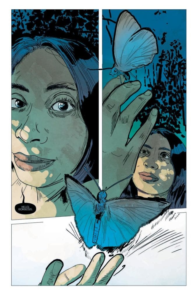
In the first panel of the first scene, the reader meets Eve. Her face takes up the majority of that first panel, and she stares out at the reader. The opening words “Hello, Gorgeous,” appear to be spoken directly to the audience. Instantly you get the impression that this woman is not only important but also powerful. Sampson plays with the confines of the comic page to produce the impression of something much larger. This concept is helped along by the blue moth that is literally breaking out of the third panel on the page. The panel border disappears as the moth flies up and out of the page. The Blue Moth and this idea of transition from one plane to another is an important aspect of Sleeping Beauties and is a continuing visual theme throughout.
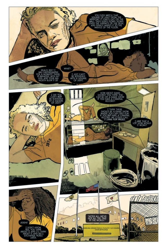
Ree is introduced in the first panel of the second scene. She is positioned at the top of the page with a similar stare that escapes the page and reaches the reader. However, as the scene plays out, her importance is questioned. Is the scene about her, or is it about her cell mate who daydreams on the bunk below? As the plot unfolds, the notion of sleep becomes significant, and all references to it grow in importance.
This leads to the introduction of Lila Norcross. In contrast to Eve, Lila is introduced through her family; her husband and son are the central characters in the scene. Lila starts off in the background before moving to the foreground for the final panel of the scene. This is where her importance is stamped into the comic as she stares out of the page with the same penetrating eyes and her speech invokes the significance of sleep within the story:
“Coffee. Thanks, kiddo… But this’ll have to be one strong brew to keep me awake. I feel like I could sleep until Christmas.”
These introductions of the central characters are just the first building blocks in the visual construction of Sleeping Beauties.

Inks, Color, Letters
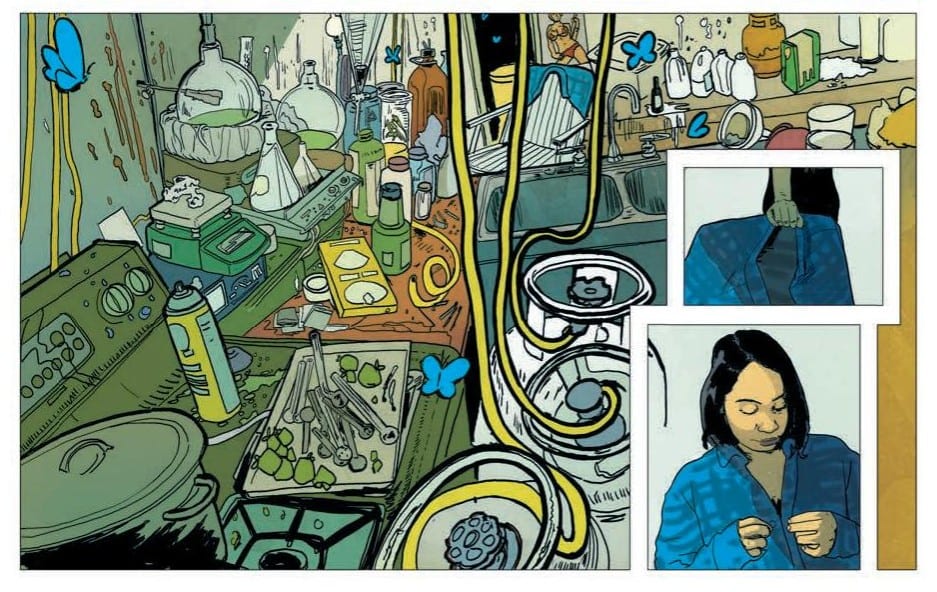
Sampson’s art work is complex and best described as magical realist. She comes from an architectural background which is evident in the way she composes her images, distorting perspective to create uncomfortable scenes. There is an attention to detail that gives off the impression of realism but, like the stories she illustrates, there are more abstract worlds just underneath, waiting to break out.
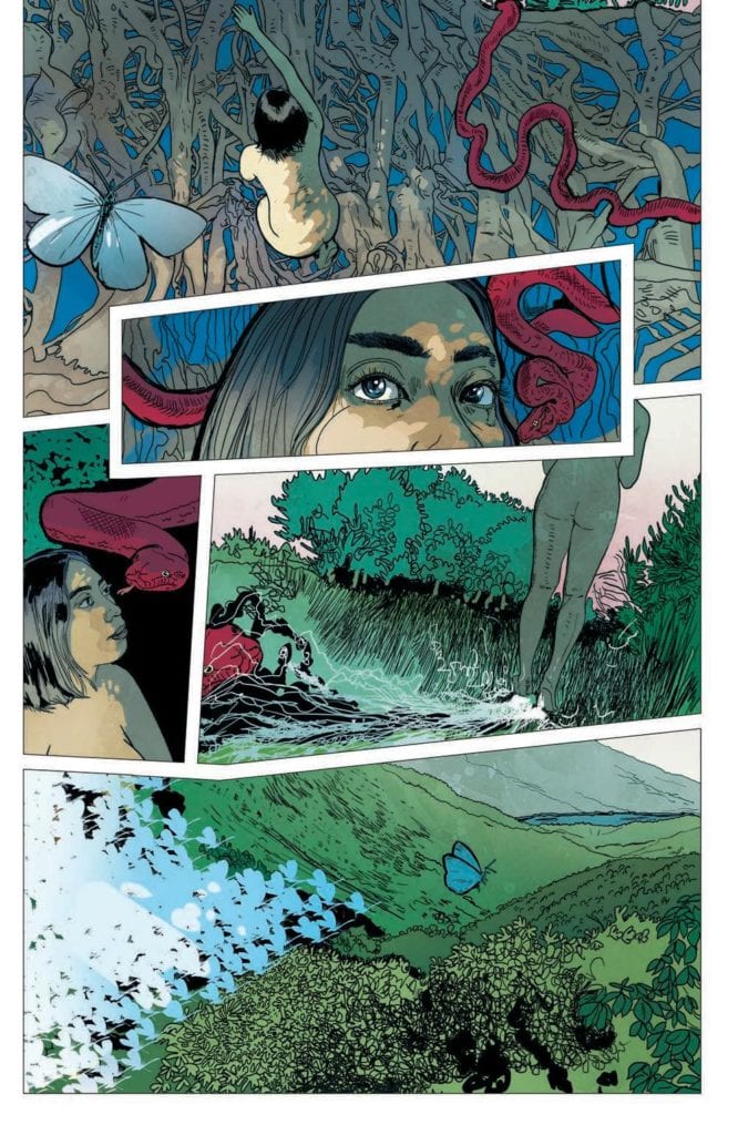
Triona Farrell picks out elements of the artwork and makes them a colorful focus for a panel or page. The bright blue moths or the carmine snake lead the reader across the page allowing Farrell to fill Sampson’s detailed images with an array of color. This continues the realistic impression but is also a constant reminder to the reader that this is a fantasy world.
The next layer of the image is the lettering by Christa Miesner which immediately stands out. The decision to use black word balloons with a white font is a bold one because it is so uncommon in mainstream comics. The gamble pays off in Sleeping Beauties because it contrasts and compliments the rest of the artwork. The black balloon tails become an extension of the line work, and the overall design blends better with the chaos of color in each panel. It draws attention to the script and forces the reader to work that little bit harder.
Each layer adds something to the panels, the page, and the larger narrative. Just as you would build a character by illustrating their appearance and giving them a specific linguistic voice, the artists in Sleeping Beauties are creating personalities through specific line work, colors, and lettering.

A Final Construct
Like an architectural landmark, a comic is constructed with different layers working together to present a finished product. The different levels may not be noticeable because only the surface is ultimately important but the collective decisions have to gel for the entirety to work. Sampson’s complex images are the driving force behind the artwork but the intended tone is only possible because the colors and lettering match the inks.
If the comic follows the general plot of the novel, then over the ten-issue run, there will be a lot of complex narrative issues to deal with. There are some twists and turns coming that are socially relevant and important in the current climate: an uncontrollable pandemic, gender politics, and a desperate feeling of helplessness. To match this is the complex artwork, driven by Sampson’s obsession with constructing almost abstract scenes that lay the groundwork for character development and plot enhancement. Her colleagues then bring out different aspects of the cast and story to produce a fully rounded visual narrative.
Sleeping Beauties is a visual treat and worth picking apart, layer by layer. The artistry on display is exceptional and complex, befitting the intensity of the plot.

