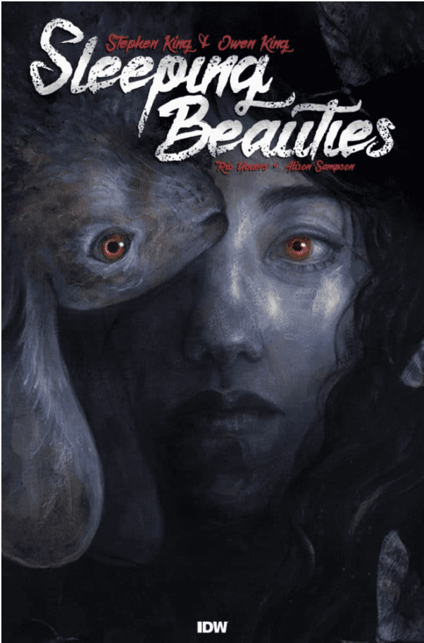
Sleeping Beauties #1 out this week from IDW is based on the horror novel by Stephen King and Owen King and adapted by Rio Youers and Alison Sampson.
Sleeping Beauties #1 Has a Decent Outline
Sleeping Beauties is a project the Kings are investing a lot into as advisors. Stephen in particular seems to have some enthusiasm towards comics, having co-created an X-Men villain and co-writing the first American Vampire issues with Scott Snyder. His son Owen meanwhile is a fan of award-winning thriller novelist Rio Youers. Combine all of this with a plot about a pandemic that induces outrage; this sounds like a best-selling formula, especially with these events happening in real-time with Covid-19 and nationwide protests. However, good concepts need just as good or better execution.
Unfortunately, Youers’ writing feels out of place throughout Sleeping Beauties #1. The opening pages are somewhat confusing; some captions would’ve significantly benefitted this piece. To Youers’ credit, he sets up the plot, primary setting, and half of the conflict. Every other action that happens in the plot happens just to move the plot rather than provide an explanation. That being said, seeing the outbreak disease affect one of the main characters does look troubling. Especially considering the reader learns about the full context near the end. One that could have dire ramifications down the road.
Art
Sleeping Beauties #1 has the artwork of Hit-Girl artist Alison Sampson. Sampson’s art at its best gives off a surreal atmosphere from just its opening. When it comes to character designs, however, most of them look emotionally stilted. When the characters you’re supposed to be rooting for have decent family downtime, it’s a little hard to relate to them, especially when the only character to show any other emotion cuts loose and commits gleeful mayhem.
Tríona Farrell, one of Sampson’s regular collaborators, as the colorist is arguably the best part of Sleeping Beauties #1. The muted color she employs for most of the issue sets the dour tone. The blue butterflies are practically messengers of a calamity, all in contrast to the color’s historically calming properties especially when one of these calamities gets decorated in red splotches of blood.
As for Christa Miesner’s lettering, it’s rather confusing. Most of the word balloons are black with white letters. It might be a little better if the words are said with some aggression, like what Clint Norcross says under his breath in his first appearance. But when everybody does this, it just makes it sound like everybody’s grumpy. All except for when the homicidal woman converses with a rabbit through orange balloons. Which implies an otherworldly force behind the disease. As for the wordmarks, they range from being creative with how their color contrasts to the situations at hand to being in the wrong place. At least that’s the latter’s the case with Lila’s encounter with the homicidal woman when she breaks her car before the sound takes place.
Sleeping Beauties #1 Could Be Better
Sleeping Beauties #1 certainly displays the series potential. There’s a very real dour sense happening in the background, but it’s not properly communicated. At least as far as the writing and penciling are concerned. Sleeping Beauties as a whole might improve later on, but for now, people might want to consider watching Castle Rock to satisfy any Stephen King cravings.


