

STAR TREK: YEAR FIVE #11 finds Captain Kirk and the Enterprise crew fighting former ally Gary Seven for control of the ship. Written by Jackson Lanzing and Collin Kelly with art by Stephen Thompson, the protector of the future must sacrifice his allies to prevent a cataclysm. Does he succeed, or will Kirk cheat death one more time?
Cover Art
Stephen Thompson’s cover art brings one word to mind: “mod”. It’s a perfect example of the elegant silhouette style that was so prevalent and popular in the 1960’s when the original Star Trek show was released. The shapes of the characters and ship are emblematic of the series, and the style captures the stylistic flavor of its time in a classic and classy way.
Writing
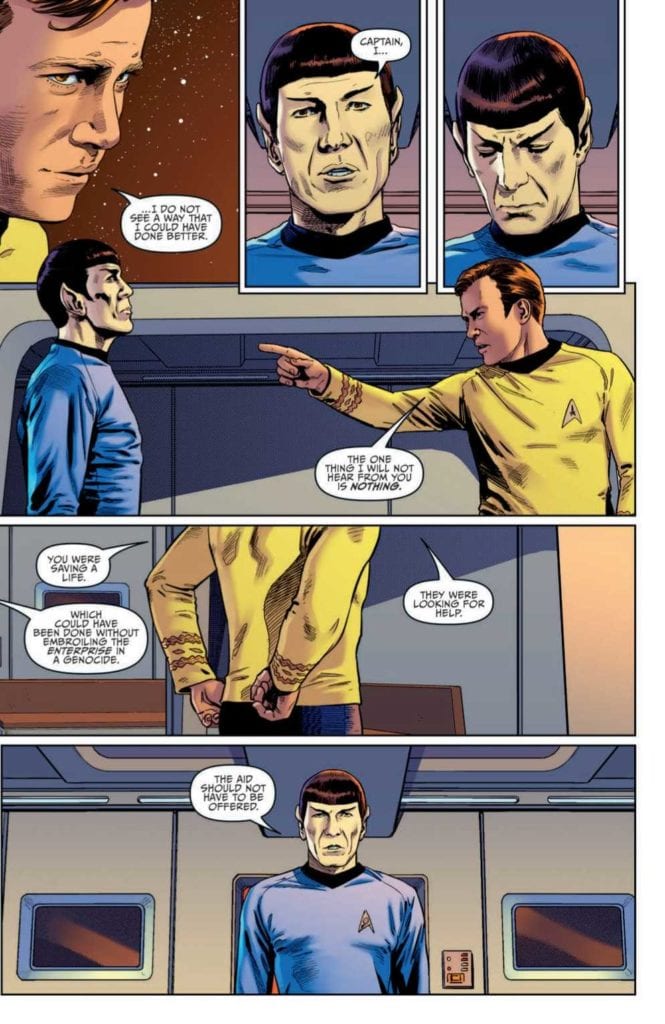
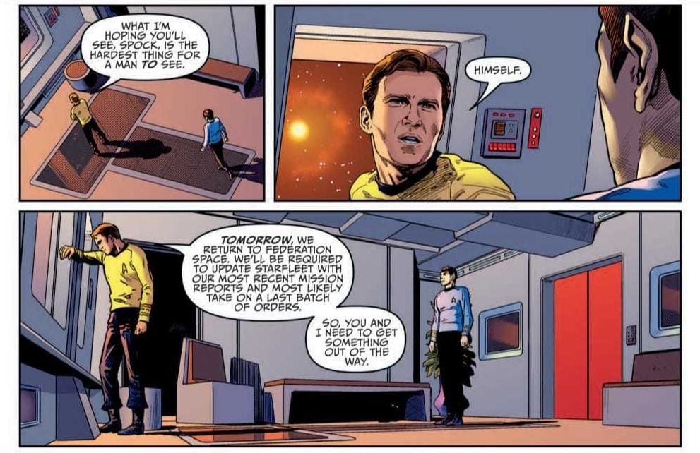
Jackson Lanzing and Collin Kelly’s story reads on par with an episode from the original series. There’s a character scene where Kirk is giving Spock a positive review for his performance, and in typical Spock fashion, he disagrees. The ensuing argument is as close to time traveling back to the 60’s to see the actors play the scene out in person as you can reasonably get. The dialog and tone is perfectly on-point.
The story also adheres closely to the vibe of the original series. Gary Seven uses his superior tech to invade Enterprise and take control of its systems. Kirk, in typical Kirk fashion, pulls off a minor miracle by isolating the invader and saving his crew. The final moments set up a one-on-one, showdown, cliffhanger that earns your anticipation for the next issue.
Looking at the story structure, it’s super lean. In essence, it would just qualify as the first half of an on-air episode. And that’s okay. Character introductions are simple and make perfect sense in context, the action pace is brisk. There’s no fluff here. Not one panel is wasted telling a good, old-fashioned space adventure story.
Pencils/Inks
Drawing a Star Trek comic based on real actors is a risky proposition. If Spock doesn’t look like Spock, that’s an immediate red flag. Thankfully, Stephen Thompson portrays the legendary characters with the right mix of homage and realism. These legendary characters aren’t rendered so hyper-realistic as to look like static portraits, but their renditions are just close enough to the real thing to pay respect to the original show.
Thompson does an equally admirable job rendering the look of the ship and its technology. The Bridge looks like the Bridge. Engineering looks like Engineering. Even the classic, albeit goofy, phaser rile makes an appearance in the hands of Lt. Chekov. All the little bits of Star Trek aesthetic are present to satisfy lovers of the show.
Favorite Panel/Page: The favorite panel of this issue is the external shot of Enterprise as the leaves in escape pods. There was no clear depiction of escape pods in the original series, so to show something “new” that organically matches the “old” style is impressive. Plus, who doesn’t love a great long shot of old NCC-1701.
Coloring
The original Star Trek designers were fond of primary colors for the shows design. Charlie Kirchoff’s coloring leans on the history of primary color uniforms and adds well-placed gradients and shading to give each character the right amount of depth and contour. The original shows lighting tended to be bright to the point of almost tacky, so Kirchoff wisely cools the lighting and adds a little extra shadow to infuse the panels with more drama. Nice work here by Kirchoff.
Lettering
Neil Uyetake’s lettering work is first rate. The human(oid) dialog is well-placed to keep the pacing up while letting the art tells the action parts of the story. There are some unusual designs for word bubbles that I’ve never seen before. However, they make total sense considering your have an 8-limbed alien speaking through a modified spacesuit into a universal translator. I don’t know what that’s supposed to sound like, but it’s believable in Uyetake’s lettering.
Conclusion
STAR TREK: YEAR FIVE #11 looks, reads, and feels like it was lifted directly from the original series. The dialog is realistic to the voices of the characters, the story is on the level of one of the better episodes, and the art hits all the right nostalgia notes. Highly recommended for any Star Trek fan.
Author’s Note: Local Comic Shops (LCS) are going through a tough time right now with the pandemic outbreak of COVID-19. Comics fans of every flavor that care about his or her LCS should try to do what they can. So, here’s my part:
If you’re in Northern Delaware, South East Pennsylvania, or Southern New Jersey area, please take a moment to visit Captain Blue Hen Comics in Newark, DE. Say ‘hi,’ pick up a book, order a book (they’re on Comichub.com), and let them know you support them.
If you’re nowhere near that area, please find YOUR LCS using Comic Shop Locator and lend your support.
Thanks, and stay safe.