Home Blog Page 291

BLACKHAND IRONHEAD – A Relevant Capepunk Story

Blackhand Ironhead Cover

Blackhand Ironhead is the latest release between Panel Syndicate and Image Comics for September 23, 2020. Headed by comic artist David Lopez, and his colorist Nayoung Kim bring the series stateside, with help from script tutor David Munoz, logo artist Cris Castan, and translations by Stephen Blanford.

Blackhand Ironhead – What A Time For a Collection

Blackhand Ironhead physically collects at a time of important relevance. This series is what TV Tropes calls a Capepunk, a series about the prevalence with superheroes in a realistic manner. Realistic, in this case, refers to the age-old question from Watchmen “who watches the Watchmen [police].” Because people with some form of power can easily let it go to their heads, the current Ironhead, Alexia Ross’s father, for example, is a respected superhero and runs a corporate empire. But he is heavily image-obsessed and even suggests his daughter take over the company in an impractical outfit that she doesn’t even fit in. Even then, he wants to leave Alexia a better world than what it was before a heart condition claims him.

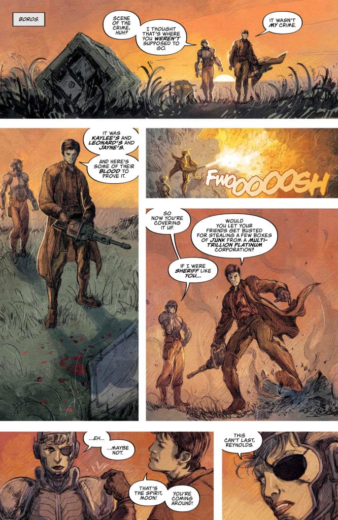
Unfortunately, it turns out the old Ironhead had a few skeletons in the closet. One of which comes in the form of Alexia’s older half-sister, the current Black Hand. The original Black Hand was supposedly a supervillain who had a fling with Charles Ross. But the only reason she was thrown in jail was being a threat to Charles’ reputation. All without a lawyer or due process.

That reflects a particularly bad reality, especially for people of color. Readers of Blackhand Ironhead are quickly becoming aware of some of the morally reprehensible things done by notable people. Athletes, pro wrestlers, police, even people in the comics industry, all of which involved in some form of abuse scandals. If these people are the highest authority or what to aspire towards, does this give them the power to do as they want? Or is it an excuse to justify their actions? These questions serve as the basis for a story of significant importance.

Art

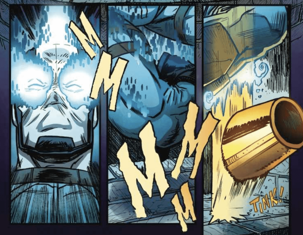
As writer and artist, Lopez crafts Blackhand Ironhead as he sees fit. The younger characters like Ironhead and Blackhand not only look youthful, but their lack of greater detail make them expressive. A good number of the older characters like Charles and Titan, however, have the traditional designs of square-jaws. But this design makes them look both old, stiff, and not a lot of room for expression. Unless they get angry, something Nayoung Kim shows with both red and black on Titan’s face. The only exception to that role is Arthur Watson, whose high energy fills him with life and expression.

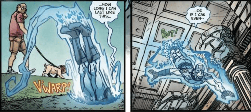
A number of objects come with surprising detail within Blackhand Ironhead. Some of the supervillain weaponry look positively whacky, including an Oscar Meyer car with giant ears. Against the rotoscoped or simple architecture, the whimsy is a nice distraction from the seriousness—all without feeling obligatory.

Blackhand Ironhead: A Look at Superheroes

At the end of the day, Blackhand Ironhead isn’t simply a critique of superheroes like The Boys. It’s about how heroism is about responsibility, not entitlement. No matter how many people criticize superheroes, there is still a need for them in bleak times. But that doesn’t mean that their sacrifices and efforts should make them above it all. Because when service and reputation matter more than helping others, that’s abusing karma to avoid responsibility.

What do you all think? Is this series just another attempt at Watchmen? Or do the themes matter now more than ever? Leave your thoughts in the comments.

Monkeys Fighting Robots Youtube

SOMETHING IS KILLING THE CHILDREN #8 – Reflective Tensions

Something is Killing the Children #8 cover

Something is Killing the Children #8 out this week brought to readers by Boom! Studios continues James Tynion IV, Werther Dell’edera, and Miquel Muerto’s horror thriller.

Something is Killing the Children #8: Reactions

This moment requires context.
This requires context.

Prior to Something is Killing the Children #8, lead monster hunter Erica Slaughter took drastic measures to find the titular ‘something.’ Despite disliking her superiors, she doesn’t have any way to lure the monsters out without bait. So Tynion goes into how those actions have consequences. The town’s deputy sheriff Tom even points a gun at Erica and her watcher Aaron for the last trade’s climax. Despite the somewhat necessary actions to fight the monster, the baiting technique is still child endangerment.

Aaron is more than willing to exploit the moral gray areas of handling the situation at hand. Since the town doesn’t really have any idea of what they’re dealing with, this might seem necessary. However, his first action is to knock out a nice old woman who could’ve calmed a tense situation down with a call. Erica meanwhile dislikes her superiors like Aaron and is willing to compromise where she can rather than get her way. It’s practically a way of saying that while some morals can be obstacles, some ethical boundaries are necessary. Otherwise, what kills the children might not be the monsters.

Art

Werther Dell’edera continues to provide the tense situations of Something is Killing the Children #8. Half of this issue has double-page spreads filled with panels with placements so chaotic the reader feels the tension with each second. Nothing since the Dark Knight Returns 16-panel pages has something like been attempted. Or in such a way that tells the reader that things are only going to get worse.

Jumping into Something is Killing the Children #8

Except for maybe Miquel Muerto’s coloring. The mostly saturated world of Something is Killing the Children #8 leaves readers feeling uneasy. Sure there’s a bit of light to contrast the settings, but it practically reflects a bad mood. When the sheriff questions Erica’s helper from issues back James, all he gets is what readers already know, not much. It’s frustrating to both sides as it looks like nobody knows how to deal with the situation. The only exceptions are clashes that further illustrate the tensions like when Erica hits Aaron to illustrate her frustrations with her superiors. Or the sight of blood near the end of the issue represents the threat of the monsters.

The lettering by Andworld Design further illustrates the tense moments of Something is Killing the Children #8. With each word balloon, the time in an already tense situation feels longer. In just the double spreads, the transition from one panel to the next feels longer or shorter, especially when they’re of different sizes. The sparse wordmarks of bright colors are practically the building tensions exploding.

Study Up On Something is Killing the Children #8

Something is Killing the Children #8 requires a little background knowledge to fully appreciate. While it’s not friendly to new readers, the act of consequences are a strong theme here. Tensions build up over time, especially as reactions with the main characters. It can even be a critique on the nature of the anti-hero in modern times. Just because something can only be done through moral gray areas, it doesn’t justify lowering the moral bar.

What do you think? Would you rather start at the beginning for an emotional context? Or would rather just dive into the unknown, barring consequences? Leave your thoughts in the comments.

Monkeys Fighting Robots Youtube

How The Plan Is Falling Apart In FIREFLY #17

A new figure enters the fray in Firefly #17.

FIREFLY #17, out this Wednesday from Boom! Studios brings readers back to a ‘verse full of dangers, and people who think they have the right to dictate how the rest of humanity should behave. That’s a world that Malcolm Reynolds has always chafed against.

A new figure enters the fray in Firefly #17.

***SPOILER WARNING***

The crew of Serenity has been facing many changes over the recent years (months?), many of them being unpredictable even to the most dedicated of fans. On the bright side, that means the series has consistently been full of surprises.

Malcolm Reynolds makes for the most unlikely of sheriffs, yet in Firefly #17, one can see just how easily he can get stuck between a rock and a hard place. After all, it’s not like the rest of his crew have quit the illegal gigs just because of his new career path.

Mal’s job title has always had a timer going for it. There was simply no way he would be capable of staying there long term. Now we’re starting to see the endpoint of his run at going legit, and it’s not looking pretty.

The alternate cover for Firefly #17 is looking a might foreboding…

The Writing

Greg Pak is still at the helm of this project, bringing the Firefly crew to new heights – and lows. This is a plot that has been coming to a head for a while now, yet he’s somehow managed to up the ante in spite of that.

Firefly #17 is an issue packed to the brim with action. Much of it revolves around the obvious guesses (Mal does have a penchant for trouble), but a few moments will bring surprises – and cheers. There’s something refreshing in that.

The introduction of the Blue Sun organization was a good call, and it’s still paying off even several issues later. That’s proof of a slow-building plot arc right there. One that feels distressingly similar to another organization fans already saw fall.

The conclusion of this issue is setting up for another climactic series of events. Events that might, with any luck, bring the beloved crew back together once again. Though possibly not for the reasons fans would like.

It’s just like Mal to be cleaning up after his crew.

The Artwork

The artwork found inside Firefly #17 is bold and distinct. While fans can certainly recognize their favorites from the show, it’s clear that the creative team has started to feel bolder in taking risks in styles and portrayals. On the whole, those risks have paid off.

The medium is well-suited to the changes created, as well as for all of the actions (and explosions) provided thus far. There are a few fight scenes worth talking about here, but one of them stands above the rest. The unique style of the series shone clearly at that particular moment, making the whole scene feel even fiercer than it otherwise could have been.

Lalit Kumar Sharma was the lead artist, with Francesco Segala providing the colors, and Jim Campbell the letters. Together they created a newer looking universe that still manages to feel familiar. All while providing the characters, action, and setting that fans have come to love.

They say there’s no rest for the wicked.

In Conclusion

Firefly #17 continues to bring fans along a path full of surprises. This is not where fans expected to find their favorite crew, yet in some ways, it is still fitting. In many other ways, it proves that this is a series with many more stories left to tell.

Monkeys Fighting Robots Youtube

Review: THE FLASH #757 – The Legion of Zoom Attacks!

It’s the beginning of the end of Joshua Williamson’s Flash story in The Flash #757, released by DC Comics on July 7. Eobard Thawne sets his a plan in motion, years in the making, against Barry Allen and the Flash Family. Joined by Rafa Sandoval on Pencils, Jordi Tarragona on Inks, Steve Wands on Letters, and Colors by Hi-Fi, Williamson sets in motion the final stretch of his story almost five years in the making with the introduction of the Legion of Zoom.

Writing

Williamson has certainly been playing the long game with his run on The Flash. Back in 2016, The Flash: Rebirth #1 introduced readers to a murder case that was eerily similar to the death of Barry’s own mother at the hands of Eobard Thawne. While Barry’s initial suspicions about the case were dismissed because his objectivity was called into question, Barry is vindicated not only by finding out that, no, Heather’s husband did not kill her, but in fact, the Reverse-Flash did, on the very night that saw Wally West return from the Speed Force! Before Barry can investigate this revelation, however, Central City is attacked by a number of Flash’s rogues, in locations that are directly tied to Barry Allen. Williamson is bringing his story together, setting up a(nother) final confrontation between the Flash and Reverse-Flash, which will hopefully see the return of the entire Flash Family!

Art and Coloring

I’m a big fan of the Sandoval/Tarragona art team over the past few issues. They are very good at conveying the bombastic, frenetic action of the story, since characters are always portrayed in wide, expansive poses with their arms spread.


Seriously? Who runs like this?

They are helped, of course, by the solid coloring from Hi-Fi. All the colors are excellent. The red of Flash’s costume really “pops” against the background.

One thing I like about the following panel is the way that the art team portrays the nuances of Thawne’s negative Speed Force energy.

The line work is solid, and the colors within the energy are shaded well without bleeding too much out into the solid colors of the background setting, something that can tend to happen when portraying these types of energy fields.

Lettering

Wands does a fine job with lettering. Most of the lettering focuses on either Barry’s dialogue or inner monologue, although Wands does throw in a few nice flourishes. The Speed Force lightning and whooshing sounds are always a nice touch. Wands also gives each of the Rogues unique lettering when their names are said (a fun, if silly, comic book trope).

Conclusion

Williamson’s run is coming full circle, racing towards its conclusion while calling back to the beginning of his run, including the return of Wally West and the death of Heather Macy. With the Legion of Zoom attacking Barry’s life, it’s most likely the case that Williamson is setting up the return of the Flash Family as his run comes to an end.

What did you think of The Flash #757? Tell us in the comments below.

Monkeys Fighting Robots Youtube

LOIS LANE #12: Does It Fizzle or Does It Bang? A Little of Both

Lois LAne DC comics Rucka

Does DC Comics’ Lois Lane #12 end this stellar series with a fizzle or a bang? Well, it’s not quite that simple. Writer Greg Rucka, artist Mike Perkins, colorist Andy Troy and letter Simon Bowland put forth an issue that feels as “split” as Renee and Elicia. Despite moments of pure, unadulterated beauty, the script feels torn between what it’s trying to do. Is it trying to tell us that love makes the world go round? It does so brilliantly with small moments shared by many of the characters. Or is it trying to tell us the Multiverse is on fire? Because I’m a little less convinced of that.

Lois LAne DC Comics Rucka

Writing

Rucka’s writing in this chapter seems to get slightly off course. The plot’s connection to the multiverse is something we are told is of utmost importance, yet those moments feel out of step. Rucka manages to ground these high minded ideas in the characters of Renee and Elicia. They represent the concepts he puts forward of personas splitting, and they represent it with a brilliant flair. Yet Lois and Sister Clarice’s final moments leave you scratching your head. Their mission together, though it has supposedly been just beneath the surface all along, feels like it comes out of nowhere. It seems Rucka bit off more than he could chew when he introduced the Multiverse in the final three issues, making this ending a little half-baked.

In the end, the multiversal aspect of the series only serves to distract from the intimate story Rucka is telling. An intimate story that still shines in these pages. With Lois and Clark reuniting, Alejandra coming back to her family, even Elicia and Renee going on a joyride, it’s impossible to read these pages without a smile. Though Rucka’s writing stumbles, it’s only for a moment. Rucka takes his eye of the prize for a second, forgetting briefly that these characters are good as they are. There’s no need for a multiverse to back them.

Art

Perhaps one of the reasons the multiverse feels out of step here, is because of the beautiful job Perkins does. His artwork is just so present. It feels real. It’s tangible. So intangible, high-minded ideas like a multiversal meltdown feel a little too out there. It’s strange to see a series concerned with the big picture, when it’s so familiar with the crease of a forehead or the shape of an eyebrow.

In the last two issues of Lois Lane, Perkins makes the intangible Multiverse real with his gorgeous spreads. Despite their sheer power at making your jaw drop, it’s nice they aren’t in these pages. We come back to the things that matter in this final chapter. We see the smirks and winks that make Renee and Elicia work. The grins from ear to ear on Alejandra’s children make your heart warm. And Lois Lane’s easygoing smile in the face of a world on fire is the face of what makes her and this series so incredible.

Lois Lane DC Comics Rucka

Coloring

Troy finishes his sonata of colors in this issue. The palette warms up considerably, compared to the last couple issues. We get a sense of safety, a sense that the danger has passed, in the first few pages. But what’s so interesting, as has been all along, is Troy’s use of the color purple. Throughout this series this is a color Troy keeps coming back to. From Lois Lane herself, constantly garbed in purple and always a source of mystery, to his coloring of magic and the “other.”

We see Troy continue to do that. Lois is in her purple top, Midnight uses purple magic to find a cellphone. Midnight gets on a call with Renee who is surrounded by a purple background. Troy’s use of the color hasn’t changed, but the characters’ reaction to it has. Lois, Renee and Midnight take it all in stride. The unknown has become the known, they are no longer afraid of what they don’t know. And so, with a simple recurrence of one color, Troy gives us a barometer of every character in this series. It’s amazing to see it all come full circle.

Lettering

Bowland’s rhythm and timing allow the smallest moments in this issue to speak volumes. Bowland sparsely letters much of the first part of the issue. In the place of dialogue, we instead get sound effects and action. But when we cut to the Daily Planet newsroom, this all changes. Word balloons overlap one another, as everyone in the everyday chaos of the bullpen is trying to be heard. Of course much of the dialogue goes over our heads. Snippets of stories we have no context for. But Bowland focuses us in on one set of word balloons, a thought train we follow panel to panel, by placing it in the middle of each panel. It’s just someone looking for their mechanical pencil, asking people if they’ve seen it.

Brilliantly, when Lois enters the bull pen for the first time in ages, all the dialogue disappears, except for a word balloon in small lettering of someone saying “… I gotta call you back…” Once Lois enters Perry’s office, it’s business as usual. And hilariously, Bowland shows us this by placing “Look can I just borrow a pen, then?” as the last thing we see on the page. It connects us to the wonderful mundanity of life, even on the heels of seemingly important moments.


There is so much to say about this issue and about this series from DC Comics. With the direction it was heading, this issue could have been such a letdown. But it wasn’t. It was a beautiful story about our connectedness, and our need to depend on one another. The introduction of the multiverse to this series retrospectively feels like Godzilla barging in on two people making love. It’s out of place and so much bigger and less intimate than the story being told. But this creative team didn’t allow it to steal enough focus to ruin anything.

So while there’s the briefest of moments where one reads this and says “huh?” we come back to an image of Clark and Lois holding hands. The creative team doesn’t allow the series to get derailed. We just hit a tiny speed bump. This is a gorgeous series, one of the best DC Comics has produced in the past ten years. And It’s certainly left us wanting more Lois Lane. LOIS LANE #12 is out from DC Comics July 7th!

Monkeys Fighting Robots Youtube

ADVENTUREMAN #2 is Fantastic and Mundane, All At Once

Adventureman Dodson Image Comics

Image Comics’ Adventureman #2, written by Matt Fraction, with pencils and colors by Terry Dodson, inks by Rachel Dodson and letters by Clayton Cowles, is a love letter to old superhero stories. But it’s also a love letter to everyday life. It invites us deeper into a world and a history that these characters already know well. Claire, a single mom who lives in New York and owns a bookstore, delves deeper into the city’s history. And she begins to wonder if the pulp-action stories she reads with her son at bedtime are more than stories. We are brilliantly left in the dark, yet every new detail that comes to light already feels familiar.

Writing

Fraction overloads these pages with captions, based off of Claire’s inner monologue. For any other comic, this would be a simple info dump. But Fraction balances humor and exposition tactfully, making the whole thing work. In captions, we get to see what Claire is thinking she should be saying. The humor comes from the fact that she rarely listens to her own inner monologue. She plays everything close to the chest, living in her own world, even though we know she feels she should share more. But her self-awareness is more than just funny. It gives us a trust in the character, shows us she knows the difference between a dumb and a smart move. Even if she tends to opt for the dumb one. It makes her likable, and so human.

Art

Rachel and Terry Dodson create a world in this issue. I mean, of course they do. That’s what a comic book is. But their real world base of New York City, with an added fantastical filter, is full of life. The issue opens with a few pages set in some kind of mythical purgatory. Filled with tentacles, skulls, and bugs, the Dodsons somehow make it look beautiful. Terrifying, but beautiful. And only a page later, they’re showing kids playing basketball, and buses pulling up to schools. Though we’re now focused on the mundane, it doesn’t stop feeling fantastical. The panels and framing make every page feel fun and playful. And a simple page of Claire on her scooter looks as cool and fun as any superhero flying through the air. The Dodsons don’t “talk down” to normal life. They make it seem just as fun and majestic as fighting monsters.

Coloring

In the same way that the art doesn’t talk down to normal life, Terry Dodson’s colors actually celebrate it. In fact, it’s the “super” scenes that Dodson gives a washed out color palette. Scenes of family dinners around the table are beautifully colored. Warm, inviting colors characterize these scenes. Whenever Claire finds herself tangled up in the mystery of long lost superheroes, the pages become monochromatic. While this shows us that a normal day in NYC is just as adventurous as any day with Adventureman, it also reminds us the heroes are gone. They are a thing of the past. The washed out colors look like faded photographs. We’ll have to wait and see if the colors warm back up if the heroes ever make a comeback.

Lettering

Cowles is not the man you hire if you just want to get the job done. He’s not going to slap a few letters up there so the characters are all saying what you told them to. Cowles is going to have fun with it. This issue is no exception. First, Baron Bizarre’s lines all get special treatment. Every word balloon is framed in tiny moth-like shapes. It’s as if the words sound like they’re rotting. And later, as Claire and Tommy discuss the book they’ve found, the lettering switches back and forth based on whether they’re reading. The lines that are read look like they’ve been typed, not handwritten. All Cowles needed to do was put quotation marks around these lines, which he did, but adding a change of lettering just looks so great. Cowles adds this little extra step just to make it fun.


Image Comics’ Adventureman is going to be a blast. The owner of a bookstore in NYC, finding out a book she found was written by who she thought were fictional superheroes. I mean, what’s not to love? This series has already hit its stride. Fraction, Dodson, Dodson and Cowles are a great team producing brilliant work. Pick up Adventureman #2, out from Image Comics on July 8th!

Monkeys Fighting Robots Youtube

Review: SUPERGIRL – BEING SUPER – Supergirl Done Right!

On July 7, 2020, DC Comics releases an updated edition of Mariko Tamaki and Joëlle Jones’s limited series Supergirl – Being Super. With Sandu Florea assisting Jones, Jeremy Lawson on colors, and lettering by Saida Temofonte, this story reimagines the origins of Supergirl as she struggles to find her place to belong while trapped between two worlds.

Writing

Supergirl can be a hard character to get right and keep right. Sometimes, she’s a pale shadow of her well-known cousin. Other times, her alien nature is emphasized over-against any human connections or attachments to Earth. Still other times, she begins with an already convoluted status quo that degenerates into the worst kind of comic book silliness. One thing all of these stories have in common, however, is that eventually Supergirl comes face to face with Superman. Which she does. Eventually. The Man of Steel is quite de-centered in this story (at one point I wondered if he even existed in this tale), which allows Kara to shine!

Tamaki’s strategy is to copy part of Clark’s upbringing while making it unique to Kara. She was discovered in a spaceship by two farmers in the town of Midvale, Kansas, but these are not the Kents. Her father is a gruff but compassionate country man, slightly wary of his daughter’s powers, who may ask for her help around the farm, but Kara is her own person. She is an athlete (who carefully controls how fast she runs track). She is Gen-Z, constantly on her phone with her friends. And she is given her own unique inner world. While some of the elements of her life rhyme with Clark Kent’s, they are not the same, and Kara is given a chance to shine as a fully realized character.

Tamaki also explores Kara’s relationship with Krypton. She is still an older child when she is sent away in a spacecraft by her parents, but she blocks the memories from her mind, which allows her to embrace humanity more than, say, the New 52 version of Supergirl. With her powers fluctuating throughout the series, readers eventually learn that LexCorp is performing experiments on her and another Kryptonian, Tan-On (who I thought might be Clark at first, in some sort of role reversal), who having suffered at the hands of humanity seeks revenge against them. This puts Kara at odds with her homeworld the person who symbolizes her homeworld. After establishing that, yes, Superman does indeed exist in this world, Kara seeks advice from this other strange visitor from another planet. The Supergirl origin arc is complete, although in a way that builds on Kara as a unique character and gives her agency.

Art

One of the joys of this collected series is seeing teenage Kara navigate high school life as someone with superpowers. And these moments are illustrated beautifully by Jones and Florea. Now, some of you may have always wondered, “Do Kryptonians get acne?” and even more importantly, “If they get acne, is it ‘super acne’ since they’re on Earth?” Well, wonder no more friends.

I am equal parts hilariously amused and grossed out by this panel. But it is representative of the humor and heart in this book.

This is the face of horrified teenage self-consciousness.

This is very much a coming of age tale that these panels capture, albeit in the most excessive of ways.

There are some more subtle moments that capture the coming of age angle of the story, like when Kara rescues Tan-On.

From the eye contact, to the bashful looking away, to the slightly curved up smile on Tan-On’s face, this scene made me think of a season one Buffy/Angel interaction on Buffy the Vampire Slayer (complete with the heel-turn from the older Kryptonian possible/forbidden love interest). Two lonely hearts, connecting with someone like themselves. As Kara says, “This feels like a dream,” but the dream soon becomes a nightmare.

Coloring

Lawson’s colors really play on the red, blue, and yellow of the Supergirl costume. As readers can tell in the images above, each page is saturated in either yellow or blue, with the red popping on page and providing an accent. It’s a credit to Lawson, Jones, and Florea that despite each page essentially being one color, that the shading of the blues and yellows creates enough nuance and differentiation to never be distracting. In fact, it looks quite good!

Lettering

I guess Kara is technically Gen-Z in this story (remember, Millennials are 40 now), and Temofonte’s lettering does a good job depicting the one-fourth of all social interactions that happen on Kara’s phone, complete with emojis and ellipses (for when you can tell the other person is typing). As the way we communicate changes, so should the way we depict communication (like texting), and this story works in those conversations seamlessly and makes them nuanced and meaningful.

Conclusion

Kara is a cool person in this story and a fully realized and compelling character. Tamaki and Jones give her a little bit of a Buffy vibe, and it works. I would love to see a follow-up that addresses the loose threads of this story, like Kara’s conversation with Superman and the dual threats of Tan-On and Lex Luthor. I do think there were a few pacing issues here and there, with the Tan-On story in some ways feeling like it might’ve taken a little long to get to and then accelerated a little too quickly, but overall, this was a very enjoyable tale, and could serve as a fresh entry point for new young adult comic readers.

What did you think of Supergirl – Being Super? Tell us in the comments below.

Monkeys Fighting Robots Youtube

Deep Dive With Artist Ryan Browne Of QUANTUM & WOODY

Deep Dive With Artist Ryan Browne Of QUANTUM & WOODY

Quantum & Woody #4 hits your local comic book shop on July 8, but thanks to Valiant Entertainment, Monkeys Fighting Robots was able to chat with the artist of the series, Ryan Browne.

Quantum & Woody is written by Christopher Hastings, with pencils & inks by Browne, Ruth Redmond handles colors, and you will read Hassan Otsmane-Elhaou letters. The series is fun, intense, and crazy.

About the final issue:
Home Alone, the boys are left to defend their lair against would-be bandits! What is Woody’s dark secret? The truth is finally revealed!

Deep Dive With Artist Ryan Browne Of QUANTUM & WOODY

Enjoy The Interview With Ryan Browne:

MFR: Ryan, thank you for taking the time to chat with me. The final issue of Quantum & Woody comes out this week, after a 3-month delay. What’s your emotional reaction going to be when you see it on the shelf at your local comic book shop (Challengers)?

BROWNE: Well, we are quarantining pretty hard in the Browne household–keeping my baby son Kirby safe–but when I make Challengers deliver the issue to my house it will be a fantastic thrill! So happy we got to finish the arc and that everyone gets to see the shocking cliff-hanger ending!

Deep Dive With Artist Ryan Browne Of QUANTUM & WOODY

MFR: Issue three had some fantastic action/reaction panels. Do you have a favorite panel or page from the series, and if so, why?

BROWNE: Thank you! I’m really proud of the acting I’ve drawn into the issue. The two characters really carry their personalities in their postures and gestures. I’m a fan of the drawing of Quantum at the end of issue 1 when he realizes that he’s just punched that evil kid in the face. Trying to show terror and regret on a face that wears a mask was no easy feat!

Deep Dive With Artist Ryan Browne Of QUANTUM & WOODY

MFR: The colors in Quantum & Woody hit extremes when the action happens, can you talk about Ruth Redmond’s color palette?

BROWNE: Oh! It’s so good. This issue has ghost energy, Woody blasts, and evil dude Kirby krackle all flying around in one big battle sequence. No easy feat for a colorist to handle all of those different glowy light sources, and Ruth crushed it! Having multiple light sources and still keeping the depth and focus is no easy feat!

Deep Dive With Artist Ryan Browne Of QUANTUM & WOODY

MFR: Quantum & Woody talk a lot! How do you balance panel design with all the back and forth banter?

BROWNE: Well, Hass is a master of lettering twisting tails of dialog–so he bails me out a lot. It’s always important to note which character speaks first in the panel before I draw it so I can have them on the left side of the panel. Then it’s just leaving lots of room for Hass to work his magic! Good lettering is no easy feat!

Deep Dive With Artist Ryan Browne Of QUANTUM & WOODY

MFR: The creator of Quantum & Woody, Christopher Priest drew inspiration from Woody Harrelson and Wesley Snipes in White Men Can’t Jump. Did this inspiration come over in your interpretation of the characters?

BROWNE: Not as much. I wanted to get sillier and more rubbery with Woody and give Quantum some stillness and weight. Woody can flop around clumsily, whereas Quantum is a well ground tank. Coming up with that was no easy feat!

Deep Dive With Artist Ryan Browne Of QUANTUM & WOODY

MFR: Your commission sketches are insane. What is the craziest commission sketch you’ve done, and can you share it with the readers?

BROWNE: Uh once someone asked for Bib Fortuna (I’m not looking up the correct spelling), and I drew her (I think?) riding Kaneda’s bike from Akira because I wanted to try and draw that bike! Once someone asked for Red Sonja and I drew her as a centaur complete with metal bikini bottoms on the horse end. My great, great ideas are no easy feat!


Ryan Browne ECCC

MFR: When Valiant Entertainment first approached you to work on Quantum & Woody, what part of the project got you most excited and did that come across in the four issues?

BROWNE: I was most excited to work with Chris Hastings. Dr. McNinja was popular around the same time God Hates Astronauts was gaining popularity, and I was always jealous of his great jokes and ideas. Also, I was excited to work for Valiant for a while. They had a great reputation, and they lived up to it for sure. Also, I’ve known Heather Antos for years, and I always love working for her, so I knew it’d be stress-free! Finding such a perfect job was no easy feat!


Deep Dive With Artist Ryan Browne Of QUANTUM & WOODY

MFR: The first time I met you 10+ years ago, your self-published book God Hates Astronauts cost $5 when Big Two books cost $3. You stated that it was a self-published book, and it cost more. What I remember most about that conversation was the other indie creators around us taking note (you could see the light bulb turn on). You knew the worth of your creation and demanded it (not in a bad way). Now, self-publishing comic books is booming, and readers are paying a boutique price to support creators. Do you think you were a trendsetter, and how do you think you influenced other self-published creators?

BROWNE: Hmm. I don’t know I was a trendsetter, but I certainly had to figure it out my own way. Lots of gimmicks and dumb merch kept comic shows manageable, and being at those artist alleys is really how I built my following. My comics seem to work best if I have a personal connection with the reader–which is something I know I used to really love about going to comic shows in the 90s and meeting creators. Before comic shows got so popular, meeting comic artists sure was an easy feat!


Deep Dive With Artist Ryan Browne Of QUANTUM & WOODY

MFR: The comic book industry is at crossroads here in 2020, what are your predictions regarding what the industry will look like in 2030?

BROWNE: Well, I think that collector energy will never go away even as digital comics become easier and cheaper. I still love ordering zines from creators and self-publishing myself. I think those personal DIY stuff will never go away or really change. No clue what will happen with mainstream, but Valiant has an amazing and dedicated fanbase, so I’m sure Quantum and Woody will be alive and Klanging.

MFR: Ryan, thank you again for your time and best of luck with your next project.

BROWNE: Sure thing. Answering these questions was no easy feat!


Again, the final issue of Quantum & Woody is out this week. You can read Cat Wyatt’s review of issue four here: The End of An Era In QUANTUM & WOODY #4

What Valiant books are you reading? Comment below with your thoughts.

Deep Dive With Artist Ryan Browne Of QUANTUM & WOODY

Monkeys Fighting Robots Youtube

Review: UNDISCOVERED COUNTRY VOL. 1 is Well-Honed Chaos

The tremendously talented all-star pair of writers in Scott Snyder and Charles Soule have come together to craft the completely bombastic and highly engaging  Undiscovered Country. Along with a massive visual team consisting of Giuseppe Camuncoli on layouts, pencils from Daniele Orlandini and Leonardo Marcello Grassi, and colors from Matt Wilson, this first volume containing the 6 issues that make up the “Destiny” story arc are a volley of meticulously crafted and completely insane comic issues. This is a highly engaging story with carefully woven threads, compelling characters, and utterly insane visuals. Equal parts  Mad Max, Escape From N.Y, Contagion, and  Saga, Undiscovered Country Vol.1 is among the most entertaining and original comics hitting shelves right now.

“Journey into the near future, and an unknown nation that was once the United States of America—a land that’s become shrouded in mystery after walling itself off from the rest of the world without explanation over thirty years ago. When a team seeking a cure for a global pandemic breaches U.S. borders, they quickly find themselves in a struggle to survive this strange and deadly lost continent!”

Writing & Plot

The major power in Undiscovered Country Vol. 1’s compelling direction is the combined strength of A-List writers Scott Snyder (Batman, American Vampire) and Charles Soule (Daredevil, Letter 44). The two former Swamp Thing writers utilize their combined strengths to craft a story that is rich in originality, character, and complexity but never feels overstuffed. The elements of political thriller, high-octane action, hard sci-fi, and well-constructed character drama are all due to Snyder and Soule’s meticulous process of weaving a narrative that includes a multitude of character stories, double-crosses, and high-concept plot details. This is a masterclass in what can be accomplished in a 6-issue volume without ever losing grip on pacing. The plot is told via the steadily unraveling mystery of what has become of the United States in the time since it has sealed, in combination with flashbacks and historical segues that all manage to be entertaining and fascinating. The presentation of both the plot and the character drama is paced out in perfectly manageable chunks of character interaction and illuminating story events. This volume does so much in terms of how it divulges the story, but it never loses itself in bulky exposition.

Admittedly, when I first saw that Snyder was a part of the project I was a bit worried. While his earlier works such as�� Batman: The Black Mirror,  his New 52 Batman run, and the early volumes of American Vampire are great carefully crafted series, some of his more recent material suffers from being overstuffed and inconsistently paced. Fortunately, Charles Soule is on hand to maintain this comic’s steady pace. Soule has a similar style to Snyder (probably why he was chosen to follow up Snyder’s Swamp Thing run), albeit he’s been notably more consistent in his stories’ quality. Regardless, Undiscovered Country is a series that throws a considerable amount of info at the reader, but it always manages to stay compelling thanks to its pacing and attention to character. The inclusion of the more bombastic and wild features such as the desert-roving mutant men, rolling fortresses, and flying sharks, take a Saga style approach – that is, just put it on the page and take it or leave it. While there is obviously mystery around why the U.S. suddenly looks like this, any explanation at this point is eschewed in favor of fleshing out other more pressing plot threads.

Art Direction

A series with such a complex net of interwoven plot threads and insane concepts needs not just a crack creative team, but a considerable amount of visual direction. As such, Undiscovered Country  Vol. 1 has issue layouts from Giuseppe Camuncoli, who has done a stellar job of constructing how this story visually flows. The shifting perspective in characters, as well as the frequent flashbacks elaborating on the plot, are handled in a smart visual manner that makes these sudden shifts a seamless reading experience. The art is handled by Daniele Orlandini and Leonardo Marcello Grassi (the former on issues 1-4, the letter on 4-6), and it never skips a beat in terms of creativity and detail. The designs of the various wastelanders and their steeds both mechanical and mutated animal are delightfully off-the-wall, and their attention to character detail is stellar. Every character looks wholly unique and their array of expressions makes them easy to interface with as a reader. Although the two artists switch duties just over halfway through this volume, their styles are so similar that the difference is hard to notice. Much of this is likely due to the outstanding coloring of Matt Wilson. His palette here ranges from the dusty browns that permeate the American wasteland to the super-vibrant neon colors that exude from land-sea creatures and the glowing appendages of their masters. The consistent and excellent colors unite the entire visual experience that matches the concise insanity of the script.

Undiscovered Country Vol. 1 is a carefully constructed, highly original, and completely insane 6-issue opening arc that is an absolute joy to behold. The plotting and script of Scott Snyder and Charles Soule is compelling for every page of every issue, and divulges its story through thoughtful character writing and well-earned revelations. The visual work of Giuseppe Camuncoli, Daniele Orlandini, Leonardo Marcello Grassi, and Matt Wilson is a fantastic quilt of creative panel layouts and consistently detailed artwork. Pick up the first volume of this insane romp from your local comic shop on July 8th!

Monkeys Fighting Robots Youtube

Review: DCEASED: Dead Planet #1 Debuts A Dynamic Justice League

DCeased: Dead Planet #1 cover

DCeased: Dead Planet #1 cover

In DCeased: Dead Planet #1, on sale July 7, writer Tom Taylor kicks off the spin-off to DC Comics’ horrifying zombie invasion story with an opening chapter that strikes a bittersweet balance between devastating loss and courageous perseverance. Taylor offers readers a heartfelt story that transcends its genre, though he still sprinkles plenty of frightening moments throughout the issue.

DCeased: Dead Planet #1

Writer: Tom Taylor

Pencils: Trevor Hairsine

Inks: Gigi Baldassini & Stefano Gaudiano

Colors: Rain Beredo

Letters: Saida Temofonte

From the first page, Taylor sets the scene: the heroes have lost everything, but they still have to keep living. The art team, led by the work of pencil Trevor Hairsine, opens the issue with an alarming collage that shows a zombified Batman, a decapitated Cyborg, and other similarly fallen heroes. The Dark Knight’s devilish grin is particularly disturbing, as it shows that all semblance of the hero we know is gone. This harsh, brief recap of DCeased makes it impossible to forget the series’ dire consequences, and it immediately draws the reader into the sequel; the heroes are already broken, so we’re eager to see how they carry on.

Justice League Dead Planet 2
Right away, Tom Taylor reminds us how far the heroes have fallen.

Though we see Cyborg’s head right away in the story, Taylor still clearly has big plans for Victor Stone. When Cyborg sends a distress signal to the new Justice League, he serves as the catalyst for the rest of the plot. The scene’s emotional impact is magnified by its terrifying effect on the reader. Hairsine shows Victor’s decapitated head left abandoned on the ground of the abandoned Earth. After a time jump, Cyborg’s head hasn’t moved an inch. Instead, Hairsine shows that weeds and moss have grown both around and on him. Cyborg’s implied misery is staggering; the man watched his friends turn to zombies and his world fall apart in every conceivable way . Now, for five years, he has been completely stationary and alone. Taylor leaves the reader to imagine Cyborg’s suffering, which leaves us feeling utterly unsettled.

Justice League Dead Planet 3
Cyborg’s suffering is unimaginable.

On a happier note, Taylor introduces a Justice League that will leave you begging for another spin-off. Led by Superman (Jonathan Kent,) this unconventional lineup features Batman (Damian Wayne), Green Lantern (Dinah Lance), and other roles filled by new faces under their respective costumes. All of the legacy heroes have been forced to grow up too fast, as Damian and Jonathan are both coping with the loss of their legendary fathers. As seen in series like Super Sons, the bond between Damian and Jonathan is always a fertile ground for narrative possibilities. Unfortunately, a heroic sacrifice at the end of the issue limits the room for further exploration in this series. Still, both men face the unenviable task of filling their fathers’ shoes. Their ability, or lack thereof, to do so will likely shape the story as a whole.

DCEased: Dead Planet #1 4
Cyborg holds the key to the mystery in DCeased: Dead Planet

The opening installment of this series appropriately revolves around Jonathan, who, as Superman, is the heart and soul of the Justice League. Two tear-jerking moments distinctly place Jonathan at the foreground. First, when the Justice League decides to answer Cyborg’s distress call, he discusses the matter with his mother, Lois Lane. She affectionately caresses Jonathan’s face and says, “Come straight back. We’ve lost enough, Superman.” Color artist Rain Beredo makes the moment visually striking, as he uses a white background to place even more importance on the characters. The implicit gravity of Lois calling her son Superman after Clark Kent sacrificed himself in DCeased demonstrates Taylor’s brilliant subtlety. This touch allows him to infuse a story about zombies with genuine tenderness. 

Whether you read every issue of DCeased or randomly decided to pick up this issue, Taylor presents a story that draws the reader in by including warm moments amidst profound horror. Additionally, a gutting cliffhanger leaves the reader already counting down the days until the next issue’s release.

What’d you think of DCeased: Dead Planet #1? Check out your local comic shop to see if you can pick it up there, or you can also shop online.

Monkeys Fighting Robots Youtube