Home Blog Page 290

Advance Review: GRIT #1 By Brian Wickman And Kevin Castaniero Is BONKERS!

Grit #1, Castaniero cover

GRIT #1, available from Scout Comics on July 29th, is the inaugural story of a grizzled monster hunter cum backwoods pest exterminator that gets rid of your magical beasties for a modest fee. Brian Wickman’s writing and Kevin Castaniero’s art give birth to a new story that reads like a cross between The Witcher and A&E’s Billy The Exterminator visits Ash vs. The Evil Dead. In other words, Bonkers!

Cover Art

Castaniero’s cover gets right to the bloody bottom line with what you can expect in the issue. Old Man Barrow, the main character, looks gritty and determined to get the job done in a completely no-nonsense manner. Castaniero is also the internal artist, so the style is consistent from outside to in. Barrow’s design, costume, setting, and demeanor borrow heavily from the Southern loaner motif, and the closest comparison would be Clint Eastwood in any one of his better Westerns.

Writing [No Spoilers]

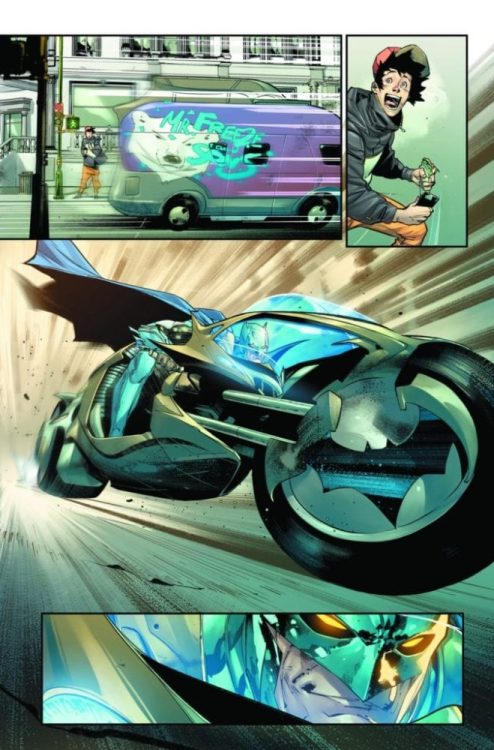
Wickman’s script is short on dialog and exposition, heavy on bloody action. The general premise centers on a grizzled monster hunter who’s periodically hired by the farm folk of his town to deal with pests. In this case, the pests are of the high fantasy variety: trolls, ogres, demons, and the like. When Barrow is summoned to help out with a “troll problem,” he quickly discovers the problem is a lot bigger (in more ways than one) than he was originally told. Mayhem ensues.

This issue is a standard 23 pages, and yet, it practically flies. There are several spots in the issue where the reader goes two or three pages without a single caption box or word bubble. Wickman’s script goes heavy on the action to tell the story and effectively tells you everything you need to know about how Barrow goes about his work and what a typical day-in-the-life is for him.

A final note about the tone: the setup and action are played straight. While the story is very amusing, it’s not silly or written for laughs. It’s horror with the occasional spot of black humor, and Wickman nails it.

Pencils/Inks

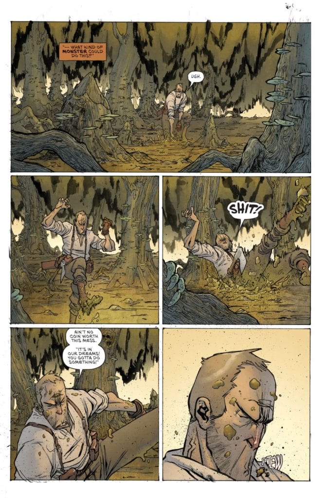
Castaniero’s art style for this issue adroitly blends Southern farmer charm with maximum amounts of gore. No limb is spared, and absolutely every type of living creature was harmed in the making of this issue.

Fantasy lovers will appreciate the sheer range of elements drawn in such a compact story. Everything from trolls, to goblins to apocalyptic cults to faceless demons are represented here in gory detail. Horror lovers will appreciate the matter-of-fact way Barrow hacks and slashes his way through the hordes that descend upon him. Through it all, Castaniero has created a near-eyeless look of grit (hence, the title) in Barrow that convinces the reader not a single horror presented in the panel phases him in the least.

Coloring

Simon Gough’s coloring here is practically a masterclass in contrast. Everything – from the woods to the local saloon to the farmlands and farmhands to Barrow himself — is richly colored in earth tones. However, there’s not a hint of drab or dullness in the setting. Then, when the action kicks in, The blood and gore stand out in stark contrast to the surroundings to make the violent outcomes all the more shocking, and therefore, effective.

Grit #1, coloring sample

Lettering

Admittedly, Micah Myers is not given a lot to do in this issue, but the scant lettering here is top-notch. Due to the high gore content, Myers is tasked with creating sounds through lettering that need to portray impacts that are…moist. And that they are. Heavy punches, sweeping slashes, and wet thuds are all amplified perfectly with Myers’ lettering.

Conclusion

GRIT #1, available from Scout Comics on July 29th, is what would have happened if Clint Eastwood were cast in one of Peter Jackson’s earlier gore films. The art is both rustic and dripping with fantasy gore. And the character introductions leave you wanting more.  I can’t wait for the next issue.

Monkeys Fighting Robots Youtube

BATMAN #96 Preview: Clownhunter Joins “Joker War”

Batman #96

After all the anticipation and buildup, “Joker War” is finally upon us. DC Comics has released a preview of the storyline’s second chapter in Batman #96, which also teases more information on the new character Clownhunter.

Here’s the lowdown and preview art:

With apologies to The Grateful Dead, The Dark Knight goes on his own “Long Strange Trip” and the mysterious Clownhunter is revealed in the pages of Batman #96, part two of “The Joker War,” by James Tynion IV, with art by Jorge Jimenez. Here’s your first look!

Reeling from the effects of the worst Joker toxin attack ever, Batman is on the run through Gotham City, pursued by the dark shadows and voices that haunt is past and present! As The Joker’s plan materializes, the only person who can save him from the brink of true madness is… Harley Quinn?

Plus, who is the mysterious figure known as Clownhunter?

BATMAN #96 (“The Joker War, Part Two)

Written by James Tynion IV

Art by Jorge Jimenez

Cover by Guillem March

Card stock variant cover by Francesco Mattina

1:25 Clownhunter card stock variant cover by Jorge Jimenez

On Sale Tuesday, August 4, 2020

$3.99 US/32 Pages

Card stock variant cover $4.99 US

Monkeys Fighting Robots Youtube

Interview: Tom Scioli on JACK KIRBY: THE EPIC LIFE OF THE KING OF COMICS

Kirby

Tom Scioli is no stranger to Jack Kirby and Kirby’s comics. In much of his work, like Godland and IDW’a Go-Bots, Scioli’s Kirby love is evident in the art. And then, of course, there is his recent Fantastic Four: Grand Design, where Scioli re-told those early Lee/Kirby FF’s through the Grand Design lens. Now the cartoonist is releasing JACK KIRBY: THE EPIC LIFE OF THE KING OF COMICS, an actual biography of the man himself. Tom took a little time to answer a few questions for us. Enjoy!


Monkeys Fighting Robots: So Tom, thanks for talking to us. How have you been holding up during this national crisis?

Tom Scioli: I’m hanging in there! How about you?

MFR: Not too bad! So last time we talked, it was about Fantastic Four: Grand Design. There you adapted a bunch of Kirby comics. But now, with your new book, Jack Kirby: The Epic Life of the King of Comics,  you are taking on the life of the man himself. Have you always wanted to do a Kirby biography? What led to it happening?

Scioli: It’s always been a dream of mine. I’ve always wanted to read a Jack Kirby comics autobiography, but other than one amazing short story (Street Code), such a thing doesn’t exist. So the next best thing is to make one. I started rolling it out on instagram and Twitter and my website ambarb.com around the time of Jack’s 100th birthday and it just went from there.

MFR: Why do you think a Kirby biography is so appealing? Especially a cartoon one like yours. 

Scioli: He’s one of the primary creators of the pop culture landscape we live in. Captain. America, Avengers, X-Men—the list goes on and on. It’s our modern mythology, and he created and co-created it in his basement. Its staggering when you look at it, one after the other. It’s his life story done in the medium he pioneered, using the tool he used, the pencil. He spent so many hours filling squares with visual story. This is the perfect marriage of form and content.

MFR: The way you draw Jack is very specific, especially compared to the other characters. What led to this wise decision? 

Scioli: The story is told in the first person. I wanted the reader to live Jack’s life, see things through his eyes. There’s a technique Scott McCloud refers to in Understanding Comics he calls the “masking” effect. Basically the simpler and more cartoony you draw a character, the more the reader will identify with them. When you put that character in a naturalistic environment, among realistic-looking characters, you have a strong identification with a detailed and sensual world to interact with and explore. There are lots of other effects that come out of that decision, but my main conscious reason for doing it was that.

MFR: Did you have a specific narrative style planned out, like a specific page layout, structure, panel size, etc?

Scioli: I mainly used the six-panel grid, which was Kirby’s preferred method during the ’50s, ’60s and ’70s. I like it for the same reasons Kirby did. It emphasizes the story and what happens within the panels rather than the panels themselves. It’s versatile and almost invisible.Kirby

MFR: What was your creative process on this like? Did it involve a lot of research?

Scioli: Yes nonstop research, checking and rechecking, figuring out what came when who was where. I was course-correcting and narrowing my focus as I worked on each page.

MFR: Did you get any feedback along the way from any Kirby scholars or people who knew him?

Scioli: I have a small group of people who I share my work with. The editor Patrick Barb and the team at TenSpeed were part of the process. The people I really would’ve liked to talk with are no longer with us.

MFR: How long do you think you worked on this from start to finish?

Scioli: I’ve lost track. All the years I spent studying Kirby’s life and work factor into this. I’ve been learning and relearning his life story since the 90s. Without that priming, this would’ve been a very different process.

MFR: Was there a specific period in Kirby’s life you were most excited to create on the page? Or a specific Kirby comic moment?

Scioli: I’m a huge fan of his 70s work so I was looking forward to that. All the Gangs of New York stuff from his childhood is so colorful and so much fun and works its way into his Kid Gang comics like The Newsboy Legion. The relationship with Stan is fun, the reversals of fortune, how Stan starts out as this annoying kid, the office boy, and then years later Kirby comes back to Marvel and Stan’s running the place. I had a surprisingly good time covering Jack’s tv animation work in the 80s. That was the stuff I grew up with and my first exposure to Kirby’s work. Stuff like Thundarr the Barbarian, the Mr. T cartoon and a Turbo Teen.

MFR: What was the hardest part of Kirby’s life to tackle? 

Scioli: I was not looking forward to covering his health decline and death. That was emotionally tough to draw and reckon with.

MFR: Do you have a personal favorite Kirby comic or image?

Scioli: My favorite Kirby comic is New Gods #7, ‘The Pact. When you asked that question, the first image that came to mind was the double spread of Metron and the Promethean Giant from New Gods #5. That’s my favorite Jack Kirby single image.

Kirby
Tom’s favorite Kirby comic!

MFR: Would you want to do any other comics-related biographies?

Scioli: Yes, but Jack Kirby is a tough act to follow.

MFR: Where can readers get a copy of Jack Kirby: The Epic Life of the King of Comics?

Scioli: Your local comics shop or bookstore is the best way to get it.

MFR: Are you working on anything new you would care to talk about?

Scioli: I’m in that in-between phase where I haven’t decided what my next project will be. I’m tinkering, playing with ideas hoping they’ll grow into something or point me in the direction of what the next thing will be.

MFR: Quick Cartoonist Kayfabe question. Are you going to be back regularly? 

Scioli: I was so busy working on this book and Fantastic Four: Grand Design that I was pretty unavailable. Once that wrapped, the pandemic hit. I was on an episode recently and I’ll probably do some more in the near future


Jack Kirby: The Epic Life of the King of Comics is out July 14th, 2020. 

Monkeys Fighting Robots Youtube

Review: BLACK PANTHER AND THE AGENTS OF WAKANDA #8 And Fin Fang Foom’s Self-Analysis

BLACK PANTHER AND THE AGENTS OF WAKANDA #8, available in stores on Wednesday, July 8th, is the conclusion to Jim Zub, Lan Medina, Craig Yeung, Marcio Menyz, and VC’s Joe Sabino’s Legion of Foom story arc. The dragon trio continue their assault on Avengers Mountain. But who is this “traitor” they speak of? Can our heroes prevent the destruction of their base?

Story

To the immense surprise of Broo, the dragon Fin Fang Foom is revealed to be hiding out in Avengers Mountain. While the rest of the Agents figure out a way to stop the three dragons’ rampage, our favorite scientist decides take a more psychological approach. That is, he probes the depths of Foom’s heart and mind.

Readers then receive a telling of Foom’s past unlike ever before. We learn about his origins on a distance planet and subsequent descent into despair. While seeking inner peace through self-analysis, the dragon inadvertently purged the rage, guilt, and selfishness from himself (which soon turned into the physical dragons assaulting the mountain). But rather than feeling empty, Foom tells Broo he’s never felt more alive.

Zub’s writing is simultaneously fast-paced, action-packed, and heartfelt. Rather than relying on the punch and smash style our Marvel heroes are known for, the character of Broo shows threats can be alleviated in more peaceful ways.

Artwork

Medina’s penciling, Yeung’s ink work, Menyz’s coloring, and Sabino’s lettering contributions were a thrill to behold. The dragons are highly detailed, showcasing glistening scales and flames full of vibrant warm colors. In addition, the lettering helps show Broo and Fin Fang Foom’s emotional exchange by using large fonts when needed.

Conclusion

BLACK PANTHER AND THE AGENTS OF WAKANDA #8’s unexpected ending made for the perfect conclusion to this arc. We’re excited to see what adventures–or misadventures–our Agents will get into next.

Were you satisfied with the conclusion of this dragon-filled arc? Let us know in the comments below!

Monkeys Fighting Robots Youtube

Review: Forrest J Ackerman Would Be Proud Of BETTIE PAGE #1

Bettie Page #1, Yoon cover

BETTIE PAGE #1, available from Dynamite Comics on July 15th, follows the iconic pinup queen as she gets her big movie break and winds up in the middle of a murder mystery. Karla Pacheco’s story and Vincenzo Federici’s art combine for a sometimes-silly, and lighthearted, romp that hearkens back to the camp and circumstance of B-movie film making.

Cover Art

Jung-Geun Yoon’s cover is a fresh, modern take on the classic cheesecake paintings of the ’30s, ’40s, and ’50s. Bettie Page looks ready for a fun day at the beach in one of her timeless swimsuits. What’s unique about this painting is Yoon’s blurring technique for the background to make a painting look simultaneously like a photograph. It gives the art a 3-D effect; that’s a nice touch.

Writing

Pacheco’s story is over-the-top ridiculous in a way that fits right in with the classic comedy-of-errors type farces that were so prevalent in the early 20th century. Bettie Page and friends are flown out to a remote island to film her big movie debut. While there, Bettie encounters catty rivals, crooked producers, and elephants(?) during the frantically disorganized week of filming. Just when things couldn’t get any worse, the male lead is murdered, and things only go downhill from there.

Pacheco’s characters are exaggerated caricatures of classic Hollywood types. The plot is super silly but loaded with charm. And throughout it all, Bettie Page is written as the slightly naive but always hopeful hero that you can’t help like.

Pencils/Inks

Vincenzo Federici does an admirable job rendering arguably one of the most photographed women on the planet. Bettie looks like a fully-realized character constantly in motion, as if in a windswept photoshoot that never ends. It sounds cheesy and ridiculous, and it is, but that’s part of the charm for both the writing and the art. Federici move Bettie from one panel to the next in snapshot poses that mimic how some of her iconic photos would have been taken if you had present to witness the snapshot.

It’s almost as if Federici is drawing Pacheco’s story in a documentary style. You can almost picture all these story shenanigans going on behind the scenes, which makes Federici’s art all the more impressive for bringing a surreal reality into comics.

Bettie Page #1, art sample

Coloring

Rebecca Nalty’s coloring gets the job done, but it doesn’t quite work for the theme and tone of the issue. The entire story is a wild and over-the-top farce, so it would have played better to see more pop and bolder use of colors. Here, even the red dresses are muted to the point of dull. Again, Nalty does a fine job, but the drab color choices miss the mark.

Lettering

Becca Carey’s lettering is top-notch for this episode. In between the characters running around like a slightly more adult version of the Scooby Gang, there’s quite a lot of dialog going on between the characters to establish their personalities. Carey keeps the pace up by spanning the word balloons across panel borders like a cascading waterfall to keep the reader’s eye moving. Nice work by Carey.

Conclusion

BETTIE PAGE #1, available from Dynamite Comics on July 15th, is a charming, silly, bawdy start to an imaginary tale in the life of the seminal pin-up queen. The writing is lighthearted fun, and the art flows with the tropical breezes. This is a great choice for Bettie Page fans of all ages.

Monkeys Fighting Robots Youtube

Review: JAMES BOND 007 VOL. 2 Is Literal Gold

James Bond 007 Vol 2, Johnson cover

JAMES BOND 007 VOL. 2, available from Dynamite Comics on July 8th, follows the titular super spy as he infiltrates ORU to uncover Goldfinger’s plan for terrorist domination. Greg Pak’s story continues through this second volume to showcase an alternate take on one of Bond’s most iconic villains, updated with a modern, evil plan.

Cover Art

Dave Johnson’s cover art is a sly statement on Bond’s conflict as he goes undercover for this volume. Bond is ostensibly one of the good guys, but he spends most of his time acting the villain part. Johnson’s use of the Ying-and-Yang symbol underscores Pak’s key story elements nicely.

Writing

Pak’s story is a prime Bond adventure with a healthy blend of action, romance, and surprises. In the story, Bond goes undercover to get acquainted with Goldfinger and ultimately join his organization. The goal? Discover and foil ORU’s master plan.

The story is straightforward, but Pak infuses plenty of twists and turns to keep the reader guessing. When the final conflict is revealed, Pak throws in a plot twist that puts Bond into a moral dilemma that you never see coming. It adds a layer of complexity that turns a typical Bond adventure into anything, but. A seasoned Bond fan might think, “Didn’t James Bond kill Goldfinger in the movie?” and you’d be right, but this new take on the Goldfinger legend felt completely fresh and new without detracting from the spirit of the original.

Pencils/Inks

Eric Gapstur and Robert Carey’s art is exceptional for a wholly unexpected reason. The character designs are standard fare for the handsome and square-jawed spy. The action scenes are authentic enough. But what really stands out is the incredible volume of scenery changes.

This volume has almost a different scene change on every other page. It must have taken Gapstur and Carey weeks to render a casino, Goldfinger’s mansion, Bond’s headquarters, a storage facility, an island visited by the 1%, a Director’s penthouse, and on and on. While that might seem like an inconsequential artistic focus, what the high turnover in scenery does is push you through the story at a break-neck pace. For a decently sized volume (about 175 pages), there’s barely a lull to be found—an excellent example of using the background, as much as the character movements, to push the pace.

James Bond 007 Vol. 2, art sample

Coloring

Rosha Kurichiyani’s coloring works well on two fronts. First, keeping pace with the tidal wave of scenery changes is no easy feat. While the backgrounds may not be super detailed, they’re colored realistically enough to keep the settings believable and grounded. Second, Pak’s story calls for a high amount of dramatic shadow on just about every panel. Kurichiyani handles the shading work with aplomb to give each scene change a little more dramatic depth.

Lettering

Ariana Maher’s lettering work is heavily dependent on the dialog in this volume. There’s the occasional ‘BRAKA” of gunfire, but this volume relies heavily on word balloons. Maher makes excellent use of space by shrinking the line spacing as tightly as possible to conserve space while still keeping the dialog readable. Maher’s space conservation allows the art and action to shine through to tell the story along with the dialog instead of competing against it.

James Bond 007 Vol. 2, lettering sample

Conclusion

JAMES BOND 007 VOL. 2, available from Dynamite Comics on July 8th, is an exciting entry in Dynamite’s run of Bond stories. The story keeps you guessing and the art flies. This is one of the better Bond stories you’ll read this year.

Monkeys Fighting Robots Youtube

Review: SONIC THE HEDGEHOG ANNUAL 2020 And The Metal Pandemic

SONIC THE HEDGEHOG ANNUAL 2020, on sale in comic book stores Wednesday, July 8th, is a packed issue filled with six mini-stories. Each intriguing story features a different prominent character reacting to their own world’s pandemic.

Stories: Writing and Artwork

Big’s Big Adventure

Writer Ian Flynn, penciller and inker Jonathan Gray, and colorist Reggie Graham bring readers an offbeat tale featuring Big, the lovable cat well-known in the series. Readers join him in his recollection of a search for his best friend Froggy after the two’s recent estrangement. We see Big navigate an increasingly chaotic landscape, seemingly unaware of the destruction around him.

Darkest Hour

Evan Stanley, writer and artist of this mini-story, features Nite the owl in a spin on classic zombie stories. We watch the charismatic radio DJ refuse to leave his post after the late hours of night (much to his janitor Don’s chagrin). The contrasts between the owl’s brightly colored office with the dark shades outside are the perfect juxtaposition.

Reflections

Caleb Goellner, Aaron Hammerstrom, and Reggie Graham put together Reflections, a short but powerful tale for Metal Sonic. The Blue Blur’s antagonist reviews footage of his battles with his counterpart, shaking with anger. But when he watches Sonic come in contact with a dubious metal substance, Metal seems to have some other thoughts.

Eggman’s Day Off

Eggman’s Day Off, created by Sarah Graley, Lamar Wells, Bracardi Curry, and Gigi Dutreix, directly follows the previous story. We watch as Dr. Starline marvels at the growing spread of the metal substance and it’s increasing control over the populace. But when Eggman reveals his greater plans, the duck may have some second thoughts about his boss.

Flock Together

Sam King, Jamal Peppers, and Priscilla Tramontano offer up an action-packed story featuring the Chaotix. Espio and Vector plan a rescue mission for their partner Charmy. Readers will feel the team’s heartfelt determination to rescue their friend from the ever encroaching substance.

The Catalyst

Dutreix and Abigail Bulmers’s The Catalyst is the last mini-story of the issue. Jewel the beetle shows she’s a capable leader by helping the President of the Sonic Fan Club. But when they find more people hurt in search of Club members, readers will brace for the situation to grow from bad to worse.

Each of these mini-stories were lettered by the talented Shawn Lee, whose fonts brought a sense of cohesion to this different stories.

Conclusion

SONIC THE HEDGEHOG ANNUAL 2020 was an intense and exciting read. We’re anxious to learn more about the substance in subsequent issues.

Which mini-story was your favorite in this book? Let us know in the comments below!

Monkeys Fighting Robots Youtube

Review: DEJAH THORIS VOL. 3 #6 Faces A Surprising Assassin

Dejah Thoris Vol. 3 #6, Parrillo cover

DEJAH THORIS VOL. 3 #6, available from Dynamite Comics on July 1st, finds Dejah Thoris and her team locked in combat against the Jeweled Assassin, who may be protecting the source of the End Winter. Dan Abnett’s story and Vasco Georgiev’s art reveals the assassin’s identity and the power behind the coming war.

Cover Art

Lucio Parrillo’s cover work is consistently outstanding. Dejah Thoris strikes a confident action pose with both blasters firing away. Her quintessentially gravity-defying outfit is painted in a Parrillo’s unique style, and the entire scene is laden with the dusty reds of Mars. Parrillo’s painting pulls all of Edgar Rice Burroughs’ iconic components together for a stunning cover.

Writing

Abnett’s story starts right in the middle of the cliffhanger fight from the last issue (you can read our review of issue #5 here). Dejah and crew confront the assassin that’s psychically haunted her dreams, and they discover his surprising origin. Meanwhile, Tars Tarkas joins forces with Thuvia for protection against unknown enemies.

Abnett demonstrates he really has a handle on pulp adventure with this issue. The opening fight scene is rowdy, and it concludes with new information that furthers the plot. It’s a fine balancing act between mindless action and thoughtful detective work. The reader will vacillate between the two, both equally well done. With this level of quality, I’d be interested to see what Abnett could do if given another detective/fighter such as Batman, Daredevil, or The Shadow.

Pencils/Inks

Georgiev’s art hits the mark in two key areas. The action sequences are dynamic and slick. You feel every strike when Llana unleashes her fury on the assassin. The kicks, the punches, and glave strikes streak through the panels with a high degree of kinetic momentum.

Dejah thoris Vol. 3 #6, art sample

Second, Georgiev put an extraordinary amount of thought and execution into the faces. In particular, when Morokh steps in for a little insectoid mind control, the victim of his psychic work unsettles you with a disturbingly zoned out stare. It’s one thing to draw faces with emotional expression, but it’s another to draw faces that look disconnected from the owner’s mind in a believable way. Great work by Georgiev on this issue.

Coloring

Dearbhla Kelly turns in another excellent performance with her nuanced use of skin tones on the coloring. Barsoomians have a distinctly reddish tinge to their skin, and Kelly gives the lead character the right tones without looking tacky. The pop of dark lips helps to emphasize the signature red skin by way of contrast to make the distinctively Barsoomian quality stand out a little more without looking like a bad sunburn.

Dejah Thoris Vol. 3 #6, coloring sample

Lettering

Consistent with the previous issue, Simon Bowland’s lettering makes great use of alternate font colors to emphasize non-human(oid) speech and provide some visual interest. The Kaldanian bug speech’s pinkish-red and the Tharks fern green speech bubbles add a little more alien distinction from one species to the next. As a point of improvement, sometimes the green font with the green fill for Tars’ word bubbles was a little too hard to read. It would have worked a little better if two greens were selected with a higher contrast to make it easier on the eyes.

Conclusion

DEJAH THORIS VOL. 3 #6, available from Dynamite Comics on July 1st, is a great mix of action, adventure, and detective work. The writing is a high-quality pulp adventure, and the art team is firing on all cylinders. The cliffhanger ending will leave you wanting more.

[UPDATE: The article was updated to correctly reflect that Dejah Thoris was created by Edgar Rice Burroughs and not Robert E. Howard]

Monkeys Fighting Robots Youtube

Review: The Truce Begins To Unravel In SACRED SIX #1

Sacred Six #1, Lee cover

SACRED SIX #1, available from Dynamite Comics on July 8th, begins a new story where creatures of the night attempt peaceful living in the town of Ashthorne in an uneasy alliance with humans. Christopher Priest’s story sets up multiple threads from Dynamite’s canon of Vampirella characters to weave a narrative that’s completely new, and yet, all too familiar.

Cover Art

There’s no better way to kick off a Dynamite series than with a cover by Jae Lee. On the painting, Nyx, Pantha, Chastity, and Draculina are overlooking their collective target, ready to pounce. Without even a hint of action, Lee’s composition and whimsical style communicates characters that are powerful and confident.

Writing

Priest’s story establishes the town of Ashthorne, and the dynamics of its supernatural residents, pretty quickly. First, through the eyes of its children. Then, through the misfortune of one its local zombies. Finally, through the conflicts of its town leaders.

Priest’s concept is pretty simple (“a town of monsters that just wants to be left alone”), but he deserves kudos for establishing so many interpersonal relationships in a small amount of pages. That said, there are a few too many threads started all at once with jarring cuts in the narrative flow. It was difficult to absorb it all without having to re-read the issue more than once. The inaugural issue could have benefited from either more pages or focus on fewer sub-plots to start off.

Pencils/Inks

Lee is a go-to artist for Dynamite covers, so it was a major treat to see him also drew the prologue as well. (Note for Dynamite: convince Lee to do a whole series or at least a one-shot). Lee’s prologue is a young adult’s slightly re-imagined recount of ancient Egyptian intrigue, and it’s gorgeous. The Egyptian characters are drawn with aristocratic superiority, and Lee’s signature whimsy suits perfectly for a vampire-centric story.

Moving on to his first mainstream work, Gabriel Ibarra draws everything post-prologue to set up the goings-on in and around the town of Ashthorne. Lee and Ibarra’s styles couldn’t be more different, but where Lee captures the majesty and magic of ancient Egypt, Ibarra breathes life into the dust and shadows of a Gothic town filled with gloom. Ibarra’s characters are immersed in constant shadow, even during the day. Although the creatures of Ashthorne live in peace with humans, Ibarra’s use of hidden eyes and faces that just barely emerge from the shadows when speaking gives the distinct impression that everyone in Ashthorne is dangerous.

Coloring

June Chang and Mohan’s coloring stands out for visual interest when almost nothing is bright or clear. In the sunny heat of an Egyptian battlefield, the scenes are covered by the yellow haze of smoke and sand. During the children’s walk home, two perspectives are colored (for two different sets of children) with the foreboding gloom of a setting sun. And the Ashthorne town meeting is barely lit by candlelight to keep the otherwordly residents “comfortable.” It’s almost a portfolio on the myriad of expert ways to do haze and indirect lighting for dramatic effect.

Lettering

Willie Schubert’s lettering is the glue that holds this issue together. Lee and Ibarra’s work are both gorgeous, but the shift from one to the other is a bit harsh. Schubert softens the shift with lettering that maintains a consistent level of readability and tone for the reader during the transition. This is a great example of lettering that helps to balance the art.

Conclusion

SACRED SIX #1, available from Dynamite Comics on July 8th, kicks off a complex new story in the Vampirella universe. The characters are fully-realized, and the art, from two separate artists, is dramatic and perfectly suited for the horror genre. This book is worth a look.

Monkeys Fighting Robots Youtube

Review: Revealed Identities Bring Crisis In STEALTH #3

Stealth #3, Howard cover

STEALTH #3, available from Image Comics on July 8th, follows Tony’s father as he seeks to reclaim his suit and gather intel on Dead Hand before Detroit is ripped apart. Mike Costa places the heroes and villains on a collision course while Tony struggles with his new secret.

Cover Art

Jason Howard’s composition on the cover is a great match for this issue’s content. Dead Hand takes the city hostage in Joker-like fashion, and he calls on the citizens of Detroit to turn over Stealth. Effectively, he turns Detroit against their hometown hero and puts Stealth right in the palm of his hand. There’s a quality about this cover’s composition that’s reminiscent of classic Neal Adams’ Batman covers.

Writing [No Spoilers]

Mike Costa’s story focuses on the fallout from Tony’s discovery of Stealth’s real identity. Deadly Hand turns Detroit into a fear-zone by ordering and carrying out random executions, and Stealth visits old haunts to gather any weapon he can use to put an end to the violence.

Howard’s cover works so well because this reads very much like a Batman/Joker story from cover to cover. Costa sets up a villain that’s practically a kissing cousin to the Joker, distorted face included. Stealth is a man against the world, using gadgets and guile to stop Dead Hand. And Detroit (much like Gotham) is ready to boil over from the violence and fear. Despite the lack of action in this issue, the tension is turned up to 11 for the next issue.

Pencils/Inks

Nate Bellegarde’s art is grounded and emotional. Building on Costa’s writing, most of the issue is a plot development that starts the climb towards the arc’s climax. That development takes place in small vignette scenes where the characters are exchanging information and laying plans, usually through serious conversation. To prevent those scenes from becoming flat, Bellegarde pays a lot of attention to facial expressions that communicate just as much through the eyes as their word balloons.

Bellegarde’s attention to facial expressions is made all the more exceptional by the distinctive and realistic design of all the characters, including the lesser side characters. From the doctor you meet in the opening scene to the gang members that receive an unlikely proposition, everyone looks like real people you’d see walking down a city street. Noses, eyes, and hair are distinctive and natural, and you can tell Bellegarde took the time to not just put copy/paste side characters in the panels just to get it done.

Coloring

Tamra Bonvillain’s coloring is excellent in this issue for her execution of shading. There’s an entire range of scenes that take place just past sunset, and the sky is cast in deep violet. The characters have an outdoor meeting, and the character shading pops without looking too bright, and it makes the darkening sky stand out more than its already rich color. It’s a gorgeous bit of work from Bonvillain.

Lettering

Sal Cipriano’s lettering is clean, easy to read, and efficient. Cipriano made a clever choice with the caption boxes when Stealth is suited up that staggers with a beveled square tooth on one edge to mimic the style of Stealth’s wing design. It adds to the flair of the overall issue’s style and makes the text more enjoyable to read.

Conclusion

STEALTH #3, available from Image Comics on July 8th, is a strong mid-point in the story arc that looks and feels like a classic Batman/Joker story. The writing is grounded and hits all the right emotional notes, and the art matches the emotional punches beat-for-beat. This is a solid recommendation.

Monkeys Fighting Robots Youtube