Home Blog Page 266

REVIEW: SUICIDE SQUAD #8 Gets Stuck in Its Own Head

Suicide Squad Tom Taylor DC

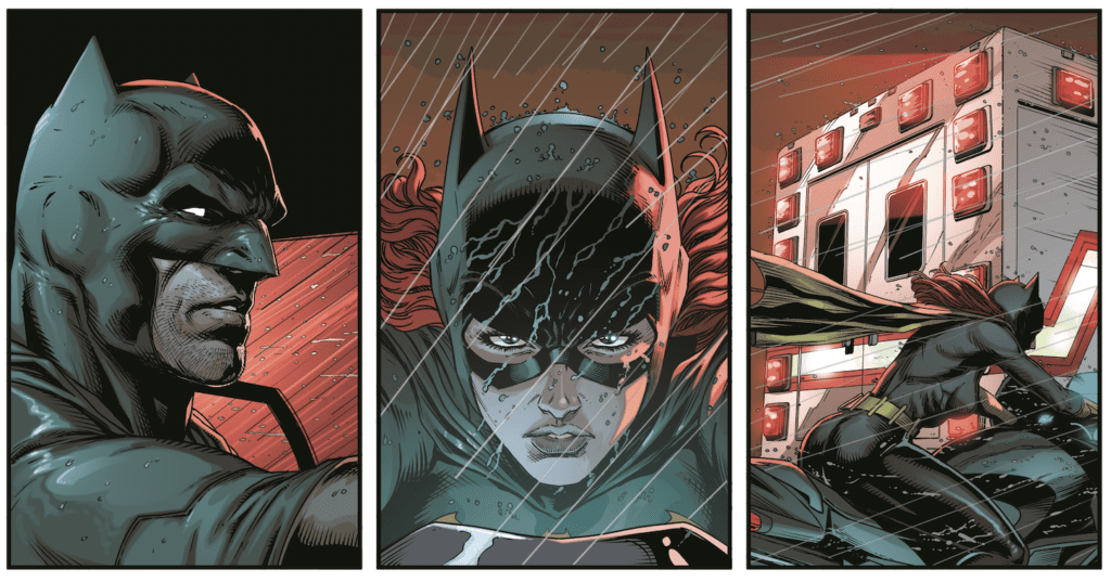
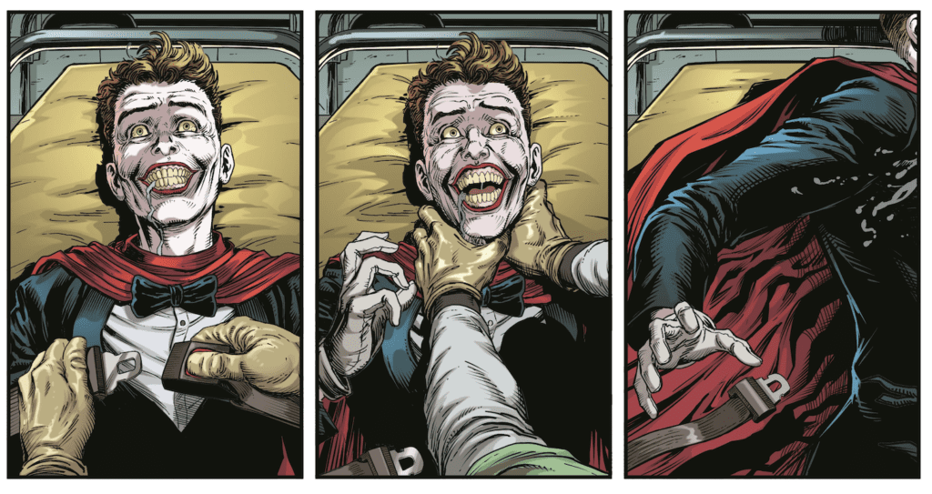
Written by Tom Taylor, with art by Daniel Sampere, colors by Adriano Lucas, and letters by Wes Abbott, Suicide Squad #8 gets stuck in its own head. In a series that is so strong, issue 8 stands out like a sore thumb. Despite some genuinely great moments, this issue is mired by an uncharacteristically awkward script.

Writing

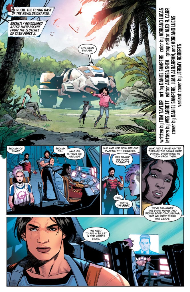
It’s always tough when you read something and can’t stop thinking about how one person wrote it. Taylor is typically very good at avoiding this pitfall. His characters have unique voices, and his plots have a joyful randomness. But Suicide Squad #8 feels like one person talking through many different mouths. In the beginning, Wink asks where Zoe is. When Floyd tells Wink that Zoe’s out playing with Dogshot, Wink says: “Zoe named the puppy Dogshot?” “Yes,” Floyd replies. “That’s the best.” Wink says. Honestly, who doesn’t love a puppy called Dogshot joining the group? It’s incredible. But Taylor, essentially complimenting his own writing, cheapens the novelty of it a little.

Suicide Squad Tom Taylor DC

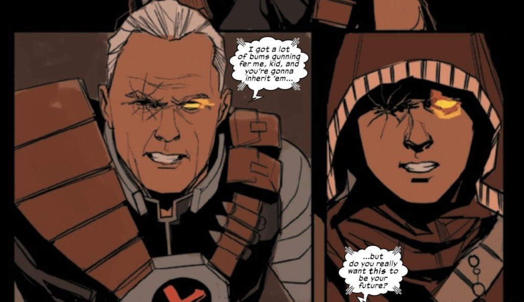
When we follow the story of Wink and the Aerie, we arrive at some similar problems. Their conversation back and forth is awkward, but more because we’re just a slight bit behind Taylor’s thought process with each line. Perhaps it’s that Wink thinks ten steps ahead of everyone else, but Wink’s lines feel slightly out of joint. Similarly, when a character says to Kord, “Someone will stop you,” his response is, “Someone, hey? You couldn’t come up with a more specific threat?” It feels like a joke we’re not in on, a beat that didn’t quite land. Saying “someone will stop you” feels normal, and Kord’s response feels awkward and strange.

That said, the story of Wink and the Aerie getting to know each other is undoubtedly a highlight of the series so far. Despite some awkward lines, we get a real sense of their love for one another. Taylor doesn’t allow for the darker sides to their origins to detract from the fun or the humanity.

Art

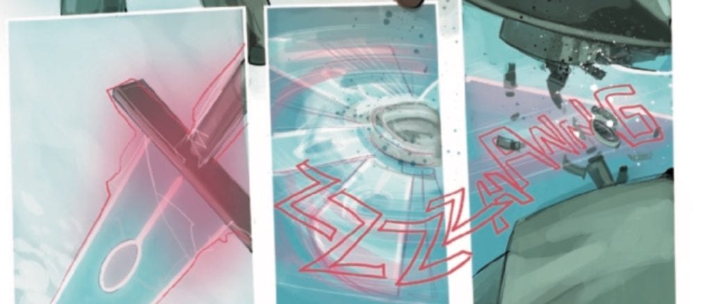
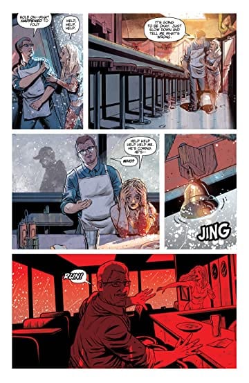
Sampere’s art is wonderfully playful in this issue. It’s a joy to see him mess around with what he wants to show, and what he wants to keep hidden. Mostly because Sampere always seems to make the right decision. When the Aerie is locked away in a cell, they cover themselves with their wings. It’s a little odd to be hiding in an empty cell, yet the fact that the Aerie feels so vulnerable that they’ll even hide when they’re alone in a locked room speaks volumes. Later, when we get a brief cameo appearance from Croc and KGBeast, members of an earlier version of the Suicide Squad, Sampere brilliantly swerves away from giving us a real sense of their size.

The first time we see them enter the room, they’re in the background, and their relative size remains unclear. From then on, we mostly see them in parts — Croc from the waist up, looking huge and daunting. We see close-ups of KGBeast’s gun arm or Croc’s gargantuan foot coming into panel briefly to wreak havoc. Not knowing how large these characters are creates an added layer of fear. Sampere knows he can’t make them loom as large on the page as they will in our minds, so he lets us fill in the blanks.

Coloring

Lucas keeps much of this issue feeling light and fun, despite what may be happening. He colors moments of danger in bright yellows, and the respites between in cool blues. It gives the issue a rhythm, and the fight scenes a sense of spectacle. As the Aerie and Wink have a showdown with an old version of the Suicide Squad, the scene is cast in a pink hue. The whole scene is both terrifying and beautiful at the same time—kind of like the Suicide Squad themselves.

It’s interesting to see Lucas use the same colors for starkly different things. A dark cell, colored in light blues, goes from being depressing, to comforting and safe. The orange and yellows of danger in battle is then used to show the peace of a sunset or the explosiveness of a kiss. Each time Lucas shifts from one use of a color to another, we get a sense of the scene being reclaimed. The Aerie and Wink refuse to let the Aerie’s cell be a place of depression; it becomes their own little refuge. It gives us a sense of the layers to their relationship. Their relationship was built on a foundation of pain that they have reclaimed and turned into something beautiful.

Suicide Squad Tom Taylor DC

Lettering

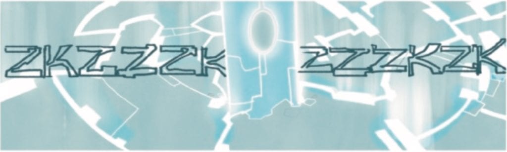
The lettering keeps its flair in this issue. It’s interesting to see Abbott lettering moments of violence against our protagonists now. Thus far, most of the gunshots and explosions have happened in times of giddy chaos. But now, as we see the Aerie and Wink at the butt end of each sound effect, these moments feel different. That doesn’t stop Abbott though. Gunshots, explosions, tasers and breaking bones are all given the fun theatrics we’re used to. We just become more divided about how fun the moment really feels to us.

One brief sound effect does seem a little odd, though. When the Aerie and Wink are in the air, we see the sound effect of something approaching. The sound effect appears in the corner of the panel and disappears behind Wink’s arm. There’s just not quite enough space given to this particular sound effect for it to be noticeable, and not look like a misprint. Altogether, Abbott is an incredibly experimental letterer who is always trying new things, so it’s easy to take the moments that don’t work when there are just so many that do.


Suicide Squad #8 might be too self-effacing; it might be too self-aggrandizing. Whatever it is, it’s certainly too trapped in its own head. The creative team gets mired in commenting on what’s happening, detracting from what is otherwise a truly great story. If this were any other series, the problems with this issue would be completely unnoticeable. But this is Suicide Squad, and this series has gotten us used to a truly remarkable level of entertainment. Suicide Squad is a blast, and you can bet this creative team will find their footing in the next issue. They always do. Pick up Suicide Squad #8 at a comic book shop near you!

Monkeys Fighting Robots Youtube

Review: Everything Has A Price In JUSTICE LEAGUE DARK #25

JUSTICE LEAGUE DARK #25 hits comic book stores Tuesday, August 25th, diving further into the mysterious Other Place. Zatanna and Wonder Woman are looking for the former’s father, whose spirit lies within the realm’s grasp. In a brilliant feat of storytelling, Ram V brings readers along on a journey that teaches everyone a hard lesson about the true costs of life.

Story

Readers initially find themselves in a self-narrated memory from Zatanna’s childhood. The young girl finds a deceased rabbit and is brought to tears at the sight. Her innocence is clear as day, making us feel for the girl who’s yet to experience the horrors of reality.

Out of desperation, Zatanna uses magic to revive the animal. But, sensing a threat, her father Zatara rushes to her side and casts a spell that transfers the cost of her magic to his own body.

With this sacrificial act, the older magician teaches his daughter a valuable lesson: there’s always a price that must be paid.

After navigating the Other Place, Zatanna and Wonder Woman find themselves face-to-face with Zatara, the magician’s now deceased father. The two have a heartbreaking exchange reminiscent of the memory from earlier. This narrative choice allows readers to bridge the gap between Zatanna’s childhood and adulthood.

Unfortunately, Zatara is tethered to the nefarious Upside-Down Man. And so, on the outskirts of reality, our heroes must wage war against the powers of death itself.

Artwork

Amancay Nahuelpan’s penciling and ink work, June Chung’s coloring, and Rob Leigh’s lettering framed this issue beautifully. The gloomy illustrations of the hellscape in the Other Place are staggering, combining harsh yellows, reds, and oranges for Zatara’s burning soul, dark shades of the jagged rocks surrounding them, and the off-putting white tint of the Upside-Down Man. What’s more, the lettering balloons are modified to show the eery speech of the villain, adding to our feelings of dread as our heroes navigate the bowels of the underworld.

Conclusion

JUSTICE LEAGUE DARK #25 scared us, surprised us, and flat out enticed us with its heart-wrenching storyline.

What part in all of this does Zatanna and her father have to play? Let us know what you think in the comments below!

Monkeys Fighting Robots Youtube

Review: BATMAN: THREE JOKERS #1 Rallies In The Ninth

Review - BATMAN: THREE JOKERS #1 Rallied In The Ninth

BATMAN: THREE JOKERS #1 from DC Comics hits your local comic book this week, with the pressure to save the comic book industry and tell an un-tellable story. The book is by writer Geoff Johns and artist Jason Fabok, with Brad Anderson’s colors, and Rob Leigh’s letters.


How DC Comics describes the book:
Thirty years after Batman: The Killing Joke changed comics forever, Batman: Three Jokers reexamines the myth of who, or what, The Joker is and what is at the heart of his eternal battle with Batman. New York Times bestselling writer Geoff Johns and Jason Fabok, the writer/artist team that waged the “Darkseid War” in the pages of Justice League, reunite to tell the ultimate story of Batman and The Joker!

After years of anticipation starting in DC Universe: Rebirth #1, the epic miniseries you’ve been waiting for is here: find out why there are three Jokers, and what that means for the Dark Knight and the Clown Prince of Crime. It’s a mystery unlike any Batman has ever faced!


Review - BATMAN: THREE JOKERS #1 Rallied In The Ninth

For me to explain my thoughts on this comic book, I’m going to use baseball as a metaphor. BATMAN: THREE JOKERS #1 is like the first five innings of Game One of the World Series. Your team is on the road, down by four runs, and the ace of the staff has just been pulled. In the biggest moment, your number one pitcher didn’t have his best stuff, and a few errors in the field were costly. On the bright side, the game isn’t over; you’re only down four, and it’s only the first game.

BATMAN: THREE JOKERS #1 is a very good looking book that introduces a story and has a better than average cliffhanger, but for some reason, the first issue of this three-part miniseries doesn’t resonate emotionally. Johns doesn’t take the time to connect the reader with the story. Batman, Barbara Gordon, and Jason Todd are distant and emotionally walled off. You don’t know who to root for as the reader. Furthermore, the comic doesn’t do anything revolutionary; it is what it is. But when DC Comics hypes it as the next KILLING JOKE, readers are expecting something more than just another Batman story for $6.99 an issue.

Review - BATMAN: THREE JOKERS #1 Rallied In The Ninth

Fabok’s art is gorgeous, but there isn’t a panel we haven’t seen before. There is nothing iconic about the issue because it just seems to be borrowing from other iconic moments in the Batman mythos. BATMAN: THREE JOKERS #1 is a DC Black Label book, and I would have asked Anderson and Leigh to swing for the fences when it came to the colors and letters. But the colors are bland, and everyone in the story speaks with the same cadence. There are THREE JOKERS — this book should be pure chaos, but it isn’t. There are ways the colors and lettering could have visually enhanced the story, but they left the talent on the table.

To continue the baseball metaphor, BATMAN: THREE JOKERS #1 does rally in the last five pages of the book. Johns’ writing is filthy good and sets up a moral question that will have die-hard Batman fans battling it out in the Facebook groups.

Review - BATMAN: THREE JOKERS #1 Rallied In The Ninth

I didn’t go into too much detail because I want you to enjoy the book without spoilers, but my hope for the rest of the series is for Johns and Fabok to move away from THE KILLING JOKE style and tell their own story. Swing for the fences and shock the world.


Did you read BATMAN: THREE JOKERS #1? What did you think? Comment below with your thoughts.

Monkeys Fighting Robots Youtube

Review: DEVIL’S HIGHWAY Is A Murder Mystery With A Visual Punch

Devil's Highway #1
Devil's Highway #1 Credit: AWA Studios

There is a killer on the road in AWA Studio’s latest crime thriller Devil’s Highway; a violent hunter who is about to become the hunted. When he is forced by circumstance to kill the owner of a small town diner he unleashes a determined, vengeful daughter onto his trail.

In this bittersweet homecoming story writer Benjamin Percy and artist Brent Schoonover mix police procedural with a Death Wish movie to create a murder mystery with a sharp bite.

Devil's Highway #1 Art
Devil’s Highway #1 Credit: AWA Studios

Creating Mood

There is a distinctive feel to Devil’s Highway that is created in large part by the setting. The decision to unfurl events during the Christmas Season allows Percy and Schoonover to juxtapose ideas and emotions beautifully. The coldness of winter, with the constant snowfall, mirrors the bleak story line and the heartbreak that a number of the characters encounter. This is contrasted with the trimmings of the season, the baubles and bells, enhancing the sense of loss. From the opening diner scene onward, the violence of the story contradicts the inferred emotional highs of the season.

As the story progresses the cold winter scenes allow the creators to produce a brooding atmosphere. Tension is built around the bleakness and the murky white of the landscape. There is diminished lighting for most of the scenes with the colorist, Nick Filardi, picking out details from Schoonover’s inks using gradients of grey. The truck stop scenes especially have a run down, off the beaten track feel to them.

The atmosphere is accentuated by the noir-esq voice-over, spoken by the central character, Sharon. Her meticulous investigation of her own father’s murder gives the comic that classic P.I. vibe. Sharon has all the hallmarks of a Raymond Chandler protagonist and she is instantly likeable. There are layers, buried beneath the hard exterior, that are sure to be excavated over the course of the series, but in the first two issues her personality has enough sides to keep readers interested.

Devil's Highway #1
Devil’s Highway #1 Credit: AWA Studios

Visualising Character

The focus of Devil’s Highway is on the search for a mysterious serial killer, who leaves a specialist mart on his victims, and as such touches a number of the cliches from the crime genre. The inept police department; the vengeful family member, the sinful victims; they all have a part to play in the narrative. This does make an element of the plot seem unoriginal and the comic occasionally struggles to make itself significantly different or new.

However, the majesty of the artwork helps to pave over the occasional crack in the narrative. Schoonover draws some visually impressive characters and brings their personalities, or lack thereof, to the page. Each panel allows the reader an insight into the cast member or get a step closer to the locations. He captures the knowing and subtle looks that the characters give each other, adding depth to the story. The casts interactions scream of fear, desperation, or any number of other emotions. There is a scene in issue one where Sharon confronts the police officers and through minimal, but specific, gestures, Schoonover is able to bring out the animosity and fear that the characters have for each other. Sharon makes her presence known in the police station and on the page.

Devil’s Highway #1 Credit: AWA Studios

Marks on Bodies

One of the most fascinating aspects of the comic is the running motif of marked bodies. The most obvious is the mark left by the serial killer on each of his victims. This represents the mystery inherent in the comic and the dominance that the killer has over the local town. Marks on bodies extend as a motif beyond this however, to take in various tattoos and even injuries. Sharon has a prominent tattoo on her chest, one that is shown too often not to be specific in some way. Part of the growing mystery inherent in the comic, perhaps?

Sal Cipriano’s letters fit the theme of the comic. The majority of the speech is straightforward with balloons placed in an orderly manner, befitting of the straight talking, down to Earth characters. Where his work really shines in this series is in the background lettering or the design work for the computers. The style of font that he uses to pick out the different levels of technology gives the scenes a realistic feel while reinforcing the mundane lives of the townspeople. Very little depicted in Devil’s Highway is high tech, and this comes across in design work.

The visuals are highly detailed in every respect, from the pencils and backgrounds to the color choices and the lettering design. All of the Art works together to provide a full picture of Drift County where this is set. The reader gets a feel for the people and the place from the images in the panels. This sense of location is then used to intensify the action within the narrative, drawing the reader deeper into Sharon’s life.

Devil's Highway #2
Devil’s Highway #2 Credit: AWA Studios

Conclusion

The opening gambit in Devil’s Highway is gripping, if not too original. From the beginning the creators pull you into the narrative and make you care for the central character. When the plot begins to dip, the visuals lead you through by creating a tense atmosphere that it is difficult to escape. Ultimately, the mystery is intriguing and the central character is empathetic enough to keep you hooked. There is a warming humanity underneath Sharon’s hard exterior which is illustrated through a number of her actions. This is a refreshing aspect to the comic because too often ‘tough’ characters don’t have any real redeeming features.

Devil’s Highway has a solid concept and a visually engaging world. If you are a fan of crime thrillers and enjoyed titles such as Killer Groove from AfterShock Comics or Criminal from Image then this is worth investing in. It has a bit more heart than AWAs Archangel 8 but just as much gripping action.

Issues 1 and 2 of Devil’s Highway are available now with the third issue in the series due for release on 16th September.

Monkeys Fighting Robots Youtube

Review: THE LEGEND OF KORRA: TURF WARS Library Edition – A Delightful Return to a Beloved World

There is no doubt that the world of Avatar: The Last Airbender is one of the most acclaimed and brilliant pieces of fiction crafted in the last 20 years. Both it and its follow up  The Legend of Korra are both rife with incredible character writing, resonant themes, heavy emotional stakes, and stacks upon stacks of lore. As such, continuing the story and legacy of one of the most beloved fictions in recent years via comics is a daunting task. However, it also makes perfect sense. What other medium would allow the freedom of storytelling and visual artistry that the comics medium does? The proof is in the end results, as  The Legend of Korra: Turf Wars, written by original series co-creator Michael Dante DiMartino and drawn by Irene Koh, is a wonderfully executed direct sequel to  Korra’s fourth and final book (season, for you newcomers). With plenty of well-orchestrated returns from fan-favorite characters, an intense plot full of mystery and tension, an emotionally satisfying love story, and breathtaking visuals, this complete Library Edition is the best way to experience the return to the world of the four bending nations and the one woman who can unite them all.

“After a refreshing sojourn in the Spirit World, Korra and Asami return to Republic City but find nothing but political hijinks and human vs. spirit conflict! Pompous developer Wonyong Keum plans to turn the new spirit portal into an amusement park, potentially severing an already tumultuous connection with the spirits. At the city’s edge, Zhu Li enlists everyone she can to aid the thousands of hungry and homeless evacuees who have relocated there. Meanwhile, the Triple Threats ruthless new leader, Tokuga, is determined to unite the other triads under his rule, no matter the cost.”

Writing & Plot

It would be difficult to imagine any Avatar story without the touch of the show’s original creative team (we saw the Shamalan film, right?), so it’s fortunate that Dark Horse reached out to Legend of Korra and The Last Airbender co-creator Micheal Dante DiMartino to craft a follow up to Korra’s animated adventures. With input from the show’s other lead creator Bryan Konietzko, DiMartino has written a highly entertaining and engaging sequel to the events of The Legend of Korra here in Turf Wars. This series starts right where Korra book 4 ended, with the newly coupled Korra and Asami taking a vacation in the spirit world following Team Avatar’s victory over Kuvira and the Earth Empire. One of the major criticisms of Korra’s finale was that the romantic pairing of Korra and Asami was a bit out of left field. Outside of (maybe) minor hints scattered throughout the later seasons, there wasn’t much build-up to them being romantically involved. DiMartino does a good job of advancing their relationship through a more believable lens, as the new couple goes through the opening growing pains of any new relationship topped with the intense situations of the world they live in. Korra and Asami’s relationship is legitimately the element I enjoyed most out of this comic, which is a credit to how much work DiMartino puts into fleshing out this new romance. The socio-political touches in Turf Wars are allowed to come away more cleanly than they did in the original series as well, since the comics medium has less of a censor stranglehold on it than major animation does. This being said, everything outside of the same-sex relationship material is handled in a simple and round-about manner, so don’t expect a gripping thesis on class issues and public vs. private property here.

The characterization of the show’s main cast is still absolutely on par with how they appeared in the animated series. Korra is still brash and hot-headed, Asami is still the smartest person in the room, Bolin is lovable, Mako is edgy and boring, and Zhu Li still does the things but now she’s in charge. Much like with the original series, I wish we got more time with Tenzin and his family, but overall the time we received with the cast was satisfying and felt like a natural continuation of the events in the show. Turf Wars really does feel like a small arc in a season of Legend of Korra, and most readers will feel right at home opening these pages. If there was one complaint I had to lodge against this arc, it would be that the main villain didn’t get quite enough time on the page. Tokuga’s kickass introduction is not only highly entertaining but also wildly intriguing for long time Avatar fans (no spoilers). Unfortunately, after this, he just becomes a cut and paste bad guy. Even with an early story life-altering event for him, he never goes past just being a power-hungry criminal. In all other regards, Dimartino and Konietzko have crafted a tautly paced sequel-series that has enough character focus, spiritual and political obstacles, and rad bending action to please the majority of Legend of Korra fans.

Art Direction

The now-iconic visual style of The Last Airbender and The Legend of Korra, with its anime and eastern-influenced animation and color, requires a team of significant talent to replicate onto the pages of a comic. Fortunately for Turf Wars, Irene Koh’s pencils and Vivian Ng’s colors bring the striking visuals of this universe to life in a splendid manner. Ko’s pencils replicate the characters and environments of Legend of Korra with an instantly recognizable authenticity, all the while maintaining her own visual style. Koh does the show’s creative team great service by adhering to the aesthetics of Korra’s world, with everything from the streets of Republic City to the garb of members of the bending nations being drawn with spot-on detail. The designs of some of the spirits that make appearances are stunning as well, fitting in with the Avatar world but bringing something new to the table at the same time (some reminded me of a Miyazaki creation). The fight scenes bring the proper amounts of visceral intensity, with the bending martial arts and destruction looking like something right out of the show. Her talent shows through in the small moments as well. Much of what makes Korra and Asami’s relationship so engaging to read is how the couple is presented on the page. Hints of trepidation are interlaced with the apparent care and love the two have for each other, and this creative touch makes the pair feel all the more believable. The colors, shadows, and lighting effects provided by Vivian Ng bring this series to life in the Avatar ever bit as much as the pencils do. The hazy light of the spirit world, gas-lantern lit streets, and the array of elemental shades match the gorgeous views in both animated series. The lettering from Nate Piekos is simple yet dynamic, altering fonts based on characters and of course changing drastically for exclamations and screams/cries. The visual work on Turf Wars is not only a love letter to the creative team of the original animation but a triumph that stands on its own.

The Legend of Korra: Turf Wars is fast-paced, exciting romp through Republic City and a fun return to this universe. Dimartino’s script feels like a natural progression of the events of the final season, while he delicately fleshes out the new romance between Korra and Asami. The political fallout from the show’s final season is handled in a simple but effective in-universe manner. I would have liked to have spent more time with some of the other members of Team Avatar and the main villain, but this is still an engrossing read. The visual work of Irene Koh and Vivian Ng is a gorgeous effort that perfectly encapsulates the look and feel of the Avatar animated universe, while still having the unique style of both artists. For those unfamiliar with Dark Horse’s library edition format, it is without a doubt one of the finest oversized collected edition formats in comics. An over 9×12 book with stop-a-bullet thick paper stock, and tons of extras including scripts and looks at the artistic process. Will this story convert any non-Korra fans? Not likely, as this is very much a story crafted to maintain and continue the legacy of these characters rather than improve on some of the show’s flaws. However, if you’re a huge fan of this world and the characters in The Legend of Korra, then this first Library Edition will be a must-own. Be sure to order it from your local comic shop or online now!


Monkeys Fighting Robots Youtube

Review: DOSE! #1 Is A Disturbing Turn On The Superhero Genre

dose! #1 comic book review

DOSE! is a new indie comic by writer Sean Ellis and artist John Gebbia that shows a dark underbelly to the world of superheroes.

The series centers on Screw Worm, an ex-teenage sidekick with a drug problem. In the world he lives in, the extraordinary is just ordinary. Kaiju walk the streets, and everybody seems to have a superpower. In DOSE! #1, we follow Worm as he stumbles his way through his daily life, trying to find his next fix.

This comic is a labor of love for Ellis and Gebbia — a self-funded endeavor that you can actually read online for free, and which the creators hope to be able to keep free and online forever.

The first thing you notice reading DOSE! is the crowded scenery. Gebbia packs each setting with an insane amount of detail. Screw Worm’s humble abode is filled to the brim with junk. The streets are overflowing with people. It’s a claustrophobic reading experience where you genuinely feel like you don’t have enough room to breathe.

And that uncomfortable motif is carried out throughout the issue. There’s a scene in the latter half of the book in which Worm visits a club where the headlining “act” secretes some sort of liquid through her skin that can get people high. The woman then voluntarily crowd surfs around the room and is licked by her adoring “fans.” It’s disturbing. Very disturbing. But again, this comic doesn’t seem to want you to get comfortable.

DOSE! is a sensory overload that makes your skin crawl, so Ellis and Gebbia are actually putting you — the reader — in the same mindset as their protagonist. As Screw Worm struggles his way through his day trying to get a fix, you too will feel a constant sense of unrest and stress.

The solicit text pitches DOSE! as more of a neo-noir, stating that Screw Worm “unwittingly stumbles onto a conspiracy that threatens to hasten the destruction of a world already teetering on the edge of collapse.” You don’t get much of the conspiracy element in this first issue, but what you do get is an established sense of the world on the edge of collapse. It’ll be interesting to see how this story evolves in future issues as Ellis and Gebbia dig deeper into this strange and disturbing world.


DOSE! is available to read right now on dosecomic.com, or it will be available through your local comic shop on October 21.

Monkeys Fighting Robots Youtube

DOCTOR TOMORROW #5: The End Of The Hero’s Journey Cycle

Doctor Tomorrow #5 Cover

Doctor Tomorrow #5 is this week’s finale to Valiant Entertainment’s short but sweet series by writer Alejandro Arbona, artist Jim Towe, colorist Kelly Fitzpatrick, and letterer Clayton Cowles.

Recap

Doctor Tomorrow follows Bart Simms, a teenager who encounters his alternate superhero self who recruits him to fight a supervillain. After some breakneck battles and revelations, Doctor Tomorrow comes full circle in Bart’s journey.

Doctor Tomorrow #5: The End of The Circle

Doctor Tomorrow #5 completes the series by reflecting situations from previous issues. From confronting the antagonist to making amends with past friends, Arbona uses subtlety for new audiences. This series’ main flaw comes from an MFR interview with Arbona, how some slightly important details rush for the story’s sake. Continuing on the Hero’s Journey formula, this return phase is an accomplishment for the entire series. Especially since Bart makes important interactions that resolve some internal and external conflicts he has. Although on its own, this issue feels like it’s completing a checklist.

Art

Towe’s artwork benefits from subtleties, similar to the story. The facial differences between the adult Bart and Doctor Tomorrow display their characters. Doctor Tomorrow has scars he couldn’t prevent while Bart, despite being the same age, has a cleaner maturity. Which is more than the fight between them can attest to. The fight is bland with the superpower blows barely appearing to make an impact, even with Doctor Tomorrow’s defeat. Their last conversation with the small changes in facial features holds more weight between them. In fact the baseball sessions between Bart and his friend Gretchen are a better display of Bart’s powers. It’s also what gives Doctor Tomorrow #5 more power to it as a sign of growth in comparison to the first issue.

Fitzpatrick’s coloring at least gives the powers on display their desired effect of impact. A glowing fist from Doctor Tomorrow can serve as a warning for Bart about a powerful blow. Even interactions between them with the sun shining in the background give weight to their conversations. It’s practically highlighting crucial moments in their interactions.

Cowles continues to provide generally good coordination with both word balloons and wordmarks. Even when word balloons don’t leave their panels, they follow a pattern concurrent with neighboring panels. It keeps the actions in a distinct rhythm that doesn’t overlap. The wordmarks follow this like when a fall occurs in one panel, and the neighboring one with a wordmark drives home the impact.

Finish With Doctor Tomorrow #5

Doctor Tomorrow #5 is the weakest issue in an overall decent story. Although reading the prior four issues is required to fully appreciate this one, it’s only because that’s what allows readers to see Bart’s growth into a hero. One that opens up potential new developments in the Valiant Universe. So it’s best to catch this character where he begins before all that happens.

Monkeys Fighting Robots Youtube

Review: WOLVERINE #4 – Don’t Let Down Your Guard!

On August 19, Marvel Comics released Wolverine #4. Writer Benjamin Percy, artist Viktor Bogdanovic, colorist Matthew Wilson, and letterer VC’s Cory Petit take Wolverine to the cold north for a cold drink, but he finds more than he bargained for when Percy throughs the kitchen sink at him.

Writing

If you read X-Force #11, you may have noticed two things: 1) the absence of Wolverine, and 2) Omega Red’s presence on the cover but not in the book. Considering that Percy is writing both books, it’s not hard to imagine that he’s probably interweaving his tale between both books (although Omega Red’s presence on the X-Force cover is still a mystery).

After readers discover that Wolverine peed in Magneto’s helmet, Logan goes through a private gate to a bar in the frozen north, where he comes into conflict with a group of humans who are part of an anti-mutant trauma group, when they throw Wolverine into a frozen lake, Omega Red attacks, with an army of vampires behind him.

Readers have known that Omega Red was a Krakoan traitor, and while his overt betrayal may not have been expected this quickly, it will be interesting to see what the Krakoan response will be.

There is a slight “hat on a hat” element happening here in the writing. To have Wolverine be ambushed by Omega Red is one thing. To have him captured by an anti-mutant group is another. To put them both together and have one baddie taken out by another makes Wolverine’s world feel a bit small. It does show that mutants are surrounded by threats everywhere, both from within and without, and talking with the anti-mutant group does serve as a moment of reflection for Wolverine. It does seem like some of the X-books are forsaking earned conflicts and stakes and just escalating the threats in each issue with a sort of “and then this bad thing happens, and then this bad thing happens” logic.

It’s still a decent issue, and Percy’s X-books are still some of the best, but there is a sense that the X-books are stalling a bit, possibly waiting for the other shoe to drop in Hickman and company’s mega X-saga.

Art & Colors

Bogdanovic’s art is solid in this issue. His style is somewhat reminiscent of Patrick Gleason (who does a variant cover for this issue) and Greg Capullo.

Bogdanovic gives his figures a bit more shading and coarseness, but those eyes are definitely Gleason-like! The whole issue has the look of an artist born if Greg Capullo and Patrick Gleason had a baby together (which isn’t a bad thing).

See? Don’t you almost expect the Batman Who Laughs to be under that hood?

Even in the picture below, doesn’t this look like Wolverine if Capullo designed him?

Meanwhile, Bogdanovic’s art is perfectly complemented by Wilson’s colors. There is some cartoony whimsy in some of the writing and tone of this issue, but that is undercut by the shading of the colors and the coarse texture that they’re given. One almost thinks about the whimsy yet sinister underbelly and darkness of a Tim Burton cartoon, and given the horror that this issue ends with, that description may be fitting.

Lettering

Petit’s lettering is always fantastic and complements the story well. The goal for any letterer should be to complement the visuals in the story without distracting and overcrowding. This should especially be the case in a Wolverine comic where readers want to see, among other things, a fair share of visceral action and violence, which this issue does have. The sound effects blend into the visuals they are placed within, and the dialogue and narration keep the story moving forward.

There are two prose sections that are worth mentioning. These prose sections in the Hickman era have pros and cons. They can serve to fill in background information that keeps the story moving without having to devote entire issues to setting up certain plot elements. Still, in 20+ page comics, every page counts, and sometimes the prose has been excessive. That’s not necessarily the case in this book, although the prose page talking about Wolverine’s private gate probably could’ve been illustrated, while the page about the anti-mutant trauma group serves its purpose in filling in the background motivations of the humans who attack Logan.

Conclusion 

Wolverine continues to be an interesting series, and it’s great getting into the head of Marvel’s favorite-although-sometimes-over-exposed mutant. It is interesting seeing how Wolverine has changed since the Dawn of X, where he could be seen laughing and playing with children on Krakoa. Now, he is a bit more reticent.

Readers may still be getting used to the rhythm of this book. After his first arc, Wolverine seeks some catharsis in a bar, only to find plenty of other threats waiting for him to kickstart his next arc. This series is still young, so despite some criticisms, I think it is one of the more visceral X-books published right now.

What did you think of Wolverine #4? Tell us in the comments below!

Monkeys Fighting Robots Youtube

DC News: John Ridley Penning Alternate BATMAN Series, Confirmed For January 2021

Batman by Ridley (Ladronn art)

There’s been some speculation about DC Comics’ plans with famed screenwriter John Ridley on Batman. In an official press release, DC has confirmed John Ridley will be penning a four-issue miniseries scheduled for January 2021 featuring art by Nick Derington.

Ridley confirmed in a recent conversation with Jim Lee that this Batman definitely
will not be Bruce Wayne: “I think it’s a pretty safe bet that if I’m writing Batman, it’s probably a little better than a 47% chance he’s going to be a person of color.”

You can check out the first piece of art from the miniseries and read the official DC press release below.

Are you ready for a new take on the classic hero? Let us know what you think in the Comments section, and please share this post on social media using the links below.

DC CONFIRMS BATMAN LIMITED SERIES WRITTEN BY AWARD-WINNING SCREENWRITER JOHN RIDLEY

Four-Issue Miniseries Scheduled for January 2021 Featuring Art by Nick Derington

“Better Than A 47% Chance This Batman is a Person of Color,” Says Ridley

Today’s Legacy of the Bat panel in DC FanDome’s Hall of Heroes contained great topics and panelists in a celebration of the Dark Knight’s heritage and the impact he’s had on his allies as they continue to do their part to protect Gotham City.

In addition to lively discussions spotlighting Talent and creators from popular DC shows such as Batwoman and Titans, as well as from Warner Bros. Games Montréal, DC also ended months of speculation regarding Batman’s upcoming comic book adventures, confirming that award-winning screenwriter John Ridley (12

Years a Slave, Guerrilla, American Crime) and artist Nick Derington (Doom Patrol, Batman Universe, Mister Miracle) will team up for a four-issue miniseries scheduled for January 2021, featuring a version of the Caped Crusader different from what many fans know and existing alongside the current Batman run by James Tynion IV and Jorge Jimenez.

During his conversation with DC Publisher and Chief Creative Officer Jim Lee, Ridley revealed a breathtaking piece of key art for his version of Batman by artist LADRÖNN. The writer also provided further credence to fan speculation that this Batman definitely will not be Bruce Wayne: “I think it’s a pretty safe bet that if I’m writing Batman, it’s probably a little better than a 47% chance he’s going to be a person of color,” said Ridley.

In addition, Ridley raised additional curiosity when he revealed his series will focus on the family of Lucius Fox, head of Wayne Enterprises. “But he [Fox] has a family and this is a family that has secrets, has kept secrets from one another,” said Ridley. “It’s a little bit different dynamic than the Batman that we’ve always seen.”

While this will be the first time Ridley has written a series featuring Batman, he’s no stranger to comic book writing, nor to DC. In 2004, he wrote The Authority: Human on the Inside (with artist Ben Oliver) and contributed an arc to the 2005 series,The Razor’s Edge: Warblade (with legendary artist Simon Bisley). Most recently, Ridley also collaborated with artist Georges Jeanty on the groundbreaking limited series The American Way (2006) and its sequel, The American Way: Those Above and Those Below (2017).

Fans interested in learning more about Ridley’s plans for this series should check out the Batman: The Joker War panel at DC FanDome: Explore the Multiverse, Saturday, September 12 at 10amPT/1pmET. Ridley is writing a short story (with art by Olivier Coipel) for the Batman: Joker War Zone one-shot anthology that may provide drop additional hints at his plans for the January miniseries.

For the latest news on DC FanDome, make sure to check out The Daily Star, the official blog of DC Fandome, at www.dccomics.com/dcfandome.

Batman by Ridley (Ladronn art)

Monkeys Fighting Robots Youtube

Review: CABLE #3 – Visiting the King…of Staten Island.

Marvel Comics released Cable #3 on August 19. Writer Gerry Duggan, artist Phil Noto, and letterer VC’s Joe Sabino continue the tale of Cable’s conflict with the Space Knights, the exploits of future Cable, and the missing mutant child, all while bringing young Cable face to face with an old friend.

Writing

What started as a story about a search for a missing mutant child continues to evolve into something crazy and whacky. When Cable bargains with the Space Knights to keep the Sword of Galador in exchange for a time machine that can send them back to save their planet, Cable, Esme, and the Knights go on a search for “old Cable’s” body, which has been confiscated by everyone’s favorite Merc’ with a Mouth and King of Staten Island.

Duggan writes with a lot of wit and charm. While there are a lot of random elements in this issue (Space Knights, time travel, a missing child…Deadpool), it comes together well, while continuing to tease a possible reunion between young Cable and old Cable.

Art

Noto’s art is gorgeous in this issue. The character design and the colors are beautifully done, and this may be one of the best looking X-books currently in print.

One particularly effective element of the art continues to be the way that Noto distinguishes between scenes with old and young Cable through coloring, shading, and styles.

Scene with “old” Cable.
Scene with young Cable.

There isn’t so much a change in art style as there is a type of coloring, with “young” Cable’s scenes given more of a watercolor look while “old” Cable’s scenes have an almost colored pencil look to them. This is effective for providing each Cable’s story a unique look that keeps the dual narratives straight since they appear to be coming to an eventual head if old Cable’s letter at the end of the issue is any indication.

Lettering

Sabino’s lettering is a beautiful complement to this issue. His sound effects, in particular, look great, and the wording, through its color and style, is “wrapped into” the action it describes.

Above is an excellent example of the lettering serving the story and its visual sequences well.

Also, worthy of note is the prose letters between old Cable and Deadpool at the end of the issue. Prose sections in a comic can be tricky. Still, they work with both of these letters, as Cable’s style and words capture his pragmatic and sometimes rough exterior, with Wade’s written in a whimsical, faux-Romantic fashion, whose look adds to the humor of the issue.

Conclusion

Cable #3 is an excellent continuation of the series, which seems to wrap of the Space Knights conflict with a minimum of action, all while setting up a possible future conflict between two Cables. Meanwhile, we’ll have to wait and see until next issue how the investigation of the missing mutant children progresses.

What did you think of Cable #3? Tell us in the comments below!

Monkeys Fighting Robots Youtube