Home Blog Page 258

Coming Back Around in THE MAGNIFICENT MS. MARVEL #14

The events of Outlawed are about to hit The Magnificent Ms. Marvel #14

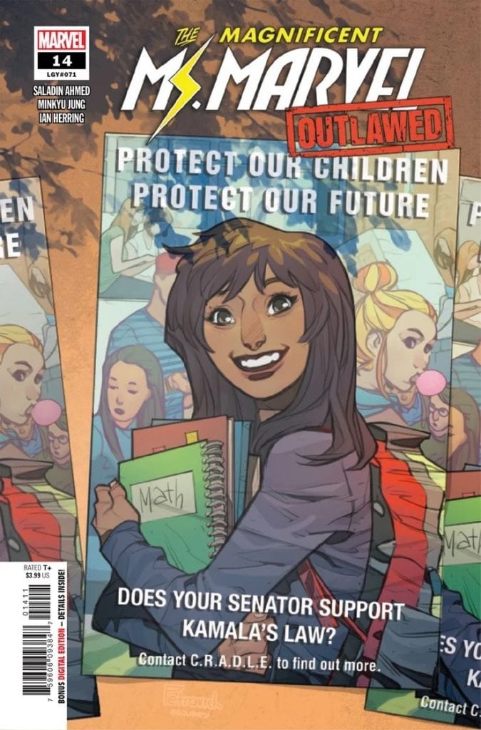
THE MAGNIFICENT MS. MARVEL #14, available Wednesday from Marvel Comics, is an issue that many a fan has been waiting for. The world around her has been changing, and now it’s time for Kamala to make her voice heard.

***SPOILER WARNING***

spoilers ahead

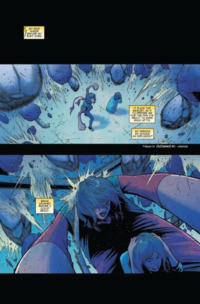
The events of Outlawed changed the superhero world for all those underage – but arguably none more so that Kamala Kahn, aka Ms. Marvel. It all started as another mission for the Champions. Protect an important figure, keep the school safe.

You know, the usual. But only, it ended up being far from usual. Everything went out of control, and fast. While Kamala did succeed in keeping everyone else safe, she took a huge hit. Literally. To make matters worse, the event quickly became politicized.

Hence, Kamala’s Law. The law that keeps underage superheroes from being a thing. Not like it’s the first time superheroes have faced regulations, right? Though this time it’s made to feel more personal, what with Kamala being used as a martyr (the irony cannot be ignored here).

All of that is vital to remember, going into The Magnificent Ms. Marvel #14. This will be the first time Kamala’s perspective has been shown since that fateful event, and that means fans are finally going to get a chance to see how she reacts to it all. It’s a moment we’ve been waiting for, to put it mildly.

Obviously, don’t dive into this issue if you haven’t read Outlawed. Unless you’re okay with spoilers, in which case go right ahead. The issue does a solid job of getting fans up to date, though some details are naturally lost in the process.

The events of Outlawed are about to hit The Magnificent Ms. Marvel #14

The Writing

The Magnificent Ms. Marvel #14 is a long-awaited issue. It’s been months since Outlawed #1 came out, and that’s a long time for any fan to wait and see what’s going to happen to their favorite character. Realistically, there was no way that Marvel was going to put somebody like Kamala on the bench for very long, but it’s still refreshing to finally see her side of the story.

After all, Kamala has never been a character afraid to speak her mind. Her perspective to this particular event is vital, due to the fact that it revolves around her – both her superhero and mild-mannered persona.

Saladin Ahmed did an excellent job of juggling multiple elements in this issue. There’s a quick recap, which will also allow fans that missed the event to continue reading Ms. Marvel’s story. It also sets the tone, and puts readers into the right frame of mind.

From there, it’s a series of truly moving events, dreams, and revelations. Ms. Marvel/Kamala has always led a complex life, despite her best efforts. All of that shines through here, and in such detail. It’s beautiful and heartbreaking all in one.

It showed the conflict she deals with on a daily basis. A conflict similar to many other heroes out there, yet with a uniquely Kamala-like twist to it. It’s colored by her history, and her choices (much of which was hinted at throughout this issue).

Every revelation, every moment in this issue felt like it was leading up to something. It all pushed towards Ms. Marvel rising once again. As well as setting the scene for events to come (Champions #1 and Ms. Marvel #15, respectively).

Her memories are rising to the surface.

The Art

Unsurprisingly, the artwork within The Magnificent Ms. Marvel #14 is just as stunning and moving as the plot itself. The artistic team was hard-pressed for this issue, portraying a variety of scenes, with characters and details steadily shifting throughout. It’s somewhat alarming at times, and yet it is also so perfectly suited to the emotional turmoil that Kamala (and her loved ones) is currently going through.

Minkyu Jung (art), Juan Velasco (inks), Ian Herring (colors), and VC’S Joe Caramagna (letters) all worked together to bring this awakening to life. There is literally not a dull moment to be found in this issue. There’s always something to catch the eye.

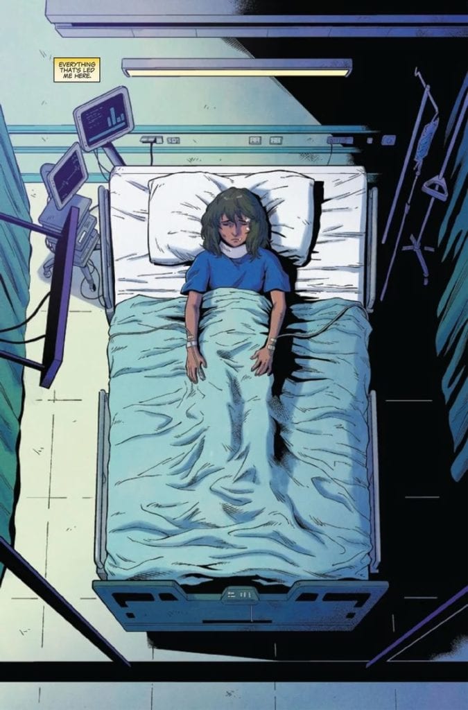
Be it the stillness of Kamala Khan, laying in her hospital bed. Or the jarring way her friends and family are portrayed in her nightmares. Or any number of details found in between. It all merges together to carry the story, and the tone, and bring readers to the same conclusion.

It’s time to wake up. Wake up, and save the day.

Conclusion

The Magnificent Ms. Marvel #14 is an issue that fans had been waiting some time for. It’s also an issue worth the wait, which is very convenient. This is one of those rare issues that takes a major event and turns it into a deeply personal journey for one character. In that sense, as well as several others, this issue did justice to Kamala’s character.

Monkeys Fighting Robots Youtube

Kickstarter: NOCTERRA COLLECTOR’S EDITION Adds New High-End Reward Tiers

With nine days left in the Kickstarter campaign, Scott Snyder and Tony Daniel announced a new stretch goal and two new high-end reward tiers for NOCTERRA 1 Collector’s Edition. The campaign is currently sitting at $172,012, and at $200k, backers of the physical book will get a free NOCTERRA print by Jorge Jimenez and Gilded Edges for the book. The new tiers will include getting drawn into the book, speaking roles, and original pages.

“We really want to keep surprising fans, both throughout the campaign and when they read the comic,” said Snyder. “And we still have some big surprises left!”

For additional information, check out the press release below:


Scott Snyder and Tony S. Daniel Invite Readers to Get Drawn into NOCTERRA COLLECTOR’S EDITION in a Red Shirt Role on Kickstarter

Plus New Stretch Goal Announced: A Free NOCTERRA Print By Superstar Comic Artist Jorge Jimenez

(September 8, 2020) The NOCTERRA COLLECTOR’S EDITION Kickstarter campaign from superstar comic creators Scott Snyder and Tony S. Daniel is bringing fans behind-the-scenes for their upcoming series from Image Comics, with Snyder’s script displayed alongside Daniel’s linework to provide a rare look at the process of making comics. Now the hit campaign is offering a new tier that offers fans a chance to be drawn into an issue from the series’ first story arc, with a speaking role… and an untimely on page death. Backers at this tier will also receive the page of original art of that scene by Tony S. Daniel. In addition, the creators are offering 5 slots for the chance for to be drawn into NOCTERRA issues 2 through 6.

“We were surprised by how quickly the tier offering fans a chance to be drawn into issue one disappeared,” said Tony S Daniel. “And since this is a horror comic, we thought it would be great to bring our fans in on all the gruesome action.”

In addition, the creators announced a new stretch goal of $200K, which will unlock Gilded Edges for the book and a free NOCTERRA print by superstar comic artist Jorge Jimenez (JUSTICE LEAGUE) for all backers of the physical book.

NOCTERRA print by superstar comic artist Jorge Jimenez

The new tiers are as follows:

$1000: Get Drawn Into NOCTERRA

Get yourself or a loved one immortalized in an issue of NOCTERRA, ranging from #2 through #6. You must provide adequate photo reference. Where and how the person appears will be at Tony’s sole discretion. You will receive a high quality scan of the art to print and frame at your own leisure, all three prints (by Jock, Francis Manapul, and BossLogic), plus a softcover! NOTE: you will NOT appear in NOCTERRA #1: Collector’s Edition. You will only appear in one of the issues between #2 through #6 which will be put out by Image next year and you will have to buy that copy separately on your own.

$5000: Redshirt Speaking Role + Original Page

You or a loved one will have a speaking cameo in an issue of NOCTERRA, ranging from #2 through #6, followed by a grisly death. You must provide adequate photo reference. Where and how the person appears and dies will be at Tony’s sole discretion. You will receive the original page on which you appear, all three prints (by Jock, Francis Manapul, and BossLogic), plus a softcover! NOTE: you will NOT appear in NOCTERRA COLLECTOR’S EDITION. You will only appear in one of the issues between #2 through #6 which will be put out by Image next year and you will have to buy that copy separately on your own.

In NOCTERRA, you can still feel the sun’s warmth – it must be there – but for some reason, light no longer reaches the earth. There’s only darkness. But this new darkness, there’s something strange about it, something terrifying. Because anything – or anyone – that stays in it too long starts to change… NOCTERRA takes place ten years after the world is plunged into an everlasting night that turns all living creatures into monstrous “shades.” Enter Valentina “Val” Riggs, a skilled “ferryman” who transports people and goods along deadly unlit roads with her heavily illuminated eighteen-wheeler. When an old man promising sanctuary offers Val a job to drive him and his granddaughter up through the Rocky Mountains, she takes it, hoping there might be some truth to his claim. What she finds in the end, though, is something much more horrifying than any shade…

Starting at 72 pages, NOCTERRA COLLECTOR’S EDITION is a one-of-a-kind reading experience, with Scott Snyder’s script displayed alongside Tony S. Daniel’s linework, to provide a rare look at the process of making comics. NOCTERRA COLLECTOR’S EDITION will be released to backers ahead of Image Comics’ release of issue #1 this winter and will mark the first time that one of Snyder’s scripts has been published in its entirety.

For more updates, follow Best Jackett Press on Twitter and Facebook.

To support the campaign, visit Kickstarter: https://www.kickstarter.com/projects/scottsnyder/823774553.


In addition to the comic book or graphic novel, what type of Kickstarter rewards do you like? Comment below with your thoughts.

Monkeys Fighting Robots Youtube

Marvel Preview: Create Your Faction’s Colors in WARHAMMER 40,000: MARNEUS CALGAR #1

WARHAMMER 40,000 MARNEUS CALGAR #1, cover

Marvel Comics is is bringing their comics one step closer to tabletop gaming. Today, Marvel has announced their upcoming issue of WARHAMMER 40,000: MARNEUS CALGAR #1, available to retailers this October, will come with a paper stock cover so you can customize your very own Space Marine.

Written by Kieron Gillen, WARHAMMER 40,000: MARNEUS CALGAR #1 tells the “untold origin of the legendary Space Marine Chapter Master.” You can check out the cover and read the official Marvel press release below.

Do you play Warhammer 40,000? Do you already have faction colors or are you looking forward to a little customizing experimentation? Let us know what you think in the Comments section, and please share this post on social media using the links below.

DESIGN A SPACE MARINE WITH THE WARHAMMER 40,000: MARNEUS CALGAR #1 COLOR YOUR OWN COVER!

New York, NY— September 8, 2020 — The action-packed universe of the Warhammer tabletop gaming universe is coming to Marvel Comics this October! Written by Kieron Gillen (Uncanny X-MenJourney Into MysteryThe Wicked + The Divine) and drawn by artist Jacen Burrows (Punisher: SovietMoon Knight), WARHAMMER 40,000: MARNEUS CALGAR #1 will reveal the untold origin of the legendary Space Marine Chapter Master. Witness Marneus Calgar’s beginnings on the world of Nova Thulium, his campaigns in the Black Crusades, and discover a deadly threat from his past, the mysterious Black Altar. To gear up for this latest mission, hone your design skills with the Color Your Own Variant cover by popular artist Max Dunbar (Champions). This special paper stock cover allows you to color Dunbar’s artwork so you can create your very own Space Marine and save the Ultramar system from destruction in this extraordinary chapter of the Warhammer saga!

“Part of the reason I said yes is I because I believe with Marvel I can do a 40K comic “properly”— as in, with all the skill and craft I’ve learned over the years. If I’m going to do a 40K comic as a mature creator I’d like to hit it hard,” Gillen explained in an interview with CBR. “The other part is, as the writer of the first mini in the Warhammer line I get to set the tone for everything else. Also, I get to introduce folks to the world. You asked me how I would explain Warhammer to somebody? I’d do that by giving them my mini.”

Prepare for glorious combat when WARHAMMER 40,000: MARNEUS CALGAR #1 hits stands this October!

WARHAMMER 40,000: MARNEUS CALGAR #1 (OF 5)

Written by KIERON GILLEN

Art by JACEN BURROWS

Variant Cover by MAX DUNBAR

WARHAMMER 40,000 MARNEUS CALGAR #1, cover

Monkeys Fighting Robots Youtube

INTERVIEW: Shannon Wheeler And Steve Duin Of THE MUELLER REPORT Graphic Novel

The Mueller Report Graphic Novel hits your local comic book store on September 16, but thanks to IDW, Monkeys Fighting Robots has a great interview with Eisner Award-winning New Yorker cartoonist Shannon Wheeler and The Oregonian Metro columnist Steve Duin.

About the book:
Details from the Mueller Report are brought to life in every excruciating detail by Wheeler and Duin, including the infamous Trump Tower Meeting of 2016, the questionable contacts, misleading statements, and unreported engagements. If it’s in the report, it’s in the graphic novel.

Shannon Wheeler And Steve Duin Interview:

MFR: How important was it for you to get the graphic novel version of The Muller Report published?

Shannon: Very. It’s a historical document. Mueller didn’t write it to be an easy read. Getting the information into a format that is digestible was very important to me.

MFR: How many times did you read The Mueller Report?

Steve: Cover-to-cover? Once. But I’ve spent 50 hours with the report open in my lap or at my elbow.

Shannon: I read it a couple times – and listened to it once. Mostly I relied on Steve to process what was important and what was a dead end.

MFR: Can you talk about the process of unpacking The Mueller Report and how you decided what to put in your book?

Steve:Unpacking” is a telling verb. Mueller had no interest in a simple narrative, one that would fit snugly in a Fox & Friends news crawl. His investigation was exhaustive, and in early drafts of the graphic novel, we tried to connect too many of the dots.

Mueller needed 400 pages to flesh out his conclusions; we had roughly 400 panels. Because Mueller found scant evidence of a conspiracy between Russia and the Trump campaign, we devoted most of those panels to the president’s obstructions of justice. Mueller did not believe he could file criminal charges against a sitting president, but his investigation provided Congress with all it needed to impeach Trump for his actions involving Michael Flynn, James Comey, and the special counsel.

Shannon: There were some obvious parts that had to be included; like the Trump Tower Meeting, Chris Christie Lunch, and the Comey Conversation. There were a few bits in the Mueller Report that became more important in retrospect – like all the Roger Stone conversations.

MFR: Shannon, can you talk about the artistic tone you used for the book?

Shannon: I strove for clarity. I added jokes every now and again, sometimes cheap jokes, but the main idea was to communicate the ideas Steve had making the Mueller Report understandable.

MFR: How do you think the use of black and white helps the reading experience?

Shannon: It’s a story that doesn’t need whistles and bells. We tried to reduce the complexity of the plot. Trump refusing to answer Mueller’s questions isn’t made more understandable by being rendered with red reflective light.

MFR: In your book, Mueller is this towering figure narrating the story (page 44 is a great example). It works well to bring the reader into the universe. Did you play with the size of Mueller when putting the book together?

Shannon: Mueller is a narrator as well as a character. He’s a combination of Rod Serling and Columbo. It’s a visual conceit to change his size – Serling would do it by stepping toward the camera – Columbo did it by stopping as he stepped out a door and saying “one more thing…”

MFR: After reading The Mueller Report, how do you think history will remember Donald Trump?

Steve: History tends to be more charitable than the average newspaper columnist. As Michael Cohen notes, Trump never thought he would win the election; he ran to augment the family brand. Understandably angry that he was never given credit for running a smart, if cynical, campaign, Trump played the petty, vicious, incoherent narcissist to the bitter end.

Shannon: I quote Churchill, “history is written by the victors.”

MFR: How has the political cartoon evolved over the past 20 years?

Steve: It has barely survived. Political cartoons were long the audacious centerpiece of an editorial page. With rare exceptions, they have disappeared in the froth of social media.

Shannon: The Germans published a list of people to be shot on sight in Belgium once the invasion was finished. Several cartoonists were on that list. Recently, Charlie Hebdo republished their Mohammed cartoons that inspired a slaughter. So – not much.

I know you meant content, not reaction, but the basic impulse to create political cartoons has stayed the same.

MFR: Do you think Joe Biden and Kamala Harris have what it takes to win the election in November?

Steve: The 2020 Democratic ticket has this going for it: empathy, a sense of humor, @King James and the belief that Black Lives Matter, a reasonable amount of faith in the face mask, and the commitment – which Hillary lacked – to campaign in Michigan, Pennsylvania, and Wisconsin.

Shannon: A fellow cartoonist, Ace Backwords, said; “the more entertaining candidate always wins.”

MFR: I think the most critical political question that is not being asked right now is how do we bring the country together. How do we get past Republican and Democrat and do what’s best for our country?

Steve: Maybe the question isn’t being asked because the answer is so damn discouraging: Few Republicans – and only a slim majority of Democrats – are looking for that middle ground. As long as Trump controls the right and Fox serves as his personal messenger, this divisiveness will not ebb.

Shannon: I thought fighting an external enemy would bring us together as a country because I read The Lathe of Heaven and later, the Watchmen. But seeing a pandemic be politicized makes me question my assumptions. How do we get past a two-party system? Make politics boring again. What’s best for our country? We should start being nice to each other again.

MFR: Shannon and Steve, thank you again for your time and best of luck with The Mueller Report!

Monkeys Fighting Robots Youtube

REVIEW: HAWKMAN #27 Captures Time in a Bottle

Hawkman Venditti DC Comicsi

Written by Robert Venditti, with pencils by Fernando Pasarin, inks by Oclair Albert and Wade Von Grawbadger, colors by Jeromy Cox, and letters by Rob Leigh, DC Comics’ Hawkman #27 captures the feel and style of a 1940s comic brilliantly. This creative team is writing an ode to the Golden Age, and having fun doing it.

Writing

Venditti shines a light on all the things we love about old comics in Hawkman #27. We have all the classic DC characters of the 1940s, along with some truly cheesy repartee. Venditti centers most of the issue around a fight between the Justice and Injustice Societies. We get a moment, typical to Golden and Silver Age comics, where it looks like the villains have won. It’s closely followed by the heroes winning in a Deux Ex Machina moment, explained away by the simple fact that they knew the villains would act as they did. On their own, these are all elements of bad writing, but when recreating the feel of a Golden Age comic, it’s perfect. Venditti is reminding us of the days that these writing flaws were common, even charming. It takes a truly skilled writer to implement bad writing techniques well. Thank God Venditti is truly skilled.

Hawkman Venditti DC Comics

Art

Pasarin, Albert, and Von Grawbadger pull out all stops to make this issue of Hawkman fun. As the heroes and villains fight, this team of artists is constantly playing around with the page layout. No two pages look alike. The layout is constantly changing to mimic the changes in the battle. The dynamic feel to the page makes it feel incredibly playful. Beyond that, Pasarin, Albert, and Von Grawbadger make sure there are lots of smiles in this fight. Vandal Savage smiles into the face of Hawkwoman, and Jay Garrick is constantly grinning as he zooms around Brain Wave. This is a simpler time. Pasarin, Albert, and Von Grawbadger lure us into the simplicity of it all by making sure the characters seem like they’re enjoying their fight.

Hawkman Venditti DC Comics

Colors

Cox goes back to basics. He’s coloring a comic to look classic, so a lot of the colors are what you would expect. Hawkman is in a red panel, filled with rage. Separately, we see a scene set in a mysterious location, and the blue makes the scene feel foreboding. Red is danger or anger; blue is foreboding and melancholy. But Cox also uses his colors to make the page just look great. Sandman and the Gambler look like they coordinated before the fight. The Wizard’s blue projections wrap around the green objects Alan Scott is creating with his wring. Cox helps us feel the fun of the fight by creating a page that pops.

Lettering

Leigh letters his sound effects in a pretty simple style in this issue. Normally, Leigh’s sound effects in Hawkman are diverse. But in this issue, he keeps things uniform. Every sound tends to have the same font in a different color or size. Leigh is referencing old comics when sound effects were uniform and not even written in block letters. Every sound effect looked the same. But when Hawkman and Hawkwoman’s maces get rammed into each other, the resulting explosion makes a different sound. The letters are messy and look scribbled onto the page. With this, Leigh is telling us that these two, and the power they bring with them, are beyond this plane of existence. They aren’t quite like everyone else they know live with, and even the sounds they make look different on the page.


Hawkman #27, out from DC Comics September 8th, is a great way to jump back into the 40s. It has the charming simplicity of a comic from the Golden Age and the self-awareness of a modern work. This creative team has made a really fun issue; hopefully there will be more along these lines. Pick up DC Comics’ Hawkman #27 from a comic shop near you!


Monkeys Fighting Robots Youtube

Marvel Comics Exclusive Reveal: VENOM #31 — The King In Black Arrives!

Marvel Comics Exclusive Reveal: VENOM #31 — The King In Black Arrives!

VENOM #31 hits your local comic book store this December, but thanks to Marvel Comics, Monkeys Fighting Robots has the privilege of revealing the cover and solicit text for you.

The comic is by writer Donny Cates and artist Iban Coello, with the cover by Coello and colorist Frank Martin.

About the issue:
What happens to Eddie Brock when he finally comes face to face with the lord of the abyss, the KING IN BLACK: KNULL?

KING IN BLACK is what Cates, Ryan Stegman, and all of their collaborators have been building up to since the start of their run. From the first arc of VENOM through ABSOLUTE CARNAGE, everything has been leading to the arrival of Knull, King of the Symbiotes, on Earth.

Similar to ABSOLUTE CARNAGE, KING IN BLACK will be its own event mini-series with essential tie-ins in VENOM (and most likely additional titles).

Donny Cates on KING IN BLACK:
“As far as event books go, this is the coolest, darkest, most heavy metal, Cthulhu dark horror thing I’ve ever been able to do…
I still can’t believe that Marvel is letting us go as dark and scary as we’re going.”

Ryan Stegman:
“One of the things I’m most proud of in this series… is the creation of the character Knull…
We have some new designs that we’ll be unveiling throughout the series that are really cool and really creepy.”

Check out the VENOM #31 cover below:

marvel comics exclusive venom king in black

And with the KING IN BLACK trade dress:

marvel comics exclusive venom king in black


Are you excited for KING IN BLACK? How have you been liking VENOM? Sound off in the comments!

Monkeys Fighting Robots Youtube

Review: NIGHTWING #74 — A Thrilling Battle For Dick Grayson’s Heart

NIGHTWING #74, available in stores on Tuesday, September 8th, upends readers’ expectations just as its predecessors did in this arc. The Joker has seized complete mental control over our hero—dubbing him “Dickyboy”—and has sent him to terrorize the Bat-Family. Fortunately, it’s this very family that holds the key to Dick Grayson’s freedom. Readers will enjoy a thrilling clash between the two sides as the battle for the heart of Nightwing concludes.

Story

The scene is set; Bea, “Ric’s” love interest, arrives to find the Boy Wonder preparing to fight alongside Robin and the Red Hood. But then, in a move only surprisingly to his former teammates, Dick turns on them and immediately proceeds to pound their faces in.

However, the key panel that completes this moment shows the Joker literally weeping with pride over his new “son.” The madman simply cannot hide the fact that turning a family against each other brings him joy,  and readers (ironically) love him for it. It’s comic characterization at its finest.

Readers soon learn shortly after that a bomb was also placed somewhere in Gotham City, leaving the heroes with another major threat to deal with. Bea, already at her wits’ end, feels hopeless. But like the sun bursting from behind the clouds on a stormy day, Batgirl swoops in to deliver a swift kick of justice.

The fight only gets more exciting from there with the special appearance of another notable member of the Bat-Family. Throughout this and the following scenes, writer Dan Jurgens demonstrates an ability to up the ante at the perfect pace.

Artwork

Ryan Benjamin’s penciling and and Richard Friend’s ink work is fantastic; the panel showing Dick’s reveal as “Dickyboy” to his former teammates embodies the Joker’s very essence. His entire expression, while on the surface “happy,” contains that unnameable menacing quality fans associate with the Clown Prince of Crime.

Rain Beredo’s coloring gives life to these and other impressive illustrations. Through a mix of darker shades and unnaturally bright hues, readers are kept fully engaged with the narrative. In addition, Andworld Design’s lettering tells the story in its own way through the use of bold fonts to emphasize Dickyboy (and the Joker’s) emphatic manner of speaking.

Conclusion

All in all, NIGHTWING #74 closes one door while opening five more. We are anxious to see what the future holds for this hero who’s mind has undergone so much trauma.

What do you think the Joker’s ultimate goal is? Let us know in the comments below!

Monkeys Fighting Robots Youtube

DOCTOR WHO SERIES 12 | TV Review

The Thirteenth Doctor returns for a second season of Doctor Who. It was a season that managed to be an improvement over Series 11 and was still able to annoy fans.

The Doctor and her companions reunite for more adventures across time and space. Their journey sees them conflict with familiar foes, meet historical figures, and face environmental threats. The Doctor also has a long-running threat due to mystery involving the Timeless Child and The Lone Cyberman.

Series 11 was reviled by fans for numerous reasons. Many of the stories were tepid, there was too much emphasis on political stories, had no recurring villains and there was no season-long arc. It was the most boring and worst series in the modern era. Series 12 tried to rectify these issues. This season brought back elements from the Davies/Moffatt eras. There was a season-long arc and a mystery box. Series 12 also brought back The Master and the Cybermen as villains.

There was an improvement in the writing compared to the last season. “Nikola Tesla’s Night of Terror” and “The Haunting of Villa Diodati” were the best episode of the series. These two episodes were the historical episodes and they were two of the three episodes where Chris Chibnall wasn’t involved in the scripting. “Nikola Tesla’s Night of Terror” was a simple monster-of-the-week story that saw the Doctor team up with the famous inventor. “The Haunting of Villa Diodati” was a gothic horror episode that showed in Doctor Who fashion how Mary Shelley was inspired to write Frankenstein. Both films were entertaining adventures that combined history and sci-fi and were able to offer a little bit of education. Both episodes were written by first-time writers for the show and hopefully they will come back to write more episodes.

The worst episode in the series was “Orphan 55.” This episode saw The Doctor and her companions arrive on a luxury resort and find it’s infested with monsters. This episode had lots of issues like annoying characters, the Doctor acting out of character, and cheap-looking make-up and costumes. But the worst aspect of this episode was the forced environmental message. The reveal in that episode was the toxic planet was really Earth and it turned like that because climate change led to war. The environmental message was tacked on and there was an easy fix: climate change directly turned the planet into a toxic wasteland and mutating the inhabitants. At the end of the episode, The Doctor pretty much spoke to the audiences to change their ways or face oblivion. It was like an after-school special.

“Praxeus” was the other environmentally themed episode of the series. The writers there at least knew to directly link threat to the environmental message because in that episode plastic pollution led to the created a virus that risks the whole planet.

“Fugitive of the Judoon” was one of the most praised episodes of Series 12. It was an entertaining episode that had the feel of a Russell T. Davies/Steven Moffatt episode. It had big spectacle and world-building that audiences came to know and love. But it was a double-edged sword because that episode had a big reveal that changed the backstory of The Doctor. The season finale doubled down on this lore change that has annoyed fans because Chibnall decided to rewrite The Doctor’s history and didn’t understand the character or the show.

Series 12 had issues with consistency and underdeveloped concepts, like Series 11. “Can You Hear Me?” was a great example of this because it was an episode that featured god-like aliens that made two planets their playthings. It was an episode that had big ideas and I wanted to see more of this.

Inconsistency also plagued the characters. Jodie Whittaker’s Doctor was at her best when had her character headfirst so she can protect others and she had some weighty concerns like what happened to Gallifrey. However, at other times Whittaker seemed like she was told to be quirky and she even said her character was ‘socially awkward’ instead of acting that way. At times, The Doctor did have a disregard for non-human life which goes against the philosophy of the character.

Yaz as a companion improved a lot in this season. In Series 11 it felt like she was just tagging along with The Doctor, Ryan, and Graham. She had a lot more to do in this season, like evacuating civilians or going into a spaceship. “Can You Hear Me?” was a great character episode because it shows what drove Yaz. However, Yaz’s extra characterization came at the expense of Ryan and Graham. This was due to Ryan and Graham arcs have already been concluded: Ryan and Graham have overcome their grief and Ryan accepted Graham as his family. Graham still had the occasional moment because he feared his cancer can come back but Ryan felt the third wheel.

Series 12 did take advantage of the expanded Tardis group in some episodes. In “Spyfall” and “Praxeus” The Doctor was able to send her companions to other parts of the world to investigate something. But in “Fugitive of the Judoon” all three companions were sidelined from the main adventure.

This series does continue one of the better parts of Series 11, the high production values. There were lots of location shooting with South Africa and Tenerife being used as well as locations in England like Gloucester Cathedral and the West Usk Lighthouse. There was also excellent CGI for the show, especially spaceships.

Series 12 did learn from the mistakes of Series 11, episodes that will last in the mind. The season had some of the best historical episodes of the modern era, had high stakes, and attempts at characterization. But the season finale will annoy fans.

Monkeys Fighting Robots Youtube

Review: Rent-A-Pal Offers Tense Character Study

IFC Midnight have something special to offer yet again, and this time it features Will Wheaton as a creepy Mr. Rogers type character in Rent-A-Pal. IFC has carried 2020 when it comes to horror films, and this is just another successful addition. Also, Rent-A-Pal is the latest film to showcase the scary reality of caring for an aging parent with dementia, and how it can affect the individuals around them.

Rent-A-Pal is inspired by Rent-A-Friend, the old VHS tape for lonely individuals. After viewing that tape on my own, it makes this film much more unsettling. This is the directional debut for Jon Stevenson, and it’s a successful outing. Rent-A-Pal stars Will Wheaton, Amy Rutledge, Kathleen Brady, Adrian Egolf, and Brian Folkins. Written by Stevenson, the film is set in 1990 (Before Tinder) and follows David (Folkins), a lonely bachelor who is searching for an escape from taking care of his aging mother. While searching for love using a video dating service, he locates a tape called Rent-A-Pal.

Brian Folkins as David In Rent-A-Pal

This tape introduces David to Andy (Wheaton), the host of Rent-A-Pal, and the new source fulfilling David’s desire for company, compassion, and friendship. David is very caring towards his sickly mother, but it’s clear he wants a life of his own outside of dealing with her. He’s an introvert, a middle-aged geek, fumbles this video dating service, and his life is not the most attractive. His mother, Lucille (Brady), has dementia and constantly confuses David for her deceased husband. David’s life is so boring, but Stevenson has written a character for you to easily feel sorry for up until David goes insane.

Once David finds the Rent-A-Pal tape, you gradually become immersed in the odd interactions between these two. Andy isn’t real, but David replays the tape so much that he develops an unhealthy safe spot with the man on his television. Adding to that, it gets to the point where it seems like something supernatural is occurring. However, David is so immersed in this relationship with Andy that he has remembered all the words and times out his responses. Performance wise, this will definitely be a callback for Folkins if he stars in future films. He embodies the eccentric and desperate nature of David with ease, and makes you feel for the characters situation.

Amy Rutledge and Brian Folkins In Rent-A-Pal

Wheaton is great as our Rent-A-Pal, an overly caring, but weird presence that becomes David’s therapist per multiple re-watches. Rutledge stars as Lisa, David’s eventual date that goes well until it doesn’t. She perfectly captures this shy, down to earth nature and the chemistry between the three actors is so good. Stevenson does a solid job at getting you glued to the screen during the late-night chats between Andy and David. He sets it up in a way where you’re forced to experience this unhealthy descent into madness with David.

At its core, Rent-A-Pal is an extreme look at how too much of anything can have severe consequences. In this case, solitude has finally become an enemy for David because he is completely disconnected from reality by the end. The cinematography by Scott Park creates a visual example of just how disconnected David has become and adds a unique vibe to the films setting. However, the sudden shift from drama to horror does a feel slightly out of place. David is bonkers by the end, but his actions feel over the top.

Rent-A-Pal fumbles a bit in the end, but overall, this is a terrific directional debut by Stevenson. Wheaton shines in as our virtual friend, and this is a breakout performance from Folkins. This dramatic horror film could easily develop a cult following of sorts as the years go by.

Monkeys Fighting Robots Youtube

How WE ONLY FIND THEM WHEN THEY’RE DEAD Creates Believable Characters in an Unbelievable World

We Only Find Them When They’re Dead is a new science fiction series published by BOOM! Studios that tells a wondrous tale in a universe very unlike ours. Despite the difference in setting between the story and our own world, the characters are still relatable, and Al Ewing makes this happen through two very simple techniques.

We Only Find Them When They're Dead Autopsy Ship Captain

The writing of Al Ewing allows We Only Find Them When They’re Dead to have characters we relate to, but it would be a disservice to the book to neglect to mention the brilliant illustrations of Simone De Meo, the beautiful color assists of Mariasara Miotti, and the fantastic lettering of AndWorld Design. The first issue — out now — is gorgeous, and the fun cartoon-like feel of the art only adds to the adventurous nature of the main characters’ quest. The first issue is an incredibly fun journey into a world so imaginative and interesting that one would have a hard time not following the series after such an astonishing start.

In science fiction, not only are the creators allowed to flex their creative muscles as much as they would like, but the stakes in science fiction adventures can be higher than anything found in realistic fiction. This allows for some incredibly nerve-wracking scenarios, but this can be ruined without an emotional connection to the people that are in danger. Unfortunately, a significant error that many science fiction tales make is creating a group of characters that live such different lives that it is hard for anyone to relate to them. If their cultures and the way they express themselves are so different, it is challenging to develop an emotional attachment. There are many ways to circumvent this issue. If you go back and reexamine the science fiction movies, shows, books, or comic books that you like the most, you will almost surely see precautions taken by the writer that help make the characters relate to the audience. We Only Find Them When They’re Dead has Al Ewing responsible for making the characters able to empathize with, and he does this through character roles that we understand regardless of the time and through believable dialogue.

We Only Find Them When They're Dead Art Example

By giving the characters jobs and or roles that can be recognized regardless of the time they are set in, Al Ewing can make the characters of We Only Find Them When They’re Dead deeply relatable. This first issue features a slew of characters that all fall under the simple role of worker. Similar to the first Alien movie, the main cast of workers are performing highly futuristic tasks that may seem advanced to the reader, but are commonplace to the characters. Due to this, characters are relaxed as they perform their duties, and we can see that there is more to their personality than simply working. By having characters in this fantastic world fit a role that we are very familiar with, the characters remind us of construction workers, or oil rig operators, or any blue-collar people who operate complex machinery. This allows us to understand the characters more and thus become more emotionally invested in them.

We Only Find Them When They're Dead Dialogue Example

We Only Find Them When They’re Dead #1 features some brilliant dialogue writing. The formal dialogue that a character has while speaking to a person of higher authority serves as a contrast to the casual dialogue they normally speak with. We see this with the captain of the autopsy ship, Georges Malik. While more formal than the other crew members, Georges still says things such as “Let’s get back to work, eh?” and “Oh, it’s quite simple, Jason.” We then also can see him speak more formally with someone from an escort ship — which seems to be some sort of law enforcement — which then highlights through contrast how relaxed he is around his crew. The rest of the crew have many lines of relaxed dialogue as they perform their duties, which — when paired with the casual body language — causes the cast of characters to seem more likable and relatable.

WE ONLY FIND THEM WHEN THEY’RE DEAD has an astonishing first issue with spectacular art and a story that quickly introduces us to relatable characters. The highly effective techniques used in the issue make it a deeply enjoyable read, as well as prove that Ewing knows what he is doing with this new science fiction saga. The art and lettering are wonderful complements, which can only mean that WE ONLY FIND THEM WHEN THEY’RE DEAD is sure to be an incredible reading experience for those willing to pick it up.


Are there other science fiction stories that you love the characters from? Let me know in the comments below!

Monkeys Fighting Robots Youtube