On September 30, Marvel Comics releases Giant-Size X-Men – Tribute to Wein & Cockrum #1. This issue retells the original tale from Len Wein and Dave Cockrum 1975’s Giant-Size X-Men #1, with some minor updates in outdated language and over thirty-six artists paying tribute to the story, with each artist doing a different page. VC’s Clayton Cowles letters this new edition.
In the age of Jonathan Hickman’s Dawn of X, with its emphasis on Krakoa, it only makes sense to re-release the first issue that introduced the living island. This issue is a fine tribute to Wein and Cockrum’s classic story, with unique material in the back, including interviews by Jess Harrold from the wives of Wein and Cockrum, Christine Valada, and Paty Cockrum, as well as a few words by Chris Claremont.
Two notable pages stick out, in part because the original images are included in Claremont’s tribute. The first is by Carmen Carnero and David Curiel, featuring an image of Storm taking flight in Africa to answer the prayers of her people. The second is Mark Brooks’ image of the assembled New X-Men in the Westchester mansion. Carnero and Curiel’s take on Storm de-sexualizes her a bit, gives her a more stiff character design, and more of a scowl compared to the original image. Brooks’ image is a beautiful homage to the original assembly of X-Men, with updated character designs, gorgeous colors, and a metaled-up Colossus.
Cowles does an excellent job in this issue of updating the original lettering in this new edition, making the letters a little bit more substantial and legible without changing the look of it too much from the original.
Fans of the X-Men should love this issue. It’s a gorgeous tribute to the comic that changed X-Men forever! Hardcore fans will love revisiting the story and will love the bonus material. This is also a great tribute to release at this time when X-Men stories are focused on Krakoa. Revisit the tale that started it all! Or at least, got it started again!
What did you think of Giant-Size X-Men – Tribute to Wein & Cockrum #1? Tell us in the comments below!
Newly published by Boom! Studios, the library edition of Buffy the Vampire Slayer: Season 12 collects BtVS: Season 12 #1-4 and Giles: Girl Blue #1-4 in hardcover. Previously published by Dark Horse, the book features the writing talent of Christos Gage, Erika Alexander, and Kel MacDonald. Illustration, pencils, and inks contributions by Jonathan Lam, Georges Geanty and Karl Story, and Yishan Lee. Further, color talent by Dan Jackson, Rod Espinosa, and Tony Galvin. And finally, lettering contributions came from Richard Starking, Comicraft’s Jimmy Betancourt, and Steve Dutro. Such diverse talent makes for a dynamic reading experience.
Included in Season 12‘s blurb, the YouTube reviewer Geeked Out Nation is quoted describing the book as “the perfect love letter to fans and this series.” You will find yourself agreeing with Geeked Out Nation’s assessment.
First and foremost of the Season 12 stories is Giles’ spin-off entitled “Girl Blue.” Written by Erika Alexander across four issues, it’s the story of Giles magically going undercover as a teenager at a Compton high school. Through many whirlwind plot twists and cinematic storytelling, we come to love a new side of Giles as he falls in love with a mysterious student at the school.
This series is the longest of the three revolving around the mystery of missing teachers and students getting progressively dumber. With the help of an unlikely ally, Roux, Giles can defeat a corporate and demonic evil.
Reckoning
Through screenplay-like use of slugline captions and extended flashbacks, what is essentially a conventional Buffyverse anti-capitalist demon-of-the-week story gets elevated to a character study of someone new. For Giles, in the body of a teenager, allying himself with Roux ended up changing him. Indeed, some have argued that Giles’ attitude in Girl Blue is out of character. But, freeing oneself of that judgment, you can appreciate the arc as another example of the themes fans love in the Buffyverse. Themes of friendship, anti-prejudice, and holding fast to convictions.
BUFFY RECRUITS UNLIKELY ALLIES.
In the second series, “The Reckoning,” our favorites from Buffy and Angel team up to prevent Hell on Earth using time travel. It has all the style of Infinity War with the heart of Buffy. Sacrifices have to be made, but no hero dies. In a twist of all twists, Buffy doesn’t have to go to Hell again. It’s a story about legacy and the consequences of changing the future. Buffy and the gang are full adults now. There’s no turning back, only forging ahead.
With that in mind, the final single-issue stands as a perfect ending. Xander and Buffy visit a comic book shop. While there, Xander leaves Buffy to browse and maybe find the book that’ll turn her onto comics. Xander then discovers the cashier being strangled by a disgruntled vampire customer. Buffy saves the day, of course, but a young girl witnessed the entire thing. The girl turns to her mother while they’re checking out and says, “Mom, why didn’t you tell me superheroes were real?” Her innocent question warms the heart and sounds like a valentine to the fans because, in Buffy, we have the nearest thing to a real superhero.
A La Mode
Beyond the lovely storytelling, each series has its own artistic style and motifs. In Girl Blue, the characters are drawn in an expressive yet semi-cartoonish manner. The letterer had fun creating SFX as a method of foreshadowing, while the artist often used background elements to tell the story. These motifs make for a dynamic and layered comic.
The Reckoning’s artistic style being like DC with its clean lines, warm coloring, and crowded panels. The styling fits the grand themes of legacy and martyrdom. In other words, the art makes the book feel big.
Furthermore, the final story is drawn in an imitation of anime as befits the reference to Sailor Moon and light-hearted nature of this one-shot.
As a whole, thematic artistry and a sense of final catharsis make Buffy the Vampire Slayer: Season 12, a satisfying read for fans old and new, whether it be your transition into the Boom! Studios reboot or your ending with the Buffyverse, the library edition is worth picking up for any Buffy lover.
VOYAGE TO THE STARS #2 hits comic book stores on Wednesday, September 30th, detailing the fallout of last issue’s disastrous accident. Tucker faces the fallout of unintentionally caused the death of the Exemplar. But the call is made—the Knights Exemplar are en route to the team’s location. The solution? They decide to carry around the dead Exemplar in “Weekend at Bernie’s” fashion. The events are sure to be both hilarious and surprising for readers.
Story
After a brief recap of the voyagers’ team and mission, Ryan Copple and James Asmus’s narrative dives into the frantic atmosphere on the ship. The crew scramble to find a way to keep the Knights at bay in hilarious fashion despite the recent murder of their new “friend.”
The ability these writers have for turning a dark situation into something full of irony and hilarity makes this comic a classic. It’s a great visual representation of the humor listeners regularly enjoy in the podcast version.
But the story isn’t all fun and games; the Knights find the voyagers’ ruse suspicious. And the resulting chaos that ensues engages readers in outstanding fashion.
Artwork
The illustrations within this issue match perfectly with the written narrative. Connie Daidone’s penciling and ink work presents readers with protagonists drawn in awkward positions to represent the themes of uncertainty and deception within the story. Reggie Graham’s coloring complements these with smart color choices to reflect the characters’ moods—ranging from deep reds of panic to light colored hues representing their unease and guilt. In addition, Justin Birch’s lettering adds character to each person by varying the sizes in their speech to represent yelling, shrieking, or laughing.
Conclusion
VOYAGE TO THE STARS #2 way a thrill to read. Exploring this recreation of “Weekend at Bernie’s” will make any 80’s movie fan happy.
Do you think the Exemplar is gone for good? Let us know in the comments below.
A jaw dropping opening and an unexplained event sets the scene for Mad Cave’s new science fiction series Stargazer. The relatively new independent publisher has a number of titles already under their belts but this year sees a range of new offerings covering a number of genres. Stargazer is part X-Files, part Close Encounters of the Third Kind, and part Saucer County. It hides it’s science fiction roots under great characters and a mysterious narrative, never giving too much away.
The story starts in the late 1990’s with a bunch of kids getting into trouble. Unfortunately for them the trouble escalates and the consequences come back to haunt them later in their lives. But for one of their group, Kenny, the ‘trouble’ never goes away and his life is ruled by fear and his absolute belief that he was abducted by Aliens.
Stargazer #1 Credit: Mad Cave Studios
Openings
Any story that starts with an alien abduction is instantly going to be compared to a number of movies, television shows, and comics: It is impossible to escape classics such as The X-Files. The trick is finding a new way to tell the story, to surprise the reader from the outset so that any comparisons are forgotten until the entire issue has been read. Anthony Cleveland begins Stargazer with a very short opening that does just that.
The opening includes an enigmatic doctor, a collection of Agents, and a scene of absurdity that it could almost feature in a Douglas Adams book. The setting is instantly engaging thanks to the superb color work by Stefano Simeone who gives everything a dust enshrouded haze; creating a hot and uncomfortable place. You can’t help but gag on the air that Simeone illustrates with swipes of red and orange across the panels with almost no regard for Antonio Fuso’s inks.
The two page spread that greats the reader is a double hit. First you get the shock of the Doctor, her reaction spilling from an insert panel as her speech crosses the panel border into the image below. The second is the inescapable image of death filling most of the main image. You know that what you are looking at can’t exist in the place that has been expertly described by the art and yet the image is no lie.
As an opening to a comic, Stargazer has it spot on.
Stargazer #1 Credit: Mad Cave Studios
Establishing Character
After this opening, the narrative becomes more recognisable with a group of kids out in the woods. This is comfortable territory for the reader and for the writer. Cleveland uses these pages to establish fairly quickly the dynamic of the group, making sweeping statements about the characters and their relationships with each other. It is not important to bring out the complexities of each individual but to get an overview of the cast, something that Cleveland does successfully.
Fuso uses a collection of mid range shots in the panels in order to focus on particular members of the group but never in isolation. This helps to make the audience a part of the group and not an outsider. This reinforces the closeness of the kids. Even Kenny, who feels like an outsider to his sister and her friends, is still a dominant part of the group.
It is only when things start to go side-wards that isolation becomes part of the panels. Kenny is soon separated from the group through a number of visual signifiers, such as a metal rail distancing him from the others. Panels begin to feature Kenny and Kenny alone, making his experience more important. The reader suddenly finds themselves following a single character instead of a group.
This shift in focus draws the reader closer to the action and pulls us emotionally into the comic. When the narrative jumps forward in time, the effects of the experience are still fresh in our minds and helps us to understand the reactions of the kids when they are all grown up.
Stargazer #1 Credit: Mad Cave Studios
The Good and The Not So Good
The opening half of the comic engages the reader on an emotional level, pulling at the heartstrings. The artwork helps this by having wonderfully rendered characters and a slightly uncomfortable obsession with irregular panel shapes.
As the comic moves into the modern day the panels become more regular in shape except when the central character is under stress or talk returns to their experience as children. Fuso does a beautiful job of leading the reader through these emotional moments, signalling the emotional shifts through the use of panel layouts.
The lettering by Justin Birch also helps to lead the reader through the pages, creating a steady pace that is broken in some scenes of character tension. There are, however, moments where the speech balloons are inconsistent, especially where they butt up against the panel borders. On occasions the balloon ends flat against the frame, other times it breaks through and the balloon interior bleeds into the gutter. While off putting in places it doesn’t jar the reading experience.
The coloring can also be off putting in places. Simeone’s decision to limit the color palette throughout pays dividends during some of the scenes, especially the opening pages. The atmosphere is created quickly and effectively. Unfortunately, with later scenes, this approach generates conflicting readings of a situation. It is not always clear what the mood of the scene is. Some of the character interactions are cold and distant which are understandable. However, there are moments that move from one emotional state to another but are difficult to understand. This is because the coloring doesn’t change, or changes to subtly. If this was realistic coloring the continuity of color would be acceptable but with these sweeping emotional colors the lack of change is more noticeable.
Conclusion
When Stargazer works, it works really well. Each of the creators pull together to produce an enthralling piece of work. Despite the similarities to a number of other Alien Abduction stories, Stargazer manages to impress with enough shocking or emotional moments to make the reader forget about comparisons.
The cliches of the genre are apparent throughout but it’s as if Cleveland leans into them, embracing the imagery, instead of trying to cover them up. The outcome is something that feels like an homage instead of a rip-off. It almost makes you wonder if there is more going on behind the images. Is it all as it seems?
Stargazer #1 is an exciting first issue with a number of stand out moments. There are a number of great characters to follow and art work that impresses more often than not. This is an easy comic to recommend, especially if you feel there’s an X-Files shaped hole in your life.
Stargazer by Mad Cave Studios and is available now both physically and digitally.
STAR WARS: DOCTOR APHRA #4, available Wednesday from Marvel Comics, is bringing Doctor Aphra’s adventures back into the forefront, and that means she’s got another bad scheme or two in mind.
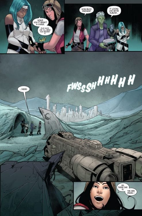
The Lost City of Vaale doesn’t seem like the most welcoming of places.
Doctor Aphra’s first series ended in a moment that almost seemed to redeem her character. She made bold moves and decisions – but for once, she was sincerely doing it for the greater good. As opposed to, you know, trying to land a big score.
Now she has a new series, and it’s become clear that the Aphra we all know and love hasn’t changed all that much. She’s still coming up with schemes and heists, though one would like to believe that she has a made room in her heart for more compassion.
Star Wars: Doctor Aphra #4 continues her latest series of adventures, as she works alongside a team that is already fracturing. Apparently, even her first reappearance in the field isn’t enough to protect her from bad teammates and backstabbing.
An escape route perfectly laid out! That isn’t like Doctor Aphra’s luck…
The Writing
If there’s one thing you can count on when it comes to Doctor Aphra, it’s that she’s always got a plan. She also always knows the difference between a safe plan, and a good plan. Feel free to guess which one she typically goes with.
All of this is relevant information for Doctor Aphra #4. Written by Alyssa Wong, this issue brings her latest plan to an end, but at least she’s already got a few more plans in motion. You know, for dealing with the sudden conclusion of the original plan.
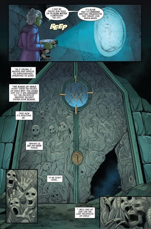
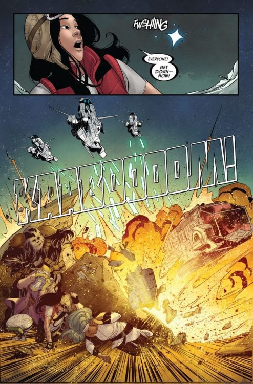
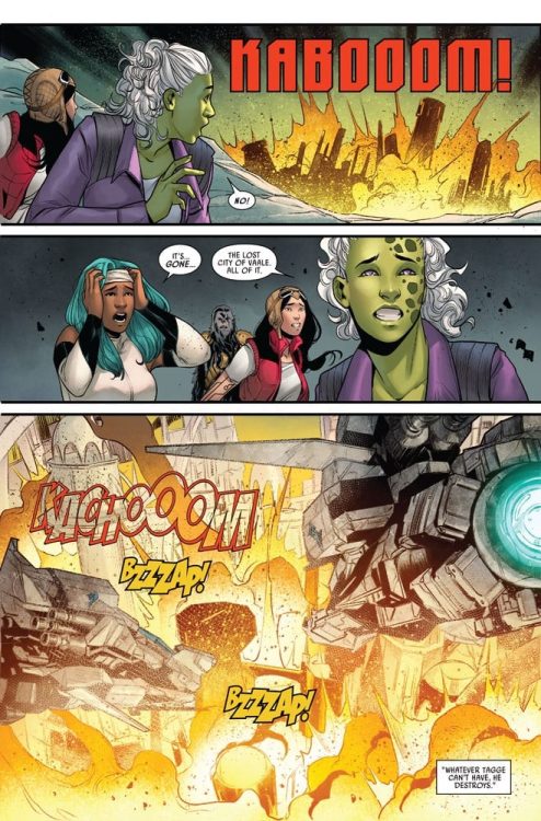
There were some interesting revelations made in this issue, especially in regards to the Lost City of Vaale. It’s actually almost a shame that they didn’t stay there longer, but then again, Aphra never really does seem to stick around much. In this case, it wasn’t much of a choice. However, it does prove that once again Aphra is the most talented at finding fascinating (and deadly) locations.
Overall, this was an incredibly fast issue to read, with much of it setting up for a larger clash in the future. Interestingly, the character development is also setting up for something, but that one is harder to predict.
That however, seems to be more in line for the luck of Doctor Aphra.
The Art
Doctor Aphra #4 features some bold and dynamic artwork. It’s an absolute highlight, not just for this issue, but of the entire series so far. Marika Cresta (art), Rachelle Rosenberg (colors), and VC’s Joe Caramagna (letters) are all working together here, and the end result is quite memorable.
The characters themselves are unique and interesting – from the newly introduced crew, to Aphra’s typical style and preferred partners. The variety is notable, and it also helps to balance out the visual look as well.
The colors lean towards bold, especially in terms of the backgrounds. This went a long way in defining the space both groups were in. Though the starry skies probably steal the show, in the end. Actually, no, that isn’t quite accurate. The Lost City of Vaale does that.
Even when only shown as a backdrop, the City is shockingly foreboding. The faces carved into the stone as every bit as haunting as they should be, and it really does set the tone – even when the crew is actively working to leave.
And there goes the Lost City of Vaale.
Conclusion
Doctor Aphra #4 is another fun and chaotic adventure for Doctor Aphra, even while setting up for a larger confrontation in the future. It’s issues like these that allow for the major moments to actually feel like they carry weight, and so it’s impossible not to look forward to what will happen next.
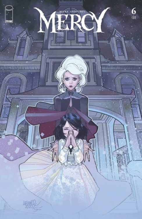
MIRKA ANDOLFO’S MERCY #6 is set to conclude the series this Wednesday. Available from Image Comics, this is not a series to skip. The combination of stunning artwork, chilling plots, and intricate world-building demands attention for this series.
The end is here in Mercy #6.
By this point, most fans know all about The Woodsburgh Devil, not to mention all of the reasons why they chose to haunt such a small town. Mirka Andolfo’s Mercy has made a point of diving into the darker side of this town, revealing the practices occurring within the mine.
Now that the entire world has been established, alongside all of the pain and vendettas, it’s time to see this series conclude. It’s a bit depressing to think about, but then again, Mercy never made a promise to be uplifting.
This series has been groundbreaking for a variety of reasons. The biggest point being how it forced a debate about morality to the surface. Who defines ‘good’ and ‘bad’? Is this a definition that can only apply to humans? It’s certainly a series that makes you think.
*Mercy #6 once again contains some graphic imagery, like much of the series itself. However, it might just tip the scale in this issue, thanks to those targeted. This is not an issue (or series) for sensitive or young readers.
An unlikely family has formed in Mercy #6.
The Writing
It’s almost hard to believe that it all ends with Mercy #6, but that is exactly what is happening here. It’s a tale that feels ageless, thanks to the creatures within, and yet there’s an oddly finite time frame for the series itself. An interesting juxtaposition, when one thinks about it.
Mirka Andolfo was clearly not afraid about pulling punches for this sixth and final issue in the series. The actions were harsh and brutal at times – but then again, the whole series has been that way, so this shouldn’t be that much of a surprise.
Looking back on it, the actions and events in this issue do justice to the entire series. A promise was made at the beginning, and a promise was kept. At the end of the day, isn’t that all we can ever ask for?
One thing Mercy #6 does wonderfully is tug on the heartstrings of the readers. This once again raises points about morality, monsters, and humans, putting it all into question once again. It’s beautiful, it’s chilling, and it’s more than a little heartbreaking. Yet Mercy wouldn’t have been the same without this inclusion.
Lady Hellaine in repose (Mercy #6).
The Art
The artwork for Mercy #6 is beautiful, as always. Mirka Andolfo is the leading artist, as well as being the author of the entire series. Though special thanks go to Gianluca Papi and Chiara Di Francia (from Arancia Studio). Additionally, Fabio Amelia stepped up for the lettering.
It’s not surprising to say that this is one graphic yet compelling issue. All of the plot points came to a head in this final issue, and it brought with it more than a fair share of danger. The otherworldly creatures do appear more threatening – and less human – than ever in this issue.
That being said, there is a sense of delicacy in the way the monsters are portrayed. Not just the monsters themselves (though they do seem oddly elegant), but in the devastation they left behind. You can really see how some elements were carefully skirted around – yet the impact is still there.
What is truly impressive is the sheer amount of emotion infused into the series. It’s raw and shockingly human – an ironic twist, in some cases. Yet it’s the perfect final touch for this series, and it’s conclusion.
Conclusion
Mercy #6 was a dramatic and climatic issue, bringing the series to close with a daunting sense of finality. Yet it is also very much the conclusion this series deserved, wrapping up all the plots in a beautiful and compelling manner. One that will linger in the hearts and minds of readers.
LUDOCRATS #5, available this Wednesday from Image Comics, brings one of the most comical, inane, and quirky series to a close – and it does it with gusto. Naturally, the series like no others must find a most original way to conclude.
***SPOILER WARNING***
Ludocrats has been a ride right from the start, with the entire cast of characters abhorring anything that could potentially be considered mundane or otherwise boring. They’ve romped through their world, and done their all to protect their ludicrous ways (literally).
Unfortunately, all good (and chaotic) things must come to an end. That means that Ludocrats too, ends here with the fifth issue. On the bright side, that means that there’s going to be a whole lot less naked Otto in your future…probably.
Time to run from the BOREDOM gavel.
The Writing
Ludocrats #5 is every bit the quirky conclusion fans could have hoped for. No, strike that. It is ten times quirkier and crazier than that, with lots of fun, twists, and countless references and jokes. It makes for a memorable conclusion, to say the least.
If you ever needed proof that the writers, Kieron Gillen and Jim Rossignol know how to take a breathe and have a bit of fun, look no further than Ludocrats. This series has never taken itself too seriously (they’d be offended by the very idea). Yet this final issue felt like it brought that element to a whole new level.
Though maybe that is merely the number of fourth-wall breaks towards the end that end up giving it that impression. Either way, this issue works hard to say goodbye to a series that was as standout as it was insane.
At this point in the series, one might think that there is no room left for twists or surprises. After all, Ludocrats has kind of pulled out all the stops. But as it turns out, you’d be wrong. The major twists that come at the conclusion are exactly that – utterly unexpected, altering the tone. And then altering it again. In true Ludocrats fashion. It’s actually the perfect ending, when you think about it.
Ah, the love of Otto’s life is getting some attention on this variant cover of Ludocrats #5.
The Art
The artwork inside Ludocrats #5 is every bit as energetic and chaotic as the storyline it portrays. That probably shouldn’t be a surprise as this point. Otto and his friends (Enemies? Frenemies?) have quite the romp over this world, and it simply would not have been the same without the artwork to support it.
Jeff Stokely was the lead artist, and thus the lead chaos infuser. Meanwhile Tamra Bonvillain provided those bright and merry colors, and Clayton Cowles the bold and sometimes dangerous lettering (but really, how often does one get the opportunity to run away with lettering?).
What is impressive about the artwork in this particular issue is that it contains two completely different art styles. There’s the usual quirkiness, and then there’s a darker and intentionally morose style, which is a pleasant twist.
Bonus points for the inclusion of dozens of portraits at the very end of this issue. Variant covers, character portraits, and previous works all make an appearance in the end. It’s unusual, but it absolutely fits the style of this series. Artists included in the fray are Jamie McKelvie, Kris Anka, Ro Stein & Ted Brandt, Darko Lafuente, Mirka Andolfo, and Skottie Young.
Conclusion
In short, Ludocrats #5 is without a shadow of a doubt the most chaotic conclusion this reviewer has ever seen – and it isn’t afraid to celebrate in that fact. This series has truly been a unique (and ludicrous) series, from start to finish.
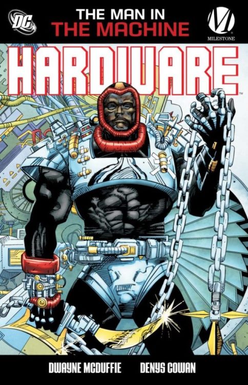
We got the news at FanDome that the Milestone line would be rejoining the DC Comics family. Now, the first batch of titles — featuring Hardware and Icon — have been announced.
Here’s the official word:
DC Reveals First Wave of Milestone Collected Editions Available For Purchase Digitally
Icon: A Hero’s Welcome Available Tuesday, October 6
Icon Vol. 2: The Mothership Connection Available Tuesday, October 13
More Titles to Follow Ahead of An All-New Static Shock Digital Comic Book Series, Scheduled for February 2021
Following the announcement on the Milestone panel at DC FanDome: Hall of Heroes, DC revealed today that for the first time ever, titles from the Milestone library are available for purchase now on digital platforms such as Comixology, Amazon Kindle, Apple and others.
Hardware: The Man in the Machine (2010)
Written by Dwayne McDuffie
Art by Denys Cowan and J.J. Birch
$12.99
On Sale now
This first-ever HARDWARE collection introduces inventor/engineer Curt Metcalf, who begins his adventures by breaking free of his employer, businessman Edwin Alva, who refused to share the profits from Metcalf’s many creations. Discovering that Alva is tied to organized crime and learning that no law enforcement agency would touch him, Metcalf created the high-tech Hardware armor that enabled him to take on his corrupt boss.
Icon: A Hero’s Welcome (1999)
Written by M.D. Bright and Dwayne McDuffie
Art by M.D. Bright
$12.99
On Sale October 6
The flagship character from Milestone Comics is back in this new printing of the classic title collecting ICON #1-8. This is the title that introduced Augustus Freeman, a successful lawyer who covertly uses his alien super-powers to help those in need. But when a teenaged girl from the streets convinces him to use his abilities to inspire his people and becomes his sidekick, Rocket, the affluent Augustus embraces his true destiny and becomes Icon, the hero of Dakota.
Icon Vol. 2: The Mothership Connection (2010)
Written by Dwayne McDuffie
Art by M.D. Bright and Mike Gustovich
$16.99
On Sale October 13
In 1869, the life pod of an adult alien crashed in the cotton fields of the South. Discovered by a slave woman, the extraterrestrial’s genetic structure was reconfigured, and he was transformed into an African American baby. Now, over a hundred and twenty years later, Augustus Freeman is a successful lawyer who covertly uses his alien super-powers to help those in need. But when a teenaged girl from the streets convinces him to use his abilities to inspire his people, the affluent Augustus embraces his true destiny and becomes Icon, the hero of Dakota.
More titles will be added between now and February 2021, when DC and Milestone debut an all-new Static Shock digital series. For the latest information on Milestone and the World’s Greatest Super Heroes, visit the website at www.dccomics.com and follow on social media @DCComics and @thedcnation.
Bomb Queen: Trump Card #2 is this week’s release from Image Comics’ Shadowline Productions. Jimmie Robinson, as sole creative outlet, goes right into the social satire.
Recap
In the last issue, Bomb Queen decides to run against Donald Trump to be president after an encounter with White Knight. But she seems to be in a sticky situation over some Generation Z superheroes.
Bomb Queen: Trump Card #2 Outrage Rules
Bomb Queen: Trump Card #2 makes clever use of social satire in ways that attract the reader’s attention. In just the opening act, the Queen uses the attack on her to advertise her campaign. Outrage is the Queen’s primary weapon to get her point across. Whether it’s the way she dresses, the uncensored profanity on live TV, or showing Donald Trump up at his rally. Shock advertisement has a paradoxical way of working. Despite the risque subjects, as long as the audience has enough tolerance and the message stays on brand, the point gets across. It is a significant part of how Donald Trump won the 2016 election.
Along with this are constant references to the toxic sides of the comic industry. There are the little tidbits about the comic industry being dead, often in the form of memes. All despite sales data that display, they’re still in the millions even in the pandemic. Bomb Queen: Trump Card #2 shows that despite these projections, comics are very much alive. If you want a better example, the Queen had an orgy with followers of the campaign-that-shall-not-be-named who all end up dead at her feet. Whether anyone’s for or against her, it’s the Queen who wins.
Art
Jimmie Robinson pulls out all of the stops in his art duties. In the first few pages of Bomb Queen: Trump Card #2, he displays his main character’s vanity. From the way, she decorates her penthouse to advertising her own comics in the background of the news interview. But more importantly, he shows how the world around everyone turns. On a bus are advertisements with varying campaigns that go against one another. To anyone with a linear sense of good and evil like White Knight, they are hopelessly outmatched.
No better display of the above description is in the coloring and lettering. When Bomb Queen appears at the Trump Rally, she speaks about Trump bringing unity to a crowd of overwhelmingly white men who wave Confederate flags. Then she proceeds to praise Trump in a pose resembling the Nazi salute. It’s a display of having power over a man who got his strength from both overtly bureaucratic politics and memes. But now, with someone who can challenge him, Trump is at the Queen’s mercy.
Long Live Bomb Queen: Trump Card #2
Bomb Queen: Trump Card #2 is a display on why the Bomb Queen franchise is memorable. It’s self-awareness of what it’s satirizing means that it pays attention to the context of its subjects. On the surface, it’s just Bad Girl trash, yet that hasn’t stopped other Bad Girls like Lady Death from financial success. Neither does outrage hamper the likes of Trump or the earlier censored campaign. So why would Bomb Queen not satirize these aspects?
What do you all think? Despite everything in this review, is this just Trump or Bad Girl propaganda in disguise? Leave your thoughts in the comments.
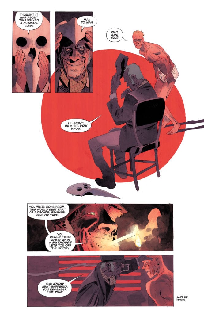
Written by Simon Spurrier, with art by Matias Bergara, colors by Jordie Bellaire, and lettering by Aditya Bidikar, DC Comics’ John Constantine: Hellblazer #10brings Constantine to account. This creative team takes Constantine, a character known for escaping unscathed from the hairiest of circumstances, and makes him feel the unforgiving pain of surviving. DC Comics’ Hellblazer continues to be the best title on the stands, helping readers digest some of the darkest parts of the current zeitgeist.
Writing
Spurrier understands the heart of John Constantine. He’s a man who is afraid of nothing except himself. Constantine has evaded death, mutilation, and capture over and over again, but at what cost? Spurrier suggests Constantine has forfeited his soul, arguably long before the start of Spurrier’s run. And so pitting Constantine against an older version of himself is the only thing that will put the fear of God in him. He must think, for the first time, about his effect on the world and wonder if he’s doing it any good.
Spurrier is the kind of writer you want to quote. Just put a snippet in to show people how brilliant his writing is. The problem is, there’s just too damn much to choose from. Spurrier rhapsodizes poetically about truth and illusion. Spurrier’s question is, are hallucinations and dreams any less real? Does it matter if Constantine sold his soul to a figment of his imagination if he willfully did it either way? Spurrier is continually pushing our concept of what’s real. So when Constantine faces the ghosts of his past, in a dream or not, it hits home. He’s still a bastard, even if the people telling him so aren’t real.
Art
Bergara hones in on the danger of this issue. As characters are being stalked, Bergara creates pages of their brutal demise that take the same format each time. Three panels, stacked on top of each other, before the rest of the page is taken up by the image of their death. Bergara simulates the feeling of something approaching. The first of the three panels is smaller. The characters only just notice their followers. Then the next panel widens. The characters are doing something about the danger, taking charge. They’re aware the danger is closer. But then the third panel shrinks back. They think they’re in the clear. And finally, Bergara shows their bloody end, stretched out across the rest of the page.
This makes each of these pages terrifying. Each moment feels like one step closer to the danger. Bergara’s repetition of the process only adds to the terror. That third panel no longer fools us. The shrinking back isn’t the character in the clear; it’s their loss of focus. Bergara achieves these small moments of fear and destruction brilliantly. As Constantine looks out at the death he’s caused, those images loom over him. They’re cobbled together on some kind of cracked black screen that looks suspiciously like panels on a comic book page. Bergara is reminding us that these aren’t the first deaths John’s been responsible for. John’s list of sins is long, and it’s been innocuously recorded in years and years of comic book pages.
Coloring
Bellaire shows us when John is really in his comfort zone. Throughout this issue, hopping through dreams and dodging death, John is in reds and greys, and he’s mostly in his underpants. Bellaire makes John a victim of his surroundings. He isn’t red, the overarching horror in the sky is, and he’s covered in its light. He isn’t grey, the darkness of his past is, and its shadow surrounds him. But when do we see John looking at home? In the color schemes we’re used to. The yellows and oranges we associate with his powers and fashion sense.
It’s when he’s lighting a cigarette that he looks like himself, washed in the lighter’s glow. Or it’s when he’s grabbing a drink in a pub. John is a man of vices, Bellaire is telling us. Vices that he uses to escape the moment. It’s these things Constantine wants to drown in, rather than face the music. These vices, these distractions from his own soul, are where he finds his identity, and Bellaire’s familiar color scheme for these moments shows us that.
Lettering
In John Constantine: Hellblazer #10, Bidikar places some captions in boxes, and others in the blank space on the page. Bidikar makes these moments, words that have no borders, feel dangerous and uncontained. The feeling is that they aren’t from anywhere; they simply exist. As one character walks down an alleyway, she feels she’s being followed. It’s the familiar moments that get a text box. She’s been followed before; she recognizes when someone’s breathing and pace matches hers. But Bidikar makes the dangerous moments both unbound and more subtle by their lack of a text box. Those are the thoughts she has of her old traumas, sneaking their way back in. As she turns to face her stalker, the captions get another text box. This thought is a thought that is comfortable and emphasized. She is choosing to have this thought, not trying to pretend it isn’t there.
As she turns to face her attacker, “…wh… where’d y–” she says as she sees them disappear. Bidikar slaps a giant blam of a gunshot on the bottom of the page to create a kind of whiplash. We go from a small quieter moment that’s broken by a loud, violent one. The prominence of the “blam” on the page means we know this moment is coming. It’s impossible to miss, even peripherally. Bidikar wants us to know what’s coming, and give a damn anyway.
DC Comics’ John Constantine: Hellblazer is easily the hardest cancellation to digest of DC Comics’ recent culling. This series rips apart the heart and soul of Constantine, so it can also rip into our own fears and ugliness. Pick up John Constantine: Hellblazer #10, out from DC Comics September 29th, at a comic shop near you. It’s the soul-searching comic we need right now.


