Home Blog Page 245

Review: STARGAZER #1 Is An Old Concept Made New – Ish

Stargazer #1 Credit: Mad Cave Studios

A jaw dropping opening and an unexplained event sets the scene for Mad Cave’s new science fiction series Stargazer. The relatively new independent publisher has a number of titles already under their belts but this year sees a range of new offerings covering a number of genres. Stargazer is part X-Files, part Close Encounters of the Third Kind, and part Saucer County. It hides it’s science fiction roots under great characters and a mysterious narrative, never giving too much away.

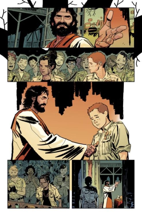
The story starts in the late 1990’s with a bunch of kids getting into trouble. Unfortunately for them the trouble escalates and the consequences come back to haunt them later in their lives. But for one of their group, Kenny, the ‘trouble’ never goes away and his life is ruled by fear and his absolute belief that he was abducted by Aliens.

Stargazer #1
Stargazer #1 Credit: Mad Cave Studios

Openings

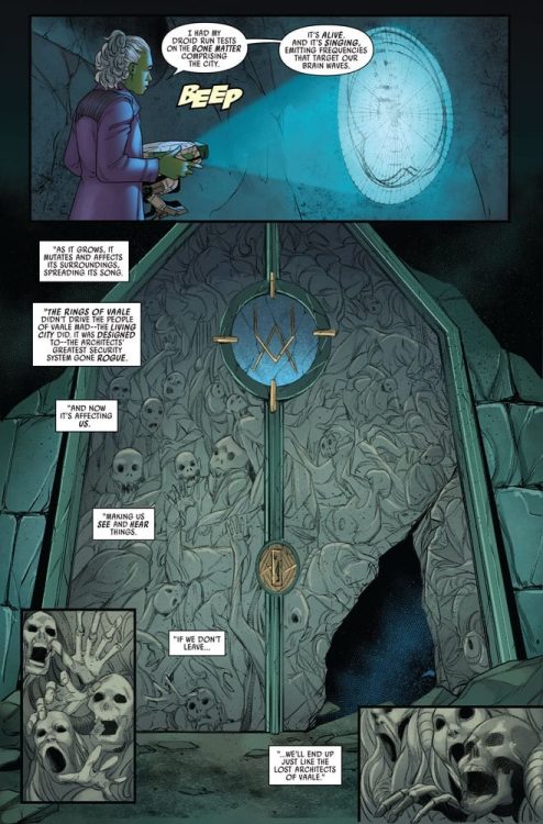
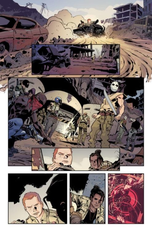
Any story that starts with an alien abduction is instantly going to be compared to a number of movies, television shows, and comics: It is impossible to escape classics such as The X-Files. The trick is finding a new way to tell the story, to surprise the reader from the outset so that any comparisons are forgotten until the entire issue has been read. Anthony Cleveland begins Stargazer with a very short opening that does just that.

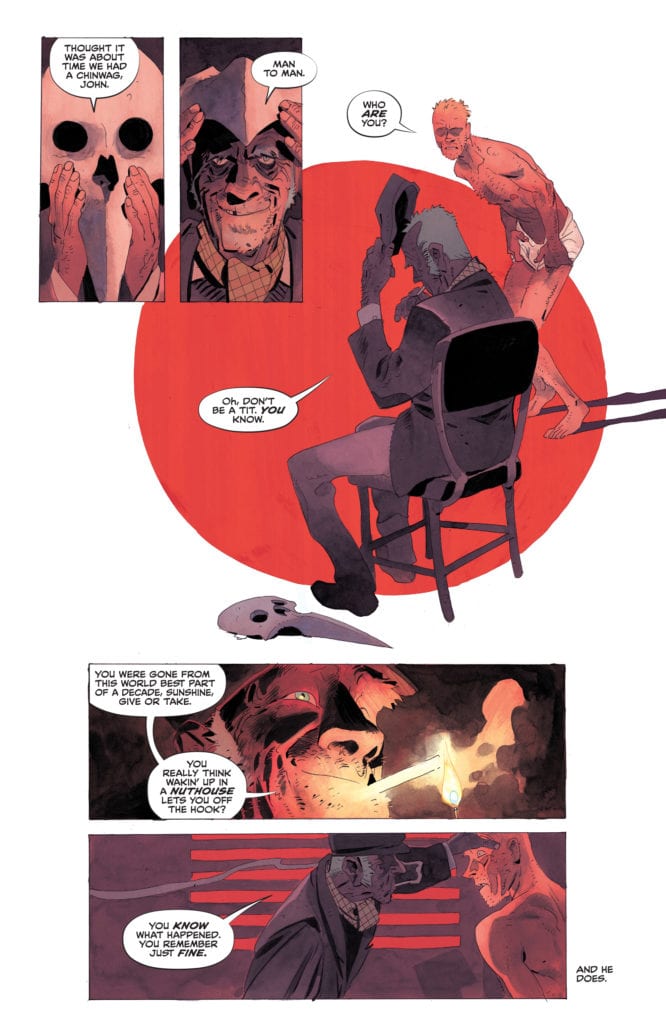
The opening includes an enigmatic doctor, a collection of Agents, and a scene of absurdity that it could almost feature in a Douglas Adams book. The setting is instantly engaging thanks to the superb color work by Stefano Simeone who gives everything a dust enshrouded haze; creating a hot and uncomfortable place. You can’t help but gag on the air that Simeone illustrates with swipes of red and orange across the panels with almost no regard for Antonio Fuso’s inks.

The two page spread that greats the reader is a double hit. First you get the shock of the Doctor, her reaction spilling from an insert panel as her speech crosses the panel border into the image below. The second is the inescapable image of death filling most of the main image. You know that what you are looking at can’t exist in the place that has been expertly described by the art and yet the image is no lie.

As an opening to a comic, Stargazer has it spot on.

Stargazer #1
Stargazer #1 Credit: Mad Cave Studios

Establishing Character

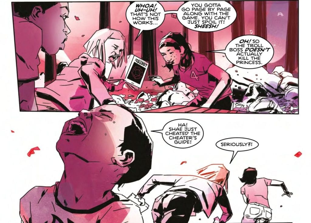
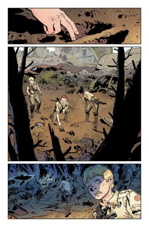
After this opening, the narrative becomes more recognisable with a group of kids out in the woods. This is comfortable territory for the reader and for the writer. Cleveland uses these pages to establish fairly quickly the dynamic of the group, making sweeping statements about the characters and their relationships with each other. It is not important to bring out the complexities of each individual but to get an overview of the cast, something that Cleveland does successfully.

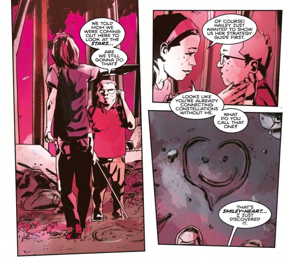
Fuso uses a collection of mid range shots in the panels in order to focus on particular members of the group but never in isolation. This helps to make the audience a part of the group and not an outsider. This reinforces the closeness of the kids. Even Kenny, who feels like an outsider to his sister and her friends, is still a dominant part of the group.

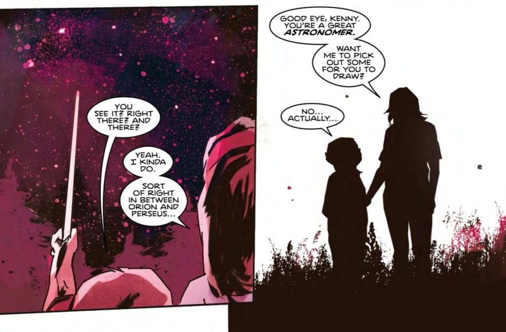
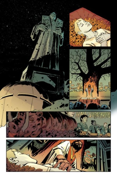
It is only when things start to go side-wards that isolation becomes part of the panels. Kenny is soon separated from the group through a number of visual signifiers, such as a metal rail distancing him from the others. Panels begin to feature Kenny and Kenny alone, making his experience more important. The reader suddenly finds themselves following a single character instead of a group.

This shift in focus draws the reader closer to the action and pulls us emotionally into the comic. When the narrative jumps forward in time, the effects of the experience are still fresh in our minds and helps us to understand the reactions of the kids when they are all grown up.


Stargazer #1
Stargazer #1 Credit: Mad Cave Studios

The Good and The Not So Good

The opening half of the comic engages the reader on an emotional level, pulling at the heartstrings. The artwork helps this by having wonderfully rendered characters and a slightly uncomfortable obsession with irregular panel shapes.

As the comic moves into the modern day the panels become more regular in shape except when the central character is under stress or talk returns to their experience as children. Fuso does a beautiful job of leading the reader through these emotional moments, signalling the emotional shifts through the use of panel layouts.

The lettering by Justin Birch also helps to lead the reader through the pages, creating a steady pace that is broken in some scenes of character tension. There are, however, moments where the speech balloons are inconsistent, especially where they butt up against the panel borders. On occasions the balloon ends flat against the frame, other times it breaks through and the balloon interior bleeds into the gutter. While off putting in places it doesn’t jar the reading experience.

The coloring can also be off putting in places. Simeone’s decision to limit the color palette throughout pays dividends during some of the scenes, especially the opening pages. The atmosphere is created quickly and effectively. Unfortunately, with later scenes, this approach generates conflicting readings of a situation. It is not always clear what the mood of the scene is. Some of the character interactions are cold and distant which are understandable. However, there are moments that move from one emotional state to another but are difficult to understand. This is because the coloring doesn’t change, or changes to subtly. If this was realistic coloring the continuity of color would be acceptable but with these sweeping emotional colors the lack of change is more noticeable.

Conclusion

When Stargazer works, it works really well. Each of the creators pull together to produce an enthralling piece of work. Despite the similarities to a number of other Alien Abduction stories, Stargazer manages to impress with enough shocking or emotional moments to make the reader forget about comparisons.

The cliches of the genre are apparent throughout but it’s as if Cleveland leans into them, embracing the imagery, instead of trying to cover them up. The outcome is something that feels like an homage instead of a rip-off. It almost makes you wonder if there is more going on behind the images. Is it all as it seems?

Stargazer #1 is an exciting first issue with a number of stand out moments. There are a number of great characters to follow and art work that impresses more often than not. This is an easy comic to recommend, especially if you feel there’s an X-Files shaped hole in your life.

Stargazer by Mad Cave Studios and is available now both physically and digitally.

Monkeys Fighting Robots Youtube

Turning the Tables in STAR WARS: DOCTOR APHRA #4

STAR WARS: DOCTOR APHRA #4, available Wednesday from Marvel Comics, is bringing Doctor Aphra’s adventures back into the forefront, and that means she’s got another bad scheme or two in mind.

The Lost City of Vaale doesn’t seem like the most welcoming of places.

Doctor Aphra’s first series ended in a moment that almost seemed to redeem her character. She made bold moves and decisions – but for once, she was sincerely doing it for the greater good. As opposed to, you know, trying to land a big score.

Now she has a new series, and it’s become clear that the Aphra we all know and love hasn’t changed all that much. She’s still coming up with schemes and heists, though one would like to believe that she has a made room in her heart for more compassion.

Star Wars: Doctor Aphra #4 continues her latest series of adventures, as she works alongside a team that is already fracturing. Apparently, even her first reappearance in the field isn’t enough to protect her from bad teammates and backstabbing.

An escape route perfectly laid out! That isn’t like Doctor Aphra’s luck…

The Writing

If there’s one thing you can count on when it comes to Doctor Aphra, it’s that she’s always got a plan. She also always knows the difference between a safe plan, and a good plan. Feel free to guess which one she typically goes with.

All of this is relevant information for Doctor Aphra #4. Written by Alyssa Wong, this issue brings her latest plan to an end, but at least she’s already got a few more plans in motion. You know, for dealing with the sudden conclusion of the original plan.

There were some interesting revelations made in this issue, especially in regards to the Lost City of Vaale. It’s actually almost a shame that they didn’t stay there longer, but then again, Aphra never really does seem to stick around much. In this case, it wasn’t much of a choice. However, it does prove that once again Aphra is the most talented at finding fascinating (and deadly) locations.

Overall, this was an incredibly fast issue to read, with much of it setting up for a larger clash in the future. Interestingly, the character development is also setting up for something, but that one is harder to predict.

That however, seems to be more in line for the luck of Doctor Aphra.

The Art

Doctor Aphra #4 features some bold and dynamic artwork. It’s an absolute highlight, not just for this issue, but of the entire series so far. Marika Cresta (art), Rachelle Rosenberg (colors), and VC’s Joe Caramagna (letters) are all working together here, and the end result is quite memorable.

The characters themselves are unique and interesting – from the newly introduced crew, to Aphra’s typical style and preferred partners. The variety is notable, and it also helps to balance out the visual look as well.

The colors lean towards bold, especially in terms of the backgrounds. This went a long way in defining the space both groups were in. Though the starry skies probably steal the show, in the end. Actually, no, that isn’t quite accurate. The Lost City of Vaale does that.

Even when only shown as a backdrop, the City is shockingly foreboding. The faces carved into the stone as every bit as haunting as they should be, and it really does set the tone – even when the crew is actively working to leave.

And there goes the Lost City of Vaale.

Conclusion

Doctor Aphra #4 is another fun and chaotic adventure for Doctor Aphra, even while setting up for a larger confrontation in the future. It’s issues like these that allow for the major moments to actually feel like they carry weight, and so it’s impossible not to look forward to what will happen next.

Monkeys Fighting Robots Youtube

How MERCY #6 Brings the Tale to An End

The end is here in Mercy #6.

MIRKA ANDOLFO’S MERCY #6 is set to conclude the series this Wednesday. Available from Image Comics, this is not a series to skip. The combination of stunning artwork, chilling plots, and intricate world-building demands attention for this series.

The end is here in Mercy #6.

By this point, most fans know all about The Woodsburgh Devil, not to mention all of the reasons why they chose to haunt such a small town. Mirka Andolfo’s Mercy has made a point of diving into the darker side of this town, revealing the practices occurring within the mine.

Now that the entire world has been established, alongside all of the pain and vendettas, it’s time to see this series conclude. It’s a bit depressing to think about, but then again, Mercy never made a promise to be uplifting.

This series has been groundbreaking for a variety of reasons. The biggest point being how it forced a debate about morality to the surface. Who defines ‘good’ and ‘bad’? Is this a definition that can only apply to humans? It’s certainly a series that makes you think.

*Mercy #6 once again contains some graphic imagery, like much of the series itself. However, it might just tip the scale in this issue, thanks to those targeted. This is not an issue (or series) for sensitive or young readers.

An unlikely family has formed in Mercy #6.

The Writing

It’s almost hard to believe that it all ends with Mercy #6, but that is exactly what is happening here. It’s a tale that feels ageless, thanks to the creatures within, and yet there’s an oddly finite time frame for the series itself. An interesting juxtaposition, when one thinks about it.

Mirka Andolfo was clearly not afraid about pulling punches for this sixth and final issue in the series. The actions were harsh and brutal at times – but then again, the whole series has been that way, so this shouldn’t be that much of a surprise.

Looking back on it, the actions and events in this issue do justice to the entire series. A promise was made at the beginning, and a promise was kept. At the end of the day, isn’t that all we can ever ask for?

One thing Mercy #6 does wonderfully is tug on the heartstrings of the readers. This once again raises points about morality, monsters, and humans, putting it all into question once again. It’s beautiful, it’s chilling, and it’s more than a little heartbreaking. Yet Mercy wouldn’t have been the same without this inclusion.

Lady Hellaine in repose (Mercy #6).

The Art

The artwork for Mercy #6 is beautiful, as always. Mirka Andolfo is the leading artist, as well as being the author of the entire series. Though special thanks go to Gianluca Papi and Chiara Di Francia (from Arancia Studio). Additionally, Fabio Amelia stepped up for the lettering.

It’s not surprising to say that this is one graphic yet compelling issue. All of the plot points came to a head in this final issue, and it brought with it more than a fair share of danger. The otherworldly creatures do appear more threatening – and less human – than ever in this issue.

That being said, there is a sense of delicacy in the way the monsters are portrayed. Not just the monsters themselves (though they do seem oddly elegant), but in the devastation they left behind. You can really see how some elements were carefully skirted around – yet the impact is still there.

What is truly impressive is the sheer amount of emotion infused into the series. It’s raw and shockingly human – an ironic twist, in some cases. Yet it’s the perfect final touch for this series, and it’s conclusion.

Conclusion

Mercy #6 was a dramatic and climatic issue, bringing the series to close with a daunting sense of finality. Yet it is also very much the conclusion this series deserved, wrapping up all the plots in a beautiful and compelling manner. One that will linger in the hearts and minds of readers.

Monkeys Fighting Robots Youtube

A Most Chaotic Conclusion In LUDOCRATS #5

Time to run from the BOREDOM gavel.

LUDOCRATS #5, available this Wednesday from Image Comics, brings one of the most comical, inane, and quirky series to a close – and it does it with gusto. Naturally, the series like no others must find a most original way to conclude.

***SPOILER WARNING***

spoilers ahead

Ludocrats has been a ride right from the start, with the entire cast of characters abhorring anything that could potentially be considered mundane or otherwise boring. They’ve romped through their world, and done their all to protect their ludicrous ways (literally).

Unfortunately, all good (and chaotic) things must come to an end. That means that Ludocrats too, ends here with the fifth issue. On the bright side, that means that there’s going to be a whole lot less naked Otto in your future…probably.

Time to run from the BOREDOM gavel.

The Writing

Ludocrats #5 is every bit the quirky conclusion fans could have hoped for. No, strike that. It is ten times quirkier and crazier than that, with lots of fun, twists, and countless references and jokes. It makes for a memorable conclusion, to say the least.

If you ever needed proof that the writers, Kieron Gillen and Jim Rossignol know how to take a breathe and have a bit of fun, look no further than Ludocrats. This series has never taken itself too seriously (they’d be offended by the very idea). Yet this final issue felt like it brought that element to a whole new level.

Though maybe that is merely the number of fourth-wall breaks towards the end that end up giving it that impression. Either way, this issue works hard to say goodbye to a series that was as standout as it was insane.

At this point in the series, one might think that there is no room left for twists or surprises. After all, Ludocrats has kind of pulled out all the stops. But as it turns out, you’d be wrong. The major twists that come at the conclusion are exactly that – utterly unexpected, altering the tone. And then altering it again. In true Ludocrats fashion. It’s actually the perfect ending, when you think about it.

Ah, the love of Otto’s life is getting some attention on this variant cover of Ludocrats #5.

The Art

The artwork inside Ludocrats #5 is every bit as energetic and chaotic as the storyline it portrays. That probably shouldn’t be a surprise as this point. Otto and his friends (Enemies? Frenemies?) have quite the romp over this world, and it simply would not have been the same without the artwork to support it.

Jeff Stokely was the lead artist, and thus the lead chaos infuser. Meanwhile Tamra Bonvillain provided those bright and merry colors, and Clayton Cowles the bold and sometimes dangerous lettering (but really, how often does one get the opportunity to run away with lettering?).

What is impressive about the artwork in this particular issue is that it contains two completely different art styles. There’s the usual quirkiness, and then there’s a darker and intentionally morose style, which is a pleasant twist.

Bonus points for the inclusion of dozens of portraits at the very end of this issue. Variant covers, character portraits, and previous works all make an appearance in the end. It’s unusual, but it absolutely fits the style of this series. Artists included in the fray are Jamie McKelvie, Kris Anka, Ro Stein & Ted Brandt, Darko Lafuente, Mirka Andolfo, and Skottie Young.

Conclusion

In short, Ludocrats #5 is without a shadow of a doubt the most chaotic conclusion this reviewer has ever seen – and it isn’t afraid to celebrate in that fact. This series has truly been a unique (and ludicrous) series, from start to finish.

Monkeys Fighting Robots Youtube

Milestone Titles Now Available Digitally From DC Comics

Milestone Icon

We got the news at FanDome that the Milestone line would be rejoining the DC Comics family. Now, the first batch of titles — featuring Hardware and Icon — have been announced.

Here’s the official word:

DC Reveals First Wave of Milestone Collected Editions Available For Purchase Digitally

 Hardware: The Man in The Machine Available Now

 Icon: A Hero’s Welcome Available Tuesday, October 6

 Icon Vol. 2: The Mothership Connection Available Tuesday, October 13

More Titles to Follow Ahead of An All-New Static Shock Digital Comic Book Series, Scheduled for February 2021

Following the announcement on the Milestone panel at DC FanDome: Hall of Heroes, DC revealed today that for the first time ever, titles from the Milestone library are available for purchase now on digital platforms such as Comixology, Amazon Kindle, Apple and others.

Hardware: The Man in the Machine (2010)

Written by Dwayne McDuffie

Art by Denys Cowan and J.J. Birch

$12.99

On Sale now

This first-ever HARDWARE collection introduces inventor/engineer Curt Metcalf, who begins his adventures by breaking free of his employer, businessman Edwin Alva, who refused to share the profits from Metcalf’s many creations. Discovering that Alva is tied to organized crime and learning that no law enforcement agency would touch him, Metcalf created the high-tech Hardware armor that enabled him to take on his corrupt boss.

Icon: A Hero’s Welcome (1999)

Written by M.D. Bright and Dwayne McDuffie

Art by M.D. Bright

$12.99

On Sale October 6

The flagship character from Milestone Comics is back in this new printing of the classic title collecting ICON #1-8. This is the title that introduced Augustus Freeman, a successful lawyer who covertly uses his alien super-powers to help those in need. But when a teenaged girl from the streets convinces him to use his abilities to inspire his people and becomes his sidekick, Rocket, the affluent Augustus embraces his true destiny and becomes Icon, the hero of Dakota.

Icon Vol. 2: The Mothership Connection (2010)

Written by Dwayne McDuffie

Art by M.D. Bright and Mike Gustovich

$16.99

On Sale October 13

In 1869, the life pod of an adult alien crashed in the cotton fields of the South. Discovered by a slave woman, the extraterrestrial’s genetic structure was reconfigured, and he was transformed into an African American baby. Now, over a hundred and twenty years later, Augustus Freeman is a successful lawyer who covertly uses his alien super-powers to help those in need. But when a teenaged girl from the streets convinces him to use his abilities to inspire his people, the affluent Augustus embraces his true destiny and becomes Icon, the hero of Dakota.

More titles will be added between now and February 2021, when DC and Milestone debut an all-new Static Shock digital series. For the latest information on Milestone and the World’s Greatest Super Heroes, visit the website at www.dccomics.com and follow on social media @DCComics and @thedcnation.

Monkeys Fighting Robots Youtube

BOMB QUEEN: TRUMP CARD #2 – Let Outrage Roar

Bomb Queen: Trump Card #2 Cover

Bomb Queen: Trump Card #2 is this week’s release from Image Comics’ Shadowline Productions. Jimmie Robinson, as sole creative outlet, goes right into the social satire.

Recap

In the last issue, Bomb Queen decides to run against Donald Trump to be president after an encounter with White Knight. But she seems to be in a sticky situation over some Generation Z superheroes.

Bomb Queen: Trump Card #2 Outrage Rules

Bomb Queen: Trump Card #2 makes clever use of social satire in ways that attract the reader’s attention. In just the opening act, the Queen uses the attack on her to advertise her campaign. Outrage is the Queen’s primary weapon to get her point across. Whether it’s the way she dresses, the uncensored profanity on live TV, or showing Donald Trump up at his rally. Shock advertisement has a paradoxical way of working. Despite the risque subjects, as long as the audience has enough tolerance and the message stays on brand, the point gets across. It is a significant part of how Donald Trump won the 2016 election.

Along with this are constant references to the toxic sides of the comic industry. There are the little tidbits about the comic industry being dead, often in the form of memes. All despite sales data that display, they’re still in the millions even in the pandemic. Bomb Queen: Trump Card #2 shows that despite these projections, comics are very much alive. If you want a better example, the Queen had an orgy with followers of the campaign-that-shall-not-be-named who all end up dead at her feet. Whether anyone’s for or against her, it’s the Queen who wins.

Art

Jimmie Robinson pulls out all of the stops in his art duties. In the first few pages of Bomb Queen: Trump Card #2, he displays his main character’s vanity. From the way, she decorates her penthouse to advertising her own comics in the background of the news interview. But more importantly, he shows how the world around everyone turns. On a bus are advertisements with varying campaigns that go against one another. To anyone with a linear sense of good and evil like White Knight, they are hopelessly outmatched.

No better display of the above description is in the coloring and lettering. When Bomb Queen appears at the Trump Rally, she speaks about Trump bringing unity to a crowd of overwhelmingly white men who wave Confederate flags. Then she proceeds to praise Trump in a pose resembling the Nazi salute. It’s a display of having power over a man who got his strength from both overtly bureaucratic politics and memes. But now, with someone who can challenge him, Trump is at the Queen’s mercy.

Long Live Bomb Queen: Trump Card #2

Bomb Queen: Trump Card #2 is a display on why the Bomb Queen franchise is memorable. It’s self-awareness of what it’s satirizing means that it pays attention to the context of its subjects. On the surface, it’s just Bad Girl trash, yet that hasn’t stopped other Bad Girls like Lady Death from financial success. Neither does outrage hamper the likes of Trump or the earlier censored campaign. So why would Bomb Queen not satirize these aspects?

What do you all think? Despite everything in this review, is this just Trump or Bad Girl propaganda in disguise? Leave your thoughts in the comments.

Monkeys Fighting Robots Youtube

HELLBLAZER #10 Is The Soul-Searching Comic We Need Right Now

Hellblazer Spurrier DC Comics

Written by Simon Spurrier, with art by Matias Bergara, colors by Jordie Bellaire, and lettering by Aditya Bidikar, DC Comics’ John Constantine: Hellblazer #10 brings Constantine to account. This creative team takes Constantine, a character known for escaping unscathed from the hairiest of circumstances, and makes him feel the unforgiving pain of surviving. DC Comics’ Hellblazer continues to be the best title on the stands, helping readers digest some of the darkest parts of the current zeitgeist.

Writing

Spurrier understands the heart of John Constantine. He’s a man who is afraid of nothing except himself. Constantine has evaded death, mutilation, and capture over and over again, but at what cost? Spurrier suggests Constantine has forfeited his soul, arguably long before the start of Spurrier’s run. And so pitting Constantine against an older version of himself is the only thing that will put the fear of God in him. He must think, for the first time, about his effect on the world and wonder if he’s doing it any good.

Spurrier is the kind of writer you want to quote. Just put a snippet in to show people how brilliant his writing is. The problem is, there’s just too damn much to choose from. Spurrier rhapsodizes poetically about truth and illusion. Spurrier’s question is, are hallucinations and dreams any less real? Does it matter if Constantine sold his soul to a figment of his imagination if he willfully did it either way? Spurrier is continually pushing our concept of what’s real. So when Constantine faces the ghosts of his past, in a dream or not, it hits home. He’s still a bastard, even if the people telling him so aren’t real.

Hellblazer DC Comics Spurrier

Art

Bergara hones in on the danger of this issue. As characters are being stalked, Bergara creates pages of their brutal demise that take the same format each time. Three panels, stacked on top of each other, before the rest of the page is taken up by the image of their death. Bergara simulates the feeling of something approaching. The first of the three panels is smaller. The characters only just notice their followers. Then the next panel widens. The characters are doing something about the danger, taking charge. They’re aware the danger is closer. But then the third panel shrinks back. They think they’re in the clear. And finally, Bergara shows their bloody end, stretched out across the rest of the page.

This makes each of these pages terrifying. Each moment feels like one step closer to the danger. Bergara’s repetition of the process only adds to the terror. That third panel no longer fools us. The shrinking back isn’t the character in the clear; it’s their loss of focus. Bergara achieves these small moments of fear and destruction brilliantly. As Constantine looks out at the death he’s caused, those images loom over him. They’re cobbled together on some kind of cracked black screen that looks suspiciously like panels on a comic book page. Bergara is reminding us that these aren’t the first deaths John’s been responsible for. John’s list of sins is long, and it’s been innocuously recorded in years and years of comic book pages.

Coloring

Bellaire shows us when John is really in his comfort zone. Throughout this issue, hopping through dreams and dodging death, John is in reds and greys, and he’s mostly in his underpants. Bellaire makes John a victim of his surroundings. He isn’t red, the overarching horror in the sky is, and he’s covered in its light. He isn’t grey, the darkness of his past is, and its shadow surrounds him. But when do we see John looking at home? In the color schemes we’re used to. The yellows and oranges we associate with his powers and fashion sense.

It’s when he’s lighting a cigarette that he looks like himself, washed in the lighter’s glow. Or it’s when he’s grabbing a drink in a pub. John is a man of vices, Bellaire is telling us. Vices that he uses to escape the moment. It’s these things Constantine wants to drown in, rather than face the music. These vices, these distractions from his own soul, are where he finds his identity, and Bellaire’s familiar color scheme for these moments shows us that.

Lettering

In John Constantine: Hellblazer #10, Bidikar places some captions in boxes, and others in the blank space on the page. Bidikar makes these moments, words that have no borders, feel dangerous and uncontained. The feeling is that they aren’t from anywhere; they simply exist. As one character walks down an alleyway, she feels she’s being followed. It’s the familiar moments that get a text box. She’s been followed before; she recognizes when someone’s breathing and pace matches hers. But Bidikar makes the dangerous moments both unbound and more subtle by their lack of a text box. Those are the thoughts she has of her old traumas, sneaking their way back in. As she turns to face her stalker, the captions get another text box. This thought is a thought that is comfortable and emphasized. She is choosing to have this thought, not trying to pretend it isn’t there.

As she turns to face her attacker, “…wh… where’d y–” she says as she sees them disappear. Bidikar slaps a giant blam of a gunshot on the bottom of the page to create a kind of whiplash. We go from a small quieter moment that’s broken by a loud, violent one. The prominence of the “blam” on the page means we know this moment is coming. It’s impossible to miss, even peripherally. Bidikar wants us to know what’s coming, and give a damn anyway.

Hellblazer Spurrier DC Comics


DC Comics’ John Constantine: Hellblazer is easily the hardest cancellation to digest of DC Comics’ recent culling. This series rips apart the heart and soul of Constantine, so it can also rip into our own fears and ugliness. Pick up John Constantine: Hellblazer #10, out from DC Comics September 29th, at a comic shop near you. It’s the soul-searching comic we need right now.

Monkeys Fighting Robots Youtube

Review: The Boy Behind the Door Offers Nail biting Child Horror

The Boy Behind the Door is every parent’s worst nightmare, a film centered on two young boys caught in a dire situation. The film had its world premiere last night at Fantastic Fest, and it was a hit. It draws attention to child abduction, and sex trafficking, which is probably why landing a distributor might be an issue. However, this is a very relevant film that addresses a dark subject matter and is capped off by two stellar child performances.

This has been the year of timely films, and The Boy Behind the Door is at the top of that list. While logically flawed, the film packs a very important message about friendship and wants to be a statement against the heinous rings that exist around the world. The Boy Behind the Door is so relentless it might cause parents to keep a closer eye on their children. Directed and written by David Charbonier and Justin Powell, the film stars Lonnie Chavis, Ezra Dewey, Scott Michael Foster, and Kristin Bauer Van Straten. The Boy Behind the Door follows two best friends, Bobby (Chavis) and Kevin (Dewey), who are abducted during the day while playing. After being taken to a house, Bobby quickly escapes but returns to save his friend from the danger within.

Lonnie Chavis in The Boy Behind the Door

While very engaging from start to finish, this film rushes to its point and you don’t really get to know the two kids. Still, the predicament they are placed in will be enough to get audiences on their side. The villains in the film aren’t that fleshed out either, but they are child traffickers and that’s all that matters. The Boy Behind the Door does a terrific job of showing the strong bond between these two best friends because Bobby will not leave this house without Kevin. Most of the film is Bobby running around the house trying to dodge his captors, and this bridges into a few homages from other classics like The Shining. Usually, the bad decisions characters make are unforgivable, but these are two kids behaving just how two scared kids would behave in this horrific situation. Overall, this script is solid and the bond between Bobby and Kevin will keep everyone invested.

Chavis and Dewey are incredible, these two actors are examples of the talent child actors can possess. They easily will draw you in with their cries and screams, as they beautifully bring Bobby and Kevin to life. The interactions they share are spectacular to watch and Chavis is giving it his all here as Bobby. He is our focus for most of the film, taking us on this thrilling cat and mouse adventure that resembles a twisted version of Home Alone. When you have two kids in peril, it may become too intense for some, but these two young stars are phenomenal in The Boy Behind the Door.

Lonnie Chavis as Bobby in The Boy Behind the Door

Charbonier and Powell have crafted a fast-paced thriller that should help bring attention to these real-world issues. These two snatch you up and refuse to let go till every hair on your back is raised. The ways they create fear out of these lingering shots of shadows and intimidating standoffs throughout the house is amazing. The Boy Behind the Door starts off very innocent and quickly becomes a nerve-racking ride that raises the tension with each passing moment. Anton Sanko’s score only adds to the danger lurking in the shadows for these two best friends, it accompanies the intense faceoffs wonderfully. Also, it needs to be said that this film’s message is made loud and clear, and it never comes off as exploitative.

The Boy Behind the Door follows familiar beats, copies a few scenes from better films, but still delivers an engaging adventure that brings attention to a growing issue that a lot of people aren’t concerned with. A heart-pounding thriller that deserves a theatrical release, but probably won’t get the recognition it deserves. A call to action that gets brought to life by two rising actors who deserve every bit of praise they are destined to get.


Monkeys Fighting Robots Youtube

AfterShock Announcement: The Scouts Take Over The Future In SCOUT’S HONOR #1

Scout's Honor #1, cover

AfterShock comics has announced a new series about a post-apocalyptic future where society follows an ancient Ranger Scout rule book. SCOUT’S HONOR #1, available to retailers on January 6th, 2021, is brought to you from multiple Ringo Award-nominated writer David Pepose (Spencer & Locke, Going to the Chapel, The O.Z.) and artist Luca Casalanguida.

Says AfterShock about the new series: “…in a harsh survivalist society that only allows men to serve, Kit has concealed her identity as a woman to pursue her calling as a Ranger Scout. But when she makes a shocking discovery dating back to the Ranger Scouts’ conception, Kit will be forced to reexamine everything she once believed,…”

You can check out a collection of images from the first issue and read the full AfterShock press release below.

Are you a fan of post-apocalyptic stories with a twist? let us know what you think in the Comments section, and please share this post on social media using the links below.

SCOUT’S HONOR #1 / $4.99 / 32 pages / Color / On sale 1.06.21

Writer: David Pepose

Artist: Luca Casalanguida

Colorist: Matt Milla

Letterer: Carlos M. Mangual

Cover: Andy Clarke w/ Jose Villarrubia

Incentive Cover: Brent Schoonover

Years after a nuclear apocalypse, a new society has risen from the ashes…and their bible is an old Ranger Scout manual.

A young Ranger Scout named Kit has endured the harsh survivalist upbringing needed to conquer the irradiated Colorado Badlands. But after discovering a terrible secret once lost to history, Kit must risk everything on a dangerous quest to uncover the truth behind the Ranger Scouts’ doctrine.

From multiple Ringo Award-nominated writer David Pepose (Spencer & Locke, Going to the Chapel, The O.Z.) and artist Luca Casalanguida (James Bond, Lost Soldiers) comes a post-apocalyptic coming-of-age tale that proves when all you know is a lie, a Scout’s Honor is the only way to move forward.

DAVID PEPOSE ON WHAT THE BOOK IS ABOUT AND WHY HE’S EXCITED FOR IT TO COME OUT:

“Scout’s Honor is about a post-apocalyptic cult rising from the ashes of a nuclear war… and their bible is an old Boy Scout manual. Our series follows Kit, a promising young trainee with a big secret — in a harsh survivalist society that only allows men to serve, Kit has concealed her identity as a woman to pursue her calling as a Ranger Scout. But when she makes a shocking discovery dating back to the Ranger Scouts’ conception, Kit will be forced to reexamine everything she once believed, as she struggles to survive both her fellow Ranger Scouts and the radioactive horrors of the Colorado Badlands.

Having been working on this story for over a year now, I’m excited for the world to finally get to meet Kit, and to discover the world of Scout’s Honor. This isn’t just a post-apocalyptic action story — it’s a story about losing your religion, and about having to find your way back through the wilderness. It’s a story about the blindspots of history, and about confronting the ugly truths of our past that lurk beneath the shadows. And that’s not even touching upon the incredible artwork by Luca Casalanguida, Matt Milla and Carlos Mangual, who have made the Colorado Badlands a beautiful but harrowing place for even the toughest of Ranger Scouts. I truly believe that Kit is a heroine for our era, and I can’t wait for readers to follow her dangerous journey in the pages of Scout’s Honor.”

DAVID PEPOSE ON SOME OF HIS INSPIRATIONS BEHIND CREATING THE BOOK:

“The best way for me to describe Scout’s Honor is like Fallout meets Mulan meets The Handmaid’s Tale… but there are tons of other influences that found its way into the book, as well. Video games like The Last of Us and Horizon Zero Dawn were also crucial inspirations for fleshing out this dangerous post-apocalyptic world, while TV shows and movies like The Path and The Hunger Games really spoke to this dystopian society, and the feeling of rediscovery when you learn your entire life might be a lie. And that’s not even including real-world inspirations, like the disillusionment felt by many after the sexual abuse stories coming from the Catholic Church, down to my own spiritual and political awakening as a Jewish writer originally raised in the conservative Midwest.

But ultimately, my biggest inspiration behind the series was watching my two younger brothers serve as Boy Scouts — from their uniforms to their manuals to their bylaws, the Boy Scouts as an organization has this kind of pageantry and regulations that can often feel religious. The idea of history being like a game of telephone felt like some exciting narrative territory to explore, and the idea of the Boy Scout ethos mutating into this hypermasculine survivalist cult felt eerily plausible given the state of the world today. Whether it takes weeks or hundreds of years, eventually the truth will come out — and having to reorient yourself in the face of these startling revelations can be challenging and painful. Thankfully for Kit, the most important Ranger

Scout law is to always be prepared…”

DAVID PEPOSE ON WHAT HIS EARLIER CREATOR-OWNED EXPERIENCES TOUGHT HIM THAT HE WAS ABLE TO APPLY TO THIS BOOK:

“Books like Spencer & Locke, Going to the Chapel, and The O.Z. have taught me that no matter how crazy your high-concepts are, it doesn’t matter one bit unless you’ve got a universal human core at the heart of your story, some emotional anchor that people can access to get invested in your story. If you boil it all down, I truly believe that storytelling is the art of making complete strangers give a damn — and I think in the case of Scout’s Honor, we can all relate to having the rug pulled out from under us, that we find ourselves believing in things that maybe aren’t as constant or enduring as we once thought.

Whereas much of my previous work follows characters digging themselves out of the wreckage of longstanding heartache, Kit’s journey in Scout’s Honor is dealing with the immediate aftermath of trauma, and trying to make sense of it and move forward. There’s a sense of catharsis that comes from exploring trauma that really resonates with readers, because we all have painful experiences that we’re looking to transcend and move past. In that regard, Scout’s Honor really fits in nicely with my previous work, while still being unique thanks to Kit’s distinctive struggles with her life in Ranger Scout society.”

DAVID PEPOSE ON IF HIS TIME AT DC COMICS HELPED HIM BECOME A SUCCESSFUL FREELANCE WRITER:

“Absolutely — it took me three years to get my internship at DC Comics, and it was worth every phone call. (Laughs) It’s easy as a reader to overlook the various elements that go into making a comic — people might know a writer or an artist’s names, but not many readers know who’s inking or coloring or lettering a book, let alone knowing who’s editing or working on production, let alone departments like marketing or publicity or creative services. My time at DC was an amazing experience because it really made me put a face to every aspect of the comics-making process. To be honest, it really was an eye-opening experience that made me truly realize that you could make comics as a career — and absolutely lit the fire under me to pursue that dream long-term.

I’m also lucky because DC was my first experience of interacting with comics editors, including Mike Marts, who would wind up becoming my terrific editor on Scout’s Honor alongside the equally incredible Christina Harrington. I learned so much about the editorial process, which was invaluable towards getting my own comics off the ground — everything from finding reference art, to learning how scripts are paced and formatted, to providing notes on thumbnails, colors, and lettering, I learned

during my time at DC. It really was the perfect boot camp for my comics career.”

DAVID PEPOSE ON ADVICE HE HAS FOR FOLKS THAT WANT TO GET STARTED MAKING COMICS:

“Start small, and get your reps in. When I was first dipping my toes in the world of making comics, I wrote a short script every day for 90 days. But here’s the big secret — they don’t have to be good, let alone published. The most important thing is you will learn something from every script you finish. They say you have to write 100,000 terrible words in order to get to the gold, and I think aspiring creators owe it to themselves to train as hard as they can by themselves before trying to start the marathon of creating a miniseries.

The other critical piece of advice I like to remember? Dessert first — while a reader consumes your story in chronological order, that doesn’t mean you have to build it that way. Writing is supposed to be fun, so write the stuff that speaks to you first — the worst-case scenario is you’ll find out quickly you didn’t have much to work with, but I’ve always found that once you start to pick up momentum, the rest of the story will start to click together in fun and unexpected ways.

And lastly, the other thing I want people to know is that if you want to make a comic, you can make a comic — this is a process that anyone can pick up with enough time, patience, and self-discipline. As someone who grew up in an area with few creative role models, I can tell you firsthand that so many people deprive themselves of a creative career simply because they didn’t give themselves permission to think of themselves as creators. So if you have a dream to make comics, go for it — and start today. Take it from me — the only regret in my career is that I didn’t make the leap years ago.”

Monkeys Fighting Robots Youtube

Kickstarter Spotlight: THE TRAP By Lance Briggs, Kyle Higgins, And Danilo Beyruth

Monday morning, former Chicago Bears linebacker Lance Briggs announced the Kickstarter for his passion project The Trap, a 120-page sci-fi graphic novel.

The creative team on the project includes Briggs, writer Kyle Higgins, artist Danilo Beyruth, colorist by Tamra Bonvillain, lettering by Hassan Otsmane-Elhaou, and Book Design by Sasha Head.

Kickstarter Spotlight: THE TRAP By Lance Briggs, Kyle Higgins, And Danilo Beyruth

About the book:
In THE TRAP, Jaylen Robinson is a rising sports star from a not-so-great part of the galaxy: Earth. He’s worked hard his whole life. Everyone’s saying that Jaylen is the Next Big Thing for the interstellar sport of the future: surfriding. The future is his. This is his chance. Until it’s not.

Check out the Kickstarter Campaign here: https://www.kickstarter.com/projects/457252441/the-trap-presented-by-nfl-star-lance-briggs-and-kyle-higgins

Why Monkeys Fighting Robots is excited about The Trap:
• Chicago Sci-Fi, Nuff said!
• Danilo Beyruth’s style works well with an urban, punk, futuristic story.
• Lance Briggs’ statement below, the raw emotion and heart can’t help but endear readers

Briggs’ gives an inside intimate look at the meaning of The Trap:

Before I played professional football, my life was very different.

I grew up in Sacramento, CA during the 1980s and 1990s, with my mother and two older sisters. But while many people hear “Sacramento” and associate it with a place of power and decision making in the state of California, the reality— for many of its residents— is anything but.

Our family struggled no differently than most in the south area. There were times when the pantry was bare and the fridge was empty. Days or weeks without power. Waking up to cold showers before school.

For those of us who came of age in an environment like this, we have a simple name for it: The Trap. Put simply, the name translates to a community that has been failed by its governing bodies. The Trap is both a neighborhood and a resulting way of life— a system designed to keep you from succeeding.

Living in an environment like this comes with an inherent sense of hopelessness. It feels like no one cares about you, like you have no voice, because when you try to use your voice it’s met by common refrains like ”just work harder,” or “comply with the police and you won’t get hurt.” But the truth is far more bleak, made up of liquor stores on every corner, drugs at every turn, constant police stereotyping, shootings, siblings in the house suffering from addiction and eviction notices because your brother stole everything your mother had.

In The Trap, there are very few ways to make money. As a result, residents resort to selling drugs or gang life, which leads to jail time, which then leads to even fewer job prospects. And so, the cycle repeats.

Fortunately for me, I was able to escape. A path towards professional football and a mother who refused to let me fall through the cracks helped me to stay focused. In no small order, both saved my life.

But I am the exception rather than the rule.

The reality is, that few people really understand how easily their lives could have gone a different direction had they simply been born in a different situation— environments, after all, breed influence. When you grow up in The Trap, you do what you have to and become who you have to be, purely to survive.

I’ve spent the last several years, post-retirement, wondering how we give context to issues that too many people disregard, because they don’t apply to them? If you’ve never lived this life, how could you possibly understand it? How do we show people that the lives of the economically and marginally oppressed are just as valid as their own?

It’s time more people understood what THE TRAP really means.

The Trap will be presented in an oversized, deluxe format hardcover (8 ¾ x 11 ⅝ ).

Monkeys Fighting Robots Youtube