Home Blog Page 235

Review: THE AMAZING SPIDER-MAN #50.LR – The Challenges Of Balancing An Issue

The Amazing Spider-Man #50.LR Cover

The Amazing Spider-Man #50.LR, out now from Marvel Comics, is a detour from the main storyline of The Amazing Spider-Man to fit the sheer amount of content in the “Last Remains” arc.

About the Book:
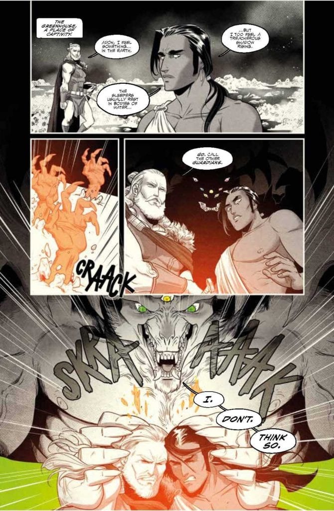
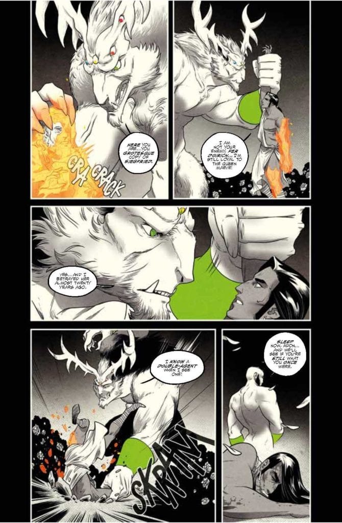
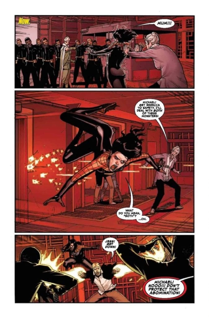
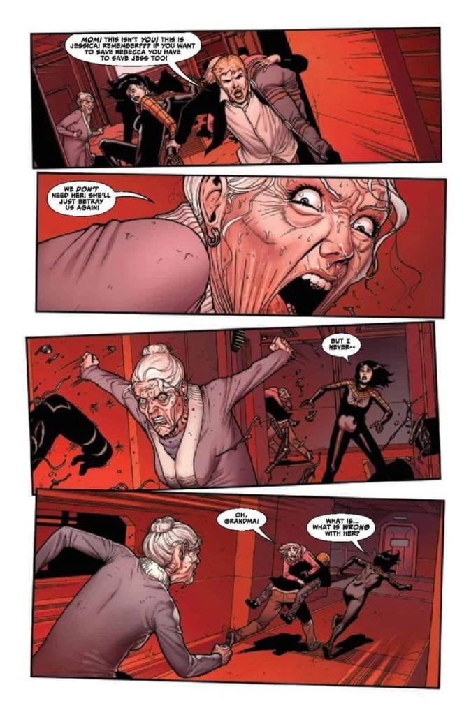
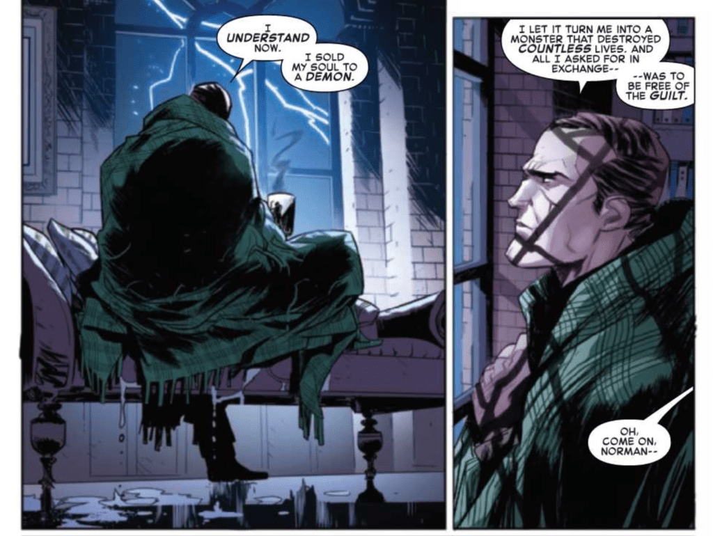
Now that Norman Osborn has been cleansed, the Sin-Eater is out of the picture, and the “Order of the Web” has been possessed, the final battle between Spider-Man and the demon Kindred draws nearer. Everything has changed now that Norman Osborn has revealed Kindred’s true identity, and he is doing everything he can to help.

Norman Osborn Repenting

The Amazing Spider-Man #50.LR Story

As stated by the editor at the end of the issue, The Amazing Spider-Man #50.LR and the other LR books will feature less Spider-Man and instead focus on the mission Norman Osborn is embarking on in this issue. Despite this focus, this issue featured a battle between Spider-Man and “the Order of the Web.” This was a smart decision on the part of Nick Spencer and Matthew Rosenberg because it kept up the story’s pace when Norman’s wasn’t as engaging. The main story of the issue consisted of a dialogue-heavy scene of Norman Osborn discussing Kindred with Dr. Kafka. While this doesn’t feature the action expected in nearly every superhero comic book, it is still integral for the story of future issues. Spencer and Rosenberg interspersed the fight scenes to keep readers from losing interest so that the issue was still engaging for those whose favorite part of the series is the action.

Art

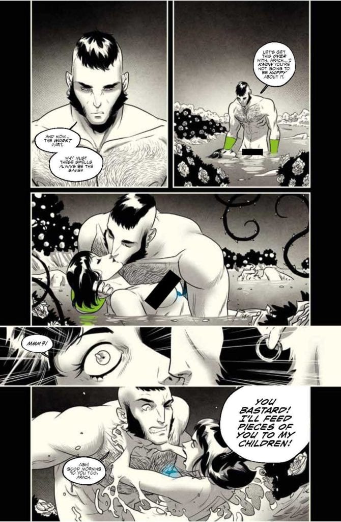
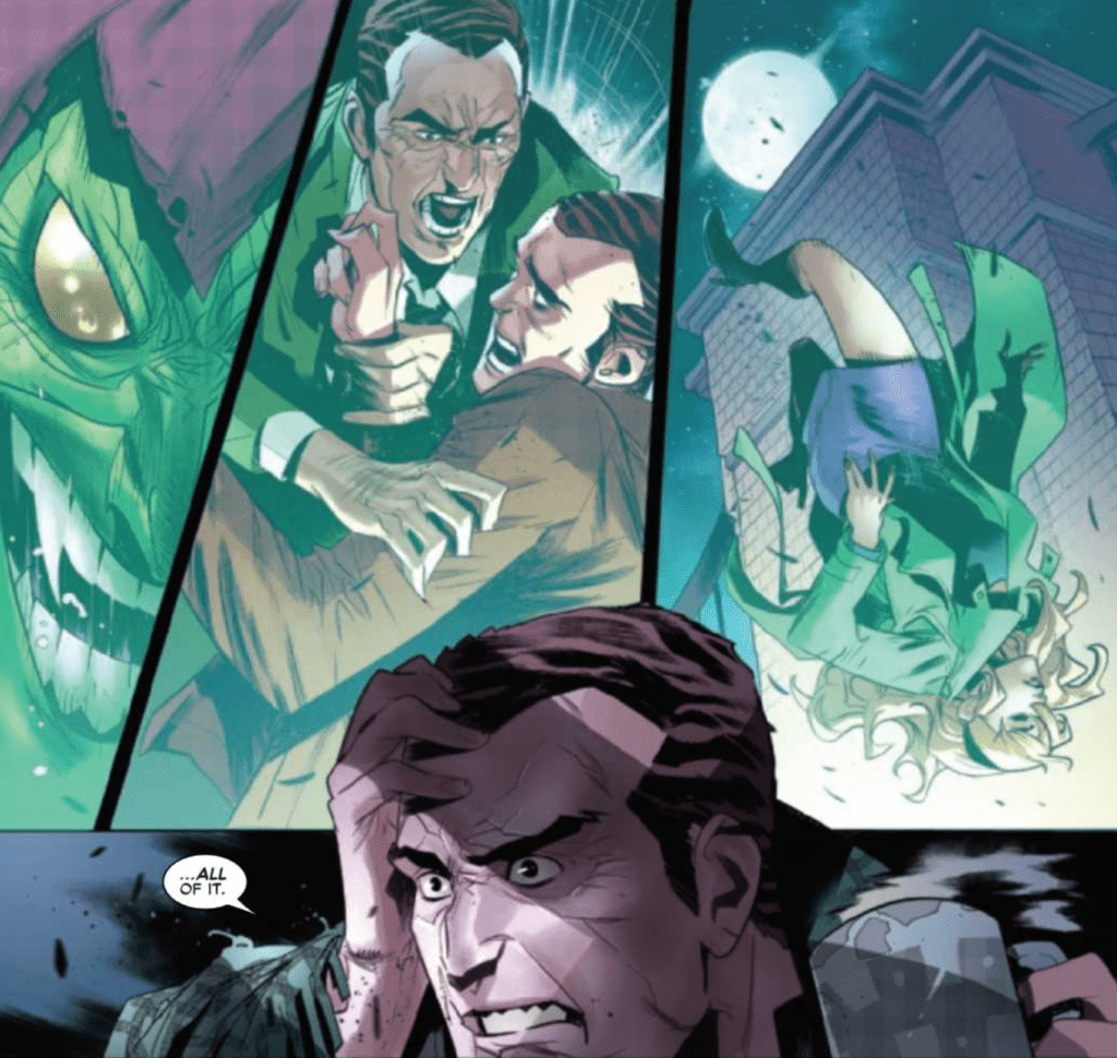
Federico Vicentini provides some glorious art in The Amazing Spider-Man #50.LR, and it is a wonderful complement to the writing of Spencer and Rosenberg. Vicentini’s characters all have deeply expressive faces, which pairs nicely with the emotional and tense story that constitutes much of the issue. He also often accents the action scenes of the issue with techniques such as characters overlapping panel borders, which can help emphasize the purpose of many panels.

The Amazing Spider-Man #50.LR one page spread

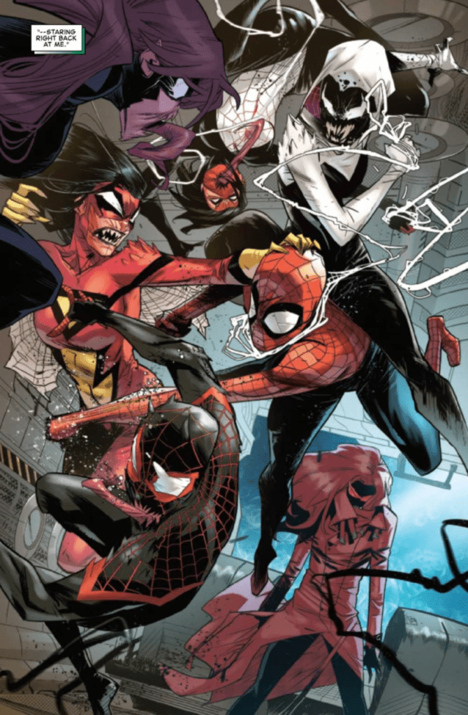
The colors of Marcio Menyz added lots of energy to action scenes and made other scenes feel more real. His use of single-colored backgrounds contrasted with the characters in front of it added a lot to specific panels where the main focus was on a character’s action. The tints he used to indicate that certain panels were flashbacks were done nicely because the tints used were distinct enough to indicate that a panel was a flashback, but not so distinct that it overpowered the rest of the colors on the panel.

VC’s Joe Caramagna always does an amazing job at lettering and The Amazing Spider-Man #50.LR features some of his best work. The choices of fonts and sizes for sound effects always do a perfect job of fitting with the scene they are taking place in, and this issue features one particular page that is enhanced greatly by Caramagna’s choice of lettering.

The Amazing Spider-Man #50.LR Coloring Example

Conclusion

The Amazing Spider-Man #50.LR is the beginning of what I am sure will be an interesting subplot. The issue is full of fun action that is beautifully drawn, colored, and lettered, but the story falls flat. The story introduced in this issue that will be followed in later LR issues is intriguing, but the issue itself doesn’t stand well on its own. The art more than makes up for any pitfalls, however, and the issue is worth purchasing so that you can follow along with all of the “Last Remains” arc.

Monkeys Fighting Robots Youtube

How It All Unravels In FIREFLY #21

FIREFLY #21, available Wednesday from BOOM! Studios, continues the escalating Blue Sun Rising event, where one corporation has risen up after the Alliance fell. Unfortunately, they are proving to be just as difficult to contend with.

spoilers ahead

It’s safe to say that things have changed a lot since the Firefly crew was on screen. This most recent comic run has taken a particular focus on Malcolm Reynolds, putting him in a position that many fans would never have predicted.

Now, it seems like all of those changes and risks are coming back tenfold, and looking to make the crew pay. In Firefly #21, there are more dangers than ever, while also providing an event that no Firefly fan would have ever predicted.

We could spend all day arguing about whether or not change and risk is good. But it won’t change the fact that this series of Firefly has taken a lot of risks, many of which have deviated from the original series that so many fell in love with. Again, for better or for worse.

A flashback to ‘Ariel’ for this cover of Firefly #21.

The Writing

Written by Greg Pak, Firefly #21 is not an issue afraid of taking risks. There are certainly plenty of those. Unfortunately, it also kind of feels like the series has finally started jumping the shark. The latest threat introduced feels…out of place in this world.

That isn’t to say that the core concept isn’t intriguing – it actually truly is. It brings up a lot of interesting debates, mostly revolving around ethics, the differences between right and wrong, and the cost of following all rules to the fullest extent.

All of which fit in nicely with the theme of Firefly. It’s simply the execution that feels more like another science fiction series, and less like the series so many fans love. Robots are not uncommon in the sci-fi world, and yet Firefly always felt like more of a Western, and thus felt like it would escape that concept.

Every series has its ups and downs, so while it is tempting to focus entirely on the strange events in Blue Sun Rising, let us not forget the positive moments. Walsh still being alive is a pretty big deal, as is the search that Zoe has been on. It feels pretty spot on for how her character would have reacted, after the events of Serenity.

This is an issue that has left me feeling fairly conflicted, truth be told. On the one hand, it seems like the perfect time to take a break from the series. On the other hand, part of me would really like to know what the series looks like, after Blue Sun Rising has come to a conclusion.

Malcolm Reynolds in all his glory on this variant cover of Firefly #21.

The Art

Firefly #21 is an issue full to the brim of colorful and brilliant artwork. The artists in charge also took some risks, deviating slightly from the standard style developed in the television show. On the whole, those risks are quickly proving to be worth it.

Lalit Kumar Sharma and Daniel Bayliss were the lead artists, bringing to life all of those characters that we love. Their style is unique, yet it worked nicely here, for the most part. Though all of the characters do seem to be oddly tired, intentionally or not (most likely, intentionally). Of course, there is that one oddity discussed up above, with the robot and all. The design itself isn’t bad, and in fact, they did a good job making the origin of the bot clear from just a glance.

Marcelo Costa provided those vibrant colors, which honestly make the issue stand out so much. Every backdrop seems to be bursting with colors, rendering a stark contract to the relatively muted characters. It feels hopeful somehow, while also staying true to the roots of the franchise.

Naturally, Jim Campbell’s lettering is perfectly done, as always. It’s easy to follow the narrative, and even large conversations (with an even larger crew), thanks to the careful placement of speech bubbles and the like.

Feel free to guess at what this alternate cover of Firefly #21 implies.

Conclusion

Firefly #21 took a lot of risks, and it should be acknowledged for doing so. Unfortunately, not all risks pay off, and while it may be too soon to speak about this particular risk, it’s starting to feel that way.

Mainly because it has taken a step away from the core feeling and tone of the universe in which Firefly is set in. Only time will tell if the series will get back to it’s roots at a later date.

Monkeys Fighting Robots Youtube

The Roles of Heroes and Villains in NOMEN OMEN #10

NOMEN OMEN #10, available Wednesday from Image Comics, brings the most recent arc of the series to a conclusion, and it does so on such a dramatic note. Don’t be deceived by the elegant cover, as dark things lurk within.

King Taranis lies in wait on this variant cover of Nomen Omen #10.

The most recent plot arc of Nomen Omen truly gave Becky a chance to come to terms with what happened to her, as well as finally taking control. She hasn’t gotten her heart back, or her revenge, but it’s starting to feel like only a matter of time.

Nomen Omen #10 marks the conclusion of the second arc, which means there are only five issues left in this series. The scale has been ever-increasing, with Becky’s power levels growing, and the threat becoming larger than life with every step.

This series seems to have gotten darker with every step, and shows no signs of slowing down. In a world where legends, magic, and humans interact, things rarely turn out well.

The past crops back up in Nomen Omen #10.

The Writing

Nomen Omen #10 is one of those issues that will make you stop and think. It’s also going to do a whole lot more than that, with shocking twists, turns, and revelations almost all over the place. Marco B. Bucci has really outdone himself this time.

In some ways, what is happening almost feels inevitable. It’s been ten issues of build-up, after all. But in so many other ways, it is still so shocking and raw. There are implications for what happened here, and for what had been planned. Not all of which can be digested in a quick read through.

What really makes this issue so striking has to be the number of ancient beings interacting, planning, and reacting within. Their presence makes the story more complicated, more convoluted. It’s their actions that will make readers put on their thinking caps.

All while Becky’s side of the story is still an emotional catalyst, giving fans all the reason in the world to actually care about the events unfolding on the pages. The conclusion, surprisingly, is a mixture of the two, setting up for an iconic storytelling twist.

It’s time to sleep (Nomen Omen #10).

The Art

Nomen Omen #10 features the bold and magnificent artwork that has become iconic to the series. The magic portrayed is reason enough to keep coming back for more, thanks to the unique ways in which it is showcased.

Jacopo Camagni is the lead artist, working alongside Fabio Amelia for the lettering. Together they have truly created something here. The characters feel larger than life, the magic is as brilliant as ever, and the emotions so raw.

The last several issues have worked hard to dance around some difficult scenes, and this one is no exception. Though the focus and reason are entirely different. Honestly though, this is one of those scenes that had to be portrayed, and there’s no doubt that the artwork was vital for this scene, for the description alone never would have been enough.

Nomen Omen #10 features one of the more striking covers of the collection, as well as several pages that seem even brighter than the rest. It’s an impressive feat, given the standard set by the previous nine issues.

Only one way to wake those in an enchanted sleep.

Conclusion

Nomen Omen #10 is a dark and enthralling conclusion to the second arc in the series. That leaves just five issues, all of which are sure to be more dangerous than ever, with a few twists hidden here are there.

This is an issue with heavy implications, as well as several thought-provoking moments. It feels like this is a moment that the series was designed around; almost like we’re been waiting for this inevitable moment.

Monkeys Fighting Robots Youtube

How Quickly Lives Can Change in FAMILY TREE #9

A familiar hand takes center stage on this cover of Family Tree #9.

FAMILY TREE #9, available Wednesday from Image Comics, is the beginning of a new story arc. It’s amazing how much change one family can bring with it, even in a short five-year time span. Yet the world is undoubtedly changed in this series.

spoilers ahead

The family drama and horror series known as Family Tree is still on a roll, leaning more towards horror and science fiction for it’s newest plot arc. This one family has been through so much, and we’re not even at the ten-issue mark.

Created by Jeff Lemire, Phil Hester, Eric Gapstur, Ryan Cody, Family Tree #9 is yet another issue full of intriguing and shocking combinations of themes. In many ways, it has changed so much from the first issue. And yet the tone is still as strong as ever.

A familiar hand takes center stage on this cover of Family Tree #9.

The Writing

Josh’s narrative takes center stage in Family Tree #9. Once upon a time, he was just a normal teenager. In this instance, once upon a time was only eight issues ago. It’s amazing how much things change, in such a short period of time.

That almost feels to be the theme of this month’s issue, as the story unfolds through two specific points in time. One set in the present, with the struggles surrounding Meg still going strong. The other? A mere five years in the future, and yet so much has changed.

In many ways, the story has changed dramatically, with this forward leap into the future. It’s showing the diversity of writing involved, while also sticking strongly to the creative elements that make this series stand out.

Josh’s story is also proving to be as full of action as before. No, that’s not quite right. His world is full of fighting, that much has already been made clear. He’s taken up the family business, it would seem.

Despite all of the violence, that sense of hope from earlier issues is back, and it is stronger than ever. The world may still be a little too dark to fit that pure solarpunk aesthetic, and yet it’s very much hovering on the edge of it.

The Art

As with the rest of the series, Family Tree #9 is full of bold artwork that fits the unique voice of the series. Even the fighting scenes (of which there are several) feel like they stand out, thanks to the narrative, color palettes, and highly stylized feel of it all.

There are times where it really does feel like every part of this world is made up of trees. Everything from the people, to the items they interact with, they all have a rougher organic look that feels shockingly similar to bark. Something that was almost certainly done with intention.

The two time periods are so distinct as to be immediately identifiable. There’s no need to waste time telling the readers of the switch – the setting alone makes it clear, all thanks to the artwork, of course.

Conclusion

Family Tree #9 took a slight change in direction, both by allowing Josh to drive the narrative, and by jumping to the future (once again). The horror elements are still strong, yet there’s a feeling that something else is growing alongside it all.

Monkeys Fighting Robots Youtube

Love, Loss, and Moving On in SPIDER-WOMAN #5

SPIDER-WOMAN #5, available Wednesday from Marvel Comics, continues an adventure that only Jessica Drew could find herself in the middle of. Family drama meets spider drama in the conclusion to Jess’ most recent plot arc.

spoilers ahead

Fans have been delighted to see Jessica Drew getting her own series once again, even if that means she is once again diving into more danger and chaos. That’s sort of her style, after all. Even with Gary and Greg waiting for her to come home.

Spider-Woman’s latest run has been surprise, after surprise, bringing family drama into the mix, and not from the new family she had made for herself. No, this is all stemming from a family she thought long gone.

Spider-Woman #5 picks up where the previous issue left off. Given that it was a cliffhanger, that is no small relief for the fans out there. Time to let Jessica Drew’s story continue, one way or another.

She thought she had lost everything (Spider-Woman #5).

The Writing

For just the briefest of moments, it seemed like Jessica Drew was going to find a major win for herself in this plot. And then it was all torn away, courtesy of the turn of events leading to a cliffhanger ending.

Spider-Woman #5 is thus very much the issue that fans have been waiting for this past month. It’s time to see what happens next, and why events ever hit that dark point to begin with. It’s also time for some answers.

Karla Pacheco has written a carefully crafted story here, blending family drama with the drama that constantly surrounds Jessica Drew. It’s dark and intense, and more than a little bit emotional. It’s also clearly designed to leave readers asking questions (Jess as well, for that matter).

Things get pretty…twisted in this issue. The betrayal in the last issue has been taken beyond the logical extreme, which in itself has several interesting implications. It all seems to be winding back around to the same focal point.

While this issue does provide a bold and happy ‘END’, implying everything is wrapped up, there are still questions left. Thankfully, there are pages left to this story as well. Jessica’s story is told through vignettes, quick moments, showcasing what brought her to this point – and her intended actions for what is to come.

All of which confirms that Jessica Drew’s latest series is not yet over. These vignettes also provided some much needed comic relief, after what was without a doubt one of the more intense issues in her series.

Right back into the action in Spider-Woman #5.

The Art

Spider-Woman #5 is full of fierce and bright artwork. The emotions and turmoil that Jess goes through in this issue are on clear display, as is the mental state of every other character portrayed (an important note, given what is happening).

Pere Perez is the lead artist and is the mind behind the action-filled scenes, as well as the scenes that seem to be full of just about everything else. The fight scenes felt different than Jess’ usual fare, but there’s a reason for that. A reason which Perez portrays in great detail, showing how warped everything has become.

Frank D’Armata’s colors really bring the whole look together. The colors seem to lend very strongly to the sense of movement (which was already well done), as well as enhancing the emotional state of events. Not to mention that it all added vibrancy that suits the series, and character, in countless ways.

VC’s Travis Lanham provided the lettering, and that is exactly what this issue needed to finalize the story. The sound effects alone enhance the fights, as does the sense of shouting (and all the venom infused into those words).

Somebody might have lost it…just a bit.

Conclusion

Spider-Woman #5 may have wrapped up the first plot arc for the series, but she’s not done yet. Her story is far from over, as there are still several trials up ahead. If fans want an idea of what is in store next, a peek at the cover for Spider-Woman #6 should be more than enough of a hint.

Monkeys Fighting Robots Youtube

STRANGER THINGS HALLOWEEN SPECIAL ONE-SHOT Spooktacular

Settle down for a campfire tale in Stranger Things Halloween Special.

STRANGER THINGS HALLOWEEN SPECIAL ONE-SHOT, available this Wednesday from Dark Horse Comics, brings fans back to the world of Stranger Things for a seasonally appropriate tale. One that feels right at home with the series.

Settle down for a campfire tale in Stranger Things Halloween Special.

The Stranger Things Halloween Special One-Shot may be a bit of a mouthful for a title, but it is an accurate description. The world of Stranger Things is well suited to horror tales, for obvious reasons. So it’s really no surprise that they’re diving back in to tell a quick and spooky tale.

It’s even less of a surprise, given just how many Stranger Things series are out there at the moment. There are several complete series now, as well as Stranger Things Science Camp, which is actively updating. Not to mention at least one more series on the horizon (Stranger Things and Dungeons and Dragons).

Yeah, it’s a lot. And it’s possibly intimidating to keep up with all of those series. Here’s the good news, the Halloween Special really is just a one-shot. You need only have watched the series (and just the first season at that) to understand and appreciate this issue. Nothing else is required.

The Writing

Michael Moreci took charge of the Stranger Things Halloween Special One-Shot. It is an issue that delivers on its promise. Interestingly enough, that isn’t all that it does.

Picture the boys (Mike, Will, Lucas, and Dustin) all having a fun time telling spooky stories in their beloved spot in the woods. Now you have the setting for this issue – and it feels pretty in line with the world (and characters) so far.

It’s a quick read, letting fans dive into a single moment of four friends simply enjoying each other’s company. Yet there seems to be more to it, all the same. Set before the events of the first season, there’s a dark implication found within.

The spooky story itself feels familiar, in some ways. It’s dark and twisted and leaves many connections to the events that unfolded over the course of the series so far. Again, it feels right at home here.

The Art

The Stranger Things Halloween Special One-Shot has an art style that feels like a cross between the show and the comic book world. Fans of the other Stranger Things series will immediately recognize the given style.

Todor Hristov was the lead artist for this project, portraying beloved characters, as well as an entirely new cast as well. While at times the characters seem to be flat, and contain less life than their television versions, overall the style is well-suited to the world.

The darker elements are danced around, playing a game of hide and seek. Until suddenly, it’s not. Much like the show itself, once the horror is shown, it takes full advantage of taking the focus upon itself.

Chris O’Halloran’s colors really bring it all together. The bright pops of color against darker backgrounds is reminiscent of many a campfire tale, with a classic 80s color palette thrown into the mix as well.

Nate Piekos’ lettering is another vital piece of the art, adding tension at key moments, while overall carrying the story along flawlessly.

Conclusion

The Stranger Things Halloween Special One-Shot is a fun and quick read. It’s absolutely perfect for any and all fans of Stranger Things. Especially if you want an excuse to dive into the spookier side of their stories, during this time of year.

Overall, this issue provided an odd combination of sweet and spooky. It’s the sort of combination one can only find in the Stranger Things franchise. The essence of the world and characters was perfectly captured here, with a few added embellishments for the sake of the Halloween focus.

Monkeys Fighting Robots Youtube

Review: A Clash Between Clans Arises In TEENAGE MUTANT NINJA TURTLES #110

TEENAGE MUTANT NINJA TURTLES #110 hits comic book stores on Wednesday, October 21st, diving further into the turtles’ exploits in Mutant Town. Disparate groups continue to form under New York City’s newest suburb. But what happens when these organizations come into conflict with the Splinter Clan?

Story

This issue is split into two parts: the first places emphasis on Raphael and Alopex while the second gives readers a look at Leonardo’s endeavors.

Raphael and Alopex spend most of their evening exploring the streets of Mutant Town. Watching them express gratitude over the fact that no one judges them reminds us of the struggles marginalized groups of people face every day.

Unfortunately, their peaceful stroll is soon interrupted by a biker gang called Road Hogs who see them as a threat. What ensues is a thrilling clash between the groups, complete with fighting, racing, and unexpected events.

While the aforementioned duo are handling the Road Hogs, Leonardo races across rooftops to meet with another troublesome organization. A recent attack from an octopus mutant of the Mutanimals led the ninja to seek further intel regarding their plans.

Leonardo soon infiltrates Old Hob’s Mutanimal hideout disguised as a “new recruit.” And everything seems to be going according to plan. But an issue soon arises that could cost both his and other lives if not taken care of.

Writer Sophie Campbell masterfully blends Raphael and Leonardo’s storylines together in seamless fashion. The transition from one plot point to the next is so smooth readers will be surprised to learn they essentially read two stories in one issue.

We also loved the characterization of both the Road Hogs and lackeys in Old Hob’s hideout. These antagonists are far from one-dimensional, offering readers a sobering look at how hard it is for groups to trust one another.

Artwork

Jodi Nishijima’s penciling and ink work for the turtles’ action sequences are truly stunning. Their reptilians forms glide from panel to panel with the grace and flexibility of real world ballerinas. Ronda Pattison’s coloring complements these illustrations beautifully with earthen tones for each turtle, which stand out starkly against the urbanized landscapes of Mutant Town.

Although the Shawn Lee’s lettering is placed well throughout the scenes, it would have been helpful to see more variance in dialogue fonts. This would help differentiate each mutant character’s unique manner of speaking from one another.

Conclusion

TEENAGE MUTANT NINJA TURTLES #110 provides two stories in one thrilling issue. It moves the Mutant Town plot forward via each character’s unique abilities and personality.

What plans do you think the Mutanimals have for the turtles? Let us know in the comments below!

Monkeys Fighting Robots Youtube

Review: A Test Of Inner Strength In JIM HENSON’S THE DARK CRYSTAL: AGE OF RESISTANCE #12

JIM HENSON’S THE DARK CRYSTAL: AGE OF RESISTANCE #12, available in stores on Wednesday, October 21st, concludes this comic book adaptation of Netflix and The Jim Henson Company’s beloved televised series. As the Gelfling clans travel to their meeting location, Dot’leth finds herself among the first arrivals on SkekSa’s ship. But with the new All-Maudra presumed dead, coupled with the dubious meeting location, can any true peace be made?

Story

This chapter opens with Dot arriving on the ship of SkekSa, hoping to begin clan negotiations. She is greeted by Fenth in an awkward, yet telling display. One senses the shame the Gelfling pirate feels after a piece of his past faces him and his current life choices.

The reunion is cut short, however, when the Mondo Levidian crashes their meeting. Dot, having spent time mourning Mayrin’s supposed death, shouts for joy after realizing her beloved granddaughter is alive. But then an attacking swarm of Zoa appears! Can the new All-Maudra turn the tide and finally establish peace among the Gelfling clans?

What ensues is a high-adrenaline battle for the fate of Thra. We see Mayrin embrace her role as All-Maudra and attempt to save her fellow Gelflings. The pressure of filling her mother’s shoes is daunting, but the encouragement from Dot and Kam’Lu may be the motivation she needs

Matthew Erman’s narrative offers readers a heartfelt story of inner strength. Thanks to an indominable will and a slew of support from friends, his version of Mayrin embodies the sense of wonder that draws so many to the story.

Artwork

The illustrations beautifully reflect the magical elements found within the television show. Jo Migyeong’s penciling and ink work, along with Fabiana Mascolo’s coloring, beautifully translates the visual appeal of the show to the panels of this comic book. The characters’ details are extremely precise, from the unique dimples and wrinkles on their faces to the fixtures on SkekSa’s ship.

We loved the brightly colored backgrounds setting the scenes for these animated characters. And Jim Campbell’s lettering provided the finishing touch so readers could imagine the manner of speech they employed.

Conclusion

JIM HENSON’S THE DARK CRYSTAL: AGE OF RESISTANCE #12 beautifully concludes The Journey into the Mondo Levidian storyline. We loved watching our favorite characters come into their own in this thrilling finale.

Were you satisfied with the conclusion of this series? Let us know in the comments below!

Monkeys Fighting Robots Youtube

LOST SOLDIERS #3 – The Rhythmic Drumming Action

Lost Soldiers #3 Cover

Lost Soldiers #3 is this week’s release from Image Comics from writer Ales Kot, artist Luca Casalanguida, colorist Heather Moore, and letterer Aditya Bidikar.

Background and Recap

Lost Soldiers is the story of three Vietnam War veterans and how they’re drawn into a drug conflict forty years later. As post-war PTSD still affects our unnamed main character, he still fights on like the war never stops. Between hallucinations and a former ally out for blood, the POV character fights by playing a war drum.

Lost Soldiers #3: A and B Sides

Alest Kot of Zero fame opens Lost Soldiers #3 with lines from David Lynch and Barry Gifford’s Lost Highway. In that movie is a surreal premise that likens to a Mobius Strip where the protagonist fails to encounter his real self. This can set up the premise rather nicely for newcomers, especially since the next page opens the issue in a shootout. This allows both newcomers and returning readers from issue 2 to seam into the conflict. The rest of the issue’s first-half plays out with an intense brawl with a beating like that of war drums. Something that the POV character claims to hear himself.

The other half, meanwhile, is the recovery period, taking a much more melancholic tone. After surviving a life-threatening situation, our unnamed protagonist has a chance to reflect on what he lost. However, he only seems ready to repeat a conflict because it’s the only constant in his life. This allows Lost Soldiers #3 to create a very tragic conflict that calls back to that quote at the beginning. Much like the protagonist there, this character fails to encounter himself only glimpse at it. At least that’s what a hallucination suggests.

Art

Luca Casalanguida provides Lost Soldiers #3 with artwork that allows for wide panel cinematography and visuals that provide different beats. Every discharge of kinetic energy almost acts like musical notes. They even combine with the captions of Aditya Bidikar to the point they almost act like song lyrics. A few other aesthetics, like lines provide just the right kind of weight to counteract negative space. And that’s just the first half of Lost Soldiers #3.

The other half makes heavy use of repeating panels that might or might not change for dramatic effect. Unlike the rock music vibes from the first half, there comes this slow song with no lyrics just moods. These small changes redirect a plot point’s trajectory, giving them much more weight than the straightforward cinematics. But that’s not all; during a page-turning moment, people don’t know what to expect after a slow build up on opening a door. On the next page, people get a glimpse of what was inside, where they join the protagonist in disappointment on a damaged abode.

Coloring

Heather Moore’s coloring, along with these techniques, highlights the emotional moments of Lost Soldiers #3. The first half features bright lines and flashes as the things to pay attention to. This makes the symphonic impressions all the more viable to apply. Not to mention the numerous shifts in coloring present different moods that shift the narratives. Reds are often a point of danger or conflict for events that have happened or are about to happen. Most of either half of the issue feature muted to semi-monochromatic to illustrate a hollow feeling the characters are going through. Contrasting all of that is the peaceful, diverse, and brighter coloring of a life the protagonist lost. Everything arranges into ways where readers feel both excitement and sympathy towards the protagonist.

The Mini-Album of Lost Soldiers #3

Within Lost Soldiers #3 is a simple yet compelling tale of Vietnam War Veterans unable to escape their many conflicts. When a life brings the rock music-esque adrenaline-pumping action, it’s hard to want to give that up. In turn, that helps readers follow the tragic fall of a man stuck in a limbo of his own making. One that could lead to a big dramatic conclusion.

Monkeys Fighting Robots Youtube

BLADE RUNNER 2019: OFF WORLD – Scars Of Memory’s Past

Blade Runner 2019: Off World Cover

Blade Runner 2019: Off World is this week’s second chapter in Titan Comics take on the epic franchise. Michael Green, Mike Johnson, Andres Guinaldo, Marco Lesko, and Jim Campbell dedicate this series to the late Syd Mead, who contributed the original movie’s designs. All through a story about how memory gives something to strive for.

Background

In the first trade, Los Angeles, Blade Runner Aahna ‘Ash’ Ashina rescues the daughter of a ruthless agribusiness tycoon because a father willing to sell off his daughter to central antagonist Tyrell Corporation is anything but nurturing.

Blade Runner 2019: Off World Plot

Blade Runner 2019: Off World follows Ash and her ward Cleo Selwyn on the run from Cleo’s father and Earth authorities. Going undercover is taking its toll on Cleo; she can’t use her real name or gender. In this bleak and empty space where replicant (bioengineered beings people mistake for cyborgs) and human relationships are at their most cutthroat, there’s a need for meaning. Blade Runner 2049 writer Michael Green and Star Trek‘s Mike Johnson present this search for meaning through Cleo and the replicant Padraic. Unlike so many of the more militant replicants desperate for their freedom to the point of murder, Padraic is a poet who shows kindness to Cleo for no reward. With the real world becoming so bleak, it evokes a universal need for kindness and compassion. Something that drives Cleo to find a place that gave her hope with the name of Arcadia.

Unlike say, the new Blade Runner Hythe who is as cold and ruthless following a Replicant uprising. The way she presents herself and acts displays Hythe as both hateful and somewhat sympathetic. She’s driven by an event that was good for replicants but traumatizing for people. One that Hythe believes she needs to be even more ruthless than militant replicants. It’s a rather sad way to look at life where only the bad things in life drive a person. Because who can really find meaning in something so hateful?

Art

Andres Guinaldo provides designs worthy of Mead throughout Blade Runner 2019: Off World. The machines like Ash’s augmentations that allow her to walk are a synthesis of highly advanced technology and humanity. It makes her more similar to the replicants she used to hunt, even if it’s surface level, which is evident with the return of the device for the Voight-Kampf replicant detection test. With how cold many people look and feel where humans and replicants can’t be told apart, it feels necessary. Because as it turns out, these differences between people like compassion and lack of it are artificial.

Marco Lesko provides muted colors to reflect the Neo-Noir atmosphere that is ever-present. Every place feels without a soul or meaning through this. Even in times of emergency, reds blend into one another, giving an almost nihilistic conflict throughout Blade Runner 2019: Off World. It’s only when lights are showing that anything meaningful happens, like when Padraic gives Cleo a precious mineral for her plans to live free out of kindness.

The lettering by Jim Campbell is extremely professional and ordinary. The simple use of spacing with the word balloons provide efficient use of dialogue to get the point across. Most of the time, the wordmarks and word balloons don’t come close unless it’s meant to show a sharp change in the atmosphere. Like when someone is speaking only to get shot. Yet it’s the captions that feature different fonts that allow characters to speak their minds that feel the most authentic. Padraic’s written italicized font looks poetic and delicate to show his kind nature. In contrast, Ash’s captions with italicized font look like it was written in a log for her serious nature. A caption that changes color from blue to yellow as she gets serious.

The Spirit In Blade Runner 2019: Off World

Blade Runner 2019: Off World features the melancholic if hopeful essence that makes Blade Runner famous. When things start to look bleak as time marches on with people at each other’s throats, hope can be found in unusual but small places because it’s those small moments that drive people forward. Hence why the legacy of Syd Mead lives on in those he inspires.

Monkeys Fighting Robots Youtube