Home Blog Page 225

Review: TASKMASTER #1 – Captures The Tone Of An MCU Film

marvel comics exclusive preview taskmaster #1

TASKMASTER #1, out this Wednesday from Marvel Comics, is the first issue of a 5-issue miniseries by writer Jed MacKay, artist Alessandro Vitti, colorist Guru-eFX, and letterer Joe Caramagna.

About the issue:
TASKMASTER HAS MURDERED MARIA HILL! Or at least that’s what the whole world thinks. Now the greatest spies in the business are hunting him down and won’t stop until Taskmaster is dead or clears his own name!

marvel comics exclusive preview taskmaster #1

Writing

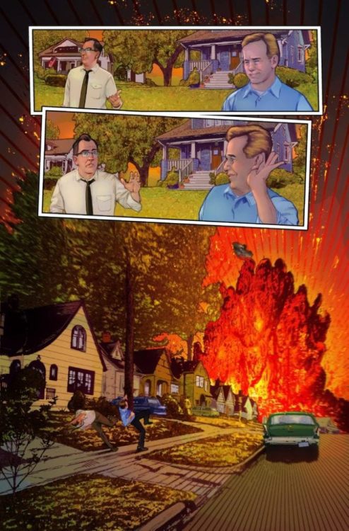
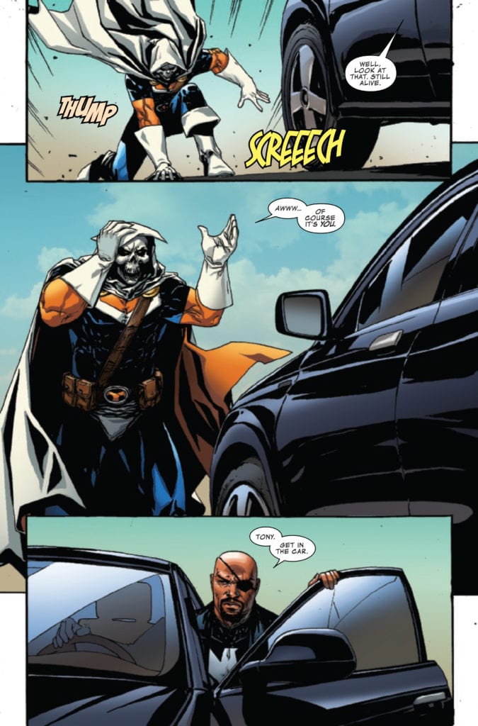
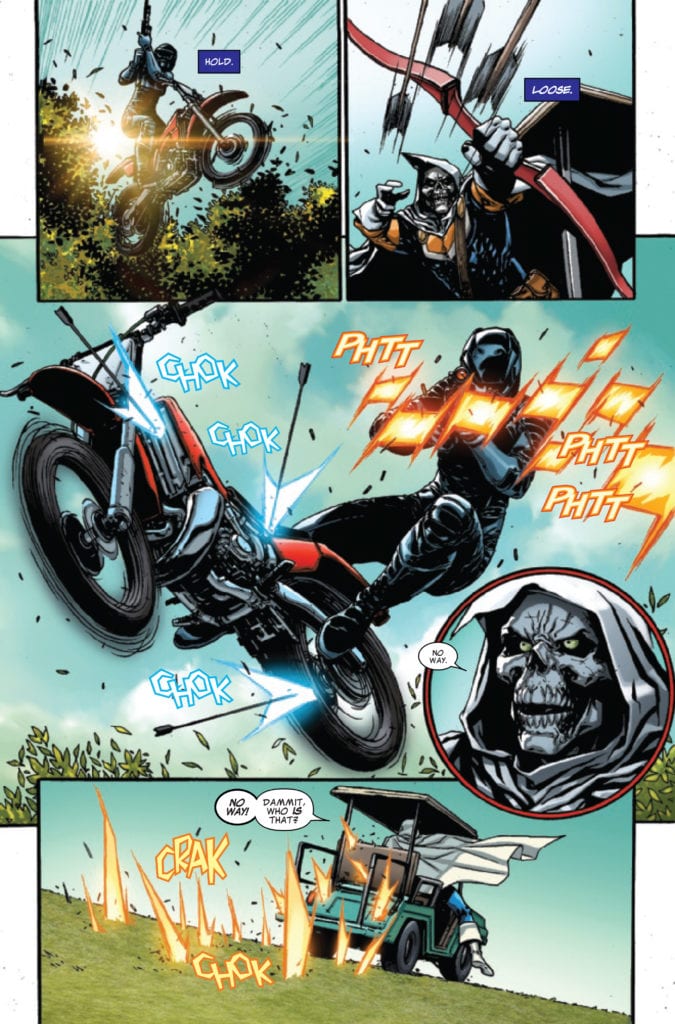
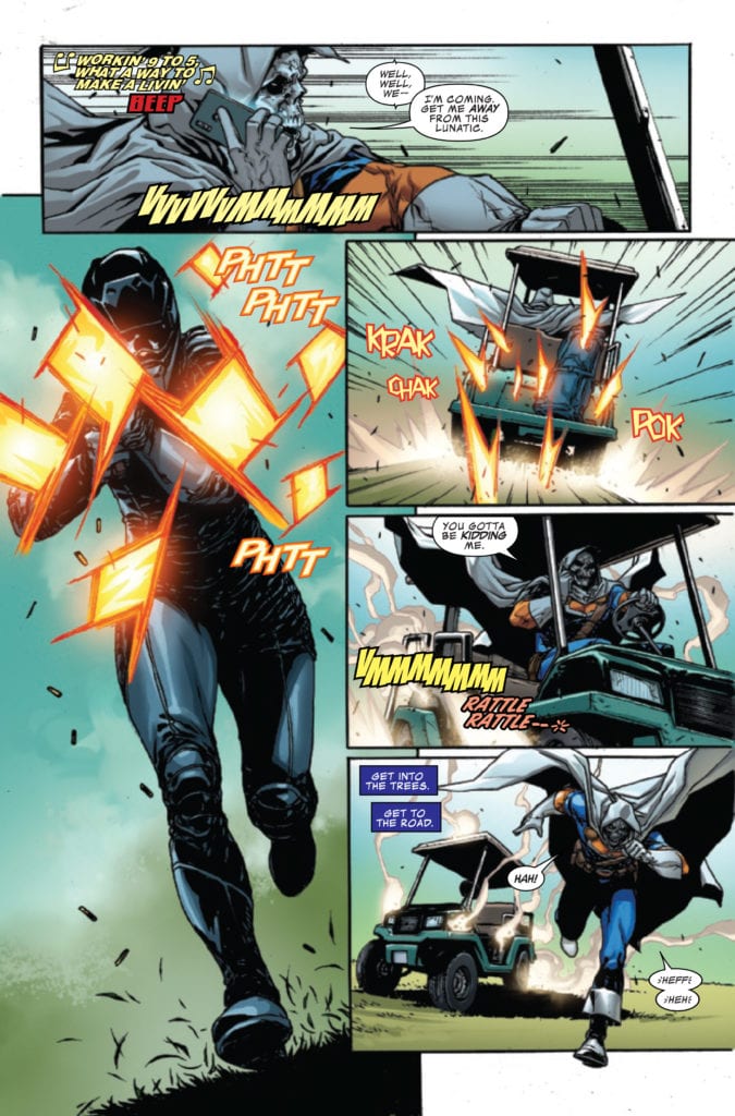
In a nutshell, what Jed MacKay set out to do with this book, he accomplished because TASKMASTER #1 is a whole lot of fun. It never drags out or feels boring. There is flawless chemistry between the main characters. The dialogue flows naturally. The action sequences and the funny banter manage to keep the readers engaged throughout the entire story and even get a smile out of them. Everything about this comic reads and feels like an MCU movie, which works well here.

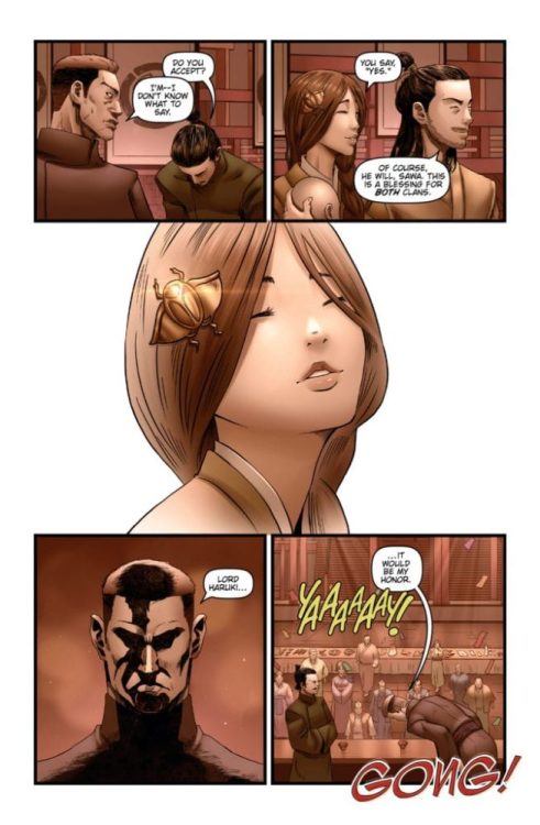
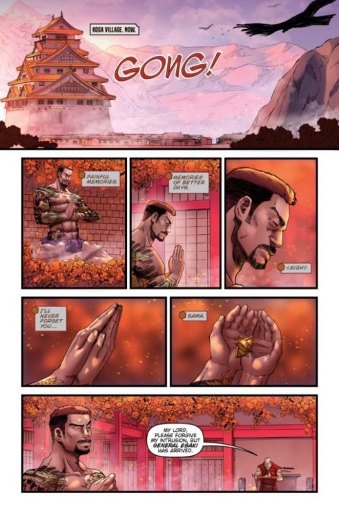
However, MacKay’s greatest accomplishment is he makes the reader care about the supervillain and sometimes antihero, Taskmaster. By letting the reader get a glimpse into Taskmaster’s mind and his thoughts, we understand who he is. Taskmaster never comes off here as evil or malevolent. He just does what he does best to keep a roof over his head. The readers can understand and respect him for that.

Art

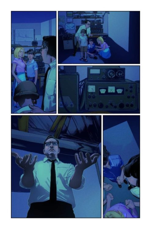
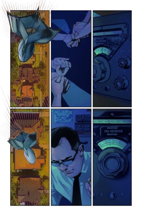
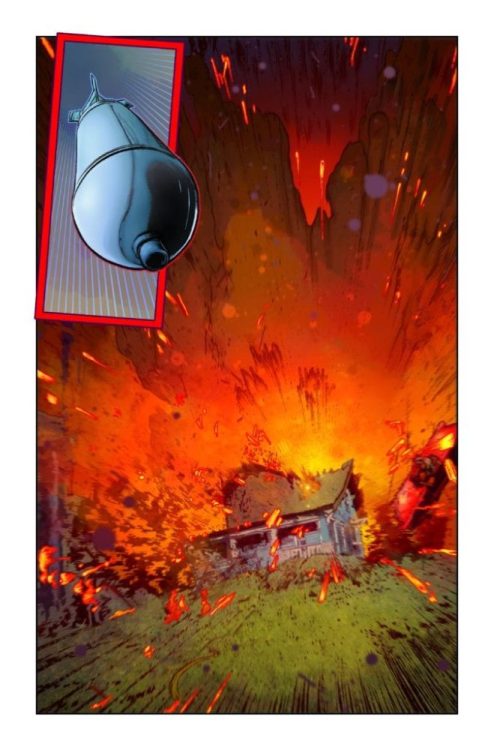
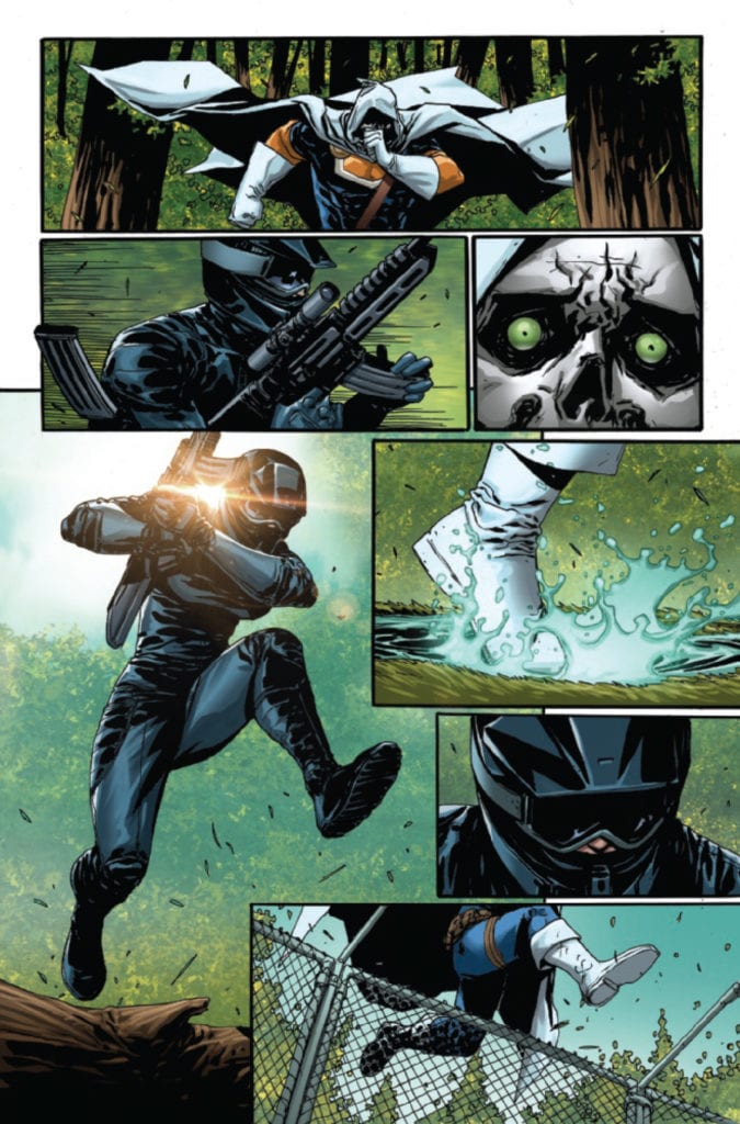
There’s no better match to MacKay’s fun story than Vitti’s vibrant art. Everything about his artwork just feels so energetic and full of life. The acting looks incredible, the faces are well-detailed, and the angles and shot types Vitti chose to get a laugh or astonish the reader hit the mark each time.

Though his clever use of layouts to manipulate the reader’s feelings is highly remarkable. The chase scenes’ layouts are chaotic and alive, everything an action sequence should aspire to be, and the dialogue scenes are orderly and efficient; They calm the reader down and make them focus more on what’s being said, without pulling back on the details and hurting the artwork’s quality.

marvel comics exclusive preview taskmaster #1

Coloring

Guru-eFX’s coloring work is realistic in the best way possible, but it still manages to make the art pop and complement it. More specifically, the lights are colored beautifully. Whenever someone shoots a gun, it looks like real gunfire. Whenever the sun is shining in the background, you almost feel dazzled by how bright it is. Incredible work here from Guru-eFX.

Lettering

Back in the day, there was an understanding that truly great lettering should go unnoticed. To this day, some people still believe it. But, with this comic, Joe Caramagna brilliantly proves them wrong. Caramgna doesn’t shy away and uses every chance he’s got to design some colorful, lavish sound effects and captions, making the artwork and coloring work look all the more alive and fun.

Conclusion

If you’re looking to read a comic book that beautifully captures an MCU movie’s tone, TASKMASTER #1 is the perfect book for you. The story is a hilarious adventure tale featuring one of the most likable portrayals of Taskmaster, and the artwork elevates the energetic writing. Highly recommended.

Monkeys Fighting Robots Youtube

How History Repeats Itself in CHAMPIONS #2

CHAMPIONS #2, available Wednesday from Marvel Comics, continues to show the increasingly dark aftermath of Kamala’s Law. A law put in place to stop underage superheroes, a turn of events eerily similar to another event in Marvel’s past.

The creative team behind this poignant issue.

The fallout from Outlawed is still going strong, as C.R.A.D.L.E. agents continue to gain more power. Much like the events that unfolded during the Superhuman Registration Act, this series is quickly proving the willingness to discuss the worst that humanity has to offer.

All while putting it in stark contrast against the best of humanity. Those that stand up and fight. That speak when others can not. It’s a subject that Marvel has covered before, and they will almost certainly cover again.

Champions #2 dives back into this complicated and dark world, portraying many a young hero’s positions and struggles. Not just the Champions themselves, but all young – with and without powers.

There are plenty of opinions to be found within Champions #2.

The Writing

Champions #2 is a powerful issue that will hit home for a lot of readers. The events that unfold here are not romanticized, nor does Eve L. Ewing pull any punches. The story here is raw and painful, as it should be.

Each of the Champions is on the cusp of something. They have been from the moment Outlawed occurred. They have to decide which side of the law they’re on – and more importantly, they have to live with that decision. That is the unavoidable truth that Ewing brought to bear within these pages.

Champions #2 is an issue with no fear. This is an issue that tackles intense and diverse subjects, forcing subtext into text. All while discussing ethics, morality, history, and many modern events as well.

It isn’t just that Kamala’s Law is painfully similar to the Superhuman Registration Act. There are similarities there, of course. But what goes on in this arc will feel familiar for other reasons. Many readers will have personally experienced or know someone who has experienced some of what occurs.

It adds a certain sense of weight, and yet it does feel perfectly at home within the Marvel Universe. After all, Marvel has always proven how willing they are to tackle and discuss current events and world problems.

There are passionate arguments to both sides of the issue.

The Art

The artwork inside Champions #2 is as complex as the plot itself, portraying various scenes and characters. All of whom are finding their own way to cope, or otherwise going through a massive amount of emotion and conflict of their own.

Impressively, all of this is clear as day on the pages. Each of the Champions has picked their side more or less, and the determination shines through their eyes. Yet one can see that the decision is anything but easy, for some of them.

Simone Di Meo and Bob Quinn were the lead artists for this issue, working alongside Federico Blee for colors, and VC’s Clayton Cowles for letters. All of which work together in a way that is ideal for the Champions.

The colors are bold, and the lighting is truly a spectacular sight to behold. It added a sense of drama and gravitas – as if there wasn’t already enough of that. Combined with the hundreds of other little details, it will leave an impression.

Meanwhile, the younger heroes have a decision they need to make.

Conclusion

Champions #2 is a hard-hitting read, as it was meant to be. Once again, readers are being presented with an arc that has a moral to the story, and with it comes an infinite level of complexity.

If you’re not actively reading The Magnificent Ms. Marvel and Miles Morales: Spider-Man, then you are potentially missing out on some of this story. Both series have been tackling the fallout of Outlawed, and with excellent reason.

Monkeys Fighting Robots Youtube

AfterShock Announcement: The Cold War Goes White Hot In NUCLEAR FAMILY

AfterShock Comics is delivering an alternate US history where America and the USSR really do drop the bomb. NUCLEAR FAMILY, available from AfterShock on February 24th, 2021, is a fresh take on the Philip K. Dick short story Breakfast at Twilight where a 1950’s-era family deals with the fallout of nuclear war.

Written by Stephanie Phillips and illustrated by Tony Shasteen, AfterShock describes the comic as “Cold War-era science fiction at its most timely and terrifying.” You can check out a selection of exclusive preview images and read the full AfterShock press release below.

Are you a Philip K. Dick fan? What other Dick stories would you like to see adapted into comics? Let us know what you think in the Comments section, and please share this post on social media using the links below.

Nuclear Family #1 / $4.99 / 32 pages / Color / On Sale 02.24.2021

Writer: Stephanie Phillips

Artist: Tony Shasteen

Colorist: JD Mettler

Letterer: Troy Peteri

Cover: Tony Shasteen with JD Mettler

Incentive cover: Tony Harris

America, 1957. Elvis dominates the airwaves and apple pie is served after every meal. But, with the dark cloud of nuclear holocaust looming, Korean War vet Tim McClean’s major concern is taking care of his family in the atomic age.

When the first bomb does drop on an unexpecting Midwest city, Tim and his family find
themselves plunged into a strange new world, where what’s left of the Unites States has gone underground while continuing to wage war on Russia with unthinkable tactics.

Based on Philip K. Dick’s short story Breakfast at Twilight, NUCLEAR FAMILY is written by
Stephanie Phillips (Butcher of Paris, Heavy Metal, ARTEMIS AND THE ASSASSIN, RED ATLANTIS) and illustrated by Tony Shasteen (Star Trek). It is Cold War era science fiction at its most timely and terrifying.

STEPHANIE PHILLIPS ON WHAT THE BOOK IS ABOUT AND WHY SHE IS EXCITED FOR IT TO COME OUT:

“The story is about a family that seems like the ideal nuclear family in the 1950s. But, when an unexpected nuclear attack happens on US soil, they find themselves propelled into an alternate future where the US has fled into underground bunkers in an unending nuclear war. The family struggles with this grim outlook of their future, while also trying to find a way home.”

STEPHANIE PHILLIPS ON HER APPROACH TO THE STORY:

“This story is really a collaboration with artist Tony Shasteen. We have tried to create a really weird vision for this nuclear future that is unlike anything that we have seen in apocalyptic fiction to this point. We pulled a lot of inspiration from Philip K. Dick and The Twilight Zone to try to imagine what could have been for the United States if the Cold War didn’t remain cold.”

STEPHANIE PHILLIPS ON HER FAVORITE CHARACTER AND WHY:

“The family that this story is about, the McCleans, have a teenaged daughter named Robin and I really enjoy writing her. She’s sharp and witty, but also at that stage where she wants to be rebellious against her parents. Being thrown into this alternate future, Robin has no choice but to trust her parents and cooperate with them in a way that I think most teenagers are not really enthused about.” 

STEPHANIE PHILLIPS ON WORKING WITH COMIC PUBLISHERS, INLCUDING AFTERSHOCK:

“It’s an exciting time to be in comics and AfterShock is definitely at the forefront.”

STEPHANIE PHILLIPS ON 3 REASONS WHY COMIC FANS SHOULD PICK UP THIS BOOK:

  1. Tony Shasteen’s art. Tony could draw an entire book of walls and I would buy it. Tony has created this alternate reality in such a beautiful and unique way, that I can’t wait for readers to see it. 

  2. This story blends fiction and history to create a “what if?” scenario about the events of the Cold War.

  3. We really tried to create family tension to see how this family reacts to unreal and horrific scenarios. It’s really interesting to see this family of four change as they are put through these trials.

Monkeys Fighting Robots Youtube

Review: DUNGEONS & DRAGONS: AT THE SPINE OF THE WORLD #1 Delivers The Goods!

D&D At The Spine Of The World #1, Coccolo cover

DUNGEONS & DRAGONS: AT THE SPINE OF THE WORLD #1, available from IDW Publishing on November 11th, starts a new campaign to hunt for magical plants that will save a town from wintry starvation. Writers Aimee Garcia and AJ Mendez assume the role of dungeon masters to set up a standard but enjoyable D&D adventure straight from the pages of Icons of the Realm: Icewind Dale.

Cover Art

Martin Coccolo’s art and Katrina Mae Hao’s colors make for an exciting cover. The barbarian and the archer (Saarvin – another nod to the source material) run to escape the remorhaz, and Hao’s choice to mute the beast’s coloring keeps focus on the heroes and amplifies the difference between the background and foreground. The coloring works well to give the already excellent painting greater depth.

Writing

Garcia and Mendez’s story is standard fare for a sword and sorcery adventure. Characters are introduced in rapid order with their roles clearly defined. Each introduction is matched with a dangerous conflict so characters can showcase their skills, and the quest is made clear without too much complication or fluff.

Garcia and Mendez push to do better than a standard campaign through the sub-plot, hinting at an unseen villain mining dangerous gems for an as yet unrevealed purpose. Overall, this is much better than the average campaign, and it’s refreshing to see writers pay proper respect to the source material.

Pencils/Inks

Coccolo’s artwork is outstanding in this issue for one reason above all others. Everything feels like it’s in constant motion. This is an energetic book from start to finish, and Coccolo plays up the energy and speed in every panel. Dog crews race through blasting blizzard winds. Party members are fighting off dangerous beasts and drunken townsfolk with a bone to pick.

You barely have time to take a breath before you’re off to the next leg of the campaign, but the art never looks sloppy or feels rushed. Coccolo put the time in to make the art high quality and cinematic, and it makes this first issue visually satisfying.

Coloring

Hao’s color work on the internal pages is just as expert and beautiful as the cover art. Colors on every page and well-balanced between the characters, their costumes, and the backgrounds. In particular, the glowing effect on the malignant gems coming from the mine is really well done and adds strong visual interest.

Lettering

Neil Uyetake’s lettering is clean, clear, and well-paced. The kerning and leading make this issue exceptionally easy to read, and although there are no sound effects of any kind in the book, it didn’t detract from the story in any way. A great example of “less is more.”

Conclusion

DUNGEONS & DRAGONS: AT THE SPINE OF THE WORLD #1, available from IDW Publishing on November 11th, delivers the goods on a rock-solid D&D story. The writing holds up against the best dungeon masters, and the art is captivating. I highly recommend this book.

Monkeys Fighting Robots Youtube

X OF SWORDS Aftermath: X-MEN #13 Explains One Mutant’s Core Motivation

X of Swords is halfway over. We’ve seen the Krakoan sword-wielders go to great lengths to attain their swords, with some literally going through hell itself (ahem, Wolverine)!

This issue brings readers back to the man at the heart of the story, Apocalypse, whose progeny have returned to kill their father and vanquish the mutant nation.

Ever since Apocalypse first (fully) debuted in X-Factor #6 in 1986, his modus operandi has remained the same–to weed out the weak through a twisted version of “the survival of the fittest.” But why? What inspired Apocalypse to take this course of action?

According to Apocalypse co-creator Louise Simonson in an article in the Philadelphia Inquirer, Apocalypse’s twisted Darwinian vision came about because of his encounter with the god-like race known as the Celestials. The Celestials are the ones responsible for seeding the universe with many of its sentient lifeforms, including humanity, for their own mysterious purposes, with the Celestials periodically returning to evaluate the progress of their work, with a failing evaluation leading to the destruction of that species. Simonson explains, “Apocalypse encountered the Celestials and realized there was a time when humanity might be judged unworthy and destroyed.” This is what has driven him “to kill off the weak and force the survivors to grow stronger, to push humanity to get better and more powerful,” including those who are a part of human evolution’s next step–mutants.

Getting judged poorly by the Celestials is NOT good.

Hickman performs a bit of a retcon to Apocalypse’s motivations in X of Swords.

In an effort to hold back the invading demonic hordes of Amenth, Apocalypse’s wife Genesis and their children stay behind on Arakko and seal the dimensional breach behind them, cutting themselves off from Earth. She tells Apocalypse that he cannot come because he is “not strong enough,” and she advises him, concerning the Earth’s denizens, “Stay. Use what time we buy you to make this world into something that can stand against our enemy. Judge them, my love… So that they–that you–become what we need. See that only the fittest remain.”

This seems to be the inception of Apocalypse’s survival of the fittest ideology, born of a desperate need to come to the aid of his wife and children against a demonic enemy, to make sure at the very least that their sacrifice is not in vain.

But now, with Apocalypse’s own children leading that very horde and having betrayed him while threatening Krakoa, are we about to see a dynamic change in this former X-villain’s motivations?

Apocalypse lived by the principle of the survival of the fittest because of his commitment to his old family and their struggle for survival in Arakko. With his old family turning against him and the inevitable victory of Krakoa, could we see a fundamental change in Apocalypse’s character and core motivation moving forward?

As he defends and fights for his new family, will Apocalypse change and find a new purpose and principle to live by, one beyond the bleakness of “survival of the fittest”?

The ending of this series surely means a deep personal loss for Apocalypse. Perhaps his grief and vulnerability, shared with those in the new Krakoan society, will forge a new path for the world’s oldest mutant.

Or perhaps, Krakoa’s losses in the X of Swords tournament will harden them and push them toward Apocalypse’s approach, in a world where vulnerability is dangerous for the new mutant state and where death in Otherworld may be permanent.

Monkeys Fighting Robots Youtube

Interview: Adam Hughes Talks Hellboy And The Elements Of Horror

HELLBOY & THE BPRD THE SEVEN WIVES CLUB

HELLBOY & THE BPRD THE SEVEN WIVES CLUB written by Mike Mignola hits your local comic book shop this week, but thanks to Dark Horse Comics, Monkeys Fighting Robots got a chance to talk with artist Adam Hughes about the one-shot.

About the issue:
The team behind the Eisner Award-winning one-shot Hellboy: Krampusnacht spins a new ghostly yarn! Hellboy comes to the aid of a young girl whose ghost hunt goes wrong, and a visit to an abandoned medical school reveals sinister layers to a grisly, long-ago murder. Stolen cadavers, vengeful spirits, and more abound in this one-shot.


MONKEYS FIGHTING ROBOTS: Adam, thank you for taking the time to talk with us. When I read a well-made horror comic, I get goosebumps, I’m nervous, and I’m scared to turn the page. Are the emotions of an artist different working on a horror book, and if so, why?

ADAM HUGHES: The sad thing is, your average comic can be read in the time it takes to have a healthy bowel movement, depending, of course, on the comic and your fiber intake. You can write a horror comic in such a time that the feelings of terror and dread linger over your process. Drawing a comic takes awhile––or if you’re me, forever––so, by the time you enter the home stretch, all the house lights are up in the Haunted Mansion, and you’re just wearily vacuuming the well-lit floors.

MFR: At a certain point in the issue, “the shit hits the fan.” The page layout immediately responds. Panels look like they’re falling off the page. Yet within the chaos, there are a few moments of structured right angles and straight edges. What made you choose one or the other on those pages?

HUGHES: Hey, somebody noticed! Thank you. I like it when Shit Hits Fans and the comic kind of explodes. Even if the reader doesn’t notice on a conscious level, I hope there’s an unconscious sense of “Waugh! Everything in life has gone wibbly-wobbley!” The structured right angles in the midst of that are my way of showing the readers that an attempt is being made at a restoration of sanity.

MFR: Throughout the issue, many panels almost look like polaroids out of a camera. What lead you to that style?

HUGHES: They do? I was just trying to make creative, immersive environments, and believable characters. I hope Polaroid doesn’t sue.

MFR: Agent Raskin is so defined by her normalcy throughout the issue. When Hellboy looks stone-faced, she’s grimacing. She’s a breath of fresh air in the universe. What went into some of the choices in creating her character, and do you hope she might pop up again someday?

HUGHES: I struggle drawing Hellboy. I just don’t have a comfy ‘lock’ on the character. Pauline Raskin, conversely, was well within my wheelhouse. She’s only appeared a handful of times before, and Mike’s take on her has been so rapturously vague, so I felt I had freedom to make her as I saw fit in my head. When Mike drew her, only twice as far as I can tell, she’s just a Mignola shape in a B.P.R.D. windbreaker with glasses and brown hair that ends in a swoop. That’s it. So, I created my own look and backstory for Pauline, much as an actor might do for a part they are playing. None of it shows up in the final production, and it might be COMPLETELY wrong in the eyes of the creator of the thing, but it helped me pass the hours.

In my world, Pauline is a third-generation Texas lawperson. Her grampa was a Texas Ranger, and her dad was a US Marshall. She disappointed her dad by not going into traditional law enforcement but rather the supernatural crime-busters of the B.P.R.D. Her grampa is okay with this because he encountered, as a Texas Ranger, something scary once in his career, and he GETS IT. Pauline’s gun? I didn’t make it an efficient semi-automatic pistol; it’s an old-school revolver, her grampa’s gun that he gave her when she joined the B.P.R.D. She is, in my hands, a lanky Texas lawperson with bootcut jeans and a no-nonsense laconic style. A female Clint Eastwood with a library card. I could be totally wrong, she’s Mike’s character, but that’s what I was thinking when I drew her. I assumed there has to be a reason why Hellboy feels cool being partnered with her; he must know she can handle herself and can do her job.

MFR: The page below taunts me so much! You literally have to put your finger on the “KEEP OUT” sign to turn the page. Can talk about how this page builds tension and what techniques you used?

HUGHES: Uh, yeah. Yeah! I planned that! I’m the Stanley Kubrick of comics, I know what I’m doing at every turn!

I have NO idea what you’re talking about. Is it the page where the three of them are getting out of the car in front of the old nursing school? I just wanted a sense of “SPOOKY.” I knew that once they get into The Room at the End of the Story, the rest of the tale unfolds in this one dark little chamber of horrors. So, I figured that all panels before that were my only chances at setting a sense of mood and spooky dread. I wanted to make the abandoned school look monolithic and supernaturally off-limits, like the Marsten House in SALEM’S LOT.

Look, I’m like MAYBE sixteen IQ points above a savant. I just go with my instinct as to what feels right in any given creative situation, and then trust to an unearned sense of erudition afterward to make it look like I knew what was doing. None of the Beatles could read or write sheet music, but they ended up making some pretty timeless songs. Never underestimate us undereducated fools with loud guts that we listen to.

Interview: Adam Hughes Talks Hellboy And The Elements Of Horror

MFR: Thank you again, and best of luck with HELLBOY & THE BPRD THE SEVEN WIVES CLUB!


Who is your favorite Hellboy artist besides Mike Mignola? Comment below with your thoughts.

Monkeys Fighting Robots Youtube

AEROBICIDE RAD ONE-SHOT: Pure 80s Cheese Parody

Aerobicide Rad One-Shot Cover

The Aerobicide Rad One-Shot (released on November 4) spins-off from indie publisher Shonuff Studios’ premiere title Aerobicide: The Extreme Ninja Workout. For this 3-part anthology, creator Terry Parr serves multiple roles (writer, artist, colorist, and overall letterer) with some other creatives. Joining this 80s pop culture parody is writer/editor David Doub for chapters 2 and 3, while artist Cal Slayton and colorist/editor Halo Toons contribute to just 2.

Background

Aerobicide follows Sheri Ken, a Korean American aerobic instructor, dancer, and ninja hunter. Her hometown of Venice Beach, Los Angeles, has an infestation of ninja spirits that possess people. Sheri, managing to keep her sanity, decides to use her new skills to defend her home. All while playing her era of the 1980s pop culture to its most absurd. Which is where Aerobicide Rad One-Shot comes in to help explore the concept.

Aerobicide Rad One-Shot – 80s Parody Cheese

Whether it’s Terry Parr or David Doub as writer, they both play their parts in the Aerobicide: Rad One-Shot. In any situation, the reader sees Sheri pulling a double shift as both a dancer and a ninja hunter trying to get by. Parr does the opening chapter with Sheri trying to get her big break in her career. This allows her audition to feel empathy for Sheri, especially when she answers questions. Sheri dodges questions about where she lives, which given her mixed ethnicity, makes this feel more like an interrogation. It doesn’t help that the audition judges aren’t fans of her metal dance music and make comments about her lean figure. Readers familiar with the #MeToo campaign would definitely emphasize concerns. Which is why when the judges turn out to be ninja assassins, the beat down Sheri gives them feels satisfying.

Doub, on the other hand, puts a stronger emphasis on gags and parody. On their own, some jokes aren’t bad, but some like bad puns and not-so-subtle sex jokes can feel trite. Especially when the sudden and cartoony slapstick used by and against the antagonist seems funnier. Fortunately, Doub forgoes those in favor of horror movie parodies in the third chapter. Given the series parodying 80s ninja cinema, this is a better use for the Aerobicide Rad One-Shot. With Sheri getting thrown into a slasher pic, and by her own “experience,” she seems to be in trouble. But then a couple of gags towards videotape recordings de-escalate the horror. Depending on the audience, this can be a good jab at 80s video culture and bootlegs or a deus ex machina. Nobody said anthologies were all quality pieces.

Art With Style

While Terry Parr does have the most creative duties, he’s more than willing to ask for help from others, even if the change in designs can look confusing as chapters 1 and 3 are by him. For that matter, Cal Slayton demonstrates doll-like anatomical designs that, at one point, comes with a questionable pose use. Sheri dive kicks a suspicious man down, but in the next panel, she’s on the ground hands first a small distance away for some reason. To circumvent this, Slayton makes use of subtle facial features and cartoonish slapstick. Take, for example, a rocket launcher from out of nowhere just because. Halo Toon’s coloring increases this cartoony feel by making the resulting explosion look so simple any suggested damage wouldn’t be serious.

Now compare the above to Terry Parr’s default artwork. The designs look detailed and dynamic to the point, emphasizing whatever action is taking place. Just Sheri’s presence keeps the reader’s attention due to her hair color, makeup, and outfit. Contrasting all of that against a dim room not only keeps attention but signals that Sheri is approaching danger. The coloring that fills the page in reaction to Sheri’s dance, where shades of light fuchsia brighten the bleak room. It serves a dual purpose, one it shows Sherri in control of the situation despite the threat imposing on her and an ironic joke as the bright but cool colors are in reaction to metal music.

Lyrical Lettering

Trying everything together in the Aerobicide Rad One-Shot is Terry Parr’s lettering that he uses to a diverse effect. Everything for the word balloons, the captions, the wordmarks, and especially the musical notes is used to the fullest. The fonts perfectly capture the volume and intent in people’s voices when they embolden or shrink in size. But it’s when the fonts and wordmarks are used to accent 80’s era phrases where they really shine. “Time to get physical” and “Grody to the Max” perfectly encapsulate the setting’s mood, humorous parodies. Even in the second chapter, there are well-crafted music lines and notes to showcase a catchy tune. Finally, the last chapter features a video on captions display in conjunction with the wordmarks to capture videotapes’ visual and auditory experience.

Aerobicide Rad One-Shot Is Stupid Fun

The Aerobicide Rad One-Shot is best for people who like the cheesy parodies of a popular era like Everybody Hates Chris. Not that it doesn’t take time to fully embrace elements that feel authentic. There are aerobic exercises included so that anyone interested doesn’t miss out on the fun, with safety guidelines no less. Because feeling dumb in one area can just mean you’re open to experience in other areas. Terry Parr did all of this to share experiences with his co-creators and his fans.

Monkeys Fighting Robots Youtube

Review: THE DREAMING – THE WAKING HOURS #4: An Enchanting Lesson In Fantasy

Where every issue of this series has been nothing but great so far, “The Dreaming: The Waking Hours” #4 is the best chapter yet. Writer G. Willow Wilson, artist Nick Robles, colorist Mat Lopes, and letterer Simon Bowland put together a beautiful comic book that sings with a wide range of emotion, sensitive characterization, and mystical in-universe plot development that will leave any reader elated.

“Ruin has traveled to Worlds’ End to seek help from the denizen of the Dreaming who set him free in the first place…unfortunately, Brute and Glob have followed him there—on the orders of Dream himself! And back in the Dreaming, Lindy has taken on the challenge of discovering who the “true” Shakespeare is, via a staging of the apocryphal play The Birth Of Merlyn. But when you tell a tale inside the Dreaming, it has a strange way of becoming very real indeed…”

Writing & Plot

G. Willow Wilson has a habit of outdoing herself with every subsequent issue of “The Dreaming: The Waking Hours.” This time though with issue #4, she really, really destroyed her own record. This chapter of the thus far incredible continuation of the Sandman Universe story is a warm and intelligent piece of mystical fiction that is every bit as human as it is fantastically imaginative. Wilson follows in Gaiman’s footsteps by mixing wonder and horror into a vast fantasy landscape, and brings beings as powerful as gods down to the level of your roommate who never bothers loading the dishwasher. While the Dreamlord himself, in all his moody fury, is written as foreboding and edgy as ever, he is far from the star of this show. Willow’s attention to the human condition when dealing with Lindy’s life is as inspiring as it is heartbreaking. The fact that she’s able to mix it with her literary intellect (Wilson writes some damn convincing Shakespeare) and unique spin on the nature of The Dreaming, all while making this feel like a true Sandman story makes this one of the most impressive feats of comics writing coming out at this time.

There are three plots running during “Waking Hours:” Lindy’s time stuck in the Dreaming to figure out who the “real” Shakespeare is, Ruin & Co.’s need to reunite Lindy’s infant with it’s mother, and Dream’s chase of his escaped nightmare. It would be pretty normal for one of these plots to be more interesting than the other, thus making the time spent away from that superior plot feel like a drag. This is not the case with this series, as every facet of the story is titillating in a different manner. The most Sandman-esque scenes with Dream are perfect for longtime fans, Lindy’s experiences are perfectly intimate, and Ruin’s journey is outstandingly intra- and extra-personal. In the last of which a character is suddenly introduced into the mix, and he has to be one of the greatest audience stand-ins I’ve ever seen in a comic; wildly confused but devoted and along for the ride. Speaking of character introductions, there are a couple familiar faces that show up in this issue (one classic, the other from a much more recent tale), and as with every issue of “Waking Hours,” their appearances have weight within the plot as well as being well-executed fan-service. This is hands down one of the best scripts I’ve read this year.

Art Direction

As stellar as Wilson’s script may be, it wouldn’t be so impressive if the visual end of the team couldn’t hold up their end of the deal. Fortunately, “The Dreaming: The Waking Hours” #4 has the never-ending gift of Nick Robles’s pencils and Mat Lopes’s colors. As an artist and the co-creator of this vision of dreamscapes and nightmares, Robles crafts the characters and world of The Dreaming with a delicate and immensely detailed hand. The character animations and designs are personable while also being endlessly imaginative. The ever-shifting landscapes made of dream-stuff offer some of the most awe-inspiring visuals of any comic in recent memory. The very nature of the story being told allows for Robles to vary his stylistic approach from moment to moment, and the results are unbelievably cool. The colors of Mat Lopes create a vivid complexity seldom seen in any art form. The sheer amount of shades and variations of colors he seems to bury in a single image is staggering, and the finished product is bursting with life. Returning letterer Simon Bowland again offers a classical Sandman tonal experience with his work, offering varied fonts and effects straight from the Vertigo era of Sandman but with a contemporary touch. The visual work here is once again staggeringly great, and a beyond worthy addition to the artistic vision of the Sandman Universe.

“The Dreaming: The Waking Hours” #4 is a wonderfully human comic that manages to be so perfectly emotionally balanced while also being hyper-imaginative. Wilson’s commentary on subjects ranging from academia and literature to the weight of having children alone is impactful, but the script still has brilliant moments of levity. The visuals from Nick Robles and Mat Lopes are a wondrous sight to behold as always, and some of the greatest work seen in a Sandman comic. This is possibly the best single comic issue I’ve read all year, and it’s a desperately needed piece of relatable fantasy with needed bits of inspiring realism. Be sure to grab this latest chapter of the Sandman Universe from your local comic shop!

Monkeys Fighting Robots Youtube

Marvel Comics Exclusive Preview: TASKMASTER #1

marvel comics exclusive preview taskmaster #1

TASKMASTER #1 hits your local comic book store November 11th, but thanks to Marvel Comics, Monkeys Fighting Robots has an exclusive four-page preview for you.

About the issue:
TASKMASTER HAS MURDERED MARIA HILL! Or at least that’s what the whole world thinks. Now the greatest spies in the business are hunting him down and won’t stop until Taskmaster is dead or clears his own name!

TASKMASTER #1 is by writer Jed Mackay and artist Alessandro Vitti, with colors by Guru-eFX and letters by Joe Caramagna. The cover is by Valerio Giangiordano and Arif Prianto.

The mini-series is slated to run five issues, and is being billed as a “globe-spanning adventure that will send ripples through every corner of the Marvel Universe’s espionage community!

Taskmaster is set to make his big-screen debut in Marvel Studio’s BLACK WIDOW, currently scheduled for May 7, 2021 release.

Check out the TASKMASTER #1 preview below:

marvel comics exclusive preview taskmaster #1

marvel comics exclusive preview taskmaster #1

marvel comics exclusive preview taskmaster #1

marvel comics exclusive preview taskmaster #1

marvel comics exclusive preview taskmaster #1


Are you excited for a new TASKMASTER series? Sound off in the comments!

Monkeys Fighting Robots Youtube

Exclusive Mad Cave Studios Preview: HONOR AND CURSE #7 Returns

Exclusive Mad Cave Studios Preview: HONOR AND CURSE #7

Honor and Curse #7 hits your local comic book shop in January 2021, but thanks to Mad Cave Studios, Monkeys Fighting Robots has a seven-page preview of the supernatural, shinobi thriller to share with our readers. You can also read Honor and Curse #1 for free over at madcavestudios.com.

The book is written by Mark London, with art by Nicolas Salamanca, Tekino handled colors, and you will read Miguel Angel Zapata’s letter work.

“When I first came up with the idea for Honor and Curse, it was supposed to be a straightforward ninja tale with some historical elements and tons of action. However, once I started diving into the research, I became fascinated by all of the mythology surrounding the era and the story morphed into what it is today; a story about a talented ninja possessed by an evil mountain spirit known as a Tengu. With the fantastic art that Nicolas and Tekino bring to the table, I can’t wait for the fans to see what we have in store for Genshi, Akemi, and the rest of the Iga clan,” said Mark London via Mad Cave Studios PR.

About Honor and Curse #7:
With the return of Genshi Sakagura and the Tengu, the second arc of this story will see Genshi continue training to control the tormenting spirit within him. Meanwhile, after the death of her father, Lord Haruki, Akemi has been doing some training of her own and now plans to protect the Iga with a shinobi skill set. All the while, the Koga see the death of Haruki as the perfect opportunity to strike at the rival
Iga clan.

“Honor and Curse is a comic that I have a lot of affection for, not only because of the fact that it is set in feudal Japan, but it has allowed me to grow as an artist. I definitely consider it an honor and not a curse to continue working with Mark and Tekino on this incredible story,” said Nicolas Salamanca via Mad Cave Studios PR.

Check out the seven-page preview below:

Are you reading MadCave Studios books? Comment below with your thoughts.

Monkeys Fighting Robots Youtube