Home Blog Page 205

When Events Merge in SPIDER-WOMAN #7

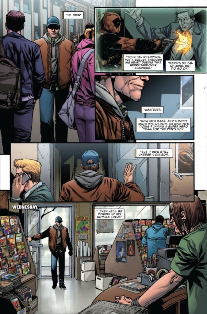
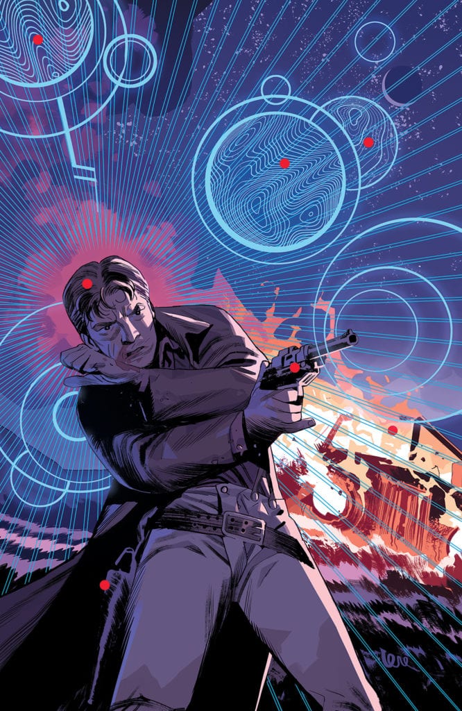
SPIDER-WOMAN #7, available Wednesday from Marvel Comics, is about to merge the already intense plot of Spider-Woman with the event that is tearing apart the Marvel universe. It’s no surprise that she would get pulled into this mess, when you think about it.

Well, that’s one way to phrase what’s going on.

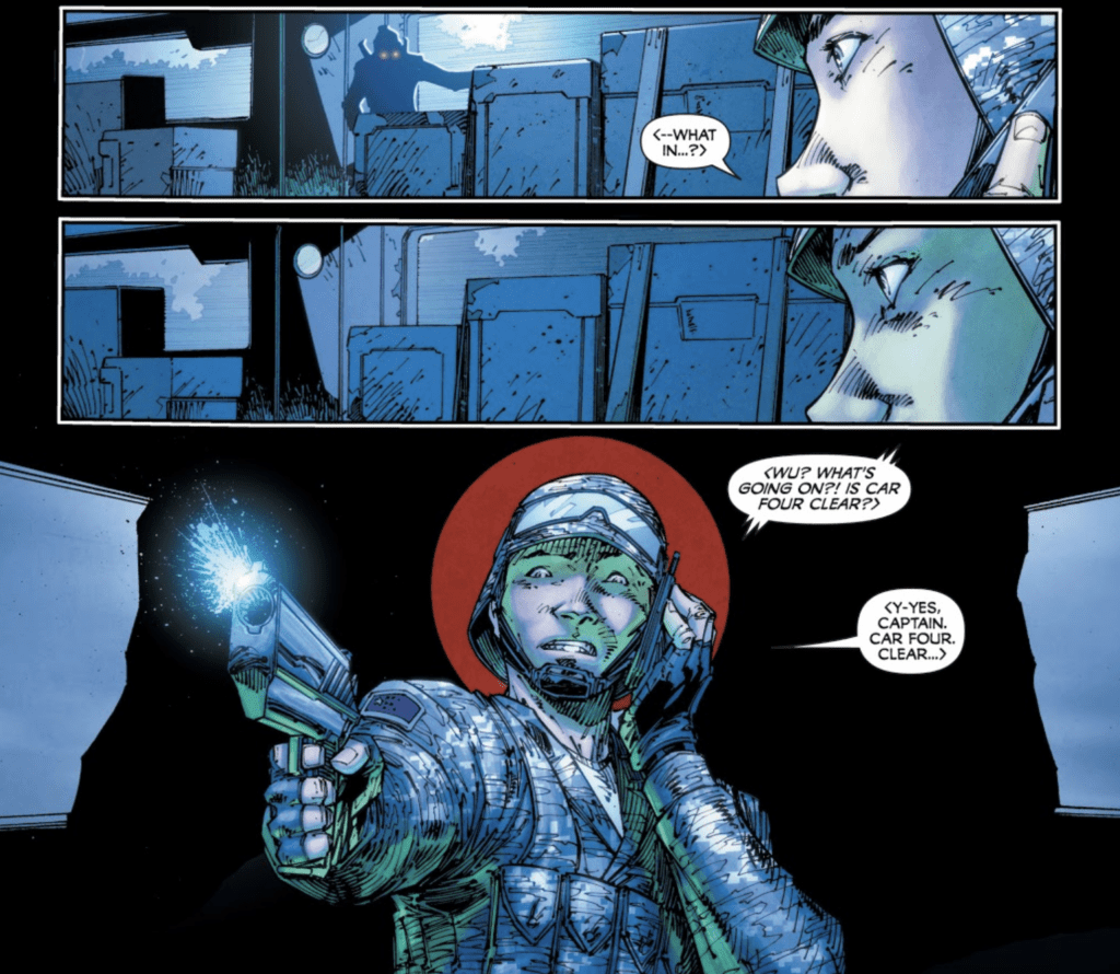
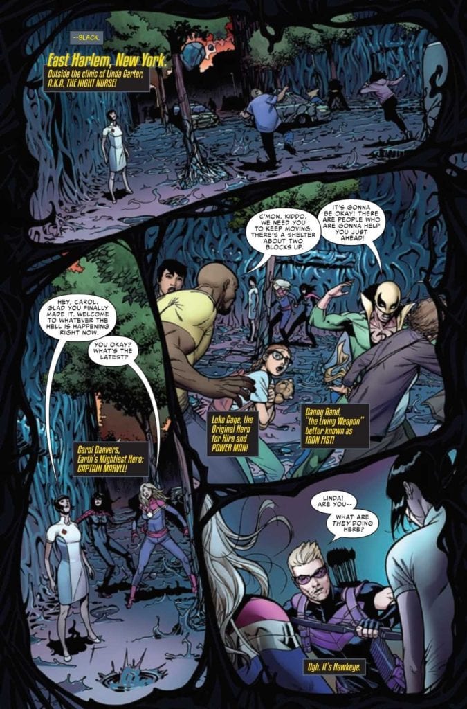
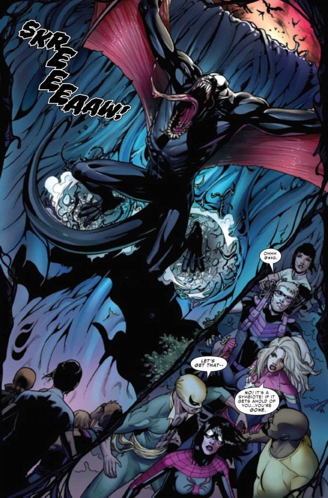
The Knull Invasion is in full force on Earth, something that Jessica Drew and her allies just learned the hard way. Much of what happens in this issue (but not all) is heavily tied in with the vents of The King in Black, and that means this dark plot is about to get just a little bit darker.

Ever since her series started up (again), Jessica Drew has been fighting for her life. Literally. And it’s not just her life, it’s the life of her son, and the niece she never knew she had. She doesn’t exactly have time to get involved with a war. Nor is she in the most stable state, at the moment.

Thus, that is where Spider-Woman #7. She’s facing a war on two fronts (three, if you count the mental state her ‘treatment’ is putting her in). Something’s gotta give, the real question is, what?

Look at who’s shown up for this battle!

The Writing

Spider-Woman #7 is a lot of things. It’s thrilling and intense. It’s humorous (at times), and it’s also heartbreaking. If one thing is certain, it’s that Karla Pacheco wrote in dozens of highs and lows into this particular issue.

It makes sense, given everything that’s going on. We have the main plot, we have the invasion, the best friend drama, and the drama/humor that comes with multiple heroes interacting. In short, it’s a feast for the readers.

While this issue may be hard for some fans to read, it did an excellent job of highlighting everything that is truly going on behind the scenes. The full effects of the cure (if you can call it that), the strain of being a hero, the worry that can eat away at a person. It’s all so painfully clear.

All of that before taking into account the cameos. Those helped to heighten and lighten the scenes, depending on what was needed. It’s a fine balance, but it is one that was found here. Naturally, some characters leaned more towards the funny side of the scale, while others were clearly there for physical (read: battle) backup.

The cliffhanger ending for this issue is perhaps the most intriguing turn of events so far. Once again a classic Spider character has entered the fray, and that just raises even more questions. Only time will tell how that will fallout.

Time to take a peek at how the invasion is going…

The Art

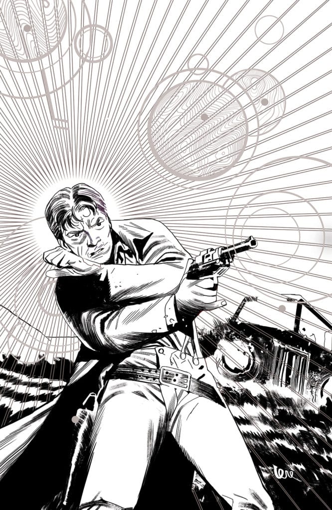
If you’re looking for an issue full of action and fighting, then Spider-Woman #7 is the issue for you. Pere Perez (art), Frank D’Armata (colors), and VC’s Travis Lanham (letters) did an outstanding job of portraying a variety of scenes and emotions.

To put it bluntly, this issue feels raw. Not in the incomplete sense, but in the sheer amount of emotions, from pain to rage, that cross the pages. It is Spider-Woman like we’ve never seen her before, and you can’t escape what she’s going through.

Bold colors and lines work together to create dynamic scenes, either full of action or those dramatic poses we all know so well. The clever borders helped to enhance the scene as well, while also reminding readers of what is at stake. (Especially those readers who are following along with The King in Black).

Spider-Woman #7 features some of the best lettering of the series thus far. The zaps and hits feel real, while the screeches almost resonate in our eardrums. It all works together to create a sense of scale and chaos.

Well, that can’t be good!

Conclusion

Spider-Woman #7 is an intense read, right from the very beginning, up until the very end. It makes for a tough read at points, but that just furthers the impact of it all. After all, no story is complete without a little bit of upheaval.

It’s going to be fascinating to see where Jessica’s story leads from here, and if she’ll be involved ever again in the current war tearing it’s way across Earth 616. Only time will tell.

Monkeys Fighting Robots Youtube

The End of An Adventure in FIREFLY: BLUE SUN RISING #1

FIREFLY: BLUE SUN RISING #1, available Wednesday from BOOM! Studios, concludes both the Blue Sun Rising plot arc, and the main plot for the most recent run of Firefly. However, their story is far from over.

A tech oriented variant cover for Firefly: Blue Sun Rising #1.

It all comes to a head here, in Firefly: Blue Sun Rising #1. The crew on Serenity has gotten in over their heads on more than one occasion, and this time is no exception. Heck, even the stakes are something they’ve had to deal with before. It’s almost refreshing to see them tackling it all head on, once again.

Blue Sun Rising was the first-ever crossover event that Firefly got a chance to play with. So it makes sense that it was also used to conclude this major plot arc at the same time. That doesn’t mean that the series will conclude after this issue is over, however.

The next issue of Firefly (Firefly #25) will begin a new plot arc. One that follows the events of Serenity – as in, follows the events of the movies. That’s going to be…tough. It’ll be one of the first times fans have seen the crew (in comic form) since all of the changes that occurred over the course of that plot.

We’ve always wondered how they continued on after that, and very soon, we’re going to be getting a chance to find out. Any theories?

Malcolm Reynolds is doing what he does best, in Firefly: Blue Sun Rising #1.

The Writing

Firefly: Blue Sun Rising #1 made one major promise in its advert – that everything was going to change. As far as that promise goes, they really hit the nail on the head there. Everything did change. The crew went up against new enemies, made new friends, had some scraps, and kept on moving. It’s what they do.

Written by Greg Pak, this issue is the one that ties the last plot arc up in a neat little bow. It’s clear that this is meant to be a finale of sorts, even while the series continues on. After all, it’s going to be quite a jump from here, as a whole new plot and timeline take control.

While I haven’t loved every moment of the Blue Sun Rising plot, I have to admit that it was wrapped up rather cleanly here. Each character seemed to get a moment to shine, even the newer ones introduced over the course of this series.

Yes, that does include the enemies. Though perhaps ‘shine’ isn’t the best descriptor in that case. The point is, everything felt…complete by the time it was all said and done. There are no loose ends, and we’re left with a reminder of the original characters and how we fell in love with them.

A black and white version of that famous character.

The Art

Firefly: Blue Sun Rising #1 is one of those issues that has a little bit of everything, at least on the artwork side. It has drama and action (in the form of some difficult flying), it shows pain and love, and it even has a little bit of humor.

Dan McDaid was the lead artist, with Vincenzo Federici providing some of the inking for this issue. As such, the scenes are highly stylized, yet feel thematically appropriate. Once again that odd blend of space and Western is found here, with a few heavier science fiction elements thrown into the mix.

Marcelo Costa’s colors help to bring it all together. The skies are an absolute highlight, as always. Even when the stars aren’t visible. The tech of the enemy really does stand out once colors are brought into the mix, and I think that helps solidify the concept and name of it all.

Then there’s the lettering, created by Jim Campbell. The lettering is another highlight of this issue, especially given all of the space battles going on. You can see that a bit of fun was had there, but that is far from being a bad thing here.

Right into the action in Firefly: Blue Sun Rising #1.

Conclusion

And so, with Firefly: Blue Sun Rising #1 coming to an end, so this crossover event, and the plot arc as a whole. It had its ups and downs. But at least it’s good to know that the series is still up for taking risks.

Now we’re left wondering how things will go, following the events of the movie. Granted, there isn’t much longer to wait.

Monkeys Fighting Robots Youtube

How They Survive in FAMILY TREE #10

FAMILY TREE #10, available Wednesday from Image Comics, brings us ever closer to what is starting to feel like an inevitable conclusion in Family Tree. The horror and family drama elements are still going strong, just in different ways than before.

Things are looking pretty dangerous in Family Tree #10.

This is one family who has seen it all. If by all, you mean the fall of civilization as we know it. They’ve been through hell and back, and still, somehow have managed to stay together. Even when certain family members have taken on…different forms.

Created by Jeff Lemire, Phil Hester, Eric Gapstur, and Ryan Cody, Family Tree #10 brings readers ever closer to the conclusion of the series, leaving us with only two issues before the end. It’s amazing (and more than a little bit horrifying) to see how quickly this world has changed.

The Writing

As the world changes, so do the dynamics. The sense of family drama is still there, but in fewer quantities than before. In its place is a survivalist element, as Josh struggles for survival – both in the past, and in the present.

Family Tree #10 is another harrowing addition to this series. One that isn’t afraid to get more than a little bit speculative about the future. It’s hard to say if this is wishful thinking, or if it is well and truly horrifying. I imagine any doubt will be erased over the course of the next two issues.

As with the past two issues, this one divides its time between the past and the present. There’s no narrator to tell us when a switch occurs, and yet it is clear as day when it does occur. That is how dramatically the world has been changing.

It’s fascinating to see how much this one family has had to adapt in order to survive. In a way, the entire lot of them is almost unrecognizable between one point in time and the next. Done by intent, naturally. Though it does beg the question, how many more changes are in store for them?

The Art

The artwork inside Family Tree #10 is full of that stylized design we’ve come to expect at this point. Every page feels more organic than usual, which matches the theme and premise of the story with alarming accuracy.

Watching the characters age and grow has become a surprising highlight of this series. There are plenty of correlations to be made between then and their…less active family members. It’s quite clever, and credit should be given to the overall art style.

The color palette seemed to bring in lighter hues of green this time around, yet they appear to be serving a purpose. It helps to distinguish the fresh green of new growth. Versus the older trees and forests that become dominant later.

Conclusion

Family Tree #10 brings with it some dark changes, as well as some brighter moments as well. All of which will help make the reader even more curious to see how this series intends to conclude. After all, there are only a couple of issues left.

Monkeys Fighting Robots Youtube

KING-SIZE CONAN: The Epic Nature Of The Cimmerian

King-Size Conan Cover

King-Size Conan is Marvel Comics celebrating the 50th anniversary of its first Conan The Barbarian comic. Releasing on December 23, this anthology brings several notable creatives who have a history with Conan. These include writers Roy Thomas, Kurt Busiek, Chris Claremont, Kevin Eastman, and Steven S. DeKnight. The artists on the book are Steven McNiven, Pete Woods, Roberto de la Torre, Jesus Saiz, as well as colorists Ive Svorcina, Carlos Lopez, and Neeraj Menon illustrate each depiction. Wrapping them all up is letterer Travis Lanham, acting almost like a chronicler to Conan’s adventures.

King-Size Conan The “X”

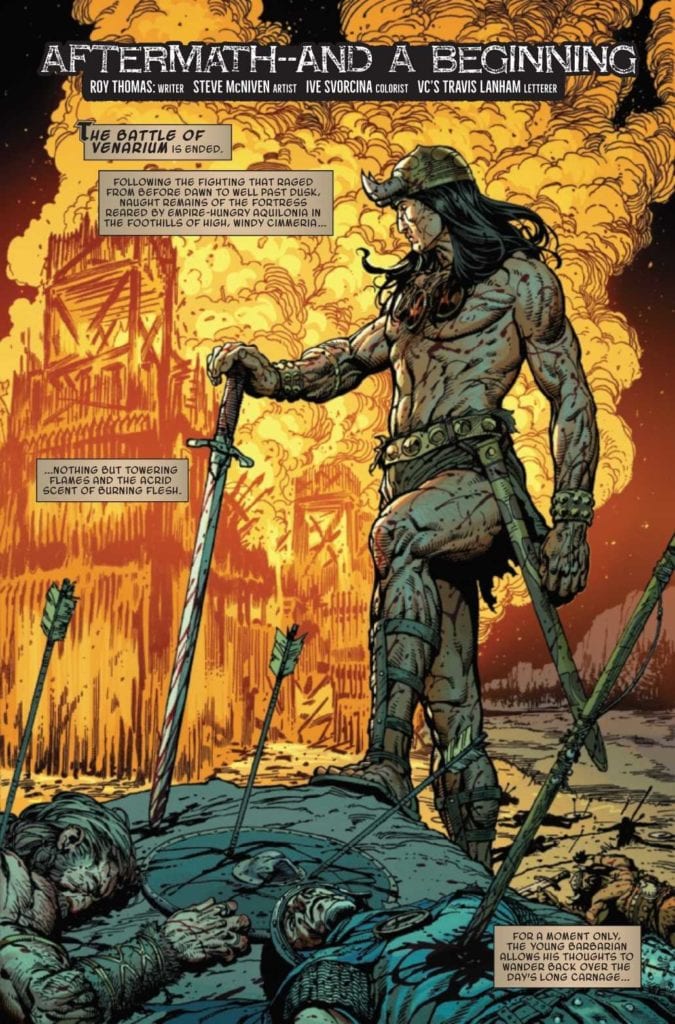
The nearly century-old character of Conan has many depictions, “Barbarian” just being one of several titles in King-Size Conan. Within Thomas’ “Aftermath–and a Beginning,” readers see the classic depiction of Conan’s struggle against civilization. One of Conan’s defining characteristics that many readers identify with is his search for an identity. Conan doesn’t feel at home with his fellow Cimmerians with many of his family and friends dead. This serves as a motivator for Conan to go out into the world. Some of these adventures and encounters make Conan less prone to suicidal risks. That being said, Busiek’s “In The City Of Thieves” displays Conan as a smarmy pickpocket who robs the careless out of hedonism.

Let it be said that Conan is not without compassion; Claremont and Eastman write their segments of King-Size Conan to show the Cimmerian as less of a conqueror. “Die By The Sword” has Conan comforting the mourning daughter of a woman he slew. “Requiem” in the meantime shows the Cimmerian doing whatever is necessary to pay debts. These display warmth in a cold, cruel world where “might often makes right” and how Conan appreciates small moments of kindness. Because as DeKnight’s “Ship Of The Damned” showcases, these moments, while timeless, are fleeting like with his lost love Belit.

Epic Illustrations


Within the different segments, each artist in King-Size Conan showcases how they portray the legend of Conan. McNiven displays Conan’s pride in his Cimmerian heritage by adorning him in keepsakes of fallen loved ones. The coloring by Svorcina presents Conan and people like him standing out in fiery bright colors, unlike soldiers in armor. Woods demonstrates this further by how Conan stands out both in his simple attire within civilization and in bold line work. This is what makes de la Torre’s artwork of him practically blending into battle stand out; even Carlos Lopez’s coloring displays him in the same light as a soon to be dead character. Not only is Conan in his element, but he could very well die in such a place, something the Cimmerian admits is out of luck.

The rougher artwork by Eastman and coloring by Menon goes straight into the more action-oriented savagery. The detailing line work, actions in sequence, and color changes in reaction are an artform in symbology. Conan is a person of conflict, and it follows him wherever he goes. Finally, Saiz gives a photorealistic airbrush touch that displays the Cimmerian with someone his equal. Conan and Belit are larger-than-life characters who encounter the equally absurd. A ship made out of what looks like past victims is something that only Conan can survive.

The Chronicler Speaks!

King-Size Conan Introduction
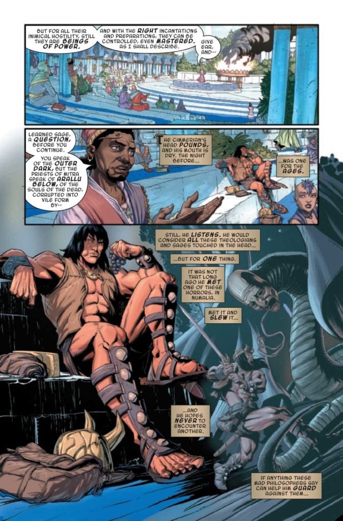
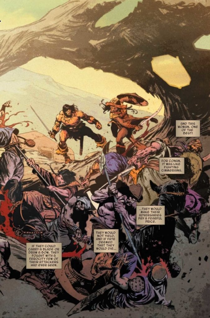
Anybody familiar with the line “Hither came Conan” seen in the beginning of King-Size Conan may likely equate VC’s Lanham with a Chronicler who tells Conan’s adventures. The captions help the reader appreciate the artwork for large scenes as moments frozen time. Unlike the short but sweet moments in action that hit hard and fast. Something that reappears in the last segment where Conan serves as narrator where his confines are simple and in the moment. Conan can certainly speak for himself when people gloss over or add parts to his story. The biggest takeaway comes in a papyrus-like caption at the end of the first story segment. It invites the readers to read Conan’s chronicles throughout Marvel’s run, for the story of Conan the Barbarian is ever-changing and revised.

King-Size Conan Is For Everyone

After getting back Conan, Marvel really goes out of its way to showcase its love for the Cimmerian. With so many at the pen, it’s nice to see how they interpret such a cultural icon. “Ship of the Damned” stands out over the other stories by displaying Conan’s beliefs at their utmost limit: live in the moment because you never know when you could lose them and the people you love… especially when you become a little more aware of yours and others fate. It’s what helps people like myself deal with an absurd world.

Monkeys Fighting Robots Youtube

BLOODSHOT Colorist ANDREW DALHOUSE Explains His Process

BLOODSHOT Colorist ANDREW DALHOUSE Explains His Process

BLOODSHOT #10 – Part 1 of “One Last Shot” hits your local comic book shop next month, but Monkeys Fighting Robots got a chance to talk with veteran colorist Andrew Dalhouse about his process and what he brings to Bloodshot.

Dalhouse has worked for all the big publishers and has been a busy man for the past ten-plus years, with his most notable works being Irredeemable, Faith, New 52 Teen Titans, and now Bloodshot.


About BLOODSHOT #10:
He only has “One Last Shot” as the brand-new story arc starts now! Superstar artist Brett Booth and Pedro Andreo join best-selling scribe Tim Seeley for Bloodshot’s road to retribution. Who can one a one-man army trust when everyone’s trying to kill him? On sale January 13, 2021.


Andrew Dalhouse Interview:

MFR: As a novice when it comes to the work of a colorist, what elements stand out in your work?

ANDREW DALHOUSE: Storytelling. I try my best to convey the story in color. Leading the reader by adjusting the color temperature to the emotions happening on the page.

MFR: What is your philosophy when it comes to colorwork in comics?

ANDREW: Enhance what story the artist and writer are telling.

MFR: What a colorist can do in comics has exponentially changed over time. How has your style evolved over the past 20 years?

ANDREW: Before I started coloring comics, I went to art school and used a variety of mediums before I started using computers. Computers make the job easier and faster to do certain things. I do miss using markers and watercolors. I still use them, but just for fun when I have free time.

MFR: When I see a lightning blue or a fiery yellow in a comic book, I get excited. Is there a color that gets you excited when you use it?

ANDREW: Actually I get excited to see both blue and fiery yellows. I love seeing a good purple and yellow used in a complementary way. I really loved what Justin Ponsor did on that last Defenders series. The book was so pretty.

MFR: How deep do you go into Color Psychology when laying out a book? Do you think about the emotional impact you have on the reader?

ANDREW: It goes deep. I try and convey emotions by using different color temperatures and secondary lighting. This is the main reason I love receiving a book in page order. It makes it easier to see how the story plays out. The script helps, but a lot of the time the artist adds or subtracts from what the script says. Those additions and subtractions can make a huge difference in how I color a book.

MFR: Bloodshot is a character set up for great colorwork with his blue-ish white skin and the potential for blood going everywhere. How do you put your personal spin on Bloodshot?

ANDREW: I always have his eyes and chest symbol a bright red. They are his biggest defining features, and I want that to show through always. I try to make them also have a boogeyman element in dark, moody scenes. Bloodshot #4, page 1, shows how it can be used dramatically.

BLOODSHOT Colorist ANDREW DALHOUSE Explains His Process

MFR: Who are some great colorists that inspired you?

ANDREW: Justin Ponsor, Frank D’Armata, Steve Firchow, Laura Martin, J.D. Smith, Jessica Ruffner.

MFR: Bloodshot has a good amount of action; what is your role in taking the action to the next level?

ANDREW: Help make those action beats readable and enhance them. Really make that explosion looks cool and cinematic. If it’s a big gun battle, there will be lots of fiery yellows. I will use rim lights to help separate the characters.

MFR: What is the one thing you wished more people knew about colorists?

ANDREW: We work very hard. There is a misconception that the computer does most of the work. There is no magic “Color Page” button on our keyboards. The computer is just a tool. Just like a penciler’s pencil or an inker’s brushes and nibs. It takes knowledge, training, and lots of coffee to get the job done.

MFR: Andrew, thank you again for your time, and best of luck with BLOODSHOT #10!

ANDREW: Thank you for the interview. It was fun.

BLOODSHOT Colorist ANDREW DALHOUSE Explains His Process

Monkeys Fighting Robots Youtube

Review: KING IN BLACK #2 – Isn’t The Journey Supposed To Be The Fun Part?

Review: KING IN BLACK #2 - Isn't The Journey Supposed To Be The Fun Part?

King In Black #2 hits your local comic book shop this week, just in time to spread the holiday cheer!

I purposely did not read any of the King In Black tie-ins before issue two because I wanted to see if the big Marvel Comics event could stand on its own. Without spoiling anything, the second issue reads as a direct continuation of the first, which is great for new readers.

We have the same creative staff for King In Black #2 – writer Donny Cates, penciler Ryan Stegman, inker JP Mayer, color artist Frank Martin, and letterer Clayton Cowles – but the book somehow feels a bit different. It felt brighter and not as grungy as the first issue. Also, with the main character sidelined, the book’s pace was brought to a standstill as the remaining Marvel heroes talk about the problem at hand (Knull).

The main issue is that King In Black #1 is amazing. I gave it a perfect score, and if you know me, that’s like pigs flying. Cates works at an insane storytelling pace in the first issue, with Stegman punching you in the face with breathtaking splash pages over and over again until you are dumbfounded by the end of the issue with a giant smile on your face. As the story turns toward, “How do we defeat Knull?” the pace slows way down, and Cates falls into a few tropes that are repetitive and possibly annoying. Cates’ tone of Namor comes off as a parody of the character, and apparently Namor, Sue Storm, and Reed Richards are still in a love triangle. There are six pages in the book where the lines coming out the heroes are very token and genric. With this generic conversation, it desensitizes you and lifts you away from the story by the time the cliff-hanger hits, and then that final page lacks weight, which is a solid bummer.

Review: KING IN BLACK #2 - Isn't The Journey Supposed To Be The Fun Part?

The first six pages of King In Black #2 continue the pace of the first issue, and Stegman has an epic Spider-Man full-page that I wish a double-page spread. As I mentioned earlier, Martin’s colors felt brighter and took away from our heroes’ desperation. The generic lines led to some stiff and awkward poses as well (I’m looking at you, Blade and Magneto). There is a moment in the book where Cates and company create something new, and they don’t take advantage of it, which is the biggest miss of the issue. It’s something so new and refreshing that we would all buy the Marvel Legends action figure immediately, BUT… we only get three small panels, and it’s gone. If Stegman were given a full page for this new creation, this would be the conversation of the week and the standout moment of the series. I would put this new creation up there with The Batman Who Laughs when it comes to potential. Cowles does a fine job with the lettering in this issue. He was not given much to work with to spread his artist wings, as most of the characters involved spoke genric English and the action sequences were minimal. The Michael Bay over-the-top nature of the first issue, which I loved, was missing this time around.

Overall, the story didn’t progress a lot, and the big moments didn’t feel like they had much weight. With three issues left, Cates is still building toward a climax with the possibilities of more twists and turns ahead, so I’m still on board for the ride.


Come back here after you read King In Black #2 and let me know what you think.

Monkeys Fighting Robots Youtube

INTERVIEW: Actor And Producer Han Soto Discusses Horror Film DON’T LOOK BACK

Don’t Look Back is a new horror film from Jeffrey Reddick, the mastermind behind Final Destination, which centers around a young woman who survives a tragedy only to face more dangers when supernatural forces run amuck. Actor Han Soto (Cobra Kai, Watchmen) faced some real-life fears while filming and taking on a new, off-camera role.

Kourtney Bell (All-American, It Follows) plays Caitlin Kramer, a young woman who watches her father die during a home invasion. Nearly a year later, Caitlin is scared of leaving the house. However, Josh, Caitlin’s boyfriend, played by Skyler Hart (For The People, Grey’s Anatomy), convinces her to rejoin the outside world. It was advice she should’ve ignored as Caitlin soon witnesses another tragic moment that begins a terrifying chain of events for the final girl.

PopAxiom spoke with Han about becoming an actor, making Don’t Look Back, and a teeny, tiny bit about Cobra Kai.

Actor & Producer

“I started as regional talent doing print ads and industrials,” Han says of his earliest gigs in showbiz. “I did extra work. I did one particular job that I came on as an extra; it was for Madden NFL. I’m a Saints fan, and this was back when they were on the cover. I helped this PA [production assistant] move some boxes, and he said, ‘When I come back in, step to the front, and I’ll select you.’”

The PA kept his promises, and Han “ended up on a bus,” and soon after, he “was bumped up to a principal role in a national commercial.”

Acting gigs were happening organically for Han, but it was still more a gig for fun than a primary career. After Madden, that changed, “When those checks started coming in, I was like, ‘wow, I can make a living at this!’”

Han is nearing 100 credits on IMDB, but he’s added the role of producer to his repertoire along with acting. “I like producing because I like making sure that things are in line and that the end products are all in your hand.”

“On the acting side,” he says, “it’s all about craft and getting into character. I study all the time. You learn about all these techniques so that you can let go and be yourself.”

“I started learning writing too. That helped me be a better actor.”

don't look back-interview-han soto-actor

About Don’t Look Back

Han was recruited into Don’t Look Back as “an actor first,” he says, “I built my career in the South East region like the Miami market. Burn Notice was my first gig ever. Miami, Atlanta, New Orleans, I’ve developed relationships with casting directors in those regions.”

“I was in the running to read for the role of the detective,” Han says about the audition process for Don’t Look Back. “They also wanted me to read another role; I thought it was a smaller role because the sides were short. It turned out to be much bigger.”

Han recalls a moment with producer Andrew van den Houten that lead to a new role for the actor. “I was on set for about a week watching Andrew navigating the set. One day I had a small scene, he sat down by me and said, ‘You’ve been in a couple of my movies, but I don’t know you. Tell me about Han Soto.’”

“I was fresh out of a premiere at SXSW,” Han says, and “I started talking about acting and producing. I said that I put together a film fund, and I want to go in and help finish smaller films. He offered me an opportunity to secure the remaining points for Don’t Look Back.”

After that, Han started “watching dailies and giving feedback. Andrew and I hit it off, and we started our own distribution company.”

Don’t Look Back writer and director Jeffery Reddick is a legend in the horror space, creating the Final Destination franchise. “When you have someone working in that horror space, you expect their personality to have some sort of darkness, but Jeffrey is just a sweet guy. When asks you to do something; you want to appease him.”

“So, I remember I was hanging out with some friends on a day off,” Han shares a story about Jeffery, “and I get a call from Jeffrey at around 10:30 at night. It was direct but soft, and he was writing some new scenes that involved my character. He asked me to do something terrifying.”

I asked, “Will it make the movie better?” He said, “’ Yeah, absolutely.’”

Han shot the scene, which you’ll know immediately when you watch the film. PopAxiom won’t spoil it, but we’ll leave it at this: “I could hear them eating in my ear.”

To get through the horrifying moment, Han used a breathing technique known as Wim Hof. “You can pretty much settle your body down … you can control how you feel. I implemented that, and it worked.”

“Jeffrey would ask ‘You got another one in you?’” Han says with a laugh, “And I was just like, yeah, but this may be the last one before I go to the bathroom on myself.”

The sequence took place on “the last day of shooting, and I think they did that on purpose, probably thinking ‘If we do it at the beginning he’ll never come back.’”

Cobra Kai

Han is in Cobra Kai season three, which releases on Netflix in January. “I wish I could talk about it. I have so much I want to say.”

Talking about Cobra Kai is off-limits, but Han shares how being on the show was another learning experience. “From the producing side, I was able to watch three childhood friends manifest their dreams. That’s what I love about producing, you figure out who your team is, and you go forward together.”

don't look back-horror-film-jeffrey reddick

Wrapping Up

Who are some other creatives who inspire Han? “Oh, man, Robert DeNiro and Mark Ruffalo. In the horror space, Wes Craven, Tobe Hooper, Bernard Rose. These are the people that scared the sh*t out of me since I was a kid. I love Spielberg and Stanley Kubrick.”

“I find a lot of nuggets in the people I work with,” he continues, “I’ve seen Jack Black step away from a scene to talk to his kids. I thought that was amazing.”

Hollywood is entirely in the throes of remake fever. So, what would be a dream remake project for Han? “I wouldn’t mind doing a Jaws, maybe mixed with a water-borne virus. I want something real, a shark affected by pollution or something human-made. It’s a couple beats away from reality.”

“We’re excited for Don’t Look Back,” Han says. The film is available on digital services across the web. “The message is so timely.”

What’s next for Han? “I finished Outer Banks for Netflix. We have some films through the label, Kamikaze Dogfight, that will be released through the coming year. There’s a game that I’m the lead in, I can’t talk about it, but I’m so excited!”

Is Don’t Look Back on your watch list?

Thanks to Han Soto and October Coast
for making this interview possible.

Read more interviews from Ruben R. Diaz!

Monkeys Fighting Robots Youtube

NO ONE’S ROSE Vol. 1: The Distractions Of Factionalism

No One's Rose Cover

No One’s Rose Vol. 1 out now from Vault Comics is the perfect reading at an appropriate time. Writers Zac Thompson (Relay) and Emily Horn craft a story about different points-of-view in a future close to home. Guiding the readers is the expressive artwork of Alberto Alburquerque, lively colors of Raul Angulo, and diverse lettering of Hassan Otsmane-Elhaou.

No One’s Rose: Empathic Pushes

No One’s Rose is about trying to convey a person’s desire to make a difference and how that drive can put strains on peoples’ relationships. Thompson and wholesomeness speaker Horn emphasizes this with two of the lead characters. Tenn and Severo Gavrillo vehemently stick to their sides, unable to be bipartisan and only see the other sides for their flaws. To anybody familiar with how the 2020 election divided families, this is an uncomfortable feeling, making it all the worse considering that some readers will likely identify with one of them over the other.

Like The Pull, empathy towards these characters drives the story of No One’s Rose. It’s a feeling that expresses throughout the series where the reader empathizes with the Gavrillos and how they deal with their family legacy. Tenn wants the love and acceptance to get out of her lower-level habitat as per her late father’s punishment. Meanwhile, Severo wants to see his father’s wish not to live in the domed city’s confines where people of the lower levels slave away. Each point the Gavrillos and their factions make are valid reasons for taking action, and the reader wants everyone to succeed for this.

What An Evocative World

Alburquerque brings a wide range of designs and expressive facial and body language to express the culture in No One’s Rose. The clothing, hair color, and facial decorations on the many characters suggest diverse lifestyles. Some like Seren seem to like some retro technology like headphones, unlike Tenn, who seems to follow the trends of the top-siding people she wants to mingle with. The plants, technology, and animals all pop out for big moments, something that Angulo’s coloring makes even more apparent by giving each subject of importance brighter color contrasting backgrounds with muted colors.

Fan-favorite letterer “Hass” Ostmane-Elhaou of “Strip Panel Naked” gives every word in No One’s Rose distinct identities. The word balloons look like they’ve been painted on with a brush with care. The captions are all in different colors distinct from the inner monologues of different characters: white with blue outlines for Tenn, orange with black fonts for Seren. But it’s the stylized wordmarks that really stand out; every new area has large letter words with description captions, capturing the readers’ attention about this world.

Crucial Flaw of No One’s Rose

Unfortunately, once the reader nears the end of No One’s Rose, they find that the plot is rushed. That same investment towards the main characters’ arcs can’t cover the plot holes involving the greater world. Several of the characters connected to the political sides of the domed city get pushed to the side so that the series can end. Whether it was the bureaucratic city council or the ecoterrorists’ leaders, the world was just too big for six issues.

Does It Have Your Attention

No One’s Rose is a fascinating piece at the time of its release. As political debates run rampant, this series serves as a good example of why. When characters readers can identify/sympathize with act out in ways you want to root for, it’s easy to get caught up in the excitement. It can be a good pass time, especially with a world that readers want to explore. Give No One’s Rose a try.

Monkeys Fighting Robots Youtube

Comics Studies: STAGED And Television As Comics

staged
Staged by BBC Television

We all know what a comic is, ”Juxtaposed pictorial and other images in deliberate sequence, intended to convey information and/or to produce an aesthetic response in the viewer” (McCloud Scott, Understanding Comics).

We know them when we see them and when someone tells us they’ve read a comic, we know exactly what they mean. But how clear is our understanding of what they mean? Would we think of fumetti, those Photo Comics where each panel is a photograph, and all of the drawn elements have been removed? These were popular in the National Lampoon Magazine and several UK newspapers and a massive part of the Comics industry in Italy.

Or Motion Comics? A combination of illustration and animation where extended scenes might include sound effects and verbal elements to produce an audio/visual sensation on a screen. The frames, or panels, are often kept in place, but the sequences they depict are often highly stylized. In 2008 the seminal work Watchmen was turned into a motion comic and released to coincide with the blockbuster movie. The comic includes captions and animated versions of the pages from the original comic book release. The caption boxes and word balloons are read aloud. The characters are given voices by a single voice actor, Tom Stechschulte. This gives the entire project the feel of an animated audiobook, mixing up media like the multimodal narrative woven throughout Moore and Gibbons’ masterpiece.

Staged Multiple Panels: Credit BBC Television

Staged, A Comic

Currently available on Netflix is the BBC comedy series Staged. Made and set during the pandemic, the series features a group of actors who attempt to rehearse a play using video calls. One of the most striking elements of the series is not the acting, which is magnificent throughout, or the surprisingly touching plot, but the commonalities that the series shares with a Comics form. It may be a television show, but the structure and design have numerous crossovers with comics and how we read them.

On the surface, this may seem like a bold statement and one that is instantly open to ridicule; however, a quick look at the presentation of Staged on a screen should make it immediately clear where my thinking is coming from (see image above).

The characters exist within their own computer screens, which act like frames, encapsulating the character and the characters’ family. For most of the series, the central protagonists are seen through this unique lens, and their interactions are displayed on the screen next to each other, producing a ‘strip’ like image. Each screen is displayed like a panel, interacting directly with the panel by its side. As one character speaks, the other is silent, and then the focus shifts. We ‘read’ the image on the screen as simultaneous, that both screens occupy the same time, if not space, but we only do this because of the interaction between the characters. Comics are read in the same way, with the progression from one panel to the next, allowing the reader to create a full picture, placing each panel in relation to the others. Our understanding of one panel only exists because of the sequence, just as our understanding of the conversation between David Tennant and Michael Sheen only exists because of the interaction between them, one panel at a time.

Staged contains groups in ‘panels’ Image Credit: BBC Television

On-Screen Panel Layout

In some scenes, there are multiple screens with several characters but these behave in exactly the same way. As a viewer, we move from one screen to the next as the characters act or speak. However, we are constantly aware of the other screens, and we piece the entirety together from the fragments, which is a significant aspect of comic reading.

On occasion, several characters inhabit the same panel, each speaking before the focus shifts, but again, this also happens on a comics page. An exchange or even full conversation can occur in a single panel without confusing the reader. Simple placement techniques will lead a reader through a panel, just as the vocal back and forth leads a viewer through a scene in television.

Even the establishing shot, often important in comic book storytelling, is present in Stages. Long shots or panning shots illustrate each scene’s location and tone so that when the screens return, the audience is not distracted by trying to ‘place’ the action. Establishing shots work in exactly the same way in comics as the following example from Undone By Blood demonstrates. We are shown the grocery store that the protagonist walks into, from that point on the artist only shows us exactly what we need to see for the narrative. We understand she is in a shop and therefore do not need to see the shop setting in every panel.

Undone by blood
Establishing a scene in Undone By Blood Credit: AfterShock Comics

One of the most important features of comics, and one that is usually absent from film and television, is of course the gutter. The gutter is instrumental to comics reading because this is where the ‘closure’ happens. Readers complete scenes and sequences within the breaks between panels, whether this is the frame or the more obvious gutter. This rarely occurs in film, even with examples of split screens where the separating elements tend to serve a different function. However, in Staged, there is a deliberate use of ‘gutters’ separating the computer screens that serve a narrative function similar to the gutter in a comic. There are even moments where ‘blank’ panels inform the reading of the scene. Large black spaces sit to the left or right of a panel, illustrating the loneliness or the impatience of a character.

Staged
Staged: Image Credit BBC Television

Text/Speech

The one element missing from the television series is the Speech Balloon, although there are textual elements that inform and react to the narrative. Each episode’s title sequences relate directly to previous episodes, with the text referencing conversations between the characters.

In Comics, the introduction of Word Balloons ‘shifted the understanding of text within comics: it was no longer read as internal dialogue but rather as a theatrical projection of sound.” (Ian Gordon in Comics Studies: A Guidebook). It is a small step from the internal reading to the verbalization of text. Are Audiobooks still classified as books? And in the same sense, would a spoken word comic still remain a comic? For this, we would have to refer back to the Motion Comic mentioned earlier. A simple addition of animation and sound can transform a comic but still be accepted as one. There’s not much of a leap from there to the presentation of Staged.

Staged
Staged uses panel sequences for action scenes Image Credit: BBC Television.

Conclusion

I am not suggesting that Staged is a comic and should be analyzed as such, but the functions of Comics, elements of the language that scholars like McCloud and Groensteen discuss, are present in this television series. The shaping of the narrative, the discourse between specifically framed images, and the canvas of the screen are all specifically Comics forms discussed regularly. I mentioned Photo Comics and Motion Comics at the start of this article because they employ techniques not usually associated with comics but still manage to fall under the Comics umbrella. Similarly, Staged is a television show that borrows heavily from the Comics lexicon to create a challenging narrative form. The show demonstrates how the borders between media can be broken down, and a merging of idea’s outside usual thinking can create a new experience.

In an article for The Comics Journal, Kim Jooha introduces Extended Comics, which he describes as ‘artistic/cultural works in any medium that can be viewed as comic or comics-like objects regardless of the intention of the creator.’ In Staged, we find a perfect example of Jooha’s Extended Comic in a television format.

Monkeys Fighting Robots Youtube

Review: How To Fight A God In TASKMASTER #2

TASKMASTER #2, out now from Marvel Comics, is the second issue of the superhero miniseries by writer Jed MacKay, artist Alessandro Vitti, colorist Guru-eFX, and letterer Joe Sabino. This issue gets too serious for its own good but still reveals more about Taskmaster’s personality, ultimately making the reader care about the main character’s goals.

Writing

As mentioned above, Taskmaster #2, in comparison to the first issue, feels a little out of place. In the first issue, the tone was more fun and entertaining, making a comic about a mercenary anti-hero be all the more inviting. But in this issue, Mackay decided to go with a more serious approach. To be fair, the reader does get more of Taskmaster’s narration, which puts them in the character’s shoes and makes the reader relate more to the anti-hero. But after reading the first issue, the reader could get a bit let down when going into this issue, expecting the tastefully weird comic they read before. Other than that, the fight sequence manages to engage the reader throughout its entirety, and the issue definitely ends on a fascinating note.

Art

Vitti’s art looks more down to earth and realistic here to help elevate the story’s grim tone. This does a few things. It makes the few jokes in this story not quite land, like when Phil Coulson walks into a comic book shop out of all places. It also makes the character’s facial expression look and feels less alive and expressive. But, what Vitti does achieve here is he makes the fighting sequence feel all the more real and dangerous. In this sequence, Vitti conveys to the readers through Taskmaster’s body language how hard and frustrating it feels to fight a “god” like Hyperion. Each punch or blow Taskmaster takes; it truly looks like it hurts him.

Coloring & Lettering

Guru-eFX captures the sense of danger in this fight sequence through how he colors the blood. Throughout the sequence, with each new blow, Guru-eFX makes the blood further stain and cover Taskmaster’s costume. The blood looks so realistic and weirdly visceral, the reader can’t help but feel the pain Taskmaster is going through. Taskmaster #2‘s grim mood definitely helped compliment Guru-eFx’ realistic color choices.

Sabino’s lettering is arguably the only fun aspect of this comic. The vibrant, colorful sound effects pop wonderfully. The shape of the dialogue balloons when the Taskmaster is suffering elevates his despair. The lettering feels like it doesn’t belong paired with all the other elements of this issue.

Conclusion

Taskmaster #2 is certainly not a complete let-down. The story manages to come off as quite entertaining; The realistic, grim art never fails to impress, but I personally would have liked to see more of the first issue’s silliness that made me love the miniseries in the first place.

Monkeys Fighting Robots Youtube