

TASKMASTER #2, out now from Marvel Comics, is the second issue of the superhero miniseries by writer Jed MacKay, artist Alessandro Vitti, colorist Guru-eFX, and letterer Joe Sabino. This issue gets too serious for its own good but still reveals more about Taskmaster’s personality, ultimately making the reader care about the main character’s goals.
Writing
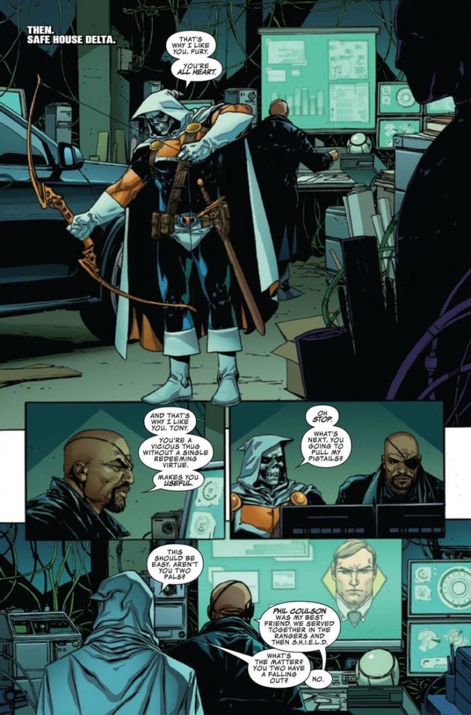
As mentioned above, Taskmaster #2, in comparison to the first issue, feels a little out of place. In the first issue, the tone was more fun and entertaining, making a comic about a mercenary anti-hero be all the more inviting. But in this issue, Mackay decided to go with a more serious approach. To be fair, the reader does get more of Taskmaster’s narration, which puts them in the character’s shoes and makes the reader relate more to the anti-hero. But after reading the first issue, the reader could get a bit let down when going into this issue, expecting the tastefully weird comic they read before. Other than that, the fight sequence manages to engage the reader throughout its entirety, and the issue definitely ends on a fascinating note.
MFR ON YOUTUBE (latest video)
Help us reach 5K Subs!
Art
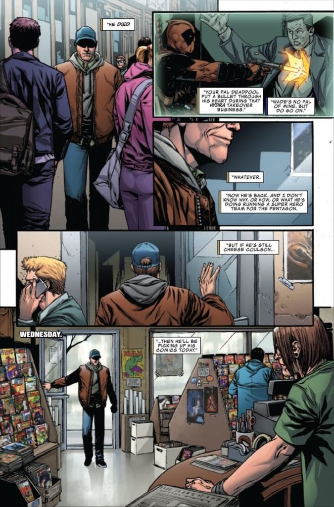
Vitti’s art looks more down to earth and realistic here to help elevate the story’s grim tone. This does a few things. It makes the few jokes in this story not quite land, like when Phil Coulson walks into a comic book shop out of all places. It also makes the character’s facial expression look and feels less alive and expressive. But, what Vitti does achieve here is he makes the fighting sequence feel all the more real and dangerous. In this sequence, Vitti conveys to the readers through Taskmaster’s body language how hard and frustrating it feels to fight a “god” like Hyperion. Each punch or blow Taskmaster takes; it truly looks like it hurts him.
Coloring & Lettering
Guru-eFX captures the sense of danger in this fight sequence through how he colors the blood. Throughout the sequence, with each new blow, Guru-eFX makes the blood further stain and cover Taskmaster’s costume. The blood looks so realistic and weirdly visceral, the reader can’t help but feel the pain Taskmaster is going through. Taskmaster #2‘s grim mood definitely helped compliment Guru-eFx’ realistic color choices.
Sabino’s lettering is arguably the only fun aspect of this comic. The vibrant, colorful sound effects pop wonderfully. The shape of the dialogue balloons when the Taskmaster is suffering elevates his despair. The lettering feels like it doesn’t belong paired with all the other elements of this issue.
Conclusion
Taskmaster #2 is certainly not a complete let-down. The story manages to come off as quite entertaining; The realistic, grim art never fails to impress, but I personally would have liked to see more of the first issue’s silliness that made me love the miniseries in the first place.